
The respected Tax Policy Center (TPC), a non-partisan think tank set up as a joint venture of Brookings and the Urban Institute, released on November 8 its first estimates of the distributional impact of the November 3 Republican tax proposal. The TPC runs a sophisticated micro-simulation model of the US tax system, using a large but anonymous set of tax returns to determine the impact of proposed changes in tax law. The model is similar in nature to models run by the US Treasury and in Congress, but with full disclosure of the results and how they arrived at the estimates that they obtained.
As was discussed in an earlier post on this blog (on the Trump plan released in late September), these Republican plans will provide huge cuts in taxes for the very rich, and far more modest cuts for others. The November 3 plan released by the Republican Chair of the House Ways and Means Committee (the committee responsible for all tax issues) is the first fully detailed plan for which good quantitative estimates can now be made of the impact by income group. While certain elements in the proposal are changing daily, with the Republican leadership in a rush to push their plan through quickly before there can be extensive analysis and a solid debate, there is enough now available to make reasonable estimates of the impact. And so far, the changes adopted have been minor, with the basic structure of the original proposal maintained. It remains a plan where the rich will benefit disproportionately.
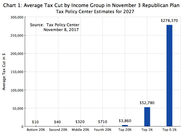
The chart at the top of this post shows the estimated average cuts in taxes that would be provided under this plan, categorized by income group: in quintiles plus for the top 1% and top 0.1%. The quintile groups are defined by equal shares of the population (20%), with the bottom 20% in those households in the lowest income rank, and so on up to the richest 0.1%. The breakpoints (in 2027, but in terms of prices of 2017) for household incomes for each group are:
a) Bottom 20%: $0 to $28,099 of annual income;
b) Second 20%: $28,100 to $54,699;
c) Middle 20%: $54,700 to $93,199;
d) Fourth 20%: $93,200 to $154,899;
e) Top 20%: $154,900 or more;
f) Top 1%: $912,100 or more;
g) Top 0.1%: $5,088,900 or more.
One would have to be earning over $900,000 a year (in 2017 prices) to be part of the top 1% in 2027, and over $5 million a year to be in the top 0.1%. These groups are very well off.
As the chart shows, the cuts are overwhelmingly clustered at the top. Indeed, the cuts are relatively so small for the first 80% of the population that they do not even register at all on the bar lines. And even if one re-draws the chart to remove the tax cuts the top 0.1% would gain (which stretches the scale), there is not much of a difference:

One can still barely see the cuts that would go to the first 80% of the population.
However, supporters of the Republican plan respond by saying that the rich get most of the cuts because the rich pay most of the taxes. It is true that the rich do pay more in the current system when expressed in absolute dollar terms. (It is not always the case when the taxes are expressed as a share of their incomes, but that is a separate issue and one I will not go into here.) But is it the case that the tax cuts that will go to the rich under the Republican plan are proportionate to their incomes and/or the taxes that they pay? As we will see in the remainder of this post, they are not.
First, one can calculate from the TPC figures (available for 2027 for the groups analyzed here in spreadsheet form at this link) the share of the tax cuts (in total dollar terms) that will go to each of the income groups identified:

The rich will receive a much higher share, in dollar terms, of the tax cuts than would go to the others. The richest 20% will receive 73% of the dollar value of the cuts, while the subset within this group that are the top 1% will receive 47% and the top 0.1% will receive 25%.
But how does this compare to their shares of overall income? After all, if the top 20% receive 73% of the tax cuts, but also account for 73% of overall income, one could say the tax cuts are proportionate to their incomes. But that is not the case:
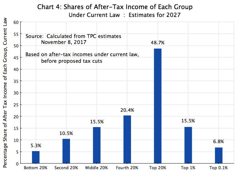
The top 20% account “only” for 49% of the nation’s household incomes (as forecast for 2027), but will obtain 73% of the tax cuts (as also forecast for that year). And one can look at the similar relative amounts for the other income groups.
Perhaps the argument would then be made that the tax cuts should not be compared to the income shares, but to the shares of taxes each group would be paying (before the tax cuts, as under current law). There is still a degree of progressivity in the tax system, even though the progressivity was reduced sharply in the Reagan and Bush tax cuts. For the shares of taxes that would be paid (under current law) in 2027, one can calculate:

But even here, the share of the top 20%, say, comes to 69%, which is still less than the share of the tax cuts (73%) they would receive under the Republican plan. And the shares are far more disproportionate for the top 1% and especially the top 0.1%.
One can look at this systematically, for all groups, by calculating the ratio of the shares of the tax cuts which would go to each group, to the shares of what each group would be paying in taxes (under current law). By definition, the average ratio will be 1.0 (weighted properly), but the individual ratios will be above or below this. What we find by dividing the shares of the tax cuts (Chart 3 above) by the shares of taxes to be paid under current law (Chart 5) is:
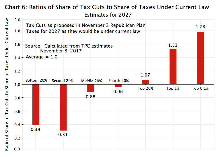
The ratio of what the bottom 20% of the population will be receiving in the proposed tax cuts, to what they would be paying in taxes under current law, is only 0.4. They would be receiving, under the Republican plan, a disproportionately low share of the cuts. And the ratio is even worse for the second 20% (which one might consider as the lower middle class), at just 0.3. At the other end of the scale, the ratio of what the top 1% will be receiving in the proposed tax cuts (47% of the cuts) to what they would be paying in taxes under current law (31% of the taxes) is very generous, at 1.5. And the top 0.1% would enjoy a ratio of tax cuts to what would they pay in taxes under current law of an even higher 1.8.
Finally, what do the ratios look like if one compares the share of the tax cuts that would go to each group to the shares of the incomes of those groups? For the purposes here, I have taken the incomes as they would be after taxes, but only after the taxes as they would be under current law. This is the base one is starting from, and thus the basis for such a comparison. One finds:

Here the ratios are even starker. The ratio of the share of the tax cuts that would go to the bottom 20% (0.4% – see Chart 3), to the share of income of those in that group (5.3% – see Chart 4), is just 0.07. Put another way, the share of the tax cuts that would go to the poorest 20% of the population is 93% below what it would be had the tax cuts been allocated equally according to income shares. It is almost as low for the second 20%, at just 0.12 (or 88% below what it would be had the cuts been allocated equally according to income shares). And the ratio remains below 1.0 for all but the top 20% of the population.
But the tax cuts are generous for those with high incomes. For the top 1%, the share they would receive in the proposed tax cuts is over 3 times their share of income. And it is 3.6 times as high for the top 0.1%.
It is nonsense to claim that this would be a “middle-class tax cut”, as the Trump administration and the Republican leadership in Congress have repeatedly asserted. A dramatically disproportionate share of the cuts will go to the extremely rich, while those at the lower end of the distribution will receive only token amounts.

You must be logged in to post a comment.