
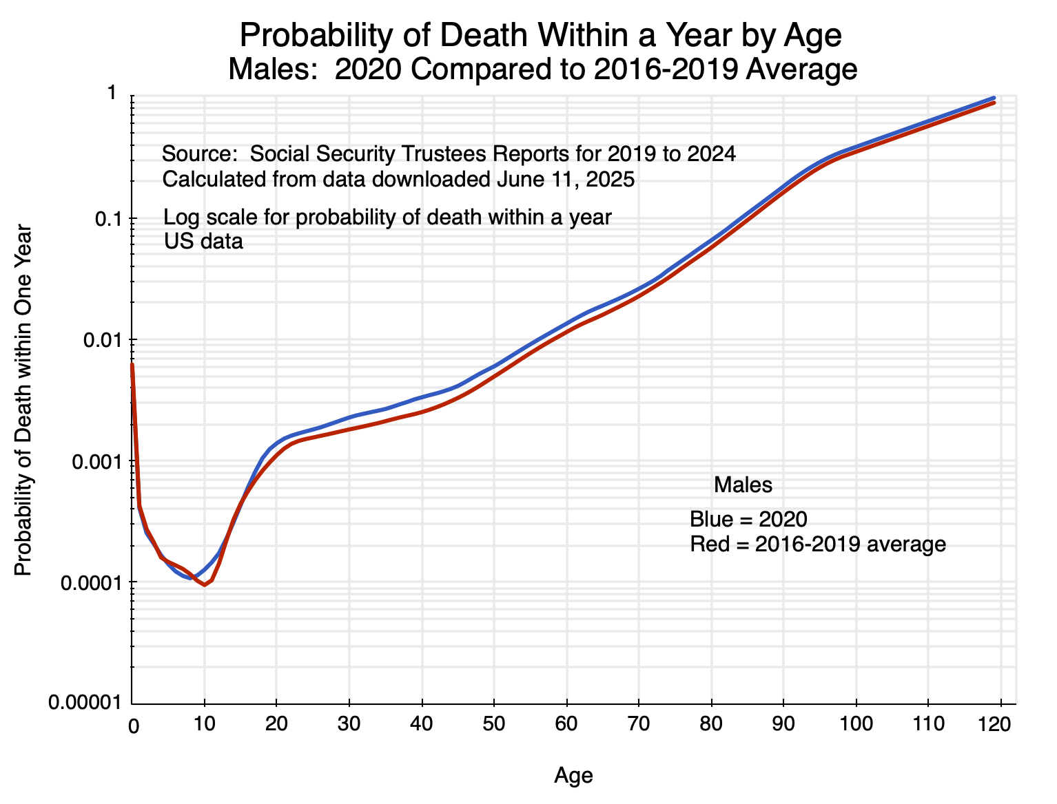
Chart 1
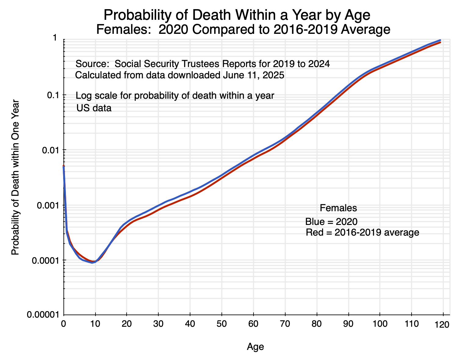
Chart 2
A. Introduction
As a diversion from the more strictly economic posts usually on this blog, this post will examine data that can be used to better understand the impact the Covid pandemic had on US mortality rates. The Social Security Administration provides figures each year on historical mortality rates as part of the legislatively mandated Annual Report of the Board of Trustees of the Social Security Trust Funds. The 2025 Trustees Report was released on June 18, and as part of the background material, it provides mortality rates by year of age (for males and for females) for the year 2022. Prior Trustee Reports provide the figures for earlier years (always with a three-year lag). Comparing the mortality rates of one year to another allows us to see the impact of an event such as the Covid pandemic.
The charts above show the probabilities of dying within a year in 2020 (the first year of Covid) for someone of a given age compared to what it was on average over 2016 to 2019. The gap between the respective curves is a measure of the impact of the special circumstances of 2020 compared to what would have been expected based on past experience. One can look at such figures in different ways, which provide alternative perspectives. As will be discussed below, in terms of the absolute difference in mortality rates (i.e. in percentage points), the impact was greatest for the elderly. In terms of the relative difference in mortality rates (i.e. as a percentage of what they were in prior years), the impact was greatest on those in middle age – in their 30s and 40s.
The data can also be used (together with data from the Census Bureau on population by age) to calculate the number of “excess deaths” due to the special circumstances of 2020 (and similarly for 2021 and 2022). This impact will depend on the combination of the greater likelihood of dying combined with the population in each age group. We will see that from this perspective, the impact (the number of excess deaths) was greatest for those in their 60s to their early 90s.
Also of interest (and indeed what first led me to look at these patterns) are the basic figures on mortality rates themselves by year of age. Before seeing such figures, I would have guessed that mortality rates did not rise by all that much between the ages of 20 and 60 or so. After that they would be higher, and I would have guessed progressively higher at an accelerating rate for those who were older.
But they do not follow such a pattern. Rather, while the mortality rates rise with age, they rise at a remarkably steady rate from around age 20 to age 70 – basically doubling with each decade of life. They then accelerate for those in their 70s to 90s (roughly tripling with each decade, up from doubling), before decelerating – although still increasing – for those older than around 95.
I found this pattern remarkable. While I am an economist and not a biologist, I suspect that this pattern (with mortality rates doubling each decade up to around age 70), reflects something profound in how our biological systems function.
This pattern of mortality by age will be discussed in the first section below. The section following will then look at charts similar to that for 2020 above but for the 2021 and 2022 figures. The same basic pattern holds. While deaths due to Covid diminished in 2022, they remained significant in that year (based on CDC estimates on deaths due to Covid), before dropping sharply in 2023 and by more in 2024. The section will examine the percentage and percentage point differences in the mortality rates by age, focusing on the 2020 data. It will then look at excess deaths by year of age in 2020 – as well as the totals for 2021 and 2022 – compared to what they would have been at the 2016-2019 average mortality rates. The estimates calculated here of excess deaths in 2020 – and especially in 2021 and 2022 – are remarkably close to the CDC estimates on deaths due to Covid in those respective years.
An annex to this post will then briefly examine material from a presentation by Sir David Spiegelhalter on the impact of being infected with Covid on death rates. He compared them to pre-Covid death rates by age (based on UK data). It was this work by Spiegelhalter that led me to look at US data on mortality rates.
Spiegelhalter found that the death rates by age were similar to the death rates of those infected with the virus that causes Covid. That is, for those infected by the virus, the likelihood of dying due to Covid was similar to the likelihood of dying (pre-Covid) due to any cause within a year.
This was then grossly misinterpreted in the press. As Spiegelhalter noted to his great dismay, instead of recognizing that this evidence pointed to a Covid infection as doubling the likelihood of dying within a year, the chart was interpreted by some in the press as saying the likelihood of dying within a year was the same whether or not one had come down with Covid.
The episode illustrates well how basic (and in this case highly important) statistics can be easily misinterpreted.
B. Mortality Rates by Age
To start: consider the basic pattern of mortality by age. For males and for females, and using the 2016-2019 average (although any year could have been used for illustrating the basic pattern), the figures are:
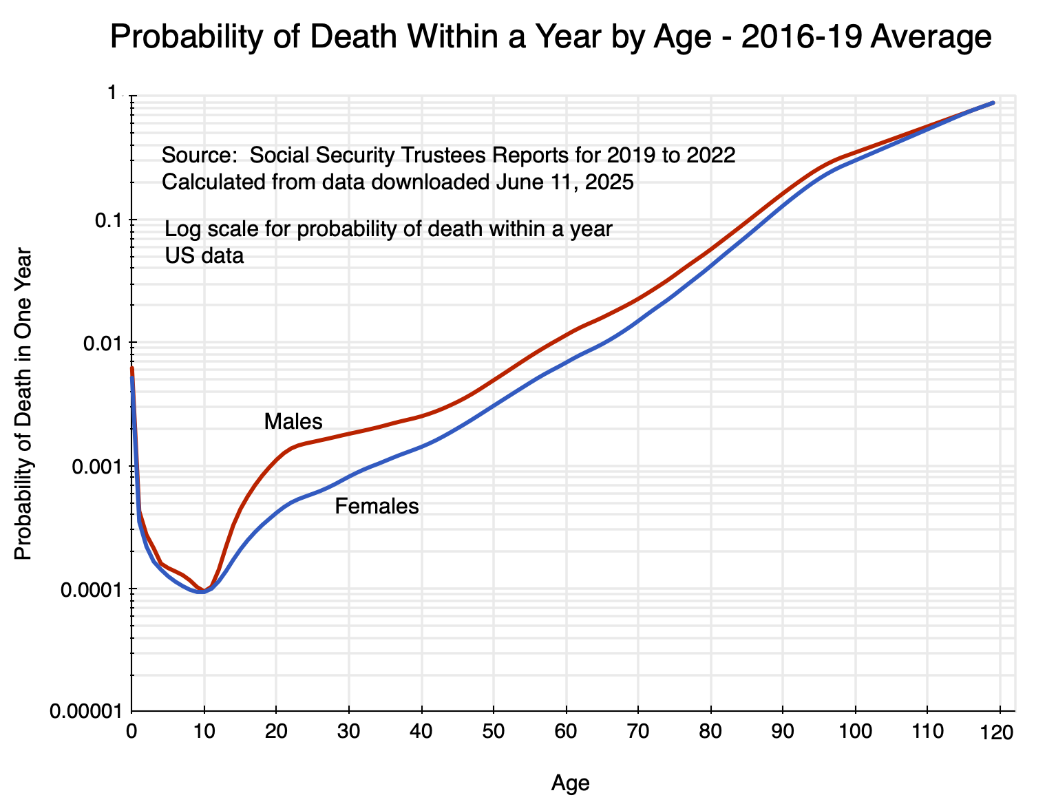
Chart 3
The chart shows the probability of dying within a year for someone of a given age, with the vertical scale in logarithms. It reaches a trough of around just 0.0001 ( = 0.01%) at around age 10 (following substantially higher rates as an infant, and especially for those in the first year after birth). It then rises until the probability approaches 1 at the upper end. The Social Security figures go all the way out to 120, but this is a modeled extrapolation as few are alive beyond age 110.
The death rates for males are uniformly above those for females. They are especially higher at around age 20, and then remain higher (although at a diminishing proportion) until the age of 100 or more. The higher rates for males are in part due to higher deaths for males from accidents, violence, and suicides. For this reason, it is better to focus on the female rates to get a sense of the basic biological processes leading to the observed mortality rates.
As one may remember from their high school math, a straight line in a chart with a vertical scale in logarithms will follow a constant rate of growth, with the slope of that line giving the rate of growth. In the chart above, the mortality rate for females rises at a remarkably steady rate (i.e. along a straight line) from age 20 to around age 70. From the underlying mortality figures by age, one can calculate that the rate basically doubles (i.e. increases by about 100%, plus or minus around 20%) every decade over that age span. The rate accelerates (the slope becomes steeper) from age 70 to around 95 – roughly tripling with each decade rather than doubling – after which it slows (as eventually it must: the probability can never exceed 100%).
The mortality rates start, of course, at very low levels. As noted above, the rate of dying within a year at age 10 (males or females) is only 0.0001 ( = 0.01%). For females at age 20, it is around 0.0004 ( = 0.04%). It then doubles to 0.0008 ( = 0.08%) at age 30, almost doubles again to 0.0014 ( = 0.14%) at age 40, basically doubles again to 0.0031 ( = 0.31%) at age 50, again to 0.0069 ( = 0.69%) at age 60, and again to 0.0150 ( = 1.5%) at age 70. The pace then rises (roughly tripling with each decade) between ages 70 and 95 before slowing down.
The mortality rates before age 70 are all low, of course. But it is interesting that they basically double each decade from age 20. I suspect that this represents something fundamental about how biological systems function.
In any case, we can now look at how those mortality rates were affected by the special circumstances of 2020 (as well as in 2021 and 2022) during the height of the Covid pandemic. Mortality rates rose, but far from uniformly by age.
C. Mortality Rates in 2020, 2021, and 2022
Charts 1 and 2 at the top of this post show what mortality rates were according to age for males and females, respectively, in 2020 compared to the average over 2016 to 2019. The charts are similar for 2021 and 2022:
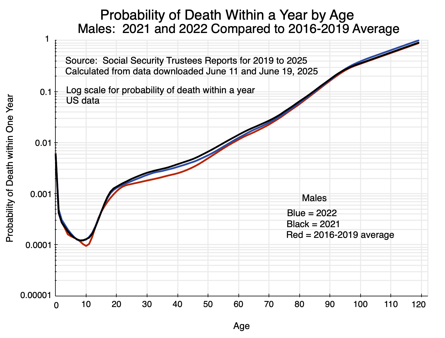
Chart 4
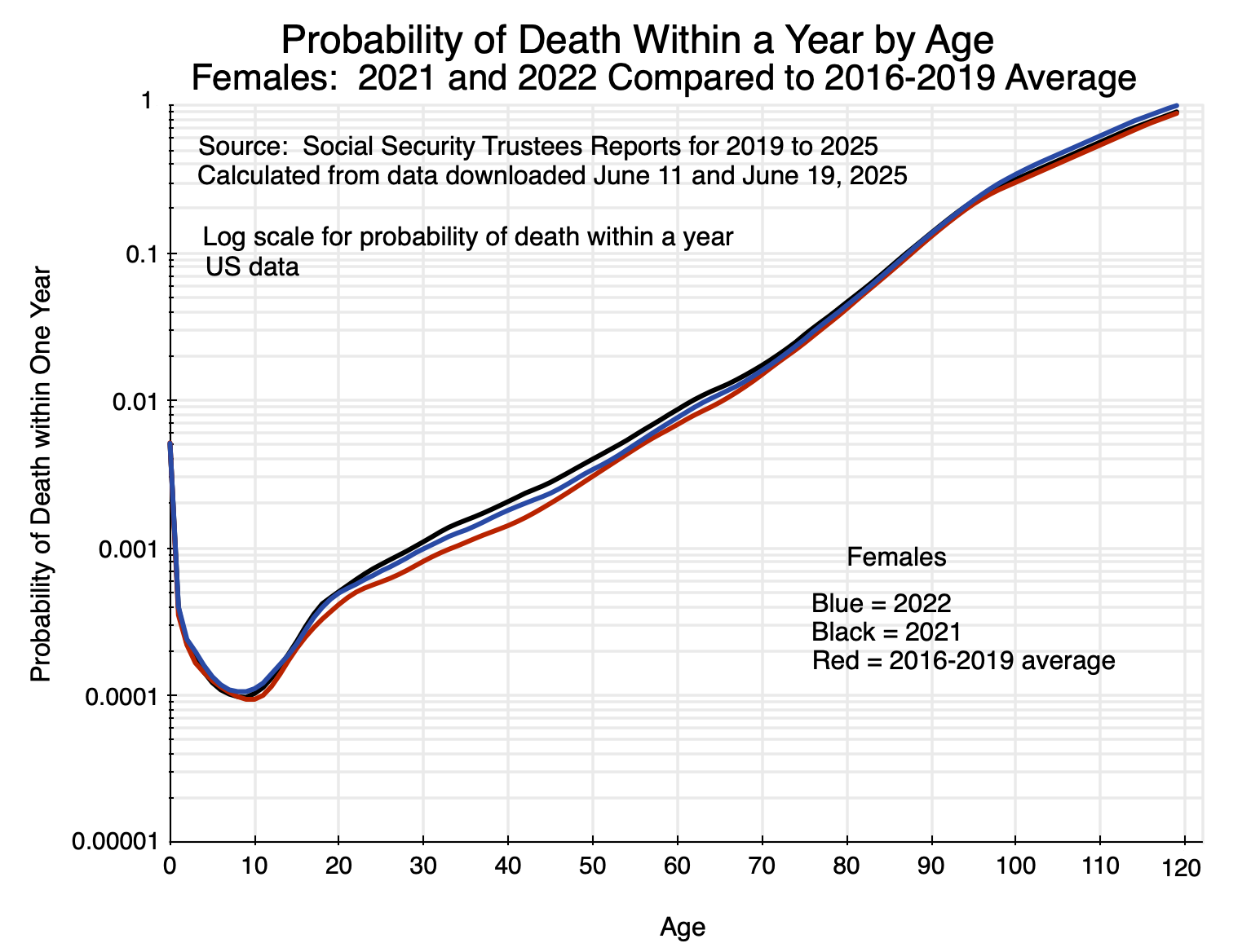
Chart 5
The gap between the lines shows the impact of the special circumstances of the respective years relative to pre-Covid mortality rates. One can look at this gap in different ways. Most commonly, the differences in the mortality rates have been shown in absolute terms (i.e. in percentage points). That impact is greatest for the elderly. For 2020 compared to the 2016-2019 average rates (the basic pattern is similar for 2021 and 2022, although at a different level):
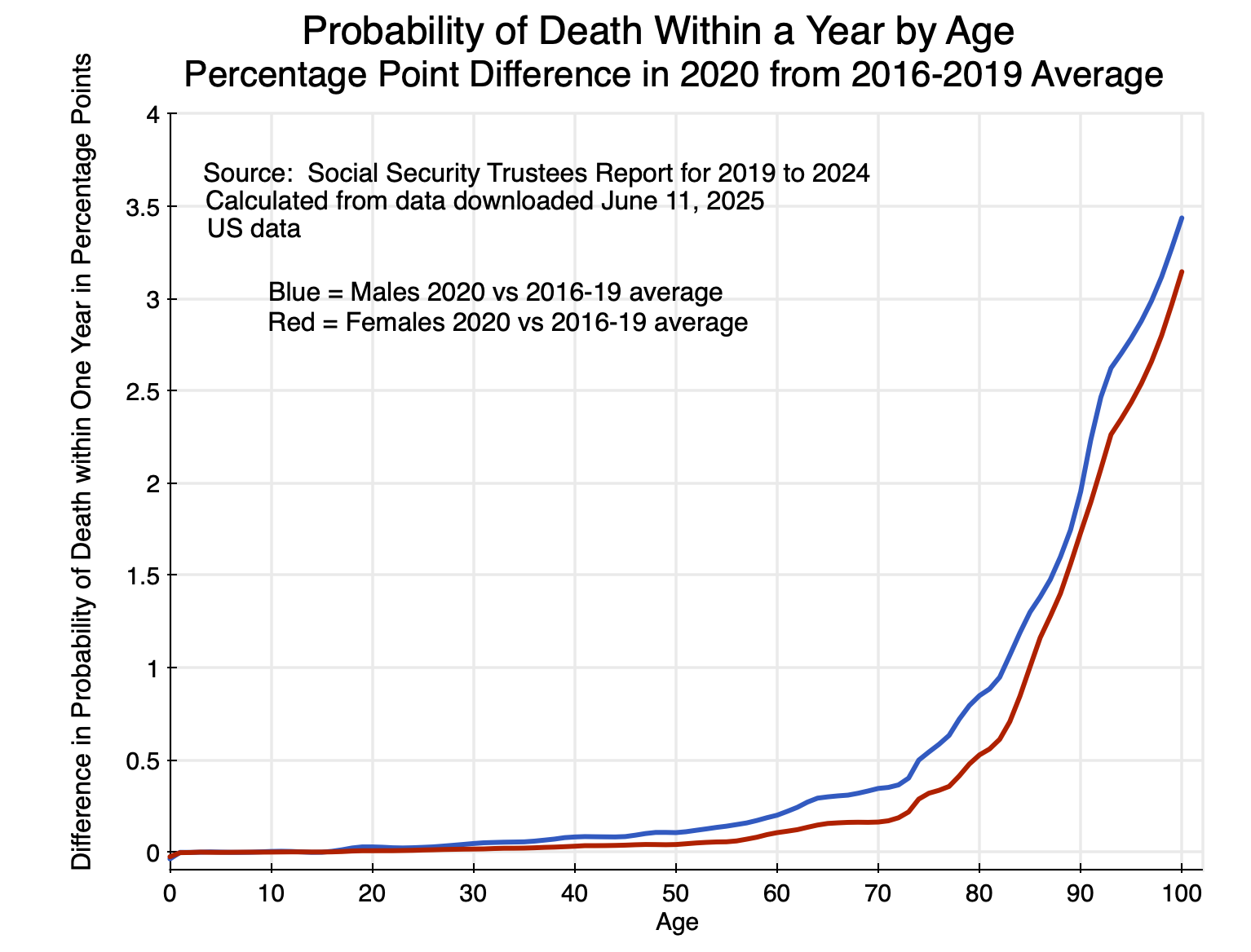
Chart 6
The increase in mortality rates in 2020 relative to what they were before was far higher in absolute terms (i.e. in percentage points) for the elderly than for the young. They were also consistently higher for males than for females.
And the differences by age are huge. Keep in mind that the impact on mortality depends on a combination of the likelihood of being infected by the virus that causes Covid, and the likelihood that one will die if infected. Based on these figures for 2020 compared to the average mortality rates between 2016 and 2019, the increase in mortality of males at age 90, say, was 1.95% points. The increase for males at age 20 was, in contrast, 0.028% points. That is, the increase was 70 times higher for males at age 90 compared to those at age 20. For females, the increase was even greater: almost 250 times higher for those at age 90 compared to those at age 20. The impact of the 2020 events on the elderly was huge.
A different way to look at the figures is in terms of the percentage increase in mortality rates for someone of a given age. For 2020 compared to the 2016-2019 averages (where again, the basic pattern is similar for 2021 and 2022):
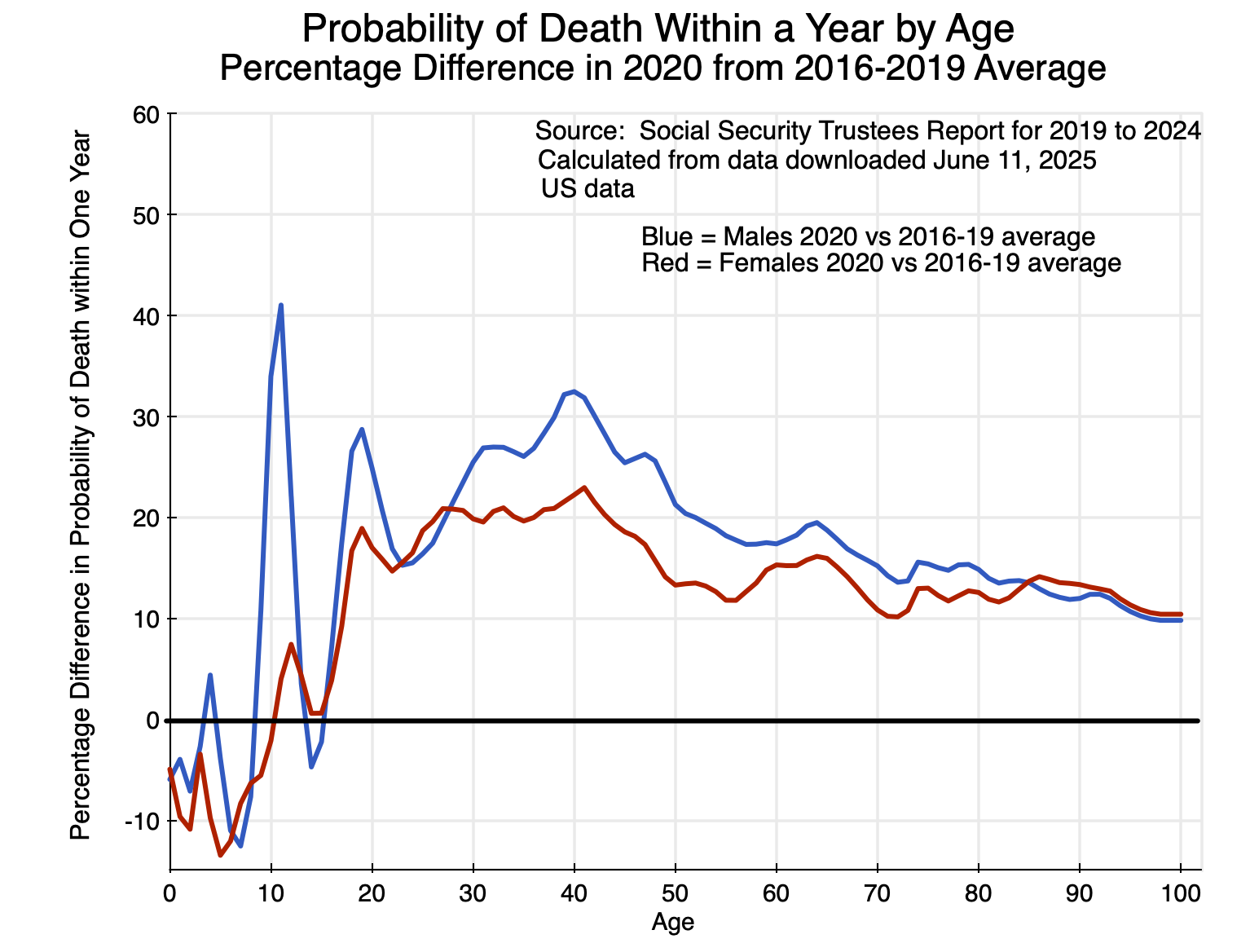
Chart 7
In terms of the relative increase in mortality rates, the impact of the 2020 events was highest for those between the ages of 20 and 50 (along with a peak at ages 10 and 11 for males). The absolute increase in mortality rates for those in this age range was not high (as seen in Chart 6). But relative to the normally small probabilities of dying for those who are young or middle-aged, the relative increase was greater than for the elderly.
From this, coupled with figures from the Census Bureau on the US population for each year of age, one can calculate the number of “excess deaths” arising due to the special circumstances of 2020 (Covid and its indirect as well as direct effects), compared to what the mortality would have been at the mortality rates of prior years (where the 2016 to 2019 average was used as this base).
For 2020, the excess deaths by year of age were:
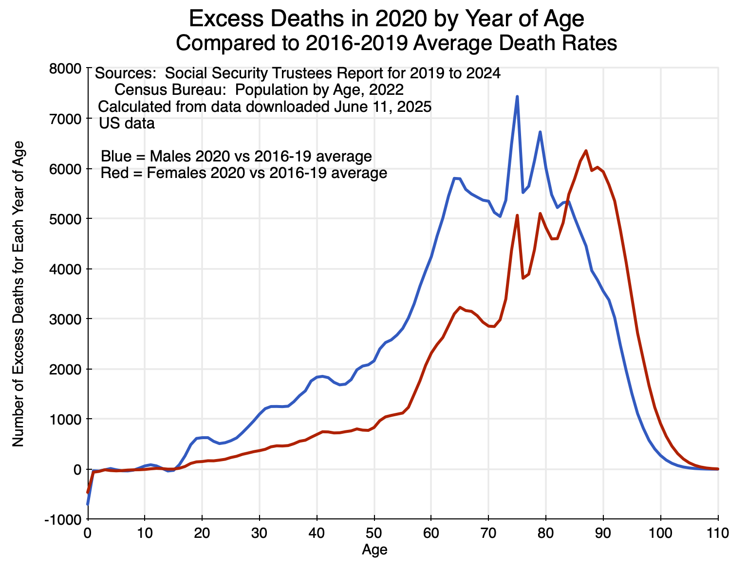
Chart 8
The impact was largest on the elderly, and especially so for females more than for males. Up to age 15 or so, there was almost no impact. Indeed, the data indicate that for those in their first year of life, excess deaths were substantially reduced. There were then very small effects – some positive and some negative – up to age 15.
Adding up the number of excess deaths across all ages – and with similar calculations for 2021 and 2022 – leads to:
| Calculated Excess Deaths | CDC Covid Deaths | % difference | |
| 2020 | 418,076 | 385,676 | 8.4% |
| 2021 | 467,992 | 463,267 | 1.0% |
| 2022 | 245,081 | 247,196 | -0.9% |
| 2020 to 2022 | 1,131,150 | 1,096,139 | 3.2% |
The CDC estimates of deaths due to Covid by year are shown in the second column of the table. The two estimates turn out to be remarkably similar, especially for 2021 and 2022 where they are within +/- 1% of each other. And the methodologies are completely different. The CDC figures are based on death certificate data reported to it for its National Vital Statistics System. The excess death figures here are calculated from a comparison of mortality (by year of age) in each year compared to what the mortality rates were on average between 2016 and 2019, applied to Census Bureau figures on the US population by year of age in each of these years.
This surprising congruence might be a coincidence – although the figures are extremely close in two of the three years so it would have to be an extreme coincidence. And while this is speculation, the calculated excess deaths figure in 2020 – which is 8.4% higher than the recorded number of Covid deaths in that year – might reflect the special circumstances of the health care system (and especially of hospitals) in that year. Due to the rapidly spreading virus that year and with no vaccine yet available, hospitals were crowded with patients being treated for Covid. One avoided going to a hospital except under dire circumstances. That led to patients with conditions that would have benefited from being treated at a hospital avoiding such care when they would have benefited from it, and consequent higher death rates. While not a direct consequence of being infected with the virus that causes Covid, their higher mortality would have been an indirect consequence.
This indirect impact of Covid then largely went away in 2021 and 2022, as the Covid vaccine led to lower case loads, less hospital overcrowding, and less reason to avoid going to a hospital when needed for non-Covid reasons.
D. Conclusion
The Covid-19 pandemic was a tragedy. Over 1.2 million Americans have died, which is more than double the number of American soldiers who have died in combat in all of the country’s wars since 1775. The Trump administration terribly mismanaged the response to the then spreading pandemic in the first half of 2020, with Trump asserting that his bans on travel – first from China, later from Europe and elsewhere – would stop the spread of the virus and that it would soon “go away”. It did not. And by his statement that he would not wear a mask in public despite the CDC recommendation to do so, Trump made the refusal to wear a mask into a sign of political fealty. This later carried over into a refusal to be vaccinated.
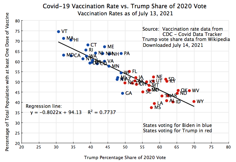
This had real consequences. People died. And they died at higher rates in proportion to the share of the vote in a state for Trump.
Management of the Covid pandemic would have been difficult by even the most capable of administrations. But it was not capably managed in the US. As a reasonable comparator of what should have been possible, one can consider the case of Canada. Deaths from Covid in Canada were 1,538 per million of population (as of April 2024, when cross-country comparable data collection stopped). For the same period, it was 3,642 per million of population in the US: 2.4 times as high as in Canada. If the US had had the same mortality rate as Canada, deaths would not have been 1.2 million (as of the end of 2024), but rather about 500,000. An additional 700,000 Americans would be alive today.
The virus that leads to Covid will now be with us for the foreseeable future. The peak number of deaths came in 2021 as it was the first full calendar year when the virus had spread to all parts of the nation. In 2020, there were very few cases nationally until mid-March, and it did not spread to all corners of the nation until several months later. Vaccines became available in 2021, but were in short supply for most of the first half of the year. And even when fully available without restriction, a substantial share of the population refused to be vaccinated.
But with the vaccinations in 2021, as well as the immunity obtained by those who were infected by Covid at some point and survived, the number of deaths from Covid fell by almost half in 2022 to 247,000 in the CDC data. See the table above. Deaths then fell further to 76,000 in 2023 and to 47,500 in 2024. Deaths in the coming years will likely be in the tens of thousands each year, similar to the pattern seen for deaths due to the influenza (flu) virus. On average, about 30,000 have died each year since 2011 from influenza, but this has varied widely from a low of 6,300 in the 2021/22 season (when measures taken by many to limit exposure to Covid also served to limit exposure to the flu virus) to a high of 52,000 in the 2017/2018 season. Deaths from Covid-19 may be similar in the coming years, with a good deal of variability and levels that depend on measures such as how many will be vaccinated each year against the evolving variants of the virus.
Mortality rates will also vary by age. While the variation by age may be moderating, it is likely that the elderly will remain the most severely affected in absolute terms (as in Chart 6 above). However, one should still recognize that in relative terms (relative to mortality rates at the given age), those in middle age may well remain the most affected (as in Chart 7 above).
Covid-19 was a tragedy. There is, unfortunately, little indication that the mistakes that were made in the management of it will not be repeated when the next pandemic comes.
——————————————————————————————————-
Annex: Mortality Rates by Age from Infections by Covid Compared to Pre-Covid Mortality Rates from All Causes
The impetus for this post came from a chart I saw in a video of a November 2021 lecture by Sir David Spiegelhalter (a professor at the University of Cambridge, and on the board of the UK Statistics Authority). See the section starting at around minute 18. Based on very early (March 2020) UK data on the Covid fatality rate (later confirmed with much more data), he showed that the fatality rate if infected by Covid was similar for any given age as that of dying for any reason (before Covid began to spread) at that age. The chart, with the vertical scale in logarithms, was:
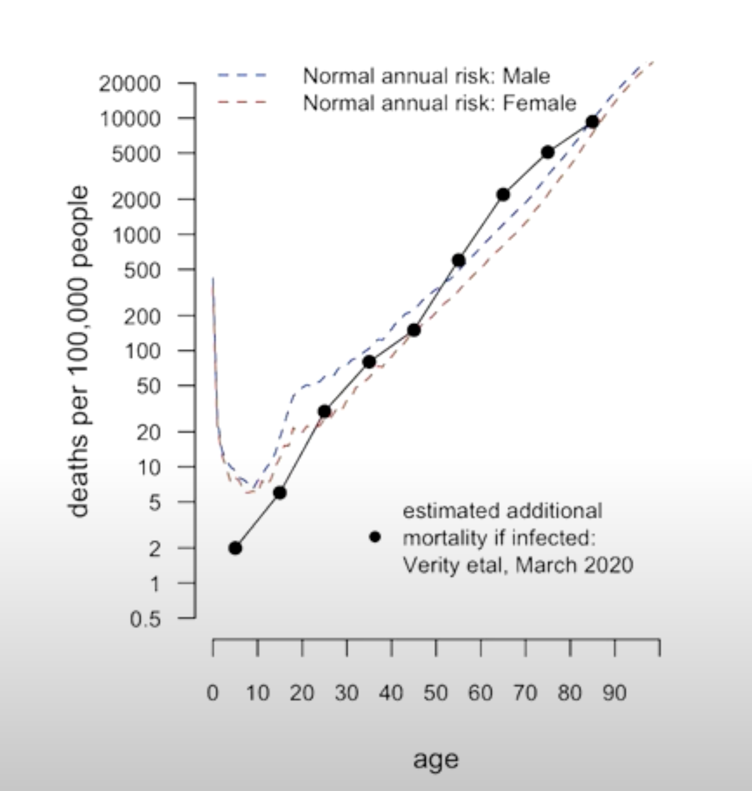
Chart 9
Two points to note:
a) Leaving aside the impact of a Covid infection, the mortality rate (from all causes, pre-Covid) in this UK data rises with age (from around age 10) at a remarkably steady rate through to age 90. As noted in the post above, I was surprised that the pace at which mortality increases with age is close to the same for those in their 20s and 30s as it is for those much older.
b) The mortality rate of those infected with Covid was basically the same as the mortality rate pre-Covid. That is, being infected with Covid basically meant that the mortality rate doubled for any given age. Note that this is not the same as what is in Chart 7 above, which shows the increase in the mortality rate for any given age in 2020 during the Covid pandemic. Those increases were in the range of 20 to 30% for those in their 30s and early 40s, declining to 10 to 15% for the elderly. It is not the same in Chart 7 because not everyone caught the virus that causes Covid in 2020 (and was also US rather than UK data, although this was probably not a factor). Chart 9 from Spiegelhalter shows mortality rates from Covid for those who were infected with the virus that causes it.
Spiegelalter’s finding was then profoundly misunderstood. Some in the British news media were soon citing this as “evidence” from a highly esteemed scholar that said (as in a headline in The Sun newspaper): “Your risk of dying is NO different this year – despite coronavirus epidemic, says expert”.
Spiegelhalter was not saying that at all. He had thought the correct interpretation would be obvious, but clearly it was not. The chart is saying that, at each age group, the likelihood of dying if infected with the virus that causes Covid is close to the same as dying at that age for any reason (pre-Covid). Hence, if you have been infected by Covid, your probability of dying that year has doubled. As Spiegelhalter later noted, this is a good example of how statistics can be easily misinterpreted.
(After Spiegelhalter complained, the Sun changed the title to: “Your risk of dying from coronavirus is roughly the same as your annual risk, says expert”. A bit better, but still easy for readers to misinterpret.)

You must be logged in to post a comment.