
Chart 1
A. Introduction
On May 28, the Bureau of Economic Analysis (BEA) of the US Department of Commerce released its Second Estimate of GDP for the first quarter of 2026. Along with it, it released its estimates of Personal Income and Outlays for April 2026. Together, they provide further evidence on the damage that Trump and his misguided (as well as erratic) policies have done to the US economy.
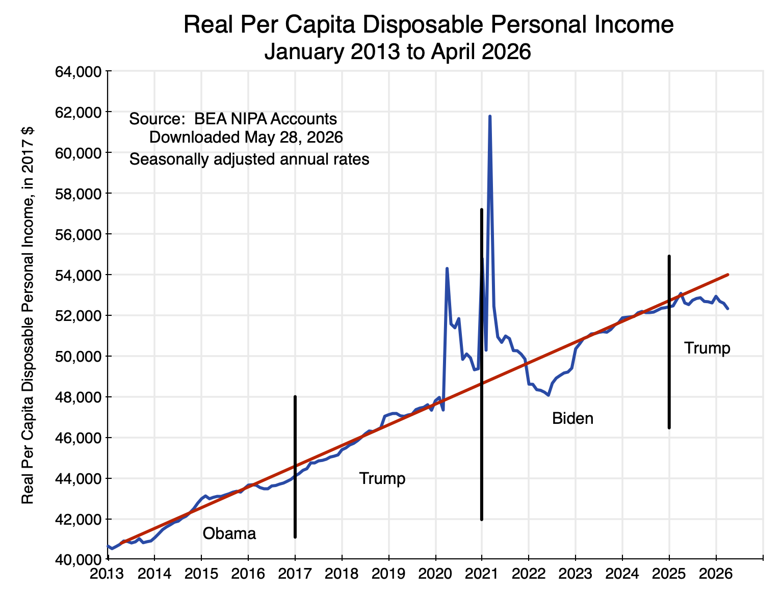
This note will review some of the figures that came out. The chart above shows in a longer-term context what has happened to real per capita disposable personal income – perhaps the best measure in the GDP accounts of average real incomes of Americans. It stagnated in the first year of Trump’s return to the presidency and is now falling in 2026. It is also now well below what it would have been had it continued to follow the rising trend path of the last 13 years. The figures will be discussed in the next section below, as well as figures on the divergent paths of what has happened to wages and salaries (stagnant in real terms) in contrast to corporate profits (up by 12.0% in the first quarter of 2026 over the year earlier in nominal terms, and by 8.7% in real terms).
The section that follows will then discuss a few points that can be found in the new GDP estimates. GDP growth in the first quarter was weak, with a revised estimate that real GDP grew at a 1.6% annual rate in the quarter (down from 2.0% in BEA’s initial estimate released in April). But this includes the effect of the return to normal levels for a full quarter of government production following the end of the federal government shutdown in the fourth quarter of 2025. That recovery already happened in mid-November. The previous post on this blog discussed that impact and how it is measured. The bounce back to normal levels led to GDP as measured that was 0.6 percentage point higher in the first quarter than otherwise by my calculations (and 1.0 percentage point higher in figures cited by the BEA when discussing the negative impact of the shutdown in the fourth quarter). Excluding this impact of government workers returning to their offices, GDP growth in the first quarter would have been only 1.0% (using the 0.6% figure) or just 0.6% (using the BEA figure).
Furthermore, more than all of this growth was a consequence of the AI boom. The contribution to the growth in GDP in the first quarter from private investment in information processing equipment and software totaled 1.4 percentage points in the BEA figures. That is, after taking into account the impact on measured GDP from government workers returning to their offices for the full quarter and private investments linked to the AI boom, production in the entire rest of the economy fell. Production in the entire rest of the economy other than AI investments would have led to a fall in GDP at a rate of – 0.3% using the 0.6% figure for the impact of the government shutdown (or at a rate of – 0.7% using the 1.0% figure the BEA cited for the impact of the government shutdown).
On top of this, inflation is now high. As discussed in Section D below, the upturn in inflation started already in late 2025 / early 2026, i.e. before Trump’s decision to start a war with Iran on February 28. The resulting jump in fuel prices led to inflation being even higher.
The economy is doing poorly. Living standards are falling. Only investments linked to the AI boom are keeping GDP growth positive.
B. The Impact on Living Standards
Per capita disposable personal income in real terms was stagnant in the first year of Trump’s second presidency and falling in 2026. It is now well below where it would have been had it continued on the previous upward trend. The figures are shown in the chart at the top of this post.
The BEA provides an estimate of personal income monthly, and it can be found with its underlying components in Table 2.6 of the NIPA Accounts. Personal income includes all sources of income accruing to individuals, including from wages and salaries (along with supplements to wages, such as company contributions to health and pension plans), income from unincorporated businesses (sole proprietorships and partnerships – i.e. most small businesses), rental incomes accruing to persons, personal interest income and dividend income, and current transfer receipts (such as from Social Security and Medicare) net of taxes paid for such programs (e.g. Social Security and Medicare taxes).
Personal income minus personal taxes (primarily income taxes) will then be disposable personal income. The BEA deflates these figures using its estimates of the personal consumption expenditures price index (often referred to – not quite correct technically, but close – as the PCE deflator) to put them in real terms, and divides them by current population levels (with estimates from the Census Bureau) to put them in per capita terms.
Per capita disposable personal income in real terms was close to its long-term trend in January 2025, as Trump took office, and continued close to that trend until April 2025. But that was the month when Trump announced huge and essentially arbitrary tariffs would be charged on imports on almost every country and region in the world (including an island populated only by penguins and seals). He called this “Liberation Day”. Erratic changes in tariffs since then, as well as in other policies (such as the granting of special favors or special penalties to various firms depending on Trump’s whims), have since continued. Real personal income then came down from its April 2025 peak, stagnated to the end of the year, and fell to just $52,330 in the BEA estimate for April 2026. This is below where it was when Trump took office, and $750 below where it was in April 2025. This is in 2017 prices. In current prices and as of April 2026, real personal income (at an annual rate) is now $980 per person less than it was on “Liberation Day”.
But a more appropriate measure of performance would be relative to where it would have been had it continued to rise as it had under Biden and before. Compared to what it would have been, the shortfall in living standards by April 2026 came to $1,700 per person in terms of 2017 prices, or $2,200 for every man, woman, and child in the country in current prices. For a family of four, the reduction in living standards as of April 2026 was $8,800 at an annual rate. This is not a small amount. Households could make good use of the higher income they would have had, had it continued to grow as it had under Biden and before.
Furthermore, the gap between what it could have been and what it actually has been under Trump is widening over time. It is also an average, and hence does not take into account the increases in inequality of recent years. There has been much discussion of the so-called “K-shaped” economy, where higher-income individuals are doing increasingly well while lower-income individuals are doing poorly. With growing inequality, the reduction in the overall average real personal incomes under Trump has been especially stark for the lower and middle income classes.
Defenders of Trump might well point out that there was also a substantial dip in real personal incomes in 2022 during the Biden administration. This is true and is seen in the chart at the top of this post. It was, however, temporary. Real personal incomes returned to their previous growth path by the end of that year, and then continued on that path until Trump took office. The dip was a consequence of the severe disruptions to the US (and indeed world) economy due to the sudden lockdowns due to Covid in 2020 that continued into 2021, and then the time needed to re-establish the regular functioning of supply chains once the production plants and transportation networks could be reopened. The impact of this on disposable personal incomes in 2020 and 2021 was masked by the numerous (and massive) emergency government support programs under both Trump and Biden – as seen by the sharp upward spikes in personal incomes in those years. Much of this was saved (stores were often still closed), and the drawdown on such savings could then support purchases in 2022 despite real incomes being temporarily low while supply chains were still not fully functioning. Real personal income then rapidly recovered, and by late 2022 it was back to its prior trend.
Another indicator in the recently released BEA estimates of the increasing stress that American households are experiencing can be found in the estimates of the personal savings rate. This is also provided in Table 2.6 of the NIPA accounts. The personal savings rate is personal savings as a percentage of disposable personal income. That rate has been falling during Trump’s second term to just 2.6% as of April 2026 – less than half the rate of 5.5% of April 2025. It is also now well below its recent longer-term average. Between January 2013 and February 2020 (before the Covid disruptions began), it varied between about 5% and as much as 8%, and averaged 5.9%.
The 2.6% rate is low, and the fact it has been falling is an indication that households are stressed. Given urgent current needs, they are saving less for retirement and other future objectives. As with personal income, the BEA can only estimate personal savings as an average over all households. Thus the 2.6% rate is an average that includes both upper income households who are likely saving a relatively high share of their income and lower and middle income households, who may not now be saving much at all.
At the same time as personal income has been falling, corporate profits have been rising at a fast rate. The BEA estimates corporate profits only on a quarterly basis, and the initial estimates of these profits are released only with the release of the second estimates of the GDP accounts each quarter (as in the estimates released on May 28). See specifically Table 6.16D in the NIPA Accounts. Between the first quarter of 2025 and the first quarter of 2026, corporate profits in all industries rose by 12.0% in nominal terms. Using the PCE deflator to put this in real terms, the increase was 8.7%. In contrast, wages and salaries rose by just 3.5% in nominal terms between those two quarters, or 0.4% in real terms using the PCE deflator. Adjusting also for population growth, the increase was essentially zero (less than 0.1%).
Corporate profits have been going up, and at a rapid pace. Wages have not.
C. The Growth in GDP in the First Quarter of 2026
The BEA’s estimate of GDP growth in the first quarter of 2026 was revised down from 2.0% (at an annual rate) in the BEA’s initial (“Advance”) estimate released on April 30 to 1.6% in the Second Estimate released on May 28. But as noted above, this 1.6% rate includes the impact of the bounce-back to normal levels of federal government production of services for a full calendar quarter. It had been curtailed during the shutdown that spanned almost one-half of the fourth quarter of 2025, and GDP measures the flow of goods and services provided over a full quarter. Taking this effect into account, growth in the first quarter of 2026 was even less.
The impact of the government shutdown was discussed in the previous post on this blog. GDP is the sum total of a flow of goods produced and services provided during a period of time (a calendar quarter here), and the reduction in the provision of those government services in the first half of that quarter meant a reduction in GDP in the quarter. As discussed in that blog post, the impact (by my calculations from the figures the BEA provided) reduced measured GDP by about 0.6 percentage points (at an annual rate) below what it otherwise would have been. The BEA, in commentary it provided with its releases of the GDP estimates for the fourth quarter of 2025, indicated the impact was about 1.0 percentage point of GDP. The reason for the discrepancy is not clear, but one guess would be that some higher official at the BEA or the Department of Commerce took the 0.6% figure and rounded it to 1%, and that someone else started to write this as 1.0%.
With either figure, GDP in the fourth quarter of 2025 was reduced by some amount. By simple arithmetic, there would then be a bounce-back effect on GDP in the first quarter of 2026 of a similar magnitude, as the government returned to normal operations for the full quarter. Taking this into account, the rate of growth in GDP in the quarter other than from this return to normal government operations would have been 1.0% rather than the 1.6% reported (or 0.6% rather than 1.6% based on the 1.0% figure for the impact of the shutdown that the BEA cited).
But in addition, GDP growth – such as it was – is more than fully accounted for by the continuing boom in private investments linked to building the data centers, developing the software, and supplying the other equipment needed for the new artificial intelligence (AI) systems. This AI boom accounts for much of the growth in GDP in 2025, with this continuing into 2026.
While the NIPA sector categories will not match precisely the investments related to the AI boom, a reasonable approximation is the sum of private investments in information processing equipment and in software. The NIPA accounts provide figures for private investment in these categories, and from this the BEA provides figures (in Table 1.5.2 of the NIPA accounts) of the contribution from the growth of each to the overall growth in real GDP. For technical reasons (the use of chain-weighted price indices), the sum of the individual contributions to the growth in GDP may differ slightly from the estimated growth in real GDP, but they are well close enough for the purposes here. Of greater importance is that investments in information processing equipment and in software will be for more than that just for AI, plus there will be AI-linked investments in other categories as well. These will in part offset each other.
What is clear is that in 2025 and continuing into 2026, there has been a major increase in private investment in these AI-related categories. Their contribution to the growth in GDP in the BEA calculations (Table 1.5.2 in the NIPA accounts) was an average of a 0.90% point contribution to the GDP growth rate each quarter (at annual rates). This is triple the average contribution to GDP growth of investments in information processing equipment and in software between the first quarter of 2013 and the last quarter of 2024, when its contribution was on average 0.30% point.
Subtracting from overall GDP growth the contribution of the AI boom, as well as accounting for the impact of the federal government shutdown, yields the contribution to the growth in GDP of the entire rest of the economy:
Contributions to GDP Growth
| GDP Growth | Contribution of Info Processing + Software | Impact of Gov’t Shutdown | Contribution of All Else | |
| 2025Q1 | -0.65% | 1.30% | -1.95% | |
| 2025Q2 | 3.84% | 0.80% | 3.04% | |
| 2025Q3 | 4.38% | 0.26% | 4.12% | |
| 2025Q4 | 0.48% | 0.78% | -0.57% | 0.27% |
| 2026Q1 | 1.62% | 1.36% | 0.56% | -0.31% |
Seasonally adjusted annual rates.
(The figures for the impact of the federal government shutdown (-0.57% of GDP and +0.56% of GDP) have been rounded in the text to 0.6%, and are shown here at two digits of accuracy to be consistent with the rest of the table. Also, they differ very slightly between the two quarters – 0.57% vs. 0.56% – as the impact is taken as a share of GDP, and GDP is slightly higher in the first quarter of 2026 than what it was in the fourth quarter of 2025.)
Taking into account the impact of the government shutdown and of the boom in AI investments, growth in the rest of the economy was essentially zero over the past half year. It was relatively high in the second and third quarters of 2025, but was substantially negative in the first quarter. While the quarter to quarter figures will bounce around (due both to real changes and to statistical noise), the economy – other than for investments related to AI – is clearly weak. This is consistent with the findings discussed above on the stagnation in real personal incomes in 2025 and its fall in 2026.
Another sign of weakness in the US economy has been a continued decline in private investment in business structures (e.g. office buildings, commercial structures, warehouses) and in residential housing. See Table 1.1.1 of the NIPA accounts. Each has declined in real terms in every quarter since Trump took office at the start of 2025, most recently with real investment in business structures falling at an annual rate of 5.4% in the first quarter of 2026 and real investment in residential housing falling at a 6.2% rate in the quarter. Other than for AI, private investors are wary of committing to investments in the economy.
A proviso on the AI investments should, however, be noted. The figures above are based on the BEA calculations of what it terms the “contributions to the percent change in real gross domestic product”. It is, however, a calculation from the demand side measure of GDP, where all the components of demand for GDP (private consumption, private investment, government, and exports less imports) are added up. This provides an estimate of domestic production during the period, as private investment includes investment in inventory accumulation and changes in inventories act as a balancing item. Increases in imports are therefore a negative contribution to the growth in GDP in this framework, and the BEA is only able to make an estimate of the change in total imports during the period – not imports that in some way both directly and indirectly provided part of the supply to fill a specific demand.
With imports equal to only about 14% of GDP, the approach is not unreasonable, as 88% of what is used to fulfill the various demands will come from domestic production. (With imports at 14% of GDP, total supply will be 100 + 14 = 114, and the share domestically supplied will be 100 / 114 = 88%.)
But while the average import share in total supply is 12% ( = 14 / 114), the share is likely substantially higher for the investments linked to the AI boom. How much higher is not clear. Many of the semiconductor chips and much of the specialized equipment are imported, but the investments in the data centers supporting AI and in the software used for this will be more than just imports. The data centers need to be built, the equipment put together, and the centers then connected to power, water, and information networks. And the software, in contrast to the chips, is primarily from domestic production.
The relatively high share that is imported will matter for the impact such AI investments will have on domestic production rather than direct imports, and GDP is a measure of domestic production. It is impossible to say how much that impact will be, but it will reduce the “contribution” of such investments to the growth in GDP (as depicted in the table above). However, even with this, the contribution of the “all else” category to the growth in GDP is likely still to be small – just not as small as the figures indicate.
D. Inflation is Now High
Inflation is now also a concern. Table 2.8.4 of the NIPA accounts provides monthly estimates of the price indices estimated by the BEA for personal consumption expenditures – both overall and for the major types of products making up personal consumption. (Technically these are price indices rather than price deflators, but in practice they are almost always the same within round-off and the terms – price indices or deflators – are often used interchangeably.) The Fed uses the core PCE deflator (the deflator excluding food and energy) as the primary indicator of inflation that it focuses on, with the objective of keeping it at around 2.0% on an annualized basis.
Monthly changes in the price indices are volatile and often not meaningful, while changes in the indices over year-earlier periods will miss turning points due to the long lag. Changes over six-month periods are usually a good compromise to show when a turning point has been reached. And it is clear from this that inflation turned decidedly higher in late 2025 / early 2026:
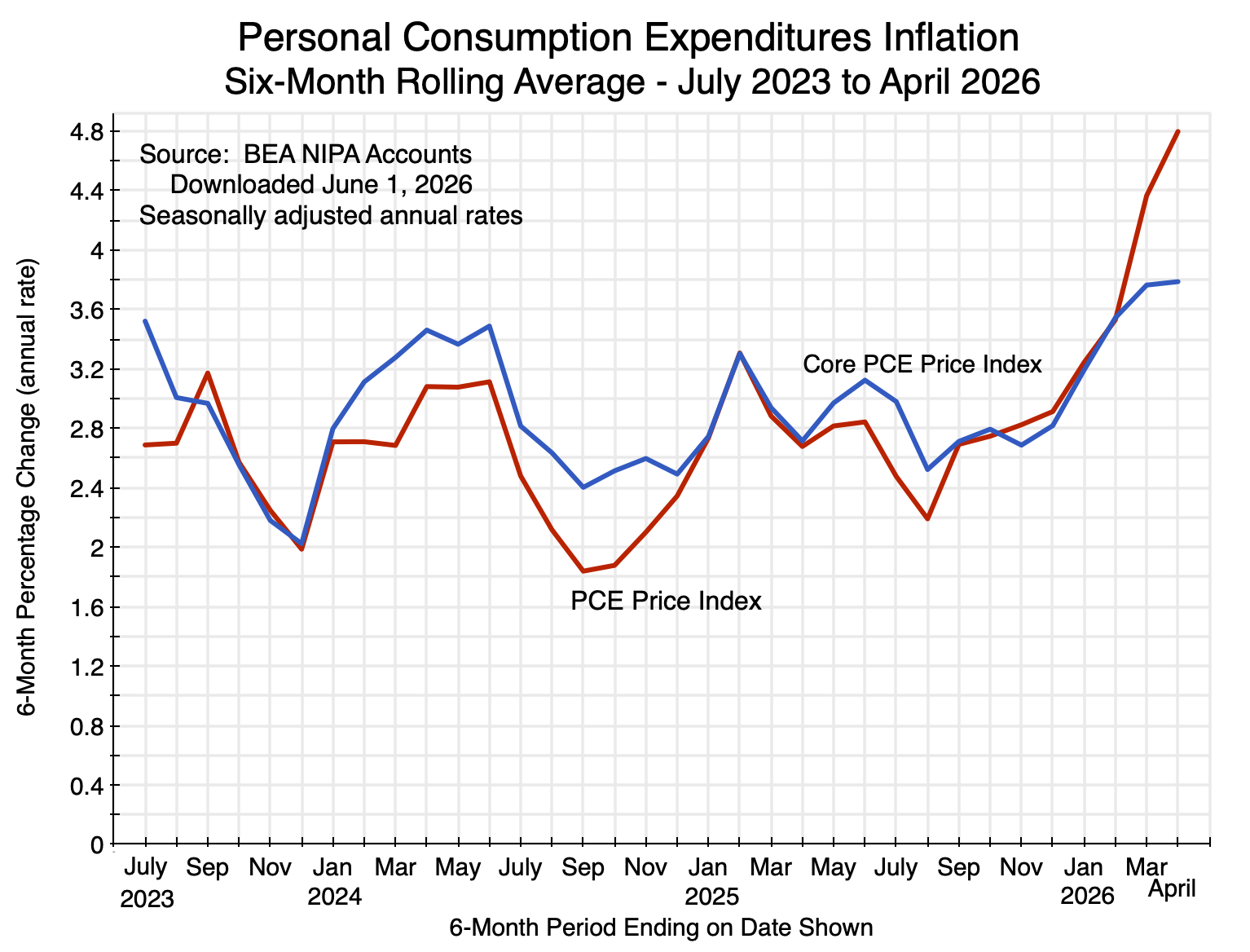
Chart 2
The overall PCE price index over the six months ending in April 2026 rose at a 4.8% annualized rate. The core PCE price index rose at a 3.8% pace. Both of these are now far above the Fed’s 2.0% goal. And this is not just due to energy prices: By April, the six-month core PCE price index had risen by a full percentage point from the 2.8% rate of the six-month periods ending in late 2025. Furthermore, energy prices in the months of January and February 2026 were in fact relatively low and below their levels of the last several months of 2025. Trump did not launch his war against Iran until February 28, after which energy prices skyrocketed. This then compounded what was already becoming an inflation problem.
Inflation by itself will not necessarily lead to a reduction in average real personal incomes in the NIPA accounts – the topic of Section B above. Higher prices mean that the loss of one party is a gain to another. And the stagnation in real personal incomes began in 2025 well before the recent jump in inflation. But to the extent the inflated prices end up benefiting corporate entities (such as the big oil companies), average real personal incomes will be reduced as corporate profits go up. This has likely been an additional factor in the more recent fall in 2026 in the absolute levels of average real personal incomes.
The recent rise in inflation does not in itself account for the slump in living standards under Trump. The stagnation in real personal incomes was already underway in 2025. Trump’s misguided policies led to that. High inflation is now compounding those difficulties.
E. Conclusion
There is another figure in the recently released NIPA accounts that is of interest as an indicator of what has happened to the living standards of lower-income Americans. It has in fact had a positive contribution to GDP as mechanically measured. Included within the goods and services that add up to overall personal consumption expenditures, the BEA has the category labelled “Final consumption expenditures of nonprofit institutions serving households (NPISHs)”. These are the net expenditures of nonprofit groups serving lower-income households, such as food banks, health clinics, and other providers of similar services. The “net” is net of any payments they receive from those receiving those services. Table 2.8.11 in the NIPA accounts shows the percentage change in real expenditures on this consumption category over the same month one year before.
The net consumption of these goods and services provided through nonprofits was 10.6% higher in real terms in April 2026 than what it was in April 2025. This is major growth (and a contribution to GDP as measured), and is the highest percentage increase since 2022 (when the disruptions of the Covid crisis were being finally resolved). This need to resort to food banks and other services provided through non-profits is another indication that lower-income households are stressed in this economy, and need to find support somewhere.
This indicator of stress among American households is consistent with the stagnation – and more recent decline – in real personal incomes shown in the chart at the top of this post. It is also consistent with the fall in the average personal savings to just 2.6% – half of what it was when Trump took office. When times are difficult, households set aside their savings plans. It is also consistent with slow growth in GDP outside of investments in the booming AI sector. And it is consistent with the more recent rise in inflation – affecting some households more than others – where the inflation rate was already going up before Trump chose to bomb Iran and drove up the price of fuels.
Trump’s policies are doing real damage to the economy and to living standards, that are evident in data that cover only a little over a year since he took office in his second term. But there is no indication that Trump recognizes this and that he intends to change what he has been doing.


You must be logged in to post a comment.