Chart 1
A. Introduction
Employment hardly grew in 2025. Total nonfarm employment increased by only 116,000 between December 2024 and December 2025 in the most recent BLS estimates. Employment in the Private Education and Health Services sector alone rose by 682,000, meaning that in the entire rest of the economy, employment fell by 566,000 – over half a million.
On the face of it, this appears to be inconsistent with figures on GDP growth. GDP fell in the first quarter of 2025, rose at reasonably rapid rates in the second and third quarters, and then grew only slowly in the fourth quarter (slowly with or without an adjustment for the impact of the federal government shutdown during the quarter). Most of the growth – such as it was – can be attributed on the GDP demand side to the boom in investments to provide AI services (data centers, software, and such). See Section C of this earlier post.
An increase in GDP coupled with less of an increase in employment implies that labor productivity rose. This is by definition, as labor productivity is simply GDP divided by employment. Over time, growth in real income per person is only possible with growth in productivity, so this is not necessarily bad. As long as high unemployment is not an issue (and it is not at this time – while the unemployment rate under Trump has been higher than what it was under Biden, it is still low by historical standards), employment is at the level that is possible given the size of the labor force. Incomes can then increase only with an increase in productivity. This is not what the Trump White House has been saying – with its stated focus on jobs, jobs, jobs – but the lack of coherence is not surprising.
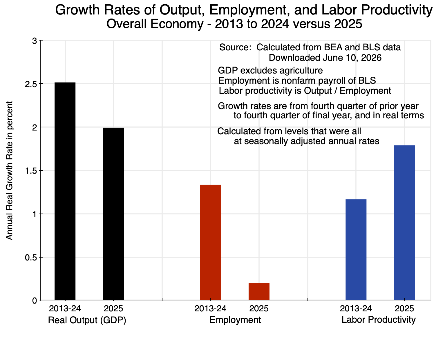
But what lies behind this? Section B of this post will first look at the aggregate figures, comparing what was observed in 2025 to the observed trend over the prior 12 years. At the aggregate level, the rate of growth in GDP was a bit less in 2025 than what it was in the prior 12 years. But employment growth was much less, so productivity growth in 2025 was necessarily higher than before. The figures are shown in the chart at the top of this post.
This is at the aggregate level. What is of interest is what happened in a few key sectors that may be leaders in and beneficiaries of the boom in AI investments. This will be examined in Section C below. The BEA has now released data that allows us to examine at the sectoral level where productivity grew on the supply side of the economy – and in particular in sectors that may be especially able to make use of the new AI systems that the recent investments made available. While sectors as defined by the BEA in the NIPA accounts (matched with employment in those sectors from the BLS databases) are relatively broad, just two of them – Information and Finance (accounting for about one-quarter of the economy together) – had a disproportionate impact on the growth in GDP in 2025 as well as on the growth in labor productivity. Outside of those two sectors, the growth in GDP and in productivity both slowed in 2025 compared to the years before.
Also, the impact on overall productivity in 2025 came not only from the observed growth in productivity in each sector of the economy taken individually. In addition, there was a compositional effect arising from the especially rapid growth in sectors where labor productivity was relatively high – and sometimes exceptionally high – compared to the overall average. These sectors included Information and Finance. A shift in the sector composition of GDP – arising from relatively faster growth in a few sectors where labor productivity is high – will by itself increase average productivity in the economy. This is separate from and in addition to any increase in productivity at the level of the individual sectors. That impact has typically been ignored in the discussion of the impact AI may have on productivity in the economy as a whole, but was significant in 2025. This will be discussed in Section D below.
The post will conclude with a short Summary and Conclusions.
B. Growth in GDP, Employment, and Labor Productivity in 2025 Compared to the Prior Trend
The chart at the top of this post shows the growth rates – all in real terms – for the economy as a whole, for employment, and for labor productivity, in the twelve years from 2013 through 2024 and then in 2025. The year 2013 is a good starting point as the economy had by then largely recovered from the 2008/09 economic and financial collapse. GDP (output for the economy as a whole) is measured in quarterly terms, so the growth rates are over the period from the fourth quarter of 2012 to the fourth quarter of 2024, and then between the fourth quarter of 2024 and the fourth quarter of 2025. Also, because the employment figures gathered by the BLS are for nonfarm payrolls, the figures for total output are for GDP excluding agriculture, to put this on the same basis as the nonfarm payroll figures. However, since agriculture is such a small share of GDP (less than 1%), the growth rates shown are almost exactly the same and are well within rounding.
Overall output (real GDP) grew at a rate of 2.5% per year between 2013 and 2024. Growth was lower in 2025 at 2.0%. There is year-to-year volatility so the reduction in 2025 is not necessarily significant unless it is sustained (but it also does not support claims by Trump that the economy was booming in 2025). Employment (nonfarm payrolls) grew at a 1.3% annual pace in the twelve years leading up to 2025, with this then falling to just 0.2% in 2025.
The growth in output was less in 2025, but the employment growth was far less, so labor productivity rose at a faster rate in 2025: a rate of 1.8% compared to an annual rate of 1.2% in the years leading up to it. A 1.8% rate of growth in labor productivity – if sustained – would be a good rate, and close to the long-term 1.9% rate the US enjoyed prior to the 2008/09 economic and financial collapse at the end of the Bush administration (a record dating back to 1870).
But what were the factors lying behind that 1.8% rate of growth in labor productivity in 2025? Was it a result of productivity growing across the board in most sectors, or rather rapid growth in a few sectors and not much elsewhere? As we will see in the next section, it was the latter.
C. The Impact of Growth in the Information and Finance Sectors Alone on the Growth in Employment and Labor Productivity
As has been discussed in prior posts on this blog, GDP is a measure of the total output (i.e. product) of the domestic economy and can be estimated in three different ways: 1) by summing the demands for the product, i.e. how all of it is used (with inventory accumulation or decumulation acting as a balancing item to match up what is supplied with what is demanded); 2) by adding up all incomes accruing from that production as wages to labor and as profits; and 3) by estimating directly the net production (i.e. net of purchases of intermediate goods used in that production, and more properly referred to as value added) of every sector of the economy and adding it up. In principle, all three measures should yield the same GDP figure, but due to statistical noise and other real-world factors, discrepancies can arise.
Most look at GDP from the demand side estimates – the first of the three above, and also the first the BEA releases (usually one month after the end of each calendar quarter). The second estimation by adding up all incomes generated – and which the BEA refers to as Gross Domestic Income (GDI) to distinguish it from GDP even though it should in principle be the same value – is usually released two months after the end of each calendar quarter. The third – of production by sector – is usually released three months after the end of each quarter, and sometimes later.
It is this third set of estimates that is of interest here. They provide a breakdown of GDP by sector, and can be found in the “GDP-by-Industry” section of the online NIPA accounts. Formally, the measure is of the value added produced in each sector (that is, the total or gross output of the sector less the purchases of intermediate products used in that production), where the sum of the value added across all sectors equals overall GDP. That sector value added is often loosely referred to as sector output or even sector GDP. I will generally refer to it here as output, and real output refers to the value added in terms of the prices of 2017.
The question of interest is whether sectors that may have benefited most from the boom in AI investments accounted for the acceleration in the growth in labor productivity observed in 2025. It is important to be clear in distinguishing between the boom in AI investments being made – a demand side matter – from sectors that may have made use of those new AI systems – a supply side matter. The prior posts on this blog that examined the impact of the boom in AI investments on GDP in 2025 looked at the demand side impacts. Most of the demand side impetus to GDP in 2025 came from the massive investments being made in new data centers and other facilities – as well in software – to support making AI available. The question now is whether making AI available and increasingly effective may have led to increases in productivity in sectors that could make use of those investments.
The data on sector outputs suggests that this may have been the case. I should hasten to add this is not proof, as this is only data on what has happened at a broad sectoral level, and cannot identify what the specific micro-level mechanisms were that led to these overall outcomes. It is also only one year of data. But they may be providing an early hint that AI is having an impact on productivity in certain sectors.
An issue is that the BEA sectors are broad, and thus include sub-sector activities where AI could have a major impact as well as others where it would not. But within the 14 major sectors of the economy that the BEA distinguishes (and where the BLS provides comparable employment data), Information and Finance are two sectors where AI might be expected to have a significant impact. Information includes data processing activities as well as internet publishing, although it also includes traditional publishing, movie-making, and broadcasting. Finance includes banking and other such financial activities, but also real estate and rental activities. Information and Finance together accounted for 27.4% of GDP as of the fourth quarter of 2025, with the rest accounting for 72.6%.
The growth in labor productivity in those two sectors in 2025 was exceptional:
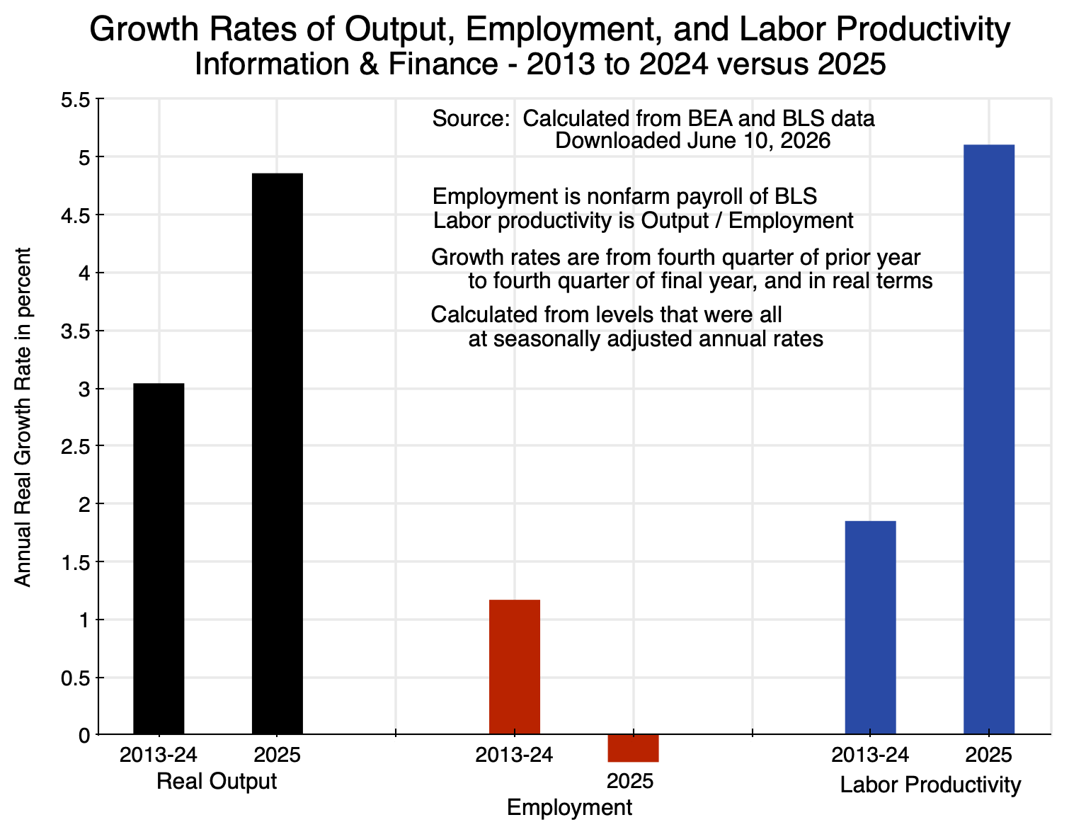
Chart 2
Real output (i.e. real value-added) in those sectors grew at a 4.9% rate in 2025, up from a 3.0% trend in the years before. And employment in fact fell in 2025, at a rate of -0.2%. With fast growth in sector output while employment declined, output per unit of labor (labor productivity) rose in 2025 at a 5.1% rate, up from 1.9% in the years before.
This may be a hint that AI is having an impact. Information and Finance are sectors where one can envision AI allowing more to be produced while requiring less labor. It is of course not proof, as these are simply observations on the changes in 2025 in the aggregates for the sectors. But it is consistent with an interpretation that AI may be having an impact here.
For the rest of the economy other than Information and Finance, labor productivity grew at a slower pace in 2025 than in the years before:
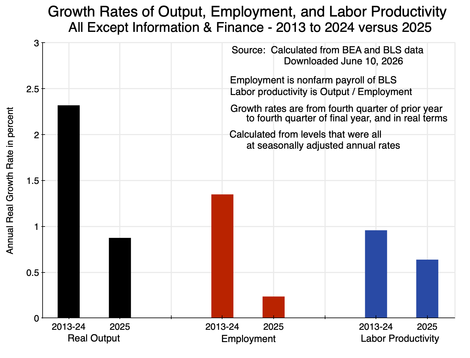
Chart 3
Real output in the sectors other than Information and Finance (and accounting for almost three-quarters of GDP) grew at a pace of only 0.9% in 2025 – down from 2.3% in the years before. Employment rose at a rate of 0.2%, down from 1.3% in the years before. Together, this meant the growth in labor productivity fell from a rate of just below 1.0% in the years leading up to 2025, to 0.6% in 2025.
The increase in labor productivity in 2025 – shown in the chart at the top of this post – can therefore be attributed at least in part to the significant increase in productivity in the Information and Finance sectors in the year. In the almost three-quarters of the economy other than Information and Finance, productivity grew at a slower pace than it had before.
Finally, the similar calculations for a more narrowly defined sector – Computer System Design – are of interest:
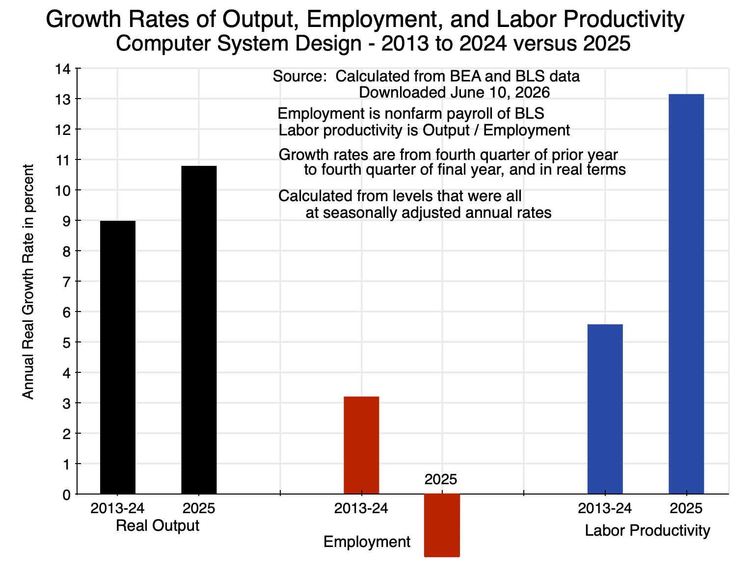
Chart 4
Computer System Design is a small sector – accounting for only 1.8% of GDP – and is a sub-sector within the Professional and Business Services major sector of the BEA. The Professional and Business Services sector is broad, and includes services from such highly-paid occupations as legal, consulting, and managerial services, to more mundane services such as those from janitors, groundkeepers, and in waste management. One can envision that AI may be having a strong impact on the services provided in computer system design, but not so much in janitorial and similar services. Thus the focus here is only on the former.
Output in Computer System Design was rising at a fast pace even before 2025 – a rate of 9.0% per annum – and then grew even faster at a 10.8% rate in 2025. Employment also grew at a relatively rapid pace of 3.2% in the years leading up to 2025 – a good deal faster than the 1.3% pace of employment growth in the economy as a whole in those years. With output rising at a 9.0% rate before 2025, labor productivity was growing at a 5.6% rate – much faster than the 1.2% pace of productivity growth in the economy as a whole in those years. The sector has seen rapid productivity growth for some time.
Productivity then rose by substantially more in 2025. Real output rose by 10.8% in the year. Despite this, employment in the sector fell by 2.1%. The implication is that labor productivity rose by an exceptional 13.2% in 2025. Those employed in computer system design and related services could produce a good deal more than they could before, which is consistent with AI-enabled productivity gains. But as anecdotal evidence has suggested, it has become extremely hard to obtain a new job in the field.
D. The Impact of Shifting Sector Compositional Effects on Productivity Growth in 2025
All of the discussion on AI-enabled productivity gains (at least all that I am aware of) has been on what AI might make possible for a given sector or occupation. The discussion above was similar, with a focus on a few key sectors. There may, however, be a different source of growth in the productivity figures for the economy as a whole, i.e. for overall GDP. Specifically, some of the sectors that have seen an acceleration in their growth – possibly due to AI – may also be sectors where labor productivity is especially high. With such sectors growing faster than overall GDP, they will account for an increasing share of GDP. And labor productivity in the economy as a whole will then increase due to their increasing weight in GDP – a compositional effect separate from what may be happening to productivity in the individual sectors alone.
Labor productivity – real output per employee – differs markedly across the different sectors of the economy:
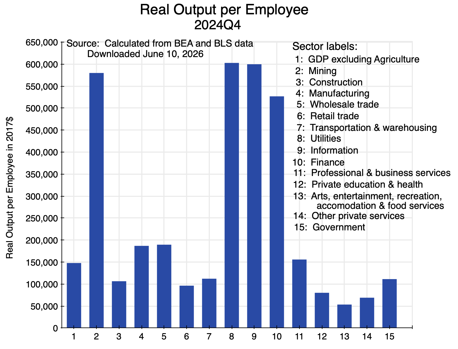
Chart 5
The figures are for the fourth quarter of 2024 in order to focus on the base levels before the growth in 2025 (with levels at end-2025 that will, in any case, differ only by a small amount as growth in a year is a matter of only a few percentage points). The levels vary greatly, from a few sectors where real output per employee (in 2017 prices) was over $500,000 (Mining, Utilities, Information, and Finance), to as low as $53,000 (in Arts, Entertainment, Recreation, Accommodation, and Food Services) – a difference of almost a factor of ten. Overall real output (GDP) per employee was just below $150,000.
The range across the different sectors of the economy is wide. Some sectors do not employ many compared to the other investments they need: Mining and Utilities are prime examples. Other sectors are much more labor intensive – the leisure and hospitality fields, for example – where total output (value added) per employee is relatively far less. With such wide variation across sectors, the growth in labor productivity in the economy as a whole will be sensitive not only to what might be happening to productivity in the individual sectors, but also to what is happening to the mix of sectors that make up GDP when some sectors are growing faster than others.
As noted above, output growth was substantially higher in 2025 in the Information and Finance sectors than the output growth in the rest of the economy:
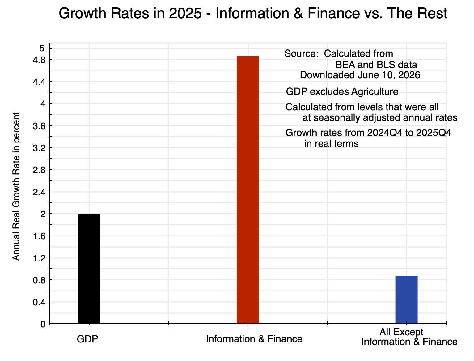
Chart 6
While this repeats material from the charts above, showing them all on the same scale makes clear how very different the growth rates were.
Labor productivity in those sectors also differed markedly from each other:
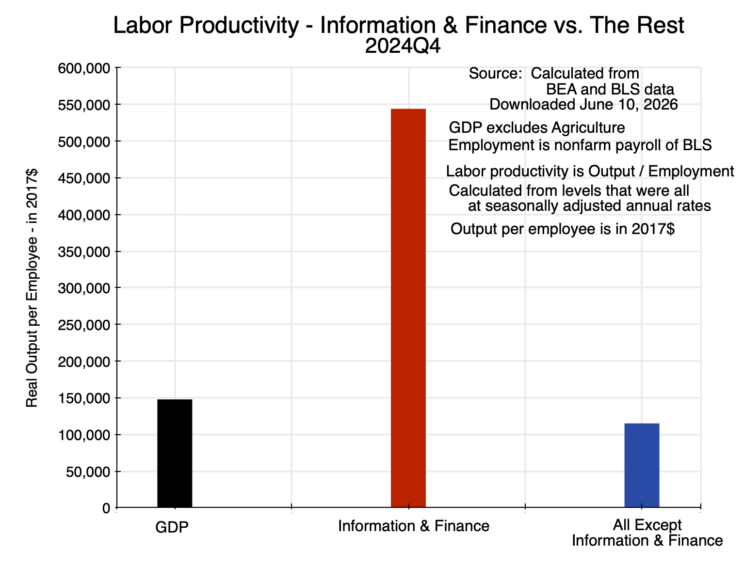
Chart 7
One can isolate the impact on productivity of the changing sector composition of GDP by calculating what would have happened to overall labor productivity in a case where sectors grew as they had in 2025 but with no change in productivity in the individual sectors themselves. Of interest here is what may have been due to growth in 2025 in the Information and Finance sectors in comparison to the rest of the economy. Any change in overall productivity would then be due solely to the resulting changes in sector weights in overall GDP:
Impact from Compositional Effects on Overall Labor Productivity
| Growth Rates 2025 |
Actual
|
Compositional Effect on Productivity
|
| Real Output: |
|
|
| All (GDP) |
1.99%
|
1.99%
|
| Information + Finance |
4.86%
|
4.86%
|
| All Other |
0.88%
|
0.88%
|
| Employment: |
|
|
| All (GDP) |
0.20%
|
1.18%
|
| Information + Finance |
-0.23%
|
4.86%
|
| All Other |
0.24%
|
0.88%
|
| Labor Productivity: |
|
|
| All (GDP) |
1.79%
|
0.80%
|
| Information + Finance |
5.11%
|
0.00%
|
| All Other |
0.64%
|
0.00%
|
Compositional Effect: Calculates the change in overall labor productivity arising from shifts in the sector composition of GDP only.
This table presents the figures for the simple case where the sectors have been aggregated to just the two discussed above – to Information and Finance as one and everything else as the other. The first column presents the figures as they actually were in 2025. The second column sets labor productivity growth in the two individual sectors at zero. Employment in each would then need to grow at the same rate as output growth in each. One can then add up total output (GDP – the same as the actual in 2025) and total employment (the sum of what would then be needed in each of the sectors) to find that the overall growth in labor productivity would have been 0.80% simply from the change in the sector composition of GDP over the course of the year.
Labor productivity in the economy as a whole grew in this calculation despite no productivity growth in the individual sectors since the Information and Finance sectors grew relatively fast in 2025 and labor productivity in those sectors is substantially higher than what it is in the rest of the economy. In 2025, the 0.80% coming from this shift in sector composition accounted for 45% of the growth of 1.79% in overall labor productivity in the year – close to half.
The consequences of such shifts in sector composition on labor productivity are typically ignored in discussions of what has happened to productivity in the economy. This is understandable, as one can easily calculate what happened to overall labor productivity by dividing the growth in GDP in the period by the growth in total employment. The initial (Advance) estimate of GDP is provided by the BEA just one month after the end of each calendar quarter, while the employment figures for the period are provided by the BLS even earlier. Sectoral output figures are available only several months later, and by that time interest has shifted to what will be published for GDP for the next quarter.
The effect may be large. The impact will differ in different time periods depending on how much faster or slower the various sectors are growing at, coupled with whether the faster (or slower) growing sectors are sectors with relatively high or relatively low labor productivity levels. In 2025, the Information and Finance sectors grew relatively fast (possibly due to their ability to make good use of the new AI systems), and they are also sectors with far higher labor productivity levels than on average in the rest of the economy. Their growing share in GDP then led by itself to substantial growth in average labor productivity in the economy as a whole.
E. Summary and Conclusion
GDP grew at a rate of 2.0% in 2025. That is not especially high, but nor is it zero. Yet employment grew hardly at all. The question is why.
We now have data at the sectoral level that allows a deeper examination of what has been going on. A few sectors – specifically in the groups of the BEA that cover Information Services and Financial Services – saw especially rapid labor productivity growth. Their production per person employed was already high, and it then grew even faster in 2025 than it had in the years leading up to 2025. The output of those sectors also grew in 2025 at a substantially faster pace than output in the rest of the economy, leading to their share in the economy growing.
Both the rising productivity in those sectors and their rising share in the economy led to an increase in average labor productivity in the economy as a whole. The shift in sectoral composition – a factor that is typically ignored in these discussions – accounted for close to half (about 45%) of the increase in labor productivity in the economy as a whole.
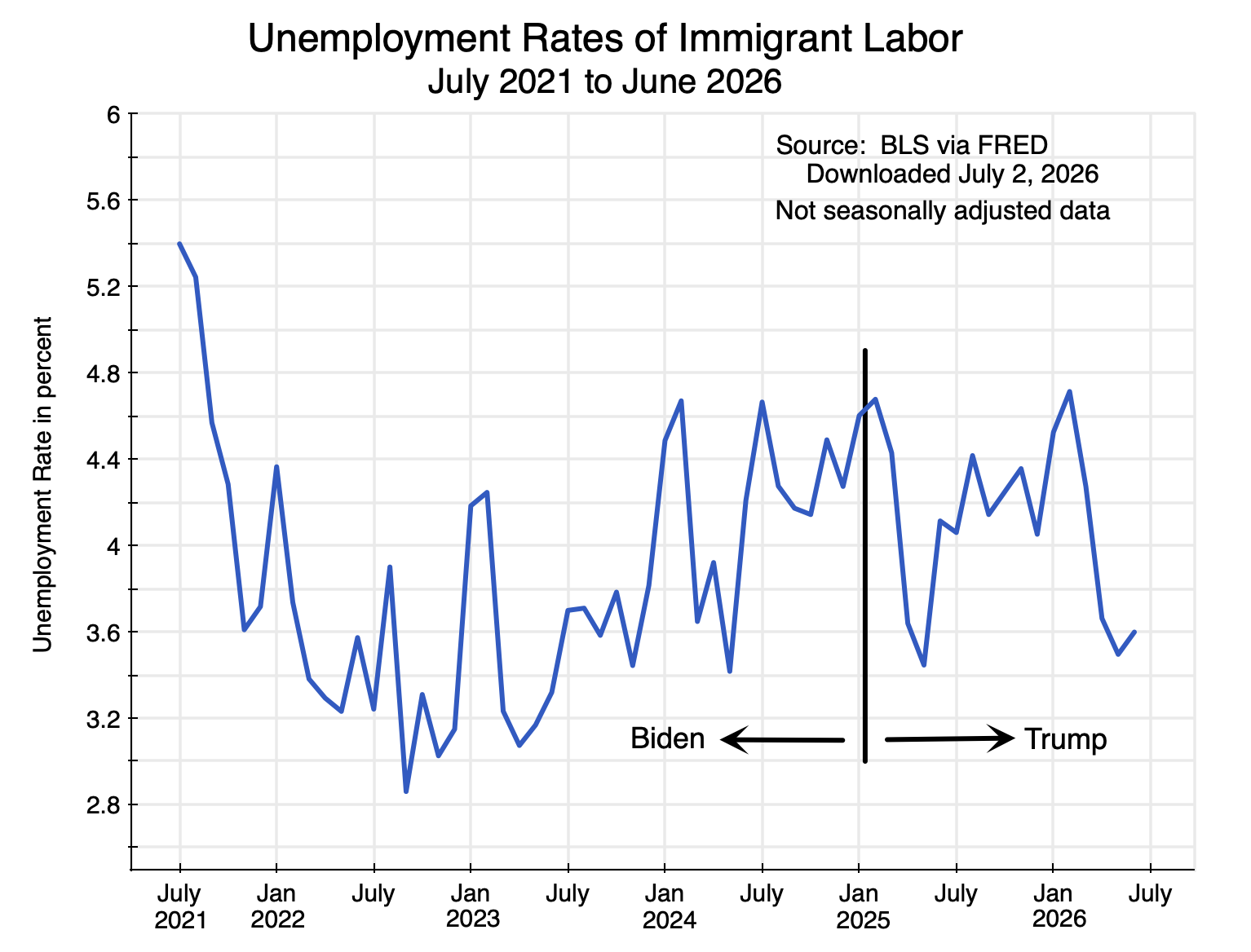
An alternative hypothesis set out by some for why employment was close to stagnant in 2025 despite the modest GDP growth centers on the sharp decline and possible reversal of net immigration into the US due to Trump’s anti-immigrant policies. Under this hypothesis, GDP still grew (by 2.0%) despite the reduction in immigrant workers because firms were able to increase production from (i.e. raise the productivity of) the workers they still had to offset this. If this were true, then one would see a general increase in productivity broadly across the economy, and not just in the Information and Finance sectors. But this was not the case. Labor productivity outside of those two sectors rose more slowly in 2025 than it had in the years leading up to 2025 (i.e. at a 0.6% rate in 2025 versus 1.0% per annum in the years leading up to it). See Chart 3 above. There is no sign that a shortage of workers (if it indeed existed) led firms to adopt approaches that would accelerate the pace of productivity growth.
Labor productivity rose sharply, however, in Information and Finance in 2025. The data on this are clear. But while the data can point to where the increases in productivity arose, the aggregate figures cannot in themselves tell us what was behind this. The Information and Finance sectors are, however, ones where it is plausible that the availability of the new AI systems may be enabling workers in those sectors to produce substantially more than they could before. It might also be a key underlying factor in why those sectors grew especially fast in 2025 (at a 4.9% rate) compared to growth in the rest of the economy (a 0.9% rate).
These may be early hints that AI is having an observable impact on productivity as measured at aggregate levels. It is still early, of course, and one will need to see whether this is sustained over time. But it does provide a plausible explanation for why employment grew so slowly in 2025 despite the growth in GDP in the year.


You must be logged in to post a comment.