Weakening Growth and Signs of Overheating: The US Economy Under Trump

Chart 1

A.  Introduction

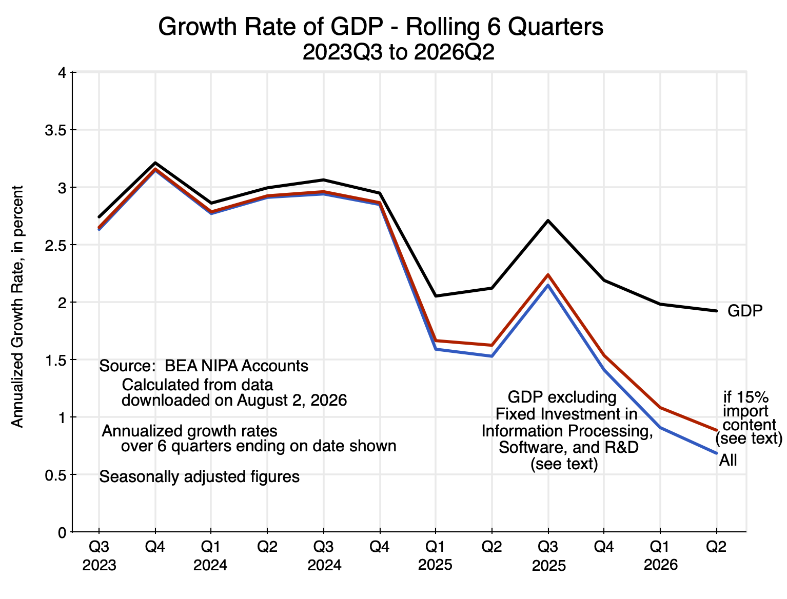
Economic growth has weakened under Trump, with GDP growth falling to below 2% at an annual rate in the year and a half since he took office.  GDP grew at a rate of close to 3% in the last year and a half of Biden’s term in office.  Furthermore and importantly, much of the GDP growth during Trump’s second term can be attributed to the sharp increase in investments in equipment for information processing and related items – the AI boom.

While the import content of AI-linked investments is significant, one can get a sense of the direct impact on GDP of those investments under reasonable assumptions.  As will be discussed below, the growth in GDP other than production for AI-linked fixed investments has been less than 0.9% at an annual rate during Trump’s second term, when account is taken of the estimated import content of that investment.  It would be less than 0.7% if the import content of AI-linked investment is ignored (as many do).

This poor record should not be surprising.  Trump has enacted numerous policies – often hastily – that critics have noted would harm growth.  They have.  Section G below will briefly discuss some of the more prominent among them.  But the primary focus of this post will be on the data, and in particular on data now available with the release on July 30 of the initial estimates from the BEA of the NIPA (i.e. GDP) accounts for the second quarter of 2026.

The GDP figures for the second quarter are also of interest as they show what happens when domestic demand grows more rapidly than the limits of what domestic supply can provide as capacity limits are reached.  GDP is a measure of supply, i.e. of domestic production (which is why it is called Gross Domestic Product).  It grew at an annual rate of just 1.5% in real terms in the second quarter.  But domestic demand grew substantially faster.  Final sales to domestic purchasers grew at a rate of 3.1%.  These final sales are the sales for personal consumption, for fixed investment, and for government spending on goods and services, and could grow faster than supply only because the trade deficit increased and inventories were drawn down.  That is, sales came from greater imports and out of inventories that had been produced in the past.

With unemployment low (at a 4.1% rate in July – higher than under Biden but still low by historical standards), the economy was not able to produce much more despite the increase in demand.  A slowing economy while demand is growing faster is a recipe for overheating.  And there are indications that inflation is indeed rising as a consequence, even aside from the compounding factor of the higher energy prices resulting from Trump’s decision to start a war with Iran.

Section B will first look at what has happened to growth in GDP in the first year and a half of Trump’s second term, with this compared to what it was in the last year and a half of Biden’s term.  It has slowed substantially, from growth at a 3% pace under Biden to below a 2% pace now.  Furthermore, and as noted above, much of this growth can be attributed to fixed investments related to the AI boom.  Growth in everything other than production for the AI boom has slowed by substantially more.

Why did growth in GDP (i.e. growth in production) slow?  Section C of this post will start to address this by examining what has happened to fixed investment under Trump.  While AI-related investment has boomed, fixed investment in everything but the AI-related investments has gone down in absolute terms during Trump’s term.  Instead of growing – as a healthy economy needs – such investment is now 8% below where it was in the fourth quarter of 2024 – the last full quarter of Biden’s term.  This affects the supply of capital.

Section D will then look at the growth – and recent decline – in the labor force.  The labor force is shrinking under Trump in contrast to modest growth under Biden.  Trump’s aggressive policies to deport migrant workers have been an important factor behind this.

Section E looks at the balance between aggregate supply (GDP) and aggregate domestic demand (Final Sales to Domestic Purchasers).  The difference is the trade balance and the net change in inventories.  The more rapid growth in domestic demand in the second quarter of 2026 than the growth in domestic supply had to be met by a larger trade deficit (higher imports) and a drawdown of inventories.  This is a sign of an economy that is overheating.  Inventories can only be drawn down to the extent there are inventories to draw from; it cannot continue forever.  And while a trade deficit can be sustained as long as foreign lenders are willing to fund it (and the US has had a significant trade deficit since the mid-1980s – they began under Reagan), the increase in the deficit is a sign of an economy reaching the limit of what it could produce domestically during the period.

This is an early sign of an economy that is overheating, due here to a combination of rapid domestic demand growth with a weakening of the economy’s ability to supply that demand.  It is also directly counter to Trump’s claims that his tariff policies will lead to a sharp reduction in the trade deficit (as well as a stronger economy, he asserts).  He has the economics of this wrong, and the consequences are clear in the data.

An overheating economy is reflected in the inflation numbers.  These are reviewed in Section F of this post.  Inflation is now rising, and the turning point on this began already in the fall of 2025, well before the war on Iran was launched.  The war then led to a sharp rise in energy and certain other prices, which has compounded the underlying problem.  This has resulted in real wages falling.  Living standards for most have diminished, with Disposable Personal Income faltering already in late 2025 and falling in 2026.

Why has growth in GDP weakened?  Section G of the post will list a few of the policies under Trump that have hurt growth.  Section H will present some scenarios of what might happen now, and Section I will conclude.

B.  Growth in GDP

GDP growth has weakened.  While there is substantial volatility in the quarter-to-quarter changes, a rolling average over six quarters will smooth those out to show the trends.  Growth (at annual rates) fell from about 3% during the later years of Biden’s term in office to less than 2% during the first year and a half of Trump’s second term.  See the chart at the top of this post.

Furthermore, much of that 2% growth was driven by the boom in AI-related investments.  The entire rest of the economy has been growing even more slowly.  Based on a reasonable estimate of the growth resulting from production to support the boom in AI-linked investments, the rest of the economy has been growing at a rate of below 0.9%.

To clarify a point of possible confusion:  The 0.9% growth rate refers to growth in the supply of production for everything included in GDP other than production for the AI-linked investments.  The estimate of the impact of the AI-linked investments does not refer here to growth that might result from the demand-side impact on GDP of such investments.  An increase in investment can spur GDP growth by increasing consumer and other demands for output in the standard Keynesian way in times when unemployment is high and production is constrained by aggregate demand.  But production is not now demand constrained (as will be discussed in Section E below) while unemployment (at 4.1% in July) is low by historical standards.

The question being addressed here is the growth of all that is included in GDP other than production for the AI-linked investments.  That figure is a better estimate of the impact Trump has had on economic growth than the growth in overall GDP.  The AI boom is a consequence of developments that have been underway over a decade or more, and are now materializing in massive investments for data centers and related items to support the further development of the AI models and to make available their services.

The National Income and Product Accounts (NIPA, often loosely referred to as the GDP accounts) do not specifically provide line item figures for investments dedicated specifically to the provision of AI services.  This is, of course, not surprising; AI is new.  However, the NIPA accounts do provide estimates for fixed investment in equipment for information processing purposes, as well as for investment in software and in research and development (R&D).  While there have long been such investments, much of the increase in such investments since early 2025 is likely due to investments that are linked to what was needed to support the new AI systems.

This will nevertheless likely overestimate the investments just for AI, as there will be new investments in those categories for purposes other than AI.  Acting in the other direction, the line items shown in the NIPA accounts are solely for equipment produced for such investments (plus investment in software and R&D).  AI-linked investments will also include investments in structures, which are a separate category in the NIPA accounts.  There are also supporting investments in areas such as new power generation capacity (AI is creating a huge demand for additional power), new water systems, fiber optic cable networks to connect them all, and more.

Treating the investments in information processing equipment, software, and R&D as “AI-linked” investments is therefore a shortcut and certainly imperfect.  But it will suffice for the purposes here, which is to give a sense of the extent to which the growth in GDP has been due to such investment, and how limited growth has been outside of that narrow area.

An additional difficulty is that the figures on investment and the other items in the GDP accounts do not (and cannot) show to what extent imports are a source of supply (directly or indirectly) for those expenditures.  Imports are taken into account for overall GDP by simply adding up all of the demands (i.e. for consumption, total investment including in inventories, government spending, and exports) and then subtracting total imports.  But it is impossible to come up with good estimates of the extent to which imports accounted for the supply of the items that were used to satisfy some specific demand, especially in some indirect way.  One knows, for example, how much fuel was imported in total to supplement the domestic supply of fuels, but it is impossible to know how much of the fuel used directly and especially indirectly to produce some specific item was imported rather than domestically supplied.

We do know, however, that a substantial share of the expenditures to build the new data centers are imported.  The semiconductor chips required are almost all imported (from Taiwan for processors and Korea for memories), as is a substantial share of the specialized equipment.  But the cost to build a new data center is more than just the cost of the chips.  Furthermore, one should not count the gross cost of an imported semiconductor chip used in such centers.  Much of that cost goes back to the American firms that designed them.  Nvidia – the source of the graphical processing unit chips used in the data centers – enjoys a gross margin of 75%.  That means that of $100 in revenues from its sales of chips and other products, the cost to it of the goods it sold (e.g. what it paid to TSMC in Taiwan to fabricate the chips, which were then imported) was just $25.  The gross cost of the chips imported will be $100, but $75 of this is earned by Nvidia to cover its costs to design the chips and as profits accruing to it as an American firm.  Taking this into account, the net import cost was only $25, not the value at the “list price” of $100.

Furthermore, while a significant share of the cost of building the AI data centers is accounted for by imports, there has also been a substantial increase in related investments in the production of software and in R&D.  Imports do not play a major role in the production of either of these.  Together, they accounted for 70% of the investment that increased sharply in the AI boom.  Investment in “Information Processing Equipment” was just 30% of the total.

Thus, assuming (probably on the high side) that 50% of the cost of the investment in new data centers (the Information Processing Equipment) comes from imports, and essentially no imports for the 70% accounted for by the investments in software and R&D, the import share of what was invested as a result of the AI boom would be 15%.  That is, 85% of the cost would be domestically supplied.

The chart at the top of this post shows total GDP growth during this period, and then the growth in GDP for everything other than what was produced for the investments going into the AI boom.  Based on the estimate of a 15% import content in the production of what was invested in the AI-linked investments, the growth in GDP in everything other than for the AI investments has been at an annual rate of less than 0.9% during Trump’s term in office so far.  Ignoring the import content (and thus implicitly setting it at zero), the growth rate would have been less than 0.7%.  Either is a substantial fall from the approximately 3% rate under Biden.

Furthermore, despite its recent rapid growth, domestic production for the investments in information processing equipment, software, and R&D only accounted for 8% of GDP in the second quarter of 2026.  That is, the “rest of the economy” is 92% of GDP.  This 92% of GDP has grown at a rate of only 0.9% since Trump began his current term in office.

Why this fall in growth?  Supply comes from production using capital and labor, and both are declining.

C.  Fixed Investment

Capital is produced by new fixed investment.  While overall fixed investment has grown by a total of almost 7% over the year and a half in Trump’s second term (4.5% at an annual rate), all of the growth was due to the rapid growth in investments for the AI boom.  Those rose by over 23% during that period (15.0% at an annual rate).  Fixed investment in everything else in the economy actually fell by 7.4% (a fall of 5.0% at an annual rate):
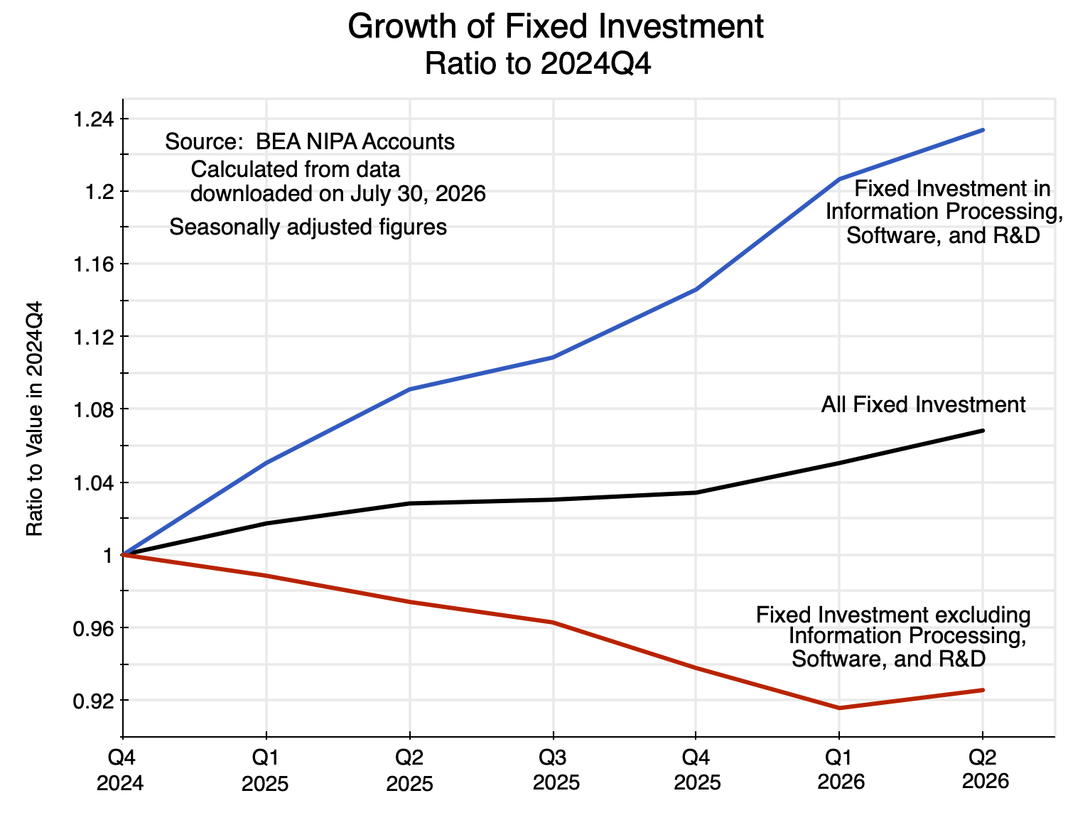
Chart 2

Other than the investments in the items linked to developing and providing the new AI services, investment has performed poorly under Trump – indeed terribly.  Investment in residential structures (housing) fell in every quarter but one during this year and a half, and by the second quarter of this year was 5.3% below where it was in the last quarter of Biden’s term in office.  Investment in nonresidential structures (i.e. commercial real estate, offices, warehouses, factories, etc.) was even worse:  It fell in every quarter since Trump returned to office, and is now almost 8% below where it was at the end of Biden’s term.  All other investment items (primarily other equipment) fell in three of the six quarters and rose in three, and ended up at just 0.95% above where it was under Biden.

The result is that the supply of capital for all of the economy other than for providing AI services is now well less than what it would have been had investment been sustained as it had under Biden.  Over 2023 and 2024, total fixed investment grew at an annual rate of 3.3% while investment in all but the AI-linked investments grew at a 3.0% rate.  These supported and were consistent with GDP growth during the period of about 3%.  Under Trump, investment other than for AI fell.

D.  Labor Force

Labor is the other source of supply.  And there is now less of it to support the American economy:
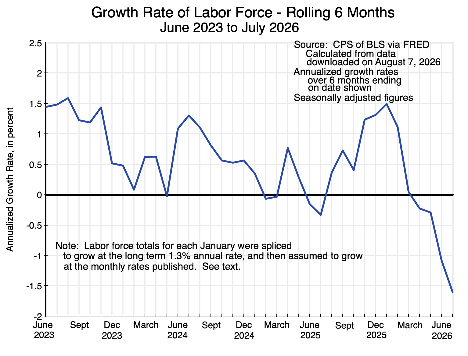
Chart 3

The chart shows the estimated growth in the total labor force in the US on a rolling 6-month basis.  A person is considered to be in the labor force if they are employed or, if unemployed, have been actively looking for work at some point during the four weeks leading up to and including the week of the survey.

Comparisons over time of labor force statistics are, however, complicated by the fact that they derive from figures in the Current Population Survey (CPS) of households of the BLS.  The issue is that the population weights used to derive US-wide estimates from the set of households surveyed are updated every January.  But the BLS does not then go back and revise the estimates issued before.  Thus there will always be a “jump” in the estimates (up or down) in the January figures from those of December.  That means one cannot properly estimate growth rates for the labor force for periods that straddle December to January (although many analysts ignore the issue and do it anyway).

This is in contrast to the approach taken in the Current Employment Statistics Survey (CES) of the BLS – its survey of business establishments (both public and private) from which it derives estimates of total non-farm employment.  Those employment estimates are updated on a regular annual cycle to produce figures that are comparable across time.

For Chart 3 above on the labor force,  I adjusted the CPS data by in essence splicing the series in each January from 2022 onwards by assuming the growth in the labor force in that month was simply the long-term rate of growth between December 2022 and December 2025.  That rate was 1.30% (in annual terms).  The growth in the labor force in every other month but January was as recorded in the CPS data.  This smoothed the series by removing the jumps each January and substituting for that month – and that month only – the overall rate of growth since December 2022.  Without the splicing in this manner, the jump in the labor force estimates would have been up in two of the four years and down in two of the years.  The spliced series provides a better sense of the trends in the size of the labor force, and will suffice for the purposes here.

Furthermore, keep in mind that the six-month growth rate for the period ending in July 2026 is the growth rate from January to July.  That period is not affected by whatever adjustment was made to smooth out the December to January jump when new population weights were introduced.  And from January to July of this year the total labor force fell at an annual rate of 1.6%, consistent with the trend seen in the chart for the prior months.

A declining labor force has significant implications for how fast GDP can grow.  Without additional labor, GDP can grow only as fast as productivity does, and that is limited.  Since the start of Trump’s second term in office, labor productivity (the ratio of GDP to workers employed) has on average grown at an annual rate of 1.6% – down some from the 1.9% rate in the final year and a half of Biden’s term.  If the labor force is falling at a rate of 1.6% a year – as it is now – then at a 1.6% rate of productivity growth, GDP will not grow at all.  And if one assumes the labor force will now stop falling and remain flat, GDP could grow at only a 1.6% rate if that rate of productivity growth is sustained.  That is still about half the rate of growth in GDP achieved in the last year and a half of Biden’s term (and also half of what it was in Biden’s full term).

It is not surprising that there has been a sizable fall in the size of the overall labor force this year.  The Trump administration has moved aggressively against migrant workers, incarcerating and deporting many.  Of those not detained, many have withdrawn from the labor force in order to keep a lower profile.  And the actions taken against migrants are not only against those who have not been given official status.  Roughly three-quarters of the migrant population in the US has legal status.  However, the Trump administration has sharply curtailed the number of new applicants they are approving for some form of legal status, while also removing or curtailing the legal status of many who had had it before (such as those with asylum or refugee status).  All of these actions have led to a reduction in the number of workers in the labor force.

This is coming on top of the aging of the native-born population, with an increasing share moving into their normal retirement years.  The consequence of this demographic shift is that while the native-born adult population has been growing at a rate of between 0.7 and 0.8% per year (calculated over a period starting before the Covid disruptions, when there were sharp fluctuations in the recorded data), the labor force of the native born population has been growing at a rate of just half that – between 0.3 and 0.4% per year (based on BLS data).  That rate is expected to fall further in the coming years.  Workers are needed, and Trump is deporting them.

Migrant workers contribute to the economy.  The value of their work in a market system (and as measured in the GDP accounts) is greater than what is paid to them in wages.  Furthermore, removing them from their jobs has not led to a reduction in unemployment of native-born workers.  That is, the jobs they had are not now being taken up by previously unemployed native-born labor.  Their unemployment rate as of July, while low at 4.6% for the native-born population and 4.1% overall, was lower under Biden.  Removing migrant workers has led to a smaller labor force and thus the contribution they make to the economy.

E.  Demand is Growing Faster Than Supply

GDP growth, as discussed above, has weakened significantly under Trump.  GDP is a measure of domestic production (i.e. supply).  While often measured through the demand components of GDP (since what is produced will be sold, once one takes into account changes in inventory levels), GDP is not itself equal to demand.

One can, however, easily arrive at a measure of aggregate demand by adding up the estimates for Personal Consumption Expenditures (expenditures by households on consumption items), for Private Fixed Investment, and for Government Spending on goods and services.  This is known as “Final Sales to Domestic Purchasers” and differs from GDP in that it leaves out changes in inventories (hence the use of the term “Final”) and also the trade balance (i.e. Net Exports, or Exports minus Imports, and hence the term “Domestic Purchasers”).  A drawdown of inventories will add to the flow of supply produced domestically in the period, as will the net amount obtained through the trade deficit (with an increase in net supply by exporting less or importing more).

Expansions in aggregate demand can lead to an expansion in domestic supply in the standard Keynesian way when there is available extra capacity to produce those goods and services as well as labor that can be hired.  But there are limits to what can be produced domestically, including limits on how much labor can be newly hired when an economy is at or close to full employment.  At times such as those, an increase in aggregate demand will not be met by a similar increase in aggregate domestic supply, but rather by increased pressure to draw down inventories and to run a larger trade deficit by exporting less and especially (and usually) by importing more.

This is what was observed in the accounts for the most recent quarter.  Final Sales to Domestic Purchasers rose at a 3.1% rate, but domestic supply (GDP) could not keep up and rose at only a 1.5% rate:
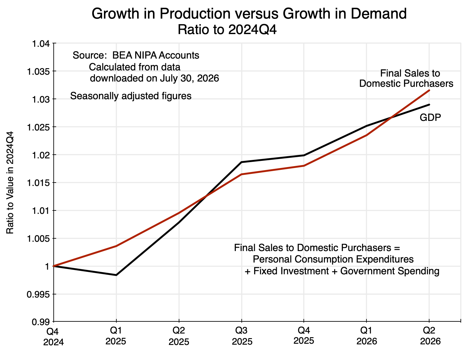
Chart 4

The chart shows the increases in demand (Final Sales to Domestic Purchasers) and domestic supply (GDP) – all in real terms – during Trump’s current term in office.  They will normally move roughly in parallel.  The fall in GDP in the first quarter ot 2025 was mostly due to the anticipation that Trump would soon be charging high tariffs on imports (which he did), leading firms to accelerate their purchases of imports to get ahead of the anticipated tariffs (with a resulting major increase in the trade deficit in the period), along with a cut back in purchases from domestic suppliers to balance this.

Note, however, that while the curves in the chart cross in the second quarter of 2026, no special significance should be assigned to that fact alone.  They are both drawn relative to their levels in the fourth quarter of 2024, and there was already a trade deficit in that period.  Indeed, the US has run significant trade deficits since the 1980s when, under Reagan, there were large tax cuts as well as major increases in government spending (primarily for the military).

Rather, the point to note is that the increase in Final Sales to Domestic Purchasers (demand) in the second quarter of this year was significantly greater than the increase in GDP (supply).  To meet that higher demand, the economy had to draw down inventories and run a larger trade deficit.  The relatively weaker growth of GDP (of just 1.5%) is a sign that domestic production could not keep up with the increase in domestic demand.

Not surprisingly, White House officials as well as at least some news reports misinterpreted this and treated the relatively rapid growth in demand as a sign of strength in the economy.  Demand did, indeed, grow.  But supply could not keep up.  That is what happens when an economy starts to overheat.  And when an economy overheats, inflation rises.

F.  Inflation is Rising, and Real Wages and Personal Income Are Falling

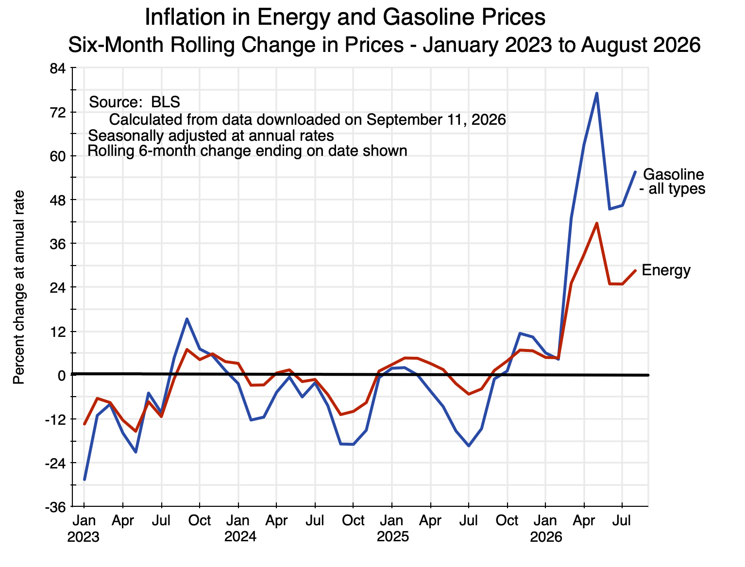
Inflation has gone up this year, driven in part by the high oil and gas prices resulting from Trump’s decision to start a war against Iran.  But inflation in fact started to rise last fall, well before the attacks against Iran were launched on February 28.

Inflation rates over rolling six-month periods work well for finding turning points.  There is too much statistical noise in one-month only changes, while changes over twelve months (i.e. year-on-year) are too long before changes in trends are recognized.  Yet most analysts and news reports focus on the one-month and twelve-month changes.

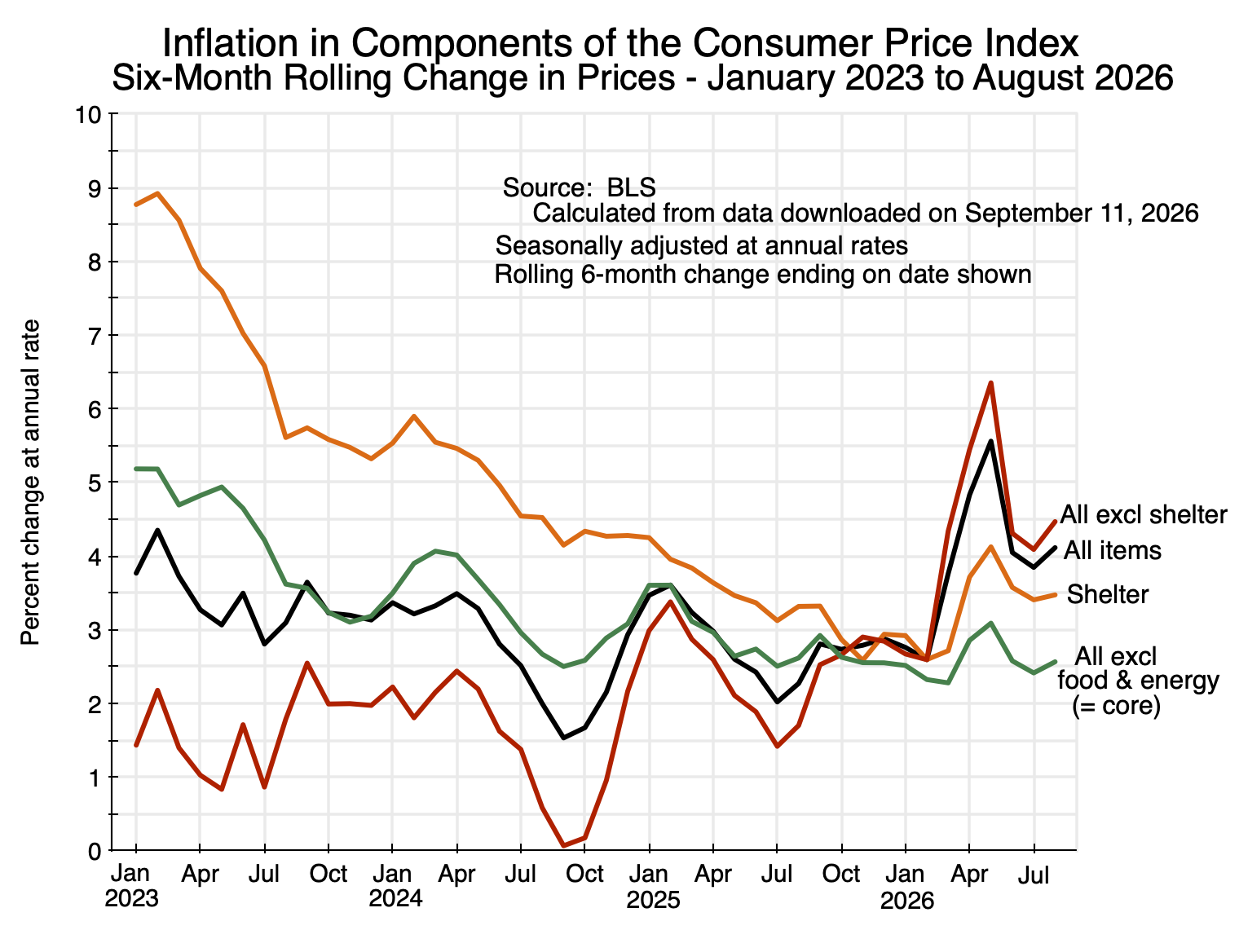
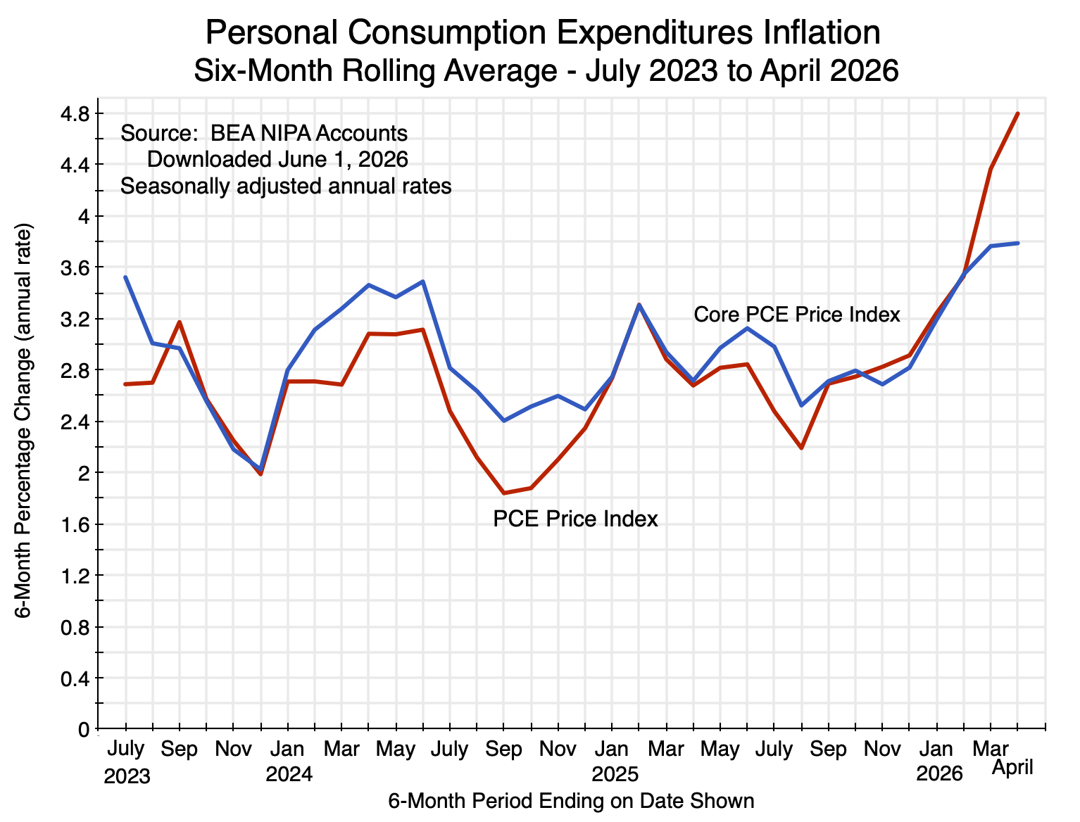
Based on the six-month rolling change in prices, increases in the price indices for Personal Consumption Expenditures (both overall and core, where the core price indices exclude food and energy) were mostly within the range of 2.5 to 3.0% at annual rates through most of 2025 (with a few exceptions on each side).  They were also about that, on average, in the last two years of Biden’s term.  But the rate of increase of both price indices then started to go up in the six-month periods ending in January and especially February 2026.  Note that prices for these indices are recorded as of the middle of each month, so the first set of prices following the February 28 start of the war on Iran are reflected in the March figures:
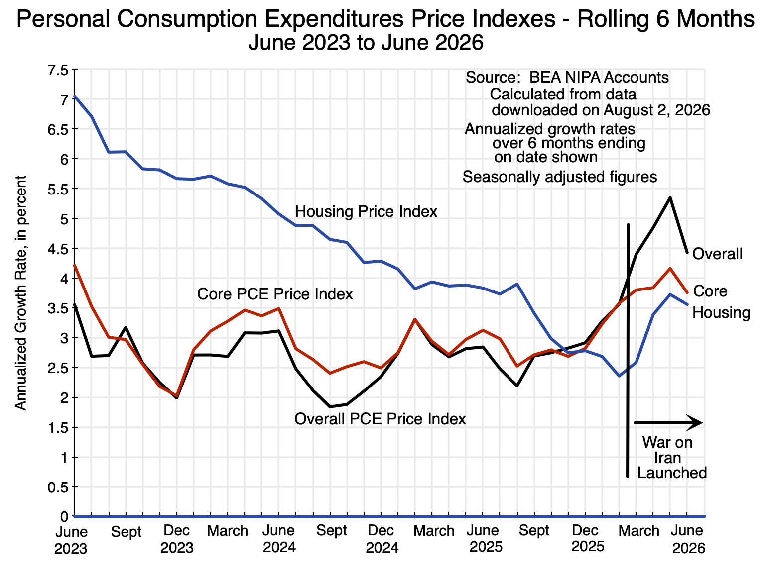
Chart 5

Note also that inflation in the price index for Housing had been falling steadily from at least 2023.  Housing has a significant weight in the PCE price indices (15% in the overall PCE price index and 17% in the core PCE price index – see the discussion in this earlier post on this blog), so it matters.  But the housing price index also changes with a lag, as it is estimated from surveys of rental households on their cost of renting similar housing.  Rental contracts are typically set in the US for a 12-month period.  Inflation in the price index for Housing, as measured, continued to fall into 2026, and in fact fell below the rates for the overall and core PCE price indices.  This acted to moderate somewhat the rise in those indices in late 2025 and early 2026.  But then inflation in the price index for Housing soon started to rise as well, confirming the general upward pressures seen on prices.

A consequence of the rise in inflation has been a fall in real wages:
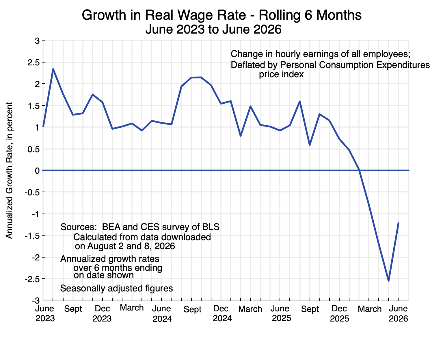
Chart 6

Real wages were rising in the last two years of the Biden administration, but in 2026 wages have not kept up with rising prices and have fallen in real terms.  Should wage demands now rise to try to offset this, there is a danger that the economy could end up in a wage-price spiral.

The result has also been a fall in real per capita Disposable Personal Income:

Chart 7

Real Disposable Personal Income had been steadily rising as Biden left office, and continued upward in the early part of Trump’s term.  But it already started to falter in late 2025 (notably before the Iran war had its impact on prices) and is down in 2026.  (Disposable Personal Income is Personal Income after personal taxes are paid and transfers – such as Social Security – are received.  It is deflated in the NIPA accounts by the PCE price index.)

Inflation will increase when an economy is operating at full capacity and full employment, and there is pressure from demand rising by more than supply.  That is consistent with what is observed here.  Demand – at least through the second quarter of 2026 – has grown at a relatively rapid pace.  But supply has not kept up, and is indeed slowing.  Given what Trump has done, that is not surprising.

G.  Trump’s Policies Are Hurting Growth

Why has growth weakened?  The purpose here is not to provide an in-depth analysis, but rather just to summarize a few of the more obvious examples of decisions that have hurt growth and increased costs:

a)  High, arbitrary, and often capricious tariffs have been imposed on essentially everyone, including on imports from nations that had been the closest allies of the US.  Many were announced by Trump in late-night posts on his social media accounts.  Trump also often soon changed them to something else – also often announced via social media.  Not only did they violate international trade treaties that the US had negotiated and approved over decades, many were also clearly illegal under US law.  But it took some months for the cases to wind through the courts to an eventual final decision.

Tariffs have an immediate impact on prices.  They are in essence a sales tax, paid by the American firms importing the items and then passed on (to the extent they can) to American households.  Trump has insisted that foreign exporters are bearing the cost of the tariffs (by reducing the prices they charge by that amount, he asserts), but careful empirical studies of the actual data have found this not to be the case.  While theoretically possible, a recent careful study found that US firms and households are bearing 96% of the cost of Trump’s tariffs.  Other studies have had similar findings.

In addition, with high but variable and uncertain tariffs facing them, firms are in a poor position to plan on how much to invest and in what.  They cannot be sure how much they will be paying in tariffs on what they need to import, nor what price they will be able to charge for what they produce.  It is thus not surprising that investment in everything other than items related to the AI boom has declined under Trump (as seen in Chart 2).

b)  Trump’s aggressive policies against migrant workers have reduced the labor force.  But labor is needed in an economy.  And removing migrants from the labor force has not led to increased employment of native-born workers:  Their unemployment rate – while relatively low (4.6% as of July 2026) – is higher than what it was during Biden’s term.

With less labor, less can be produced.  But what is produced with labor has a value greater than what is paid in wages in a market system (and as measured in the GDP accounts), so the cost is borne not just by those taken away from the workforce.  The result is slower growth.

c)  The war Trump started against Iran on February 28 has also hurt the economy.  It led to increases in the cost of not just oil (crude and refined products), but also items such as natural gas (LNG), petrochemicals, fertilizers and fertilizer components, and other such products due both to direct war damage and to a drastic reduction in shipments through the Strait of Hormuz.  While the US is also a producer of many of these, US firms and households will still pay higher prices for such products (and for the products that these are used as inputs to) as the prices are determined globally for such goods.

d) Trump has also brought in blatant clientelism, where favored firms and friends can benefit greatly while unfavored firms are punished.  There have been several avenues for this.  One has been “donations” by firms to special projects Trump has initiated.  An example is the building of a grandiose new ballroom on the grounds of the White House, where as of last November over 37 firms and individuals had donated $300 million.  There have also been massive amounts raised in various Political Action Committees sponsored by Trump, where already in August 2025 Trump said on his social media platform that over $1.5 billion had been raised since his November 2024 election.  This is unprecedented for a president in his second term.  And there have been numerous examples of direct payments coinciding with favorable treatment in legal cases, presidential pardons, and similar actions by the administration.

Trump and his immediate family have gained unprecedented wealth during his new term in office.  Only rough estimates are possible, however, as Trump has been far less transparent than prior presidents on his finances.  Prior presidents released their tax returns, for example, but Trump has refused.  A minimum estimate is possible based on a mandatory financial disclosure, but that disclosure only provides figures in ranges, such as $5 million to $25 million, $25 million to $50 million, and anything above $50 million.  But based on what was provided in the disclosure, reporters at The New York Times concluded that Trump brought in a minimum of $2.2 billion in 2025.

Firms and wealthy individuals may well feel obliged with this presidency to make such payments.  They have good grounds to fear punishment if they don’t.  But the impact of such clientelism – where the favored firms then benefit from government contracts directed to them, special exemptions in the new tariff regime, special tax treatment, and so on – is harmful to the economy as a whole.

e)  While the impact will be in the next year or two, a particularly perverse example of the policies of this administration has been its use of taxpayer funds to stop work that was underway on a series of offshore wind power projects.  The Trump administration at first sought to halt all offshore wind power generation projects then under development by claiming “national security” issues.  After a judge rejected this, the administration adopted an approach where it would use taxpayer funds to pay the energy companies to abandon their projects.  With the recent announcement (on August 6) of another such deal, the Trump administration has paid five firms close to $4 billion to walk away from offshore wind projects in development.

The projects would have added a total of 23,900 MW (megawatts) of generation capacity.  To put this in perspective, the US added a total (in gross terms) of 53,000 MW of generation capacity in all forms of power generation in 2025.  The 23,900 MW of the canceled projects would have been 45% of all that was added in the country in 2025.  That power is desperately needed, as the data center expansion requires massive amounts of new power and those demands are driving up power costs for everyone.  And wind projects – once built – have close to no marginal cost to run as they do not burn fuels.

It is not only offshore wind power projects that this administration has sought to block.  It is also blocking onshore wind projects – projects that provide especially inexpensive (as well as clean) power.  It has, for example, simply refused to provide the once routine approvals needed to ensure there are no national security issues (which, while rare, could then be addressed through design changes).  A total of 29,000 MW of additional power generation capacity (a further 55% of the total new capacity added in the US in 2025 from all power sources) was being blocked in this way.  The Defense Department simply did nothing, thus holding up these desperately needed additions to US power capacity.  On August 6, a judge (appointed by Trump in 2019) ruled that the Defense Department could not simply sit on the applications and had to carry out its responsibility to provide the mandated reviews.

In response to criticisms such as those above, Trump has claimed that a boom is underway.  Indeed, in a signed column published in the Wall Street Journal (titled “My Tariffs Have Brought America Back”), Trump asserted that “more than $18 trillion” in new investment commitments have been made by foreign nations in trade deals negotiated in response to his tariff threats.  He noted that such a number is so large that it is “unfathomable to many”.

It is, indeed, unfathomable.  It is also totally unrealistic and will never be done.  But suppose that it were.  While a time frame has not been provided, assume the $18 trillion would be invested over six years, and hence would amount on average to $3 trillion in new foreign investment into the US each year.

To make such investments, foreign investors need dollars, and they can only obtain the dollars by exporting more to the US (i.e. the US importing more) or by importing less from the US (i.e. the US exporting less).  The US trade deficit would have to increase.  The broadest measure of the foreign trade balance is the current account balance, which in addition to trade in goods and services, includes payments for items such as earnings on capital that US nationals have invested abroad.

The current account balance for the US in 2025 was a deficit of $1.2 trillion (in the BEA estimates).  If there were to be an additional $3 trillion each year in net new foreign investment into the US financed from abroad, this would need to grow to $4.2 trillion.  That is, the current account deficit would have to more than triple, from a level that Trump already considers to be far too high.  This is just basic economics, but evidently no one on Trump’s staff has explained this to him.

H.  Scenarios

What may happen going forward?  Four scenarios are worth considering.  They are ranked here in order from what is probably the most likely (at least for the near term) to the least likely:

a)  Continue similar to now, but with some easing in the growth of demand to align better with the slower growth in supply:

Growth in GDP could continue at a relatively slow pace.  This would be sustainable provided the growth in aggregate demand slowed similarly rather than increase at a faster pace (as it did in the second quarter, when demand grew at a 3.2% rate while supply – GDP – grew at a 1.5% rate).  Price pressures would then subside.

The largest component of demand is Personal Consumption Expenditures.  It was equal to 68% of GDP in the second quarter of 2026, and grew at a 3.2% annual pace in the quarter in real terms.  But real Disposable Personal Income fell in the second quarter at a rate of 1.7%.  With Personal Income falling while expenditures rose, the Personal Savings Rate (defined as a percentage of Disposable Personal Income) fell to just 2.8% in the second quarter (and 2.7% in the month of June only).  This is only half of the 5.4% savings rate in 2024, and even further below the pre-Covid rate in 2019 of 7.3%.

The Personal Savings Rate cannot go much lower, and indeed should be expected to rise.  Even if incomes do not continue to fall in real terms, it is likely that consumption expenditures will need to be pulled back to something more sustainable.  This would reduce the growth in aggregate demand, which would bring it into better balance with the slower growth in supply.

The Fed could also help bring demand growth in line with the slower growth in supply by raising interest rates.  But the new chair of the Fed – Kevin Warsh – was nominated by Trump in large part due to his promise to reduce (not raise) interest rates.  Trump has repeatedly called for lower interest rates, not recognizing (and with his economic advisors evidently not telling him) that lower interest rates would increase further the pressure for higher prices.  It is difficult to say how soon Warsh will openly admit that he (and Trump) are wrong, and that interest rates should go up and not down.

b)  Demand continues to grow faster than supply:

If the growth in demand continues to exceed the growth in supply, one should expect both a larger trade deficit and greater pressure on prices.  This can be sustained as long as foreigners are willing to fund that trade deficit and the higher rate of inflation is tolerated.  However, that higher rate of inflation might well lead to greater pressure from labor for wage increases to offset the higher prices, with a resulting wage-price spiral.

This is a recipe for stagflation.  Supply is not growing all that fast and might fall further behind demand if the efforts by labor to protect living standards lead to disruptions.  But prices are already rising at a relatively rapid pace compared to what they have in recent decades; labor may become increasingly active to try to protect its real living standards; and prices could then rise even faster.

c)  The AI boom is a bubble that bursts:

Much of the growth in GDP – such as it is – is accounted for by the growth in what is being produced for the boom in AI investments.  Whether that boom in AI investments is sustainable has been questioned by some.  The amounts being invested are massive, and announced plans are far greater.

And even if the AI investments turn out to provide AI services that are found to be valuable to the economy as a whole, it is not clear that the firms providing those AI services will profit by enough to cover the cost of those investments.  Booms and then busts in new technologies have happened repeatedly over the years, from the 19th-century boom in railway investments up to the boom and then collapse in the internet bubble of 1999/2000.  The product may well be valuable, but with increased supply the price of what the new technology provides comes down and the investing firms may end up bankrupt.

This would lead to equity prices falling and possibly crashing, and a resulting cutback in consumption expenditures (by investors in those equities) on top of a rapid fall in AI-linked investments.  The impact would likely be far less than what happened in 2008/2009 as a result of the collapse in the housing bubble – as mortgage securities were far larger relative to the size of the economy than investments in the AI firms are.  But it could be similar to the recession in 2001 that followed the bursting of the internet bubble, when the unemployment rate rose from below 4% (in 2000) to a peak (in 2003) of 6.3%.

Price pressures would be relieved, but at the cost of higher unemployment.

d)  Trump reverses his policies:

Finally, there could be a scenario where Trump recognizes the imbalances in the economy and the harm being done to growth by his policies.  There would then be a reversal of the policies listed above.

But the likelihood of that is next to zero.

I.  Conclusion

Growth has slowed under Trump.  What may happen next is not clear, and there are a range of possible scenarios, as described above.

But while growth is on a downward trend, that does not mean that exceptionally fast growth in estimated GDP is not possible in any given quarter.  There is substantial volatility in the estimated quarter-to-quarter growth rates for a number of reasons.  For example, overall GDP growth averaged 1.9% (at an annual rate) over the six quarters of Trump’s second term.  But the growth rates of those six quarters taken individually were (in order): -0.6%, 3.8%, 4.4%, 0.5%, 2.1%, and 1.5%.  The range was from a low of -0.6% to a high of 4.4%.  This volatility can be due not just to policy issues during the period, but also the impacts of idiosyncratic factors (such as from weather events) as well as statistical noise.  Hence it is better to focus on the trends.

The reduction in the pace of overall GDP growth since Trump took office also masks that much of that growth was due to production for the massive new investments in AI-linked data centers and related items such as software.  Taking out an estimate of the production for that, growth in the entire rest of the economy grew at a pace of just 0.9% since Trump’s second term started.  And that “rest of the economy” is 92% of the total economy.  Even after the rapid recent growth in the AI-linked investments, the production for that investment (as estimated above) currently accounts for just 8% of GDP.

This is now a two-track economy, where those firms (and their employees) working in the development and supply of AI services are doing well (often exceptionally well, financially), while the rest of the economy is lagging.  There have certainly been spillovers from the investments linked to AI to the rest of the economy (which is overall stimulative, although also with negative impacts such as on power prices), but even with that spur, growth outside of production for AI investments has weakened markedly.

The slowdown is not surprising, as discussed above.  The Trump administration has aggressively pushed policies that have deterred investment (leading to the slump in investment not linked to AI – Chart 2 above), and reduced the labor force (Chart 3).  It should not then be surprising that the growth in supply (GDP) has diminished.  But the growth in domestic final demand has been high this year – outstripping supply (Chart 4) –  thus leading to greater pressure on prices (Chart 5), and a resulting fall in real wages (Chart 6) and in real personal incomes (Chart 7).

Worst of all, although not surprising:  there is no sign that Trump recognizes this.  In early August, for example, Trump asserted at a speech in Las Vegas “The economy’s the greatest economy we’ve ever had by far.”

Until the problems are recognized, nothing will be done to address them.

More Evidence on the Damage Trump’s Policies are Doing to the Economy

Chart 1

A.  Introduction

On May 28, the Bureau of Economic Analysis (BEA) of the US Department of Commerce released its Second Estimate of GDP for the first quarter of 2026.  Along with it, it released its estimates of Personal Income and Outlays for April 2026.  Together, they provide further evidence on the damage that Trump and his misguided (as well as erratic) policies have done to the US economy.

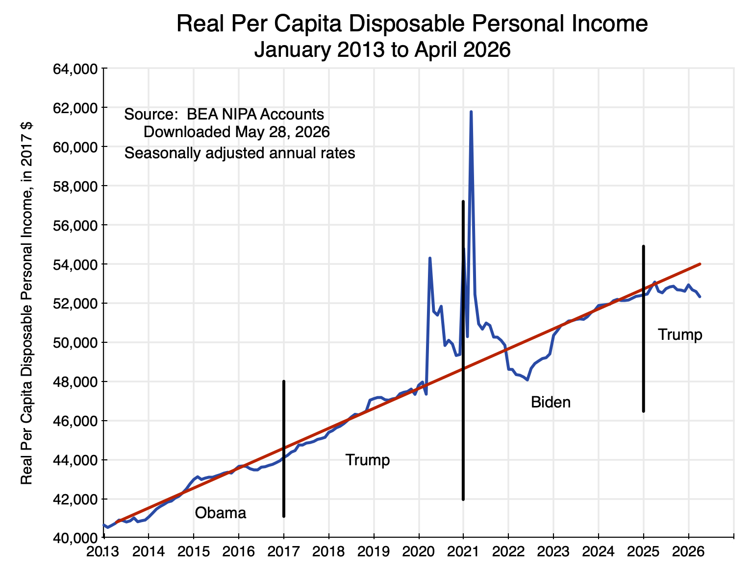
This note will review some of the figures that came out.  The chart above shows in a longer-term context what has happened to real per capita disposable personal income – perhaps the best measure in the GDP accounts of average real incomes of Americans.  It stagnated in the first year of Trump’s return to the presidency and is now falling in 2026.  It is also now well below what it would have been had it continued to follow the rising trend path of the last 13 years.  The figures will be discussed in the next section below, as well as figures on the divergent paths of what has happened to wages and salaries (stagnant in real terms) in contrast to corporate profits (up by 12.0% in the first quarter of 2026 over the year earlier in nominal terms, and by 8.7% in real terms).

The section that follows will then discuss a few points that can be found in the new GDP estimates.  GDP growth in the first quarter was weak, with a revised estimate that real GDP grew at a 1.6% annual rate in the quarter (down from 2.0% in BEA’s initial estimate released in April).  But this includes the effect of the return to normal levels for a full quarter of government production following the end of the federal government shutdown in the fourth quarter of 2025.  That recovery already happened in mid-November.  The previous post on this blog discussed that impact and how it is measured.  The bounce back to normal levels led to GDP as measured that was 0.6 percentage point higher in the first quarter than otherwise by my calculations (and 1.0 percentage point higher in figures cited by the BEA when discussing the negative impact of the shutdown in the fourth quarter).  Excluding this impact of government workers returning to their offices, GDP growth in the first quarter would have been only 1.0% (using the 0.6% figure) or just 0.6% (using the BEA figure).

Furthermore, more than all of this growth was a consequence of the AI boom.  The contribution to the growth in GDP in the first quarter from private investment in information processing equipment and software totaled 1.4 percentage points in the BEA figures.  That is, after taking into account the impact on measured GDP from government workers returning to their offices for the full quarter and private investments linked to the AI boom, production in the entire rest of the economy fell.  Production in the entire rest of the economy other than AI investments would have led to a fall in GDP at a rate of – 0.3% using the 0.6% figure for the impact of the government shutdown (or at a rate of – 0.7% using the 1.0% figure the BEA cited for the impact of the government shutdown).

On top of this, inflation is now high.  As discussed in Section D below, the upturn in inflation started already in late 2025 / early 2026, i.e. before Trump’s decision to start a war with Iran on February 28.  The resulting jump in fuel prices led to inflation being even higher.

The economy is doing poorly.  Living standards are falling.  Only investments linked to the AI boom are keeping GDP growth positive.

B.  The Impact on Living Standards

Per capita disposable personal income in real terms was stagnant in the first year of Trump’s second presidency and falling in 2026.  It is now well below where it would have been had it continued on the previous upward trend.  The figures are shown in the chart at the top of this post.

The BEA provides an estimate of personal income monthly, and it can be found with its underlying components in Table 2.6 of the NIPA Accounts.  Personal income includes all sources of income accruing to individuals, including from wages and salaries (along with supplements to wages, such as company contributions to health and pension plans), income from unincorporated businesses (sole proprietorships and partnerships – i.e. most small businesses), rental incomes accruing to persons, personal interest income and dividend income, and current transfer receipts (such as from Social Security and Medicare) net of taxes paid for such programs (e.g. Social Security and Medicare taxes).

Personal income minus personal taxes (primarily income taxes) will then be disposable personal income.  The BEA deflates these figures using its estimates of the personal consumption expenditures price index (often referred to – not quite correct technically, but close – as the PCE deflator) to put them in real terms, and divides them by current population levels (with estimates from the Census Bureau) to put them in per capita terms.

Per capita disposable personal income in real terms was close to its long-term trend in January 2025, as Trump took office, and continued close to that trend until April 2025.  But that was the month when Trump announced huge and essentially arbitrary tariffs would be charged on imports on almost every country and region in the world (including an island populated only by penguins and seals).  He called this “Liberation Day”.  Erratic changes in tariffs since then, as well as in other policies (such as the granting of special favors or special penalties to various firms depending on Trump’s whims), have since continued.  Real personal income then came down from its April 2025 peak, stagnated to the end of the year, and fell to just $52,330 in the BEA estimate for April 2026.  This is below where it was when Trump took office, and $750 below where it was in April 2025.  This is in 2017 prices.  In current prices and as of April 2026, real personal income (at an annual rate) is now $980 per person less than it was on “Liberation Day”.

But a more appropriate measure of performance would be relative to where it would have been had it continued to rise as it had under Biden and before.  Compared to what it would have been, the shortfall in living standards by April 2026 came to $1,700 per person in terms of 2017 prices, or $2,200 for every man, woman, and child in the country in current prices.  For a family of four, the reduction in living standards as of April 2026 was $8,800 at an annual rate.  This is not a small amount.  Households could make good use of the higher income they would have had, had it continued to grow as it had under Biden and before.

Furthermore, the gap between what it could have been and what it actually has been under Trump is widening over time.  It is also an average, and hence does not take into account the increases in inequality of recent years.  There has been much discussion of the so-called “K-shaped” economy, where higher-income individuals are doing increasingly well while lower-income individuals are doing poorly.  With growing inequality, the reduction in the overall average real personal incomes under Trump has been especially stark for the lower and middle income classes.

Defenders of Trump might well point out that there was also a substantial dip in real personal incomes in 2022 during the Biden administration.  This is true and is seen in the chart at the top of this post.  It was, however, temporary.  Real personal incomes returned to their previous growth path by the end of that year, and then continued on that path until Trump took office.  The dip was a consequence of the severe disruptions to the US (and indeed world) economy due to the sudden lockdowns due to Covid in 2020 that continued into 2021, and then the time needed to re-establish the regular functioning of supply chains once the production plants and transportation networks could be reopened.  The impact of this on disposable personal incomes in 2020 and 2021 was masked by the numerous (and massive) emergency government support programs under both Trump and Biden – as seen by the sharp upward spikes in personal incomes in those years.  Much of this was saved (stores were often still closed), and the drawdown on such savings could then support purchases in 2022 despite real incomes being temporarily low while supply chains were still not fully functioning.  Real personal income then rapidly recovered, and by late 2022 it was back to its prior trend.

Another indicator in the recently released BEA estimates of the increasing stress that American households are experiencing can be found in the estimates of the personal savings rate.  This is also provided in Table 2.6 of the NIPA accounts.  The personal savings rate is personal savings as a percentage of disposable personal income.  That rate has been falling during Trump’s second term to just 2.6% as of April 2026 – less than half the rate of 5.5% of April 2025.  It is also now well below its recent longer-term average.  Between January 2013 and February 2020 (before the Covid disruptions began), it varied between about 5% and as much as 8%, and averaged 5.9%.

The 2.6% rate is low, and the fact it has been falling is an indication that households are stressed.  Given urgent current needs, they are saving less for retirement and other future objectives.  As with personal income, the BEA can only estimate personal savings as an average over all households.  Thus the 2.6% rate is an average that includes both upper income households who are likely saving a relatively high share of their income and lower and middle income households, who may not now be saving much at all.

At the same time as personal income has been falling, corporate profits have been rising at a fast rate.  The BEA estimates corporate profits only on a quarterly basis, and the initial estimates of these profits are released only with the release of the second estimates of the GDP accounts each quarter (as in the estimates released on May 28).  See specifically Table 6.16D in the NIPA Accounts.  Between the first quarter of 2025 and the first quarter of 2026, corporate profits in all industries rose by 12.0% in nominal terms.  Using the PCE deflator to put this in real terms, the increase was 8.7%.  In contrast, wages and salaries rose by just 3.5% in nominal terms between those two quarters, or 0.4% in real terms using the PCE deflator.  Adjusting also for population growth, the increase was essentially zero (less than 0.1%).

Corporate profits have been going up, and at a rapid pace.  Wages have not.

C.  The Growth in GDP in the First Quarter of 2026

The BEA’s estimate of GDP growth in the first quarter of 2026 was revised down from 2.0% (at an annual rate) in the BEA’s initial (“Advance”) estimate released on April 30 to 1.6% in the Second Estimate released on May 28.  But as noted above, this 1.6% rate includes the impact of the bounce-back to normal levels of federal government production of services for a full calendar quarter.  It had been curtailed during the shutdown that spanned almost one-half of the fourth quarter of 2025, and GDP measures the flow of goods and services provided over a full quarter.  Taking this effect into account, growth in the first quarter of 2026 was even less.

The impact of the government shutdown was discussed in the previous post on this blog.  GDP is the sum total of a flow of goods produced and services provided during a period of time (a calendar quarter here), and the reduction in the provision of those government services in the first half of that quarter meant a reduction in GDP in the quarter.  As discussed in that blog post, the impact (by my calculations from the figures the BEA provided) reduced measured GDP by about 0.6 percentage points (at an annual rate) below what it otherwise would have been.  The BEA, in commentary it provided with its releases of the GDP estimates for the fourth quarter of 2025, indicated the impact was about 1.0 percentage point of GDP.  The reason for the discrepancy is not clear, but one guess would be that some higher official at the BEA or the Department of Commerce took the 0.6% figure and rounded it to 1%, and that someone else started to write this as 1.0%.

With either figure, GDP in the fourth quarter of 2025 was reduced by some amount.  By simple arithmetic, there would then be a bounce-back effect on GDP in the first quarter of 2026 of a similar magnitude, as the government returned to normal operations for the full quarter.  Taking this into account, the rate of growth in GDP in the quarter other than from this return to normal government operations would have been 1.0% rather than the 1.6% reported (or 0.6% rather than 1.6% based on the 1.0% figure for the impact of the shutdown that the BEA cited).

But in addition, GDP growth – such as it was – is more than fully accounted for by the continuing boom in private investments linked to building the data centers, developing the software, and supplying the other equipment needed for the new artificial intelligence (AI) systems.  This AI boom accounts for much of the growth in GDP in 2025, with this continuing into 2026.

While the NIPA sector categories will not match precisely the investments related to the AI boom, a reasonable approximation is the sum of private investments in information processing equipment and in software.  The NIPA accounts provide figures for private investment in these categories, and from this the BEA provides figures (in Table 1.5.2 of the NIPA accounts) of the contribution from the growth of each to the overall growth in real GDP.  For technical reasons (the use of chain-weighted price indices), the sum of the individual contributions to the growth in GDP may differ slightly from the estimated growth in real GDP, but they are well close enough for the purposes here.  Of greater importance is that investments in information processing equipment and in software will be for more than that just for AI, plus there will be AI-linked investments in other categories as well.  These will in part offset each other.

What is clear is that in 2025 and continuing into 2026, there has been a major increase in private investment in these AI-related categories.  Their contribution to the growth in GDP in the BEA calculations (Table 1.5.2 in the NIPA accounts) was an average of a 0.90% point contribution to the GDP growth rate each quarter (at annual rates).  This is triple the average contribution to GDP growth of investments in information processing equipment and in software between the first quarter of 2013 and the last quarter of 2024, when its contribution was on average 0.30% point.

Subtracting from overall GDP growth the contribution of the AI boom, as well as accounting for the impact of the federal government shutdown, yields the contribution to the growth in GDP of the entire rest of the economy:

Contributions to GDP Growth

GDP Growth Contribution of      Info Processing                   + Software Impact of Gov’t Shutdown Contribution of All Else
2025Q1  -0.65%        1.30%     -1.95%
2025Q2   3.84%        0.80%      3.04%
2025Q3   4.38%        0.26%      4.12%
2025Q4   0.48%        0.78%   -0.57%      0.27%
2026Q1   1.62%        1.36%    0.56%     -0.31%

Seasonally adjusted annual rates.

(The figures for the impact of the federal government shutdown (-0.57% of GDP and +0.56% of GDP) have been rounded in the text to 0.6%, and are shown here at two digits of accuracy to be consistent with the rest of the table.  Also, they differ very slightly between the two quarters – 0.57% vs. 0.56% – as the impact is taken as a share of GDP, and GDP is slightly higher in the first quarter of 2026 than what it was in the fourth quarter of 2025.)

Taking into account the impact of the government shutdown and of the boom in AI investments, growth in the rest of the economy was essentially zero over the past half year.  It was relatively high in the second and third quarters of 2025, but was substantially negative in the first quarter.  While the quarter to quarter figures will bounce around (due both to real changes and to statistical noise), the economy – other than for investments related to AI – is clearly weak.  This is consistent with the findings discussed above on the stagnation in real personal incomes in 2025 and its fall in 2026.

Another sign of weakness in the US economy has been a continued decline in private investment in business structures (e.g. office buildings, commercial structures, warehouses) and in residential housing.  See Table 1.1.1 of the NIPA accounts.  Each has declined in real terms in every quarter since Trump took office at the start of 2025, most recently with real investment in business structures falling at an annual rate of 5.4% in the first quarter of 2026 and real investment in residential housing falling at a 6.2% rate in the quarter.  Other than for AI, private investors are wary of committing to investments in the economy.

A proviso on the AI investments should, however, be noted.  The figures above are based on the BEA calculations of what it terms the “contributions to the percent change in real gross domestic product”.  It is, however, a calculation from the demand side measure of GDP, where all the components of demand for GDP (private consumption, private investment, government, and exports less imports) are added up.  This provides an estimate of domestic production during the period, as private investment includes investment in inventory accumulation and changes in inventories act as a balancing item.  Increases in imports are therefore a negative contribution to the growth in GDP in this framework, and the BEA is only able to make an estimate of the change in total imports during the period – not imports that in some way both directly and indirectly provided part of the supply to fill a specific demand.

With imports equal to only about 14% of GDP, the approach is not unreasonable, as 88% of what is used to fulfill the various demands will come from domestic production.  (With imports at 14% of GDP, total supply will be 100 + 14 = 114, and the share domestically supplied will be 100 / 114 = 88%.)

But while the average import share in total supply is 12% ( = 14 / 114), the share is likely substantially higher for the investments linked to the AI boom.  How much higher is not clear.  Many of the semiconductor chips and much of the specialized equipment are imported, but the investments in the data centers supporting AI and in the software used for this will be more than just imports.  The data centers need to be built, the equipment put together, and the centers then connected to power, water, and information networks.  And the software, in contrast to the chips, is primarily from domestic production.

The relatively high share that is imported will matter for the impact such AI investments will have on domestic production rather than direct imports, and GDP is a measure of domestic production.  It is impossible to say how much that impact will be, but it will reduce the “contribution” of such investments to the growth in GDP (as depicted in the table above).  However, even with this, the contribution of the “all else” category to the growth in GDP is likely still to be small – just not as small as the figures indicate.

D.  Inflation is Now High

Inflation is now also a concern.  Table 2.8.4 of the NIPA accounts provides monthly estimates of the price indices estimated by the BEA for personal consumption expenditures – both overall and for the major types of products making up personal consumption.  (Technically these are price indices rather than price deflators, but in practice they are almost always the same within round-off and the terms – price indices or deflators – are often used interchangeably.)  The Fed uses the core PCE deflator (the deflator excluding food and energy) as the primary indicator of inflation that it focuses on, with the objective of keeping it at around 2.0% on an annualized basis.

Monthly changes in the price indices are volatile and often not meaningful, while changes in the indices over year-earlier periods will miss turning points due to the long lag.  Changes over six-month periods are usually a good compromise to show when a turning point has been reached.  And it is clear from this that inflation turned decidedly higher in late 2025 / early 2026:

Chart 2

The overall PCE price index over the six months ending in April 2026 rose at a 4.8% annualized rate.  The core PCE price index rose at a 3.8% pace.  Both of these are now far above the Fed’s 2.0% goal.  And this is not just due to energy prices:  By April, the six-month core PCE price index had risen by a full percentage point from the 2.8% rate of the six-month periods ending in late 2025.  Furthermore, energy prices in the months of January and February 2026 were in fact relatively low and below their levels of the last several months of 2025.  Trump did not launch his war against Iran until February 28, after which energy prices skyrocketed.  This then compounded what was already becoming an inflation problem.

Inflation by itself will not necessarily lead to a reduction in average real personal incomes in the NIPA accounts – the topic of Section B above.  Higher prices mean that the loss of one party is a gain to another.  And the stagnation in real personal incomes began in 2025 well before the recent jump in inflation.  But to the extent the inflated prices end up benefiting corporate entities (such as the big oil companies), average real personal incomes will be reduced as corporate profits go up.  This has likely been an additional factor in the more recent fall in 2026 in the absolute levels of average real personal incomes.

The recent rise in inflation does not in itself account for the slump in living standards under Trump.  The stagnation in real personal incomes was already underway in 2025.  Trump’s misguided policies led to that.  High inflation is now compounding those difficulties.

E.  Conclusion

There is another figure in the recently released NIPA accounts that is of interest as an indicator of what has happened to the living standards of lower-income Americans.  It has in fact had a positive contribution to GDP as mechanically measured.  Included within the goods and services that add up to overall personal consumption expenditures, the BEA has the category labelled “Final consumption expenditures of nonprofit institutions serving households (NPISHs)”.  These are the net expenditures of nonprofit groups serving lower-income households, such as food banks, health clinics, and other providers of similar services.  The “net” is net of any payments they receive from those receiving those services.  Table 2.8.11 in the NIPA accounts shows the percentage change in real expenditures on this consumption category over the same month one year before.

The net consumption of these goods and services provided through nonprofits was 10.6% higher in real terms in April 2026 than what it was in April 2025.  This is major growth (and a contribution to GDP as measured), and is the highest percentage increase since 2022 (when the disruptions of the Covid crisis were being finally resolved).  This need to resort to food banks and other services provided through non-profits is another indication that lower-income households are stressed in this economy, and need to find support somewhere.

This indicator of stress among American households is consistent with the stagnation – and more recent decline – in real personal incomes shown in the chart at the top of this post.  It is also consistent with the fall in the average personal savings to just 2.6% – half of what it was when Trump took office.  When times are difficult, households set aside their savings plans.  It is also consistent with slow growth in GDP outside of investments in the booming AI sector.  And it is consistent with the more recent rise in inflation – affecting some households more than others – where the inflation rate was already going up before Trump chose to bomb Iran and drove up the price of fuels.

Trump’s policies are doing real damage to the economy and to living standards, that are evident in data that cover only a little over a year since he took office in his second term.  But there is no indication that Trump recognizes this and that he intends to change what he has been doing.

Why Voters Are Upset 3: Not Enough Homes Are Being Built

Chart 1

A.  Introduction

One of the more important reasons many voters are upset is that buying a home has become increasingly difficult.  Not enough homes are being built, and with the need for housing (one has to live somewhere), home prices have shot up to record levels.  While they had also gone up in the housing bubble that peaked in 2006/7 and then crashed (leading to the economic and financial collapse of 2008), that was a demand-driven bubble.  Mortgages were provided with very little down and with scant attention to affordability to borrowers who could not then repay them.  This soon came crashing down, along with home prices.

The recent spike in home prices is different.  Not only are prices substantially higher now than at their pre-2008 peak, but they are also far higher (in real terms, not just nominal) than they have ever been in the US in data going back to 1890.  See the chart above.  For over a century (i.e. from 1890 to 2000), real home prices fluctuated between index values of around 70 on the low side and at most 130 on the high side (where the price in 1890 = 100).  They are now at 220.  While homeowners can have good reason to be pleased by this rise in the value of their homes, those who are not homeowners see the rising prices as an ever-rising bar that will prevent them from ever being able to afford to buy a home.  For good reason, they are upset.

This post is the third in a series that have examined the economic factors behind why voters are upset.  Earlier posts looked at the overall figures on the slowdown in growth (and hence in incomes) following the 2008 economic and financial collapse, and at the structural factors behind that slowdown (with roughly equal shares due to: 1) a slowdown in labor force growth as a consequence of an aging population; 2) a slowdown in private investment despite record high profits and slashing taxes on profits from 35% to 21% in Trump’s 2017 tax measure; and 3) a slowdown in the growth in productivity of the resulting labor and capital).

This post will examine the reasons behind the recent sharp rise in home prices.  There are numerous home builders in the country, and with competition one might normally expect at least some to step in and build more homes to take advantage of those high prices.  That has not happened, and the interesting – and important – question is why.

What we will find:

a)  First, home prices in the US are at historic highs and are now far higher than where they have ever been (in real terms) going back to 1890 – 135 years ago.

b)  Second, the number of homes being built has not been enough to keep up with the growing number of households in the country.   But people have to live somewhere, so people do what they can to pay for the housing (whether owned or rented) they need.  This pushes up the price of housing.

c)  With those high prices, why are more homes not being built?  What one reads in the news media is that home builders claim they cannot build enough and have to charge such high prices because they are facing higher costs themselves – of labor, lumber, and other inputs – and because of burdensome regulation.

d)  If this were true, then the profitability of home building would be going down.  With higher costs, profitability would fall.  However, this has not been the case.  The profitability of the major home builders is remarkably high.

e)  There is also the odd result that productivity in the construction sector (of which home building is a major part) has gone down in recent decades in absolute terms.  Productivity almost always goes up, as productivity comes from knowledge of how to do things better.  Over time, one learns more.  The rate of increase in productivity can and does vary by sector, but what is puzzling is why it would go down in absolute terms.  Yet the construction sector produced 25% less per unit of labor in 2024 than it did in 1998.  Labor productivity in the overall private economy was 50% higher in 2024 than it was in 1998.

f)  The question, then, is why has the construction of new homes fallen far short of what is needed despite the high profits the homebuilders are enjoying?  With competition, one would expect that if some home builders do not build more, then others will step in and do it.  The technology on how to build a home is not secret or proprietary, and at a national level there are hundreds if not thousands of firms building homes.

g)  This has not happened.  It can be explained by what we see at the local level, where one needs to recognize that the relevant market for home building is not national but local.  Home building is not like making cars, for example, where one factory can serve the entire nation.  What we will find is that at the level of local markets – metro areas – home building has become much more concentrated over the last couple of decades, with a limited number of firms in each metro area taking an increasing share of the metro area market.  Homebuilders have been merging with each other or acquiring smaller firms, with the result that a small number of firms have grown to dominate the individual local markets.  The market shares of the top firms in each local market have grown, even though there can be (and normally are) different sets of firms in the different local markets across the nation.

h)  At a national level, therefore, the relatively modest market shares of individual home builders can make it look like the market for home building is diverse, with numerous builders each of whom is small compared to the overall national market.  But the national market is not the relevant market for home building:  local markets are.  And at the local market level, a few firms dominate in each and their dominance has grown in recent decades.

i)  By dominating their local markets, those few firms in each market can then have the market power to limit the building of new homes despite the high demand.  They face little pressure to invest to develop greater capacity to build more homes, and little pressure to improve their productivity.  Their productivity can fall in absolute terms – as has happened – yet their profitability can be high and indeed even grow despite that fall in productivity.  Without the pressure of competition, they can charge high prices for the homes they do build and thus be highly profitable.

This post will cover each of these points in the sections below, documenting them and illustrating the developments through a series of charts.

An annex to this post will then present, through basic supply and demand diagrams, an analysis of what to expect under such market conditions.  Economists love supply and demand diagrams, but few others do.  You will not miss much by skipping the annex, but some may enjoy the exercise of working through the charts.

Cases such as this are called instances of “monopolistic competition” by economists.  The annex will first review the base case of firm-level supply and demand under conditions of perfect competition and, alternatively, then of monopolistic competition where there are limits to the entry of new competitors in those markets.  Under each, we will see how much the firm will choose to build (the answer is they will choose to build less – possibly far less – under conditions of monopolistic competition than they would under conditions of perfect competition), the price the firm will charge for what it produces (higher – and possibly far higher – than they would if they faced more competition), and the resulting profits (higher as well – and again possibly far higher).  All this can be found in any basic introductory microeconomics textbook.

But the conditions in the local housing markets in the US then deviate from those covered in the standard textbooks.  In the standard textbook case, the high profitability in a market with monopolistic competition will induce at least some new firms to enter the market and provide a similar product.  After price and quantity adjustments, no exceptional profits will then be earned.  But in the local housing markets of the US, concentration among home-building firms has increased over the last couple of decades, not decreased.  There is now less competition, rather than more.

The annex will show that under such conditions the exceptional profits will then grow even higher with that increase in market concentration.  And in a third case, the annex will show that with both growing market concentration and growing demand for the product (housing), the exceptional profits will grow yet higher again.

B.  The High Price of Homes

Home prices in the US are exceptionally high.  The chart at the top of this post provides an estimate of real home prices (adjusted based on the general CPI) for the period from 1890 (with an index value set equal to 100) through to April 2025.  The data were assembled by Professor Robert Shiller of Yale, and was originally constructed for his book Irrational Exuberance.  The data in it is now updated monthly, and is available at Shiller’s personal website.

The series was assembled by Shiller by splicing together the estimates of several researchers, with the data through 1952 on an annual basis and since then on a monthly basis.  The data from April 1975 onward is from the Case-Shiller house price index that Shiller originally developed along with Karl Case and other colleagues, and is now a product of S&P/Corelogic.  While there will be more uncertainty in such data as one goes back in time, the Case-Shiller home price indices are carefully done, and it is the data for the last half-century (i.e. 1975 to now) that are of most interest to us.  Note that the prices incorporate adjustments to reflect changes in the quality of the homes being sold.  The Case-Shiller index does this by tracking the repeat sale prices of individual homes, adjusted for the cost of major renovations.  But it would have been increasingly difficult to do this accurately the further one goes back in time.

But it is the overall trends that are of most interest, plus what has happened to such home prices in recent years.  And the story is clear:  Real home prices fluctuated in a relatively narrow range (narrow given the length of time being considered) of between index values of 70 and 130 in the 110 years between 1890 and 2000 (with 1890 = 100.0).

This then changed in the period leading up to 2006.  Home prices in real terms reached a peak of 195 in 2006 and then fell – at first slowly and then quickly – as the demand-led housing bubble burst.  Financial markets discovered that home prices – driven as they had been by easy mortgage lending boosting demand – would not keep going up forever, as mortgage delinquency rates rose:

Chart 2

As home prices fell, the housing assets that backed the mortgages would not suffice to allow for a full recovery of what had been lent to the borrowers now going into default.  Mortgage lenders became more careful, the effective demand for housing fell, and home prices crashed.

The current run-up in home prices is different.  Mortgage delinquency rates, as seen in Chart 2, are now roughly where they were before the run-up to the 2007/08 mortgage-led crisis.  Easy mortgage lending is not now driving up home prices.  Rather, and as we will see in the next section, the cause has been supply-led rather than demand-led.  Home building has not kept pace with the growing number of households.

C.  Not Enough Homes Are Being Built

One can look at the adequacy of the number of new homes being built each year – adding to the existing stock of housing – in a number of different ways.  We will examine several in this section, and they all point to the problem of not enough homes being built.

First, there are figures on the number of housing units being completed each month:

Chart 3

The number being completed has fluctuated widely over the years but fell especially sharply following the bursting of the housing bubble in 2007.

But the figures on the absolute number of new homes built each period tell only part of the story, as the population of the US has grown substantially as have the number of households.  There were 60 million households in the US in 1968 but more than double that now with 132 million households as of 2024.  The number of new housing units being built each year per thousand US households has come down sharply:

Chart 4

The 10-year average number of new housing units being built each year per thousand households was 24.2 in the 1970s.  The most recent 10-year average (ending in 2024) was just 9.9 (60% less than in the 1970s), and hit a low of just 7.1 in 2018 (70% less).  Home building has not kept up.

The fall in residential investment is also clear in the National Income and Product Accounts (NIPA, and more commonly referred to as the GDP accounts, produced by the Bureau of Economic Analysis.  Net residential fixed investment (i.e. in housing, and “net” refers to net of depreciation) as a share of GDP has fluctuated widely in recent decades, but around a declining trend:

Chart 5

I have included in the chart the share of private non-residential net fixed investment as a share of GDP for context.  It has also been declining, although not by as much as net investment in residential fixed assets.  Net residential investment fell to essentially zero as a share of GDP in 2009-11, following the bursting of the housing bubble, and then recovered to only between 1 and 2% of GDP.  As of 2023 it was around 1% of GDP –  well below where it was in the 1960s and 70s.

[Side note:  This and the following chart were prepared in December 2024, as part of my preparation for my earlier post on the slowdown in overall GDP growth.  I then decided that the slowdown in housing investment should be addressed in a separate post – this one.  But the underlying data – through 2023 here – are still the most recent available.  They are updated only annually, and the data for 2024 will be released only in late September 2025.]

The growth in the resulting stock of residential fixed assets in real terms (i.e. the housing stock) was then:

Chart 6

The chart is on a logarithmic scale on the vertical axis.  A straight line on a logarithmic scale will reflect a constant rate of growth (with that rate of growth equal to the slope of the line).  The straight line in black is thus the trend growth in the stock of residential fixed assets between around 1980 and 2007.  It closely tracks that growth over the 1980 to 2007 period, with little fluctuation around it.  But then the growth in housing assets diverges sharply below the previous trend. The stock of housing would have been 32% higher in 2023 had it kept growing at its pre-2007 trend.  That is huge.  It should be no wonder that home prices were consequently bid up by so much.

While new home building has been slowing for some time in the US, it is noteworthy that the divergence from the previous trend in the real stock of residential fixed assets came only in 2008.  That divergence was then sustained and the relative gap continues to widen.  The increase in home prices under such conditions is not then surprising.  But why have home builders not responded by building more new homes?  If, as they often argue, they could not produce more because their costs had risen (costs of labor, materials, regulatory burdens, and other such costs), then their profitability would have gone down.  But as we will see in the next section, profits have instead been high, and have indeed been exceptionally high for some time.

D.  But Home Building is Highly Profitable

Possibly the best measure of whether the profitability of a firm has been increasing – and is expected to continue to do so – comes from observing the price of its publicly traded shares.  Investors buy equity in firms based on their expected profitability, and they will pay prices that will rise faster over time than the prices of other possible investments when that profitability is (and is expected to be) increasing faster than others.

And the observed prices of what investors are willing to pay for equity in the major home builders have increased spectacularly:

Chart 7

The chart shows the percentage increases in the stock prices (including reinvested dividends and capital gain distributions, and adjusted for any stock splits) of the five largest homebuilders in the nation (in terms of gross revenues earned in 2024) over the more than 25 years from January 2000 to August 12, 2025.  For comparison, the percentage increase in an investment in the S&P500 stock index (and again including reinvested dividends and any other distributions) over the same period is also shown.  The equity price figures were obtained from Yahoo Finance historical stock data.  For example, see here for the figures on D.R. Horton.

The figures for the resulting investment returns are summarized in this table:

             Value of a $10,000 Investment Made in January 2000

Value as of August 12, 2025

Rate of Return

S&P500                      $74,279               8.2%
D.R. Horton                    $685,108             18.0%
Lennar Corp                    $228,805             13.0%
PulteGroup                    $347,408               14.9%
NVR, Inc                 $1,759,624             22.4%
Toll Brothers, Inc                    $332,358             14.7%

An investment of $10,000 in January 2000 in the S&P500 stock index would have grown to $74,279 as of August 12, 2025, for an annual rate of return of 8.2%.  This is a nominal rate of return, but one can adjust for inflation by subtracting 2.6% – the average rate of inflation per annum over the period (as measured by the CPI).

An investment in the S&P500 index over the period – with a $10,000 investment rising to $74,279 – would have provided an excellent return.  But a $10,000 investment over the same period in any of the large homebuilders would have been far better.  A $10,000 investment in Lennar Corporation would have grown to almost $230,000.  And that would have been the worst among the five.  A $10,000 investment in NVR would have grown to over $1.7 million!

Furthermore, it appears that at least one prominent investor expects these excellent returns to continue.  Berkshire Hathaway – with Warren Buffett as CEO – revealed this month through a regular filing with the SEC that it had recently made major investments in Lennar Corporation and D.R. Horton.

There is no evidence here that home builder profits have been squeezed in recent years by high costs, forcing them to cut back on their home building.  Rather, the stock price data would be consistent with the opposite line of causation:  That the reduction in the pace of housing being built (as seen since 2008) has led to much higher profits.

Another indication of profitability can be found in the income statements of the different home builders, with measures such as the return on equity (ROE) generated in any given year.  I looked at the case of D.R. Horton – currently the largest home builder in the US in terms of the number of homes built each year (as well as in gross revenues).  ROE figures can be found in the various annual reports of D.R. Horton.  These were then compared to the overall average ROE figure of all US publicly traded firms (compiled annually by Professor Aswath Damodaran of NYU, for over 6,000 publicly traded firms on US stock exchanges):

Chart 8

With the major exception of negative returns in 2007-09 following the collapse of the housing price bubble, and a relatively low return in 2011, the return on equity of D.R. Horton has generally been higher than the average ROE of firms traded on US stock exchanges – and often far higher.  The gap has been especially high in recent years (as it was earlier when the demand-led home price bubble was building up in the years before 2007).  Home building has been a highly profitable activity.

The profitability of home building has remained exceptionally high in recent years.  There is no evidence that rising home prices should be blamed on rising costs of materials, labor, regulatory burdens, or other such factors – as is often asserted.  If rising costs were the cause, then the profitability of home builders would be low.  They are not.

E.  Profitability Has Been High Despite a Large Fall in Productivity

Another clue to what has been happening in the home building sector – with too few homes being built despite the exceptionally high profitability of home-building firms – can be found in how productivity in the sector has changed over time.  One always expects productivity to grow over time, as productivity reflects knowledge (the knowledge of how best to build what one is building), and knowledge only goes in one direction.  Knowledge is gained as one learns how to do things better, and whatever one knew before will presumably not be forgotten.

Yet remarkably, productivity in the construction sector has gone down over the past several decades, not up.  Government statistics on this are unfortunately only available for the construction sector as a whole – not for residential construction (home building) alone.  But residential construction is a major part of what is covered by the construction sector, accounting for 35% of it in 2023 (in value-added terms).

While productivity figures for residential construction alone are not available, the productivity growth figures for residential construction are almost certainly worse than what they were for construction as a whole.  The remainder of construction includes activities such as the building of bridges, roads, and highways, as well as of office buildings and commercial structures.  Those non-residential construction activities can make more extensive use of heavy equipment (such as bulldozers and excavators), tall cranes (for the building of multi-story office structures), and other such equipment that have gotten better over time.  Building individual homes is smaller scale and more decentralized, and heavy equipment is not as helpful to productivity.

But productivity has declined over time even for the overall construction sector.  In terms of simple labor productivity (what is produced in terms of the sector’s real value-added per employee, with those employed measured in full-time equivalent terms – i.e. with part-time workers included and weighted by their hours relative to full-time workers):

Chart 9

Labor productivity by sector can be calculated on a fully consistent basis for the construction sector only going back to 1998 in the current BEA statistics.  There was a change in how sectors were defined in 1997/98, so the prior series are not always fully consistent with the more recent ones.  But over the 26 years since 1998, labor productivity in the construction sector actually fell by 2023 to just 73% of what it was in 1998 and to 75% of what it was in 2024 (based on a 2024 estimate where I assumed employment of full-time equivalent workers grew at the same rate as the number of full-time workers – data on part-time workers are not yet available).  The fall in productivity mostly came in two periods:  the years leading up to 2008 (after which there was a partial recovery to 2010) and then again very recently in 2022 and 2023.  Between 2010 and 2021 productivity in construction was flat, without the growth over time that one sees in other sectors.

In contrast, labor productivity for the overall private economy grew by 50% between 1998 and 2024 – an annual rate of growth of 1.7% a year.  While the 1.7% per year might not appear to be high, it compounds over time.  If labor productivity in construction had grown at the same pace as it had in the overall private economy, the construction sector in 2024 would have been producing twice as much per worker (=1.50/0.75) as it was.

Labor productivity is simple to calculate as one only needs data on how much is produced in the sector and how many people are employed.  For certain purposes it is also the more meaningful concept, e.g. when one is interested in living standards that are possible.  But a more comprehensive measure of productivity will take into account other inputs used in production and in particular how much capital is employed (i.e. machinery and equipment, vehicles such as trucks, and so on).  The Bureau of Labor Statistics (BLS) provides an estimate of such a concept, which is called total factor productivity (TFP) – how much is produced (in real value-added terms) per unit of labor and capital inputs together.

We again see a sharp divergence in recent decades between growth in productivity in the overall economy and a large fall in the construction sector:

Chart 10

The earliest year in this data set is 1987, and the respective TFP estimates have each been indexed to 100 in 1987.  Since then, total factor productivity for the overall private business sector grew to an index value of 136.3 as of 2023 and 138.1 as of 2024 – an average growth rate of 0.9% per year since 1987.  Total factor productivity in construction fell, however, to an index value of 79.7 in 2023 – a fall of an average 0.6% per year since 1987.  The figure for 2024 is not yet available.  Had TFP grown in construction at the average for the overall private business sector, the construction sector in 2023 would be producing 71% more ( = 136.3/79.7) per unit of labor and capital input.  That is huge.

Why did productivity fall (and fall by so much) in construction over this period?  That is not normal.  As noted above, one does not expect productivity to fall over time, as productivity comes from knowledge of how things can best be organized and produced.  Knowledge over time only increases.  It would certainly be possible (and indeed normal) that productivity growth will be faster in certain sectors than in others.  But the mystery is not that productivity growth was slow in construction, but rather that it fell in absolute terms – and fell by a lot.  And productivity fell despite the high profits among home builders, as discussed above.  It cannot be attributed to a failure of not being able to fund investments to add to (or make more efficient) the capacity in the sector.

One possibility to consider might be that the cost of labor in the sector had gone down, perhaps due (in this theory) to immigrant labor driving down wages.  According to the National Association of Home Builders, immigrants make up about one-quarter of all those employed in the construction sector (which would include office employees), and almost one-third of those in the construction trades themselves.  Those shares are high.  The argument might then be that with cheaper labor becoming available, home building firms chose not to invest in new machinery and equipment as they could instead use cheap – and perhaps increasingly cheap – labor to build the homes.

But total compensation per worker in the construction sector since 1998 has not gone down.  It has gone up.  And it has gone up at a remarkably similar pace as compensation per worker in the overall private economy:

Chart 11

Furthermore, while this is a chart of how compensation per worker has changed (in real terms) since 1998 in construction versus the overall private economy, it is also the case that the average compensation levels themselves were remarkably similar.  In terms of current prices, average per worker total compensation (which will include the cost of benefits such as for health and pensions) in 1998 was $42,049 in construction and $41,694 in the overall private economy.  In 2023, the rates (again in current prices) were $94,191 in construction and $94,373 in the overall private economy.  And over the full 1998 to 2023 period, they never deviated by more than 3% from each other.

Thus wages in construction are not unusually low, nor did they increase at a slower pace than overall wage rates.  And this was not a consequence of some economic principle linking sector wages to overall wages.  In other sectors they could and did vary substantially from the overall average:

Chart 12

This chart is similar to Chart 11 above, but for all the major sectors of the economy (such as agriculture, mining, manufacturing, and so on) as defined by the BEA.  The paths are all over the place.  It just turned out that the figures for construction are very close to those for the overall private economy.  There was no necessity in this.

Another argument some might make for the fall in productivity in construction is that regulations on health and safety conditions at the work sites have become increasingly strict in recent decades.  It is probably correct that such regulations are stricter now than before – although I know of no figures or statistics that might measure this.  But if the burden of such measures were indeed significant and increasing over time, and were the cause of the lower productivity seen in the charts above for the sector, then profitability in the sector would have gone down.  Costs would be higher.  But profitability has not gone down; it has been high.

So once again:  Why did productivity fall in construction over this period, and fall despite profitability among home builders being especially high (so they could afford the capital investments had they chosen to make them)?  The high profitability itself might provide a clue.  One can conceive of productivity falling when home builders are not facing competitive pressures to stay efficient.  Lacking competitive pressures, they can defer investments, build few homes in inefficient ways, but still see high profits as no one else is stepping in to compete against them.  Put loosely, it is then easy to be lazy and not worry about producing for the lowest cost possible, as no one is pressuring you to do so.  Fewer homes are being built than would be the case if the home builders were facing strong competitive pressures, but with fewer homes being built the prices of those they did build then rose to unprecedented levels.  And profits could then be staggeringly high.

There will be less competitive pressure when a limited number of home builders in the relevant markets account for an increasingly higher share of the homes built in each of the markets.  The next section will show that such consolidation has indeed been the norm in housing markets across the US.

F.  The Increase in Home Building Firm Concentration in Local Markets 

The relevant markets for home building are local – i.e. metro areas – and not national.  This is key.  It may look like there are numerous competing home building firms when viewed at the national level, but what is relevant to anyone seeking to purchase a home is not some “national” market but rather what is available in the area where one will live.  Thus one needs to look at concentration in the new home markets not at the national level but rather by metro area.

Data on concentration among firms in local markets are rarely easy to access, if available at all.  Fortunately, there is such data on home builders.  Builder Online – basically a trade journal for home builders – provides figures each year (going back to 2005) on the share of the new housing market (in terms of the number of home sales closed) of the top 10 builders in each of 50 metro areas in the US.  From this, we can track whether – and the extent to which – the home building market has grown more concentrated by metro area over the last two decades.

One can examine various sets of markets with these figures.  For the 10 largest new home markets in 2024 (largest in terms of number of closings of newly built homes), we have:

Chart 13

The pattern is clear:  Concentration rose in each of these markets over the last two decades.  The increases were especially sharp between 2008 and 2011 following the economic and financial collapse of 2008/2009 (except for Phoenix, where there had been an especially large jump in concentration between 2005 and 2008).  This increase in concentration also coincides with the point at which growth in the net stock of fixed assets fell below its previous trend path (Chart 6 above).  The start of the sharp rise in home prices of recent years (shown in the chart at the top of this post) came soon after.  The trough in the Shiller real home price index was in February 2012.

There was then a second jump in market concentration between 2020 and 2022, which may have been related to the disruptions surrounding the Covid pandemic crisis plus the very low interest rates of that period (making it easy to borrow to buy out competitors).  The increase in concentration then continued in most of these markets between 2022 and 2024.  In all of the markets the concentration was higher in 2024 than in 2020, and usually substantially higher.

One can also look at other sets of markets.  For example, 11 of the top 50 markets in 2024 saw market shares of the top 10 home builders in each accounting for more than 90% of the number of new homes built and sold.  A few were among the smaller markets, but there was also:

Chart 14

One again sees the sharp increase in concentration between 2008 and 2011 and then a further increase after 2020.

And in some other major markets:

Chart 15

The pattern is again similar.

Finally, the pattern comes out clearly in the simple average of the top 10 home builder concentration across all of the top 50 housing markets in the US each year:

Chart 16

There was a large increase in concentration following the 2008/2009 economic and financial collapse, concentration then leveled off at those higher levels for a period, and then it rose again following the 2020/2021 Covid disruptions.

Home building markets by metro area have become substantially more concentrated over the past two decades.  Fewer home builders are competing with each other in each metro area.  This will reduce competitive pressures.  While it is impossible to say what this might mean in absolute terms, what is relevant when looking at the impact on the pace of home building is what it means in relative terms over time.  As we will discuss in the next section, with greater concentration production will be less than it would have been had the home-building markets not grown more concentrated.

G.  Monopolistic Competition and Home Building

Markets for new homes are what economists call “monopolistically competitive” markets, and in this case one where entry of new firms is limited for some reason.  Such markets differ from what economists call “perfectly competitive” markets – markets that represent more of an ideal than what one will normally see (with a few exceptions).  In a perfectly competitive market, any supplier can sell all that he produces at some market price, and whatever amount he sells will have no observable effect on that market price.  There are a few markets like this, such as a farmer growing a standard commodity such as wheat or soybeans.  They can sell all the wheat or soybeans that they produce at the market price of that day and have no observable effect on it.  If they try to ask for a higher price than that, they will not be able to sell any, and there is no reason why they should be interested in selling at a price lower than that market price.

Homes, and most products in the modern economy, are different.  Take breakfast cereals as a simple example.  People have different preferences for different cereals from different brands, such as, for example, for Kellogg’s Corn Flakes.  Because of this, if Kellogg should choose to raise its price by some small amount, most of those now purchasing the cereal will continue to do so, although some might switch to a different brand or a different cereal (or even no cereal).  The fact that most consumers will still buy their Corn Flakes gives Kellogg some power to set prices where it chooses, a power that the wheat or soybean farmer does not have.  Kellogg will then choose to price its Corn Flakes at a level that it finds most advantageous – meaning most profitable.

In a simple, static, system, Kellogg will choose to adjust its price to the point where the revenues it loses from lower sales (at the margin) from a somewhat higher price exceed what it saves in lower costs (again at the margin) from having to produce less due to those lower sales.  That is, Kellogg will choose to price its product so that – at the consequent level of sales – its marginal revenues will equal its marginal costs.  And at that point, it will be earning a substantial profit.

This is all standard economics, as taught in an introductory Econ 101 course on microeconomics.  The Annex to this post works through this using standard supply and demand diagrams.

Homes are similar in that each one is different.  Not only do different home builders build different types of homes, with at least perceived differences in quality and style, but they also build those homes in different places in any metro area.  As any real estate agent will tell you, the three most important attributes in buying a home are location, location, and location.  And by definition, every home built will be in a different location – with advantages and disadvantages to any interested buyer – even if the lots are adjacent to each other.

Home builders will thus have some degree of power to set prices for the homes they build.  It is not absolute: If they price too high, they will not be able to sell any.  But in general if they raise their price by some amount they will still be able to sell, but not as much as before (or, more properly for an asset such as a home, it will take them a longer time to make the sale, while they are incurring carrying costs such as interest on the loans they took out to build it).  In such a monopolistically competitive market, they will be able to earn a substantial profit.

But the recent home building markets in the US then deviate from the standard model taught in Econ 101 classes for what will happen next.  In the standard Econ 101 classes, students are taught that the high profits being earned by existing firms in those markets will attract new firms to compete with them.  With that additional supply and competition, the excess profits that were first earned by the prior firms in the markets will be bid down, eventually to the point where no excess profits are being earned by any firms in those markets.  The final outcome will still differ in some important respects from that in the model of perfect competition, but the main assumption is that excess profits will draw in new firms to the point where there are no more excess profits.

The home building markets in recent years have not behaved in this way.  Instead of new firms entering the markets and thus making them less concentrated, the home building firms in those markets have been able to take an increased (not decreased) share of the relevant markets: the markets in each metro area.  Mergers and acquisitions in the sector have been described as “red hot” in recent years and this has been underway for some time.  In principle, enforcement of laws on competition should limit such consolidation, but the rules and regulations set by the federal government do not fit well with the conditions in the local markets of home builders.  To start, concentration in the home builder market is not great at the national level.  While the rules and regulations should in principle also apply in the smaller local markets, those are not always closely examined by national regulators.

Also important is that regulators do not focus on concentration at, for example, the top ten share.  They focus, rather, on the share of an individual firm in the relevant market, with a normal “rule” that no individual firm accounts for more than 30% of the market.  The assumption is that purchasers can easily switch to an alternative supplier from the 70%.  Markets with ten competitors would normally be considered highly competitive.  But there is not, in fact, such flexibility in purchasing a home.  Due to the importance of location and other factors unique to each home builder, purchasers do not have an effective degree of choice such as they would have in purchasing, for example, groceries at ten different supermarket chains.

But for whatever reason, concentration among home builders has risen in the relevant markets over the past two decades.  Relative to where it was in 2005, concentration in these markets are now all higher.  And when there is an increase in concentration in the market (from whatever level), the home builders operating in those markets will be able to earn an even higher level of profits than they were earning before.  They will be able to charge a higher price than before, and can adjust their prices (and the pace at which they build new homes) to take advantage of this.  This is shown with supply and demand diagrams in the Annex to this post.

Finally, when markets have become both more concentrated and the demand for housing has increased (as it will with a growing population), their profitability will grow by even more.  This makes intuitive sense as the limited number of home builders will see an increase in demand for what they produce, and is also shown diagrammatically in the Annex.

H.  Putting It All Together

The story is straightforward.  Local housing markets have become progressively more concentrated over the last two decades, with a small number of home builders accounting for higher shares of the relevant markets.  They have been able to limit competition from new firms entering these markets, and hence the builders have been able to earn exceptionally high profits without those profits being competed away by new entrants.  The lack of competition has also allowed them to function profitably even while they allowed their productivity to fall over time.

The result is that too few homes are being built.  Or to be more precise, the result is that home building has not kept up with the growing demand from an expanding population.  This became especially important following the economic and financial collapse of 2008/09, which was itself caused by the collapse of a housing bubble that had reached its peak in 2006/07.  The result has been the unprecedented increase in home prices.

This does not mean that new home prices might, in the short run, fall from their current heights.  As seen in Chart 1 at the top of this post, new home prices (in real terms) went dramatically up until the spring of 2022 and have since fluctuated around that high level.  The spring of 2022 was when the Fed began to raise interest rates from the lows they had brought them to during the Covid pandemic in 2020 and 2021.

As a result, 30-year US home mortgage rates – which had been below 3% from mid-2020 through most of 2021, rose to over 7% by late 2022 and into 2023..  As I write this, they are still at around 6 1/2%.  The higher mortgage rates mean that a purchaser who needs a mortgage will pay much more each month on that mortgage, even if the home price is the same as before.

This would normally lead to a reduction in home prices.  The fact that they have remained largely unchanged over the last three years is unusual, and can be explained by special factors.  One is that those with a low interest rate mortgage – taken out or refinanced when interest rates were low – will be reluctant to sell that home and move to a new one as they would then need to take out a new mortgage at the current much higher rates.  This has reduced turnover and increased rigidities in the housing markets.

But home prices might fall from their current heights at some point in the next year or two.  While the long-term trend for new home building has been down (Charts 4 and 5 above), there has been an increase since around 2012 as construction emerged from the depths of the 2008-2011 collapse.  This might eventually have an impact on home prices.

Such short-term fluctuations should not be surprising, and are in fact the norm for home prices.  But one should not confuse such short-term fluctuations with the long-term trend in home prices of the last few decades.  And that trend is up.

Before ending, I should mention an alternative argument for why home prices have risen by so much in recent years.  This argument puts the blame on local housing regulation, asserting that these regulations have become more stringent over time and are primarily responsible for the lack of adequate new housing being built despite the record high home prices.

These arguments have been made under the label of the “Abundance” agenda – a term that came from the title of the recent book of Ezra Klein and Derek Thompson (although they address more than just housing).  It is also behind what has been called the “Missing Middle” and similar terms.  The Missing Middle agenda is that home builders should be given the option to build higher density structures (e.g. small apartment buildings) on the existing land footprint of areas now occupied by single-family homes.

It is not my purpose here to address these arguments in full.  Local land use policies can certainly matter, and increased concentration of home builders in their local markets and changes in land use policies may both have had an impact on home prices.  But I do not see the basis for arguing that only local land use policies (and other increasingly costly or restrictive regulations) have been the cause of high home prices:

a)  If the constraint on the building of more new homes comes from restrictions on the use of available land, then the ones who will profit from this are not the home builders (who must purchase land for any new home construction, including for what is being built now) but rather the land owners.  That is, this would not explain why home building itself has become so highly profitable.  What economists call the “economic rents” here will be accruing to the land owners, not the home builders.

b)  One can see why owners of available land may welcome the chance to sell their lots for high density development.  They will be moving elsewhere, and it will be those who continue to live in the neighborhood who will bear the costs of greater congestion and pressure on public infrastructure, and have to live with fewer trees and other green space in their neighborhoods.  The benefits of a pleasant neighborhood are basically an externality produced by all the lots in the neighborhood.  Converting the first lot to a high density structure will reduce that marginally.  But as more and more are converted, the value of that externality will be steadily reduced and property values will go down.

c)  This may well lead to lower home prices in the neighborhood, both due to the greater supply and due to the neighborhood not being as pleasant as before.  Homeowners who have not moved will bear that cost.  But this is basically a zero-sum (indeed possibly negative-sum) game:  The benefits to those now able to move in at a lower cost (and those who sold their lots and moved away) will be offset by the losses of those who had lived and remain in the neighborhood.

d)  An alternative approach would be to follow a transportation (or transit corridor) oriented development policy.  Rather than placing high density structures into the middle of low density neighborhoods (where the newcomers will need to rely on cars to get around), development should be directed to neighborhoods built up along transit corridors.  The transit corridors could be rail lines in certain cases, but more commonly various levels of bus service from standard up to express or bus rapid transit services.  There is substantial low density commercial development (surrounded by large expanses of surface parking lots) around all American cities.  Diverse neighborhoods could be developed on such land, with the highest density close to the main transit stops and lower density as one goes further away.

As noted, land use constraints – either by changes in land use regulations or simply a matter of space being used up as cities have grown – may be a contributing factor to higher home prices.  But they do not explain why home builders have been so highly profitable.  More fundamentally, if land use constraints were the primary cause of the higher home prices now observed, one would expect this to have led to a gradual but steady increase in home prices over several decades, rather than the sharp jump observed more recently.  Residential assets had risen on a steady trend up to around 2007 (Chart 6 above).  The question is what caused the deviation from this trend that began in 2008 and was then sustained.  The observed increase in market concentration of home builders in individual metro areas after 2005 can explain this.

A natural question is what to do now in terms of policy.  That has not been the focus of this post, where the aim was to examine what has led to our current very high home prices.  Nor are there any easy answers.  But a few points can be made.

First, as the proverb says:  “When you’re in a hole, the first thing to do is stop digging”.  Home building has become a substantially more concentrated industry in individual local markets in recent decades, and more serious enforcement of competition policy could stop this from getting worse.  That should be done.  It will be more difficult to unwind this to return to the less concentrated markets of the past, but measures might be possible to encourage greater competition between home builders.  Signs of collusion should be monitored.

Beyond this, government has a direct role to play in developing and expanding transportation corridors where new, diverse, neighborhoods can be developed (with a mix of high, medium, and low density).  New housing would be built and would add to available supply.  Development of such corridors depends on public investment, primarily in the development of suitable public transit options (which can vary, as noted, from bus service at an appropriate standard to rail options).  Government plays a direct role in making such development possible.

The bottom line is that there is a need to ensure more housing is built.  Transit-oriented development can be a key part of this.  Government can play an important role here and needs to.


Annex:  Supply and Demand Curves Under Monopolistic Competition

Firms (such as home builders) can make substantial profits under conditions of monopolistic competition.  And those profits can be sustained if the entry of new potential competitors is limited for some reason.  Furthermore, under such conditions the profitability of the home builders will increase if the markets become even more concentrated (with a small number of home builders accounting for an increasing share of the relevant markets), and even more so if demand is also growing.

This annex will back up each of these propositions via standard supply and demand diagrams, the same diagrams that anyone would be taught in an introductory Econ 101 microeconomics course.  They will be built up in steps, starting with the most simple situation (the assumption of perfect competition) and moving from there by steps to the more complex.  In the end, the shifts in the supply and demand curves may look complicated, but they in fact simply reflect a step-by-step buildup.

Note also that this supply-demand diagram (and the subsequent ones below) are for what an individual firm faces.  While such diagrams are sometimes used to depict conditions in a sector as a whole, that is not the use here.

Economists start with the assumption that the firm operates in a market of perfect competition.  This is not because such markets are common or even realistic, but rather because they provide a starting point as a basis of comparison.  As discussed in the text, under perfect competition a producer can sell all that he wishes to produce at a certain market price, and whatever he sells will not affect that price.  One can find such markets in cases such as farmers selling a standard commodity (e.g. wheat or soybeans).  In such markets, producers will choose to produce and sell up to an amount where their marginal cost of producing the good will equal that market price.

In cases where products are differentiated for any reason (e.g. brand identity, differences – actual or perceived – in what the product actually provides or in quality, and for any other reason), the producer has some power to set the price at which they will sell their product.  If they raise their price by some amount, the total amount they can then sell may go down (and likely will go down) by some amount, but not immediately to zero.  Thus they have some degree of flexibility to decide what price to charge for their particular product (such as a new home of a certain design and quality in a particular location).

The situation is then depicted in the following supply and demand diagram:

Chart 17

First, if this were in fact a perfectly competitive market, the producer would choose to produce a quantity Q0 which it could sell at a price P0:  that is, at point A in the diagram.  Their marginal and average costs of production are assumed to follow the curves shown (rising with increasing production after some point).  The demand curve they face (not explicitly shown) would be a horizontal line at price P0 – the market price they face which they cannot affect through how much they choose to sell.  Since they can receive price P0 for whatever amount they offer, they will choose to produce and sell as long as their marginal cost of production is less than the price at which they can sell it, and thus will produce Q0.

The firm being depicted here will also be making a profit when they produce quantity Q0 that they sell at price P0 (i.e. at point A in the diagram).  Their average cost of production is less than their marginal cost at that point, and the profits they would then be earning would be the quantity produced Q0 times the difference between the price they receive P0 and their average cost at that level of production AC0.  In general, both the average cost and marginal cost curves will be rising at that point, with the marginal cost curve above the average cost curve.  Indeed, the marginal cost curve will pass through the lowest point of the average cost curve, since average cost will be falling as long as the marginal cost is below it and rising as long as the marginal cost is above it.

When the firm operates in a market with product differentiation, in contrast, the demand curve they will face is not horizontal (at price P0), but rather some downward sloping curve such as the one depicted here as D1.  For simplicity, it is drawn as a straight line, but in general it can be any curve that slopes downward throughout.  The demand curve shows how much they will be able to sell in a period for any given price.  Or put the other way, it shows what price they will be able to obtain for any given quantity that they choose to provide.

Their decision on how much to produce and at what price now differs from the case of perfect competition.  What matters now is what revenue they will earn – at the margin – at any given level of production (with the associated price they can charge at that level of production).  If they scale back production by some amount, they will be able to charge and receive a higher price.  Or put the other way, if they choose to charge a higher price, the amount they will be able to sell will be reduced by some amount.

The average revenue they will earn for sales of any given quantity will simply be the price they can get at that level of sales (i.e. what is shown on the demand curve).  Hence the demand curve can be referred to as the average revenue curve.  But the marginal revenue they will earn when they charge a higher price will be less than that price since the quantity they can sell will be less.  Hence for any given quantity along the horizontal axis in the chart, the marginal revenue curve will be below the average revenue curve.

And that is all that we need to know.  In the special case where the demand curve is a straight line, one can easily show (as is always done in the introductory Econ 101 microeconomics class) that the marginal revenue curve will also be a straight line with a slope that is twice the negative slope of the demand curve (average revenue curve).  This is a result of some elementary calculus that will not be repeated here.  For the purposes here, all one needs to understand is that the marginal revenue curve will be uniformly below the associated demand (average revenue) curve.

A firm facing such supply and demand conditions will then choose to scale back production to the point where their marginal cost of production will equal the marginal revenue they will earn from that production. That is, they will not remain at a point such as A, as at that point their marginal cost is higher than the marginal revenue that they earn at that level of production.  (In the perfect competition case, where the demand curve they face is not the D1 curve shown in the diagram but rather a horizontal line at price P0 – as noted before – their marginal revenue curve will also be a horizontal line at that same price P0.  The slope of the demand curve is zero, and the slope of the marginal revenue curve – which is double that of the demand curve – will also be zero as double zero is still zero.)

Producing a quantity Q0 for sale at price P0 will therefore not be as profitable to them as scaling back production to Q1, where their marginal cost is no longer higher than the marginal revenue they can earn but rather equal to it.  This is point B in the diagram.  Or going from the opposite direction, they will expand production as long as the marginal revenue they earn at that level of production exceeds their marginal cost of producing it.  And they will stop expanding at the point where their marginal cost becomes equal to their marginal revenue.

When they are producing at point B with quantity Q1, their average cost of production will be at point C with cost AC1.  And they will be able to sell their output at point D on the demand curve, i.e. at price P1.  Their profits will then be equal to quantity produced Q1 times the price they will receive P1 minus their average cost AC1, i.e. the area shown in the box in light blue in the diagram.  They are producing less than they would in a situation of perfect competition, but they are receiving a higher price and their average cost will be less.  Since their marginal revenues are below their marginal costs for production above that point, scaling back production to Q1 from what it would be under perfect competition will always be more profitable for such firms.

[And as a point of clarification:  The particular way I drew the diagram here has the marginal revenue curve MR1 intersecting the quantity-axis in the chart at the same point as quantity Q0.  This is a coincidence, and will not in general be the case.  It happened here as I drew the initial point A at a center-point in the diagram – six units on each axis – and the demand curve as a 45-degree line.  The quantity Q0 will then be at the same point where the MR1 curve hits the axis.  This will not in general be the case, but I did not want to redraw all the charts.]

Starting from this, one can then look at what will happen to the firm’s choice on how much to produce (and the impact on its profitability) if the market should become even more concentrated.  This now deviates from the standard textbook treatment of monopolistic competition, in that in the standard treatment, it is assumed that the high profit the firm is able to earn (shown as the box in light blue in the chart above) will attract new competitors.  The new competitors will add to production in the market, which will lead the prices to be bid down and possibly increase costs for all (as they compete to buy some of the inputs needed in production).  This will reduce profits for the firms, and it is assumed (in the standard treatment) that new entrants will continue to come in as long as exceptional profits are being made.

But the home building industry has become more concentrated rather than less in the relevant local markets for new homes, as discussed in the text.  And by being able to increase concentration in those markets, home builders will become even more profitable than before.

This is shown in this second supply and demand diagram:

Chart 18

In a more concentrated market, the home builder depicted here faces less competition than before.  Should he raise his price, the amount he will be able to sell will still be less, but not as much less as before.  With fewer competitors for the purchaser to turn to, the firm will be able to keep a higher share of its customers (should they raise their prices) than would have been the case had market concentration not increased.

The result is that the demand curve for the firm will “twist” clockwise relative to where it was before – i.e. become steeper.  Their demand curve will now be the one in green (D2) rather than the one in blue (D1).  The associated marginal revenue curve will similarly twist to MR2 from MR1.  Their profit maximizing point will be where their new marginal revenue equals their marginal cost, and this point will have shifted to the left, with production now at Q2 rather than Q1.  (I left out letters to label the intersection points as the chart would have been too crowded with them.)  With lower production, the associated average cost AC2 will be below the prior AC1.  And the price they will be able to charge will now be P2 – above the prior P1.  Prices of new homes will be higher.  Profits will be higher as well, and are shown as the box in green in the chart.

Finally, if there is an increase in demand over time while the home building market is becoming more concentrated, new home prices (and profits) will grow by even more:

Chart 19

In this comparison, both concentration among home builders in the local market and the demand for homes in that market have increased.  Due to the growth in demand, the demand curve has shifted to the right from D2 to D3.  Production would rise from Q2 to Q3, i.e. to where the marginal revenue curve MR3 intersects the marginal cost curve. The average cost AC3 will be higher due to the rising average cost curve.  But the price will be substantially higher, rising to P3 from P2.  The firm’s profits will now grow to the area shaded in pink.  They can be much larger.

It is worth noting that while production will have gone up (from Q2 to Q3), that increase in production is less than the growth in demand.  The increase in demand can be measured by how much higher demand would have grown to at a constant price (the starting price of P2 – although this does not matter in the simple example here of a straight line demand curve shifted out by the same distance at all prices).  With a rising marginal cost curve as well as a falling marginal revenue curve, the increase from Q2 to Q3 will always be less than the distance that the demand curve has shifted at the original price of P2.  Or put another way, demand is constrained to grow from Q2 to Q3 rather than what the increase would have been at a constant price, by the producer raising the price from P2 to P3 in order to raise production and sales only to the point where his marginal revenue is equal to his marginal cost (i.e. only to Q3).

Note that with the growth in demand and an unchanged average cost curve, the average cost will go up (from AC2 to AC3).  This could be due to lower productivity at the higher demand (due, for example, to inadequate investment), but this could in principle be due to other factors as well.