
A. Introduction
The botched rollout of the new health care insurance exchanges, through which individuals without employer sponsored health insurance are to sign up for private insurance under the new Obamacare system, has focused renewed attention on the problems in the US health insurance system. The software has been a disaster. The rollout has also had to face the determined opposition of the Republican Party, which has done whatever it can to block or undermine this extension of health care to those now without insurance. Most Republican governors (27 out of 30) refused to set up state health insurance exchanges, thus adding to the federal burden, even though decentralized state-based systems have traditionally been the preference of conservatives. And with a few exceptions, most of these governors have also refused to extend Medicaid, thus denying health insurance to the working poor (and thus denying payments as well to hospitals that provide services to these poor), even though federal funds will pay for 100% of the costs for the first three years and 90% thereafter. Republicans in Congress have blocked whatever funding they could for implementation of the system, and have blocked or delayed appointments of key officials responsible for implementation of the system.
It remains to be seen whether this complex system can be implemented despite this determined opposition. And it is a complex system not out of the preference of liberals (who generally would have preferred simply extending the Medicare system to all), but as part of the political compromises necessary to get a system that would extend health insurance to those not now covered. Decentralized health insurance with an individual mandate, the most controversial part of Obamacare, was originally proposed by the conservative Heritage Foundation in 1989, and was then championed by Republicans in Congress in 1993 as the conservative alternative to the health care proposals of the Clinton Administration.
But Obamacare is limited. Its focus is on extending the availability of health care to millions of Americans now without health insurance, and not on health care costs. While there are provisions in the Affordable Care Act (aka Obamacare) designed to lower costs and improve the efficiency of the US health care system, they are modest. There is nonetheless evidence that even these modest provisions in the Affordable Care Act have accounted for at least some of the slow-down in health care costs in recent years. But few expect that these provisions, by themselves, will suffice.
This blog post will be the first in a series that will discuss the problems with the US health care system, why there are these problems, and what might be done to address the problems. This first post will compare the US to other high income countries in terms of the overall cost of health care, and in the results obtained. Future posts will look at additional data that can help us understand the causes of the problems; will discuss the inherent problems that arise in a system of decentralized health insurance that make it such a problematic industry; and then will discuss what could be done to establish a competitive market-driven process, based on individual choice, that will lead to efficient health care outcomes.
B. The High Cost of the US Health Care System
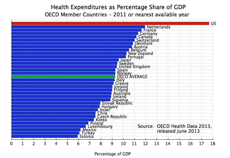
The graph at the top of this post shows total health care expenditures (both public and private) as a share of GDP for each OECD member country. The OECD issues each year the most comprehensive set of data on health care statistics available for its member countries, with attention paid to making these statistics as comparable as possible across the countries. The data used in this post, including in all the graphs below, come from the 2013 data set, which was released in June 2013. The data provided is for 2011 (or for the nearest available year). All the major high income countries of the world are OECD members, and OECD membership in recent decades has been extended to countries such as Mexico, Chile, Korea, and many of the previous communist countries of Central Europe.
As the graph above shows, the US stands out prominently from the rest of the world in what it spends. The US spends close to 18% of GDP on health care, while no other OECD country spends even 12% of GDP, and the OECD average is just 9.3% of GDP. That is, the US spends 50% more than the next highest country on health care as a share of GDP, and almost double what the average OECD country spends. If US health care costs could be cut by 6% of GDP just to the highest being spent by anyone else in the world, the savings would be about $1 trillion per year. This is huge.
And just to show that this result is not somehow a consequence of using GDP share rather than absolute dollar amounts, the graph below shows how the US compares to other OECD members in terms of the absolute amount spent per capita in dollar terms (at purchasing power parity):

The US again stands out. The US spent $8,508 per capita in 2011, or 50% more than the next highest county (Norway, which spent $5,669 per capita, with Switzerland just slightly less). The OECD average was only $3,322, so US spending was over two and a half times as much.
C. The High US Expenditures Did Not Lead to Greater Health Services
Did the higher spending on health care in the US lead to greater delivery of basic medical services? There is no one single measure of “basic medical services”, but one can examine a few important ones.
To start, did the high level of spending in the US lead to more doctors being available? The answer is no:

Despite the high spending in the US, there are only 2.5 doctors per 1000 of population available in the US, which is 23% less than the OECD average of 3.2. Surprisingly perhaps, there were over 6 doctors per 1000 of population in Greece, while Austria was second highest at 4.8.
How about doctor consultations?
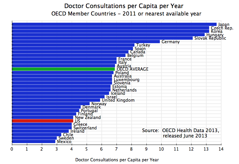
There were only 4.1 doctor consultations per capita in the US in 2011, which was 40% less than the OECD average of 6.9. Japan had 13.7 doctor consultations per capita.
Perhaps the greatest investment in basic medical care is in hospitals. Did the high US spending lead to greater hospital availability? Again, the answer is no:

The US had only 3.1 hospital beds per 1000 of population in 2011, which was 40% less than the OECD average of 5.2. Japan stands out from the others with 13.9 hospital beds per 1000 of population (4 1/2 times as many as in the US), followed by Korea at 9.6.
Despite the lower availability of hospital beds, was the US able to work in a similar or higher number of patients into that more limited capacity? Again the answer is no:
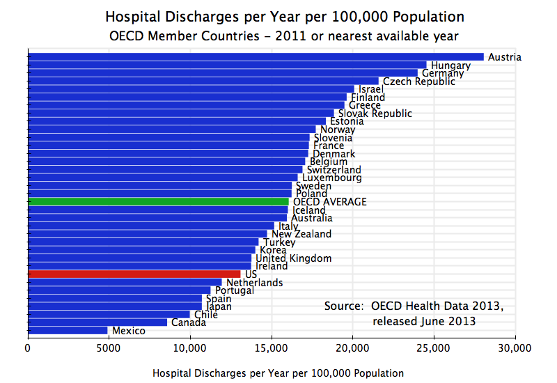
There were 13,091 hospital discharges per 100,000 of population in the US in 2011, which was 18% less than the OECD average of 16,057. While the utilization rate of the existing hospital capacity was somewhat higher in the US than in the OECD average, this higher utilization rate was not sufficient to offset the lower capacity. Austria had the highest number of hospital discharges per 100,000 of population at 28,063, more than double the US rate.
With more limited hospital capacity, what was the average length of stay?
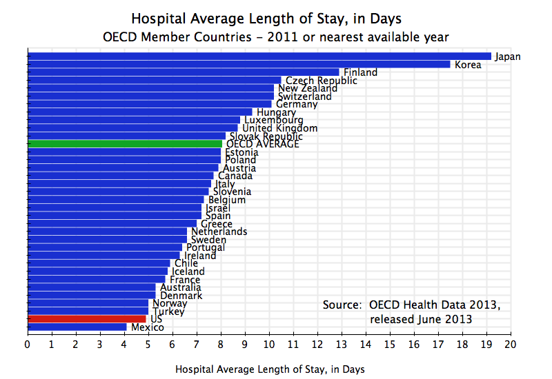
The average length of stay in a hospital in the US was only 4.9 days. Only Mexico had less among the OECD members at 4.1 days. The OECD average was 8.1 days, or 65% higher than for the US.
In summary, despite the fewer doctors in the US and fewer doctor consultations, and despite the far more limited days of an average hospital stay in the US and the lower number of hospitalizations and hospital bed capacity in the US, the US still spent on health care close to double what the average OECD country spent as a share of GDP, and two and a half times as much in absolute dollar terms.
D. The High US Expenditures Did Not Lead to Better Health Outcomes
The ultimate goal is of course good health outcomes. Availability of doctors and hospital services is just a means to an end, and not an end in itself. How does the US compare in terms of such outcomes?
First, one of the most common measures of the effectiveness of a health system is the infant mortality rate. This is a measure that is sensitive to the availability and quality of the care mothers and infants receive. The US rates poorly on this measure:

The infant mortality rate in the US was 6.1 per 1000 live births in 2011. Only Mexico, Turkey, and Chile were worse. The US rate was 50% worse than the OECD average of 4.07.
Overall life expectancy is another common measure of the quality of the health care system. Did the high US expenditures on health lead to a significantly higher life expectancy? No:

US life expectancy in 2011 was 78.7 years, below the OECD average of 80.1 years. The US rate was worse than that of two-thirds of the OECD members. And the only OECD members that ranked below the US have far lower average incomes.
Life expectancy is not a terribly sensitive measure of health care outcomes in an absolute sense, as the range from the highest to the lowest is relatively narrow. It is still meaningful in terms of ranking countries, but health experts find more useful a more sensitive measure that takes into account the age at which a death occurs. The measure “Potential Years of Life Lost” (or PYLL), is defined as the number of years lost from an early death, up to an upper limit set at age 70 (by the OECD; some others might use age 75 or something else). Thus a death at age 50 is taken as 20 years of potential life lost, and counts as twice as much as a death at age 60. The upper limit taken (70 in the OECD data) is essentially arbitrary, but as a relative measure across countries is fine as long as it is uniform.
Does the high spending in the US lead to a better outcome by this measure? Again, no:
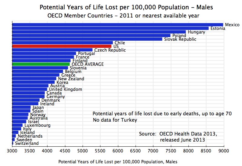
For males, the PYLL per 100,000 population for the US was 5,814 in 2011. This was 26% higher than the OECD average of 4,633. Only Mexico and four countries of Central Europe had significantly worse rates than the US (Chile was only a bit higher, and data was not available for Turkey). But incomes in these countries are far less than that of the US.
For females:
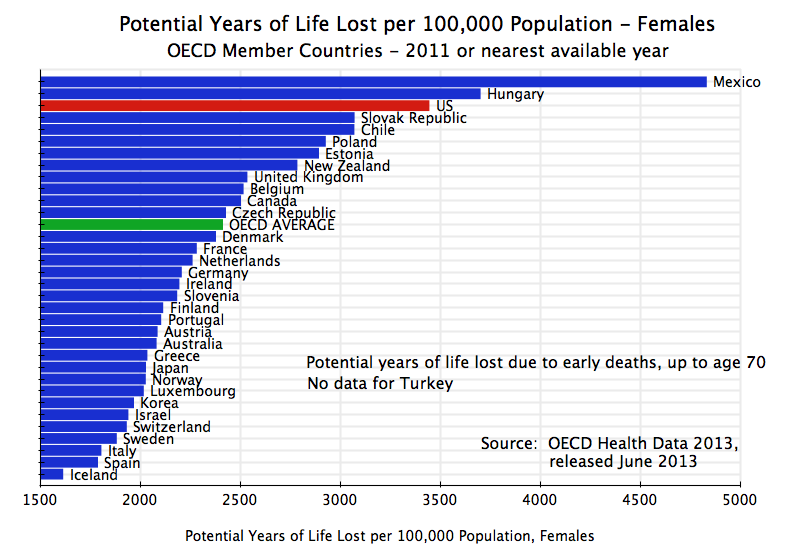
The US is the third worst at 3,447 (only Mexico and Hungary were worse), or 43% above the OECD average of 2,415.
In summary, the US ranks exceedingly poorly in terms of outcomes such as infant mortality or life expectancy. The only countries that rank worse are ones that are not only far poorer, but also spend far far less on health per capita. The US spends $8,508 per capita per year on health care (in 2011), and the only countries that rank worse on the outcome measures spend less than $2,000 per year, and some (Mexico and Turkey) less than $1,000 per year.
E. The Relative Performance of the US Has Worsened Over Time
The graphs above present a snap shot of the relative performance of the US in 2011. But perhaps the high levels of US spending has led to an improvement in the relative ranking of the US over time? Again the answer is no:

The comparisons here are taken relative to a sub-set of only the High Income OECD countries. While the trends would have been the same had the average for all current OECD members been used, a number of the more recent members (such as Mexico and Korea) were quite poor early in the period being covered here. A comparison only to the High Income OECD members is more fair. The High Income OECD members are defined as the US, Canada, Japan, Australia, New Zealand, and most of Western Europe (excluding Greece, Portugal, and Ireland).
Over the period 1960 to 2011, the US always spent considerably more than the High Income OECD average on overall health expenditures. In 1960, US spending as a share of GDP was 36% above the average, with that then falling somewhat (although erratically) up to 1978, where it hit a trough that was still 23% higher than the others. After that it rose sharply, and in 2011 US spending as a share of GDP was 69% higher than the High Income OECD average.
This consistently higher, and substantially higher, spending did not, however, lead to improving outcomes on a relative basis. The infant mortality rate in the US was roughly equal (indeed about 1% better) than the High Income OECD average in 1960. But by 2011, infant mortality was 75% higher in the US than in the other countries. And the Potential Years of Life Lost measures show a similar deterioration. The US PYLL measures were already 18% and 12% worse in 1960, for males and females respectively, and this then deteriorated to 53% and 57% worse in 2010 (there is not yet US data for 2011).
The high levels of US spending compared to the others did not lead to an improvement in the relative ranking of the US. Instead, US health outcomes have deteriorated substantially relative to other High Income OECD members over the last 50 years.
F. The Poor Record for the US Cannot Be Blamed on a High Share of Public Expenditure in the Total Spent on Health
Finally, one can use this same OECD data set to look at whether the poor US performance relative to the other OECD members can be ascribed to a high share of public expenditures in total health expenditures. Conservatives assert that the public sector is inefficient compared to the private sector, and hence might see this as a possible explanation of the poor US performance.
Anyone who knows even a bit about health systems in other countries will, of course, know that the share of public spending is far higher in those countries than in the US. But here are the figures:
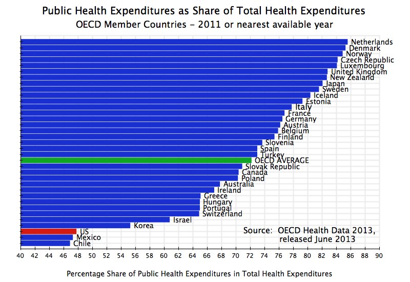
A large number of countries in Western Europe, as well as Japan and New Zealand, have the public sector accounting for over 80% of total health expenditures. The Netherlands is the highest at 86%, but several others are close. And most of the rest of Western Europe spends over 70% of health expenditures through the public sector. The OECD average is 72%.
But the US spends only 48% of its health expenditures through the public sector. This includes Medicare, Medicaid, the Veterans Administration, a number of special programs for children, health for federal retirees, and other programs. Only Mexico and Chile spend a smaller share than the US through the public sector, and they are close to the low US share.
If private spending was more efficient than public sector spending on health, the US would be at the very top of the performance measures. Instead it is at the bottom.
G. Conclusion
There can be little dispute that the US health care system and its funding is a disaster. The system as a whole is extremely expensive: The US spends close to 18% of GDP on health care, while no other country spends even 12%. This extra 6% of GDP on what health care costs in the US compared to anyone else in the world comes to $1 trillion each and every year. And it is this high and rising cost of health care which is the primary driver of rising future fiscal deficits, if nothing is done. Despite such high expenditures, the US health outcomes are mediocre at best.
Why is such a wasteful system sustained, and why is the Republican Party pushing so aggressively to block Obamacare and revert to the system as we have had up until now? One has to suspect that the primary reason is precisely that $1 trillion of excess expenditures each year. That $1 trillion goes to someone, and hence enormous vested interests have been created that benefit from the current excess. These include not only the insurance companies, but also pharmaceutical and medical device firms, many hospitals (a profitable business for several large firms), and others. Future blog posts will explore this further, and present recommendations on what might be done.

You must be logged in to post a comment.