Part Time Workers and the Affordable Care Act: A Proposal to Address the Real Issue

Part Time Workers as Share of Total Employed, Dec 2007 to Dec 2014

A.  Introduction

The Affordable Care Act (ACA, and also often referred to as ObamaCare) has been working well by any objective measure.  There are now more than 10 million additional Americans who have health insurance who could not get affordable health care before; the share of the uninsured in the US population is now a quarter less than what it was before the individual mandate of the Affordable Care Act went into effect; and this has been achieved at premium rates for the new plans that are reasonable and well less than opponents charged they would be.  Health care costs have also stabilized under Obama, both as a share of GDP and in terms of health prices relative to overall prices, in contrast to the relentless increases in both before.  And while some have criticized this, it is good that there are now minimum quality and coverage standards in health insurance plans.  Such standards are good in themselves.  And without such standards, purported health care “plans” which offer next to nothing (due, for example, to extremely high deductibles) and which can then cost next to nothing, would lead to a death spiral for genuine health care plans that cover costs when you are sick and need treatment.

Gains from the ACA are also reflected in the findings of a recently published report from The Commonwealth Fund.  The Commonwealth Fund has been organizing a periodic survey on health care coverage since 2001.  The most recent survey (for 2014) found that for the first time since the question was first asked in 2003, there was a reduction in the number of Americans avoiding (because of cost) health care services that they needed.  And for the first time since the question was first asked in 2005, the number reporting medical bill or debt problems also fell.  Personal financial distress due to medical problems has been reduced, due to greater access to health insurance and due to health insurance plans that now meet minimum standards.

Despite this (but not surprisingly given the position they staked out against the reform), the Republican Congress continues to vote to repeal, or at least weaken, the law.  The most recent vote was aimed at the provision in the Act which complements the individual mandate to purchase health insurance, with an employer mandate requiring firms with 100 full time equivalent employees or more from January 1 of this year (and with 50 or more from January 1, 2016) to offer health insurance to their full time employees or pay a fee.  The proposed Republican bill would change the definition of a full time worker from one who normally works 30 hours or more a week, to one who works 40 hours or more a week.

The supporters of the change charge that the prospect that employers (with 50 or 100 employees or more) will soon be required to offer health insurance to their full time employees has led firms to cut working hours of their employees, to shift them from full time to part time status, and hence avoid the employer mandate of the ACA.  As a Republican congressman from Texas said:  “We have heard story after story from every state in the union that employers are dropping workers’ hours from less than 39 hours a week to perhaps less than 29.”

This accusation is confused on several levels.  This post will first look at whether there is in fact any evidence that workers are being shifted from full time to part time status as a result of the ACA (or indeed for any other reason).  The answer is no, at least at the level of the overall economy.  Second, there has been a good deal of confusion in the discussion on what the issue really is with regard to part time workers, including by prominent congressmen such as Paul Ryan.  Either Ryan does not understand what the employer mandate is, or if he does, then he has deliberately mischaracterized it.

The public discussion has also avoided altogether the real issue.  It is not that firms with 50 workers or more would be required to offer health insurance to their employees (most do already), but that this insurance is only made available to their full time workers.  Part time workers get nothing, no matter what size firm they work at.  The final section of this blog post will discuss a way to resolve this equitably.

B.  What is the Evidence on Whether the ACA Has Increased the Ranks of Part Time Workers?

The opponents of ObamaCare assert that as a result of the employer mandate, firms have been shifting workers from full time to part time status.  E.g., instead of employing one worker for 40 hours, they are choosing to employ two workers for 20 hours each.  If true, the ratio of part time workers to the total employed will rise.

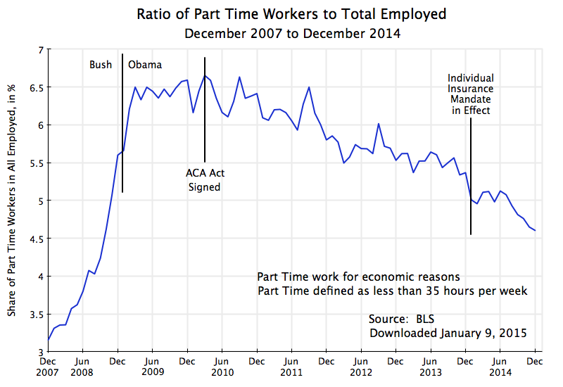
The chart at the top of this post shows this has not been the case.  It is based on data from the Bureau of Labor Statistics, from its Current Population Survey.  This monthly survey of households is used to determine the unemployment rate among other statistics.  The households surveyed are asked whether household members are employed full time or part time (if employed), and if part time, whether this is by choice (because they only want to work part time) or because they want a full time job but cannot find one.  The chart above shows the ratio of workers who are working part time not by choice but for economic reasons, to all workers employed.  Note that the BLS data defines a part time worker as one with fewer than 35 hours of work per week.  While this differs from the 30 hour standard in the ACA, as well as the 40 hour standard in the recently passed Republican legislation, the results in terms of the trends should be similar.  The BLS does not publish data with a different cutoff in terms of hours per week for what is considered part time work.

As in any economic downturn, the ratio rose rapidly in the economic collapse of the last year of the Bush administration.  Regular jobs were disappearing, with some of them shifting to part time status.  Indeed, the absolute number of part time jobs was increasing at the time, even as the total number of jobs was falling, thus leading to two reasons for the ratio to rise, and rise rapidly.

The ratio reached a peak soon after Obama took office, and began to fall about a year later.  Since then it has fallen at a fairly steady pace in terms of the trend.  There were sometimes relatively sharp month to month fluctuations in the data, but this can be on account of statistical noise.  The data comes from a limited sample of households, with only 5 to 6% or so of those employed on part time status (for economic reasons) for most of this period, so the statistical noise in a relative sense (month to month) will be large.  But the downward trend over time is clear, and at a similar downward pace for close to five years now.

What one does not see is any shift in this downward trend linked either to the signing of the Affordable Care Act in March 2010, or to the start of the individual health insurance mandate in January 2014, or to the anticipation of the start of the employer health insurance mandate in January 2015.  Note that since the classification of a worker as a full time or part time worker (and hence the classification of the firm as crossing the 100 or 50 full time worker standard) will be in a period of up to 12 months before the employer mandate goes into effect, one would have seen an impact in 2014 if the 2015 mandate mattered.  There is no indication of this.

The data cover the overall economy.  The figures refer to millions of workers as well as millions of employers.  The US is a large place.  Within such a large place, it will undoubtedly be possible to find particular cases where employers will say that they reduced worker hours to part time status so that they could avoid the health insurance employer mandate.  And one could indeed probably find a long list of firms making such statements.  It would be even easier to find a long list of firms and other entities where working hours were cut, whether or not there was any employer mandate pending.  In a dynamic economy, there will always be a large number of such cases (along with a large number of cases of firms going in the opposite direction, converting part time jobs to full time jobs).

Such anecdotal information, and even a long list of such anecdotes, is not evidence of an issue of substantial scale.  As seen above, there is no evidence of it in the overall numbers.  But one should still recognize that the issue could exist in particular cases.  The question, however, is what is the real issue here, and if there is one, how can it be addressed.

C.  What the Employer Health Insurance Mandate Says

For better or worse, the US health care insurance system is built around health plans normally provided to workers through their place of employment, as part of their overall wage compensation package.  The system began during World War II and has expanded since, supported through substantial tax advantages.  By now, health insurance provision is close to universal among large employers, but substantially less so among small private firms:

Share of Private Firms Offering Health Insurance – 2013
< 10 employees 28.0%
10 to 24 employees 55.3%
25 to 99 employees 77.2%
100 to 999 employees 93.4%
≥ 1000 employees 99.3%
< 50 employees 34.8%
≥ 50 employees 95.7%
All private employees 84.9%
Source:  MEPS, Tables I.A.2 and I.B.2 (2013)

Overall, 84.9% of private sector employees are in firms that offer health insurance as part of their wage packages.  And 96% of firms with more than just 50 employees offer health insurance.

The Affordable Care Act built on this and did not replace it.  Liberals (including myself) would have preferred moving to a system where Medicare would be extended to cover the entire population rather than just those over age 65.  Medicare is an efficient and well managed program, and as an earlier post in this blog discussed, its administrative expenses come to only 2.1% of the benefits paid.  In contrast, administrative costs (including profits) of private health insurance are seven times higher at 14.0% of benefits paid, and an even higher 18.6% of benefits paid in the privately administered Medicare Advantage plans.

But Obama agreed instead to support an approach first proposed by the conservative Heritage Foundation, which was then put forward by Republicans in Congress as their alternative to the health reforms proposed by the Clinton administration (coming out of the task force Hillary Clinton chaired), and which was later adopted in Massachusetts when Mitt Romney was governor.  These plans were built around keeping the existing employer-based provision of health insurance for most of those employed, but to complement this with markets where individuals could purchase health insurance directly if they did not have employer-based coverage, coupled with an individual mandate to buy such health insurance.  The individual mandate is necessary to counter what would otherwise be a resulting death spiral of health insurance plans if everyone is granted access (including those with pre-existing conditions) but only the sick then purchased health insurance (for a description and discussion, see this earlier Econ 101 blog post).

It was not unreasonable to believe that the Republicans would not oppose a plan whose origins lies in their own earlier proposals, but that was not to be.

As noted, the individual mandate is necessary to avoid death spirals in health insurance plans for individuals.  Complementing this, an employer mandate to offer health insurance to their employees is necessary to counter what could otherwise be a “race to the bottom”.  If certain firms did not support such health insurance for their employees, thus reducing the cost to them of their workers, they could undercut competitors who did provide good health insurance support.  It could lead to a race to the bottom.  While not yet widespread in the US, especially for larger firms (see the table above), there has been increasing competitive pressure in the US over the last couple of decades to cut such health insurance support.  An increasing number of employers have done so.

Thus the ACA includes an employer mandate to complement the individual mandate.  However, while the individual mandate went into effect on January 1, 2014, the employer mandate has been twice delayed, and has now (as of January 1, 2015) gone into effect for firms employing 100 of more full time equivalent employees, and will go into effect on January 1, 2016, for firms employing 50 or more full time equivalent employees.  It is this provision that the Republicans in Congress are now trying to subvert.

The charge by Paul Ryan and others has been that medium to small size firms have been cutting the hours of their employees to shift the workers from a full-time classification to a part-time one.  The aim, they say, has been to reduce the number of their full time workers to below 50 so as to avoid the employer mandate.  For example, in a recent opinion piece published in USA Today, Congressman Ryan wrote:  “The law requires employers with more than 50 full-time employees to give them health insurance.  But because the law defines “full time” as 30 hours or more, employers are keeping employees below that threshold to avoid the mandate entirely.”

However, that is not what the law says.  Precisely to avoid such an incentive, the boundaries on the size of a firm subject to the employer mandate is defined in terms of full time equivalent workers (whether 50 or 100).  That is, if a job is split from one full time worker to two half time workers, the number of full time equivalent workers is unchanged.  The two half time workers count as one full time worker for the purposes of the statute.  Cutting back on the number of hours of individual workers to make them part time will not change the status of the firm when the total hours of labor to produce whatever the firm is producing remains unchanged.  And it would be foolish for a firm to produce and sell less when the demand exists for such sales, simply to avoid this mandate.

There is, however, a critically important issue here which Ryan and his colleagues have not discussed.  While splitting jobs of full time workers into multiple part time jobs will not change the status of the firm on whether it is subject to the employer mandate, shifting workers from full time to part time status does affect whether the firm would be required to include health insurance as part of their wage compensation package.  Firms subject to the mandate must offer an affordable health insurance plan available to at least 95% of full time (not full time equivalent) workers, or pay a fee.  The fee (of up to $2,000 per year per worker, less 30 workers per firm) is designed to partially offset (and only very partially offset) the cost of health insurance that they are shifting to others.

But such health insurance typically only is provided to full time workers.  This is true even for giant corporations.  Hence a firm can avoid making health insurance available to its workers by shifting them from full time to part time status.  This has always been the case, and is indeed a problem.

The Affordable Care Act addresses the issue only partially and tangentially.  By including a definition of what constitutes full time work at 30 hours a week or more, the ACA reduces the incentive to shift workers from the traditional 40 hours per week for full time work, to just under 40 hours in order to avoid providing health insurance cover.  A firm would need to cut a normal worker’s hours to below 30 hours per week to avoid providing health insurance, and is unlikely to do that for its regular work force.  But by moving the dividing line up to 40 hours per week, as the Republican legislation passed on January 8 would do, one opens up a loophole for firms to reduce worker hours from 40 to say 39 per week (or 39 1/2 or even 39.99 I would suppose).  Firms would be able easily to avoid offering health insurance to what are in reality their regular, full time, workers; use this to undercut competitors who do offer such insurance; and thus spark a race to the bottom on health insurance coverage in those industries.

D.  Addressing the Problem of Health Insurance for Part Time Workers

As noted above, the ACA does not do much to address the problem of part time workers receiving nothing from their employers for the health insurance everyone needs.  Setting the floor at 30 hours per week helps by ensuring workers close to the traditional 40 hour workweek will receive an employer contribution to their health insurance, and avoids the incentive to shift workers from 40 hours per week to just a bit below.  But part time workers of less than 30 hours per week will still normally receive nothing from their employer to help cover their health insurance.  And it creates an incentive for employers to structure positions as two workers at 20 hours per week, say, than one at 40.  While whether or not the firm was subject to the employer mandate would not be affected (since it is expressed in terms of full time equivalent workers), whether or not the firms would need to provide anything in terms of health insurance would be affected.

But there is a way to address this, now that the individual health insurance marketplaces are operational under the ACA.  All firms could be required to contribute an amount for their part time workers proportional to the hours of such part time work to what full time work would be.  That is, if two workers are each working half time, the firm would contribute an amount of 50% (for each) of the cost of the employer contribution to the health insurance for one full time worker.  The total cost would be the same whether the firm employed one full time or two half time workers.  There would also then not be an incentive to split jobs from full time workers to multiple part time workers.

The employer contribution to the part time worker’s health insurance costs would then be paid, along with taxes such as for Social Security or Medicare, to the government in the name of the specific part time worker.  These funds would then be used as a partial pay down of the costs of that worker purchasing health insurance on the individual health insurance market exchanges set up under the ACA.  And while other splits could be considered, I would recommend that those funds would be split half and half between what the worker would need to pay on the exchange for his or her health plan, and what the government subsidy would provide.

A simple numerical example may help clarify this.  Using made up numbers, suppose the full monthly cost of a standard (Silver level) health insurance plan on the individual exchange where the worker resides is $400.  Assume also that at the current income level of this (part time) worker, the government subsidy for such insurance would be $200 per month, while the worker would pay $200 per month.  Now assume that firms would be required to pay proportional shares of what they provide to full time workers for their health insurance, and that this would come to $100 per month for this part time worker.  This would be split half and half between what the government subsidy would be and what the worker would pay, so under the new approach the government would provide $150, the worker would pay $150, and the funds coming from the firm would cover $100, summing to the $400 total cost.

A few specifics to note:  Many part time workers hold down multiple jobs.  They would receive for their “account” the total proportional amounts from all of their employers.  Many part time workers are also part of married couples.  There could be a household account into which all the sums were paid (for each family member), which could be used to purchase a family health plan on the exchanges.  In the event that the family was not purchasing insurance through the exchange (perhaps, for example, because the spouse worked at a firm providing family coverage), the amount paid by the firm for the part time worker would be returned to the firm (or canceled from the start).

And if the total amounts paid in from the full set of employers for that individual (or family) led to the government subsidy falling all the way to zero, any excess would be allocated to what the individual would pay for the insurance.  This could be common in cases where the family income of the part time worker was close to, or above, the income limit on which government subsidies are provided.

It is only with the advent of the individual health insurance exchanges that this method for covering part time workers became possible.  Previously, firms were not in a position to purchase half of an insurance policy for a half time worker.  But now they can contribute an amount equal to half the cost, with this then used to help purchase coverage on the individual marketplace exchanges.

Note also that with this reform, it would matter less whether full time work was defined as 30 hours per week or 40 hours per week or whatever.  I would recommend keeping the 30 hour per week boundary as it would be a factor in determining what the employer contribution would be.  But it would not be as critical as now, where the boundary determines whether 100% of the employer share of the health insurance cost is paid or 0% is paid.  There would be a smooth transition (a worker of 39 hours when 40 hours is defined as the standard would still receive 39/40 of the payment, and not zero), without a drop straight to zero.

There would also be no reason to limit this extension of the employer mandate only to firms with 50 (or 100) or more full time equivalent workers.  All firms should make such a contribution to covering the cost of their workers’ health insurance needs, just as they all make a contribution to Social Security and Medicare taxes.  Indeed firms of whatever size (although this will soon apply only to firms with less than 50 full time equivalent workers) that do not have any health insurance plan for their staff should participate.  The amounts paid could be set as a proportion to the cost of the medium Silver level plan available on the individual health insurance exchanges in their area.

Undoubtedly, there will be assertions by the Republicans that requiring such a contribution to health insurance costs for their part time workers will lead to an end to such jobs.  This would be similar to the arguments they have made that raising the minimum wage will lead to higher unemployment of lower paid workers, and arguments that were made earlier that paying Social Security taxes would lead to higher unemployment.  But as was discussed in an earlier blog post, there is no evidence that increases in the minimum wage in the magnitudes that have been discussed have led to such higher unemployment.  Ensuring firms contribute proportionally to the health insurance costs of their part time workers would not either.

The Cost of Health Care Has Stabilized Under Obama

Total National Health Expenditures as Share of GDP, 1980-2013

A.  Introduction

The Centers for Medicare and Medicaid Services (CMS) released in early December its regular annual estimate of overall health care expenditures in the US.  Their highly detailed tables start in 1960 and now go through 2013, and they provide the most reliable and complete regular figures on health care spending in the US.  While a number of news outlets noted that national health care expenditures had once again remained stable at 17.4% of GDP under Obama (for the fifth straight year now), there is much more that one can derive from these numbers that is of interest to anyone concerned with US health care expenditures.

B.  National Health Care Expenditures as a Share of GDP

The stability of total national health care expenditures at 17.4% of GDP under Obama is indeed significant.  But it is not unprecedented:  Health care expenditures were also stable as a share of GDP for an extended period during the Clinton administration.  But the general path has been strongly upward over recent decades, with the share now close to double what it was in 1980.  Large increases during the Reagan/Bush I and Bush II presidential terms were not offset by the stability during the Clinton and Obama years.  While I have not examined in detail the primary reasons for this difference, I would suspect that a factor has been the greater willingness during Democratic administrations to use government initiatives to hold down health costs.

But while the share of health expenditures in GDP in current prices has almost doubled over this period, the share expressed in terms of constant prices has been flat.  That line is also shown in the chart above, in red.  While there is no published estimate of a price deflator specifically for overall national health expenditures, it is reasonable to use the price deflator in the GDP accounts for personal consumption of health care.  The personal consumption figure accounts for about two-thirds of national health care expenditures, where the remainder will be for such items as investment in hospitals and equipment, for direct government expenditures on health care such as for doctors in the military and in the Veterans Administration, and for research.

Using this price deflator, the share of health expenditures in GDP in real terms in fact declined some over 1980 to 2000, rose by an equal amount between 2000 and 2009, and since then has been flat, to end in 2013 at the same share as it was in 1980 (8.9% of GDP in terms of the prices of 1980).  This is pretty remarkable.  Despite an aging population over this period, where older people require much more health care services than younger ones do, US spending on health care as a share of GDP would have been no higher in 2013 than it was in 1980 if the price of health care relative to overall prices (the GDP deflator) had not changed.

Note that this is not a result of the prices of 1980 as being something special.  The same result would have been found using the prices of any year.  And while not shown in the diagram above, the constancy of the share of health expenditures in GDP in real terms held back to the mid-1970s.  The share rose from the mid-1960s to the mid-1970s, in part due to the introduction of Medicare (the Medicare Act was passed during the Johnson administration in 1965, and the program started in 1966).  The increase in share over that period was by about a quarter (from a bit over 7% to a bit less than 9% of GDP, all in terms of 1980 prices).  It has since been relatively constant.

C.  Relative Prices Matter

The GDP share could only rise in current prices when it was flat in constant prices because the price of health care rose relative to the general price deflator for GDP.  This is just arithmetic.  It is therefore of interest to look more closely at what has happened to the relative price of health care.

For the period since 1980, health care prices have consistently out-paced the rise of overall prices until the last few years:

Change in Relative Price of Health Care vs. GDP, 1980-2013


The price index for GDP is a weighted average of the prices of all goods and services produced by the economy.  That is, and speaking loosely, a GDP price index rising by say 2% implies that about half (in weighted terms) of all prices rose by more than 2% while about half rose by less than 2% (including some that could have fallen).

What is unusual for the health care price index is that it has risen consistently faster than the overall GDP price index, until recent years.  The increase was particularly rapid during the Reagan / Bush I years, with the health care price index outpacing the GDP price index by 4.1% per year on average over this period.  For the more technically minded, the GDP deflator rose at an annual average rate of 3.9% over this period, while the health care price index rose at an annual average rate of 8.2%, so the relative price rose at the rate of 1.082/1.039, which equals 1.041, or 4.1% a year.

A 4.1% relative price growth compounded over 12 years (1980 to 1992) is huge:  At that rate, health care prices rose by 62% more than overall prices over that 12 year period.  And that is the immediate cause of health care rising as a share of GDP from 8.9% to over 13% in current prices over the period, despite a slowly falling share in real terms.  Real health care consumption relative to GDP fell, but total health care expenditures still rose relative to GDP in current dollar terms due to the higher relative prices for health care.

The relative price of health care relative to GDP then continued to rise, but at a much slower pace, during the Clinton years.  It then bounced back up some during the Bush II years (other than in 2005 and 2006, when the GDP deflator rose in the peak years of the housing bubble and then matched the increases in the price deflator for health care in those two years).

Under Obama, the relative price of health care came back down, and indeed was significantly negative in 2011 for the first time since before 1980.  This was then followed by two further years of zero or negative growth.  There have not been three consecutive years zero or negative growth in the relative price of health care in the US since 1946 to 1948, two-thirds of a century ago.

The Obamacare reforms account for at least some of this.  The Affordable Care Act (Obamacare) was passed in early 2010, and while the insurance coverage reforms (making health care insurance coverage available for all Americans) only went into effect in 2014, other health care reforms went into effect immediately.  These included a wide range of individually modest, but cumulatively significant, measures to bring down costs.  For example, the Medicare system for compensating hospitals now is set up to provide a financial incentive for good rather than poor quality care.  Under earlier systems, hospitals were paid more when the patient received poor quality care and got an avoidable infection, for example.  Such measures improved efficiency and brought down costs.

D.  Even At a Constant Share of GDP in Real Terms, Per Capita Consumption of Health Care Can Still Rise 

The relative price of health care has stabilized for three years now under Obama, while the share of health care expenditures in GDP, whether in real or nominal terms, has stabilized for five years.  But has this been achieved at the cost of reducing the availability and use of health care?  No:

Growth of Real Per Capita Personal Consumption of Health Care, and of Real GDP, 2001-2013

This diagram plots what has happened since 2001 to real per capita national health expenditures (from the same figures as used above from the CMS, but now converted into real per capita terms), real per capita personal consumption of health care services (from the GDP accounts), and real per capita GDP.  The figures are all scaled to equal 100 in 2008.  The national health expenditure and personal consumption of health care lines track each other fairly closely.  One could have used either.

As the graph shows, real per capita expenditures on (or use of) health care services have increased each year over this period.  There was still an increase, although at a slower pace, in the peak years of the economic downturn in 2009 and 2010.  And the increases continued, at a strong pace, in 2011 to 2013, when GDP was recovering as well.

When health expenditures stabilized as a share of GDP under Obama, some analysts at first speculated that this was due to lower consumption of health care services during the economic downturn.  Unemployment was high and many had less access to health insurance.  But use of health care services did not fall during the downturn.  And it then came back strongly in 2011 to 2013.  The stable share of GDP has been due to stable prices for health care since 2011, with real per capita health care expenditures then rising at a similar rate as rising real per capita GDP.

E.  Why Isn’t the Figure for National Health Expenditures Equal to 18% of GDP? 

An earlier post in this blog in the series on health reform stated that the US has been spending close to 18% of GDP on health care.  This was 50% more than the second highest spending OECD country (the Netherlands) and close to double the average spent of all OECD countries.  The figures were for 2011 and came from the then current OECD data for the US and other OECD countries (close to, but not quite the same as, the national health expenditure totals from the CMS for the US).  Why are the figures for the US now at 17.4% of GDP in 2011, as well as since?

The US health expenditure numbers have in fact not changed.  They are still expected to total $3 trillion in 2014.  The reason for the difference (aside from round-off:  they were a bit below 18% in the earlier numbers) is that the estimate of the denominator in the health expenditures to GDP ratio has changed.  In the summer of 2013, the BEA revised its methodology for estimating GDP, as it periodically does.  While there were several changes, the one with the largest impact was to revise the treatment of research and development expenditures.  The BEA had before treated such expenditures as what economists call an intermediate product (a good which is immediately used up as goods are produced, much like coking coal is used up in the production of steel).  They decided it was more appropriate to treat them as an investment product, which will last for several years (depreciating over time).  This was purely a methodology change.  But the effect was to revise estimated GDP up by about 3 to 3 1/2% in recent years.  This was not just applied to the GDP figures of recent years, but rather to the full GDP series going all the way back to 1929.  Hence the year to year growth rates were largely unaffected.

But a denominator which is now larger will lead to a health expenditure share in GDP which is lower.  By simple arithmetic, a share of 17.9% of GDP will fall to 17.4% of GDP if GDP is estimated to be 3% higher than before.

F.  Conclusion

Health care costs stabilized during Obama’s tenure, with health care costs as a share of GDP now flat (in both constant and in current prices) in contrast to the big increases (in current prices) before.  This has not come at the expense of falling availability or use of health care services.  They have continued to grow throughout his presidency, and especially since 2010.

Looking forward, 2014 may be different.  The Obamacare insurance reforms came into effect in 2014, and have reduced the ranks of the uninsured by more than 10 million Americans.  The share of the population without any health insurance fell by over 30%.  The newly insured are likely to make greater use of regular health care services in 2014, especially by those who previously had conditions which had been left untreated due to an inability to pay before.  However, this may be offset by fewer emergency room admissions by those who previously had no other option, where emergency room care is an especially expensive way to deliver health care services.

It is not clear what the net effect will be.  Preliminary quarterly GDP data (for the first three-quarters of 2014) do not show a rise in the share for personal consumption of health care (there was a growth in real terms similar to the growth in real GDP).  But these numbers are still early and preliminary.  And the full national health expenditure numbers for 2014 will not be out until next December.

But so far, health expenditures as a share of GDP have stabilized under Obama, and the preliminary indication is that this is continuing in 2014.  This is a major achievement.  But they have stabilized at what is still a very high share of GDP, far higher than what is spent on health in other OECD countries.  Much more aggressive and fundamental reform will be necessary to bring the share down to the far lower levels of what other countries spend, and yet obtain  health outcome results that are similar to or better than the outcomes in the US.

The High Cost of the Purple Line Light Rail Transit Project: Free Bus Service Would Be Cheaper For Everyone, and Provide a Better Service

Purple Line Costs vs BRT

A.  Introduction

The Purple Line is a proposed light rail transit project that would thread itself through suburban neighborhoods over 16 miles in an arc from the east of Washington, DC, to its north.  It is a controversial project, but with strong political pressure to sign soon a contract with a private concessionaire who would construct and then operate the rail line over a 30 year life.  The aim is to begin construction in 2015, complete construction by late 2020, and open the line to ridership by early 2021.

The project is controversial for several reasons.  There are environmental and noise concerns, as a portion of the line will be routed over what is now a park (on an old, abandoned, rail line) with a walking and biking trail that is the most popular in Maryland in terms of usage.  Two parallel rail lines would be built on this trail, with a new trail then built alongside the tracks, necessitating the clear cutting of the mature trees along the trail to allow for the much wider right of way.  There will also be major noise issues, as frequent trains (every 10 minutes in each direction during the off-peak hours, and every 6 minutes during the peak) will go by, until 3:00 am on weekends and starting at 5:00 am on week-day mornings.  Homes now backing on to a quiet park will instead have to contend with the noise of the frequent passing trains.  No compensation will be provided to those adversely impacted, and it should not be surprising that they, as well as others, are opposed.

The line is also expensive.  The most recent estimate, from July 2014, puts the capital cost alone at $2.4 billion, with annual operating costs then of $58 million.  But the Purple Line will only serve suburban neighborhoods of medium to low density, so ridership will not be high.  The cost estimates are of course only estimates, and the final costs will not be known until the work is completed (when it is too late to do anything).  Based on past experience with such projects, one should expect that the final costs will be substantially higher than these estimates.  And as will be discussed below, the published cost estimates do not even cover all of the costs that will be incurred for the Purple Line.  Finally, even these estimates have increased substantially from what they were initially.  As late at June 2007, with initial design work well under way and alternatives being considered, the estimated capital cost was only $1 billion.  Subsequent estimates were $1.5 billion (in August 2009), $1.9 billion (in September 2011), and $2.2 billion (in September 2012).  The most recent estimate is $2.4 billion.  Few will be surprised if this goes higher, and perhaps much higher.

These cost totals by themselves do not tell us much, however, unless they are put in the context of how many riders will use the system.  While thousands of pages of documents have been posted on the web on the proposed project, with the Final Environmental Impact Statement (FEIS, August 2013) the most comprehensive review, I have not been able to find any serious economic analysis of the project, nor of the alternatives to provide such transit services.  The FEIS does describe in great detail a set of alternatives it states they considered, and I am sure such work was done.  There are full chapters in the FEIS on the alternatives (see in particular Chapter 2 and Chapter 9).  But figures are not presented which would allow one to compare one alternative to another.

Evaluating major projects such as this is something I did during my career at the World Bank.  This blog post will summarize estimates I have made of what the full costs of the Purple Line will be, and will compare these to some alternatives.

B.  The Cost of the Purple Line

A transit project such as the Purple Line will incur both upfront capital costs to build the system, and then annual operations and maintenance (O&M) costs to operate it.  Ridership will start only once the system is built, and then should grow over time.  Determining the full cost of the system per boarding (one rider getting on board for one trip) is therefore complex.  While it would be easy to determine the annual O&M costs per boarding once the system is up and running, one should not ignore the up-front capital costs that are incurred.  And since the capital costs are incurred up-front, there will be interest costs, either explicit (for what the private operator borrows) or implicit (if government grants are used –  but such funds will still need either to be borrowed or to come from some other use, so there will be an opportunity cost in such usage of the limited funds available).  One cannot simply ignore the costs of these funds, and yet the published analysis appears to do just that.

One therefore needs to use a spreadsheet which separates out by year when the costs are incurred (both capital and O&M costs), and when the ridership occurs.  One can then calculate what the cost would be per boarding which, over some given lifetime, would cover the full costs incurred by building and then operating the Purple Line.  If riders are charged this cost per boarding (and assuming the projected ridership would still be the same, even though such a fare was charged), the system would cover its costs from the ridership.  While transit systems rarely cover their full costs from the fare box, one will still need to know what this cost will be to judge whether the system is worthwhile, as well as to judge whether some alternative would be a better use of the funds.

The Technical Note at the bottom of this post describes in some detail the methodology followed, the sources for the data used, and the assumptions then made.  The end result is that the estimated full cost for the Purple Line comes out to be $10.42 per boarding, in terms of constant dollars of 2012.  This is a lot.  The riders on the Purple Line will mostly be making only short trips of just a few miles, connecting to Metrorail lines and/or traditional bus routes to get to and from work.  At $10.42, private taxi service would likely normally to be cheaper.

The busiest portion of the route is expected to be between Silver Spring and Bethesda, connecting two business centers each on two effectively separate Metrorail lines (although in fact they are the same line, after looping through downtown Washington, DC).  This is the portion of the route that would destroy the existing park.  It is only 4.3 miles long, and the time savings would be small.  Existing local bus service between these two points only requires 17 minutes, and that is during rush hour.  The Purple Line light rail service would require 9 minutes, producing a savings of only 8 minutes.

It is expected that few if any travelers would ride the full 16 miles of the line.  Traveling that route on the Purple Line would take an estimated 63 minutes based on the current design.  But one could travel between the same two points on the existing Metrorail service in 51 minutes now, during rush hour.  The Purple Line is designed for local service.

Riders would of course not pay that $10.42.  If they were charged such fares for the short trips being taken, very few would take the Purple Line (as noted, taxis would likely be cheaper).  The FEIS (Chapter 3, page 3-8) estimates that the additional fare box revenue in 2040 (but in 2012 dollars) would be $9,615,564 (which is more precise than one would think they intend).  Based on the FEIS ridership projections, this comes to just 38 cents per boarding.  It is so low because most of the riders would be transfers to and from Metrorail and traditional bus services, or would displace ridership on existing services.  Transfers pay zero or small additional fares.

The cost per boarding of $10.42 and the fare per boarding of $0.38 implies that the subsidy that would be provided to those riding the Purple Line would be $10.04 per boarding.  These figures are shown in the chart at the top of this post.  A subsidy of over $10 per ride is huge.

C.  Comparison to a Bus Rapid Transit System for Montgomery County

To put the $10.42 per boarding cost of the Purple Line in perspective, one needs to look at alternative forms of transit.  Montgomery County, Maryland (through which roughly half of the Purple Line will run) is also looking closely at use of Bus Rapid Transit (BRT) systems for certain of its public transit routes.  A consultant’s report completed in 2011 commissioned by the county provides figures that can be used to provide perspective on the Purple Line costs.

A Bus Rapid Transit system provides high-capacity and streamlined bus services along selected routes.  By use of larger buses, dedicated stations where one will pay the fares before boarding (thus streamlining boarding), various road improvements and perhaps dedicated bus lanes, one can provide transit services that are significantly faster than, and more comfortable than, traditional bus services.

The Montgomery County BRT study looked at a system whose capital cost came to an estimated $2.4 to $2.6 billion (in 2012 dollars).  This was roughly the same, coincidently, as the current estimated cost of the Purple Line Light Rail project.  But what one would obtain for that similar investment would be far more:

Comparison of Purple Line to BRT BRT Purple Line Difference
Capital Cost $2.4 to $2.6b $2.43b similar
Number of routes 16 1 16 times
Number of miles covered 150 16 9.4 times
Daily boardings, 2040 (mid-point) 186,300 59,130 3.2 times
O&M cost per boarding (mid-point) $2.424 $2.688 10% less
Total cost per boarding $4.16 $10.42 60% less

The Montgomery County BRT system would cover 16 routes, versus only one for the Purple Line.  It would cover 150 miles, versus only 16 for the Purple Line.  The projected daily boardings in 2040 of 186,300 (based on the mid-point of the range projected) would be over three times the 59,130 projected for the Purple Line.  And the operational and maintenance (O&M) costs per boarding (again based on the mid-point of the range in the BRT study) would be 10% less.  Normally one justifies the higher capital expenditures per mile of a rail system by its then lower O&M costs.  But the O&M costs of the Purple Line would be higher.

The full cost (including capital costs) per boarding of the BRT system is then far below the cost of the Purple Line.  As discussed above, the estimated full cost of the Purple Line would be $10.42 (in 2012 dollars).  Using a similar methodology, but with the BRT cost and ridership estimates, the full cost of the BRT system would be $4.16 per boarding, or 60% less.

The BRT system would be a far better investment, then, of the scarce transit dollars available.  Many more people would be served, at a far lower cost.  For the Purple Line corridor itself, various BRT systems (as well as alternative light rail systems and other options) were examined by the Purple Line consultants, but rejected in favor of the light rail system selected.  However, I cannot find in any of the thousands of pages of documentation now posted any presentation of figures on the total cost per boarding of a light rail system versus a BRT for the selected route.  It is not clear if this was ever examined.  And some have argued that the BRT alternative was never seriously considered as an option, but rather that the light rail approach was chosen early, with the analysis then done by the hired consultants directed at justifying this choice.

It is possible that the BRT alternative was rejected for the Purple Line corridor due to the nature of the streets it would pass through, in particular on the Prince George’s County portion of it.  However, a BRT would likely work quite well for the section between Silver Spring and Bethesda, where there is a four-lane major road connecting the two centers.  A BRT could simply run along that.  A BRT would also provide an option to loop up to another major employment center just north of Bethesda, where the Naval Medical Center and headquarters (and main labs) of the National Institutes of Health are located.  The proposed light rail system would not do that.

Use of a BRT line between Silver Spring and Bethesda would also mean that the linear park between the two would not be destroyed.  A hybrid system of light rail up to Silver Spring, and then BRT between Silver Spring and Bethesda, would be a possible compromise.  The BRT could then join up with north-south BRT lines being planned separately for Bethesda, as well as BRT lines being planned for Silver Spring.

D.  A Cheaper and Better Alternative:  Free Bus Service

As noted above, the subsidy of over $10.00 per boarding for the Purple Line is huge.  The cost will be borne in one form or another (either capital subsidies or operational payments) by the government, and hence ultimately by the taxpayer.  Recognizing that government would be providing a subsidy of $10.00 per boarding to transit users in this corridor, provides a new and better perspective on how best to provide transit services.  Instead of asking the question of how much will it cost to build and then operate a light rail transit line, the question shifts to how best to use the funds that would be made available for transit in this corridor.

When one looks at the issue this way, one alternative stands out:  Why not simply charge a zero fare for bus service along the Purple Line corridor (and perhaps more broadly)?  While I was not able to find figures to allow a calculation of the full cost of operating a traditional bus system in an area of similar density as the Purple Line corridor, the cost should be expected to be less than the cost of a BRT system in Montgomery County.  That is, the cost will likely be less than $4.16 per boarding.

And note that with no fare being collected, there will be at least two additional advantages gained over current bus service.  First, the new bus system will have a similar advantage in terms of speed as a BRT system.  BRT buses are able to move more quickly on regular roads primarily because they can load passengers quickly, since fares have already been paid at the special bus stations built at each stop along a BRT line.  But if no fares are being collected, one can simply get on a traditional bus quickly, with no delays due to people lining up to pay their fare.  Over time, one could also replace current buses with ones with multiple entrances and exits, since everyone would not need anymore to pass through the front door by the driver, to ensure fares were being paid.  This would allow even speedier boarding.

Second, collecting individual fares is costly in itself.  Cash fares need to be kept secure and later counted and deposited, and one needs special equipment and technology to keep track of fares paid by those using electronic smart cards or similar devices.  In addition, speedier bus trips mean that the number of driver-hours one needs to pay for (the most significant expense in operating a bus system) will be reduced in per rider terms.  Both of these factors reduce costs, and significantly so.

But even assuming the traditional bus system will have full costs of $4.16 per boarding (the same as the BRT), one could still carry 2.4 times as many passengers as the Purple Line would carry, for the same net cost (of $10.04).  With a likely cost of well less than $4.16 per boarding, one could carry even more.  And with a larger number of riders, a higher frequency of bus service on each route (say every five minutes instead of every 15 minutes) could then be supported.  Free fares for riders coupled with more frequent service would then be expected to attract even more riders, and possibly many more.  The main concern public officials should probably have is that such bus service would become so popular that many more than 2.4 times as many riders would want to ride the system.  While economies of scale (more riders on each bus, on average) will reduce costs per rider to even less, a large number of new riders eager to take buses is a “problem” that public officials should welcome.

One would then also expect that such ridership shifts to public transit would start to have a significant impact on car usage and hence road congestion, even with additional bus service.  An individual bus with reasonable ridership levels displaces many cars from the roads along the corridor.

Even if it were argued that such a shift to free and frequent bus service were not possible for much of the Purple Line, it is clear that it would work well for at least the Bethesda to Silver Spring section.  As noted above, there is an existing four lane road, and even during congested rush hour traffic, the current traditional bus line (with its frequent stops, and passengers lining up at each stop to step aboard and pay their fare) only requires 17 minutes.  This could be sped up significantly with a shuttle service where no fare is paid (so need to line up to pay it) and perhaps a limited number of stops.  Such a service would likely match or almost match the 9 minutes the Purple Line light rail system would require for this 4.3 mile segment.  Furthermore, one could start to offer this free shuttle service immediately.  There is no need to wait until 2021 for the Purple Line to be built.  This alternative would also save the park that the Purple Line would destroy, and the residents whose land now backs on to this park would not need to contend with the noise of rail cars passing their windows every 5 minutes until midnight (as a train will pass every 10 minutes in each direction), and until 3:00 am on weekends.

E.  Reality Check:  Why the Better Solution is Unlikely to be Followed

So far, the analysis above has kept to what would make most sense to provide transit services along the corridor the Purple Line would serve.  But just because a simpler, cheaper, and better service might be available, does not mean that it is likely to be done.  There are at least three reasons in this case:

a)  Bureaucratic rules:  Government support for transit projects is biased to providing capital support to build things, rather than operational support to run things.  State and especially federal government support is biased in this way.  This creates distortions when decisions are made, as an option requiring much up-front capital will be favored over a solution which instead has primarily on-going operational expenses.  Funds for the capital investment may be available as a grant, while operational expenses are not covered (or are not covered to the same degree).

There would likely be such an issue here, as the state and federal funding is focussed on providing grants for construction.  Those advocating the expensive light rail system will argue that while they can get these funds for construction, they could not obtain such funds to operate improved bus services along this corridor.

But these are bureaucratic rules.  Such rules can be changed.  If a cheaper option than a light rail system (such as free and frequent bus service) provides a better solution, then elected politicians should be able to find a way to make this possible.

b)  Some parties will gain by an expensive light rail system:  Even though transit users as well as taxpayers might lose by building the expensive option, there are some groups that may gain.  Two in particular should be noted.  One is developers who own land parcels close to the proposed stations of the Purple Line.  These parcels will gain significantly in value as transit users are channeled to those locations (and not to others), with land values that may well rise by hundreds of millions of dollars.  Someone else will be paying the $2.4 billion construction cost.

The second is the group of private construction and engineering companies that will participate in the construction, as well as the ultimate concessionaire.  Profits on a $2.4 billion project are substantial.

c)  The embarrassment factor from admitting your choice was wrong:  Finally, one should not neglect that politicians and others will be extremely reluctant to admit that they made a mistake on a project they had previously supported and indeed championed.  But they should not be criticized if they recognize that the information they had before was perhaps insufficient, or that conditions have changed as more information has been gathered.

The Governor of Maryland announced in August 2009 that a light rail line would be the “locally preferred alternative” for the corridor the Purple Line would serve.  At that time, the capital cost was estimated to total just $1.5 billion, with construction that could start in 2013 and be competed by 2016, and with projected daily boardings of 64,800 by 2030.  But the current estimates are that the capital cost will come to $2.4 billion (60% more), construction will not begin until 2015 and only be completed in 2020 (four years later), and that daily boardings now projected for 2030 are only 53,000 (18% less).

Estimates are of course only estimates, and one cannot know for certain beforehand what the costs and ridership will be, nor how long it will take to build such a system.  But how high do the costs need to go before one agrees that earlier decisions need to be reconsidered?  A 60% increase is not small.

One way to resolve this:  Why not hold a vote?  Arrange for a ballot referendum in the areas impacted, where the population would be allowed to vote on whether they prefer the Purple Line light rail system (to be built as currently proposed, and with regular fares then to be paid to ride it), or the alternative of using the funds to provide free bus service along this corridor, starting immediately.  Since the issue is one of service preferences, as the costs would be similar, the general population should be given a say in how the funds are utilized.


———————————————————————————

Technical Note on Methodology, Data, and Assumptions Used

This technical note presents in some detail the methodology, sources of data, and assumptions made, to come up with an estimate of the full cost per boarding of the proposed Purple Line Light Rail transit project.  The basic approach is to develop a spreadsheet which estimates the full costs (for each year over the lifetime of the project) of building and then operating the rail line.  One then subtracts from these costs what would need to be “charged” per boarding, so that the “revenues” thus generated (given the ridership estimates) will suffice so that the project will have paid for itself in full by the end of the time horizon chosen.  The “shadow fare” thus computed is not the fare that would actually be charged, but rather the cost per boarding that would need to be covered for the full cost of the project to be covered by the end of the time horizon.  Riders are not in fact charged this fare, but rather something far less.  The purpose of the exercise is to calculate what the full cost per boarding will be.

The spreadsheet needs to break out the costs by year since, like any project, capital costs are incurred up-front, ridership starts only when the project is completed, and ridership generally will grow over time as the region grows and develops.  Annual operations and maintenance budgets will also grow over time to cover the costs incurred from carrying more riders (with more frequent train service, for example).

Importantly, because major capital expenses are incurred up front, there will be a cost from providing the necessary funds up front, to be repaid only later.  These will be interest costs.  These interest costs will be incurred whether the project itself borrows directly the funds necessary for the construction, or if some level of government (federal, state, or local) provides the funds as a grant.  The grant funds need to come from somewhere, and governments need to borrow.  Even if the governments were currently running a budget surplus, they could have used the funds being provided to the transit project instead to pay down some of the government’s existing outstanding debt, or for some other use.  Economists call this the opportunity cost of capital, and it exists even when the transit project itself is receiving the funds as a grant.  This cost cannot be ignored, even though it often is.

Thus the basic structure of the spreadsheet starts by accounting for the capital costs during the construction period, by year, and including the interest costs incurred (implicit or explicit) to cover those capital costs (and after the first period, also the costs of covering the accumulated interest itself).  The construction period is primarily 2015 to 2020 according to the current planned schedule.  Operation then begins in early 2021, with annual operations and maintenance costs starting then and ridership beginning.  Since the current plan is to provide a concession to a private firm to build and operate the system, with the operations concession lasting for 30 years from the end of the construction period, the spreadsheet was used to determine what “shadow fare” would be necessary so that at the end of this 30 year concession, the “revenues” thus generated (given the ridership projections) less the annual operations and maintenance expenditures, would have covered the up-front capital costs incurred (along with accrued interest on the outstanding annual balances).  An iterative process was used to arrive at that shadow fare.  That shadow fare will be the full cost incurred, per boarding, of this light rail line.

The calculations were done all in current dollar terms.  That is, certain inflation rates were assumed and the implicit interest rate on the capital costs was defined in nominal terms.  However, all the figures reported here on cost per boarding are expressed in terms of prices of 2012.  One could have set up the spreadsheet to do all the calculations in real, inflation-adjusted, terms, but the results (if everything was done correctly) would be the same.  For the purposes here, working in current price (or nominal) terms, was simpler.

Data were taken from the documents posted on the internet for this project.  Most important were the most recently updated summary sheet from the US Federal Transportation Agency (FTA) of July 2014; the Final Environmental Impact Statement (FEIS) of August 2013, in particular its Chapters Two, Three, and Nine, plus its Volume III Technical Report on Capital Costs; and the “Request for Proposals (RFP) to Design, Build, Finance, Operate, and Maintain the Purple Line Project”, issued by the State of Maryland in July 2014.

One would have expected that with all these reports, totaling thousands of pages, the project designers would have made available a spreadsheet of their own with the expected costs by year as well as ridership.  But the information from such a spreadsheet does not appear to have been posted.  I am sure they would have themselves made such calculations, but they evidently chose not to make them available to the public.  I therefore had to make various estimates of my own, drawing on the figures they did make available and anchoring the projections in the figures they provided for only certain of the outlying years (most commonly 2035 or 2040).

Due to the inherent uncertainties in all this, I erred on the side of conservatism whenever assumptions needed to be made.  That is, I aimed to err on the side of keeping estimated costs low.  The estimated cost per boarding (in 2012 dollars) of $10.42 in the base case is therefore probably low.  The true figure will probably be higher.  But I have some confidence it will be at least this high.

Specific figures used included:

1)  Estimated capital costs (construction costs) was taken from the FTA summary sheet.  The figure reported there of $2,427.97 million includes, however, $126.0 million in “finance charges”.  These finance charges appear to include the financing costs that will be incurred only on the private borrowing portion of the total costs (estimated to cover $800 million of the overall $2.4 billion cost) and only during the construction period.  Since the total financing cost (including on government borrowed funds) will be accounted for separately, the capital cost figure used for construction expenses only was $2,302 million ($2,428 million less $126 million).  Like all the cost figures presented in the FEIS and RFP, it is assumed these are expressed in prices of 2012.  They were then spread evenly (in real terms) over the construction period of 2015 to 2020.

2)  While this capital cost figure of $2,302 million was used, it should be noted that all of the capital costs of the project have not been accounted for in this widely reported figure.  In particular, it does not include the cost of perhaps the most complex and difficult light rail station to construct, at the western end of the line (Bethesda).  This will be fitted into an existing underground tunnel under a building (where the old train line had run), with underground connections made there to link it to an existing subway line station.  Consideration was given to tearing down the existing building above the lines to allow the construction, but a recent decision was made not to, as the costs would be even higher.  The capital cost figure also does not include the cost of re-building the existing walking/biking path that the new rail line will take over, as this cost will be covered by Montgomery County.  However, it is still a cost, and should have been included.  Finally and perhaps most importantly, the capital cost figure of $2,302 million does not include anything for the significant costs incurred (mostly by the State of Maryland) for the design work, environmental impact and other assessments, and all else that has been done to bring the project to this point.  As has been noted, thousands of pages of analysis have been posted on the internet, consultants were hired to produce these reports, and public officials have devoted a good deal of time to organizing and overseeing this work.  These costs should not be ignored.  While it can be argued that these costs are already incurred and hence should not be a factor in what to do now, one should then not present the capital cost estimate (of $2,302 million currently) as the total capital cost of the project.  Rather, it is an estimate of the additional capital cost now needed to complete the project.  But in any case, since I do not have figures on the costs already incurred, I have had to leave them out.  The true total capital costs are higher.

3)  Also left out is any valuation for the cost of the public lands taken (including public park lands) for the rail line.  The public park and other public lands taken have been treated as if they were free, with zero value.  In particular, the western section of the line, from Silver Spring to Bethesda, will be built over an existing walking/biking path, and will need to clear-cut the existing trees on both sides to allow for the two new parallel rail lines plus a re-built path adjacent to it.  The park will be effectively destroyed.  Instead of a walk through the woods, one will have a utilitarian paved path next to a busy rail line.  If this project were being financed by the World Bank in a developing country, the World Bank would have required (by its environmental standards) that a new similarly sized park be created near-by, as an environmental offset to the land taken for the transit project.  The cost of acquiring this new park land would then be reflected in the project cost.  The cost would not be small, which is probably why it was never seriously considered here, but that high cost (reflecting the high value of such land) is precisely the point.  And while poor countries are expected to follow such measures to protect the environment, there is no such plan here, even though Montgomery County (where this section of the line will run) is one of the richest counties in one of the richest countries in the world.

4)  The implicit interest rate used (the opportunity cost of capital) to cover the cost of the up-front capital expenditures will also be important.  The project documents appear to have all left this out (except for the relatively minor $126 million finance charge included in the most recent FTA summary sheet, discussed above).  The current financing plan is for two-thirds of the cost to be covered by government grants (federal and state) and one-third by private borrowing by the project concessionaire.  The private borrower will of course need to cover its interest costs.  While interest rates are currently low, and have been since the Lehman Brothers collapse in September 2008 (as the Fed has kept rates low to spur the recovery), it is expected that interest costs will return to normal once full employment is recovered.  Over the ten year period leading up to September 2008, the average corporate bond borrowing rate for a AAA borrower averaged 6.2%, while it averaged 7.1% for a BBB borrower over this same period.  To be conservative, I assumed the borrowing rate would be 6.0% for this project, even though this is likely to be low.  Note that this is a nominal, not real, interest rate.

5)  More importantly, one also needs to include a cost for the government funds being provided.  It is certainly not zero, even if the project itself receives the funds as a grant.  The government has to obtain the funds from somewhere.  And while the government can borrow, in this case it is choosing to have the private concessionaire borrow funds for a substantial share of the project, rather than provide additional government borrowed funds.  This implies that the government would rather have the private entity borrow funds for the project, and that it views this cost (assumed to be 6.0%) as preferable to whatever it would pay for directly borrowed funds.  Therefore, the spreadsheet calculations were done based on a 6.0% interest cost, implicit or explicit, for the full project cost.

6)  Finally, all the calculations were undertaken in nominal terms, and hence one needed to make certain inflation assumptions.  Based on figures from the RFP and the FEIS, I assumed inflation rates of 3.1% for the construction costs, 2.5% for operations and maintenance costs, and 2.0% for general consumer prices (reflected in the shadow fare rates).

7)  Ridership forecasts were taken from the most recent FTA summary sheet, which shows figures for 2014 (which I interpret reflect what ridership would be today, if the system were operational today) and for 2035.  It was assumed ridership between these dates would grow at a steady growth rate.  This worked out to 1.113% a year, which is reasonable for the already developed region the rail line would go through.

Based on these cost and ridership assumptions, the cost per boarding for the proposed Purple Line comes to $10.42.  This is a lot, for what is designed to be basically a local service (providing connections to and from Metrorail lines and traditional bus services).

There is of course uncertainty in this single point estimate.  It depends on the accuracy of the underlying cost and other estimates used.  One needs to know the sensitivity of this point estimate to the data assumptions made, in order to judge how meaningful the point estimate is.  Several different scenarios were therefore examined to test the sensitivity.  Most of the scenarios tested looked at changes that would lead to higher costs, but the impacts would be similar going in the opposite direction:

Purple Line Scenarios Cost per Boarding
         (prices of 2012)
Base Case $10.42
Interest rate 6.0% → 7.0% $11.62
Time horizon 30 → 40 years $9.28
Ridership 20% less $13.02
Capital Cost + 20% $11.92
Construction Period + 2 years $11.02
Capital Cost + 20%, and also
    Construction Period + 2 years $12.64

The base case assumptions, as noted, lead to an estimated break-even cost per boarding of $10.42.  If the borrowing costs (implicit or explicit) were 7.0% rather than 6.0%, then the cost per boarding would rise to $11.62.  Some would argue that a 7% borrowing rate over the long term would likely be a better estimate of what it will be for such a project entity in coming decades than 6% (the BBB borrowing rate averaged 7.1% over the decade before Lehman Brothers collapsed), but the Base Case was deliberately conservative.

Extending the time horizon would also affect the break-even cost.  The private concession is planned to extend for thirty years of operation following completion of construction, so determining the break-even cost per boarding at that point is of interest.  But some of the assets would likely last longer.  Offsetting this, however, is that there will also be major rehabilitation costs periodically, and I was not able to find any estimates for what those would be.  They were therefore implicitly set at zero.  But even assuming rehabilitation costs were zero, and that assets were all able to last for 40 years rather than 30, the break-even cost per boarding would still be high at $9.28.

Ridership is also difficult to predict with great confidence.  Ridership that turns out to be 20% less than projected would raise the break-even cost per boarding to $13.02.

Construction costs (capital costs) also often turn out to be higher than projected, and/or completion takes longer than planned, and these often come together (delays in completion lead to higher costs).  If the capital cost turns out to be 20% higher, then the break-even cost per boarding rises to $11.92.  If completion is delayed by two years (but with no additional capital cost), the cost per boarding would be $11.02.  And if both the capital cost turns out to be 20% higher and completion is delayed by two years, the break-even cost per boarding rises to $12.64.

Finally, one could have (and indeed generally will have) a combination of differences.  Some might be offsetting, but one could also have some combination of lower ridership, higher construction costs, delays in completion, and higher borrowing costs.  But the degree of difference in each case might well be less than those tested here.

Based on the sensitivities in these scenarios, the estimated cost per boarding of $10.42 in the base case is probably accurate within a dollar or perhaps two.  Given past experience with such projects, there is a greater likelihood that costs will turn out to be higher than expected rather than lower.  I would therefore doubt that the final cost per boarding turns out to be less than the base scenario estimate of $10.42, while there is a significant risk that it could be $12 or even more.

===============================================

October 1, 2014:  Update

The Washington Post reported (in its print edition today, and in an on-line note yesterday) that the official estimate of the capital cost of the Purple Line has increased again, by $21 million this time from the estimate published in July.  The total is now $2.45 billion.  While the $21 million increase should perhaps not be considered large in itself, it comes as the most recent such increase that has steadily raised the estimated cost of the Purple Line from just $1 billion in 2007, to the estimated $2.45 billion now.

I have not changed any of the text above.  With this new capital cost estimate and assuming nothing else has also been changed, the cost per boarding would now work out to $10.48, a bit more than the $10.42 estimated before.