

A. Introduction
The Centers for Medicare and Medicaid Services (CMS) released in early December its regular annual estimate of overall health care expenditures in the US. Their highly detailed tables start in 1960 and now go through 2013, and they provide the most reliable and complete regular figures on health care spending in the US. While a number of news outlets noted that national health care expenditures had once again remained stable at 17.4% of GDP under Obama (for the fifth straight year now), there is much more that one can derive from these numbers that is of interest to anyone concerned with US health care expenditures.
B. National Health Care Expenditures as a Share of GDP
The stability of total national health care expenditures at 17.4% of GDP under Obama is indeed significant. But it is not unprecedented: Health care expenditures were also stable as a share of GDP for an extended period during the Clinton administration. But the general path has been strongly upward over recent decades, with the share now close to double what it was in 1980. Large increases during the Reagan/Bush I and Bush II presidential terms were not offset by the stability during the Clinton and Obama years. While I have not examined in detail the primary reasons for this difference, I would suspect that a factor has been the greater willingness during Democratic administrations to use government initiatives to hold down health costs.
But while the share of health expenditures in GDP in current prices has almost doubled over this period, the share expressed in terms of constant prices has been flat. That line is also shown in the chart above, in red. While there is no published estimate of a price deflator specifically for overall national health expenditures, it is reasonable to use the price deflator in the GDP accounts for personal consumption of health care. The personal consumption figure accounts for about two-thirds of national health care expenditures, where the remainder will be for such items as investment in hospitals and equipment, for direct government expenditures on health care such as for doctors in the military and in the Veterans Administration, and for research.
Using this price deflator, the share of health expenditures in GDP in real terms in fact declined some over 1980 to 2000, rose by an equal amount between 2000 and 2009, and since then has been flat, to end in 2013 at the same share as it was in 1980 (8.9% of GDP in terms of the prices of 1980). This is pretty remarkable. Despite an aging population over this period, where older people require much more health care services than younger ones do, US spending on health care as a share of GDP would have been no higher in 2013 than it was in 1980 if the price of health care relative to overall prices (the GDP deflator) had not changed.
Note that this is not a result of the prices of 1980 as being something special. The same result would have been found using the prices of any year. And while not shown in the diagram above, the constancy of the share of health expenditures in GDP in real terms held back to the mid-1970s. The share rose from the mid-1960s to the mid-1970s, in part due to the introduction of Medicare (the Medicare Act was passed during the Johnson administration in 1965, and the program started in 1966). The increase in share over that period was by about a quarter (from a bit over 7% to a bit less than 9% of GDP, all in terms of 1980 prices). It has since been relatively constant.
C. Relative Prices Matter
The GDP share could only rise in current prices when it was flat in constant prices because the price of health care rose relative to the general price deflator for GDP. This is just arithmetic. It is therefore of interest to look more closely at what has happened to the relative price of health care.
For the period since 1980, health care prices have consistently out-paced the rise of overall prices until the last few years:
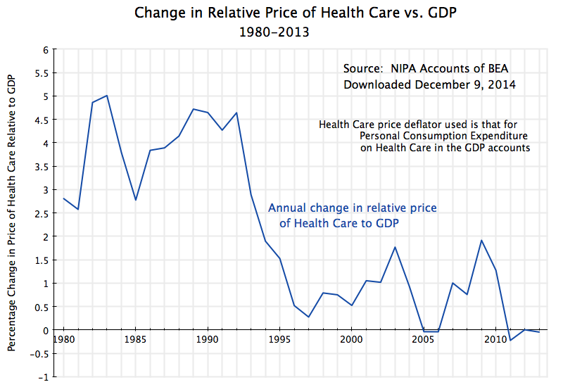
The price index for GDP is a weighted average of the prices of all goods and services produced by the economy. That is, and speaking loosely, a GDP price index rising by say 2% implies that about half (in weighted terms) of all prices rose by more than 2% while about half rose by less than 2% (including some that could have fallen).
What is unusual for the health care price index is that it has risen consistently faster than the overall GDP price index, until recent years. The increase was particularly rapid during the Reagan / Bush I years, with the health care price index outpacing the GDP price index by 4.1% per year on average over this period. For the more technically minded, the GDP deflator rose at an annual average rate of 3.9% over this period, while the health care price index rose at an annual average rate of 8.2%, so the relative price rose at the rate of 1.082/1.039, which equals 1.041, or 4.1% a year.
A 4.1% relative price growth compounded over 12 years (1980 to 1992) is huge: At that rate, health care prices rose by 62% more than overall prices over that 12 year period. And that is the immediate cause of health care rising as a share of GDP from 8.9% to over 13% in current prices over the period, despite a slowly falling share in real terms. Real health care consumption relative to GDP fell, but total health care expenditures still rose relative to GDP in current dollar terms due to the higher relative prices for health care.
The relative price of health care relative to GDP then continued to rise, but at a much slower pace, during the Clinton years. It then bounced back up some during the Bush II years (other than in 2005 and 2006, when the GDP deflator rose in the peak years of the housing bubble and then matched the increases in the price deflator for health care in those two years).
Under Obama, the relative price of health care came back down, and indeed was significantly negative in 2011 for the first time since before 1980. This was then followed by two further years of zero or negative growth. There have not been three consecutive years zero or negative growth in the relative price of health care in the US since 1946 to 1948, two-thirds of a century ago.
The Obamacare reforms account for at least some of this. The Affordable Care Act (Obamacare) was passed in early 2010, and while the insurance coverage reforms (making health care insurance coverage available for all Americans) only went into effect in 2014, other health care reforms went into effect immediately. These included a wide range of individually modest, but cumulatively significant, measures to bring down costs. For example, the Medicare system for compensating hospitals now is set up to provide a financial incentive for good rather than poor quality care. Under earlier systems, hospitals were paid more when the patient received poor quality care and got an avoidable infection, for example. Such measures improved efficiency and brought down costs.
D. Even At a Constant Share of GDP in Real Terms, Per Capita Consumption of Health Care Can Still Rise
The relative price of health care has stabilized for three years now under Obama, while the share of health care expenditures in GDP, whether in real or nominal terms, has stabilized for five years. But has this been achieved at the cost of reducing the availability and use of health care? No:
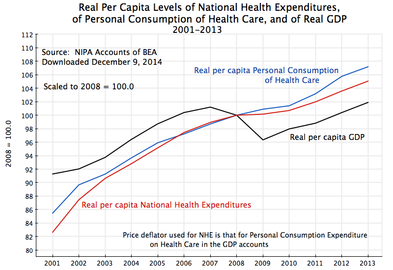
This diagram plots what has happened since 2001 to real per capita national health expenditures (from the same figures as used above from the CMS, but now converted into real per capita terms), real per capita personal consumption of health care services (from the GDP accounts), and real per capita GDP. The figures are all scaled to equal 100 in 2008. The national health expenditure and personal consumption of health care lines track each other fairly closely. One could have used either.
As the graph shows, real per capita expenditures on (or use of) health care services have increased each year over this period. There was still an increase, although at a slower pace, in the peak years of the economic downturn in 2009 and 2010. And the increases continued, at a strong pace, in 2011 to 2013, when GDP was recovering as well.
When health expenditures stabilized as a share of GDP under Obama, some analysts at first speculated that this was due to lower consumption of health care services during the economic downturn. Unemployment was high and many had less access to health insurance. But use of health care services did not fall during the downturn. And it then came back strongly in 2011 to 2013. The stable share of GDP has been due to stable prices for health care since 2011, with real per capita health care expenditures then rising at a similar rate as rising real per capita GDP.
E. Why Isn’t the Figure for National Health Expenditures Equal to 18% of GDP?
An earlier post in this blog in the series on health reform stated that the US has been spending close to 18% of GDP on health care. This was 50% more than the second highest spending OECD country (the Netherlands) and close to double the average spent of all OECD countries. The figures were for 2011 and came from the then current OECD data for the US and other OECD countries (close to, but not quite the same as, the national health expenditure totals from the CMS for the US). Why are the figures for the US now at 17.4% of GDP in 2011, as well as since?
The US health expenditure numbers have in fact not changed. They are still expected to total $3 trillion in 2014. The reason for the difference (aside from round-off: they were a bit below 18% in the earlier numbers) is that the estimate of the denominator in the health expenditures to GDP ratio has changed. In the summer of 2013, the BEA revised its methodology for estimating GDP, as it periodically does. While there were several changes, the one with the largest impact was to revise the treatment of research and development expenditures. The BEA had before treated such expenditures as what economists call an intermediate product (a good which is immediately used up as goods are produced, much like coking coal is used up in the production of steel). They decided it was more appropriate to treat them as an investment product, which will last for several years (depreciating over time). This was purely a methodology change. But the effect was to revise estimated GDP up by about 3 to 3 1/2% in recent years. This was not just applied to the GDP figures of recent years, but rather to the full GDP series going all the way back to 1929. Hence the year to year growth rates were largely unaffected.
But a denominator which is now larger will lead to a health expenditure share in GDP which is lower. By simple arithmetic, a share of 17.9% of GDP will fall to 17.4% of GDP if GDP is estimated to be 3% higher than before.
F. Conclusion
Health care costs stabilized during Obama’s tenure, with health care costs as a share of GDP now flat (in both constant and in current prices) in contrast to the big increases (in current prices) before. This has not come at the expense of falling availability or use of health care services. They have continued to grow throughout his presidency, and especially since 2010.
Looking forward, 2014 may be different. The Obamacare insurance reforms came into effect in 2014, and have reduced the ranks of the uninsured by more than 10 million Americans. The share of the population without any health insurance fell by over 30%. The newly insured are likely to make greater use of regular health care services in 2014, especially by those who previously had conditions which had been left untreated due to an inability to pay before. However, this may be offset by fewer emergency room admissions by those who previously had no other option, where emergency room care is an especially expensive way to deliver health care services.
It is not clear what the net effect will be. Preliminary quarterly GDP data (for the first three-quarters of 2014) do not show a rise in the share for personal consumption of health care (there was a growth in real terms similar to the growth in real GDP). But these numbers are still early and preliminary. And the full national health expenditure numbers for 2014 will not be out until next December.
But so far, health expenditures as a share of GDP have stabilized under Obama, and the preliminary indication is that this is continuing in 2014. This is a major achievement. But they have stabilized at what is still a very high share of GDP, far higher than what is spent on health in other OECD countries. Much more aggressive and fundamental reform will be necessary to bring the share down to the far lower levels of what other countries spend, and yet obtain health outcome results that are similar to or better than the outcomes in the US.

You must be logged in to post a comment.