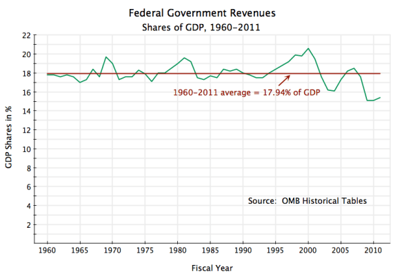
An excellent report from the Congressional Budget Office was issued yesterday, and has received a fair amount of publicity for noting that taxes in the US as a share of income are the lowest in at least 30 years (their analysis went back to 1979). See, for example, this article in today’s Washington Post. The CBO findings are correct, and carefully done, but readers of this blog may recall a posting from April 22, which also noted that taxes as a share of income are the lowest in over a half century (and indeed the lowest since 1950). The graph above is copied from that post.
The CBO report looks at taxes as a share of household incomes, relying on data from the IRS and the Census Bureau, and hence had data only through 2009. The data I used comes from the National Income and Product Accounts (GDP Accounts) of the Bureau of Economic Analysis in the Department of Commerce, which had data through 2011 (and now up to the first quarter of 2012). But both come to the same basic conclusion: That taxes as a share of income are the lowest in decades. Republicans have asserted that high and rising taxes are the reason the economy has not recovered from the 2008 downturn, and that therefore further tax cuts are needed. But there is no factual support for this.
Taxes are low in part precisely because of the 2008 collapse, with conditions only turning around in mid-2009, soon after Obama took office. Incomes fell, and therefore taxes due fell as well and indeed fell by more. But the low taxes are not simply a result of the downturn. The economic downturn in 1982-83 under Reagan was also sharp, and the unemployment rate then hit a peak of 10.8%, or much more than the 10.0% peak reached in the current downturn. But taxes during this Reagan period as a share of income did not then fall to as low a share as they have now. The reason is the Bush tax cuts, which had already put taxes on a falling trend, plus an additional $1.5 trillion in tax cuts signed by Obama since he took office. Tax cuts are one of the few areas where Obama can get support from a Republican congress for passage. See the April 22 post for details on these tax cuts under Obama.
With the data it had access to, the CBO report could go into other areas as well, including distributional issues. It merits a close look. Figure 6 on page 15 is particularly interesting. It shows that real after tax income growth for the bottom 80% of the population over the last 30 years (basically since Reagan), has been modest at best, while it has been spectacular for the top 1%. Based on data published along with the report (in the Supplementary Tables), one can calculate that income growth for the bottom 80% of the population has averaged just 1.1% a year, and was fairly similar for each of the quintiles (i.e. for the 0 to 20%, 21 to 40%, 41 to 60%, and 61 to 80% quintiles), with a range of only between 0.9% and 1.2% for the annual average growth rates. After 30 years, real incomes grew by a total of only 38% for the bottom 80% of the US population.
In contrast, real income was 155% higher in 2009 than it was in 1979 for the top 1%. And the 2009 income was relatively low due to the 2008 economic collapse (and we know from other sources that the income of the very rich then bounced back in 2010 and 2011). In 2007, real after tax incomes of the top 1% was 304% above where it was in 1979. For the bottom 80%, changing to a 2007 base makes little difference: it was only 38.6% higher. It is also interesting to note that it is really only the top 1% that has gained so spectacularly in this post-Reagan period. Total real after tax income growth between 1979 and 2009 was 50% for the 81 to 90th percentile, was 61% for the 91 to 95th percentile, and was 70% for the 96 to 99th percentile. The spectacular growth is only seen in the top 1%.
The results are similar to what was shown in a graph I had in a January 29, 2012, post on this blog, on the impact of Reagan, reproduced here and which uses data from Thomas Piketty and Emmanuel Saez:
The pattern is similar. There has been spectacular income growth since Reagan for the top 1%, and even more so for the top 0.1% or top 0.01%, but not for everyone else.


You must be logged in to post a comment.