
Executive Summary
There are several major problems with the forecast ridership figures for the Purple Line, a proposed 16-mile light rail line that would pass in a partial arc around Washington, DC, in suburban Maryland. The forecasts, as presented and described in the “Travel Forecasts Results Technical Report” of the Final Environmental Impact Statement for the project, are in a number of cases simply impossible.
Problems include:
a) Forecast ridership in 2040 between many of the Transit Analysis Zone pairs along the Purple Line corridor would be higher on the Purple Line itself than it would be for total transit ridership (which includes bus, Metrorail, and commuter rail ridership, in addition to ridership on the Purple Line) between these zones. This is impossible. Such cases are not only numerous (found in more than half of the possible cases for zones within the corridor) but often very large (12 times as high in one case). If the forecasts for total transit ridership are correct, then correcting for this, with Purple Line ridership some reasonable share of the totals, would lead to far lower figures for Purple Line ridership.
b) Figures on forecast hours of user benefits (primarily forecast time savings from a rail line) in a scenario where the Purple Line is built as compared to one where it is not, are often implausibly high. In two extreme cases, the figures indicate average user benefits per trip between two specific zones, should the Purple Line be built, of 9.7 hours and 11.5 hours. These cannot be right; one could walk faster. But other figures on overall user benefits are also high, leading to an overall average predicted benefit of 30 minutes per trip. Even with adjustments to the pure time savings that assign a premium to rail service, this is far too high and overestimates benefits by at least a factor of two or even three. The user benefit figures are important for two reasons: 1) An overestimate leads to a cost-effectiveness estimate (an estimate of the cost of the project per hour of user benefits) that will be far off; and 2) The figures used for user benefits from taking the proposed rail line enter directly into the estimation of ridership on the rail line (as part of the choice on whether to take the rail line rather than some other transit option, or to drive). If the user benefit figures are overstated, ridership will be less. With the user benefit figures overstated by a large margin, ridership will be far less.
c) Figures on ridership from station to station are clearly incorrect. They indicate, for example, that far more riders would exit at the Bethesda station (an end point on the line) each day (19,800) than would board there (10,210). This is impossible. More significantly, the figures indicate system capacity must be sufficient to handle 21,400 riders each day on the busiest segment (on the segment leaving Silver Spring heading towards Bethesda). Even if the overall ridership numbers were correct, the figure for ridership on this segment is clearly too high (and it is this number which leads to the far higher number of those exiting the system in Bethesda than would enter there each day). The figure is important as the rail line has been designed to a capacity sufficient to carry such a load. With the true number far lower, there is even less of a case for investing in an expensive rail option. Upgraded bus services could provide the capacity needed, and at far lower cost.
There appear to be other problems as well. But even just these three indicate there are major issues with these forecasts. This may also explain why a number of independent observers have noted for some time that the Purple Line ridership forecasts look implausibly high. The figure for Purple Line ridership in 2040 of 69,300 per day is three times the average daily ridership actually observed in 2012 on 31 light rail lines built in the US over the last three decades. It would also be 58% higher on the Purple Line than on the highest amongst those 31. Yet the Purple Line would pass solely through suburban neighborhoods, of generally medium to low density. Most of these other light rail lines in the US serve travel to and from downtown areas.
The causes of these errors in the ridership forecasts for the Purple Line are not always clear. But the issues suggest at a minimum that quality checks were insufficient. And while the Purple Line is just one example, inadequate attention to such issues might explain in part why ridership forecasts for light rail lines have often proven to be substantially wrong.
A. Introduction
The Purple Line is a proposed light rail line that would be built in Suburban Maryland, stretching in a partial arc from east of Washington, DC, to north of the city. I have written several posts previously in this blog on the proposed project (see the posts here, here, here, and here) and have been highly critical of it. It is an extremely expensive project (the total cost to be paid to the private concessionaire to build and then operate the line for 30 years will sum to $5.6 billion, and other costs borne directly by the state and/or local counties will add at least a further $600 million to this). And the state’s own analyses of the project found that upgraded bus services (including any one of several bus rapid transit, or BRT, options) to provide the transit services that are indeed needed in the corridor, would be both cheaper and more cost-effective. Such alternatives would also avoid the environmental damage that is inevitable with the construction of dual rail lines along the proposed route, including the destruction of 48 acres of forest cover, the filling in of important wetland areas, and the destruction of a linear urban park that has the most visited trail in the state.
The state’s rationale for building a rail line rather than providing upgraded bus services is that ridership will be so high that at some point in the future (beyond 2040) only rail service would be able to handle the load. But many independent analysts have long questioned those ridership forecasts. A study from 2015 found that the forecast ridership on the Purple Line would be three times as high as the ridership actually observed in 2012 on 31 light rail lines built in the US over the last three decades. Furthermore, the forecast Purple Line ridership would be 58% higher than ridership actually observed on the highest line among those 31. And with the Purple Line route passing through suburban areas of generally medium to low density, in contrast to routes to and from major downtown areas for most of those 31, many have concluded the Purple Line forecasts are simply not credible.
Why did the Purple Line figures come out so high? The most complete description provided by the State of Maryland of the ridership forecasts are provided in the chapter titled “Travel Forecasts Results Technical Report”, which is part of Volume III of the Final Environmental Impact Statement (FEIS) for the Purple Line, dated August 2013 (which I will hereafter often refer to simply as the “FEIS Travel Forecasts chapter”). A close examination of that material indicates several clear problems with the figures. This post will discuss three, although there might well be more.
These three are:
a) The FEIS forecast ridership for 2040 on the Purple Line alone would be higher (in a number of cases far higher) in most of the 49 possible combinations of travel between the 7 Transit Analysis Zones (TAZs) defined along the Purple Line route, than the total number of transit riders among those zones (by bus, Metrorail, commuter rail, and the Purple Line itself). This is impossible.
b) Figures on user benefits per Purple Line trip (primarily the time forecast to be saved by use of a rail line) are implausibly high. In two cases they come to 9.7 hours and 11.5 hours, respectively, per trip. This cannot be. One could walk faster. But these figures for minutes of user benefits per trip were then passed through in the computations to the total forecast hours of user benefits that would accrue as a consequence of building the Purple Line, thus grossly over-estimating the benefits. Such user benefit figures would also have been used in the estimation of how many will choose to ride the Purple Line. If these user benefit figures are overestimated (sometimes hugely overestimated), then the Purple Line ridership forecasts will be overestimated.
c) The figure presenting rail ridership by line segment from station to station (which then was used to determine what ridership capacity would be needed to service the proposed route) shows almost twice as many riders exiting at the Bethesda station (an end of the line) as would board there each day (19,800 arriving versus 10,210 leaving each day). While there could be some small difference (i.e. some people might take transit to work in the morning, and then get a car ride home with a colleague in the evening), it could not be so large. The figures would imply that Bethesda would be accumulating close to 9,600 new residents each day. The forecast ridership by line segment (which is what determines these figures) is critical as it determines what the capacity will need to be of the transit system to service such a number of riders. With these figures over-stated, the design capacity is too high, and there is even less of a rationale for building a rail line as opposed to simply upgrading bus services in the corridor.
These three issues are clear just from an examination of the numbers presented. But as noted, there might well be more. We cannot say for sure what all the errors might be as the FEIS Travel Forecasts chapter does not give a complete set of the numbers and assumed relationships needed as inputs to the analysis and then resulting from it, nor more than just a cursory explanation of how the results were arrived at. But with anomalies such as these, and with no explanations for them, one cannot treat any of the results with confidence.
And while necessarily more speculative, I will also discuss some possible reasons for why the mistakes may have been made. This matters less than the errors themselves, but might provide a sense for why they arose. Broadly, while the FEIS Travel Forecasts chapter (and indeed the entire FEIS report) only shows the Maryland Transit Administration (MTA) as the source for the documents, the MTA has acknowledged (and as would be the norm) that major portions of the work – in particular the ridership forecasts – were undertaken or led by hired consulting firms. The consulting firms use standard but large models to prepare such ridership forecasts, but such models must be used carefully to ensure reliable results. It is likely that results were generated by what might have been close to a “black box” to the user, that there were then less than sufficient quality checks to ensure the results were reasonable, and that the person assigned to write up the results (who may well have differed from the person generating the numbers) did not detect these anomalous results.
I will readily admit that this is speculation as to the possible underlying causes, and that I could be wrong on this. But it might explain why figures were presented in the final report which were on their face impossible, with no explanation given. In any case, what is most important is the problems themselves, regardless of the possible explanations on why they arose.
Each of the three issues will be taken up in turn.
B. Forecast Ridership on the Purple Line Alone Would Be Higher in Many Cases than Total Transit Ridership
The first issue is that, according to the forecasts presented, there would be more riders on the Purple Line alone between many of the Transit Analysis Zones (TAZs) than the number of riders on all forms of transit. This is impossible.
Forecast Ridership on All Transit Options in 2040:
Forecast Ridership on Purple Line Alone in 2040: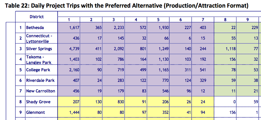
These two tables are screenshots of the upper left-hand corners of Table 16 and 22 from the FEIS Travel Forecasts chapter. While they show the key numbers, I would recommend that the reader examine the full tables in the original FEIS Travel Forecasts chapter. Indeed, if your computer can handle it, it would be best to open the document twice in two separate browsers and then scroll down to the two tables to allow them to be compared side by side on your screen.
The tables show forecast ridership in 2040 on all forms of transit in the “Preferred Alternative” scenario where the Purple Line is built (Table 16), or for the sub-group of riders just on the Purple Line (Table 22). And based on the total ridership figures presented at the bottoms of the full tables, the titles appear to be correct. That is, Table 16 forecasts that total transit ridership in the Washington metro region would be about 1.5 million trips per day in 2040, which is plausible (Table 13 says it was 1.1 million trips per day in 2005, which is consistent with WMATA bus and rail ridership, where WMATA accounts for 80 – 85% of total ridership in the region). And Table 22 says the total number of trips per day on the Purple Line in 2040 would be 68,650, which is consistent (although still somewhat different from, with no explanation) with figures given elsewhere in the chapter on forecast total Purple Line trips per day in 2040 (of 69,330 in Table 24, for example, or 69,300 in Tables 25 and 26, with that small difference probably just rounding). So it does not appear that the tables were mislabeled, which was my first thought.
The full tables show the ridership between any two pairs of 22 defined Transit Analysis Zones (TAZs), in production/attraction format (which I will discuss below). The 22 TAZs cover the entire Washington metro region, and are defined as relatively compact geographic zones along the Purple Line corridor and then progressively larger geographic areas as one goes further and further away. They have seven TAZs defined along the Purple Line corridor itself (starting at the Bethesda zone and ending at the New Carrollton zone), but Northern Virginia has just two zones (where one, labeled “South”, also covers most of Southern Prince George’s County in Maryland). See the map shown as Figure 4 on page 13 of the FEIS Travel Forecasts chapter for the full picture. This aggregation to a manageable set of TAZs, with a focus on the Purple Line corridor itself, is reasonable.
The tables then show the forecast ridership between any two TAZ pairs. For example, Table 16 says there will on average be 1,589 riders on all forms of transit each day in 2040 between Bethesda (TAZ 1, as a “producer” zone) and Silver Spring (TAZ 3, as an “attractor” zone). But Table 22 says there will be 2,233 riders each day on average between these same two TAZs on the Purple Line alone. This is impossible. And there are many such impossibilities. For the 49 possible pairs (7 x 7) for the 7 TAZs directly on the Purple Line corridor, more than half (29) have more riders on the Purple Line than on all forms of transit. And for one pair, between Bethesda (TAZ 1) and New Carrollton (TAZ 7), the forecast is that there would be close to 12 times as many riders taking the Purple Line each day as would take all forms of public transit (which includes the Purple Line and more).
Furthermore, if one adds up all the transit ridership between these 49 possible pairs (where the totals are presented at the bottom of the tables; see the FEIS Travel Forecasts chapter), the total number of trips per day on all forms of transit sums to 29,890 among these 7 TAZs (Table 16), while the total for the Purple Line alone sums to 30,560 (Table 22).
How could such a mistake have been made? One can only speculate, as the FEIS chapter had next to no description of the methods they followed. One instead has to infer a good deal based on what was presented, in what sequence, and from what is commonly done in the profession to produce such forecasts. This goes into fairly technical issues, and readers not interested in these details can skip directly to the next section below. But it will likely be of interest at least to some, provides a short review of the modeling process commonly used to generate such ridership forecasts, and will be helpful to an understanding of the other two obvious errors in the forecasts discussed below.
To start, note that the tables say they are being presented in “production/attraction” format. This is not the more intuitive “origin/destination” format that would have been more useful to show. And I suspect that over 99% of readers have interpreted the figures as if they are showing travel between origin and destination pairs. But that is not what is being shown.
The production/attraction format is an intermediate stage in the modeling process that is commonly used for such forecasts. That modeling process is called the “four-step model”. See this post from the Metropolitan Washington Council of Governments (MWCOG) for a non-technical short description, or this post for a more academic description. The first step in the four-step model is to try to estimate (via a statistical regression process normally) how many trips will be “produced” in each TAZ by households and by businesses, based on their characteristics. Trips to work, for example, will be “produced” by households at the TAZ where they live, and “attracted” by businesses at the TAZ where those businesses are located. The number of trips so produced will be forecast based on some set of statistical regression equations (with parameters possibly taken from what might have been estimated for some other metro area, if the data does not exist here). The number of trips per day by household will be some function of average household size in the TAZ, average household income, how many cars the households own, and other such factors. Trips “attracted” by businesses in some TAZ will similarly be some function of how many people are employed by businesses in that TAZ, perhaps the nature of the businesses, and so on. Businesses will also “produce” their own trips, for example for delivery of goods to other businesses, and statistical estimates will be made also for such trips.
Such estimates are unfortunately quite rough (statistical error is high), and the totals calculated for the region as a whole of the number of trips “produced” and the number of trips “attracted” will always be somewhat different, and often far different. But by definition the totals have to be the same, as all trips involve going from somewhere to somewhere. Hence some scaling process will commonly be used to equate the totals.
This will then yield the total number of trips produced in each TAZ, and the total number attracted to each TAZ. But this does not tell us yet the distribution of the trips. That is, one will have the total number of trips produced in TAZ 1, say, but not how many go from TAZ 1 to TAZ 2 or to TAZ 3 or to TAZ 4, and so on. For this, forecasters generally assume the travel patterns will fit what is called a “gravity model”, where it is assumed the trips from each TAZ will be distributed to the “attractor” TAZs in some statistical relationship which is higher depending on the “mass” (i.e. the number of jobs in some TAZ) and lower depending on the distance between them (typically measured in terms of travel times). This is also rough, and some iterative rescaling process will be needed to ensure the trips produced in each TAZ and attracted to each TAZ sum to the already determined totals for each.
This all seems crude, and it is. Many might ask why not determine such trip distributions from a straightforward survey of households asking where they travel to. Surveys are indeed important, and help inform what the parameters of these functions might be, but one must recognize that any practicable survey could not suffice. The 22 TAZs defined for the Purple Line analysis were constructed (it appears; see below) from a more detailed set of TAZs defined by the Metropolitan Washington Council of Governments. But MWCOG now identifies 3,722 separate TAZs for the Washington metro region, and travel between them would potentially involve 13.9 million possible pairs (3,722 squared)! No survey could cover that. Hence MWCOG had to use some form of a gravity model to allocate the trips from each zone to each zone, and that is indeed precisely what they say they did.
At this point in the process, one will have the total number of trips produced by each TAZ going to each TAZ as an attractor, which for 2040 appears as Table 8 in the FEIS chapter. This covers trips by all options, including driving. The next step is to separate the total number of trips between those taken by car from those taken by transit, and then, at the level below, the separation of those taken by transit into each of the various transit options (e.g. Metrorail, bus, commuter rail, and the Purple Line in the scenario where it is built). This is the mode choice issue, and note that these are discrete choices where one chooses one or the other. (A combined option such as taking a bus to a Metrorail station and then taking the train would be modeled as a separate mode choice.) This separation into various travel modes is normally then done by what is called a nested logit (or logistic) regression model, where the choice is assumed to be a function of variables such as travel time required, out of pocket costs (such as for fares or tolls or parking), personal income, and so on.
Up to this stage, the modeling work as described above would have been carried out by MWCOG as part of its regular work program (although in the scenario of no Purple Line). Appendix A of the FEIS Travel Forecasts chapter, says specifically that the modelers producing the Purple Line ridership forecasts started from the MWCOG model results (Round 8.0 of that model for the FEIS forecasts). By aggregating from the TAZs used by MWCOG (3,722 currently, but possibly some different number in the Round 8.0 version), to the 22 defined for the Purple Line work, the team doing the FEIS forecasts would have been able to arrive at the table showing total daily trips by all forms of transportation (including driving) between the 22 TAZs (Table 8 of the FEIS chapter), as well as the total trips by some form of transit between the 22 in the base case of no Purple Line being built (the “No Build” alternative; Table 14 of the FEIS chapter).
The next step was then to model how many total transit trips would be taken in the case where the Purple Line has been built and is operating in 2040, as well as how many of such transit trips will be taken on the Purple Line specifically. The team producing the FEIS forecasts would likely have taken the nested logit model produced by MWCOG, and then adjusted it to incorporate the addition of the Purple Line travel option, with consequent changes in the TAZ to TAZ travel times and costs. At the top level they then would have modeled the split in travel between by car or by any form of transit, and at the next level then modeled the split of any form of transit between the various transit options (bus, Metrorail, commuter rail, and the Purple Line itself).
This then would have led to the figures shown in Table 16 of the FEIS chapter for total transit trips each day by any transit mode (with the Purple Line built), and Table 22 for trips on the Purple Line only. Portions of those tables are shown above. They are still in “production/attraction” format, as noted in their headings.
While understandable as a step in the process by which such ridership forecasts are generated (as just described), trips among TAZs in production/attraction format are not terribly interesting in themselves. They really should have gone one further step, which would have been to convert from a production/attraction format to an origin/destination format. The fact that they did not is telling.
As discussed above, a production/attraction format will show the number of trips between each production TAZ and each attraction TAZ. Thus a regular commute for a worker from home (production TAZ) to work (attraction TAZ) each day will appear as two trips each day between the production TAZ and the attraction TAZ. Thus, for example, the 1,589 trips shown as total transit trips (Table 16) between TAZ 1 (Bethesda) and TAZ 3 (Silver Spring) includes not only the trips by a commuter from Bethesda to Silver Spring in the morning, but also the return trip from Silver Spring to Bethesda in the evening. The return trip does not appear in this production/attraction format in the 4,379 trips from Silver Spring (TAZ 3) to Bethesda (TAZ 1) element of the matrix (see the portion of Table 16 shown above). The latter is the forecast of the number of trips each day between Silver Spring as a production zone and Bethesda as an attractor.
This is easy to confuse, and I suspect that most readers seeing these tables are so confused. What interests the reader is not this production/attraction format of the trips, which is just an intermediate stage in the modeling process, but rather the final stage showing trips from each origin TAZ to each destination TAZ. And it only requires simple arithmetic to generate that, if one has the underlying information from the models on how many trips were produced from home to go to work or to shop or for some other purpose (where people will always then return home each day), and separately how many were produced by what they call in the profession “non-home based” activities (such as trips during the workday from business to business).
I strongly suspect that the standard software used for such models would have generated such trip distributions in origin/destination format, but they are never presented in the FEIS Travel Forecasts chapter. Had they been, one would have seen what the forecast travel would have been between each of the TAZ pairs in each of the two possible directions. One would probably have observed an approximate (but not necessarily exact) symmetry in the matrix, as travel from one TAZ to another in one direction will mostly (but not necessarily fully) be matched by a similar flow in the reverse direction, when added up over the course of a day. For that reason also, the row totals will match or almost match each of the column totals. But that will not be the case in the production/attraction format.
That the person writing up the results for this FEIS chapter did not understand that an origin/destination presentation of the travel would have been of far greater interest to most readers than the production/attraction format is telling, I suspect. They did not see the significance. Rather, what was written up was mostly simply a restatement of some of the key numbers from the tables, with little to no attempt to explain why they were what they were. It is perhaps then not surprising that the author did not notice the impossibility of the forecast ridership between many of the TAZ pairs being higher on the Purple Line alone (Table 22) than the total ridership on all transit options together (Table 16).
C. User Benefits and Time Savings
The modeling exercise also produced a forecast of “user benefits” in the target year. These benefits are measured in units of time (minutes or hours) and arise primarily from the forecast savings in the time required for a trip, where estimates are made as to how much less time will be required for a trip if one has built the light rail line. I would note that there are questions as to whether there would in fact be any time savings at all (light rail lines are slow, particularly in designs where they travel on streets with other traffic, which will be the case here for much of the proposed route), but for the moment let’s look at what the modelers evidently assumed.
“User benefits” then include a time-value equivalent of any out-of-pocket cost savings (to the extent any exists; it will be minor here for most), plus a subjective premium for what is judged to be the superior quality of a ride on a rail car rather than a regular bus. The figures in the AA/DEIS (see Table 6-2 in Chapter 6) indicate a premium of 19% was added in the case of the medium light rail alternative – the alternative that evolved into what is now the Purple Line. The FEIS Travel Forecasts chapter does not indicate what premium they now included, but presumably it was similar. User benefits are thus largely time savings, with some markup to reflect a subjective premium.
Forecast user benefits are important for two reasons. One is that it is such benefits which are, to the extent they in fact exist, the primary driver of predicted ridership on the Purple Line, i.e. travelers switching to the Purple Line from other transit options (as well as from driving, although the forecast shifts out of driving were relatively small). Second, the forecast user benefits are also important as they provide the primary metric used to estimate the benefit of building the Purple Line. Thus if the inputs used to indicate what the time savings would be by riding the Purple Line as opposed to some other option were over-estimated, one will be both over-estimating ridership on the line and over-estimating the benefits.
And it does appear that those time savings and user benefits were over-estimated. Table 23 of the FEIS chapter presents what it labels the “Minutes of User Benefits per Project Trip”. A screenshot of the upper left corner, focussed on the travel within the 7 TAZs through which the Purple Line would pass, is:

Note that while the author of the chapter never says what was actually done, it appears that Table 23 was calculated implicitly by dividing the figures in Table 21 of the FEIS Travel Forecasts chapter (showing calculated total hours of time savings daily for each TAZ pair) by those in Table 22 (showing the number of daily trips on the Purple Line, the same table as was discussed in the section above). This would have been a reasonable approach, given that the time savings figures include that saved by all the forecast shifts among transit alternatives (as well as from driving) should the new rail line be built. The Table 23 numbers thus show the overall time saved across all travel modes, per Purple Line trip.
But the figures are implausible. Taking the most extreme cases first, the table says that there would be an average of 582 minutes of user benefits per trip for travel on the Purple line between Bethesda (TAZ 1) and Riverdale Park (TAZ 6), and 691 minutes per trip between Bethesda (TAZ 1) and New Carrollton (TAZ 7). This works out to user benefits per trip of 9.7 hours and 11.5 hours respectively! One could walk faster! And this does not even take into account that travel between Bethesda and New Carrollton would be faster on Metrorail (assuming the system is still functioning in 2040). The FEIS Travel Forecasts chapter itself, in its Table 6, shows that Metrorail between these two stations currently requires 55 minutes. That time should remain unchanged in the future, assuming Metrorail continues to operate. But traveling via the Purple Line would require 63 minutes (Table 11) for the same trip. There would in fact be no time savings at all, but rather a time cost, if there were any riders between those two points.
Perhaps some of these individual cases were coding errors of some sort. I cannot think of anything else which would have led to such results. But even if one sets such individual cases aside, I find it impossible to understand how any of these user benefit figures could have followed from building a rail line. They are all too large. For example, the FEIS chapter provides in its Table 18 a detailed calculation of how much time would be saved by taking a bus (under the No Build alternative specifically) versus taking the proposed Purple Line. Including average wait times, walking times, and transfers (when necessary), it found a savings of 11.4 minutes for a trip from Silver Spring (TAZ 3) to Bethesda (TAZ 1); 2.6 minutes for a trip from Bethesda (TAZ 1) to Glenmont (TAZ 9); and 8.0 minutes for a trip from North DC (TAZ 15) to Bethesda (TAZ 1). Yet the minutes of user benefits per trip for these three examples from Table 23 (see the full table in the FEIS chapter) were 25 minutes, 19 minutes, and 25 minutes, respectively. Even with a substantial premium for the rail options, I do not see how one could have arrived at such estimates.
And the figures matter. The overall average minutes of user benefits per project trip (shown at the bottom of Table 23 in the FEIS chapter) came to 30 minutes. If this were a more plausible average of 10 minutes, say, then with all else equal, the cost-effectiveness ratio would be three times worse. This is not a small difference.
Importantly, the assumed figures on time savings will also matter to the estimates made of the total ridership on the Purple Line. The forecast number of daily riders in 2040 of 68,650 (Table 22) or 69,300 (in other places in the FEIS chapter) was estimated based on inputs of travel times required by each of the various modes, and from this how much time would be saved by taking the Purple Line rather than some other option. With implausibly large figures for travel time savings being fed in, the ridership forecasts will be too high. If the time savings figures being fed in are far too large, the ridership forecasts will be far too high. This is not a minor matter.
D. Ridership by Line Segment
An important estimate is of how many riders there will be between any two station to station line segments, as that will determine what the system capacity will need to be. Rail lines are inflexible, and completely so when, as would be the case here, the trains would be operated in full from one end of the line to the other. The rider capacity (size) of the train cars and the spacing between each train (the headway) will then be set to accommodate what is needed to service ridership on what would be the most crowded segment.
Figure 10 of the FEIS Travel Forecasts chapter provides what would be a highly important and useful chart of ridership on each line segment, showing, it says, how many riders would (in terms of the daily average) arrive at each station, how many of those riders would get off at that station, and then how many riders would board at that station. That would then produce the figure for how many riders will be on board traveling to the next station. And one needs to work this out for going in each direction on the line.
Here is a portion of that figure, showing the upper left-hand corner:

Focussing on Bethesda (one end of the proposed line), the chart indicates 10,210 riders would board at Bethesda each day, while 19,800 riders would exit each day from arriving trains. But how could that be? While there might be a few riders who might take the Purple Line in one direction to go to work or for shopping or for whatever purpose, and then take an alternative transportation option to return home, that number is small, and would to some extent balance out by riders going in the opposite direction. Setting this small possible number aside, the figures in the chart imply that close to twice as many riders will be exiting in Bethesda as will be entering. They imply that Bethesda would be seeing its population grow by almost 9,600 people per day. This is not possible.
But what happened is clear. The tables immediately preceding this figure in the FEIS Travel Forecasts chapter (Tables 24 and 25) purport to show for each of the 21 stations on the proposed rail line, what the daily station boardings will be, with a column labeled “Total On” at each station and a column labeled “Total Off”. Thus for Bethesda, the table indicates 10,210 riders will be getting on, while 19,800 will be getting off. While for most of the stations, the riders getting on at that station could be taking the rail line in either direction (and those getting off could be arriving from either direction), for the two stations at the ends of the line (Bethesda, and at the other end New Carrollton) they can only go in one direction.
But as an asterisk for the “Total On” and “Total Off” column headings explicitly indicates, the figures in these two columns of Table 24 are in production/attraction format. That is, they indicate that Bethesda will be “producing” (mostly from its households) a forecast total of 10,210 riders each day, and will be “attracting” (mostly from its businesses) 19,800 riders each day. But as discussed above, one must not confuse the production/attraction presentation of the figures, with ridership according to origin/destination. A household where a worker will be commuting each day to his or her office will be shown, in the production/attraction format, as two trips each day from the production TAZ going to the attraction TAZ. They will not be shown as one trip in each direction, as they would have been had the figures been converted to an origin/destination presentation. The person that generated the Figure 10 numbers confused this.
This was a simple and obvious error, but an important one. Because of this mistake, the figures shown in Figure 10 for ridership between each of the station stops are completely wrong. This is also important because ridership forecasts by line segment, such as what Figure 10 was supposed to show, are needed in order to determine system capacity. The calculations depicted in the chart conclude that peak ridership in the line would be 21,400 each day on the segment heading west from the Woodside / 16th Street station (still part of Silver Spring) towards Lyttonsville. Hence the train car sizes and the train frequency would need to be, according to these figures (but incorrectly), adequate to carry 21,400 riders each day. That is their forecast of ridership on the busiest segment. The text of the chapter notes this specifically as well (see page 56).
That figure is critically important because the primary argument given by the State of Maryland for choosing a rail line rather than one of the less expensive as well as more cost-effective bus options, is that ridership will be so high at some point (not yet in 2040, but at some uncertain date not too long thereafter) that buses would be physically incapable of handling the load. This all depends on whether the 21,400 figure for the maximum segment load in 2040 has any validity. But it is clearly far too high; it leads to almost twice as many riders going into Bethesda as leave. It was based on confusing ridership in a production/attraction format with ridership by origin/destination.
Correcting for this would lead to a far lower maximum load, even assuming the rest of the ridership forecasts were correct. And at a far lower maximum load, there is even less of a case against investing in a far less expensive, as well as more cost-effective, system of upgraded bus services for the corridor.
E. Other Issues
There are numerous other issues in the FEIS Travel Forecasts chapter which leads one to question how carefully the work was done. One oddity, as an example and perhaps not important in itself, is that Tables 17 and 19, while titled differently, are large matrices where all the numbers contained therein are identical. Table 17 is titled “Difference in Daily Transit Trips (2040 Preferred Alternative minus No Build Alternative) (Production/Attraction Format)”, while Table 19 is titled “New Transit Trips with the Preferred Alternative (Production/Attraction Format)”. That the figures are all identical is not surprising – the titles suggest they should be the same. But why show them twice? And why, in the text discussing the tables (pp. 41-42), does the author treat them as if they were two different tables, showing different things?
But more importantly, there are a large number of inconsistencies in key figures between different parts of the chapter. Examples include:
a) New transit trips in 2040: Table 17 (as well as 19) has that there would be 19,700 new transit trips daily in the Washington region in 2040, if the Purple Line is built (relative to the No Build alternative). But on page 62, the text says the number would be 16,330 new transit trips in 2040 if it is built. And Table B-1 on page 67 says there would be 28,626 new transit trips in 2040 (again relative to No Build). Which is correct? One is 75% higher than another, which is not a small difference.
b) Total transit trips in 2040: Table 16 says that there would be a total of 1,470,620 total transit trips in the Washington region in 2040 if the Purple Line is built, but Table B-1 on page 67 puts the figure at 1,683,700, a difference of over 213,000.
c) Average travel time savings: Table 23 indicates that average minutes of “user benefits” per project trip would be 30 minutes in 2040 if the Purple Line is built, but the text on page 62 says that average travel time savings would “range between 14 and 18 minutes per project trip”. This might be explained if they assigned a 100% premium to the time savings for riding a rail line, but if so, such an assumed premium would be huge. As noted above, the premium assigned in the AA/DEIS for the Medium Light Rail alternative (which was the alternative later chosen for the Purple Line) was just 19%. And the 14 to 18 minutes figure for average time savings per trip itself looks too large. The simple average of the three representative examples worked out in Table 18 of the chapter was just 7.3 minutes.
d) Total user benefit hours per day in 2040: The text on page 62 says that the total user benefit hours per day in 2040 would sum to 17,175. But Table B-5 says the total would come to 24,073 hours (shown as 1,444,403 minutes, and then divided by 60), while Table 21 gives a figure of 33,960 hours. The highest figure is almost double the lowest. Note the 33,960 hours figure is also shown in Table 20, but then shows this as 203,760 minutes (but should be 2,037,600 minutes – they multiplied by 6, not 60, for the conversion of hours to minutes).
There are other inconsistencies as well. Perhaps some can be explained. But they suggest that inadequate attention was paid to ensure accuracy.
F. Conclusion
There are major problems with the forecasts of ridership on the proposed Purple Line. The discussion above examined several of the more obvious ones. There may well be more. Little explanation was provided in the documentation on how the forecasts were made and on the intermediate steps, so one cannot work through precisely what was done to see if all is reasonable and internally consistent. Rather, the FEIS Travel Forecasts chapter largely presented just the final outcomes, with little description of why the numbers turned out to be what they were presented to be.
But the problems that are clear even with the limited information provided indicate that the correct Purple Line ridership forecasts would likely be well less than what their exercise produced. Specifically:
a) Since the Purple Line share of total transit use can never be greater than 100% (and will in general be far less), a proper division of transit ridership between the Purple Line and other transit modes will result in a figure that is well less than the 30,560 forecast for Purple Line ridership for trips wholly within the Purple Line corridor alone (shown in Table 22). The corridor covers seven geographic zones which, as defined, stretch often from the Beltway to the DC line (or even into DC), and from Bethesda to New Carrollton. There is a good deal of transit ridership within and between those zones, which include four Metrorail lines with a number of stations on each, plus numerous bus routes. Based on the historical estimates for transit ridership (for 2005), the forecasts for total transit ridership in 2040 within and between those zones look reasonable. The problem, rather, is with the specific Purple Line figures, with figures that are often higher (often far higher) than the figures for total transit use. This is impossible. Rather, one would expect Purple Line ridership to be some relatively small share (no more than a quarter or so, and probably well less than that) of all transit users in those zones. Thus the Purple Line ridership forecasts, if properly done, would have been far lower than what was presented. And while one cannot say what the precise figure would have been, it is a mathematical certainty that it cannot account for more than 100% of total transit use within and between those zones.
b) The figures on user benefits per trip (Table 23) appear to be generally high (an overall average of 30 minutes) and sometimes ridiculously high (9.7 hours and 11.5 hours per trip in two cases). At more plausible figures for time savings, Purple Line ridership would be far less.
c) Even with total Purple Line ridership at the official forecast level (69,300), there will not be a concentration in ridership on the busiest segment of 21,400 (Figure 10). The 21,400 figure was derived based on an obvious error – from a confusion in the meaning of the production/attraction format. Furthermore, as just noted above, correcting for other obvious errors imply that total Purple Line ridership will also be far less than the 69,300 figure forecast, and hence the station to station loads will be far less. The design capacity required to carry transit users in this corridor can therefore be far less than what these FEIS forecasts said it would need to be. There is no need for a rail line.
These impossibilities, as well as inconsistencies in the figures cited at different points in the chapter for several of the key results, all suggest insufficient checks in the process to ensure the forecasts were, at a minimum, plausible and internally consistent. For this, or whatever, reason, forecasts that are on their face impossible were nonetheless accepted and used to justify building an expensive rail line in this corridor.
And while the examination here has only been of the Purple Line, I suspect that such issues often arise in other such transit projects, and indeed in many proposed public infrastructure projects in the US. When agencies responsible for assessing whether the projects are justified instead see their mission as project advocates, a hard look may not be taken at analyses whose results support going ahead.
The consequence is that a substantial share of the scarce funds available for transit and other public infrastructure projects is wasted. Expensive new projects get funded (although only a few, as money is limited), while boring simple projects, as well as the maintenance of existing transit systems, get short-changed, and we end up with a public infrastructure that is far from what we need.

You must be logged in to post a comment.