
A. Introduction
There is little that is more important to a worker than his or her wages. And as has been discussed in an earlier post on this blog, real wages in the US have stagnated since around 1980. An important question is whether this has changed recently. Trump has claimed that his policies (of lifting regulations, slashing corporate taxes, and imposing high tariffs on our trading partners) are already leading to higher wages for American workers. Has that been the case?
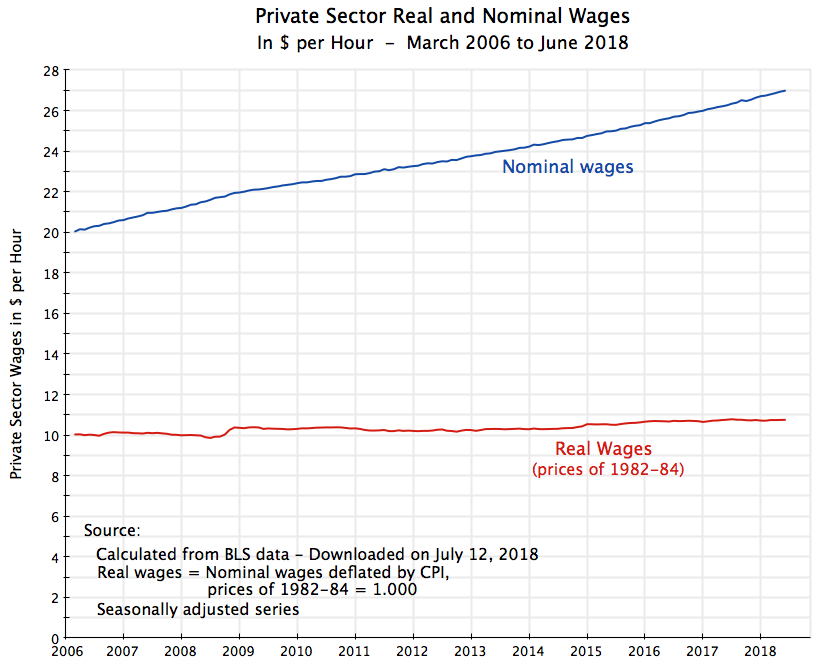
The answer is no. As the chart at the top of this post shows, real wages have been close to flat. Nominal wages have grown with inflation, but once inflation is taken into account, real wages have barely moved. And one does not see any sharp change in that trend after Trump took office in January 2017.
It is of course still early in Trump’s term, and the experience so far does not mean real wages will not soon rise. We will have to see. One should indeed expect that they would, as the unemployment rate is now low (continuing the path it has followed since 2010, first under Obama and now, at a similar pace, under Trump). But the primary purpose of this blog post is to look at the numbers on what the experience has been in recent years, including since Trump took office. We will see that the trend has not much changed. And to the extent that it has changed, it has been for the worse.
We will first take an overall perspective, using the chart at the top of this post and covering the period since 2006. This will tell us what the overall changes have been over the full twelve years. For real wages, the answer (as noted above) is that not much has changed.
But the overall perspective can mask what the year to year changes have been. So we will then examine what these have been, using 12 month moving averages for the changes in nominal wages, the consumer price index, and then the real wage. And we will see that changes in the real wage have actually been trending down of late, and indeed that the average real wage in June 2018 was below where it had been in June 2017.
We will then conclude with a short discussion of whether labor market trends have changed since Trump took office. They haven’t. But those trends, in place since 2010 as the economy emerged from the 2008/09 downturn, have been positive. At some point we should expect that, if sustained, they will lead to rising real wages. But we just have not seen that yet.
B. Nominal and Real Wages Since 2006
It is useful first to start with an overall perspective, before moving to an examination of the year to year changes. The chart at the top of this post shows average nominal wages in the private sector, in dollars per hour, since March 2006, and the equivalent in real terms, as deflated by the consumer price index (CPI). The current CPI takes the prices of 1982-84 (averaged over that period) as the base, and hence the real wages shown are in terms of the prices of 1982-84. For June 2018, for example, average private sector wages were $26.98 per hour, equivalent to $10.76 per hour in terms of the prices of 1982-84.
The data series comes from the Current Employment Survey of the Bureau of Labor Statistics, which comes out each month and is the source of the closely watched figures on the net number of jobs created each month. The report also provides figures on average private sector wages on a monthly basis, but this particular series only started being reported in March 2006. That is part of the reason why I started the chart with that date, but it is in any case a reasonable starting point for this analysis as it provides figures starting a couple of years before the economic collapse of 2008, in the last year of Bush’s presidential term, through to June 2018.
The BLS report also only provides figures on average wages in the private sector. While it would be of interest also to see the similar figures on government wages, they are not provided for some reason. If they had been included, the overall average wage would likely have increased at an even slower pace than that shown for the private sector only, as government wages have been increasing at a slower pace than private wages over this period. But government employment is only 15% of total employment in the US. Private wages are still of interest, and will provide an indication of what the market pressures have (or have not) been.
The chart shows that nominal wages have increased at a remarkably steady pace over this period. Many may find that lack of fluctuation surprising. The economy in 2008 and early 2009 went through the sharpest economic downturn since the Great Depression, and unemployment eventually hit 10.0% (in October 2009). Yet nominal private sector wages continued to rise. As we will discuss in more detail below, nominal wages were increasing at about a 3% annual pace through 2008, and then continued to increase (but at about a 2% pace) even after unemployment jumped.
But while nominal wages rose at this steady pace, it was almost all just inflation. After adjusting for inflation, average real wages were close to flat for the period as a whole. They were not completely flat: Average real wages over the period (March 2006 to June 2018) rose at an annual rate of 0.57% per year. This is not much. It is in fact remarkably similar to the 0.61% growth in the average real wage between 1979 and 2013 in the data that were discussed in my blog post from early 2015 that looked at the factors underlying the stagnation in real wages in the decades since 1980.
But as was discussed in that blog post, the average real wage is not the same as the median real wage. The average wage is the average across all wage levels, including the wages of the relatively well off. The median, in contrast, is the wage at the point where 50% of the workers earn less and 50% earn more. Due to the sharp deterioration in the distribution of income since around 1980 (as discussed in that post), the median real wage rose by less than the average real wage, as the average was pulled up by the more rapid increase in wages of those who are relatively well off. And indeed, the median real wage rose by almost nothing over that period (just 0.009% per year between 1979 and 2013) when the average real wage rose at the 0.61% per year pace. If that same relationship has continued, there would have been no increase at all in the median real wage in the period since 2006. But the median wage estimates only come out with a lag (they are estimated through a different set of surveys at the Census Bureau), are only worked out on an annual basis, and we do not yet have such estimates for 2018.
C. 12 Month Changes in Nominal Wages, the Consumer Price Index, and Real Wages Since 2006
While the chart at the top of this post tracks the cumulative changes in wages over this period, one can get a better understanding of the underlying dynamics by looking at how the changes track over time. For this we will focus on percentage changes over 12 month periods, worked out month by month on a moving average basis. Or another way of putting it, these will be the percentage changes in the wages or the CPI over what it had been one year earlier, worked out month by month in overlapping periods.
For average nominal wages (in the private sector) this is:
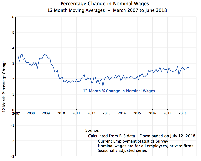 Note that the date labels are for the end of each period. Thus the point labeled at the start of 2008 will cover the percentage change in the nominal wage between January 2007 and January 2008. And the starting date label for the chart will be March 2007, which covers the period from March 2006 (when the data series begins) to March 2007.
Prior to the 2008/09 downturn, nominal wages were growing at roughly 3% a year. Once the downturn struck they continued to increase, but at a slower pace of roughly 2% a year or a bit below. And this rate then started slowly to rise over time, reaching 2.7% in the most recent twelve-month period ending in June 2017. The changes are remarkably minor, as was also noted above, and cover a period where unemployment was as high as 10% and is now just 4%. There has been very little year to year volatility.
[A side note: There is a “bump” in late 2008/early 2009, with wage growth over the year earlier period rising from around 3% to around 3 1/2%. This might be considered surprising, as the bump up is precisely in the period when jobs were plummeting and unemployment increasing, in the worst period of the economic collapse. But while I do not have the detailed microdata from the BLS surveys to say with certainty, I suspect this is a compositional effect. When businesses start to lay off workers, they will typically start with the least experienced, and lowest paid, workers. That will leave them with a reduced labor force, but one whose wages are on average higher.]
There have been larger fluctuations in the consumer price index:
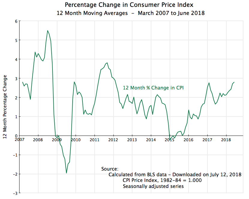 But note that “larger” should be interpreted in a relative sense. The absolute changes were generally not all that large (with some exceptions), and can mostly be attributed to changes in the prices of a limited number of volatile commodities, namely for food items and energy (oil). The prices of such commodities go up and down, but over time they even out. Thus for understanding inflationary trends, analysts will often focus instead on the so-called “core CPI”, which excludes food and energy prices. For the full period being examined here, the regular CPI rose at a 1.88% annual pace while the core CPI rose at a 1.90% pace. Within round-off, these are essentially the same.
But what matters to wage earners is what their wages earn, including for food and energy. Thus to examine the impact on real living standards, what matters is the real wage defined in terms of the regular CPI index. And this was:
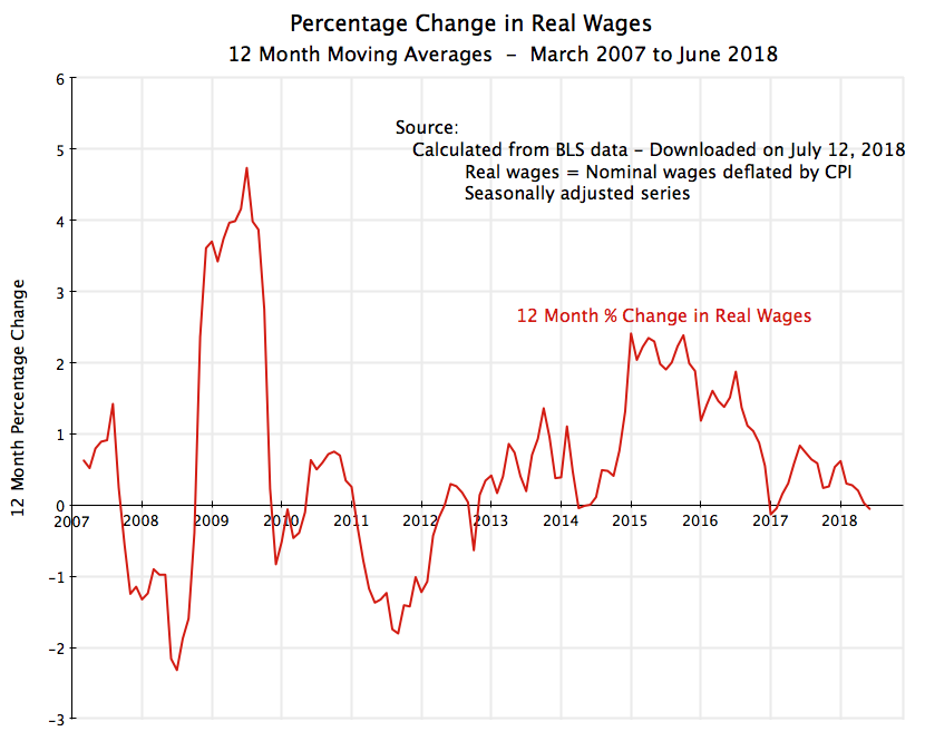 With the relatively steady changes in average nominal wages, year to year, the fluctuations will basically be the mirror image of what has been happening to inflation. When prices fell, real wages rose, and when prices rose more than normal, real wages fell.
Prices are now again rising, although still within the norm of the last twelve years. For the 12 months ending in June 2018, the CPI (using the seasonally adjusted series) rose at a 2.8% rate. The average nominal wage rate rose at a rate of 2.74% and thus the real wage fell slightly by 0.05% (calculated before rounding). Average real wages are basically the same as (and formally slightly below) where they were a year ago.
D. Employment and Unemployment
There is thus no evidence that the measures Trump has trumpeted (of deregulation, slashing taxes for corporations, and launching a trade war) have led to a step up in real wages. This should not be surprising. Deregulation which spurs industry consolidation increases the power of firms to raise prices while holding down wages. And there is no reason to believe that tax cuts will lead quickly to higher wages. Corporations do not pay their workers out of generosity or out of some sense of charity. In a market economy they pay their employees what they need to in order to get the workers in the number and quality they need. And although there can be winners in a trade war, there will also certainly be losers, and overall there will be a loss. Workers, on average, will lose.
But what is surprising is that wages are not now rising by more in an economy that has reached full employment. Federal Reserve Chair Jerome Powell, for example, has called this “a puzzle”. And indeed it is.
The labor market turned around in the first two years of the Obama administration, and since then employment has grown consistently:
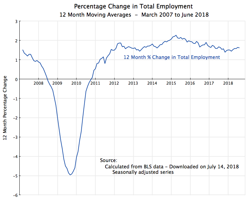
This has continued (although at a slightly slower pace) since Trump took office in January 2017. The same trend as before has continued. And this trend growth in net jobs each month has meant a steady fall in the unemployment rate:
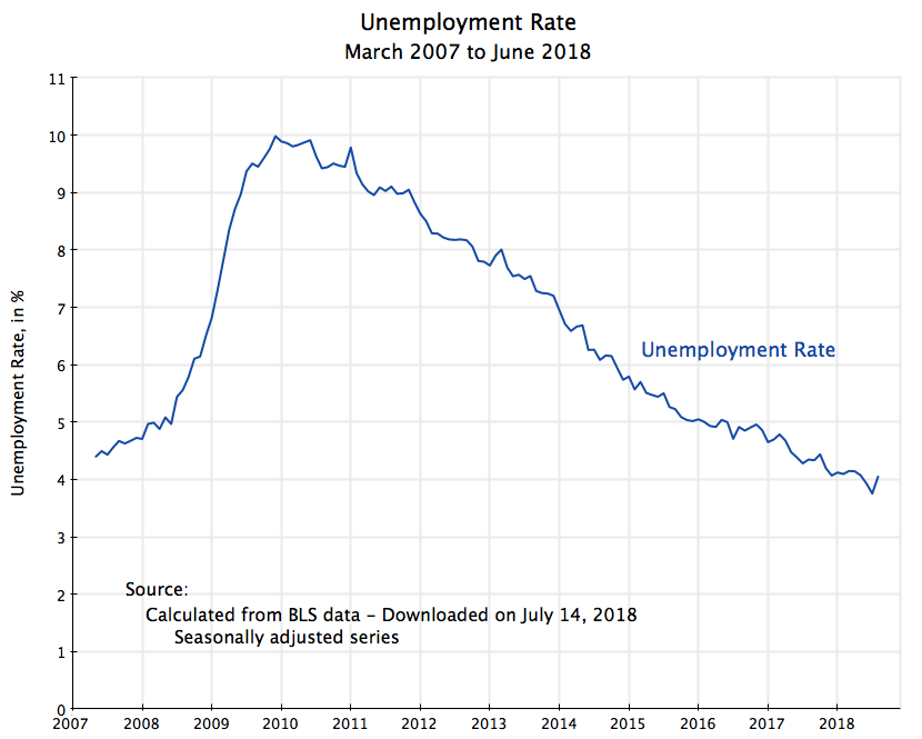
Again, the pace since Trump took office is similar to (but a bit slower than) the pace when Obama was still in office. But the somewhat slower pace should not be surprising. With the economy at close to full employment, one should expect the pace to slow.
Indeed, the unemployment rate cannot go much lower. There is always a certain amount of “churn” in the job market, which means an unemployment rate of zero is impossible. And many economists in fact have taken a somewhat higher rate of unemployment (or at least 5.0%) as the appropriate target for “full employment”, arguing that anything lower will lead to a wage and price spiral.
But we have not seen any sign of that so far. Nominal wages are rising at only a modest pace, and indeed over the last year at a pace less than inflation.
E. Conclusion
There has been no step up in real wages since Trump took office. Indeed, over the past twelve months, they fell slightly. But while there is no reason to believe there should have been a jump in real wages following from Trump’s economic policies (of deregulation, tax cuts for corporations, and trade war), it is surprising that the economy is not now well past the point where low unemployment should have been spurring more substantial wage gains.
This very well could change, and indeed I would expect it to. There is good reason to believe that the news for the real wage will be a good deal more positive over the next year than it has been over the past year. But we will have to wait and see. So far it has not happened.

You must be logged in to post a comment.