
A. Introduction
The cost of solar photovoltaic power has fallen dramatically over the past decade, and it is now, together with wind, a lower cost source of new power generation than either fossil-fuel (coal or gas) or nuclear power plants. The power generated by a new natural gas-fueled power plant in 2018 would have cost a third more than from a solar or wind plant (in terms of the price they would need to sell the power for in order to break even); coal would have cost 2.4 times as much as solar or wind; and a nuclear plant would have cost 3.5 times as much.
These estimates (shown in the chart above, and discussed in more detail below) were derived from figures estimated by Lazard, the investment bank, and are based on bottom-up estimates of what such facilities would have cost to build and operate, including the fuel costs. But one also finds a similar sharp fall in solar energy prices in the actual market prices that have been charged for the sale of power from such plants under long-term “power purchase agreements” (PPAs). These will also be discussed below.
With the costs where they are now, it would not make economic sense to build new coal or nuclear generation capacity, nor even gas in most cases. In practice, however, the situation is more complex due to regulatory issues and conflicting taxes and subsidies, and also because of variation across regions. Time of day issues may also enter, depending on when (day or night) the increment in new capacity might be needed. The figures above are also averages, particular cases vary, and what is most economic in any specific locale will depend on local conditions. Nevertheless, and as we will examine below, there has been a major shift in new generation capacity towards solar and wind, and away from coal (with old coal plants being retired) and from nuclear (with no new plants being built, but old ones largely remaining).
But natural gas generation remains large. Indeed, while solar and wind generation have grown quickly (from a low base), and together account for the largest increment in new power capacity in recent years, gas accounts for the largest increment in power production (in megawatt-hours) measured from the beginning of this decade. Why? In part this is due to the inherent constraints of solar and wind technologies: Solar panels can only generate power when the sun shines, and wind turbines when the wind is blowing. But more interestingly, one also needs to look at the economics behind the choice as to whether or not to build new generation capacity to replace existing capacity, and then what sources of capacity to use. Critical is what economists call the marginal cost of such production. A power plant lasts for many years once it is built, and the decision on whether to keep an existing plant in operation for another year depends only on the cost of operating and maintaining the plant. The capital cost has already been spent and is no longer relevant to that decision.
Details in the Lazard report can be used to derive such marginal cost estimates by power source, and we will examine these below. While the Lazard figures apply to newly built plants (older plants will generally have higher operational and maintenance costs, both because they are getting old and because technology was less efficient when they were built), the estimates based on new plants can still give us a sense of these costs. But one should recognize they will be biased towards indicating the costs of the older plants are lower than they in fact are. However, even these numbers (biased in underestimating the costs of older plants) imply that it is now more economical to build new wind and possibly solar plants, in suitable locales, than it costs to continue to keep open and operate coal-burning power plants. This will be especially true for the older, less-efficient, coal-burning plants. Thus we should be seeing old coal-burning plants being shut down. And indeed we do. Moreover, while the costs of building new wind and solar plants are not yet below the marginal costs of keeping open existing gas-fueled and nuclear power plants, they are on the cusp of being so.
These costs also do not reflect any special subsidies that solar and wind plants might benefit from. These vary by state. Fossil-fueled and nuclear power plants also enjoy subsidies (often through special tax advantages), but these are long-standing and are implicitly being included in the Lazard estimates of the costs of such traditional plants.
But one special subsidy enjoyed by fossil fuel burning power plants, not reflected in the Lazard cost estimates, is the implicit subsidy granted to such plants from not having to cover the cost of the damage from the pollution they generate. Those costs are instead borne by the general public. And while such plants pollute in many different ways (especially the coal-burning ones), I will focus here on just one of those ways – their emissions of greenhouse gases that are leading to a warming planet and consequent more frequent and more damaging extreme weather events. Solar and wind generation of power do not cause such pollution – the burning of coal and gas do.
To account for such costs and to ensure a level playing field between power sources, a fee would need to be charged to reflect the costs being imposed on the general population from this (and indeed other) such pollution. The revenues generated could be distributed back to the public in equal per capita terms, as discussed in an earlier post on this blog. We will see that a fee of even just $20 per ton of CO2 emitted would suffice to make it economic to build new solar and wind power plants to substitute not just for new gas and coal burning plants, but for existing ones as well. Gas and especially coal burning plants would not be competitive with installing new solar or wind generation if they had to pay for the damage done as a result of their greenhouse gas pollution, even on just marginal operating costs.
Two notes before starting: First, many will note that while solar might be fine for the daytime, it will not be available at night. Similarly, wind generation will be fine when the wind blows, but it may not always blow even in the windiest locales. This is of course true, and should solar and wind capacity grow to dominate power generation, there will have to be ways to store that power to bridge the times from when the generation occurs to when the power is used.
But while storage might one day be an issue, it is mostly not an issue now. In 2018, utility-scale solar only accounted for 1.6% of power generation in the US (and 2.3% if one includes small scale roof-top systems), while wind only accounted for 6.6%. At such low shares, solar and wind power can simply substitute for other, higher cost, sources of power (such as from coal) during the periods the clean sources are available. Note also that the cost figures for solar and wind reflected in the chart at the top of this post (and discussed in detail below) take into account that solar and wind cannot be used 100% of the time. Rather, utilization is assumed to be similar to what their recent actual utilization has been, not only for solar and wind but also for gas, coal and nuclear. Solar and wind are cheaper than other sources of power (over the lifetime of these investments) despite their inherent constraints on possible utilization.
But where the storage question can enter is in cases where new generation capacity is required specifically to serve evening or night-time needs. New gas burning plants might then be needed to serve such time-of-day needs if storage of day-time solar is not an economic option. And once such gas-burning plants are built, the decision on whether they should be run also to serve day-time needs will depend on a comparison of the marginal cost of running these gas plants also during the day, to the full cost of building new solar generation capacity, as was discussed briefly above and will be considered in more detail below.
This may explain, in part, why we see new gas-burning plants still being built nationally. While less than new solar and wind plants combined (in terms of generation capacity), such new gas-burning plants are still being built despite their higher cost.
More broadly, California and Hawaii (both with solar now accounting for over 12% of power used in those states) are two states (and the only two states) which may be approaching the natural limits of solar generation in the absence of major storage. During some sunny days the cost of power is being driven down to close to zero (and indeed to negative levels on a few days). Major storage will be needed in those states (and only those states) to make it possible to extend solar generation much further than where it is now. But this should not be seen so much as a “problem” but rather as an opportunity: What can we do to take advantage of cheap day-time power to make it available at all hours of the day? I hope to address that issue in a future blog post. But in this blog post I will focus on the economics of solar generation (and to a lesser extent from wind), in the absence of significant storage.
Second, on nomenclature: A megawatt-hour is a million watts of electric power being produced or used for one hour. One will see it abbreviated in many different ways, including MWHr, MWhr, MWHR, MWH, MWh, and probably more. I will try to use consistently MWHr. A kilowatt-hour (often kWh) is a thousand watts of power for one hour, and is the typical unit used for homes. A megawatt-hour will thus be one thousand times a kilowatt-hour, so a price of, for example, $20 per MWHr for solar-generated power (which we will see below has in fact been offered in several recent PPA contracts) will be equivalent to 2.0 cents per kWh. This will be the wholesale price of such power. The retail price in the US for households is typically around 10 to 12 cents per kWh.
B. The Levelized Cost of Energy
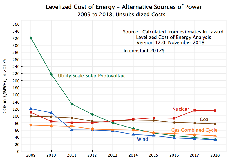
As seen in the chart at the top of this post, the cost of generating power by way of new utility-scale solar photovoltaic panels has fallen dramatically over the past decade, with a cost now similar to that from new on-shore wind turbines, and well below the cost from building new gas, coal, or nuclear power plants. These costs can be compared in terms of the “levelized cost of energy” (LCOE), which is an estimate of the price that would need to be charged for power from such a plant over its lifetime, sufficient to cover the initial capital cost (at the anticipated utilization rate), plus the cost of operating and maintaining the plant,
Lazard, the investment bank, has published estimates of such LCOEs annually for some time now. The most recent report, issued in November 2018, is version 12.0. Lazard approaches the issue as an investment bank would, examining the cost of producing power by each of the alternative sources, with consistent assumptions on financing (with a debt/equity ratio of 60/40, an assumed cost of debt of 8%, and a cost of equity of 12%) and a time horizon of 20 years. They also include the impact of taxes, and show separately the impact of special federal tax subsidies for clean energy sources. But the figures I will refer to throughout this post (including in the chart above) are always the estimates excluding any impact from special subsidies for clean energy. The aim is to see what the underlying actual costs are, and how they have changed over time.
The Lazard LCOE estimates are calculated and presented in nominal terms. They show the price, in $/MWHr, that would need to be charged over a 20-year time horizon for such a project to break even. For comparability over time, as well as to produce estimates that can be compared directly to the PPA contract prices that I will discuss below, I have converted those prices from nominal to real terms in constant 2017 dollars. Two steps are involved. First, the fixed nominal LCOE prices over 20 years will be falling over time in real terms due to general inflation. They were adjusted to the prices of their respective initial year (i.e. the relevant year from 2009 to 2018) using an inflation rate of 2.25% (which is the rate used for the PPA figures discussed below, the rate the EIA assumed in its 2018 Annual Energy Outlook report, and the rate which appears also to be what Lazard assumed for general cost escalation factors). Second, those prices for the years between 2009 and 2018 were all then converted to constant 2017 prices based on actual inflation between those years and 2017.
The result is the chart shown at the top of this post. The LCOEs in 2018 (in 2017$) were $33 per MWHr for a newly built utility-scale solar photovoltaic system and also for an on-shore wind installation, $44 per MWHr for a new natural gas combined cycle plant, $78 for a new coal-burning plant, and $115 for a new nuclear power plant. The natural gas plant would cost one-third more than a solar or wind plant, coal would cost 2.4 times as much, and a nuclear plant 3.5 times as much. Note also that since the adjustments for inflation are the same for each of the power generation methods, their costs relative to each other (in ratio terms) are the same for the LCOEs expressed in nominal cost terms. And it is their costs relative to each other which most matters.
The solar prices have fallen especially dramatically. The 2018 LCOE was only one-tenth of what it was in 2009. The cost of wind generation has also fallen sharply over the period, to about one-quarter in 2018 of what it was in 2009. The cost from gas combined cycle plants (the most efficient gas technology, and is now widely used) also fell, but only by about 40%, while the cost of coal or nuclear were roughly flat or rising, depending on precisely what time period is used.
There is good reason to believe the cost of solar technology will continue to decline. It is still a relatively new technology, and work in labs around the world are developing solar technologies that are both more efficient and less costly to manufacture and install.
Current solar installations (based on crystalline silicon technology) will typically have conversion efficiencies of 15 to 17%. And panels with efficiencies of up to 22% are now available in the market – a gain already on the order of 30 to 45% over the 15 to 17% efficiency of current systems. But a chart of how solar efficiencies have improved over time (in laboratory settings) shows there is good reason to believe that the efficiencies of commercially available systems will continue to improve in the years to come. While there are theoretical upper limits, labs have developed solar cell technologies with efficiencies as high as 46% (as of January 2019).
Particularly exciting in recent years has been the development of what are called “perovskite” solar technologies. While their current efficiencies (of up to 28%, for a tandem cell) are just modestly better than purely crystalline silicon solar cells, they have achieved this in work spanning only half a decade. Crystalline silicon cells only saw such an improvement in efficiencies in research that spanned more than four decades. And perhaps more importantly, perovskite cells are much simpler to manufacture, and hence much cheaper.
Based on such technologies, one could see solar efficiencies doubling within a few years, from the current 15 to 17% to say 30 to 35%. And with a doubling in efficiency, one will need only half as many solar panels to produce the same megawatts of power, and thus also only half as many frames to hold the panels, half as much wiring to link them together, and half as much land. Coupled with simplified and hence cheaper manufacturing processes (such as is possible for perovskite cells), there is every reason to believe prices will continue to fall.
While there can be no certainty in precisely how this will develop, a simple extrapolation of recent cost trends can give an indication of what might come. Assuming costs continue to change at the same annual rate that they had over the most recent five years (2013 to 2018), one would find for the years up to 2023:
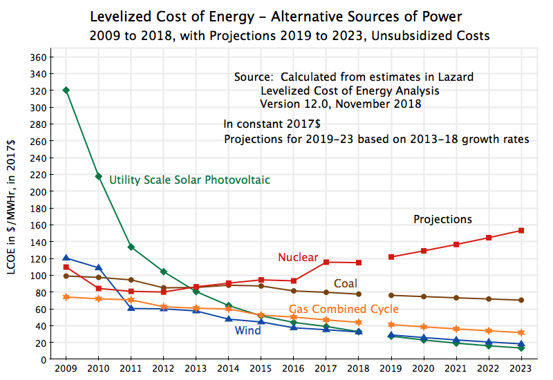 If these trends hold, then the LCOE (in 2017$) of solar power will have fallen to $13 per MWHr by 2023, wind will have fallen to $18, and gas will be at $32 (or 2.5 times the LCOE of solar in that year, and 80% above the LCOE of wind). And coal (at $70) and nuclear (at $153) will be totally uncompetitive.
This is an important transition. With the dramatic declines in the past decade in the costs for solar power plants, and to a lesser extent wind, these clean sources of power are now more cost competitive than traditional, polluting, sources. And this is all without any special subsidies for the clean energy. But before looking at the implications of this for power generation, as a reality check it is good first to examine whether the declining costs of solar power have been reflected in actual market prices for such power. We will see that they have.
C. The Market Prices for Solar Generated Power
Power Purchase Agreements (PPAs) are long-term contracts where a power generator (typically an independent power producer) agrees to supply electric power at some contracted capacity and at some price to a purchaser (typically a power utility or electric grid operator). These are competitively determined (different parties interested in building new power plants will bid for such contracts, with the lowest price winning) and are a direct market measure of the cost of energy from such a source.
The Lawrence Berkeley National Lab, under a contract with the US Department of Energy, produces an annual report that reviews and summarizes PPA contracts for recent utility-scale solar power projects, including the agreed prices for the power. The most recent was published in September 2018, and covers 2018 (partially) and before. While the report covers both solar photovoltaic and concentrating solar thermal projects, the figures of interest to us here (and comparable to the Lazard LCOEs discussed above) are the PPAs for the solar photovoltaic projects.
The PPA prices provided in the report were all calculated by the authors on a levelized basis and in terms of 2017 prices. This was done to put them all on a comparable basis to each other, as the contractual terms of the specific contracts could differ (e.g. some had price escalation clauses and some did not). Averages by year were worked out with the different projects weighted by generation capacity.
The PPA prices are presented by the year the contracts were signed. If one then plots these PPA prices with a one year lag and compare them to the Lazard estimated LCOE prices of that year, one finds a remarkable degree of overlap:
 This high degree of overlap is extraordinary. Only the average PPA price for 2010 (reflecting the 2009 average price lagged one year) is off, but would have been close with a one and a half year lag rather than a one year lag. Note also that while the Lawrence Berkeley report has PPA prices going back to 2006, the figures for the first several years are based on extremely small samples (just one project in 2006, one in 2007, and three in 2008, before rising to 16 in 2009 and 30 in 2010). For that reason I have not plotted the 2006 to 2008 PPA prices (which would have been 2007 to 2009 if lagged one year), but they also would have been below the Lazard LCOE curve.
What might be behind this extraordinary overlap when the PPA prices are lagged one year? Two possible explanations present themselves. One is that the power producers when making their PPA bids realize that there will be a lag from when the bids are prepared to when the winning bidder is announced and construction of the project begins. With the costs of solar generation falling so quickly, it is possible that the PPA bids reflect what they know will be a lag between when the bid is prepared and when the project has to be built (with solar panels purchased and other costs incurred). If that lag is one year, one will see overlap such as that found for the two curves.
Another possible explanation for the one-year shift observed between the PPA prices (by date of contract signing) and the Lazard LCOE figures is that the Lazard estimates labeled for some year (2018 for example) might in fact represent data on the cost of the technologies as of the prior year (2017 in this example). One cannot be sure from what they report. Or the remarkable degree of overlap might be a result of some combination of these two possible explanations, or something else.
But for whatever reason, the two estimates move almost exactly in parallel over time, and hence show an almost identical rate of decline for both the cost of generating power from solar photovoltaic sources and in the market PPA prices for such power. And it is that rapid rate of decline which is important.
It is also worth noting that the “bump up” in the average PPA price curve in 2017 (shown in the chart as 2018 with the one year lag) reflects in part that a significant number of the projects in the 2017 sample of PPAs included, as part of the contract, a power storage component to store a portion of the solar-generated power for use in the evening or night. But these additional costs for storage were remarkably modest, and were even less in several projects in the partial-year 2018 sample. Specifically, Nevada Energy (as the offtaker) announced in June 2018 that it had contracted for three major solar projects that would include storage of power of up to one-quarter of generation capacity for four hours, with overall PPA prices (levelized, in 2017 prices) for both the generation and the storage of just $22.8, $23.5, and $26.4 per MWHr (i.e. 2.28 cents, 2.35 cents, and 2.64 cents per kWh, respectively).
The PPA prices reported can also be used to examine how the prices vary by region. One should expect solar power to be cheaper in southern latitudes than in northern ones, and in dry, sunny, desert areas than in regions with more extensive cloud cover. And this has led to the criticism by skeptics that solar power can only be competitive in places such as the US Southwest.
But this is less of an issue than one might assume. Dividing up the PPA contracts by region (with no one-year lag in this chart), one finds:
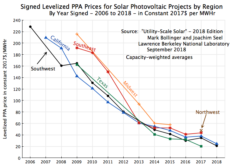 Prices found in the PPAs are indeed lower in the Southwest, California, and Texas. But the PPA prices for projects in the Southeast, the Midwest, and the Northwest fell at a similar pace as those in the more advantageous regions (and indeed, at a more rapid pace up to 2014). And note that the prices in those less advantageous regions are similar to what they were in the more advantageous regions just a year or two before. Finally, the absolute differences in prices have become relatively modest in the last few years.
The observed market prices for power generated by solar photovoltaic systems therefore appear to be consistent with the bottom-up LCOE estimates of Lazard – indeed remarkably so. Both show a sharp fall in solar energy prices/costs over the last decade, and sharp falls both for the US as a whole and by region. The next question is whether we see this reflected in investment in additions to new power generation capacity, and in the power generated by that capacity.
D. Additions to Power Generation Capacity, and in Power Generation
The cost of power from a new solar or wind plant is now below the cost from gas (while the cost of new coal or nuclear generation capacity is totally uncompetitive). But the LCOEs indicate that the cost advantage relative to gas is relatively recent in the case of solar (starting from 2016), and while a bit longer for wind, the significant gap in favor of wind only opened up in 2014. One needs also to recognize that these are average or mid-point estimates of costs, and that in specific cases the relative costs will vary depending on local conditions. Thus while solar or wind power is now cheaper on average across the US, in some particular locale a gas plant might be less expensive (especially if the costs resulting from its pollution are not charged). Finally, and as discussed above, there may be time-of-day issues that the new capacity may be needed for, with this affecting the choices made.
Thus while one should expect a shift towards solar and wind over the last several years, and away from traditional fuels, the shift will not be absolute and immediate. What do we see?
First, in terms of the gross additions to power sector generating capacity:
 The chart shows the gross additions to power capacity, in megawatts, with both historical figures (up through 2018) and as reflected in plans filed with the US Department of Energy (for 2019 and 2020, with the plans as filed as of end-2018). The data for this (and the other charts in this section) come from the most recent release of the Electric Power Annual of the Energy Information Agency (EIA) (which was for 2017, and was released on October 22, 2018), plus from the Electric Power Monthly of February, 2019, also from the Energy Information Agency (where the February issue each year provides complete data for the prior calendar year, i.e. for 2018 in this case).
The planned additions to capacity (2019 and 2020 in the chart) provide an indication of what might happen over the next few years, but must be interpreted cautiously. While probably pretty good for the next few years, biases will start to enter as one goes further into the future. Power producers are required to file their plans for new capacity (as well as for retirements of existing capacity) with the Department of Energy, for transparency and to help ensure capacity (locally as well as nationally) remains adequate. But these reported plans should be approached cautiously. There is a bias as projects that require a relatively long lead time (such as gas plants, as well as coal and especially nuclear) will be filed years ahead, while the more flexible, shorter construction periods, required for solar and wind plants means that these plans will only be filed with the Department of Energy close to when that capacity will be built. But for the next few years, the plans should provide an indication of how the market is developing.
As seen in the chart, solar and wind taken together accounted for the largest single share of gross additions to capacity, at least through 2017. While there was then a bump up in new gas generation capacity in 2018, this is expected to fall back to earlier levels in 2019 and 2020. And these three sources (solar, wind, and gas) accounted for almost all (93%) of the gross additions to new capacity over 2012 to 2018, with this expected to continue.
New coal-burning plants, in contrast, were already low and falling in 2012 and 2013, and there have been no new ones since then. Nor are any planned. This is as one would expect based on the LCOE estimates discussed above – new coal plants are simply not cost competitive. And the additions to nuclear and other capacity have also been low. “Other” capacity is a miscellaneous category that includes hydro, petroleum-fueled plants such as diesel, as well as other renewables such as from the burning of waste or biomass. The one bump up, in 2016, is due to a nuclear power plant coming on-line that year. It was unit #2 of the Watts Bar nuclear power plant built by the Tennessee Valley Authority (TVA), and had been under construction for decades. Indeed the most recent nuclear plant completed in the US before this one was unit #1 at the same TVA plant, which came on-line 20 years before in 1996. Even aside from any nuclear safety concerns, nuclear plants are simply not economically competitive with other sources of power.
The above are gross additions to power generating capacity, reflecting what new plants are being built. But old, economically or technologically obsolete, plants are also being retired, so what matters to the overall shift in power generation capacity is what has happened to net generation capacity:
 What stands out here is the retirement of coal-burning plants. And while the retirements might appear to diminish in the plans going forward, this may largely be due to retirement plans only being announced shortly before they happen. It is also possible that political pressure from the Trump administration to keep coal-burning plants open, despite their higher costs (and their much higher pollution), might be a factor. We will see what happens.
The cumulative impact of these net additions to capacity (relative to 2010 as the base year) yields:
 Solar plus wind accounts for the largest addition to capacity, followed by gas. Indeed, each of these accounts for more than 100% of the growth in overall capacity, as there has been a net reduction in the nuclear plus other category, and especially in coal.
But what does this mean in terms of the change in the mix of electric power generation capacity in the US? Actually, less than one might have thought, as one can see in a chart of the shares:
 The share of coal has come down, but remains high, and similarly for nuclear (plus miscellaneous other) capacity. Gas remains the highest and has risen as a share, while solar and wind, while rising at a rapid pace relative to where it was to start, remains the smallest shares (of the categories used here).
The reason for these relatively modest changes in shares is that while solar and wind plus gas account for more than 100% of the net additions to capacity, that net addition has been pretty small. Between 2010 and 2018, the net addition to US electric power generation capacity was just 58.8 thousand megawatts, or an increase over eight years of just 5.7% over what capacity was in 2010 (1,039.1 thousand megawatts). A big share of something small will still be small.
So even though solar and wind are now the lowest cost sources of new power generation, the very modest increase in the total power capacity needed has meant that not that much has been built. And much of what has been built has been in replacement of nuclear and especially coal capacity. As we will discuss below, the economic issue then is not whether solar and wind are the cheapest source of new capacity (which they are), but whether new solar and wind are more economic than what it costs to continue to operate existing coal and nuclear plants. That is a different question, and we will see that while new solar and wind are now starting to be a lower cost option than continuing to operate older coal (but not nuclear) plants, this development (a critically important development) has only been recent.
Why did the US require such a small increase in power generation capacity in recent years? As seen in the chart below, it is not because GDP has not grown, but rather because energy efficiency (real GDP per MWHr of power) improved tremendously, at least until 2017:
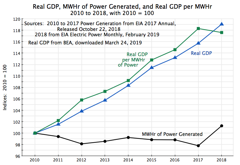 From 2010 to 2017, real GDP rose by 15.7% (2.1% a year on average), but GDP per MWHr of power generated rose by 18.3%. That meant that power generation (note that generation is the relevant issue here, not capacity) could fall by 2.2% despite the higher level of GDP. Improving energy efficiency was a key priority during the Obama years, and it appears to have worked well. It is better for efficiency to rise than to have to produce more power, even if that power comes from a clean source such as solar or wind.
This reversed direction in 2018. It is not clear why, but might be an early indication that the policies of the Trump administration are harming efficiency in our economy. However, this is still just one year of data, and one will need to wait to see whether this was an aberration or a start of a new, and worrisome, trend.
Which brings us to generation. While the investment decision is whether or not to add capacity, and if so then of what form (e.g. solar or gas or whatever), what is ultimately needed is the power generated. This depends on the capacity available and then on the decision of how much of that capacity to use to generate the power needed at any given moment. One needs to keep in mind that power in general is not stored (other than still very limited storage of solar and wind power), but rather has to be generated at the moment needed. And since power demand goes up and down over the course of the day (higher during the daylight hours and lower at night), as well as over the course of the year (generally higher during the summer, due to air conditioning, and lower in other seasons), one needs total generation capacity sufficient to meet whatever the peak load might be. This means that during all other times there will be excess, unutilized, capacity. Indeed, since one will want to have a safety margin, one will want to have total power generation capacity of even more than whatever the anticipated peak load might be in any locale.
There will always, then, be excess capacity, just sometimes more and sometimes less. And hence decisions will be necessary as to what of the available capacity to use at any given moment. While complex, the ultimate driver of this will be (or at least should be, in a rational system) the short-run costs of producing power from the possible alternative sources available in the region where the power is needed. These costs will be examined in the next section below. But for here, we will look at how generation has changed over the last several years.
In terms of the change in power generation by source relative to the levels in 2010, one finds:
 Gas now accounts for the largest increment in generation over this period, with solar and wind also growing (steadily) but by significantly less. Coal powered generation, in contrast, fell substantially, while nuclear and other sources were basically flat. And as noted above, due to increased efficiency in the use of power (until 2017), total power use was flat to falling a bit, even as GDP grew substantially. This reversed in 2018 when efficiency fell, and gas generated power rose to provide for the resulting increased power demands. Solar and wind continued on the same path as before, and coal generation still fell at a similar pace as before. But it remains to be seen whether 2018 marked a change in the previous trend in efficiency gains, or was an aberration.
Why did power generation from gas rise by more than from solar and wind over the period, despite the larger increase in solar plus wind capacity than in gas generation capacity? In part this reflects the cost factors which we will discuss in the next section below. But in part one needs also to recognize factors inherent in the technologies. Solar generation can only happen during the day (and also when there is no cloud cover), while wind generation depends on when the wind blows. Without major power storage, this will limit how much solar and wind can be used.
The extent to which some source of power is in fact used over some period (say a year), as a share of what would be generated if the power plant operated at 100% of capacity for 24 hours a day, 365 days a year, is defined as the “capacity factor”. In 2018, the capacity factor realized for solar photovoltaic systems was 26.1% while for wind it was 37.4%. But for no power source is it 100%. For natural gas combined cycle plants (the primary source of gas generation), the capacity factor was 57.6% in 2018 (up from 51.3% in 2017, due to the jump in power demand in 2018). This is well below the theoretical maximum of 100% as in general one will be operating at less than peak capacity (plus plants need to be shut down periodically for maintenance and other servicing).
Thus increments in “capacity”, as measured, will therefore not tell the whole story. How much such capacity is used also matters. And the capacity factors for solar and wind will in general be less than what they will be for the other primary sources of power generation, such as gas, coal, and nuclear (and excluding the special case of plants designed solely to operate for short periods of peak load times, or plants used as back-ups or for cases of emergencies). But how much less depends only partly on the natural constraints on the clean technologies. It also depends on marginal operating costs, as we will discuss below.
Finally, while gas plus solar and wind have grown in terms of power generation since 2010, and coal has declined (and nuclear and other sources largely unchanged), coal-fired generation remains important. In terms of the percentage shares of overall power generation:
 While coal has fallen as a share, from about 45% of US power generation in 2010 to 27% in 2018, it remains high. Only gas is significantly higher (at 35% in 2010). Nuclear and other sources (such as hydro) accounts for 29%, with nuclear alone accounting for two-thirds of this and other sources the remaining one-third. Solar and wind have grown steadily, and at a rapid rate relative to where they were in 2010, but in 2018 still accounted only for about 8% of US power generation.
Thus while coal has come down, there is still very substantial room for further substitution out of coal, by either solar and wind or by natural gas. The cost factors that will enter into this decision on substituting out of coal will be discussed next.
E. The Cost Factors That Enter in the Decisions on What Plants to Build, What Plants to Keep in Operation, and What Plants to Use
The Lazard analysis of costs presents estimates not only for the LCOE of newly built power generation plants, but also figures that can be used to arrive at the costs of operating a plant to produce power on any given day, and of operating a plant plus keeping it maintained for a year. One needs to know these different costs in order to address different questions. The LCOE is used to decide whether to build a new plant and keep it in operation for a period (20 years is used); the operating cost is used to decide which particular power plant to run at any given time to generate the power then needed (from among all the plants up and available to run that day); while the operating cost plus the cost of regular annual maintenance is used in the decision of whether to keep a particular plant open for another year.
The Lazard figures are not ideal for this, as they give cost figures for a newly built plant, using the technology and efficiencies available today. The cost to maintain and operate an older plant will be higher than this, both because older technologies were less efficient but also simply because they are older and hence more liable to break down (and hence cost more to keep running) than a new plant. But the estimates for a new plant do give us a sense of what the floor for such costs might be – the true costs for currently existing plants of various ages will be somewhat higher.
Lazard also recognized that there will be a range of such costs for a particular type of plant, depending on the specifics of the particular location and other such factors. Their report therefore provides both what it labels low end and high end estimates, and with a mid-point estimate then based usually on the average between the two. The figures shown in the chart at the top of this post are the mid-point estimates, but in the tables below we will show the low and high end cost estimates as well. These figures are helpful in providing a sense of the range in the costs one should expect, although how Lazard defined the range they used is not fully clear. They are not of the absolutely lowest possible cost plant nor absolutely highest possible cost plant. Rather, the low end figures appear to be averages of the costs of some share of the lowest cost plants (possibly the lowest one third), and similarly for the high end figures.
The cost figures below are from the 2018 Lazard cost estimates (the most recent year available). The operating and maintenance costs are by their nature current expenditures, and hence their costs will be in current, i.e. 2018, prices. The LCOE estimates of Lazard are different. As was noted above, these are the levelized prices that would need to be charged for the power generated to cover the costs of building and then operating and maintaining the plant over its assumed (20 year) lifetime. They therefore need to be adjusted to reflect current prices. For the chart at the top of this post, they were put in terms of 2017 prices (to make them consistent with the PPA prices presented in the Berkeley report discussed above). But for the purposes here, we will put them in 2018 prices to ensure consistency with the prices for the operating and maintenance costs. The difference is small (just 2.2%).
The cost estimates derived from the Lazard figures are then:
(all costs in 2018 prices)
A. Levelized Cost of Energy from a New Power Plant: $/MWHr
|
Solar |
Wind |
Gas |
Coal |
Nuclear |
|
|
low end |
$31.23 |
$22.65 |
$32.02 |
$46.85 |
$87.46 |
|
mid-point |
$33.58 |
$33.19 |
$44.90 |
$79.26 |
$117.52 |
|
high end |
$35.92 |
$43.73 |
$57.78 |
$111.66 |
$147.58 |
B. Cost to Maintain and Operate a Plant Each year, including for Fuel: $/MWHr
|
Solar |
Wind |
Gas |
Coal |
Nuclear |
|
|
low end |
$4.00 |
$9.24 |
$24.38 |
$23.19 |
$23.87 |
|
mid-point |
$4.66 |
$10.64 |
$26.51 |
$31.30 |
$25.11 |
|
high end |
$5.33 |
$12.04 |
$28.64 |
$39.41 |
$26.35 |
C. Short-term Variable Cost to Operate a Plant, including for Fuel: $/MWHr
|
Solar |
Wind |
Gas |
Coal |
Nuclear |
|
|
low end |
$0.00 |
$0.00 |
$23.16 |
$14.69 |
$9.63 |
|
mid-point |
$0.00 |
$0.00 |
$25.23 |
$18.54 |
$9.63 |
|
high end |
$0.00 |
$0.00 |
$27.31 |
$22.40 |
$9.63 |
A number of points follow from these cost estimates:
a) First, and as was discussed above, the LCOE estimates indicate that for the question of what new type of power plant to build, it will in general be cheapest to obtain new power from a solar or wind plant. The mid-point LCOE estimates for solar and wind are well below the costs of power from gas plants, and especially below the costs from coal or nuclear plants.
But also as noted before, local conditions vary and there will in fact be a range of costs for different types of plants. The Lazard estimates indicate that a gas plant with costs at the low end of a reasonable range (estimated to be about $32 per MWHr) would be competitive with solar or wind plants at the mid-point of their cost range (about $33 to $34 per MWHr), and below the costs of a solar plant at the high end of its cost range ($36) and especially a wind plant at its high end of its costs ($44). However, there are not likely to be many such cases: Gas plants with a cost at their mid-point estimate would not be competitive, and even less so for gas plants with a cost near their high end estimate.
Furthermore, even the lowest cost coal and nuclear plants would be far from competitive with solar or wind plants when considering the building of new generation capacity. This is consistent with what we saw in Section D above, of no new coal or nuclear plants being built in recent years (with the exception of one nuclear plant whose construction started decades ago and was only finished in 2016).
b) More interesting is the question of whether it is economic to build new solar or wind plants to substitute for existing gas, coal, or nuclear plants. The figures in panel B of the table on the cost to operate and maintain a plant for another year (all in terms of $/MWHr) can give us a sense of whether this is worthwhile. Keeping in mind that these are going to be low estimates (as they are the costs for newly built plants, using the technologies available today, not for existing ones which were built possibly many years ago), the figures suggest that it would make economic sense to build new solar and wind plants (at their LCOE costs) and decommission all but the most efficient coal burning plants.
However, the figures also suggest that this will not be the case for most of the existing gas or nuclear plants. For such plants, with their capital costs already incurred, the cost to maintain and operate them for a further year is in the range of $24 to $29 (per MWHr) for gas plants and $24 to $26 for nuclear plants. Even recognizing that these costs estimates will be low (as they are based on what the costs would be for a new plant, not existing ones), only the more efficient solar and wind plants would have an LCOE which is less. But they are close, and are on the cusp of the point where it would be economic to build new solar and wind plants and decommission existing gas and nuclear plants, just as this is already the case for most coal plants.
c) Panel C then provides figures to address the question of which power plants to operate, for those which are available for use on any given day. With no short-term variable cost to generate power from solar or wind sources (they burn no fuel), it will always make sense to use those sources first when they are available. The short-term cost to operate a nuclear power plant is also fairly low ($9.63 per MWHr in the Lazard estimates, with no significant variation in their estimates). Unlike other plants, it is difficult to turn nuclear plants on and off, so such plants will generally be operated as baseload plants kept always on (other than for maintenance periods).
But it is interesting that, provided a coal burning plant was kept active and not decommissioned, the Lazard figures suggest that the next cheapest source of power (if one ignores the pollution costs) will be from burning coal. The figures indicate coal plants are expensive to maintain (the difference between the figures in panel B and in panel C) but then cheap to run if they have been kept operational. This would explain why we have seen many coal burning plants decommissioned in recent years (new solar and wind capacity is cheaper than the cost of keeping a coal burning plant maintained and operating), but that if the coal burning plant has been kept operational, that it will then typically be cheaper to run rather than a gas plant.
d) Finally, existing gas plants will cost between $23 and $27 per MWHr to run, mostly for the cost of the gas itself. Maintenance costs are low. These figures are somewhat less than the cost of building new solar or wind capacity, although not by much.
But there is another consideration as well. Suppose one needs to add to night-time capacity, so solar power will not be of use (assuming storage is not an economic option). Assume also that wind is not an option for some reason (perhaps the particular locale). The LCOE figures indicate that a new gas plant would then be the next best alternative. But once this gas plant is built, it will be available also for use during the day. The question then is whether it would be cheaper to run that gas plant during the day also, or to build solar capacity to provide the day-time power.
And the answer is that at these costs, which exclude the costs from the pollution generated, it would be cheaper to run the gas plant. The LCOE costs for new solar power ranges from $31 to $36 per MWHr (panel A above), while the variable cost of operating a gas plant built to supply nighttime capacity ranges between $23 and $27 (panel C). While the difference is not huge, it is still significant.
This may explain in part why new gas generation capacity is not only being built in the US, but also is then being used more than other sources for additional generation, even though new solar and wind capacity would be cheaper. And part of the reason for this is that the costs imposed on others from the pollution generated by burning fossil fuels are not being borne by the power plant operators. This will be examined in the next section below.
F. The Impact of Including the Cost of Greenhouse Gas Emissions
Burning fossil fuels generates pollution. Coal is especially polluting, in many different ways. But I will focus here on just one area of damage caused by the burning of fossil fuels, which is that from their generation of greenhouse gases. These gases are warming the earth’s atmosphere, with this then leading to an increased frequency of extreme weather events, from floods and droughts to severe storms, and hurricanes of greater intensity. While one cannot attribute any particular storm to the impact of a warmer planet, the increased frequency of such storms in recent decades is clearly a consequence of a warmer planet. It is the same as the relationship of smoking to lung cancer. While one cannot with certainty attribute a particular case of lung cancer to smoking (there are cases of lung cancer among people who do not smoke), it is well established that there is an increased likelihood and frequency of lung cancer among smokers.
When the costs from the damage created from greenhouse gases are not borne by the party responsible for the emissions, that party will ignore those costs. In the case of power production, they do not take into account such costs in deciding whether to use clean sources (solar or wind) to generate the power needed, or to burn coal or gas. But the costs are still there and are being imposed on others. Hence economists have recommended that those responsible for such decisions face a price which reflects such costs. A specific proposal, discussed in an earlier post on this blog, is to charge a tax of $40 per ton of CO2 emitted. All the revenue collected by that tax would then be returned in equal per capita terms to the American population. Applied to all sources of greenhouse gas emissions (not just power), the tax would lead to an annual rebate of almost $500 per person, or $2,000 for a family of four. And since it is the rich who account most (in per person terms) for greenhouse gas emissions, it is estimated that such a tax and redistribution would lead to those in the lowest seven deciles of the population (the lowest 70%) receiving more on average than what they would pay (directly or indirectly), while only the richest 30% would end up paying more on a net basis.
Such a tax on greenhouse gas emissions would have an important effect on the decision of what sources of power to use when power is needed. As noted in the section above, at current costs it is cheaper to use gas-fired generation, and even more so coal-fired generation, if those plants have been built and are available for operation, than it would cost to build new solar or wind plants to provide such power. The costs are getting close to each other, but are not there yet. If gas and coal burning plants do not need to worry about the costs imposed on others from the burning of their fuels, such plants may be kept in operation for some time.
A tax on the greenhouse gases emitted would change this calculus, even with all other costs as they are today. One can calculate from figures presented in the Lazard report what the impact would be. For the analysis here, I have looked at the impact of charging $20 per ton of CO2 emitted, $40 per ton of CO2, or $60 per ton of CO2. Analyses of the social cost of CO2 emissions come up with a price of around $40 per ton, and my aim here was to examine a generous span around this cost.
Also entering is how much CO2 is emitted per MWHr of power produced. Figures in the Lazard report (and elsewhere) put this at 0.51 tons of CO2 per MWHr for gas burning plants, and 0.92 tons of CO2 per MWHr for coal burning plants. As has been commonly stated, the direct emissions of CO2 from gas burning plants is on the order of half of that from coal burning plants.
[Side note: This does not take into account that a certain portion of natural gas leaks out directly into the air at some point in the process from when it is pulled from the ground, then transported via pipelines, and then fed into the final use (e.g. at a power plant). While perhaps small as a percentage of all the gas consumed (the EPA estimates a leak rate of 1.4%, although others estimate it to be more), natural gas (which is primarily methane) is itself a highly potent greenhouse gas with an impact on atmospheric warming that is 34 times as great as the same weight of CO2 over a 100 year time horizon, and 86 times as great over a 20 year horizon. If one takes such leakage into account (of even just 1.4%), and adds this warming impact to that of the CO2 that is produced by the gas that has not leaked out but is burned, natural gas turns out to have a similar if not greater atmospheric warming impact as that resulting from the burning of coal. However, for the calculations below, I will leave out the impact from leakage. Including this would lead to even stronger results.]
One then has:
|
D. Cost of Greenhouse Gas Emissions: $/MWhr |
|
Solar |
Wind |
Gas |
Coal |
Nuclear |
|
|
Tons of CO2 Emitted per MWHr |
0.000 |
0.000 |
0.510 |
0.920 |
0.000 |
|
Cost at $20/ton CO2 |
$0.00 |
$0.00 |
$10.20 |
$18.40 |
$0.00 |
|
Cost at $40/ton CO2 |
$0.00 |
$0.00 |
$20.40 |
$36.80 |
$0.00 |
|
Cost at $60/ton CO2 |
$0.00 |
$0.00 |
$30.60 |
$55.20 |
$0.00 |
|
E. Levelized Cost of Energy for a New Power Plant, including Cost of Greenhouse Gas Emissions (mid-point figures): $/MWHr |
|
Solar |
Wind |
Gas |
Coal |
Nuclear |
|
|
Cost at $20/ton CO2 |
$33.58 |
$33.19 |
$55.10 |
$97.66 |
$117.52 |
|
Cost at $40/ton CO2 |
$33.58 |
$33.19 |
$65.30 |
$116.06 |
$117.52 |
|
Cost at $60/ton CO2 |
$33.58 |
$33.19 |
$75.50 |
$134.46 |
$117.52 |
|
F. Short-term Variable Cost to Operate a Plant, including Fuel and Cost of Greenhouse Gas Emissions (mid-point figures): $/MWHr |
|
Solar |
Wind |
Gas |
Coal |
Nuclear |
|
|
Cost at $20/ton CO2 |
$0.00 |
$0.00 |
$35.43 |
$36.94 |
$9.63 |
|
Cost at $40/ton CO2 |
$0.00 |
$0.00 |
$45.63 |
$55.34 |
$9.63 |
|
Cost at $60/ton CO2 |
$0.00 |
$0.00 |
$55.83 |
$73.74 |
$9.63 |
Panel D shows what would be paid, per MWHr, if greenhouse gas emissions were charged for at a rate of $20 per ton of CO2, of $40 per ton, or of $60 per ton. The impact would be significant, ranging from $10 to $31 per MWHr for gas and $18 to $55 for coal.
If these costs are then included in the Levelized Cost of Energy figures (using the mid-point estimates for the LCOE), one gets the costs shown in Panel E. The costs of new power generation capacity from solar or wind sources (as well as nuclear) are unchanged as they have no CO2 emissions. But the full costs of new gas or coal fired generation capacity will now mean that such sources are even less competitive than before, as their costs now also reflect, in part, the damage done as a result of their greenhouse gas emissions.
But perhaps most interesting is the impact on the choice of whether to keep burning gas or coal in plants that have already been built and remain available for operation. This is provided in Panel F, which shows the short-term variable cost (per MWHr) of power generated by the different sources. These short-term costs were primarily the cost of the fuel used, but now also include the cost to compensate for the damage from the resulting greenhouse gas emissions.
If gas as well as coal had to pay for the damages caused by their greenhouse gas emissions, then even at a cost of just $20 per ton of CO2 emitted they would not be competitive with building new solar or wind plants (whose LCOEs, in Panel E, are less). At a cost of $40 or $60 per ton of CO2 emitted, they would be far from competitive, with costs that are 40% to 120% higher. There would be a strong incentive then to build new solar and wind plants to serve what they can (including just the day time markets), while existing gas plants (primarily) would in the near term be kept in reserve for service at night or at other times when solar and wind generation is not possible.
G. Summary and Conclusion
The cost of new clean sources of power generation capacity, wind and especially solar, has plummeted over the last decade, and it is now cheaper to build new solar or wind capacity than to build new gas, coal, and especially nuclear capacity. One sees this not only in estimates based on assessments of the underlying costs, but also in the actual market prices for new generation capacity (the PPA prices in such contracts). Both have plummeted, and indeed at an identical pace.
While it was only relatively recently that the solar and wind generation costs have fallen below the cost of generation from gas, one does see these relative costs reflected in the new power generation capacity built in recent years. Solar plus wind (together) account for the largest single source of new capacity, with gas also high. And there have been no new coal plants since 2013 (nor nuclear, with the exception of one plant coming online which had been under construction for decades).
But while solar plus wind plants accounted for the largest share of new generation capacity in recent years, the impact on the overall mix was low. And that is because not that much new generation capacity has been needed. Up until to at least 2017, efficiency in energy use was improving to such an extent that no net new capacity was needed despite robust GDP growth. A large share of something small will still be something small.
However, the costs of building new solar or wind generation capacity have now fallen to the point where it is cheaper to build new solar or wind capacity than it costs to maintain and keep in operation many of the existing coal burning power plants. This is particularly the case for the older coal plants, with their older technologies and higher maintenance costs. Thus one should see many of these older plants being decommissioned, and one does.
But it is still cheaper, when one ignores the cost of the damage done by the resulting pollution, to maintain and operate existing gas burning plants, than it would cost to build new solar or wind plants to generate the power they are able to provide. And since some of the new gas burning plants being built may be needed to add to night-time generation capacity, this means that such plants will also be used to generate power by burning gas during the day, instead of installing solar capacity.
This cost advantage only holds, however, because gas-burning plants do not have to pay for the costs resulting from the damage their pollution causes. While they pollute in many different ways, one is from the greenhouse gases they emit. But if one charged them just $20 for every ton of CO2 released into the atmosphere when the gas is burned, the result would be different. It would then be more cost competitive to build new solar or wind capacity to provide power whenever they can, and to save the gas burning plants for those times when such clean power is not possible.
There is therefore a strong case for charging such a fee. However, many of those who had previously supported such an approach to address global warming have backed away in recent months, arguing that it would be politically impossible. That assessment of the politics might be correct, but it really makes no sense. First, it would be politically important that whatever revenues are generated are returned in full to the population, and on an equal per person basis. While individual situations will of course vary (and those who lose out on a net basis, or perceive that they will, will complain the loudest), assessments based on current consumption patterns indicate that those in the lowest seven deciles of income (the lowest 70%) will on average come out ahead, while only those in the richest 30% will pay more. It is the rich who, per person, account for the largest share of greenhouse gas emissions, creating costs that others are bearing. And a redistribution from the richest 30% to the poorest 70% would be a positive redistribution.
But second, the alternative to reducing greenhouse gas emissions would need to be some approach based on top-down directives (central planning in essence), or a centrally directed system of subsidies that aims to offset the subsidies implicit in not requiring those burning fossil fuels to pay for the damages they cause, by subsidizing other sources of power even more. Such approaches are not only complex and costly, but rarely work well in practice. And they end up costing more than a fee-based system would. The political argument being made in their favor ultimately rests on the assumption that by hiding the higher costs they can be made politically more acceptable. But relying on deception is unlikely to be sustainable for long.
The sharp fall in costs for clean energy of the last decade has created an opportunity to switch our power supply to clean sources at little to no cost. This would have been impossible just a few years ago. It would be unfortunate in the extreme if we were to let this opportunity pass.

You must be logged in to post a comment.