
 A. Introduction
The Sturgis Motorcycle Rally is an annual 10-day event for motorcycle enthusiasts (in particular of Harley-Davidsons), held in the normally small town in far western South Dakota of Sturgis. It was held again this year, from August 7 to August 16, despite the Covid-19 pandemic, and drew an estimated 460,000 participants. Motorcyclists gather from around the country for lots of riding, lots of music, and lots of beer and partying. And then they go home. Cell phone data indicate that fully 61% of all the counties in the US were visited by someone who attended Sturgis this year.
Due to the pandemic, the town debated whether to host the event this year. But after some discussion, it was decided to go ahead. And it is not clear that town officials could have stopped it even if they wanted. Riders would likely have shown up anyway.
Despite the on-going covid pandemic, masks were rarely seen. Indeed, many of those attending were proud in their defiance of the standard health guidelines that masks should be worn and social distancing respected, and especially so in such crowded events. T-shirts were sold, for example, declaring “Screw Covid-19, I Went to Sturgis”.
Did Sturgis lead to a surge in Covid-19 cases? Unfortunately, we do not have direct data on this because the identification of the possible sources of someone’s Covid-19 infection is incredibly poor in the US. There is little investigation of where someone might have picked up the virus, and far from adequate contact tracing. And indeed, even those who attended the rally and later came down with Covid-19 found that their state health officials were often not terribly interested in whether they had been at Sturgis. The systems were simply not set up to incorporate this. And those attending who were later sick with the disease were also not always open on where they had been, given the stigma.
One is therefore left only with anecdotal cases and indirect evidence. Recent articles in the Washington Post and the New York Times were good reports, but could only cover a number of specific, anecdotal, cases, as well as describe the party environment at Sturgis. One can, however, examine indirect evidence. It is reasonable to assume that those motorcycle enthusiasts who had a shorter distance to get to Sturgis from their homes would be more likely to go. Hence near-by states would account for a higher share (adjusted for population) of those attending Sturgis and then returning home than would be the case for states farther away. If so, then if Covid-19 was indeed spread among those attending Sturgis, one would see a greater degree of seeding of the virus that causes Covid-19 in the near-by states than would be the case among states that are farther away. And those near-by states would then have more of a subsequent rise in Covid-19 cases as the infectious disease spread from person to person than one would see in states further away.
This post will examine this, starting with the chart at the top of this post. As is clear in that chart, by early November states geographically closer to Sturgis had far higher cases of Covid-19 (as a share of their population) than those further away. And the incidence fell steadily with geographic distance, in a relationship that is astonishingly tight. Simply knowing the distance of the state from Sturgis would allow for a very good prediction (relative to the national average) of the number of daily new confirmed cases of Covid-19 (per 100,000 of population) in the 7-day period ending November 6.
A first question to ask is whether this pattern developed only after Sturgis. If it had been there all along, including before the rally was held, then one cannot attribute it to the rally. But we will see below that there was no such relationship in early August, before the rally, and that it then developed progressively in the months following. This is what one would expect if the virus had been seeded by those returning from Sturgis, who then may have given this infectious disease to their friends and loved ones, to their co-workers, to the clerks at the supermarkets, and so on, and then each of these similarly spreading it on to others in an exponentially increasing number of cases.
To keep things simple in the charts, we will present them in a standard linear form. But one may have noticed in the chart above that the line in black (the linear regression line) that provides the best fit (in a statistical sense) for a straight line to the scatter of points, does not work that well at the two extremes. The points at the extremes (for very short distances and very long ones) are generally above the curve, while the points are often below in the middle range. This is the pattern one would expect when what matters to the decision to ride to the rally is not some increment for a given distance (of an extra 100 miles, say), but rather for a given percentage increase (an extra 10%, say). In such cases, a logarithmic curve rather than a straight (linear) line will fit the data better, and we will see below that indeed it does here. And this will be useful in some statistical regression analysis that will examine possible explanations for the pattern.
It should be kept in mind, however, that what is being examined here are correlations, and being correlations one can not say with certainty that the cause was necessarily the Sturgis rally. And we obviously cannot run this experiment over repeatedly in a lab, under varying conditions, to see whether the result would always follow.
Might there be some other explanation? Certainly there could be. Probably the most obvious alternative is that the surge in Covid-19 cases in the upper mid-west of the US between September and early November might have been due to the onset of cold weather, where the states close to Sturgis are among the first to turn cold as winter approaches in the US. We will examine this below. There is, indeed, a correlation, but also a number of counter-examples (with states that also turned colder, such as Maine and Vermont, that did not see such a surge in cases). The statistical fit is also not nearly as good.
One can also examine what happened across the border in the neighboring provinces of Canada. The weather there also turned colder in September and October, and indeed by more than in the upper mid-west of the US. Yet the incidence of Covid-19 cases in those provinces was far less.
What would explain this? The answer is that it is not cold weather per se that leads to the virus being spread, but rather cold weather in situations where socially responsible behavior is not being followed – most importantly mask-wearing, but also social distancing, avoidance of indoor settings conducive to the spread of the virus, and so on. As examined in the previous post on this blog, mask-wearing is extremely powerful in limiting the spread of the virus that causes Covid-19. But if many do not wear masks, for whatever reason, the virus will spread. And this will be especially so as the weather turns colder and people spend more time indoors with others.
This could lead to the results seen if states that are geographically closer to Sturgis also have populations that are less likely to wear masks when they go out in public. And we will see that this was likely indeed a factor. For whatever reason (likely political, as the near-by states are states with high shares of Trump supporters), states geographically close to Sturgis have a generally lower share of their populations regularly wearing masks in this pandemic. But the combination of low mask-wearing and falling temperatures (what statisticians call an interaction effect) was supplemental to, and not a replacement of, the impact of distance from Sturgis. The distance factor remained highly significant and strong, including when controlling for October temperatures and mask-wearing, consistent with the view that Sturgis acted as a seeding event.
This post will take up each of these topics in turn.
B. Distance to Sturgis vs. Daily New Cases of Covid-19 in the Week Ending November 6
The chart at the top of this post plots the average daily number of confirmed new cases of Covid-19 over the 7-day period ending November 6 in a state (per 100,000 of population), against the distance to Sturgis. The data for the number of new cases each day was obtained from USAFacts, which in turn obtained the data from state health authorities. The data on distance to Sturgis was obtained from the directions feature on Google Maps, with Sturgis being the destination and the trip origin being each of the 48 states in the mainland US (Hawaii and Alaska were excluded), plus Washington, DC. Each state was simply entered (rather than a particular address within a state), and Google Maps then defaulted to a central location in each state. The distance chosen was then for the route recommended by Google, in miles and on the roads recommended. That is, these are trip miles and not miles “as the crow flies”.
When this is done, with a regular linear scale used for the mileage on the recommended routes, one obtains the chart at the top of this post. For the week ending November 6, those states closest to Sturgis saw the highest rates of Covid-19 new cases (130 per 100,000 of population in South Dakota itself, where Sturgis is in the far western part of the state, and 200 per 100,000 in North Dakota, where one should note that Sturgis is closer to some of the main population centers of North Dakota than it is to some of the main population centers of South Dakota). And as one goes further away geographically, the average daily number of new cases falls substantially, to only around one-tenth as much in several of the states on the Atlantic.
The model is a simple one: The further away a state is from Sturgis, the lower its rate (per 100,000 of population) of Covid-19 new cases in the first week of November. But it fits extremely well even though it looks at only one possible factor (distance to Sturgis). The straight black line in the chart is the linear regression line that best fits, statistically, the scatter of points. A statistical measure of the fit is called the R-squared, which varies between 0% and 100% and measures what share of the variation observed in the variable shown on the vertical axis of the chart (the daily new cases of Covid-19) can be predicted simply by knowing the regression line and the variable shown on the horizontal axis (the miles to Sturgis).
The R-squared for the regression line calculated for this chart was surprisingly high, at 60%. This is astonishing. It says that if all we knew was this regression line, then we could have predicted 60% of the variation in Covid-19 cases across states in the week ending November 6 simply by knowing how far the states are from Sturgis. States differ in numerous ways that will affect the incidence of Covid-19 cases in their territory. Yet here, if we know just the distance to Sturgis, we can predict 60% of how Covid-19 incidence will vary across the states. Regressions such as these are called cross-section regressions (the data here are across states), and such R-squares are rarely higher than 20%, or at most perhaps 30%.
But as was discussed above in the introduction, trip decisions involving distances often work better (fit the data better) when the scale used is logarithmic. On a logarithmic scale, what enters into the decision to make the trip of not is not some fixed increment of distance (e.g. an extra 100 miles) but rather some proportional change (e.g. an extra 10%). A statistical regression can then be estimated using the logarithms of the distances, and when this estimated line is re-calculated back on to the standard linear scale, one will have the curve shown in blue in the chart:
The logarithmic (or log) regression line (in blue) fits the data even better than the simple linear regression line (in black), including at the two extremes (very short and very long distances). And the R-squared rises to 71% from the already quite high 60% of the linear regression line. The only significant outlier is North Dakota. If one excludes North Dakota, the R-squared rises to 77%. These are remarkably high for a cross-section analysis.
This simple model therefore fits the data well, indeed extremely well. But there are still several issues to consider, starting with whether there was a similar pattern across the states before the Sturgis rally.
C. Distance to Sturgis vs. Daily New Cases of Covid-19 in the Week Ending August 6, and the Progression in Subsequent Months
The Sturgis rally began on August 7. Was there possibly a similar pattern as that found above in Covid-19 cases before the rally? The answer is a clear no: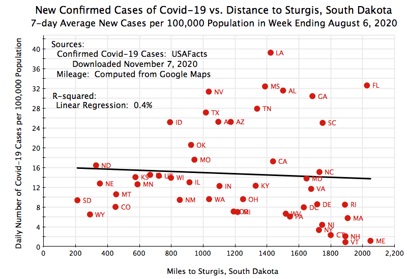
In the week ending August 6, the relationship of Covid-19 cases to distance from Sturgis was about as close to random as one can ever find. If anything, the incidences of Covid-19 cases in the 10 or so states closest to Sturgis were relatively low. And for all 48 states of the Continental US (plus Washington, DC), the simple linear regression line is close to flat, with an R-squared of just 0.4%. This is basically nothing, and is in sharp contrast to the R-squared for the week ending November 6 of 60% (and 71% in logarithmic terms).
One should also note the magnitudes on the vertical scale here. They range from 0 to 40 cases (per 100,000 of population) per day in the 7-day period. In the chart for cases in the 7-day period ending on November 6 (as at the top of this post), the scale goes from 0 to 200. That is, the incidence of Covid-19 cases was relatively low across US states in August (relative to what it was later in parts of the US). That then changed in the subsequent months. Furthermore, one can see in the charts above for the week ending November 6 that the states further than around 1,400 miles from Sturgis still had Covid new case rates of 40 per day or less. That is, the case incidence rates remained in that 0 to 40 range between August and early November for the states far from Sturgis. The states where the rates rose above this were all closer to Sturgis.
There was also a steady progression in the case rates in the months from August to November, focused on the states closer to Sturgis, as can be seen in the following chart:
Each line is the linear regression line found by regressing the number of Covid-19 cases in each state (per 100,000 of population) for the week ending August 6, the week ending September 6, the week ending October 6, and the week ending November 6, against the geographic distance to Sturgis. The regression lines for the week ending August 6 and the week ending November 6 are the same as discussed already in the respective charts above. The September and October ones are new.
As noted before, the August 6 line is essentially flat. That is, the distance to Sturgis made no difference to the number of cases, and they are also all relatively low. But then the line starts to twist upwards, with the right end (for the states furthest from Sturgis) more or less fixed and staying low, while the left end rotated upwards. The rotation is relatively modest for the week ending September 6, is more substantial in the month later for the week ending October 6, and then the largest in the month after that for the week ending November 6. This is precisely the path one would expect to find with an exponential spread of an infectious disease that has been seeded but then not brought under effective control.
D. Might Falling Temperatures Account for the Pattern?
The charts above are consistent with Sturgis acting as a seeding event that later then led to increases in Covid-19 cases that were especially high in near-by states. But one needs to recognize that these are just correlations, and by themselves cannot prove that Sturgis was the cause. There might be some alternative explanation.
One obvious alternative would be that the sharp increase in cases in the upper mid-west of the US in this period was due to falling temperatures, as the northern hemisphere winter approached. These areas generally grow colder earlier than in other parts of the US. And if one plots the state-wide average temperatures in October (as reported by NOAA) against the average number of Covid-19 cases per day in the week ending November 6 one indeed finds: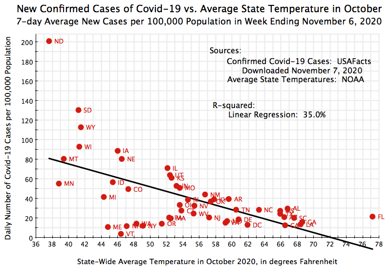
There is a clear downward trend: States with lower average temperatures in October had more cases (per 100,000 of population) in the week ending November 6. The relationship is not nearly as tight as that found for the one based on geographic distance from Sturgis (the R-squared is 35% here, versus 60% for the linear relationship based on distance), but 35% is still respectable for a cross-state regression such as this.
However, there are some counterexamples. The average October temperatures in Maine and Vermont were colder than all but 7 or 10 states (for Maine and Vermont, respectively), yet their Covid-19 case rates were the two lowest in the country.
More telling, one can compare the rates in North and South Dakota (with the two highest Covid-19 rates in the country in the week ending November 6) plus Montana (adjacent and also high) with the rates seen in the Canadian provinces immediately to their north:
The rates are not even close. The Canadian rates were all far below those in the US states to their south. The rate in North Dakota was fully 30 times higher than the rate in Saskatchewan, the Canadian province just to its north. There is clearly something more than just temperature involved.
E. The Impact of Wearing Masks, and Its Interaction With Temperature
That something is the actions followed by the state or provincial populations to limit the spread of the virus. The most important is the wearing of masks, which has proven to be highly effective in limiting the spread of this infectious disease, in particular when complemented with other socially responsible behaviors such as social distancing, avoiding large crowds (especially where many do not wear masks), washing hands, and so on. Canadians have been far more serious in following such practices than many Americans. The result has been far fewer cases of Covid-19 (as a share of the population) in Canada than in the US, and far fewer deaths.
Mask wearing matters, and could be an alternative explanation for why states closer to Sturgis saw higher rates of Covid-19 cases. If a relatively low share of the populations in the states closer to Sturgis wear masks, then this may account for the higher incidence of Covid-19 cases in those near-by states. That is, perhaps the states that are geographically closer to Sturgis just happen also to be states where a relatively low share of their populations wear masks, with this then possibly accounting for the higher incidence of cases in those states.
However, mask-wearing (or the lack of it), by itself, would be unlikely to fully account for the pattern seen here. Two things should be noted. First, while states that are geographically closer to Sturgis do indeed see a lower share of their population generally wearing masks when out in public, the relationship to this geography is not as strong as the other relationships we have examined:
The data in the chart for the share who wear masks by state come from the COVIDCast project at Carnegie Mellon University, and was discussed in the previous post on this blog. The relationship found is indeed a positive one (states geographically further from Sturgis generally have a higher share of their populations wearing masks), but there is a good deal of dispersion in the figures and the R-squared is only 27.5%. This, by itself, is unlikely to explain the Covid-19 rates across states in early November.
Second, and more importantly: While the states closer to Sturgis generally have a lower share of mask-wearing, this would not explain why one did not see similarly higher rates of Covid-19 incidence in those states in August. Mask-wearing was likely similar. The question is why did Covid-19 incidence rise in those states between August (following the Sturgis rally) and November, and not simply why they were high in those states in November.
However, mask-wearing may well have been a factor. But rather than accounting for the pattern all by itself, it may have had an indirect effect. With the onset of colder weather, more time would be spent with others indoors, and wearing a mask when in public is particularly important in such settings. That is, it is the combination of both a low share of the population wearing masks and the onset of colder weather which is important, not just one or the other.
These are called interaction effects, and investigating them requires more than can be depicted in simple charts. Multiple regression analysis (regression analysis with several variables – not just one as in the charts above) can allow for this. Since it is a bit technical, I have relegated a more detailed discussion of these results to a Technical Annex at the conclusion of this post for those who are interested.
Briefly, a regression was estimated that includes miles from Sturgis, average October temperatures, the share who wear masks when out in public, plus an interaction effect between the share wearing masks and October temperatures, all as independent variables affecting the observed Covid-19 case rates of the week ending November 6. And this regression works quite well. The R-squared is 75.4%, and each of the variables (including the interaction term) are either highly significant (miles from Sturgis) or marginally so (a confidence level of between 6 and 8% for the variables, which is slightly worse than the 5% confidence level commonly used, but not by much).
Note in particular that the interaction term matters, and matters even while each of the other variables (miles to Sturgis, October temperatures, and mask-wearing) are taken into account individually as well. In the interaction term, it is not simply the October temperatures or the share wearing masks that matter, but the two acting together. That is, the impact of relatively low temperatures in October will matter more in those states where mask-wearing is low than they would in states where mask-wearing is high. If people generally wore masks when out in public (and followed also the other socially responsible behaviors that go along with it), the falling temperatures would not matter as much. But when they don’t, the falling temperatures matter more.
From this overall regression equation, one can also use the coefficients found to estimate what the impact would be of small changes in each of the variables. These are called elasticities, and based on the estimated equation (and computing the changes around the sample means for each of the variables): a 1% reduction in the number of miles from Sturgis would lead to a 1.0% rise in the incidence of Covid-19 cases; a 1% reduction (not a 1 percentage point increase, but rather a 1% reduction from the sample mean) in the share of the population wearing masks when out in public would lead to a 1.7% rise in the incidence of Covid-19 cases; and a 1% reduction in the average October temperature across the different states would lead to a 1.2% rise in the incidence of Covid-19 cases. All of these elasticity estimates look quite plausible.
These results are consistent with an explanation where the Sturgis rally acted as a significant superspreader event that led to increased seeding of the virus in the locales, in near-by states especially. This then led to significant increases in the incidence of Covid-19 cases in the different states as this infectious disease spread to friends and family and others in the subsequent months, and again especially in the states closest to Sturgis. Those increases were highest in the states that grew colder earlier than others when the populations wearing masks regularly in those states was relatively low. That is, the interaction of the two mattered. But even with this effect controlled for, along with controlling also for the impact of colder temperatures and for the impact of mask-wearing, the impact of miles to Sturgis remained and was highly significant statistically.
F. Conclusion
As noted above, the analysis here cannot and does not prove that the Sturgis rally acted as a superspreader event. There was only one Sturgis rally this year, one cannot run repeated experiments of such a rally under various alternative conditions, and the evidence we have are simply correlations of various kinds. It is possible that there may be some alternative explanation for why Covid-19 cases started to rise sharply in the weeks after the rally in the states closest to Sturgis. It is also possible it is all just a coincidence.
But the evidence is consistent with what researchers have already found on how the virus that causes Covid-19 is spread. Studies have found that as few as 10% of those infected may account for 80% of those subsequently infected with the virus. And it is not just the biology of the disease and how a person reacts to it, but also whether the individual is then in situations with the right conditions to spread it on to others. These might be as small as family gatherings, or as large as big rallies. When large numbers of participants are involved, such events have been labeled superspreader events.
Among the most important of conditions that matter is whether most or all of those attending are wearing masks. It also matters how close people are to each other, whether they are cheering, shouting, or singing, and whether the event is indoors or outdoors. And the likelihood that an attendee who is infectious might be there increases exponentially with the number of attendees, so the size of the gathering very much matters.
A number of recent White House events matched these conditions, and a significant number of attendees soon after tested positive for Covid-19. In particular, about 150 attended the celebration on September 26 announcing that Amy Coney Barrett would be nominated to the Supreme Court to take the seat of the recently deceased Ruth Bader Ginsburg. Few wore masks, and at least 18 attendees later tested positive for the virus. And about 200 attended an election night gathering at the White House. At least 6 of those attending later tested positive. While one can never say for sure where someone may have contracted the virus, such clusters among those attending such events are very unlikely unless the event was where they got the virus. It is also likely that these figures are undercounts, as White House staff have been told not to let it become publicly known if they come down with the virus. Finally, as of November 13 at least 30 uniformed Secret Service officers, responsible for security at the White House, have tested positive for the coronavirus in the preceding few weeks.
There is also increasing evidence that the Trump campaign rallies of recent months led to subsequent increases in Covid-19 cases in the local areas where they were held. These ranged from studies of individual rallies (such as 23 specific cases traced to three Trump rallies in Minnesota in September), to a relatively simple analysis that looked at the correlation between where Trump campaign rallies were held and subsequent increases in Covid-19 cases in that locale, to a rigorous academic study that examined the impact of 18 Trump campaign rallies on the local spread of Covid-19. This academic study was prepared by four members of the Department of Economics at Stanford (including the current department chair, Professor B. Douglas Bernheim). They concluded that the 18 Trump rallies led to an estimated extra 30,000 Covid-19 cases in the US, and 700 additional deaths.
One should expect that the Sturgis rally would act as even more of a superspreader event than those campaign rallies. An estimated 460,000 motorcyclists attended the Sturgis rally, while the campaign rallies involved at most a few thousand at each. Those at the Sturgis rally could also attend for up to ten days; the campaign rallies lasted only a few hours. Finally, there would be a good deal of mixing of attendees at the multiple parties and other events at Sturgis. At a campaign rally, in contrast, people would sit or stand at one location only, and hence only be exposed to those in their immediate vicinity.
The results are also consistent with a rigorous academic study of the more immediate impact of the Sturgis rally on the spread of Covid-19, by Professor Joseph Sabia of San Diego State University and three co-authors. Using anonymous cell phone tracking data, they found that counties across the US that received the highest inflows of returning participants from the Sturgis rally saw, in the immediate weeks following the rally (up to September 2), an increase of 7.0 to 12.5% in the number of Covid-19 cases relative to the counties that did not contribute inflows. But their study (issued as a working paper in September) looked only at the impact in the immediate few weeks following Sturgis. They did not consider what such seeding might then have led to. The results examined in the analysis here, which is longer-term (up to November 6), are consistent with their findings.
It is therefore fully plausible that the Sturgis rally acted as a superspreader event. And the evidence examined in this post supports such a conclusion. While one cannot prove this in a scientific sense, as noted above, the likelihood looks high.
Finally, as I finish writing this, the number of deaths in the US from this terrible virus has just surpassed 250,000. The number of confirmed cases has reached 11.6 million, with this figure rising by 1 million in just the past week. A tremendous surge is underway, far surpassing the initial wave in March and April (when the country was slow to discover how serious the spread was, due in part to the botched development in the US of testing for the virus), and far surpassing also the second, and larger, wave in June and July (when a number of states, in particular in the South and Southwest, re-opened too early and without adequate measures, such as mask mandates, to keep the disease under control). Daily new Covid-19 cases are now close to 2 1/2 times what they were at their peak in July.
This map, published by the New York Times (and updated several times a day) shows how bad this has become. It is also revealing that the worst parts of the country (the states with the highest number of cases per 100,000 of population) are precisely the states geographically closest to Sturgis. There is certainly more behind this than just the Sturgis rally. But it is highly likely the Sturgis rally was a significant contributor. And it is extremely important if more cases are to be averted to understand and recognize the possible role of events such as the rally at Sturgis.
Average Daily Cases of Covid-19 per 100,000 Population
7-Day Average for Week Ending November 18, 2020

Source: The New York Times, “Covid in the US: Latest Map and Case Count”. Image from November 19, with data as of 8:14 am.
Technical Annex: Regression Results
As discussed in the text, a series of regressions were estimated to explore the relationship between the Sturgis rally and the incidence of Covid-19 cases (the 7-day average of confirmed new cases in the week ending November 6) across the states of the mainland US plus Washington, DC. Five will be reported here, with regressions on the incidence of Covid-19 cases (as the dependent variable) as a function of various combinations of three independent variables: miles from Sturgis (in terms of their natural logarithms), the average state-wide temperature in October (also in terms of their natural logarithms), and the share of the population in the respective states who reported they always or most of the time wore masks when out in public. Three of the five regressions are on each of the three independent variables individually, one on the three together, and one on the three together along with an interaction effect measured by multiplying the October temperature variable (in logs) with the share wearing masks. The sources for each variable were discussed above in the main text.
The basic results, with each regression by column, are summarized in the following table:
Regressions on State Covid-9 Cases – November 6
Miles to Sturgis and Temperatures are in natural logs
|
Miles only |
Temp only |
Masks only |
Miles, Temp, &Masks |
All with Interaction |
|
|
Miles to Sturgis |
|||||
|
Slope |
-54.9 |
-41.9 |
-36.6 |
||
|
t-statistic |
-10.7 |
-5.2 |
-4.3 |
||
|
Avg Temperature |
|||||
|
Slope |
-133.3 |
-45.5 |
-516.8 |
||
|
t-statistic |
-5.5 |
-2.0 |
-1.9 |
||
|
Share Wear Masks |
|||||
|
Slope |
-3.1 |
-0.8 |
-22.4 |
||
|
t-statistic |
-3.9 |
-1.3 |
-1.8 |
||
|
Interaction Temp & Masks |
|||||
|
Slope |
5.44 |
||||
|
t-statistic |
1.8 |
||||
|
Intercept |
425.5 |
572.5 |
309.4 |
582.5 |
2,422.5 |
|
t-statistic |
11.9 |
6.0 |
4.5 |
7.1 |
2.3 |
|
R-squared |
71.0% |
39.4% |
24.2% |
73.7% |
75.4% |
In the regressions with each independent variable taken individually, all the coefficients (slopes) found are highly significant. The general rule of thumb is that a confidence level of 5% is adequate to call the relationship statistically “significant” (i.e. that the estimated coefficient would not differ from zero just due to random variation in the data). A t-statistic of 2.0 or higher, in a large sample, would signal significance at least at a 5% confidence level (that is, that the estimated coefficient differs from zero at least 95% of the time), and the t-statistics are each well in excess of 2.0 in each of the single-variable regressions. The R-squared is quite high, at 71.0%, for the regression on miles from Sturgis, but more modest in the other two (39.4% and 24.2% for October temperature and mask-wearing, respectively).
The estimated coefficients (slopes) are also all negative. That is, the incidence of Covid-19 goes down with additional miles from Sturgis, with higher October temperatures, and with higher mask-wearing. The actual coefficients themselves should not be compared to each other for their relative magnitudes. Their size will depend on the units used for the individual measures (e.g. miles for distance, rather than feet or kilometers; or temperature measured on the Fahrenheit scale rather than Centigrade; or shares expressed as, say, 80 for 80% instead of 0.80). The units chosen will not matter. Rather, what is of interest is how the predicted incidence of Covid-19 changes when there is, say, a 1% change in any of the independent variables. These are elasticities and will be discussed below.
In the fourth regression equation (the fourth column), where the three independent variables are all included, the statistical significance of the mask-wearing variable drops to a t-statistic of just 1.3. The significance of the temperature variable also falls to 2.0, which is at the borderline for the general rule of thumb of 5% confidence level for statistical significance. The miles from Sturgis variable remains highly significant (its t-statistic also fell, but remains extremely high). If one stopped here, it would appear that what matters is distance from Sturgis (consistent with Sturgis acting as a seeding event), coupled with October temperatures falling (so that the thus seeded virus spread fastest where temperatures had fallen the most).
But as was discussed above in the main text, there is good reason to view the temperature variable acting not solely by itself, but in an interaction with whether masks are generally worn or not. This is tested in the fifth regression, where the three individual variables are included along with an interaction term between temperatures and mask-wearing. The temperature, mask-wearing, and interaction variables now all have a similar level of significance, although at just less than 5% (at 6% to 8% for each). While not quite 5%, keep in mind that the 5% is just a rule of thumb. Note also that the positive sign on the interaction term (the 5.44) is an indication of curvature. The positive sign, coupled with the negative signs for the temperature and mask-wearing variables taken alone, indicates that the curves are concave facing upwards (the effects of temperature and mask-wearing diminish at the margin at higher values for the variables). Finally, the miles to Sturgis variable remains highly significant.
Based on this fifth regression equation, with the interaction term allowed for, what would be the estimated response of Covid-19 cases to changes in any of the independent variables (miles to Sturgis, October temperatures, and mask-wearing)? These are normally presented as elasticities, with the predicted percentage change in Covid-19 cases when one assumes a small (1%) change in any of the independent variables. In a mixed equation such as this, where some terms are linear and some logarithmic (plus an interaction term), the resulting percentage change can vary depending on the starting point is chosen. The conventional starting point taken is normally the sample means, and that will be done here.
Also, I have expressed the elasticities here in terms of a 1% decrease in each of the independent variables (since our interest is in what might lead to higher rates of Covid-19 incidence):
Elasticities from Full Equation with Interaction Term
|
Percent Increase in Number of Covid-19 Cases from a 1% Decrease Around Sample Means |
|
|
Elasticity |
|
|
Miles to Sturgis |
1.02% |
|
October Temperature |
1.16% |
|
Share Wearing Masks |
1.69% |
All these estimated elasticities are quite plausible. If one is 1% closer in geographic distance to Sturgis (starting at the sample mean, and with the other two variables of October temperature and mask-wearing also at their respective sample means), the incidence of Covid-19 cases (per 100,000 of population) as of the week ending November 6 would increase by an estimated 1.02%. A 1% lower October temperature (from the sample mean) would lead to an estimated 1.16% increase in Covid-19 cases. And the impact of the share wearing masks is important and stronger, where a 1% reduction in the share wearing masks would lead to an estimated 1.69% increase in cases, with all the other factors here taken into account and controlled for.
These results are consistent with a conclusion that the Sturgis rally led to a significant seeding of cases, especially in near-by states, with the number of infections then growing over time as the disease spread. The cases grew faster in those states where mask-wearing was relatively low, and in states with lower temperatures in October (leading people to spend more time indoors). When the falling temperatures were coupled with a lower share (than elsewhere) of the population wearing masks, the rate of Covid-19 cases rose especially fast.

You must be logged in to post a comment.