No belief is more firmly held in Republican dogma than that the Reagan “Revolution” turned the US economy around from perpetual stagnation to strong growth, with consequent benefits for all. It is now 30 years since Reagan took office and started his program of tax cuts, financial deregulation, and other measures, and we therefore now have 30 years of data to see what the impact has been. We can compare this to how the US economy performed in the 30 years before Reagan, 1950 to 1980, to see what the differences have been.
We will do this with a series of graphs, starting with:
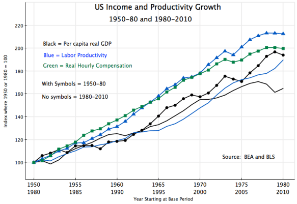
 This shows the path of per capita real GDP, real labor productivity, and real hourly compensation (everything will be in real terms in this note). Per capita GDP grew by 94% over this 30 year period, or an average of 2.2% a year, while labor productivity grew by a bit more, by a total of 113% or 2.5% a year. Real hourly compensation grew similarly, by 100%, for a 2.3% annual rate. In “normal” times one would expect these three measures of productivity and real incomes to grow at similar rates and to track each other, and this is basically what one observes in the pre-Reagan period.
If the Reagan measures helped spur growth, then these growth rates should have shot upwards in the next 30 years. But one finds:
Per capita real GDP and labor productivity still grew following Reagan, but at a slower rate than before. Per capita GDP grew only by 65% in the thirty years following Reagan (1.7% a year), vs. 94% (i.e. 45% higher) in the thirty years before. Much of this difference is due to the weak economy at the very end of the period, due to the 2008 collapse at the end of the Bush administration and only weak recovery after, and it could be argued that one should allow for this. Growth in the 25 years to 2005 was almost as high as the growth in the 25 years to 1975. But then growth was strong during the Carter years (despite the widespread and oft-repeated incorrect assertion that the economy was stagnant then), while it collapsed at the end of the Bush Administration.
Growth in the economy ultimately comes from growth in labor productivity, and here the record post-Reagan is consistently weaker relative to before. Labor productivity over 1980 to 2010 consistently tracks below where it was over 1950 to 1980, and grew by a total of 90% (2.2% a year) vs. 113% (2.5%) before Reagan.
But the really startling difference is in real hourly labor compensation:
 Instead of tracking closely to the growth in labor productivity, as one would normally expect, real hourly compensation was well below. For all workers, average real hourly compensation grew only by 39% (1.1% a year) over the thirty years post-Reagan, vs. 100% in the thirty years before. There clearly was a change, post-Reagan, but if you were a worker, it was sharply for the worse.
The figures so far have been about overall averages: for per capita GDP, productivity per worker, and hourly compensation per worker. But it is also of interest to see how the average gains have been distributed across income groups.
First, for 1950 to 1980:
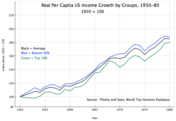
This data comes from Piketty and Saez, and is based on incomes as reported in US income tax returns (deflated to real terms using the GDP deflator). Taxable income (including income from capital gains) is a different concept from income as defined in the GDP accounts, but the two concepts track each other fairly well over time, so comparisons in terms of growth relative to a base period will be similar.
For 1950 to 1980, one sees that average real incomes, the real incomes of the bottom 90%, and the real incomes of the top 10%, all track each other within a relatively narrow band. Overall growth (of taxable income) was 85% (2.1% a year), with slightly more (88%, still 2.1% a year) for the bottom 90%, and a bit less (80%, or 2.0% a year) for the top 10%. Pre-Reagan, all income groups shared similarly in income growth. A rising tide lifted all boats. And with incomes of the bottom 90% growing a bit faster than that of the top 10%, income equality improved some.
But things changed post-Reagan:
First of all, note that the scale here is very different than that in the previous graphs. Note also that the data goes only up to 2008, the most recent year for which such US income tax return data has been released in a form that Piketty and Saez could analyze. Note also that with the economic collapse in 2008, some comparisons can better be made using 2007 instead of to a trough in the business cycle.
For the full period of 1980 to 2008, average real taxable income for everyone grew by 60% (1.7% a year). This is a somewhat slower pace than that for the thirty years before Reagan (where average real taxable income grew by 2.1% a year), consistent with and similar to the slower pace noted above for per capita real GDP. But real incomes of the bottom 90% grew only by a total of 26% over 1980 to 2008, or 1.1% a year. In contrast, the top 10% saw their incomes grow by 122% in the post-Reagan period, or 2.9% a year. Distribution became more unequal, with incomes of the top 10% growing substantially faster than the incomes of the bottom 90%.
But what is startling is the growth in the shares of income going to the increasingly rich. The top 10% enjoyed income growth over 1980 to 2008 of 122% (2.9% a year), vs. just 26% for the bottom 90%, as noted above. But the top 1% enjoyed income growth of 234% (4.4% a year) over this period, while the top 0.1% saw their real incomes grow by 387% (5.8% a year), and the top 0.01% saw their incomes grow by 527% (6.8% a year). The super-rich became far far richer.
Furthermore, the last year of the Bush Administration, 2008, was a year of economic collapse, with the stock market also crashing. There were few capital gains to report as part of taxable income. If one takes 2007 rather than 2008 as a more reasonable point of comparison, real income growth over the 27 years post-Reagan was only 33% for the bottom 90%, but 149% for the top 10%, 306% for the top 1%, 523% for the top 0.1%, and 716% for the top 0.01%. Distribution became sharply worse.
To summarize:
1) Overall growth in per capita GDP and in labor productivity was not higher post-Reagan, but rather was lower. Per capita GDP, relative to the starting point, grew by 45% more in the 30 years before Reagan than in the 30 years after Reagan.
2) Before Reagan, the paths of per capita GDP, labor productivity, and hourly compensation, tracked each other fairly closely. After Reagan, hourly compensation rose at a far slower rate than labor productivity or per capita GDP. Wage earners did far worse relative to others post-Reagan.
3) Before Reagan, the incomes of the bottom 90% and the top 10% grew at fairly similar rates. Indeed, income growth of the bottom 90% was a bit higher than that of the top 10%, indicating some move in the direction of greater equality of incomes. But this was shattered post-Reagan, with the bottom 90% seeing income growth of just 26% over the 28 years from 1980 to 2008, while the top 10% enjoyed income growth of 122%. But even this growth by the top 10% was small compared to that enjoyed by the top 1%, top 0.1% and especially the top 0.01%.
In other words, if you are among the rich, and especially the super-rich, you have benefited post-Reagan. It is this elite that account for most of the money given to political campaigns, who drive the political discussion, and from the evidence considered here, have good reason to believe Reagan was positive.
But for the economy as a whole, and especially for those in the middle and lower classes all the way to the 90% mark, growth in living standards was far better before Reagan than it has been after.


You must be logged in to post a comment.