How Fast Can GDP Grow?: Not as Fast as Trump Says

A.  Introduction

A debate now underway between the Trump Administration and others is on the question of how fast the economy can and will grow.  Trump claimed during the presidential campaign that if elected, he would get the economy to grow at a sustained rate of 5% or even 6%.  Since then the claim has been scaled back, to a 4% rate over the next decade according to the White House website (at least claimed on that website as I am writing this).  And an even more modest rate of growth of 3% for GDP (to be reached in 2020, and sustained thereafter) was forecast in the budget OMB submitted to Congress in May of this year.

But many economists question whether even a 3% growth rate for a sustained period is realistic, as would I.  One needs to look at this systematically, and this post will describe one way economists would address this critically important question.  It is not simply a matter of pulling some number out of the air (where the various figures presented by Trump and his administration, varying between 6% growth and 3%, suggests that that may not be far removed from what they did).

One way to approach this is to recognize the simple identity:  GDP will equal GDP per worker employed times the number of workers employed.  Over time, growth in the number of workers who can be employed will be equal to the growth in the labor force, and we have a pretty good forecast for that will be from demographic projections.  The other element will then depend on growth in how much GDP is produced per worker employed.  This is the growth in productivity, and while more difficult to forecast, we have historical numbers which can provide a sense for what its growth might be, at best, going forward.  The chart at the top of this post shows what it has been since 1947, and will be discussed in detail below.  Forecasts that productivity will now start to grow at rates that are historically unprecedented need to be viewed with suspicion.  Miracles rarely happen.

I should also be clear that the question being examined is the maximum rate at which one can expect GDP to grow.  That is, we are looking at growth in what economists call capacity GDP.  Capacity GDP is what could be produced in the economy with all resources, in particular labor, being fully utilized.  This is the full employment level of GDP, and the economy has been at or close to full employment since around 2015.  Actual GDP can be less than capacity GDP when the economy is operating at less than full employment.  But it cannot be more.  Thus the question being examined is how fast the economy could grow, at most, for a sustained period going forward, not how fast it actually will grow.  With mismanagement, such as what was seen in the government oversight of the financial markets (or, more accurately, the lack of such oversight) prior to the financial and economic collapse that began in 2008 in the final year of the Bush administration, the economy could go into a recession and actual GDP will fall below capacity GDP.  But we will give Trump the benefit of the doubt and look at how fast capacity GDP could grow at, assuming the economy can and will remain at full employment.

We will start with a look at what is expected for growth in the labor force and hence in the number of workers who can be employed.  That is relatively straightforward, and the answer is not to expect much possible growth in GDP from this source.  We will then look at productivity growth:  what it has been in the past and whether it could grow at anything close to what is implicit in the Trump administration forecasts.  Predicting what that actual rate of productivity growth might be is beyond the scope of this blog post.  Rather, we will be looking at it whether it can grow as fast as is implied by the Trump forecasts.  The answer is no.

B.  Growth in the Labor Force 

Every two years, the Bureau of Labor Statistics provides a detailed ten-year forecast of what it estimates the US labor force will be.  The most recent such forecast was published in December 2015 and provided its forecast for 2024 (along with historical figures up to 2014).  The basic story is that while the labor force is continuing to grow in the US, it is growing at an ever decreasing rate as the population is aging, the baby boom generation is entering into retirement, and decades ago birth rates fell.  The total labor force grew at a 1.2% annual rate between 1994 and 2004, at a 0.6% rate between 2004 and 2014, and is forecast by the BLS to grow at a 0.5% rate between 2014 and 2024.

But it is now 2017.  With a decelerating rate of growth, a growth rate in the latter part of a period will be less than in the early part of a period.  Taking account of where the labor force is now, growth going forward to 2024 will only be 0.3% (with these figures calculated based on the full numbers before round-off).  This is not much.

A plot of the US civilian labor force going back to 1948 puts this in perspective:

The labor force will be higher in 2024 than it is now, but not by much.  The labor force grew at a relatively high rate from the 1950s to the 1970s (of a bit over 2% a year), but then started to level off.  As it did, it continued to grow but at an ever slower rate.  There was also a dip after the economic collapse of 2008/09, but then recovered to its previous path.  When unemployment is high, some workers drop out of the labor force for a period. But we are now back to what the path before would have predicted.  If the BLS forecasts are correct, growth in the labor force will continue, but at a rate of just 0.3% from where it is now to 2024, to the point shown in red on the chart.  And this is basically a continuation of the path followed over the last few decades.

One should in particular not expect the labor force to get back to the rapid growth rate (of over 2% a year) the US had from the 1950s to the 1970s.  This would require measures such as that immigration be allowed to increase dramatically (which does not appear to enjoy much support in the Trump administration), or that grandma and grandpa be forced back into the labor force in their 70s and 80s rather than enjoy their retirement years (where it is not at all clear how this would “make America great again”).

I have spoken so far on the figures for the labor force, since that is what the BLS and others can forecast based largely on demographics.  Civilian employment will then be some share of this, with the difference equal to the number of unemployed.  That curve is also shown, in blue, in the chart.  There will always be some unemployment, and in an economic downturn the rate will shoot up.  But even in conditions considered to be “full employment” there will be some number of workers unemployed for various reasons. While economists cannot say exactly what the “full employment rate of unemployment” will be (it will vary over time, and will also depend on various factors depending on the make-up of the labor force), it is now generally taken to be in the range of a 4 to 5% unemployment rate.

The current rate of unemployment is 4.4%.  It is doubtful it will be much lower than this in the future (at least not for any sustained period).  Hence if the economy is at full employment in 2024, with unemployment at a similar rate to what it is now, the rate of growth of total employment from now to 2024 will be the same as the rate of growth of the labor from now to then.  That is, if unemployment is a similar share of the total labor force in 2024 as it is now, the rates of growth of the labor force and of total employment will match.  And that rate of growth is 0.3% a year.

This rate of growth in what employment can be going forward (at 0.3%) is well below what it was before.  Total employment grew at an annual rate of 2.1% over the 20 years between 1947 and 1967, and a slightly higher 2.2% between 1967 and 1987.  With total employment able to grow only at 1.8 or 1.9% points per annum less than what was seen between 1947 and 1987, total GDP growth (for any given rate of productivity growth) will be 1.8 or 1.9% points less.  This is not a small difference.

C.  Growth in Productivity 

Growth in productivity (how much GDP is produced per worker employed) is then the other half of the equation.  What it will be going forward is hard to predict; economists have never been very good at this.  But one can get a sense of what is plausible based on the historical record.

The chart below is the same as the one at the top of this post, but with the growth rates over 20 year periods from 1947 (10 years from 2007) also shown:

These 20 year periods broadly coincide with the pattern often noted for the post-World War II period for the US:  Relatively high growth (2.0% per year) from the late 1940s to the late 1960s; a slowdown from then to the mid 1980s (to 0.9%); a return to more rapid growth in productivity in the 1990s / early 2000s, although not to as high as in the 1950s and 60s (1.5% for 1987 to 2007); and then, after the economic collapse of 2008/2009, only a very modest growth (0.8% for 2007 to 2017, but much less from 2010 onwards).

Note also that these break points all coincide, with one exception (1987), with years where the economy was operating at full employment.  In the one exception (1987, near the end of the Reagan administration) unemployment was still relatively high at 6.6%.  While one might expect productivity levels to reach a local peak when the economy is at or close to full employment, that is not always true (the relationship is complex), and is in any case controlled for here by the fact the break points coincide (with the one exception) with full employment years.

Another way to look at this is productivity growth as a rolling average, for example over continuous 10 year periods:


Productivity, averaged over 10 year periods, grew at around 2% a year from the late 1940s up to the late 1960s.  It then started to fall, bottoming out at roughly 0.5% in the 1970s, before reverting to a higher pace.  It reached 2% again in the 10 year period of 1995 to 2005, but only for a short period before starting to fall again.  And as noted before, it fell to 0.8% for the 2007 to 2017 period.

What productivity growth going forward could at most be will be discussed below, but first it is useful to summarize what we have seen so far, putting employment growth and productivity growth together:

Growth Rates

Employment

GDP per worker

GDP

1947-1967

2.1%

2.0%

4.1%

1967-1987

2.2%

0.9%

3.1%

1987-2007

1.6%

1.5%

3.1%

2007-2017

0.6%

0.8%

1.4%

Employment grew at over 2% a year between the late 1940s and 1987.  This was the period of the post-war recovery and baby boom generation coming of working age.  With GDP per worker growing at 2.0% a year between 1947 and 1967, total GDP grew at a 4.1% rate.  It still grew at a 3.1% rate between 1967 and 1987 despite productivity growth slowing to just 0.9%, as the labor force continued to grow rapidly over this period.  And total GDP continued to grow at a 3.1% rate between 1987 and 2007 despite slower employment (and labor force) growth, as a recovery in productivity growth (to a 1.5% pace) offset the slower availability of labor.

It might, at first glance, appear from this that a return to 3% GDP growth (or even 4%) is quite doable.  But it is not.  Employment growth fell to a pace of just 0.6% between 2007 and 2017 (and the unemployment rates were almost exactly the same in early 2007, at 4.5%, and now, at 4.4%, so this matched labor force growth).  Going forward, as discussed above, the labor force is forecast to grow at a 0.3% pace between now and 2024.  To get to a 3% GDP growth rate now at such a pace of labor growth, one would need productivity to grow at a 2.7% pace.  To get a 4% GDP growth, productivity would have to grow at a 3.7% pace.  But productivity growth in the US since 1947 has never been able to get much above a 2% pace for any sustained period.  To go well beyond this would be unprecedented.

D.  Why Does This Matter?  And What Can Be Achieved?

Some readers might wonder why all this matters.  On the surface, the difference between growth at a 2% rate or 3% rate may not seem like much.  But it is, as some simple arithmetic illustrates:

  Alternative Growth Scenarios

 Growth Rates:

GDP 

Population

GDP per capita

Cumulative

Over 30 years

1.0%

0.8%

0.2%

6%

2.0%

0.8%

1.2%

43%

3.0%

0.8%

2.2%

91%

4.0%

0.8%

3.2%

155%

This table works out the implications of varying rates of hypothetical GDP growth, between 1.0% and 4.0%.  Population growth in the US is forecast by the Census Bureau at 0.8% a year (for the period to the 2020s).  It is higher than the forecast pace of labor force growth (of 0.3% in the BLS figures) primarily because of the aging of the population, so a higher and higher share of the adult population is entering their retirement years.

The result is that GDP growth at 1.0% a year will be just 0.2% a year in per capita terms with a 0.8% population growth rate.  After 30 years (roughly one generation) this will cumulate to a total growth in per capita income of just 6%.  But GDP growth at 2% a year will, by the same calculation, cumulate to total per capita income growth of 43%, to 91% with GDP growth of 3%, and to 155% with GDP growth of 4%.  These differences are huge.  What might appear to be small differences in GDP growth rates add up over time to a lot.  It does matter.

[Note that this does not address the distribution issue.  Overall GDP per capita may grow, as it has over the last several decades, but all or almost all may go only to a few.  As a post on this blog from 2015 showed, only the top 10% of the income distribution saw any real income growth at all between 1980 and 2014 – real incomes per household fell for the bottom 90%.  And the top 1%, or richer, did very well.

But total GDP growth is still critically important, as it provides the resources which can be distributed to people to provide higher standards of living.  The problem in the US is that policies followed since 1980, when Ronald Reagan was first elected, have led to the overwhelming share of the growth the US has achieved to go to the already well off. Measures to address this critically important, but separate, issue have been discussed in several earlier posts on this blog, including here and here.]

Looking forward, what pace of productivity growth might be expected?  As discussed above, while the US was able to achieve productivity growth at a rate of about 2.0% in the 1950s and 1960s, since then it was able to achieve a rate as high as this over a ten year period only once (between 1995 and 2005), and only very briefly.  And over time, there is some evidence that reaching the rates of productivity growth enjoyed in the past is becoming increasingly difficult.

A reason for this is the changing structure of the economy.  Productivity growth has been, and continues to be, relatively high in manufacturing and especially in agriculture. Mechanization and new technologies (including biological technologies) can raise productivity in manufacturing and in agriculture.  It is more difficult to do this in services, which are often labor intensive and personal.  And with agriculture and manufacturing a higher share of the economy in the past than they are now (precisely because their higher rates of productivity growth allowed more to be produced with fewer workers), the overall pace of productivity growth in the economy will move, over time, towards the slower rate found in services.

The following table illustrates this.  The figures are taken from an earlier blog post, which looked at the changing shares of the economy resulting from differential rates of productivity growth.

Productivity Growth

Agriculture

Manufacturing

Services

Overall (calculated)

1947 to 2015:

3.3%

2.8%

0.9%

1.4%

At GDP Shares of:

   – 1947 shares

8.0%

27.7%

64.3%

1.7%

   – 1980 shares

2.2%

23.6%

74.2%

1.4%

   – 2015 shares

1.0%

13.9%

85.2%

1.2%

The top line (with the figures in bold) shows the overall rates of productivity growth between 1947 and 2015 in agriculture (3.3%), manufacturing (2.8%), services (0.9%), and overall (1.4%).  The overall is for GDP, and matches the average for growth in GDP per employed worker between 1947 and 2017 in the chart shown at the top of this post.

The remaining lines on the table show what the pace of overall productivity growth would then have been, hypothetically, at these same rates of productivity growth by sector but with the sector shares in GDP what they were in 1947, or in 1980, or in 2015.  In 1947, with the sector shares of agriculture and manufacturing higher than what they were later, and services correspondingly lower, the pace of productivity growth overall (i.e. for GDP) would have been 1.7%.  But at the sector shares of 2015, with services now accounting for 85% of the economy, the overall rate of productivity growth would have been just 1.2%, or 0.5% lower.

This is just an illustrative calculation, and shows the effects of solely the shifts in sector shares with the rates of productivity growth in the individual sectors left unchanged.  But those individual sector rates could also change over time, and did.  Briefly (see the earlier blog post for a discussion), the rate of productivity growth in services decelerated sharply after the mid-1960s; the pace in agriculture was remarkably steady; while the pace in manufacturing accelerated after the early 1980s (explaining, to a large extent, the sharp fall in the manufacturing share of the economy from 24% in 1980 to just 14% in 2015).  But with services dominating the economy (74% in 1980, rising to 85% in 2015), it was the pace of productivity growth in services, and its pattern over time, which dominated.

What can be expected going forward?  The issue is a huge one, and goes far beyond what is intended for this post.  But especially given the headwinds created by the structural transformation in the economy of the past 70 years towards a dominance by the services sector, it is unlikely that the economy will soon again reach a pace of 2% productivity growth a year for a sustained period of a decade or more.  Indeed, a 1.5% rate would be exceptionally good.

And with labor force growth of 0.3%, a 1.5% pace for productivity would imply a 1.8% rate for overall GDP.  This is well below the 3% rate that the Trump administration claims it will achieve, and of course even further below the 4% (and 5% and 6%) rates that Trump has claimed he would get.

E.  Conclusion

As a simple identity, GDP will equal GDP per worker employed (productivity) times the number of workers employed.  Growth in GDP will thus equal the sum of the growth rates of these two components.  With a higher share of our adult population aging into the normal retirement years, the labor force going forward (to 2024) is forecast to grow at just 0.3% a year.  That is not much.  Overall GDP growth will then be this 0.3% plus the growth in productivity.  That growth in the post World War II period has never much exceeded 2% a year for any 10-year period.  If we are able to get to such a 2% rate of productivity growth again, total GDP would then be able to grow at a 2.3% rate.  But this is below the 3% figure the Trump administration has assumed for its budget, and far below the 4% (or 5% or 6%) rates Trump has asserted he would achieve.  Trump’s forecasts (whether 3% or 4% or 5% or 6%) are unrealistic.

But a 2% rate for productivity growth is itself unlikely.  It was achieved in the 1950s and 1960s when agriculture and manufacturing were greater shares of the economy, and it has been in those sectors where productivity growth has been most rapid.  It is harder to raise productivity quickly in services, and services now dominate the economy.

Finally, it is important to note that we are speaking of growth rates in labor, productivity, and GDP over multi-year, sustained, periods.  That is what matters to what living standards can be achieved over time, and to issues like the long-term government budget projections.  There will be quarter to quarter volatility in the numbers for many reasons, including that all such figures are estimates, derived from surveys and other such sources of information.  It is also the case that an exceptionally high figure in one quarter will normally soon be followed by an exceptionally low figure in some following quarter, as the economy, as well as the statistical measure of it, balances out over time.

Thus, for example, the initial estimate (formally labeled the “advance estimate”) for GDP growth in the second quarter of 2017, released on July 28, was 2.6% (at an annual rate). Trump claimed this figure to be “an unbelievable number” showing that the economy is doing “incredibly well”, and claimed credit for what he considered to be a great performance.  But it is a figure for just one quarter, and will be revised in coming months as more data become available.  It also follows an estimate of GDP growth in the first quarter of 2017 of just 1.2%.  Thus growth over the first half of the year averaged 1.9%. Furthermore, productivity (GDP per worker) grew at just a 0.5% rate over the first half of 2017.  While a half year is too short a period for any such figure on productivity to be taken seriously, such a performance is clearly nothing special.

The 1.9% rate of growth of GDP in the first half of 2017 is also nothing special.  It is similar to the rate achieved over the last several years, and is in fact slightly below the 2.1% annual rate seen since 2010.  More aptly, in the 28 calendar quarters between the second quarter of 2010 and the first quarter of 2017, GDP grew at a faster pace than that 2.6% estimated rate a total of 13 times, or almost half. The quarter to quarter figures simply bounce around, and any figure for a single quarter is not terribly meaningful by itself.

It therefore might well be the case that a figure for GDP growth of 3%, or even 4% or higher, is seen for some quarter or even for several quarters.  But there is no reason to expect that the economy will see such rates on a sustained basis, as the Trump administration has predicted.


The Purple Line Ridership Forecasts Are Wrong: An Example of Why We Get Our Infrastructure Wrong

Executive Summary

There are several major problems with the forecast ridership figures for the Purple Line, a proposed 16-mile light rail line that would pass in a partial arc around Washington, DC, in suburban Maryland.  The forecasts, as presented and described in the “Travel Forecasts Results Technical Report” of the Final Environmental Impact Statement for the project, are in a number of cases simply impossible.

Problems include:

a)  Forecast ridership in 2040 between many of the Transit Analysis Zone pairs along the Purple Line corridor would be higher on the Purple Line itself than it would be for total transit ridership (which includes bus, Metrorail, and commuter rail ridership, in addition to ridership on the Purple Line) between these zones.  This is impossible. Such cases are not only numerous (found in more than half of the possible cases for zones within the corridor) but often very large (12 times as high in one case).  If the forecasts for total transit ridership are correct, then correcting for this, with Purple Line ridership some reasonable share of the totals, would lead to far lower figures for Purple Line ridership.

b)  Figures on forecast hours of user benefits (primarily forecast time savings from a rail line) in a scenario where the Purple Line is built as compared to one where it is not, are often implausibly high.  In two extreme cases, the figures indicate average user benefits per trip between two specific zones, should the Purple Line be built, of 9.7 hours and 11.5 hours.  These cannot be right; one could walk faster.  But other figures on overall user benefits are also high, leading to an overall average predicted benefit of 30 minutes per trip.  Even with adjustments to the pure time savings that assign a premium to rail service, this is far too high and overestimates benefits by at least a factor of two or even three.  The user benefit figures are important for two reasons:  1) An overestimate leads to a cost-effectiveness estimate (an estimate of the cost of the project per hour of user benefits) that will be far off;  and 2) The figures used for user benefits from taking the proposed rail line enter directly into the estimation of ridership on the rail line (as part of the choice on whether to take the rail line rather than some other transit option, or to drive).  If the user benefit figures are overstated, ridership will be less.  With the user benefit figures overstated by a large margin, ridership will be far less.

c)  Figures on ridership from station to station are clearly incorrect.  They indicate, for example, that far more riders would exit at the Bethesda station (an end point on the line) each day (19,800) than would board there (10,210).  This is impossible.  More significantly, the figures indicate system capacity must be sufficient to handle 21,400 riders each day on the busiest segment (on the segment leaving Silver Spring heading towards Bethesda).  Even if the overall ridership numbers were correct, the figure for ridership on this segment is clearly too high (and it is this number which leads to the far higher number of those exiting the system in Bethesda than would enter there each day).  The figure is important as the rail line has been designed to a capacity sufficient to carry such a load.  With the true number far lower, there is even less of a case for investing in an expensive rail option.  Upgraded bus services could provide the capacity needed, and at far lower cost.

There appear to be other problems as well.  But even just these three indicate there are major issues with these forecasts.  This may also explain why a number of independent observers have noted for some time that the Purple Line ridership forecasts look implausibly high.  The figure for Purple Line ridership in 2040 of 69,300 per day is three times the average daily ridership actually observed in 2012 on 31 light rail lines built in the US over the last three decades.  It would also be 58% higher on the Purple Line than on the highest amongst those 31.  Yet the Purple Line would pass solely through suburban neighborhoods, of generally medium to low density.  Most of these other light rail lines in the US serve travel to and from downtown areas.

The causes of these errors in the ridership forecasts for the Purple Line are not always clear.  But the issues suggest at a minimum that quality checks were insufficient.  And while the Purple Line is just one example, inadequate attention to such issues might explain in part why ridership forecasts for light rail lines have often proven to be substantially wrong.


A.  Introduction

The Purple Line is a proposed light rail line that would be built in Suburban Maryland, stretching in a partial arc from east of Washington, DC, to north of the city.  I have written several posts previously in this blog on the proposed project (see the posts here, here, here, and here) and have been highly critical of it.  It is an extremely expensive project (the total cost to be paid to the private concessionaire to build and then operate the line for 30 years will sum to $5.6 billion, and other costs borne directly by the state and/or local counties will add at least a further $600 million to this).  And the state’s own analyses of the project found that upgraded bus services (including any one of several bus rapid transit, or BRT, options) to provide the transit services that are indeed needed in the corridor, would be both cheaper and more cost-effective.  Such alternatives would also avoid the environmental damage that is inevitable with the construction of dual rail lines along the proposed route, including the destruction of 48 acres of forest cover, the filling in of important wetland areas, and the destruction of a linear urban park that has the most visited trail in the state.

The state’s rationale for building a rail line rather than providing upgraded bus services is that ridership will be so high that at some point in the future (beyond 2040) only rail service would be able to handle the load.  But many independent analysts have long questioned those ridership forecasts.  A study from 2015 found that the forecast ridership on the Purple Line would be three times as high as the ridership actually observed in 2012 on 31 light rail lines built in the US over the last three decades.  Furthermore, the forecast Purple Line ridership would be 58% higher than ridership actually observed on the highest line among those 31.  And with the Purple Line route passing through suburban areas of generally medium to low density, in contrast to routes to and from major downtown areas for most of those 31, many have concluded the Purple Line forecasts are simply not credible.

Why did the Purple Line figures come out so high?  The most complete description provided by the State of Maryland of the ridership forecasts are provided in the chapter titled “Travel Forecasts Results Technical Report”, which is part of Volume III of the Final Environmental Impact Statement (FEIS) for the Purple Line, dated August 2013 (which I will hereafter often refer to simply as the “FEIS Travel Forecasts chapter”).  A close examination of that material indicates several clear problems with the figures.  This post will discuss three, although there might well be more.

These three are:

a)  The FEIS forecast ridership for 2040 on the Purple Line alone would be higher (in a number of cases far higher) in most of the 49 possible combinations of travel between the 7 Transit Analysis Zones (TAZs) defined along the Purple Line route, than the total number of transit riders among those zones (by bus, Metrorail, commuter rail, and the Purple Line itself).  This is impossible.

b)  Figures on user benefits per Purple Line trip (primarily the time forecast to be saved by use of a rail line) are implausibly high.  In two cases they come to 9.7 hours and 11.5 hours, respectively, per trip.  This cannot be.  One could walk faster.  But these figures for minutes of user benefits per trip were then passed through in the computations to the total forecast hours of user benefits that would accrue as a consequence of building the Purple Line, thus grossly over-estimating the benefits. Such user benefit figures would also have been used in the estimation of how many will choose to ride the Purple Line.  If these user benefit figures are overestimated (sometimes hugely overestimated), then the Purple Line ridership forecasts will be overestimated.

c)  The figure presenting rail ridership by line segment from station to station (which then was used to determine what ridership capacity would be needed to service the proposed route) shows almost twice as many riders exiting at the Bethesda station (an end of the line) as would board there each day (19,800 arriving versus 10,210 leaving each day).  While there could be some small difference (i.e. some people might take transit to work in the morning, and then get a car ride home with a colleague in the evening), it could not be so large.  The figures would imply that Bethesda would be accumulating close to 9,600 new residents each day.  The forecast ridership by line segment (which is what determines these figures) is critical as it determines what the capacity will need to be of the transit system to service such a number of riders.  With these figures over-stated, the design capacity is too high, and there is even less of a rationale for building a rail line as opposed to simply upgrading bus services in the corridor.

These three issues are clear just from an examination of the numbers presented.  But as noted, there might well be more.  We cannot say for sure what all the errors might be as the FEIS Travel Forecasts chapter does not give a complete set of the numbers and assumed relationships needed as inputs to the analysis and then resulting from it, nor more than just a cursory explanation of how the results were arrived at.  But with anomalies such as these, and with no explanations for them, one cannot treat any of the results with confidence.

And while necessarily more speculative, I will also discuss some possible reasons for why the mistakes may have been made.  This matters less than the errors themselves, but might provide a sense for why they arose.  Broadly, while the FEIS Travel Forecasts chapter (and indeed the entire FEIS report) only shows the Maryland Transit Administration (MTA) as the source for the documents, the MTA has acknowledged (and as would be the norm) that major portions of the work – in particular the ridership forecasts – were undertaken or led by hired consulting firms.  The consulting firms use standard but large models to prepare such ridership forecasts, but such models must be used carefully to ensure reliable results.  It is likely that results were generated by what might have been close to a “black box” to the user, that there were then less than sufficient quality checks to ensure the results were reasonable, and that the person assigned to write up the results (who may well have differed from the person generating the numbers) did not detect these anomalous results.

I will readily admit that this is speculation as to the possible underlying causes, and that I could be wrong on this.  But it might explain why figures were presented in the final report which were on their face impossible, with no explanation given.  In any case, what is most important is the problems themselves, regardless of the possible explanations on why they arose.

Each of the three issues will be taken up in turn.

B.  Forecast Ridership on the Purple Line Alone Would Be Higher in Many Cases than Total Transit Ridership

The first issue is that, according to the forecasts presented, there would be more riders on the Purple Line alone between many of the Transit Analysis Zones (TAZs) than the number of riders on all forms of transit.  This is impossible.

Forecast Ridership on All Transit Options in 2040:

Forecast Ridership on Purple Line Alone in 2040:

These two tables are screenshots of the upper left-hand corners of Table 16 and 22 from the FEIS Travel Forecasts chapter.  While they show the key numbers, I would recommend that the reader examine the full tables in the original FEIS Travel Forecasts chapter. Indeed, if your computer can handle it, it would be best to open the document twice in two separate browsers and then scroll down to the two tables to allow them to be compared side by side on your screen.

The tables show forecast ridership in 2040 on all forms of transit in the “Preferred Alternative” scenario where the Purple Line is built (Table 16), or for the sub-group of riders just on the Purple Line (Table 22).  And based on the total ridership figures presented at the bottoms of the full tables, the titles appear to be correct. That is, Table 16 forecasts that total transit ridership in the Washington metro region would be about 1.5 million trips per day in 2040, which is plausible (Table 13 says it was 1.1 million trips per day in 2005, which is consistent with WMATA bus and rail ridership, where WMATA accounts for 80 – 85% of total ridership in the region).  And Table 22 says the total number of trips per day on the Purple Line in 2040 would be 68,650, which is consistent (although still somewhat different from, with no explanation) with figures given elsewhere in the chapter on forecast total Purple Line trips per day in 2040 (of 69,330 in Table 24, for example, or 69,300 in Tables 25 and 26, with that small difference probably just rounding). So it does not appear that the tables were mislabeled, which was my first thought.

The full tables show the ridership between any two pairs of 22 defined Transit Analysis Zones (TAZs), in production/attraction format (which I will discuss below).  The 22 TAZs cover the entire Washington metro region, and are defined as relatively compact geographic zones along the Purple Line corridor and then progressively larger geographic areas as one goes further and further away.  They have seven TAZs defined along the Purple Line corridor itself (starting at the Bethesda zone and ending at the New Carrollton zone), but Northern Virginia has just two zones (where one, labeled “South”, also covers most of Southern Prince George’s County in Maryland).  See the map shown as Figure 4 on page 13 of the FEIS Travel Forecasts chapter for the full picture.  This aggregation to a manageable set of TAZs, with a focus on the Purple Line corridor itself, is reasonable.

The tables then show the forecast ridership between any two TAZ pairs.  For example, Table 16 says there will on average be 1,589 riders on all forms of transit each day in 2040 between Bethesda (TAZ 1, as a “producer” zone) and Silver Spring (TAZ 3, as an “attractor” zone).  But Table 22 says there will be 2,233 riders each day on average between these same two TAZs on the Purple Line alone.  This is impossible.  And there are many such impossibilities.  For the 49 possible pairs (7 x 7) for the 7 TAZs directly on the Purple Line corridor, more than half (29) have more riders on the Purple Line than on all forms of transit.  And for one pair, between Bethesda (TAZ 1) and New Carrollton (TAZ 7), the forecast is that there would be close to 12 times as many riders taking the Purple Line each day as would take all forms of public transit (which includes the Purple Line and more).

Furthermore, if one adds up all the transit ridership between these 49 possible pairs (where the totals are presented at the bottom of the tables; see the FEIS Travel Forecasts chapter), the total number of trips per day on all forms of transit sums to 29,890 among these 7 TAZs (Table 16), while the total for the Purple Line alone sums to 30,560 (Table 22).

How could such a mistake have been made?  One can only speculate, as the FEIS chapter had next to no description of the methods they followed.  One instead has to infer a good deal based on what was presented, in what sequence, and from what is commonly done in the profession to produce such forecasts.  This goes into fairly technical issues, and readers not interested in these details can skip directly to the next section below.  But it will likely be of interest at least to some, provides a short review of the modeling process commonly used to generate such ridership forecasts, and will be helpful to an understanding of the other two obvious errors in the forecasts discussed below.

To start, note that the tables say they are being presented in “production/attraction” format.  This is not the more intuitive “origin/destination” format that would have been more useful to show.  And I suspect that over 99% of readers have interpreted the figures as if they are showing travel between origin and destination pairs.  But that is not what is being shown.

The production/attraction format is an intermediate stage in the modeling process that is commonly used for such forecasts.  That modeling process is called the “four-step model”.  See this post from the Metropolitan Washington Council of Governments (MWCOG) for a non-technical short description, or this post for a more academic description.  The first step in the four-step model is to try to estimate (via a statistical regression process normally) how many trips will be “produced” in each TAZ by households and by businesses, based on their characteristics.  Trips to work, for example, will be “produced” by households at the TAZ where they live, and “attracted” by businesses at the TAZ where those businesses are located.  The number of trips so produced will be forecast based on some set of statistical regression equations (with parameters possibly taken from what might have been estimated for some other metro area, if the data does not exist here).  The number of trips per day by household will be some function of average household size in the TAZ, average household income, how many cars the households own, and other such factors.  Trips “attracted” by businesses in some TAZ will similarly be some function of how many people are employed by businesses in that TAZ, perhaps the nature of the businesses, and so on.  Businesses will also “produce” their own trips, for example for delivery of goods to other businesses, and statistical estimates will be made also for such trips.

Such estimates are unfortunately quite rough (statistical error is high), and the totals calculated for the region as a whole of the number of trips “produced” and the number of trips “attracted” will always be somewhat different, and often far different.  But by definition the totals have to be the same, as all trips involve going from somewhere to somewhere. Hence some scaling process will commonly be used to equate the totals.

This will then yield the total number of trips produced in each TAZ, and the total number attracted to each TAZ.  But this does not tell us yet the distribution of the trips.  That is, one will have the total number of trips produced in TAZ 1, say, but not how many go from TAZ 1 to TAZ 2 or to TAZ 3 or to TAZ 4, and so on.  For this, forecasters generally assume the travel patterns will fit what is called a “gravity model”, where it is assumed the trips from each TAZ will be distributed to the “attractor” TAZs in some statistical relationship which is higher depending on the “mass” (i.e. the number of jobs in some TAZ) and lower depending on the distance between them (typically measured in terms of travel times). This is also rough, and some iterative rescaling process will be needed to ensure the trips produced in each TAZ and attracted to each TAZ sum to the already determined totals for each.

This all seems crude, and it is.  Many might ask why not determine such trip distributions from a straightforward survey of households asking where they travel to.  Surveys are indeed important, and help inform what the parameters of these functions might be, but one must recognize that any practicable survey could not suffice.  The 22 TAZs defined for the Purple Line analysis were constructed (it appears; see below) from a more detailed set of TAZs defined by the Metropolitan Washington Council of Governments.  But MWCOG now identifies 3,722 separate TAZs for the Washington metro region, and travel between them would potentially involve 13.9 million possible pairs (3,722 squared)!  No survey could cover that.  Hence MWCOG had to use some form of a gravity model to allocate the trips from each zone to each zone, and that is indeed precisely what they say they did.

At this point in the process, one will have the total number of trips produced by each TAZ going to each TAZ as an attractor, which for 2040 appears as Table 8 in the FEIS chapter. This covers trips by all options, including driving.  The next step is to separate the total number of trips between those taken by car from those taken by transit, and then, at the level below, the separation of those taken by transit into each of the various transit options (e.g. Metrorail, bus, commuter rail, and the Purple Line in the scenario where it is built). This is the mode choice issue, and note that these are discrete choices where one chooses one or the other.  (A combined option such as taking a bus to a Metrorail station and then taking the train would be modeled as a separate mode choice.)  This separation into various travel modes is normally then done by what is called a nested logit (or logistic) regression model, where the choice is assumed to be a function of variables such as travel time required, out of pocket costs (such as for fares or tolls or parking), personal income, and so on.

Up to this stage, the modeling work as described above would have been carried out by MWCOG as part of its regular work program (although in the scenario of no Purple Line). Appendix A of the FEIS Travel Forecasts chapter, says specifically that the modelers producing the Purple Line ridership forecasts started from the MWCOG model results (Round 8.0 of that model for the FEIS forecasts).  By aggregating from the TAZs used by MWCOG (3,722 currently, but possibly some different number in the Round 8.0 version), to the 22 defined for the Purple Line work, the team doing the FEIS forecasts would have been able to arrive at the table showing total daily trips by all forms of transportation (including driving) between the 22 TAZs (Table 8 of the FEIS chapter), as well as the total trips by some form of transit between the 22 in the base case of no Purple Line being built (the “No Build” alternative; Table 14 of the FEIS chapter).

The next step was then to model how many total transit trips would be taken in the case where the Purple Line has been built and is operating in 2040, as well as how many of such transit trips will be taken on the Purple Line specifically.  The team producing the FEIS forecasts would likely have taken the nested logit model produced by MWCOG, and then adjusted it to incorporate the addition of the Purple Line travel option, with consequent changes in the TAZ to TAZ travel times and costs.  At the top level they then would have modeled the split in travel between by car or by any form of transit, and at the next level then modeled the split of any form of transit between the various transit options (bus, Metrorail, commuter rail, and the Purple Line itself).

This then would have led to the figures shown in Table 16 of the FEIS chapter for total transit trips each day by any transit mode (with the Purple Line built), and Table 22 for trips on the Purple Line only.  Portions of those tables are shown above.  They are still in “production/attraction” format, as noted in their headings.

While understandable as a step in the process by which such ridership forecasts are generated (as just described), trips among TAZs in production/attraction format are not terribly interesting in themselves.  They really should have gone one further step, which would have been to convert from a production/attraction format to an origin/destination format.  The fact that they did not is telling.

As discussed above, a production/attraction format will show the number of trips between each production TAZ and each attraction TAZ.  Thus a regular commute for a worker from home (production TAZ) to work (attraction TAZ) each day will appear as two trips each day between the production TAZ and the attraction TAZ.  Thus, for example, the 1,589 trips shown as total transit trips (Table 16) between TAZ 1 (Bethesda) and TAZ 3 (Silver Spring) includes not only the trips by a commuter from Bethesda to Silver Spring in the morning, but also the return trip from Silver Spring to Bethesda in the evening.  The return trip does not appear in this production/attraction format in the 4,379 trips from Silver Spring (TAZ 3) to Bethesda (TAZ 1) element of the matrix (see the portion of Table 16 shown above).  The latter is the forecast of the number of trips each day between Silver Spring as a production zone and Bethesda as an attractor.

This is easy to confuse, and I suspect that most readers seeing these tables are so confused.  What interests the reader is not this production/attraction format of the trips, which is just an intermediate stage in the modeling process, but rather the final stage showing trips from each origin TAZ to each destination TAZ.  And it only requires simple arithmetic to generate that, if one has the underlying information from the models on how many trips were produced from home to go to work or to shop or for some other purpose (where people will always then return home each day), and separately how many were produced by what they call in the profession “non-home based” activities (such as trips during the workday from business to business).

I strongly suspect that the standard software used for such models would have generated such trip distributions in origin/destination format, but they are never presented in the FEIS Travel Forecasts chapter.  Had they been, one would have seen what the forecast travel would have been between each of the TAZ pairs in each of the two possible directions. One would probably have observed an approximate (but not necessarily exact) symmetry in the matrix, as travel from one TAZ to another in one direction will mostly (but not necessarily fully) be matched by a similar flow in the reverse direction, when added up over the course of a day.  For that reason also, the row totals will match or almost match each of the column totals.  But that will not be the case in the production/attraction format.

That the person writing up the results for this FEIS chapter did not understand that an origin/destination presentation of the travel would have been of far greater interest to most readers than the production/attraction format is telling, I suspect.  They did not see the significance.  Rather, what was written up was mostly simply a restatement of some of the key numbers from the tables, with little to no attempt to explain why they were what they were.  It is perhaps then not surprising that the author did not notice the impossibility of the forecast ridership between many of the TAZ pairs being higher on the Purple Line alone (Table 22) than the total ridership on all transit options together (Table 16).

C.  User Benefits and Time Savings

The modeling exercise also produced a forecast of “user benefits” in the target year. These benefits are measured in units of time (minutes or hours) and arise primarily from the forecast savings in the time required for a trip, where estimates are made as to how much less time will be required for a trip if one has built the light rail line.  I would note that there are questions as to whether there would in fact be any time savings at all (light rail lines are slow, particularly in designs where they travel on streets with other traffic, which will be the case here for much of the proposed route), but for the moment let’s look at what the modelers evidently assumed.

“User benefits” then include a time-value equivalent of any out-of-pocket cost savings (to the extent any exists; it will be minor here for most), plus a subjective premium for what is judged to be the superior quality of a ride on a rail car rather than a regular bus. The figures in the AA/DEIS (see Table 6-2 in Chapter 6) indicate a premium of 19% was added in the case of the medium light rail alternative – the alternative that evolved into what is now the Purple Line.  The FEIS Travel Forecasts chapter does not indicate what premium they now included, but presumably it was similar.  User benefits are thus largely time savings, with some markup to reflect a subjective premium.

Forecast user benefits are important for two reasons.  One is that it is such benefits which are, to the extent they in fact exist, the primary driver of predicted ridership on the Purple Line, i.e. travelers switching to the Purple Line from other transit options (as well as from driving, although the forecast shifts out of driving were relatively small).  Second, the forecast user benefits are also important as they provide the primary metric used to estimate the benefit of building the Purple Line. Thus if the inputs used to indicate what the time savings would be by riding the Purple Line as opposed to some other option were over-estimated, one will be both over-estimating ridership on the line and over-estimating the benefits.

And it does appear that those time savings and user benefits were over-estimated.  Table 23 of the FEIS chapter presents what it labels the “Minutes of User Benefits per Project Trip”.  A screenshot of the upper left corner, focussed on the travel within the 7 TAZs through which the Purple Line would pass, is:

Note that while the author of the chapter never says what was actually done, it appears that Table 23 was calculated implicitly by dividing the figures in Table 21 of the FEIS Travel Forecasts chapter (showing calculated total hours of time savings daily for each TAZ pair) by those in Table 22 (showing the number of daily trips on the Purple Line, the same table as was discussed in the section above).  This would have been a reasonable approach, given that the time savings figures include that saved by all the forecast shifts among transit alternatives (as well as from driving) should the new rail line be built.  The Table 23 numbers thus show the overall time saved across all travel modes, per Purple Line trip.

But the figures are implausible.  Taking the most extreme cases first, the table says that there would be an average of 582 minutes of user benefits per trip for travel on the Purple line between Bethesda (TAZ 1) and Riverdale Park (TAZ 6), and 691 minutes per trip between Bethesda (TAZ 1) and New Carrollton (TAZ 7).  This works out to user benefits per trip of 9.7 hours and 11.5 hours respectively!  One could walk faster!  And this does not even take into account that travel between Bethesda and New Carrollton would be faster on Metrorail (assuming the system is still functioning in 2040).  The FEIS Travel Forecasts chapter itself, in its Table 6, shows that Metrorail between these two stations currently requires 55 minutes.  That time should remain unchanged in the future, assuming Metrorail continues to operate.  But traveling via the Purple Line would require 63 minutes (Table 11) for the same trip.  There would in fact be no time savings at all, but rather a time cost, if there were any riders between those two points.

Perhaps some of these individual cases were coding errors of some sort.  I cannot think of anything else which would have led to such results.  But even if one sets such individual cases aside, I find it impossible to understand how any of these user benefit figures could have followed from building a rail line.  They are all too large.  For example, the FEIS chapter provides in its Table 18 a detailed calculation of how much time would be saved by taking a bus (under the No Build alternative specifically) versus taking the proposed Purple Line.  Including average wait times, walking times, and transfers (when necessary), it found a savings of 11.4 minutes for a trip from Silver Spring (TAZ 3) to Bethesda (TAZ 1); 2.6 minutes for a trip from Bethesda (TAZ 1) to Glenmont (TAZ 9); and 8.0 minutes for a trip from North DC (TAZ 15) to Bethesda (TAZ 1).  Yet the minutes of user benefits per trip for these three examples from Table 23 (see the full table in the FEIS chapter) were 25 minutes, 19 minutes, and 25 minutes, respectively.  Even with a substantial premium for the rail options, I do not see how one could have arrived at such estimates.

And the figures matter.  The overall average minutes of user benefits per project trip (shown at the bottom of Table 23 in the FEIS chapter) came to 30 minutes.  If this were a more plausible average of 10 minutes, say, then with all else equal, the cost-effectiveness ratio would be three times worse.  This is not a small difference.

Importantly, the assumed figures on time savings will also matter to the estimates made of the total ridership on the Purple Line.  The forecast number of daily riders in 2040 of 68,650 (Table 22) or 69,300 (in other places in the FEIS chapter) was estimated based on inputs of travel times required by each of the various modes, and from this how much time would be saved by taking the Purple Line rather than some other option.  With implausibly large figures for travel time savings being fed in, the ridership forecasts will be too high.  If the time savings figures being fed in are far too large, the ridership forecasts will be far too high.  This is not a minor matter.

D.  Ridership by Line Segment

An important estimate is of how many riders there will be between any two station to station line segments, as that will determine what the system capacity will need to be.  Rail lines are inflexible, and completely so when, as would be the case here, the trains would be operated in full from one end of the line to the other.  The rider capacity (size) of the train cars and the spacing between each train (the headway) will then be set to accommodate what is needed to service ridership on what would be the most crowded segment.

Figure 10 of the FEIS Travel Forecasts chapter provides what would be a highly important and useful chart of ridership on each line segment, showing, it says, how many riders would (in terms of the daily average) arrive at each station, how many of those riders would get off at that station, and then how many riders would board at that station.  That would then produce the figure for how many riders will be on board traveling to the next station.  And one needs to work this out for going in each direction on the line.

Here is a portion of that figure, showing the upper left-hand corner:

Focussing on Bethesda (one end of the proposed line), the chart indicates 10,210 riders would board at Bethesda each day, while 19,800 riders would exit each day from arriving trains.  But how could that be?  While there might be a few riders who might take the Purple Line in one direction to go to work or for shopping or for whatever purpose, and then take an alternative transportation option to return home, that number is small, and would to some extent balance out by riders going in the opposite direction.  Setting this small possible number aside, the figures in the chart imply that close to twice as many riders will be exiting in Bethesda as will be entering.  They imply that Bethesda would be seeing its population grow by almost 9,600 people per day.  This is not possible.

But what happened is clear.  The tables immediately preceding this figure in the FEIS Travel Forecasts chapter (Tables 24 and 25) purport to show for each of the 21 stations on the proposed rail line, what the daily station boardings will be, with a column labeled “Total On” at each station and a column labeled “Total Off”.  Thus for Bethesda, the table indicates 10,210 riders will be getting on, while 19,800 will be getting off.  While for most of the stations, the riders getting on at that station could be taking the rail line in either direction (and those getting off could be arriving from either direction), for the two stations at the ends of the line (Bethesda, and at the other end New Carrollton) they can only go in one direction.

But as an asterisk for the “Total On” and “Total Off” column headings explicitly indicates, the figures in these two columns of Table 24 are in production/attraction format.  That is, they indicate that Bethesda will be “producing” (mostly from its households) a forecast total of 10,210 riders each day, and will be “attracting” (mostly from its businesses) 19,800 riders each day.  But as discussed above, one must not confuse the production/attraction presentation of the figures, with ridership according to origin/destination.  A household where a worker will be commuting each day to his or her office will be shown, in the production/attraction format, as two trips each day from the production TAZ going to the attraction TAZ.  They will not be shown as one trip in each direction, as they would have been had the figures been converted to an origin/destination presentation.  The person that generated the Figure 10 numbers confused this.

This was a simple and obvious error, but an important one.  Because of this mistake, the figures shown in Figure 10 for ridership between each of the station stops are completely wrong.  This is also important because ridership forecasts by line segment, such as what Figure 10 was supposed to show, are needed in order to determine system capacity.  The calculations depicted in the chart conclude that peak ridership in the line would be 21,400 each day on the segment heading west from the Woodside / 16th Street station (still part of Silver Spring) towards Lyttonsville.  Hence the train car sizes and the train frequency would need to be, according to these figures (but incorrectly), adequate to carry 21,400 riders each day. That is their forecast of ridership on the busiest segment.  The text of the chapter notes this specifically as well (see page 56).

That figure is critically important because the primary argument given by the State of Maryland for choosing a rail line rather than one of the less expensive as well as more cost-effective bus options, is that ridership will be so high at some point (not yet in 2040, but at some uncertain date not too long thereafter) that buses would be physically incapable of handling the load.  This all depends on whether the 21,400 figure for the maximum segment load in 2040 has any validity.  But it is clearly far too high; it leads to almost twice as many riders going into Bethesda as leave.  It was based on confusing ridership in a production/attraction format with ridership by origin/destination.

Correcting for this would lead to a far lower maximum load, even assuming the rest of the ridership forecasts were correct.  And at a far lower maximum load, there is even less of a case against investing in a far less expensive, as well as more cost-effective, system of upgraded bus services for the corridor.

E.  Other Issues

There are numerous other issues in the FEIS Travel Forecasts chapter which leads one to question how carefully the work was done.  One oddity, as an example and perhaps not important in itself, is that Tables 17 and 19, while titled differently, are large matrices where all the numbers contained therein are identical.  Table 17 is titled “Difference in Daily Transit Trips (2040 Preferred Alternative minus No Build Alternative) (Production/Attraction Format)”, while Table 19 is titled “New Transit Trips with the Preferred Alternative (Production/Attraction Format)”.  That the figures are all identical is not surprising – the titles suggest they should be the same.  But why show them twice?  And why, in the text discussing the tables (pp. 41-42), does the author treat them as if they were two different tables, showing different things?

But more importantly, there are a large number of inconsistencies in key figures between different parts of the chapter.  Examples include:

a)  New transit trips in 2040:  Table 17 (as well as 19) has that there would be 19,700 new transit trips daily in the Washington region in 2040, if the Purple Line is built (relative to the No Build alternative).  But on page 62, the text says the number would be 16,330 new transit trips in 2040 if it is built.  And Table B-1 on page 67 says there would be 28,626 new transit trips in 2040 (again relative to No Build).  Which is correct?  One is 75% higher than another, which is not a small difference.

b)  Total transit trips in 2040:  Table 16 says that there would be a total of 1,470,620 total transit trips in the Washington region in 2040 if the Purple Line is built, but Table B-1 on page 67 puts the figure at 1,683,700, a difference of over 213,000.

c)  Average travel time savings:  Table 23 indicates that average minutes of “user benefits” per project trip would be 30 minutes in 2040 if the Purple Line is built, but the text on page 62 says that average travel time savings would “range between 14 and 18 minutes per project trip”.  This might be explained if they assigned a 100% premium to the time savings for riding a rail line, but if so, such an assumed premium would be huge.  As noted above, the premium assigned in the AA/DEIS for the Medium Light Rail alternative (which was the alternative later chosen for the Purple Line) was just 19%.  And the 14 to 18 minutes figure for average time savings per trip itself looks too large. The simple average of the three representative examples worked out in Table 18 of the chapter was just 7.3 minutes.

d)  Total user benefit hours per day in 2040:  The text on page 62 says that the total user benefit hours per day in 2040 would sum to 17,175.  But Table B-5 says the total would come to 24,073 hours (shown as 1,444,403 minutes, and then divided by 60), while Table 21 gives a figure of 33,960 hours.  The highest figure is almost double the lowest.  Note the 33,960 hours figure is also shown in Table 20, but then shows this as 203,760 minutes (but should be 2,037,600 minutes – they multiplied by 6, not 60, for the conversion of hours to minutes).

There are other inconsistencies as well.  Perhaps some can be explained.  But they suggest that inadequate attention was paid to ensure accuracy.

F.  Conclusion

There are major problems with the forecasts of ridership on the proposed Purple Line.  The discussion above examined several of the more obvious ones.  There may well be more. Little explanation was provided in the documentation on how the forecasts were made and on the intermediate steps, so one cannot work through precisely what was done to see if all is reasonable and internally consistent.  Rather, the FEIS Travel Forecasts chapter largely presented just the final outcomes, with little description of why the numbers turned out to be what they were presented to be.

But the problems that are clear even with the limited information provided indicate that the correct Purple Line ridership forecasts would likely be well less than what their exercise produced.  Specifically:

a)  Since the Purple Line share of total transit use can never be greater than 100% (and will in general be far less), a proper division of transit ridership between the Purple Line and other transit modes will result in a figure that is well less than the 30,560 forecast for Purple Line ridership for trips wholly within the Purple Line corridor alone (shown in Table 22).  The corridor covers seven geographic zones which, as defined, stretch often from the Beltway to the DC line (or even into DC), and from Bethesda to New Carrollton.  There is a good deal of transit ridership within and between those zones, which include four Metrorail lines with a number of stations on each, plus numerous bus routes.  Based on the historical estimates for transit ridership (for 2005), the forecasts for total transit ridership in 2040 within and between those zones look reasonable.  The problem, rather, is with the specific Purple Line figures, with figures that are often higher (often far higher) than the figures for total transit use.  This is impossible.  Rather, one would expect Purple Line ridership to be some relatively small share (no more than a quarter or so, and probably well less than that) of all transit users in those zones.  Thus the Purple Line ridership forecasts, if properly done, would have been far lower than what was presented.  And while one cannot say what the precise figure would have been, it is a mathematical certainty that it cannot account for more than 100% of total transit use within and between those zones.

b)  The figures on user benefits per trip (Table 23) appear to be generally high (an overall average of 30 minutes) and sometimes ridiculously high (9.7 hours and 11.5 hours per trip in two cases).  At more plausible figures for time savings, Purple Line ridership would be far less.

c)  Even with total Purple Line ridership at the official forecast level (69,300), there will not be a concentration in ridership on the busiest segment of 21,400 (Figure 10).  The 21,400 figure was derived based on an obvious error – from a confusion in the meaning of the production/attraction format.  Furthermore, as just noted above, correcting for other obvious errors imply that total Purple Line ridership will also be far less than the 69,300 figure forecast, and hence the station to station loads will be far less.  The design capacity required to carry transit users in this corridor can therefore be far less than what these FEIS forecasts said it would need to be.  There is no need for a rail line.

These impossibilities, as well as inconsistencies in the figures cited at different points in the chapter for several of the key results, all suggest insufficient checks in the process to ensure the forecasts were, at a minimum, plausible and internally consistent.  For this, or whatever, reason, forecasts that are on their face impossible were nonetheless accepted and used to justify building an expensive rail line in this corridor.

And while the examination here has only been of the Purple Line, I suspect that such issues often arise in other such transit projects, and indeed in many proposed public infrastructure projects in the US.  When agencies responsible for assessing whether the projects are justified instead see their mission as project advocates, a hard look may not be taken at analyses whose results support going ahead.

The consequence is that a substantial share of the scarce funds available for transit and other public infrastructure projects is wasted.  Expensive new projects get funded (although only a few, as money is limited), while boring simple projects, as well as the maintenance of existing transit systems, get short-changed, and we end up with a public infrastructure that is far from what we need.

Fund the Washington Area Transit System With A Mandatory Fee on Commuter Parking Spaces

A.  Introduction

The Washington region’s primary transit authority (WMATA, for Washington Metropolitan Area Transit Authority, which operates both the Metrorail system and the primary bus system in the region) desperately needs additional funding.  While there are critical issues with management and governance which also need to be resolved, everyone agrees that additional funding is a necessary, albeit not sufficient, element of any recovery program. This post will address only the funding issue.  While important, I have nothing to contribute here on the management and governance issues.

WMATA has until now been funded, aside from fares, by a complex set of financial contributions from a disparate set of political jurisdictions in the Washington metropolitan region (four counties, three municipalities, plus Washington, DC, the states of Maryland and Virginia, and the federal government, for a total of 11 separate political jurisdictions). Like for governments everywhere, budgets are limited.  Not surprisingly, the decisions on how to share out the costs of WMATA are politically difficult, and especially so as a higher contribution by one jurisdiction, if not matched by others, will lead to a lower share in the costs by those others.  And unlike most large transit systems in the US, WMATA depends entirely (aside from fares) on funding from political jurisdictions.  It has no dedicated source of tax revenues.

This is clearly not working.  Everyone agrees that additional funding is needed, and most agree that a dedicated funding source needs to be created to supplement the funds available to WMATA.  But there is no agreement on what that additional funding source should be.  There have been several proposals, including an increase in the sales tax rate in the region or a special additional tax on properties located near Metro stations, but each has difficulties and there is no consensus.  As I will discuss below, there are indeed issues with each.  They would not provide a good basis for funding transit.

The recommendation developed here is that a fee on commuter parking spaces would provide the best approach to providing the additional funding needed by the Washington region’s transit system.  This alternative has not figured prominently in the recent discussion, and it is not clear why.  It might be because of an unfounded perception that such a fee would be difficult to implement.  As discussed below, this is not the case at all.  It could be easily implemented as part of the property tax system that is used throughout the Washington region.  It should be considered as an approach to raising the funds needed, and would perhaps serve as an alternative that could break the current impasse resulting from a lack of consensus for any of the other alternatives that have been put forward thus far.

Four factors need to be considered in any assessment of possible options to fund the transit systems.  These are:

  • Feasibility:  Would it be possible to implement the option in practical terms?  If it cannot be implemented, there is no point in considering it further.
  • Effectiveness:  Would the option be able to raise the amount of funds needed, with the parameters (such as the tax rates) at reasonable levels that would not be so high as to create problems themselves?
  • Efficiency:  Would the economic incentives created by the option work in the direction one wants, or the opposite?
  • Fairness:  Would the tax or option be fair in terms of who would pay for it?  Would it be disproportionately paid for by the poor, for example?

This blog post will assess to what degree these four tests are met by each of several major options that have been proposed to provide additional funding to WMATA.  A mandatory fee on parking spaces will be considered first, and in most detail.  Many will call this a tax on parking, and that is OK.  It is just a label.  But I would suggest it should be seen as a fee on rush hour drivers, who make use of our roads and fill them up to the point of congestion.  It can be considered similar to the fees we pay on our water bills – one would be paying a fee for using our roads at the times when their capacity is strained.  But one should not get caught up in the polemics:  Whether tax or mandatory fee, they would be a charge on the parking spaces used by those commuters who drive.

Other options then considered are an increase in the bus and rail fares charged, an increase in the sales tax rate on all goods purchased in the region, and enactment of a special or additional property tax on land and development close to the Metrorail stations in the region.

No one disputes that enactment of any of these taxes or fees or higher fares will be politically difficult.  But the Washington region would collapse if its Metrorail system collapsed.  Metrorail was until recently the second busiest rail transit system in the US in terms of ridership (after New York).  However, Metrorail ridership declined in recent years, to the point that it was 17% lower in FY2016 than what it was in FY2010.  The decline is commonly attributed to a combination of relatively high fares, lack of reliability, and the increased safety concerns of recent years, combined most recently with periodic shutdowns on line segments in order to carry out urgent repairs and maintenance. Despite this, Metrorail in 2016 was still the third busiest rail system in the country (just after Chicago).

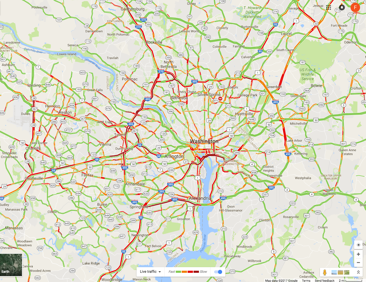
But the Washington region cannot afford this decline in transit use.  Its traffic congestion, even with Metro operating, is by various measures either the worst in the nation or one of the worst.  Furthermore, the traffic congestion is not just in or near the downtown area.  As offices have migrated to suburban centers over the last several decades, traffic during rush hour is now horrendous not simply close to the city center, but throughout the region. See, for example, this screen shot from a Google Maps image I took at typical weekday afternoon during rush hour (5:30 pm on Tuesday, April 18):

The roads shown in red have traffic backed up.  The congestion is bad not simply around downtown, nor simply on the notoriously congested Capital Beltway as well, but also on roads at the very outer reaches of the suburbs.  The problem is region-wide, and it is in the interest of everyone in the region that it be addressed.

A good and well-run transit system will be a necessary component of what will be needed to fix this, although this is just the minimum.  And for this, it will be fundamental that there be a change in approach from a short-term focus on resolving the immediate crisis by some patch, to a perspective that focuses on how best to utilize, and over time enhance, the overall transportation system assets of the Washington region.  This includes both the Metro system assets (where a value of $40 billion has been commonly cited, presumably based on its historical cost) but also the value of the highways and bridges and parking facilities of the region, with a cost and a value that would add up to far more. These assets are not well utilized now.  A proper funding system for WMATA should take this into account.  If it is not, one can end up with empty seats on transit while the roads are even more congested.

The first question, however, is how much additional funding is required for WMATA.  The next section will examine that.

B.  WMATA’s Additional Funding Needs

How much is needed in additional funding for WMATA?  There is not a simple answer, and any answer will depend not only on the time frame considered but also on what the objective is.

To start, the FY18 budget for WMATA as originally drawn up in the fall of 2016 found there to be a $290 million gap between expenditures it considered to be necessary based on the current plans, and the revenues it forecast it would receive from fares (and other revenue generating activities such as parking fees at the stations and from advertising) and what would be provided under existing formulae from the political jurisdictions.  This gap was broadly similar in magnitude to the gaps found in recent years at a similar stage in the process.  And as in earlier years, this $290 million gap was largely closed by one-off measures that one could not (or at least should not) be used again.  In particular, funds were shifted from planned expenditures to maintain or build up the capital assets of the system, to cover current operating costs instead.

Looking forward, all the estimates of the additional funding needs are far higher.  To start, an analysis by Jeffrey DeWitt, the CFO of Washington, DC, released in October 2016 as part of a Metropolitan Washington Council of Governments (COG) report, estimated that at a minimum, WMATA faced a shortfall over the next ten years averaging $212 million per year on current operations and maintenance, and $330 million per year for capital needs, for a total of $542 million a year.  This estimate was based on an assumption of a capital investment program summing to $12 billion over the ten years.

But the “10-Year Capital Needs” report issued by WMATA a short time later estimated that the 10-year capital needs of WMATA would be $17.4 billion simply to bring Metro assets up to a “state of good repair” and maintain them there.  It estimated an additional $8 billion would be needed for modest new investments – needed in part to address certain safety issues.  But even if one limited the ten-year capital program to the $17.4 billion to get assets to a state of good repair, there would be a need for an additional $540 million a year over the October 2016 DeWitt estimates, i.e. a doubling of the earlier figure to almost $1.1 billion a year.

A more recent, and conservative, figure has been provided by Paul Wiedefeld, the General Manager of WMATA, in a report released on April 19.  He recommended that while Metro has capital needs totaling $25 billion over the next ten years, he would propose that a minimum of $15.5 billion be covered for the system “to remain safe and reliable”.  Even with this reduced capital investment program, he estimated that if funding from the jurisdictions remained at historical levels, there would be a 10-year funding gap of $7.5 billion remaining.  If jurisdictional funding were to rise at 3% a year in nominal terms, then he estimated that $500 million a year would still be necessary from some new funding source.

But this was just for the capital budget, and a highly constrained one at that.  There would, in addition, be a $100 million a year gap in the operating budget, even with the funding from the jurisdictions for operations rising also at 3% a year.  Wiedefeld suggested that it might be possible to reduce operating costs by that amount.  However, this would require cutting primarily labor expenditures, as direct labor costs account for 74% of operating expenditures.  Not surprisingly, the WMATA labor union is strongly opposed.

Even more recently, the Metropolitan Washington Council of Governments issued on April 26 the final report of a panel it convened (hereafter COG Panel or COG Panel Report) that examined Metro funding options.  The panel was made up of senior local administrative and budget officials.  While the focus of the report was an examination of different funding options (and will be discussed further below), it took as a basis of its estimated needs that WMATA would need to cover a ten-year capital investment program of $15.6 billion (to reach and maintain a “state of good repair” standard).  After assuming a 3% annual increase in what the political jurisdictions would provide, it estimated the funding gap for the capital budget would sum to $6.2 billion. Assuming also a 3% annual increase in funding from the political jurisdictions for operations and maintenance (O&M), it estimated a remaining funding gap of $1.3 billion for O&M.  The total gap for both capital and O&M expenses would thus sum to $7.5 billion over the period.

But while these COG estimates were referred to as 10-year funding gaps (thus averaging $750 billion per year), the table in its PowerPoint presentation on the report on page 13 makes clear that these are actually the funding gaps for the eight year period of FY19 to FY26.  FY17 is already almost over, and the FY18 budget has already been settled.  For the eight year period from FY19 going forward, the additional funding needed averages $930 million per year.  The COG Panel recommended, however, a dedicated funding source that would generate less, at $650 million per year to start (which it assumes would be in 2019).  But the reason for this difference is that the COG Panel recommended also that WMATA borrow additional funds in the early years against that new funding stream, so as to cover together the higher figure ($930 million on average per year over FY19-26) for what is in fact needed.  While such borrowing would supplement what could be funded in the early years, the resulting debt service would then subtract from what one could fund later.  While prudent borrowing certainly has a proper role, future funding needs will certainly be higher than what they are right now, and thus this will not provide a long-term solution to the funding issue.  More funding will eventually (and soon) be required.

All these figures reviewed thus far assume capital investment programs only just suffice to bring existing assets up to a “state of good repair”, with nothing done to add to these assets.  It also appears that the estimates were influenced at least to some extent by what the analysts thought might be politically feasible.  Yet additional capacity will be needed if the Washington region is to continue to grow.  While these additional amounts are much more speculative, there is no doubt that they are large, indeed huge.

The most careful recent study of long-term expansion needs is summarized in a series of reports released by WMATA in early 2016.   A number of rail options were examined (mostly extensions of existing rail lines), with the conclusion that the highest priority for a 2040 time horizon was to enhance the capacity at the center of the system.  Portions of these lines are already strained or at full capacity, including in particular the segment for the tunnel under the Potomac from Rosslyn.  Under this plan, there would be a new circular underground loop for the Metro lines around downtown Washington and extending across the Potomac to Rosslyn and the Pentagon.  It is not clear that a good estimate has yet been done on what this would cost, but the Washington Post gave a figure of $26 billion for an earlier variant (along with certain other expenditures).  This would clearly be a multi-decade project, and if anything like it is to be done by 2040, work would need to begin within the current 10-year WMATA planning horizon.  Yet given WMATA’s current difficulties, there has been little focus on these long-term needs.  And nothing has been provided for them.

To sum up, how much in additional funding is needed?  While there is no precise number, in part because the focus has been on the immediate crisis and on what might be considered politically feasible, for the purposes of this post we will use the following.  At a minimum, we will look at what would be needed to generate $650 million per year, the same figure arrived at in the COG Panel Report.  But this figure is clearly at the low end of the range of what will be needed.  At best, it will suffice only for a few years.  Our political leaders in the region should recognize that this will need to rise to at least $1 billion per year within a few years if necessary investments are to be made to ensure the system not only reaches a “state of good repair” but also sustains it.  Furthermore, it will need to rise further to perhaps $2.0 billion a year by around 2030 if anything close to the system capacity that will be needed by 2040 is to be achieved.

For the analysis below, we will therefore look at what the rates will need to be to generate $650 million a year at the low end and roughly three times this ($2.0 billion a year in nominal terms, by the year 2030) at the high end.  These figures are of course only illustrative of what might be required.  And for the forecast figures for 2030, I will assume (consistent with what the COG Panel did) that inflation from now to then will rise at 2% a year while real growth in the region will rise, conservatively, at 1% a year.  Note that $2.0 billion in 2030 in nominal terms would be equivalent to $1.55 billion in terms of dollars of today (2017) if inflation rises at 2% a year.

It is important to recognize that providing just the low-end figure of $650 million a year will not suffice for more than a few years.  It does provide a starting point, and while that is important, when considering such a major reform as moving to a dedicated funding source to supplement government funding sources, one should really be thinking longer term.  Not much would be gained by moving to a funding source which would prove insufficient after just a few years, leading to yet another crisis.

C.  A Mandatory Fee on Commuter Parking Spaces

A fee would be assessed (generally through the property tax system) on all parking spaces used by office and other commuting employees.  It would not be assessed on residential parking, nor on customer parking linked to retail or other such commercial space, but would be limited to the all-day parking spots that commuters use.

It would be straightforward to implement.  The owners of the property with the parking spaces would be assessed a fee for each parking space provided.  For example, if the fee is set at $1 per day per space, a fee of $250 per year would be assessed (based on 250 work-days a year, of 52 weeks at 5 days per week less 10 days for holidays).  It would be paid through the regular property tax system, and collected from the owners of that land along with their regular property taxes on the semi-annual (or quarterly or whatever) basis that they pay their property taxes. The owners of the spaces would be encouraged to pass along the costs to those employees who drive and use the spaces (and owners of commercial parking lots will presumably adjust their monthly fees to reflect this), but it would be the owners of the parking spaces themselves who would be immediately liable to pay the fees.

Property records will generally have the number of parking spaces provided on those plots of land.  This will certainly be so in the cases of underground parking provided in modern office buildings and in multi-story commercial parking garages.  And I suspect there will similarly be such a record of the number of spaces in surface parking lots.  But even if not, it would be straightforward to determine their number.  Property owners could be required to declare them, subject to spot-checks and fines if they did not declare them honestly. One can now even use satellite images available on Google Maps to count such spaces. And a few years ago my water bills started to include a monthly fee for the square footage of impermeable space on my land (from roofs and driveways primarily), as drainage from such surfaces feed into stormwater drains and must ultimately be treated before being discharged into the Potomac river.  They determined through the property records system and from satellite images the square footage of such spaces on all individual properties.  If that can be done, one certainly determine the number of parking spaces on open lots.

There are, however, a few special cases where property taxes are not collected and where different arrangements will need to be made.  But this can be done.  Specifically:

  1. Properties owned by federal, state, and local governments will generally not pay property taxes.  But the mandatory fees on parking spaces could still be collected by these government entities and paid into the system just as by private property owners.  Presumably, the governments support the reform as it is supplementing the funds they already provide to WMATA.
  2. Similarly, international organizations located in the Washington region, such as the World Bank, the IMF, the Inter-American Development Bank, and others (mostly much smaller) operate under international treaties which provide that they do not owe property taxes on properties they own.  But as with governments, they could collect such fees on parking spaces made available to their employees who drive to work.  They already charge their employees monthly fees for the spaces, and the new fee could be added on.  And while I am not a lawyer, it might well be the case that such a fee on parking spots could be made mandatory.  The institutions do pay the fees charged for the water they use, and employees do pay sales taxes on the food they purchase in their cafeterias.  Finally, these institutions advise governments to apply good policy.  The same should apply here.
  3. There are also non-profit hospitals, universities, and similar institutions, which are major employers in the region but which may not be charged property taxes. However, the fee on parking spaces, while collected for most through the property tax system, can be seen as separate from regular property taxes.  It is a fee on commuters who make use of our road system and add to its congestion.  The parking fees could still be collected and paid in, even if no regular property taxes are due.
  4. Finally, the Washington region has a large number of embassies and other properties with strict internationally recognized immunities.  It might well be the case that it will not be possible to collect such a mandatory fee on parking spots for their employees (although again, presumably the embassies pay the fees on their water bills).  But the total number employed through such embassies is tiny as a share of total employment in the DC region.  And some embassies might well pay voluntarily, recognizing that they too are members of the local community, making use of the same roads.  Finally, note that embassy employees with diplomatic status also do not pay sales tax on their day-to-day purchases, while the embassy compounds themselves do not pay property taxes.  Proposals to fund WMATA through new or higher property taxes or sales taxes (discussed below) will face similar issues.  But as noted above, the amounts involved are tiny.

How, then, would such a mandatory fee on commuter parking spaces stand up under the four criteria noted above?:

a)  Feasibility:  As just discussed, such a fee on commuter parking spaces, implemented generally through the regular property tax system, would certainly be feasible.  It could be done.  It may well be that a lack of recognition of this which explains why such an option has typically not been much considered when alternatives are reviewed for how to fund a transit system such as WMATA.  It appears that most believe that it would require some system to be set up which would mandate a payment each day as commuters enter their parking lots.  But there is no need for that.  Rather, the fee could be imposed on the owner of the parking space, and collected as part of their property tax payments.  It would be up to the owner of that space to decide whether to pass along that cost to the commuters making use of those spaces (although passing along the cost should certainly be encouraged, so that the commuters face the cost of their decision to drive).

b)  Effectiveness:  The next question is whether such a fee, at reasonable rates, would generate the funds needed.  To determine this, one first needs to know how many such parking spots there are in the Washington region.  While more precise figures can be generated later, all that is needed at this point is a rough estimate.

As of January 2017, the Bureau of Labor Statistics estimated there were 3,217,400 employees in the Washington region’s Metropolitan Statistical Area (MSA).  While this MSA area is slightly larger than the jurisdictions that participate in the WMATA regional compact, the additional counties at the fringes of the region are relatively small in population and employment.  This figure on regional employment can then be coupled with the estimate from the most recent (2016) Metropolitan Washington COG “State of the Commute” survey, which concluded that 61.0% of commuters drive alone to work, while an additional 5.4% drive in either car-pools or van-pools.  Assuming an average of 2.5 riders in car-pools and van-pools (van-pools are relatively minor in number), this would work out to 63.2% as the number of cars (as a share of total employment) that carry commuters to their jobs.  Applying the 63.2% to the 3,217,400 figure for the number employed, an estimated 2,033,400 cars are used to carry commuters.  The total number of parking spaces will be somewhat more, as the parking lots will normally have some degree of excess capacity, but this can be ignored for the estimate here.  Rounding down, there are roughly 2 million parking spaces for these cars in the DC region.  And this number can be expected to grow over time.

With 2 million parking spaces, a daily fee of $1 would generate $500 million per year (based on 250 work-days per year).  A fee of $1.30 per day would generate $650 million. And assuming commuter parking spots grow at 1% a year (along with the rest of the regional economy) to 2030, a $3.50 fee in 2030 would generate $2.0 billion in the prices of that year (equivalent to $2.70 per day in the prices of 2017, assuming 2% annual inflation for the period).

Compared to the cost of driving, fees of $1.30 per day or even $3.50 per day are modest. While many workers do not pay for their parking (or for the full cost of their parking), the actual cost can be estimated by what commercial parking firms charge for their monthly parking contracts.  For the 33 parking garages listed as “downtown DC” on the Parking Panda website, the average monthly fee (showing on April 29, 2017) was a bit over $270. This would come to $13 per work day (based on 250 work days per year).  While the charges will be less in the suburbs, there will still be a cost.  But the full cost to commuters to drive to work is in fact much more.  Assuming the average cost of the cars driven is $36,000, and with simple straight line depreciation over 10 years, the average monthly cost will be $300. To this one should add the cost of car insurance (on the order of $50 to $100 per month), of expected repair costs (probably of similar magnitude), and of gas. The full cost of driving would on average then total over $600 per month, or about $29 per work day.  Even if one ignores the cost of the parking spot itself (as drivers will if their employers provide the spots for free), the cost to the driver would still average about $16 per work day.  An added $1.30 per day to cover the funding needs of the public transit system is minor compared to any of these cost estimates, and would still be modest at $3.50 per day (equal to $2.70 in the prices of today).

Thus at reasonable rates on commuter parking spots, it would be possible to collect the $650 million to $2.0 billion a year needed to help fund WMATA.

c)  Efficiency:  Another consideration when choosing how best to provide additional funds to WMATA is the impact on efficiency of that option.  A fee on parking spaces would be a positive for this.  The Washington region stands out for its severe congestion, including not only in the city center but also in the suburbs (and often even more so in the suburbs).  A fee on parking spots, if passed along to the commuters who drive, would serve as an incentive to take transit, and might have some impact on those at the margin. The impact is likely to be modest, as a $1.30 to $3.50 fee per day would not be much.  As just discussed above, given the current cost of driving (even when commuters who drive are not charged for their parking spots), an additional $1.30 to $3.50 would be only a small additional cost, even when it is passed along.  But at least it would operate in the direction one wants to alleviate traffic congestion.

d)  Fairness:  Finally, the fee would be fair relative to the other options being considered in terms of who would be impacted.  Those who drive to work (over 90% of whom drive alone) are generally of higher income.  They can afford the high cost of driving, which is high (as noted above) even in those cases when they are provided free parking spaces by their employer.

Some would argue that since the drivers are not taking transit, they should not help pay for that transit.  But that is not correct.  First of all, they have a direct interest in reducing road congestion, and only a well-functioning transit system can help with that.  Drivers benefit directly (by reduced congestion) for every would-be driver who decides instead to take transit.  Second, all the other feasible funding options being considered for WMATA will be paid for in large part by drivers as well.  This is true whether a higher sales tax is imposed on the region, higher property taxes, or just higher government funding from their budgets (with this funding coming from the income taxes as well as sales taxes and property taxes these governments receive).  And as discussed below, higher fares on WMATA passengers to raise the amounts needed is simply not a feasible option.

Some drivers will likely also argue that they have no choice but to drive.  While they would still gain by any reduction in congestion (and would lose in a big way due to extreme congestion if WMATA service collapses due to inadequate funding), it is no doubt true that at least some commuters have no alternative but to drive.  However, the number is quite modest.  The 2016 survey of commuters undertaken by the Metropolitan Washington COG, referred to also above, asked their sample of commuters whether there was either bus service or train service “near” their homes (“near” as they would themselves consider it), and separately, “near” their place of work.  The response was 89% who said there were such transit services near their homes, and 86% who said there were such transit services near their places of work.  But note also that the 11% and 14%, respectively, who did not respond that there was such nearby transit, included those who responded that they did not know.  Many of those who drive to work might not know, as they never had a need to look into it.

The share of the Washington region’s population who do not have access to transit services is therefore relatively small, probably well less than 10% of commuters.  The transit options might not be convenient, and probably take longer than driving in many if not most cases given the current service provision, but transit alternatives exist for the overwhelming share of the regional population.  The issue is that those who can afford the high cost will drive, while the poorer workers who cannot will have no choice but to take transit.  Setting a fee on parking spaces for commuters in order to support the maintenance of decent transit services in the region is socially as well as economically fair.

D.  Alternative Funding Options That Have Been Proposed

1)   Higher Fares:  The first alternative that many would suggest for raising additional funds for the transit system is to charge higher fares.  While certainly feasible in a mechanical sense, such an alternative would fail the effectiveness test.  The fares are already high.  Any increase in fares will lead to yet more transit users choosing to drive instead (for those for whom this is an option).  The increase in fare revenues collected will be less than in proportion to the increase in fare rates set.  And at some point, so many transit users will switch that total fare revenue would in fact decrease.

In the recently passed FY18 budget for WMATA, the forecast revenues to be collected from fares is $709 million.  This is down from an expected $792 million in FY17 despite a fare increase averaging 4%.  Transit users are leaving as fares have increased and service has deteriorated.  To increase the fares to try to raise an additional $650 million would require an increase of over 90% if no riders then leave.  But more riders would of course leave, and it is not clear if anything additional (much less an extra $650 million) would be raised. And this would of course be even more so if one tried to raise an extra $2.0 billion.

So as all recognize, it will not be possible to resolve the WMATA funding issues by means of higher fares.  Any increase in fares will instead lead to more riders leaving the system for their cars, leading to even greater road congestion.

2)  Increase the Sales Tax Rate:  Mayor Muriel Bowser of Washington has pushed for this alternative, and the recent COG Technical Panel concluded with the recommendation that  “the best revenue solution is an addition to the general sales tax in all localities in the WMATA Compact area in the National Capital Region” (page 4).  This alternative has drawn support from some others in the region as well, but is also opposed by some. There is as yet no consensus.

Sales taxes are already imposed across the region, and it would certainly be feasible to add an extra percentage point to what is now charged.  But each jurisdiction sets the tax in somewhat different ways, in terms of what is covered and at what rates, and it is not clear to what the additional 1% rate would be applied.  For example, Washington, DC, imposes a general rate of 5.75%, but nothing on food or medicines, while liquor and restaurants are charged a sales tax of 10% and hotels a rate of 14.5%.  Would the additional 1% rate apply only to the general rate of 5.75%, or would there also be a 1% point increase in what is charged on liquor, restaurants, and the others?  And would there still be a zero rate on food and medicines?  Virginia, in contrast, has a general sales tax rate (in Northern Virginia) of 6.0%, but it charges a rate on food of 2.5%.  Would the Virginia rate on food rise to 3.5%, or stay at 2.5%?  There is also a higher sales tax rate on restaurant meals in certain of the local jurisdictions in Virginia (such as a 10% rate in Arlington County) but not in others (just the base 6% rate in Fairfax County).  How would these be affected?  And similar to DC, there are also special rates on hotels and certain other categories.  Maryland also has its own set of rules, with a base rate of 6.0%, a rate of 9% on alcohol, and no sales tax on food.

Such specifics could presumably be worked out, but the distribution of the burden across individuals as well as the jurisdictions will depend on the specific choices made.  Would food be subject to the tax in Virginia but not in Maryland or DC, for example?  The COG Technical Panel must have made certain assumptions on this, but what they were was not explained in its report.

But it concluded that an additional 1% point on some base would generate $650 million in FY2019.  This is higher than the estimate made last October as part of the COG Panel work, where it estimated that a 1% point increase in the sales tax rate would raise $500 million annually.  It is not clear what the underlying reasons were for this difference, but the recent estimates might have been more thoroughly done.  Or there might have been differing assumptions on what would be included in the base to be taxed, such as food.

A 1% point rise in the sales tax imposed in the region would, under these estimates, then suffice to raise the minimum $650 million needed now.  But to raise $1.0 billion annually, rising to $2.0 billion a few years later, substantial further increases would soon be needed. The amount would of course depend on the extent to which local sales of taxable goods and services grew over time within the region.  Assuming that sales of items subject to the sales tax were to rise at a 3% annual rate in nominal terms (2% for inflation and 1% for real growth), and that one would need to raise $2.0 billion by 2030 (in terms of the prices of 2030), then the base sales tax rate would need to rise by about 2.2% points.  A 6% rate would need to rise to 8.2%.  A rate that high would likely generate concerns.

Thus while a sales tax increase would be effective in raising the amounts needed to fund WMATA in the immediate future, with a 1% rise in the tax rate sufficing, the sales tax rate would need to rise further to quite high levels for it to raise the amounts needed a few years later.  Whether such high rates would be politically possible is not clear.

Also likely to be a concern, as the COG Panel itself recognized in its report, is that the distribution of the increased tax burden across the local jurisdictions would differ substantially from what these jurisdictions contribute now to fund WMATA, as well as from what it estimates each jurisdiction would be called on to contribute (under the existing sharing rules) to cover the funding gap anticipated for FY17 – FY26:

Funding Shares:

FY17 Actual

FY17-26 Gap

From Sales Tax

DC

37.3%

35.8%

22.8%

Maryland

38.4%

33.5%

26.5%

Virginia

24.3%

30.7%

50.8%

Source:  COG Panel Final Report, pages 9 and 15.

If an extra 1% point were added to the sales tax across the region, 50.8% of the revenues thus generated would come from the Northern Virginian jurisdictions that participate in the WMATA compact.  This is substantially higher than the 24.3% share these jurisdictions contributed in WMATA funding in FY17, or the 30.7% share they would be called on to contribute to cover the anticipated FY17-26 gap (higher than in just FY17 primarily due to the opening of the second phase of the Silver Line).  The mirror image of this is that DC and Maryland would gain, with much lower shares paid in through the sales tax increase than what they are funding now.  Whether this would be politically acceptable remains to be seen.

Use of a higher sales tax to fund WMATA needs would also not lead to efficiency gains for the transportation system.  The sales tax on goods and services sold in the region would not have an impact on incentives, positive or negative, on decisions on whether to drive for your commute or to take transit.  It would be neutral in this regard, rather than beneficial.

Finally, and perhaps most importantly, sales taxes are regressive, costing the poor more as a share of their income than what they cost the well-off.  A sales tax rise would not meet the fairness test.  Even with exemptions granted for foods and medicines, poor households spend a high share of their incomes on items subject to sales taxes, while the well-off spend a lower share.  The well-off are able to devote a higher share of their incomes to items not subject to the general sale tax, such as luxury housing, or vacations elsewhere, or services not subject to sales taxes, or can devote a higher share of their incomes to savings.

Aside from the regressive nature of a sales tax, an increase in the sales tax to fund transit (and through this to reduce road congestion) will be paid by all in the region, including those who do not commute to work.  It would be paid, for example, also by retirees, by students, and by others who may not normally make use of transit or the road system to get to work during rush hour periods.  But they would pay similarly to others, and some may question the fairness of this.

An increase in the sales tax rate would thus be feasible.  And while a 1% point rise in the rate would be effective in raising the amounts needed in the immediate future, there is a question as to whether this approach would be effective in raising the amounts needed a few years later, given constraints (political and otherwise) on how high the sales tax rate could go.  The region would likely then face another crisis and dilemma as to how WMATA can then be adequately funded.  There are also political issues in the distribution of the sales tax burden across the jurisdictions of the region, with Northern Virginia paying a disproportionate share.  This would be even more of a concern when the tax rate would need to be increased further to cover rising WMATA funding needs.  There would also be no efficiency gains through the use of a sales tax.  Finally and importantly, a higher sales tax is regressive and not fair as it taxes a higher share of the income of the poor than of the well-off, as well as of groups who do not use transit or the roads during the rush hour periods of peak congestion.

3)  A Special Property Tax Rate on Properties Near Metro Stations

Some have argued for a special additional property tax to be imposed on properties that are located close to Metro stations.  The largest trade union at WMATA has advocated for this, for example, and the COG Technical Panel looked at this as one option it considered.

The logic is that the value of such properties has been enhanced by their location close to transit, and that therefore the owners of these more valuable properties should pay a higher property tax rate on them.  But while superficially this might look logical, in fact it is not, as we will discuss below.  There are several issues, both practical and in terms of what would be good policy.  I will start with the practical issues.

The special, higher, tax rate would be imposed on properties located “close” to Metro stations, but there is the immediate question of how one defines “close”.  Most commonly, it appears that the proponents would set the higher tax on all properties, residential as well as commercial, that are within a half-mile of a station.  That would mean, of course, that a property near the dividing line would see a sharply higher property tax rate than its neighbor across the street that lies on the other side of the line.

And the difference would be substantial.  The COG Technical Panel estimated that the additional tax rate would need to be 0.43% of the assessed value of all properties within a half mile of the DC area Metro stations to raise the same $650 million that an extra 1% on the sales tax rate would generate.  It was not clear from the COG Panel Report, however, whether the higher tax of 0.43% was determined based on the value of all properties within a half-mile of Metro stations, or only on the base of all such properties which currently pay property tax.  Governmental entities (including international organizations such as the World Bank and IMF) and non-profits (such as hospitals and universities) do not pay this tax (as was discussed above), and such properties account for a substantial share of properties located close to Metro stations in the Washington region.  If the 0.43% rate was estimated based on the value of all such properties, but if (just for the sake of illustration; I do not know what the share actually is) properties not subject to tax make up half of such properties, then the additional tax rate on taxable properties that would be needed to generate the $650 million would be twice as high, or 0.86%.

But even at just the 0.43% rate, the increase in taxes on such properties would be large. For Washington, DC, it would amount to an increase of 50% on the current general residential property tax rate of 0.85%, an increase of 26% on the 1.65% rate for commercial properties valued at less than $3 million, and an increase of 23% on the 1.85% rate for commercial properties valued at more than $3 million.  Property tax rates vary by jurisdiction across the region, but this provides some sense of the magnitudes involved.

The higher tax rate paid would also be the same for properties sitting right on top of the Metro stations and those a half mile away.  But the locational value is highest for those properties that are right at the Metro stations, and then tapers down with distance. One should in principle reflect this in such a tax, but in practice it would be difficult to do. What would the rate of tapering be?  And would one apply the distance based on the direct geographic distance to the Metro station (i.e. “as the crow flies”), or based on the path that one would need to take to walk to the Metro station, which could be significantly different?

Thus while it would be feasible to implement the higher property tax as a fixed amount on all properties within a half-mile (at least on those properties which are not exempt from property tax), the half-mile mark is arbitrary and does not in fact reflect the locational advantages properly.

The rate would also have to be substantially higher if the goal is to ensure WMATA is funded adequately by the new revenue source beyond just the next few years.  Assuming, as was done above for the other options, that property values rise at a 3% rate over time going forward (due both to growth and to price inflation), the 0.43% special tax rate would raise $900 million by 2030.  If one needed, however, $2 billion by that year for WMATA funding needs, the rate would need to rise to 0.96%.  This would mean that residential properties within a half mile would be paying more than double the property tax paid by neighbors just beyond the half-mile mark (assuming basic property tax rates are similar in the future to what they are now, and based on the current DC rates), while commercial rates would be over 50% more.  The effectiveness in raising the amounts required is therefore not clear, given the political constraints on how high one could set such a special tax.

But the major drawback would be the impact on efficiency.  With the severe congestion on Washington region roads, one should want to encourage, not discourage, concentrated development near Metro stations.  Indeed, that is a core rationale for investing so much in building and sustaining the Metro system.  To the extent a higher property tax discourages such development, the impact of such a special property tax on real estate near Metro stations would be to discourage precisely what the Metro system was built to encourage.  This is perverse.  One could indeed make the case that properties located close to Metro stations should pay a lower property tax rather than a higher one.  I would not, as it would be complex to implement and difficult to explain.  But technically it would have merit.

Finally, a special additional tax on the current owners of the properties near Metro stations would not meet the fairness test as the current owners, with very few if any exceptions, were not the owners of that land when the Metro system locations were first announced a half century ago.  The owners of the land at that time, in the 1960s, would have enjoyed an increase in the value of their land due to the then newly announced locations of the Metro stations.  And even if the higher values did not immediately materialize when the locations of the new Metro system stations were announced, those higher values certainly would have materialized in the subsequent many decades, as ownership turned over and the properties were sold and resold.  One can be sure the prices they sold for reflected the choice locations.

But those who purchased that land or properties then or subsequently would not have enjoyed the windfall the original owners had.  The current owners would have paid the higher prices following from the locational advantages near the Metro stations, and they are the ones who own those properties now.  While they certainly can charge higher rents for space in properties close to the Metro stations, the prices they paid for the properties themselves would have reflected the fact they could charge such higher rents.  They did not and do not enjoy a windfall from this locational advantage.  Rather, the original owners did, and they have already pocketed those profits and left.

Note that while a special tax imposed now on properties close to Metro stations cannot be justified, this does not mean that such a tax would not have been justified at an earlier stage.  That is, one could justify that or a similar tax that focused on the initial windfall gain on land or properties that would be close to a newly announced Metro line.  When new such rail lines are being built (in the Washington region or elsewhere), part of the cost could be covered by a special tax (time-limited, or perhaps structured as a share of the windfall gain at the first subsequent arms-length sale of the property) that would capture a share of the windfall from the newly announced locations of the stations.

An example of this being done is the special tax assessments on properties close to where the Silver Line stations are being built.  The Silver Line is a new line for the Washington region Metro system, where the first phase opened recently and the second phase is under construction.  A special property tax assessment district was established, with a higher tax rate and with the funds generated used to help construct the line.  One should also consider such a special tax for properties close to the stations on the proposed Purple Line (not part of the WMATA system, but connected to it), should that light rail line be built. The real estate developers with properties along that line have been strong proponents of building that line.  This is understandable; they would enjoy major windfall gains on their properties if the line is built.  But while the windfall gains could easily be in the hundreds of millions of dollars, there has been no discussion of their covering a portion of the cost, which will sum to $5.6 billion in payments to the private contractor to build and then operate the line for 30 years.  Under current plans, the general taxpayer would be obliged to pay this full amount, with only a small share of this (less than one-fourth) recovered in forecast fares.

While setting a special (but temporary) tax for properties close to stations can be justified for new lines, such as the Silver Line or the Purple Line, the issues are quite different for the existing Metro lines.  Such a special, additional, tax on properties close to the Metro stations is not warranted, would be unfair to the current owners, and could indeed have the perverse outcome of discouraging concentrated development near the Metro stations when one should want to do precisely the reverse.

4)  Other Funding Options

There can, of course, be other approaches to raising the funds that WMATA needs.  But there are issues with each, they in general have few advocates, and most agree that one of the options discussed above would be preferable.

The COG Technical Panel reviewed several, but rejected them in favor of its preference for a higher sales tax rate.  For example, the COG Panel estimated that it would be possible to raise their target for WMATA funding of $650 million if all local jurisdictions raised their property tax rates by 0.08% of the assessed values on all properties located in the region. But general property taxes are used as the primary means local jurisdictions raise the funds they need for their local government operations, and it would be best to keep this separate from WMATA funding.  The COG Panel also considered the possibility of creating a new Value-Added Tax (or VAT), a tax that is common elsewhere in the world but has never been instituted in the US.  It is commonly described as similar to a sales tax, but is imposed only on the extra value created at each stage in the production and sale process. But it would be complicated to develop and implement any new tax such as this, and it also has never been imposed (as far as I am aware) on a regional rather than national basis.  A regional VAT might be especially complicated.  The COG Panel also noted the possibility of a “commuter tax”.  Such a tax would have income taxes being imposed on a worker based on where they work rather than where they live.  But since there would be an offset for any such taxes against what the worker would otherwise pay where they are resident, the overall revenues generated at the level of the region as a whole would be essentially nothing.  It would be a wash.  There is also the issue that Congress has by law prohibited Washington, DC, from imposing any such commuter tax.

The COG Panel also looked at the imposition of an additional tax on motor vehicle fuels (gasoline and diesel) sold in the region.  This would in principle be more attractive as a means for funding transit, as it would affect the cost of commuting by car (by raising the cost of fuel) and thus might encourage, at the margin, more to take transit and thus reduce congestion.  Fuel taxes in the US are also extremely low compared to the levels charged in most other developed countries around the world.  And federal fuel taxes have not been changed since 1993, with a consequent fall in real, inflation-adjusted, terms. There is a strong case that the rates should be raised, as has been discussed in an earlier post on this blog.  But such fuel taxes have been earmarked primarily for road construction and maintenance (the Highway Trust Fund at the federal level), and any such funds are desperately needed there.  It would be best to keep such fuel taxes earmarked for that purpose, and separated from the funding needed to support WMATA.

E.  Summary and Conclusion

All agree that there is a need to create a dedicated source of funds to provide additional funds to WMATA.  While there are a number of issues with WMATA, including management and governance issues, no one disagrees that a necessary element in any solution is increased funding.  WMATA has underinvested for decades, with the result that the current system cannot operate reliably or safely.

Estimates for the additional funding required by WMATA vary, but most agree that a minimum of an additional $650 million per annum is required now simply to bring the assets up to a minimum level of reliability and safety.  But estimates of what will in fact be needed once the current most urgent rehabilitation investments are made are substantially higher.  It is likely that the system will need on the order of $2 billion a year more than what would follow under current funding formulae by the end of the next decade, if the system’s capacity is to grow by what will be necessary to support the region’s growth.

A mandatory fee on parking spaces for all commuters in the region would work best to provide such funds.  It would be feasible as it can be implemented largely through the existing property tax system.  It would be effective in raising the amounts needed, as a fee equivalent to $1.30 per day would raise $650 million per year under current conditions, and a fee of $3.50 per day would raise $2 billion per year in the year 2030.  These rates are modest or even low compared to what it costs now to drive.

A mandatory fee on parking spaces would also contribute to a more efficient use of the transportation assets in the region not only by helping to ensure the Metro system can function safely and reliably, but by also encouraging at least some who now drive instead to take transit and hence reduce road congestion.  Finally, such a fee would be fair as it is those of higher income who most commonly drive (in part because driving is expensive), while it is the poor who are most likely to take transit.

An increase in the sales tax rate in the region would not have these advantages.  While an increase in the rate by 1% point was estimated by the COG Panel to generate $650 million a year under current conditions, the rate would need to increase by substantially more to generate the funds that will be needed to support WMATA in the future.  This could be politically difficult.  The revenues generated would also come disproportionately from Northern Virginia, which itself will create political difficulties.  It would also not lead to greater efficiencies in transport use, other than by keeping WMATA operational (as all the options would do).  Most importantly, a sales tax is regressive (even when foods and medicine are not taxed), with the poor bearing a disproportionate share of the costs.

A special property tax on all properties located a half mile (or whatever specified distance) of existing Metro stations could also be imposed, although readily so only on such properties that are currently subject to property tax.  But there would be arbitrariness with such a rigidly specified distance being imposed, with a sharp fall in the tax rate for properties just across that artificial border line.  There is also a question as to whether it would be politically feasible to set the rates to such high rates as would be necessary as to address the WMATA funding needs of beyond just the next few years.

But most important, such a special tax on the current owners would not be a tax on those who gained a windfall when the locations of the Metro stations were announced many decades ago.  Those original owners have already pocketed their windfall gains and have left.  The current owners paid a high price for that land or the developments on them, and are not themselves enjoying a special windfall.  And indeed, a new special property tax on developments near the Metro stations would have the effect of discouraging any such new investment.  But that is the precise opposite of what we should want.  The policy aim has long been to encourage, not discourage, concentrated development around the Metro stations.

This does not mean that some such special tax, if time-constrained, would not be a good choice when a new Metro line (or rail line such as the proposed Purple Line) is to be built. The owners of land near the planned future Metro stops would enjoy a windfall gain, and a special tax on that is warranted.  Such a special tax district has been set for the new Silver Line, and would be warranted also if the Purple Line is to be built.  Those who own that land will of course object, as they wish to keep their windfall in full.

To conclude, no one denies that any new tax or fee will be controversial and politically difficult.  But the Metro system is critical to the Washington region, and cannot be allowed to continue to deteriorate.  Increased funding (as well as other measures) will be necessary to fix this.  Among the possible options, the best approach is to set a mandatory fee that would be collected on all commuter parking spaces in the region.