There is No Reason to Expect Increased Labor Force Participation Rates to be a Source of Spectacular Growth

Labor Force Participation Rate, Ages 25 to 54, All, Male, Female, Jan 1948 to Feb 2016

A.  Introduction

An important issue in the current presidential campaign, although somewhat technical, is whether one should expect that employment could jump to substantially higher levels than where it is now, if only economic policy were better.  The argument is that while the unemployment rate as officially measured (4.9% currently) might appear to be relatively low and within the range normally considered “full employment”, this masks that many people (it is asserted) have given up looking for jobs and make up a large reservoir of “hidden unemployed”.  If only the economy were functioning better, it is said, more jobs would be created and taken up by these hidden unemployed, the economy would then be producing more, and everyone would be better off.

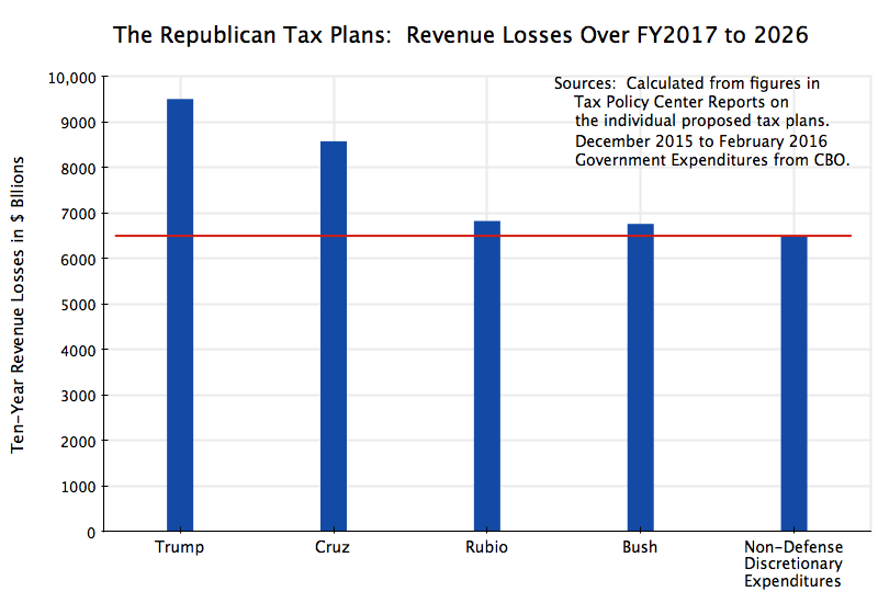
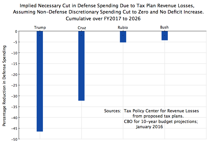
This is important for the Republicans, not only as part of their criticism of Obama, but also as a basis for their tax plans.  As discussed in the previous post on this blog, the Republican tax plans would all cut tax rates sharply, leading to such revenue losses that deficits would rise dramatically even if non-defense discretionary budget expenditures were cut all the way to zero.  The Republican candidates have asserted that deficits would not rise (even with sharply higher spending for defense, which they also want), because the tax cuts would spur such a large increase in growth of GDP that the tax revenues from the higher output would offset the reductions from lower tax rates.  Aside from the fact that there is no evidence to support the theory that such tax cuts would spur growth by any amount, much less the jump they are postulating (see the earlier blog post for a discussion), any rise in GDP of such magnitude would also depend on there being unemployed labor to take on such jobs.  With the economy now at close to full employment (with the unemployment rate of 4.9%), this could only be achieved if a large pool of hidden unemployed exists to enter (or re-enter) the labor force.

Given the huge magnitudes involved, few economists see these Republican tax plans as serious.  One cannot have such massive tax cuts and expect deficits not to rise.  And Democrats have long criticized such Republican plans for being unrealistic (there were similar, although not as extreme, Republican tax plans in the 2012 campaign, and Paul Ryan’s budget plans also relied on completely unrealistic assumptions).

Unfortunately, the Bernie Sanders campaign this year on the Democratic side has similarly set out proposals that are economically unrealistic.  A detailed assessment of the Bernie Sanders economic program by Professor Gerald Friedman of the University of Massachusetts at Amherst concluded that the Sanders program would raise GDP growth rates by more than even the Republicans are claiming.  But even left-wing commentators have criticized it heavily.  Kevin Drum at Mother Jones, for example, said the Sanders campaign had “crossed into neverland”.

A more detailed and technical evaluation from Professors Christina Romer and David Romer of UC Berkeley (with Christina Romer also the first Chair of the Council of Economic Advisers in the Obama Administration), concluded Friedman’s work was “highly deficient”, as they more politely put it.  And an open letter issued by four former Chairs of the Council of Economic Advisers under Obama and Bill Clinton (including Christina Romer) said “the economic facts do not support these fantastical claims”.

This is important.  In recent decades, it was the Republican candidates who have set out economic programs which did not add up or which depended on completely unrealistic assumptions of how the economy would respond.  The analysis by Professor Friedman of the Sanders program is similarly unrealistic.  As the four former Chairs of the CEA put it in their open letter:

“As much as we wish it were so, no credible economic research supports economic impacts of these magnitudes. Making such promises runs against our [Democratic] party’s best traditions of evidence-based policy making and undermines our reputation as the party of responsible arithmetic. These claims undermine the credibility of the progressive economic agenda and make it that much more difficult to challenge the unrealistic claims made by Republican candidates.”

To be fair, the relationship of the Friedman work to the Sanders campaign is not fully clear. At least one news report said the analysis was prepared at the request of Sanders, while others said not.  But upon its release, the Sanders campaign did explicitly say it was “outstanding work” which should receive more attention.  And when the work began to be criticized by economists such as the former chairs of the CEA, the response of the Sanders campaign was that their criticism should be dismissed, as they were of “the establishment of the establishment”.  Rather than engage on the real issues raised, the Sanders campaign simply dismissed the criticisms.  This does not help.

Both the Republican plans and the Sanders program depend on the assumption that so many workers would enter or re-enter the labor force that GDP could take a quantum leap up from what current projections consider to be possible.  (Both depend on other assumptions as well, such as unrealistically high assumptions on what would happen to productivity growth.  But it is not the purpose of this blog post to go into all such issues. Rather, it is to address the single issue of labor force participation.)  Their plans depend on a higher share of the population participating in the labor force than currently choose to do so, leading to an employment to population ratio that would thus rise sharply.  We will look in this post at whether this is possible.  An earlier post on this blog examined similar issues.  This post will come at it from a slightly different direction, and will update the figures to reflect the most recent numbers.

The key chart will be the one shown at the top of this post.  But to get to it, we will first go through a series of charts that set the story.  The data all come from the Bureau of Labor Statistics (BLS), either directly, or via the data set maintained by the Federal Reserve Bank of St. Louis (FRED).

B.  Recent Behavior of the Employment to Population Ratio

Many observers, from both the left and the right of the political spectrum, have looked at how the employment to population ratio has moved in the recent downturn, and concluded that there must be a significant reservoir of hidden unemployed.  Specifically, they have looked at charts such as the following:

Employment to Popul only, Jan 2007 to Feb 2016

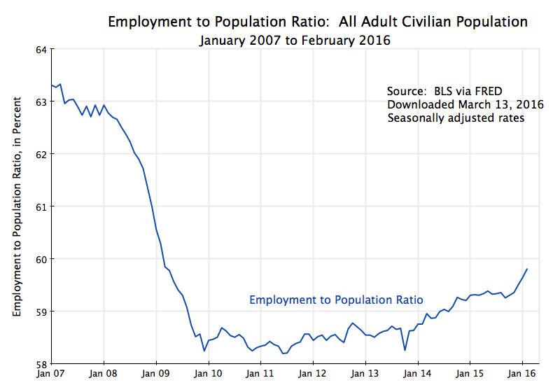
Employment as a share of the population fell rapidly and sharply with the onset of the economic downturn in 2008, in the last year of the Bush Administration, and reached a low point in late 2009.  From about 63% in 2007 to around 58 1/2% in late 2009, it fell by over 7%.  It then remained at such low levels until 2013, rising only slowly, and since then has risen somewhat faster.

But at the current reading of 59.8%, it remains well below the 63% levels of 2007.  And it remains even more below the peak it reached in the history of the series of 64.7% in April 2000.  If this does, in fact, reflect a pool of hidden unemployed, then GDP could be significantly higher than it is now.  Assuming for simplicity that GDP would rise in proportion to the increase in workers employed, annual GDP would be close to a trillion dollars higher if the employment to population ratio rose from the current 59.8% to the 63% that prevailed in 2007.  And annual GDP would be close to $1.5 trillion higher if the ratio could revert to where it was in April 2000.  With a share of about 25% of this accruing in taxes, this would be a significant pot of money, which could be used for many things.

But is this realistic?  The short answer is no.  The population has moved on, with important demographic as well as social changes that cannot be ignored.

C.  Adding the Labor Force Participation Rate

A problem with the employment to population measure is that people will not be employed not just due to unemployment (are looking but cannot find a job), but also because they might not want to be working at the moment.  If older, they might be retired, and happily so.  If younger (the figures are for all adults in the civilian population, defined as age 16 or older), they might be students in high school or college.  And not all those in middle age will want to be working:  Until recent decades, a large share of adult women did not participate in the formal labor force.  Women’s participation in the formal labor force has, however, changed significantly over time, and is one of the key factors underlying the rise seen in the overall labor force participation rate over time.  Such factors should not be ignored, but are being ignored when one looks solely at the employment to population ratio.

The first step is to take into account unemployment.  Unemployment accounts for the difference between the employment to population ratio and the labor force participation rate (which is, stated another way, the labor force to population ratio).  Adding the labor force participation rate to the diagram yields:

Employment to Popul and Labor Force Participation Rate, Jan 2007 to Feb 2016

Note the unemployment rate as traditionally referred to (currently 4.9%) is not the simple difference, in percentage points, between the labor force participation rate (62.9% in February 2016) and the employment to population ratio (59.8% in February 2016).  The unemployment rate is traditionally defined as a ratio to the labor force, not to population, while the two measures of labor force participation rate and employment to population ratio are both defined as shares of the population.  Note that if you take the difference here (62.9% – 59.8% = 3.1% points in February 2016), and divide it by the labor force participation rate (62.9%), one will get the unemployment rate of 4.9% of the labor force. But all this is just arithmetic.

The key point to note for the chart above is that while the employment to population ratio fell sharply in the 2008-2009 downturn, and then recovered only slowly, the labor force participation rate has been moving fairly steadily downward throughout the period.  There is month to month variation for various reasons, including that all these figures are based on surveys of households.  There will therefore be statistical noise.  But the downward trend over the period is clear.  The question is why.  Does it perhaps reflect people dropping out of the labor force due to an inability to find jobs when the labor market is slack with high unemployment (the “discouraged worker” effect)?  Some commentators have indeed noted that the upward bump seen in the figures in the last few months (since last November), with the unemployment rate now low and hence jobs perhaps easier to find, might reflect this.  Or is it something else?

D.  The Longer Term Trend

A first step, then, is to step back and look at how the labor force participation rate has moved over a longer period of time.  Going back to 1948, when the data series starts:

Labor Force Participation Rate, Overall, All Ages, Jan 1948 to Feb 2016

The series peaked in early 2000, at a rate of 67.3%, and has moved mostly downward since.  It was already in 2007 well below where it had been in 2000, and the decline since then continues along largely the same downward path (where the flattening out between 2004 and 2007 was temporary).  Prior to 2000, it had risen strongly since the mid-1960s.

One does see some downward deviation from the trend whenever there was an economic downturn, but then that the series soon returned to trend.  Thus, for example, the labor force participation rate rose rapidly during the years of Jimmy Carter’s presidency in the late 1970s, but then leveled off in the economic downturn of the early 1980s during the Reagan years.  The unemployment rate peaked at 10.8% in late 1982 under Reagan (significantly more than the 10.0% it peaked at in 2009 under Obama), and one can see that the labor force participation rate leveled off in those years rather than continued the rise seen in the years before.  But these are relatively mild “bumps” in the broader long-term story of a rise to 2000 and then a fall.

The long term trend has therefore been a fairly consistent rise over the 35 years from the mid-1960s to 2000, and then a fairly consistent fall in the 16 years since then.  The question to address next is why has it behaved this way.

E.  Taking Account of an Aging Society, Students in School, and Male / Female Differences

As people age, they seek to retire.  Normal retirement age in the US has been around age 65, but there is no rigid rule that it has to be at that precisely that age.  Some retire a few years earlier and some a few years later.  But as one gets older, the share that will be retired (and hence not in the formal labor force) will increase.  And with the demographic dynamics where an increasing share of the US population has been getting older over time (due in part to the baby boom generation, but not just that), one would expect the labor force participation rate to decline over time, and especially so in recent years as the baby boom generation has reached its retirement years.

At the other end of the age distribution, an increasing share of the adult population (defined as those of age 16 or more) in school in their late teens and 20s will have a similar impact.  Over this period, the share of the population (of age 16 or more) in school or college has been increasing.

The other key factor to take into account is male and female differences in labor force participation.  A half century ago, most women did not participate in the formal labor force, and hence were not counted in the labor force participation rate.  Now they do.  This has had a major impact on the overall (male plus female) labor force participation rate, and this change over time has to be taken into account.

The impact of these factors can be seen in the key chart shown at the top of this blog. Male and female rates are shown separately, and to take into account the increasing share of the population in their retirement years or in school, the figures presented are for those in the prime working age span of 25 to 54.  The trends now come out clearly.

The most important trend is the sharp rise in female participation in the formal labor force, from just 34% (of those aged 25 to 54) at the start of 1948 to a peak of over 77% in early 2000.  The male rate for this age group, in contrast, has followed a fairly steady but slow downward trend from 97 to 98% in the early 1950s to about 88% in recent years.  As a result, the combination of the male and female rates rose (for this age group) from 65% in 1948 to a peak of 84% in 2000, and then declined slowly to 81% now.

Seen in this way, the recent movement in the labor force participation rate does not appear to be unusual at all.  Rather, it is simply the continuation of the trends observed over the last 68 years.  The male rate fell slowly but steadily, and the female rate at first rose until 2000, and then followed a path similar to the male rate.  The overall rate reflected the average between these two, and was driven mostly by the rise in the female rate before 2000, and then the similar declines in the male and female rates since then.

F.  The Female Labor Force Participation Rate as a Ratio to the Male Rate

Finally, it is of interest to look at the ratio of the female labor force participation rate to the male rate:

Ratio of Female to Male LFPR, Ages 25 to 54 only, Jan 1948 to Feb 2016

This ratio rose steadily until 2000.  But what is perhaps surprising is how steady this ratio has been since then, at around 83 to 84%.  An increasing share of females entered the labor force until 2000, but since then the female behavior has matched almost exactly the male behavior.  For both, the share of those in the age span of 25 to 54 in the labor force declined since 2000, but only slowly and at the same pace.  The male rate continued along the same trend path it had followed since the early 1950s; the female rate first caught up to a share of the male rate, and then followed a similar and parallel downward path.

Why the female and male rates moved at such a similar and parallel pace since 2000, and at a 83 to 84% proportion, would be interesting issues to examine, but is beyond the scope of this blog post.  One hypothesis is that the parallel downward movements since 2000 reflect increasing enrollment in graduate level education of men and women older than age 25 (and hence included in the 25 to 54 age span).  But I do not know whether good data exists for this.  Another hypothesis might be that very early retirement (at age 54 or before), while perhaps small, has become more common.  And the ratio of the female rate to the male rate of a steady 83 to 84% might reflect dropping out of the labor force temporarily for child rearing, which most affects women.

More data would be required to test any of these hypotheses.  But it appears to be clear that long-term factors are at play, whether demographic, social, or cultural.  And the pattern seen since 2000 has been quite steady for 16 years now.  There is no indication that one should expect it to change soon.

G.  Conclusion

The downward movement in the employment to population ratio in 2008 and 2009 reflected the sharp rise in unemployment sparked by the economic and financial collapse of the last year of the Bush administration.  Unemployment then peaked in late 2009, as the economy began to stabilize soon after Obama took office, with Congress passing Obama’s stimulus program and the aggressive actions of the Fed.  From late 2009, the employment to population ratio was at first flat and then rose slowly, as falling unemployment was offset by a steadily falling labor force participation rate.

But the fall since 2007 in the labor force participation rate did not represent something new.  Rather, it reflected a continuation of prior trends.  Once one takes into account the increasing share of the population either in retirement or in school (by focussing on the behavior of those in the prime working ages of 25 to 54), and most importantly by taking into account female and male differences, the trends are quite steady and clear.  The movement since 2007 in the recent downturn has not been something special, inconsistent with what was observed before.

The implications for the economic programs of the Republican presidential candidates as well as Bernie Sanders on the Democratic side, are clear.  While there will be month to month fluctuation in the data, and perhaps some further increase in the labor force participation rate, one should not assume that there is a large reservoir of hidden unemployed who could be brought into gainful employment and allow there to be a large jump in GDP.

Economic performance can certainly be improved.  The rate of growth of GDP should be higher.  But do not expect a quantum leap.  One should not expect miracles.

The Tax Plans of the Republican Presidential Candidates Are Not Even Close to Serious

TPC Evaluations of Tax Losses in the Republican Tax Plans, 2016

A.  Introduction

There is a good deal in the current campaign of candidates seeking the Republican presidential campaign that is worrying.  When one of the main remaining candidates (Marco Rubio) tries to belittle one of the other candidates (Donald Trump) on national television by alluding to the size of his penis, one has to wonder.  This would be considered juvenile even in a campaign for a high school class president.  Yet one of these candidates will almost certainly receive the nomination of the Republican Party to be the President of the United States.

This blog seeks, however, to focus on economic issues.  And a key economic issue in modern day political campaigns is what the candidate would seek to do, if elected to office, about tax policy.  Major candidates have therefore set out detailed proposals while campaigning, with these proposals developed by teams of trusted advisors who are specialists in the area, and then put out by the candidate as what he (or she) would try to enact if elected.

The major Republican candidates have done this, and four of these (the proposals of Donald Trump, Ted Cruz, Marco Rubio, and Jeb Bush) have been analyzed in depth by the non-partisan Tax Policy Center (a joint center sponsored by the Urban Institute and the Brookings Institution).  (The Tax Policy Center has also just recently issued similar analyses of the tax plans of Hillary Clinton and Bernie Sanders.)

Among the issues examined by the Tax Policy Center was what the impact would be on revenues collected of the Republican plans.  This blog post will look at those estimates, and calculate what they imply for government expenditure cuts if, as each of the candidates insist, they would not allow deficits to rise.  And what they imply is that these plans, like much else in this campaign, simply are not serious.

B.  The Revenue Losses from the Republican Plans

The chart at the top of this post shows what the Tax Policy Center calculates the government revenue losses would be if the tax plans of the major Republican candidates were implemented.  Ten year totals (for fiscal years 2017 to 2026) are shown rather than year by year numbers to keep things simple, even though the plans would still be ramping up in 2017 with the full impact not seen until 2018.  The total revenue losses would range from $6.8 trillion for Bush as well as Rubio, to $8.6 trillion for Cruz, to $9.5 trillion for Trump.

To put this in perspective, the chart includes (on the right) the projected total government discretionary budget expenditures for all purposes other than defense over this same ten year period.  The figures are from the most recent (January 2016) ten year budget forecasts of the Congressional Budget Office, and will exclude defense as well expenditures for mandatory programs (two-thirds of which are for Social Security and Medicare) and for interest on public debt.

Forecast non-defense discretionary expenditures total $6.5 trillion over this ten year period.  This is less than what the revenue losses would be under any of the Republican plans.  That is, even with the total elimination of government discretionary spending on everything other than defense, the deficit would increase.  Yet these Republicans insist that their plans would not increase the deficit.

Cutting non-defense discretionary expenditures to zero is of course absurd.  For those concerned with security, one should note there would be no more federal prisons, no more prosecutors, no FBI, no more border control.  There would be no more federal disease control, no more federally funded medical research, no more federal support for infrastructure building or maintenance, no more NASA or supported science research, and so on.  Everything would be eliminated, not just cut.

Taking this a step further, one can look at how much defense spending would need to be cut, on top of the elimination of all non-defense expenditure, to make up for the lost revenues:

Implied Defense Reductions, FY2017 to 2026, TPC

The necessary cuts in the defense budget would range from 5% of forecast ten-year defense expenditures for Bush and Rubio, to 32% for Cruz, to 47% (!) for Trump.  Yet Cruz, Rubio and Bush have all also called for sharp increases in defense spending.  Ted Cruz has laid out an ambitious plan for a bigger military that an analyst at the conservative Cato Institute would cost an extra $2.6 trillion over eight years, an increase in defense spending of over 50%.  Bush and Kasich have each proposed increases in defense spending of $1 trillion over ten years, an increase of over 15%.  Rubio is also arguing for big (but unspecified) increases in defense spending.  Things are perhaps less clear for Donald Trump, who has asserted he is “gonna build a military that’s gonna be much stronger than it is right now”, but “for a lot less”.  How he would do this he does not say, and it is doubtful he would get a “much stronger” military if its budget is to be cut by close to half.

C.  Conclusion

The Republican candidates assert their tax cut plans would not, however, lead to deficit increases, nor that they would cut defense spending (at least other than Trump).  Rather, they would cut non-defense spending.  However, as seen above, even if non-defense spending were cut to zero, budget deficits would increase unless there were also sharp cuts in mandatory programs (which are mostly Social Security and Medicare).

How do they believe they can do this?  Because they assert their tax plans would lead to big, indeed miraculous, leaps in growth.  Yet there is no evidence that such tax plans would do this.  Indeed, they are so large that the disruption in finances would almost certainly have large negative consequences for growth.

Economic theory does suggest that tax systems can affect growth.  The Tax Policy Center evaluations of the Republican tax plans, cited above, each have a balanced discussion of what they might be.  But as they point out, one would expect from economic theory that there would be both positive and negative effects, offsetting each other to at least some degree, and that in any case the overall impact in either direction is likely to be small. What the net impact will be, and in what direction, is then an empirical question, and careful studies of historical examples of tax reforms suggests that the overall impact on growth is, indeed, small.

One also does not find any evidence in the US historical data that tax cuts lead to more rapid growth.  As an earlier post on this blog found, federal taxes as a share of GDP were substantially lower in the decade following the Bush tax cuts of 2001 than for any decade in the previous half century, but this was not associated with higher GDP or jobs growth. Rather, it was associated with the lowest growth of GDP or jobs of any decade since at least the 1960s.  Furthermore, one cannot find any indication that a reduction of the highest marginal income tax rate (a focus of the Republican tax plans) led to higher growth.  The highest marginal federal income tax rate was 91 or 92% in the 1950s under Eisenhower, and always 70% or higher during the 1960s, but growth in GDP and in jobs during those periods were reasonably good, especially in comparison to what they have been since the Bush tax cuts of 2001.  High marginal income tax rates in the 1950s and 1960s did not kill growth.

One should not then expect miracles.  The Republican tax plans simply cannot be taken seriously.  But perhaps I am being silly to expect that in this campaign for the presidency.

The Rate of Return on Funds Paid Into Social Security Are Actually Quite Good

Social Security Real Rates of Return - Various Scenarios


A.  Introduction

The rate of return earned on what is paid into our Social Security accounts is actually quite good.  It is especially good when one takes into account that these are investments in safe assets, and thus that the proper comparison should be to the returns on other safe assets, not risky ones.  Yet critics of Social Security, mostly those who believe it should be shut down in its current form with some sort of savings plan invested through the financial markets (such as a 401(k) plan) substituted for it, often assert that the returns earned on the pension savings in Social Security are abysmally poor.

These critics argue that by “privatizing” Social Security, that is by shifting to individual plans invested through the financial markets, returns would be much higher and that thus our Social Security pensions would be “rescued”.  They assert that by privatizing Social Security investments, the system will be able to provide pensions that are either better than what we receive under the current system, or that similar pensions could be provided at lower contribution (Social Security tax) rates.

There are a number of problems with this.  They include that risks of poor financial returns (perhaps due, for example, to a financial collapse such as that suffered in 2008 in the last year of the Bush administration, when many Americans lost much or all of their retirement savings) would then be shifted on to individuals.  Individuals are not in a good position to take on such risks.  Individuals are also not financial professionals, nor normally in a good position to judge the competency of financial professionals who offer them services.  They also often underestimate the impact of high and compounding fees in depleting their savings over time.  For all these reasons, such an approach would serve as a bad substitute for the Social Security system such as we have now, which is designed to provide at least a minimum pension that people can rely on in their old age, with little risk.

But there is also a more fundamental problem with this approach.  It presumes that returns in the financial markets will in general be substantially higher than returns that one earns on what we pay into the Social Security system.  This blog post will show that this is simply not true.

The post looks at what the implicit rates of return are under several benchmark cases for individuals.  We pay into Social Security over our life time, and then draw down Social Security pensions in our old age.  The returns will vary for every individual, depending on their specific earnings profile (how much they earn in each year of their working career), their age, their marital situation, and other factors.  Hence there will be over 300 million different cases, one for each of the over 300 million Americans who are either paying into Social Security or are enjoying a Social Security pension now.  But by selecting a few benchmarks, and in particular extreme cases in the direction of where the returns will be relatively low, we can get a sense of the range of what the rates of return normally will be.

The chart at the top of this post shows several such cases.  The rest of this post will discuss each.

B.  Social Security Rates of Return Under Current Tax and Benefit Rates

The scenarios considered are all for an individual who is assumed to work from age 22 to age 65, who then retires at 66.  The individual is assumed to have reached age 65 in 2013 (the most recent year for which we have all the data required for the calculations), and hence reached age 62 in 2010 and was born in 1948.  The historical Social Security tax rates, the ceiling on wages subject to Social Security tax, the wage inflation factors used by Social Security to adjust for average wage growth, and the median earnings of workers by year, are all obtained from the comprehensive Annual Statistical Supplement to the Social Security Bulletin – 2014 (published April 2015).  Information on the parameters needed to calculate what the Social Security pension payments will be are also presented in detail in this Statistical Supplement, or in a more easy-to-use form for the specific case of someone reaching age 62 in 2010 in this publication of the Social Security Administration.  It is issued annually.

The Social Security pension for an individual is calculated by first taking the average annual earnings (as adjusted for average wage growth) over the 35 years of highest such earnings in a person’s working career.  For someone who always earned the median wage who reached age 62 in 2010, this would work out to $2,290 per month. The monthly pension (at full retirement age) would then be equal to 90% of the first $761, 32% of the earnings above this up to $4,586 per month, and then (if any is left, which would not be the case in this example of median earnings) 15% of the amount above $4,586.  Note the progressivity in these rates of 90% for the initial earnings, then 32%, and finally 15% for the highest earnings.  The monthly Social Security pension will then be the sum of these three components.  Since it is then adjusted for future inflation (as measured by the CPI), we do not need to make any further adjustments to determine the future pension payments in real terms.  The pensions will then be paid out from age 66 until the end of their life, which we take to be age 84, the current average life expectancy for someone who has reached the age of 65.

The historical series of payments made into the Social Security system through Social Security taxes (for Social Security Old-Age pensions only, and so excluding the taxes for Disability insurance and for Medicare) are then calculated by multiplying earnings by the tax rate (currently 10.6%, including the shares paid by both worker and employer).  The stream of payments are then put in terms of 2010 dollars using the historical CPI series from the Bureau of Labor Statistics.

We can thus calculate the real rates of return on Social Security pensions under various scenarios.  The first set of figures (lines A-1) in the chart above are for a worker whose earnings are equal to what median wages were throughout his or her working life.  (A table with the specific numbers on the rates of return is provided at the bottom of this post, for those who prefer a numerical presentation.)  The individual paid into the Social Security pension system when working, and will now draw a Social Security pension while in retirement.  One can calculate the real rate of return on this stream of payments in and then payments out, and in such a scenario for a single worker earning median wages throughout his or her career who retired at age 66 in 2014, the real rate of return works out to be 2.9%.  If the person is married, with a spouse receiving the standard spousal benefit, the real rate of return is 4.1%.

Such rates of return are pretty good, especially on what should be seen as a safe asset (provided the politicians do not kill the system).  Indeed, as discussed in an earlier post on this blog, the real rate of return (before taxes) on an investment in the S&P500 stock market index over the 50 year period 1962 to 2012, would have been just 2.9% per annum assuming fees on 401(k) type retirement accounts of 2.5% (which is typical once one aggregates the fees at all the various levels – see the discussion in section E.3 of this blog post).  But investing in the stock market, even in a broad based index such as the S&P500, is risky due to the volatility.  Retirement accounts in 401(k)’s are generally a mix of equity investments, fixed income securities (bonds of various maturities, CDs, and similar instruments), and cash.  Based on the recent average mix seen in 401(k)’s, and for the same 50 year period of 1962 to 2012, the average real rate of return achieved after the fees typically charged on such accounts would only have been 1.2%.  Social Security for a worker earning median wages is far better.

As noted above, there is a degree of progressivity in the system, as higher income earners will receive only a smaller boost in their pension (at the 15% rate) from the higher end of their earnings.  Thus the rates of return in Social Security for high income earners will be less.  The rates of return they will earn are shown on lines A-2 of the chart.  This extreme case is calculated for a worker who is assumed to have earned throughout his or her entire work life an amount equal to the maximum ceiling on wages subject to Social Security tax (which was $113,700 in 2013).  Note also that anyone earning even more than this will have the same rates of return, as they will not be paying any more into the Social Security system (it is capped at the wage ceiling subject to tax) and hence also not withdrawing any more (or less) in pension.

Such high income earners will nonetheless still see a positive real rate of return on their Social Security contributions, of 1.4% for a single earner and 2.8% if married receiving a spousal benefit.  That is, while there is some progressivity in the Social Security system, it is not such that the returns turn negative.  And the returns achieved are still better than what typical 401(k) retirement accounts earn.

One should also take into account that high income earners are living longer than low income earners.  Indeed, the increase in life expectancies have been substantial in the last 30 years for high income earners, but only modest for those in the bottom half of the earnings distribution.  While I do not have data on what the life expectancies are for a person whose earnings have been at the absolute top of the Social Security wage ceiling over the course of their careers, for the purposes here it was assumed their life expectancy (for someone who has reached age 65) would be increased to age 90 from the age of 84 for the overall population.

In such a scenario, the real rates of return for someone who paid into the Social Security system always at the wage ceiling over their entire life time and then drew a Social Security pension up to age 90 would be 2.2% if single and 3.4% if married with a standard spousal benefit.  These are far better than typical 401(k) returns, and indeed are quite good in comparison to an investment in any safe asset (once one takes into account fees).

C.  Social Security Rates of Return Assuming Higher Social Security Tax Rates

The rates of return calculated so far have been based on what the actual historical Social Security tax rates have been, and what the current benefit formula would determine for future pensions.  But as most know, at current tax and benefit rates the Social Security Trust Fund is projected to be depleted by about 2034 according to current estimates.  The reason is that life expectancies are now longer (which is a good thing), but inadequate adjustments have been made in Social Security tax rates to allow for pay-outs which will now need to cover longer lifetimes.  The problem has been gridlock in Washington, where an important faction of politicians opposed to Social Security are able to block any decision on how to pay for longer life expectancies.

There are a number of ways to ensure Social Security could be adequately funded.  One option, which I would recommend, would be simply to lift the ceiling on wages subject to Social Security tax (which was $113,700 in 2013, $118,500 in 2015, and will remain at $118,500 in 2016).  As discussed in section E.2 of this earlier blog post, it turns out that this alone should suffice to ensure the Social Security Trust Fund remains adequate for the foreseeable future.  The extra funding needed is an estimated 19.4% over what is collected now (based on calculations from an earlier post on this blog, but with data now a few years old), and it turns out that ending the wage ceiling would provide this.  At the ceiling on wages subject to Social Security tax of $113,700 in 2013, the share of workers earning at this ceiling or more was just 6.1%, but due to the skewed distribution of income in favor of the rich, untaxed wages in excess of the ceiling accounted for 17.3% of all wages paid.  That is, Social Security taxes were being paid on only 82.7% of all wages.  If the taxes were instead paid on the full 100%, Social Security would be collecting 21% more (= 100.0 / 82.7).

The extremely rich would then pay Social Security taxes at the same rate as most of the population, instead of something lower.  It should also be noted that it is the increase in life expectancy of those at the upper end of the income distribution which is driving the Social Security system into deficit at the current tax rates, as they are the ones living longer while those in the lower part of the income distribution are not.  Thus it is fair that those who will be drawing a Social Security pension for a longer period should be those who should be called on to pay more into the system.

To be highly conservative, however, for the rate of return calculations being discussed here I have assumed that the general Social Security tax rate will be increased by 19.4% on all wages below the ceiling, while the ceiling remains where it has been.  These calculations are for historical scenarios, where the purpose is to determine what the rates of return on payments into Social Security would have been had the tax rates been 19.4% higher on all, to provide for a fully funded system.  Finally, note that while these scenarios assume a higher Social Security tax rate historically, they also set the future pension benefits to be paid out to be the same as what they would be under the current benefit rates.  That is, the pay-out formulae would need to be changed to leave benefits the same despite the higher taxes being paid into the system.

The real rates of return would then be as shown in Panel B of the chart above.  While somewhat less than before, the real returns are still substantial, and still normally better than what is earned in a typical 401(k) plan.  The returns for someone earning at the median wage throughout their career will now be 2.4% if single and 3.6% if married (0.5% points less than before).  The returns for someone earning at or above the ceiling for wages subject to Social Security taxes would now be earning at the real rate of 0.8% if single and 2.2% if married for the age 84 life expectancy (0.6% points less than before), or 1.6% and 2.9% (for single and married) if the life expectancy of such high earners is in fact age 90 (also 0.6% points less, before round-off).

The real rates of return all remain positive, and generally good compared to what 401(k)’s typically earn.

D.  Conclusion

As noted above, the actual profile of Social Security taxes paid and pension received will vary by individual.  No two cases will be exactly alike.  But the calculations here indicate that for someone with median earnings, and still even in the extreme case of someone with very high earnings (where a degree of progressivity in the system will reduce the returns), the rates of return earned on what is paid into and then taken out of the Social Security system are actually quite good.  They generally are better than what is earned in a typical 401(k) account (after fees), and indeed often better than what would earn in a pure equity investment of the S&P500 index (and without the risk and volatility of such an investment).

Social Security is important and has become increasingly important.  Due to the end of many traditional defined benefit pension plans, with a forced switch to 401(k) plans or indeed often to nothing at all from the employer, Social Security now accounts (for those aged 65 or older) for a disturbingly high share on the incomes of many of the aged. Specifically, Social Security now accounts for half or more of total income for two-thirds of all those age 65 or older, and accounts for 100% of their income for one-quarter of them. And for the bottom 40% of this population, Social Security accounted for 90% or more of their total income for three-quarters of them, and 100% of their income for over half of them.

The problem is not in the Social Security system itself.  It is highly efficient, with an expense ratio in 2014 of just 0.4% of benefits paid.  Private 401(k) plans, with typical expenses of 2.5% of assets (not benefits) each year will have expenses over their life time that are 90 times as great as what Social Security costs to run.  And as seen in this post, the return on individual Social Security accounts are quite good.

The problem that Social Security faces is rather that with longer life expectancies (most importantly for those of higher income), the Social Security taxes being paid are no longer sufficient to cover the payouts to cover these longer lifetimes.  They need to be adjusted. There are several options, and my recommendation would be to start by ending the ceiling on wages subject to Social Security taxes.  This would suffice to solve the problem.  But one could go further.  As discussed in an earlier blog post (see Section E.2), not only should all wages be taxed equally, but one should extend this to taxing all forms of income equally (i.e. income from wealth as well as income from wages).  If one did this, one could then either cut the Social Security tax rate sharply, or raise the Social Security benefits that could be paid, or (and most likely) some combination of each.

But something needs to be done, or longer life spans will lead the Social Security Trust Fund to run out by around 2034.  The earlier this is resolved the better, both to ensure less of a shock when the change is finally made (as it could then be phased in over time) and for equity reasons (as it is those paying in now who are not adequately funding the system for what they will eventually drawdown).


============================================================

Annex:  Summary Table

Real Rates of Return from Social Security Old-Age Taxes and Benefits

A)  Social Security Scenarios – Current Rates

  1)  Earnings at Median Throughout Career

   a)  Single

2.9%

   b)  Married

4.1%

  2)  Earnings at Ceiling Throughout Career

   a)  Single

1.4%

   b)  Married

2.8%

  3)  Earnings at Ceiling, and Life Expectancy of 90

   a)  Single

2.2%

   b)  Married

3.4%

B)  Social Security with 19.4% higher tax rate

  1)  Earnings at Median Throughout Career

   a)  Single

2.4%

   b)  Married

3.6%

  2)  Earnings at Ceiling Throughout Career

   a)  Single

0.8%

   b)  Married

2.2%

  3)  Earnings at Ceiling, and Life Expectancy of 90

   a)  Single

1.6%

   b)  Married

2.9%

C)  Comparison to 401(k) Vehicles

  1)  S&P500 after typical fees

2.9%

  2)  Average 401(k) mix after typical fees

1.2%