The Cost of Health Care Has Stabilized Under Obama

Total National Health Expenditures as Share of GDP, 1980-2013

A.  Introduction

The Centers for Medicare and Medicaid Services (CMS) released in early December its regular annual estimate of overall health care expenditures in the US.  Their highly detailed tables start in 1960 and now go through 2013, and they provide the most reliable and complete regular figures on health care spending in the US.  While a number of news outlets noted that national health care expenditures had once again remained stable at 17.4% of GDP under Obama (for the fifth straight year now), there is much more that one can derive from these numbers that is of interest to anyone concerned with US health care expenditures.

B.  National Health Care Expenditures as a Share of GDP

The stability of total national health care expenditures at 17.4% of GDP under Obama is indeed significant.  But it is not unprecedented:  Health care expenditures were also stable as a share of GDP for an extended period during the Clinton administration.  But the general path has been strongly upward over recent decades, with the share now close to double what it was in 1980.  Large increases during the Reagan/Bush I and Bush II presidential terms were not offset by the stability during the Clinton and Obama years.  While I have not examined in detail the primary reasons for this difference, I would suspect that a factor has been the greater willingness during Democratic administrations to use government initiatives to hold down health costs.

But while the share of health expenditures in GDP in current prices has almost doubled over this period, the share expressed in terms of constant prices has been flat.  That line is also shown in the chart above, in red.  While there is no published estimate of a price deflator specifically for overall national health expenditures, it is reasonable to use the price deflator in the GDP accounts for personal consumption of health care.  The personal consumption figure accounts for about two-thirds of national health care expenditures, where the remainder will be for such items as investment in hospitals and equipment, for direct government expenditures on health care such as for doctors in the military and in the Veterans Administration, and for research.

Using this price deflator, the share of health expenditures in GDP in real terms in fact declined some over 1980 to 2000, rose by an equal amount between 2000 and 2009, and since then has been flat, to end in 2013 at the same share as it was in 1980 (8.9% of GDP in terms of the prices of 1980).  This is pretty remarkable.  Despite an aging population over this period, where older people require much more health care services than younger ones do, US spending on health care as a share of GDP would have been no higher in 2013 than it was in 1980 if the price of health care relative to overall prices (the GDP deflator) had not changed.

Note that this is not a result of the prices of 1980 as being something special.  The same result would have been found using the prices of any year.  And while not shown in the diagram above, the constancy of the share of health expenditures in GDP in real terms held back to the mid-1970s.  The share rose from the mid-1960s to the mid-1970s, in part due to the introduction of Medicare (the Medicare Act was passed during the Johnson administration in 1965, and the program started in 1966).  The increase in share over that period was by about a quarter (from a bit over 7% to a bit less than 9% of GDP, all in terms of 1980 prices).  It has since been relatively constant.

C.  Relative Prices Matter

The GDP share could only rise in current prices when it was flat in constant prices because the price of health care rose relative to the general price deflator for GDP.  This is just arithmetic.  It is therefore of interest to look more closely at what has happened to the relative price of health care.

For the period since 1980, health care prices have consistently out-paced the rise of overall prices until the last few years:
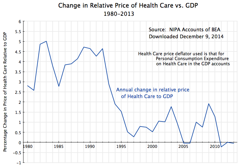
Change in Relative Price of Health Care vs. GDP, 1980-2013


The price index for GDP is a weighted average of the prices of all goods and services produced by the economy.  That is, and speaking loosely, a GDP price index rising by say 2% implies that about half (in weighted terms) of all prices rose by more than 2% while about half rose by less than 2% (including some that could have fallen).

What is unusual for the health care price index is that it has risen consistently faster than the overall GDP price index, until recent years.  The increase was particularly rapid during the Reagan / Bush I years, with the health care price index outpacing the GDP price index by 4.1% per year on average over this period.  For the more technically minded, the GDP deflator rose at an annual average rate of 3.9% over this period, while the health care price index rose at an annual average rate of 8.2%, so the relative price rose at the rate of 1.082/1.039, which equals 1.041, or 4.1% a year.

A 4.1% relative price growth compounded over 12 years (1980 to 1992) is huge:  At that rate, health care prices rose by 62% more than overall prices over that 12 year period.  And that is the immediate cause of health care rising as a share of GDP from 8.9% to over 13% in current prices over the period, despite a slowly falling share in real terms.  Real health care consumption relative to GDP fell, but total health care expenditures still rose relative to GDP in current dollar terms due to the higher relative prices for health care.

The relative price of health care relative to GDP then continued to rise, but at a much slower pace, during the Clinton years.  It then bounced back up some during the Bush II years (other than in 2005 and 2006, when the GDP deflator rose in the peak years of the housing bubble and then matched the increases in the price deflator for health care in those two years).

Under Obama, the relative price of health care came back down, and indeed was significantly negative in 2011 for the first time since before 1980.  This was then followed by two further years of zero or negative growth.  There have not been three consecutive years zero or negative growth in the relative price of health care in the US since 1946 to 1948, two-thirds of a century ago.

The Obamacare reforms account for at least some of this.  The Affordable Care Act (Obamacare) was passed in early 2010, and while the insurance coverage reforms (making health care insurance coverage available for all Americans) only went into effect in 2014, other health care reforms went into effect immediately.  These included a wide range of individually modest, but cumulatively significant, measures to bring down costs.  For example, the Medicare system for compensating hospitals now is set up to provide a financial incentive for good rather than poor quality care.  Under earlier systems, hospitals were paid more when the patient received poor quality care and got an avoidable infection, for example.  Such measures improved efficiency and brought down costs.

D.  Even At a Constant Share of GDP in Real Terms, Per Capita Consumption of Health Care Can Still Rise 

The relative price of health care has stabilized for three years now under Obama, while the share of health care expenditures in GDP, whether in real or nominal terms, has stabilized for five years.  But has this been achieved at the cost of reducing the availability and use of health care?  No:
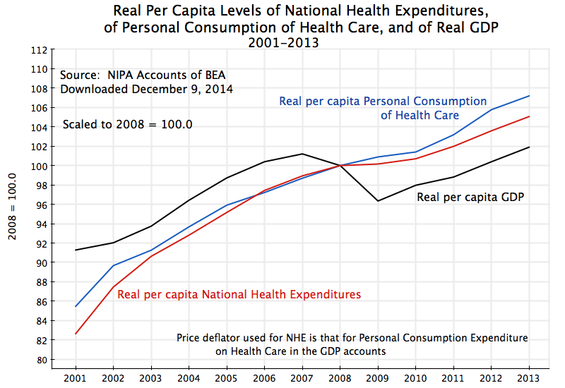
Growth of Real Per Capita Personal Consumption of Health Care, and of Real GDP, 2001-2013

This diagram plots what has happened since 2001 to real per capita national health expenditures (from the same figures as used above from the CMS, but now converted into real per capita terms), real per capita personal consumption of health care services (from the GDP accounts), and real per capita GDP.  The figures are all scaled to equal 100 in 2008.  The national health expenditure and personal consumption of health care lines track each other fairly closely.  One could have used either.

As the graph shows, real per capita expenditures on (or use of) health care services have increased each year over this period.  There was still an increase, although at a slower pace, in the peak years of the economic downturn in 2009 and 2010.  And the increases continued, at a strong pace, in 2011 to 2013, when GDP was recovering as well.

When health expenditures stabilized as a share of GDP under Obama, some analysts at first speculated that this was due to lower consumption of health care services during the economic downturn.  Unemployment was high and many had less access to health insurance.  But use of health care services did not fall during the downturn.  And it then came back strongly in 2011 to 2013.  The stable share of GDP has been due to stable prices for health care since 2011, with real per capita health care expenditures then rising at a similar rate as rising real per capita GDP.

E.  Why Isn’t the Figure for National Health Expenditures Equal to 18% of GDP? 

An earlier post in this blog in the series on health reform stated that the US has been spending close to 18% of GDP on health care.  This was 50% more than the second highest spending OECD country (the Netherlands) and close to double the average spent of all OECD countries.  The figures were for 2011 and came from the then current OECD data for the US and other OECD countries (close to, but not quite the same as, the national health expenditure totals from the CMS for the US).  Why are the figures for the US now at 17.4% of GDP in 2011, as well as since?

The US health expenditure numbers have in fact not changed.  They are still expected to total $3 trillion in 2014.  The reason for the difference (aside from round-off:  they were a bit below 18% in the earlier numbers) is that the estimate of the denominator in the health expenditures to GDP ratio has changed.  In the summer of 2013, the BEA revised its methodology for estimating GDP, as it periodically does.  While there were several changes, the one with the largest impact was to revise the treatment of research and development expenditures.  The BEA had before treated such expenditures as what economists call an intermediate product (a good which is immediately used up as goods are produced, much like coking coal is used up in the production of steel).  They decided it was more appropriate to treat them as an investment product, which will last for several years (depreciating over time).  This was purely a methodology change.  But the effect was to revise estimated GDP up by about 3 to 3 1/2% in recent years.  This was not just applied to the GDP figures of recent years, but rather to the full GDP series going all the way back to 1929.  Hence the year to year growth rates were largely unaffected.

But a denominator which is now larger will lead to a health expenditure share in GDP which is lower.  By simple arithmetic, a share of 17.9% of GDP will fall to 17.4% of GDP if GDP is estimated to be 3% higher than before.

F.  Conclusion

Health care costs stabilized during Obama’s tenure, with health care costs as a share of GDP now flat (in both constant and in current prices) in contrast to the big increases (in current prices) before.  This has not come at the expense of falling availability or use of health care services.  They have continued to grow throughout his presidency, and especially since 2010.

Looking forward, 2014 may be different.  The Obamacare insurance reforms came into effect in 2014, and have reduced the ranks of the uninsured by more than 10 million Americans.  The share of the population without any health insurance fell by over 30%.  The newly insured are likely to make greater use of regular health care services in 2014, especially by those who previously had conditions which had been left untreated due to an inability to pay before.  However, this may be offset by fewer emergency room admissions by those who previously had no other option, where emergency room care is an especially expensive way to deliver health care services.

It is not clear what the net effect will be.  Preliminary quarterly GDP data (for the first three-quarters of 2014) do not show a rise in the share for personal consumption of health care (there was a growth in real terms similar to the growth in real GDP).  But these numbers are still early and preliminary.  And the full national health expenditure numbers for 2014 will not be out until next December.

But so far, health expenditures as a share of GDP have stabilized under Obama, and the preliminary indication is that this is continuing in 2014.  This is a major achievement.  But they have stabilized at what is still a very high share of GDP, far higher than what is spent on health in other OECD countries.  Much more aggressive and fundamental reform will be necessary to bring the share down to the far lower levels of what other countries spend, and yet obtain  health outcome results that are similar to or better than the outcomes in the US.

How Much Was Bank Regulation Weakened in the New Budget Bill? And What Can Be Done Now?

A.  Introduction

In a rare, late-night and weekend, session, the US Senate on Saturday night passed a $1.1 trillion government funding bill to keep the government running through to the end of fiscal year 2015 (i.e. until September 30, 2015).  The House had passed the bill on Thursday, and it has now gone to Obama for his expected signature.  Had it not been passed, the government would once have been forced to shut down due to lack of budget authority.  It was a “must-pass” bill, and as such, was a convenient vehicle for a number of provisions which stood little chance to pass on their own, but which could only be blocked by opponents now at the cost of forcing a government shutdown.  The specific provisions included were worked out in a series of deals and compromises between the leadership of the Republican-controlled House and the now Democrat-controlled (but soon to be Republican-controlled) Senate.

One such provision was an amendment to the Dodd-Frank Wall Street reform bill, originally passed in July 2010, which enacted a series of measures to strengthen the regulatory framework for our financial sector.  The failure of this framework had led to the 2008 economic and financial collapse in the last year of the Bush administration.  The amendment in the new budget bill addressed just one, and some would say relatively minor, provision in Dodd-Frank.  But its inclusion drew heavy criticism from liberal Democrats, led by Senator Elizabeth Warren of Massachusetts.  Senator Warren argued that the amendments to Section 716 of Dodd-Frank would “would let derivatives traders on Wall Street gamble with taxpayer money and get bailed out by the government when their risky bets threaten to blow up our financial system.”  The amendments were reportedly first drafted by lobbyists for Citibank, and would benefit primarily a very small group of large Wall Street banks.

The amendments do reflect a backwards step from the tighter controls on risk that Dodd-Frank had provided for.  In my view, it would have been better to have kept the original provisions on the issue in Dodd-Frank.  But with a positive response now by the regulators to the reality of this new provision, the impact could be negated.  This blog post will discuss what was passed, what could be done now by bank regulators to address the change, and the politics of it all.

B.  The Amendment to Dodd-Frank, and the Economics of Derivatives

The amendment to Dodd-Frank addresses one specific provision in a very large and comprehensive bill.  An important link in the 2008 financial collapse was the risk major banks had carried on their books from certain financial derivative instruments.  “Derivatives” are financial instruments that derive their price or value from the price or value of some other product.  For example, oil derivatives derive their value from the price of oil (perhaps the price of oil at some future date), foreign exchange derivatives are linked to foreign exchange rates, credit default swaps are linked to whether there is a default on some bond or mortgage or other financial instrument, and so on.

Derivatives can be quite complicated and their pricing can be volatile.  And they can lead to greater, or to reduced, financial risk to those who hold them, depending on their particular situation.  For example, airlines must buy fuel to fly their planes, and hence they will face oil price risk.  They can hedge this risk (i.e. face reduced risk) by buying an oil derivative that locks in some fixed price for oil for some point in the future.  An oil producer similarly faces an oil price risk, but a bad risk for it is the opposite of what the airline faces:  The oil producer gains when the price of oil goes up and loses when it goes down.  Hence both the airline and the oil producer can reduce the adverse risk each faces by entering into a contract that locks in some future price of oil, and derivative instruments are one way to do this.  Banks will often stand in the middle of such trades, as the buyer and the seller of such derivative instruments to the airlines and the oil producers (in this example), and of course to many others.

Derivatives played an important role in the 2008 collapse.  As the housing bubble burst and home prices came down, it became clear that the assumptions used for the pricing of credit default swaps on home mortgages (derivatives which would pay to the holder some amount if the underlying mortgages went into default) had been badly wrong.  Credit default swaps had been priced on the assumption that some mortgages here and there around the US might go into default, but in a basically random and uncorrelated manner.  That had been the case historically in the US, for at least most of the time in the last few decades (it had not always been true).  But this ignored that a bubble could develop and then pop, with many mortgages then going into default together.  And that is what happened.

Dodd-Frank in no way prohibits such derivative instruments.  They can serve a useful and indeed important purpose.  Nor did Dodd-Frank say that bank holding companies could no longer operate in such markets.  But what Section 716 of Dodd-Frank did say was that banks that took FDIC-insured deposits and which had access to certain credit windows at the Federal Reserve Board, would not be allowed, in those specific corporate entities, also to trade in a specifically defined set of derivatives.  That list included, most notably, credit default swaps that were not traded through an open market exchange, as well as equity derivatives (such as on IBM and other publicly traded companies) and commodity derivatives (such as for oil, or copper, or wheat).  The bank holding companies could still set up separate corporate entities to trade in such derivatives.  Thus while Citigroup, for example, could set up a corporate entity owned by it to trade in such derivatives, Citibank (also owned by Citigroup), with its FDIC-insured deposits and with its access to the Fed, would not be allowed to trade in such derivatives.  That will now change.

It is also worth highlighting that under Dodd-Frank, banks with FDIC-insured deposits could still directly trade in such derivatives as interest rate swaps, foreign exchange derivatives, and credit default swaps that were cleared through an organized public exchange.  That had always been so, and will remain so.  The banks could also always hedge their own financial positions.  But they will now be allowed to trade directly (and not simply via an associated company under the same holding company) also in the narrow list of derivative instruments described above.

It is arguable that this is not a big change.  All it does is allow bank holding companies to keep their trading in such derivative instruments in the banks (with FDIC-insured deposits) that they own, rather than in separately capitalized entities that they also own.  The then Chairman of the Federal Reserve Ben Bernanke noted in testimony in front of a House panel in 2013 that “It’s not evident why that makes the company as a whole safer.”

So why do banks (or at least certain banks) want this?  Banks with FDIC-insured deposits and who also have access to certain credit windows at the Fed, are seen in the market as enjoying a degree of support from the government, that other financial entities do not enjoy.  The very largest of these banks may be viewed as “too-big-to-fail”, since the collapse of one or more of them in a financial crisis would in turn lead to a financial cataclysm for the country.  Thus depositors and other lenders are willing to place their money with such institutions at a lower rate of interest than they would demand in other financial institutions.

Thus Senator Warren and others charge that the amendments to Dodd-Frank “would let derivatives traders on Wall Street gamble with taxpayer money and get bailed out by the government when their risky bets threaten to blow up our financial system”, as quoted above.  To be more precise (and less eloquent), any bank with FDIC-insured deposits will make investments with those deposits, those investments will have varying degrees of risk, and if there is a threat that they will fail, the government may decide that it is better for the country to extend a financial lifeline to such banks (as they did in 2008) rather than let them fail.  The amendments to Dodd-Frank will allow these banks to invest in a broader set of derivative contracts directly (rather than only at the holding company level) than they could have before.  Thus they could end up investing directly in a riskier set of assets than they could have before without this amendment, and all else being equal, there could then be a higher risk that they will fail.

Finally, it should be noted that the amendments to Dodd-Frank will benefit largely only four very large banks.  The most recent quarterly report from the Office of the Comptroller of the Currency indicates that just four big banks (Citibank, JP Morgan Chase, Goldman Sachs, and Bank of America) account for 93% of derivative contract exposure among banks (as of June 30, 2014).  While this figure includes all types of derivatives, and not just those on the list that is at issue here, it is clear that trading in such instruments is highly concentrated.

C.  What Can Be Done Now? 

Over the objections of Senator Warren and others, the amendments to Section 716 of Dodd-Frank have been passed as part of the budget bill.  Banks, and in practice a limited number of very large banks, will now be able to take on a riskier set of assets on their balance sheets.  But Dodd-Frank, and indeed previous bank regulation, has established a bank regulatory and supervision regime that requires that banks hold capital sufficient, under reasonable estimates of the risks they face, to keep them out of insolvency and an inability then to repay their depositors.  The bank regulatory and supervision framework was clearly inadequate before, as the 2008 collapse showed.  Dodd-Frank has strengthened it considerably.  The specific rules are now being worked out, and like all such rules will evolve over time as experience dictates.

The amendments to Section 716 of Dodd-Frank will now change the set of risks the banks will possibly face.  I would suggest that now would be a good time for current Fed Chair Janet Yellen, or one of the other senior bank regulators heading up the process or even President Obama himself, to make a statement that they will of course follow the dictate of the law (as spelled out in Dodd-Frank, as it still stands) to take into account these possible new risks as they work out the capital adequacy ratios for the banks that will be required.

Specifically, the statement should make clear that the capital ratios required of banks that trade in these newly allowed instruments will now have to be set at some higher level than would previously have been required, due to the higher risks of such assets now in their portfolio.  It could and should be made clear that the law requires this:  The regulators are required to determine what the capital ratios must be on the basis of the risks being held by the banks in their portfolios.  How much higher the capital ratios will need to be will depend on the riskiness of these new assets compared to what the banks previously invested in, and how significant such new assets will be in their portfolios.  It is quite possible that faced with such higher capital requirements, the banks that had pushed for this new latitude will decide that it would be wiser not to enter into those new markets after all.  They may well come to regret that they pushed so strongly for these amendments to Dodd-Frank.

This is perhaps not the best solution.  The prohibition on direct trading in the proscribed list of certain financial derivative instruments is cleaner and clearer.  Most importantly, while current bank regulators may use their authority to ensure banks hold sufficient capital to reflect the greater risk in their portfolio, there is the danger that regulators appointed by some future president may not exercise that authority as wisely or as carefully.  This was indeed the fundamental underlying problem leading up to the 2008 collapse.  The Bush administration was famously anti-regulation, and Bush appointed officials who were often opposed to the regulations they were in office to enforce.  In at least some cases, the officials appointed who were not even competent to carry out their enforcement obligations.  For example, Bush famously appointed former Congressman Christopher Cox as head of the SEC.  The SEC at the time had the obligation to regulate investment banks such as Lehman Brothers, Goldman Sachs, and Morgan Stanley.  As Lehman Brothers collapsed, with worries that Goldman Sachs, Morgan Stanley, and others would soon be next, Christopher Cox was at a loss on what to do, and was largely by-passed.  Dodd-Frank changed regulatory responsibility (the Fed and other financial regulators are now clearly responsible, where Goldman Sachs and Morgan Stanley had already been “encouraged” to become formal banks and as such subject to Fed oversight), but there is the risk that some future president will choose, like Bush, to put in place figures who either do not believe in, or are not capable of, serious financial supervision and oversight.

In addition, financial crises are always a surprise.  They occur for some unexpected reason.  If they were expected, actions could be taken to address the causes, and they would not happen and hence not be observed.  But surprises happen.  Hence Dodd-Frank, and indeed all financial regulation, includes an overlapping and mutually reinforcing set of measures to try to ensure crises will not occur and that banks will not become insolvent should they occur.  One does not know beforehand which of the regulatory measures might be the critical one for some future and unforeseen set of circumstances leading to a crisis.  it is therefore wise to include what others might call redundancies.  The amendment to Dodd-Frank will remove one of the possibly redundant measures to ensure bank safety.  The remaining measures (e.g. the capital adequacy requirements) may well suffice to address the safety issue, but in cases like this, redundancy is better.

D.  The Politics of It All

While the economics may suggest that the change resulting from the amendment to Dodd-Frank need not be catastrophic if regulators respond wisely, and hence that the amendment is not such a big deal, the politics might be different.

The biggest concern is that many see this as possibly the opening round of a series of amendments to Dodd-Frank and other laws identified with the Obama administration, that a Republican Congress and now Senate will push through on “must-pass” legislation such as budget bills.  Particularly if this had slipped through quietly, with little public attention until after the bill had been passed, the bankers and their Republican representatives could have seen this as a model of how to pass changes to legislation that would not otherwise have gone through.  While the model is certainly not a new one, its affirmation in this instance would have strengthened their case.

The loud objections by Senator Warren and others has served to bring daylight to the changes in financial regulation being proposed.  This will hopefully make it more difficult to push through further, possibly much more damaging, changes to Dodd-Frank at the behest of the banks.

Ensuring attention was paid to the issue also served to make clear who in the House and the Senate are in fact in favor of bank bailouts.  Weakening Dodd-Frank will increase the likelihood (even if only marginally so) that bank bailouts will be necessary in some future crisis to protect FDIC insured deposits and to protect the economy from a full financial collapse.  Republicans, including in particular Tea Party supported Republicans, have asserted they are against bank bailouts.  But their actions here, with the Dodd-Frank amendments inserted into the budget bill at the insistence of the House Republican leadership, belies that.

The actual economic substance of the Dodd-Frank amendments might therefore be limited, especially if there is now the regulatory response that should be required in the environment of certain banks holding more risky assets.  But the politics may be quite different, and could explain why there was such a vociferous response by Senator Warren and others to this ultimately successful effort to weaken a provision in Dodd-Frank.

The Impact of Austerity Policies on Unemployment: The Contrast Between the Eurozone and the US

Unemployment Rates - Eurozone and US, Jan 2006 to Oct 2014

A recent post on this blog looked at the disappointing growth in the Eurozone since early 2011, when Europe shifted to austerity policies from its previous focus on recovery from the 2008 economic and financial collapse.  There has indeed been no growth at all in the Eurozone in the three and a half years since that policy shift, with GDP at first falling by about 1 1/2% (leading to a double-dip recession) and then recovering by only that same amount thus far.  The recovery has been exceedingly slow, and prospects remain poor.

The consequences of the shift to austerity can be seen even more clearly in the unemployment figures.  See the chart above (the data comes from Eurostat).  Unemployment in Europe rose sharply starting in early 2008 and into early 2009.  But it then started to level off in late 2009 and early 2010 following the stimulus programs and aggressive central bank programs launched in late 2008.  Unemployment in the US followed a similar path during this period, and for similar reasons.

But the paths then diverged.  After peaking in early 2010 at about 10% and then starting to come down, the unemployment rate in the Eurozone switched directions and started to rise again in mid-2011.  It reached 12.0% in early 2013 and has since come down slowly and only modestly to a still high 11.5% currently.  In the US, in contrast, the unemployment rate reached a peak of 10.0% in October 2009, and has since fallen more or less steadily (with bumps along the way) to the current 5.8% (as of October 2014).  It has been a slow recovery, but at least it has been a recovery.

This divergence began in 2010, as Europe shifted from its previous expansionary stance to austerity.  Influential Europeans, in particular German officials and Jean-Claude Trichet (then the head of the European Central Bank) argued that not only was austerity needed, but that austerity would be expansionary rather than contractionary.  We now see that that was certainly not the case:  GDP fell and unemployment rose.

The most clear mark of that shift in policy can be found in the actions of the European Central Bank.  ECB interest rates had been kept at a low 0.25% for its Deposit Facility rate (one of its main policy rates) for two years until April 2011.  The ECB then raised the rate to 0.50% on April 13, and to 0.75% on July 13, 2011.  But European growth was already faltering (for a variety of reasons), and it was soon recognized by most that the hike in ECB interest rates had been a major mistake.  Trichet left office at the end on his term on November 1, replaced by Mario Draghi.  On November 9 the ECB Board approved a reversal.  The Deposit Facility rate was cut to 0.50% that day, to 0.25% a month later on December 11, and to 0.00% on July 11, 2012.

Fiscal policy had also been modestly expansionary up to 2010, as monetary policy had been up to that point, but then went into reverse.  Unfortunately, and unlike the quick recognition that raising central bank interest rates had been a mistake, fiscal expenditures have continued to be cut since mid-2010.

Germany in particular called for cuts in fiscal spending for the members of the Eurozone, and forced through a significantly stricter set of rules for fiscal deficits and public debt to GDP ratios for Eurozone members.  Discussions began in 2010, amendments to the existing “Stability and Growth Pact” were approved on March 11, 2011, and a formal new treaty among Eurozone members was signed on March 2, 2012.  The new treaty (commonly referred to as the Fiscal Compact) mandated a balanced budget in structural terms (defined as not exceeding 0.5% of GDP when the economy was close to full employment, with a separate requirement of the deficit never exceeding 3% of GDP no matter how depressed the economy might be).  Financial penalties would be imposed on countries not meeting the requirements.

The result was cuts to fiscal expenditures:

Govt Expenditures, Real Terms - Eurozone and US, 2006Q1 to 2014 Q2 or Q3

Government fiscal expenditures in the Eurozone had been growing in real terms in line with real GDP up to 2008, at around 2 to 3% a year.  With the onset of the crisis, fiscal expenditures at first grew to counter the fall GDP.  But instead of then allowing fiscal expenditures to continue to grow even at historical rates, much less the higher rates that would have been warranted to offset the fall in private demand during the crisis, fiscal expenditures peaked in mid-2010 and were then cut back.  By 2014 they were on the order of 14 to 15% below where they would have been had they been allowed to keep to their historical path.  This has suppressed demand and therefore output.

The path of US real government expenditures is also shown on the graph.  Note that government expenditures here include all levels of government (federal, state, and local), and include all government expenditures including transfers (such as for Social Security).  Government expenditures for the Eurozone are defined similarly.  The US data comes from the BEA, while the Eurozone data comes from Eurostat.

Government expenditures in the US also peaked in 2010, as they had in the Eurozone, and then fell.  This has been discussed in previous posts on this blog.  But while US government expenditures fell after 2010, they had grown by relatively more in the period leading up to 2010 than they had in the Eurozone, and then fell by relatively less.  They have now in 2014 started to pick up, mostly as a consequence of the budget deal reached last year between Congress and President Obama.  State and local government expenditures, which had been severely cut back before, have also now stabilized and started to grow as tax revenues have begun to recover from the downturn.  And in part as a result, recent GDP growth in the US has been good, with real GDP growing by 4.6% in the second quarter of 2014 and by 3.9% in the third quarter.

The fiscal path followed in the US could have been better.  An earlier post on this blog calculated that GDP would have returned to its full employment level by 2013 if government spending had been allowed to grow merely at its historical rate.  And the US could have returned to full employment by late 2011 or early 2012 if government spending had been allowed to grow at the more rapid rate that it had under Reagan.

But with the fiscal cuts, unemployment has come down only slowly in the US.  The recovery has been the slowest of any in the US for at least 40 years, and fiscal drag by itself can account for it.  But at least unemployment has come down in the US, in contrast to the path seen in Europe.