Growth in France and the US: The Bottom 90% Have Done Better in France

France vs US, 1980-2012, GDP per capita overall and of bottom 90%

A.  Introduction

Conservative media and conservative politicians in the US have looked down on France over the last decade (particularly after France refused to join the US in the Iraq war, and then turned out to be right), arguing that France is a stagnant, socialist state, with an economy being left behind by a dynamic US.  They have pointed to faster overall growth in the US over the last several decades, and average incomes that were higher in the US to start and then became proportionately even higher as time went on.

GDP per capita has indeed grown faster in the US than it has in France over the last several decades.  Over the period of 1980 to 2007 (the most recent cyclical peak, before the economic collapse in the last year of the Bush administration from which neither the US nor France has as yet fully recovered), GDP per capita grew at an annual average rate of 2.0% in the US and only 1.5% in France.

But GDP per capita reflects an average covering everyone.  As has been discussed in this blog (see here and here), the distribution of income became markedly worse in the US since around 1980, when Reagan was elected and began to implement the “Reagan Revolution”.  The rich in the US have done extremely well since 1980, while the not-so-rich have not.  Thus while overall GDP per capita has grown by more in the US than in France, one does not know from just this whether that has also been the case for the bulk of the population.

In fact it turns out not to be the case.  The bottom 90%, which includes everyone from the poor up through the middle classes to at least the bottom end of the upper middle classes, have done better in France than in the US.

B.  Growth in GDP per Capita in France vs. the US:  Overall and the Bottom 90%

The graph at the top of this post shows GDP per capita from 1980 to 2012 for both the US and France.  The figures come from the Total Economy Database (TED database) of the Conference Board, and are expressed in terms of 2012 constant prices, in dollars, with the conversion from French currency to US dollars done in terms of Purchasing Power Parity (PPP) of 2005.  PPP exchange rates provide conversions based on the prices in two respective countries of some basket of goods.  They provide a measure of real living standards.  Conversions based on market exchange rates can be misleading as those rates will vary moment to moment based on financial market conditions, and also do not take into account the prices of goods which are not traded internationally.

Real GDP per capita (for the entire population) rose for both the US and France over this period, and by proportionately somewhat more in the US than in France.  These incomes are shown in the top two lines in the graph above, with the US in black and France in blue.  GDP per capita in France was 83% of the US value in 1980, and fell to 72% of the US by 2012.

But the story is quite different if one instead focuses on the bottom 90%.  The GDP per person of those in the bottom 90% of the US and in France are presented in the lower two lines of the graph above.  The figures were calculated using the distribution data provided in the World Top Incomes Database, assembled by Thomas Piketty, Emmanuel Saez, and others, applied to the GDP and population figures from the TED database.  The US distribution data extends to 2012, but the French data only reaches 2009 in what is available currently.

The Piketty – Saez distribution data is drawn from information provided in national income tax returns, and hence is based on incomes as defined for tax purposes in the respective countries.  Thus they are not strictly comparable across countries.  Nor is taxable income the same as GDP, even though GDP (sometimes referred to as National Income) reflects a broad concept of what constitutes income at a national level.  But for the moment (the direction of some adjustments will be discussed below), distributing GDP according to income shares of taxable income is a good starting point.

Based on this, incomes (as measured as a share of GDP, and then per person in the group) of the bottom 90% in France were 88% of the US level in 1980.  But this then grew to 98% of the US level by 2007, before backing off some in the downturn.  That is, the real income of the bottom 90%, expressed purely in GDP per person, rose in France over this period from substantially less than that for the US in 1980, to very close to the average US income of that group by 2007.  And since one is talking about 90% of the population, that is all those other than the well-off and rich, this is not an insignificant group.

C.  Most of the US Income Growth Went to the Top 10%

Figures on the growth of the different groups, and their distributional shares, show what happened:

France US
GDP per Capita, Rate of Growth, 1980-2007
  Overall 1.5% 2.0%
  Bottom 90% 1.4% 1.0%
Share of GDP, 1980
  Top 10% 31% 35%
  Bottom 90% 69% 65%
Share of GDP, 2007
  Top 10% 33% 50%
  Bottom 90% 67% 50%
Share of Increment of GDP Growth, 1980-2007
  Top 10% 36% 62%
  Bottom 90% 64% 38%

As noted before, overall GDP per capita grew at a faster average rate in the US than in France over this period:  2.0% annually in the US vs. 1.5% in France.  But for the bottom 90%, GDP per capita (for the group) grew at a rate of only 1.0% in the US while in France it grew at a rate of 1.4% per year.  The French rate for the bottom 90% was almost the same as the overall average rate for everyone there, while in the US the rate of income growth for the bottom 90% was only half as much as for the overall average.

Following from this, income shares did not vary much over the 1980 to 2007 period in France.  That is, all groups shared similarly in growth in France.  In contrast, the top 10% in the US enjoyed a disproportionate share of the income growth, leaving the bottom 90% behind.

In 1980 in France, the top 10% received 31% of the income generated in the economy and the bottom 90% received 69%.  With perfect equality, the top 10% would have had 10% and the bottom 90% would have had 90%, but there is no perfect equality.  The US distribution in 1980 was somewhat more unequal than in France, but not by much.  In 1980, the top 10% received 35% of national income, while the bottom 90% received 65%.

This then changed markedly after 1980.  Of the increment in GDP from growth over the 1980 to 2007 period, the top 10% received 36% in France (somewhat above their initial 31% share, but not by that much), while the bottom 90% received 64%.  The pattern in the US was almost exactly the reverse:  The top 10% in the US received fully 62% of the increment in GDP, while the bottom 90% received only 38%.  As a result of this disproportionate share of income growth, the top 10% in the US increased their overall share of national income from 35% in 1980 to 50% in 2007.  Distribution became far more unequal in the US over this period, while in France it did not.

The data continue to 2012 for the US, but the results are the same within roundoff.  That is, the top 10% received 62% again of the increment of GDP between 1980 and 2012 while the bottom 90% only received 38%.  For France the data continue to 2009, but again the results are the same as for 1980 to 2007, within roundoff.

With this deterioration in distribution, the bottom 90% in the US saw their income grow at only half the rate for the economy as a whole.  The top 10% received most (62%) of the growth in GDP over this period.  In France, in contrast, the bottom 90% received close to a proportionate share of the income growth.  For those who make up the first 90%, economic performance and improvement in outcomes were better in France than in the US.  Only the top 10% fared better in the US.

D.  Other Factors Affecting Living Standards:  Social Services and Leisure Time

In absolute terms, even with the faster growth of real incomes of the bottom 90% in France relative to the US over this period, the bottom 90% in France came close to but were still a bit below US income levels in 2007.  They reached 98% of US income levels in that year, and then fell back some (in relative terms) with the start of the 2008 downturn.

But the calculations discussed above were based on applying distributional shares from tax return data to GDP figures.  For income earning comparisons, this is reasonable.  But living standards includes more than cash earnings.  In particular, one should take into account the impact on living standards of social services and leisure time.

Social services include services provided by or through the government, which are distributed to the population either equally or with a higher share going to the poorer elements in society.  An example of a service distributed equally would be health care services.  In France government supported health care services (largely provided via private providers such as doctors and hospitals) are made available to the entire population.  Since individual health care needs are largely similar for all, one would expect that the bottom 90% would receive approximately 90% of the benefit from such services, while the top 10% would receive about 10%.  If anything, the poor might receive a higher share, as their health conditions will on average likely be worse (and might account for why they are poor).  For other social services, such as housing allowances or unemployment compensation, more than 90% will likely accrue to the bottom 90%.

Taking such services into account, the bottom 90% in France will be receiving more than the 67% share of income (in 2007) seen in tax return data.  How much more I cannot calculate as I do not have the data.  The direction of change would be the same in the US.  However, one would expect a much lower impact in the US than in France because social services provided by or through the government are much more limited in the US than in France.  While Medicare provides similar health care as one finds in France, Medicare in the US is limited to those over 65, while government supported health care in France goes to the entire population.  And the social safety net, focussed on the poor and middle classes, is much more limited in the US than in France.

In addition, economists recognize that GDP per capita is a only crude measure of living standards as it does not take into account how many hours each individual must work to obtain that income.  Your living standard is higher if you can earn the same income but work fewer hours as someone else to receive that income, as the remaining time can be spent on leisure.  And there is nothing irrational to choose to work 10% fewer hours a year, say, even though your annual income would then be 10% less.  The work / leisure tradeoff is a choice to be made.

GDP per capita may often be the best measure available due to lack of data on working hours, but for the US and France such data are available (and are provided in the TED database referred to previously).  One can then calculate GDP per hour of work instead of GDP per capita, both overall and (using the same distributional data as above) for the bottom 90%.  The resulting graph for 1980 to 2012 is as follows:

France vs US, 1980-2012, GDP per hour overall and of bottom 90% (Autosaved)

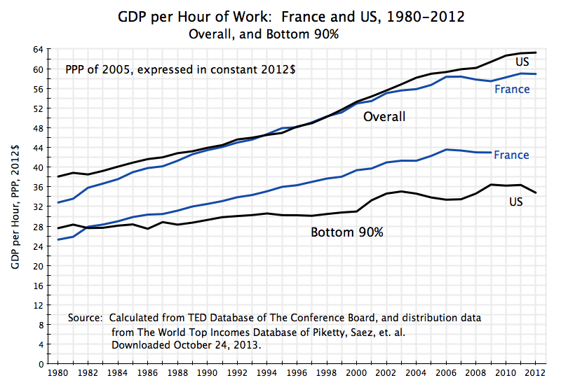
By this measure, overall GDP per hour of work in France was similar to that of the US in the 1990s, but somewhat less before and after.  Overall GDP per capita was always higher in the US over this full period (the top graph in this post), and by a substantial 20% (in 1980) to 38% (in 2012).  Yet GDP per hour worked never varied by so much, and indeed in some years was slightly higher in France than in the US.

But for the bottom 90%, income received per hour of work has been far better in France than in the US since 1983.  By 2007, GDP per hour worked was 30% higher in France than in the US for the bottom 90%.  This is not a small difference.  French workers are productive, and take part of their higher productivity per hour in more annual leisure time than their US counterparts do.

E.  Summary and Conclusions

The French economic record has been much criticized by conservative media and politicians in the US, with France seen as a stagnant, socialist, state.  Overall GDP per capita has indeed grown faster in recent decades in the US than in France, averaging 2.0% per annum in the US vs. a rate of 1.5% in France.  While such a difference in rates might appear to be small, it compounds over time.

But the picture is quite different if one focusses on the bottom 90%.  This is not a small segment of the population, but rather everyone from the poor up to all but the quite well off.  Growth in average real income of this group was substantially faster in France than in the US since 1980.  While overall growth was faster in the US than in France, most of this income growth went to the top 10% in the US, while the gains were shared more equally in France.

Furthermore, when one takes into account social services, which are more equally distributed than taxable income and which are much more important in France than in the US, as well as leisure time, the real living standards of the bottom 90% have not only grown faster in France, but have substantially surpassed that of the US.

For those other than those fortunate enough to be in the top 10%, living standards are now higher, and have improved by more in recent decades, in France than in the US.

ObamaCare Has Not Led to a Shift of Employees From Full-Time to Part-Time Work

Part-Time Employment #2 as Share of Total Employment, Jan 2007 to Sept 2013

Conservative media have repeatedly asserted that due to ObamaCare (formally the Affordable Care Act), there has been and will be a big shift of workers from full-time to part-time status.  Publications such as Forbes, the Wall Street Journal, and of course Fox News, have asserted that this is a fact and a necessary consequence of ObamaCare.  The argument is that since ObamaCare will require employers to include health care benefits as part of the wage compensation package to full time employees (defined as those who normally work more than 30 hours a week for the firm), firms will have the incentive, and by competition the necessity, of shifting workers to part-time status.  It is argued that instead of employing three workers for 40 hours each (for 120 employee hours), firms will instead employ four part time workers at just below 30 hours each to obtain the 120 employee hours.

There are a number of problems with this argument.  First, the ObamaCare requirements for health coverage only apply to firms with more than 50 full time employees.  There is no change for firms employing fewer than 50 workers.  Second, almost all of the firms in the US with more than 50 employees, and indeed a majority also of the workers in firms of fewer than 50 employees, are already in firms that provide health insurance coverage for their workers.   Specifically, 97% of the workers in firms with more than 50 employees are in firms offering health insurance coverage as part of their wage compensation package.  ObamaCare will require this (to avoid a per worker penalty) to go from 97% to 100%, which is not a big change.  And even though ObamaCare will not have such a requirement for firms employing fewer than 50 workers, it is already the case that 53% of the workers in such firms are in firms providing health insurance coverage.   Firms provide health insurance coverage as part of the total compensation package they pay their employees both because they have a direct interest in having healthy workers, but also because there are tax and financial advantages to doing so.

Notwithstanding these issues, the conservative media and Republican politicians continue to assert that ObamaCare is leading to a large substitution of part-time for full-time workers.  But as Jason Furman, the Chairman of the Council of Economic Advisors in the White House has recently noted, this is not seen in the data.  The graph at the top of this blog post is one way to look at this data.

The graph shows the share of part-time workers (part time for economic reasons and not part time by choice) in all workers, by month, for the period from January 2007 to September 2013.  The data come from the Bureau of Labor Statistics.  If ObamaCare is leading to a large shift of workers from full-time to part-time status, then this ratio would be rising since ObamaCare was passed or at some more recent date.  But it is not.

The share of part-time workers in all workers rose in the last year of the Bush administration due to the economic crisis, from about 3% before to about 6 1/2% after.  It was rising rapidly as Obama took office, but stabilized soon thereafter as the economy began to stabilize with the passage of Obama’s stimulus package and aggressive actions by the Fed.  Since then the ratio has trended downwards, albeit slowly.  As has been noted previously in this blog, the continued fiscal drag from government expenditure cuts since 2010 has held back the economy and hence the recovery in the job market.  The blog post noted that if government spending had simply been allowed to grow at its long term average rate, we would likely have already returned to full employment (and would have returned to full employment in 2011, if government expenditures had been allowed to rise at the same pace as they had during the Reagan years).

The Affordable Care Act was signed by Obama in March 2010.  As the graph above indicates, there was no sharp change in trend once that act was signed.  If anything, the share of part-time workers in all workers then began to decline from a previous steady level.  Such a response is the opposite of what the conservative media and Republican politicians have asserted has been the result of ObamaCare coming into effect.

To put the figures in perspective, the graph above also shows how high the ratio of part-time workers to all workers would have had to jump, had either just 5% (the square point) or 10% (the round point) of full-time workers been substituted for by an equal number of part-time workers, additional to where the September 2013 ratio in fact was.   An equal number is used between the full-time and part-time workers to be conservative in the estimate.  The argument being made by the critics is in fact that a higher number of part-time workers would have been hired to substitute for the full-time workers let go, to get the same number of working hours.  But even with an equal number being substituted, such a shift of 5% of the workers would have led to rise in the ratio by 74% relative to where it was in September 2013, and a shift of 10% would have led to a rise of 148%.  One does not see anything like this.

It is not known what the paths would have been to reach those 5% or 10% shifts, but the resulting changes in the paths would have been obvious.  Such changes did not occur.  Since one is comparing the figures to what otherwise would have been the case, the conservative critics would need to argue that the ratio of part-time to all workers would have plummeted in the absence of ObamaCare.  There is no reason given on why this would have been so.  Furthermore, for the case of a 10% shift the number of part-time workers would have had to be negative in the absence of ObamaCare, which is of course impossible.

There is simply no evidence to support the assertion in the conservative media that ObamaCare is leading a significant share of firms to shift workers from full-time to part-time status.

The Rate of Economic Growth and the Budget Gap: Returning to the Long-Term Average Growth Rate Would Eliminate It

Long Run US GDP per Capita Growth (1870-2088) in logarithms

Larry Summers published an op-ed yesterday (appearing in Reuters, the Financial Times, the Washington Post, and probably elsewhere) in which he makes the important point that the current budget impasse is focussed on the wrong issues.  The discussion, at least as publicly expressed, has focussed on what is seen as needed to deal with the fiscal deficit and the resulting public debt.  Even the Republican attempt to end ObamaCare was ostensibly about cutting the government deficit (even though the CBO concluded that the opposite would happen, as they found that the ObamaCare reforms will reduce the deficit, rather than increase it).

Yet this focus on near term and projected budget deficits is misguided.  As Summers notes, under current policies the public debt to GDP ratio is falling, and is projected to continue to fall into the 2020s.  The recently issued Long-Term CBO budget projections indicate that while the debt ratio would then start to rise (primarily driven by expected higher health care costs), there is a good deal of uncertainty in those projections.

Specifically the CBO figures show that it would not take much, in terms of either higher revenues or lower spending, to keep the public debt to GDP ratio flat.  Higher revenues or lower spending or some combination of the two, of 0.8% of GDP over the next 25 years or 1.7% of GDP over the next 75 years, would suffice.  This is consistent with an earlier post on this blog, which showed that if the Bush tax cuts had not been extended for almost all households, the projected debt to GDP ratio in the CBO numbers would fall rapidly.

But projections of revenues or of spending are highly uncertain.  Projected health care spending has been coming down steadily in recent years, for example, in part due to the slow economy, but also in part as a result of the efficiency gains and cost reductions that the ObamaCare reforms are leading to.  With these lower costs, the CBO has been steadily reducing the projected costs to the government budget from Medicare, Medicaid, and other such health programs.  In the recent CBO report, for example, the projections of government spending on health care programs in the 2030s were reduced by 0.5% of GDP from what the CBO had projected just one year earlier.  Going back further, the CBO projections for government spending on health care in 2035 were over 1% of GDP lower in the projections recently issued than in the projections published in June 2010.

This should not be interpreted as a criticism of CBO.  Their projections are probably the best available.  Rather, the point is that these projections are inherently hard to do, and the uncertainty surrounding them should not be ignored.  Yet the politicians often ignore precisely that.

Furthermore and perhaps most importantly, the projected budget deficits and resulting public debt to GDP ratios depend critically on the rate of growth of the economy.  The CBO uses a fairly detailed and reasonable model to project this (based on projected labor force growth, investment in capital, and productivity growth).  However, it is probably even more difficult to project GDP than to project future spending levels and tax revenues for any given level of future GDP.  But Summers notes the critical sensitivity of the projected future deficits to the projected growth in GDP.  He states “Data from the CBO imply that an increase of just 0.2 percent in annual growth would entirely eliminate the projected long-term budget gap”.

One can calculate from the data made available with the CBO report their projected growth of real per capita GDP.  For 2013 to 2088, it comes to 1.60%  year.  A previous post on this blog noted the remarkable constancy of the rate of growth of real per capita GDP since at least 1870 of 1.9% a year (or 1.87% a year at two digit precision).  That earlier post noted that real per capita GDP in the US, despite large annual variations and even decade long deviations (such as during the Great Depression, and then during World War II), has always returned to a path of 1.87% growth since at least 1870.  That path even did not shift when there were even substantial deviations, such as during the Great Depression.  Rather, the economy always returned to the same, previous, path, and not one shifted up or down.

This is truly remarkable, and no one really knows the reason.  The path can be seen as a trend growth of capacity (based on labor available and capital invested, coupled with the technology of the time), but why this should path should have grown at 1.87% a year in the late 1800s; in the early, mid and late 1900s; and all the way into the 21st century, is not known.

Since we do not know why the economy has always returned to this one path, we need to be careful in looking forward.  Still, it is noteworthy that the CBO projections imply that the economy will now slow, to just 1.60% real per capita GDP growth over the next 75 years.  This CBO path is substantially lower than the path of 1.87% growth that has ruled for the last 140 years in the US.

The graph at the top of this post shows the path of GDP per capita projected by the CBO (which one should note is a year by year projection, which just averages out to 1.60% per year over the full period), along with an extension of the 1.87% path that has ruled since at least the 1870s.   The graph is adapted from my earlier post (although now converted to prices of 2005 whereas the earlier one was in prices of 1990; this does not affect the rates of growth).  It is expressed in logarithms, since in logarithms a constant rate of growth is a straight line.

It is not clear why there should be this deceleration to 1.60% from the 1.87% rate of growth the economy has followed over the last 140 years.  Mechanically, one can ascribe the deceleration to what the CBO assumes for the rate of growth of technological progress.  But projecting growth in technology over a 75 year period is basically impossible, as the CBO notes.

The deceleration over the next 75 years has a very important implication, however.  The CBO found in its sensitivity analysis that a rate of growth that is just 0.2% faster will suffice to close the budgetary gap, even if one does not take any new measures to raise revenues or cut government spending.  Hence a return to the previous historical growth path of 1.87% a year from the 1.60% rate the CBO projects, or a difference of 0.27%, will more than suffice to close the budgetary gap.

The policy implication is that with such sensitivity to the growth in GDP, we should be focussed on measures to raise growth, rather than short term budgetary measures that will act to reduce growth.  The economy has suffered from government austerity since 2010, which has held back growth.  Government has been cutting spending, thus undermining demand in an economy with high unemployment and close to zero interest rates, where more labor is not employed and more is not produced because the resulting products could not then be sold due to the lack of demand.  As an earlier post on this blog noted, if government spending had been allowed to grow simply at the historic average rate (and even more so if it had been allowed to grow as it had under Reagan), the US would by now be back at full employment.

Over the medium term, Summers notes that both conservatives and liberals agree that growth should be raised, and on the types of measures which should help this.  More investment, both public and private, is required rather than less.  Research and development, both public and private, is important.  More effective education is also required.

I would agree with all of these.  But to be honest, since we do not really understand why the economy always returned to the 1.87% growth path over the last 140 years, it would not be correct to say we can be sure such measures will be effective.  However, what we can say with confidence is that measures that hinder the recovery of the economy, as the government spending cuts have been doing, will certainly hurt.