

A. Introduction
Advocates for the current private health insurance system in America assert that through such a market of competing private insurers, and only through such a market, will we see health care that is provided efficiently and at the lowest possible price, with gains for all participants. If such a market were working at all well, one would see little variation around one low price for a specific health care treatment. Competition would drive high prices down, or such providers would soon lose all their business. But this has not happened at all.
Competition that would lead to uniform low prices for health care provision is clearly not functioning in the US. Later blogs in this series on health care in the US will review several reasons for why this is the case. In this blog we will only review a number of statistics and studies that document it. What is truly astounding is the degree to which the prices vary, and the focus of this blog post will be on this variation. But a comparison to the prices charged in other countries for the same procedures will also document how the US prices are far higher than elsewhere.
There will be a lot of numbers and graphs in this post, which some might find tedious. But it should be possible to read through them quickly. What I am continually amazed by is the extent to which the prices being charged for often expensive medical procedures can vary so dramatically from one provider to the next. With the concern over the high cost of medical care in the US, one would have thought that there would be pressure to bring these prices into line with one another. But clearly there is not.
A couple of points before we start. First, it is critically important to be clear when reviewing such prices on the distinction between the list prices that hospitals might charge for a particular treatment (the so-called “chargemaster rates”), and what hospitals actually receive from the insurers for those treatments. The chargemaster rates can easily be double the latter, and indeed can often vary by far more (even by a factor of ten, as we will see below). Insurance companies negotiate discounted rates with hospital providers who are included within their network of “preferred providers”, and pay that discounted rate. But the chargemaster rates can still be important, in particular for those without insurance. The chargemaster rates will also apply to those patients for whom that hospital will be an out-of-network provider. As a result, if you are insured but have a medical emergency for which you are taken to the nearest hospital, and that hospital is not in your insurer’s negotiated network, you can face enormous bills.
Second, some of the studies and data sets now available provide information on the prices paid by (or charged to) individual patients, while others compare the average prices paid at (or charged at) individual hospitals for the same procedures. The latter information is easier to collect, and can lead to findings such as that the average price for some procedure at some hospital is double that for the same procedure at another hospital that might be literally across the street. However, the prices actually paid on individual cases are generally of greater interest, as the hospital wide averages will have averaged away some of the variation.
Finally, I should be clear that medical treatments are highly individualized, and that any two cases will rarely be exactly the same. Therefore, one should expect some variation in prices. However, there are standard medical treatments for specific conditions, and while there will be some variation, it is hard to see how prices can vary by a factor of ten or more.
B. Prices Paid in the US for Selected Treatments, With a Comparison to Other Countries
One of the best sources of price comparisons for standard health procedures is a report issued each year by the International Federation of Health Plans, an international association of health insurers. The most recent report is for 2012, and compares the prices paid in the US with those in other countries (where they have sufficient comparable data) for a series of specific treatments. The prices shown are of actual prices paid by the insurers, and the US data come from over 100 million actual claims processed.
Due to the wide variation in the prices for the US, the report provides not simply the average price paid, but also the price at the 25th percentile (meaning 25% of the cases had prices lower than this, and 75% higher) and at the 95th percentile (so 95% were lower, with 5% even higher). Showing the ranges from the 25th to 95th percentiles is helpful as the data are not then driven by a few extreme, and possibly peculiar, outliers. But keep in mind that 25% of the cases will still be at prices below this range, and 5% will be at prices higher than this range. There is not such wide variation in other countries (and in some countries no variation at all), so only the average prices are shown for them.
The graph at the top of this post shows the cost per hospital day of simply staying in a hospital room. The cost of treating the medical condition leading one to be in the hospital is charged separately. The cost of each hospital day (in terms of the discounted rate that the insurers actually paid, not the chargemaster rate that the hospital charged and what an uninsured patient would have been expected to pay) was an average of $4,287 per day in the US. Why the cost for this is so high, which is only for a bed in a room (typically shared with another patient in the same room), a small bathroom, some very bad meals, and sometimes a chair for a guest, is not clear. There is of course also monitoring equipment, which might well be expensive (but which is standard and lasts for years), plus the cost of a portion of a nurse’s time (where nurses are however not paid that well in the US). But it is still difficult to understand why the cost per day of a period in a hospital, simply for the room and associated services, should be so high.
Other countries providing comparable care and with similar wages as in the US do not charge nearly as much. The closest is Australia, with a price of $1,472 per day, but this is only one-third of the US average rate. The cost is only $853 per day in France and only $476 per day in Spain. The range among the countries with data are between $429 and $1,472, before the jump to the US average rate of $4,287.
Furthermore, while the average US rate is $4,287 per day, the daily rates paid in 2012 in 5% of the cases were greater than $12,537 per day, almost three times as high. At the other end, the charges paid in 25% of the cases were less than $1,514 per day. Why the rate at the 95th percentile of $12,537 should be over eight times the rate at the 25th percentile, is not clear. And even this 25th percentile rate in the US is still greater than the average rate in the next highest country (Australia), and over 50% higher than the average rate in any of the other countries shown. It is over three times the average rate in Spain.
The International Federation of Health Plans report for 2012 cited above and from which this graph comes has similar graphs for 28 different health care services, including for treatments such as certain surgeries, for several diagnostic tests, and for selected drugs. A sample will be presented here, but the reader may wish to refer to the original report for more.
An angiogram is a standard medical scan, often used for heart patients. A form of x-ray, it is done to determine whether certain blood vessels are fully or partially blocked (such as surrounding the heart) or possibly enlarged (as an aneurysm). It is a common procedure, but the costs in the US can vary from $173 (at the 25th percentile) to over 14 times as much at $2,430 (at the 95th percentile), with an average of $914. The costs in other countries vary from as little as $35 (in Canada) to $378 (in Chile):

An angioplasty is a procedure to widen or open up a narrowed or blocked artery, normally of those surrounding the heart. A guide wire is threaded through the arteries to the point of narrowing, with a small balloon (usually) at the tip then inflated to widen the artery at that point. This is typically done to prevent a heart attack from a narrowing of the arteries that supply blood to the heart. The average price paid for this in the US in 2012 varied from $16,533 at the 25th percentile, to almost four times as much at $61,649 at the 95th percentile, with an average of $28,182. The prices for the same procedure in other countries varied only from $2,851 in Argentina and $5,295 in Switzerland, to $14,366 in the UK. None were as high as the rate in the US at the 25th percentile, and ranged from half the US average rate (in the UK) to only one-tenth the US average rate (in Argentina):

Heart bypass surgery is a major operation, where blood vessels are taken from some other part of the body (where they can be safely removed, due to other blood flow) and used as a graft to divert blood around a blockage in an artery that feeds blood to the heart. The costs paid for such procedures in the US in 2012 varied from $46,547 at the 25th percentile to $150,515 at the 95th percentile, with an average of $73,420. The costs varied in other countries between $8,882 (in Argentina) and $43,230 (Australia), all of which were below the rate in the US at the 25th percentile:

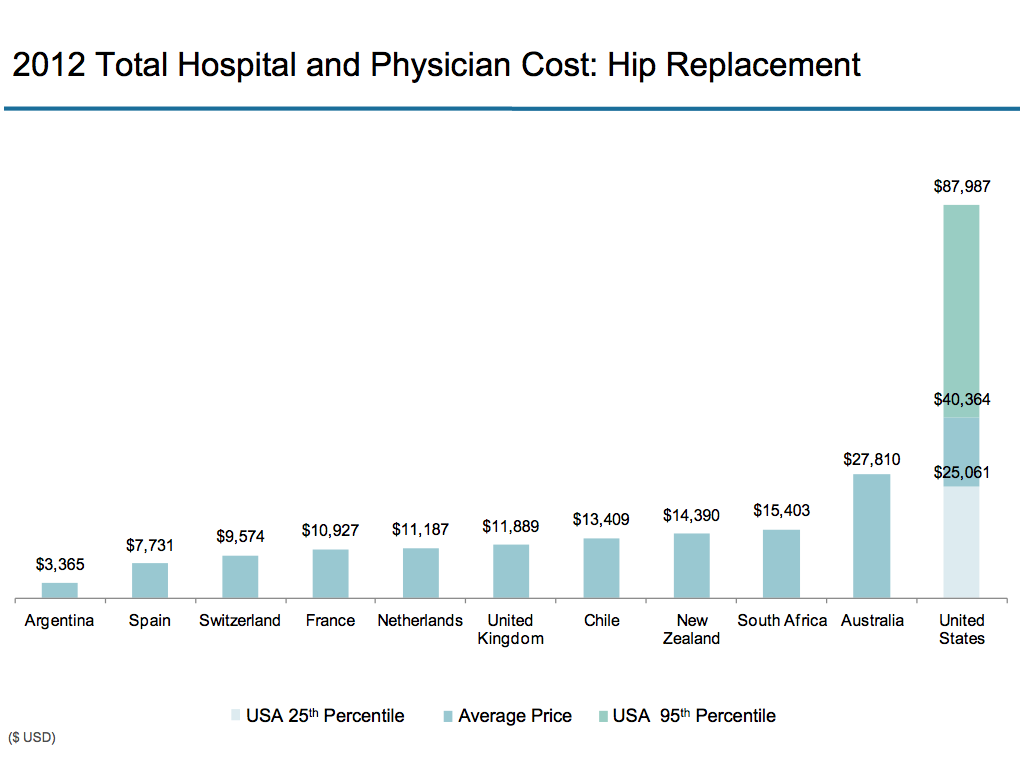
Proceeding more quickly through a selection of the other graphs, a similar pattern of wide variation in the costs paid for a procedure in the US, with far lower and more similar costs in a range of other countries can be found for hip replacement procedures:
For knee replacement surgery:

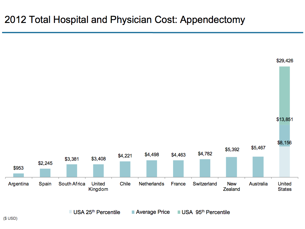
For an appendectomy:
And for a CT scan of the head:

C. Variation in Prices Paid in the State of Massachusetts
Another good source of such data was provided by the state of Massachusetts, in a report issued in 2011 and made public as part of the health care reforms implemented to extend health insurance to all of the population under the reforms signed by then Governor Romney (and which later served as a model for the Obamacare reforms). The information is now a bit dated, covering health care prices paid between July 1, 2008 and June 30, 2009, but is comprehensive. It comes from reports filed by the five major private health insurers in Massachusetts, who cover 79% of the privately insured population in the state.
The data is of prices actually paid by the insurers (not the chargemaster rates of the hospitals), and includes the minimum and maximum prices paid as well as the average. While it would have been better to show the figures for the 25th and 95th percentiles as in the graphs above (or some similar range), the Massachusetts figures are of special interest since they classify the medical conditions treated by an index of severity. In this way one can see the extent to which more complex cases might explain the high prices at the maximum.
One again sees a range of charges paid that are truly astounding. The severity of the underlying condition has only a limited impact on the charges:
| Massachusetts Health Care | |||||
| Prices Paid | Ratio | ||||
| Procedure: | Severity | Minimum | Average | Maximum | Max/Min |
| Knee Replacement | 1 | $5,202 | $21,040 | $50,726 | 9.8 |
| 2 | $7,599 | $22,743 | $59,302 | 7.8 | |
| 3 | $16,069 | $30,736 | $59,252 | 3.7 | |
| Hip Replacement | 1 | $5,423 | $22,626 | $44,867 | 8.3 |
| 2 | $9,612 | $25,235 | $63,908 | 6.7 | |
| 3 | $10,528 | $34,572 | $59,252 | 5.6 | |
| Acute Myocardial | 1 | $1,068 | $12,854 | $23,935 | 22.4 |
| Infarction | 2 | $2,351 | $16,988 | $68,695 | 29.2 |
| 3 | $2,858 | $20,137 | $56,256 | 19.7 | |
| 4 | $4,705 | $41,605 | $87,905 | 18.7 | |
| Appendectomy | 1 | $1,781 | $7,762 | $20,188 | 11.3 |
| 2 | $2,342 | $11,399 | $37,718 | 16.1 | |
| Caesarian Delivery | 1 | $3,244 | $7,859 | $15,915 | 4.9 |
| 2 | $2,828 | $9,388 | $20,424 | 7.2 | |
| 3 | $3,621 | $13,266 | $26,018 | 7.2 | |
| 4 | $9,600 | $19,156 | $30,660 | 3.2 | |
| Vaginal Delivery | 1 | $1,810 | $5,225 | $11,066 | 6.1 |
| 2 | $2,182 | $5,884 | $12,177 | 5.6 | |
| 3 | $2,812 | $7,656 | $20,446 | 7.3 |
D. The Cost of a Service Needed Immediately – The Case of Appendicitus
Some treatments can be planned ahead, and hence one is then able to choose which hospital to go to. A child birth for example, or a hip or knee replacement, can be planned ahead, and one can then choose a hospital from within your insurer’s network of preferred providers, or based on price or other considerations. Even a heart or cancer surgery is rarely necessary immediately, even if it should be done fairly soon, so one can choose one’s doctor or hospital for the surgery.
There are, however, also emergencies, where one needs the treatment immediately. An example is acute appendicitus, where one will often go by ambulance to the nearest emergency room, and have the surgery to remove the appendix within hours or otherwise face risks up to and including death. In such cases one cannot make a careful selection of doctors and facilities even if one knew the prices which would be charged. And if you are uninsured, or are taken to the nearest emergency room in a hospital which happens not to be in your insurer’s network, you could face staggeringly large bills.
Dr. Renee Hsia (an emergency room doctor practicing in California) with co-authors, published a study in 2012 in the medical journal JAMA Internal Medicine that used California data to look at what hospitals charge for treatment of acute appendicitus. Such California data is now made publicly available, and the authors examined the prices charged for uncomplicated episodes of treatment (by restricting the analysis to cases where discharge was routine and to home, with fewer than four days of hospitalization, and only for patients aged 18 to 59). The data was for 2009, and there were a total of 19,368 cases. And as the focus here was on emergency care, the prices examined were the chargemaster prices that the hospitals charged, not the discounted rates they may have negotiated with the various health insurers.
Despite the care taken to restrict the analysis to broadly similar uncomplicated cases, the price variation found was enormous. The lowest observed charge was $1,529, while the highest was $182,955, or almost 120 times as much. The median charge was $33,611. It is difficult to see how such a range of charges can be justified.
E. Finding the Cost of a Health Procedure Before the Treatment
The studies reviewed above looked at the cost of health care services ex post – that is, the charges due after the services were provided. But for prices to be useful in guiding choices on where, and indeed in some cases whether, to obtain some health treatment, one needs to know the prices before the service is provided. This can be difficult to find out.
A study published also in JAMA Internal Medicine, in March 2013, surveyed hospitals to try to determine before the treatment what the cost of a common procedure (a total hip replacement) would be. A non-technical summary can be found here. The researchers first chose two hospitals in each of the 50 states plus Washington, DC, at random among orthopedic hospitals operating in each state, and added to this sample the 20 hospitals ranked highest among orthopedic hospitals in the US in the US News and World Report ratings. They thus had a sample of 122 hospitals.
They then called each hospital, up to five separate times, and asked how much it would cost for such a total hip replacement operation. The script they used was that they were requesting what the lowest bundled price would be (including for the services of the physician) for such a procedure for their 62 year old grandmother, who did not have health insurance but had the means to pay out of pocket. In the cases of hospitals who would quote only a fee for the hospital services and not for the physician, they then called a sample of orthopedic surgical practices with rights at those hospitals to try to find the additional cost for the physician’s fees only.
Despite the repeated calls (up to five times) to each hospital, they were only able to obtain a full bundled price for such a surgery at 9 of the 20 top-ranked hospitals and 10 of the 102 hospitals chosen by state, for a total of just 16%. Contacting the physician groups separately, they were able to determine the prices that would be charged for an additional 3 of the top-ranked 20 hospitals, and an additional 54 of the 102 hospitals chosen by state. This brought the total to a more respectable 62%. This means that hospitals could provide such cost estimates if they wanted to. But apparently many do not.
The resulting range in prices quoted was enormous. For the cases where prices could be determined, the prices among the top 12 of the 20 hospitals ranged from $12,500 to $105,000, while the prices among the 64 of the 102 hospitals chosen by state ranged from a similar $11,100 to $125,798.
F. The GAO Report on Price Transparency, and Cost Estimates Provided by Aetna
The importance of price transparency for health care has been increasingly recognized in recent years. Choosing lower cost alternatives, and indeed the incentive for hospitals and other providers to offer lower cost choices, depends on patients being able to know what the charges will be. The studies reviewed above show that it is possible for hospitals to provide such estimates. But they are still difficult to obtain.
A September 2011 report of the Government Accountability Office (GAO) provides a good summary of the issues. While now over two years old and hence somewhat dated in an area that is changing rapidly, the GAO report discusses the increasing attention being paid to price transparency. It noted (citing other sources) that as of January 2011, at least 25 states had price transparency initiatives to provide health care prices on publicly accessible websites, and that as of June 2011, at least 30 states had proposed or enacted some from of price transparency legislation. But the price information being made publicly available varied widely in quality and usefulness. Most were incomplete and presented in a way which was not terribly helpful.
The GAO noted several arguments made by insurers and health care providers for why such information could not be obtained. One is that a health care treatment can be complex and highly individualized, so one will not know beforehand what the cost will be. Hospitals also argued that while they might know what their own costs would be, they would not know what the fees would be from physician and other providers making use of their hospital facilities. Finally, some argued there could be legal issues. The negotiated rate between a hospital and an insurer is a contractual obligation, and some would assert secrecy in such contracts. Both parties might well want others not to know what their agreed rates were, and hence would insist on secrecy clauses being included. A hospital might not want another insurer to know that they had agreed on a lower price with one insurer than with another, while an insurer might not want another hospital to know that they had agreed to pay a higher price at one hospital than another. And indeed, some argued that anti-trust law required such secrecy.
While the GAO did not present a position on these arguments, their validity is questionable. First, it is recognized that treatments costs can differ by patient, but this would not preclude providing average costs for some procedure, which can be taken as an indication (when comparing costs at one hospital to another) of what the relative costs are likely to be. It is also the case that a number of procedures and diagnostic tests are quite standard, so one cannot attribute to individual patient factors prices which vary by a factor of ten between two providers. It should also be noted that prices for cosmetic surgery, which is typically not covered by insurance, can be and typically are provided to patients beforehand. Why is it that one can find out (and indeed be guaranteed) the precise cost of a breast enhancement, but not a similarly complex surgical procedure?
On the separation of costs between hospitals and physicians: If one can obtain them individually, then one can simply add them up.
Finally, the argument that anti-trust law prohibits price transparency is also odd. If this were a valid concern, then the prices of everything would be kept secret. A retailer would not be allowed to post a price for milk, as that would allow other retailers to find out what price he is charging, and then choose to price their own milk accordingly. The proper response to possible collusion is transparency and competition, not secrecy and closed networks. (In later blogs in this series on health care, I will discuss how this can be used as a basis for transforming the system.)
Despite these purported difficulties, the GAO report noted that one private insurer is now providing such price information, in a form relevant to their customers. That insurer was Aetna. I am not sure whether other insurers are also now providing such information, but Aetna happens to be my own insurance administrator (chosen by my former employer for administering its health insurance plan for retirees). I therefore had access to the “Cost Estimator” provided by Aetna on its web site, which provides individualized cost estimates based on my particular health insurance plan (including prices I would individually be liable for based on my remaining deductible for the year and co-insurance rates).
The cost estimates provided by Aetna are for a sample of specific medical procedures, as well as for a range of diagnostic and other tests, and for fees of individual doctors classified by medical specialty. Prices are not available for all providers, for reasons that are not given but which I assume are related to negotiated contract secrecy clauses. However, for the procedures and tests I examined, a fairly substantial number was normally available. The number of procedures shown were quite limited however, at only 15 standard ones. This was for the Washington, DC, metropolitan area, and might vary by locale. A map on the web site showed where Aetna cost estimates were available across the US, broken down by county. It showed coverage in 48 of the 50 states (not Vermont or Hawaii), and in most, but not all, of the counties in the remaining states. Eleven states had coverage for the entire state, and in several other states only minor areas were missing.
For this test, I examined the cost of a total knee replacement at hospitals within twenty miles of my home in Washington, DC. Rates were available for 14 hospitals, but not for six others that are in the Aetna network. Several of the six not included are among the larger hospitals in the area, and their lack of a price might be due to contract secrecy clauses.
The recorded prices for this procedure, for both the list price (the chargemaster rate) and the Aetna negotiated rate were as follows:
| Charges for Total Knee Replacement | ||
| Aetna Cost Estimator, accessed Dec 18, 2013 | ||
| Hospital: | List Price | Aetna Rate |
| A | $56,442.45 | $6,150.56 |
| B | $123,677.50 | $11,739.50 |
| C | $46,444.94 | $26,065.72 |
| D | $81,225.54 | $8,491.99 |
| E | $55,110.09 | $35,903.61 |
| F | $53,929.03 | $33,778.72 |
| G | $71,713.35 | $21,526.38 |
| H | $44,358.91 | $23,708.68 |
| I | $39,172.87 | $26,102.93 |
| J | $88,362.42 | $50,290.64 |
| K | $58,270.15 | $39,936.70 |
| L | $65,972.45 | $44,394.00 |
| M | $74,519.42 | $57,067.00 |
| N | $40,773.14 | $23,641.16 |
| Maximum | $123,677.50 | $57,067.00 |
| Minimum | $39,172.87 | $6,150.56 |
| Ratio Max/Min | 3.2 | 9.3 |
As observed elsewhere, the ranges in the prices for both the list prices and the Aetna negotiated rates were enormous. The highest list price was $123,677.50 and the lowest only $39,172.87. The Aetna negotiated rates varied between $57,067.00 and $6,150.56.
A few curious things: Despite their magnitudes, the prices were made available down to the penny. And while the prices shown above on December 18, when I checked again on December 19 for some further information, most of the prices had changed. Most of the changes were extremely small (a few tens of dollars or less) but some changed by thousands of dollars. Also, prices were no longer shown for three of the hospitals (but price information did become available for one other hospital not shown on the December 18 list). I am not sure why there were these changes, and it is possible my research coincided with an annual or other periodic revision.
The software was also quite bad. I suspect it was written by programmers drawn from the same pool of professionals that specialize in health care software, and who wrote the software for the Obamacare health insurance exchanges. When it worked, it was fine. But it was extremely slow and unpredictable (screens would lock up, or when one asked for the details on the price from Hospital A, say, it would instead provide the details for Hospital B, and for Hospital C when one tried again, and so on in some random process). But once one learned the quirks, with patience it would work.
Given this huge range of prices for the Aetna negotiated rates (with the highest price over nine times the lowest), would I choose one of the lower prices? Not necessarily, as the price I would personally pay out of pocket would be much less, and would vary very little. The precise amount would depend on how much of my annual deductible I had used in the year (and I have not used much this year), my coinsurance rates for the procedure, and how close I would be to my annual cap on health expenditures before insurance would cover 100%. For all by two of the 14 cases above, I would be at or close to my annual cap, and hence the price I would face would not differ significantly. But the difference in cost paid by my insurance at the negotiated rate would be, between the maximum and the minimum price, over $50,000.
G. Conclusion
The prices charged in the US for health care procedures are not only high, but vary enormously. If American health care were a truly competitive market, one would not see prices that can vary by a factor of ten or more between the highest and the lowest for what should be comparable treatments.
This is only possible because current actors in the system benefit from it. There are benefits to be had from a lack of price transparency and the highly variable prices that this makes possible. Future blog posts in this series on health care will look at the evidence for such benefits for at least some of the key actors, and will discuss why this can be the case.








You must be logged in to post a comment.