Federal Government Expenditures Under Obama: Close to Flat, in Contrast to the Big Increases of His Republican Predecessors

Federal Government Budget Real Expenditures, Government Outlays, Reagan, Bush Sr., Clinton, Bush, Jr., Obama

There is perhaps no more firmly held view in Republican (and especially Tea Party) circles than that federal government expenditures have exploded under Obama.  But it is simply not true.  Previous analysis in this blog has shown that total government expenditures (including state and local) traced over the course of each business cycle in the US since the mid-1970s, rose less during the Obama period than in any of the others.  Indeed, that analysis indicated that if government spending under Obama had been allowed to increase as much as it did under Reagan following the 1981 downturn, then we would now likely be at or close to full employment.

But when President Obama noted in a speech in Iowa on May 24 that the pace of federal spending had grown at the slowest pace in his term of any presidency in sixty years, the remarks were met with widespread incredulity in the press and on the internet.  Given the repeated Republican attacks asserting the opposite, many did not believe it could be true.

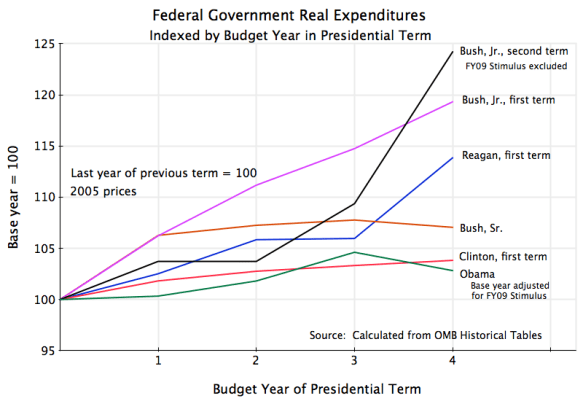
But it is true.  The graph above shows the levels of real federal spending in the first terms (and Bush’s second term) of each president since Reagan.  Growth in real federal spending in each presidential term prior to that was also higher than under Obama, going back to Eisenhower.  (Under Eisenhower there was a fall in real spending, as Korean War expenditures, at a peak when he took office, came down as the war ended.  There was an even larger fall during the Truman term as World War II came to an end.  But these cases are not terribly relevant.)

The figure above shows real federal spending levels in each presidential term since Reagan, indexed with the year preceding their first budget set equal to 100, and then showing the levels in real (inflation-adjusted) terms for the four budget years of their presidencies.  Only the first terms are shown for two term presidents other than Bush Jr., to make it comparable to the Obama term thus far, to reduce clutter in the figure, and because it made no real difference (increases during the second Reagan and Clinton terms were in the middle of the ranges shown above, with four-year increases of 7% and 8% respectively).

Federal government spending under Obama has been largely flat, increasing by less than a total of only 3% in real terms by his fourth budget year (FY13, where I used the budget proposal made to Congress in February by Obama for this figure; any actions by Congress will likely result in further cuts, not increases, in this).  The only recent president with spending at all close to this was Clinton in his first term, when spending rose by a total of 4% in real terms.  The biggest spending increases by far were by Bush, Jr., in both his first and second terms.  Real spending rose by 19% in Bush’s first term, and by 24% in his second term (even adjusting for spending approved as part of the FY09 Stimulus package:  see the technical note below).  Reagan, revered for his small government conservatism, oversaw an increase of 14% in real government spending during his first term.

The Democratic presidents Obama and Clinton have therefore kept federal government spending tightly under control, while the Republican presidents of Reagan and especially Bush, Jr., oversaw large expansions in real federal spending.  Obama’s conservatism on this has certainly hurt the economy at a time when unemployment remains high due to a lack of demand in the aggregate for what such labor could produce.  But he has been criticized, without any basis in fact, for the opposite.

———————————————–

Technical Note

It is important to be aware that budget (or fiscal) years do not coincide with presidential terms.  Presidents are inaugurated in January, while budget years start in October.  A president therefore takes office with a budget year already one-third over, Congressional appropriations already set (or at least largely set), and little ability, with rare exceptions, to influence spending in the year they take office.

Thus in the figure above, the base year of expenditures (set equal to 100) will be the budget year in the middle of which a president took office, and the final year will be the budget year underway at the end of his term.  The figures are calculated from data in the Historical Tables issued by the Office of Management and Budget.

The one exception where a president has had a major impact on spending levels in his first year would be spending under the Stimulus package that Obama signed into law, which was approved on February 17, 2009.  This package provided for a total of $971 billion in measures, but $420 billion of this was for tax cuts, and $551 billion for spending.  Of this $551 billion in spending, only $114 billion (according to the most recent estimates of the Congressional Budget Office) was spent in FY2009, approximately as planned.  The figure above adjusts for this, with the $114 billion (equal to $103 billion in 2005 prices) taken out of the fourth year of the Bush second term expenditures, and with the same amount also used to adjust the base year of the Obama expenditures.  Without these adjustments, federal government expenditures in the Bush second term would have gone up by a total of 28% (rather than 24%), and Obama’s expenditures by his fourth year would have declined by 0.5% (rather than increasing by 3%).

Job Market Dynamics: A Continued, But Slow, Recovery

Jobs, employment, new hiring, job separations, net job creation, January 2006 to March 2012


employment, jobs, total separations, layoffs and discharges, quits, January 2006 to March 2012This post is an update of one from January of this year, with more recent data and to reflect revisions that have been made in the earlier figures.  The numbers are from the Bureau of Labor Statistics, and this spring it issued new figures for the last several years, reflecting methodological improvements in the system it uses to go from its survey results to its national estimates.  What is shown above and will be discussed below are jobs in the private non-farm sector.  Government jobs have been falling, as has been noted in this blog, but follow a different dynamic than private jobs.  Hopefully government jobs will now stabilize and preferably grow, rather than continue to act to depress the economy.

The story on the private job dynamics is the same as before, and the more recent numbers (through March in the figures above, vs. through November 2011 in the January posting) confirm the trend that was noted before.  That is, the job market is recovering, but at too slow a pace given the still high level of unemployment.  At such a slow pace, it could easily go into reverse should the economy slow.  As has been noted before in this blog, US GDP growth has been slow due to the continued fiscal drag as government expenditures have been cut back.  There is also the threat of a European collapse, with negative impacts on the US, as Europe has failed to address the Eurozone problems with any policy other than increased austerity.  Growth in Europe is already at zero.

There is now the additional threat made recently by Speaker of the House John Boehner, to hold hostage the Congressional approval required for the debt ceiling later this year unless Republican demands of further government expenditure cuts are met.  Without this Congressional approval, the United States would be forced to default.  Economic chaos would result.

Among the points to note from the figures above:

1)  There were major net job losses in 2008 and 2009 (the curve in red in the top figure), but not because more people were leaving their jobs, due to layoffs or other reasons.  Rather, it was because the pace of new hiring slowed.  At the peak of the housing bubble in 2006, new hiring was being done at a pace of roughly 5 million jobs per month.  This started to fall, but slowly, in late 2006 / early 2007.  It began to fall at a rapid rate in 2008 (the last year of the Bush administration), and then stabilized and began to recover within a few months of Obama taking office, as the stimulus package and other measures began to have their positive effect.  From a trough of about 3 1/2 million new hires per month in mid-2009, new hires has slowly grown to a pace of a bit over 4 million per month currently.  That is, there has been some recovery, but the pace is still well below the 5 million new hires per month seen when the economy is at full employment.

2)  Total job separations, whether from layoffs or quitting or anything else, actually fell in the downturn.  People often believe that unemployment shot up in the downturn because of massive layoffs, but that is not really the case.  Unemployment went up not because of more people being fired or otherwise leaving their jobs, but rather because the pace of job separations did not fall as rapidly as did the pace of new hiring.  In normal times, more people separate from their jobs because they quit (usually to take a new job elsewhere) or voluntarily leave for some other reason (e.g. retirement), than leave because of being laid off.  The pace of layoffs and discharges did indeed go up in 2008, the last year of Bush, from roughly 1.7 million per month before the downturn, to a peak of 2.5 million in the last month of Bush.  But this was less than the fall in the number of people who voluntarily quit, so total separations actually fell.  And layoffs then soon started to fall in number under Obama, and is currently below 1.6 million per month, i.e. less than the pace seen when the economy was near full employment.

3)  Since late 2009, the pace of new hiring has risen under Obama, as noted above, from roughly 3 1/2 million per month to a bit over 4 million per month currently.  Quits also started to rise with the improving job market, from about 1.5 million per month to 2 million per month most recently.  This is a good sign, and an indication that people are voluntarily leaving their jobs as the pace of new hiring has improved.  And layoffs and discharges has slowly fallen over this period as well.  The result is that the pace of total separations have been below that of new hires since early 2010, with net new jobs thus being created.

But the pace of net new job creation has been slow, at only about 200,000 net new jobs per month over the last half year (other than 300,000 in February).  With unemployment still at 8.1%, it would take years to reach full employment at such a pace of net job growth.  That is, at a pace of net job growth of 200,000 per month and assuming growth in the labor force of about 0.65% per year (the rate seen in the past decade, as it depends on population growth and demographics), it would take over two more years for the unemployment rate to fall below 6%, and almost three and a half years to fall below 5%.  At 300,000 net new jobs per month, unemployment would fall below 6% in a more reasonable 15 months, and would hit 5% in about two years.

A pace of net new job growth of 300,000 per month is not at all impossible, but will require a sufficient growth in aggregate demand in the economy so that the goods and services these workers would produce could be sold.  As has been noted before in this blog, fiscal drag largely explains the slow growth in aggregate demand in the US:  Had government demand been allowed to grow during the Obama years at the pace it had during the Reagan period when the economy was recovering from the 1981 downturn, we would now be at close to full employment.

Although Improving, Still Many More Unemployed Than Job Openings

Number of unemployed as a ratio to job openings, US data, December 2000 to march 2012

There are many conservatives who argue that the unemployed need not be unemployed if they were only willing, perhaps with a cut in wages, to take one of the many jobs they assert are available.  Help wanted signs are seen, and thus these conservatives believe the unemployed could get a job if they wished.  They believe the unemployed are unemployed by their own choice, either out of laziness or due to an unwillingness to accept a lower wage.  In terms economists would use, they believe that the markets for labor would always clear if only the workers were willing to accept a lower wage.

The problem with this view is that it is not consistent with the fact that in economic downturns there are many more unemployed than job openings.  Even if every single one of the job openings were immediately filled, there would be many unemployed workers seeking jobs still left.  And since it in fact takes some time to fill any job, and since there is also constant turnover in jobs, one will see the help wanted signs posted for a while.

Data for the US on this is now gathered by the Bureau of Labor Statistics of the US Department of Labor, in a monthly survey of private establishments (which includes non-profits) and government entities.  The survey is a relatively recent one, having started only with data from December 2000, and gathers data on labor turnover (hirings, quits, firings, and other turnover) in addition to job openings (and is called JOLTS, for Job Openings and Labor Turnover Survey).  The labor turnover side of these numbers was discussed in a post on this blog in January, which used the numbers to look at the dynamics of the job market.  The post today will consider the job openings side of this survey.

The graph above, based on the JOLTS data from the Bureau of Labor Statistics coupled with the BLS unemployment figures (from its separate monthly survey of households), shows the ratio of the reported number of job openings to the number of unemployed.  For the most recent month available, the ratio of the number of unemployed to the number of open jobs was 3.4.  That is, there were 3.4 unemployed workers in the US for each open job that employers were seeking to fill.

This ratio of 3.4 is significantly better than the approximately 6.5 ratio of unemployed to open jobs when unemployment was at its peak following the recent economic collapse.  It is interesting to see in the graph the close to straight line downward trend since it hit that peak.  But there are still many more unemployed than available jobs, and the labor market is healing only slowly.  It still has a long ways to go.

Note that when the economy is close to full employment (as in December 2000, at the end of the Clinton presidency, or in late 2006 / early 2007, at the peak of the housing bubble), the ratio is around 1.0 to 1.5.  Note that there is no reason why the ratio necessarily has to be greater than one, as one could in principle have a situation of few unemployed and many open jobs seeking workers.  But in practice, it appears that in the US the ratio will always be greater than one, even when the economy is at full employment.  There will always be some unemployed and some unfilled jobs, and at full employment these are in rough balance.

But the current ratio of 3.4 unemployed for every job opening, while better than the 6.5 ratio seen when unemployment was at is peek, is still well above the 1.0 to 1.5 ratio one sees when the economy is close to full employment.  The unemployed cannot be blamed for being unemployed because they are lazy, or unwilling to accept a lower wage.  They are unemployed because there are too few jobs out there.  And there are too few jobs because there is not sufficient demand for the goods these workers could produce.

As was discussed in postings on this blog on March 3 and on March 12, this insufficiency of demand in the aggregate for what American workers can produce is largely explained by fiscal drag, compounded (although of lesser importance in the aggregate) by the collapse of housing investment following the bursting of the bubble.  Government (mostly at the state and local level) has cut back in this downturn.  This is in contrast to the expansions of government spending and hence government demand seen in other downturns, and very notably in contrast to the strong expansion in government spending during the Reagan period (despite the myth).  As the March 3 post estimated, if government spending (including state and local) during the Obama presidency had been allowed to expand by as much as it had during the Reagan presidency, the economy would now be at full employment.