

Summary of the Basic Argument:
In 1990, there were about 300,000 mobile cellular subscriptions in the lower and middle income countries of the world that can borrow from the World Bank. By 2020, that number had risen to close to 7 billion. This did not happen through the traditional telecom companies. Rather, a new ecosystem of firms developed, showed that investments in providing cellular services were viable, and then extended coverage so it became essentially universal. Finance was not the critical constraint. With viable investments, finance followed.
The world is now facing the consequences of greenhouse gases accumulating in the atmosphere – mostly through the burning of fossil fuels – leading to a changing climate with consequences that are already bad but will become far worse. The World Bank has been invited to do more to fund the investments that will be needed to address this. But if the Bank continues with its traditional approach – more of the same but simply doing more of it – it will not play a meaningful role. The investments required are simply far too high. McKinsey has estimated that to get to net zero by 2050, over $160 trillion in investments in physical assets alone will be required in the countries that can borrow from the World Bank and IDA. On top of this, investments will be needed to address the consequences of a warming planet. Even under the most optimistic of forecasts, World Bank Group funding could not cover even one-half of one percent of what will be necessary.
There have been proposals that the Bank “stretch” its balance sheet in some way to enable it to lend more than it is now. It is, indeed, arguable that the IBRD has been excessively cautious in its lending. A simple stress test shows that at its current capitalization, about half of the loan portfolio would need to go into default for five full years (with no resolution during that period) before the Bank would need to make a call on its callable capital. That is unlikely in the extreme. But even if the Bank increased its lending to the very top of what is allowed under the Articles of Agreement, then with the existing capital, the IBRD could lend only an additional $11.8 billion per year – 36% more than the $33.1 billion in new commitments in FY2022. This would still be far from what will be needed to address climate change.
The World Bank and Ajay Banga, the expected new president, need to rethink how this should be approached if the Bank is to play a meaningful role. A top-down strategy, focused on identifying individual investments deemed a “priority”, and then seeking adequate funding (from subsidized sources to the extent required), will not suffice. While the individual investment might well be beneficial, it will be a static one-off gain. What one needs, rather, is a dynamic process, similar in nature to what allowed the provision of cellular services to take off.
A more opportunistic, bottom-up, approach would provide World Bank Group support to those investments that can be viable in their local circumstances. The key point to recognize is the diversity of conditions that exist. Solar or wind generated power might not be able to compete everywhere on cost with fossil-fuel burning sources (with the implicit subsidy being provided to such polluters by not requiring them to pay for the cost of the damage they cause). But it is wrong to assume they cannot be competitive anywhere. Connections to the power grid are not always available, they are often not reliable even where they are technically available, and in many cases the power from the grid can nevertheless cost more than what it would from renewable sources.
The key is to recognize this diversity in conditions, and then exploit the opportunities that exist. And the opportunities are becoming increasingly common as technological changes are dramatically reducing costs of green alternatives not only in power, but in agricultural practices, transportation, and other sectors. The key issue for low and middle income countries is to obtain access to those alternatives. And with viable investments, funding will not be the critical constraint, just as it was not for cellular mobile services. Furthermore, such funding will not add to the public debt burden – a worrisome concern in a number of countries. When the investments are viable, what they provide and sell (such as power) will cover the cost of the financing.
The World Bank Group, both by showing the way through funding of pioneering investments that exploit such opportunities (both public and – via the IFC – private) and even more so through policy advice on best practices, can have a valuable role to play in this. But little will be accomplished from a futile attempt simply to fund a bunch of projects, up to whatever the finite availability of subsidized funds might allow. Rather, the Bank will only be effective if the support it provides (on policy as well as finance) leads to a dynamic where viable investments – not reliant on subsidies – will bring our greenhouse gas emissions down to zero.
A. Introduction
Ajay Banga, the US nominee to be the next head of the World Bank Group, will have clear marching orders when he starts in his new job: The World Bank must do more to address climate change. In a major address in early October 2022, US Treasury Secretary Janet Yellen had called on the Bank to be more aggressive, to be more innovative, and to be more effective in addressing the challenges of climate change. She asked that the Bank prepare a “roadmap” by December on how it would approach this. And she said the US would support steps that would once have been considered radical, including measures that would “stretch” the balance sheet of the Bank and other multilaterals to permit greater lending than would have been considered before. Other key shareholders, including Germany, echoed these remarks.
The relatively short (17 page) roadmap was duly prepared and distributed to the World Bank Board in mid-December, and was publicly released in January following the Board discussion. Many, however, considered it disappointing. While it did propose that the World Bank do more on climate change, it did not suggest a need for a fundamental shift in the Bank’s strategy in how it should provide such support. It was basically just more of the same – but do more of it, up to whatever level donor nations would be willing to support financially.
There are problems, however, with the approach as laid out in the roadmap. To start, whatever financial support the World Bank could provide – even with a major expansion in its lending capacity – would be tiny in comparison to the scale of the problem. While it can be argued that every little bit helps, the share of what needs to be done that such financing could support under the approaches being considered would be so small as to be basically irrelevant. Figures on this will be provided below.
But there are other issues than simply the scale. The centerpiece of what would be new for the financing provided by the World Bank (more formally the International Bank for Reconstruction and Development, or IBRD) would be that grant funds would be provided by some set of donor nations to allow the World Bank to lend at a lower interest rate than otherwise. The logic of such a subsidy is that the benefits from measures to reduce greenhouse gas emissions accrue to everyone on the planet, not only those in a particular country.
World Bank loans have not been subsidized in this way before. Since its founding more than 75 years ago, World Bank funds have been lent to countries at a rate reflecting what it costs the Bank to borrow in the markets (which is relatively low, given its AAA rating and other backing), plus a margin to cover its administrative costs and to provide for a modest level of earnings (currently a margin of about 0.8% points on average when taking into account all fees and charges). This rate has generally been less than the rate at which countries themselves can borrow in the markets, and thus it has been advantageous for the countries to borrow instead from the World Bank. The proposal now would be to charge an interest rate that is even less, by blending in donor funds to “buy down” the rates.
[For those unfamiliar with the structure of the World Bank Group: Note this is for the IBRD. There is also the affiliated International Development Agency – or IDA – that provides funds raised from donor nations as grants or highly concessional loans to the poorest member countries with a per capita income below some cut-off. The discussion in this post will be primarily on the IBRD, as that is where the changes in the approach to lending would be made.]
It is not clear how much might be provided in such donor funds, and thus not clear how large of an impact this could have on the loan rates. But even if they were large enough to reduce the interest rates by half, say, one should recognize that interest rates have been rising. The rates on World Bank loans in the coming years, even if subsidized by donors, will likely still be more than where they were until recently. This raises the question of whether country borrowers will be willing to take on such loans for these purposes at such subsidized rates going forward, if those rates – even after subsidies – are higher than what they were in the recent past. They were not all that interested before.
But an approach based on subsidies would not be sustainable for any length of time. While it is certainly true that fossil fuels (and other emitters of greenhouse gases) are subsidized implicitly by not having to pay for the cost of the damage they cause, the notion that it will be possible to out-subsidize such polluters by providing even greater subsidies to renewables is fanciful. The scale of the issue is just too vast. It is also not clear how long this would be pursued: forever?
There is a need to rethink this. Part of the problem may stem from the use of the term “global public goods”. This term is not normally applied in economics to a polluter who cuts back on how much they pollute. Pollution is more properly termed an externality, where costs are being imposed on others. And what is being produced here – whether power or cement or steel or burping cows – are all private goods that will be sold in the market, ultimately to consumers. The issue is how to have such private goods produced in ways that are financially viable while not pouring greenhouse gases into the air.
This is not impossible. The generation of power from renewable sources, for example, is already competitive without subsidies in certain circumstances. Its cost has come down tremendously over the past decade. The key is to recognize that there is a tremendous diversity in conditions in the countries, and that in particular situations in particular locales, power from renewable sources can be the least-cost source of supply. Power from the grid may not be available at all in certain locales, may be undependable even where it is technically available, and may in any case cost more than power from renewable sources even when it is available. This is of course not the case everywhere right now, with current technologies. But neither is it the case nowhere.
To exploit this will require a change in mindset for the World Bank. It needs to shift from a top-down approach – where “priority” investments are identified in some fashion with a focus then on finding adequate funding (including subsidized funding, to the extent deemed necessary), to a more bottom-up opportunistic approach. The focus should be on identifying investments that should be financially viable and then determine why they are not proceeding. Sometimes financial support might be appropriate (and done together with private sources of finance), but often the real need is to address what is blocking such investments. There might, for example, be policies (or simply the traditional practices of an integrated power monopoly) that bar renewable sources of power from integrating with the grid. The World Bank can play an important role in introducing best practices on how this can be addressed. And in some cases there might be a need for investment to strengthen the capacity of the transmission grid to accommodate decentralized sources of power from renewable sources. The World Bank might be able to play a helpful role here as well.
But the aim should be for the World Bank to shift from a mindset that it can fund a series of static, one-off, investments that might well be individually beneficial, to support for changes that can lead to a more dynamic response. The chart at the top of this post illustrates what was possible when mobile cellular providers (mostly private) were allowed to compete and provide telecommunication services, in contrast to the response of entities (mostly public and mostly monopolies) providing fixed-line services. The technology was of course new and the analogy is far from perfect, but it is doubtful that if the traditional fixed-line providers had simply been provided with greater subsidized resources they would then have come anywhere close to what the new cellular providers were able to do in just a few years. Cell phone service subscriptions in these countries (the lower and middle income nations of the world that are eligible to borrow from the IBRD or IDA) rose from just 300,000 in 1990, and still very little in the mid-1990s, to close to 7 billion by 2020.
If there is to be any hope that climate change is to be effectively addressed, with net greenhouse gas emissions brought down to anywhere close to zero by 2050, we will need a response closer to what the mobile cellular providers were able to provide than what would have been expected from the traditional fixed line phone monopolies. The challenge will be how to structure the response to allow for dynamics that are more like that which was seen with mobile cellular services. This will only be possible if well-managed firms, operating in often challenging country environments, are able to provide these private goods (whether power, or cement, or beef, or whatever) with clean technologies profitably. If they are, financing will follow, as it did for the mobile cellular providers. If they are not, the most that can reasonably be expected from trying to push subsidized financing onto them might be some limited static gain, but not the dynamics needed.
This post will start with a discussion of why a focus on engineering an expansion in World Bank lending for climate change, but with traditional approaches followed, is unlikely to achieve anything close to what is needed to address the challenge the world faces with climate change. There is a need to rethink this.
As noted above, confusion might stem in part from the way the term “Global Public Goods” is being used. That will be discussed next. While this is in the end semantics, discussion of the issue has largely ignored that private, profit-seeking, firms produce the goods (or at least can produce the goods) that are at issue here. The penultimate section of this post will discuss what the prospects for this are – or at least could be – and what might be done to facilitate this. The aim is for a response closer to the dynamics of what mobile cellular providers were able to achieve.
A concluding section will discuss briefly the related but different issue of World Bank financing being provided to countries to allow them to better adapt or respond to what the consequences of climate change have been for them – and will be for them. This fits in better with traditional World Bank approaches. There is also the separate question of whether “compensation” in some form should be paid by the countries whose past emissions have led to our climate change crisis (primarily, but not exclusively, the richer countries), to the generally lower-income countries that are now also suffering the consequences. This may well be justified. But that does not necessarily mean that such funds should be used to subsidize World Bank loans. They are two separate issues.
An annex will then follow with an analysis of a related issue. Calls have been made, including, significantly, in the October address of US Treasury Secretary Janet Yellen, for the World Bank to make better use of its callable capital to allow it to increase its lending. Using figures from the IBRD’s audited financial statements, the annex will examine how much lending could be increased even if it were raised all the way to what the IBRD’s statutory loan limit (as set in the Articles of Agreement) allows. We will find that it is not really all that much. It will then look at what the impact might then be on the financial risks the IBRD faces and hence its credit rating. We will see that the impact should not be seen as all that much either. That is, it is probably worthwhile for the Bank to lend more against its current capital structure – the financial risks of doing so are modest. But even the maximum extra lending possible given its callable capital will not be all that much when compared to the challenges following from climate change. This is not going to solve the issue.
A second annex will then look at the interest rates that have been charged on World Bank loans in recent years, and why they are now rising quickly even though World Bank loans are long-term. Many do not realize that while World Bank loans have maturities that can go out as far as 35 years, almost all are now at variable interest rates. And those interest rates have risen sharply. Even if highly subsidized, IBRD interest rates on new loans would likely still be well above where they were just a few years ago.
B. A Traditional Approach, Whether Subsidized or Not, Will Not Suffice
The investments that will be needed to address climate change will be huge. There is of course a great deal of uncertainty on how much that might be, and estimates vary (although similar in that all are very high). But for illustrative purposes one can use recent estimates from the McKinsey Global Institute in a major study released in January 2022. McKinsey looked at what it would take to reach net zero carbon (greenhouse gas) emissions by 2050, over the thirty-year period of 2021 to 2050, in 69 countries accounting for 95% of global GDP, and focused on seven sectors accounting for 85% of greenhouse gas emissions: power, industry (in particular cement, steel, and chemicals), transportation, buildings, agriculture, forestry and other land use, and waste management. That is, the estimates are for the cost of the investments in physical assets only (and only in seven sectors) in order to reduce greenhouse gas emissions along a forecast path to net zero by 2050 in countries accounting for 95% of world GDP. They do not include the also high costs of adapting to and repairing the damage from the consequences of climate change – consequences that are already well underway.
While partial, McKinsey estimated that the cost across the globe to reduce greenhouse gas emissions along this path will be $275 trillion over the 30 years. One can calculate from the regional and major country figures presented in Exhibit 24 of the main text that $160 trillion of this would be in countries that can borrow from the World Bank Group.
In its FY2022, in contrast, the World Bank (counting both IBRD and IDA), made new loan commitments of just $13.2 billion for projects that included climate mitigation measures as at least one component of the project (with an additional $12.8 billion for projects that had climate adaptation measures as at least one component). While this was a record amount for such lending from the IBRD and IDA, it is not much compared to what will be needed. Assuming it could continue at this pace for 30 years (where one needs to remember that IDA funds come from donor nations), the total for mitigation investments (including IDA) would be less than $400 billion. This would be 0.25% of the $160 trillion needed. Allowing for growth in these lending commitments at some reasonable rate (say 4% a year in real terms), it is hard to see the total ever exceeding 0.5% of what will be needed for investments to cut greenhouse gas emissions alone, and thus not counting what will also be needed to address the damages caused by climate change. Furthermore, the IBRD share of this would only be about half of that, with the other half (for IDA) dependent on how much donors will be willing to contribute.
In addition, World Bank projects normally cover a range of related activities. The investments in any given World Bank funded project that are specifically for climate mitigation measures will only be one component, and thus will only account for some share (possibly small) of the total project loan amount. But such a project will be included as one where “climate mitigation” was an element, and the full loan amounts (i.e. including for activities other than directly for climate mitigation) will be counted in the $13.2 billion total. The funding for investments in climate mitigation alone will be less.
There are other issues as well. One is that while calls are being made for the World Bank to step up its lending for climate mitigation (as well as adaptation), many of those calling for the stepped-up lending have also noted that many of the countries are already facing high public debt loads. But the IBRD as well as IDA lend only to the public sector (or at least only with a government guarantee of the loans), so there is an inherent contradiction in adding to the public debt of a country borrower that may already be facing possible debt issues.
This might in part be resolved by reducing the costs of those loans through subsidies. But those subsidies must be provided by donors, and the amounts that donors are willing and able to provide are limited. It should be noted that IDA credits have always been highly subsidized (and funded by donors) – at first as very long-term loans (up to 50 years now) at highly concessional interest rates (and called a service charge), and in more recent years some as outright grants as well. But there is no indication that donors are willing to provide funds of anywhere close to the scale that would be required to address climate change in those countries that are eligible for IDA credits.
What is different in the more recent proposals is that funds might be provided to subsidize certain IBRD loans as well, to bring down the interest rate charges on such loans to below what it costs the IBRD to make such loans. As noted in the introduction above, the IBRD has in its over 75-year history lent funds to country borrowers at rates that suffice to cover the cost to the IBRD to borrow in the markets (a rate that is relatively low due to its AAA rating as well as other backing) plus a margin (currently about 0.8%, when all fees and other charges are taken into account) to cover its administrative costs and some retained earnings. Subsidizing that IBRD rate to some level below what it costs the IBRD to make such loans would be a departure from the approach it has followed for three-quarters of a century.
How much lower the IBRD interest rates could be on loans for climate mitigation measures (and other global public goods) would depend on how much donor countries would be willing to provide. What that might be is not at all clear at this point. But interest rates have been rising, and even subsidized rates would likely be a good deal higher than what the borrowing rates were from the IBRD not all that long ago. (See Annex II below for the numbers on this.) Taken by itself, it is not at all clear that countries borrowing from the IBRD would be all that interested in borrowing for the designated climate change purposes even at a subsidized interest rate. They were not all that interested in borrowing for such purposes in prior years, when the interest rates would have been even lower without any such subsidy. There is more that needs to be addressed here. Simply subsidizing interest rates will not resolve them.
There is also the not very good record of demand by borrowers from an IFC managed facility that used IDA funds to subsidize the financing of IFC-supported private projects in IDA member countries. The IFC (International Finance Corporation) is also part of the World Bank Group (along with the IBRD and IDA), and is the arm that provides loan and/or equity finance to private projects in member countries. While the borrower would be different (private investors in the IFC projects, vs. country governments in the IBRD projects), the lesson from this “IDA Private Sector Window” is that subsidized financing terms do not make all that much of a difference in the decision on whether to proceed with a project or not. The facility was launched in 2017, but in the now more than five years since it began, it has (as of March 17, 2023), only committed $3.34 billion in funds in total (with disbursements only a share of this). It claims to have led to total investments of $19.82 billion, but it is difficult to say how much of this would have been invested anyway even without the IDA subsidy. And in the five years of 2017 through 2021, foreign direct investment in low and middle income countries totaled $3 trillion (based on what is reported in the World Bank Databank), so the share would have been tiny even if all of the $19.82 billion is counted.
One should not, therefore, expect that a traditional World Bank approach – whether with subsidized interest rates or not – will suffice to meet the enormous challenge of what needs to be done to mitigate climate change and put the world on a sustainable path. The magnitude of what the World Bank could support through its traditional approach – even with measures to expand that capacity – is simply far too small given the challenge. It is also not at all clear that the subsidies that might be provided would make all that much of a difference either.
The World Bank and its member governments need to re-examine its strategy if it is to play a meaningful role on climate change.
C. A Different Approach
Resolving this will certainly not be easy. Polluters gain an advantage by being able to shift part of their costs on to others – by not paying compensation for the damage they cause. There is also no ceiling on the costs they are thus able to shift to others: The more they produce, the greater the costs they impose on others, and the greater the implicit subsidy they enjoy by not having to pay for those costs.
In contrast, a strategy of subsidizing those who do not pollute is limited. Those subsidies need to come out of some government budget, and there is only so much that can be provided. There will thus be a ceiling on what can be done through a reliance on such subsidies, and as discussed above on the magnitudes involved, that ceiling is far less than what would be needed. Furthermore, reliance on such subsidies is certainly not sustainable. They cannot continue forever.
There is a need to rethink this. To start, it is useful to clarify the terms being used. While the issue is being portrayed as one of “global public goods”, the meaning of that is different from what economists normally refer to as “public goods”. To an economist, a “public good” is defined as some product that (in the rather ugly terms economists like to use) is both “non-rivalrous” and “non-excludable”. Non-rivalrous means that if one person uses it, others can as well. And non-excludable means that if I have access to it, others will as well and cannot be excluded. Thus a commonly cited example of a public good is spending on the military to defend a nation. I enjoy the benefits of that protection but others do as well (non-rivalrous), and if the military defends me it will similarly benefit all others in the nation (non-excludable). A piece of cake, in contrast, is not a public good. If I eat it, then others cannot, and if I have it I can exclude others from it.
The concept of global public goods as used in this discussion on climate change is referring to something a bit different. It is not referring to the goods themselves being produced, but rather to whether those goods are being produced in a way that does not lead to pollution costs being imposed on others. While there will be benefits for all to enjoy (a planet that is not wreaking as much damage as it would if heated up more), this shifts attention away from what is being produced (e.g. electric power, cement, cows) to how it is being produced. But how it is being produced is causing what economists would usually refer to as an externality, not a public good. And what is needed is for the goods to be produced in a way that does not impose this externality (the pollution costs) on others.
In the end this is just semantics. But it diverts attention from the fact that regular goods are being produced (electric power, etc.) for sale ultimately to consumers, and there is a need to shift that production to methods that do not lead to such pollution. The only financially viable and sustainable way to achieve this is for such production to be profitable. And when one can achieve this (without subsidies), one can then follow the type of dynamics that led to the explosion in the provision of mobile cellular services (such as shown in the chart at the top of this post), rather than the limited static shifts that would follow if one were to rely on case-by-case subsidies.
Such viable investments are now often possible: not everywhere, but neither nowhere. Clean technologies are being developed – primarily in the richer countries – and the issue for those countries that can borrow from the World Bank Group is whether they will make use of them.
To take a specific example, the cost of generating power by solar panels has fallen by 90% in the US since 2009, to only $30 to $40 per megawatt-hour (MWHr) – equivalent to 3 to 4 cents per kilowatt-hour (KWHr) – for utility scale systems. The cost of on-shore wind generated power is similar. These are the costs before any subsidies. (Note that these costs are measured in terms of what is called the “levelized cost of energy”, or LCOE, which is the full cost – both operating costs and capital costs – over the system’s entire lifetime expressed per megawatt-hour generated, and properly discounted over time.)
In contrast, the cost in the US for a new coal-fired plant is on the order of $80 per MWHr. Indeed, the cost of newly built solar and wind sources of power can even be below just the marginal cost of continuing to operate an existing coal-burning plant, given the cost of coal and of the other operating and maintenance costs of such plants. This is in particular true for older coal-burning plants, where their older and less efficient technologies are more costly to operate.
Depending on the situation (i.e. the adequacy of the connections to the grid as well as how large a share of the power being supplied is from intermittent sources) one might also need the ability to store power from the solar and wind systems. The cost of storage will vary tremendously based on the locale, but can be low. For example, in countries where hydro systems are a major source of power generation, one can often use solar-powered generation systems during the day while the hydro-powered systems are used at night or other times when the sun is not shining. And hydro systems currently dominate in low-income countries, accounting for 71% of power generation in Central Africa, 66% in East Africa, and 63% in the low-income countries of the world as a whole. In such cases where hydro accounts for a high share of the power generated, they can provide the flexibility needed to manage intermittent sources – assuming, of course, there is a willingness to do so.
But even with other methods to store power from intermittent sources such as solar or wind, the cost of power from renewable sources will often be below the cost of generating it from burning fossil fuels. It really depends on the particular circumstances of the location. The power markets themselves are also often highly fragmented, with high costs in some locales and lower costs in others (although the prices charged might not reflect this). And indeed, in many places power from the grid may not be available at all (or not available reliably), thus leading those who need such power to purchase expensive diesel-powered backup generators.
The key point is there is great heterogeneity in the conditions that determine the cost of obtaining power in any given country, and even more so across countries. Solar and wind generated power are not always cheaper everywhere today. But they are cheaper in many situations today, and are also rapidly falling further in cost so this advantage will spread in the years to come. The issue, rather, is that even where they have an advantage in cost, they are not being adopted as rapidly as they should.
The reason for this stems first from policy. Power from renewable sources is not always welcomed – and thus not allowed – as a contribution to the grid. Mobile cellular providers often faced similar such obstacles in their early years, as telecommunications was in many places a public monopoly and the existing operators did not want to allow such competition. Those rules had to be changed to allow mobile cellular services to compete. There is a similar need if renewable sources of energy, such as from solar and wind, are going to be allowed to grow.
The World Bank can and should play an important role in this. It will not come from funding an isolated power generation project, but rather from working with countries to share best practices so that power from renewable resources will be allowed to provide power where they have an advantage in doing so. World Bank funded investments might also play a high-leverage role in certain cases. For example, there will typically be a need to upgrade the capacity of the transmission grid if it is to accommodate power generated from decentralized and intermittent renewable sources. World Bank financial support to such investments might well be appropriate, and when in place would then make possible far greater investments (making use of other funding sources) in new generation from renewables.
One should also recognize that while there will be global benefits when power generation is switched from burning fossil fuels – with their greenhouse gas emissions – to sources such as solar or wind, there will also often be substantial local benefits. One does not exclude the other. Coal, for example, is an especially dirty fuel, not only from more greenhouse gases being emitted than from any other source of power generation (per KWHr generated), but also from sulfur and nitric oxides going into the air (leading to acid rain and other issues), mercury and other heavy metals going into bodies of water (and hence the fish caught there), and most obviously, the particulate matter going out the smokestacks. Especially toxic is PM2.5 (particulate matter smaller than 2.5 microns in size), which can make the necessary act of breathing hazardous to one’s health. The burning of coal is a major source of this (along with other practices – such as the burning of residues on agricultural lands – that also produce greenhouse gases in addition to the particulate matter in the air), and has led to pollution crises in a number of countries. This has become an especially severe problem in recent years in major cities of the subcontinent (Bangladesh, India, and Pakistan), with levels averaging 10 times or more than what is considered safe in the WHO guidelines. Many cities in China have had similar issues.
Countries therefore also have a local interest in reducing their burning of coal and other fossil fuels. There are certainly global benefits from switching away from these sources of greenhouse gases, but one should not forget there will be local benefits as well.
But the steps necessary to allow and elicit a dynamic response in the investments required to address climate change have not always been the focus of what the World Bank has funded. A recent example of the Bank’s traditional approach would be the large, $439.5 million, IBRD loan (for a $497 million project) approved in early November 2022 to support the final decommissioning of the Komati coal-burning power plant in South Africa, and replacing it with power from solar and wind sources. The Komati power plant was an old and large plant, originally commissioned in 1961, that at one time had a capacity of 1,000 MW from nine coal-burning generating units. Only one coal-burning unit (with a current capacity of just 121 MW) was still in operation, and will now be closed. In replacement, and making use of the infrastructure already there to connect to the transmission grid, they will now install 150 MW of solar capacity, 70 MW of wind capacity, and 150 MW of battery storage.
The project, in isolation, may well be a good one. But it will be a one-off gain that will still leave us far from where we need to be to address climate change. And by itself it will absorb a substantial share of what the World Bank can lend for such projects. In the World Bank’s fiscal year 2022 (that ended on June 30, 2022), the total lending of the IBRD and IDA together for climate mitigation was $13.2 billion, as noted above. The IBRD (the source of the Komati loan) accounted for probably about half of that (I have not seen figures with an IBRD and IDA breakdown of funding for climate mitigation). While the Komati project will be in the Bank’s fiscal year 2023, that single operation for a single power plant will likely account for a high share of what the IBRD will have lent for climate mitigation purposes in this fiscal year.
But there are broader issues in South Africa that limit the generation of power from renewable sources. The Komati plant is operated by Eskom, the vertically-integrated power monopoly in South Africa (covering transmission and distribution in addition to generation), which is 100% owned by the Government of South Africa. While I do not know all of the specifics of the Komati project, there is no mention in the World Bank released summary of it that anything broader is being done to address the more fundamental problems of Eskom itself – problems that not only have blocked competing sources of power from renewable sources developing but have also led to a major crisis in the country with highly disruptive rolling blackouts even while incurring major fiscal costs. While reform of Eskom has been long discussed, powerful vested interests have blocked progress. But until this becomes possible, one will not see the dynamics required to transform energy generation in South Africa to renewable sources, and isolated projects such as Komati will accomplish little.
A policy environment that allows competing suppliers of power from renewable sources is one side of what is needed if there is to be a dynamic response closer to that which was seen with mobile cellular services. The World Bank, as noted, can and should have an important role in supporting this. The other side will be an ecosystem of firms that can provide such services and operate profitably in the sometimes difficult business environments of these countries. But there is a “chicken and egg” issue here as there will be no such firms in countries where they are not allowed to provide such services.
That does not mean that such an ecosystem of firms cannot develop rapidly. One saw this, again, in the development of mobile cellular services. And while what will be required to reduce greenhouse gas emissions will often be new in many of the countries, one is starting with a number of firms – both public and private – operating in not too dissimilar sectors. There will also be an important role for foreign firms, both for the expertise they can provide and their access to resources – both technological and financial.
Within the World Bank Group, the International Finance Corporation (IFC) works with private firms to develop their capacity to implement successful investment projects in their respective markets. The IFC may make loans for such projects but may also fund a direct equity stake in the firm itself, with the objective of seeing the firms and their projects succeed. When they do succeed, the IFC loans will be repaid in full and the IFC equity interest will increase in value.
The IFC thus can play a valuable role in supporting the development of the system of firms that will be necessary if climate change is to be successfully addressed. And such support can have repercussions well beyond the individual firm itself. As an example from the US, the Obama administration in 2009 provided a $465 million loan to Tesla, at a critical time for the company. Tesla came out of this successfully, repaid that loan in full five years early, and arguably has done more to develop the market for electric cars than any other company in the world. While the Tesla case is obviously exceptional in the extreme, one does not need many examples of far more limited but still viable firms to have a major impact. And, while coincidental, one might note that the $465 million loan provided to Tesla by the Obama administration is similar to the $497 million cost of the Komati project. But the impact has been orders of magnitude greater than what can expect from Komati.
Finally, this approach of focusing on what is needed to be successful in the provision of power from renewable sources and in the application of other clean technologies – possibly in niche markets to start – also shifts the focus away from an obsession with finding funding. Rather, when the investments themselves are viable and profitable, with firms that can function effectively in the often difficult operating environments of many countries, funding will be found.
An example of this is again provided in the rapid expansion of mobile cellular services. Funding of course had to be found, but the firms could do this and funding itself did not block what was a tremendous expansion. The service was viable (initially in niche markets, which then grew as the technology further developed and costs declined), and with this viability the firms were able to secure the funding they needed. Similarly, funding per se is unlikely to be the critical constraint in an approach that focuses on projects that are viable – at first in specific locales where conditions allow the products to be produced profitably as well as cleanly, and later more broadly.
Note also that this addresses the concern that public debt levels are already high in a number of the countries the World Bank lends to. Pushing further public debt on them could lead to problems, even though it is recognized that greenhouse gas emissions need to be reduced. The strategy suggested here of focusing attention on projects that are or could be made to be (in the right policy environment) profitable resolves this as the investments themselves will generate the revenues needed to pay back the debts incurred (from the sale of the power generated, for example).
The example used in this discussion to illustrate the issues was that of power generated from renewable sources – solar or wind. And the power sector will be central if greenhouse gas emissions are to be reduced to a net of zero by 2050, both because of the greenhouse gases being emitted today in the power sector from burning fossil fuels, and because clean power will also be needed to support the transition in a number of other sectors. But there are similar opportunities in other sectors that will be critical in reducing greenhouse gas emissions to reach the net zero target of 2050. The World Bank Group would have an important role in these as well, if it so chooses. The key point is that, as for power, the diverse range of conditions within and across countries leads to opportunities where greenhouse gas emissions could be reduced without, in the particular circumstances of the location, requiring subsidies to be viable.
For example, in crop agriculture, practices such as minimum tilling, the planting of cover crops, and the introduction of organic matter can lead to substantial sequestration of carbon in the soils while increasing yields. In forestry, a focus on suitable areas where fast-growing trees can be planted and farmed on a sustainable basis will both help protect existing, old-growth, forests (as one substitutes for the timber that would otherwise be taken from the old-growth forests), and would also, as they grow, absorb CO2 directly. And livestock are a major source of greenhouse gas emissions, in particular of methane, but basic things such as better management of the manure produced (which can be valuable when done right) to more commercial activities such as the use of certain feed additives, can cut their methane emissions sharply. The World Bank can provide support both directly for such activities as well as advise on best practices that will encourage (and in some cases simply permit) them. And the IFC can provide support to the commercial firms that would be involved.
Or in another, and difficult, sector: Cement production is a major source of CO2 emissions, in part due to the chemistry of the process involved in making cement. Cement is also a sector where the IFC has historically been quite active. But there are things that can be done to reduce CO2 emissions from the production of cement, by, for example, improving energy efficiency, converting any of the wet-process plants still in operation to more efficient dry process plants, substitution of different materials for clinker, and similar approaches. The IFC can provide support to this through its investments in the sector.
D. Final Points
The basic recommendation being made is that while the World Bank Group has a major role to play if greenhouse gas emissions are to be reduced to anywhere close to a net of zero by 2050, that role does not derive primarily from the funding that it would – or could – provide. The funding needs are so large that whatever the World Bank might be able to provide would be tiny compared to the scale of the problem. And this would be true even if, with funding support from its shareholders, it would be able through some means to double or even triple what it could otherwise provide. It would still be small.
The strategy needs to be rethought. Rather than approach this in a top-down fashion – where some decision is made at the top on what investments to support, and then a determination is made on what level of subsidies would be required to get those investments done – the recommendation is to follow a more bottom-up opportunistic strategy. The key point to recognize is the diversity of conditions within as well as across countries, and that under certain circumstances in certain locations, investments can be made that will both reduce greenhouse gas emissions and be financially viable and sustainable on their own. For example, in places where power is expensive or unreliable, it may well make sense (and be profitable) for households, or firms, or entire communities to install systems of solar power generation (with suitable storage).
The focus of the World Bank Group should be to seek out and understand better why such opportunities exist but are not being funded now. It might then provide support directly, either by the World Bank proper (IBRD or IDA), or if private firms are involved then by the IFC. More commonly, it would work with member country governments to remove the roadblocks hindering such investments and then to facilitate and widen such opportunities. Sometimes it might be as straightforward as simply making it legal for decentralized sources of renewable power generation to feed into the grid. In others, it might require investments to strengthen the power transmission grid so that it can accommodate and make good use of renewable sources of generation.
In such a framework, the generation of power from renewable sources can be financially viable (that is, able to repay the investment required) and hence sustainable. Access to subsidies would not be a pre-condition. One could then have a dynamic process more similar to that which led to led to the tremendous expansion of mobile cellular services in these countries over a space of just a few years. And it is such a dynamic process that is needed, rather than the more static process of case-by-case projects being funded when sufficient subsidized finance is found.
This discussion has been about those investments that, when implemented, reduce greenhouse gas emissions either directly or, more commonly, by substituting for more polluting existing producers. In addition to such investments for climate mitigation, there are also investments for climate adaptation. The latter are investments to address the consequences of climate change, such as less reliable rainfall (leading sometimes to droughts and sometimes to floods), or more intense storms, or greater average heat making certain crops no longer viable where they have traditionally been grown, or encroachment on to lands (and resulting salinization) from rising sea levels, and so on.
Major investments will be required to address such issues. But they are issues where the traditional approach taken by the World Bank in supporting country efforts can be appropriate.
A related topic that has been raised by some is whether the countries whose greenhouse gas emissions over the last several centuries led to the now excessive levels heating up the planet (with most, although not all, of these countries also now relatively rich) should pay compensation in some form to those countries (mostly relatively poor) who are suffering the consequences of this change in the climate. While some people would tie such payments to grants that would be provided to the latter group of countries to reduce their greenhouse gas emissions, there is no logical reason – if they are indeed to be considered as compensation – why they should be connected in that way.
Rather, if such payments are to be made as compensation for the damage that has been done to the (often poor) countries that are suffering from the consequences of climate change but were not responsible for it, then that compensation should instead be in accordance with the damage that has been (and will be) done. Some countries have been damaged more than others, and some are more vulnerable to future damage than others. There has been and will be a great deal of variation in these impacts across countries. Indeed, it is possible (although probably rare) that the impact on certain countries or regions within countries could even be positive through, for example, better rainfall patterns for them. And more specifically, damages should not really be assessed at the broad level of a country, but rather at groups living within the country. Some may be suffering greatly as a result of climate change, and others not so much.
Hence if compensation is to be provided and linked to specific programs or investments, it would make greater logical sense to tie these to climate adaptation investments rather than to climate mitigation. One can understand the interest donor nations have in climate mitigation, but if this is compensation for the damage done then logically one should tie such funding to activities that will provide relief to those who have been or will be affected adversely by climate change.
Furthermore, for the reasons discussed above, directing subsidies to investments to reduce greenhouse gas emissions is unlikely to get one very far. There may be some limited, static, gains, but given the scale of the problem, such subsidies at any level that can reasonably be expected will be far from what would suffice to address the challenge of climate change.
To conclude, what will be needed will be to address the fundamental underlying issues that need to be resolved to make investments in clean technologies and methods viable. Fortunately, there is much that can already be done, given the current technologies plus the diversity of conditions within and across countries. The technologies are also improving rapidly, given the expenditures that are being made primarily in the richer countries to develop them. For the countries that can borrow from the World Bank, the basic question will be how open they will be to adopting these technologies and methods – both those available now and as they are further developed in the coming years.
Annex I: The Financial Implications of Making “Full Use” of the IBRD’s Callable Capital
The G20 assembled an expert panel (chaired by Ms. Frannie Léautier) to assess and make recommendations on the capital adequacy frameworks of the multilateral development banks, with a view to boosting their capacity to lend. Their final report was released publicly in July 2022, and can be found at the website of the Italian Ministry of Economy and Finance. (For some reason, it does not appear to be available at the G20 website.)
The release of the G20 Panel report led to a good deal of discussion on the merits of various approaches whereby, even with their current levels of capital, the multilateral development banks (MDBs) would be able to lend significantly more than they are now. If financially prudent, this would be attractive to the shareholder countries that fund the capital of the MDBs given the huge need – for climate change as well as much more.
Much of the discussion has focused on the possibility of “leveraging callable capital”, although that term per se does not appear in the G20 Panel report and different authors appear to mean different things by it. In this annex I will look at one specific possibility, which would be to increase annual lending (in the specific case of the IBRD) by an amount that would, over time, raise the stock of loans outstanding all the way to the “Statutory Lending Ceiling” (or SLL, and which grammatically would make more sense as the Statutory Loan Ceiling, as it is the stock of loans that is limited and not some figure on lending. However, the World Bank’s audited financial statements refer to it as the Statutory Lending Ceiling.)
The SLL is set in the IBRD’s Articles of Agreement as a ceiling on the stock of outstanding loans that the IBRD is permitted to make to its member countries. It is defined (as stated in the Management Discussion and Analysis accompanying the June 30, 2022, audited financial statements) to be equal to “the sum of unimpaired subscribed capital, reserves and surplus”. Subscribed capital includes both paid-in capital and callable capital, and unimpaired means the amount that is immediately available and usable in the accounts of the IBRD. The SLL was $339.0 billion as of June 30, 2022 (where all figures in this annex on stocks will be as of June 30, 2022 – the end of the IBRD’s fiscal year 2022 – and taken from the audited financial statements of that date).
IBRD loans outstanding to member countries as of that date totaled $229.25 billion in terms of what is labeled the ‘total exposure” on loans. In terms of loans as measured for the SLL it is a bit higher at $235.7 billion, with the difference (it appears, although this is not fully spelled out) largely due to counting the full value of guarantees and not just their present value, plus possibly also due to how loan provisions are treated.
Based on the $235.7 billion measure of loans outstanding, then if the IBRD lent fully up to the SLL limit of $339.0 billion, its loan portfolio could grow by $103.3 billion. Assuming that in equilibrium the additional lending would have the same average maturity as the existing IBRD portfolio (which was 8.75 years on the loans outstanding as of June 30, 2022), that would allow the IBRD to lend an additional $11.8 billion per year. The IBRD lent $33.1 billion in its fiscal year 2022, so this would be an increase of 36%. Lending an additional $11.8 billion per year over 30 years would total $354 billion. This is not much when compared to the $160 trillion the McKinsey study concluded would be needed for investments in climate mitigation alone by 2050 in the countries that can borrow from the World Bank.
Would it be prudent to lend up to the SLL? This is of course examined from many different angles as the IBRD manages its financial risks, but a core measure is the ratio of the IBRD’s usable equity to the loans outstanding. The IBRD’s usable equity is the sum of its usable paid-in capital (the paid-in capital that is immediately usable by the IBRD – which in practice has been most of it) plus reserves that have been accumulated from retained earnings since the IBRD began operations more than 75 years ago, plus some small translation and other adjustments to reflect primarily conversions into dollars from other currencies.
As of June 30, 2022, the figures were (in millions of US dollars):
| Paid-in Capital: | $20,499 |
| of which Usable Paid-in Capital: | $19,352 |
| General Reserve: | $32,053 |
| Special Reserve: | $293 |
| Translation and other adjustments: | -$1,217 |
| = Usable Equity | $50,481 |
This usable equity as a share of the Bank’s loan portfolio (using the $229.25 billion measure of total loan exposure) comes to 22.0% ( = $50,481 / $229,250). The IBRD has followed a policy to keep this ratio at 20.0% or higher. Note also – for those who have not thought through what the figures imply – that the IBRD’s loan portfolio at $229.25 billion is of course already far above its usable equity. That is, this equity ratio is 22%, not 100%. Thus protection from the callable capital guarantees is already being used to a certain extent. In the extremely unlikely event that the entire portfolio went into permanent default with nothing paid back, there would be a need to call on the callable capital to ensure IBRD borrowings in the bond markets could be paid back. Thus the backing of the callable capital guarantees is already in effect being leveraged. The question is not whether this should be done, but rather the degree to which it should be done.
If the loan portfolio were allowed to grow all the way to the SLL, that ratio of usable equity to the thus higher loan portfolio would likely fall. To properly assess by how much one would need a full spreadsheet model of how the IBRD’s balance sheet would evolve over time as the pace of new lending is increased, the new loans are disbursed (which typically takes years for the IBRD), and as the portfolio then grows. Over time, as the portfolio slowly grows the IBRD would also have increased earnings from it (a portion of which would be retained), and hence the figure for usable equity in the numerator of the ratio would also grow.
But taking as an extreme case one where the loan portfolio somehow grew instantly to the full SLL (of $339.0 billion as of June 30), with the usable equity unchanged at $50,481 million, the ratio would only fall to $50,481 / $339,000 = 14.9%. That is not all that far from the 20.0% ratio of current IBRD risk management policy. And as noted, since the portfolio would grow only slowly over time, during which usable equity would also grow, the ultimate ratio would likely be well higher than the close to 15% ratio resulting from an instantaneous change in the size of the portfolio.
Such equity ratios may be a helpful guide as a quick and easy indicator of possible risk, but do not themselves measure whether a financial institution may soon face solvency issues. Stress tests of the balance sheet can provide a clearer indication of the extent to which the financial institution can tolerate non-payment on its loans.
For example, a question that could be asked is what share of the portfolio would need to go into default – with neither principal nor interest paid for some period of time (which I will take to be five years for these scenarios) – for the IBRD to use up its entire usable equity and thus force a call on its callable capital in order to keep being able to pay IBRD bondholders the amounts coming due. If that share of the portfolio is high, the likelihood of so many borrowing countries going into default simultaneously (and unresolved in some way for five full years) is low.
Only a simple estimate is possible as I do not have a complete spreadsheet model of the IBRD balance sheet and how it might evolve over time as some portion of its portfolio goes into default. But for the purposes here it should give a sense of the magnitudes involved.
The figures needed for the calculation are (as of June 30, 2022, in $ millions):
| Usable Equity: | $50,481 |
| Loan exposure: | $229,344 |
| Principal due in next 5 years: | $70,251 |
| Share due in next 5 years: | 30.6% = $70,251/$229,344 |
| SLL: | $339,000 |
From this, together with an assumption on interest rates, one can calculate what share of the portfolio would need to go into default, with neither principal nor interest paid for a period of at least 5 years, for the IBRD to be forced to use up all of its usable equity by the end of the fifth year and hence require a call on its callable capital.
That share will depend on the interest rate over the five-year period. There are two issues. First, interest rates are going up (as is discussed in Annex II below), and we do not know at this point what those interest rates will be over the next five years. Thus I will provide below the consequences for a range of plausible average rates, where we will likely end up somewhere within this range. And second, there is the interest that will be due both for the loans made to the country borrowers in default and hence not received, and also for the borrowings in the bond markets that the World Bank has made and which will need to be paid. The rates the IBRD charges the country borrowers are on average about 0.8% points above the rates that the IBRD pays in the markets, as was described in the text, when all margins and other fees and commissions on loans are included.
Which of these two rates should one use for these calculations? While one might argue that the rates charged the IBRD borrowers (and not being paid by those in default) would be the relevant loss, those rates are on average about 0.8% higher than what those funds cost the IBRD. That 0.8% margin covers both the IBRD’s administrative costs (which would remain) and also net earnings of the IBRD which are retained (or used for optional other purposes, such as transfers to IDA). The retained earnings would be accumulated in the IBRD’s usable equity, but in the simple calculations being done here (since I do not have a full spreadsheet model to include the feedback effects), that usable equity figure is being adjusted solely by whatever is not being paid on the principal and interest on the loans assumed to be in default. That is, the calculations do not include the effects of whatever would be added to usable equity during the five years from the net earnings on loans that are not in default.
If the IBRD’s administrative costs are being covered (or more than covered) by earnings on the share of the portfolio not in default, then using the interest rate on the IBRD’s borrowings rather than on its loans would be more consistent with the assumptions being made on usable equity. And the IBRD’s administrative costs would be covered in the scenarios considered here. On average over the five years from FY2018 through FY2022, the IBRD’s administrative costs accounted for a bit less than half (46%) of gross earnings, and hence what the World Bank calls its “Allocable Income” accounted for 54%. Thus if the share of the portfolio in default is 54% or less, the share of the portfolio that is not in default would suffice to cover administrative expenses. For this reason, the interest rate used in the calculations below is that on the cost of IBRD borrowing.
The resulting shares of the portfolio that would need to be in default for five years for the usable equity to be depleted (under the stated assumptions) at various interest rates would then be:
A) With loans as in the balance sheet of June 30, 2022 (i.e. at $229,344):
| Interest Rate on Loans | 3.0% | 4.0% | 5.0% |
| Interest Rate on Borrowings | 2.2% | 3.2% | 4.2% |
| Share of Loans in Default | 52.9% | 47.2% | 42.6% |
B) With loans at the SLL limit of $339,000:
| Interest Rate on Loans | 3.0% | 4.0% | 5.0% |
| Interest Rate on Borrowings | 2.2% | 3.2% | 4.2% |
| Share of Loans in Default | 35.8% | 31.9% | 28.8% |
Note: In the loans at the SLL ceiling scenario, it is assumed that the share of the portfolio due in the next five years is the same share (30.6%) of the SLL portfolio as it was in the actual loan portfolio as of June 30, 2022. It is also assumed to be the same share for the loans in default as for the overall portfolio. Also, the interest due is not compounded over time, but rather is simply the sum (over five years) of the interest that would be due each year on the share of the portfolio that is in default.
To arrive at the percentage shares of the portfolio that would need to be default for a five-year period to deplete what was available in usable equity (of $50,481 million to start) requires a bit of high school algebra. But one can easily confirm the resulting figures shown here are correct. For example, with the IBRD current balance sheet, and with interest rates assumed to average over the five years at 3.0% on the IBRD’s loans to the country borrowers (and 2.2% as the cost to the IBRD of the funds lent), the share of the overall IBRD portfolio that would need to be in default for a full five years, with no resolution of the problem within that time, would be 52.9% of the portfolio – or a bit more than half. To confirm this, if one takes 52.9% of the $70,251 million that will be coming due in the next five years (where it is assumed that the maturity profile is the same for the borrowers in default as for the overall portfolio), and adds to this 52.9% of the interest that would be paid on the borrowed funds for the Bank’s total loans (i.e. 52.9% of 2.2% a year for five years on the portfolio of $229,344 million), the sum will come to $50,481 million.
The results are rough as simplifying assumptions had to be made. But the basic conclusion one can draw is that with the portfolio where it was on June 30, 2022, roughly half of the portfolio would need to go into default and remain there with no resolution for at least five years before the IBRD’s usable equity would have been depleted. Only at that point would there need to be a call on callable capital. The likelihood of half of the IBRD’s portfolio going into default for five years with no resolution within that time frame is certainly minimal.
In the scenario where the IBRD loan portfolio somehow instantly jumped to the SLL limit (with usable equity unchanged at $50,481 million), the share of this larger portfolio that would need to go into default in order to deplete the usable equity within five years would, of course, be less. But even here, and in this extreme case of leaving the usable equity at where it was on June 30, 2022, that share of the larger SLL portfolio would still be high – at roughly a third. The World Bank has never in its history seen defaults in its portfolio at anywhere close to this. Currently, only one country is in default to the IBRD – Zimbabwe, with outstanding loans of $428 million, or 0.2% of the IBRD loan portfolio. And even in this case, the IBRD received a partial payment of $3 million from Zimbabwe in FY2022.
Bringing loans all the way up to the SLL ceiling is just one scenario, and some would see it as an extreme case of how much extra lending the World Bank could provide. Based on the results found here, I would not see the risks to the IBRD’s financial standing to be all that much different than what they are now – they would still be minuscule.
But while the financial risks would still be low, the amount of extra lending the IBRD could provide and bring the portfolio all the way to the SLL ceiling would also not be all that much greater – just an extra $11.8 billion a year when the portfolio is in equilibrium, or 36% more than the $33.1 billion the IBRD lent in its FY2022. Thus while the increased risks of a larger portfolio with the same capital as now would not appear to be excessive, the gains in terms of a greater volume of lending from the IBRD would not be all that much either. It may well be worthwhile, but it would certainly still be very far from what is needed to address climate change.
Some would have the IBRD increase its lending by more than this, and possibly by much more. If this were to be done in the traditional fashion of a capital increase funded by the shareholders, then the risks could be kept similar to where they are now – i.e. extremely low. But the discussion that has been underway has been on ways to “stretch the balance sheet”, by boosting MDB lending without the need for an accompanying capital increase. Many have interpreted the G20 Expert Panel report as supporting this.
However, the position on this in the G20 Panel report is not so clear. They do not make an explicit recommendation on how much additional lending should be provided. But they do make the recommendation that the risk management framework of the MDBs should move away from the hard limit of the SLL ceiling (reflected in the Articles of Agreement of the IBRD and similar documents for the other MDBs), to a more flexible assessment more in line with the risk management framework of the Basel III accords. The G20 Panel sees this as a more modern system for assessing risks, and that in the case of the MDBs those risk assessments should take into account both the traditionally provided (although not legally mandated) preferred creditor status accorded the MDBs (so debt service has traditionally been paid to the IBRD and other MDBs even when the country is in default to other creditors), plus also the value of the callable capital on the balance sheets of most of the MDBs (the IFC does not have this). That callable capital is in effect a guarantee. If there were to be a period of extreme financial stress that led to a need to call on that callable capital, the G20 Panel recognizes that the callable capital obligations might not be paid in full. Thus they recognized that a valuation at 100% of the face value of these guarantees would not be appropriate. But the callable capital nonetheless has some value – greater than zero – and the G20 Panel recommended that this value should be taken better into account when lending levels are decided.
The elimination of the hard SLL limit would require, at least in the case of the IBRD, a change to its Articles of Agreement. This would be a major event. And while I am not a lawyer, I assume there would then also be a need to make changes in the legal documents that accompany the bonds the IBRD has issued and are outstanding.
IBRD lending in excess of the current SLL limit but with the same IBRD capitalization as now could affect its financial risks, depending on how far higher the lending would be raised. Depending on this extent, the AAA rating that the IBRD has had for most of its history could be affected. But it all depends on how far one would go. From the calculations here, I would not conclude that increasing lending to bring the portfolio all the way up to the SLL as currently defined would increase the risks by all that much. But if one goes well beyond this, the situation would be different and would need to be assessed based on the specifics assumed.
Annex II: Prospects for Interest Rates on World Bank Loans
IBRD loans to borrowing member countries are long-term – up to 35 years for the maximum maturity (albeit with a limit of 20 years on the average maturity based on how repayments are structured). But while the maturities are long, many people may not realize that the interest rates on these loans are mostly now determined in terms of variable rates, tied to certain overnight benchmark rates. While there is an option to take out such loans at fixed rates rather than floating rates (where the IBRD will use derivative instruments to go from floating to fixed), it appears few borrowers have chosen to make use of that option.
With interest rates rising, borrowing countries are now paying substantially more in interest on their IBRD loans than they were just a year ago. This annex will look at the recent path of the most relevant benchmark interest rate and the consequent path of what is being paid on IBRD loans. But first a brief description will be provided of the IBRD’s primary loan product, which it calls the IBRD Flexible Loan (or IFL). The IBRD also has various guarantee products and some other special loan instruments, but they are relatively minor in magnitude. One should also not confuse loans made by the IBRD with loans (as well as grants) from IDA. IDA has its own, separate, balance sheet.
The structure of the IBRD Flexible Loan allows for a wide range of possible alternatives on terms such as whether fixed or floating, the currency of denomination, the repayment schedule, and similarly. The IBRD Treasury will arrange for what is chosen by the borrower, using derivative instruments available in the financial markets, but with the basic principle that the borrower will pay the cost of whatever is chosen. Thus the IFL can be made in any of four basic currencies (the US dollar, the euro, Japanese yen, or British pounds), with a cost linked to the cost of IBRD borrowing in any of those currencies. In practice, however, 80% of the outstanding loans as of June 30, 2022, were in US dollars, 18% were in euros, and only 2% in other currencies. For the discussion here, I will primarily focus on the structures in US dollars.
But beyond those four core currency options, the IBRD is willing to structure the loan in any of a wide range of other currencies, including in certain currencies of the borrowing members (such as Mexican pesos). To do this it would enter into derivative contracts in those currencies to effectively convert the repayment obligations from one of the four core currencies (almost always the US dollar) into whatever currency is chosen, and pass along whatever the cost is of doing this (along with a small service charge for the IBRD) to the borrower of the loan. And it will do this going out to whatever maturities can be cost-effectively so converted (with the agreement of the borrower).
The basic principle applies to other such alternatives. Thus the borrower might, for example, prefer a fixed rate loan rather than a floating rate. The IBRD Treasury will arrange for this using derivative instruments (out to whatever period is reasonably possible in the markets, as the borrower agrees), but it will pass along the full cost of this (as well as a small service charge) to the borrower.
Starting with a standard loan structure, loan pricing is a spread over what it costs the IBRD to borrow in the core currency chosen. The benchmark used for the US dollar is the SOFR rate (Secured Overnight Financing Rate, which is the cost of overnight borrowing by a bank collateralized by US Treasury securities in the repurchase agreement market – it was developed to replace LIBOR), with similar overnight rates used for Japanese yen and the British pound. The 6-month EURIBOR rate is used for borrowings in euros. Interest due dates on IBRD loans are every six months, and on those dates the interest rates will be reset based on (for US dollars) the compounded SOFR rate over the preceding six months (and similarly for the Japanese yen and the British pound), while the benchmark for the euro is the 6-month EURIBOR.
The spread then charged by the IBRD will be the sum of a fixed 0.50%, plus a variable spread (reset every three months) reflecting whatever it costs the IBRD to borrow in the respective currencies relative to the SOFR and other benchmarks, plus a fee on the longer maturity loans that varies by four country groups based primarily on its per capita income. That extra spread for the maturity starts at 0.10% for a country in the lowest income group on loans with an original average maturity of 8 to 10 years, and grows to up to an extra 1.15% for a country in the highest income group on loans with an original average maturity of 18 to 20 years (with 20 years the maximum).
Note that the IBRD charges the borrowers a variable spread (updated every three months) reflecting whatever it cost the IBRD to borrow in the markets relative to the benchmark during the three-month period. Up until April 1, 2021, the Bank also offered a fixed spread loan as an alternative. This option was “suspended”, however, as of that date, and it is not clear if it will be reinstated at some point. But it is important to be clear that this is a variable (or a fixed) spread for the IBRD over a variable rate benchmark interest rate.
Adding up all of the fees and the spreads – starting with the 0.5% on all loans, the extra spread (of up to 1.15%) on loans with a longer average maturity (of up to 20 years), as well as a front-end fee on all loans and a commitment fee on undisbursed balances (and a few other smaller charges, such as the fees when the IBRD enters into derivative contracts for one of the alternatives offered) – the average implicit spread on the loans in the IBRD portfolio works out to about 0.83% when interest rates have been steady. Since the variable interest rates are determined every six months based on the compounded benchmark rates in arrears, that margin will be somewhat higher when interest rates are falling over time, and somewhat lower when interest rates are rising.
The standard IBRD loan product is therefore one with a variable spread (tied to what it costs the IBRD to fund itself) over a variable rate benchmark (SOFR for the US dollar), and are mostly (82%) in US dollars. While borrowers can arrange for fixed rate loans, it appears in the financial accounts that this is now exceedingly rare. According to figures in Table D-1 of the June 30, 2022, audited financial statements of the IBRD, only $3 million of the $162,859 million in IBRD loans that are in the variable spread category are fixed rate loans. And since only variable spread loans have been made available since April 1, 2021, this means that essentially all of recent lending has been at a variable rate. More of the older loans still on the books were fixed rate loans, but overall, as of June 30, 2022, 86% of the loans are variable rate and only 14% are fixed rate.
This means that most IBRD borrowers are highly exposed to rising interest rates. The SOFR rate is the most important, and is now rising fast:
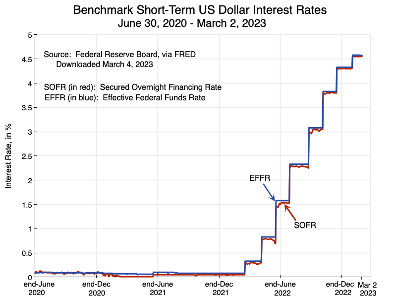 Not surprisingly, the SOFR rate tracks the Federal Funds Rate extremely closely. The Federal Funds Rate is the principal interest rate that the Fed targets, and is the rate the Fed has been raising in steps since March 2022. Prior to that, the rate had been at essentially zero since March 2020 – the month when the Fed cut it sharply at the onset of the Covid crisis.
The quarterly financial statements of the IBRD do not report the average interest rate on loans in the IBRD portfolio. While the audited annual financial statements do provide figures for weighted average interest rates for the portfolio, those appear to be just for a point in time (i.e. June 30).
One can, however, calculate from figures in the quarterly financial statements what the implicit average interest rates on IBRD loans were for each of the quarters. These implicit average interest rates will be the interest paid on loans in the quarter (from the income statement in the financial accounts) divided by average loans outstanding during the quarter (shown in the assets portion of the balance sheet, and where the average during the quarter is estimated based on the outstanding at the end of the preceding quarter and that at the end of the current quarter – which is a more than adequate estimate of the average as the overall loan portfolio changes only slowly from one quarter to the next). The quarterly rate is then annualized. The result is the line in green in this chart:
 This IBRD average interest rate on loans can be compared to the average SOFR rate in the quarter. The SOFR (based on a simple daily average over the period) is the line in red in the chart. The SOFR rate shot up starting from mid-March 2022 as the Fed started to raise interest rates, and the average IBRD loan rate has similarly shot up. The margin between them has been predictable. During the long period when the SOFR rate was essentially zero, the spread between the IBRD average interest rate on loans and the average SOFR rate of the period varied in the narrow range of 0.82% to 0.84%. Prior to that the spread was higher reflecting the fact the IBRD interest rates are calculated based on the SOFR rate in six-month arrears and the Fed had cut interest rates sharply in March 2020. And the spread is now a bit lower (0.70% in the most recent quarter) as interest rates are rising.
As I write this we do not yet have the figures for the January to March quarter of 2023. But the chart does have the SOFR rate through to March 3, and one sees that it has continued to rise. Given the spread, the average IBRD loan rate will certainly be above 5% in this quarter. How far further it will rise cannot be said with any certainty, as it will depend on how far further the Fed will raise interest rates, and the Fed itself does not know how much this will be. It will depend, as the Fed has repeatedly said, on how the data on the economic situation evolves. However, most expect the Fed to raise interest rates at least somewhat further. How long these higher interest rates will then last can also not be predicted with any certainty.
But what was certainly predictable during the period of close to zero interest rates from 2020 to early 2022 was that the close to zero interest rates would not last forever. Longer-term rates were higher, but still at historic lows. Households in the US and elsewhere thus rushed to refinance their home mortgages to lock in the record low rates. But for some reason, IBRD loans being taken out were still almost entirely at a variable rate – tied to short-term benchmark rates. While fixed rate loans taken out in 2020 or 2021 would have carried higher interest rates to start, their relatively low rates compared to what should have been expected later would then have been locked in. A reasonable estimate of what they would have been for IBRD loans would be what the rates were on 10-year US Treasury bonds (the standard indicator taken for long term rates) plus a spread (for the IBRD) of 0.8%. That rate (including the 0.8% spread) would have averaged 2.2% in CY2021 and just 1.6% in the second half of CY2020.
Those interest rates on such fixed rate loans, had they been locked in, would be one-half or less of what is now being paid on the IBRD’s largely variable rate loans. And that ratio is likely to fall further in at least the near term as short-term interest rates are still going higher.
Proposals have been made that IBRD loans to address climate change issues should perhaps be subsidized to bring their interest rates to below what the IBRD charges to cover its costs. While it is not clear who would be funding those subsidies nor how much would be provided, a more fundamental point is whether countries would find such subsidized funds sufficient incentive in themselves to invest in climate change issues. That is not at all clear. If those subsidized funds were sufficient to buy down the interest cost of the loans by half, say, their cost would still be greater than what it would have cost the countries to borrow for such purposes (or any other IBRD supported purpose) just a short time ago. If there was not much of an appeal then, it is not clear why subsidizing the now higher interest rates on such loans would lead to this now.


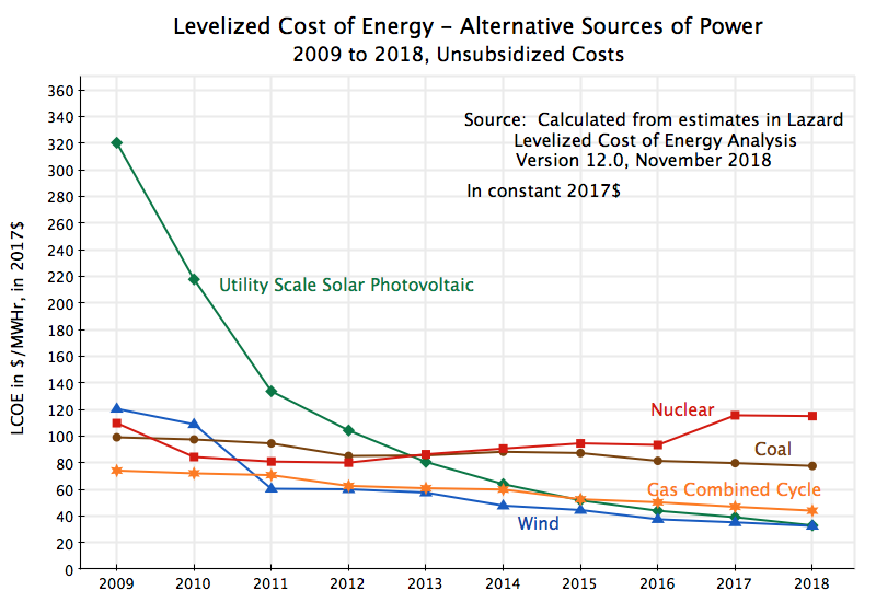
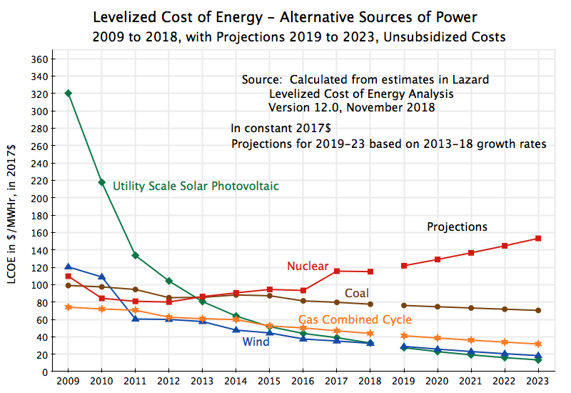

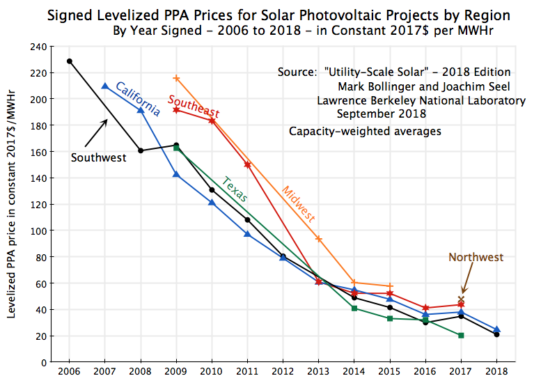


You must be logged in to post a comment.