Trump’s Mismanagement of the Covid-19 Crisis: South Korea Shows What Would Have Been Possible

Source:  David Leonhardt, Newsletter of April 13, 2020, The New York Times

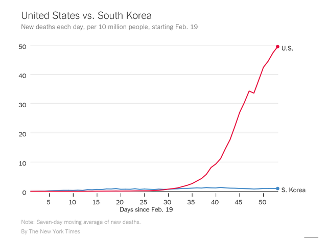
I normally only include charts I have developed myself in this blog, but the chart above, from David Leonhardt of the New York Times, is particularly striking.  It comes from his newsletter of April 13, and shows the daily number of deaths (on a seven-day moving average) per 10 million people, from February 19 to now in the US and in South Korea.

It shows what the US could have achieved had the Trump administration managed this crisis as well as South Korea has.  And one cannot argue that South Korea is a rich country with resources that the US does not have – GDP per capita in the US is double that of South Korea.  Nor is it because of travel bans.  Trump repeatedly asserts that the crisis would have been far greater in the US had he not had the singular wisdom to impose a ban on travel (by non-US citizens) from China on February 2 (and from Europe and other countries later).  But the only travel ban South Korea has imposed has been travel from Hubei Province in China.  And South Korea has far more contact with China, from both business and personal travel and trade in goods, than the US has.  Yet despite this, the deaths from Covid-19 have been far fewer in South Korea than in the US even after scaling for population.

And it is not only South Korea that has demonstrated competence in the management of the Covid-19 virus.  Death rates in other countries of East Asia, all similarly heavily exposed to China, have been even lower than that of South Korea.  In terms of the cumulative number of deaths from Covid-19 since the crisis began (as of April 13), there have been 4 deaths per million of population in South Korea, but just 2 per million in Singapore, 1 per million in Japan, 0.5 per million in Hong Kong, and 0.3 per million in Taiwan.  For the US, in contrast, the total is 71 per million.  (Reminder:  The chart above tracks deaths per day, not the cumulative total, and shows the figures per 10 million of population.)

This also shows that Trump’s repeated assertion that the deaths suffered in the US were inevitable – that nothing more could have been done – is simply nonsense.  Sadly, it is deadly nonsense.  South Korea shows what could have been done.  Travel bans were not important.  Rather, it was the basic public health measures of large-scale testing, identifying those with the virus or who may have been exposed to the virus, quarantining or isolating those exposed (including self-isolating, along with self-monitoring and regular reporting), and then treating in hospitals those who developed severe symptoms.

None of this is new to public health professionals.  And the US has excellent public health professionals.  What was different in the US was Trump, who refused to listen to them and indeed treated many of those in government as enemies to be attacked (as those with expertise were seen as members of the “deep state”).

The US had prepared plans on what to do should an infectious disease such as Covid-19 threaten.  There was, for example, a major effort to develop such plans in 2006/2007, towards the end of the Bush administration.  The work included running exercises similar to war-games of various scenarios (“table-top” exercises), to see how officials would respond and what the likely outcomes then would be.  These plans were further developed during Obama’s two terms in office.  But the Trump administration then ignored this previous preparation, and indeed took pride in dismantling important elements of it.

Dr. James Lawler, now an infectious disease doctor at the University of Nebraska but then serving in the Bush White House, participated in the 2006/2007 task force.  Over the weekend, the New York Times released a trove of over 80 pages of emails (obtained through a Freedom of Information Act request) of late-January to mid-March from Dr. Lawler and other experts, in and out of government, discussing how to address the crisis.  Particularly telling is a March 12 email from Dr. Lawler in which he said:

“We are making every misstep initially made in the table-tops at the outset of pandemic planning in 2006.  We had systematically addressed all of these and had a plan that would work – and has worked in Hong Kong/Singapore.  We have thrown 15 years of institutional learning out the window …”

Throwing those 15 years of institutional learning out the window has had deadly consequences.

The Rapid Growth in Deaths from Covid-19: The Role of Politics

Deaths from Covid-19 have been growing at an extremely rapid rate.  The chart above shows what those rates have been in the month of March, averaged over seven day periods to smooth out day-to-day fluctuations.  The figures are for the daily rate of growth over the seven day period ending on the date indicated.  The curves start in the first period when there were at least 10 cases, which was on March 3 for the US as a whole.  Hence the first growth rate shown is for the one week period of March 3 to 10.  As I will discuss below, the chart has not only the growth rates for the US as a whole but also for the set of states that Trump won in 2016 and for the set that Clinton won.  They show an obvious pattern.

The data come from the set assembled by The New York Times, based on a compilation of state and local reports.  The Times updates these figures daily, and has made them available through the GitHub site.  And it provides a summary report on these figures, with a map, at least daily.

I emphasize that the figures are of daily growth rates, even though they are calculated over one week periods.  And they are huge.  For the US as a whole, that rate was just over 28% a day for the seven day period ending March 30.  It is difficult to get one’s head around such a rapid rate of growth, but a few figures can be illustrative.  In the New York Times database, 3,066 Americans had died of Covid-19 as of March 30.  If the 28% rate of growth were maintained, then the entire population of the US (330 million) would be dead by May 16.  For many reasons, that will not happen.  The entire population would have been infected well before (if there was nothing to limit the spread) and it is fatal for perhaps 1% of those infected.  And the 99% infected who do not die develop an immunity, where once they recover they cannot spread the virus to others.  For this reason as well, 100% of those not previously exposed will not catch the virus.  Rather, it will be some lower share, as the spread becomes less and less likely as an increasing share of the population develops an immunity.  This is also the reason why mass vaccination programs are effective in stopping the spread of a virus (including to those not able to receive a vaccination, such as very young children or those with compromised immune systems).

So that 28% daily rate of growth has to come down, preferably by policy rather than by running out of people to infect.  And there has been a small reduction in the last two days (the seven day periods ending March 29 and March 30), with the rate falling modestly to 28% from a 30% rate that had ruled since the seven day period ending March 22.  But it has much farther to go to get to zero.

The recent modest dip might be an initial sign that the social distancing measures that began to be put in place around parts of the nation by March 16 are having a positive effect (and where many individuals, including myself, started social distancing some time before).  It is believed that it takes about 4 to 7 days after being infected before one shows any symptoms, and then, in those cases where the symptoms are severe and require hospitalization (about 20% of the total), another several days to two weeks before it becomes critical for those where it will prove fatal.  Hence one might be starting to see the impacts of the policies about now.

But the social distancing measures implemented varied widely across the US.  They were strict and early in some locales, and advisory only and relatively late in other locales.  Sadly, Trump injected a political element into this.  Trump belittled the seriousness of Covid-19 until well into March, even calling Covid-19 a “hoax” conjured up by the Democrats while insisting the virus soon would go away.  And even since mid-March Trump has been inconsistent, saying on some days that it needs to be taken seriously and on others that it was not a big deal.  Fox News and radio hosts of the extreme right such as Rush Limbaugh also belittled the seriousness of the virus.

It is therefore understandable that Trump supporters and those who follow such outlets for what they consider the news, have not shown as much of a willingness to implement the social distancing measures that are at this point the only way to reduce the spread of the virus.  And it shows in the death figures.  The red curve in the chart at the top of this post shows the daily growth rates of fatalities from this virus in those states that voted for Trump in the 2016 election.  While the spread of the virus in these states, many of which are relatively rural, started later than in the states that voted for Clinton, their fatalities from the virus have since grown at a substantially faster pace.

The pace of growth in the states that voted for Clinton has also been heavily influenced by the rapid spread of the virus in New York.  As of March 30, more than half (57%) of the fatalities in the Clinton states was due to the fatalities in New York alone.  And New York is a special case.  With its dense population in New York City, where a high proportion use a crowded subway system or buses to commute to work, with the work then often in tall office buildings requiring long rides in what are often crowded elevators, it should not be surprising that a virus that goes person to person could spread rapidly.

Excluding New York, the rate of increase in the other states that voted for Clinton (the curve in green in the chart above) is more modest.  The rates are also then even more substantially lower than those in the Trump-voting states.

But any of these growth rates are still incredibly high, and must be brought down to zero quickly.  That will require clear, sustained, and scientifically sound policy, from the top.  But Trump has not been providing this.

A Very Faint First Sign to be Hopeful on Covid-19: Except Not Yet for the US

Source:  New York Times, “Coronavirus Deaths by U.S. State and Country Over Time:  Daily Tracking”, downloaded March 25, 2020, with deaths reported as of 8:20am on March 25.

As in any epidemic where disease spreads person to person, the number of deaths from the Covid-19 coronavirus has exploded at exponential rates.  An important question is how long it will continue to grow like this.  It cannot continue forever, as one cannot infect more than 100% of the population, and most such diseases are turned around well before that.  But where it will turn around, with a leveling off in the cumulative number of cases, depends not only on the characteristics of the disease (how easily it spreads) but also on policy.  Since there is not yet a vaccine nor a treatment that will always work, the spread of the disease and the number of deaths from it depends on the effectiveness of social distancing measures, so there is less person to person contact and therefore less spread of the virus.  So far, this has been the only effective means to reduce the number of those catching the virus.

And there now appears to be some early evidence that such social distancing measures have helped.  The chart at the top of this post is an excellent graphic prepared by the New York Times, updated daily, which presents on a semi-log scale the cumulative number of deaths from Covid-19 by country, plotted against the number of days since that country’s 25th death.  The Financial Times also presents (and updates daily) a very similar chart, although it presents the results for each country in terms of the number of days since the 10th death.  Both of these news sources are making available this material, and all of their coronovirus coverage, free to anyone, including non-subscribers.  I very much encourage everyone to examine these postings, as there is a good deal of interesting further material (including charts on the number of deaths by national sub-regions, as well as the cumulative number of confirmed cases).  The New York Times charts are also interactive, where they present (for any individual country or region chosen) the rate of growth over the most recent 7 days, i.e. how fast it is growing now.

By presenting the numbers on a semi-log scale (where the vertical axis is logarithmic, while the horizontal axis is in regular linear terms), a path that is a straight line will indicate a constant rate of growth, and the slope of that line will indicate what that rate of growth is (where the steeper the line the higher the rate of growth).  [If you are not familiar with this, review your high school algebra textbook or read through a web post such as this one.]  The faint, gray, straight lines on the chart then show what the total number of deaths would be (for some number of days since the 25th death) if the number of deaths doubled each day, or doubled every 2 days, or doubled every 3 days, or every week, or every month.

There are several interesting findings one can draw from this:

a)  What I found most interesting, and the reason I titled this post as a “First Sign to be Hopeful”, is that for most of the countries (with the US a notable exception), the paths start out quite steep, with doubling times of between every day and every 2 days, but that they then begin to bend over to the right.  That is, they shift over time to a flatter slope, meaning a slowdown in the rate of growth in deaths.  Mainland China, which was hit first, is now (as I write this) at an almost completely flat slope, which means close to a zero rate of growth.  The curve for Italy has also bent over so that it now hits the gray line for doubling every 3 days.  But that does not mean deaths are doubling every 3 days in Italy right now.  Rather, cases were growing at a faster rate in Italy earlier (doubling at about every 2 days at first), and have decelerated to the point where the cumulative number of cases in Italy are now where they would be had they doubled every 3 days throughout.  But the slope now is a good deal less than what it was in the early days.  The New York Times interactive chart indicates that at the pace of the last 7 days, the number of deaths in Italy is now growing at a rate of doubling every 5 days.  And one sees that flattening out in a number of other cases as well, including hard-hit Iran and Spain.

b)  Japan and to a lesser degree South Korea are exceptions in that their recent rates of growth have not fallen.  But both are also exceptions in that their rates of growth, while steady (the path lines are close to straight), have also been a good deal less than that of other countries.  Their doubling times over the last 7 days (as I write this) are both low at 11 days for South Korea and 12 days for Japan.

c)  The US is also a notable exception.  The pace of growth was relatively low for the US for the first 10 days (from when the 25th death was recorded in the US).  Unlike any other country, the pace then accelerated in the US to a doubling time of every 3 days.  Or more precisely, the number of deaths in the US grew from 60 as of day 10 (from when the 25th death was recorded) to 728 deaths on day 19 (March 24).  That is a 32.0% rate of growth per day, or an increase of 2.3 times every 3 days.

Why was the pace of growth relatively modest in the US at first, and then picked up?  That is not clear from these aggregate figures, but might be because the US is a large country, where there have been several centers of outbreak and those centers are relatively distant from each other.  The earliest center was the State of Washington, and the second (and to a more limited degree at first) in California.  Then New York was hit, followed now by major centers in Michigan, Illinois, Florida, Louisiana, and Georgia.  Adding up these varied impacts by locale across the country as a whole (and where doubling times may also vary by locale, especially for New York) may explain the US curve that starts relatively slow, but then accelerates.

Furthermore, with the Trump administration unwilling or unable to provide direction and management at the national level, each state and locality has been left to enact measures on their own and at their own pace.  These have been primarily social distancing measures, but with major differences in how strict they have been structured.  And most of the measures have been enacted reactively, to local cases being confirmed, rather than preemptively.

What is perhaps most disturbing of all for those of us in the US is that there is no indication as yet of the aggregate US curve beginning to bend over to the right.  It has been close to a straight upward line for the last 9 days, growing at a rate of 32% a day.  The only encouraging sign is that the curve for Washington State alone (shown at the New York Times posting) does bend over to the right, similar to what is seen in other countries.  Washington was hit first with the virus, with the initial deaths there, and early on had a doubling time of every 3 days.  But it was then the first state to put in place relatively strict social distancing measures, and the pace of doubling has now dropped to every 9 days (based on deaths over the most recent week).

Overall, the US was late to enacting social distancing measures, with most only put in place over the last week to week and a half.  Their impact on the number of deaths from the virus will then only be seen two or three weeks later, due to the lag from when one catches the virus to when they start to show symptoms (about one week), to when their cases become serious and lead, for some, to death (a further week or two).

Watching whether the US curve starts to bend to the right soon, in the next week or two, will certainly be of interest.