The Revenue and Distributional Impacts of the Senate Republican Tax Plan

A.  Introduction

To truly understand the Republican tax plans now winding their way through Congress, one must look at the specifics of what is being proposed.  And the more closely one looks, the more appalling these plans are seen to be.  The blatant greed is breathtaking.  Despite repeatedly asserting that the plans would provide tax cuts for the middle class, the specific proposals now before Congress would in fact do the opposite.  Figures will be provided below.  And while the Secretary of the Treasury has repeatedly stated that only millionaires will pay more in taxes, the specific proposals now before Congress would in fact give millionaires huge cuts in the taxes they owe.

While provisions in the plans are changing daily, with certain differences between the versions being considered in the House and in the Senate as well as between these and what the White House set out in late September, the overall framework has remained the same (as the proponents themselves are emphasizing).  And this really is a Republican plan.  The House version was passed on a largely party-line vote with no Democrats in favor and only a small number of Republicans opposed, and the Senate version will require (assuming all Democrats vote against as they have been shut out of the process) 50 of the 52 Republican Senators (96%) to vote in favor.  The Republican leadership could have chosen to work with Democrats to develop a proposal that could receive at least some Democratic support, but decided not to.  Indeed, while their plans have been developed by a small group since Trump assumed the presidency in January, the specifics were kept secret as long as possible.  This made it impossible (deliberately) for there to be any independent analysis.  They are now trying to rush this through the House and the Senate, with votes taken as quickly as possible before the public (and the legislators themselves) can assess what is being voted upon.  The committees responsible for the legislation have not even held any hearings with independent experts.  And the Congressional Budget Office has said it will be unable to produce the analysis of the impacts normally required for such legislation, due to the compression of the schedule.

Fortunately, the staff of the Joint Committee on Taxation (JCT, a joint committee of both the House and the Senate) have been able to provide limited assessments of the legislation, focused on the budgetary and distributional impacts, as they are minimally required to do.  This blog post will use their most recent analysis (as I write this) of the current version of the Senate bill to look at who would be gaining and who would be losing, if this plan is approved.

As a first step, however, it would be good to address the claim that these Republican tax plans will spur such a jump in economic growth that they will pay for themselves.  This will not happen.  First, as earlier posts on this blog have discussed, there is no evidence from the historical data to support this.  Taxes, both on individuals and at the corporate level, have been cut sharply in the US since Reagan was president, and they have not led to higher growth.   All they did was add to the deficit.  Nor does one see this in the long-term data.  The highest individual income tax rates were at 91 or 92% (at just the federal level) between 1951 and 1963, and at 70% or more up until 1980.  The highest corporate income tax rate was 52% between 1952 and 1963, and then 46% or more up until 1986.  Yet the economy performed better in these decades than it has since.  The White House is also claiming that the proposed cut in corporate income taxes will lead to a rise in real wages of $4,000 to $9,000.  But there is no evidence in the historical data to support such a claim, which many economists have rejected as just absurd.  Corporate income tax rates were cut sharply in 1986, under Reagan, but real wages did not then rise – they in fact fell.

Finally, the assertion that tax cuts will lead to a large jump in growth ignores that the economy is already at full employment.  Were there to be an incipient rise in growth, leading to employment gains, the Federal Reserve Board would have to raise interest rates to keep the economy from over-heating.  The higher interest rates would deter investment, and one would instead have a shift in shares of GDP away from investment and towards consumption and/or government spending.

Any impact on growth would thus be modest at best.  The Tax Policy Center, using generous assumptions, estimated the tax plan might increase GDP by a total of 0.3% in 2027 and by 0.2% in 2037 over what it would otherwise then be.  An increase of 0.2% over 20 years means an increase in the rate of growth of an average of just 0.01% a year.  GDP figures are not even measured to that precision.

There would, however, be large distributional effects, with some groups gaining and some losing simply from the tax changes alone (and ignoring, for the purposes here, the further effects from a higher government debt plus increased pressures to cut back on government programs).  This blog post will discuss these, from calculations that draw on the JCT estimates of the revenue and distributional impacts.

B.  Revenue Impacts by Separate Tax Programs

The distributional consequences of the proposed changes in tax law depend on which separate taxes are to be cut or increased, what changes are made to arrive at what is considered “taxable income” (deductions, exemptions, etc.), and how those various taxes impact different individuals differently.  Thus one should first look at the changes proposed for the various taxes, and what impacts they will have on revenues collected.

The JCT provides such estimates, at a rather detailed level as well as year by year to FY2027.  The JCT estimates for the tax plan being considered in the Senate as of November 16 is available here.  Estimates are provided of the impacts of over 144 individual changes, for both income taxes on individuals and on various types of business (corporate and other).  A verbal description from the JCT of the Senate chair’s initial proposal is available here, and a description of the most recent changes in the proposal (as of November 14) is available here.  I would encourage everyone to look at the JCT estimates to get a sense of what is being proposed.  It is far more than what one commonly sees in the press, with many changes (individually often small in terms of revenue impact) that can only be viewed as catering to various special interests.

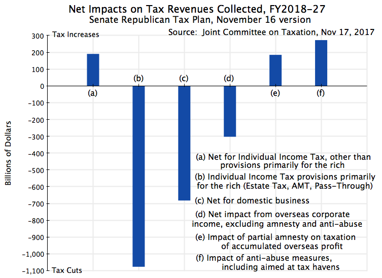
I then aggregated the JCT individual line estimates of the revenue impacts over FY18-27 to a limited set of broad categories to arrive at the figures shown in the chart at the top of this post, and (in a bit more detail) in the following table,:

Revenue Impact of Tax Plan ($billions)

FY18-27

A)  Individual excl. Estate, AMT, & Pass-Through:

  1)  Cuts

-$2,497

  2)  Increases 

 $2,688

     Net, excl. Estate, AMT, & Pass-Through  

    $191

B)  Primarily Applicable to the Rich:

  1)  Increase Estate Tax Exemption

     -$83

  2)  End Alternative Minimum Tax

   -$769

  3)  Tax Pass-Through Income at Lower Rates

   -$225

     Total for Provisions Primarily for Rich

-$1,077

C)  Business – Domestic Income:

  1)  Cut Tax Rate 35% to 20%, and End AMT 

-$1,370

  2)  Other Tax Cuts

   -$139

  3)  Tax Increases

    $826

     Net for Domestic Business

   -$682

D)  Business – Overseas Income:

  1)  End Taxation of Overseas Profit

  -$314

  2)  Other Tax Cuts

    -$21

  3)  Tax Increases (except below)

     $32

     Net for Overseas, excl. amnesty & anti-abuse 

  -$303

  4)  Partial Amnesty on Overseas Profit

    $185

  5)  Anti-abuse, incl. in Tax Havens

    $273

     Overall Totals

-$1,414

Source:  Calculated from estimated tax revenue effects made by the staff of the Joint Committee on Taxation, publication JCX-59-17, November 17, 2017, of the November 16 version of the Republican Chairman’s proposed tax legislation.

a)  Individual Income Taxes

As the chart and table show, while overall tax revenues would fall by an estimated $1.4 trillion over FY18-27 (excluding interest on the resulting higher public debt), not everyone would be getting a cut.  Proposed changes that would primarily benefit rich individuals (doubling the Estate Tax exemption amount to $22 million for a married couple, repealing the Alternative Minimum Tax in full, and taxing pass-through business income at lower rates than other income) would reduce the taxes the rich owe under these provisions by close to $1.1 trillion.  But individual income taxes excluding these three categories would in fact increase, by an estimated $191 billion over the ten years.

This increase of $191 billion in income taxes that most affect the middle and lower income classes, is not a consequence of an explicit proposal to raise their taxes.  That would be too embarrassing.  Rather, it is the net result of numerous individual measures, some of which would reduce tax liability (and which the politicians then emphasize) while others would increase tax liabilities (and are less discussed).  Cuts totaling $2.5 trillion would come primarily from reducing tax rates, from what they refer to as a “doubling” of the standard deduction (in fact it would be an increase of 89% over the 2017 level), and from increased child credits.  But there would also be increases totaling close to $2.7 trillion, primarily from eliminating the personal exemption, from the repeal of or limitation on a number of deductions one can itemize, and from changes that would effectively reduce enrollment in the health insurance market.

Part of the reason for this net tax increase over the full ten years is the decision to try to hide the full cost of the tax plan by making most of the individual income tax provisions (although not the key changes proposed for corporate taxes) formally temporary.  Most would expire at the end of 2025.  The Republican leadership advocating this say that they expect Congress later to make these permanent.  But if so, then the true cost of the plan would be well more than the $1.5 trillion ceiling they have set under the long-term budget plan they pushed through Congress in September.  Furthermore, it makes only a small difference if one calculates the impact over the first five years of the plan (FY18-22).  There would then be a small net reduction in these individual income taxes (excluding Estate Tax, AMT, and Pass-Through) of just $57 billion.  This is not large over a five year period – just 0.6% of individual income taxes expected to be generated over that period.  Over this same period, the cuts in the Estate Tax, the AMT, and for Pass-Through income would total $535 billion, or well over nine times as much.

One should also keep in mind that these figures are for overall amounts collected, and that the impact on individuals will vary widely.  This is especially so when the net effect (an increase of close to $200 billion in the individual income taxes generated) is equal to the relatively small difference between the tax increases ($2.7 trillion in total) and tax cuts ($2.5 trillion).  Depending on their individual circumstances, many individuals will be paying far more, and others far less.  For example, much stress has been put on the “doubling” of the standard deduction.  However, personal exemptions would also be eliminated, and in a household of just three, the loss of the personal exemptions ($4,050 per person in 2017) would more than offset the increase in the standard deduction (from $12,700 to a new level of $24,000).  The change in what is allowed for the separate child credits will also matter, but many households will not qualify for the special child credits.  And if one is in a household which itemizes their deductions, both before and after the changes and for whatever reason (such as for high medical expenses), the “doubling” of the standard deduction is not even relevant, while the elimination of the personal exemptions is.

Taxes relevant to the rich would be slashed, however.  Only estates valued at almost $22 million or more in 2017 (for a married couple after some standard legal measures have been taken, and half that for a single person) are currently subject to the Estate Tax, and these account for less than 0.2% of all estates.  The poorer 99.8% do not need to worry about this tax.  But the Senate Republican plan would narrow the estates subject to tax even further, by doubling the exemption amount.  The Alternative Minimum Tax (AMT) is also a tax that only applies to relatively well-off households.  It would be eliminated altogether.

And pass-through income going to individuals is currently taxed at the same rates as ordinary income (such as on wages), at a rate of up to 39.6%.  The current proposal (as of November 16) is to provide a special deduction for such income equal to 17.4%.  This would in effect reduce the tax rate applicable to such income from, for example, 35% if it were regular income such as wages (the bracket when earnings are between $400,000 and $1.0 million in the current version of the plan) to just 28.9%.  Pass-through income is income distributed from sole proprietorships, partnerships, and certain corporations (known as sub-chapter S corporations, by the section in the tax code).  Entities may choose to organize themselves in this way in order to avoid corporate income tax.  Those receiving such income are generally rich:  It is estimated that 70% of such pass-through income in the US goes to the top 1% of earners.  Such individuals may include, for example, the partners in many financial investment firms, lawyers and accountants, other professionals, as well as real estate entities. There are many revealing examples.  According to a letter from Trump’s own tax lawyers, Trump receives most of his income from more than 500 such entities.  And Jeff Bezos, now the richest person in the world, owns the Washington Post through such an entity (although here the question might be whether there is any income to be passed through).

The JCT estimates are that $83 billion in revenue would be lost if the Estate Tax exemption is doubled, $769 billion would be lost due to a repeal of the AMT, and $225 billion would be lost as a result of the special 17.4% deduction for pass-through income.  This sums to $1,077 billion over the ten years.

Rich individuals thus will benefit greatly from the proposed changes.  Taxes relevant just to them will be cut sharply.  These taxes are of no relevance to the vast majority of Americans.  With the proposal as it now stands, most Americans would instead end up paying more over the ten year period.  And even if all the provisions with expiration dates (mostly in 2025) were instead extended for the full period, the difference would be small, with at best a minor cut on average.  It would not come close to approaching the huge cuts the rich would enjoy.

b)  Taxes on Income of Corporations and Other Businesses

The proposed changes in taxes on business incomes are more numerous.  They would also in general be made permanent (with some exceptions), rather than expire early as would be the case for most of the individual income tax provisions.  There are also numerous special provisions, with no obvious explanation, which appear to be there purely to benefit certain special interests.

To start, the net impact on domestic business activities would be a cut of an estimated $682 billion over the ten year period.  The lower tax revenues result from cutting the tax rate on corporate profits from 35% to 20%, plus from the repeal of the corporate AMT.  The cuts would total $1,370 billion.  This would be partially offset by reducing or eliminating various deductions and other measures companies can take to reduce their taxable income (generating an estimated $826 billion over the period).

However, there would also be measures that would cut business taxes even further (by an estimated $139 billion) on top of the impact from the lower tax rates (and elimination of the AMT).  Most, although not all, of these would be a consequence of allowing full expensing, or accelerated depreciation in some cases, of investments being made (with such full expensing expiring, in most cases, in 2022).  The objective would be to promote investment further.  This is reasonable, but with full expensing of investments many question whether anything further is gained, in terms of investment expenses, from cutting the corporate rate to 20%.

Special provisions include measures for the craft beer industry, which would reduce tax revenues by $4.2 billion.  The rationale behind this is not fully clear, and it would expire in just two years, at the end of 2019.  The measures should be made permanent if they are in fact warranted, but their early expiration suggests that they are not.  Also odd is a provision to allow the film, TV, and theater industries to fully expense certain of their expenses.  But this provision would expire in 2022.  If warranted, it should be permanent.  If not, it should probably not be there at all.

There are a large number of such special provisions.  Individually, their tax impact is small.  Even together the impact is not large compared to the other measures being proposed.  They mostly look like gifts to well-connected interests.

Others lose out.  These include provisions that allow companies to include as a cost certain employee benefits, such as for transportation, for certain employee meals (probably those provided in remote locations), and for some retirement savings provisions.  Workers would likely lose from this.  The proposal would also introduce new taxes on universities and other non-profits, including taxes on certain endowment income and on salaries of certain senior university officials (beyond what they already pay individually).  The revenues raised would be tiny, and this looks more like a punitive measure aimed at universities than something justified as a “reform”.

There would also be major changes in the taxes due on corporate profits earned abroad.  Most importantly, US taxes would no longer be due on such activities.  While this would cost in taxes a not small $314 billion (or $303 billion after a number of more minor cuts and increases are accounted for) over the ten years, also significant is the incentive this would create to relocate plants and other corporate activities to some foreign location where local taxes are low.  There would be a strong incentive, for example, to relocate a plant to Mexico, say, if Mexico offered only a low tax on profits generated by that plant.  The same plant in the US would pay corporate income taxes at the (proposed) 20% rate.  How this incentive to relocate plant abroad could possibly be seen as a positive by politicians who say they favor domestic jobs is beyond me.  It appears to be purely a response to special interests.

The corporate tax cuts are then in part offset by a proposal to provide a partial amnesty on the accumulated profits now held overseas by US companies.  Certain assets held overseas as retained earnings would be taxed at 5% and certain others at 10%.  Under current US law, corporate profits earned overseas are only subject to US taxes (at the 35% rate currently, net of taxes already paid abroad in the countries where they operate) when those profits are repatriated to the US.  As long as they are held overseas, they are not taxed by the US.  An earlier partial amnesty on such profits, in 2004 during the Bush administration, led to the not unreasonable expectation that there would again be a partial amnesty on such taxes otherwise due when Republicans once again controlled congress and the presidency.  This created a strong incentive to hold accumulated retained earnings overseas for as long as possible, and that is exactly what happened.  Profits repatriated following the 2004 law were taxed at a rate of just 5.25%.

The result is that US companies now hold abroad at least $2.6 trillion in earnings.  And this $2.6 trillion estimate, commonly cited, is certainly an underestimate.  It was calculated based on a review of the corporate financial disclosures of 322 of the Fortune 500 companies, for the 322 such companies where disclosures permitted an estimate to be made.  Based also on the deductible foreign taxes that had been paid on such overseas retained earnings, the authors conservatively estimate that $767 billion in corporate income taxes would be due on the retained earnings held overseas by the 322 companies.  But clearly it would be far higher, as the 322 companies, while among the larger US companies, are only a sub-set of all US companies with earnings held abroad.

Thus to count the $185 billion (line D.4. in the table above) as a revenue-raising measure is a bit misleading.  It is true that compared to doing nothing, where one would leave in place current US tax law which allows taxes on overseas profits to be avoided until repatriated, revenues would be raised under the partial amnesty if those accumulated overseas earnings are now taxed at 5 or 10%.  But the partial amnesty also means that one will give up forever the taxes that would otherwise be due on the more than $2.6 trillion in earnings held overseas.  Relative to that scenario, the amnesty would lead to a $582 billion loss in revenues (equal to an estimated $767 billion loss minus a gain of $185 billion from the 5 and 10% special rates of the amnesty; in fact the losses would be far greater as the $767 billion figure is just for the 322 companies which publish data on what they are holding abroad).  This is, of course, a hypothetical, as it would require a change in law from what it is now.  But it does give a sense of what is being potentially lost in revenues by providing such a partial amnesty.

But even aside from this, one must also recognize that the estimated $185 billion gain in revenues over the next few years would be a one time gain.  Once the amnesty is given, one has agreed to forego the tax revenues that would otherwise be due.  It would help in reducing the cost of this tax plan over the next several years, but it would then lead to losses in taxes later.

Finally, as is common among such tax plans, there is a promise to crack down on abuses, including in this case the use of tax havens to avoid corporate taxes.  The estimate is that such actions and changes in law would raise $273 billion over the next ten years.  But based on past experience, one must look at such estimates skeptically.  The actual amounts raised have normally been far less.  And one should expect that in particular now, given the underfunding of the IRS enforcement budget of recent years.

C.  Distributional Impacts

The above examined what is being proposed for separate portions of the US tax system.  These then translate into impacts on individuals by income level depending on how important those separate portions of the tax system are to those in each income group.  While such estimates are based on highly detailed data drawn from millions of tax returns, there is still a good deal of modeling work that needs to be done, for example, to translate impacts on corporate taxes into what this means for individuals who receive income (dividends and capital gains) from their corporate ownership.

The Tax Policy Center, an independent non-profit, provides such estimates, and their estimate of the impacts of the Republican tax plans (in this case the November 3 House version) has been discussed previously on this blog.  The JCT also provides such estimates, using a fundamentally similar model in structure (but different in the particulars).

Based on the November 15 version of the Senate Republican plan, the JCT estimated that the impacts on households (taxpayer units) would be as follows:

Overall Change in Taxes Due per Taxpayer Unit

Income Category

2019

2021

2023

2025

2027

Less than $10,000

-$21

-$5

$9

$11

$18

$10 to $20,000

-$49

$136

$180

$180

$307

$20 to $30,000

-$87

$138

$144

$170

$355

$30 to $40,000

-$288

-$97

-$16

-$10

$284

$40 to $50,000

-$496

-$275

-$197

-$187

$283

$50 to $75,000

-$818

-$713

-$607

-$610

$139

$75 to 100,000

-$1,204

-$1,150

-$962

-$994

-$38

$100 to $200,000

-$2,091

-$2,027

-$1,622

-$1,657

-$118

$200 to $500,000

-$6,488

-$6,319

-$5,176

-$5,510

-$462

$500 to $1,000,000

-$21,581

-$20,241

-$15,611

-$16,417

-$1,495

Over $1,000,000

-$58,864

-$48,175

-$21,448

-$25,111

-$8,871

Total – All Taxpayers

-$1,357

-$1,200

-$901

-$950

$57

Source:  Calculated from estimates of tax revenue distribution effects made by the staff of the Joint Committee on Taxation, publication JCX-58-17, November 16, 2017, of the November 15 version of the Republican Chairman’s proposed tax legislation.

By these estimates, each income group would, on average, enjoy at least some cut in taxes in 2019.  A number of the proposed tax measures are front-loaded, and it is likely that this structure is seen as beneficial by those seeking re-election in 2020.  But the cuts in 2019 vary from tiny ($21 for those earning $10,000 or less, and $49 for those earning $10,000 to $20,000), to huge ($21,581 for those earning $500,000 to $1,000,000, and $58,864 for those earning over $1,000,000).  However, from 2021 onwards, taxes due would actually rise for most of those earning $40,000 or less (or be cut by minor amounts).  And this is already true well before the assumed termination of many of the individual income tax measures in 2025.  With the plan as it now stands, in 2027 all those earning less than $75,000 would end up paying more in taxes (on average) under this supposed “middle-class tax cut” than they would if the law were left unchanged.

The benefits to those earning over $500,000 would, however, remain large, although also declining over time.

D.  Conclusion

The tax plan now going through Congress would provide very large cuts for the rich.  One can see this in the specific tax measures being proposed (with huge cuts in the portions of the tax system of most importance to the rich) and also in the direct estimates of the impacts by income group.  There are in addition numerous measures in the tax plan of interest to narrow groups, that are difficult to rationalize other than that they reflect what politically influential groups want.

The program, if adopted, would lead to a significantly less progressive tax system, and to a more complex one.  There would be a new category of income (pass-through income) receiving a special low tax rate, and hence new incentives for those who are well off to re-organize their compensation system when they can so that the incomes they receive would count as pass-through incomes.  While the law might try to set limits on these, past experience suggests that clever lawyers will soon find ways around such limits.

There are also results one would think most politicians would not advocate, such as the incentive to relocate corporate factories and activities to overseas.  They clearly do not understand the implications of what they have been and will be voting on.  This is not surprising, given the decision to try to rush this through before a full analysis and debate will be possible.  There have even been no hearings with independent experts at any of the committees.  And there is the blatant misrepresentation, such as that this is a “middle-class tax cut”, and that “taxes on millionaires will not be cut”.

If this is passed by Congress, in this way, there will hopefully be political consequences for those who chose nonetheless to vote for it.

How Fast Can GDP Grow?: Not as Fast as Trump Says

A.  Introduction

A debate now underway between the Trump Administration and others is on the question of how fast the economy can and will grow.  Trump claimed during the presidential campaign that if elected, he would get the economy to grow at a sustained rate of 5% or even 6%.  Since then the claim has been scaled back, to a 4% rate over the next decade according to the White House website (at least claimed on that website as I am writing this).  And an even more modest rate of growth of 3% for GDP (to be reached in 2020, and sustained thereafter) was forecast in the budget OMB submitted to Congress in May of this year.

But many economists question whether even a 3% growth rate for a sustained period is realistic, as would I.  One needs to look at this systematically, and this post will describe one way economists would address this critically important question.  It is not simply a matter of pulling some number out of the air (where the various figures presented by Trump and his administration, varying between 6% growth and 3%, suggests that that may not be far removed from what they did).

One way to approach this is to recognize the simple identity:  GDP will equal GDP per worker employed times the number of workers employed.  Over time, growth in the number of workers who can be employed will be equal to the growth in the labor force, and we have a pretty good forecast for that will be from demographic projections.  The other element will then depend on growth in how much GDP is produced per worker employed.  This is the growth in productivity, and while more difficult to forecast, we have historical numbers which can provide a sense for what its growth might be, at best, going forward.  The chart at the top of this post shows what it has been since 1947, and will be discussed in detail below.  Forecasts that productivity will now start to grow at rates that are historically unprecedented need to be viewed with suspicion.  Miracles rarely happen.

I should also be clear that the question being examined is the maximum rate at which one can expect GDP to grow.  That is, we are looking at growth in what economists call capacity GDP.  Capacity GDP is what could be produced in the economy with all resources, in particular labor, being fully utilized.  This is the full employment level of GDP, and the economy has been at or close to full employment since around 2015.  Actual GDP can be less than capacity GDP when the economy is operating at less than full employment.  But it cannot be more.  Thus the question being examined is how fast the economy could grow, at most, for a sustained period going forward, not how fast it actually will grow.  With mismanagement, such as what was seen in the government oversight of the financial markets (or, more accurately, the lack of such oversight) prior to the financial and economic collapse that began in 2008 in the final year of the Bush administration, the economy could go into a recession and actual GDP will fall below capacity GDP.  But we will give Trump the benefit of the doubt and look at how fast capacity GDP could grow at, assuming the economy can and will remain at full employment.

We will start with a look at what is expected for growth in the labor force and hence in the number of workers who can be employed.  That is relatively straightforward, and the answer is not to expect much possible growth in GDP from this source.  We will then look at productivity growth:  what it has been in the past and whether it could grow at anything close to what is implicit in the Trump administration forecasts.  Predicting what that actual rate of productivity growth might be is beyond the scope of this blog post.  Rather, we will be looking at it whether it can grow as fast as is implied by the Trump forecasts.  The answer is no.

B.  Growth in the Labor Force 

Every two years, the Bureau of Labor Statistics provides a detailed ten-year forecast of what it estimates the US labor force will be.  The most recent such forecast was published in December 2015 and provided its forecast for 2024 (along with historical figures up to 2014).  The basic story is that while the labor force is continuing to grow in the US, it is growing at an ever decreasing rate as the population is aging, the baby boom generation is entering into retirement, and decades ago birth rates fell.  The total labor force grew at a 1.2% annual rate between 1994 and 2004, at a 0.6% rate between 2004 and 2014, and is forecast by the BLS to grow at a 0.5% rate between 2014 and 2024.

But it is now 2017.  With a decelerating rate of growth, a growth rate in the latter part of a period will be less than in the early part of a period.  Taking account of where the labor force is now, growth going forward to 2024 will only be 0.3% (with these figures calculated based on the full numbers before round-off).  This is not much.

A plot of the US civilian labor force going back to 1948 puts this in perspective:

The labor force will be higher in 2024 than it is now, but not by much.  The labor force grew at a relatively high rate from the 1950s to the 1970s (of a bit over 2% a year), but then started to level off.  As it did, it continued to grow but at an ever slower rate.  There was also a dip after the economic collapse of 2008/09, but then recovered to its previous path.  When unemployment is high, some workers drop out of the labor force for a period. But we are now back to what the path before would have predicted.  If the BLS forecasts are correct, growth in the labor force will continue, but at a rate of just 0.3% from where it is now to 2024, to the point shown in red on the chart.  And this is basically a continuation of the path followed over the last few decades.

One should in particular not expect the labor force to get back to the rapid growth rate (of over 2% a year) the US had from the 1950s to the 1970s.  This would require measures such as that immigration be allowed to increase dramatically (which does not appear to enjoy much support in the Trump administration), or that grandma and grandpa be forced back into the labor force in their 70s and 80s rather than enjoy their retirement years (where it is not at all clear how this would “make America great again”).

I have spoken so far on the figures for the labor force, since that is what the BLS and others can forecast based largely on demographics.  Civilian employment will then be some share of this, with the difference equal to the number of unemployed.  That curve is also shown, in blue, in the chart.  There will always be some unemployment, and in an economic downturn the rate will shoot up.  But even in conditions considered to be “full employment” there will be some number of workers unemployed for various reasons. While economists cannot say exactly what the “full employment rate of unemployment” will be (it will vary over time, and will also depend on various factors depending on the make-up of the labor force), it is now generally taken to be in the range of a 4 to 5% unemployment rate.

The current rate of unemployment is 4.4%.  It is doubtful it will be much lower than this in the future (at least not for any sustained period).  Hence if the economy is at full employment in 2024, with unemployment at a similar rate to what it is now, the rate of growth of total employment from now to 2024 will be the same as the rate of growth of the labor from now to then.  That is, if unemployment is a similar share of the total labor force in 2024 as it is now, the rates of growth of the labor force and of total employment will match.  And that rate of growth is 0.3% a year.

This rate of growth in what employment can be going forward (at 0.3%) is well below what it was before.  Total employment grew at an annual rate of 2.1% over the 20 years between 1947 and 1967, and a slightly higher 2.2% between 1967 and 1987.  With total employment able to grow only at 1.8 or 1.9% points per annum less than what was seen between 1947 and 1987, total GDP growth (for any given rate of productivity growth) will be 1.8 or 1.9% points less.  This is not a small difference.

C.  Growth in Productivity 

Growth in productivity (how much GDP is produced per worker employed) is then the other half of the equation.  What it will be going forward is hard to predict; economists have never been very good at this.  But one can get a sense of what is plausible based on the historical record.

The chart below is the same as the one at the top of this post, but with the growth rates over 20 year periods from 1947 (10 years from 2007) also shown:

These 20 year periods broadly coincide with the pattern often noted for the post-World War II period for the US:  Relatively high growth (2.0% per year) from the late 1940s to the late 1960s; a slowdown from then to the mid 1980s (to 0.9%); a return to more rapid growth in productivity in the 1990s / early 2000s, although not to as high as in the 1950s and 60s (1.5% for 1987 to 2007); and then, after the economic collapse of 2008/2009, only a very modest growth (0.8% for 2007 to 2017, but much less from 2010 onwards).

Note also that these break points all coincide, with one exception (1987), with years where the economy was operating at full employment.  In the one exception (1987, near the end of the Reagan administration) unemployment was still relatively high at 6.6%.  While one might expect productivity levels to reach a local peak when the economy is at or close to full employment, that is not always true (the relationship is complex), and is in any case controlled for here by the fact the break points coincide (with the one exception) with full employment years.

Another way to look at this is productivity growth as a rolling average, for example over continuous 10 year periods:


Productivity, averaged over 10 year periods, grew at around 2% a year from the late 1940s up to the late 1960s.  It then started to fall, bottoming out at roughly 0.5% in the 1970s, before reverting to a higher pace.  It reached 2% again in the 10 year period of 1995 to 2005, but only for a short period before starting to fall again.  And as noted before, it fell to 0.8% for the 2007 to 2017 period.

What productivity growth going forward could at most be will be discussed below, but first it is useful to summarize what we have seen so far, putting employment growth and productivity growth together:

Growth Rates

Employment

GDP per worker

GDP

1947-1967

2.1%

2.0%

4.1%

1967-1987

2.2%

0.9%

3.1%

1987-2007

1.6%

1.5%

3.1%

2007-2017

0.6%

0.8%

1.4%

Employment grew at over 2% a year between the late 1940s and 1987.  This was the period of the post-war recovery and baby boom generation coming of working age.  With GDP per worker growing at 2.0% a year between 1947 and 1967, total GDP grew at a 4.1% rate.  It still grew at a 3.1% rate between 1967 and 1987 despite productivity growth slowing to just 0.9%, as the labor force continued to grow rapidly over this period.  And total GDP continued to grow at a 3.1% rate between 1987 and 2007 despite slower employment (and labor force) growth, as a recovery in productivity growth (to a 1.5% pace) offset the slower availability of labor.

It might, at first glance, appear from this that a return to 3% GDP growth (or even 4%) is quite doable.  But it is not.  Employment growth fell to a pace of just 0.6% between 2007 and 2017 (and the unemployment rates were almost exactly the same in early 2007, at 4.5%, and now, at 4.4%, so this matched labor force growth).  Going forward, as discussed above, the labor force is forecast to grow at a 0.3% pace between now and 2024.  To get to a 3% GDP growth rate now at such a pace of labor growth, one would need productivity to grow at a 2.7% pace.  To get a 4% GDP growth, productivity would have to grow at a 3.7% pace.  But productivity growth in the US since 1947 has never been able to get much above a 2% pace for any sustained period.  To go well beyond this would be unprecedented.

D.  Why Does This Matter?  And What Can Be Achieved?

Some readers might wonder why all this matters.  On the surface, the difference between growth at a 2% rate or 3% rate may not seem like much.  But it is, as some simple arithmetic illustrates:

  Alternative Growth Scenarios

 Growth Rates:

GDP 

Population

GDP per capita

Cumulative

Over 30 years

1.0%

0.8%

0.2%

6%

2.0%

0.8%

1.2%

43%

3.0%

0.8%

2.2%

91%

4.0%

0.8%

3.2%

155%

This table works out the implications of varying rates of hypothetical GDP growth, between 1.0% and 4.0%.  Population growth in the US is forecast by the Census Bureau at 0.8% a year (for the period to the 2020s).  It is higher than the forecast pace of labor force growth (of 0.3% in the BLS figures) primarily because of the aging of the population, so a higher and higher share of the adult population is entering their retirement years.

The result is that GDP growth at 1.0% a year will be just 0.2% a year in per capita terms with a 0.8% population growth rate.  After 30 years (roughly one generation) this will cumulate to a total growth in per capita income of just 6%.  But GDP growth at 2% a year will, by the same calculation, cumulate to total per capita income growth of 43%, to 91% with GDP growth of 3%, and to 155% with GDP growth of 4%.  These differences are huge.  What might appear to be small differences in GDP growth rates add up over time to a lot.  It does matter.

[Note that this does not address the distribution issue.  Overall GDP per capita may grow, as it has over the last several decades, but all or almost all may go only to a few.  As a post on this blog from 2015 showed, only the top 10% of the income distribution saw any real income growth at all between 1980 and 2014 – real incomes per household fell for the bottom 90%.  And the top 1%, or richer, did very well.

But total GDP growth is still critically important, as it provides the resources which can be distributed to people to provide higher standards of living.  The problem in the US is that policies followed since 1980, when Ronald Reagan was first elected, have led to the overwhelming share of the growth the US has achieved to go to the already well off. Measures to address this critically important, but separate, issue have been discussed in several earlier posts on this blog, including here and here.]

Looking forward, what pace of productivity growth might be expected?  As discussed above, while the US was able to achieve productivity growth at a rate of about 2.0% in the 1950s and 1960s, since then it was able to achieve a rate as high as this over a ten year period only once (between 1995 and 2005), and only very briefly.  And over time, there is some evidence that reaching the rates of productivity growth enjoyed in the past is becoming increasingly difficult.

A reason for this is the changing structure of the economy.  Productivity growth has been, and continues to be, relatively high in manufacturing and especially in agriculture. Mechanization and new technologies (including biological technologies) can raise productivity in manufacturing and in agriculture.  It is more difficult to do this in services, which are often labor intensive and personal.  And with agriculture and manufacturing a higher share of the economy in the past than they are now (precisely because their higher rates of productivity growth allowed more to be produced with fewer workers), the overall pace of productivity growth in the economy will move, over time, towards the slower rate found in services.

The following table illustrates this.  The figures are taken from an earlier blog post, which looked at the changing shares of the economy resulting from differential rates of productivity growth.

Productivity Growth

Agriculture

Manufacturing

Services

Overall (calculated)

1947 to 2015:

3.3%

2.8%

0.9%

1.4%

At GDP Shares of:

   – 1947 shares

8.0%

27.7%

64.3%

1.7%

   – 1980 shares

2.2%

23.6%

74.2%

1.4%

   – 2015 shares

1.0%

13.9%

85.2%

1.2%

The top line (with the figures in bold) shows the overall rates of productivity growth between 1947 and 2015 in agriculture (3.3%), manufacturing (2.8%), services (0.9%), and overall (1.4%).  The overall is for GDP, and matches the average for growth in GDP per employed worker between 1947 and 2017 in the chart shown at the top of this post.

The remaining lines on the table show what the pace of overall productivity growth would then have been, hypothetically, at these same rates of productivity growth by sector but with the sector shares in GDP what they were in 1947, or in 1980, or in 2015.  In 1947, with the sector shares of agriculture and manufacturing higher than what they were later, and services correspondingly lower, the pace of productivity growth overall (i.e. for GDP) would have been 1.7%.  But at the sector shares of 2015, with services now accounting for 85% of the economy, the overall rate of productivity growth would have been just 1.2%, or 0.5% lower.

This is just an illustrative calculation, and shows the effects of solely the shifts in sector shares with the rates of productivity growth in the individual sectors left unchanged.  But those individual sector rates could also change over time, and did.  Briefly (see the earlier blog post for a discussion), the rate of productivity growth in services decelerated sharply after the mid-1960s; the pace in agriculture was remarkably steady; while the pace in manufacturing accelerated after the early 1980s (explaining, to a large extent, the sharp fall in the manufacturing share of the economy from 24% in 1980 to just 14% in 2015).  But with services dominating the economy (74% in 1980, rising to 85% in 2015), it was the pace of productivity growth in services, and its pattern over time, which dominated.

What can be expected going forward?  The issue is a huge one, and goes far beyond what is intended for this post.  But especially given the headwinds created by the structural transformation in the economy of the past 70 years towards a dominance by the services sector, it is unlikely that the economy will soon again reach a pace of 2% productivity growth a year for a sustained period of a decade or more.  Indeed, a 1.5% rate would be exceptionally good.

And with labor force growth of 0.3%, a 1.5% pace for productivity would imply a 1.8% rate for overall GDP.  This is well below the 3% rate that the Trump administration claims it will achieve, and of course even further below the 4% (and 5% and 6%) rates that Trump has claimed he would get.

E.  Conclusion

As a simple identity, GDP will equal GDP per worker employed (productivity) times the number of workers employed.  Growth in GDP will thus equal the sum of the growth rates of these two components.  With a higher share of our adult population aging into the normal retirement years, the labor force going forward (to 2024) is forecast to grow at just 0.3% a year.  That is not much.  Overall GDP growth will then be this 0.3% plus the growth in productivity.  That growth in the post World War II period has never much exceeded 2% a year for any 10-year period.  If we are able to get to such a 2% rate of productivity growth again, total GDP would then be able to grow at a 2.3% rate.  But this is below the 3% figure the Trump administration has assumed for its budget, and far below the 4% (or 5% or 6%) rates Trump has asserted he would achieve.  Trump’s forecasts (whether 3% or 4% or 5% or 6%) are unrealistic.

But a 2% rate for productivity growth is itself unlikely.  It was achieved in the 1950s and 1960s when agriculture and manufacturing were greater shares of the economy, and it has been in those sectors where productivity growth has been most rapid.  It is harder to raise productivity quickly in services, and services now dominate the economy.

Finally, it is important to note that we are speaking of growth rates in labor, productivity, and GDP over multi-year, sustained, periods.  That is what matters to what living standards can be achieved over time, and to issues like the long-term government budget projections.  There will be quarter to quarter volatility in the numbers for many reasons, including that all such figures are estimates, derived from surveys and other such sources of information.  It is also the case that an exceptionally high figure in one quarter will normally soon be followed by an exceptionally low figure in some following quarter, as the economy, as well as the statistical measure of it, balances out over time.

Thus, for example, the initial estimate (formally labeled the “advance estimate”) for GDP growth in the second quarter of 2017, released on July 28, was 2.6% (at an annual rate). Trump claimed this figure to be “an unbelievable number” showing that the economy is doing “incredibly well”, and claimed credit for what he considered to be a great performance.  But it is a figure for just one quarter, and will be revised in coming months as more data become available.  It also follows an estimate of GDP growth in the first quarter of 2017 of just 1.2%.  Thus growth over the first half of the year averaged 1.9%. Furthermore, productivity (GDP per worker) grew at just a 0.5% rate over the first half of 2017.  While a half year is too short a period for any such figure on productivity to be taken seriously, such a performance is clearly nothing special.

The 1.9% rate of growth of GDP in the first half of 2017 is also nothing special.  It is similar to the rate achieved over the last several years, and is in fact slightly below the 2.1% annual rate seen since 2010.  More aptly, in the 28 calendar quarters between the second quarter of 2010 and the first quarter of 2017, GDP grew at a faster pace than that 2.6% estimated rate a total of 13 times, or almost half. The quarter to quarter figures simply bounce around, and any figure for a single quarter is not terribly meaningful by itself.

It therefore might well be the case that a figure for GDP growth of 3%, or even 4% or higher, is seen for some quarter or even for several quarters.  But there is no reason to expect that the economy will see such rates on a sustained basis, as the Trump administration has predicted.


Long-Term Structural Change in the US Economy: Manufacturing is Simply Following the Path of Agriculture

A.  Introduction

A major theme of Trump, both during his campaign and now as president, has been that jobs in manufacturing have been decimated as a direct consequence of the free trade agreements that started with NAFTA.  He repeated the assertion in his speech to Congress of February 28, where he complained that “we’ve lost more than one-fourth of our manufacturing jobs since NAFTA was approved”, but that because of him “Dying industries will come roaring back to life”.  He is confused.  But to be fair, there are those on the political left as well who are similarly confused.

All this reflects a sad lack of understanding of history.  Manufacturing jobs have indeed been declining in recent decades, and as the chart above shows, they have been declining as a share of total jobs in the economy since the 1940s.  Of all those employed, the share employed in manufacturing (including mining) fell by 7.6% points between 1994 (when NAFTA entered into effect) and 2015 (the most recent year in the sector data of the Bureau of Economic Analysis, used for consistency throughout this post), a period of 21 years. But the share employed in manufacturing fell by an even steeper 9.2% points in the 21 years before 1994.  The decline in manufacturing jobs (both as a share and in absolute number) is nothing new, and it is wrong to blame it on NAFTA.

It is also the case that manufacturing production has been growing steadily over this period.  Total manufacturing production (measured in real value-added terms) rose by 64% over the 21 years since NAFTA went into effect in 1994.  And this is also substantially higher than the 42% real growth in the 21 years prior to 1994.  Blaming NAFTA (and the other free trade agreements of recent decades) for a decline in manufacturing is absurd.  Manufacturing production has grown.

For those only interested in the assertion by Trump that NAFTA and the other free trade agreements have killed manufacturing in the US and with it the manufacturing jobs, one could stop here.  Manufacturing has actually grown strongly since NAFTA went into effect, and there are fewer manufacturing jobs now than before not because manufacturing has declined, but because workers in manufacturing are now more productive than ever before (with this a continuation of the pattern underway over at least the entire post-World War II period, and not something new).  But the full story is a bit more complex, as one also needs to examine why manufacturing production is at the level that it is.  For this, one needs to bring in the rest of the economy, in particular services. The rest of this blog post will address this broader issue,

Manufacturing jobs have nonetheless indeed declined.  To understand why, one needs to look at what has happened to productivity, not only in manufacturing but also in the other sectors of the economy (in particular in services).  And I would suggest that one could learn much by an examination of the similar factors behind the even steeper decline over the years in the share of jobs in agriculture.  It is not because of adverse effects of free trade.  The US is in fact the largest exporter of food products in the world.  Yet the share of workers employed in the agricultural sectors (including forestry and fishing) is now just 0.9% of the total.  It used to be higher:  4.3% in 1947 and 8.4% in 1929 (using the BEA data).  If one wants to go really far back, academics have estimated that agricultural employment accounted for 74% of all US employment in 1800, with this still at 56% in 1860.

Employment in agriculture has declined so much, from 74% of total employment in 1800 to 8.4% in 1929 to less than 1% today, because those employed in agriculture are far more productive today than they were before.  And while it leads to less employment in the sector, whether as a share of total employment or in absolute numbers, higher productivity is a good thing.  The US could hardly enjoy a modern standard of living if 74% of those employed still had to be working in agriculture in order to provide us food to eat. And while stretching the analysis back to 1800 is extreme, one can learn much by examining and understanding the factors behind the long-term trends in agricultural employment.  Manufacturing is following the same basic path.  And there is nothing wrong with that.  Indeed, that is exactly what one would hope for in order for the economy to grow and develop.

Furthermore, the effects of foreign trade on employment in the sectors, positive or negative, are minor compared to the long-term impacts of higher productivity.  In the post below we will look at what would have happened to employment if net trade would somehow be forced to zero by Trumpian policies.  The impact relative to the long term trends would be trivial.

This post will focus on the period since 1947, the earliest date for which the BEA has issued data on both sector outputs and employment.  The shares of agriculture as well as of manufacturing in both total employment and in output (with output measured in current prices) have both declined sharply over this period, but not because those sectors are producing less than before.  Indeed, their production in real terms are both far higher. Employment in those sectors has nevertheless declined in absolute numbers.  The reason is their high rates of productivity growth.  Importantly, productivity in those two sectors has grown at a faster pace than in the services sector (the rest of the economy).  As we will discuss, it is this differential rate of productivity growth (faster in agriculture and in manufacturing than in services) which explains the decline in the share employed in agriculture and manufacturing.

These structural changes, resulting ultimately from the differing rates of productivity growth in the sectors, can nonetheless be disruptive.  With fewer workers needed in a sector because of a high rate of productivity growth, while more workers are needed in those sectors where productivity is growing more slowly (although still positively and possibly strongly, just relatively less strongly), there is a need for workers to transfer from one sector to another.  This can be difficult, in particular for individuals who are older or who have fewer general skills.  But this was achieved before in the US as well as in other now-rich countries, as workers shifted out of agriculture and into manufacturing a century to two centuries ago.  Critically important was the development of the modern public school educational system, leading to almost universal education up through high school. The question the country faces now is whether the educational system can be similarly extended today to educate the workers needed for jobs in the modern services economy.

First, however, is the need to understand how the economy has reached the position it is now in, and the role of productivity growth in this.

B.  Sector Shares and Prices

As Chart 1 at the top of this post shows, employment in agriculture and in manufacturing have been falling steadily as a share of total employment since the 1940s, while jobs in services have risen.

[A note on the data:  The data here comes from the Bureau of Economic Analysis (BEA), which, as part of its National Income and Product Accounts (NIPA), estimates sector outputs as well as employment.  Employment is measured in full-time equivalent terms (so that two half-time workers, say, count as the equivalent of one full-time worker), which is important for measuring productivity growth.

And while the BEA provides figures on its web site for employment going all the way back to 1929, the figures for sector output on its web site only go back to 1947.  Thus while the chart at the top of this post goes back to 1929, all the analysis shown below will cover the period from 1947 only.  Note also that there is a break in the employment series in 1998, when the BEA redefined slightly how some of the detailed sectors would be categorized. They unfortunately did not then go back to re-do the categorizations in a consistent way in the years prior to that, but the changes are small enough not to matter greatly to this analysis.  And there were indeed similar breaks in the employment series in 1948 and again in 1987, but the changes there were so small (at the level of aggregation of the sectors used here) as not to be noticeable at all.

Also, for the purposes here the sector components of GDP have been aggregated to just three, with forestry and fishing included with agriculture, mining included with manufacturing, and construction included with services.  As a short hand, these sectors will at times be referred to simply as agriculture, manufacturing, and services.

Finally, the figures on sector outputs in real terms provided by the BEA data are calculated based on what are called “chain-weighted” indices of prices.  Chain-weighted indices are calculated based on moving shares of sector outputs (whatever the share is in any given period) rather than on fixed shares (i.e. the shares at the beginning or the end of the time period examined).  Chain-weighted indices are the best to use over extended periods, but are unfortunately not additive, where a sum (such as real GDP) will not necessarily equal exactly the sum of the estimates of the underlying sector figures (in real terms).  The issue is however not an important one for the questions being examined in this post.  While we will show the estimates in the charts for real GDP (based on a sum of the figures for the three sectors), there is no need to focus on it in the analysis.  Now back to the main text.]

The pattern in a chart of sector outputs as shares of GDP (measured in current prices by the value-added of each sector), is similar to that seen in Chart 1 above for the employment shares:

Agriculture is falling, and falling to an extremely small share of GDP (to less than 1% of GDP in 2015).  Manufacturing and mining is similarly falling from the mid-1950s, while services and construction is rising more or less steadily.  On the surface, all this appears to be similar to what was seen in Chart 1 for employment shares.  It also might look like the employment shares are simply following the shifts in output shares.

But there is a critical difference.  The shares of workers employed is a measure of numbers of workers (in full-time equivalent terms) as a share of the total.  That is, it is a measure in real terms.  But the shares of sector outputs in Chart 2 above is a measure of the shares in terms of current prices.  They do not tell us what is happening to sector outputs in real terms.

For sector outputs in real terms (based on the prices in the initial year, or 1947 here), one finds a very different chart:

Here, the output shares are not changing all that much.  There is only a small decline in agriculture (from 8% of the total in 1947 to 7% in 2015), some in manufacturing (from 28% to 22%), and then the mirror image of this in services (from 64% to 72%).  The changes in the shares were much greater in Chart 2 above for sector output shares in current prices.

Many might find the relatively modest shifts in the shares of sector outputs when measured in constant price terms to be surprising.  We were all taught in our introductory Economics 101 class of Engel Curve effects.  Ernst Engel was a German statistician who, in 1857, found that at the level of households, the share of expenditures on basic nourishment (food) fell the richer the household.  Poorer households spent a relatively higher share of their income on food, while better off households spent less.  One might then postulate that as a nation becomes richer, it will see a lower share of expenditures on food items, and hence that the share of agriculture will decline.

But there are several problems with this theory.  First, for various reasons it may not apply to changes over time as general income levels rise (including that consumption patterns might be driven mostly by what one observes other households to be consuming at the time; i.e. “keeping up with the Joneses” dominates).  Second, agricultural production spans a wide range of goods, from basic foodstuffs to luxury items such as steak.  The Engel Curve effects might mostly be appearing in the mix of food items purchased.

Third, and perhaps most importantly, the Engel Curve effects, if they exist, would affect production only in a closed economy where it was not possible to export or import agricultural items.  But one can in fact trade such agricultural goods internationally. Hence, even if domestic demand fell over time (due perhaps to Engel Curve effects, or for whatever reason), domestic producers could shift to exporting a higher share of their production.  There is therefore no basis for a presumption that the share of agricultural production in total output, in real terms, should be expected to fall over time due to demand effects.

The same holds true for manufacturing and mining.  Their production can be traded internationally as well.

If the shares of agriculture and manufacturing fell sharply over time in terms of current prices, but not in terms of constant prices (with services then the mirror image), the implication is that the relative prices of agriculture as well as manufacturing fell relative to the price of services.  This is indeed precisely what one sees:

These are the changes in the price indices published by the BEA, with all set to 1947 = 1.0.  Compared to the others, the change in agricultural prices over this 68 year period is relatively small.  The price of manufacturing and mining production rose by far more.  And while a significant part of this was due to the rise in the 1970s of the prices of mined products (in particular oil, with the two oil crises of the period, but also in the prices of coal and other mined commodities), it still holds true for manufacturing alone.  Even if one excludes the mining component, the price index rose by far more than that of agriculture.

But far greater was the change in the price of services.  It rose to an index value of 12.5 in 2015, versus an index value of just 1.6 for agriculture in that year.  And the price of services rose by double what the price of manufacturing and mining rose by (and even more for manufacturing alone).

With the price of services rising relative to the others, the share of services in GDP (in current prices) will then rise, and substantially so given the extent of the increase in its relative price, despite the modest change in its share in constant price terms.  Similarly, the fall in the shares of agriculture and of manufacturing (in current price terms) will follow directly from the fall in their prices (relative to the price of services), despite just a modest reduction in their shares in real terms.

The question then is why have we seen such a change in relative prices.  And this is where productivity enters.

C.  Growth in Output, Employment, and Productivity

First, it is useful to look at what happened to the growth in real sector outputs relative to 1947:

All sector outputs rose, and by substantial amounts.  While Trump has asserted that manufacturing is dying (due to free trade treaties), this is not the case at all.  Manufacturing (including mining) is now producing 5.3 times (in real terms) what it was producing in 1947.  Furthermore, manufacturing production was 64% higher in real terms in 2015 than it was in 1994, the year NAFTA went into effect.  This is far from a collapse.  The 64% increase over the 21 years between 1994 and 2015 was also higher than the 42% increase in manufacturing production of the preceding 21 year period of 1973 to 1994. There was of course much more going on than any free trade treaties, but to blame free trade treaties on a collapse in manufacturing is absurd.  There was no collapse.

Production in agriculture also rose, and while there was greater volatility (as one would expect due to the importance of weather), the increase in real output over the full period was in fact very similar to the increase seen for manufacturing.

But the biggest increase was for services.  Production of services was 7.6 times higher in 2015 than in 1947.

The second step is to look at employment, with workers measured here in full-time equivalent terms:

Despite the large increases in sector production over this period, employment in agriculture fell as did employment in manufacturing.  One unfortunately cannot say with precision by how much, given the break in the employment series in 1998.  However, there were drops in the absolute numbers employed in manufacturing both before and after the 1998 break in the series, while in agriculture there was a fall before 1998 (relative to 1947) and a fairly flat series after.  The change in the agriculture employment numbers in 1998 was relatively large for the sector, but since agricultural employment was such a small share of the total (only 1%), this does not make a big difference overall.

In contrast to the falls seen for agriculture and manufacturing, employment in the services sector grew substantially.  This is where the new jobs are arising, and this has been true for decades.  Indeed, services accounted for more than 100% of the new jobs over the period.

But one cannot attribute the decline in employment in agriculture and in manufacturing to the effects of international trade.  The points marked with a “+” in Chart 6 show what employment in the sectors would have been in 2015 (relative to 1947) if one had somehow forced net imports in the sectors to zero in 2015, with productivity remaining the same. There would have been an essentially zero change for agriculture (while the US is the world’s largest food exporter, it also imports a lot, including items like bananas which would be pretty stupid to try to produce here).  There would have been somewhat more of an impact on manufacturing, although employment in the sector would still have been well below what it had been decades ago.  And employment in services would have been a bit less. While most production in the services sector cannot be traded internationally, the sector includes businesses such as banking and other finance, movie making, professional services, and other areas where the US is in fact a strong exporter.  Overall, the US is a net exporter of services, and an abandonment of trade that forced all net imports (and hence net exports) to zero would lead to less employment in the sector.  But the impact would be relatively minor.

Labor productivity is then simply production per unit of labor.  Dividing one by the other leads to the following chart:

Productivity in agriculture grew at a strong pace, and by more than in either of the other two sectors over the period.  With higher productivity per worker, fewer workers will be needed to produce a given level of output.  Hence one can find that employment in agriculture declined over the decades, even though agricultural production rose strongly. Productivity in manufacturing similarly grew strongly, although not as strongly as in agriculture.

In contrast, productivity in the services sector grew at only a modest pace.  Most of the activities in services (including construction) are relatively labor intensive, and it is difficult to substitute machinery and new technology for the core work that they do.  Hence it is not surprising to find a slower pace of productivity growth in services.  But productivity in services still grew, at a positive 0.9% annual pace over the 1947 to 2015 period, as compared to a 2.8% annual pace for manufacturing and a 3.3% annual pace in agriculture.

Finally, and for those readers more technically inclined, one can convert this chart of productivity growth onto a logarithmic scale.  As some may recall from their high school math, a straight line path on a logarithmic scale implies a constant rate of growth.  One finds:

While one should not claim too much due to the break in the series in 1998, the path for productivity in agriculture on a logarithmic scale is remarkably flat over the full period (once one abstracts from the substantial year to year variation – short term fluctuations that one would expect from dependence on weather conditions).  That is, the chart indicates that productivity in agriculture grew at a similar pace in the early decades of the period, in the middle decades, and in the later decades.

In contrast, it appears that productivity in manufacturing grew at a certain pace in the early decades up to the early 1970s, that it then leveled off for about a decade until the early 1980s, and that it then moved to a rate of growth that was faster than it had been in the first few decades.  Furthermore, the pace of productivity growth in manufacturing following this turn in the early 1980s was then broadly similar to the pace seen in agriculture in this period (the paths are then parallel so the slope is the same).  The causes of the acceleration in the 1980s would require an analysis beyond the scope of this blog post. But it is likely that the corporate restructuring that became widespread in the 1980s would be a factor.  Some would also attribute the acceleration in productivity growth to the policies of the Reagan administration in those years.  However, one would also then need to note that the pace of productivity growth was similar in the 1990s, during the years of the Clinton administration, when conservatives complained that Clinton introduced regulations that undid many of the changes launched under Reagan.

Finally, and as noted before, the pace of productivity growth in services was substantially less than in the other sectors.  From the chart in logarithms, it appears the pace of productivity growth was relatively robust in the initial years, up to the mid-1960s.  While slower than the pace in manufacturing or in agriculture, it was not that much slower.  But from the mid-1960s, the pace of growth of productivity in services fell to a slower, albeit still positive, pace.  Furthermore, that pace appears to have been relatively steady since then.

One can summarize the results of this section with the following table:

Growth Rates:

1947 to 2015

Employment

Productivity

Output

Total (GDP)

1.5%

1.4%

2.9%

Agriculture

-0.7%

3.3%

2.6%

Manufacturing

-0.3%

2.8%

2.5%

Services

2.1%

0.9%

3.0%

The growth rate of output will be the simple sum of the growth rate of employment in a sector and the growth rate of its productivity (output per worker).  The figures here do indeed add up as they should.  They do not tell us what causes what, however, and that will be addressed next.

D.  Pulling It Together:  The Impact on Employment, Prices, and Sector Shares

Productivity is driven primarily by technological change.  While management skills and a willingness to invest to take advantage of what new technologies permit will matter over shorter periods, over the long term the primary driver will be technology.

And as seen in the chart above, technological progress, and the resulting growth in productivity, has proceeded at a different pace in the different sectors.  Productivity (real output per worker) has grown fastest over the last 68 years in agriculture (a pace of 3.3% a year), and fast as well in manufacturing (2.8% a year).  In contrast, the rate of growth of productivity in services, while positive, has been relatively modest (0.9% a year).

But as average incomes have grown, there has been an increased domestic demand in what the services sector produces, not only in absolute level but also as a share of rising incomes.  Since services largely cannot be traded internationally (with a few exceptions), the increased demand for services will need to be met by domestic production.  With overall production (GDP) matching overall incomes, and with demand for services growing faster than overall incomes, the growth of services (in real terms) will be greater than the growth of real GDP, and therefore also greater than growth in the rest of the economy (agriculture and manufacturing; see Chart 5).  The share of services in real GDP will then rise (Chart 3).

To produce this, the services sector needed more labor.  With productivity in the services sector growing at a slower pace (in relative terms) than that seen in agriculture and in manufacturing, the only way to obtain the labor input needed was to increase the share of workers in the economy employed in services (Chart 1).  And depending on the overall rate of labor growth as well as the size of the differences in the rates of productivity growth between the sectors, one could indeed find that the shift in workers out of agriculture and out of manufacturing would not only lead to a lower relative share of workers in those sectors, but also even to a lower absolute number of workers in those sectors.  And this is indeed precisely what happened, with the absolute number of workers in agriculture falling throughout the period, and falling in manufacturing since the late 1970s (Chart 6).

Finally, the differential rates of productivity growth account for the relative price changes seen between the sectors.  To be able to hire additional workers into services and out of agriculture and out of manufacturing, despite a lower rate of productivity growth in services, the price of services had to rise relative to agriculture as well as manufacturing. Services became more expensive to produce relative to the costs of agriculture or manufacturing production.  And this is precisely what is seen in Chart 4 above on prices.

To summarize, productivity growth allowed all sectors to grow.  With the higher incomes, there was a shift in demand towards services, which led it to grow at a faster pace than overall incomes (GDP).  But for this to be possible, particularly as its pace of productivity growth was slower than the pace in agriculture and in manufacturing, workers had to shift to services from the other sectors.  The effect was so great (due to the differing rates of growth of productivity) that employment in services rose to the point where services now employs close to 90% of all workers.

To be able to hire those workers, the price of services had to grow relative to the prices of the other sectors.  As a consequence, while there was only a modest shift in sector shares over time when measured in real terms (constant prices of 1947), there was a much larger shift in sector shares when measured in current prices.

The decline in the number of workers in manufacturing should not then be seen as surprising nor as a reflection of some defective policy.  Nor was it a consequence of free trade agreements.  Rather, it was the outcome one should expect from the relatively rapid pace of productivity growth in manufacturing, coupled with an economy that has grown over the decades with this leading to a shift in domestic demand towards services.  The resulting path for manufacturing was then the same basic path as had been followed by agriculture, although it has been underway longer in agriculture.  As a result, fewer than 1% of American workers are now employed in agriculture, with this possible because American agriculture is so highly productive.  One should expect, and indeed hope, that the same eventually becomes true for manufacturing as well.