How Low is Unemployment in Historical Perspective? – The Impact of the Changing Composition of the Labor Force

A.  Introduction

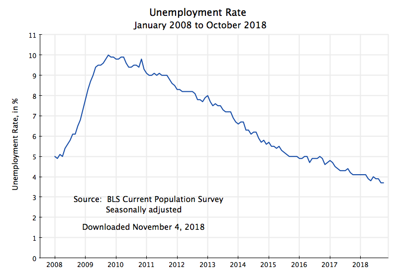
The unemployment rate is low, which is certainly good, and many commentators have noted it is now (at 3.7% in September and October, and an average of 3.9% so far this year) at the lowest the US has seen since the 1960s.  The rate hit 3.4% in late 1968 and early 1969, and averaged about 3.5% in each of those years.

But are those rates really comparable to what they are now?  This is important, not simply for “bragging rights” (or, more seriously, for understanding what policies led to such rates), but also for understanding how much pressure such rates are creating in the labor market.  The concern is that if the unemployment rate goes “too low”, labor will be able to demand a higher nominal wage and that this will then lead to higher price inflation.  Thus the Fed monitors closely what is happening with the unemployment rate, and will start to raise interest rates to cool down the economy if it fears the unemployment rate is falling so low that there soon will be inflationary pressures.  And indeed the Fed has, since 2016, started to raise interest rates (although only modestly so far, with the target federal funds rate up only 2.0% points from the exceptionally low rates it had been reduced to in response to the 2008/09 financial and economic collapse).

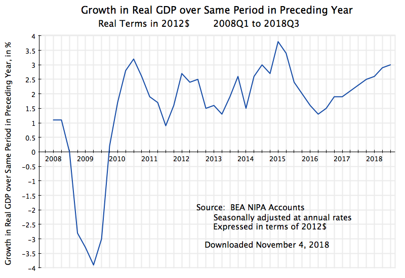
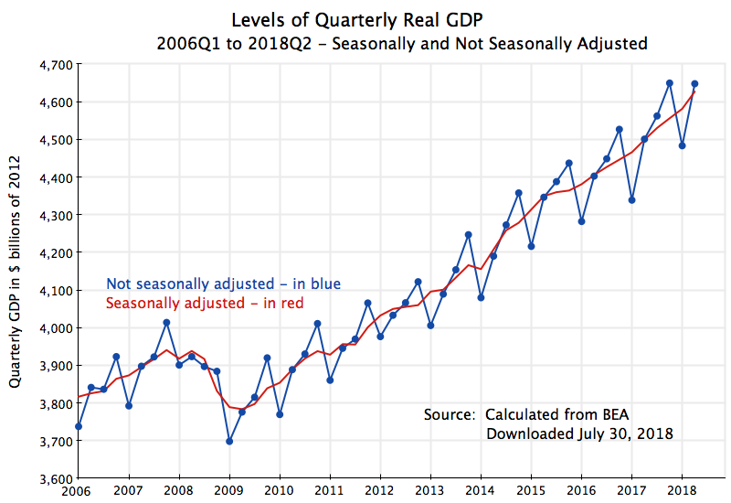
A puzzle is why the unemployment rate, at just 3.9% this year, has not in fact led to greater pressures on wages and hence inflation.  It is not because the modestly higher interest rates the Fed has set have led to a marked slowing down of the economy – real GDP grew by 3.0% in the most recent quarter over what it was a year before, in line with the pace of recent years.  Nor are wages growing markedly faster now than what they did in recent years.  Indeed, in real terms (after inflation), wages have been basically flat.

What this blog post will explore is that the unemployment rate, at 3.9% this year, is not in fact directly comparable with the levels achieved some decades ago, as the composition of the labor force has changed markedly.  The share of the labor force who have been to college is now much higher than it was in the 1960s.  Also, the share of the labor force who are young is now much less than it was in the 1960s.  And unemployment rates are now, and always have been, substantially less for those who have gone to college than for those who have not.  Similarly, unemployment rates are far higher for the young, who have just entered the labor force, than they are for those of middle age.

Because of these shifts in the shares, a given overall unemployment rate decades ago would only have happened had there been significantly lower unemployment rates for each of the groups (classified by age and education) than what we have now.  The lower unemployment rates for each of the groups, in that period decades ago, would have been necessary to produce some low overall rate of unemployment, as groups who have always had a relatively higher rate of unemployment (the young and the less educated) accounted for a higher share of the labor force then.  This is important, yet I have not seen any mention of the issue in the media.

As we will see, the impact of this changing composition of the labor force on the overall unemployment has been significant.  The chart at the top of this post shows what the overall unemployment rate would have been, had the composition of the labor force remained at what it was in 1970 (in terms of education level achieved for those aged 25 and above, plus for the share of youth in the labor force aged 16 to 24).  For 2018 (through the end of the third quarter), the unemployment rate at the 1970 composition of the labor force would then have been 5.2% – substantially higher than the 3.9% with the current composition of the labor force.  We will discuss below how these figures were derived.

At 5.2%, pressures in the labor market for higher wages will be substantially less than what one might expect at 3.9%.  This may explain the lack of such pressure seen so far in 2018 (and in recent years).  Although commonly done, it is just too simplistic to compare the current unemployment rate to what it was decades ago, without taking into account the significant changes in the composition of the labor force since then.

The rest of this blog post will first review this changing composition of the labor force – changes which have been substantial.  There are some data issues, as the Bureau of Labor Statistics (the source of all the data used here) changed its categorization of the labor force by education level in 1992.  Strictly speaking, this means that compositional shares before and after 1992 are not fully comparable.  However, we will see that in practice the changes were not such as to lead to major differences in the calculation of what the overall unemployment rate would be.

We will also look at what the unemployment rates have been for each of the groups in the labor force relative to the overall average.  They have been remarkably steady and consistent, although with some interesting, but limited, trends.  Finally, putting together the changing shares and the unemployment rates for each of the groups, one can calculate the figures for the chart at the top of this post, showing what the unemployment rates would have been over time, had the labor force composition not changed.

B.  The Changing Composition of the Labor Force

The composition of the labor force has changed markedly in the US in the decades since World War II, as indeed it has around the world.  More people have been going to college, rather than ending their formal education with high school.  Furthermore, the post-war baby boom which first led (in the 1960s and 70s) to a bulge in the share of the adult labor force who were young, later led to a reduction in this share as the baby boomers aged.

The compositional shares since 1965 (for age) and 1970 (for education) are shown in this chart (where the groups classified by education are of age 25 or higher, and thus their shares plus the share of those aged 16 to 24 will sum to 100%):

The changes in labor force composition are indeed large.  The share of the labor force who have completed college (including those with an advanced degree) has more than tripled, from 11% of the labor force in 1970 to 35% in 2018.  Those with some college have more than doubled, from 9% of the labor force to 23%.  At the other end of the education range, those who have not completed high school fell from 28% of the labor force to just 6%, while those completing high school (and no more) fell from 30% of the labor force to 22%.  And the share of youth in the labor force first rose from 19% in 1965 to a peak of  24 1/2% in 1978, and then fell by close to half to 13% in 2018.

As we will see below, each of these groups has very different unemployment rates relative to each other.  Unemployment rates are far less for those who have graduated from college than they are for those who have not completed high school, or for those 25 or older as compared to those younger.  Comparisons over time of the overall unemployment rate which do not take this changing composition of the labor force into account can therefore be quite misleading.

But first some explanatory notes on the data.  (Those not interested in data issues can skip this and go directly to the next section below.)  The figures were all calculated from data collected and published by the Bureau of Labor Statistics (BLS).  The BLS asks, as part of its regular monthly survey of households, questions on who in the household is participating in the labor force, whether they are employed or unemployed, and what their formal education has been (as well as much else).  From this one can calculate, both overall and for each group identified (such as by age or education) the figures on labor force shares and unemployment rates.

A few definitions to keep in mind:  Adults are considered to be those age 16 and above; to be employed means you worked the previous week (from when you were being surveyed) for at least one hour in a paying job; and to be unemployed means you were not employed but were actively searching for a job.  The labor force would thus be the sum of those employed or unemployed, and the unemployment rate would be the number of unemployed in whatever group as a share of all those in the labor force in that group.  Note also that full-time students, who are not also working in some part-time job, are not part of the labor force.  Nor are those, of whatever age, who are not in a job nor seeking one.

The education question in the survey asks, for each household member in the labor force, what was the “highest level of school” completed, or the “highest degree” received.  However, the question has been worded this way only since 1992.  Prior to 1992, going back to 1940 when they first started to ask about education, the question was phrased as the “highest grade or year of school” completed.  The presumption was that if the person had gone to school for 12 years, that they had completed high school.  And if 13 years that they had completed high school plus had a year at a college level.

However, this presumption was not always correct.  The respondent might only have completed high school after 13 years, having required an extra year.  Thus the BLS (together with the Census Bureau, which asks similar questions in its surveys) changed the way the question was asked in 1992, to focus on the level of schooling completed rather than the number of years of formal schooling enrolled.

For this reason, while all the data here comes from the BLS, the BLS does not make it easy to find the pre-1992 data.  The data series available online all go back only to 1992.  However, for the labor force shares by education category, as shown in the chart above, I was able to find the series under the old definitions in a BLS report on women in the labor force issued in 2015 (see Table 9, with figures that go back to 1970).  But I have not been able to find a similar set of pre-1992 figures for unemployment rates for groups classified by education.  Hence the curve in the chart at the top of this post on the unemployment rate holding constant the composition of the labor force could only start in 1992.

Did the change in education definitions in 1992 make a significant difference for what we are calculating here?  They will matter only to the extent that:  1)  the shifts from one education category to another were large; and 2) the respective unemployment rates where there was a significant shift from one group to another were very different.

As can be seen in the chart above, the only significant shifts in the trends in 1992 was a downward shift (of about 3% points) in the share of the labor force who had completed high school and nothing more, and a similar upward shift (relative to trend) in the share with some college. There are no noticeable shifts in the trends for the other groups.  And as we will see below, the unemployment rates of the two groups with a shift (completed high school, vs. some college) are closer to each other than that for any other pairing of the different groups.  Thus the impact on the calculated unemployment rate of the change in categorization in 1992 should be relatively small.  And we will see below that that in fact is the case.

There was also another, but more minor (in terms of impact), change in 1992.  The BLS always reported the educational composition of the labor force only for those labor force members who were age 25 or above.  However, prior to 1992 it reported the figures only for those up to age 64, while from 1992 onwards it reported the figure at any higher age if still in the labor force, including those who at age 65 or more but not yet retired.  This was done as an increasing share over time of those in the US of age 65 or higher have remained in the labor force rather than retiring.  However, the impact of this change will be small.  First, the share of the labor force of age 65 or more is small.  And second, this will matter only to the extent that the shares by education level differ between those still in the labor force who are age 65 or more, as compared to those in the labor force of ages 25 to 64.  Those differences in education shares are probably not that large.

C.  Differences in Unemployment Rates by Age and Education 

As noted above, unemployment rates differ between groups depending on age and education.  It should not be surprising that those who are young (ages 16 to 24) who are not in school but are seeking a job will experience a high rate of unemployment relative to those who are older (25 and above).  They are just starting out, probably do not have as high an education level (they are not still in school), and lack experience.  And that is indeed what we observe.

At the other extreme we have those who have completed college and perhaps even hold an advanced degree (masters or doctorate).  They are older, have better contacts, normally have skills that have been much in demand, and may have networks that function at a national rather than just local level.  The labor market works much better for them, and one should expect their unemployment rate to be lower.

And this is what we have seen (although unfortunately, for the reasons noted above on the data, the BLS is only making available the unemployment rates by education category for the years since 1992):

The unemployment rates of each group vary substantially over time, in tune with the business cycle, but their position relative to each other is always the same.  That is, the rates move together, where when one is high it will also be high for the others.  This is as one would expect, as movements in unemployment rates are driven primarily by the macroeconomy, with all the rates moving up when aggregate demand falls to spark a recession, and moving down in a recovery.

And there is a clear pattern to these relationships, which can be seen when these unemployment rates are all expressed as a ratio to the overall unemployment rate:

The unemployment rate for those just entering the labor force (ages 16 to 24) has always been about double what the overall unemployment rate was at the time.  And it does not appear to be subject to any major trend, either up or down.  Those in the labor force (and over age 25) with less than a high school degree (the curve in blue) also have experienced a higher rate of unemployment than the overall rate at the time – 40 to 60% higher.  There might be some downward trend, but one cannot yet say whether it is significant.  We need some more years of data.

Those in the labor force with just a high school degree (the curve in green in the chart) have had an unemployment rate very close to the average, with some movement from below the average to just above it in recent years.  Those with some college (in red) have remained below the overall average unemployment rate, although less so now than in the 1990s.  And those with a college degree or more (the curve in purple) have had an unemployment of between 60% below the average in the 1990s to about half now.

There are probably a number of factors behind these trends, and it is not the purpose of this blog post to go into them.  But I would note that these trends are consistent with what a simple supply and demand analysis would suggest.  As seen in the chart in section B of this post, the share of the labor force with a college degree, for example, has risen steadily over time, to 35% of the labor force now from 22% in 1992.  With that much greater supply and share of the labor force, the advantage (in terms of a lower rate of unemployment relative to that of others) can be expected to have diminished.  And we see that.

But what I find surprising is that that impact has been as small as it has.  These ratios have been remarkably steady over the 27 years for which we have data, and those 27 years have included multiple cycles of boom and bust.  And with those ratios markedly different for the different groups, the composition of the labor force will matter a great deal for the overall unemployment rate.

D.  The Unemployment Rate at a Fixed Composition of the Labor Force

As noted above, those in the labor force who are not young, or who have achieved a higher level of formal education, have unemployment rates which are consistently below those who are young or who have less formal education.  Their labor markets differ.  A middle-aged engineer will be considered for jobs across the nation, while someone with who is just a high school graduate likely will not.

Secondly, when we say the economy is at “full employment” there will still be some degree of unemployment.  It will never be at zero, as workers may be in transition between jobs and face varying degrees of difficulty in finding a new job.  But this degree of “frictional unemployment” (as economists call it) will vary, as just noted above, depending on age (prior experience in the labor force) and education.  Hence the “full employment rate of unemployment” (which may sound like an oxymoron, but isn’t) will vary depending on the composition of the labor force.  And more broadly and generally, the interpretation given to any level of unemployment needs to take into account that compositional structure of the labor force, as certain groups will consistently experience a higher or lower rate of unemployment than others, as seen in the chart above.

Thus it is misleading simply to compare overall unemployment rates across long periods of time, as the compositional structure of the labor force has changed greatly over time.  Such simple comparisons of the overall rate may be easy to do, but to understand critical issues (such as how close are we to such a low rate of unemployment that there will be inflationary pressure in the labor market), we should control for labor force composition.

The chart at the top of this post does that, and I repeat it here for convenience (with the addition in purple, to be explained below):

The blue line shows the unemployment rate for the labor force since 1965, as conventionally presented.  The red line shows, in contrast, what the unemployment rate would have been had the unemployment rate for each identified group been whatever it was in each year, but with the labor force composition remaining at what it was in 1970.  The red line is a simple weighted average of the unemployment rates of each group, using as weights what their shares would have been had they remained at the shares of 1970.

The labor force structure of 1970 was taken for this exercise both because it is the earliest year for which I could find the necessary data, and because 1970 is close to 1968 and 1969, when the unemployment rate was at the lowest it has been in the last 60 years.  And the red curve can only start in 1992 because that is the earliest year for which I could find unemployment rates by education category.

The difference is significant.  And while perhaps difficult to tell from just looking at the chart, the difference has grown over time.  In 1992, the overall unemployment rate (with all else equal) at the 1970 compositional shares, would have been 23% higher.  By 2018, it would have grown to 33% higher.  Note also that, had we had the data going back to 1970 for the unemployment rates by education category, the blue and red curves would have met at that point and then started to diverge as the labor force composition changed.

Also, the change in 1992 in the definitions used by the BLS for classifying the labor force by education did not have a significant effect.  For 1992, we can calculate what the unemployment rate would have been using what the compositional shares were in 1991 under the old classification system.  The 1991 shares for the labor force composition would have been very close to what they would have been in 1992, had the BLS kept the old system, as labor force shares change only gradually over time.  That unemployment rate, using the former system of compositional shares but at the 1992 unemployment rates for each of the groups as defined under the then new BLS system of education categories, was almost identical to the unemployment rate in that year:  7.6% instead of 7.5%.  It made almost no difference.  The point is shown in purple on the chart, and is almost indistinguishable from the point on the blue curve.  And both are far from what the unemployment rate would have been in that year at the 1970 compositional weights (9.2%).

E.  Conclusion

The structure of the labor force has changed markedly in the post-World War II period in the US, with a far greater share of the labor force now enjoying a higher level of formal education than we had decades ago, and also a significantly lower share who are young and just starting in the labor force.  Since unemployment rates vary systematically by such groups relative to each other, one needs to take into account the changing composition of the labor force when making comparisons over time.

This is not commonly done.  The unemployment rate has come down in 2018, averaging 3.9% so far and reaching 3.7% in September and October.  It is now below the 3.8% rate it hit in 2000, and is at the lowest seen since 1969, when it hit 3.4% for several months.

But it is misleading to make such simple comparisons as the composition of the labor force has changed markedly over time.  At the 1970 labor force shares, the unemployment rate in 2018 would have been 5.2%, not 3.9%.  And at a 5.2% rate, the inflationary pressures expected with an exceptionally low unemployment rate will not be as strong.  This may, at least in part, explain why we have not seen such inflationary pressures grow this past year.

The Economy Under Trump in 8 Charts – Mostly as Under Obama, Except Now With a Sharp Rise in the Government Deficit

A.  Introduction

President Trump is repeatedly asserting that the economy under his presidency (in contrast to that of his predecessor) is booming, with economic growth and jobs numbers that are unprecedented, and all a sign of his superb management skills.  The economy is indeed doing well, from a short-term perspective.  Growth has been good and unemployment is low.  But this is just a continuation of the trends that had been underway for most of Obama’s two terms in office (subsequent to his initial stabilization of an economy, that was in freefall as he entered office).

However, and importantly, the recent growth and jobs numbers are only being achieved with a high and rising fiscal deficit.  Federal government spending is now growing (in contrast to sharp cuts between 2010 and 2014, after which it was kept largely flat until mid-2017), while taxes (especially for the rich and for corporations) have been cut.  This has led to standard Keynesian stimulus, helping to keep growth up, but at precisely the wrong time.  Such stimulus was needed between 2010 and 2014, when unemployment was still high and declining only slowly.  Imagine what could have been done then to re-build our infrastructure, employing workers (and equipment) that were instead idle.

But now, with the economy at full employment, such policy instead has to be met with the Fed raising interest rates.  And with rising government expenditures and falling tax revenues, the result has been a rise in the fiscal deficit to a level that is unprecedented for the US at a time when the country is not at war and the economy is at or close to full employment.  One sees the impact especially clearly in the amounts the US Treasury has to borrow on the market to cover the deficit.  It has soared in 2018.

This blog post will look at these developments, tracing developments from 2008 (the year before Obama took office) to what the most recent data allow.  With this context, one can see what has been special, or not, under Trump.

First a note on sources:  Figures on real GDP, on foreign trade, and on government expenditures, are from the National Income and Product Accounts (NIPA) produced by the Bureau of Economic Analysis (BEA) of the Department of Commerce.  Figures on employment and unemployment are from the Bureau of Labor Statistics (BLS) of the Department of Labor.  Figures on the federal budget deficit are from the Congressional Budget Office (CBO).  And figures on government borrowing are from the US Treasury.

B.  The Growth in GDP and in the Number Employed, and the Unemployment Rate

First, what has happened to overall output, and to jobs?  The chart at the top of this post shows the growth of real GDP, presented in terms of growth over the same period one year before (in order to even out the normal quarterly fluctuations).  GDP was collapsing when Obama took office in January 2009.  He was then able to turn this around quickly, with positive quarterly growth returning in mid-2009, and by mid-2010 GDP was growing at a pace of over 3% (in terms of growth over the year-earlier period).  It then fluctuated within a range from about 1% to almost 4% for the remainder of his term in office.  It would have been higher had the Republican Congress not forced cuts in fiscal expenditures despite the continued unemployment.  But growth still averaged 2.2% per annum in real terms from mid-2009 to end-2016, despite those cuts.

GDP growth under Trump hit 3.0% (over the same period one year before) in the third quarter of 2018.  This is good.  And it is the best such growth since … 2015.  That is not really so special.

Net job growth has followed the same basic path as GDP:


Jobs were collapsing when Obama took office, he was quickly able to stabilize this with the stimulus package and other measures (especially by the Fed), and job growth resumed.  By late 2011, net job growth (in terms of rolling 12-month totals (which is the same as the increase over what jobs were one year before) was over 2 million per year.  It went to as high as 3 million by early 2015.  Under Trump, it hit 2 1/2 million by September 2018.  This is pretty good, especially with the economy now at or close to full employment.  And it is the best since … January 2017, the month Obama left office.

Finally, the unemployment rate:

Unemployment was rising rapidly as Obama was inaugurated, and hit 10% in late 2009.  It then fell, and at a remarkably steady pace.  It could have fallen faster had government spending not been cut back, but nonetheless it was falling.  And this has continued under Trump.  While commendable, it is not a miracle.

C.  Foreign Trade

Trump has also launched a trade war.  Starting in late 2017, high tariffs were imposed on imports of certain foreign-produced products, with such tariffs then raised and extended to other products when foreign countries responded (as one would expect) with tariffs of their own on selected US products.  Trump claims his new tariffs will reduce the US trade deficit.  As discussed in an earlier blog post, such a belief reflects a fundamental misunderstanding of how the trade balance is determined.

But what do we see in the data?:

The trade deficit has not been reduced – it has grown in 2018.  While it might appear there had been some recovery (reduction in the deficit) in the second quarter of the year, this was due to special factors.  Exports primarily of soybeans and corn to China (but also other products, and to other countries where new tariffs were anticipated) were rushed out in that quarter in order arrive before retaliatory tariffs were imposed (which they were – in July 2018 in the case of China).  But this was simply a bringing forward of products that, under normal conditions, would have been exported later.  And as one sees, the trade balance returned to its previous path in the third quarter.

The growing trade imbalance is a concern.  For 2018, it is on course for reaching 5% of GDP (when measured in constant prices of 2012).  But as was discussed in the earlier blog post on the determination of the trade balance, it is not tariffs which determine what that overall balance will be for the economy.  Rather, it is basic macro factors (the balance between domestic savings and domestic investment) that determine what the overall trade balance will be.  Tariffs may affect the pattern of trade (shifting imports and exports from one country to another), but they won’t reduce the overall deficit unless the domestic savings/investment balance is changed.  And tariffs have little effect on that balance.

And while the trend of a growing trade imbalance since Trump took office is a continuation of the trend seen in the years before, when Obama was president, there is a key difference.  Under Obama, the trade deficit did increase (become more negative), especially from its lowest point in the middle of 2009.  But this increase in the deficit was not driven by higher government spending – government spending on goods and services (both as a share of GDP and in constant dollar terms) actually fell.  That is, government savings rose (dissavings was reduced, as there was a deficit).  Private domestic savings was also largely unchanged (as a share of GDP).  Rather, what drove the higher trade deficit during Obama’s term was the recovery in private investment from the low point it had reached in the 2008/09 recession.

The situation under Trump is different.  Government spending is now growing, as is the government deficit, and this is driving the trade deficit higher.  We will discuss this next.

D.  Government Accounts

An increase in government spending is needed in an economic downturn to sustain demand so that unemployment will be reduced (or at least not rise by as much otherwise).  Thus government spending was allowed to rise in 2008, in the last year of the Bush administration, in response to the downturn that began in December 2007.  This continued, and was indeed accelerated, as part of the stimulus program passed by Congress soon after Obama took office.  But federal government spending on goods and services peaked in mid-2010, and after that fell.  The Republican Congress forced further expenditure cuts, and by late 2013 the federal government was spending less (in real terms) than it was in early 2008:

This was foolish.  Unemployment was over 9 1/2% in mid-2010, and still over 6 1/2% in late-2013 (see the chart of the unemployment rate above).  And while the unemployment rate did fall over this period, there was justified criticism that the pace of recovery was slow.  The cuts in government spending during this period acted as a major drag on the economy, holding back the pace of recovery.  Never before had a US administration done this in the period after a downturn (at least not in the last half-century where I have examined the data).  Government spending grew especially rapidly under Reagan following the 1981/82 downturn.

Federal government spending on goods and services was then essentially flat in real terms from late 2013 to the end of Obama’s term in office.  And this more or less continued through FY2017 (the last budget of Obama), i.e. through the third quarter of CY2018.  But then, in the fourth quarter of CY2017 (the first quarter of FY2018, as the fiscal year runs from October to September), in the first full budget under Trump, federal government spending started to rise sharply.  See the chart above.  And this has continued.

There are certainly high priority government spending needs.  But the sequencing has been terribly mismanaged.  Higher government spending (e.g. to repair our public infrastructure) could have been carried out when unemployment was still high.  Utilizing idle resources, one would not only have put people to work, but also would have done this at little cost to the overall economy.  The workers were unemployed otherwise.

But higher government spending now, when unemployment is low, means that workers hired for government-funded projects have to be drawn from other activities.  While the unemployment rate can be squeezed downward some, and has been, there is a limit to how far this can go.  And since we are close to that limit, the Fed is raising interest rates in order to curtail other spending.

One sees this in the numbers.  Overall private fixed investment fell at an annual rate of 0.3% in the third quarter of 2018 (based on the initial estimates released by the BEA in late October), led by a 7.9% fall in business investment in structures (offices, etc.) and by a 4.0% fall in residential investment (homes).  While these are figures only for one quarter (there was a deceleration in the second quarter, but not an absolute fall), and can be expected to eventually change (with the economy growing, investment will at some point need to rise to catch up), the direction so far is worrisome.

And note also that this fall in the pace of investment has happened despite the huge cuts in corporate taxes from the start of this year.  Trump officials and Republicans in Congress asserted that the cuts in taxes on corporate profits would lead to a surge in investment.  Many economists (including myself, in the post cited above) noted that there was little reason to believe such tax cuts would sput corporate investment.  Such investment in the US is not now constrained by a lack of available cash to the corporations, so giving them more cash is not going to make much of a difference.  Rather, that windfall would instead lead corporations to increase dividends as well as share buybacks in order to distribute the excess cash to their shareholders.  And that is indeed what has happened, with share buybacks hitting record levels this year.

Returning to government spending, for the overall impact on the economy one should also examine such spending at the state and local level, in addition to the federal.  The picture is largely similar:

This mostly follows the same pattern as seen above for federal government spending on goods and services, with the exception that there was an increase in total government spending from early 2014 to early-2016, when federal spending was largely flat.  This may explain, in part, the relatively better growth in GDP seen over that period (see the chart at the top of this post), and then the slower pace in 2016 as all spending leveled off.

But then, starting in late-2017, total government expenditures on goods and services started to rise.  It was, however, largely driven by the federal government component.  Even though federal government spending accounted only for a bit over one-third (38%) of total government spending on goods and services in the quarter when Trump took office, almost two-thirds (65%) of the increase in government spending since then was due to higher spending by the federal government.  All this is classical Keynesian stimulus, but at a time when the economy is close to full employment.

So far we have focused on government spending on goods and services, as that is the component of government spending which enters directly as a component of GDP spending.  It is also the component of the government accounts which will in general have the largest multiplier effect on GDP.  But to arrive at the overall fiscal deficit, one must also take into account government spending on transfers (such as for Social Security), as well as tax revenues.  For these, and for the overall deficit, it is best to move to fiscal year numbers, where the Congressional Budget Office (CBO) provides the most easily accessible and up-to-date figures.

Tracing the overall federal fiscal deficit, now by fiscal year and in nominal dollar terms, one finds:

The deficit is now growing (the fiscal balance is becoming more negative) and indeed has been since FY2016.  What happened in FY2016?  Primarily there was a sharp reduction in the pace of tax revenues being collected.  And this has continued through FY2018, spurred further by the major tax cut bill of December 2017.  Taxes had been rising, along with the economic recovery, increasing by an average of $217 billion per year between FY2010 and FY2015 (calculated from CBO figures), but this then decelerated to a pace of just $26 billion per year between FY2015 and FY2018, and just $13 billion in FY2018.  The rate of growth in taxes between FY2015 and FY2018 was just 0.8%, or less even than just inflation.

Federal government spending, including on transfers, also rose over this period, but by less than taxes fell.  Overall federal government spending rose by an average of just $46 billion per year between FY2010 and FY2015 (a rate of growth of 1.3% per annum, or less than inflation in those years), and then by $140 billion per year (in nominal dollar terms) between FY2015 and FY2018.  But this step up in overall spending (of $94 billion per year) was well less than the step down in the pace of tax collection (a reduction of $191 billion per year, the difference between $217 billion annual growth over FY2010-15 and the $26 billion annual growth over FY2015-18).

That is, about two-thirds (67%) of the increase in the fiscal deficit since FY2015 can be attributed to taxes being cut, and just one-third (33%) to spending going up.

Looking forward, this is expected to get far worse.  As was discussed in an earlier post on this blog, the CBO is forecasting (in their most recent forecast, from April 2018) that the fiscal deficits under Trump will reach close to $1 trillion in FY2019, and will exceed 5% of GDP for most of the 2020s.  This is unprecedented for the US economy at full employment, other than during World War II.  Furthermore, these CBO forecasts are under the optimistic scenario that there will be no economic downturn over this period.  But that has never happened before in the US.

Deficits need to be funded by borrowing.  And one sees an especially sharp jump in the net amount being borrowed in the markets in CY 2018:


These figures are for calendar years, and the number for 2018 includes what the US Treasury announced on October 29 it expects to borrow in the fourth quarter.  Note this borrowing is what the Treasury does in the regular, commercial, markets, and is a net figure (i.e. new borrowing less repayment of debt coming due).  It comes after whatever the net impact of public trust fund operations (such as for the Social Security Trust Fund) is on Treasury funding needs.

The turnaround in 2018 is stark.  The US Treasury now expects to borrow in the financial markets, net, a total of $1,338 billion in 2018, up from $546 billion in 2017.  And this is at time of low unemployment, in sharp contrast to 2008 to 2010, when the economy had fallen into the worst economic downturn since the Great Depression  Tax revenues were then low (incomes were low) while spending needed to be kept up.  The last time unemployment was low and similar to what it is now, in the late-1990s during the Clinton administration, the fiscal accounts were in surplus.  They are far from that now. 

E. Conclusion 

The economy has continued to grow since Trump took office, with GDP and employment rising and unemployment falling.  This has been at rates much the same as we saw under Obama.  There is, however, one big difference.  Fiscal deficits are now rising rapidly.  Such deficits are unprecedented for the US at a time when unemployment is low.  And the deficits have led to a sharp jump in Treasury borrowing needs.

These deficits are forecast to get worse in the coming years even if the economy should remain at full employment.  Yet there will eventually be a downturn.  There always has been.  And when that happens, deficits will jump even further, as taxes will fall in a downturn while spending needs will rise.

Other countries have tried such populist economic policies as Trump is now following, when despite high fiscal deficits at a time of full employment, taxes are cut while government spending is raised.  They have always, in the end, led to disasters.

Why Do the Quarterly GDP Figures Bounce Around So Much?: Econ 101

A.  Introduction

The Bureau of Economic Analysis (BEA) released on July 27 its initial estimate of GDP growth in the second quarter of 2018 (what it technically calls its “advance estimate”).  It was a good report:  Its initial estimate is that GDP grew at an annualized rate of 4.1% in real terms in the quarter.  Such growth, if sustained, would be excellent.

But as many analysts noted, there are good reasons to believe that such a growth rate will not be sustained.  There were special, one-time, factors, such as that the second quarter growth (at a 4.1% annual rate) had followed a relatively modest rate of growth in the first quarter of 2.2%.  Taking the two together, the growth was a good, but not outstanding, rate of 3.1%.

More fundamentally, with the economy now at full employment, few (other than Trump) expect growth at a sustained rate of 4% or more.  Federal Reserve Board members, for example, on average expect GDP growth of 2.8% in 2018 as a whole, with this coming down to a rate of 1.8% in the longer run.  And the Congression Budget Office (in forecasts published in April) is forecasting GDP growth of 3.0% in 2018, coming down to an average rate of 1.8% over 2018 to 2028.  The fundamental issue is that the population is aging, so the growth rate of the labor force is slowing.  As discussed in an earlier post on this blog, unless the productivity of those workers started to grow at an unprecedented rate (faster than has ever been achieved in the post-World War II period), we cannot expect GDP to grow for a sustained period going forward at a rate of 3%, much less 4%.

But there will be quarter to quarter fluctuations.  As seen in the chart at the top of this post covering the period just since 2006, there have been a number of quarters in recent years where GDP grew at an annualized rate of 4% or more.  Indeed, growth reached 5.1% in the second quarter of 2012, with this followed by an also high 4.9% rate in the next quarter.  But it then came back down.  And there were also two quarters (setting aside the period of the 2008/09 recession) which had growth of a negative 1.0%.  On average, GDP growth was around 2% (at an annual rate) during Obama’s two terms in office (2.2% annually from the end of the recession in mid-2009).

Seen in this context, the 4.1% rate in the initial estimate for the second quarter of 2018 was not special.  There have been a number of such cases (and with even substantially higher growth rates for a quarter or even two) in the recent past, even though average growth was just half that.  The quarterly rates bounce around.  But it is of interest to examine why they bounce around so much, and that is the purpose of this blog post.

B.  Reasons for this Volatility

There are a number of reasons why one should not be surprised that these quarter to quarter growth rates in GDP vary as they do.  I will present several here.  And note that these reasons are not mutually exclusive.  Several of them could be acting together and be significant factors in any given quarter.

a)  There may have been actual changes in growth:

To start, and to be complete, one should not exclude the possibility that the growth in the quarter (or the lack of it) was genuine.  Perhaps output did speed up (or slow down) as estimated.  Car plants might go on extra shifts (or close for a period) due to consumers wanting to buy more cars (or fewer cars) in the period for some reason.  There might also be some policy change that might temporarily spur production (or the opposite).  For example, Trump’s recent trade measures, and the response to them from our trading partners, may have brought forward production and trade that would have been undertaken later in the year, in order to avoid tariffs threatened to be imposed later.  This could change quarterly GDP even though GDP for the year as a whole will not be affected positively (indeed the overall impact would likely be negative).

[Side note:  But one special factor in this past quarter, cited in numerous news reports (see, for example, here, here, here, here, and here), was that a jump in exports of soybeans was a key reason for the higher-than-recently-achieved rate of GDP growth.  This was not correct.  Soybean exports did indeed rise sharply, with this attributed to the response threatened by China and others to the new tariffs Trump has imposed.  China and others said they would respond with higher tariffs of their own, targeted on products such as soybeans coming from the US.  There was thus a rush to export soybeans in the period between when China first announced they would impose such retaliatory tariffs (in late March) and when they were then imposed (ultimately on July 6).

But while soybean exports did indeed increase sharply in the April to June quarter, soybeans are a crop that takes many months to grow.  Whatever increase in shipments there was had to come out of inventories.  An increase in exports would have to be matched by a similar decrease in inventories, with this true also for corn and other such crops.  There would be a similar issue for any increase in exports of Kentucky bourbon, also a target of retaliatory tariffs.  Any decent bourbon is aged for at least three years.

One must keep in mind that GDP (Gross Domestic Product) is a measure of production, and the only production that might have followed from the increased exports of soybeans or similar products would have been of packing and shipping services.  But packing and shipping costs are only a relatively small share of the total value of the products being exported.

Having said that, one should not then go to the opposite extreme and assume that the threatened trade war had no impact on production and hence GDP in the quarter.  It probably did.  With tariffs and then retaliatory tariffs being threatened (but to be imposed two or three months in the future), there were probably increased factory orders to make and ship various goods before such new tariffs would enter into effect.  Thus there likely was some impact on GDP, but to an extent that cannot be quantified in what we see in the national level accounts.  And with such factory orders simply bringing forward orders that likely would have been made later in the year, one may well see a fallback in the pace of GDP growth in the remainder of the year.  But there are many other factors as well affecting GDP growth, and we will need to wait and see what the net impact will be.]

So one should not exclude the possibility that the fluctuation in the quarterly growth rate is real.  But it could be due to many other factors as well, as we will discuss below.

b)  Change at an Annualized Rate is Not the Change in a Quarter:

While easily confused, keep in mind also that in the accounts as normally published and presented in the US, the rates of growth of GDP (and of the other economic variables) are shown as annual equivalent rates.  The actual change in the quarter is only about one-fourth of this (a bit less due to compounding).  That is, in the second quarter of 2018, the BEA estimated that GDP (on a seasonally adjusted basis, which I will discuss below as a separate factor) grew by 1.00% (and yes, exactly 1.00% within two significant digits).  But at an annualized rate (some say “annual rate”, and either term can be used), this would imply a rate of growth of 4.06% (which rounded becomes 4.1%).  It is equal to slightly more than 4.0% due to compounding.  [Technically, 1% growth in the quarter means 1.00 will grow to 1.01, and taking 1.01 to the fourth power yields 1.0406, or an increase of 4.06%.]

Thus it is not correct to say that “GDP grew by 4.1% in the second quarter”.  It did not – it grew by 1.0%.  What is correct is to say that “GDP grew at an annualized rate of 4.1% in the second quarter”.

Not all national statistical agencies present such figures in annualized terms.  European agencies, for example, generally present the quarterly growth figures as simply the growth in the quarter.  Thus, for example, Eurostat on June 7 announced that GDP in the eurozone rose by an estimated 0.4% in the first quarter of 2018.  This 0.4% was the growth in the quarter.  But that 0.4% growth figure would be equivalent to growth of 1.6% on an annualized basis (actually 1.61%, if the growth had been precisely 0.400%).  Furthermore, the European agencies will generally also focus on the growth in GDP over what it had been a year earlier in that same quarter.  In the first quarter of 2018, this growth over the year-earlier period was an estimated 2.5% according to the Eurostat release.  But the growth since the year-earlier period is not the same as the growth in the current quarter at an annualized rate.  They can easily be confused if one is not aware of the conventions used by the different agencies.

c)  Don’t confuse the level of GDP with the change in GDP:

Also along the lines of how we might misleadingly interpret figures, one needs to keep in mind that while the quarterly growth rates can, and do, bounce around a lot, the underlying levels of GDP are really not changing much.  While a 4% annual growth rate is four times as high as a 1% growth rate, for example, the underlying level of GDP in one calendar quarter is only increasing to a level of about 101 (starting from a base of 100 in this example) with growth at a 4% annual rate, versus to a level of 100.25 when  growth is at an annual rate of 1%.  While such a difference in growth rates matters a great deal (indeed a huge deal) if sustained over time, the difference in any one quarter is not that much.

Indeed, I personally find the estimated quarter to quarter levels of GDP in the US (after seasonal adjustment, which will be discussed below) to be surprisingly stable.  Keep in mind that GDP is a flow, not a stock.  It is like the flow of water in a river, not a stock such as the body of water in a reservoir.  Flows can go sharply up and down, while stocks do not, and some may mistakenly treat the GDP figures in their mind as a stock rather than a flow.  GDP measures the flow of goods and services produced over some period of time (a calendar quarter in the quarterly figures).  A flow of GDP to 101 in some quarter (from a base of 100 in the preceding quarter) is not really that different to an increase to 100.25.  While this would matter (and matter a good deal) if the different quarterly increases are sustained over time, this is not that significant when just for one quarter.

d)  Statistical noise matters:

Moving now to more substantive reasons why one should expect a significant amount of quarter to quarter volatility, one needs to recognize that GDP is estimated based on surveys and other such sources of statistical information.  The Bureau of Economic Analysis (BEA) of the US Department of Commerce, which is responsible for the estimates of the GDP accounts in the US (which are formally called the National Income and Product Accounts, or NIPA), bases its estimates on a wide variety of surveys, samples of tax returns, and other such partial figures.  The estimates are not based on a full and complete census of all production each quarter.  Indeed, such an economic census is only undertaken once every five years, and is carried out by the US Census Bureau.

One should also recognize that an estimate of real GDP depends on two measures, each of which is subject to sampling and other error.  One does not, and cannot, measure “real GDP” directly.  Rather, one estimates what nominal GDP has been (based on estimates in current dollars of the value of all economic transactions that enter into GDP), and then how much prices have changed.  Price indices are estimated based on the prices of surveyed samples, and the components of real GDP are then estimated from the nominal GDP of the component divided by the relevant price index.  Real GDP is only obtained indirectly.

There will then be two sets of errors in the measurements:  One for the nominal GDP flows and one for the price indices.  And surveys, whether of income flows or of prices, are necessarily partial.  Even if totally accurate for the firms and other entities sampled, one cannot say with certainty whether those sampled in that quarter are fully representative of everyone in the economy.  This is in particular a problem (which the BEA recognizes) in capturing what is happening to newly established firms.  Such firms will not be included in the samples used (as they did not exist when the samples were set up) and the experiences of such newly established firms can be quite different from those of established firms.

And what I am calling here statistical “noise” encompasses more than simply sampling error.  Indeed, sampling error (the fact that two samples will come up with different results simply due to the randomness of who is chosen) is probably the least concern.  Rather, systemic issues arise whenever one is trying to infer measures at the national level from the results found in some survey.  The results will depend, for example, on whether all the components were captured well, and even on how the questions are phrased.  We will discuss below (in Section C, where we look at a comparison of estimates of GDP to estimates of Gross Domestic Income, or GDI, which in principle should be the same) that the statistical discrepancy between the estimates of GDP and GDI does not vary randomly from one quarter to the next but rather fairly smoothly (what economists and statisticians call “autocorrelation” – see Section C).  This is an indication that there are systemic issues, and not simply something arising from sample randomness.

Finally, even if that statistical error was small enough to allow one to be confident that we measured real GDP within an accuracy of just, say, +/- 1%, one would not then be able to say whether GDP in that quarter had increased at an annualized rate of about 4%, or decreased by about 4%.  A small quarterly difference looms large when looked at in terms of annualized rates.

I do not know what the actual statistical error might be in the GDP estimates, and it appears they are well less than +/- 1% (based on the volatility actually observed in the quarter to quarter figures).  But a relatively small error in the estimates of real GDP in any quarter could still lead to quite substantial volatility in the estimates of the quarter to quarter growth.

e)  Seasonal adjustment is necessary, but not easy to do:

Economic activity varies over the course of the year, with predictable patterns.  There is a seasonality to holidays, to when crops are grown, to when students graduate from school and enter the job market, and much much more.  Thus the GDP data we normally focus on has been adjusted by various statistical methods to remove the seasonality factor, making use of past data to estimate what the patterns are.

The importance of this can be seen if one compares what the seasonally adjusted levels of GDP look like compared to the levels before seasonal adjustment.  Note the level of GDP here is for one calendar quarter – it will be four times this at an annual rate:

There is a regular pattern to GDP:  It is relatively high in the last quarter of each year, relatively low in the first quarter, and somewhere in between in the second and third quarters.  The seasonally adjusted series takes account of this, and is far smoother.  Calculating quarterly growth rates from a series which has not been adjusted for seasonality would be misleading in the extreme, and not of much use.

But adjusting for seasonality is not easy to do.  While the best statisticians around have tried to come up with good statistical routines to do this, it is inherently difficult.  A fundamental problem is that one can only look for patterns based on what they have been in the past, but the number of observations one has will necessarily be limited.  If one went back to use 20 years of data, say, one would only have 20 observations to ascertain the statistical pattern.  This is not much.  One could go back further, but then one has the problem that the economy as it existed 30 or 40 years ago (and indeed even 20 years ago) was quite different from what it is now, and the seasonal patterns could also now be significantly different.  While there are sophisticated statistical routines that have been developed to try to make best use of the available data (and the changes observed in the economy over time), this can only be imperfect.

Indeed, the GDP estimates released by the BEA on July 27 incorporated a number of methodological changes (which we will discuss below), one of which was a major update to the statistical routines used for the seasonal adjustment calculations.  Many observers (including at the BEA) had noted in recent years that (seasonally adjusted) GDP growth in the first quarter of each year was unusually and consistently low.  It then recovered in the second quarter.  This did not look right.

One aim of the update to the seasonal adjustment statistical routines was to address this issue.  Whether it was fully successful is not fully clear.  As seen in the chart at the top of this post (which reflects estimates that have been seasonally adjusted based on the new statistical routines), there still appear to be significant dips in the seasonally adjusted first quarter figures in many of the years (comparing the first quarter GDP figures to those just before and just after – i.e. in 2007, 2008, 2010, 2011, 2014, and perhaps 2017 and 2018.  This would be more frequent than one would expect if the residual changes were now random over the period).  However, this is an observation based just on a simple look at a limited sample.  The BEA has looked at this far more carefully, and rigorously, and believes that the new seasonal adjustment routines it has developed have removed any residual seasonality in the series as estimated.

f)  The timing of weekends and holidays may also enter, and could be important:

The production of the goods and services that make up the flow of GDP will also differ on Saturdays, Sundays, and holidays.  But the number of Saturdays, Sundays, and certain holidays may differ from one year to the next.  While there are normally 13 Saturdays and 13 Sundays in each calendar quarter, and most holidays will be in the same quarter each year, this will not always be the case.

For example, there were just 12 Sundays in the first quarter of 2018, rather than the normal 13.  And there will be 14 Sundays in the third quarter of 2018, rather than the normal 13.  In 2019, we will see a reversion to the “normal” 13 Sundays in each of the quarters.  This could have an impact.

Assume, just for the sake of illustration, that production of what goes into GDP is only one-half as much on a Saturday, Sunday, or holiday, than it is on a regular Monday through Friday workday.  It will not be zero, as many stores, as well as certain industrial plants, are still open, and I am just using the one-half for illustration.  Using this, and based on a simple check of the calendars for 2018 and 2019, one will find there were 62 regular, Monday through Friday, non-holiday workdays in the first quarter of 2018, while there will be 61 such regular workdays in the first quarter of 2019.  The number of Saturdays, Sundays, and holidays were 28 in the first quarter of 2018 (equivalent to 14 regular workdays in terms of GDP produced, assuming the one-half figure), while the number of Saturdays, Sundays, and holidays will be 29 in the first quarter of 2019 (equivalent to 14.5 regular workdays).  Thus the total regular work-day equivalents will be 76 in 2018 (equal to 62 plus 14), falling to 75.5 in 2019 (equal to 61 plus 14.5).  This will be a reduction of 0.7% between the periods in 2018 and 2019 (75.5/76), or a fall of 2.6% at an annualized rate.  This is not small.

The changes due to the timing of holidays could matter even more, especially for certain countries around the world.  Easter, for example, was celebrated in March (the first quarter) in 2013 and 2016, but came in April (the second quarter) in 2014, 2015, 2017, and 2018.  In Europe and Latin America, it is customary to take up to a week of vacation around the Easter holidays.  The change in economic activity from year to year, with Easter celebrated in one quarter in one year but a different one in the next, will make a significant difference to economic activity as measured in the quarter.

And in Muslim countries, Ramadan (a month of fasting from sunrise to sunset), followed by the three-day celebration of Eid al-Fitr, will rotate through the full year (in terms of the Western calendar) as it is linked to the lunar cycle.

Hence it would make sense to adjust the quarterly figures not only for the normal seasonal adjustment, but also for any changes in the number of weekends and holidays in some particular calendar quarter.  Eurostat and most (but not all) European countries make such an adjustment for the number of working days in a quarter before they apply the seasonal adjustment factors.  But I have not been able to find how the US handles this.  The adjustment might be buried somehow in the seasonal adjustment routines, but I have not seen a document saying this.  If no adjustment is made, then this might explain part of the quarterly fluctuations seen in the figures.

g)  There have been, and always will be, updates to the methodology used:

As noted above, the GDP figures released on July 27 reflected a major update in the methodology followed by the BEA to arrive at its GDP estimates.  Not only was there extensive work on the seasonal adjustment routines, but there were definitional and other changes.  The accounts were also updated to reflect the findings from the 2012 Economic Census, and prices were changed from a previous base of 2009 to now 2012.  The July 27 release summarized the changes, and more detail on what was done is available from a BEA report issued in April.  And with the revisions in definitions and certain other methodological changes, the BEA revised its NIPA figures going all the way back to 1929, the first year with official GDP estimates.

The BEA makes such changes on a regularly scheduled basis.  There is normally an annual change released each year with the July report on GDP in the second quarter of the year.  This annual change incorporates new weights (from recent annual surveys) and normally some limited methodological changes, and the published estimates are normally then revised going back three and a half years.  See, for example, this description of what was done in July 2017.

On top of this, there is then a much larger change once every five years.  The findings from the most recent Economic Census (which is carried out every five years) are incorporated, seasonal adjustment factors are re-estimated, and major definitional or methodological changes may be incorporated.  The July 2018 release reflected one of those five-year changes.  It was the 15th such comprehensive revision to the NIPA accounts undertaken by the BEA.

I stress this to make the point that the GDP figures are estimates, and as estimates are always subject to change.  The professionals at the BEA are widely admired around the world for the quality of their work, and do an excellent job in my opinion.  But no estimates will ever be perfect.  One has to recognize that there will be a degree of uncertainty surrounding any such estimates, and that the quarter to quarter volatility observed will derive at least in part from the inherent uncertainty in any such estimates.

C.  Estimates of GDP versus Estimates of GDI

One way to develop a feel for how much the changes in quarterly GDP may be due to the inherent uncertainty in the estimates is to compare it to the estimated quarterly changes in Gross Domestic Income (GDI).  GDP (Gross Domestic Product) measures the value of everything produced.  GDI measures the value of all incomes (wages, profits, rents, etc.) generated.  In principle, the totals should be the same, as the value of whatever is produced accrues to someone as income.  They should add up to the same thing.

But the BEA arrives at its estimates of GDP and of GDI by different routes.  As a consequence, the estimates of the totals will then differ.  The differences are not huge in absolute amount, nor have they grown over time (as a share of GDP or of GDI).  That is, on average the estimates match each other over time, with the same central tendency.  But they differ by some amount in any individual quarter, and hence the quarter to quarter growth rates will differ.  And for the reasons reviewed above, those slight changes in the levels in any individual quarter can translate into often major differences in the growth rates from one quarter to the next.  And these differences may appear to be particularly large when the growth rates are then presented in annualized terms.

For the period since 2006, the two sets of growth rates were (where the initial estimate for the second quarter of 2018 will not be available until the end-August figures come out):

As is seen, the alternative estimates of growth in any individual quarter can be quite different.  There was an especially large difference in the first quarter of 2012, when the estimated growth in GDP was 3.2% at an annual rate, while the estimated growth in GDI was a giant 8.7%.

Which is correct?  Was the growth rate in the first quarter of 2012 3.2% (as found with the GDP estimate) or 8.7% (as found with the GDI estimate)?  The answer is we do not know, and indeed that probably neither is correct.  What is most likely is that the true figure is probably somewhere in between.

Furthermore, and also moderating what the impact on the differences in the respective estimated growth rates will be, it is not the case that the estimates of GDP and GDI are statistically independent of each other, with the two bouncing around randomly with respect to each other.  Rather, if one looks at what the BEA calls the “statistical discrepancy” (the difference between GDP and GDI), one finds that if, say, the estimate of GDP were above the estimate of GDI in one quarter, then it likely would also be above in the next quarter.  Not by the same amount, and the differences would evolve over time, but moving more like waves than as balls ricocheting around.  Economists and statisticians refer to this as “autocorrelation”, and it indicates that there is some systemic error in the estimates of GDP and of GDI, which carries over from one quarter to the next.  What the source of that is, we do not know.  If we did know, then it would be eliminated.  But the fact such autocorrelation exists tells us that there is some source of systemic error in the measures of GDP and GDI, and we have not been able to discover the source.

Estimates are estimates.  We need to recognize that there will be statistical uncertainty in any such figures.  Even if they even out over time, the estimated growth from one quarter to the next will reflect such statistical volatility.  The differences seen in the estimated rates of growth in any one quarter for total output (estimated by way of GDP versus by way of GDI) provides a useful benchmark for how to judge the reported changes seen in growth for GDP in any individual quarter.  The true volatility (for purely statistical reasons) is likely to be at least as much, if not more.

D.  Conclusion

There are many reasons, then, to expect the quarterly growth figures to bounce around.  One should not place too much weight on the estimates from any individual quarter.  It is the longer term trends that matter.  The estimated figure for growth in GDP of 4.1% in the second quarter was not out of line with what has been seen in a number of quarters in recent years.  But growth since mid-2009 has only been about one half as much on average, despite several quarters when estimated growth was well in excess of 4.1%.

To conclude, some may find of interest three country cases I am personally familiar with which illustrate why one needs to exercise care, and with an understanding of the country context, when considering what is meaningful or not for reported figures on GDP growth.  The countries are Japan, China, and an unidentified, but newly independent, former colony in the 1960s.

a)  Japan:  In the late 1990s / early 2000s, while holding a position within the World Bank Group, I was responsible for assessments of the prospects and risks of the countries of East Asia where the World Bank was active.  This was not long after the East Asia crisis of 1997, and the countries were just beginning to recover.  Japan was important, both as a trading partner to the others and because Japan itself had gone through a somewhat similar crisis following 1990, when the Japanese financial bubble burst.

As part of this, I followed closely the quarterly GDP growth figures for Japan.  But as many analysts at the time noted, the quarter to quarter figures behaved in ways that were difficult to understand.  Components went up when one would have thought they would go down (and vice versa), the quarterly changes were far more extreme than seen elsewhere, and in general the quarter to quarter fluctuations were difficult to make sense of.  The volatility in the figures was far greater than one would have expected for an economy such as Japan’s.

This view among analysts was such a common one that the government agency responsible for the estimates felt it necessary to issue a news release in June 2000 defending its work and addressing a number of the concerns that had been raised.

I have no doubt that the Japanese government officials responsible for the estimates were well-qualified and serious professionals.  But it is not easy to estimate GDP and its components, the underlying data on which the statisticians relied might have had problems (including sample sizes that were possibly too small), and there may have been segments of the economy (in the less formal sectors) which might not have been captured well.

I have not followed closely in recent years, and do not know if the issues continue.  But Japan’s case illustrates that even a sophisticated agency, with good professionals, can have difficulty in arriving at GDP estimates that behave as one would expect.

b)  China:  The case of China illustrates the mirror image problem of what was found in Japan.  While the Japanese GDP estimates bounced around far too sharply from one quarter to the next, the GDP estimates for China showed remarkable, and not believable, stability.

Chinese growth rates have normally been presented as growth of GDP in the current period over what it was in the same period one year ago.  Seasonal adjustment is then not needed, and indeed China only started to present seasonally adjusted figures in 2011.  However, these estimates are still not fully accepted by many analysts.  Comparing GDP in the current quarter to what it was in the same quarter a year before overcomes this, but at the cost that it does not present information on growth just in the quarter, as opposed to total growth over the preceding year.

And the growth rates reported over the same quarter in the preceding year have been shockingly smooth.  Indeed, in recent years (from the first quarter of 2015 through to the recently released figures for the second quarter of 2018), China’s reported growth of its GDP over the year-earlier period has not been more than 7.0% nor less than 6.7% in each and every quarter.  Specifically, the year on year GDP growth rates from the first quarter of 2015 through to the second quarter of 2018 were (in sequence):  7.0%, 7.0%, 6.9%, 6.8%, 6.7%, 6.7%, 6.7%, 6.8%, 6.9%, 6.9%, 6.8%, 6.8%, 6.8%, and 6.7% (one can find the figures in, for example, the OECD database).  Many find this less than credible.

There are other problems as well in the Chinese numbers.  For example, it has often been the case that the reported growth in provincial GDP of the 31 provincial level entities in China was higher in almost all of the 31 provinces, and sometimes even in all of the provinces, than GDP growth was in China as a whole.  This is of course mathematically impossible, but not surprising when political rewards accrue to those with fast reported growth.

With such weak credibility, analysts have resorted to coming up with proxies to serve as indicators of what quarter to quarter might have been.  These might include electricity consumption, or railway tonnage carried, or similar indicators of economic production.  Indeed, there is what has been labeled the “Li index”, named after Li Keqiang (who was vice premier when he formulated it, and later China’s premier).  Li said he did not pay much attention to the official GDP statistics, but rather focused on a combination of electricity production, rail cargo shipments, and loan disbursements.  Researchers at the Federal Reserve Bank of San Francisco who reproduced this and fitted it through some regression analysis found that it worked quite well.

And the index I found most amusing is calculated using nighttime satellite images of China, with an estimation of how much more night-time illumination one finds over time.  This “luminosity” index tracks well what might be going on with China’s GDP.

c)  An unidentified, newly independent, former colony:  Finally, this is a story which I must admit I received third hand, but which sounds fully believable.  In the mid-1970s I was working for a period in Kuala Lumpur, for the Government of Malaysia.  As part of an economic modeling project I worked closely with the group in the national statistical office responsible for estimating GDP.  The group was led by a very capable, and talkative, official (of Tamil origin), who related a story he had heard from a UN consultant who had worked closely with his group in the early 1970s to develop their system of national accounts.

The story is of a newly independent country in the mid-1960s (whose name I was either not told or cannot remember), and its estimation of GDP.  An IMF mission had visited it soon after independence, and as is standard, the IMF made forecasts of what GDP growth might be over the next several years.  Such forecasts are necessary in order to come up with estimates for what the government accounts might be (as tax revenues will depend on GDP), for the trade accounts, for the respective deficits, and hence for what the financing needs might be.

Such forecasts are rarely very good, especially for a newly independent country where much is changing.  But something is needed.

As time passed, the IMF received regular reports from the country on what estimated GDP growth actually was.  What they found was that reported GDP growth was exactly what had been forecast.  And when asked, the national statisticians responded that who were they to question what the IMF officials had said would happen!