The Impact of Austerity Policies on Unemployment: The Contrast Between the Eurozone and the US

Unemployment Rates - Eurozone and US, Jan 2006 to Oct 2014

A recent post on this blog looked at the disappointing growth in the Eurozone since early 2011, when Europe shifted to austerity policies from its previous focus on recovery from the 2008 economic and financial collapse.  There has indeed been no growth at all in the Eurozone in the three and a half years since that policy shift, with GDP at first falling by about 1 1/2% (leading to a double-dip recession) and then recovering by only that same amount thus far.  The recovery has been exceedingly slow, and prospects remain poor.

The consequences of the shift to austerity can be seen even more clearly in the unemployment figures.  See the chart above (the data comes from Eurostat).  Unemployment in Europe rose sharply starting in early 2008 and into early 2009.  But it then started to level off in late 2009 and early 2010 following the stimulus programs and aggressive central bank programs launched in late 2008.  Unemployment in the US followed a similar path during this period, and for similar reasons.

But the paths then diverged.  After peaking in early 2010 at about 10% and then starting to come down, the unemployment rate in the Eurozone switched directions and started to rise again in mid-2011.  It reached 12.0% in early 2013 and has since come down slowly and only modestly to a still high 11.5% currently.  In the US, in contrast, the unemployment rate reached a peak of 10.0% in October 2009, and has since fallen more or less steadily (with bumps along the way) to the current 5.8% (as of October 2014).  It has been a slow recovery, but at least it has been a recovery.

This divergence began in 2010, as Europe shifted from its previous expansionary stance to austerity.  Influential Europeans, in particular German officials and Jean-Claude Trichet (then the head of the European Central Bank) argued that not only was austerity needed, but that austerity would be expansionary rather than contractionary.  We now see that that was certainly not the case:  GDP fell and unemployment rose.

The most clear mark of that shift in policy can be found in the actions of the European Central Bank.  ECB interest rates had been kept at a low 0.25% for its Deposit Facility rate (one of its main policy rates) for two years until April 2011.  The ECB then raised the rate to 0.50% on April 13, and to 0.75% on July 13, 2011.  But European growth was already faltering (for a variety of reasons), and it was soon recognized by most that the hike in ECB interest rates had been a major mistake.  Trichet left office at the end on his term on November 1, replaced by Mario Draghi.  On November 9 the ECB Board approved a reversal.  The Deposit Facility rate was cut to 0.50% that day, to 0.25% a month later on December 11, and to 0.00% on July 11, 2012.

Fiscal policy had also been modestly expansionary up to 2010, as monetary policy had been up to that point, but then went into reverse.  Unfortunately, and unlike the quick recognition that raising central bank interest rates had been a mistake, fiscal expenditures have continued to be cut since mid-2010.

Germany in particular called for cuts in fiscal spending for the members of the Eurozone, and forced through a significantly stricter set of rules for fiscal deficits and public debt to GDP ratios for Eurozone members.  Discussions began in 2010, amendments to the existing “Stability and Growth Pact” were approved on March 11, 2011, and a formal new treaty among Eurozone members was signed on March 2, 2012.  The new treaty (commonly referred to as the Fiscal Compact) mandated a balanced budget in structural terms (defined as not exceeding 0.5% of GDP when the economy was close to full employment, with a separate requirement of the deficit never exceeding 3% of GDP no matter how depressed the economy might be).  Financial penalties would be imposed on countries not meeting the requirements.

The result was cuts to fiscal expenditures:

Govt Expenditures, Real Terms - Eurozone and US, 2006Q1 to 2014 Q2 or Q3

Government fiscal expenditures in the Eurozone had been growing in real terms in line with real GDP up to 2008, at around 2 to 3% a year.  With the onset of the crisis, fiscal expenditures at first grew to counter the fall GDP.  But instead of then allowing fiscal expenditures to continue to grow even at historical rates, much less the higher rates that would have been warranted to offset the fall in private demand during the crisis, fiscal expenditures peaked in mid-2010 and were then cut back.  By 2014 they were on the order of 14 to 15% below where they would have been had they been allowed to keep to their historical path.  This has suppressed demand and therefore output.

The path of US real government expenditures is also shown on the graph.  Note that government expenditures here include all levels of government (federal, state, and local), and include all government expenditures including transfers (such as for Social Security).  Government expenditures for the Eurozone are defined similarly.  The US data comes from the BEA, while the Eurozone data comes from Eurostat.

Government expenditures in the US also peaked in 2010, as they had in the Eurozone, and then fell.  This has been discussed in previous posts on this blog.  But while US government expenditures fell after 2010, they had grown by relatively more in the period leading up to 2010 than they had in the Eurozone, and then fell by relatively less.  They have now in 2014 started to pick up, mostly as a consequence of the budget deal reached last year between Congress and President Obama.  State and local government expenditures, which had been severely cut back before, have also now stabilized and started to grow as tax revenues have begun to recover from the downturn.  And in part as a result, recent GDP growth in the US has been good, with real GDP growing by 4.6% in the second quarter of 2014 and by 3.9% in the third quarter.

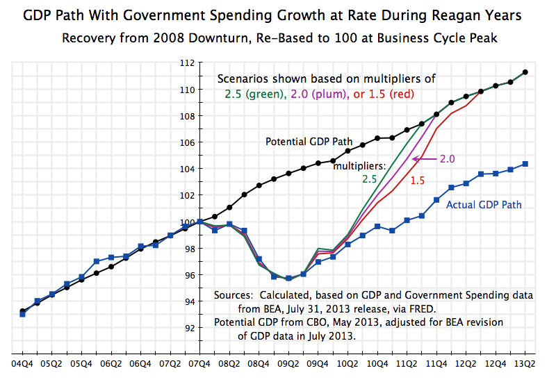
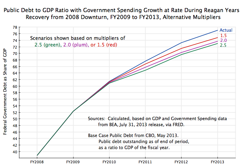
The fiscal path followed in the US could have been better.  An earlier post on this blog calculated that GDP would have returned to its full employment level by 2013 if government spending had been allowed to grow merely at its historical rate.  And the US could have returned to full employment by late 2011 or early 2012 if government spending had been allowed to grow at the more rapid rate that it had under Reagan.

But with the fiscal cuts, unemployment has come down only slowly in the US.  The recovery has been the slowest of any in the US for at least 40 years, and fiscal drag by itself can account for it.  But at least unemployment has come down in the US, in contrast to the path seen in Europe.

The Continued Fall in Government Spending Under Obama

Govt Spending on Goods & Services by Presidential Term, Quarterly

A.  Introduction

Government spending continues to fall under Obama.  As this blog has noted in earlier posts, the fiscal drag from this reduction in demand for the goods and services that unemployed workers could have been producing can fully explain why the recovery from the 2008 has been so slow.  As another blog post noted, if government spending had merely been allowed to grow under Obama at the same pace as it had historically, the economy would by now be back at full employment.  The public debt to GDP ratio would also be lower, as GDP would be higher.  And if government spending had been allowed to grow as it had under Reagan, we would likely have returned to full employment by 2011.

Fiscal drag is therefore important.  Yet it is still not yet commonly recognized that government spending has been falling in real absolute terms for the last several years (and even more so when measured as a share of GDP).  Earlier blog posts have reviewed this.  The trends have unfortunately continued and indeed strengthened over the last year.  Whether this will now change with government spending finally leveling off, and perhaps even start to recover, remains to be seen.  The budget compromise for fiscal years 2014 and 2015 reached by Senator Patty Murray and Congressman Paul Ryan in December, and passed by Congress in January, will reverse part of the impact of the budget sequester.  According to calculations by the Committee for a Responsible Federal Budget (fiscal hawks in favor of budget cuts), the agreement for FY2014 will lead to a small (1.8%) rise in nominal terms in budget authority compared to the FY2013 post-sequester levels.  This would still be flat to negative in real terms, based on inflation of about 2%.  And the FY2014 sum would still represent a 3.7% fall compared to what the FY2013 pre-sequester levels would have been.

Possibly more important would be government spending at the state and local level.  This was cut back as a result of the 2008 collapse and slow recovery, due to lower revenues and the requirement in many states and localities of a balanced budget.  While expenditures were still falling in 2013, revenues have started to grow (due to the positive, though still slow, recovery of GDP) and state and local budgets as a result can now start to recover as well.  But it also remains to be seen if that will happen.

This blog post will update the government spending figures during the Obama term through the fifth year of his administration.  And it will present the figures from a different perspective than before, by tracing the paths during the course of each presidential term (going back to Carter’s) relative to what the spending was at the start of their respective presidencies.

[Note that all the government spending figures used in this post will be in real, inflation-adjusted, terms.]

B.  Government Spending on Consumption and Investment

The graph at the top of this post shows the tracks of real government spending on consumption and investment during each presidential term going back to Carter, as a ratio to what it was at the start of their terms.  The base period is always taken as the last quarter before their inauguration (i.e. in the fourth quarter of the calendar year preceding their January 20 inauguration).  The data is computed from the figures in the standard National Income and Product Accounts (NIPA accounts, also commonly referred to as the GDP accounts) of the Bureau of Economic Analysis (BEA) of the US Department of Commerce, and are seasonally adjusted.  Note that all levels of government are included here – federal, state, and local.  We will examine below spending at the federal level only, as well as spending including transfer payments.

This government spending has fallen by 5 1/2% in real terms by the end of the fifth year (the 20th quarter) of Obama’s term in office.  It rose by 2 1/2% during Obama’s first year, which one might note is similar to the increases seen by that point under Carter, Reagan, and Bush I, and with a significantly greater increase by that point under Bush II.  Spending during Obama’s term has since been falling steadily, leading to the fiscal drag referred to above, to a point where it is now 8% lower in real terms than it was in his first year, or a net 5 1/2% fall from when he took office.

There has been no such fall in government spending under any other presidential term since Carter.  The closest was spending during the Clinton period, but there was still a 3% rise by the end of his fifth year in office.  The increases by the end of the fourth year under Carter and Bush I (single term presidencies) were 8% and 6 1/2% respectively.  And the increases by the end of the fifth year in office were 13% during the term of Bush II, and by a full 21% in real terms under Reagan.  Government spending also continued to grow under Bush II and Reagan, reaching increases of 21% and 33% respectively by the end of their eight years in office.

Yet Reagan and Bush II are seen as small government conservatives, while Obama is deemed by conservatives to be a big spending liberal.  The facts simply do not support this.

C.  Government Spending Including Transfers

Government spending for the direct purchase of goods and services (used for consumption or investment), reviewed above, is a direct component of GDP demand.  When there are substantial unemployed resources (as now), such government spending will have a significant positive impact in spurring economic expansion.  As was discussed in an Econ 101 post on this blog, under such circumstances the fiscal multiplier will be positive and high.  Hence the fiscal drag from the cut-back in government spending during Obama’s term in office has kept the recovery below what it would have been.

But there is also government spending on transfers to households (such as for Social Security, food stamps, or unemployment insurance).  Such transfers are ultimately spent by households for their consumption of goods and services (or will in part be saved, including through the pay-down of debt such as mortgage debt).  It will enter into GDP demand by way of the spending of households for consumption, and the impact on GDP will depend on the behavior of households in deciding what share of those transfers they will spend or save.

Such spending rose more sharply during Obama’s first year in office, as he faced an economy in free fall as he was taking his inaugural oath:

Govt Spending, Total incl Transfers, by Presidential Term, Quarterly

The economy was losing 800,000 jobs per month at that time, pushing the unemployment roles up rapidly and plunging the incomes of many in the population to levels where they qualified for food stamps.  Government spending including transfers therefore rose by almost 9% by the third quarter of 2009, and reached a peak of 9.8% in the third quarter of 2010.  Since then, however, total government spending including transfers has been modestly falling, and is now 7 1/2% above where it was when Obama took office.

[Note all figures are in real terms.  The personal consumption expenditures deflator in the NIPA accounts was used to adjust transfer payments for inflation.]

Only during the Clinton period did one see a modestly smaller increase, of about 6 1/2%.  But there was a 16 1/2% increase in such spending at the same point in the term of Bush II, and an increase of over 22% under Reagan.  It was also higher by the end of their fourth years in office for both Carter and Bush I.

The differences are not small.

D.  Federal Government Spending on Consumption and Investment

What matters to the economy when demand is inadequate and unemployment is high is spending at all levels of government.  Yet while we commonly blame the president in office for the performance of the economy, they at best can only influence the federal budget (and influence it only partially, as Congress decides on the budget).  Hence it may be of interest also to examine the paths of only federal government spending.

Such federal spending on direct consumption and investment at first rose during the Obama term, reaching a peak 8% increase in the third quarter of his second year in office.  It then fell sharply, to a point where it is now 5 1/2% below where it was when Obama took office:

Federal Govt Spending on Goods & Services by Presidential Term, Quarterly

The initial increase in federal spending was in part due to the stimulus package that served to restart the economy (GDP was falling from 2008 through the first half of 2009; it then began to recover).  Note that while federal spending rose by 8% by the third quarter of 2010, overall government spending (including state and local) rose only by 2 1/2% at that point.  State and local government was cutting back, as they were forced to do by the balanced budget requirements of many of them, so federal spending and the stimulus it could provide was partially being offset by their cut-backs.

But after this initial increase in the first two years of the Obama presidency, federal spending has been cut substantially, to the point where it is now 5 1/2% below in real absolute terms where it was when Obama took office.  Federal spending also fell during the Clinton term, by 11% at the same point in his term.  In contrast, federal spending rose sharply under Bush II (by 27% at the same point) and especially under Reagan (by over 31%).

E.  Federal Government Spending Including Transfers

Finally, federal government spending including transfers:

Fed Govt Spending, Total incl Transfers, Quarterly

[Technical Note:  Federal government transfers in the NIPA accounts include transfers to individuals as well as transfers to the states or localities for all purposes, including road construction, for example.  Such intra-government transfers are netted out in the accounts when government as a whole – federal, state, and local – is examined, so that remaining government transfers are then solely transfers to individuals, such as for Social Security.]

Such spending is now lower under Obama than under any of the presidencies examined, including Clinton.  Federal spending including transfers rose to a peak in 2010 of 10% above where it was when Obama took office, but has since declined to just 1% above that level.  It was 4% higher at that point in Clinton’s term, 23% higher at the point in the term of Bush II, and 25 1/2% higher at that point in the term of Reagan.

F.  Conclusion

Republicans in Congress and conservatives generally continue to criticize Obama as being responsible for runaway government spending.  But after an initial modest increase in the first two years of his term, as he sought to stop the economic free fall he inherited on taking office (and succeeded), government spending has come down under any measure one takes.  The resulting fiscal drag has held back the economy, leading to an only slow recovery.  And the fiscal drag during Obama’s term in office is in sharp contrast to the large increases in government spending observed during the terms of George W. Bush and especially Ronald Reagan. Yet they have been viewed as small government conservatives.

The Recovery From the 2008 Collapse That Could Have Been: The Impact of the Fiscal Cuts

GDP Recovery Path with Govt Growth at Historic Average, 2004Q4 to 2013Q2

A.  Introduction

Previous posts on this blog (including this older one from 2012) have discussed how the sluggish recovery from the 2008 economic collapse could have been avoided if one had allowed government spending to grow as it had during Reagan’s term.  This post will look in more detail at what the resulting path for GDP would have been if government spending had followed the path as it had under Reagan, or even had simply been allowed to grow at its normal historical rate.

The 2008 collapse was of course not caused by fiscal actions, but rather by the bursting of the housing bubble, and its consequent impact both in bankrupting a large share of an overly-leveraged financial system and in causing household consumption to fall as many homeowners struggled to repay mortgages that were now greater than the value of their homes.  Faced with the high unemployment resulting from this, an expansion of government spending would have supported the demand for output and hence for workers to produce that output.  And initially, fiscal spending did indeed grow.  This growth (along with aggressive action by the Fed) did succeed in turning around the steep slide of the economy that Obama faced as he took office.  But since 2009 government spending has been cut back, and as a result the recovery of GDP has been by far the slowest in any cyclical downturn of the last four decades.

This blog post will look at alternative scenarios of what the recovery path of GDP could have been, had government spending not been reduced.  Two primary alternatives will be examined.  In the first, government spending is allowed to grow from the point President Obama took office at a rate equal to its average rate of growth over the period 1981 to 2008.  In the second, government spending is allowed to grow from the onset of the recession (i.e. from the fourth quarter of 2007) at the same rate as it had during the Reagan years, following the downturn that began in the third quarter of 1981.

B.  Government Spending Growth at the Historic Average Rate

In the first scenario, real government spending on goods and services (as measured in the GDP accounts, and inclusive of state and local government as well as federal) is allowed to grow at a rate of 2.24% per year.  This is the average rate of growth for government spending over the 28 years from 1980 to 2008.  This was a modest growth rate, and spanned the presidencies of three Republicans (Reagan and the two Bushes) for 20 of the 28 years, and one Democrat (Clinton) for 8 of the 28 years.  The 2.24% growth rate was substantially below the growth rate of GDP of 3.04% over this same period (note this is for total GDP, not per capita).  As a result, real GDP grew by over 50% more over this period than government spending did.  But this modest pace of government spending growth was substantially more than the absolute fall in government spending during Obama’s term in office.

Note that this path for government spending is not some special rate faster than the historical average, as would normally be called for in a downturn when fiscal stimulus is needed because aggregate demand in the economy is less than what is needed for full employment.  Rather, it is just the historical average rate.  This should be seen as a neutral path, with government spending neither purposely stimulative, nor purposely contractionary.

This path for government spending is shown as the orange line in the following, where the path is superimposed on the graph presented in the earlier blog post of such paths of government spending in each of the downturns the US has faced since the 1970s:

Recessions - Govt Cons + Inv Expenditures Around Peak, 12Q before to 22Q after, with growth at avg historical rate

Maintaining government spending growth at the historical 2.24% rate would have led to government spending well below that seen during the Reagan years (in the recoveries from the July 1981 and January 1980 downturns), roughly where it was in the recoveries from the November 1973 and March 2001 downturns, and well above where it was in the recoveries from the July 1990 downturn (during the Clinton years) and of course the December 2007 downturn (under Obama).  Government spending in the current downturn (the brown curve in the graph) has fallen substantially during the period Obama has been in office.

The graph at the top of this post then shows what the GDP path would have been if government spending would have been allowed to grow at the historic average rate.  The impact will depend on the multiplier.  As was discussed in the earlier post on fiscal multipliers, the multiplier for the US in this period of high unemployment and short-term interest rates of close to zero will be relatively high.  But for the purposes here, we will run scenarios of multipliers of 1.5, of 2.0, and of 2.5.  This will span the range most economists would find reasonable for this period.

The results indicate that had one simply had government spending grow at its historic average rate, the economy would likely now be at or close to potential GDP, which is what GDP would be at full employment.  But because of the fall in government spending since 2009 rather than this increase, current actual GDP is over 6% below potential GDP, and unemployment is high.  (Potential GDP comes from the CBO estimates used in its May 2013 budget projections, but adjusted to reflect the methodological change made by the BEA in July 2013.  Due to these adjustments, including for the GDP deflators used, the potential GDP path is not as “smooth” as one would normally see.  But it will be close.)

Republicans have argued that we cannot, however, afford higher government spending, even if it would lead the economy back to full employment, as it would lead to an even higher public debt to GDP ratio.  But as was discussed in a recent post on this blog on the arithmetic of the debt to GDP ratio, it is not necessarily the case that higher government spending will lead to a higher ratio.  The Republican argument fails to recognize both that GDP will higher (due to the multiplier, and indeed a relatively high multiplier in the current conditions of high unemployment and close to zero short-term interest rates), and that a higher GDP will generate higher tax revenues due to that growth, which will off-set at least in part the impact on the deficit of the higher spending.

The resulting paths for the debt to GDP ratios by fiscal year, using a 30% marginal tax rate for the higher income, would be:

Public Debt to GDP with Govt Growth at Historic Average, FY2009 to FY2013

The impact of the higher government spending is to reduce the debt to GDP ratios over this period.  The higher government spending leads to a higher GDP, and this higher GDP along with the extra tax revenues generated at the higher output means the debt rises by proportionately less.  The ratios fall the most, as one would expect, the higher the multiplier.  If one is truly concerned about the burden of the debt, one should be supportive of fiscal spending in this environment to bring the economy quickly back to full employment.  The debt burden will then be less.

The debt to GDP ratios still rise over these years.  This serves to point out that the assertion made by the Republicans that the public debt to GDP ratio has risen so much during Obama’s term due to explosive spending under Obama is simply nonsense.  The debt to GDP ratios rose not due to higher government spending, but primarily due to the economic collapse and slow recovery, which has decimated tax revenues.  With higher government spending, the debt to GDP ratios would have been lower.

C.  Government Spending Growth at the Rate During the Reagan Years

The second set of scenarios examine what the path of GDP would have been had government spending been allowed to grow, following the onset of the downturn in December 2007, at the same pace as it had during the Reagan years following the onset of the July 1981 downturn.  The path followed is shown as the green line in the graph above on government spending around the business cycle peaks.

The resulting recovery in GDP during the current downturn would have been significantly faster:

GDP Recovery Path with Govt Growth at Reagan Rate, 2004Q2 to 2013Q2

If government spending had been allowed to grow under Obama as it had under Reagan, the economy likely would have reached full employment in 2011 (multipliers of 2.5 or 2.0), or at least by the summer of 2012 (multiplier of just 1.5).  That is, the economy would have been at full employment well before the election.

The deb to GDP ratios would also have been less than what they actually were:

Public Debt to GDP with Govt Growth at Reagan Rate, FY2008 to FY2013

Note that for these calculations I assumed that once the economy reached full employment   GDP (potential GDP), that government spending was then scaled back to what was then necessary to maintain full employment, and not over-shoot it.  Hence the curves for the 2.5 and 2.0 multipliers move parallel to each other (and are close to each other) once this ceiling has been reached.

D.  Conclusion

Fiscal spending was not the cause of the 2008 collapse.  Rather, the cause was the bursting of the housing bubble, and the resulting bankruptcy of a large share of the financial system, as well as the resulting reduction in household spending when many homeowners found that their homes were now worth less than their mortgages.

But following an initial increase in government spending, in particular as part of the fiscal stimulus package passed soon after Obama took office, government spending has been cut back.  The scenarios reviewed above indicate that had government spending merely been allowed to grow at its normal historical rate from when Obama took office (i.e. even without the special stimulus package), the US would by now be at or at least close to full employment.  And if government spending had grown as it had during the Reagan years, the economy would likely have reached full employment in 2011.

There is no need to introduce some special factor to explain why GDP is still so far below what it would be at full employment.  There is no need to assume that something such as “business uncertainty” due to Obama, or new and burdensome regulations, have for some reason led to this slow recovery in GDP.  Rather, the sluggish recovery of GDP and hence of employment can be explained fully by the policies that have kept government spending well below the historical norms.