
A. Introduction
A major theme of Trump, both during his campaign and now as president, has been that jobs in manufacturing have been decimated as a direct consequence of the free trade agreements that started with NAFTA. He repeated the assertion in his speech to Congress of February 28, where he complained that “we’ve lost more than one-fourth of our manufacturing jobs since NAFTA was approved”, but that because of him “Dying industries will come roaring back to life”. He is confused. But to be fair, there are those on the political left as well who are similarly confused.
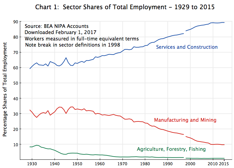
All this reflects a sad lack of understanding of history. Manufacturing jobs have indeed been declining in recent decades, and as the chart above shows, they have been declining as a share of total jobs in the economy since the 1940s. Of all those employed, the share employed in manufacturing (including mining) fell by 7.6% points between 1994 (when NAFTA entered into effect) and 2015 (the most recent year in the sector data of the Bureau of Economic Analysis, used for consistency throughout this post), a period of 21 years. But the share employed in manufacturing fell by an even steeper 9.2% points in the 21 years before 1994. The decline in manufacturing jobs (both as a share and in absolute number) is nothing new, and it is wrong to blame it on NAFTA.
It is also the case that manufacturing production has been growing steadily over this period. Total manufacturing production (measured in real value-added terms) rose by 64% over the 21 years since NAFTA went into effect in 1994. And this is also substantially higher than the 42% real growth in the 21 years prior to 1994. Blaming NAFTA (and the other free trade agreements of recent decades) for a decline in manufacturing is absurd. Manufacturing production has grown.
For those only interested in the assertion by Trump that NAFTA and the other free trade agreements have killed manufacturing in the US and with it the manufacturing jobs, one could stop here. Manufacturing has actually grown strongly since NAFTA went into effect, and there are fewer manufacturing jobs now than before not because manufacturing has declined, but because workers in manufacturing are now more productive than ever before (with this a continuation of the pattern underway over at least the entire post-World War II period, and not something new). But the full story is a bit more complex, as one also needs to examine why manufacturing production is at the level that it is. For this, one needs to bring in the rest of the economy, in particular services. The rest of this blog post will address this broader issue,
Manufacturing jobs have nonetheless indeed declined. To understand why, one needs to look at what has happened to productivity, not only in manufacturing but also in the other sectors of the economy (in particular in services). And I would suggest that one could learn much by an examination of the similar factors behind the even steeper decline over the years in the share of jobs in agriculture. It is not because of adverse effects of free trade. The US is in fact the largest exporter of food products in the world. Yet the share of workers employed in the agricultural sectors (including forestry and fishing) is now just 0.9% of the total. It used to be higher: 4.3% in 1947 and 8.4% in 1929 (using the BEA data). If one wants to go really far back, academics have estimated that agricultural employment accounted for 74% of all US employment in 1800, with this still at 56% in 1860.
Employment in agriculture has declined so much, from 74% of total employment in 1800 to 8.4% in 1929 to less than 1% today, because those employed in agriculture are far more productive today than they were before. And while it leads to less employment in the sector, whether as a share of total employment or in absolute numbers, higher productivity is a good thing. The US could hardly enjoy a modern standard of living if 74% of those employed still had to be working in agriculture in order to provide us food to eat. And while stretching the analysis back to 1800 is extreme, one can learn much by examining and understanding the factors behind the long-term trends in agricultural employment. Manufacturing is following the same basic path. And there is nothing wrong with that. Indeed, that is exactly what one would hope for in order for the economy to grow and develop.
Furthermore, the effects of foreign trade on employment in the sectors, positive or negative, are minor compared to the long-term impacts of higher productivity. In the post below we will look at what would have happened to employment if net trade would somehow be forced to zero by Trumpian policies. The impact relative to the long term trends would be trivial.
This post will focus on the period since 1947, the earliest date for which the BEA has issued data on both sector outputs and employment. The shares of agriculture as well as of manufacturing in both total employment and in output (with output measured in current prices) have both declined sharply over this period, but not because those sectors are producing less than before. Indeed, their production in real terms are both far higher. Employment in those sectors has nevertheless declined in absolute numbers. The reason is their high rates of productivity growth. Importantly, productivity in those two sectors has grown at a faster pace than in the services sector (the rest of the economy). As we will discuss, it is this differential rate of productivity growth (faster in agriculture and in manufacturing than in services) which explains the decline in the share employed in agriculture and manufacturing.
These structural changes, resulting ultimately from the differing rates of productivity growth in the sectors, can nonetheless be disruptive. With fewer workers needed in a sector because of a high rate of productivity growth, while more workers are needed in those sectors where productivity is growing more slowly (although still positively and possibly strongly, just relatively less strongly), there is a need for workers to transfer from one sector to another. This can be difficult, in particular for individuals who are older or who have fewer general skills. But this was achieved before in the US as well as in other now-rich countries, as workers shifted out of agriculture and into manufacturing a century to two centuries ago. Critically important was the development of the modern public school educational system, leading to almost universal education up through high school. The question the country faces now is whether the educational system can be similarly extended today to educate the workers needed for jobs in the modern services economy.
First, however, is the need to understand how the economy has reached the position it is now in, and the role of productivity growth in this.
B. Sector Shares and Prices
As Chart 1 at the top of this post shows, employment in agriculture and in manufacturing have been falling steadily as a share of total employment since the 1940s, while jobs in services have risen.
[A note on the data: The data here comes from the Bureau of Economic Analysis (BEA), which, as part of its National Income and Product Accounts (NIPA), estimates sector outputs as well as employment. Employment is measured in full-time equivalent terms (so that two half-time workers, say, count as the equivalent of one full-time worker), which is important for measuring productivity growth.
And while the BEA provides figures on its web site for employment going all the way back to 1929, the figures for sector output on its web site only go back to 1947. Thus while the chart at the top of this post goes back to 1929, all the analysis shown below will cover the period from 1947 only. Note also that there is a break in the employment series in 1998, when the BEA redefined slightly how some of the detailed sectors would be categorized. They unfortunately did not then go back to re-do the categorizations in a consistent way in the years prior to that, but the changes are small enough not to matter greatly to this analysis. And there were indeed similar breaks in the employment series in 1948 and again in 1987, but the changes there were so small (at the level of aggregation of the sectors used here) as not to be noticeable at all.
Also, for the purposes here the sector components of GDP have been aggregated to just three, with forestry and fishing included with agriculture, mining included with manufacturing, and construction included with services. As a short hand, these sectors will at times be referred to simply as agriculture, manufacturing, and services.
Finally, the figures on sector outputs in real terms provided by the BEA data are calculated based on what are called “chain-weighted” indices of prices. Chain-weighted indices are calculated based on moving shares of sector outputs (whatever the share is in any given period) rather than on fixed shares (i.e. the shares at the beginning or the end of the time period examined). Chain-weighted indices are the best to use over extended periods, but are unfortunately not additive, where a sum (such as real GDP) will not necessarily equal exactly the sum of the estimates of the underlying sector figures (in real terms). The issue is however not an important one for the questions being examined in this post. While we will show the estimates in the charts for real GDP (based on a sum of the figures for the three sectors), there is no need to focus on it in the analysis. Now back to the main text.]
The pattern in a chart of sector outputs as shares of GDP (measured in current prices by the value-added of each sector), is similar to that seen in Chart 1 above for the employment shares:
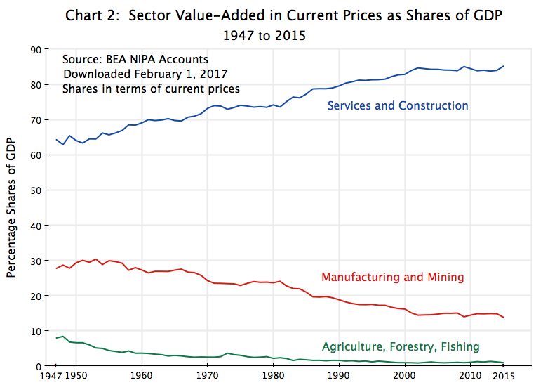 Agriculture is falling, and falling to an extremely small share of GDP (to less than 1% of GDP in 2015). Manufacturing and mining is similarly falling from the mid-1950s, while services and construction is rising more or less steadily. On the surface, all this appears to be similar to what was seen in Chart 1 for employment shares. It also might look like the employment shares are simply following the shifts in output shares.
But there is a critical difference. The shares of workers employed is a measure of numbers of workers (in full-time equivalent terms) as a share of the total. That is, it is a measure in real terms. But the shares of sector outputs in Chart 2 above is a measure of the shares in terms of current prices. They do not tell us what is happening to sector outputs in real terms.
For sector outputs in real terms (based on the prices in the initial year, or 1947 here), one finds a very different chart:
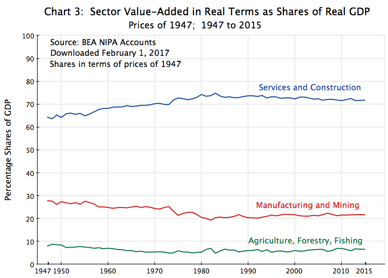 Here, the output shares are not changing all that much. There is only a small decline in agriculture (from 8% of the total in 1947 to 7% in 2015), some in manufacturing (from 28% to 22%), and then the mirror image of this in services (from 64% to 72%). The changes in the shares were much greater in Chart 2 above for sector output shares in current prices.
Many might find the relatively modest shifts in the shares of sector outputs when measured in constant price terms to be surprising. We were all taught in our introductory Economics 101 class of Engel Curve effects. Ernst Engel was a German statistician who, in 1857, found that at the level of households, the share of expenditures on basic nourishment (food) fell the richer the household. Poorer households spent a relatively higher share of their income on food, while better off households spent less. One might then postulate that as a nation becomes richer, it will see a lower share of expenditures on food items, and hence that the share of agriculture will decline.
But there are several problems with this theory. First, for various reasons it may not apply to changes over time as general income levels rise (including that consumption patterns might be driven mostly by what one observes other households to be consuming at the time; i.e. “keeping up with the Joneses” dominates). Second, agricultural production spans a wide range of goods, from basic foodstuffs to luxury items such as steak. The Engel Curve effects might mostly be appearing in the mix of food items purchased.
Third, and perhaps most importantly, the Engel Curve effects, if they exist, would affect production only in a closed economy where it was not possible to export or import agricultural items. But one can in fact trade such agricultural goods internationally. Hence, even if domestic demand fell over time (due perhaps to Engel Curve effects, or for whatever reason), domestic producers could shift to exporting a higher share of their production. There is therefore no basis for a presumption that the share of agricultural production in total output, in real terms, should be expected to fall over time due to demand effects.
The same holds true for manufacturing and mining. Their production can be traded internationally as well.
If the shares of agriculture and manufacturing fell sharply over time in terms of current prices, but not in terms of constant prices (with services then the mirror image), the implication is that the relative prices of agriculture as well as manufacturing fell relative to the price of services. This is indeed precisely what one sees:
 These are the changes in the price indices published by the BEA, with all set to 1947 = 1.0. Compared to the others, the change in agricultural prices over this 68 year period is relatively small. The price of manufacturing and mining production rose by far more. And while a significant part of this was due to the rise in the 1970s of the prices of mined products (in particular oil, with the two oil crises of the period, but also in the prices of coal and other mined commodities), it still holds true for manufacturing alone. Even if one excludes the mining component, the price index rose by far more than that of agriculture.
But far greater was the change in the price of services. It rose to an index value of 12.5 in 2015, versus an index value of just 1.6 for agriculture in that year. And the price of services rose by double what the price of manufacturing and mining rose by (and even more for manufacturing alone).
With the price of services rising relative to the others, the share of services in GDP (in current prices) will then rise, and substantially so given the extent of the increase in its relative price, despite the modest change in its share in constant price terms. Similarly, the fall in the shares of agriculture and of manufacturing (in current price terms) will follow directly from the fall in their prices (relative to the price of services), despite just a modest reduction in their shares in real terms.
The question then is why have we seen such a change in relative prices. And this is where productivity enters.
C. Growth in Output, Employment, and Productivity
First, it is useful to look at what happened to the growth in real sector outputs relative to 1947:
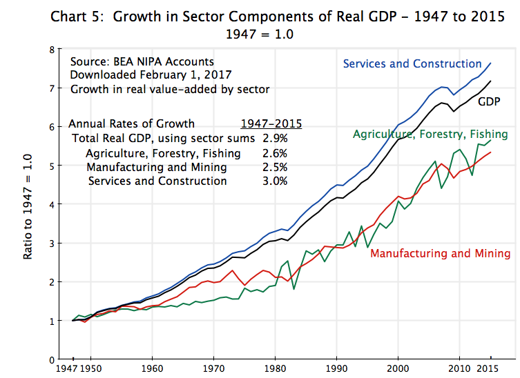 All sector outputs rose, and by substantial amounts. While Trump has asserted that manufacturing is dying (due to free trade treaties), this is not the case at all. Manufacturing (including mining) is now producing 5.3 times (in real terms) what it was producing in 1947. Furthermore, manufacturing production was 64% higher in real terms in 2015 than it was in 1994, the year NAFTA went into effect. This is far from a collapse. The 64% increase over the 21 years between 1994 and 2015 was also higher than the 42% increase in manufacturing production of the preceding 21 year period of 1973 to 1994. There was of course much more going on than any free trade treaties, but to blame free trade treaties on a collapse in manufacturing is absurd. There was no collapse.
Production in agriculture also rose, and while there was greater volatility (as one would expect due to the importance of weather), the increase in real output over the full period was in fact very similar to the increase seen for manufacturing.
But the biggest increase was for services. Production of services was 7.6 times higher in 2015 than in 1947.
The second step is to look at employment, with workers measured here in full-time equivalent terms:
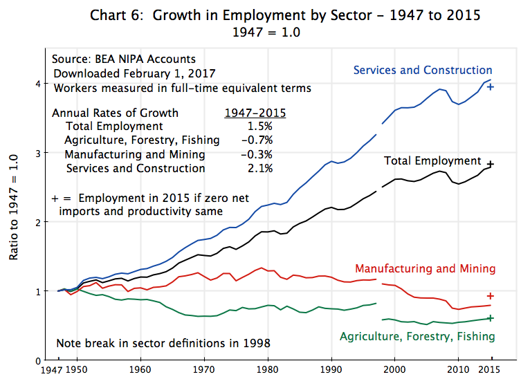 Despite the large increases in sector production over this period, employment in agriculture fell as did employment in manufacturing. One unfortunately cannot say with precision by how much, given the break in the employment series in 1998. However, there were drops in the absolute numbers employed in manufacturing both before and after the 1998 break in the series, while in agriculture there was a fall before 1998 (relative to 1947) and a fairly flat series after. The change in the agriculture employment numbers in 1998 was relatively large for the sector, but since agricultural employment was such a small share of the total (only 1%), this does not make a big difference overall.
In contrast to the falls seen for agriculture and manufacturing, employment in the services sector grew substantially. This is where the new jobs are arising, and this has been true for decades. Indeed, services accounted for more than 100% of the new jobs over the period.
But one cannot attribute the decline in employment in agriculture and in manufacturing to the effects of international trade. The points marked with a “+” in Chart 6 show what employment in the sectors would have been in 2015 (relative to 1947) if one had somehow forced net imports in the sectors to zero in 2015, with productivity remaining the same. There would have been an essentially zero change for agriculture (while the US is the world’s largest food exporter, it also imports a lot, including items like bananas which would be pretty stupid to try to produce here). There would have been somewhat more of an impact on manufacturing, although employment in the sector would still have been well below what it had been decades ago. And employment in services would have been a bit less. While most production in the services sector cannot be traded internationally, the sector includes businesses such as banking and other finance, movie making, professional services, and other areas where the US is in fact a strong exporter. Overall, the US is a net exporter of services, and an abandonment of trade that forced all net imports (and hence net exports) to zero would lead to less employment in the sector. But the impact would be relatively minor.
Labor productivity is then simply production per unit of labor. Dividing one by the other leads to the following chart:
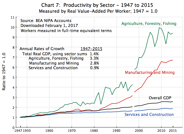 Productivity in agriculture grew at a strong pace, and by more than in either of the other two sectors over the period. With higher productivity per worker, fewer workers will be needed to produce a given level of output. Hence one can find that employment in agriculture declined over the decades, even though agricultural production rose strongly. Productivity in manufacturing similarly grew strongly, although not as strongly as in agriculture.
In contrast, productivity in the services sector grew at only a modest pace. Most of the activities in services (including construction) are relatively labor intensive, and it is difficult to substitute machinery and new technology for the core work that they do. Hence it is not surprising to find a slower pace of productivity growth in services. But productivity in services still grew, at a positive 0.9% annual pace over the 1947 to 2015 period, as compared to a 2.8% annual pace for manufacturing and a 3.3% annual pace in agriculture.
Finally, and for those readers more technically inclined, one can convert this chart of productivity growth onto a logarithmic scale. As some may recall from their high school math, a straight line path on a logarithmic scale implies a constant rate of growth. One finds:
 While one should not claim too much due to the break in the series in 1998, the path for productivity in agriculture on a logarithmic scale is remarkably flat over the full period (once one abstracts from the substantial year to year variation – short term fluctuations that one would expect from dependence on weather conditions). That is, the chart indicates that productivity in agriculture grew at a similar pace in the early decades of the period, in the middle decades, and in the later decades.
In contrast, it appears that productivity in manufacturing grew at a certain pace in the early decades up to the early 1970s, that it then leveled off for about a decade until the early 1980s, and that it then moved to a rate of growth that was faster than it had been in the first few decades. Furthermore, the pace of productivity growth in manufacturing following this turn in the early 1980s was then broadly similar to the pace seen in agriculture in this period (the paths are then parallel so the slope is the same). The causes of the acceleration in the 1980s would require an analysis beyond the scope of this blog post. But it is likely that the corporate restructuring that became widespread in the 1980s would be a factor. Some would also attribute the acceleration in productivity growth to the policies of the Reagan administration in those years. However, one would also then need to note that the pace of productivity growth was similar in the 1990s, during the years of the Clinton administration, when conservatives complained that Clinton introduced regulations that undid many of the changes launched under Reagan.
Finally, and as noted before, the pace of productivity growth in services was substantially less than in the other sectors. From the chart in logarithms, it appears the pace of productivity growth was relatively robust in the initial years, up to the mid-1960s. While slower than the pace in manufacturing or in agriculture, it was not that much slower. But from the mid-1960s, the pace of growth of productivity in services fell to a slower, albeit still positive, pace. Furthermore, that pace appears to have been relatively steady since then.
One can summarize the results of this section with the following table:
|
Growth Rates: |
|||
|
1947 to 2015 |
Employment |
Productivity |
Output |
|
Total (GDP) |
1.5% |
1.4% |
2.9% |
|
Agriculture |
-0.7% |
3.3% |
2.6% |
|
Manufacturing |
-0.3% |
2.8% |
2.5% |
|
Services |
2.1% |
0.9% |
3.0% |
The growth rate of output will be the simple sum of the growth rate of employment in a sector and the growth rate of its productivity (output per worker). The figures here do indeed add up as they should. They do not tell us what causes what, however, and that will be addressed next.
D. Pulling It Together: The Impact on Employment, Prices, and Sector Shares
Productivity is driven primarily by technological change. While management skills and a willingness to invest to take advantage of what new technologies permit will matter over shorter periods, over the long term the primary driver will be technology.
And as seen in the chart above, technological progress, and the resulting growth in productivity, has proceeded at a different pace in the different sectors. Productivity (real output per worker) has grown fastest over the last 68 years in agriculture (a pace of 3.3% a year), and fast as well in manufacturing (2.8% a year). In contrast, the rate of growth of productivity in services, while positive, has been relatively modest (0.9% a year).
But as average incomes have grown, there has been an increased domestic demand in what the services sector produces, not only in absolute level but also as a share of rising incomes. Since services largely cannot be traded internationally (with a few exceptions), the increased demand for services will need to be met by domestic production. With overall production (GDP) matching overall incomes, and with demand for services growing faster than overall incomes, the growth of services (in real terms) will be greater than the growth of real GDP, and therefore also greater than growth in the rest of the economy (agriculture and manufacturing; see Chart 5). The share of services in real GDP will then rise (Chart 3).
To produce this, the services sector needed more labor. With productivity in the services sector growing at a slower pace (in relative terms) than that seen in agriculture and in manufacturing, the only way to obtain the labor input needed was to increase the share of workers in the economy employed in services (Chart 1). And depending on the overall rate of labor growth as well as the size of the differences in the rates of productivity growth between the sectors, one could indeed find that the shift in workers out of agriculture and out of manufacturing would not only lead to a lower relative share of workers in those sectors, but also even to a lower absolute number of workers in those sectors. And this is indeed precisely what happened, with the absolute number of workers in agriculture falling throughout the period, and falling in manufacturing since the late 1970s (Chart 6).
Finally, the differential rates of productivity growth account for the relative price changes seen between the sectors. To be able to hire additional workers into services and out of agriculture and out of manufacturing, despite a lower rate of productivity growth in services, the price of services had to rise relative to agriculture as well as manufacturing. Services became more expensive to produce relative to the costs of agriculture or manufacturing production. And this is precisely what is seen in Chart 4 above on prices.
To summarize, productivity growth allowed all sectors to grow. With the higher incomes, there was a shift in demand towards services, which led it to grow at a faster pace than overall incomes (GDP). But for this to be possible, particularly as its pace of productivity growth was slower than the pace in agriculture and in manufacturing, workers had to shift to services from the other sectors. The effect was so great (due to the differing rates of growth of productivity) that employment in services rose to the point where services now employs close to 90% of all workers.
To be able to hire those workers, the price of services had to grow relative to the prices of the other sectors. As a consequence, while there was only a modest shift in sector shares over time when measured in real terms (constant prices of 1947), there was a much larger shift in sector shares when measured in current prices.
The decline in the number of workers in manufacturing should not then be seen as surprising nor as a reflection of some defective policy. Nor was it a consequence of free trade agreements. Rather, it was the outcome one should expect from the relatively rapid pace of productivity growth in manufacturing, coupled with an economy that has grown over the decades with this leading to a shift in domestic demand towards services. The resulting path for manufacturing was then the same basic path as had been followed by agriculture, although it has been underway longer in agriculture. As a result, fewer than 1% of American workers are now employed in agriculture, with this possible because American agriculture is so highly productive. One should expect, and indeed hope, that the same eventually becomes true for manufacturing as well.


You must be logged in to post a comment.