A. Introduction
Prospective patients will try to assess the quality of the medical care provided by the doctors or hospitals where they might go, when deciding where to seek treatment. They seek out recommendations from friends and family, they look at publicly available rankings such as those of US News and World Report, and they have their own past experience with some doctor or hospital. More recently, more information has become available on the internet, allowing prospective patients to look up personal histories on medical providers (where they went to medical school, their age, what languages they speak), as well as to view consumer comments and ratings on dedicated medical websites as well as websites such as Yelp. There may also be reputational ratings (where doctors are asked what other doctors they would recommend), such as those conducted by the Washingtonian magazine in the Washington, DC, area.
But such information is limited, possibly biased, and superficial. Recommendations of friends and family, your own experience, and comments and ratings on sites such as Yelp, are really just anecdotal, based on a very limited number of cases. Individuals will also not always know whether the care they received was in fact high quality or not (there may have been complications, but they will normally not know if they were avoidable). Rankings in reports such as that of US News and World Report have been criticized for being based on a small set of statistics (limited to those that the publication can obtain) which might have limited relevance. And reputational ratings can be self-reinforcing, as those being surveyed rate some doctor or hospital highly simply because they have been highly rated in the past. They may well have no real basis for making an assessment.
Most fundamentally, this information does not focus on what one really wants to know: Does the doctor or hospital provide good quality care that will cure the patient? Information such as that above has little on whether the doctors or hospitals are in fact any good at what they do. Rather, the information is mostly on inputs (where did the doctor go to medical school, for example), or on superficial factors (was the receptionist pleasant when one checked in).
As a result, one can find out more on the quality of a $500 television that one is looking to buy, than on the quality of a doctor who will perform a coronary artery bypass surgery on you.
But information on actual results of doctors and hospitals, in terms of success rates (was the condition cured) and mortality rates, the frequency of medical complications, and other such measures, in fact exist. The problem is that most of this information, with some exceptions noted below, is kept secret from the public. Especially limited is information on the performance of specific doctors. But the information is collected. There are mandatory reports filed with government and regulatory authorities (both at the federal and state levels in the US). Insurance companies (including Medicare) will know for the population they cover whether the treatment actually worked or required additional attempts or changes in approach. Insurance will also know whether there were complications that then had to be treated (with the resulting expenses then filed). And they will know all this at the level of the individual doctor and medical facility, and for the well defined specific medical procedures which were performed.
The information therefore exists. The problem is that it is not made publicly available. The normal rationale provided for this secrecy is that the information is complex and can be difficult to interpret by someone other than a medical professional. But that is a lame excuse. The information could be released in a form which adjusts for such factors as the underlying riskiness of the particular cases a doctor has dealt with (there are standard statistical ways to do this), and with accompanying information on the degree of uncertainty (derived statistically) in the information being provided. One would also expect that if such information were made publicly available, then specialized firms would develop who would take such information and assess it. Based on their technical analysis, they would sell their findings to insurance companies and firms, as well as interested individuals, on which doctors and facilities performed the best for specific medical procedures. Government entities interested in good quality care (such as Medicare, in the public interest and also because good quality care costs less in the end) could also assess and make such information available, for free.
The real reason such information on outcomes is in general not made publicly available is rather that the results can be embarrassing for the doctors and hospitals. And more than simply embarrassing, there could be huge financial implications as well. Patients would avoid the doctors and hospitals who had poor medical outcomes. With close to $3 trillion now being spent each year on medical care in the US, this means there are huge vested interests in keeping this information secret from the public.
This is starting to change, however. As noted above, there are exceptions as well as experiments underway to provide such information to the public. But it has been fragmented, partial, and highly limited. The limited information that has been provided so far has been primarily at the level of hospitals, although there have been some experiments with data also being provided on the performance of individual doctors in certain specialties.
From these trials and experiments, we know that widespread availability of such information in an easily accessible form could have profound impacts on the practice of American medicine.
B. The Impact of Transparency – A New York Experiment
The oldest and longest lasting experiment has been in New York. Starting with data from 1989 (made publicly available in 1990), the New York State Public Health Commissioner has released the risk-adjusted 30-day in-hospital mortality rates of those undergoing coronary artery bypass graft (CABG, or simply heart bypass) surgery, by specific hospital. They started to release physician specific mortality rates (on a three-year rolling basis) from December 1992. There have been a number of good descriptions of, and analyses of the impacts of, the New York program. Sources I have used include the articles here, here, here, and here. In addition, a good description is provided as the third chapter in the excellent book by Dr. Marty Makary, Unaccountable, a source I will make further use of below. Dr. Marty Makary is a physician at The Johns Hopkins Hospital, specializing in pancreatic surgery. In addition to his many medical research publications, Dr. Makary has undertaken research on how to improve the quality of medical care delivery.
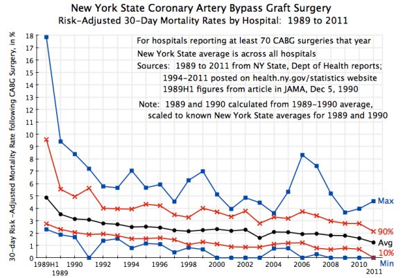
The chart at the top of this post shows what happened to 30-day in-hospital mortality rates following heart bypass surgery since 1989, across hospitals in New York State performing this procedure. Only hospitals doing 70 or more such surgeries in any given year are included in the chart. This was to reduce the statistical noise arising from small samples (and there were only a few exclusions: two hospitals were excluded in two of the 23 years of data, and only one or zero in all of the other years). A total of 28 hospitals were covered in the 1989 set, with the number rising over time to 38 in 2011.
The data were drawn from the annual reports issued by the New York State Department of Health. Reports for 1994 to 2011 (the most recent report issued) are available on their web site. Reports for earlier years were provided to me by a helpful staff member (whom I would like to thank), and the figures for the first half of 1989 were published in a December 1990 article in the Journal of the American Medical Association. All the mortality rates shown are risk-adjusted rates, as estimated by the New York Department of Health, which controls for the relative riskiness of the patients (compared to the others in New York State that year) that were treated in the facility.
The chart depicts a remarkable improvement in mortality rates once it became known that the figures would be gathered and made publicly available, with individual hospitals named. The chart shows the fall over time of the average rate across the state (note this is not the median rate, but rather the mean), as well as the minimum and maximum rates across all hospitals with 70 or more CABG procedures in the year. The ranges at the 90th and 10th percentiles are also shown. Among the points to note:
1) The average risk-adjusted mortality rate fell sharply in the early years, and since then has continued to improve. Furthermore, the underlying improvement was in fact greater than what it appears to be in these figures. The average mortality rates shown in the chart are for the mix of patients (by riskiness of their health status) in each given year. But especially in the early years, when angioplasty and coronary stent procedures were developing and found to be suitable for lower risk patients, the pool of patients for whom coronary bypass surgery was needed became a riskier mix. Taking this into account, while the overall average mortality rate fell by a very significant 21% between 1989 and 1992, once one accounts for the higher risk of the patients operated on in 1992, the fall in the cross year risk-adjusted mortality rate was an even larger 41% over just this three year period. Technology for CABG procedures did not change over this period. Transparency did.
2) The improvement in the coronary artery bypass surgery mortality rate in New York is especially impressive as New York was starting from a rate which was already in 1989 better than the average across all US states. And by 1992, the rate in New York was the best across all US states.
3) What is perhaps even more interesting and important, not only did the average rate in New York improve, but also the dispersion in mortality rates across hospitals was dramatically reduced. The maximum (worst) mortality rate dropped from almost 18% in the first half of 1989 to under 6% by 1992. The minimum rate was 2.1% in 1989H1, and fell to zero in 9 of the 12 most recent years. One sees this narrowing in dispersion also in the range between the 90th and 10th percentile bands.
Publication of the mortality results got a good deal of media attention in the early years, and led to pressure, especially on the poor performers, to improve. Note that the information being gathered was not anything new. State health authorities long had reports on death rates by hospitals. What was new was to make this information publicly available, with hospitals named.
Hospitals with poor records then scrambled to improve. A range of actions were taken. Some might have seemed obvious, but even so, were not undertaken until the mortality rates by hospital were made publicly available. For example, hospitals with poor records began to create cardiac specific teams of nurses and other staff, rather than draw on staff from a pool who could be assigned to a wide range of different medical conditions. Such specialization allowed them to learn better what was needed in cardiac surgery, and to work better as teams. Such a reorganization at Winthrop Hospital, which included bringing in a new Chief of Cardiac Surgery who led the effort, led to a drop in its mortality rate from 9.2% in 1989 (close to the worst in the state in that year) to 4.6% in 1990 and to 2.3% in 1991 (better than the state wide average that year of 3.1%).
Other issues were highly hospital specific. For example, one hospital (St. Peter’s in Albany) saw that its mortality rates for pre-scheduled elective and even urgent CABG surgery cases were similar to those elsewhere in New York. But it had especially poor rates for emergency cases, which raised its overall average. After reviewing the data, its doctors concluded that they were not stabilizing sufficiently the emergency patients before the surgery. After it corrected this, its mortality rates fell sharply. They were among the highest in New York in 1991 and 1992 (at 6.6% and 5.8%), but the rates then fell to 2.5% in 1993 and 1.4% in 1994 (when the New York average rate was 2.5%). Mortality in emergency cases fell from 26% in 1992 (11 of 42 cases) to 0% in 1993 (zero in 54 emergency cases).
Another hospital (Strong Memorial) also found that its mortality rates for routine elective cases were similar to the New York average, but very high for the emergency cases, bringing up its overall average. The problem was that while they had a good adult cardiac surgeon, he was always fully booked with routine cases, and hence was not available when an emergency case came in. They then used one of two doctors who were not trained in adult cardiac surgery to handle the emergencies (one was a vascular surgeon, and the other a specialist in pediatric cardiac surgery). By hiring a new adult cardiac surgeon and then better balancing the schedule, the rates soon dropped to normal.
American health care has traditionally relied on state regulators, armed with reports on hospital and indeed surgeon specific practices and outcomes, to impose safety and good practice measures. But there is no way a central regulator can know all that might be underlying the causes of poor outcomes, or what actions should be taken to remedy the problem. They also will not focus on hospitals with relatively good, or even average, mortality rates, even though such institutions could often still improve. By releasing the data to the public, hospitals with poor records will be under great pressure to improve, while even those with relatively good records will see the need to get better if they are to stay competitive. And the actions taken will often be actions that no central regulator would have been able to see, much less require.
C. Staff Surveys as Another Indicator of Quality
Outcome indicators, up to and including mortality rates, are one set of measures which could have a profound impact on the quality of health care delivery if made publicly available. An additional type of measure has been developed by Dr. Marty Makary, tested with a number of hospitals, and is now routinely used in hospitals across the US. But the results are then typically kept secret from the public.
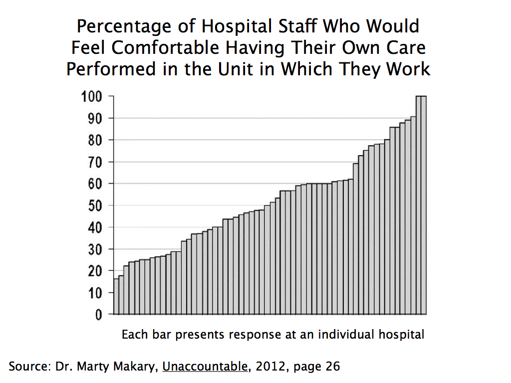
Specifically, Dr. Makary developed a simple staff survey (see here and here, in addition to his book Unaccountable referenced above) with some key questions. The survey goes to all staff in a hospital, and asks questions such as whether the respondent would feel comfortable having their own care performed in the hospital unit in which they work.
In the original test, the surveys were sent to all staff at 60 hospitals across the US. They got a 77% response rate, which is quite good. What is most interesting was the wide range they found in the results across the hospitals. For example, on the question of whether the staff member would want their own care performed at the hospital unit in which they work, there were two hospitals where close to 100% of the staff said they would, but also one hospital in which only 16% said they would. There was a fairly even spread between these two extremes, and in about half of the hospitals surveyed, less than half of the staff said they would want their own care performed there:

This would be powerful information to have as a patient. The insiders are really the ones who know best what quality of care is being provided. If even they would not want their health care needs met at their hospital, one knows where one would want to avoid.
It is recognized that the original Makary survey was done with the promise that the identities of the individual hospitals would not be revealed. Should such surveys be made publicly available, the staff responding might well be less negative. But the identities of the individual staff members would still be kept confidential (with the data gathered by an independent third party, and anonymously over the web). There would certainly still be some dispersion in results across hospitals, and one could take into account the possible biases when judging the results. And if a hospital is rated poorly by its staff even when they know the results will be made public, one knows which hospitals to avoid. One would expect such hospitals then to scramble to improve the quality of the care they provide.
D. While a Number of Transparency Initiatives Are Underway, They Remain Fragmented and Partial
Patients have always sought information on the quality of the care they will need, and have made decisions on where to go based on what they can find out. But the information that they have been able to obtain has been only partial, highly fragmented, and far from what they really need to know to make a wise decision.
People will also find measures that are easily observed, but not necessarily terribly important to the quality of the care they will receive. For example, they may find out whether parking is free and convenient, but this should not normally be a driving factor for their decision. More relevant, and obviously something they will know, will be geographic location: Is the facility close to them, or further away? But they will normally have little basis for determining whether it is worthwhile to go a facility that is further away.
There has been a substantial expansion in recent years in the amount of information one can find on providers. While still limited, one can find out more now than before. There is the New York experiment described above, which New York soon extended from hospitals to individual surgeons, and also to angioplasty and cardiac stent procedures. New York has also brought together on one web site easy access to a wide range of health topic data sets. These include data sets on outcomes and quality of care indicators (such as the most recent CABG mortality rates by hospital and by surgeon, for example) but also many others (such as the most common baby names chosen).
The Obama administration has also expanded substantially the public availability of information on hospital quality measures. The Centers for Medicare and Medicaid Services (CMS) now makes available at its Medicare Hospital Compare site results at the hospital level, drawn primarily from the data they have for Medicare patients, on such outcome measures as mortality rates, complications, hospital readmission rates, and other indicators. However, they are still partial, and instead of showing, for example, actual and historical figures by hospital for indicators such as the rate of complications or mortality, they simply show whether the rates are similar to the national norm, or better or worse by a statistically significant margin (at the 95% significance level).
With the clear positive impact of the New York experiment, other states have also begun to implement similar programs. But they remain partial and fragmented, and do not provide the comprehensive picture a patient really needs if they are to make a wise choice.
In addition, many professional medical societies have begun to collect similar data from their members, and then calculate risk-adjusted measures. However, they have then kept the individual results secret, with identifying information by hospital or physician not made available. Individual hospitals and physicians could release them if they so chose, and some have. But one can safely assume that only those with good results will release the information, while those with poor results will not.
The same is true for hospital staff surveys, such as the one described above pioneered by Dr. Makary. Such surveys are now widely used. Dr. Makary reports in Unaccountable (published in 2012) that approximately 1,500 hospitals were then undertaking such surveys. The number is certainly higher now. But the results are in general kept secret. Some hospitals make them publicly available, but one can again safely assume that these will be the ones with the better results. Without the others for comparison, it is difficult to judge how meaningful the individual figures are.
So the relevant data are often collected already. It is only a matter of making them public. There is not a question of feasibility in collecting such data, but rather a question of willingness to make them public.
E. What a Transparent System of Information on Quality Should Include
As noted above, people will gather what information they can. But what they can gather now is limited. What is needed is hard data on actual outcomes, identified by hospital and by individual doctor. As the New York experiment discussed above indicates, the result could have a profound impact on quality of care.
Specifically, there should be easy access to the following specific measures:
a) Volume: While not directly an outcome measure, it is now well established in the literature that a higher frequency of a doctor undertaking some specific medical procedure, or that is done by all the doctors at some hospital or medical facility, is positively associated with better outcomes. A doctor that undertakes a procedure a hundred times a year, or more, will on average have better outcomes than one who does the procedure only a dozen times a year (i.e. once a month). And volume can be easily measured. The problem is in obtaining easy access to the information, and at the relevant level of detail (i.e. by individual doctor, and for the procedure actually being considered for the patient, not just of some standard benchmark procedure).
b) Success rates: While many of the outcome measures being used in various trials and experiments are negative measures (mortality rates; complication rates), a more useful starting point would be risk-adjusted success rates. What percentage of the procedures undertaken by the individual doctor or at the medical facility for some condition actually leads to a cure of the condition? How success is defined will vary by the medical issue, but standard ones are available. If the risk-adjusted success rate is 80% for one doctor and 99% for another, the choice should be clear. Yet I have never seen a trial or experiment where such success rates by medical facility, much less at the level of individual doctors, were made publicly available.
c) Success rates without complications: A more stringent measure would be not only that the procedure was a success, but that it was achieved without a noteworthy complication such as an infection.
d) Complication rates: Moving to negative measures, one wants to see minimized the complications associated with some procedure. The medical profession has identified the complications often found as a result of some medical procedure, and significant complications will be reported. They can also normally be identified from medical insurance records, as they require treatment. As with mortality rates, these should be published on a risk-adjusted basis.
e) Mortality rates: The ultimate “complication” is mortality. As discussed extensively above, these should be made available by medical procedure and by individual doctor on a risk-adjusted basis. The 30 day mortality might be appropriate for most medical procedures, but for others the 60 day or 90 day rates might be more appropriate. Medical societies can work out what makes most sense for a given procedure. But everyone should then be required to use the same measure, to allow comparability.
f) Bounceback rates: Bounceback rates are the percentage of patients undergoing some procedure, who then need to be readmitted back to a hospital (the original one or some other) within some period following release, usually 90 days. Readmission rates are regularly collected by hospitals, and they can also be risk adjusted when made publicly available. They are a good indication that some problem developed. Some rate of readmission might well be expected for certain procedures. They are not risk free. But one wants to see if the bounceback rates are especially high, or low, for the physician or medical facility being considered.
g) Never events: Never events are events that should never occur. While a certain rate of complications will normally be expected, one should never see an operation done on the wrong side of the body, or sponges or medical instruments left in the body after the surgeon has sewn up. Hospitals know these and keep track of them (as such never events often lead to expensive lawsuits), but not surprisingly want to keep them secret.
h) Hospital Staff Surveys: As discussed above, Dr. Marty Makary developed a survey that would go to all hospital staff, which asks a series of questions on the quality of care being provided at the facility. While approximately 1,500 hospitals were already administering the survey in 2012 (when his book Unaccountable was published), they are voluntary and in general not made publicly available. They should be.
While the surveys can cover a long list of questions, Dr. Makary recommends (Unaccountable, page 216) that the percentage of hospital staff responding “yes” to the following three questions, at least, should be made public:
– “Would you have your operation at the hospital in which you work?”
– “Do you feel comfortable speaking up when you have a safety concern?”
– “Does the teamwork here promote doing what’s right for the patient?”
F. Conclusion
There are of course many other measures of quality one could examine, and there has been some movement in recent years to making more available. These include results from patient surveys (“were you content with your experience at the hospital?”, “were the rooms kept clean?”), as well as the percentage of cases where certain established medical best practices were followed (“was aspirin given within 24 hours of a suspected heart attack?”).
Such additional measures might well be useful in particular cases. It will depend on the individual, their particular condition, and what specifically is important to them. People should have a choice, and do the research they personally wish to do.
But until hard measures on actual outcomes, such as those described above, are made widely available, and on a comprehensive rather than partial and fragmented basis, it will not be possible to make a well informed and wise choice on which doctor and medical facility to go to. Without this, there can be no effective competition across providers. There will be little pressure on the poor quality providers either to improve their performance, or drop out and let providers who can deliver better quality care treat the patients.
The impact on the quality of health care services provided would be profound.


You must be logged in to post a comment.