
 A. Introduction
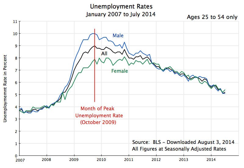
A critically important policy question is how close the US economy now is to full employment. The unemployment rate has been falling, albeit slowly, from a peak of 10.0% in October 2009, to a current 6.2% as of mid-July (ticking up from 6.1% in June, but a 0.1% change is not statistically significant). That is, the unemployment rate has come down by a bit less than 4% points from its peak.
However, some have noted that one does not see such a recovery if one focusses on the employment to population ratio. Excellent analysts, such as Paul Krugman and Brad DeLong, have argued that one should. If the unemployment rate has come down by close to 4% points, then the employment to population ratio should have gone by almost the same in percentage points unless people are dropping out of the labor force. [It will not go up by exactly the same amount in percentage points since the base for the employment to population ratio is population while the unemployment rate is expressed as a share of the labor force. But, all else equal, they will be close. One could make the relationship exact by expressing the unemployment rate in terms of the share of population rather than share of the labor force, but this is not how the unemployment rate is normally reported.]
If the employment to population rate has not recovered by the same amount (in percentage points) as the unemployment rate has, then by arithmetic this is only possible if the labor force participation rate has come down. The concern is that the pool of unemployed is coming down not because people are finding jobs (which would then be seen in a rising employment to population ratio), but rather because they are dropping out of the labor force after trying, but failing, to find a decent job (thus lowering the labor force participation rate).
There are of course demographic factors as well to take into account to explain what might be happening to the labor force participation rate, in particular the increasing share of the baby boom generation that is reaching normal retirement age. One way to do this is to focus the analysis on the prime working age group of those aged 25 to 54 only. All the charts in this post therefore do this. But even with this refinement, the apparent concern remains: The employment to population ratio does not show the same recovery that one sees in the falling unemployment rate. What is going on?
B. Recent Years
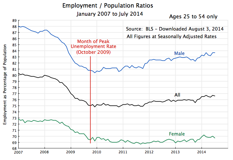
The chart at the top of this post shows the employment to population ratios from January 2007 to July 2014, for those aged 25 to 54, and for everyone together as well as for males and females separately. The chart below it shows the unemployment rates for these same groups. The data all come from the Bureau of Labor Statistics. The peak unemployment rate was hit in October 2009, after which there was a fairly steady recovery. [The month to month fluctuations mostly reflect statistical noise. The employment, unemployment, and labor force participation figures are all based on surveys of households, and there will be statistical noise in any such surveys.]
For the group as a whole (male and female), the unemployment rate for those aged 25 to 54 rose by about 5% points between late 2007 / early 2008 and its peak in October 2009. Over this period the employment to population ratio fell by a similar 5% points.
But this relationship then broke down going forward. Over the two years between October 2009 and October 2011, for example, the unemployment rate for those aged 25 to 54 fell by 1.1 percentage points, dropping to 7.9% from 9.0% at the peak (for this age group). But the employment to population ratio hardly moved. And between October 2009 and the most recent figures (for July 2014), the unemployment rate came down 3.8% points, while the employment to population ratio rose by only 1.6% points.
The question for policy makers is whether the 3.8% fall in the unemployment rate is a reasonable measure of how far the economy has recovered from the 2008 collapse, or the 1.6% recovery in the employment to population ratio is. As noted above, both the unemployment rate and the employment to population ratio deteriorated by 5% points during the 2008 collapse and follow-on into 2009. If the 3.8% recovery in the unemployment rate is the right indicator, then we would have retraced about three-quarters of the fall (3.8/5.0 = 0.76). But if the 1.6% recovery in the employment to population ratio is the right indicator, then we are less than one-third of the way (1.6/5.0 = .32) back. This is a huge difference.
Since the difference between the two measures must be reflected, by arithmetic, in a declining labor force participation rate, one needs to look there to see what is going on. For the January 2007 to July 2014 period, the picture is:
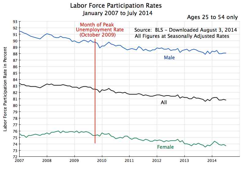
The rates are all falling after October 2009, for males and females, and hence for the two combined. What is interesting is that they appear to be falling at a fairly steady pace throughout the period (aside from the month to month squiggles that are mostly statistical noise). And for males, the rate appears to be falling at a broadly similar pace before October 2009. The trend is not so clear for females before October 2009, whose rate may have been rising until a few months before October 2009. This then leads to little change in the overall rate for males and females combined, but the period is so short that the trends are not clear.
C. A Longer Term Perspective
When one then takes a longer view, the trends do become clear:
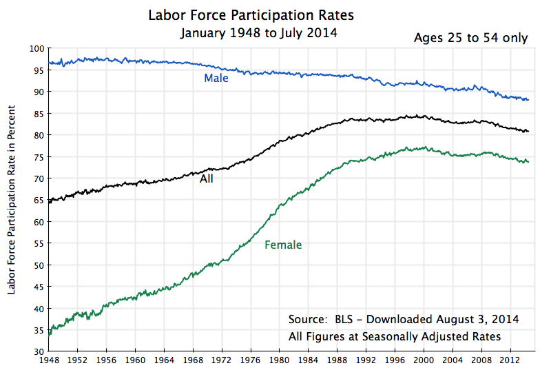
Going back to 1948 (the first year in the BLS series for all these labor market indicators), one sees a pretty steady fall in the labor force participation rate for males from around the mid-1950s (with the squiggles in the curves due to statistical noise), and a strong rise in the female labor force participation rate from the initial year with data (1948) to around 2000. There was some acceleration in the rise for females in the 1970s, and then a deceleration from the early 1990s, leading to a leveling off around 2000. Since then, the labor force participation rate for females has fallen, on a path that appears to parallel the similar fall in the rate for males, but at 14 to 15% points lower.
The data are consistent with the broader socio-economic story we have of the labor market in the post-World War II period. Male labor force participation rates are quite high, but have fallen some over time. Female rates started very low but then grew, and grew at an especially rapid rate starting in the 1970s. Female labor market participation rates then reached maturity and leveled off around 2000, after which the female rates paralleled the downward path of the male rates, but at a certain distance below.
In this longer term perspective, the decline in the labor force participation rates since 2009 therefore does not appear to be unusual, but rather a continuation of the longer term trend. There have been some small fluctuations around the long term trends in recent years that appear to coincide with the business cycle (in particular for the female rates), but they are small and dominated over time by the long term trends. There have also been similar fluctuations in the participation rates in the past (such as in the mid-1990s) that did not coincide in the same way with the business cycle, as well as large business cycle changes in the past that did not show such fluctuations (such as during the big downturn in the early 1980s at the start of the Reagan presidency, that did not lead to such fluctuations in the labor force participation rates).
The implication of this analysis is that the reported unemployment rates are a better indicator of the state of the labor market than the employment to population ratio is. The fall in the labor market participation rates in recent years has not been something new, driven by the 2008 economic downturn, but rather a continuation of the trend seen in these rates over the longer term.
Looking at unemployment rates for this age group going back to 1948 provides a useful perspective on what to expect for it:
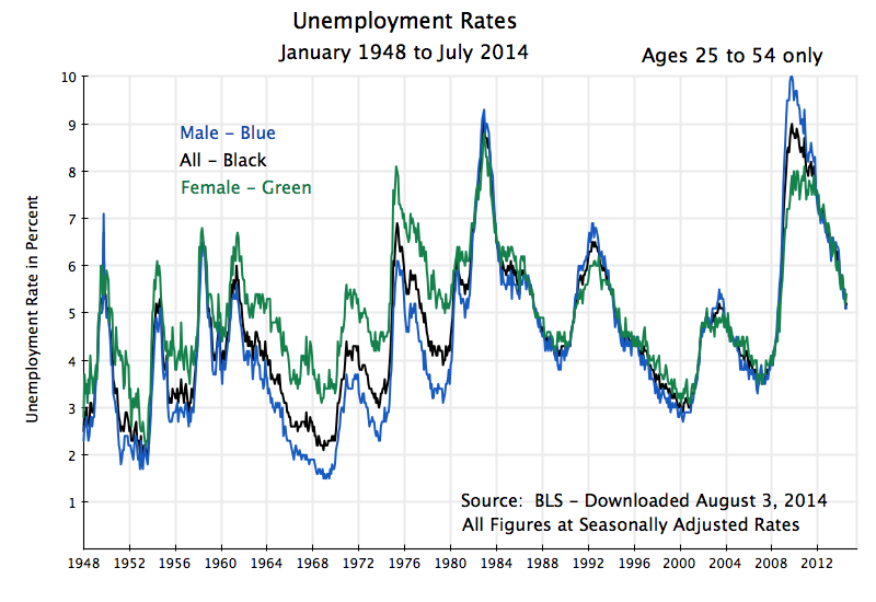
Unemployment rates continue to be high in mid-2014. Even though they have retraced about three-quarters of the deterioration in 2008/2009 (more for males, less for females), they are, at 5.2% currently (for males and females together) still well above the unemployment rates for this group of about 4% in late 2007 /early 2008, and of only 3 1/2% in late 2006 / early 2007. And the unemployment rate for this group was only 3.0% in late 2000, at the end of the Clinton years.
There is therefore still a significant distance to go before the economy will have returned to full employment. But the improvement since October 2009 is substantial, and is real.
D. Implications of the Long Term Trends for Aggregate GDP
Finally, while the employment to population ratio might not be a good indicator of how much slack there is in the labor market in the short run, there are long term implications of the trends noted above. Specifically, while the overall labor force participation rate rose steadily from 1948 (the earliest year for which we have this data) to about 2000, this was entirely due to the strong rise in the female rate over this period. The male rate was falling, steadily but slowly. Once the female rate peaked in the year 2000 and then began to fall at a rate similar to that for males, the overall rate began to fall. There is no indication this will be reversed any time soon. Indeed, the degree to which the female rate is now paralleling the male rate suggests that this really is a “new normal”.
A falling labor force participation rate is not necessarily an indication of something bad in itself. It might reflect increased prosperity, which is being enjoyed by choosing not to work but to retire early, or to attend university or post-graduate education programs in your 20s, or to stay at home and raise a family. But to the extent it reflects lack of free choice, such as being fired in your 40s or 50s and then not being able to find a job, or to remain a perpetual student due to lack of job opportunities, or to stay at home due to the unavailability of affordable child care, the implications are different. But it is well beyond the scope of this blog post to dig into this deeper.
But there will be important long term implications of declining labor force participation rates on long term GDP growth. With fewer in the labor force, aggregate GDP growth will be less. Note that this does not imply growth in GDP per capita (or more precisely, GDP per worker) will be less. GDP per worker is a function of productivity growth. But with fewer workers than otherwise, aggregate GDP growth will be less.
Two final charts, then, to close this blog post. The first shows the absolute number of people in the ages 25 to 54 population cohort, who are not in the labor force:
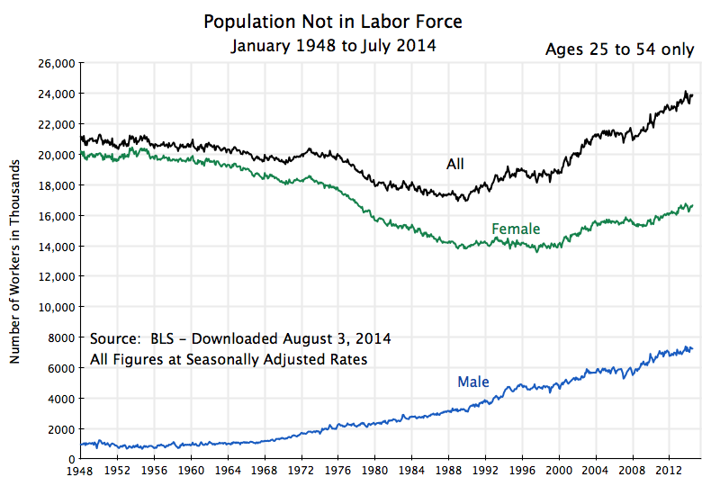
The number of males in this age group not in the labor force has been growing steadily since the late 1960s. The number of females not in the labor force fell until around 1990, was then flat for a decade, and then began to grow. Overall, the number aged 25 to 54 not in the labor force started to grow around 1990, and has continued to grow since.
Looking at the numbers of those in the 25 to 54 age group in the labor force:
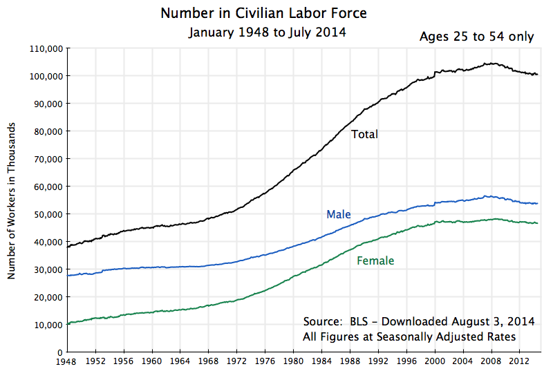
Due to a growing population in this age group (baby boomers, for example, but others as well), and the growing labor force participation rates of females until 2000, the total labor force in this group rose from the starting year (1948) until 2008. It grew especially fast in the 1970s, 80s, and 90s. But the absolute size of the labor force (in the 25 to 54 age group) then started to fall from 2008. This is a historic change for the US, and based on the fall in labor force participation rates discussed above, as well as slowing population growth, should be expected to continue. While GDP growth per capita (or per worker) might continue to grow as it has in the past (and it has grown at a remarkably consistent 1.9% a year since 1870 in the US, as discussed in this earlier blog post), one should expect aggregate GDP growth to slow.
E. Summary and Conclusion
The unemployment rate has fallen substantially since hitting its peak in October 2009, but one does not see a similar recovery in the employment to population ratio. The labor force participation rate therefore has to have fallen. However, it does not appear that this fall in the labor force participation rate has been driven by the economic downturn, where high unemployment and poor job prospects led workers to drop out of the labor force on a widespread basis. Rather it appears largely to be a continuation of longer term trends, that become clear when one separates out the paths for male and female labor force participation rates.
The implication is that the unemployment rate is probably a good indicator of how much slack there is in the labor force. The unemployment rate has retraced about three-quarters of the rise during the 2008/2009 downturn, but is still high. And it is substantially higher than what was seen as possible in late 2006 / early 2007, and especially the rate achieved in late 2000.
But there are longer term implications. The analysis suggests that we should not expect much of a recovery in the labor force participation rate when the economy finally returns to full employment. Rather, the labor force participation rate is on a downward slope, and has been since the year 2000 (when the female rates reached maturity). This is likely to continue. The result is that the absolute size of the labor force in the prime working age years of 25 to 54 should be expected to continue to fall for the foreseeable future. Japan and most of the European economies have already been facing this. While GDP per worker, which is driven by productivity change, need not necessarily slow, one should expect growth in aggregate GDP to be less than what one saw in the past. The ability to adapt to, and manage in, this new economic environment remains to be seen.




 An Economic Sense

You must be logged in to post a comment.