A. Introduction
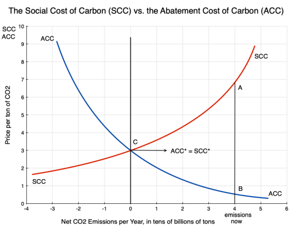
An earlier post on this blog discussed the basic economics of carbon pricing, and the distinction between the Social Cost of Carbon (SCC – the cost to society from the damage done when an extra unit of carbon dioxide, CO2, is released into the atmosphere) and the Abatement Cost of Carbon (ACC – what it costs to reduce the emissions of CO2 by a unit). Using the diagram from that post that is copied above, the post discussed some of the implications one can draw simply from an understanding that there are such curves, their basic shapes, and their relationships to each other.
There remains the question of what the actual values of the SCC and ACC might be under present conditions, and how one might obtain estimates of those values. That is not easy and can get complicated, but knowing what such values might be (even approximately) is of use as decisions are made on how best to address CO2 emissions.
This post will look at how estimates have been obtained for the SCC. A subsequent post will look at how the ACC can be estimated. The process to obtain SCC estimates is particularly complex, with significant limitations. While a number of researchers and groups have arrived at estimates for the SCC, I will focus on the specific approach followed by an interagency group established by the US federal government soon after a court ruling in 2008 that some such process needed to be established. The estimates they obtained (which were then updated several times as the process was refined) have been perhaps the most widely followed and influential estimates made of the SCC, with those estimates used in the development of federal rules and regulations on a wide range of issues where CO2 emissions might be affected.
While that interagency group had the resources to make use of best practices developed elsewhere, with a more in-depth assessment than others were able to do, there are still major limitations. In the sections below, we will first go through the methodology they followed and then discuss some of its inherent limitations. The post will then review the key issue of what discount rates should be used to discount back to the present the damages that will be ongoing for many years from a unit of CO2 that is released today (with those impacts lasting for centuries). The particular SCC estimates obtained will be highly sensitive to the discount rates used, and there has been a great deal of debate among economists on what those rates should be.
The limitations of the process are significant. But the nature of the process followed also implies that the SCC estimates arrived at will be biased too low, for a number of reasons. The easiest to see is that the estimated damages from the higher global temperatures are from a limited list: those where they could come up with some figure (possibly close to a guess) on damages following from some given temperature increase. The value of non-marketed goods (such as the existence of viable ecosystems – what environmentalists call existence values) were sometimes counted but often not, but when included the valuation could only be basically a guess. Other damages (including, obviously, those we are not able to predict now) were ignored and implicitly treated as if they were zero.
More fundamentally, the methodologies do not (and cannot, due not just to a lack of data but also inherent uncertainties) take adequately into account the possibility of catastrophic climate events resulting from a high but certainly possible increase in temperatures from the CO2 we continue to release into the air. Feedback loops are important, but are not well understood. If these possibilities are taken into account, the resulting SCC would be extremely high. We just do not know how high. In the limit, under plausible functional forms for the underlying relationships (in particular that there are “fat tails” in the distributions due to feedback effects), the SCC could in theory approach infinity. Nothing can be infinite in the real world, of course, but recognition of these factors (which in the standard approaches are ignored) implies that the SCC when properly evaluated will be very high.
We are then left with the not terribly satisfactory answer that we do not, and indeed cannot, really know what the SCC is. All we can know is that it will be very high at our current pace of releasing CO2 into the air. That can still be important, since, when coupled with evidence that the ACC is relatively low, it is telling us (in terms of the diagram at the top of this post) that the SCC will be far above the ACC. Thus society will gain (and gain tremendously) from actions to cut back on CO2 emissions.
I argue that this also implies that for issues such as federal rule-making, the SCC should be treated in a fashion similar to how monetary figures are assigned to basic parameters such as the “value of a statistical life” (VSL). The VSL is in principle the value assigned to an average person’s life being saved. It is needed in, for example, determining how much should be spent to improve safety in road designs, in the consideration of public health measures, in environmental regulations, and so on. No one can really say what the value of a life might be, but we need some such figure in order to make decisions on expenditures or regulatory rules that will affect health and safety. And whatever that value is, one should want it to be used consistently across different regulatory and other decisions, rather than some value for some decision and then a value that is twice as high (or twice as low) for some other decision.
The SCC should best be seen as similar to a VSL figure. We should not take too seriously the specific number arrived at (all we really know is that the SCC is high), but rather agree on some such figure to allow for consistency in decision-making for federal rules and other actions that will affect CO2 emissions.
This turned out to be a much longer post than I had anticipated when I began. And I have ended up in a different place than I had anticipated when I began. But I have learned a good deal in working my way through how SCC estimates are arrived at, and in examining how different economists have come to different conclusions on some of the key issues. Hopefully, readers will find this also of interest.
The issue is certainly urgent. The post on this blog prior to this one looked at the remarkable series of extreme climate events of just the past few months of this summer. Records have been broken on global average surface temperatures, on ocean water temperatures, and on Antarctic sea ice extent (reaching record lows this season). More worryingly, those records were broken not by small margins, but by large jumps over what the records had been before. Those record temperatures were then accompanied by other extreme events, including numerous floods, local high temperature records being broken, especially violent storms, extensive wildfires in Canada that have burned so far this year well more than double the area burned in any previous entire year (with consequent dangerous smoke levels affecting at different times much of the US as well as Canada itself), and other climate-related disasters. Climate events are happening, and sometimes with impacts that had not earlier been anticipated. There is much that we do not yet know about what may result from a warmer planet, and that uncertainty itself should be a major cause of concern.
B. How the SCC is Estimated
This section will discuss how the SCC is in practice estimated. While some of the limitations on such estimates will be clear as we go through the methodology, the section following this one will look more systematically at some of those limitations.
There have been numerous academic studies that have sought to determine values for the SCC, and the IPCC (the Intergovernmental Panel on Climate Change) and various country governments have come up with estimates as well. There can be some differences in the various approaches taken, but they are fundamentally similar. I will focus here on the specific process used by the US government, where an Interagency Working Group (IWG) was established in 2009 during the Obama administration to arrive at an estimate. The IWG was convened by the Office of Management and Budget with the Council of Economic Advisers (both in the White House), and was made up of representatives of twelve different government cabinet-level departments and agencies.
The IWG was established in response to a federal court order issued in 2008 (the last year of the Bush administration). Federal law requires that economic and social impacts be taken into account as federal regulations are determined as well as in whether federal funds can be used to support various projects. The case before the court in 2008 was on how federal regulations on automotive fuel economy standards are set. The social cost of the resulting CO2 emissions will matter for this, but by not taking that into account up until that point, the federal government was implicitly pricing it at zero. The court said that while there may indeed be a good deal of uncertainty in what cost should be set for that, the cost was certainly not zero. The federal government was therefore ordered by the court to come up with its best estimate for what this should be (i.e. for what the SCC should be) and apply it. The IWG was organized in response to that court order.
The first set of estimates was issued in February 2010, with a Technical Support Document explaining in some detail the methodology used. While the specifics have evolved over time, the basic approach has remained largely the same and my purpose here is to describe the essential features of how the SCC has been estimated. Much of what I summarize here comes from this 2010 document. There is also a good summary of the methodology followed, prepared by three of the key authors who developed the IWG approach, in a March 2011 NBER Working Paper. I will not go into all the details on the approach used by the IWG (see those documents if one wants more) but rather will cover only the essential elements.
The IWG updated its estimates for the SCC in May 2013, in July 2015, and again in August 2016 (when they also issued in a separate document estimates using a similar methodology for the social cost of two other important greenhouse gases: the Social Cost of Methane and the Social Cost of Nitrous Oxide). These were all during the Obama administration. The Trump administration then either had to continue to use the August 2016 figures or issue its own new estimates. It of course chose the latter, but followed a process that was basically a farce to come up with figures that were so low as to be basically meaningless (as will be discussed below). The Biden administration then issued a new set of figures in February 2021 – soon after taking office – but those “new” figures were, as they explained, simply the 2016 figures (for methane and nitrous oxide as well as for CO2) updated to be expressed in terms of 2020 prices (the prior figures had all been expressed in terms of 2007 prices – the GDP deflator was used for the adjustment). A more thorough re-estimation of these SCC values has since been underway, but finalization has been held up in part due to court challenges.
The Social Cost of Carbon is an estimate, in today’s terms, of what the total damages will be when a unit of CO2 is released into the atmosphere. The physical units normally used are metric tons (1,000 kilograms, or about 2,205 pounds). The damages will start in the year the CO2 is emitted and will last for hundreds of years, as CO2 remains in the atmosphere for hundreds of years. Unlike some other pollutants (such as methane), CO2 does not break down in the atmosphere into simpler chemical compounds, but rather is only slowly removed from the atmosphere due to other processes, such as absorption into the oceans or into new plant growth. The damages (due to the hotter planet) in each of the future years from the ton of CO2 emitted today will then be discounted back to the present based on some discount rate. How that works will be discussed below, along with a review of the debate on what the appropriate discount rate should be. The discount rate used is important, as the estimates for the SCC will be highly sensitive to the rate used.
It is important also to be clear that while there may well be (and indeed normally will be) additional emissions of CO2 from the given source in future years, the SCC counts only the cost of a ton emitted in the given year. That is, the SCC is the cost of the damages resulting from a single ton of CO2 emitted once, at some given point in time.
In very summary form, the process of estimating the SCC will require a sequence of steps, starting with an estimation of how much CO2 concentrations in the atmosphere will rise per ton of CO2 released into the air. It will then require estimates of what effect those higher CO2 concentrations will have on global surface temperatures in each future year; the year by year damages (in economic terms) that will be caused by the hotter climate; and then the sum of that series of damages discounted back to the present to provide a figure for what the total cost to society will be when a unit of CO2 is released into the air. That sum is the SCC. The discussion that follows will elaborate on each of those steps, where an integrated model (called an Integrated Assessment Model, or IAM) is normally used to link all those steps together. The IWG in fact used three different IAMs, each run with values for various parameters that the IWG provided in order to ensure uniform assumptions. This provided a range of ultimate estimates. It then took a simple average of the values obtained across the three models for the final SCC values it published. The discussion below will elaborate on all of this.
a) Step One: The impact on CO2 concentrations from a release of a unit of CO2, and the impact of those higher concentrations on global temperatures
The first step is to obtain an estimate of the impact on the concentration of CO2 in the atmosphere (now and in all future years) from an additional ton of CO2 being emitted in the given initial year. This is straightforward, although some estimate will need to be made on the (very slow) pace at which the CO2 will ultimately be removed from the atmosphere in the centuries to come. While there are uncertainties here, this will probably be the least uncertain step in the entire process.
From the atmospheric concentrations of CO2 (and other greenhouse gases, based on some assumed scenario of what they will be), an estimate will then need to be made of the impact on global temperatures following from the higher concentration of CO2. A model will be required for this, where a key parameter is called the “equilibrium climate sensitivity”. This is defined as how far higher global temperatures would ultimately increase (over a 100 to 200-year time horizon) should the CO2 concentration in the atmosphere rise to double what it was in the pre-industrial era. Such a doubling would bring it to a concentration of roughly 550 ppm (parts per million).
There is a fair degree of consensus that the direct effect of a doubling of the CO2 concentration in the atmosphere would increase global average surface temperatures by about 1.2°C. However, there will then be feedback effects, and the extent and impact of those feedback effects are highly uncertain. This was modeled in the IWG work as a probability distribution for what the equilibrium climate sensitivity parameter might be, with a median and variation around that median based on a broad assessment made by the IPCC on what those values might be. Based on the IPCC work, the IWG assumed that the median value for the parameter was that global average surface temperatures would increase by 3.0°C over a period of 100 to 200 years should the CO2 concentration in the atmosphere rise to 550 ppm and then somehow kept there. They also assumed that the distribution of possible values for the parameter would follow what is called a Roe & Baker distribution (which will be discussed below), and that there would be a two-thirds probability that the increase would be between 2.0 °C and 4.5 °C over the pre-industrial norm.
The increase from the 1.2°C direct effect to the 3.0°C longer-term effect is due to feedback effects – which are, however, not well understood. Examples of such feedback effects are the increased absorption of sunlight by the Arctic Ocean – thus warming it – when more of the Arctic ice cover has melted (as the snow on the ice cover is white and reflects light to a much greater extent than dark waters); the release of methane (a highly potent greenhouse gas) as permafrost melts; the increased number of forest fires releasing CO2 as they burn, as forests dry out due to heat and drought as well as insect invasions such as from pine bark beetles; and other such effects.
Based on this assumed probability distribution for how high global temperatures will rise as a consequence of a higher concentration of CO2 in the atmosphere, the IWG ran what are called “Monte Carlo simulations” for what the resulting global temperatures might be. While the mean expected value was that there would be a 3.0°C rise in temperatures should the CO2 concentration in the atmosphere rise to 550 ppm, this is not known with certainty. There is variation in what it might be around that mean. In a Monte Carlo simulation, the model is repeatedly run (10,000 times in the work the IWG did), where for each run certain of the parameter values (in this case, the climate sensitivity parameter) are chosen according to the probability distribution assumed. The final estimate used by the IWG was then a simple average over the 10,000 runs.
b) Step Two: The damage from higher global temperatures on economic activity
Once one has an estimate of the impact on global temperatures one will need an estimate of the impact of those higher temperatures on global output. There will be effects both directly from the higher average temperatures (e.g. lower crop yields), but also from the increased frequency and/or severity of extreme weather events (such as storms, droughts in some places and floods in others, severe heat and cold snaps, and so on). A model will be needed for this, and will provide an estimate of the impact relative to some assumed base path for what output would otherwise be. The sensitivity of the economic impacts to those higher global temperatures is modeled through what are called “damage functions”. Those damage functions relate a given increase in global surface temperatures to some reduction in global consumption – as measured by the concepts in the GDP accounts and often expressed as a share of global GDP.
Estimating what those damage functions might be is far from straightforward. There will be huge uncertainties, as will be discussed in further detail below where the limitations of such estimates are reviewed. The problem is in part addressed by focussing on a limited number of sectors (such as agriculture, buildings and structures exposed to storms, human health effects, the loss of land due to sea level rise and from increased salination, and similar). However, in limiting which sectors are looked at, the possible impacts will not be exhaustive and hence will underestimate what the overall economic impacts might be. They also do not include non-economic impacts.
In addition, the impacts will be nonlinear, where the additional damage in going from, say, a 2 degree increase in global temperatures to a 3 degree increase will be greater than in going from a 1 degree increase to 2 degrees. The models in general try to incorporate this by allowing for nonlinear damage functions to be specified. But note that a consequence (both here and elsewhere in the overall models) is that the specific SCC found for a unit release of CO2 into the air will depend on the base scenario assumed. The base path matters, and any given SCC estimate can only be interpreted in terms of an extra unit of CO2 being released relative to that specified base path. The base scenario being assumed should always be clearly specified, but it not always is.
c) Step Three: Discount the year-by-year damage estimates back to the starting date. The SCC is the sum of that series.
The future year-by-year estimates of the economic value of the damages caused by the additional ton of CO2 emitted today need then to all be expressed in terms of today’s values. That is, they will all need to be discounted back to the base year of when the CO2 was emitted. More precisely, the models must all be run in a base scenario with the data and parameters as set for that scenario, and then run again in the same way but with one extra ton of CO2 emitted in the base year. The incremental damage in each year will then be the difference in each year between the damages in those two runs. Those incremental damages will then be discounted back to the base year.
The estimated value will be sensitive to the discount rate used for this calculation, and determining what that discount rate should be has been controversial. That issue will be discussed below. But for some given discount rate, the annual values of the damages from a unit of CO2 being released (over centuries) would all be discounted back to the present. The SCC is then the sum of that series.
d) The Models Used by the IWG, and the Resulting SCC Estimates
As should be clear from this brief description, modeling these impacts to arrive at a good estimate for the SCC is not easy. And as the IWG itself has repeatedly emphasized, there will be a huge degree of uncertainty. To partially address this (but only partially, and more to identify the variation that might arise), the IWG followed an approach where they worked out the estimates based on three different models of the impacts. They also specified five different base scenarios on the paths for CO2 emissions, global output (GDP), and population, with their final SCC estimates then taken to be an unweighted average over those five scenarios for each of the three IAM models. They also ran each of these five scenarios for each of the three IAM models for each of three different discount rates (although they then kept the estimates for each of the three discount rates separate).
The three IAM models used by the IWG were developed, respectively, by Professor William Nordhaus of Yale (DICE, for Dynamic Integrated Climate and Economy), by Professor Chris Hope of the University of Cambridge (PAGE, for Policy Analysis of the Greenhouse Effect), and by Professor Richard Tol of the University of Sussex and VU University Amsterdam (FUND, for Climate Framework for Uncertainty, Negotiation and Distribution). Although similar in the basic approach taken, they produce a range of outcomes.
i) The DICE Model of Nordhaus
Professor Nordhaus has developed and refined variants of his DICE model since the early 1990s, with related earlier work dating from the 1970s. His work was pioneering in many respects, and for this he received a Nobel Prize in Economics in 2018. But the prize was controversial. While the development of his DICE model was innovative in the level of detail that he incorporated, and brought attention to the need to address the impacts of greenhouse gas emissions and the resulting climate change seriously, his conclusion was that limiting CO2 emissions at that time was not urgent (even though he argued it eventually would be needed). Rather, he argued, an optimal approach would follow a ‘policy ramp’ with only modest rates of emissions reductions in the near term, followed by sharp reductions in the medium and long terms. A primary driver of this conclusion was the use by Nordhaus of a relatively high discount rate – an issue that, as noted before, will be discussed in more depth below.
ii) The PAGE Model of Hope
The PAGE model of Professor Hope dates from the 1990s, with several updates since then. The PAGE2002 version was used by Professor Nicholas Stern (with key parameters set by him, including the discount rate) in his 2006 report for the UK Treasury titled “The Economics of Climate Change” (commonly called the Stern Review). The Stern Review came to a very different conclusion than Professor Nordhaus, and argued that addressing climate change through emissions reductions was both necessary and urgent. Professor Nordhaus, in a 2007 review of the Stern Review, argued that the differences in their conclusions could all be attributed to Stern using a much lower discount rate than he did (which Nordhaus argued was too low). Again, this controversy on the proper discount rates to use will be discussed below. But note that the implications are important: One analyst (Nordhaus) concluded that the climate change was not urgent and that it would be better to start with only modest measures (if any) and then ramp up limits on CO2 emissions only slowly over time. The other (Stern) concluded that the issue was urgent and should be addressed immediately.
iii) The FUND Model of Tol
Professor Tol, the developer of the FUND model, is controversial as he has concluded that “The impact of climate change is relatively small.” But he has also added that “Although the impact of climate change may be small, it is real and it is negative.” And while he was a coordinating lead author for the IPCC Fifth Assessment Report, he withdrew from the team for the final summary report as he disagreed with the presentation, calling it alarmist. Unlike the other IAMs, the FUND model of Tol (with the scenarios as set by the IWG) calculated that the near-term impact of global warming resulting from CO2 emissions will not just be small but indeed a bit positive. This could follow, in the “damage” functions that Tol postulated, from health benefits to certain populations (those living in cold climates) from a warmer planet and from the “fertilization” effect on plant growth from higher concentrations of CO2 in the air.
These assumptions, leading to an overall net positive effect when CO2 concentrations are not yet much higher than they are now, are, however, controversial. And Tol admitted that he left out certain effects, such as the impacts of extreme weather events and biodiversity loss. In any case, the net damages ultimately turn negative even in Tol’s model.
While Tol’s work is controversial, the inclusion of the FUND model in the estimation of the SCC by the IWG shows that they deliberately included a range of possible outcomes in modeling the impacts of CO2 emissions on climate change. The Tol model served to indicate what a lower bound on the SCC might be.
iv) The Global Growth Scenarios and the Resulting SCC Estimates
While the IWG made use of the DICE, PAGE, and FUND models, it ran each of these models with a common set of key assumptions specifically on 1) the equilibrium climate sensitivity parameter (expressed as a probability distribution and discussed above); 2) each of five different scenarios on what baseline global growth would be; and 3) each of three different social discount rate assumptions. Thus while the IWG used three IAMs that others had created, the IWG’s estimates of the resulting SCC values will differ from what the creators of those models had themselves generated (as those creators of the IAMs have used their own set of assumptions for these different parameters and scenarios). Thus the resulting SCC estimates of the IWG will differ from the SCC estimates one might see in reports on the DICE, PAGE, and FUND models. The IWG used a common set of assumptions on these key inputs in order that the resulting SCC estimates (across the three IAM models) will depend only on differences in the modeled relationships, not on assumptions made on key inputs to those models.
The three IAM models were each run with five different baseline scenarios of what global CO2 emissions, GDP, and population might be year by year going forward. For these, the IWG used four models (with the names IMAGE, MERGE, Message, and MiniCam), from a group of models that had been assembled under the auspices of the Energy Modeling Forum of Stanford University. These models provided an internally consistent view of future global GDP, population, and CO2 emissions. Specifically, they used the “business-as-usual” scenarios of those four models.
The IWG then produced a fifth scenario (based on a simple average of runs from each of the four global models just referred to) where the concentration of CO2 in the atmosphere was kept from ever going above 550 parts per million (ppm). Recall from above that at 550 ppm the CO2 concentrations would be roughly double the concentration in the pre-industrial era. But one should note that there would still be CO2 being emitted in 2050 in these 550 ppm scenarios: The 550 ppm ceiling would be reached only on some date after 2050 in this scenario. These were therefore not net-zero scenarios in 2050, but ones with CO2 still being emitted in that year (although on a declining trajectory, and well below the emission levels of the “business as usual” scenarios).
Keep in mind also that a 550 ppm scenario is far from a desirable scenario in terms of the global warming impact. As discussed above, such a concentration of CO2 in the air would be roughly double the concentration in the pre-industrial era, and the ultimate effect (the “equilibrium climate sensitivity”) of a doubling in CO2 concentration would likely be a 3.0°C rise in global average surface temperatures over that in the pre-industrial period (although with a great deal of uncertainty around that value). This is well above the 2.0°C maximum increase in global surface temperatures agreed to in the 2015 Paris Climate Accords – where the stated goal was to remain “well below” a 2.0°C increase, and preferably to stay below a 1.5°C rise. (In the estimates of at least one official source – that of the Copernicus Climate Change Service of the EU – global average surface temperatures had already reached that 1.5°C benchmark in July and again in August 2023, over what they had averaged in those respective months in the pre-industrial, 1850 to 1900, period. For the year 2022 as a whole, global average surface temperatures were 1.2°C higher than in the pre-industrial period.) The Paris Accords have been signed by 197 states (more than the 195 UN members). And of the 197 signatories, 194 have ratified the accord. The three exceptions are Iran, Libya, and Yemen.
To determine the incremental damages due to the release of an additional ton of CO2 into the air in the base period, the IAM models were run with all the inputs (including the base path levels of CO2 emissions) of each of these five global scenarios, and then run again with everything the same except with some additional physical unit of CO2 emitted (some number of tons) in the base year. The incremental damages in each year would then be the difference in the damages between those two runs. Those incremental damages in each year (discounted back to the base year) would then be added up and expressed on a per ton of CO2 basis. That sum is the SCC.
Due to the debate on what the proper discount rate should be for these calculations, the IWG ran each of the three IAM models under each of the five global scenarios three sets of times: for discount rates of 5.0%, 3.0%, and 2.5%, respectively. Thus the IWG produced 15 model runs (for each of the 3 IAMs and 5 global scenarios) for each of the 3 discount rates, i.e. 45 model runs (and actually double this to get the incremental damages due to an extra ton of CO2 being emitted). For each of the three discount rates, they then took the SCC estimate to be the simple average of what was produced over the 15 model runs at that discount rate.
Actually, there were far more than 15 model runs for each of the three discount rates examined. As noted above, the “equilibrium climate sensitivity” parameter was specified not as a single – known and fixed – value, but rather as a probability distribution, where the parameter could span a wide range but with different probabilities on where it might be (high in the middle and then falling off as one approached each of the two extremes). The PAGE and FUND models also specified certain of the other relationships in their models as probability distributions. The IWG therefore ran each of the models via Monte Carlo simulations, as was earlier discussed, where for each of the five global scenarios and each of the three IAMs and each of the three discount rates, there were 10,000 model runs where the various parameters were selected in any given run based on randomized selections consistent with the specified probability distributions.
Through such Monte Carlo simulations, they could then determine what the distribution of possible SCC values might be – from the 1st percentile on the distribution at one extreme, through the 50th percentile (the median), to the 99th percentile at the other extreme, and everything in between. They could also work out the overall mean value across the 10,000 Monte Carlo simulations for each of the runs, where the mean values could (and typically did) differ substantially from the median, as the resulting probability distributions of the possible SCCs were not symmetric but rather significantly skewed to the right – with what are known as “fat tails”. The final SCC estimates for each of the three possible discount rates were then the simple means over the values obtained for the three IAM models, five global scenarios, and 10,000 Monte Carlo simulations (i.e. 150,000 for each, and in fact double this in order to obtain the incremental effect of an additional ton of CO2 being emitted).
The resulting SCC estimates could – and did – vary a lot. To illustrate, this table shows the calculated estimates for the SCC for the year 2010 (in 2007 dollars) from the 2010 initial report of the IWG:
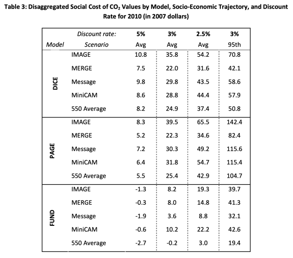
The results are shown for each of three IAMs (DICE, PAGE, and FUND), each of the five global scenarios, and each of the three discount rates (5.0%, 3.0%, and 2.5%). The final column shows what the SCC would be at the 95th percentile of the distribution when a discount rate of 3.0% is used. Each of the values in the first three columns of the tables are the simple averages over the 10,000 Monte Carlo runs for each of the scenarios.
The SCCs for 2010 (in 2007$) are then the simple averages of the figures in this table for each of the three discount rates (i.e. the simple averages of each of the columns). As one can confirm by doing the arithmetic, the average at a discount rate of 5.0% is $4.7 per ton of CO2, at a discount rate of 3.0% it is $21.4, and at a discount rate of 2.5% it is $35.1.
The values of the SCC shown in the table obviously span a very broad range, and that range will not appear when the simple averages across the 15 cases (from three IAMs and five global scenarios) are the only figures people pay attention to. The IWG was clear on this, and repeatedly stressed the uncertainties, but the broad ranges in the underlying figures do not inspire confidence. A critic could pick and choose among these for a value supportive of whatever argument they wish to make. Under one model and one global scenario and one discount rate the SCC in 2010 is estimated to be a negative $2.7 per ton of CO2 (from the FUND model results, which postulated near-term net benefits from a warming planet). Under a different set of assumptions, the SCC estimate is as high as $65.5 per ton. And much of that variation remains even if one limits the comparison to a given discount rate.
The figures in the table above also illustrate the important point that the SCC estimate can only be defined and understood in terms of some scenario of what the base path of global GDP and population would otherwise be, and especially of what the path of CO2 (and other greenhouse gas) emissions would be. In scenarios where CO2 emissions are high (e.g. “business as usual” scenarios), then damages will be high and the benefit from reducing CO2 emissions by a unit will be high. That is, the SCC will be high. But in a scenario where steps are taken to reduce CO2 emissions, then the damages will be less and the resulting SCC estimate will be relatively low. This is seen in the SCC estimates for the “550 average” scenarios in the table, which are lower (for each of the IAMs and each of the discount rates) than in the four “business as usual” scenarios.
The paradox in this, and apparent contradiction, is that to reduce CO2 emissions (so as to get to the 550 ppm scenario) one will need a higher – not a lower – cost assigned to CO2 emissions. But the contradiction is apparent only. If one were able to get on to a path of lower CO2 emissions over time, then the damages from those CO2 emissions would be smaller and the SCC in such a scenario would be lower. The confusion arises because the SCC is not a measure of what it might cost to reduce CO2 emissions, but rather a measure of the damage done (in some specific scenario) from such emissions.
Finally, such SCC estimates were produced in the same manner for CO2 that would be released in 2010, or in 2020, or in 2030, or in 2040, or in 2050. The SCC of each would be based on emissions in that specified individual year, based on the resulting damages going forward from that year. The values of the SCC in individual intervening years were then simply interpolated between the decennial figures. Keep in mind that these SCC values will be the SCC of one ton of CO2 – released once, not each year – in that specified year. The resulting SCC estimates are not the same over time but rather increase as world population and GDP are higher over time (at least in the scenarios assumed for these models). With larger absolute levels of global GDP, damages in absolute terms for some estimated percentage of global GDP will be higher over time. In addition, there will be the nonlinear impacts resulting from the increase over time of CO2 concentrations in the atmosphere, leading to greater damages and hence higher SCC values.
The resulting figures for the SCC in the estimates issued in February 2021, were then:
Social Cost of CO2, 2020 to 2050 (in 2020 dollars per metric ton of CO2)
| Year/Discount Rate |
5.0%
|
3.0%
|
2.5%
|
3.0%
|
|
Average |
Average |
Average |
95th Percentile |
| 2020 |
$14 |
$51 |
$76 |
$152 |
| 2030 |
$19 |
$62 |
$89 |
$187 |
| 2040 |
$25 |
$73 |
$103 |
$225 |
| 2050 |
$32 |
$85 |
$116 |
$260 |
Of these figures, the IWG recommended that the SCC values at the 3.0% discount rate should normally be the ones used as the base case by analysts (e.g. $51 per ton for CO2 emitted in 2020). The other SCC values might then be of use in sensitivity analyses to determine the extent to which any conclusion drawn might depend on the discount rate assumed. As noted before, these February 2021 estimates are the same as those issued in 2016, but adjusted to the 2020 general price level (where the earlier ones had all been in 2007 prices).
For those who have followed the discussion to this point, it should be clear that the process was far from a simple one. And it should be clear that there will be major uncertainties, as the IWG has repeatedly emphasized. Some of the limitations will be discussed next.
C. Limitations of the SCC Estimates
While the methodology followed by the IWG in arriving at its estimates for the SCC might well reflect best practices in the field, there are nonetheless major limitations. Among those to note:
a) To start, and most obviously, the resulting SCC estimates still vary widely despite often using simple averages to narrow the ranges. The figures for 2020 in the table above, for example, range from $14 per ton of CO2 (at a discount rate of 5%) to $76 (at a discount rate of 2.5%) – more than five times higher. The IWG recommendation is to use the middle $51 per ton figure (at the 3% discount rate) for most purposes, but the wide range at different discount rates will lead many not to place a good deal of confidence in any of the figures.
Furthermore, estimates of the SCC have been made by others that differ significantly from these. In the US government itself, the Environmental Protection Agency issued for public comment in September 2022 a set of SCC estimates that are substantially higher than the February 2021 IWG figures. This was done outside of the IWG process – in which the EPA participates – and I suspect that either some bureaucratic politicking is going on or that this is a trial balloon to see the reaction. For the year 2020, the EPA document has an SCC estimate of $120 per ton of CO2 at a discount rate of 2.5% – well above the IWG figure of $76 at a 2.5% discount rate. The EPA also issued figures of $190 at a discount rate of 2.0% and $340 at a discount rate of 1.5%. Various academics and other entities have also produced estimates of the SCC, that differ even more.
It can also be difficult to explain to the general public that an SCC estimate can only be defined in terms of some specified scenario of how global greenhouse gas emissions will evolve in the future. Reported SCC values may differ from each other not necessarily because of different underlying models and parameter assumptions, but because they are assuming different scenarios for what the base path of CO2 emissions might be.
These differences in SCC estimates should not be surprising given the assumptions that are necessary to estimate the SCC, as well as the difficulties. But the resulting reported variation undermines the confidence one may have in the specific values of any such estimates. The concept of the SCC is clear. But it may not be possible to work out a good estimate in practice.
b) As a simple example of the uncertainties, it was noted above that the IAM models postulate a damage function for the relationship between higher global temperatures and the resulting damage to global output. It is difficult to know what these might be, quantitatively. The more detailed IAM models will break this down by broad sectors (e.g. agriculture, impacts on health, damage to structures from storms, etc.), but these are still difficult to assess quantitatively. Consider, for example, making an estimate of the damage done last year – or any past year – as a consequence of higher global temperatures. While we know precisely what those temperatures were in those past years (so there is no uncertainty on that issue), estimates will vary widely of the damage done as a consequence of the higher temperatures. Different experts – even excluding those who are climate skeptics – can arrive at widely different figures. While we know precisely what happened in the past, working out all the impacts of warming temperatures will still be difficult. But the IAM models need to estimate what the damages would be in future years – and indeed in distant future years – when there is of course far greater uncertainty.
Note also that the issue here is not one of whether any specific extreme weather event can be attributed with any certainty to higher global temperatures. While the science of “extreme event attribution” has developed over the last two decades, it is commonly misunderstood. It is never possible to say with certainty whether any particular extreme storm happened due to climate change and would not have happened had there been no climate change. Nor is that the right question. Weather is variable, and there have been extreme weather events before the planet became as warm as it is now. The impact of climate change is rather that it makes such extreme weather events more likely.
Consider, for example, the impact of smoking on lung cancer. We know (despite the denial by tobacco companies for many years) that smoking increases the likelihood that one will get lung cancer. This is now accepted. Yet we cannot say with certainty that any particular smoker who ends up with lung cancer got it because he or she smoked. Lung cancers existed before people were smoking. What we do know is that smoking greatly increases the likelihood a smoker will get cancer, and we can make statistical estimates of what the increase in that likelihood is.
Similarly, we cannot say for certain that any particular extreme weather event was due to climate change. But this does not justify conservative news outlets proclaiming that since we cannot prove this for an individual storm, that therefore we have no evidence on the impact of climate change. Rather, just like for smoking and lung cancer, we can develop estimates of the increased likelihood of this happening, and from this work out estimates of the resulting economic damages. If, for example, climate change doubles the likelihood of some type of extreme weather event, then we can estimate that half of the overall damages observed by such weather events in some year can be statistically attributed to climate change.
This is still difficult to do well. There is not much data, and one cannot run experiments on this in a lab. Thus estimates of the damages resulting from climate change – even in past years – vary widely. But one needs such estimates of damages resulting from climate change for the SCC estimate – and not simply for past years (with all we know on what happened in the past) but rather in statistical terms for future years.
c) It would be useful at this point also to distinguish between what economists call “risk” and what they call “uncertainty”. This originated in the work of Frank Knight, with the publication of his book “Risk, Uncertainty and Profit” in 1921. And while not commonly recognized as often, John Maynard Keynes introduced a similar distinction in his “A Treatise on Probability”, also published in 1921.
As Knight defined the terms, “risk” refers to situations where numerical probabilities may be known mathematically (as in results when one rolls dice) or can be determined empirically from data (from repeated such events in the past). “Uncertainty”, in contrast, refers to situations where numerical probabilities are not known, and possibly cannot be known. In situations of risk, one can work out the relative likelihood that some event might occur. In situations of uncertainty, one cannot.
In general language, we often use these terms interchangeably and it does not really matter. But for certain situations, the distinction can be important.
Climate change is one. There is a good deal of uncertainty about how the future climate will develop and what the resulting impacts might be. And while certain effects are predictable as a consequence of greenhouse gas emissions (and indeed we are already witnessing this), there are likely to be impacts that we have not anticipated, That is, for both the types of events that we have already experienced and even more so for the types of events that may happen in the future as the planet grows warmer, there is “uncertainty” (in the sense defined by Knight) on how common these might be and on what the resulting damages might be. There is simply a good deal of uncertainty on the overall magnitude of the economic and other impacts to expect should there be, say, a 3.0 °C increase in global temperatures. However, the IAMs have to treat these not as “uncertainties” in the sense of Knight, but rather as “risks”. That is, the IAMs assume a specific numerical relationship between some given temperature rise and the resulting impact on GDP.
The IAMs need to do this as otherwise they would not be able to arrive at an estimate of the SCC. However, one should recognize that a leap is being made here from uncertainties that cannot be known with any assurance to treatment as if they are risks that can be specified numerically in their models.
d) Thus the IAMs specify certain damage functions to calculate what the damages to the planet will be for a given increase in global temperatures. The difficulty, however, is that there is no data that can be used to assess this directly. The world has not seen temperatures at 3.0°C above what they were in the pre-industrial era (at least not when modern humans populated the world). The economists producing the IAMs consulted various sector experts on this, but one needs to recognize that no one really knows. It can only be a guess.
But the IAMs need something in order to come up with an estimate of the SCC. So after reviewing what has been published and consulting with various experts, those developing the IAMs arrived at some figure on what the damages might be at some given increase in global temperatures. They expressed these in “consumption-equivalent” terms, which would include both the direct impact on production plus some valuation given (in some of the models using a “willingness-to-pay” approach) to impacts on non-marketed goods (such as adverse impacts on ecosystems – environmentalists call these existence values).
And while it is not fully clear whether and how the IAM models accounted for this, in principle the damages should also include damages to the stock of capital resulting from a higher likelihood of severe storm events. For example, if Miami were to be destroyed by a particularly severe hurricane made more likely due to a warming planet, the damages that year should include the total capital value of the lost buildings and other infrastructure, not just the impact on Miami’s production of goods and services (i.e. its GDP) that year. GDP does not take into account changes in the stock of capital. (And while Miami was used here as an example, the calculation of the damages would in fact be for all cities in the world and expressed probabilistically for the increase in the likelihood of such events happening somewhere on the planet in any given year in a warmer world.)
Based on such damage estimates (or guesses), they then calibrated their IAM models to fit the assumed figures. While I have expressed these in aggregate terms, in the models such estimates were broken down in different ways by major sectors or regions. For example, the DICE model (in the vintage used by the IWG for its 2010 estimates) looked at the impacts across eight different sectors (impacts such as on agriculture, on human health, on coastal areas from sea level rise, on human settlements, and so on). The PAGE model broke down the relationships into eight different regions of the world but with only three broad sectors. And the FUND model broke the impacts into eight economic sectors in 16 different regions of the world. FUND also determined the damages not just on the level of the future temperatures in any given year, but also on the rate of change in the average temperatures prior to that year.
The impacts were then added up across the sectors and regions. However, for the purposes of the discussion here, we will only look at what the three IAMs postulated would be the overall damages from a given temperature rise.
The IAM developers calibrated their damage functions to match some assumed level of damages (as a share of GDP) at a given increase in global temperatures. Damages at an increase of 3.0°C may have been commonly used as an anchor, and I will assume that here, but it could have been at some other specific figure (possibly 2.0°C or 2.5°C). They then specified some mathematical relationship between a given rise in temperatures and the resulting damages, and calibrated that relationship so that it would go through the single data point they had (i.e. the damages at 3.0°C, or whatever anchor they used). This is a bit of over-simplification (as they did this separately by sector and possibly by region of the world, and then aggregated), but it captures the essence of the approach followed.
The IWG, in its original 2010 Technical Support Document, provided this chart for the resulting overall damages postulated in the IAM models (as a share of GDP) for temperatures up to 4.0 °C above those in the pre-industrial era, where for the purposes here the scenarios used correspond to the default assumptions of each model:

The curves in red, blue, and green are, respectively, for the DICE, PAGE, and FUND models (in the vintages used for the 2010 IWG report). And while perhaps difficult to see, the dotted blue lines show what the PAGE model estimated would be the 5th and 95th percentile limits around its mean estimate. It is obvious that these damage functions differ greatly. As the IWG noted: “These differences underscore the need for a thorough review of damage functions”.
The relationships themselves are smooth curves, but that is by construction. Given the lack of hard data, the IAMs simply assumed there would be some such smooth relationship between changes in temperatures and the resulting damages as a share of GDP. In the DICE and PAGE models these were simple quadratic functions constrained so that there would be zero damages for a zero change in temperatures. (The FUND relationship was a bit different to allow for the postulated positive benefits – i.e. negative losses – at the low increases in temperatures. It appears still to be a quadratic, but shifted from the origin.)
A quadratic function constrained to pass through the origin and then rise steadily from there requires only one parameter: Damages as a share of GDP will be equal to that parameter times the increase in global temperatures squared. For the DICE model, one can easily calculate that the parameter will equal 0.278. Reading from the chart (the IWG report did not provide a table with the specific values), the DICE model has that at a 3.0°C increase in temperatures (shown on the horizontal axis), the global damages will equal about 2.5% of GDP (shown on the vertical axis). Thus one can calculate the single parameter from 0.278 = 2.5 / (3.0 x 3.0). And one can confirm that this is correct (i.e. that a simple quadratic fits well) by examining what the predicted damages would be at, say, a 2.0°C temperature. It should equal 0.278 x (2.0×2.0), which equals damages of about 1.1% of GDP. Looking at the chart, this does indeed appear to be the damages according to DICE at a 2.0°C increase in global temperatures.
One can do this similarly for PAGE. At a 3.0°C rise in temperatures, the predicted damages are about 1.4% of GDP. The single parameter can be calculated from this to be 0.156. The predicted damages at a 2.0°C increase in temperatures would then be about 0.6°C, which is what one sees in the chart.
So what will the damages be at, say, a 2.0°C rise in temperatures? The DICE model estimates there will be a loss of about 1.1% of the then GDP; the PAGE model puts it at a loss of 0.6% of GDP; and the FUND model puts it at a gain of 0.6% of GDP. This is a wide range, and given our experience thus far with a more modest increase in global temperatures, all look to be low. In the face of such uncertainty, the IWG simply weighted each of the three models equally and calculated the SCC (for any given discount rate) as the simple average of the resulting estimates across the three models. But this is not a terribly satisfactory way to address such uncertainty, especially across three model estimates that vary so widely.
If anything, the estimates are probably all biased downward. That is, they likely underestimate the damages. Most obviously, they leave out (and hence treat as if the damages would be zero) those climate change impacts where they are unable to come up with any damage estimates. They will also of course leave out damages from climate change impacts that at this point we cannot yet identify. We do not know what we do not know. But even for impacts that have already been experienced at a more modest rise in global temperatures (such as more severe storms, flooding in some regions and drought in others, wildfires, extremely high heat waves impacting both crops and human health, and more) – impacts that will certainly get worse at a higher increase in global temperatures – the estimated impact of just 1.1% of GDP or less when temperatures reach 2.0°C over the pre-industrial average appears to be far too modest.
e) The damage functions postulate that the damages in any given year can be treated as a “shock” to what GDP would have been in that year, where that GDP is assumed to have followed some predefined base path to reach that point. In the next year, the base path is then exactly the same, and the damages due to climate change are again treated as a small shock to that predefined level of future GDP. That is, the models are structured so that their base path of GDP levels will be the same regardless of what happens due to climate change, and damages are taken as a series of annual shocks to that base path.
[Side note: The DICE model is slightly different, but in practice that difference is small. It treats the shock to GDP as affecting not only consumption but also savings, and through this also what investment will be. GDP in the next year will then depend on what the resulting stock of capital will be, using a simple production function (a Cobb-Douglas). But this effect will be small. If (in simple terms), consumption is, say, 80% of GDP and savings is 20%, and there is a 2% of GDP shock to what GDP would have been due to climate change with this split proportionally between consumption and savings, then savings will fall by 2% to 19.8% of GDP. The resulting addition to capital in the next period will be reduced, but not by much. The path will be close to what it would have been had this indirect effect been ignored.]
One would expect, however, that climate change will affect the path that the world economy will follow and not simply create a series of shocks to an unchanged base path. And due to compounding, the impact of even a small change to that base path can end up being large and much more significant than a series of shocks to some given path. For example, suppose that the base path growth is assumed to be 3.0% per year, but that due to climate change, this is reduced slightly to, say, 2.9% per year. After 50 years, that slight reduction in the rate of growth would lead GDP to be 4.7% lower than had it followed the base path, and after 100 years it would be 9.3% lower. Such a change in the path – even with just this illustrative very small change from 3.0% to 2.9% – will likely be of far greater importance than impacts estimated via a damage function constructed to include only some series of annual shocks to what GDP would be on a fixed base path.
It is impossible to say what the impact on global growth might be as a consequence of climate change. But it is likely to be far greater than the reduction in growth used in this simple example, which assumed a change of just 0.1% per year.
f) The damage functions also specify some simple global total for what the damages might be. The distribution of those damages across various groups or even countries is not taken into account, and hence neither do the SCC estimates. Rather, the SCC (the Social Cost of Carbon) treats the damages as some total for society as a whole.
Yet different groups will be affected differently, and massively so. Office workers in rich countries who go from air-conditioned homes to air-conditioned offices (in air-conditioned cars) may not be affected by as much as others (other than higher electricity bills). But farmers in poor countries may be dramatically affected by drought, floods, heat waves, salt-water encroachment on their land, and other possible effects.
This should not be seen as negating the SCC as a concept. It is what it is. That is, the SCC is a measure of the total impact, not the distribution of it. But one should not forget that even if the overall total impact might appear to be modest, various groups might still be severely affected. And those groups are likely in particular to be the poorer residents of this world.
g) It is not clear that the best way to address uncertainty on future global prospects (the combination of CO2 emissions, GDP, and population) is by combining – as the IWG did – four business-as-usual scenarios with one where some limits (but not very strong limits) are assumed to be placed on CO2 emissions. These are different. Rather, they could have estimated the SCC based on the business-as-usual scenarios (using an average) and then shown separately the SCC based on scenarios where CO2 emissions are controlled in various specified ways.
The IWG might not have done this as the resulting different sets of SCC estimates would likely have been even more difficult to explain to the public. The ultimate bureaucratic purpose of the exercise was also to arrive at some estimate for the SCC that could be used as federal rules and regulations were determined. For this they would need to arrive at just one set of estimates for the SCC. Presumably this would need to be based on a “most likely” scenario of some sort. But it is not clear to me that combining four “business-as-usual” scenarios with one where there are some measures to reduce carbon emissions would provide this.
The fundamental point remains that any given SCC estimate can only be defined in terms of some specified scenario on the future path of CO2 (and other greenhouse gas) emissions as well as the path of future GDP and population. There will also be at least implicit assumptions being made on future technologies and other factors. Clarity on the scenarios assumed is needed in order to understand what the SCC values mean and how any specific set of such estimates may relate to others.
h) There is also a tremendous amount of uncertainty in how strong the feedback effects will be. The IAM models attempted to incorporate this by assigning a probability distribution to the “equilibrium climate sensitivity” parameter, but there is essentially no data – only theories – on what that distribution might be.
Uncertainty on how strong such feedback effects might be is central to one of the critiques of the SCC concept. But this is best addressed as part of a review of the at times heated debate on what discount rate should be used. That issue will be addressed next.
D. Discount Rates
CO2 emitted now will remain in the atmosphere for centuries. Thus it will cause damage from the resulting higher global temperatures for centuries. The SCC reflects the value, discounted back to the date when the CO2 is released into the air, of that stream of damages from the date of release to many years from that date. Because of the effects of compounding over long periods of time, the resulting SCC estimate will be highly sensitive to the discount rate used. If the discount rate is relatively high, then the longer-term effects will be heavily discounted and will not matter as much (in present-day terms). The SCC will be relatively low. And if the discount rate is relatively low, the longer-term effects will not be discounted by as much, hence they will matter more, and hence the SCC will be relatively high.
This was seen in the SCC estimates of the IWG. As shown in the table at the end of Section B above, for CO2 that would be emitted in 2020 the IWG estimates that the SCC would be just $14 per ton of CO2 if a discount rate of 5.0% is used but $76 per ton if a discount rate of 2.5% is used – more than five times higher. And while a 2.5% rate might not appear to be all that much different from a 3.0% rate, the SCC is $51 at a 3.0% rate. The $76 per ton at 2.5% is almost 50% higher. And all of these estimates are for the exact same series of year-by-year damages resulting from the CO2 emission: All that differed was the discount rate used to discount back to the base year the stream of year-by-year damages.
Different economists have had different views on what the appropriate discount rate should be, and this became a central point of contention. But it mattered not so much because the resulting SCC estimates differed. They did – and differed significantly – and that was an obvious consequence. But the importance of the issue stemmed rather from the implication for policy. As was briefly discussed above, Professor William Nordhaus (an advocate for a relatively high discount rate) came to the conclusion that the optimal policy to be followed would be one where not much should be done directly to address CO2 emissions in the early years. Rather, Nordhaus concluded, society should only become aggressive in reducing CO2 emissions in subsequent decades. The way he put it in his 2008 book (titled A Question of Balance – Weighing the Options on Global Warming Policies), pp. 165-166:
“One of the major findings in the economics of climate change has been that efficient or ‘optimal’ policies to slow climate change involve modest rates of emission reductions in the near term, followed by sharp reductions in the medium and long terms. We might call this the ‘climate-policy ramp’, in which policies to slow global warming increasingly tighten or ramp up over time.”
But while Nordhaus presented this conclusion as a “finding” of the economics of climate change, others would strongly disagree. In particular, the debate became heated following the release in 2006 of the Stern Review, prepared for the UK Treasury. As was briefly noted above, Professor Stern (now Lord Nicholas Stern) came to a very different conclusion and argued strongly that action to reduce CO2 and other greenhouse gas emissions was urgent as well as necessary. It needed to be addressed now, not largely postponed to some date in the future.
Stern used a relatively low discount rate. Nordhaus, in a review article published in the Journal of Economic Literature (commonly abbreviated as JEL) in September 2007, argued that one can fully account for the difference in the conclusions reached between him and Stern simply from the differing assumptions on the discount rate. (He also argued he was right and Stern was wrong.) While there was in fact more to it than only the choice of the discount rate, discount rates were certainly an important factor.
There have now been dozens, if not hundreds, of academic papers published on the subject. And the issue in fact goes back further, to the early 1990s when Nordhaus had started work on his DICE models and William Cline (of the Peterson Institute for International Economics) published The Economics of Global Warming (in 1992). It was the same debate, with Nordhaus arguing for a relatively high discount rate and Cline arguing for a relatively low one.
I will not seek to review this literature here – it is vast – but rather focus on a few key articles in order to try to elucidate the key substantive issues on what the appropriate discount rate should be. I will also focus on the period of the few years following the issuance of the Stern Review in late 2006, where much of the work published was in reaction to it.
Nordhaus will be taken as the key representative of those arguing for a high discount rate. Nordhaus’s own book on the issues (A Question of Balance) was, as noted, published in 2008. While there was a technical core, Nordhaus also wrote portions summarizing his key points in a manner that should be accessible to a non-technical audience. He also had a full chapter dedicated to critiquing Stern. Stern and the approach followed in the Stern Review will be taken as the key representative of those arguing for a low discount rate.
In addition, the issue of uncertainty is central and critical. Two papers by Professor Martin Weitzman, then of Harvard, were especially insightful and profound. One was published in the JEL in the same September 2007 issue as the Nordhaus article cited above (and indeed with the exact same title: “A Review of The Stern Review of the Economics of Climate Change“). The other was published in The Review of Economics and Statistics in February 2009, and is titled “On Modeling and Interpreting the Economics of Catastrophic Climate Change”.
These papers will be discussed below in a section on Risk and Uncertainty. They were significant papers, with implications that economists recognized were profoundly important to the understanding of discount rates as they apply to climate change and indeed to the overall SCC concept itself. But while economists recognized their importance, they have basically been ignored in the general discussion on climate change and the role of discount rates – at least in what I have seen. They are not easy papers to go through, and non-economists (and indeed many economists) will find the math difficult.
The findings of the Weitzman papers are important. First, he shows that one should take into account risk (in the sense of Knight) and recognize that there are risks involved in the returns one might expect from investments in the general economy and in investments to reduce greenhouse gas emissions. The returns on each will vary depending on how things develop in the world – which we cannot know with certainty – but the returns on investments to reduce CO2 emissions will likely not vary in the same direction as returns on investments in the general economy. Rather, in situations where there is major damage to the general economy due to climate change, the returns to investments that would have been made to reduce CO2 emissions would be especially high. Recognizing this, the appropriate discount rate on investments to reduce CO2 emissions should be, as we will discuss below, relatively low. Indeed, they will be close to (or even below) the risk-free rate of return (commonly taken to be in the range of zero to 1%). This was addressed in Weitzman’s 2007 paper.
Second and more fundamentally, when one takes into account genuine uncertainty (in the sense of Knight) in the distribution of possible outcomes due to feedback and other effects (thus leading to what are called “fat tails”), one needs to recognize a possibly small, but still non-zero and mathematically significant chance of major or even catastrophic consequences if climate change is not addressed. The properly estimated SCC would then be extremely high, and the discount rate itself is almost beside the point. The key more practical conclusion was that with such feedback effects and uncertainties, any estimates of the SCC will not be robust: They will depend on what can only be arbitrary assumptions on how to handle those uncertainties, and any SCC estimate will be highly sensitive to the particular assumptions made. But the feedback effects and uncertainties point the SCC in the direction of something very high. This was covered by Weitzman in his 2009 paper.
The Weitzman papers were difficult to work through. In part for this reason, it is useful also to consider a paper published in 2010 authored by a group of economists at the University of Chicago. The paper builds on the contributions of Weitzman but also explains the basic points of Weitzman from a different perspective. The paper is still mathematical but complements the Weitzman papers well. The authors are Professors Gary Becker, Kevin Murphy, and Robert Topel, all then at the University of Chicago. Gary Becker has long been a prominent member of the faculty of economics at Chicago and has won a Nobel Prize in Economics. This is significant, as some might assume Weitzman (at Harvard) was not taking seriously enough a market-based approach (where the assumption of Nordhaus and others was that the discount rate should reflect the high rate of return one could obtain in the equity markets). The Chicago School of Economists is well known for its faith in markets, and the fact that Becker would co-author an article that fully backs up Weitzman and his findings is significant.
The paper of Becker and his co-authors is titled “On the Economics of Climate Policy”, and was published in the B.E Journal of Economic Analysis & Policy. But it also has not received much attention (at least from what I have seen), possibly because the journal is a rather obscure one.
The sub-sections below will discuss, in order, Nordhaus and the arguments for a relatively high discount rate; Stern and the arguments for a relatively low discount rate; and the impact of risk and uncertainty.
a) Nordhaus, and the arguments for a relatively high discount rate
Nordhaus, together with others who argued the discount rate should be relatively high, argue that the discount rate should be viewed as a measure of the rate at which an investment could grow in the general markets. In A Question of Balance (pp. 169-170) he noted that in his usage, the terms “real return on capital”, “real interest rate”, “opportunity cost of capital”, “real return”, and “discount rate”, all could be used interchangeably.
One can then arrive, he argued, at an estimate of what the proper discount rate should be by examining what the real return on investments had been. Nordhaus noted, for example, that the real, pre-tax, return on U.S. nonfinancial corporations over the previous four decades (recall that this book was published in 2008) was 6.6% per year on average, with the return over the shorter period of 1997 to 2006 equal to 8.9% per year. He also noted that the real return on 20-year U.S. Treasury securities in 2007 was 2.7%. And he said that he would “generally use a benchmark real return on capital of around 6 percent per year, based on estimates of rates of return from many studies” (page 170).
The specific discount rate used is important because of compound interest. While in the calculation of the SCC the discount rate is used to bring to the present (or more precisely, the year in which the CO2 is emitted) what the costs from damages would be in future years if an extra ton of CO2 is emitted today, it might be clearer first to consider this in the other direction – i.e. what an amount would grow to from the present day to some future year should that amount grow at the specified discount rate.
If the discount rate assumed is, say, 6.0% per annum, then $1 now would grow to $18.42 in 50 years. In 100 years, that $1 would grow to $339.30. These are huge. The basic argument Nordhaus makes is that one could invest such resources in the general economy today, earn a return such as this, and then in the future years use those resources to address the impacts of climate change and/or at that point then make the investments required to stop things from getting worse. One could, for example, build tall sea walls around our major cities to protect them from the higher sea level. If the cost to address the damages arising from climate change each year going forward is less than what one could earn by investing those funds in the general economy (rather than in reducing CO2 emissions), then – in this argument – it would be better to invest in the general economy. The discount rate (the real return on capital) defines the dividing line between those two alternatives. Thus by using that discount rate to discount the stream of year-by-year damages back to the present, one can determine how much society should be willing to pay for investments now that would avoid the damages arising from an extra ton of CO2 being emitted. The sum of that stream of values discounted at this rate is the SCC.
There are, however, a number of issues. One should note:
i) While it is argued that the real return on capital (or real rate of interest, or similar concept) should be used as an indication of what the discount rate should be, there are numerous different asset classes in which one can invest. It is not clear which should be used. It is generally taken that US equity markets have had a pre-tax return of between 6 and 7% over long periods of time (Nordhaus cites the figure of 6.6%), but one could also invest in highly rated US Treasury bonds (with a real return of perhaps 2 to 3%), or in essentially risk-free short-term US Treasury bills (with a real return on average of perhaps 0 to 1%). There are of course numerous other possible investments, including in corporate bonds, housing and land, and so on.
The returns vary for a reason. Volatility and risk are much higher in certain asset classes (such as equities) than in others (such as short-term Treasury bills). Such factors matter, and investors are only willing to invest in the more volatile and risky classes such as equities if they can expect to earn a higher return. But it is not clear from this material alone how one should take into account such factors when deciding what the appropriate comparator should be when considering the tradeoff between investments in reducing CO2 emissions and investments in “the general economy”. And even if one restricted the choices just to equity market returns, it is not clear which equity index to use. There are many.
ii) The returns on physical investments (the returns that would apply in the Nordhaus recommendation of investing in the general economy as opposed to making investments to reduce CO2 emissions) are also not the same thing as returns on investments in corporate equities. Corporations, when making physical investments, will fund those investments with a combination of equity capital and borrowed capital (e.g. corporate bonds, bank loans, and similar). The returns on the equity invested might well be high, but this is because that equity was leveraged with borrowed funds paying a more modest interest rate. Rather, if one believes we should focus on the returns on corporate investments, the comparison should be to the “weighted average cost of capital” (the weighted average cost of the capital invested in some project), not on returns on investments just in corporate equity.
iii) Even if a choice were made and past returns were observed, there is no guarantee that future returns would be similar. But it is the future returns that matter.
iv) This is also all US-centric. But the determination of the SCC is based on the global impacts, and hence the discount rate to use should be based not solely on how one might invest in the US but rather on what the returns might be on investments around the world. The US equity markets have performed exceptionally well over the past several decades, while the returns in other markets have in general been less. And some have been especially low. The Japan Nikkei Index, for example, is (as I write this) still 15% below the value it had reached in 1989, over a third of a century ago.
v) The US equity market has performed exceptionally well not solely because the actual returns on investments made by firms have been especially high, but also because the multiples that investors have become willing to pay for those earnings have risen sharply in recent decades. Probably the best measure of those multiples was developed by Professor Robert Shiller of Yale (also a Nobel Laureate in Economics) called the Cyclically Adjusted Price Earnings (CAPE) Ratio. The CAPE Ratio calculates the ratio of the value of the S&P 500 index to the inflation-adjusted earnings of the companies included in the S&P 500 index over the previous 10 years. By taking a 10-year average (adjusted for inflation during those ten years), the CAPE ratio averages over the fluctuations in earnings that one will see as a result of the business cycle.
The CAPE ratio has on average risen significantly over time. Investors are paying far higher multiples on given earnings now than they did earlier. I used data for the CAPE Ratio for January 1 of each year, and ran simple ordinary least squares regressions over the relevant years (in logarithms) to calculate the trend growth rates (so these are not the growth rates simply from the given initial year to the given final year, but rather the trend over the full period). I found that the increase in the multiple alone (as measured by the Shiller CAPE Ratio) contributed 2.2% points over the more than half-century from 1970 to 2023, and 2.6% points over the period from 1980 to 2023. For the four decades prior to Nordhaus’s book of 2008 (where he said the equity markets generated a real return of 6.6% per year), the increase in the CAPE Ratio accounted for 2.4% points of the return to investors. That is, the equity returns on the underlying investments (which is what Nordhaus is seeking to capture for his discount rate) rose only by 4.2% a year. The rest was simply the effect of investors being willing to pay a higher multiple on those returns.
vi) All this assumes corporations are operating in what economists call “perfectly competitive” markets, and that the equity valuations are based on such competition. But for reasons of both changes in technology and in policy, markets have become less competitive over time. Firms such as Facebook and Google have benefited from technologies supportive of “winner-take-all” markets (or perhaps “winner-take-most”), where due to network effects a few firms can generate extremely high returns with only low capital investment needs. And policy in recent decades – followed by both parties in the US – has been supportive of industry consolidation (such as among the airlines, military contractors, national drug store and supermarket chains, and many more). The resulting returns (reflected in equity prices) are then not necessarily reflective of investments per se, but rather also of greater market power that can be reflected in, for example, pricing.
The approach also leaves out the issue of uncertainty. While this will be addressed in more detail below, one should recognize that due to risk (or uncertainty) one will rationally aim for an investment return that differs from some benchmark. A firm will rationally aim for a relatively high rate of return on new projects it might invest in (using what is called a “hurdle rate”), even though on average they expect to earn a lower return. Things happen and investments do not always work out, so while they might have a hurdle rate of, say, 15% in real terms for a project to be approved, they will be happy if, on average, such investments earn, say, 7% (with all these numbers just for illustration). That is, they include a margin (15% rather than 7%) due to the risk that things will not work out as they hope.
This would be for projects producing something profitable or beneficial. For CO2 emissions, in contrast, one is trying to reduce something that is bad. In such a case, instead of discounting future returns at some higher rate, one would do the opposite and discount the future damages at some lower rate. One cannot say by how much just with this simple thought experiment – one can only say that the appropriate discount rate would be less than the rate that would be used in the absence of risk and/or uncertainty. Another way of thinking about the issue is that an insurance policy could be purchased (if a market for such insurance existed) to guard against the risk that the reduction in the “bad” (the global warming impacts from the CO2 emissions) will not be as large as what one had hoped from such investments. Such insurance would have a cost that would be added to the SCC – leading to a higher SCC – and similar to what one would obtain with a lower discount rate.
There are also other issues in the Nordhaus “climate ramp-up” approach, where building high sea walls later to protect coastal cities from rising sea levels is an example. One issue is that this ignores distribution, and the fact that incomes vary enormously across different parts of the world. It might be conceivable that cities such as New York or London or Tokyo could find the resources to address the consequences of rising sea levels by building high sea walls at some point a few decades from now, but it is hard to see that this would be possible in cities such as Dhaka or Lagos. CO2 emissions have global consequences, but most of the emissions have come from the rich countries of the world and now China and India as well. The poor will lose under the proposed strategy of delay.
One also needs to recognize that some of the consequences of a warming planet will be irreversible. These are already underway: Species are going extinct, coral reefs are dying, and many ecosystems are being permanently changed. A strategy of waiting until later to get serious about reducing CO2 emissions in the ramp-up strategy cannot address irreversible consequences, even if the resources available are higher in the future.
Finally, one should note that at least certain politicians will very much welcome a recommendation that they can postpone serious investments to address climate change to some point in the future. But there is no guarantee that when that future comes a few decades from now, they then will be any more willing to make the investments called for in the Nordhaus ramp-up strategy. Many will likely then choose to “kick the can down the road” again.
What discount rate did Nordhaus himself use? This is actually not as clear as it should be, but my conclusion is that Nordhaus in 2007/2008 used a declining discount rate starting at 6.5% for “2015” (which is in fact an average for the 10-year period from 2010 to 2019), and then declining in each 10-year period to reach 5.5% for 2055 and 4.5% for 2095 (with intermediate values as well). These discount rates decline over time primarily, I believe, because he expects growth rates to decline for demographic reasons, as growth in the labor force slows and in some parts of the world actually falls. The impact of declining growth over time on the discount rate will be discussed below.
But Nordhaus was inconsistent, with different values provided in his 2007 JEL article commenting on Stern and in his 2008 book A Question of Balance, even though both were supposedly from his DICE-2007 model. I believe he made a mistake in the chart he included in his 2008 book. But that is a side story and will be discussed in an annex at the end of this post.
The Trump administration decided on a social discount rate that was even higher than Nordhaus used, setting it at 7% and then keeping it there forever. As was noted above, in 2017 they issued revised guidance on what the SCC should be (as the federal government was required to have something), but what they issued was basically a farce. First, they decided that a discount rate of 7% in real terms should be used. While OMB had issued guidance in 2003 that a 7% discount rate should be used in assessing certain federal regulations and investments, they in fact said that rates of both 3% and 7% should be used as different scenarios. These would bracket, they believed, what the proper rate might be, which was uncertain. But the OMB guidance was for these discount rates to be used in circumstances that are quite different from what would be appropriate for addressing the costs of CO2 emissions. For example, they assumed a maximum time horizon of 30 years, while CO2 in the atmosphere will be there for centuries.
This high discount rate of 7%, by itself, would bring the SCC down into the single digits. As noted above, the IWG estimates for 2020 (and in 2020$) were $51 at a discount rate of 3% and $14 at a discount rate of 5%. At 7%, they would likely be far below $10. And second, the Trump administration decided that the impacts of the CO2 emissions on only the US would be counted. Yet the impacts are global. If every country counted only the impacts on itself and ignored the costs they were imposing on others, the SCC estimates would range from the small (for the largest countries, as even the US only accounts for about 20% of world GDP) to the minuscule (for most countries, as their economies are not at all large as a share of world GDP). Every country might have an SCC, but by ignoring the costs they are imposing on others all would be gross underestimates. They would be useless as a guide to policy, which was, of course, likely the intention of the Trump administration.
Based on the discount rates he used, Nordhaus arrived at an estimate for the SCC of about $7.40 per ton of CO2 emitted in 2005 and in 2005$. This would be equivalent to $9.63 per ton of CO2 in 2020$. (Note that Nordhaus normally presented his SCC estimates in terms of $ per ton of carbon, i.e. of C and not of CO2. This can be confusing, but the convention of expressing the SCC in terms of $ per ton of CO2 was not yet as widespread in 2008 as it is now. But one can convert from the price per ton of C to the price per ton of CO2 by dividing by 3.666, as that equals the ratio of the molecular weight of CO2 to that of C. The molecular weight of carbon, C, is 12; that of oxygen, O, is 16; so CO2 = 12 + 2×16 = 44, and 44/12 = 3.666.)
This SCC of $9.63 per ton of CO2 in 2020$ is, however, the SCC he calculated that should apply for emissions in 2005. This would then grow (or “ramp up”) over time. For his 2008 book, he showed estimates for emissions in 2005, 2015, 2025, and so on for every 10 years. Taking the simple average of his figures for 2015 and 2025 to approximate what it would be for emissions made in 2020, and converting the figures into CO2 terms and in 2020$ (using the US GDP deflator), the estimate of Nordhaus for the SCC in 2020 would be $16.91. This is actually a bit above the IWG estimate for emissions in 2020 (and in 2020$) of $14 at a discount rate of 5%. As noted above, Nordhaus used a discount rate that started at 6.5% but fell to 4.5% a century later (and presumably further beyond a century, although no figures were given by Nordhaus in what I could find).
Based on this “ramp up” strategy where serious investments to address climate change (and the consequences of climate change) would be deferred to later, Nordhaus worked out what he termed an “optimal” path for CO2 emissions, the resulting concentration of CO2 in the atmosphere, and the resulting increase in global temperatures. On this “optimal” path – as he viewed it – the concentration of CO2 in the atmosphere would peak at 680 ppm in the year 2175, and global temperatures would peak soon thereafter at about 3.5 °C over the pre-industrial average.
Many would view a 3.5°C increase in temperatures as dangerous, far too high, and quite possibly disastrous. It would be far above the goals of the Paris Accords that global temperatures should not be allowed to rise above 2.0°C, and that efforts should be made to limit the increase to 1.5°C or less.
b) Stern, and the arguments for a relatively low discount rate
Lord Stern, in contrast to Nordhaus and others arguing for equating the discount rate to some market comparator, approached the issue of discounting by starting from first principles. In economics, the classic paper that derived the basis for social discounting was “A Mathematical Theory of Saving”, by Frank Ramsey, published in the Economic Journal in 1928. Ramsey was a genius, primarily a mathematician focused on logic but who wrote three classic papers in economics. All were ground-breaking. But Ramsey tragically died at the age of 26 from an illness that is still not known with certainty, but may have been from a bacterial infection picked up from swimming in the River Cam at Cambridge. He was made a fellow of King’s College, Cambridge, in 1924 at age 21 with John Maynard Keynes pulling strings to make it possible. Keynes knew him well as an undergraduate (he received his BA at Cambridge in 1923) as Ramsey had pointed out problems with some aspects of Keynes’ A Treatise on Probability – and Keynes recognized Ramsey was probably right. Even though he died at the young age of just 26, Ramsey made important contributions in a number of related fields. A philosopher in 1999 coined the term “the Ramsey Effect”, which applied when a philosopher working on a discovery that they believed to be new and exciting, found out instead that Ramsey had already discovered it, and had presented it more elegantly.
For the social discount rate, Ramsey in his 1928 article showed that to maximize social benefits over time, the discount rate used should be equal to (in terms of the Greek letters typically used in modern presentations of it):
ρ = δ + η g
where ρ (the Greek letter rho) is the social discount rate on future returns; δ (delta) is the pure social rate of time preference, η (eta) is the elasticity of marginal utility with respect to increases in consumption (to be explained in a moment), and g is the expected growth rate (in per capita terms) of overall consumption by society. It is variously referred to as the Ramsey Formula, Ramsey Equation, or Ramsey Rule.
Starting from the right: g is the expected rate of growth over the relevant time period in society’s overall per capita consumption levels. Stern, in his 2006 Review, used a value of 1.3% a year for this for the two centuries from 2001 to 2200. He took this figure from the PAGE model of Professor Chris Hope (in its 2002 vintage) in a scenario where climate change is not addressed. Some might view this as too high, particularly in such a scenario, but any figure over a two-century period is necessarily highly speculative. Note that if the expected growth rate is slower, then the social discount rate will be lower, and one should not be discounting future returns (or damages resulting from CO2 emissions) by as much.
The symbol η stands for the negative of the elasticity of marginal utility with respect to increases in consumption. Note that in most discussions of η, the “negative” is often left out. This confused me until I saw a reference confirming they are really referring to the negative of the marginal utility with respect to increases in consumption, and not simply to the marginal utility. Utility is assumed to increase with increases in consumption, but it will increase by less and less per unit of consumption as consumption goes up. Hence the marginal utility of an extra unit of consumption will be falling and the elasticity (the percentage change in the marginal utility – a negative – with respect to the percentage change in consumption – a positive) will be negative. And the negative of that negative elasticity of marginal utility will then be positive. But almost always one will see references to that elasticity of marginal utility simply as if it were positive, and to conform with others, I will treat it that way here as well.
The welfare of society as a whole depends on how much it can sustainably produce and consume, but as the incomes of societies (as well as individuals) grow over time, the extra welfare from an extra dollar of consumption will, as noted, diminish. That is, as societies grow richer, the marginal utility from an extra unit of consumption will be less. This is certainly reasonable. An extra dollar means more to a poor person (or a poor society) than to a rich one.
The elasticity of marginal utility is a measure of this curvature: The rate at which the marginal benefits (the marginal utility) become less and less as per capita consumption goes up. If that elasticity is equal to zero, then there would be no curvature and a dollar would be valued the same whether it went to someone rich or someone poor. If that elasticity is equal to 1.0, then the marginal utility is twice as much if that dollar went to someone with only half the income rather than to a person with the higher income. If that elasticity is equal to 2.0, then the marginal utility is four times as much if that dollar went to someone with only half the income rather than to a person with the higher income. And so on for other values of this elasticity.
So what should one expect the value of that elasticity to be? Keep in mind that this is for society as a whole, and fundamentally (Stern argues in his Review) it should be seen as a moral decision made by society. And societies make decisions based on this – implicitly – in certain policies. For example, decisions on the degree of progressivity in income tax rates across individuals (with higher-income individuals paying at higher rates) reflect an implicit decision on what that elasticity should be.
Keep in mind also that what is being examined here is changes in welfare or utility for society as a whole across generations. There can also be distributional issues within a generation (and how they might change over time). For a discussion of such issues, see the Technical Annex to Chapter 2 of the Stern Review.
But the basic issue being examined here is how much should we discount returns on investments that would be made at some cost today (that is, at some cost to the current generation) but with benefits to not just the current generation but to future generations as well (from reduced climate damage). Those future generations will be better off than the current one – if per capita growth remains positive (as is assumed here, at a rate of 1.3% per year) – and hence the marginal utility of an extra dollar of consumption to them will be less than the marginal utility of an extra dollar of consumption now. The η times g term captures this in the determination of the discount rate, where if growth is faster (a higher g), or the elasticity of marginal utility is greater (a higher η, so the marginal utility of an extra dollar is greater to a generation that is poorer), then future returns should be discounted more heavily. And note that if η = zero (the limiting case where an extra dollar has the same marginal utility whether it goes to someone rich or to someone poor), then this term will be zero and drops out no matter the growth rate g. But in the normal case where η has some value greater than zero, then one will place greater weight on the benefits to poorer societies and discount more heavily benefits that will accrue over time to societies that are richer than societies are now.
Stern argued for a value of 1.0 for η. As noted before, with such a value a dollar of extra consumption going to someone (in this case a society) with half the income will be valued twice as highly as that dollar going to the richer society. Others have argued that an appropriate estimate for what η is (i.e. not necessarily what they would want it to be, but what it is) would be more like 2. But to be honest, no one really knows. It should be a reflection of how society acts, but it is not safe to assume society is always acting rationally and for the good of the general public. Politics matters.
The other term in the equation is δ. This is the “pure rate of time preference”, and reflects what discount would be assigned to the welfare of future generations relative to the present one. Note that this does not reflect that future generations may be better off: The impact of that is already accounted for in the η times g term (where benefits to future generations are discounted to the extent their income is higher). Rather, the pure rate of time preference would capture any additional reasons there might be to discount benefits accruing to future generations (or damages avoided).
Stern argues, reasonably, that the only reason for possibly treating future generations differently (aside from differences in per capita income – already addressed) is that future generations might not exist. Everyone on the planet might have been destroyed in some future catastrophe (other than from climate change) by, for example, a nuclear war, or a large asteroid hitting the planet, or from a virus more deadly than Covid-19 leaking from a lab, or whatever. If future generations might not exist (with some probability) then benefits to future generations that do not exist will not be worth anything, and based on the probability of this occurring, should be discounted.
There is no real way to determine what value should be placed on the δ, but Stern uses a value of 0.1%. He says even that may be high. One can calculate that at that rate, the probability of humanity surviving 100 years from now would be 90.5% (0.999 raised to the power of 100), and thus the probability of not surviving 9.5%. Given that humanity has survived until now, that might appear high. But we now have nuclear bombs, the ability to manipulate viruses in a lab, and other capabilities that we did not have all that long ago.
Others have argued that 0.1% figure Stern uses is far too low. But it is not clear why they would argue that benefits to future generations should be discounted so heavily (aside from the impact of higher incomes – already accounted for), other than a possible end to future society. If it is intended to reflect the possibility of life ending due to some catastrophe, then one can calculate that with, say, a 1.0% rate (rather than 0.1% rate) the probability of humanity surviving 100 years from now would only be 37% (0.99 raised to the power of 100), and the probability of not surviving therefore 63%. For those advocating for a much higher pure rate of time preference – often even of 2% per annum – it does not appear that their focus is on the possible end of civilization sometime soon. But it is not clear what else they have in mind as a justification for such a high pure rate of time preference.
It is important to keep in mind that these are values for society as a whole. The pure rate of time preference for an individual would be quite different. Individuals have a finite life: Few of us will live to 100. Hence it makes sense for us to discount the future more heavily. But societies continue, and to treat future societies as if they were worth less than our current one is fundamentally, Stern argued, immoral.
Stern therefore used as his social discount rate 1.4% = 0.1% + 1.0 x 1.3%. It differs significantly from the rates Nordhaus used (of 6.5% in the near-term declining to 4.5% a century from now).
Interestingly, Nordhaus himself sought to justify his much higher rates in terms of the Ramsey Formula. But he did this by choosing parameters for the Ramsey Formula that would lead to the discount rates he had already decided to use. For example (see page 61 of A Question of Balance) he noted that with a growth rate (g) of 2.0% per year, an elasticity for the marginal utility (η) of 2.0, and a pure rate of time preference (δ) of 1 1/2%, then one will get a social discount rate out of the Ramsey Formula of 5 1/2%. This was the discount rate Nordhaus assumed for 2055. But Nordhaus is choosing parameters to reproduce his chosen discount rate, not estimating what those parameters might be in order to arrive at an estimate of the social discount rate.
Nordhaus appears to have done this in part because his IAM model differs from others in that he allows for a bit of endogeneity in the rate of growth of the world economy. As was discussed before, the future damages from a warming planet resulting from CO2 emissions affect, in his model, not only total output (GDP) but also the resulting savings and hence investment in the given year. And lower investment then results in lower capital accumulation, leading to slightly lower GDP in subsequent years. That is, there will be an effect on the rate of growth. The effect will be small, as noted before, but something.
With this ability (by way of the Ramsey Formula, with particular parameters chosen) to adjust the discount rate to reflect changes in the rate of growth, Nordhaus then also had an easy way to calculate what the discount rate should be period-by-period to reflect a declining rate of growth in the baseline path (largely for demographic reasons I believe, due to the expected slowdown in growth in the global workforce). The Ramsey Formula, with parameters chosen to fit his baseline discount rate of 5 1/2% in 2055 – a half-century from his start date of 2005 – could be used to provide a baseline path for what the discount rates would be (as shown, for example, in Figure 2 of his 2007 JEL article – discussed before).
But at least in what I have been able to find in A Question of Balance, Nordhaus does not provide a rationale for why the pure rate of time preference should be 1 1/2% or why the elasticity of marginal utility should be 2.0. He spends a good deal of time criticizing the parameters Stern chose, but little on why the parameters should be what he chose. The only rationale given is that with those parameters, one will get a base level for the discount rate of 5 1/2%. He does note, however, that his model results do not vary too much based on what those parameters specifically are, as long as they would lead to his 5 1/2% in 2055. That is, one parameter in the Ramsey Formula could be higher as long as the other is lower to balance it. The basic results coming out of his model are then similar.
The SCC that follows from Stern’s social discount rate of 1.4% – along with all the other assumptions provided to the IAM model he used (the PAGE model of Professor Hope, in the 2002 variant) – was $85 per ton of CO2 in terms of year 2000 prices and for emissions in the year 2005 (I believe – he refers to it as “today” in his 2006 Review). In terms of 2020 prices, this would be an SCC of $124 per ton of CO2. Stern did not provide in his Review figures for what the SCC would be for emissions in years other than 2005 (“today”), but Nordhaus used his model to calculate what the SCC would be based on the social discount rate Stern used of 1.4%. While not fully comparable, Nordhaus calculated that Stern’s SCC for emissions in 2020 would be just short of 50% higher than what it would be for emissions in 2005. Applied to the $124 per ton for emissions in 2005, they would come to $186 per ton for emissions in 2020.
c) Risk and Uncertainty
Risk and uncertainty enter into the determination of the social discount rate in multiple ways, but two are especially significant. One follows from the recognition that variations in returns from investments in climate investments may well differ in direction from variations in returns in the general economy. That is, when the return on one investment turns out to be high the return on the other may be expected to be low. Hence there is value in diversifying. This is not captured in the standard IAM models as they are fundamentally of one good only (“GDP”), where damages from climate change are expressed as some percentage reduction in that one good.
Second and more fundamentally, due to true uncertainties (in Knight’s sense) in systems where there are feedback effects, the possibility of catastrophic increases in temperatures and consequent impacts on the climate should not be ignored. They typically are in IAM models. Recognition of the possibility of a large increase in temperatures – with consequent severe climate impacts – implies that any calculated SCC will be extremely high if properly done, and also highly sensitive to the particular assumptions made on how to address these uncertainties. That is, one should not expect the results coming out of the IAM models to be robust.
i) Covariation in Returns: CAPM Applies
Weitzman, in his 2007 JEL article, noted that IAM models typically treated the damages resulting from a warming planet to be some percentage of global output (GDP) at the time. That is, the damages entered multiplicatively, and not much thought was evidently given to the implications of that model structure.
But one should recognize that we do not live in a one-good world (where everything is simply “GDP”), but rather one with a wide variety of goods. And investments in different goods will have different returns, with returns that vary with how conditions in the world turn out. In particular, it is useful to distinguish investments that will reduce CO2 (and other greenhouse gas) emissions from investments in the general economy. If conditions in the world turn out to be one where climate impacts from a warming world are severe, then investments made today to reduce CO2 emissions could be especially valuable.
Becker, et al., stated it this way in their 2011 paper (pages 20-21):
climate projects are alleged to have the potential of averting disasters, so they may pay off precisely in states of the world where willingness to pay is greatest. For example, if climate change may greatly reduce future productivity and living standards, or cause widespread harm and death in some states of nature, then projects that avert such outcomes may be highly valued even if the payoff is rare—they have low expected return but high market value because they pay off when mitigation of damage is most valuable. [Two references to specific variables and equations in the paper were removed].
That is, it is good to diversify. And this is then exactly the situation addressed in the standard Capital Asset Pricing Model (CAPM) for financial investments (a model developed in the early 1960s by William Sharpe, who received a Nobel Prize in Economics for this work).
A standard result following from the CAPM model is that in an efficient portfolio that balances risk and return, the expected return on an investment will equal the risk-free rate of return plus a term where a coefficient typically called β (beta) for that investment is multiplied times the difference between the overall market return (typically the return on the S&P500 Index for US markets) and the risk-free rate. The relationship can be summarized as:
ERi = Rf +βi (ERm − Rf )
where ERi is the expected return on investment of type i, Rf is the risk-free rate of interest, βi is the beta for investment of type i, and ERm is the expected return in the market as a whole. This is the standard equation one will see with all descriptions of the CAPM.
The β in this equation reflects the covariation in the returns between that of the investment and that of the overall market (e.g. the returns for the S&P500 Index). If β = 1.0, for example, then if the S&P500 goes up by, say, 10%, then one would expect that on average the capital value of this investment (and hence return on this investment) would also go up by 10%. And if the S&P500 goes down by 10%, then one would expect the capital value of (and return on) this investment would also go down by 10%. That is, it would be expected to match the market. One could also have stocks with betas greater than 1.0. In such a case one would expect them to go up and down by a greater percentage than what one sees in the S&P500. Many tech stocks have a beta greater than 1.0.
If β = 0, then the returns do not covary – that is, they do not vary in the same direction. Such investments can still earn returns, and normally of course will, but their returns do not move together with the variations in the returns in the overall market. They are independent. And if β = -1.0, then the variation in the returns is negative, where when the market goes up the capital value of such an investment will normally go down, and when the market goes down the value of this particular investment will go up.
This is all standard CAPM. But Weitzman in his 2007 JEL article, and more explicitly Becker, et al. in their 2011 article, show that environmental investments can be treated in an exactly analogous way. And that then results in the same type of equation for expected returns (i.e. discount rates) as one finds in the standard CAPM. For the expected returns on investments to help reduce environmental damage, Becker, et al., derived:
re = rf +β (rm – rf)
where re is the returns on environmental investments (the discount rate to be used to discount future damages from CO2 emissions), rf is the risk-free rate of return, and rm is the rate of return for general investments in the economy. The β in the equation is a measure of the extent of covariation between the returns on environmental investments with the returns on general investments in the economy. (Note that Becker, et al., use in their analogous equation 11 a β that is the opposite sign of that which is normally used, so it appears in the equation as a negative rather than a positive. Their reason for this is not clear to me, and the opposite sign is confusing. But others treat it with the normal sign, and I have shown it that way here.)
From this basic equation, one can then look at a few special cases. If, for example, β = 1.0 (as is implicitly assumed in the standard one-good IAM models of Nordhaus and others), then one has:
With β = 1.0, then re = rf +1.0x(rm – rf) = rf + rm – rf = rm
That is, in circumstances where the returns on environmental investments go up or down together with the returns on general investments, then the discount rate to use is the general market rate of return. That is what Nordhaus argued for. And in the implicit one-good IAM models (everything is “GDP”), nothing is possible other than a β = 1.0.
If, however, the returns do not covary and β = 0, then:
With β = 0.0, then re = rf +0.0x(rm – rf) = rf
In such circumstances, one should use the risk-free rate of return, i.e. perhaps 0 to 1% in real terms. This is close to the rate Stern used, and even somewhat below, although arrived at in a different approach that recognizes the diversity in returns.
And if, at the other extreme, the returns covary inversely and β = -1.0, then:
With β = -1.0, then re = rf -1.0x(rm – rf) = 2rf – rm
The discount rate to use would be even lower – and indeed negative – at twice the risk-free rate minus the general market rate.
Which should be used? Unlike for equity market returns – where we have daily, and indeed even more frequent, data that can be used to estimate how the prices of particular investments covary with changes in the S&P500 Index -, we do not have data that could be used to estimate the β for investments to reduce damage to the environment from CO2 emissions. We have only one planet, and temperatures have not risen to what they will be in a few years if nothing is done to reduce CO2 emissions. But as noted in the quotation taken from the Becker, et al., paper cited above, one should expect investments in actions to reduce CO2 emissions would prove to be especially valuable in conditions (future states of the world) where climate damage was significant and returns on general investments in fields other than the environment would be especially low. That is, they would covary in a negative way: the β would be negative. By the standard CAPM equation, the discount rate that would follow for such environmental investments should then be especially low and even below the risk-free rate.
ii) The Possibility of Catastrophic Climate Consequences Cannot Be Ignored When There Are Feedback Effects and “Fat Tails”
The other issue raised by Weitzman is that there are major uncertainties in our understanding of what will follow with the release of CO2 and other greenhouse gases, with this arising in part from feedback effects on which we know very little. The implications of this were developed in Weitzman’s 2009 paper. Weitzman specifically focused on the implications of what are called “fat-tailed” distributions – to be discussed below – but it is useful first to consider the impact of a very simple kind of uncertainty on what one would be willing to pay to avoid the consequent damages from CO2 emissions. It illustrates the importance of recognizing uncertainty. The impact is huge.
The example is provided in the paper of Becker, et al. They first consider what society should be willing to pay to avoid damages that would start 100 years from now (and then continue from that date) equivalent to 1% of GDP, using a discount rate of 6% and a growth rate of 2%. With certainty that damages equal to 1% of GDP would start 100 years from now and then continue, then by standard calculations one can show that it would be worthwhile in their example to pay today an amount equivalent to 0.45% of GDP to avoid this – or $118 billion in terms of our current US GDP of $26 trillion (where Becker, et al., use US GDP in their example although one should really be looking at this in terms of global GDP).
They then introduce uncertainty. The only change that they make is that the damages of 1% of GDP could start at any date, but that the expected value of that date would remain the same at 100 years from now. That is, on average it is expected to start 100 years from now, but there is an equal (and low) probability of it starting at any date. That is, there is an equal probability of it starting in any year from now to 200 years from now. The 1% of GDP damages would then continue from that uncertain date into the future.
With this single and simple example of uncertainty allowed for, Becker, et al., show that what society should be willing to pay to avoid those future damages is now far higher than when there was certainty on the arrival date. Instead of 0.45% of GDP, society should be willing to pay 5.0% of GDP ($1.3 trillion at the current $26 trillion US GDP) with the otherwise same parameters. This is more than 11 times as much as when there is certainty as to when the damages will start, even though the expected value of the date is unchanged. This far higher amount of what one should be willing to pay to avoid those future damages is primarily a consequence of how discount rates and future discounting interact with the possibility that damages may start soon, even though the expected value of that date remains 100 years from now.
Keep in mind that this impact – that one would be willing to pay 11 times as much to reduce damages following from CO2 emissions – arose from allowing for just one type of uncertainty. There are many more.
The resulting SCC calculations will therefore be sensitive to how uncertainty is addressed (or not). The standard approach of the IAM models is to ignore the possible consequences of events considered to have only a low probability (e.g. beyond, say, the 99th probability on some distribution), on the basis of an argument that we know very little about what might happen under such circumstances, and the probability is so low that we will not worry about it.
Such an assumption might be justified – with possibly little impact on the final result (i.e. on the value of the estimated SCC in this case) – if the probability distribution of those possible outcomes follows a path similar to what one would have in, for example, a Normal (Gaussian) Distribution. Such distributions have what are loosely referred to as “thin tails”, as the probabilities drop off quickly. But for matters affecting the climate, this is not a safe assumption to make. There are feedback effects in any climate system, and those feedbacks – while highly uncertain – can lead to far higher probabilities of some extreme event occurring. Distributions that follow when there are such feedback effects will have what are loosely referred to as “fat tails”.
An example of a fat-tailed distribution was already seen above in the discussion of the equilibrium climate sensitivity parameter used in standard IAMs. That parameter is defined as how much global temperatures will increase as a consequence of a doubling of the concentration of CO2 in the atmosphere, i.e. bringing it up to 550 ppm from where it was in pre-industrial times.
As was noted before, there is a general consensus that in the absence of feedback effects, such an increase in CO2 concentration in the air would lead to an increase in global temperatures of about 1.2°C. But due to feedback effects, the equilibrium increase would be a good deal higher (after things would be allowed to stabilize at some higher temperature, in a scenario where the CO2 concentration was somehow kept flat at that higher concentration). As was discussed above, after examining a number of studies on what the final impact might be, the Interagency Working Group decided to assume it would follow a specific type of probability distribution called a Roe & Baker distribution, with a median increase of 3.0°C, and with a two-thirds probability that the increase would be between 2.0°C and 4.5°C over the pre-industrial norm.
With parameters set to match those assumptions, the Roe & Baker Distribution would indicate that there is a 5% chance that the increase in global temperatures would be 7.14°C or more (that is, at the 95th percentile). That is not terribly comforting: It indicates that if CO2 is allowed to reach 550 ppm (which right now looks inevitable), and then miraculously somehow kept at the level rather than go even higher, there would be a one in twenty chance that global temperatures would eventually increase by 7.14°C above the pre-industrial norm. As noted before, global average surface temperatures were already, in the year 2022 as a whole, 1.2°C above the 1850 to 1900 average. With the impacts of a hotter climate already clear at these temperatures, it is difficult to imagine how terrible they would be at a temperature increase of 7.14°C.
The 2010 IWG report shows in its Figure 2 the probability distribution of the global temperature increase resulting from an increase in the CO2 concentration to 550 ppm for the assumed Roe & Baker distribution (as calibrated by the IWG) and, for comparison, what the similar probability distributions are from a range of other studies:
Rise in global temperatures from a doubling of CO2 concentration to 550ppm
Source: IWG, 2010 Technical Support Document
The calibrated Roe & Baker distribution used by the 2010 IWG is shown in black; the probability distributions of the other studies are shown in various colors; and at the bottom of the chart there are lines indicating the 5% to 95% probability ranges of the various studies (along with two more, and with their median values shown as dots).
There are several things worth noting. First, and most obviously, there are major differences in the postulated distributions. The lines are all over the place. This reflects the inherent uncertainties, as we really do not know much about how this may turn out. While the lines all follow a similar general pattern, the specifics differ in each and often in large amounts. The median increase in temperatures (i.e. where one would expect there is a 50% chance that the actual rise in temperature will be higher and 50% that it will be lower) is 3.0 °C in the Roe & Baker distribution (because the IWG set it there), but in the other studies the median increase is as low as 2.0 °C and as high as 5.0 °C. The 5% to 95% bands also differ significantly at both ends.
But most significant for the point being discussed here is that the probability that the increase in temperatures may be between 6 and 8 °C, or more, is still quite high in all the studies – roughly around 5%. That is, all these studies predict there is about a one in twenty chance that an increase in the CO2 concentration in the atmosphere of 550 ppm will lead to a global increase in temperatures (over the pre-industrial norm) of 6 to 8 °C or more. And in fact, according to two of the studies, it appears there is still a 5% chance that global temperatures might increase by 10 °C (or more). These are “fat tails”, where the probability of such an extreme event does not drop sharply as one considers whether the temperatures might rise by so much.
A Normal Distribution will not have such fat tails. The probability of such extreme events drops off quickly if the Normal Distribution applies. But they do not in distributions with fat tails. An example of such a fat-tailed distribution is the Pareto Distribution – named after the Italian economist Vilfredo Pareto (who died August 19, 2023 – 100 years ago as I write this). Pareto discovered that this distribution – now named after him – fits well with the distribution of wealth across individuals. He observed that 20% of the population in Italy owned about 80% of the wealth. The Pareto Distribution also fits well for a number of other observations in economics, including the distribution of income across individuals, the size distribution of populations of urban agglomerations, and more. It also fits well for earthquakes and other natural phenomena where feedback effects matter.
The Pareto Distribution is mathematically what is also called a power-law distribution. Weitzman, in a 2011 article where he restated some of his key findings, provided this table of calculations of what the differences would be in the tail probabilities following a Pareto Distribution or a Normal Distribution (although I have expressed them here in terms of percentages rather than absolute numbers). By construction, he assumed that the median (50%) increase in global temperatures would be 3.0 °C and that there would be a 15% probability that it would be 4.5 °C or more. The parameters on both distributions were set to meet these outcomes, and with those two constraints, the distributions were fully defined. But then they were allowed to go their own, separate, ways:
Impact of Assuming a Pareto versus a Normal (Gaussian) Distribution
Consequences for the Probabilities of a Global Temperature Increase of the Temperature Shown or Higher Should CO2 Rise to 550 ppm
| Temperature Increase |
Pareto Distribution |
Normal Distribution |
| 3.0 °C |
50% |
50% |
| 4.5 °C |
15% |
15% |
| 6.0 °C |
6% |
2% |
| 8.0 °C |
2.7% |
0.3% |
| 10.0 °C |
1.4% |
7×10⁻⁵ % |
| 12.0 °C |
0.8% |
3×10⁻⁸ % |
Despite having the same mean (of 3.0 °C) and nearby probabilities (i.e. at 4.5 °C), there would be a 6% probability that the increase in global temperatures would be 6 °C or more with a Pareto Distribution but only a 2% chance if it is following a Normal Distribution. The probability of an 8.0 °C or higher increase in global temperatures is 2.7% if it is following a Pareto Distribution but only 0.3% if it is following a Normal. At increases of 10 or 12 °C, there is still a non-minor chance with a Pareto Distribution, but essentially none at all if the system is following a Normal. And keep in mind that an increase in global temperatures of anywhere in those upper temperatures (of, say, 8 °C or more) would likely be catastrophic. Do we really want to face a likelihood that is far from minor of that happening? And keep in mind as well that these estimates are for an increase in CO2 concentration in the atmosphere to only 550 ppm and no more. The world is on a trajectory that will greatly overshoot that.
Stock market fluctuations are a good example of the consequences of fat-tailed distributions. Nordhaus provided some numbers illustrating this in an article published as part of a symposium of three papers in the Review of Environmental Economics and Policy in the summer 2011 issue – all addressing the impact of fat tail events on how we should approach climate change (with the other two papers by Weitzman – the 2011 paper noted above – and by Professor Robert Pindyck of MIT). Nordhaus noted that on October 19,1987, the US stock market fell by 23% in one day. He calculated that based on daily data from 1950 to 1986, the standard deviation of the daily change was about 1%. If daily stock market fluctuations followed a Normal Distribution, then one would expect that roughly two-thirds of the time the daily change would be no more than +/- 1% (one standard deviation), and that 95% of the time the daily change would be no more than +/- 2% (two standard deviations).
But on October 19, 1987, the stock market fell by 23%, or by 23 standard deviations. That would be far in excess of anything one could ever expect if daily stock market fluctuations followed a Normal Distribution. Indeed, Nordhaus cited figures indicating that if the stock market followed a Normal Distribution with a standard deviation of 1% for the daily fluctuation in prices, then one would expect a change of even just 5% only once in 14,000 years, and a change of just 7.2% only once in the lifetime of the universe. A 23% change would be impossible. Yet it happened.
That is what can happen when there are feedback effects. In the equity markets, people sell when they see others are selling (possibly because they have to; possibly because they choose to), with this now computerized so it can happen in microseconds. Hence one sees periodic stock market crashes (as well as booms) that are difficult to explain other than the system feeding on itself. The feedback effects lead to what are called complex adaptive systems, and in such systems, fat tails are the norm. And the climate is a complex adaptive system.
Feedback mechanisms in environmental systems will not respond as rapidly as they do in the equity markets, but they still exist and will have an impact over periods measured in years or perhaps decades. Examples (such as that resulting from the melting of Arctic ice) were noted before. But even more worrying is that there likely are feedback effects that even scientists in the field are not now aware of, and where we will not be aware of them until we observe them.
I have so far focused on the feedback effects and uncertainties regarding just the response of global temperatures to an increase in the concentration of CO2 to 550 ppm. But there are many more uncertainties than just those.
Weitzman has a good summary of the sequence of uncertainties in the standard approach of the IAM models in his 2011 paper, referred to above. It deserves to be quoted in full (from pp. 284/285):
To summarize, the economics of climate change consists of a very long chain of tenuous inferences fraught with big uncertainties in every link: beginning with unknown base-case GHG emissions; compounded by big uncertainties about how available policies and policy levers will affect actual GHG emissions; compounded by big uncertainties about how GHG flow emissions accumulate via the carbon cycle into GHG stock concentrations; compounded by big uncertainties about how and when GHG stock concentrations translate into global average temperature changes; compounded by big uncertainties about how global average temperature changes decompose into specific changes in regional weather patterns; compounded by big uncertainties about how adaptations to, and mitigations of, climate change damages at a regional level are translated into regional utility [social welfare] changes via an appropriate ‘‘damages function’’; compounded by big uncertainties about how future regional utility changes are aggregated into a worldwide utility function and what its overall degree of risk aversion should be; compounded by big uncertainties about what discount rate should be used to convert everything into expected present discounted values. The result of this lengthy cascading of big uncertainties is a reduced form of truly extraordinary uncertainty about the aggregate welfare impacts of catastrophic climate change, which is represented mathematically by a PDF [probability density function] that is spread out and heavy with probability in the tails.
The overall distribution of uncertainty will be a compounding (usually multiplicatively) of these individual distributions of uncertainties in each of the sequence of steps to arrive at an estimate of the SCC. With at least some (and probably most) of these uncertainties following fat-tailed distributions (as we discussed above on the equilibrium climate sensitivity parameter), the overall distribution will be, as Weitzman noted, “heavy with probability in the tails.” The probability of a climate catastrophe (and the damage resulting from that) will not drop off quickly.
The Monte Carlo simulations run by the IWG and discussed in Section B above were designed to address some of these uncertainties. But while they help, Weitzman in his 2010 article discussed why they would not suffice to address these fat-tailed uncertainties. While a large number of Monte Carlo simulations were run (10,000 for each of the three IAM models, for each of the five global scenarios, and for each of the three discount rates assumed), even such high numbers will not suffice to address the possible outcomes in the low probability but high consequence events. Monte Carlo simulations are good at examining the variation around the central median values for the temperature increase, but they do not suffice for examining the possible impacts far out on the tails.
So far our focus has been on the probability of severe climate consequences following from some rise in the CO2 concentration in the air (possibly leading to a very large increase in global temperatures). Weitzman in his 2009 article coupled the probabilities of an extreme climate event with the possible consequences for society. It is recognized that the probability of a greater increase in global temperatures will be less than some lesser increase. That is, while the probabilities follow “fat tails”, the probabilities decline as one goes further out on those tails. But a greater increase in temperatures – should that occur – will have a greater impact on people’s lives (or as economists like to call it, on their utility). And with a standard form of utility function that economists often use (with continuous impacts all the way to zero, where in the limit, as consumption falls the marginal value of any consumption at all will approach infinity), the marginal damage to people’s lives from a climate catastrophe grows by an unbounded amount. That is important. The probability of it happening will be less as one goes out further on the tail (i.e. to higher and higher temperatures), but the loss should the temperatures rise to that point will be far greater.
This led Weitzman to what he half-jokingly named the “Dismal Theorem” (suitable for economics as the Dismal Science) that showed that what society would be willing to pay to avoid the damages from CO2 emissions (i.e. the SCC) should in fact be infinite. The probabilities of some given increase in global temperatures (following from some given increase in CO2 ppm in the atmosphere) will diminish at higher temperatures (although diminish by much less when there are fat tails – as in a Pareto Distribution – than if they followed a thin-tailed distribution such as the Normal). But the consequences for society of the increase in global temperatures will rise since higher global temperatures would lead to more severe environmental consequences. And the ratio of those consequent damages to the probability-weighted possibility of the higher global temperatures will, in the limit, approach infinity. That is, the SCC (what one would be willing to pay to reduce CO2 emissions by a ton) would in principle grow to infinity.
This is a loose rendition – in words – of Weitzman’s Dismal Theorem. In his 2009 paper, he proved the theorem mathematically, for damage and utility functions of a given form and for fat-tailed probability distributions for how high global temperatures might increase for some given level of CO2 emissions. But Weitzman also explained that the theorem should not be taken literally. Infinity does not exist in the real world. He stated this most clearly and bluntly in a short paper that appeared in the American Economics Review: Papers & Proceedings, of April 2014:
Let us immediately emphasize that which is immediately obvious. The “dismal theorem” is an absurd result! It cannot be the case that society would pay an infinite amount to abate one unit of carbon. (emphasis in original)
An SCC of infinity would be, as he said, an absurd result. In practice, any estimated SCC will not be infinitely large. But it is not infinite because various assumptions are being made as to how much one should value at the margin the damages resulting from a possible climate catastrophe, what probabilities one will include beyond which one believes it to be safe to assume they can be ignored, and other such assumptions. There is nothing wrong with making such assumptions. Indeed, Weitzman noted that some such assumptions will have to be made. But Weitzman’s point is that the resulting SCC estimates will be sensitive to the specific assumptions made. That is, the SCC estimates cannot be robust.
In the end, the conclusion is that while the SCC estimate will not be infinite (it cannot be – infinity does not exist), it will be “high” in a basic sense. But precisely how high we cannot know with any confidence – the specific estimates will depend on what must be assumptions that we cannot have much confidence in. And the discount rate to be used is basically beside the point.
E. Conclusion
This final point – that we cannot know what the level of the SCC might be with any confidence – is disconcerting. No one has refuted the Weitzman conclusion, although Nordhaus (in his 2011 symposium paper) argued that the conditions that would lead to the conclusion of Weitzman’s Dismal Theorem (that the SCC would be infinite) would only hold under what he considers to be “very limited conditions”. But as Weitzman himself noted, one cannot get to infinity in the real world, and the actual message is not that the SCC is infinite but rather that whatever SCC is arrived at will be sensitive to the specific assumptions made to estimate it. And Nordhaus in the end agreed that it will depend on information on what would happen out on the fat tails in the probability distribution, on which we know very little. Data on this simply does not exist.
So where does this leave us? Actually, it is not as bad as it might at first appear. We know the SCC is not infinite, but infinity is a very big number and there is a good deal of headroom beneath it. But it does support the argument that the SCC is relatively high, and specifically higher than estimates of the SCC (such as those made by the IWG as well as by others) that do not take into account the full distribution of possible outcomes and the impact of fat tails on such calculations.
We also know that the returns to investments in reducing CO2 (and other greenhouse gas) emissions will likely not covary with returns to investments in the general economy (as the returns to investments to reduce CO2 emissions will be especially valuable in states of the world where climate damage is high, which is when the returns to investments in the general economy will be low). In such circumstances, the appropriate social discount rate will be very low: at the risk-free interest rate or even less. This is just standard CAPM diversification. This will matter once one moves away from the SCC being infinite to something less. The discount rate can then matter, but with a low social discount rate (the risk-free rate or less), the resulting SCC for whatever estimate is made of future damages will again be a high figure.
But the main message is that Weitzman’s conclusions point to the need to be modest in what we claim to know. There is value in acknowledging that we do not know what we cannot know.
And operationally, we have the material to be able to proceed. First and most importantly, while the overwhelming share of the literature on these issues has focussed on the SCC, what is important operationally to reducing CO2 emissions is not the SCC but rather the ACC (the abatement cost of carbon). As depicted in the figure at the top of this post (and discussed in this earlier post on this blog), the ACC is an estimate of what it would in fact cost to reduce CO2 emissions by a ton (starting from some designated pace of CO2 emissions per year).
I plan on addressing how the ACC may be estimated in a future post on this blog. The issue for the ACC is far less complicated than for the SCC as the impact of any given ACC can be observed. The SCC depends on uncertain (and often unknowable) future impacts resulting from CO2 emissions, discounted back to the present. But if an ACC is set at some level, one can observe whether or not CO2 emissions are being reduced at the pace intended and then adjust the ACC up or down over time based on what is observed.
We do need to know whether the ACC is less than the SCC. As long as it is, then the cost of reducing CO2 emissions is less than the cost incurred by society from the damages resulting from CO2 emissions. And with the SCC very high while the ACC is low at current emission levels (since so little has been done to reduce emissions), we can be sure that there will be major gains to society by cutting back on emissions. This also shows why it is silly to assert that “we cannot afford it”.
One should also note that while climate change does pose an existential threat to society if nothing (or too little) is done to address it, there are other threats as well. For example, there is a risk that a large meteor may crash into the planet and destroy civilization – just like a large meteor led to the end of the dinosaurs. We now have the technology to be able to determine whether a meteor of such a size is on a course to hit our planet, and it would be straightforward (if we wished) to develop the technology to stop such an event from happening.
But just because there is such a threat, with major uncertainties (and fat-tailed uncertainties, as the size distribution of meteors hitting our planet would, I believe, follow a power law distribution), that does not mean that we should devote 100% of our GDP to address it. While personally I believe we should be spending more than we are now to address this risk, that does not mean we should devote the entire resources of our society to this single purpose.
Similarly, no one is arguing that we should be devoting 100% of our GDP to measures to limit climate change. But we can take actions – at relatively low cost (the low ACC) – to limit the damage that would be caused by climate change. The question, fundamentally, is finding a suitable balance. And at that balance, we should be as efficient as possible in the use of resources to address the problem.
The need to find such a balance is in fact common in formulating public policy. For example, the US Department of Transportation has to arrive at some decision on how much should be spent to increase the safety of road designs. Roads can be made safer by, for example, smoothing out curves. But smoother curves require more land and such safer roads cost more to build. The question they must address is how much extra should we spend on roads in order to improve safety by some estimated amount.
For such calculations, the Department of Transportation has for some time calculated what it calls the “Value of a Statistical Life” (which, this being a bureaucracy, has been given the acronym VSL). For 2022, this was set at $12.5 million. The VSL expresses, in statistical terms, what value should be placed on the probability of a life being saved as a result of the expenditures being made to improve safety (as for a road design). In the US government, the Environmental Protection Agency and the Department of Health and Human Services have also come up with their own estimates of the VSL for use in their fields of responsibility. (Where, for reasons I do not understand, the VSL figures for the three agencies are very close to each other, but not quite the same.)
I would argue that the SCC should be seen as similar to the VSL. That is, while any estimate for the VSL will to a significant extent be arbitrary and dependent on the assumptions made (starting with the assumption that all individuals view and act on risk in the same way), government agencies will need some figure for the VSL in order to assess tradeoffs in road design, determine environmental regulations (the EPA), set access to health care (HHS), and for many other decisions that will need to balance expenditures with saving lives. For this, it is efficient to have just one VSL (at least within an agency), so that consistent decisions are made on such issues. For example, with a given VSL to use, officials within the Department of Transportation can be consistent in their decisions on road designs, and not spend much more or much less for a given impact on safety on one road compared to another.
The SCC should be viewed similarly. It can provide guidance on the benefits received from reducing CO2 emissions by one ton, to allow for consistency in the setting of different federal rules and regulations and in other federal actions that may impact CO2 emissions. For this, the precise figure is not critical, as long as it is relatively high. It might be set at $300 per ton, or $500, or $700, or something else. Whatever value that is set will still be below what the true cost of the damages would be, but a given price will allow for consistency across federal decision-making. The true value will almost certainly be higher, but just like addressing the threat of a large meteor striking the planet, we do not assign a price of infinity to it and we do not drop everything else and devote 100% of society’s resources to measures to reduce CO2 emissions.
Thus having some value for the SCC is still valuable. But we should not fool ourselves into believing we can estimate what the SCC is with any certainty.
==============================================================
Annex A: What Social Discount Rate Did Nordhaus Use?
As noted in the text, Nordhaus has been working on his integrated assessment models (named DICE, with RICE for a variant where global regions are distinguished) since the early 1990s. The DICE models have evolved over that time, but in the text we focussed on the DICE-2007 variant, as the one used in the debates with Stern following the release of the Stern Review. DICE-2007 was also used by the IWG in its initial, 2010, SCC estimates.
DICE-2007 had a declining social discount rate, with values shown in Figure 2 on page 700 of his 2007 JEL article commenting on Stern. Shown for each 10-year period from what is labeled “2015” (which is in fact an average for 2010 to 2019) to “2095” (an average for 2090 to 2099), the discount rate starts at 6.5% in 2015 and falls on basically a linear path to 5.5% in 2055 and to 4.5% in 2095. What is assumed for after 2095 is not clear, but I assume the discount rates would have continued to decline.
Nordhaus has basically the same chart in A Question of Balance (Figure 9-2 on page 189). But while these are supposedly for the same DICE-2007 model, the values are very different. They start here at about 5.6% in 2015, are at 5.3% in 2055, and 5.0% in 2095 (with intermediate values as well). It is not clear why these differ between the two sources.
Which is correct? Probably the one in the 2007 JEL. In the later report of a panel of prominent economists reviewing discount rate issues, where Nordhaus was one of several co-authors, reference is made to the discount rates Nordhaus used. The values reported were the ones in the JEL article (along with a reference to the JEL article as the source).
Furthermore, Nordhaus refers to the discount rates he used in the text of A Question of Balance in two locations (from what I have been able to find), and the values given appear to be more consistent (although still not fully consistent) with those shown in the 2007 JEL article rather than in the chart in A Question of Balance itself. On page 10, he writes “The estimated discount rate in the model averages 4 percent per year over the next century.” But while one might have thought that this would be an average over a century where it would have started higher and ended lower (I thought that at first), Nordhaus in fact appears to be referring to the discount rate as the one to be used to discount back the damages from the specific year a century from now – and that year only. Immediately after his reference to the 4 percent discount rate, he notes that $20 today would grow to $1,000 in a century. This would be true at a 4 percent rate compounded over 100 years, as one can calculate (1.04 to the power of 100 equals 50.5, so $20 would grow to a little over $1,000).
Nordhaus also states (on page 61 of A Question of Balance) that he uses a rate that, again, “averages” around 5 1/2% per year over the first half of the coming century. As a point estimate of what it would be for discounting damages 50 years from now, the 5 1/2% is exactly what was provided in the JEL article (taking 2055 as 50 years from the base year of 2005). But it is not what it is in the otherwise similar chart in A Question of Balance itself.
It thus appears that the discount rates used in DICE-2007 are those shown in the 2007 JEL article. The chart with quite different discount rates shown on page 189 of A Question of Balance is different and appears to be incorrect. It may have been inserted by mistake. Furthermore, the language used in A Question of Balance on the discount rates he used (that they “averaged” 4% over the next century and 5 1/2% over the next half-century) is confusing at best. It does not appear that he meant them to be seen as averages over the full periods cited, but rather as point estimates to be used to discount back damages from the final year – and only the final year – in those periods.


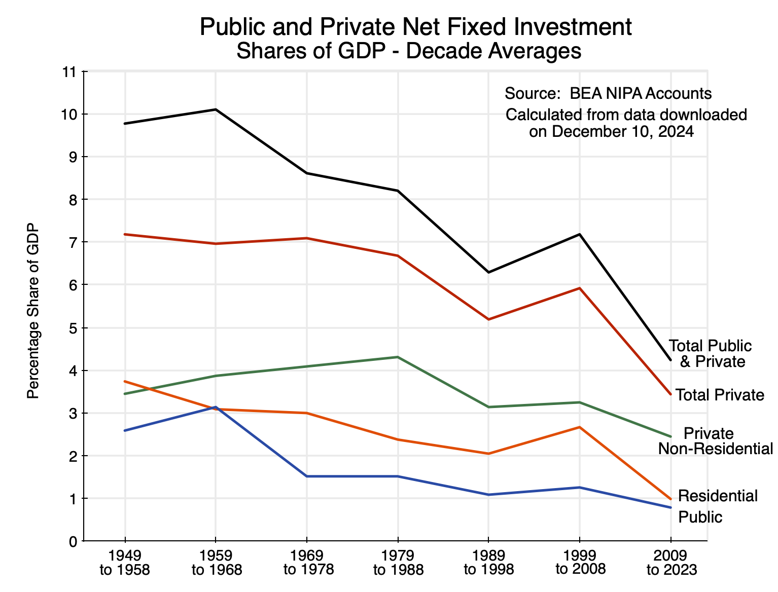
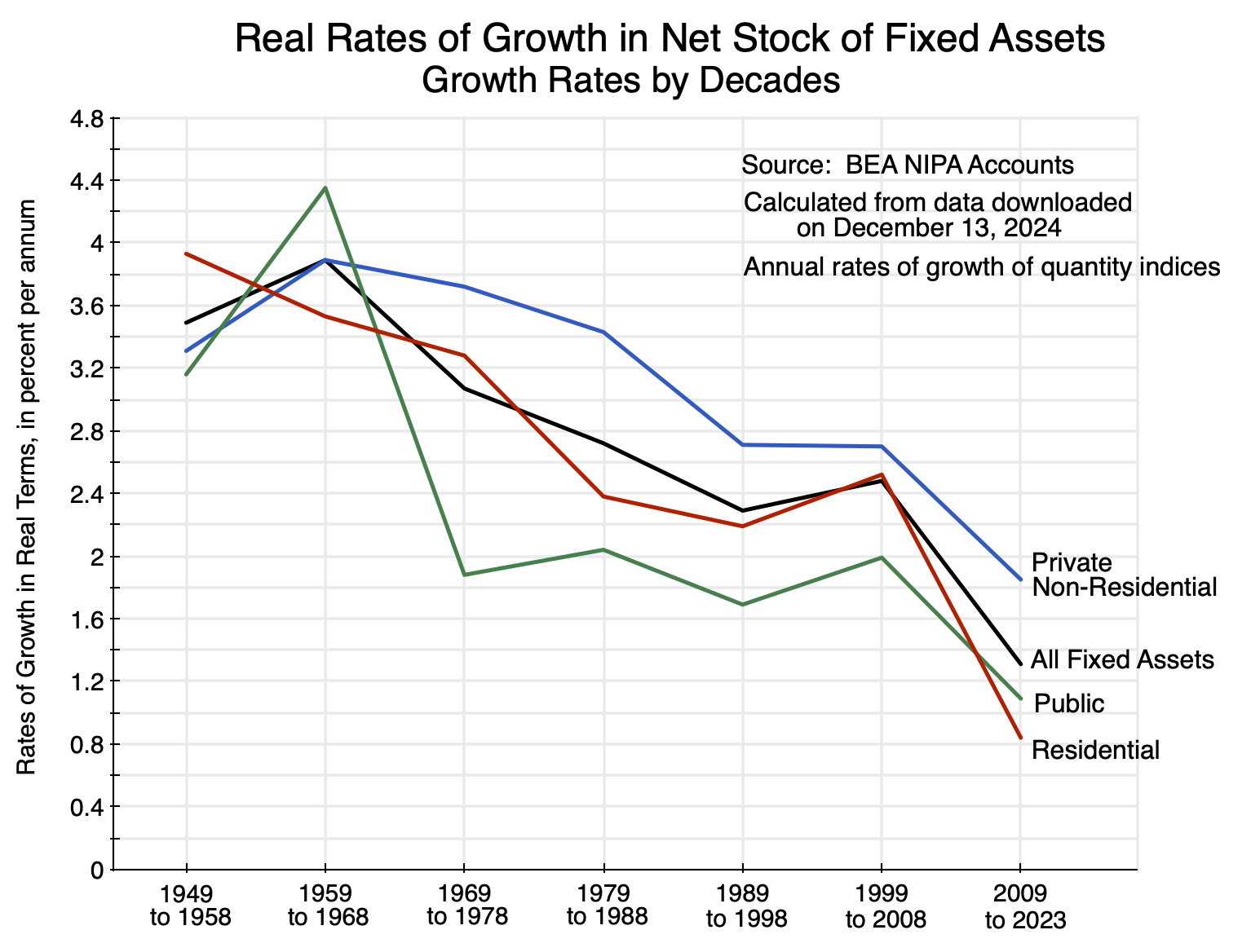

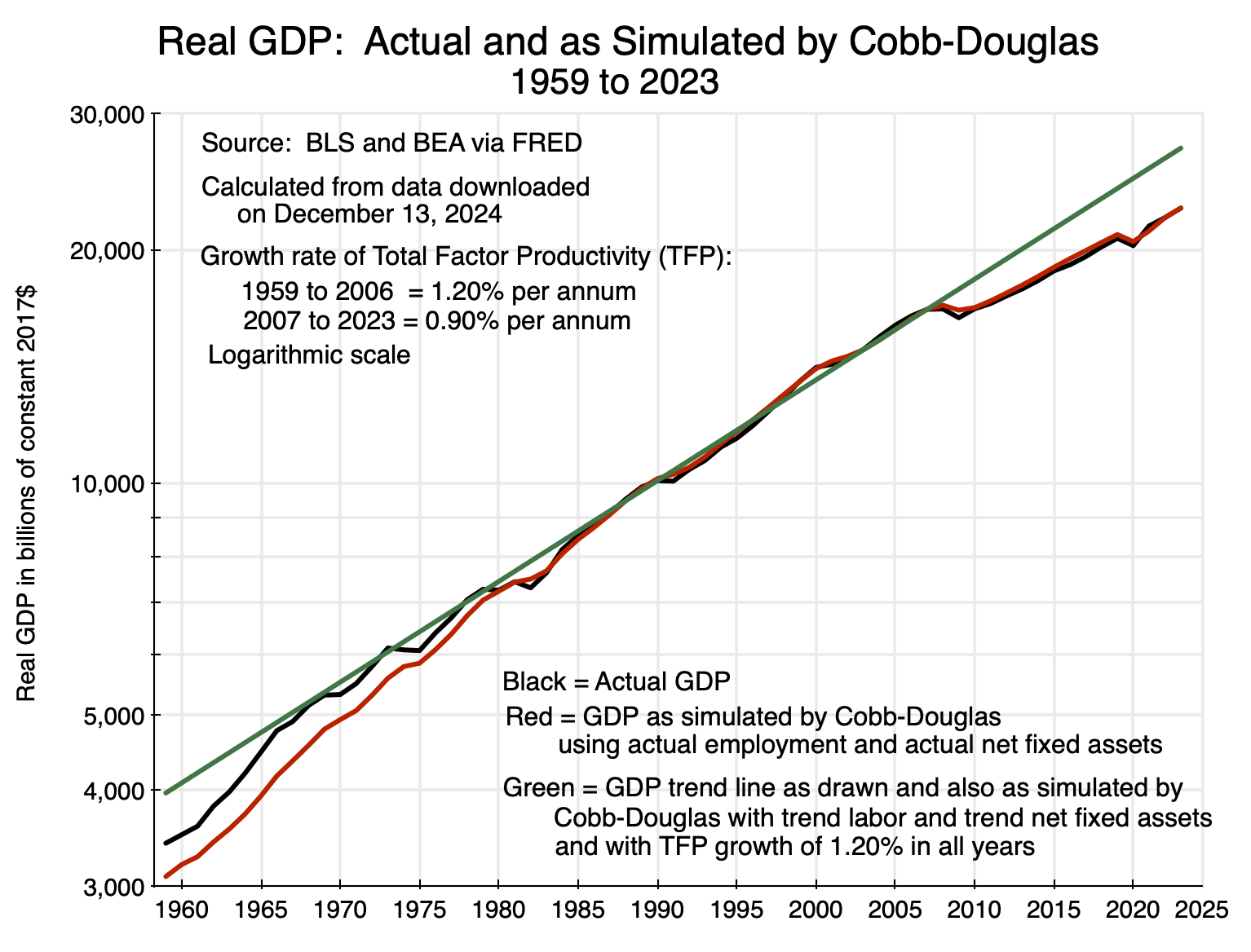

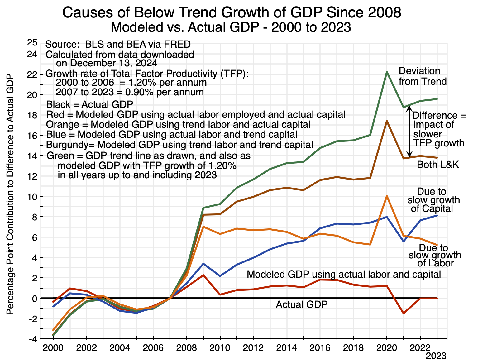

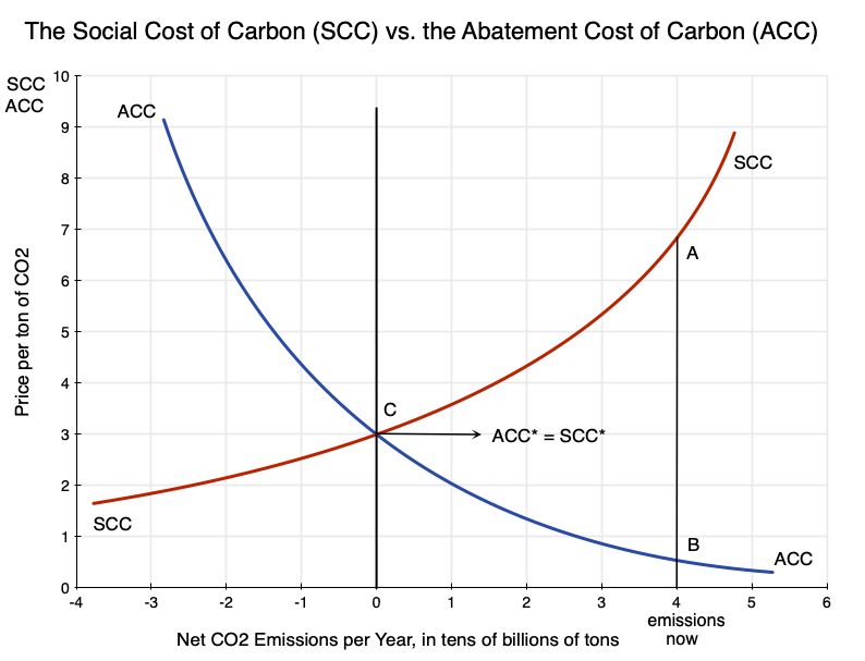

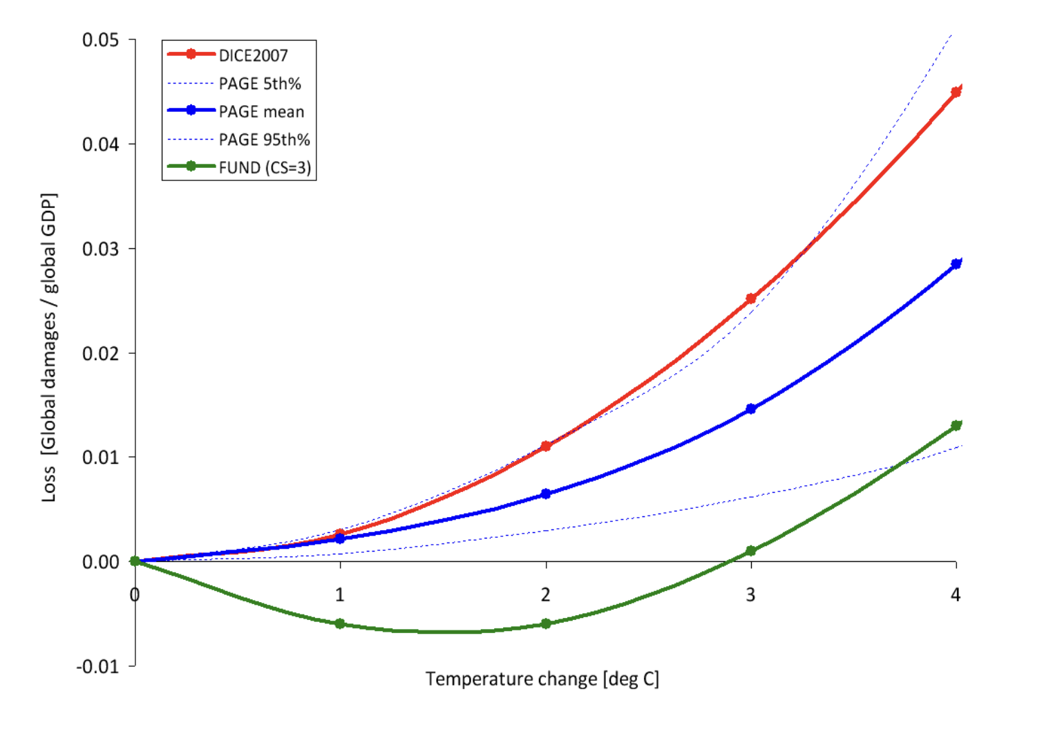
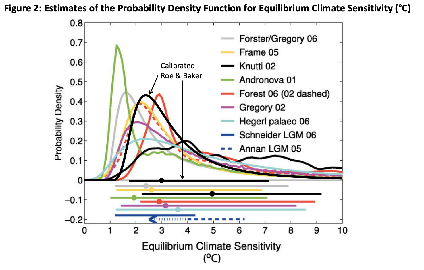

You must be logged in to post a comment.