The Failure of the US to Limit the Spread of Covid-19: A Comparison to What Other Countries Have Been Able to Achieve

A.  Introduction

The virus that causes Covid-19 has struck countries around the world, and it is the same virus everywhere.  But countries have responded differently.  Many countries have responded effectively, and some highly effectively.  The US is not among them.  The experience in other countries shows what would have been possible, had the US responded as they did.  Unfortunately, the US, with Trump leading as president, did not.

B.  The US Compared to Italy, Spain, Germany, and the UK

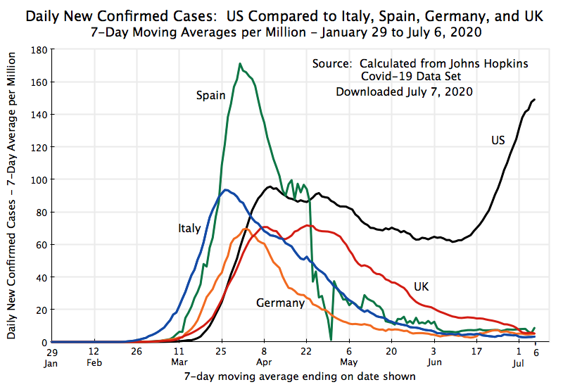
The chart above shows the daily number of new confirmed cases (on a 7-day moving average basis) since the start of the pandemic through to July 6, for the US plus several of the larger countries of Western Europe:  Italy, Spain, Germany, and the UK.  These countries were chosen in part as they were all hit with the virus that causes Covid-19 earlier than most (including earlier than in the US).  They thus faced a crisis when much was still not known about the virus, including how quickly it could spread and under what conditions, and uncertainty on what should be done to bring it under control.  The underlying data on Covid-19 case totals, from which the figures for the chart were derived, comes from the widely-used data set maintained by Johns Hopkins University.  Population numbers from the UN were used to put the number of cases on comparable terms:  of daily new cases per million residents.

Italy was the first major country in Europe to have been hit by the virus, for reasons still not fully known.  Cases rose quickly, reaching a peak at the end of March.  Spain came next, roughly a week later than Italy at first, but then rose especially quickly to a peak in early April of almost double the peak in Italy.  Germany also had a high number of cases early, but was then more successful through aggressive testing and quarantining to keep the peak from rising as high.  Finally, the UK saw a similar peak to that of Germany, but with that peak then lasting for close to a month.

Each of these European countries was then able to bring their daily new case numbers down sharply, to less than 10 new cases a day per million residents by early July (and indeed by early June for all other than the UK).  Each country had its own policies, and I will not go into the nuances of the country-specific differences here, but they succeeded through a combination of social distancing (including lockdowns), wide use of masks, extensive testing, contact tracing, and then isolation or quarantining of those infected or exposed to someone infected.  And with their success in bringing down the number of Covid-19 cases, these countries are now opening up for business, schools, and travel, and are doing so safely.

The US followed a different path.  Cases rose similarly at first as in these European countries, although with a lag (or about two weeks compared to Italy).  One should be cautious with these early numbers as testing, particularly in the US, was not as complete as was being done later, but the early trends appear to be broadly similar.

But what is important is what happened next.  In contrast to the European countries, who were all able to bring down their case numbers by 90% or more, new daily cases in the US fell much more modestly.  Despite official policies (in much, although not all, of the country) to lock down the economy to limit person-to-person spread of the virus, plus guidelines encouraging (and in some cases mandating, but with lax to no enforcement) the wearing of masks and social distancing, the daily case numbers in the US were reduced only from about 95 per million in early/mid April to a trough in early June that never fell below 60.

US cases then started to shoot up.  This followed the easing of social distancing and other measures to limit the spread of the virus during the month of May.  While there were important differences by state and indeed often by locality, most states started to lift the measures cautiously in early May and much more comprehensively by the end of May (and sometimes completely so by that point).  And as was examined in an earlier post on this blog, the increases in daily cases have been particularly sharp in the states won by Trump in 2016 – states often with governments and a population that have been particularly aggressive in lifting (or increasingly ignoring) those measures.

As a further example of the impact of this politicization of what should be seen as basic public health measures, the number of Covid-19 cases in Tulsa, Oklahoma, have now spiked two weeks after Trump held a large campaign rally in an indoor arena there.  Local health officials have said it is “more than likely” that the two are linked.  Few at the Trump rally wore masks, they were grouped closely together for the cameras, and loud cheering was of course encouraged.  The two week lag from the rally to the spike in Covid-19 cases is about what health experts say one should expect, between when there is exposure to the virus at an event such as this to when confirmed case numbers will rise as results are obtained for people seeking tests following an onset of symptoms.

C.  The US Compared to Europe, Canada, and Sweden

The chart at the top of this post highlights only a few countries.  But the same results hold for Western Europe as a whole as well as for Canada:

Cases in Western Europe as a whole rose early, reached a peak, and then fell.  Since early June cases have remained below 10 per day per million.  As of July 6, they were at 8.3, or less than 6% of the US rate of 149 per day.  The path for the countries of Eastern Europe (the countries from Estonia on the north to Bulgaria on the south, who are now mostly members of the EU) is interesting as they were able to contain the virus throughout, with a peak of less than 14 in early to mid-April.  But a modest increase in recent weeks (to almost 15 currently) warrants watching.

Canada is also interesting as the economy and the population are broadly similar to that of the US, but with very different politics.  Cases rose in Canada to a peak of about 50 in mid-April.  But they were then brought down, to levels now very similar to that of Western Europe.  Again, this is in sharp contrast to the US.

Sweden is an exception to others in Europe.  It is also the one country of the rich Western democracies that explicitly followed a different policy path.  Instead of mandating a lockdown of the economy, the wearing of masks, social distancing, and other such measures, it only issued general guidance.  And even this guidance was eased later.  Daily cases per million then reached about 60 in late April, fell only modestly to about 50 in late May, before increasing significantly to as much as 120 at points in June (although with erratic numbers that probably reflect reporting practices).  Sweden is now taken as a good example of what not to do.  Furthermore, while “protecting the economy” was presented as a rationale for Sweden’s decision to issue only general guidelines, with no requirement for businesses such as restaurants to close, early evidence indicates that the Swedish economy has suffered similarly to those of its neighbors.  There was no economic gain, but a profound human loss in sickness as well as lives.  As I write this (July 9), the accumulated number of deaths per million of population has come to 545 in Sweden, or roughly ten times the totals of 46 in neighboring Norway and 59 in Finland.

D.  The US Compared to East Asia, Australia, and New Zealand

Europe (with the exception of Sweden), as well as Canada, have therefore been far more successful than the US in limiting the spread of the virus that causes Covid-19.  But the countries that have been by far the most successful in containing the virus have been those of East Asia, as well as Australia and New Zealand:

Drawn on the same scale as the other charts, one can barely distinguish their case levels, other than during a few, and still always low, periods (in early March in South Korea and in late March and early April for most of the others).  And the daily case rates in Taiwan were never over 1 per million of population, so one cannot distinguish its curve from the horizontal axis of the chart.  Yet Taiwan has probably closer contact with China, from business relationships as well as personal travel, than any other country in the world other than Hong Kong.

All of these countries reacted quickly as soon as it became clear that an infectious disease had spread in China.  While travel limits were imposed, these limits were complemented by extensive testing and contact tracing, quarantining of all travelers (whether citizens or not), and wide use of masks and other social distancing measures.  None of this was secret.  Nor did it require special expertise.  Others could have responded similarly, but did not.

E.  Countries with a Similar Result as the US

Which, then, are the country cases that are broadly comparable to that of the US?  The closest are Brazil and South Africa, with similarities also in the cases of Russia and Mexico:

These are not countries that the US would normally compare itself to.  One should certainly be cautious and note that the quality of the case number data may not be all that good in some of these countries (and indeed, it is not all that good in the US itself).  But the patterns are probably broadly accurate.

Brazil is the one major country in the world with more confirmed cases (per million of population) than the US.  Its right-wing president, Jair Bolsonaro, has responded to the virus in many ways similar to Trump.  He has consistently downplayed the virus (like Trump), has refused to wear a mask (like Trump), has encouraged rallies to oppose rules on social distancing that some Brazilian states and localities had issued (also like Trump), and has insisted that the disease is not serious but rather “It’s just a little flu or the sniffles”.  And like Trump, he accuses the media of stoking hysteria.

The result is that the number of cases in Brazil per million of population is now the highest of any large country in the world, and indeed second only to the US in absolute total number.  And on July 7, Bolsonaro himself tested positive for the virus.  Again like Trump (who took the drug when he was possibly exposed to the virus), Bolsonaro is now taking doses of hydroxychloroquine as a treatment, even though there is clear evidence that this drug does not help with Covid-19 and may in fact do harm.

Other countries with rising numbers of new cases include South Africa and Mexico.  The daily cases for South Africa now match the US number, with a path since mid-June broadly similar to the US path.  Russia saw an increase in April to mid-May, after which there has been some decrease.  But the daily numbers in Russia remain high.

F.  Conclusion

There is not much here for the US to be proud of.  While countries in Western Europe, as well as Canada, saw sharp increases in cases in much of March and early April, they were then all (with the notable exception of Sweden) able to bring the rates for new cases down to modest levels.  With that success, they are now reopening their economies, are permitting travel (other than, notably, to and from the US), and will be reopening schools.  They are all still cautious, and maintain aggressive efforts at testing, contact tracing, and then quarantining when warranted, but their success in bringing down the daily case numbers means they can, albeit carefully, resume a degree of normalcy.  It is possible that things will take a turn for the worse in the weeks and months ahead.  Until there is an effective vaccine that is broadly available, there will remain conditions in which the virus could pop up and cause major disruptions again.  But the situation in these countries has remained stable there for more than a month now.

Countries in East Asia, as well as Australia and New Zealand, have done far better.  They kept rates low from the start and have thus been able to reopen safely and more quickly.  Indeed, schools in Taiwan never even closed (other than for a two-week extension of the traditional Chinese New Year holiday in February).  But Taiwan then opened schools safely, with students required to wear masks, temperature checks carried out daily of all students, and with plastic shields installed to separate desks from each other.  [Not everyone liked this.  I know from direct personal information that at least a few elementary school age children thought it horribly unfair that they have had to go to school while children around the world were able to stay home.]

So who resembles the US in effectiveness in limiting the spread of the virus that causes Covid-19?:  Among the larger countries of the world, only Brazil and South Africa, and to some extent Mexico and Russia.  In the past, they were not the countries the US would see as comparables.  But they are now.

The Increase in Covid-19 Cases is Real: Hospitalization Has Gone Up in Trump States

Cases of Covid-19 infection are going up in the US.  Indeed, the daily number of new confirmed cases have been hitting record levels, with almost all of the recent increase recorded in states that Trump won in 2016.  But Trump has continued to insist the record highs are only because his administration has done such a great job in making tests finally available.  Health professionals who actually have expertise in such issues dispute this.  And many more people are seeking tests, even waiting in lines in their cars that are miles (and many hours) long.  You don’t do this if it does not look serious.

But while it is true that there would be fewer cases confirmed if we did not know about them due to fewer tests, one statistic this would not affect would be the number of those being sent to a hospital having contracted a severe case of the infection.  Numbers on those hospitalized due to the virus are available for most US states (with Florida an important exception – this will be discussed below).  One then gets the chart above when the hospitalization numbers for those states won by Trump in 2016 are compared to those won by Clinton (as a proxy for the more conservative, mostly Republican, states compared to the more liberal, mostly Democratic, ones).

The chart shows that there has been a marked increase in hospitalizations in the Trump states since about June 15.  Excluding Florida, hospitalizations in the Trump states have grown to almost 20,000 as of June 29 from only about 12,000 in early June, an increase of two-thirds.  In contrast, hospitalizations in the states won by Clinton rose fast early, but then fell.  Little was known early on about the virus and how fast it was spreading in the US, particularly in dense urban locations, in part because of the early blunders of the Trump administration that severely limited testing in February and into most of March.  But from a peak in hospitalizations in mid-April in the states won by Clinton, the numbers have come down steadily, although with some leveling off since mid-June.  They are now well below the number hospitalized in the Trump states.

The data comes from figures assembled by the CovidTracking project, a private initiative launched by The Atlantic Monthly.  The project has assembled, on a daily basis, figures officially reported by US states and territories on Covid-19 tests being conducted (and the positive or negative results), the number of deaths, the numbers hospitalized, those in an ICU and those on ventilators, and more.  The data available, and its quality, are only as good, however, as what the states and territories report.  While the figures on confirmed positive tests and on deaths appear to be of fairly good quality and completeness, what the states report on the other variables is uneven and often incomplete.  One then has to be careful in interpreting the numbers, as figures not reported by certain states (or on certain dates) are left blank and then treated as a zero when the national numbers are aggregated.  The figures on numbers in ICU beds or on ventilators are notably incomplete.  And one should be especially careful with the earlier numbers, as they are often quite partial.  The later numbers are more complete and generally more reliable.

The figures on those hospitalized due to Covid-19 are complete (as I write this) except for four states:  Kansas, Idaho, Hawaii, and notably Florida.  The number of cases in Kansas, Idaho, and especially Hawaii are all relatively small, in part as all three are relatively small states.  Based on a 7-day moving average to smooth out day to day fluctuations, the daily number of new confirmed cases in the three states totaled only 482 as of June 29 (with only 12 in the case of Hawaii, which has done a superb job of containing the virus that causes Covid-19).  In contrast, Florida alone averaged 6,589 cases daily in the 7-day period ending on June 29, or almost 14 times the other three states combined.  Florida matters – the other three states not so much.

But data reporting on the spread of Covid-19 by Florida has been especially poor, and politicized.  Rebekah Jones, the state employee who developed the Florida “dashboard” that presented the Covid-19 results by county was fired in May when she refused to manipulate the data in a way to make it appear that much of the state was meeting the criteria for reopening when in fact they were not.  She has since developed and made available over the internet a dashboard similar to the one she had developed for the State of Florida, but with data that has not been so manipulated.

The underlying problem was that Florida Governor Ron DeSantis (a close ally of Trump) had been declaring victory over the virus that causes Covid-19 already in early May, as he proceeded to reopen the state early and aggressively.  He held news conferences, including at the White House, claiming he had succeeded where others had failed, and that Florida should serve as a model for the country.  Trump lavished praise on the governor, saying he was doing a “spectacular job”.

It is therefore more than a bit embarrassing for DeSantis that cases in Florida have been rising so fast since his May 1 reopening.  For the US as a whole, the average number of daily new cases for the 7-day period ending June 29 was 37% higher than what it was for the period ending on May 1.  But in Florida, the number of daily new cases for the 7-day period ending June 29 was 11.0 times higher than what it was for the 7-day period ending May 1.

With the high number of cases in Florida, it is worthwhile to try to estimate, even if only roughly, what the hospitalization figures would look like if Florida reported its results.  They do have such data – they have reported on the number of new hospitalizations each day.  But this is incompatible with what most other states report.  And knowing the number of those infected with the virus who are currently hospitalized is closely monitored everywhere as it is important to know how close one is to current hospital limits on the ability to handle more cases.  But Florida has not made these figures available.

One can, however, make a rough estimate of what the impact would be if figures for Florida were available.  Other states with a similarly sharp rise in new cases since mid-June include Texas, Arizona, and Georgia.  Hospitalization figures are available for each.  In those states, the ratio of the number currently hospitalized (where one should keep in mind that those hospitalized for Covid-19 are always there for at least several days, and sometimes several weeks), to the 7-day average daily number of new cases, averages across the three states and on two dates to 1.015 (with not much variation around this average).  Using that ratio, one can estimate what the hospitalization figures in Florida might be, given the number of new cases found in Florida.

The result is shown in the curve in orange in the chart above.  The number of patients hospitalized due to the coronavirus in the Trump states would, with this estimate for Florida, have risen to over 26,000 as of June 29.  This is a third higher than the 19,600 hospitalized in the Trump states as of that date excluding Florida.  Or in another comparison, the increase in hospitalizations in the Trump states between June 15 and June 29 was 51% excluding Florida.  But with these estimates for Florida included, the increase over that period was an even higher 78%.

Trump’s reaction to this sharp increase in cases, concentrated in states that supported him in 2016?  It appears that he simply does not know what to do.  So while it has become clear that the increase in cases is real, with the increase in hospitalizations now also confirming this, Trump appears to have retreated into a fantasy world where the virus that causes Covid-19 simply disappears.  In an interview on June 29 on the Trump-friendly Fox Business Network, Trump said:

“I think we’re going to be very good with the coronavirus. I think that at some point that’s going to sort of just disappear”

He then added, “I hope”.  During the worst health crisis the nation has been through since the Spanish Flu pandemic of 1918/19, the US has a president who is lost, does not know what to do, and is reduced to hoping it will just go away.

The Spread of Covid-19: Trump States vs. Clinton States

Update:  A more recent post, with data for these charts through July 16, is now available.

It has been much noted in the news in recent days that confirmed cases of Covid-19 have been soaring in a number of states in the US, primarily in the south and southwest.  But it is of interest to examine how widespread this is, and how it correlates with the politics of the different states.  With the politicization by Trump of what should be a matter of public health, states (and their residents) are responding differently in their management of this public health crisis.

One way to look at this is to group the states according to who won there in 2016:  Trump or Clinton.  This divides the country roughly in half, between more liberal and more conservative areas.  The chart above shows what then results for daily new confirmed cases (on a 7-day moving average).

The division is stark.  The states won by Clinton (which included New York, New Jersey, the Northeast, Illinois, California, and Washington) were exposed early to Covid-19.  These states are generally more highly urbanized and there is more international travel by both residents and visitors.  This left them especially vulnerable as the virus that causes Covid-19 started to spread (first with little knowledge of how fast it was spreading, due to blunders in rolling out the necessary testing program in February and into much of March).  But after peaking in April, these states brought down the daily number of new cases by over 60%, although with a partial and still limited reversal in the past week.

The pattern in the Trump states is quite different.  Confirmed cases rose in the period leading up to April (in part as testing only became broadly available then), but then leveled off in these states through essentially all of April and May.  Furthermore, the numbers leveled off at roughly 10,000 cases a day, or less than half the 21,000 cases per day seen in the Clinton states at their peak.  The Trump states are often more rural, and there is less international travel (by both residents and visitors), so the lower numbers there were taken by some as indicating they were less vulnerable to this infectious disease.

But this then changed markedly at the end of May.  As the states that voted for Trump relaxed their lockdown and social distancing measures, often rapidly, the case numbers began to rise.  And over the last ten days they have accelerated markedly.  The number of confirmed new cases is now significantly higher in the Trump states than they ever were in the Clinton states.  And there is no sign yet of this leveling off.  Quite the contrary – it is accelerating rapidly.

The similar figure for the number of deaths per day from Covid-19:

The number of daily deaths (again using 7-day moving averages) peaked in the Clinton states in mid-April at about 1,670, and has since come down to about 300 (or by 82%).  In the Trump states the peak was only around 600, but it stayed there longer and then came down more slowly, to also around 300 now (so by half).

That the death rates have come down in each is encouraging, but it is still too early to know precisely why.  It may be a combination of factors, including that doctors and hospitals know better now how to treat the most severe cases (with some therapeutics, such as dexamethasone and remdesivir, showing promise, while the doctors also now know that the therapeutic promoted strongly by Trump, hydroxychloroquine, may in fact increase death rates – the FDA has warned against its use).  Also, hospitals have become less crowded at centers of the outbreak, at least until recently, which has allowed them to provide better care.  Finally (and I would guess likely the most important reason, although I have seen no data on this), lower death rates would result if the age distribution of those infected has shifted to those who are younger.  Death rates for the elderly are an order of magnitude higher than for the middle-aged (and two orders of magnitude higher than for the young), so even a relatively modest shift in the age distribution of those infected could lead to a marked change in mortality rates.

Finally, deaths from Covid-19 come only with an average lag that may be a month or more from the day of initial exposure (with this also differing by age).  The number of daily confirmed cases began to rise less than a month ago in the Trump states (around May 30), and more sharply about ten days ago.  We will see in the days and weeks ahead whether this will now lead to a rise in the death figures.  So far, it appears that the daily death numbers have leveled off (since June 17 in the Trump states, and June 21 in the Clinton states), while they had been declining before.

But the sharp increase in the number of new cases over the last month, in particular in the Trump states as social distancing measures were lifted, suggests a number of lessons.  One is that social distancing measures worked.  When they were in place they brought down the number of new cases and deaths from the disease, while lifting them (or increasingly, ignoring them even while formally still in place) has led to a sharp rebound in the number of cases.  Trump has now made this into a political issue, with his flagrant refusal to wear a mask or to keep a distance from others.  In other times this would be considered bizarre behavior in a public health crisis, but is seen here by his supporters as a signal of freedom and independence rather than as a behavior that will lead many of them, as well as others, to become sick (and some to die).

The problem starts at the top.  Rather than model responsible behavior, Trump has insisted he will never wear a mask in public – he believes it hurts his image.  Trump also orchestrated his daily press briefings on the crisis so that through most of March the other officials present were crowded around him, shoulder to shoulder, with no masks.  This only changed (and changed only partially) later.  And now Trump has restarted his political rallies in large indoor arenas, with people crowded tightly together but with few wearing masks, while loud cheering is strongly encouraged.

Most importantly, the Trump administration has failed to address the real and important challenges of this pandemic.  Rather, he has said recently (such as on an interview on June 17 on Fox News) that the coronavirus is “fading away, it’s going to fade away” even if no vaccine is ever developed.  Similarly, at a rally at a megachurch in Phoenix, Arizona, on June 23, to an estimated 3,000 (mostly young) cheering supporters (with few, if any, wearing protective masks), Trump asserted that “It’s going away” while claiming his administration had done a wonderful job.  And over the last week he has repeatedly said that he has asked for less testing to be done, since with less testing there will be fewer cases confirmed.  See, for example, this June 23 tweet, where he says “With smaller [sic] testing we would show fewer cases!”.  Certainly true, but why he would think this wise is worrisome.

Over 124,000 Americans are now dead from the virus (as of today).  This is well more than in any other country in the world (Brazil is second at 55,000).  The US has had 377 deaths per million of population.  In contrast, Japan has had 8 deaths per million, South Korea 6, Australia 4, New Zealand 4, Singapore 4, Hong Kong 0.9, and Taiwan 0.3.  As noted in an earlier post on this blog, the US could learn a lot by simply examining why those countries, all with far closer interactions with China through travel and trade than is the case for the US, have been able to contain the virus while the US has not.

While there are a number of elements to a successful program, one simple but key component is the wearing of masks.  This is common in East Asia, and no one there treats the wearing or not of a mask as a political statement (nor did anyone in the US, until this crisis).  It is simply something easy to do that will protect the health of you, the ones you love, and others.

Yet even now, a full half-year since the start of this crisis, it remains difficult to find in the US the N-95 masks that are the most protective against a viral infection.  Supplies are short, and the masks that are available are provided (as they should be under the circumstances) only to health professionals (although even here there are shortages).  The regular population cannot find such masks other than on a black market (with those available of uncertain pedigree and reliability).  Yet N-95 masks are not hard to make.  3M is the major manufacturer, it is based here in the US, and it would be straightforward to open up additional production lines.  Why hasn’t the Trump administration done something to ensure an adequate supply?

Consider, for example, what a more capable administration might have done.  After ensuring an adequate supply, a box of say a dozen masks per person could be mailed to every household in the US.  With 120 million households (an average of 2.6 people per household), and assuming a production and mailing cost of $20 per household, the total cost would be $2.4 billion.  This is less than one / one-thousandth of the $2.8 trillion that Congress has already approved to be spent to provide partial relief to the effects of the economic crisis brought on by the pandemic.  If everyone then wore such a mask every time they left their home, within a few weeks there would likely be a major knock-back of the infection chain to where focused efforts on the hotspots that might then still remain, or hotspots that later spring up, could be very effective.

This might well be unrealistic.  But even if feasible it would not go far in the current political environment.  Even if an adequate supply of such masks were made available, the politicization by Trump of this public health crisis means that many of his supporters would refuse to wear a mask.  They now see it as a statement of their political, and indeed cultural, beliefs to openly and flagrantly refuse.

As others have noted, it would be hard to find a time when the US was more poorly served by its president than now.