


A) Introduction
The Bureau of Labor Statistics released on November 6 its most recent report on the state of the job market. It was a strong report, with net job gains of 271,000 in October and the unemployment rate falling to 5.0%. One should not, however, put too much weight on the figures in just one month’s report. Indeed, the report for October followed relatively weaker reports in the two previous months. Rather, one should put all these reports in the longer term context of how the labor market has moved in recent years. And what they show is continued, and remarkably steady, improvement.
This post will look at that longer term context by updating several labor market charts that have been discussed in previous posts on this blog. It will look first at net job growth in the private sector and in the government sector in the period since Obama’s inauguration, with a comparison to the similar period during George W. Bush’s term. The post will then look at the continued fall in the unemployment rate, with a comparison to the similar period under Reagan, and finally to the share of part time workers in total employment. The last is to see whether there is any evidence to support the assertion coming from Republican critics that Obamacare has led to a shift by employers to part time workers so that they can avoid providing health insurance in the overall wage compensation package for their staff. We will find that there is no indication in the data that this has been the case.
B) Total Job Growth
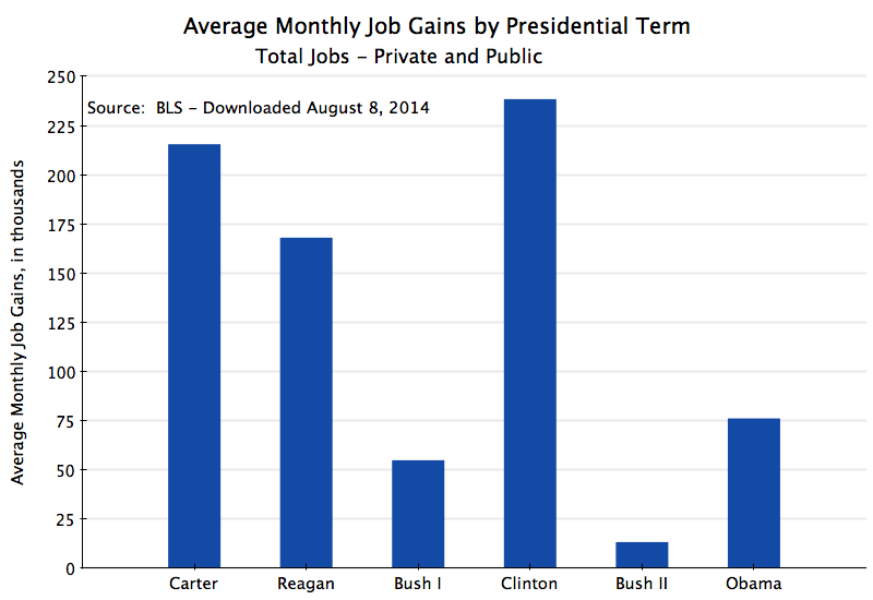
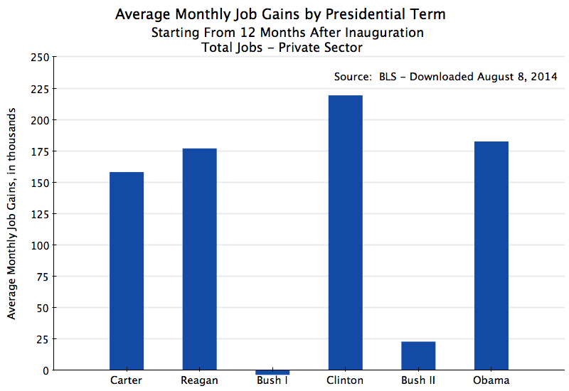
The charts at the top of this post show total net job growth, in the private sector and in the government sector, in the period since Obama’s inauguration (up to October 2015) and under Bush (for his two full terms). They update similar charts discussed in several earlier posts on this blog, most recently from June 2014.
Private sector job growth has been strong under Obama, and continues to be. And the record is clearly far better than that under the George W. Bush administration. There has been a net increase of 9.3 million new private jobs under Obama since the month he was inaugurated, versus just 4.0 million new private jobs over the similar period in the Bush administration. Furthermore, this 4.0 million additional private jobs was close to the peak achieved in the Bush years, before it started to fall and then plummet as the housing bubble burst and the economy collapsed in the last year of his second term. By the end of his presidency there were fewer private jobs than there were on the day he was inaugurated, eight years before.
Obama faced this collapse in the jobs market as he took office. The economy was losing 800,000 private jobs per month, with the economy contracting at the fastest pace since the Great Depression. The new administration was able to turn this around with the stimulus package and with aggressive Fed actions, with the fall in employment first slowing and then turning around. The result has been a net growth of 13.5 million new private jobs from the trough just one year into the new administration until now.
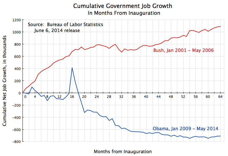
Government jobs, in contrast, have been cut. This hurt total job growth both directly (government jobs are part of total jobs obviously) as well as indirectly. Indirectly, the government job cuts (as well as the fiscal austerity that began in 2010) reduced demand for goods and hence production at a time when the economy was still depressed and suffering from insufficient demand to keep production lines going. As discussed in an earlier post on this blog, without the fiscal austerity introduced from 2010 onwards the economy would have recovered from the economic downturn by 2013 and perhaps even 2012. The initial stimulus package in 2009 turned things around. It is unfortunate that the government then moved to cuts from 2010 onwards, which reduced the pace of the recovery.
It should be recognized that government jobs as recorded here include government jobs at all levels (federal, state, and local), with federal government jobs only a relatively small share of the total (12.4%). But government jobs have fallen at all three levels, federal as well as state and local.
The cuts on government jobs during Obama’s time in office stand in sharp contrast to the growth in government jobs during Bush’s two terms. Yet Obama is charged with being a big government liberal while the Republicans claim to be small government conservatives.
C) The Rate of Unemployment
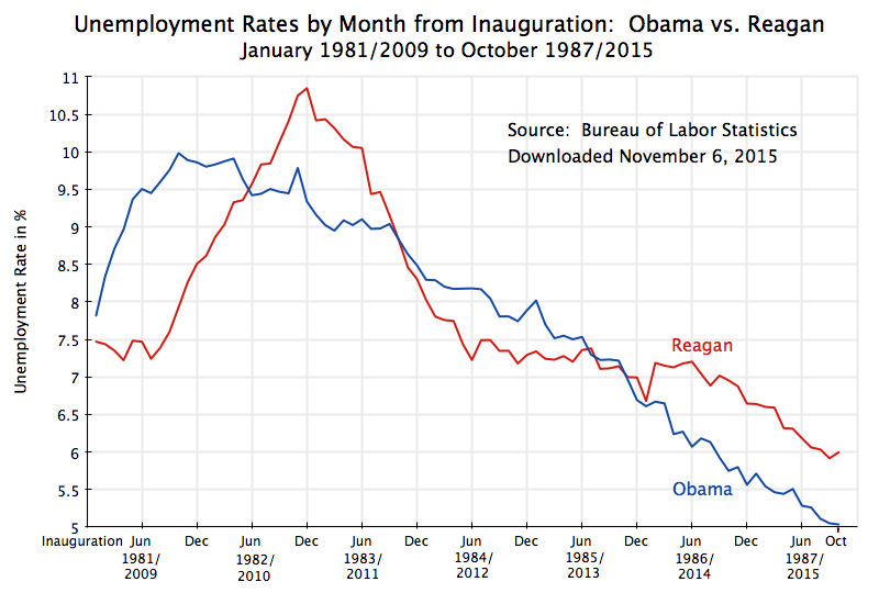 After peaking at 10.0% in October 2009, the rate of unemployment has fallen at a remarkably steady pace under Obama (aside from the monthly fluctuations in the reported figures, which will in part be statistical noise as unemployment estimates come from household surveys). This was discussed in this earlier post on this blog. The record is certainly better than that under Reagan. The unemployment rate is now 5.0%, while it was still 6.0% at the same point in the Reagan presidency.
Furthermore, Reagan was not confronted, as Obama was, with an economy in collapse as he took office. Rather, unemployment began to rise only about a half year after Reagan took office, as he began to implement his new budgetary and other policies. The unemployment rate then rose to a peak of 10.8% in late 1982 before starting to fall. And while the recovery was then rapid for a period, supported by rising government spending, it stalled by mid-1984 with unemployment then fluctuating in the range of 7.0% to 7.5% for most of the next two years. One does not see the steady improvement as one has had under Obama.
With the unemployment rate now at 5.0%, it is expected that the Fed will soon start to raise interest rates. This would be unfortunate in my view (as well as that of many others, such as Paul Krugman). Inflation remains low (only 0.2% over the past year for personal consumption expenditures for all goods, or 1.3% over the past year if one excludes the often volatile food and energy costs). And while wages ticked up by 2.5% over the year before in the most recent BLS labor market report, this is still below the roughly 3 1/2% increases that would be consistent (after expected productivity gains in a normally functioning job market) with the Fed’s 2.0% inflation target. And if wages are not allowed to rise faster than inflation, then by definition there will be no increase in real wages.
It is of course recognized that the rate of unemployment cannot fall forever. There will always be some slack in the labor market as workers transition between jobs, and if the unemployment rate is too low, there will be excessive upward pressure on wages, and inflation can become a problem. But where that “full employment rate of unemployment” is, is not clear. Different economists have different views. It does not appear to be at 5.0% under current conditions, as the rate of inflation remains low. But whether it is at 4.5% or 4.0% is not clear. At some point, it would be reached.
When it is, the pace of job creation will need to fall to match the pace of labor force growth (from population growth). Otherwise, by simple arithmetic, the rate of unemployment would continue to fall. And this cut in employment growth would be the objective of the Fed in raising interest rates: It would be to slow down the pace of job growth to the rate that matches labor force growth.
Once the Fed does start to raise interest rates, one should then not be surprised, nor criticize, that the pace of job growth has slowed. That is the aim. And it will need to slow sharply from what the pace of job growth has been in recent years under Obama. Over the past two years, for example, employment growth has averaged 236,000 per month. The labor force has grown at a pace of 101,000 per month over this period. As a result, unemployment has fallen at a pace of 135,000 per month (= 236,000 – 101,000), with this leading the unemployment rate to fall to 5.0% now from 7.2% two years ago. If unemployment is now to be kept constant rather than falling, the pace of job growth will need to fall by more than half, from 236,000 per month to just 101,000 per month (or slightly more, to be precise, taking into account the arithmetic of a constant unemployment rate).
I have no doubt that when this happens, and the pace of job growth slows, that Obama will be criticized by his Republican critics. But this will reflect a fundamental confusion of what full employment implies for the labor market.
D) Part-Time Employment as a Share of Total Employment

Finally, it is of interest to update the graph in an earlier post to see whether there is now any evidence that the Affordable Care Act (Obamacare) has led employers to fire their regular full time workers and replace them with part-timers, in order to avoid the mandate of including health insurance coverage in the wage compensation package they pay to their workers. Conservative politicians and media asserted this as a fact (see the earlier blog post cited for several references). But as discussed before, and as confirmed with the more recent data, there is no indication in the data that this has been the case. Indeed, the share of part time workers in the total has been falling at an accelerated pace in the most recent two years, at a time when the Obamacare insurance mandate provisions have come into effect.
The acceleration in the pace of this improvement is consistent with the improvement seen in the overall labor market over the past several years, as discussed above. As the economy approaches full employment, those who are working part time (not by choice, but because they have no alternative) are able to find full time jobs. The share of part-time workers in total employment is still somewhat above (at about 4%) what would be normal when the economy is at full employment (at about 3%), lending support to those arguing that while the labor market is improving, we are not yet at full employment (and the Fed should thus wait longer before it starts to raise interest rates). But it is getting better.
I have also added to the graph a line (in red) showing what the share of part-time employment workers were in total employment during the Reagan years. At the comparable time in his presidency, the share was higher than what it is now under Obama. Furthermore, it had improved only slowly under Reagan over the three years leading up to that point. Yet Reagan is praised by conservatives for his purportedly strong labor market.
E) Conclusion
The labor market has improved considerably in recent years under Obama. It could have been better had the government not turned to austerity in 2010, but even with the government cuts, job growth has been reasonably good. The unemployment rate has now fallen to 5%, and it is expected the Fed will soon begin to raise interest rates in order to slow the pace of job creation. One should not then be surprised if fewer net new jobs are created each month, nor criticize Obama when it does. That will be precisely the aim of the policy. But I strongly suspect that we will nonetheless hear such criticisms.


You must be logged in to post a comment.