

A. Introduction
I have been working for some time on a post that discusses how the Social Cost of Carbon is estimated in practice, reviews the inherent limitations in that process, and examines some of the controversies that have arisen – in particular with regard to what discount rate to use to discount back to the present the damages that will follow when a unit of carbon dioxide is released today, damages that can go on for centuries.
I hope to complete that post soon. My original plan was to have a short section in the introduction listing some of the extreme climate events of this summer that show that our climate is indeed changing. But the number of such events over just the past few months has grown remarkably, and what had been planned as just a short and illustrative list grew longer and longer. I decided therefore to present it as a separate, stand-alone, post, together with a number of charts that illustrate several of the events and place them in a longer-term context.
The list is, I am sure, still incomplete. It has a North American bias as those are the reports I have most likely come across, as I live in the US. And some might dispute whether some of these events can be attributed to climate change. That is always possible. Climate change increases the likelihood of such events occurring, and it is rare when one can say with absolute certainty that some specific event was necessarily a consequence of our warmer planet. But nor should that be the test. We know (despite the denial of the tobacco companies for many years) that cigarette smoking increases the likelihood that a person will get cancer. But while we cannot then say with certainty that a heavy smoker who died from lung cancer necessarily died because of their smoking habit, we can say with certainty that smoking greatly increases the chances that he or she did.
Similarly, while it is possible to argue that certain of the events listed below may have happened in the absence of a warming planet, it is difficult (indeed disingenuous) to argue that none of these events can be attributed to the warming planet. Nor is it possible that this combination of so many extreme climate events could have happened in the absence of climate change. Perhaps a few. But not all of them.
The list also forces us to recognize that climate change is not something that may or may not happen at some point in the future. These events are happening now.
B. Record High Global Surface Temperatures in July 2023
One can start with global average surface temperatures in the month of July. The chart at the top of this post shows what that temperature was for each July from 2023 going back to 1850, expressed in terms of the difference (or “anomaly” – the term used by specialists in the field) with what it was on average in the second half of the 1800s. Temperatures in the second half of the 1800s are often taken as a reference period for what global temperatures were in the pre-industrial era. The data for the chart comes from the National Centers for Environmental Information, National Oceanic and Atmospheric Administration (NOAA), US Department of Commerce, although I have rebased it from the original (where anomalies were defined relative to the 1901 to 2000 average) to an 1850 to 1899 base.
The July 2023 average global surface temperatures were a new record – at 1.27°C (or 2.29°F) higher in these NOAA estimates than what the average was in the pre-industrial period. The Paris Climate Accords, ratified and agreed to by 194 nations of the world (the only ones that have not are Iran, Libya, and Yemen), has set the goal that global temperatures should be kept to “well below” 2°C over the pre-industrial average, and that efforts should be pursued to limit the increase to 1.5°C. The 1.27°C of this July is already close to that, although the 1.5°C benchmark would be for each month in the year as a whole (over what they had previously been for those months), not simply for one of those months.
More worryingly, it was not just that this was a record high, but also that it shattered the previous record high – set in 2021 – by 0.20°C (or 0.36°F). That is huge. Previous records are normally only exceeded by small margins, just like previous Olympic records in a 100-meter dash are broken only by fractions of a second. Climate is different – it is a complex adaptive system – leading to much greater swings than would be the case in a system without feedback loops. But even in such a system, the 0.20°C by which the previous record temperature was broken is exceptional. In the NOAA data going back to 1850, there was only one time when the July temperature exceeded the previous record by more – by 0.24°C in 1998. In all but a few years, new temperature records exceeded the previous record by only 0.05°C or less.
C. Exceptional Climate Events in June, July, and August, 2023
The higher summer temperatures have been associated with a series of dramatic climate events. Based only on the news reports I have come across, one can note:
a) To start, average global surface temperatures in June were already the highest they have ever been for the month of June in records going back to 1850. And they broke the previous record (which had been set in June 2019) by 0.14°C (or 0.25°F). As later for July, the record was broken not by some small incremental amount, but by a big leap.
b) This was followed in early July when on July 3, global average surface temperatures were the highest ever recorded up to then. But that record did not last long. Global average temperatures were even higher on July 4. They matched this on July 5 and were then higher still on July 6, and only slightly less on July 7 (with the average temperatures on July 7 the second highest ever, exceeded only by those on July 6). And temperatures in the first week of July were the highest of any week in recorded history. Finally, temperatures for the month of July as a whole were the highest of any month of any year in recorded history. And while reliable, satellite-based, data on daily global average temperatures have only been available since 1979, it is almost certain that these temperatures have not been exceeded on our planet for at least 125,000 years.
c) The daily average global surface temperatures (technically at a 2-meter height) going back to 1979 are provided in this chart:
 Source: Climate Reanalyzer, Climate Change Institute, University of Maine. Underlying data from NOAA. Downloaded August 26, 2023.
The dark black line is for 2023, and one can see not only that it has been at record highs (with this also the case in June), but also that the increases from the previous record highs are huge. (Note that even though July is summer in the Northern Hemisphere, it is winter in the Southern Hemisphere. However, global temperatures follow the pattern for the Northern Hemisphere as land accounts for a much higher share of the surface area of the planet in the Northern Hemisphere than in the Southern, and land heats and cools with far greater swings than ocean waters do.)
d) These temperature records were not surprisingly matched by temperature records being set in numerous places around the globe during this period, including in China, in Northern and Southern Europe, in the Svalbard Archipelago of Norway (well above the Arctic Circle and just 860 miles from the North Pole), in the Middle East, in western and far northern Canada, in the American Southwest, and elsewhere. In Phoenix, Arizona, for example, July was the hottest month for any US city ever, with an average temperature (day and night) of 39.3 °C (or 102.7 °F), and a day-time temperature exceeding 43.3 °C (or 110 °F) on each day for 31 days. A town in Canada at a latitude just 70 miles below the Arctic Circle hit a temperature of 37.8°C (or 100.0 °F). While a record for the Western Hemisphere for a town so far north, the world record was set in Siberia in Russia – in a town just north of the Arctic Circle – in June 2020 at a reading of 38.0 °C (or 100.4 °F). And while it is mid-winter in the Southern Hemisphere, temperatures have exceeded 37.8 °C (or 100 °F) in numerous locations where winter temperatures would normally be far less.
e) When the heat dome that had been enveloping Europe was swept away by a cold front in late July, the result was extremely violent storms. There were tornados, baseball-sized hailstones (with one measured at 20 cm, or 7.9 inches, just short of the 8.1 inch world record), and winds as strong as that in hurricanes – reaching 135 mph in western Switzerland. While not sustained as in a hurricane, a wind speed of 135 mph would be that of a strong Category 4 hurricane. And Hurricane Idalia, which as I write this just slammed into the portion of the Florida Gulf Coast called the “Big Bend”, was “only” a Category 3 storm when it made landfall, with a maximum wind speed of 125 mph. Yet it was the strongest storm to hit that stretch of the Florida coast since 1896.
f) The high temperatures so early in the Northern Hemisphere summer season have also led to record high ocean water temperatures. And the ocean water temperatures also rose rapidly, at rates that left scientists baffled as well as alarmed. The temperatures in waters surrounding Florida, for example, were in early July already at what was described as “downright shocking” levels. In late July, recorded water temperatures hit 38.4 °C (or 101.1 °F) off southern Florida, setting a new world record (exceeding the previous world record set in 2020 in waters off Kuwait of 37.6 °C, or 99.7 °F). There have also been record-breaking ocean temperatures in the ocean waters around the United Kingdom and Europe, as well as of the Mediterranean Sea, and indeed around the globe.
g) As with surface air temperatures around the globe, surface sea temperatures have risen this year not simply to record high levels, but to record highs by a huge jump over what had been the record highs before:
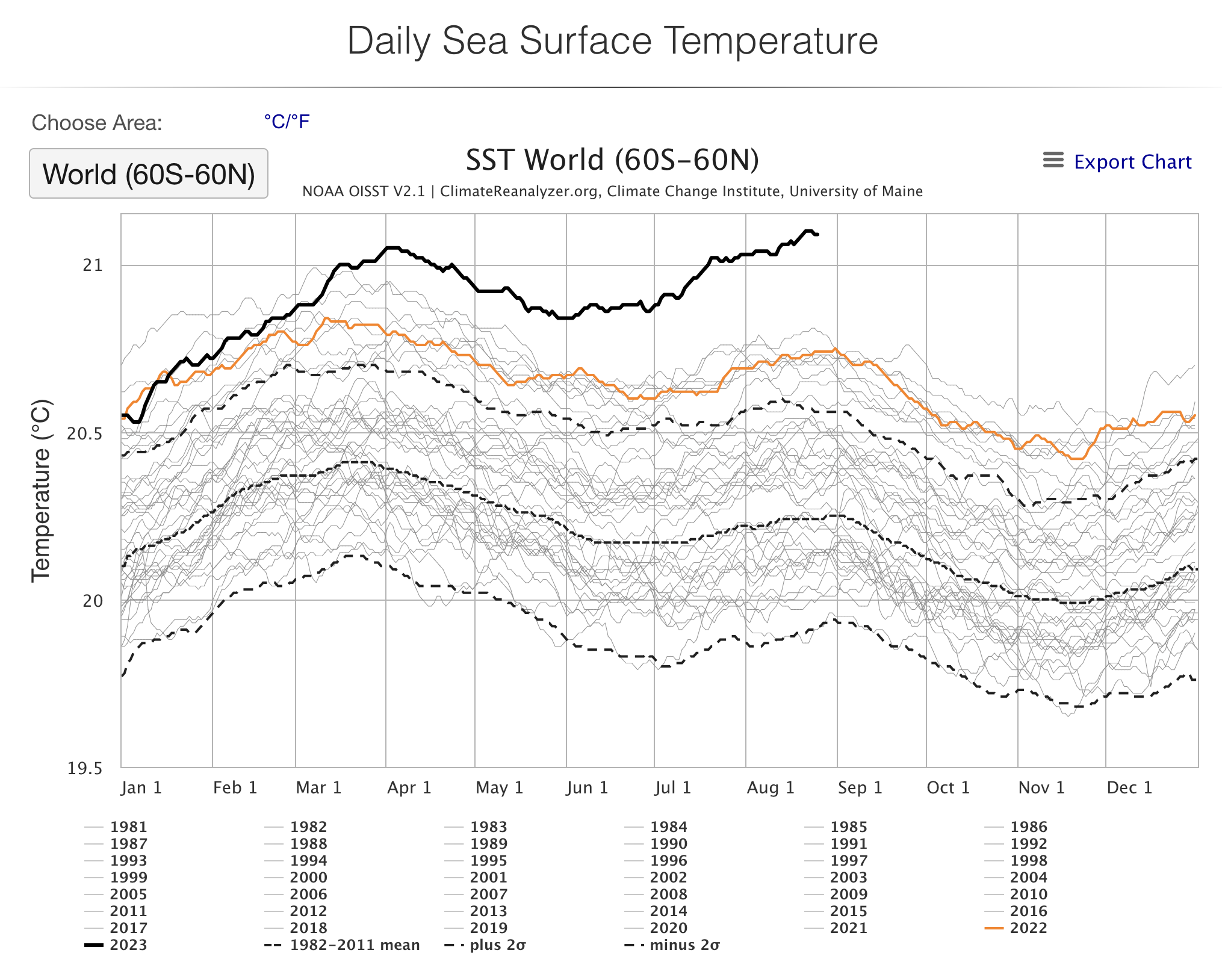
Source: Climate Reanalyzer, Climate Change Institute, University of Maine. Underlying data from NOAA. Downloaded August 26, 2023.
h) The multi-year rise in global temperatures has had other consequences as well. High heat and lack of rain have dried out soils and facilitated insect invasions as well, leading to devastating wildfires. As of August 28, wildfires in Canada have already burned 15.2 million hectares so far in 2023. The year is far from over, but this is already well more than double the previous high for area burned of 7.1 million hectares in an entire year.

Source: Canadian Interagency Forest Fire Centre, Statistics. Downloaded August 29, 2023.
i) Those Canadian wildfires then led to hazardous air quality levels in New York, in Washington, DC, in Chicago and the midwest, and in major Canadian cities as well. The color-coded air quality index goes from green to yellow to orange to red. I had never realized before that it in fact goes to purple and then maroon, with maroon levels indicating air quality that is hazardous to everyone. Air quality often hit maroon levels during these episodes.
j) Warmer temperatures dry out soils due to greater evaporation, leading to droughts in some areas. But warmer air can also hold more moisture. Under the right conditions, that moisture-laden air can empty out in severe rainfalls, causing flooding. There has been especially severe flooding in just the last couple of months in South Korea, in Japan, in northern India, in western Pennsylvania to New England, in Kentucky, in Chile, in Turkey, and in Nova Scotia. And I am sure this list is not complete.
k) Sea ice surrounding Antarctica builds up each year in the Southern Hemisphere winter. But this year, it has built up by far less than before, and again with a margin over the previous record (low) levels that is shocking:

Source: Climate Reanalyzer, Climate Change Institute, University of Maine. Underlying data from NOAA. Downloaded August 26, 2023
l) And while an event of late last year, a just released study estimated that about 10,000 emperor penguin chicks died when ice sheets surrounding Antarctica broke up early – already in November – near the start of the Southern Hemisphere summer. Emperor penguins are in the “Near Threatened” category for endangered species, and their chicks depend on such ice to last until they are able to swim in the cold ocean waters.
m) Finally, as an example of the indirect effects of a changing climate, the Panama Canal has had to limit the number of ships passing through the canal (as well as limit their weight) since drought is limiting the supply of water needed to work the series of locks that the ships pass through. This is leading to long queues of ships waiting to be allowed through. Rainfall is normally ample in Panama, and water in the high lakes is used to feed the canal with the water it needs to operate. But drought, affecting Central America as well as Mexico in addition to Panama, has now severely limited that water supply, thus leading to the limits imposed on the number of ships being allowed to pass through.
D. Conclusion
This is an exceptional string of climate-related events over a period of just a few months. One cannot say for certain that every single one of these events was a consequence of our warming planet and the resulting changes in the climate, but the number of such events in just the last few months is stunning and should be worrying.
Several are record highs for directly recorded temperatures. Most alarming, perhaps, is how much those temperatures have jumped this year over previous records, as well as what is seen in measures such as the area burned by wildfires in Canada. And the string of record high temperatures in locations around the world, of numerous severe floods, and of especially violent storms, is startling.
Some of these events might have occurred in the absence of how climate has changed in recent decades. The climate fluctuates. But one would have to be in denial to believe that all of them could have arisen in the absence of a changing climate.


You must be logged in to post a comment.