The Basic Economics of Carbon Pricing: The Social Cost of Carbon vs. the Abatement Cost of Carbon – Econ 101

A.  Introduction

Climate change is arguably the most important challenge facing the world today.  The damage being done by a warming world is already clear:  Extreme temperatures have become more common, and extreme weather events have become both more frequent and more severe.  Glaciers as well as the ice that used to cover the Artic Ocean are melting, as are the vast ice sheets covering Greenland and Antarctica.  And the melting glaciers and ice sheets, as well as thermal expansion as ocean water becomes warmer, are together leading the sea level to rise.  If this is not addressed, not only will coastal land be lost but our coastal cities will be inundated.

The problems will grow worse as long as greenhouse gases (mainly carbon dioxide – CO2 – but others as well) continue to be released into the air.  The gases accumulate in the atmosphere, with some, such as CO2, lasting for hundreds of years before being diminished by natural processes.  It is the cumulative total that matters as it is the concentrations of these gases in the atmosphere that lead to the higher temperatures.  And the damage increases more than proportionally with those higher temperatures, where the damage in going from, say, 2 degrees to 3 degrees above the pre-industrial average is far greater than in going from 1 degree to 2 degrees.  Global average surface temperatures are already about 1.2 degrees Celsius greater than what they were on average between 1850 and 1900.

There is, however, a good deal of confusion on the basic economics of what will be needed to address this.  One hears, for example, politicians and others saying that “we cannot afford” to address climate change.  But they have not recognized that the cost of not cutting back on greenhouse gas emissions can be far greater than the cost of reducing those emissions.  Indeed, the cost of reducing greenhouse gas emissions is actually often quite low, even though the cost of not addressing climate change is high.  Those two concepts are different but are sometimes not clearly distinguished.

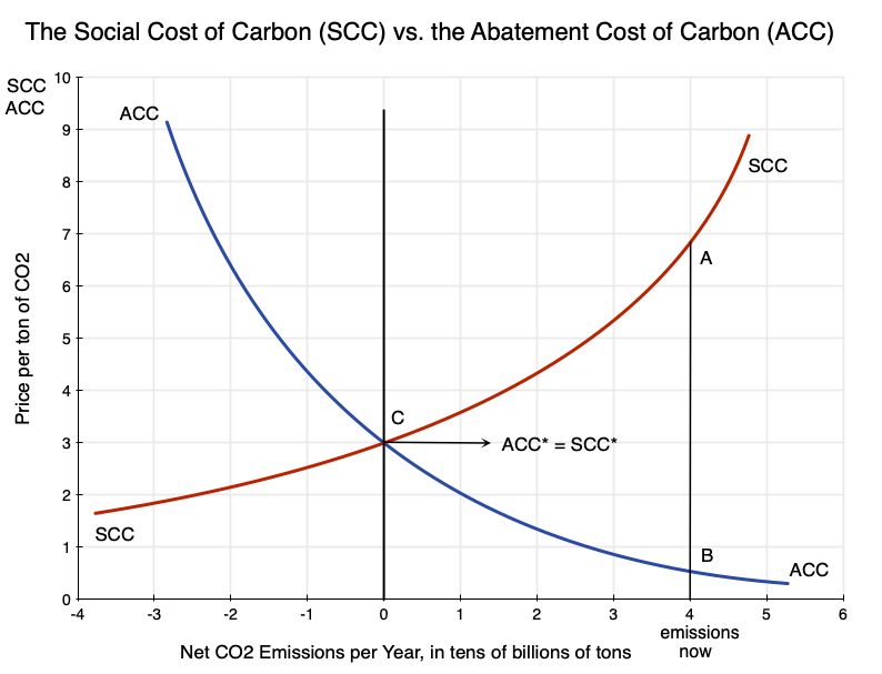
A diagram such as that at the top of this post can be helpful in keeping the concepts clear, as well as in understanding how they interact.  Many might immediately note the similarity to the standard supply and demand diagrams that economists (but few others) know and love, and there is indeed a similarity.  But there is an important difference:  In the supply and demand diagrams normally used, what is being produced and made available is something good, and hence one wants more of it.  But in the diagrams here, what is being produced (polluting greenhouse gases, and in particular CO2 as the primary greenhouse gas) is something bad.  Hence one wants less of it.  But it costs something to reduce those emissions.

The first section below will discuss this diagram, including the concepts behind it and how to interpret and use it to examine various issues.  This will all be just standard economics, but for something one wants less of rather than more of.  The basic measures – analogous to a demand price and a supply price – are the Social Cost of Carbon (SCC – what it costs society when an extra unit of CO2 is emitted) and what I have labeled here the Abatement Cost of Carbon (ACC- what it costs to reduce the emissions of CO2 by a unit).

The post will then discuss some of the implications that one can work out from this simple diagram.  One does not need to know precisely where those curves will be – just their basic relationship to each other.  And a fair amount can be found simply from the concepts themselves.  The key is to be clear as one thinks things through.  How one in practice determines estimates of specific values for the SCC and the ACC is also important, of course, but that issue is different and will be reviewed in subsequent posts on this blog.  There is an enormous literature on determining those values, a fair amount of controversy, and as practitioners always emphasize, also a good deal of uncertainty.  But there is much that follows from the basic concepts themselves, and this blog post will focus on that.

One point of disclosure:  The diagram above was derived from first principles.  And it is a diagram that I thought would be fairly commonly seen in the literature on climate change.  However, while I looked for references using it, I could not find any.  This does not mean that no one has ever produced something similar.  Someone almost certainly has.  But I have not been able to find an example.  At a minimum, it does not appear to be common, and thus reviewing the basic concepts here may be of interest.

July 25, 2023 – Update:  A reader of this blog flagged to me that there is indeed a text that presents a diagram very similar to what I discuss here.  The text is “Principles of Environmental Economics:  Economics, Ecology, and Public Policy”, by Ahmed M. Hussen (a professor of economics at Kalamazoo College in Michigan, USA).  I would like to thank Mr. Naren Mistry for bringing this reference to my attention.

Furthermore, I created the term “Abatement Cost of Carbon” used here – the cost to reduce the emissions of CO2 by a unit.  I believe it is a good description of the concept, but as will be discussed in the subsequent post on estimating the ACC, others have examined somewhat similar concepts with various names.

B.  The Social Cost of Carbon vs. the Abatement Cost of Carbon

The diagram at the top of this post presents schematically the relationship between the Social Cost of Carbon (SCC) and the Abatement Cost of Carbon (ACC).  These are drawn in relation to the net number of tons of CO2 emissions per year along the horizontal axis of the chart (or x-axis).  And while the diagram is shown in terms of CO2 emissions, CO2 is being taken as a proxy for all greenhouse gas emissions (which are often expressed in CO2 equivalent terms – equivalent in terms of their global warming impact over a period that is usually taken to be 100 years).

While one could measure the CO2 in any physical unit, I have labeled it as tens of billions of tons per year.  World emissions in 2021 were about 37 billion metric tons.  But the physical units one can use are arbitrary.  I also want to make clear that while the horizontal axis depicts CO2 emissions as so many tons (or tens of billions of tons) per year, this is simply a representation of the scale of production of those emissions per year.  The price (whether SCC or ACC) is then of one unit (one ton) of those CO2 emissions in any given year – not a price of one ton being emitted each year for multiple years.  It is the price for just one ton, once.

The Social Cost of Carbon (SCC) is the cost to society of a unit of CO2 being emitted into the atmosphere today, in a scenario where CO2 emissions overall are at the pace per year shown on the horizontal axis.  One can think of the SCC as what society would be willing to pay to avoid a unit of CO2 being released into the air.  Since CO2 will remain in the atmosphere for hundreds of years, the damage due to its incremental global warming effect will equal the damage this year, plus the damage next year, plus the year after that, and so on for hundreds of years.

These future damages will be discounted back to the present year based on some social discount rate.  The subsequent blog post on how the SCC is estimated, referred to above, discusses the question of what the appropriate social discount rate should be.  It will have a significant impact on the specific value of the SCC estimated, and is an issue that has been much debated.  For now we will simply assume that a suitable social discount rate has been used.  But an important and practical implication of discounting is that what matters most in the determination of the SCC estimate will only be the damages over the next century or so.  Beyond that, the discounted values are generally so small (depending on the specific social discount rate used) as not to materially affect the SCC estimate.

The damages caused by an extra unit of CO2 being emitted today will depend on how much CO2 (and other greenhouse gases) are already in the atmosphere.  Importantly, the resulting economic damage (which the SCC measures) per unit of global temperature increase will be highly non-linear.  As noted above, the incremental extra damages will be greater if the CO2 (and other greenhouse gases) have led global average temperatures to be, say 2 degrees higher than what they were in the pre-industrial era, than what the incremental damages were when those temperatures were 1 degree higher.  And those per unit damages will be greater still when coming on top of concentrations that would have led to temperatures 3 degrees higher (than in the pre-industrial period) compared to the incremental impact at 2 degrees higher.

In addition, and also importantly, there are feedback effects resulting from increasing concentrations of CO2 in the air that also lead to more than proportionally higher global temperatures.  An important example is the effect on permafrost.  A higher global temperature leads to permafrost that is on the margin of remaining frozen, instead to melt.  And melted permafrost then leads to additional greenhouse gases being released into the air (in particular the highly potent greenhouse gas methane), which then leads to even higher global temperatures.

For both of these reasons (the resulting economic damages, and the feedback effects) the SCC curve in the diagram above not only slopes upward but also bends upwards.

There is one shortcoming in such a schematic, however, that should be flagged.  Supply and demand diagrams are static and do not handle the time dimension well.  There are similar issues here.  In particular, as emissions accumulate in the atmosphere over time, the damages will be greater.  The SCC curve as shown (over its full length) can be viewed as what it would be for a given starting point for the concentration of CO2 in the air.  At higher atmospheric concentrations of CO2, it will shift upwards over its entire length.  This could in principle be handled by adding a third dimension to the diagram.  That is, one could add a third axis perpendicular to the other two (and going away – i.e. adding depth) for the stock of CO2 that had accumulated in the atmosphere.  The two-dimensional diagram shown here can then be thought of as a slice of that more complete three-dimensional chart – showing a slice for some given level of accumulated CO2.  But such a three-dimensional diagram would be complicated, and the two-dimensional one is adequate for our purposes here.

The Abatement Cost of Carbon (ACC) is what it would cost society to reduce the emissions of CO2 by one unit.  When emissions are high (the right side of the chart), it does not cost much to reduce those emissions by a unit.  There are a lot of relatively easy (low-cost) things that one can do.  But as emissions are reduced, ultimately to zero and then even into net negative levels, it becomes increasingly difficult (and hence increasingly costly) to reduce them further.  Hence the ACC curve goes from the upper left in the diagram to the lower right, and bends upwards as well.

The resulting SCC and ACC curves should therefore be expected to look like those shown.  The SCC curve starts high on the right side of the chart (as damages are great when CO2 emissions are high and assumed to remain so); they fall as one moves to the left to lower rates of emissions (with a resulting lower pace of CO2 being released into the air); and the curve bends upward.  The ACC curve, in contrast, starts low on the right – when a high rate of emissions means much could be done at a low cost to reduce those emissions by a unit – and then rises as one moves to the left to lower rates of emissions and it becomes increasingly more difficult (more costly) to reduce emissions by an additional unit.  It will also bend upwards.

At some point the ACC and SCC curves will cross.  In the diagram above, I have them cross at net emissions of zero.  The reason for that will be discussed below.  But there is no a priori reason why they should necessarily cross at zero net emissions.  Where they will cross is an empirical issue.  Rather, all one knows is that they will cross at some point.  (A contrarian might note that it is possible that the ACC curve might theoretically lie always and everywhere above the SCC curve – at least within the range of CO2 emissions shown on the diagram – and hence will never cross it.  But any reasonable estimate of the SCC and the ACC finds that that is not nearly the case in practice – and not by orders of magnitude.)

C.  Some Implications

With these basics, one can draw several implications of interest:

a)  First, at current levels of CO2 emissions (well to the right in the diagram), the SCC will be high and ACC will be low.  In the diagram at the top of this post, the SCC at point A is far above the ACC at point B.  To say that “we cannot afford” to reduce emissions of CO2 is simply wrong as the cost of not taking action to reduce emissions (the SCC at current emission rates) is well above what it would cost to reduce carbon emissions from their current pace (the ACC at current emission rates).  Indeed, the opposite is closer to the truth:  We cannot afford not taking action to reduce CO2 emissions.  And it will remain worthwhile to do this as long as the SCC is above the ACC.

b)  The SCC curve will intersect the ACC curve at some point.  At the point where they intersect the cost of reducing CO2 emissions by a further unit (the ACC) will match the benefit of doing so (the SCC, i.e. the cost to society from a unit of CO2 being emitted).  Beyond that (i.e. further to the left), the cost of further reducing CO2 emissions exceeds the benefits.  At the point where they intersect, the benefits will match the costs.

In the diagram, I have drawn the curves so that they cross at zero net emissions of CO2.  This is the “net zero” goal that the international community has targeted as the appropriate goal to address climate change.  Assuming the international community is acting fully rationally (a big stretch, I acknowledge), then that net zero goal is the appropriate one if the SCC and ACC curves cross at that point.  I have assumed that in the diagram, and the point where they cross is labeled as point C in the diagram, with ACC* = SCC* there.

c)  In reality, there is of course a good deal of uncertainty on where the SCC and ACC curves lie, and hence where they cross. But they do cross somewhere, and as we learn over time more about how the climate is changing, about the costs that the changing climate is imposing on the world, and what it would cost to cut back on CO2 emissions, we will become better able to determine where that intersection is.  But we do not need to know that with any precision right now.  All we need to know at the current moment is that the point where they cross is at a level of CO2 emissions that are well below where they now are, and that therefore we should be reducing CO2 emissions (i.e. moving to the left in the diagram).

d)  But the fact that the SCC is something positive even at net zero emissions brings out that even at net zero emissions – whenever that is achieved – there will still be damage being done from the CO2 that has accumulated in the atmosphere up to that point.  The planet would be as hot as it had ever been, with all the resulting consequences for the climate.  It would just not be getting even hotter (setting aside the complicated lags in the climate system – an important but separate issue).

e)  There would therefore be benefits from reducing the accumulated CO2 in the air from where it would be at that point, even if net emissions at that point were zero.  There is nothing special about net zero as a target – other than the ease with which it can be explained politically.  If it is the case that the cost of reducing CO2 emissions further at that point (the ACC curve) is below what the cost from damages would be of one more unit of CO2 in the air (the SCC curve), then it would make sense to reduce the net emissions of CO2 further.

It might well become significantly more difficult (more costly) to reduce CO2 emissions further once one has reached the net zero level.  It is easier to stop putting more CO2 into the air than it is to draw CO2 out of the air.  But there are ways to do this.  One can plant more trees, for example, or adopt agricultural practices that fix more carbon in the soil or in the oceans, or make use of more esoteric (and currently much more expensive) technologies that draw CO2 directly out from the air and then store it some manner where it will not end up in the air again.  But the fundamental point to recognize is that there is nothing that special about net zero emissions.  Depending on the cost (the ACC), one might well want to take action to reduce some of the CO2 we have put into the air.

f)  This brings us to the role of technology and how, over time, one should expect the technologies for reducing carbon emissions to continue to improve and thus continue to reduce the cost of abating carbon emissions.  The impact of such technological change in reducing the cost of abatement of emissions would be to shift the ACC curve downward, as shown here:

The appropriate goal would then be to reduce net CO2 emissions even further to the left, into the net negative levels at point D in the diagram rather than point C.  With the technology assumed to be available by the time society has reduced CO2 emissions to point C, the cost to reduce it further could by then be less.  At point C, the SCC cost shown in the diagram would be 3 (in some monetary units – dollars or euros or yen or whatever – per some given physical unit), but the ACC cost to reduce CO2 by one of those physical units would be less at a bit below 2 in this diagram.  Thus it would make sense to reduce CO2 emissions even further (into negative levels), where at D one would be matching the cost to society from it (the SCC) with the cost of reducing it making use of the technology available then (on the ACC’ curve).

D.  Summary and Conclusion

That there is a distinction between the costs that carbon emissions impose on society (the SCC) and what it would cost to reduce those emissions (the ACC) is obvious as soon as one thinks about it.  But many people – and especially politicians – often do not think about it, and have confused the two.

One can look at the issue with the simple tools of basic economics.  The only difference with what is normally done is that what is being produced here (CO2 emissions) are something bad – and hence one wants less of them – rather than something good.  And it costs something to reduce those CO2 emissions, even though there is a benefit when they are reduced.  This is in contrast to standard goods, where it costs something to produce more of them and there is a benefit when one has more of them.

Seen in this way, the SCC can be viewed as similar to but with an opposite sign to a demand price.  A demand price is what one would pay to obtain something good, while the SCC is a measure of the benefit one would obtain (what one would be willing to pay) in order to reduce CO2 emissions by a unit.  And while a standard supply price is how much it would cost to increase production by a unit, the ACC is how much it would cost to reduce emissions by a unit.

This then yields a simple diagram such as that at the top of this post, but where instead of a downward-sloping demand curve and an upward-sloping supply curve (as in a standard supply-demand diagram for a normal good – a good that one wants more of), the analog to the demand curve (the SCC curve) slopes up rather than down and the analog to the supply curve (the ACC) slopes down rather than up (all in going from left to right).

Several implications then follow.  The world is currently emitting high levels of CO2, and should that pace of emissions continue, the costs to society from climate change will be immense.  That is, the SCC is high.  But at these levels of CO2 emissions, there is a lot that can be done, at a low cost, to reduce those emissions by a unit.  That is, the ACC is low.  It is therefore mistaken to assert “we cannot afford” to reduce CO2 emissions.  The cost to society from not reducing them will be far greater.

The pace of CO2 emissions should then be reduced as long as the costs to society from releasing these greenhouse gases into the air (the SCC) exceeds the cost of reducing such emissions (the ACC).  At some point the curves will cross, and at that point it would no longer be worthwhile to reduce further the CO2 going into the air.  The now broadly accepted goal of the international community that net emissions of CO2 should go to zero would be logical if the SCC and ACC curves cross at net zero emissions (and I have drawn the diagram at the top of this post as if this is the case).  But there is uncertainty on precisely where those curves lie.  And it is indeed possible they cross at a net negative pace of emissions – i.e. where CO2 would be removed from the atmosphere by some means.  It is also likely that as technology improves, the position where they cross will move further to the left.

But there is no need to know today precisely where they might cross.  All we need to know right now is that with the social costs from emitting CO2 (the SCC) far in excess of what it would cost to reduce those emissions (the ACC), we should be reducing the CO2 we are putting into the air each year.  Progress on this will take time, but as CO2 emissions are reduced we will learn more about what the true costs are:  for the SCC as well as the ACC.  And with technology also advancing, it may well be the case that society will benefit not simply from reducing net emissions to zero, but then in moving beyond that – and possibly well beyond that – to removing CO2 from the atmosphere.

But that is something that we do not need to address today.  As the common saying goes, if you are digging yourself into a hole, the first thing to do is to stop digging.  That is, stop emitting the greenhouse gases that are warming the planet.  But once we have stopped digging the hole even deeper, there will be the issue of how far out of that hole we should want to go.

This post has covered only the basics.  The practical question remains of how one estimates what the SCC and ACC figures are.  That will come in subsequent posts that I hope to put up soon.

Contribution to GDP Growth of the Change in Inventories: Econ 101 Again

A.  Introduction

The contribution of changes in inventories to changes in reported GDP is easily misunderstood.  One saw this in reports on the recent release (on July 28) by the Bureau of Economic Analysis (BEA) of its first estimate of GDP for the second quarter of 2022.  It estimated that GDP fell – at an annualized rate of -0.9% in the quarter – and that along with the first quarter decline in GDP (at an estimated rate of -1.6%), the US has now seen two straight quarters of falling GDP.  While there will be revisions in the coming months of the second quarter figures, as additional data become available, a fall in GDP for two straight quarters has often been used as a rule of thumb for an economy being in recession.

News reports on the figures noted also that were it not for the estimated change in inventories, GDP would have gone up rather than down.  The estimate was that GDP fell by -0.9% (at an annual rate) in the second quarter, and that the change in private inventories alone accounted for a 2.0% point reduction in GDP.  That is, if the inventory contribution had been neutral, GDP would have grown by about 1% rather than fallen by almost 1%.

But it would be wrong to attribute this to “decreases in inventories”, as some reports did.  Inventories grew strongly in the fourth quarter of 2021, with this continuing at a similarly strong pace in the first quarter of 2022 and still (although at a slower pace) in the second quarter of 2022.  How, then, could this have contributed to a reduction in GDP in 2022?

It is easy to become confused on this.  While really just a consequence of some basic arithmetic, it does require a good understanding of what GDP is and how changes in inventories are reflected in GDP.  I discussed this in a January 2012 post on this blog, but that was more than a decade ago and a revisit to the issue may be warranted.  This post will examine the problem from a different perspective from that used before.  It will start with a review of what GDP measures, and then use some simple numerical examples to show how changes in inventories affect GDP.  It will then use a series of charts, based on actual numbers from the GDP accounts in recent years, to show how changes in inventories have mattered.

A note of the data:  All the figures used come from the BEA National Income and Product Accounts (NIPA), as updated through the July 28 release.  These are often also called by many (including myself) the GDP accounts, but NIPA is the more proper term.  Also, the figures for inventories in the NIPA accounts are for private inventories only.  Inventories held by government entities are small and are not broken out separately in the accounts.  Instead, changes in such inventories are aggregated into the figures for government consumption.  While I will often refer to “inventories” in this post, the measures of those inventories are technically for private inventories only.

B.  Inventories and GDP, with Some Simple Numerical Illustrations

GDP – Gross Domestic Product – is a measure of production (product).  Yet as anyone who has ever taken an Econ 101 class knows, GDP is typically described as (and measured by) how those goods and services are used:  for Consumption plus Investment plus Government Spending plus Net Foreign Trade (Exports less Imports).  In symbols:

GDP = C + I + G + (X-M)

Where “C” is private consumption; “I” is private investment; “G” is government spending on goods or services for direct consumption or investment; and “X-M” is exports minus imports, or net foreign trade.

(Imports, M, can be thought of either as an addition to the supply of available goods or netted out from exports, X, to yield net exports.  To keep the language simple, I will treat it as being netted out from exports.)

Private investment includes investment both in new fixed assets (such as buildings or machinery and equipment) and in accumulation of inventory.  This accumulation of inventory, or net change in inventory, is key to why this equation adds up.  As noted above, GDP is product – how much is produced.  Whatever is produced can then be sold for consumption, fixed asset investment, government spending on consumption or investment, or net exports.  If whatever is produced exceeds what is sold in the period for these various purposes, then the difference will accrue as inventories.  If the amount produced falls short of what is sold, there will have to have been a drawdown of inventories for the demands to have been met.  Otherwise it would not have been possible – the goods had to come from somewhere.

The balancing item is therefore the change in inventories.  It is what allows us to go from an estimate of what is sold to an estimate (if one knows how much inventories changed by) of what was produced, i.e. to Gross Domestic Product.

How then do changes in inventories affect measured GDP?  This is best seen through a series of simple numerical examples, tracing changes in the stock of inventories over time.

Period

Stock

Change

Change in the Change

0

2000

1

2200

200

2

2400

200

0

Start with a stock of inventories in the economy as a whole in period 0 of say 2000 (in whatever units – perhaps billions of dollars).  This stock then grows to 2200 in period 1 and 2400 in period 2.  The change in inventories in period 1 will then be 200, and that change in inventories will be one of the components making up GDP (along with private consumption, private fixed investment, and so on).  It is an investment – an investment in inventories – and thus one of the uses of whatever product was produced in the period.  It will equal the total of what was produced (GDP) less what was sold for the sum of all final demands (private consumption, private fixed Investment, government, and net foreign trade).

With the stock of inventories growing to 2400 in period 2, the change in inventories in that period will once again be 200.  Hence the contribution to GDP will once again be 200.  This is the same as what its contribution to GDP was in the previous period, and hence the higher inventories would not have been a contributor to some higher level of GDP – its contribution to GDP is the same as before.  The change in the change in the stock of inventories is zero.

But this does not mean that inventories fell in period 2.  They grew by 200.  But that was simply the same as its accumulation in the prior period, so it did not add to GDP growth.

To make a contribution to GDP growth in period 2, the addition to inventories would have had to have grown.  For example:

Period

Stock

Change

Change in the Change

0

2000

1

2200

200

2

2500

300

100

In this example, the stock of inventories grew to 2500 in period 2.  The change in inventories was then 300, which is higher than the change in inventories of 200 in period 2 – it is 100 more.  This would be reflected in a GDP in period 2 which would be 100 higher than it would have been otherwise.

If, on the other hand, the pace of inventory accumulation slows, then inventory accumulation will subtract from GDP:

Period

Stock

Change

Change in the Change

0

2000

1

2200

200

2

2300

100

-100

In this example, inventories are still growing in period 2 – to a level of 2300.  This is 100 higher than what it was in period 2.  But the change in inventories is then only 100 – which is less than the change of 200 in period 1.  Inventories are still growing but they will add less to GDP than they had in period 2.  Hence they will subtract from whatever growth in GDP there might have been otherwise.

This is what happened in the recently released estimates for GDP growth in the second quarter of 2022.  Inventories were still growing, but they were growing at a slower pace than in the prior quarter.  In terms of annual rates (and with seasonally adjusted figures), inventories grew by $81.6 billion in the second quarter (in terms of constant 2012 dollar prices; see line 40 of Table 3 of the BEA release).  But this was less than the $188.5 billion growth in inventories in the first quarter of 2022.  In percentage point terms, that difference (a reduction of $106.8 billion) subtracted 2.0% from what GDP growth would have otherwise been in the second quarter (see line 40 of Table 2 of the BEA release).  With the changes in the other components of GDP, the end result was that estimated GDP fell by 0.9% in the quarter.  Thus one can attribute the fall in GDP in the quarter to what happened to inventories, but not because inventories fell.  It was because they did not grow as fast as they had in the previous quarter.

C.  Changes in Inventories in the Data

Based on this, it is of interest to see how inventories have in fact changed quarter to quarter in recent years.  These changes, and especially the changes in the changes, are volatile.  They can make a big difference in the quarter-to-quarter changes in GDP.  Over time, however, they will even out, as there is some desired level of inventories in relation to their sales and producers will target their purchases to levels to try to reach that desired level.

Start with the chart at the top of this post.  It shows the stock of private inventories by quarter going back to 1998.  The figures are in constant 2012 dollars so that inflation is not a factor (and more precisely using what are called “chained” dollars where the weights used to compute the overall indices are based on prior period shares of each of the goods – so the weights shift over time as these shares shift).

Stocks generally move up over time as the economy grows, although there have been reductions in periods when the economy was in recession or otherwise disrupted.  Thus one sees a fall in 2001, due to the recession in the first year of the Bush II administration, an especially sharp fall in 2008 with the onset of the economic and financial collapse in the last year of the Bush II administration with this then carrying over into 2009, and then a fall again in 2020 due to the Covid lockdowns.  The trough in the most recent downturn was reached in the third quarter of 2021, following which the stock of inventories grew rapidly.  They are still, however, slightly below the level reached in mid-2019 even though GDP is higher now than what it was then.

One starts with the stocks, but as was discussed above, the contribution to GDP comes from the accumulation of inventories – the change in the stocks.  These changes, based on the figures underlying the chart at the top of this post, have been:

There is considerable quarter-to-quarter volatility.  Note that the figures here are expressed in terms of annual rates.  That is, they are each four times what the actual change was (in dollar terms) in the given quarter.  One sees that the change in the fourth quarter of 2021 was quite high – higher than in any other quarter of this 24-year period – and was still almost as high in the first quarter of 2022.  The increase was then less in the second quarter of 2022, but was still a substantial increase (of $81.6 billion at an annual rate) in the quarter.

The changes in inventories are a component of GDP, but the contribution to the growth in GDP comes from the changes in the change in inventories.  These are easily computed as well by simple subtraction, and were:

These are now very highly volatile, and one sees especially sharp fluctuations in the last couple of years.  With all the disruptions of the lockdowns, the subsequent supply chain disruptions, and the very strong recovery of the economy in 2021 (with GDP growing faster than in any year in almost four decades, and private consumption growing faster than in any year since 1946!), it has been difficult to manage production to meet expected demands and allow for some desired target level of inventories.

This had a substantial impact on the quarter-to-quarter changes in GDP, both positive and negative.  Focussing on the recent quarters, the changes in inventories were a $193.2 billion increase in the fourth quarter of 2021, and as noted before, a further $188.5 billion increase in the first quarter of 2022 and a further although smaller increase of $81.6 billion in the second quarter of 2022.  These were the changes in inventories.  But the changes in the changes, which is what will add to or subtract from GDP growth, were a very high $260.0 billion in the fourth quarter of 2021, and then a fall of $4.7 billion in the first quarter of 2022.  This reduction in the first quarter of 2022 came despite inventories increasing in that quarter by close to a record high level.  But they followed a quarter where inventories rose by a bit more, so the change in the change was small and indeed a bit negative.

In the second quarter of 2022 inventories again rose – by $81.6 billion.  But following the close to record high growth in the first quarter of 2022, its contribution to the growth in GDP in the quarter was substantially negative.  The $81.6 billion increase in inventories in the second quarter was $106.9 billion less than the increase of $188.5 billion in the first quarter.  And it is this $106.9 billion which is a contribution to (or in this case a subtraction from) what GDP growth would have been in the quarter.

Finally, one can show this also in the possibly more helpful units of the percentage point contribution to the growth in GDP:

Although in different units, the chart here mirrors closely the preceding one, as one would expect if one has been doing the calculations correctly.  The only difference, in principle, is that with GDP growth over time, the dollar values of the quarter-to-quarter changes will look larger when expressed as a share of GDP in the earlier years of the period.

There are, however, some minor differences deriving from the nature of the data used.  The chart here was drawn directly from the figures presented in the BEA NIPA accounts for the percentage point contributions to GDP growth from changes in inventories.  One can also calculate it by taking the quarterly changes in the change in constant dollar terms (from the preceding chart, in red), dividing it by the previous quarter’s GDP (as one is looking at growth over the preceding quarter), and then annualizing it by taking one plus the ratio to the fourth power.  I did that, and the curve lies very close to on top of the curve shown here (in orange).

But not quite, due in part to rounding errors that compound when one is taking the changes and then the changes in the changes.  In addition, inventories by their nature are highly heterogeneous, with some going up and some down in any given period even though there is some bottom line total on whether the aggregate rose or fell.  This makes working with price indices tricky.  The BEA figures are based on far more disaggregated calculations than the ones they present in the NIPA accounts, and their underlying data also have more significant digits than what they show in the tables they report.

D.  Inventories to Sales, and Near Term Prospects

What will happen to inventories now?  Given how important changes in inventories are to the quarter-to-quarter figures on GDP growth, economists have long tried to develop some system to predict how they will change (as have Wall Street analysts, where success in this could make some of them very rich).  But they have all failed (at least to my knowledge).

One statistic that many focus on, quite logically, is the ratio of inventory to sales:

The figures here were computed from data reported in the BEA NIPA Accounts, Table 5.8.6B, where inventories include all private inventories while sales are of goods (including newly built structures) sold by domestic businesses.  Inventories are by nature of goods only, and hence one should leave out services (as an increasing share of services in GDP would, on its own, lead to a fall in the ratio).  Sales of newly built structures are included as one has inventories of building materials.  The figures on the sale of goods by domestic businesses are provided by the BEA.  Note that “sales” here are expressed on a monthly basis.  Hence the ratio is of inventories in terms of months of sales.

As one sees in the chart, the ratio of inventory to sales has been coming down over time.  This is consistent with all the literature advising on tighter inventory management.  There was then an unusually sharp decline in 2020 – a consequence of the Covid lockdowns – that bottomed out in the second quarter of 2021 (as a share of sales) and has since grown strongly.  But the ratio is still below where it was prior to the pre-Covid trend, although how much below depends on how one would draw the trend line pre-Covid.

Where will it go from here?  While important to what will happen to the quarter-to-quarter figures for GDP growth, as discussed above, I doubt that anyone has a good forecast of what that will be.  While there might well be room for the inventory to sales ratio to rise from where it is now, keep in mind that the ratio can rise not only by adding to inventories but also by sales going down.  And while GDP growth was exceptionally strong in 2021, it has been weak so far this year (indeed negative) and that weakness might well worsen.  Personally, while I do not see that the economy is in recession now (employment growth has been strong, with 2.7 million net new jobs in the first half of 2022, and the unemployment rate has been just 3.6% for several months now), the likelihood of a recession in 2023 is, I would say, quite high.

There also have been recent announcements by major retailers that the inventories they are currently holding are well in excess of what they want, and that they will take exceptional measures to try to bring them down.  Target announced a plan to do so in June (with a warning it will squeeze their near-term profits), Walmart announced in July they had similar issues (and that it would slash prices to move that inventory), and other retailers have announced similar problems.  If this is indeed a general issue, then those efforts to bring down inventories in themselves will act as a strong drag on the economy, making a recession even more likely.  And as was discussed above, the stock of inventories does not need to fall in absolute terms to cut GDP growth – a change that is less than what the change had been in the prior period will subtract from GDP growth, even though the inventories may still be growing in absolute terms.

Firms such as Target and Walmart employ many highly trained professionals to manage their inventories.  Yet even they find it difficult to get their inventories to come out where they want them to be.  If they and others now begin a concerted effort to bring down their inventory levels in the coming months, the impact on GDP in the rest of this year could be severe.

Why Do the Quarterly GDP Figures Bounce Around So Much?: Econ 101

A.  Introduction

The Bureau of Economic Analysis (BEA) released on July 27 its initial estimate of GDP growth in the second quarter of 2018 (what it technically calls its “advance estimate”).  It was a good report:  Its initial estimate is that GDP grew at an annualized rate of 4.1% in real terms in the quarter.  Such growth, if sustained, would be excellent.

But as many analysts noted, there are good reasons to believe that such a growth rate will not be sustained.  There were special, one-time, factors, such as that the second quarter growth (at a 4.1% annual rate) had followed a relatively modest rate of growth in the first quarter of 2.2%.  Taking the two together, the growth was a good, but not outstanding, rate of 3.1%.

More fundamentally, with the economy now at full employment, few (other than Trump) expect growth at a sustained rate of 4% or more.  Federal Reserve Board members, for example, on average expect GDP growth of 2.8% in 2018 as a whole, with this coming down to a rate of 1.8% in the longer run.  And the Congression Budget Office (in forecasts published in April) is forecasting GDP growth of 3.0% in 2018, coming down to an average rate of 1.8% over 2018 to 2028.  The fundamental issue is that the population is aging, so the growth rate of the labor force is slowing.  As discussed in an earlier post on this blog, unless the productivity of those workers started to grow at an unprecedented rate (faster than has ever been achieved in the post-World War II period), we cannot expect GDP to grow for a sustained period going forward at a rate of 3%, much less 4%.

But there will be quarter to quarter fluctuations.  As seen in the chart at the top of this post covering the period just since 2006, there have been a number of quarters in recent years where GDP grew at an annualized rate of 4% or more.  Indeed, growth reached 5.1% in the second quarter of 2012, with this followed by an also high 4.9% rate in the next quarter.  But it then came back down.  And there were also two quarters (setting aside the period of the 2008/09 recession) which had growth of a negative 1.0%.  On average, GDP growth was around 2% (at an annual rate) during Obama’s two terms in office (2.2% annually from the end of the recession in mid-2009).

Seen in this context, the 4.1% rate in the initial estimate for the second quarter of 2018 was not special.  There have been a number of such cases (and with even substantially higher growth rates for a quarter or even two) in the recent past, even though average growth was just half that.  The quarterly rates bounce around.  But it is of interest to examine why they bounce around so much, and that is the purpose of this blog post.

B.  Reasons for this Volatility

There are a number of reasons why one should not be surprised that these quarter to quarter growth rates in GDP vary as they do.  I will present several here.  And note that these reasons are not mutually exclusive.  Several of them could be acting together and be significant factors in any given quarter.

a)  There may have been actual changes in growth:

To start, and to be complete, one should not exclude the possibility that the growth in the quarter (or the lack of it) was genuine.  Perhaps output did speed up (or slow down) as estimated.  Car plants might go on extra shifts (or close for a period) due to consumers wanting to buy more cars (or fewer cars) in the period for some reason.  There might also be some policy change that might temporarily spur production (or the opposite).  For example, Trump’s recent trade measures, and the response to them from our trading partners, may have brought forward production and trade that would have been undertaken later in the year, in order to avoid tariffs threatened to be imposed later.  This could change quarterly GDP even though GDP for the year as a whole will not be affected positively (indeed the overall impact would likely be negative).

[Side note:  But one special factor in this past quarter, cited in numerous news reports (see, for example, here, here, here, here, and here), was that a jump in exports of soybeans was a key reason for the higher-than-recently-achieved rate of GDP growth.  This was not correct.  Soybean exports did indeed rise sharply, with this attributed to the response threatened by China and others to the new tariffs Trump has imposed.  China and others said they would respond with higher tariffs of their own, targeted on products such as soybeans coming from the US.  There was thus a rush to export soybeans in the period between when China first announced they would impose such retaliatory tariffs (in late March) and when they were then imposed (ultimately on July 6).

But while soybean exports did indeed increase sharply in the April to June quarter, soybeans are a crop that takes many months to grow.  Whatever increase in shipments there was had to come out of inventories.  An increase in exports would have to be matched by a similar decrease in inventories, with this true also for corn and other such crops.  There would be a similar issue for any increase in exports of Kentucky bourbon, also a target of retaliatory tariffs.  Any decent bourbon is aged for at least three years.

One must keep in mind that GDP (Gross Domestic Product) is a measure of production, and the only production that might have followed from the increased exports of soybeans or similar products would have been of packing and shipping services.  But packing and shipping costs are only a relatively small share of the total value of the products being exported.

Having said that, one should not then go to the opposite extreme and assume that the threatened trade war had no impact on production and hence GDP in the quarter.  It probably did.  With tariffs and then retaliatory tariffs being threatened (but to be imposed two or three months in the future), there were probably increased factory orders to make and ship various goods before such new tariffs would enter into effect.  Thus there likely was some impact on GDP, but to an extent that cannot be quantified in what we see in the national level accounts.  And with such factory orders simply bringing forward orders that likely would have been made later in the year, one may well see a fallback in the pace of GDP growth in the remainder of the year.  But there are many other factors as well affecting GDP growth, and we will need to wait and see what the net impact will be.]

So one should not exclude the possibility that the fluctuation in the quarterly growth rate is real.  But it could be due to many other factors as well, as we will discuss below.

b)  Change at an Annualized Rate is Not the Change in a Quarter:

While easily confused, keep in mind also that in the accounts as normally published and presented in the US, the rates of growth of GDP (and of the other economic variables) are shown as annual equivalent rates.  The actual change in the quarter is only about one-fourth of this (a bit less due to compounding).  That is, in the second quarter of 2018, the BEA estimated that GDP (on a seasonally adjusted basis, which I will discuss below as a separate factor) grew by 1.00% (and yes, exactly 1.00% within two significant digits).  But at an annualized rate (some say “annual rate”, and either term can be used), this would imply a rate of growth of 4.06% (which rounded becomes 4.1%).  It is equal to slightly more than 4.0% due to compounding.  [Technically, 1% growth in the quarter means 1.00 will grow to 1.01, and taking 1.01 to the fourth power yields 1.0406, or an increase of 4.06%.]

Thus it is not correct to say that “GDP grew by 4.1% in the second quarter”.  It did not – it grew by 1.0%.  What is correct is to say that “GDP grew at an annualized rate of 4.1% in the second quarter”.

Not all national statistical agencies present such figures in annualized terms.  European agencies, for example, generally present the quarterly growth figures as simply the growth in the quarter.  Thus, for example, Eurostat on June 7 announced that GDP in the eurozone rose by an estimated 0.4% in the first quarter of 2018.  This 0.4% was the growth in the quarter.  But that 0.4% growth figure would be equivalent to growth of 1.6% on an annualized basis (actually 1.61%, if the growth had been precisely 0.400%).  Furthermore, the European agencies will generally also focus on the growth in GDP over what it had been a year earlier in that same quarter.  In the first quarter of 2018, this growth over the year-earlier period was an estimated 2.5% according to the Eurostat release.  But the growth since the year-earlier period is not the same as the growth in the current quarter at an annualized rate.  They can easily be confused if one is not aware of the conventions used by the different agencies.

c)  Don’t confuse the level of GDP with the change in GDP:

Also along the lines of how we might misleadingly interpret figures, one needs to keep in mind that while the quarterly growth rates can, and do, bounce around a lot, the underlying levels of GDP are really not changing much.  While a 4% annual growth rate is four times as high as a 1% growth rate, for example, the underlying level of GDP in one calendar quarter is only increasing to a level of about 101 (starting from a base of 100 in this example) with growth at a 4% annual rate, versus to a level of 100.25 when  growth is at an annual rate of 1%.  While such a difference in growth rates matters a great deal (indeed a huge deal) if sustained over time, the difference in any one quarter is not that much.

Indeed, I personally find the estimated quarter to quarter levels of GDP in the US (after seasonal adjustment, which will be discussed below) to be surprisingly stable.  Keep in mind that GDP is a flow, not a stock.  It is like the flow of water in a river, not a stock such as the body of water in a reservoir.  Flows can go sharply up and down, while stocks do not, and some may mistakenly treat the GDP figures in their mind as a stock rather than a flow.  GDP measures the flow of goods and services produced over some period of time (a calendar quarter in the quarterly figures).  A flow of GDP to 101 in some quarter (from a base of 100 in the preceding quarter) is not really that different to an increase to 100.25.  While this would matter (and matter a good deal) if the different quarterly increases are sustained over time, this is not that significant when just for one quarter.

d)  Statistical noise matters:

Moving now to more substantive reasons why one should expect a significant amount of quarter to quarter volatility, one needs to recognize that GDP is estimated based on surveys and other such sources of statistical information.  The Bureau of Economic Analysis (BEA) of the US Department of Commerce, which is responsible for the estimates of the GDP accounts in the US (which are formally called the National Income and Product Accounts, or NIPA), bases its estimates on a wide variety of surveys, samples of tax returns, and other such partial figures.  The estimates are not based on a full and complete census of all production each quarter.  Indeed, such an economic census is only undertaken once every five years, and is carried out by the US Census Bureau.

One should also recognize that an estimate of real GDP depends on two measures, each of which is subject to sampling and other error.  One does not, and cannot, measure “real GDP” directly.  Rather, one estimates what nominal GDP has been (based on estimates in current dollars of the value of all economic transactions that enter into GDP), and then how much prices have changed.  Price indices are estimated based on the prices of surveyed samples, and the components of real GDP are then estimated from the nominal GDP of the component divided by the relevant price index.  Real GDP is only obtained indirectly.

There will then be two sets of errors in the measurements:  One for the nominal GDP flows and one for the price indices.  And surveys, whether of income flows or of prices, are necessarily partial.  Even if totally accurate for the firms and other entities sampled, one cannot say with certainty whether those sampled in that quarter are fully representative of everyone in the economy.  This is in particular a problem (which the BEA recognizes) in capturing what is happening to newly established firms.  Such firms will not be included in the samples used (as they did not exist when the samples were set up) and the experiences of such newly established firms can be quite different from those of established firms.

And what I am calling here statistical “noise” encompasses more than simply sampling error.  Indeed, sampling error (the fact that two samples will come up with different results simply due to the randomness of who is chosen) is probably the least concern.  Rather, systemic issues arise whenever one is trying to infer measures at the national level from the results found in some survey.  The results will depend, for example, on whether all the components were captured well, and even on how the questions are phrased.  We will discuss below (in Section C, where we look at a comparison of estimates of GDP to estimates of Gross Domestic Income, or GDI, which in principle should be the same) that the statistical discrepancy between the estimates of GDP and GDI does not vary randomly from one quarter to the next but rather fairly smoothly (what economists and statisticians call “autocorrelation” – see Section C).  This is an indication that there are systemic issues, and not simply something arising from sample randomness.

Finally, even if that statistical error was small enough to allow one to be confident that we measured real GDP within an accuracy of just, say, +/- 1%, one would not then be able to say whether GDP in that quarter had increased at an annualized rate of about 4%, or decreased by about 4%.  A small quarterly difference looms large when looked at in terms of annualized rates.

I do not know what the actual statistical error might be in the GDP estimates, and it appears they are well less than +/- 1% (based on the volatility actually observed in the quarter to quarter figures).  But a relatively small error in the estimates of real GDP in any quarter could still lead to quite substantial volatility in the estimates of the quarter to quarter growth.

e)  Seasonal adjustment is necessary, but not easy to do:

Economic activity varies over the course of the year, with predictable patterns.  There is a seasonality to holidays, to when crops are grown, to when students graduate from school and enter the job market, and much much more.  Thus the GDP data we normally focus on has been adjusted by various statistical methods to remove the seasonality factor, making use of past data to estimate what the patterns are.

The importance of this can be seen if one compares what the seasonally adjusted levels of GDP look like compared to the levels before seasonal adjustment.  Note the level of GDP here is for one calendar quarter – it will be four times this at an annual rate:

There is a regular pattern to GDP:  It is relatively high in the last quarter of each year, relatively low in the first quarter, and somewhere in between in the second and third quarters.  The seasonally adjusted series takes account of this, and is far smoother.  Calculating quarterly growth rates from a series which has not been adjusted for seasonality would be misleading in the extreme, and not of much use.

But adjusting for seasonality is not easy to do.  While the best statisticians around have tried to come up with good statistical routines to do this, it is inherently difficult.  A fundamental problem is that one can only look for patterns based on what they have been in the past, but the number of observations one has will necessarily be limited.  If one went back to use 20 years of data, say, one would only have 20 observations to ascertain the statistical pattern.  This is not much.  One could go back further, but then one has the problem that the economy as it existed 30 or 40 years ago (and indeed even 20 years ago) was quite different from what it is now, and the seasonal patterns could also now be significantly different.  While there are sophisticated statistical routines that have been developed to try to make best use of the available data (and the changes observed in the economy over time), this can only be imperfect.

Indeed, the GDP estimates released by the BEA on July 27 incorporated a number of methodological changes (which we will discuss below), one of which was a major update to the statistical routines used for the seasonal adjustment calculations.  Many observers (including at the BEA) had noted in recent years that (seasonally adjusted) GDP growth in the first quarter of each year was unusually and consistently low.  It then recovered in the second quarter.  This did not look right.

One aim of the update to the seasonal adjustment statistical routines was to address this issue.  Whether it was fully successful is not fully clear.  As seen in the chart at the top of this post (which reflects estimates that have been seasonally adjusted based on the new statistical routines), there still appear to be significant dips in the seasonally adjusted first quarter figures in many of the years (comparing the first quarter GDP figures to those just before and just after – i.e. in 2007, 2008, 2010, 2011, 2014, and perhaps 2017 and 2018.  This would be more frequent than one would expect if the residual changes were now random over the period).  However, this is an observation based just on a simple look at a limited sample.  The BEA has looked at this far more carefully, and rigorously, and believes that the new seasonal adjustment routines it has developed have removed any residual seasonality in the series as estimated.

f)  The timing of weekends and holidays may also enter, and could be important:

The production of the goods and services that make up the flow of GDP will also differ on Saturdays, Sundays, and holidays.  But the number of Saturdays, Sundays, and certain holidays may differ from one year to the next.  While there are normally 13 Saturdays and 13 Sundays in each calendar quarter, and most holidays will be in the same quarter each year, this will not always be the case.

For example, there were just 12 Sundays in the first quarter of 2018, rather than the normal 13.  And there will be 14 Sundays in the third quarter of 2018, rather than the normal 13.  In 2019, we will see a reversion to the “normal” 13 Sundays in each of the quarters.  This could have an impact.

Assume, just for the sake of illustration, that production of what goes into GDP is only one-half as much on a Saturday, Sunday, or holiday, than it is on a regular Monday through Friday workday.  It will not be zero, as many stores, as well as certain industrial plants, are still open, and I am just using the one-half for illustration.  Using this, and based on a simple check of the calendars for 2018 and 2019, one will find there were 62 regular, Monday through Friday, non-holiday workdays in the first quarter of 2018, while there will be 61 such regular workdays in the first quarter of 2019.  The number of Saturdays, Sundays, and holidays were 28 in the first quarter of 2018 (equivalent to 14 regular workdays in terms of GDP produced, assuming the one-half figure), while the number of Saturdays, Sundays, and holidays will be 29 in the first quarter of 2019 (equivalent to 14.5 regular workdays).  Thus the total regular work-day equivalents will be 76 in 2018 (equal to 62 plus 14), falling to 75.5 in 2019 (equal to 61 plus 14.5).  This will be a reduction of 0.7% between the periods in 2018 and 2019 (75.5/76), or a fall of 2.6% at an annualized rate.  This is not small.

The changes due to the timing of holidays could matter even more, especially for certain countries around the world.  Easter, for example, was celebrated in March (the first quarter) in 2013 and 2016, but came in April (the second quarter) in 2014, 2015, 2017, and 2018.  In Europe and Latin America, it is customary to take up to a week of vacation around the Easter holidays.  The change in economic activity from year to year, with Easter celebrated in one quarter in one year but a different one in the next, will make a significant difference to economic activity as measured in the quarter.

And in Muslim countries, Ramadan (a month of fasting from sunrise to sunset), followed by the three-day celebration of Eid al-Fitr, will rotate through the full year (in terms of the Western calendar) as it is linked to the lunar cycle.

Hence it would make sense to adjust the quarterly figures not only for the normal seasonal adjustment, but also for any changes in the number of weekends and holidays in some particular calendar quarter.  Eurostat and most (but not all) European countries make such an adjustment for the number of working days in a quarter before they apply the seasonal adjustment factors.  But I have not been able to find how the US handles this.  The adjustment might be buried somehow in the seasonal adjustment routines, but I have not seen a document saying this.  If no adjustment is made, then this might explain part of the quarterly fluctuations seen in the figures.

g)  There have been, and always will be, updates to the methodology used:

As noted above, the GDP figures released on July 27 reflected a major update in the methodology followed by the BEA to arrive at its GDP estimates.  Not only was there extensive work on the seasonal adjustment routines, but there were definitional and other changes.  The accounts were also updated to reflect the findings from the 2012 Economic Census, and prices were changed from a previous base of 2009 to now 2012.  The July 27 release summarized the changes, and more detail on what was done is available from a BEA report issued in April.  And with the revisions in definitions and certain other methodological changes, the BEA revised its NIPA figures going all the way back to 1929, the first year with official GDP estimates.

The BEA makes such changes on a regularly scheduled basis.  There is normally an annual change released each year with the July report on GDP in the second quarter of the year.  This annual change incorporates new weights (from recent annual surveys) and normally some limited methodological changes, and the published estimates are normally then revised going back three and a half years.  See, for example, this description of what was done in July 2017.

On top of this, there is then a much larger change once every five years.  The findings from the most recent Economic Census (which is carried out every five years) are incorporated, seasonal adjustment factors are re-estimated, and major definitional or methodological changes may be incorporated.  The July 2018 release reflected one of those five-year changes.  It was the 15th such comprehensive revision to the NIPA accounts undertaken by the BEA.

I stress this to make the point that the GDP figures are estimates, and as estimates are always subject to change.  The professionals at the BEA are widely admired around the world for the quality of their work, and do an excellent job in my opinion.  But no estimates will ever be perfect.  One has to recognize that there will be a degree of uncertainty surrounding any such estimates, and that the quarter to quarter volatility observed will derive at least in part from the inherent uncertainty in any such estimates.

C.  Estimates of GDP versus Estimates of GDI

One way to develop a feel for how much the changes in quarterly GDP may be due to the inherent uncertainty in the estimates is to compare it to the estimated quarterly changes in Gross Domestic Income (GDI).  GDP (Gross Domestic Product) measures the value of everything produced.  GDI measures the value of all incomes (wages, profits, rents, etc.) generated.  In principle, the totals should be the same, as the value of whatever is produced accrues to someone as income.  They should add up to the same thing.

But the BEA arrives at its estimates of GDP and of GDI by different routes.  As a consequence, the estimates of the totals will then differ.  The differences are not huge in absolute amount, nor have they grown over time (as a share of GDP or of GDI).  That is, on average the estimates match each other over time, with the same central tendency.  But they differ by some amount in any individual quarter, and hence the quarter to quarter growth rates will differ.  And for the reasons reviewed above, those slight changes in the levels in any individual quarter can translate into often major differences in the growth rates from one quarter to the next.  And these differences may appear to be particularly large when the growth rates are then presented in annualized terms.

For the period since 2006, the two sets of growth rates were (where the initial estimate for the second quarter of 2018 will not be available until the end-August figures come out):

As is seen, the alternative estimates of growth in any individual quarter can be quite different.  There was an especially large difference in the first quarter of 2012, when the estimated growth in GDP was 3.2% at an annual rate, while the estimated growth in GDI was a giant 8.7%.

Which is correct?  Was the growth rate in the first quarter of 2012 3.2% (as found with the GDP estimate) or 8.7% (as found with the GDI estimate)?  The answer is we do not know, and indeed that probably neither is correct.  What is most likely is that the true figure is probably somewhere in between.

Furthermore, and also moderating what the impact on the differences in the respective estimated growth rates will be, it is not the case that the estimates of GDP and GDI are statistically independent of each other, with the two bouncing around randomly with respect to each other.  Rather, if one looks at what the BEA calls the “statistical discrepancy” (the difference between GDP and GDI), one finds that if, say, the estimate of GDP were above the estimate of GDI in one quarter, then it likely would also be above in the next quarter.  Not by the same amount, and the differences would evolve over time, but moving more like waves than as balls ricocheting around.  Economists and statisticians refer to this as “autocorrelation”, and it indicates that there is some systemic error in the estimates of GDP and of GDI, which carries over from one quarter to the next.  What the source of that is, we do not know.  If we did know, then it would be eliminated.  But the fact such autocorrelation exists tells us that there is some source of systemic error in the measures of GDP and GDI, and we have not been able to discover the source.

Estimates are estimates.  We need to recognize that there will be statistical uncertainty in any such figures.  Even if they even out over time, the estimated growth from one quarter to the next will reflect such statistical volatility.  The differences seen in the estimated rates of growth in any one quarter for total output (estimated by way of GDP versus by way of GDI) provides a useful benchmark for how to judge the reported changes seen in growth for GDP in any individual quarter.  The true volatility (for purely statistical reasons) is likely to be at least as much, if not more.

D.  Conclusion

There are many reasons, then, to expect the quarterly growth figures to bounce around.  One should not place too much weight on the estimates from any individual quarter.  It is the longer term trends that matter.  The estimated figure for growth in GDP of 4.1% in the second quarter was not out of line with what has been seen in a number of quarters in recent years.  But growth since mid-2009 has only been about one half as much on average, despite several quarters when estimated growth was well in excess of 4.1%.

To conclude, some may find of interest three country cases I am personally familiar with which illustrate why one needs to exercise care, and with an understanding of the country context, when considering what is meaningful or not for reported figures on GDP growth.  The countries are Japan, China, and an unidentified, but newly independent, former colony in the 1960s.

a)  Japan:  In the late 1990s / early 2000s, while holding a position within the World Bank Group, I was responsible for assessments of the prospects and risks of the countries of East Asia where the World Bank was active.  This was not long after the East Asia crisis of 1997, and the countries were just beginning to recover.  Japan was important, both as a trading partner to the others and because Japan itself had gone through a somewhat similar crisis following 1990, when the Japanese financial bubble burst.

As part of this, I followed closely the quarterly GDP growth figures for Japan.  But as many analysts at the time noted, the quarter to quarter figures behaved in ways that were difficult to understand.  Components went up when one would have thought they would go down (and vice versa), the quarterly changes were far more extreme than seen elsewhere, and in general the quarter to quarter fluctuations were difficult to make sense of.  The volatility in the figures was far greater than one would have expected for an economy such as Japan’s.

This view among analysts was such a common one that the government agency responsible for the estimates felt it necessary to issue a news release in June 2000 defending its work and addressing a number of the concerns that had been raised.

I have no doubt that the Japanese government officials responsible for the estimates were well-qualified and serious professionals.  But it is not easy to estimate GDP and its components, the underlying data on which the statisticians relied might have had problems (including sample sizes that were possibly too small), and there may have been segments of the economy (in the less formal sectors) which might not have been captured well.

I have not followed closely in recent years, and do not know if the issues continue.  But Japan’s case illustrates that even a sophisticated agency, with good professionals, can have difficulty in arriving at GDP estimates that behave as one would expect.

b)  China:  The case of China illustrates the mirror image problem of what was found in Japan.  While the Japanese GDP estimates bounced around far too sharply from one quarter to the next, the GDP estimates for China showed remarkable, and not believable, stability.

Chinese growth rates have normally been presented as growth of GDP in the current period over what it was in the same period one year ago.  Seasonal adjustment is then not needed, and indeed China only started to present seasonally adjusted figures in 2011.  However, these estimates are still not fully accepted by many analysts.  Comparing GDP in the current quarter to what it was in the same quarter a year before overcomes this, but at the cost that it does not present information on growth just in the quarter, as opposed to total growth over the preceding year.

And the growth rates reported over the same quarter in the preceding year have been shockingly smooth.  Indeed, in recent years (from the first quarter of 2015 through to the recently released figures for the second quarter of 2018), China’s reported growth of its GDP over the year-earlier period has not been more than 7.0% nor less than 6.7% in each and every quarter.  Specifically, the year on year GDP growth rates from the first quarter of 2015 through to the second quarter of 2018 were (in sequence):  7.0%, 7.0%, 6.9%, 6.8%, 6.7%, 6.7%, 6.7%, 6.8%, 6.9%, 6.9%, 6.8%, 6.8%, 6.8%, and 6.7% (one can find the figures in, for example, the OECD database).  Many find this less than credible.

There are other problems as well in the Chinese numbers.  For example, it has often been the case that the reported growth in provincial GDP of the 31 provincial level entities in China was higher in almost all of the 31 provinces, and sometimes even in all of the provinces, than GDP growth was in China as a whole.  This is of course mathematically impossible, but not surprising when political rewards accrue to those with fast reported growth.

With such weak credibility, analysts have resorted to coming up with proxies to serve as indicators of what quarter to quarter might have been.  These might include electricity consumption, or railway tonnage carried, or similar indicators of economic production.  Indeed, there is what has been labeled the “Li index”, named after Li Keqiang (who was vice premier when he formulated it, and later China’s premier).  Li said he did not pay much attention to the official GDP statistics, but rather focused on a combination of electricity production, rail cargo shipments, and loan disbursements.  Researchers at the Federal Reserve Bank of San Francisco who reproduced this and fitted it through some regression analysis found that it worked quite well.

And the index I found most amusing is calculated using nighttime satellite images of China, with an estimation of how much more night-time illumination one finds over time.  This “luminosity” index tracks well what might be going on with China’s GDP.

c)  An unidentified, newly independent, former colony:  Finally, this is a story which I must admit I received third hand, but which sounds fully believable.  In the mid-1970s I was working for a period in Kuala Lumpur, for the Government of Malaysia.  As part of an economic modeling project I worked closely with the group in the national statistical office responsible for estimating GDP.  The group was led by a very capable, and talkative, official (of Tamil origin), who related a story he had heard from a UN consultant who had worked closely with his group in the early 1970s to develop their system of national accounts.

The story is of a newly independent country in the mid-1960s (whose name I was either not told or cannot remember), and its estimation of GDP.  An IMF mission had visited it soon after independence, and as is standard, the IMF made forecasts of what GDP growth might be over the next several years.  Such forecasts are necessary in order to come up with estimates for what the government accounts might be (as tax revenues will depend on GDP), for the trade accounts, for the respective deficits, and hence for what the financing needs might be.

Such forecasts are rarely very good, especially for a newly independent country where much is changing.  But something is needed.

As time passed, the IMF received regular reports from the country on what estimated GDP growth actually was.  What they found was that reported GDP growth was exactly what had been forecast.  And when asked, the national statisticians responded that who were they to question what the IMF officials had said would happen!