The Survey of Establishments Say Employment is Rising, But the Survey of Households Say It Is Falling – Why?

A.  Introduction

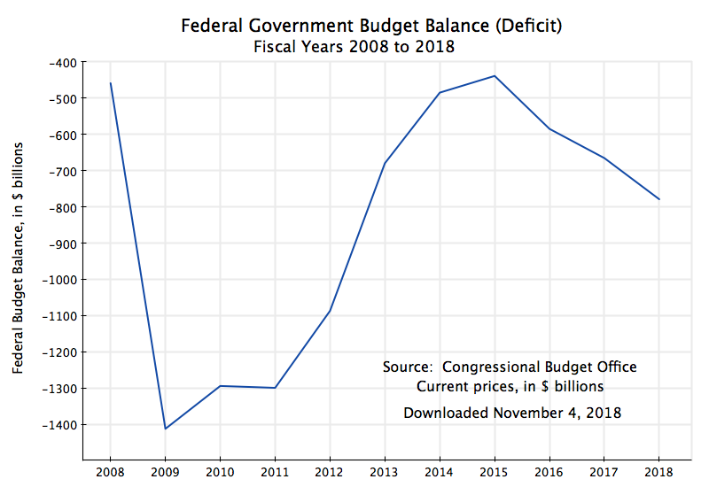
Those who follow the monthly release of the Employment Situation report of the Bureau of Labor Statistics (with the most recent issue, for April, released on May 3) may have noticed something curious.  While the figures on total employment derived from the BLS survey of establishments reported strong growth, of an estimated 263,000 in April, the BLS survey of households (from which the rate of unemployment is estimated) reported that estimated employment fell by 103,000.  And while there is month-to-month volatility in the figures (they are survey estimates, after all), this has now been happening for several months in a row:  The establishment survey has been reporting strong growth in employment while the household survey has been reporting a fall.  The one exception was for February, where the current estimate from the establishment survey is that employment grew that month by a relatively modest 56,000 (higher than the initial estimate), while the household survey reported strong growth in employment that month of 255,000.

The chart above shows this graphically, with the figures presented in terms of their change relative to where they were in April 2017, two years ago.  For reasons we will discuss below, there is substantially greater volatility in the employment estimates derived from the household survey than one finds in the employment estimates derived from the establishment survey.  But even accounting for this, a significant gap appears to have opened up between the estimated growth in employment derived from the two sources.  Note also that the estimated labor force (derived from the household survey) has also been going down recently.  The unemployment rate came down to just 3.6% in the most recent month not because estimated employment rose – it in fact fell by 103,000 workers.  Rather, the measured unemployment rate came down because the labor force fell by even more (by 490,000 workers).

There are a number of reasons why the estimates from the two surveys differ, and this blog post will discuss what these are.  To start, and as the BLS tries to make clear, the concept of “employment” as estimated in the establishment survey is different from that as measured in the household survey.  They are measuring different, albeit close, things.  But there are other factors as well.

One can, however, work out estimates where the employment concepts are defined almost, but not quite, the same.  What is needed can be found in figures provided as part of the household survey.  We will look at those below and present the results in a chart similar to that above, but with employment figures from the household survey data adjusted (to the extent possible) to match the employment concept of the establishment survey.  But one finds that the gap that has opened up between the employment estimates of the two surveys remains, similar to that in the chart above.

There are residual differences in the two employment estimates.  And they follow a systematic pattern that appear to be correlated with the unemployment rate.  The final section below will look at this, and discuss what might be the cause.

The issues here are fairly technical ones, and this blog post may be of most interest to those interested in digging into the numbers and seeing what lies behind the headline figures that are the normal focus of news reports.  And while a consistent discrepancy appears to have opened up between the two estimates of employment growth, the underlying cause is not clear.  Nor are the implications for policy yet fully clear.  But the numbers may imply that we should be paying more attention to the much slower growth in the estimates of total employment derived from the household survey, than the figures from the establishment survey that we normally focus on.  We will find in coming months whether the inconsistency that has developed signals a change in the employment picture, or simply reflects unusual volatility in the underlying data.

B.  The BLS Surveys of Establishments, and of Households

The monthly BLS employment report is based on findings from two monthly surveys the BLS conducts, one of establishments and a second of households.  As described by the BLS in the Techincal Note that is released as part of each month’s report (and which we will draw upon here), they need both.  And while the surveys cover a good deal of material other than employment and related issues, we will focus here just on the elements relevant to the employment estimates.

The establishment survey covers primarily business establishments, but also includes government agencies, non-profits, and most other entities that employ workers for a wage.  However, the establishment survey does not include those employed in agriculture (for some reason, possibly some historical bureaucratic issue between agencies), as well as certain employment that can not be covered by a survey of establishments.  Thus they do not cover the self-employed (if they work in an unincorporated business), nor unpaid family workers.  Nor do they cover those employed directly by households (e.g. for childcare).

But for the business establishments, government agencies, and other entities that they do cover, they are thorough.  They survey more than 142,000 establishments each month, covering 689,000 individual worksites, and in all cover in this “sample” approximately one-third of all nonfarm employees.  This means they obtain direct figures each month on the employment of about 50 million workers (out of the approximately 150 million employed in the US), with this closer to a census than a normal sample survey.  But the extensive coverage is necessary in order to be able to arrive at statistically valid sample sizes at the detailed individual industries for which they provide figures.  And because of this giant sample size, the monthly employment figures cited publicly are normally taken from the establishment survey.

To arrive at unemployment rates and other figures, one must however survey households.  Businesses will know who they employ, but not who is unemployed.  And while the current sample size used of households is 60,000, this is far smaller relative to the sample size used for establishments (142,000) than it might appear.  A household will in general have just one or two workers, while a business establishment (or a government agency) could employ thousands.

Thus the much greater volatility seen in the employment estimates from the household survey should not be a surprise.  But they need the household survey to determine who is in the labor force.  They define this to be those adults of age 16 or older, who are either employed (even for just one hour, if paid) in the preceding week, or who, if not employed, were available for a job and were actively searching for one at some point in the four week period before the week of the survey.  Only in this way can the BLS determine the share of the labor force that is employed, and the share unemployed.  The survey of establishments by its nature cannot provide such information no matter what its sample size.

For this and other reasons, the definition of what is covered in “employment” between these two surveys will differ.  In particular:

a)  As discussed above, the establishment survey does not cover employment in the agricultural sector.  While they could, in principle, include agriculture, for some reason they do not.  The household survey does include those in agriculture.

b)  The establishment survey also does not include the self-employed (unless they are running an incorporated business).  They only survey businesses (or government agencies and non-profits), and hence cannot capture those who are self-employed.

c)  The establishment survey also does not capture unpaid family workers.  The household survey counts them as part of the labor force and employed if they worked in the family business 15 hours or more in the week preceding the survey.

d)  The establishment survey, since it does not cover households, cannot include private household workers (such as those providing childcare services).  The household survey does.

e)  Each of the above will lead to the count in the household survey of those employed being higher than what is counted in the establishment survey.  Working in the opposite direction, someone holding two or more jobs will be counted in the establishment survey two or more times (once for each job they hold).  The establishment being surveyed will only know who is working for them, and not whether they are also working elsewhere.  The household survey, however, will count such a worker as just one employed person.

f) The household survey also counts as employed those who are on unpaid leave (such as maternity leave).  The establishment survey does not (although it is not clear to me why they couldn’t – it would improve comparability if they would).

g)  The household survey also only includes those aged 16 or older as possibly in the labor force and employed.  The establishment survey covers all its workers, whatever their age.

There are therefore important differences between the two surveys as to who is covered in the figures provided for “total employment”.  And while the BLS tries to make this clear, the differences are often ignored in references by, for example, the news media.  One can, however, adjust for most, but not all, of these differences.  The data required are provided in the BLS monthly report (for recent months), or online (for the complete series).  But how to do so is not made obvious, as the data series required are scattered across several different tables in the report.

I will discuss in more detail in the next section below what I did to adjust the household survey figures to the employment concept as used in the establishment survey.  Adjustments could be made for each of the categories (a) through (e) in the list above, but was not possible for (f) and (g).  However, the latter are relatively small, with the residual difference following an interesting pattern that we will examine.

When those adjustments are made, the number of employed as estimated from the household survey, but reflecting (almost) the concept as estimated in the establishment survey, looks as follows:


While there are some differences between the estimates here and those in the chart at the top of this post of employment made using the household survey (as adjusted), the basic pattern remains.  While employment as estimated from the household survey (and excluding those in agriculture, the self-employed, unpaid family workers, household employees, and adjusted for multiple jobholders) is now growing, it was growing over the last half year at a much slower pace than what the establishment survey suggests.

C.  Adjustments Made to the Employment Estimates So They Will Reflect Similar Concepts

As noted above, adjustments were made to the employment figures to bring the two concepts of the different surveys into line with each other, to the extent possible.  While in principle one could have adjusted either, I chose to adjust the employment concept of the household survey to reflect the more narrow employment concept of the establishment survey.  This was because the underlying data needed to make the adjustments all came from the household survey, and it was better to keep the figures for the adjustments to be made all from the same source.

Adjustments could be made to reflect each of the issues listed above in (a) through (e), but not for (f) or (g).  But there were still some issues among the (a) through (e) adjustments.  Specifically:

1)  I sought to work out the series going back to January 1980, in order to capture several business cycles, but not all of the data required went back that far.  Specifically, the series on those holding multiple jobs started only in January 1994, and the series on household employees only started in January 2000.

2)  I also worked, to the extent possible, with the seasonally adjusted figures (for the establishment survey figures as well as those from the household survey).  However, the figures on unpaid family workers and of household employees were only available without seasonal adjustment.  I was therefore forced to use these.  But since the numbers in these categories are quite small relative to the overall number employed, one does not see a noticeable difference in the graphs.

One can then compare, as a ratio, the figures for total employment as adjusted from the household survey to those from the establishment survey.  The ratio will equal 1.0 when the figures are the same.  This was done in steps (depending on how far back one could go with the data), with the result:


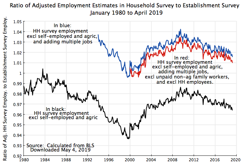
The curve in black, which can go back all the way to 1980, shows the ratio when the employment figure in the household survey is adjusted by taking out those who are self-employed (in unincorporated businesses) and those employed in agriculture.  The curve in blue, from 1994 onwards, then adds in one job for each of those holding multiple jobs.  The assumption being made is that those with multiple jobs almost always have two jobs.  The establishment survey would count these as two employees (at two different establishments), while the household survey will only count these as one person (holding more than one job).  Therefore adding a count of one for each person holding multiple jobs will bring the employment concepts used in the two surveys into alignment (and on the basis used in the establishment survey).

Finally, the curve in red subtracts out unpaid family workers in non-agricultural sectors (as those in the agricultural sector will have already been taken out when total employees in agriculture were subtracted), plus subtracts out household employees.  Neither of these series are available in seasonally adjusted form, but they are small relative to total employment, so this makes little difference.

What is interesting is that even with all these adjustments, the ratio of the adjusted figures for employment from the household survey to those from the establishment survey follows a regular pattern.  The ratio is low when unemployment was low (as it was in 2000, at the end of the Clinton administration, and to a lesser extent now).  And it is high when unemployment was high, such as in mid-1980s during the Reagan administration (with a downturn that started in 1982) and again during the downturn of 2008/09 that began at the end of the Bush administration, with unemployment then peaking in 2010 before it started its steady recovery.

Keep in mind that the relative difference in the employment figures between the household survey (as adjusted) and the establishment survey are not large:  about 1% now and a peak of about 3% in 2009/10.  But there is a consistent difference.

Why?  In part there are still two categories of workers where we had no estimates available to adjust the figures from the household survey to align them with the employment concept of the establishment survey:  for those on unpaid leave (who are included as “employed” in the household survey but not in the establishment survey), and for those under age 16 who are working (who are not counted in the household survey but are counted as employees in the establishment survey).

These two categories of workers might account for the difference, but we do not know whether they will fully account for the difference as we have no estimates.  A more interesting question is whether these two categories might account for the correlation observed with unemployment.  We could speculate that during periods of high unemployment (such as 2009/10), those taking unpaid leave might be relatively high (thus bumping up the ratio), and that those under age 16 may find it particularly hard, relative to others, to find jobs when unemployment is high (as employers can easily higher older workers then, with this then also bumping up the ratio relative to times when overall unemployment is low).  But this would just be speculation, and indeed more like an ex-post rationalization of what is observed than an explanation.

Still, despite the statistical noise seen in the chart, the basic pattern is clear.  And that is of a ratio that goes up and down with unemployment.  But it is not large.  Based on the change in the ratio observed from May 2010 to April 2011 (using a 12 month average to smooth out the monthly fluctuations), to the average over May 2018 to April 2019, the monthly divergence in the employment growth figures would only be 23,000 workers.  That is, the unexplained residual difference in recent years between the growth in employment (as estimated by the household survey and as estimated by the establishment survey) would be about 23,000 jobs per month.

But the differences in the estimates for the monthly change in employment between the (adjusted) series from the household survey and that from the establishment survey are much more.  Between October 2018 and April 2019, employment in the adjusted household survey series grew by 65,000 per month on average.  In the establishment survey series the growth was 207,000 per month.  The difference (142,000) is much greater than the 23,000 that can be explained by whatever has been driving down the ratio between the two series since 2010 as unemployment has come down.  Or put another way, the 65,000 figure can be increased by 23,000 per month to 88,000 per month, from adding in the unexplained residual change we observe in the ratio between the two series in recent years.  That 88,000 increase in employment per month from the (adjusted) household survey figures is substantially less than the 207,000 per month figure found in the establishment survey.

D.  Conclusion

Due to the statistical noise in the employment estimates of the household series, one has to be extremely cautious in drawing any conclusions.  While a gap has opened up in the last half year between the growth in the employment estimates of the household survey and those of the establishment survey, it is still early to say whether that gap reflects something significant or not.

The gap is especially large if one just looks at the “employment” figures as published.  Employment as recorded in the household survey has fallen between December 2018 and now, and has been essentially flat since October.  But the total employment concepts between the two surveys differ, so such a direct comparison is not terribly meaningful.  However, if the figures from the household survey are adjusted (to the extent possible) to match the employment concept of the business survey, there is still a large difference.  Employment (under this concept) grew by 207,000 per month in the establishment survey, but by just 88,000 per month in the adjusted household survey figures.

Whether this difference is significant is not yet clear, due to the statistical noise in the household survey figures.  But it might be a sign that employment growth has been less than the headline figures from the establishment survey suggest.  We will see in coming months whether this pattern continues, or whether one series starts tracking the other more closely (and if so, which to which).

How Low is Unemployment in Historical Perspective? – The Impact of the Changing Composition of the Labor Force

A.  Introduction

The unemployment rate is low, which is certainly good, and many commentators have noted it is now (at 3.7% in September and October, and an average of 3.9% so far this year) at the lowest the US has seen since the 1960s.  The rate hit 3.4% in late 1968 and early 1969, and averaged about 3.5% in each of those years.

But are those rates really comparable to what they are now?  This is important, not simply for “bragging rights” (or, more seriously, for understanding what policies led to such rates), but also for understanding how much pressure such rates are creating in the labor market.  The concern is that if the unemployment rate goes “too low”, labor will be able to demand a higher nominal wage and that this will then lead to higher price inflation.  Thus the Fed monitors closely what is happening with the unemployment rate, and will start to raise interest rates to cool down the economy if it fears the unemployment rate is falling so low that there soon will be inflationary pressures.  And indeed the Fed has, since 2016, started to raise interest rates (although only modestly so far, with the target federal funds rate up only 2.0% points from the exceptionally low rates it had been reduced to in response to the 2008/09 financial and economic collapse).

A puzzle is why the unemployment rate, at just 3.9% this year, has not in fact led to greater pressures on wages and hence inflation.  It is not because the modestly higher interest rates the Fed has set have led to a marked slowing down of the economy – real GDP grew by 3.0% in the most recent quarter over what it was a year before, in line with the pace of recent years.  Nor are wages growing markedly faster now than what they did in recent years.  Indeed, in real terms (after inflation), wages have been basically flat.

What this blog post will explore is that the unemployment rate, at 3.9% this year, is not in fact directly comparable with the levels achieved some decades ago, as the composition of the labor force has changed markedly.  The share of the labor force who have been to college is now much higher than it was in the 1960s.  Also, the share of the labor force who are young is now much less than it was in the 1960s.  And unemployment rates are now, and always have been, substantially less for those who have gone to college than for those who have not.  Similarly, unemployment rates are far higher for the young, who have just entered the labor force, than they are for those of middle age.

Because of these shifts in the shares, a given overall unemployment rate decades ago would only have happened had there been significantly lower unemployment rates for each of the groups (classified by age and education) than what we have now.  The lower unemployment rates for each of the groups, in that period decades ago, would have been necessary to produce some low overall rate of unemployment, as groups who have always had a relatively higher rate of unemployment (the young and the less educated) accounted for a higher share of the labor force then.  This is important, yet I have not seen any mention of the issue in the media.

As we will see, the impact of this changing composition of the labor force on the overall unemployment has been significant.  The chart at the top of this post shows what the overall unemployment rate would have been, had the composition of the labor force remained at what it was in 1970 (in terms of education level achieved for those aged 25 and above, plus for the share of youth in the labor force aged 16 to 24).  For 2018 (through the end of the third quarter), the unemployment rate at the 1970 composition of the labor force would then have been 5.2% – substantially higher than the 3.9% with the current composition of the labor force.  We will discuss below how these figures were derived.

At 5.2%, pressures in the labor market for higher wages will be substantially less than what one might expect at 3.9%.  This may explain the lack of such pressure seen so far in 2018 (and in recent years).  Although commonly done, it is just too simplistic to compare the current unemployment rate to what it was decades ago, without taking into account the significant changes in the composition of the labor force since then.

The rest of this blog post will first review this changing composition of the labor force – changes which have been substantial.  There are some data issues, as the Bureau of Labor Statistics (the source of all the data used here) changed its categorization of the labor force by education level in 1992.  Strictly speaking, this means that compositional shares before and after 1992 are not fully comparable.  However, we will see that in practice the changes were not such as to lead to major differences in the calculation of what the overall unemployment rate would be.

We will also look at what the unemployment rates have been for each of the groups in the labor force relative to the overall average.  They have been remarkably steady and consistent, although with some interesting, but limited, trends.  Finally, putting together the changing shares and the unemployment rates for each of the groups, one can calculate the figures for the chart at the top of this post, showing what the unemployment rates would have been over time, had the labor force composition not changed.

B.  The Changing Composition of the Labor Force

The composition of the labor force has changed markedly in the US in the decades since World War II, as indeed it has around the world.  More people have been going to college, rather than ending their formal education with high school.  Furthermore, the post-war baby boom which first led (in the 1960s and 70s) to a bulge in the share of the adult labor force who were young, later led to a reduction in this share as the baby boomers aged.

The compositional shares since 1965 (for age) and 1970 (for education) are shown in this chart (where the groups classified by education are of age 25 or higher, and thus their shares plus the share of those aged 16 to 24 will sum to 100%):

The changes in labor force composition are indeed large.  The share of the labor force who have completed college (including those with an advanced degree) has more than tripled, from 11% of the labor force in 1970 to 35% in 2018.  Those with some college have more than doubled, from 9% of the labor force to 23%.  At the other end of the education range, those who have not completed high school fell from 28% of the labor force to just 6%, while those completing high school (and no more) fell from 30% of the labor force to 22%.  And the share of youth in the labor force first rose from 19% in 1965 to a peak of  24 1/2% in 1978, and then fell by close to half to 13% in 2018.

As we will see below, each of these groups has very different unemployment rates relative to each other.  Unemployment rates are far less for those who have graduated from college than they are for those who have not completed high school, or for those 25 or older as compared to those younger.  Comparisons over time of the overall unemployment rate which do not take this changing composition of the labor force into account can therefore be quite misleading.

But first some explanatory notes on the data.  (Those not interested in data issues can skip this and go directly to the next section below.)  The figures were all calculated from data collected and published by the Bureau of Labor Statistics (BLS).  The BLS asks, as part of its regular monthly survey of households, questions on who in the household is participating in the labor force, whether they are employed or unemployed, and what their formal education has been (as well as much else).  From this one can calculate, both overall and for each group identified (such as by age or education) the figures on labor force shares and unemployment rates.

A few definitions to keep in mind:  Adults are considered to be those age 16 and above; to be employed means you worked the previous week (from when you were being surveyed) for at least one hour in a paying job; and to be unemployed means you were not employed but were actively searching for a job.  The labor force would thus be the sum of those employed or unemployed, and the unemployment rate would be the number of unemployed in whatever group as a share of all those in the labor force in that group.  Note also that full-time students, who are not also working in some part-time job, are not part of the labor force.  Nor are those, of whatever age, who are not in a job nor seeking one.

The education question in the survey asks, for each household member in the labor force, what was the “highest level of school” completed, or the “highest degree” received.  However, the question has been worded this way only since 1992.  Prior to 1992, going back to 1940 when they first started to ask about education, the question was phrased as the “highest grade or year of school” completed.  The presumption was that if the person had gone to school for 12 years, that they had completed high school.  And if 13 years that they had completed high school plus had a year at a college level.

However, this presumption was not always correct.  The respondent might only have completed high school after 13 years, having required an extra year.  Thus the BLS (together with the Census Bureau, which asks similar questions in its surveys) changed the way the question was asked in 1992, to focus on the level of schooling completed rather than the number of years of formal schooling enrolled.

For this reason, while all the data here comes from the BLS, the BLS does not make it easy to find the pre-1992 data.  The data series available online all go back only to 1992.  However, for the labor force shares by education category, as shown in the chart above, I was able to find the series under the old definitions in a BLS report on women in the labor force issued in 2015 (see Table 9, with figures that go back to 1970).  But I have not been able to find a similar set of pre-1992 figures for unemployment rates for groups classified by education.  Hence the curve in the chart at the top of this post on the unemployment rate holding constant the composition of the labor force could only start in 1992.

Did the change in education definitions in 1992 make a significant difference for what we are calculating here?  They will matter only to the extent that:  1)  the shifts from one education category to another were large; and 2) the respective unemployment rates where there was a significant shift from one group to another were very different.

As can be seen in the chart above, the only significant shifts in the trends in 1992 was a downward shift (of about 3% points) in the share of the labor force who had completed high school and nothing more, and a similar upward shift (relative to trend) in the share with some college. There are no noticeable shifts in the trends for the other groups.  And as we will see below, the unemployment rates of the two groups with a shift (completed high school, vs. some college) are closer to each other than that for any other pairing of the different groups.  Thus the impact on the calculated unemployment rate of the change in categorization in 1992 should be relatively small.  And we will see below that that in fact is the case.

There was also another, but more minor (in terms of impact), change in 1992.  The BLS always reported the educational composition of the labor force only for those labor force members who were age 25 or above.  However, prior to 1992 it reported the figures only for those up to age 64, while from 1992 onwards it reported the figure at any higher age if still in the labor force, including those who at age 65 or more but not yet retired.  This was done as an increasing share over time of those in the US of age 65 or higher have remained in the labor force rather than retiring.  However, the impact of this change will be small.  First, the share of the labor force of age 65 or more is small.  And second, this will matter only to the extent that the shares by education level differ between those still in the labor force who are age 65 or more, as compared to those in the labor force of ages 25 to 64.  Those differences in education shares are probably not that large.

C.  Differences in Unemployment Rates by Age and Education 

As noted above, unemployment rates differ between groups depending on age and education.  It should not be surprising that those who are young (ages 16 to 24) who are not in school but are seeking a job will experience a high rate of unemployment relative to those who are older (25 and above).  They are just starting out, probably do not have as high an education level (they are not still in school), and lack experience.  And that is indeed what we observe.

At the other extreme we have those who have completed college and perhaps even hold an advanced degree (masters or doctorate).  They are older, have better contacts, normally have skills that have been much in demand, and may have networks that function at a national rather than just local level.  The labor market works much better for them, and one should expect their unemployment rate to be lower.

And this is what we have seen (although unfortunately, for the reasons noted above on the data, the BLS is only making available the unemployment rates by education category for the years since 1992):

The unemployment rates of each group vary substantially over time, in tune with the business cycle, but their position relative to each other is always the same.  That is, the rates move together, where when one is high it will also be high for the others.  This is as one would expect, as movements in unemployment rates are driven primarily by the macroeconomy, with all the rates moving up when aggregate demand falls to spark a recession, and moving down in a recovery.

And there is a clear pattern to these relationships, which can be seen when these unemployment rates are all expressed as a ratio to the overall unemployment rate:

The unemployment rate for those just entering the labor force (ages 16 to 24) has always been about double what the overall unemployment rate was at the time.  And it does not appear to be subject to any major trend, either up or down.  Those in the labor force (and over age 25) with less than a high school degree (the curve in blue) also have experienced a higher rate of unemployment than the overall rate at the time – 40 to 60% higher.  There might be some downward trend, but one cannot yet say whether it is significant.  We need some more years of data.

Those in the labor force with just a high school degree (the curve in green in the chart) have had an unemployment rate very close to the average, with some movement from below the average to just above it in recent years.  Those with some college (in red) have remained below the overall average unemployment rate, although less so now than in the 1990s.  And those with a college degree or more (the curve in purple) have had an unemployment of between 60% below the average in the 1990s to about half now.

There are probably a number of factors behind these trends, and it is not the purpose of this blog post to go into them.  But I would note that these trends are consistent with what a simple supply and demand analysis would suggest.  As seen in the chart in section B of this post, the share of the labor force with a college degree, for example, has risen steadily over time, to 35% of the labor force now from 22% in 1992.  With that much greater supply and share of the labor force, the advantage (in terms of a lower rate of unemployment relative to that of others) can be expected to have diminished.  And we see that.

But what I find surprising is that that impact has been as small as it has.  These ratios have been remarkably steady over the 27 years for which we have data, and those 27 years have included multiple cycles of boom and bust.  And with those ratios markedly different for the different groups, the composition of the labor force will matter a great deal for the overall unemployment rate.

D.  The Unemployment Rate at a Fixed Composition of the Labor Force

As noted above, those in the labor force who are not young, or who have achieved a higher level of formal education, have unemployment rates which are consistently below those who are young or who have less formal education.  Their labor markets differ.  A middle-aged engineer will be considered for jobs across the nation, while someone with who is just a high school graduate likely will not.

Secondly, when we say the economy is at “full employment” there will still be some degree of unemployment.  It will never be at zero, as workers may be in transition between jobs and face varying degrees of difficulty in finding a new job.  But this degree of “frictional unemployment” (as economists call it) will vary, as just noted above, depending on age (prior experience in the labor force) and education.  Hence the “full employment rate of unemployment” (which may sound like an oxymoron, but isn’t) will vary depending on the composition of the labor force.  And more broadly and generally, the interpretation given to any level of unemployment needs to take into account that compositional structure of the labor force, as certain groups will consistently experience a higher or lower rate of unemployment than others, as seen in the chart above.

Thus it is misleading simply to compare overall unemployment rates across long periods of time, as the compositional structure of the labor force has changed greatly over time.  Such simple comparisons of the overall rate may be easy to do, but to understand critical issues (such as how close are we to such a low rate of unemployment that there will be inflationary pressure in the labor market), we should control for labor force composition.

The chart at the top of this post does that, and I repeat it here for convenience (with the addition in purple, to be explained below):

The blue line shows the unemployment rate for the labor force since 1965, as conventionally presented.  The red line shows, in contrast, what the unemployment rate would have been had the unemployment rate for each identified group been whatever it was in each year, but with the labor force composition remaining at what it was in 1970.  The red line is a simple weighted average of the unemployment rates of each group, using as weights what their shares would have been had they remained at the shares of 1970.

The labor force structure of 1970 was taken for this exercise both because it is the earliest year for which I could find the necessary data, and because 1970 is close to 1968 and 1969, when the unemployment rate was at the lowest it has been in the last 60 years.  And the red curve can only start in 1992 because that is the earliest year for which I could find unemployment rates by education category.

The difference is significant.  And while perhaps difficult to tell from just looking at the chart, the difference has grown over time.  In 1992, the overall unemployment rate (with all else equal) at the 1970 compositional shares, would have been 23% higher.  By 2018, it would have grown to 33% higher.  Note also that, had we had the data going back to 1970 for the unemployment rates by education category, the blue and red curves would have met at that point and then started to diverge as the labor force composition changed.

Also, the change in 1992 in the definitions used by the BLS for classifying the labor force by education did not have a significant effect.  For 1992, we can calculate what the unemployment rate would have been using what the compositional shares were in 1991 under the old classification system.  The 1991 shares for the labor force composition would have been very close to what they would have been in 1992, had the BLS kept the old system, as labor force shares change only gradually over time.  That unemployment rate, using the former system of compositional shares but at the 1992 unemployment rates for each of the groups as defined under the then new BLS system of education categories, was almost identical to the unemployment rate in that year:  7.6% instead of 7.5%.  It made almost no difference.  The point is shown in purple on the chart, and is almost indistinguishable from the point on the blue curve.  And both are far from what the unemployment rate would have been in that year at the 1970 compositional weights (9.2%).

E.  Conclusion

The structure of the labor force has changed markedly in the post-World War II period in the US, with a far greater share of the labor force now enjoying a higher level of formal education than we had decades ago, and also a significantly lower share who are young and just starting in the labor force.  Since unemployment rates vary systematically by such groups relative to each other, one needs to take into account the changing composition of the labor force when making comparisons over time.

This is not commonly done.  The unemployment rate has come down in 2018, averaging 3.9% so far and reaching 3.7% in September and October.  It is now below the 3.8% rate it hit in 2000, and is at the lowest seen since 1969, when it hit 3.4% for several months.

But it is misleading to make such simple comparisons as the composition of the labor force has changed markedly over time.  At the 1970 labor force shares, the unemployment rate in 2018 would have been 5.2%, not 3.9%.  And at a 5.2% rate, the inflationary pressures expected with an exceptionally low unemployment rate will not be as strong.  This may, at least in part, explain why we have not seen such inflationary pressures grow this past year.

The Economy Under Trump in 8 Charts – Mostly as Under Obama, Except Now With a Sharp Rise in the Government Deficit

A.  Introduction

President Trump is repeatedly asserting that the economy under his presidency (in contrast to that of his predecessor) is booming, with economic growth and jobs numbers that are unprecedented, and all a sign of his superb management skills.  The economy is indeed doing well, from a short-term perspective.  Growth has been good and unemployment is low.  But this is just a continuation of the trends that had been underway for most of Obama’s two terms in office (subsequent to his initial stabilization of an economy, that was in freefall as he entered office).

However, and importantly, the recent growth and jobs numbers are only being achieved with a high and rising fiscal deficit.  Federal government spending is now growing (in contrast to sharp cuts between 2010 and 2014, after which it was kept largely flat until mid-2017), while taxes (especially for the rich and for corporations) have been cut.  This has led to standard Keynesian stimulus, helping to keep growth up, but at precisely the wrong time.  Such stimulus was needed between 2010 and 2014, when unemployment was still high and declining only slowly.  Imagine what could have been done then to re-build our infrastructure, employing workers (and equipment) that were instead idle.

But now, with the economy at full employment, such policy instead has to be met with the Fed raising interest rates.  And with rising government expenditures and falling tax revenues, the result has been a rise in the fiscal deficit to a level that is unprecedented for the US at a time when the country is not at war and the economy is at or close to full employment.  One sees the impact especially clearly in the amounts the US Treasury has to borrow on the market to cover the deficit.  It has soared in 2018.

This blog post will look at these developments, tracing developments from 2008 (the year before Obama took office) to what the most recent data allow.  With this context, one can see what has been special, or not, under Trump.

First a note on sources:  Figures on real GDP, on foreign trade, and on government expenditures, are from the National Income and Product Accounts (NIPA) produced by the Bureau of Economic Analysis (BEA) of the Department of Commerce.  Figures on employment and unemployment are from the Bureau of Labor Statistics (BLS) of the Department of Labor.  Figures on the federal budget deficit are from the Congressional Budget Office (CBO).  And figures on government borrowing are from the US Treasury.

B.  The Growth in GDP and in the Number Employed, and the Unemployment Rate

First, what has happened to overall output, and to jobs?  The chart at the top of this post shows the growth of real GDP, presented in terms of growth over the same period one year before (in order to even out the normal quarterly fluctuations).  GDP was collapsing when Obama took office in January 2009.  He was then able to turn this around quickly, with positive quarterly growth returning in mid-2009, and by mid-2010 GDP was growing at a pace of over 3% (in terms of growth over the year-earlier period).  It then fluctuated within a range from about 1% to almost 4% for the remainder of his term in office.  It would have been higher had the Republican Congress not forced cuts in fiscal expenditures despite the continued unemployment.  But growth still averaged 2.2% per annum in real terms from mid-2009 to end-2016, despite those cuts.

GDP growth under Trump hit 3.0% (over the same period one year before) in the third quarter of 2018.  This is good.  And it is the best such growth since … 2015.  That is not really so special.

Net job growth has followed the same basic path as GDP:


Jobs were collapsing when Obama took office, he was quickly able to stabilize this with the stimulus package and other measures (especially by the Fed), and job growth resumed.  By late 2011, net job growth (in terms of rolling 12-month totals (which is the same as the increase over what jobs were one year before) was over 2 million per year.  It went to as high as 3 million by early 2015.  Under Trump, it hit 2 1/2 million by September 2018.  This is pretty good, especially with the economy now at or close to full employment.  And it is the best since … January 2017, the month Obama left office.

Finally, the unemployment rate:

Unemployment was rising rapidly as Obama was inaugurated, and hit 10% in late 2009.  It then fell, and at a remarkably steady pace.  It could have fallen faster had government spending not been cut back, but nonetheless it was falling.  And this has continued under Trump.  While commendable, it is not a miracle.

C.  Foreign Trade

Trump has also launched a trade war.  Starting in late 2017, high tariffs were imposed on imports of certain foreign-produced products, with such tariffs then raised and extended to other products when foreign countries responded (as one would expect) with tariffs of their own on selected US products.  Trump claims his new tariffs will reduce the US trade deficit.  As discussed in an earlier blog post, such a belief reflects a fundamental misunderstanding of how the trade balance is determined.

But what do we see in the data?:

The trade deficit has not been reduced – it has grown in 2018.  While it might appear there had been some recovery (reduction in the deficit) in the second quarter of the year, this was due to special factors.  Exports primarily of soybeans and corn to China (but also other products, and to other countries where new tariffs were anticipated) were rushed out in that quarter in order arrive before retaliatory tariffs were imposed (which they were – in July 2018 in the case of China).  But this was simply a bringing forward of products that, under normal conditions, would have been exported later.  And as one sees, the trade balance returned to its previous path in the third quarter.

The growing trade imbalance is a concern.  For 2018, it is on course for reaching 5% of GDP (when measured in constant prices of 2012).  But as was discussed in the earlier blog post on the determination of the trade balance, it is not tariffs which determine what that overall balance will be for the economy.  Rather, it is basic macro factors (the balance between domestic savings and domestic investment) that determine what the overall trade balance will be.  Tariffs may affect the pattern of trade (shifting imports and exports from one country to another), but they won’t reduce the overall deficit unless the domestic savings/investment balance is changed.  And tariffs have little effect on that balance.

And while the trend of a growing trade imbalance since Trump took office is a continuation of the trend seen in the years before, when Obama was president, there is a key difference.  Under Obama, the trade deficit did increase (become more negative), especially from its lowest point in the middle of 2009.  But this increase in the deficit was not driven by higher government spending – government spending on goods and services (both as a share of GDP and in constant dollar terms) actually fell.  That is, government savings rose (dissavings was reduced, as there was a deficit).  Private domestic savings was also largely unchanged (as a share of GDP).  Rather, what drove the higher trade deficit during Obama’s term was the recovery in private investment from the low point it had reached in the 2008/09 recession.

The situation under Trump is different.  Government spending is now growing, as is the government deficit, and this is driving the trade deficit higher.  We will discuss this next.

D.  Government Accounts

An increase in government spending is needed in an economic downturn to sustain demand so that unemployment will be reduced (or at least not rise by as much otherwise).  Thus government spending was allowed to rise in 2008, in the last year of the Bush administration, in response to the downturn that began in December 2007.  This continued, and was indeed accelerated, as part of the stimulus program passed by Congress soon after Obama took office.  But federal government spending on goods and services peaked in mid-2010, and after that fell.  The Republican Congress forced further expenditure cuts, and by late 2013 the federal government was spending less (in real terms) than it was in early 2008:

This was foolish.  Unemployment was over 9 1/2% in mid-2010, and still over 6 1/2% in late-2013 (see the chart of the unemployment rate above).  And while the unemployment rate did fall over this period, there was justified criticism that the pace of recovery was slow.  The cuts in government spending during this period acted as a major drag on the economy, holding back the pace of recovery.  Never before had a US administration done this in the period after a downturn (at least not in the last half-century where I have examined the data).  Government spending grew especially rapidly under Reagan following the 1981/82 downturn.

Federal government spending on goods and services was then essentially flat in real terms from late 2013 to the end of Obama’s term in office.  And this more or less continued through FY2017 (the last budget of Obama), i.e. through the third quarter of CY2018.  But then, in the fourth quarter of CY2017 (the first quarter of FY2018, as the fiscal year runs from October to September), in the first full budget under Trump, federal government spending started to rise sharply.  See the chart above.  And this has continued.

There are certainly high priority government spending needs.  But the sequencing has been terribly mismanaged.  Higher government spending (e.g. to repair our public infrastructure) could have been carried out when unemployment was still high.  Utilizing idle resources, one would not only have put people to work, but also would have done this at little cost to the overall economy.  The workers were unemployed otherwise.

But higher government spending now, when unemployment is low, means that workers hired for government-funded projects have to be drawn from other activities.  While the unemployment rate can be squeezed downward some, and has been, there is a limit to how far this can go.  And since we are close to that limit, the Fed is raising interest rates in order to curtail other spending.

One sees this in the numbers.  Overall private fixed investment fell at an annual rate of 0.3% in the third quarter of 2018 (based on the initial estimates released by the BEA in late October), led by a 7.9% fall in business investment in structures (offices, etc.) and by a 4.0% fall in residential investment (homes).  While these are figures only for one quarter (there was a deceleration in the second quarter, but not an absolute fall), and can be expected to eventually change (with the economy growing, investment will at some point need to rise to catch up), the direction so far is worrisome.

And note also that this fall in the pace of investment has happened despite the huge cuts in corporate taxes from the start of this year.  Trump officials and Republicans in Congress asserted that the cuts in taxes on corporate profits would lead to a surge in investment.  Many economists (including myself, in the post cited above) noted that there was little reason to believe such tax cuts would sput corporate investment.  Such investment in the US is not now constrained by a lack of available cash to the corporations, so giving them more cash is not going to make much of a difference.  Rather, that windfall would instead lead corporations to increase dividends as well as share buybacks in order to distribute the excess cash to their shareholders.  And that is indeed what has happened, with share buybacks hitting record levels this year.

Returning to government spending, for the overall impact on the economy one should also examine such spending at the state and local level, in addition to the federal.  The picture is largely similar:

This mostly follows the same pattern as seen above for federal government spending on goods and services, with the exception that there was an increase in total government spending from early 2014 to early-2016, when federal spending was largely flat.  This may explain, in part, the relatively better growth in GDP seen over that period (see the chart at the top of this post), and then the slower pace in 2016 as all spending leveled off.

But then, starting in late-2017, total government expenditures on goods and services started to rise.  It was, however, largely driven by the federal government component.  Even though federal government spending accounted only for a bit over one-third (38%) of total government spending on goods and services in the quarter when Trump took office, almost two-thirds (65%) of the increase in government spending since then was due to higher spending by the federal government.  All this is classical Keynesian stimulus, but at a time when the economy is close to full employment.

So far we have focused on government spending on goods and services, as that is the component of government spending which enters directly as a component of GDP spending.  It is also the component of the government accounts which will in general have the largest multiplier effect on GDP.  But to arrive at the overall fiscal deficit, one must also take into account government spending on transfers (such as for Social Security), as well as tax revenues.  For these, and for the overall deficit, it is best to move to fiscal year numbers, where the Congressional Budget Office (CBO) provides the most easily accessible and up-to-date figures.

Tracing the overall federal fiscal deficit, now by fiscal year and in nominal dollar terms, one finds:

The deficit is now growing (the fiscal balance is becoming more negative) and indeed has been since FY2016.  What happened in FY2016?  Primarily there was a sharp reduction in the pace of tax revenues being collected.  And this has continued through FY2018, spurred further by the major tax cut bill of December 2017.  Taxes had been rising, along with the economic recovery, increasing by an average of $217 billion per year between FY2010 and FY2015 (calculated from CBO figures), but this then decelerated to a pace of just $26 billion per year between FY2015 and FY2018, and just $13 billion in FY2018.  The rate of growth in taxes between FY2015 and FY2018 was just 0.8%, or less even than just inflation.

Federal government spending, including on transfers, also rose over this period, but by less than taxes fell.  Overall federal government spending rose by an average of just $46 billion per year between FY2010 and FY2015 (a rate of growth of 1.3% per annum, or less than inflation in those years), and then by $140 billion per year (in nominal dollar terms) between FY2015 and FY2018.  But this step up in overall spending (of $94 billion per year) was well less than the step down in the pace of tax collection (a reduction of $191 billion per year, the difference between $217 billion annual growth over FY2010-15 and the $26 billion annual growth over FY2015-18).

That is, about two-thirds (67%) of the increase in the fiscal deficit since FY2015 can be attributed to taxes being cut, and just one-third (33%) to spending going up.

Looking forward, this is expected to get far worse.  As was discussed in an earlier post on this blog, the CBO is forecasting (in their most recent forecast, from April 2018) that the fiscal deficits under Trump will reach close to $1 trillion in FY2019, and will exceed 5% of GDP for most of the 2020s.  This is unprecedented for the US economy at full employment, other than during World War II.  Furthermore, these CBO forecasts are under the optimistic scenario that there will be no economic downturn over this period.  But that has never happened before in the US.

Deficits need to be funded by borrowing.  And one sees an especially sharp jump in the net amount being borrowed in the markets in CY 2018:


These figures are for calendar years, and the number for 2018 includes what the US Treasury announced on October 29 it expects to borrow in the fourth quarter.  Note this borrowing is what the Treasury does in the regular, commercial, markets, and is a net figure (i.e. new borrowing less repayment of debt coming due).  It comes after whatever the net impact of public trust fund operations (such as for the Social Security Trust Fund) is on Treasury funding needs.

The turnaround in 2018 is stark.  The US Treasury now expects to borrow in the financial markets, net, a total of $1,338 billion in 2018, up from $546 billion in 2017.  And this is at time of low unemployment, in sharp contrast to 2008 to 2010, when the economy had fallen into the worst economic downturn since the Great Depression  Tax revenues were then low (incomes were low) while spending needed to be kept up.  The last time unemployment was low and similar to what it is now, in the late-1990s during the Clinton administration, the fiscal accounts were in surplus.  They are far from that now. 

E. Conclusion 

The economy has continued to grow since Trump took office, with GDP and employment rising and unemployment falling.  This has been at rates much the same as we saw under Obama.  There is, however, one big difference.  Fiscal deficits are now rising rapidly.  Such deficits are unprecedented for the US at a time when unemployment is low.  And the deficits have led to a sharp jump in Treasury borrowing needs.

These deficits are forecast to get worse in the coming years even if the economy should remain at full employment.  Yet there will eventually be a downturn.  There always has been.  And when that happens, deficits will jump even further, as taxes will fall in a downturn while spending needs will rise.

Other countries have tried such populist economic policies as Trump is now following, when despite high fiscal deficits at a time of full employment, taxes are cut while government spending is raised.  They have always, in the end, led to disasters.