
A. Introduction
With the release last Friday by Eurostat of the initial GDP growth estimates for most of Europe for the third quarter of 2014, and the release on Monday of the initial estimate for Japan, it is a good time to provide an update on how successful austerity strategies have been.
B. Europe
As was discussed in earlier posts in this blog on Europe (here and here), Europe moved from expansionary fiscal policies in its initial response to the 2008 downturn, to austerity programs with fiscal cutbacks starting in 2010/11. The initial expansionary policies did succeed in stopping the sharp downturn in output that followed the financial collapse of 2008/2009. European economies began to grow again in mid-2009, and by late 2010 had recovered approximately two-thirds of the output that had been lost in the downturn.
But then a number of European leaders, and in particular the leaders of Germany (Chancellor Angela Merkel and others) plus the then-leader of the European Central Bank (Jean-Claude Trichet), called for fiscal cuts. They expressed alarm over the fiscal deficits that had developed in the downturn, and argued that financial instability would result if they were not quickly addressed. And they asserted that austerity policies would not be contractionary under those circumstances but rather expansionary. Trichet, for example, said in a June 2010 interview with La Repubblica (the largest circulation newspaper in Italy):
Trichet: … As regards the economy, the idea that austerity measures could trigger stagnation is incorrect.
La Republicca: Incorrect?
Trichet: Yes. In fact, in these circumstances, everything that helps to increase the confidence of households, firms and investors in the sustainability of public finances is good for the consolidation of growth and job creation. I firmly believe that in the current circumstances confidence-inspiring policies will foster and not hamper economic recovery, because confidence is the key factor today.
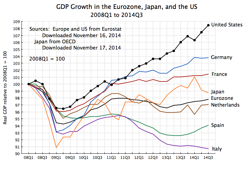
So what has actually happened since the austerity programs were imposed in Europe? The chart at the top of this post shows the path of real GDP for the larger Eurozone economies as well as for the Eurozone as a whole, plus Japan and the US for comparison. The data for Europe (as well as the US) comes from Eurostat, with figures for 2014Q3 from the November 14 Eurostat press release, while the data for Japan came most conveniently from the OECD. Real GDP is shown relative to where it was in the first quarter of 2008, which was the peak for most of Europe before the 2008/09 collapse.
In a word, the results in Europe have been terrible. Real GDP in the Eurozone as a whole is basically the same as (in fact slightly less than) what it was in early 2011, three and a half years ago. To be more precise, real GDP in the Eurozone fell by a bit more than 1% between early 2011 and early 2013, and since then rose by a bit over 1%, but it has basically been dead. There has been no growth in the three and a half years since austerity programs took over. And Eurozone output is still more than 2% below where it had been in early 2008, six and a half years ago.
Since early 2011, in contrast, the US economy grew by 8.6% in real terms. Annualized, this comes to 2.4% a year. While not great (fiscal drag has been a problem in the US as well), and not sufficient for a recovery from a downturn, the US result was at least far better than the zero growth in the Eurozone.
There was, not surprisingly, a good deal of variation across the European economies. The chart shows the growth results for several of the larger economies in the Eurozone. Germany has done best, but its growth flattened out as well since early 2011. As was discussed in an earlier post, Germany (despite its rhetoric) in fact followed fairly expansionary fiscal policies in 2009, with further increases in 2010 and 2011 (when others, including the US, started to cut back). And as the chart above shows, the recovery in Germany was fairly solid in 2009 and 2010, with this continuing into 2011. But it then slowed. Growth since early 2011 has averaged only 0.9% a year.
Other countries have done worse. There has been very little growth in France since early 2011, and declines in the Netherlands, Spain, and Italy. Spain was forced (as a condition of European aid) to implement a very tight austerity program following the collapse of its banking system in 2008/09 as a consequence of its own housing bubble, but has loosened this in the last year. Only in France is real GDP higher now than where it was in early 2008, and only by 1.4% total over those six and a half years. But France has also seen almost no growth (just 0.4% a year) since early 2011.
C. Japan
The new figures for Japan were also bad, and many would say horrible. After falling at a 7.3% annualized rate in the second quarter of this year, real GDP is estimated to have fallen by a further 1.6% rate in the third quarter. The primary cause for these falls was the decision to go ahead with a planned increase in the consumption tax rate on April 1 (the start of the second quarter) from the previous 5% to a new 8% rate, an increase of 60%.
The Japanese consumption tax is often referred to in the US as a sales tax, but it is actually more like a value added tax (such as is common in Europe). It is a tax on sales of goods and services to final consumers such as households, with offsets being provided for such taxes paid at earlier stages in production (which makes it more like a value-added tax). As a tax on consumption, it is the worst possible tax Japan could have chosen to increase at this time, when the economy remains weak. There is insufficient demand, and this is a straight tax on consumption demand. It is also regressive, as poor and middle class households will pay a higher share of their incomes on such a tax, than will a richer household. With its still weak economy, Japan should not now be increasing any such taxes, and increasing the tax on consumption is the worst one they could have chosen.
With recessions conventionally defined as declines in real GDP in two consecutive quarters, Japan is now suffering its fourth recessionary contraction (a “quadruple-dip” recession) since 2008. This may be unprecedented. Japan’s output is still a bit better, relative to early 2008, than it is for the Eurozone as a whole, but it has been much more volatile.
Prime Minister Shinzo Abe was elected in December 2012 and almost immediately announced a bold program to end deflation and get the economy growing again. It was quickly dubbed “Abenomics”, and was built on three pillars (or “arrows” as Abe described it). The first was a much more aggressive monetary policy by the Central Bank, with use of “quantitative easing” (such as the US had followed) where central bank funds are used to purchase long term bonds, and hence increase liquidity in the market. The second arrow was further short-term fiscal stimulus. And the third arrow was structural reforms.
In practice, however, the impacts have been mixed. Expansionary monetary policy has been perhaps most seriously implemented, and it has succeeded in devaluing the exchange rate from what had been extremely appreciated levels. This helped exporters, and the stock market also boomed for a period. The Nikkei stock market average is now almost double where it was in early November 2012 (when it was already clear to most that Abe would win in a landslide, which he then did). But the impact of such monetary policy on output can only be limited when interest rates are already close to zero, as they have been in Japan for some time.
The second “arrow” of fiscal stimulus centered on a package of measures announced and then approved by the Japanese Diet in January 2013. But when looked at more closely, it was more limited than the headline figures suggest. In gross terms, the headline expenditure figure amounted to a bit less than 2% of one year’s GDP, but the spending would be spread over more than one year. It also included expenditures which were already planned. It therefore needs to be looked at in the context of overall fiscal measures, including the then planned and ultimately implemented decision to raise the consumption tax rate on April 1, 2014. The IMF, in its October 2013 World Economic Outlook, estimated that the net impact of all the fiscal measures (including not only the announced stimulus programs, but also the tax hike and all other fiscal measures) would be a neutral fiscal stance in 2013 (neither tightening nor loosening) and a tightening in the fiscal stance of 2.5% of GDP in 2014. The fall in GDP this year should therefore not be a surprise.
Finally, very little has been done on Abe’s third “arrow” of structural reforms.
On balance, Abe’s program supported reasonably good growth of 2.4% for real GDP in 2013 (see the chart above). There was then a spike up in the first quarter of 2014. However, this was largely due to consumers pulling forward into the first quarter significant purchases (such as of cars) from the second quarter, due to the planned April 1 consumption tax hike. Some fall in the second quarter was then not seen as a surprise, but the fall turned out to be a good deal sharper than anticipated. And the further fall in the third quarter was a shock.
As a result of these developments, Abe has announced that he will dissolve the Diet, hold new elections in mid-December with the aim of renewing his mandate (he is expected to win easily, due to disorder in the opposition), and will postpone the planned next increase in the consumption tax (from its current 8% to a 10% rate) from the scheduled October 2015 date to April 2017. Whether the economy will be strong enough to take this further increase in a tax on consumption by that date remains to be seen. The government has no announced plans to reverse the increase of 5% to 8% last April.
Japan’s public debt is high, at 243% of GDP in gross terms as of the end of 2013. Net debt is a good deal lower at 134% (debt figures from IMF WEO, October 2014), but still high. The comparable net debt figure for the US was 80% at the end of 2013 (using the IMF definitions for comparability; note this covers all levels of government, not just federal). Japan will eventually need to raise taxes. But when it does, with an economy just then emerging from a recession due to inadequate demand, one should not raise a tax on consumption. A hike in income tax rates, particularly on those of higher income, would be far less of a drag on the economy.

You must be logged in to post a comment.