
A. Introduction
A point on which all agree, whether conservative or liberal, Republican or Democrat, is that the cost of government keeps rising. Whether it is the cost of building new roads or new military jet fighters, or the cost of schools or health services, the cost now is much more than in the past. And this is not simply general inflation. The cost of government services has risen at a significantly faster pace than general inflation.
This is true. But what is not generally recognized if the fundamental cause, nor the implications as we as a nation have struggled to maintain government services. The fundamental cause is not waste and corruption, nor lazy government workers. Rather, it lies in the nature of the goods and services used for the public services the government provides.
This blog post will first review the facts on what has happened to expenditures on government goods and services (which for brevity, will hereafter often simply be referred to as government goods) over the past 60 years. The 60 year period is taken so as to encompass most of the post-World War II period, but to begin once the numbers had stabilized from the very high levels during the war and the immediate post-war fluctuations.
The post will then review the fundamental cause, drawing on the work that has come to be called “Baumol’s Cost Disease”. The post will discuss how this applies to the government sector, and the implications.
B. The Share of Government Expenditures in GDP
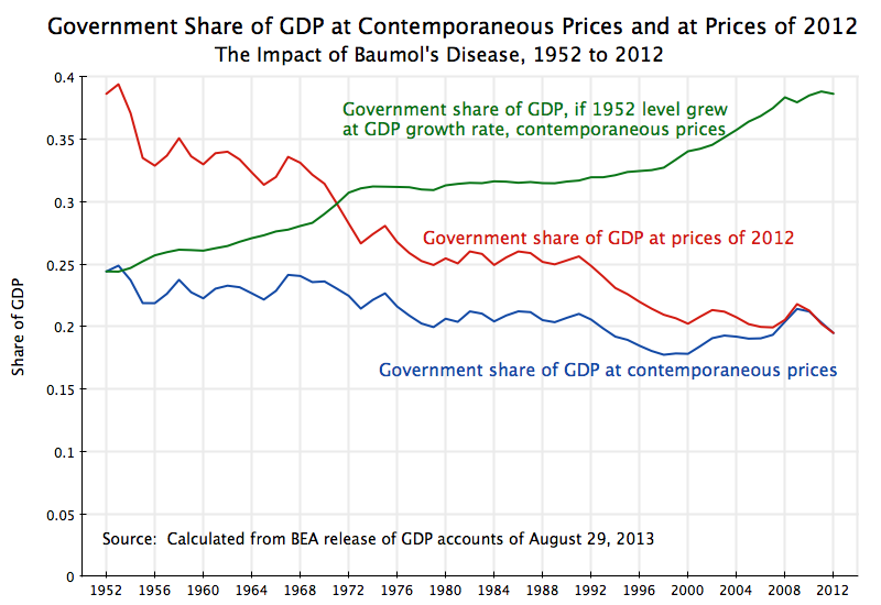
The share of government spending in GDP has declined over the last 60 years, from almost 25% of GDP in 1952 to less than 20% in 2012, a fall of a fifth. It is shown as the blue line in the graph at the top of this post. [Note: The definition of “government spending” used here is for government as it appears in the GDP demand accounts. It includes all level of government – federal, state, and local – but only includes direct government spending on goods and services. Hence it excludes government transfers payments, such as for Social Security or farm subsidies. Transfer payments are spent by those receiving the funds.]
A fall of a fifth is a significant reduction in the government share. But it does not show the true extent of the fall, as such GDP share calculations are based on the prices of each given year. One also needs to know how much one received in real terms for what was spent, and this depends on how prices have changed.
The GDP accounts issued by the BEA do include estimates of the changes in the relative prices of the different components of the GDP accounts. Over the 60 years from 1952 to 2012, the GDP deflator (the index of inflation for all the goods and services making up GDP) rose at an annual average rate of 3.3%. Over this same period, the deflator for government spending rose at a somewhat higher rate of 4.1% a year. This might seem to be only modestly higher, and for a short period it would be. But compounded over 60 years, this difference in inflation rates cumulates to a difference of 58% in the prices of goods and services used for government vs. goods and services used in overall GDP.
With this relative price change, it now (in 2012) on average costs 58% more (compared to 1952) to produce goods to be used for government expenditures, than it does to produce goods for overall GDP. Since GDP is also our income (i.e. what we as a nation receive for what we produce), it takes a higher share of our income today to buy the same real goods used for government expenditures as it would have at the relative prices of 60 years ago.
Put another way, to get the same real goods used for government expenditure in 2012 as one would have gotten at the relative prices of 60 years ago, one will now have to spend 58% more. Or if one spends the same dollar amount adjusted for general (GDP) inflation, one will receive only 1/1.58 = 63% as much.
This impact is huge. We are indeed receiving far less now in government services for a given dollar expenditure than we would have at the relative prices of 1952.
One way to view this is to ask how much would we have spent as a share of GDP in 1952, for the same real level of goods used for government in that year, if the prices then were instead the relative prices we had in 2012. The result is the red line in the graph at the top of this blog. The same goods used for government in 1952 would, at the prices of 2012, have been equivalent to expenditures of 39% of GDP in that year.
Over time, this red line then fell. It fell in part because the share of GDP used for government (in the contemporaneous prices of each year) was reduced over time and by a fifth by 2012, but more importantly also because the relative prices of the goods used for government provided services rose by 58% over the period. The government share fell until it reached just 19 1/2% of GDP in 2012. That is, correcting for the fact that prices of goods used for government were rising (relative to other prices) over time, in addition to the cut-back in the share at contemporaneous prices by a fifth, real government expenditures in terms of GDP share were only half as much in 2012 (19 1/2% of GDP) as what they were in 1952 (39% of GDP).
This fall by half is huge, and explains why we seem to get less and less from our government expenditures (whether on roads, or for military equipment, or in schooling), even though government spending as a share of GDP only fell by a fifth when measured in the current prices of each year.
Another way to look at this would be to ask what government spending would be now, if it had been allowed to grow over the 60 years at the same pace as GDP grew. If there had been no relative price change, then at equal rates of growth the share of government in GDP would not have changed. But with the relative price changes, a higher share of GDP would have been spent on government to provide such a bundle of goods for government. The fact that we spent less than that is a measure of how much government spending has been squeezed.
The result is the green curve in the graph at the top of this post. It shows what would have been spent on goods used for government in each year, if government spending had grown at the same rate as GDP in that year, and valued in the prices of each year. From 1952 to 2012, real GDP grew at an average rate of 3.1% a year (note this is total, not per capita, GDP). Real government spending grew only at a rate of 1.9% a year over that period. Cumulated over 60 years, the difference in growth rates meant that GDP grew by a total of twice as much as government did. And the goods used for government provided services would have totaled 39% of GDP in 2012 at this constant growth share, or double the 19 1/2% of GDP actually spent in 2012.
[Note: It is not a coincidence that the 39% of GDP in 2012 on the green line is the same as the 39% of GDP in 1952 on the red line. The red line figure shows what the spending would have been at the government share in 1952 but at 2012 prices. The green line figure projects forward this same 1952 share, leaving it unchanged relative to GDP in real terms, and in 2012 shows what this share would then have been at 2012 prices. But the paths between 1952 and 2012 will differ, and are not mirror images.]
Whichever way one looks at it, this reduction by half in the government share is a huge squeeze on public services. It goes a long way to explaining why our roads are so much more inadequate now compared to decades ago, with extreme congestion and poor repair. It explains why our state universities are charging so much more in tuition, while state support has declined. It explains why what we receive today in public services simply is not what it used to be. But why have these costs of goods for public use risen so much faster than the cost of other goods?
C. Baumol’s Cost Disease
What has come to be called Baumol’s Cost Disease (or sometimes simply Baumol’s Disease) was developed by William J. Baumol (then Professor of Economics at Princeton), together with William G. Bowen (then also Professor of Economics at Princeton, and later President of Princeton) in the mid-1960s. They were engaged in a research project looking at why the cost of tickets to live performances of the fine arts had to rise continually, at rates above the general inflation rate, and yet still could not keep up with costs. A recent re-statement of the issue (but with a particular focus on health care), is provided in the 2012 book by Baumol and others, titled “The Cost Disease: Why Computers Get Cheaper and Health Care Doesn’t”.
In a nutshell, the fundamental cause of the cost problem is that labor productivity, while perhaps rising in all sectors, will not rise as fast in some sectors as in others. The sectors where labor productivity rises relatively less fast will face increasing costs, as labor in such sectors will need to be paid more, due to competition for such labor from those sectors where productivity is rising faster. Yet those sectors with the relatively slower productivity growth will not be able to offset that rising cost of labor with a rate of productivity growth that is as high as that enjoyed by the other sectors. If we still want or need what the sectors with the relatively slower productivity growth produce, we will need to pay a higher relative price to cover those higher costs.
This is clear in the example of the performing arts. A Mozart string quartet that required four performers 20 minutes to play in 1780, still required four performers 20 minutes to play in 1966, or in 2013. Their productivity has not grown at all in over two centuries. Such performers could instead be employed in other sectors, and paid at increasing rates over time there, as labor productivity rose in those other sectors. If they are going to be employed still to perform Mozart, they will need to be paid more, even though their productivity in playing a Mozart string quartet has not risen in centuries.
Baumol’s Cost Disease will arise whenever productivity growth in the sector being examined is less than productivity growth in the rest of the economy. There has been a good deal of discussion recently of the implications of this in health (as for example in the Baumol “The Cost Disease” book cited above), as well as in education (explaining why university tuition has steadily risen at a pace greater than general inflation). But it applies generally for sectors where the goods produced are labor intensive or hand crafted.
Much of the goods and services used by government for the services it provides are of this nature. Roads, for example, are custom made for the specific site; military jet fighters (and most high tech military equipment generally) are made by highly skilled technicians in small batches of a perhaps a few dozen a year; elementary school teachers teach in classes that are similar in size now as they were 60 years ago; public health workers need to examine patients one on one; and public safety workers (police, firemen, prison guards, and other security workers) provide what they do by their direct presence; and so on. Teachers, health care workers, and public safety workers, plus military personnel and postal workers facing similar issues, account for most public sector employees (keep in mind we are referring to all levels of government in this note). And by its nature, the work of those in general public administration (“bureaucrats”) is also highly labor intensive.
It should be emphasized that productivity growth in the provision of government services has not been zero or negligible. There have been efficiency gains in the government sector. But the important point for Baumol’s Cost Disease is not that the productivity growth in that sector is zero, but rather that it is simply something less than the rate of productivity growth in other sectors.
And the nature of what government provides makes it impossible to match the productivity growth rates that one has seen most spectacularly in goods such as microchips and hence computers, but more generally in manufacturing and agriculture. Government services, like many services, have had improvements in productivity, but at rates that simply cannot match the pace of productivity growth possible elsewhere.
Hence, because of Baumol’s Cost Disease the relative price of government services should be expected to go up over time. This is precisely what has been observed. There is no reason to attribute this rise in the relative price to allegations of corruption or lazy government workers. It is of course possible that corruption and lazy workers exist, but for this to have caused the rise in the relative price over time one would need to make the case that corruption and lazy workers are not only worse now than before, but that they have become steadily worse over time. There is no evidence that supports this.
It is also important to note that while the relative price of government services has risen over time in the past, with this also expected to continue going forward, this does not imply that we as a society will be unable to afford the government services at the higher relative price. Labor productivity is growing, in the government sector as well as in the rest of the economy, and hence the cost in terms of labor time of the goods of government as well as this cost in the rest of the economy are both getting cheaper. Hence we can afford to devote a higher share of GDP to government services over time, if we so choose, as the relative cost of government services rises. And since what government provides, whether in education and health services, or infrastructure, or security and national defense, are all important, we should want to ensure they are adequately provided.
There is therefore nothing wrong for the share of government in GDP to rise over time, as Baumol’s Cost Disease will predict will happen if the services government provides are important. They would need to be paid for, through higher taxes, but as the society grows richer from the productivity growth in both the government and non-government sectors, we can afford this. The only problems that arise come from not recognizing this.
D. Implications, and Conclusion
Since the implications of Baumol’s Cost Disease for government services has generally not been recognized, there are indeed problems. There has been a tremendous squeeze on government, leading to government services that are an embarrassment for a rich country. As the numbers above indicate, we are now spending only half as much on government in real terms as we would have had government been allowed to grow at the same pace as GDP since 1952.
Note that this is not an argument that government spending should have been twice as much in 2012 as it was. This would have matched the real share that it was in 1952, and therefore is an indicator of how much government has been squeezed over this period, but the 1952 benchmark is arbitrary. And with the 58% higher relative price for government goods over this period, it would be rational to try to scale back on the expenditures for the now more expensive goods. But cutting back by half is extreme. Rather, the argument made here is that one should be making a well-considered decision at any point in time on whether particular government expenditures (whether for education, or for police, or for military jets) are worthwhile at the price of the time. If so, one should do it. But one should not subject total government expenditures to some arbitrary cap, and say that expenditures under that cap are fine while expenditures over that cap should not be allowed. Since the higher prices over time (due to Baumol’s Cost Disease) reflect differential but still positive productivity growth rates, we can afford those higher government expenditures if we so choose.
Unfortunately, much of the budget discussion in recent years has focussed precisely on setting some fixed cap on government expenditures as a share of GDP. There have been calls for such a cap directly, or indirectly by saying government revenues should be set at some cap as a share of GDP and that there should then also be a balanced budget (or a budget surplus).
For example, the Bowles-Simpson budget plan called for federal government revenues to be capped at 21% of GDP, with expenditures then set to match this. The Paul Ryan budget plan called for federal revenues to be capped at 19% of GDP, with expenditures reduced to meet this and then to fall even further. [Note that both of these figures are for total federal government expenditures, including transfers. The figures in the graph at the top of this post are for government direct spending only, excluding transfers, but for federal, state, as well as local government.]
Understanding the underlying dynamics resulting from Baumol’s Cost Disease shows how misguided such constant share of GDP targets are. They ignore that a growing economy, with a growing population, will need to be supported by growing government services. Given the nature of government services, one cannot expect the rate of productivity growth in government to match that enjoyed elsewhere in the economy. There is nothing wrong with that, and does not necessarily reflect a lack of innovation or skill. Some goods are simply more labor intensive than others, and productivity growth will generally be less for such goods.
By Baumol’s Cost Disease we can see that then the prices of the goods used for government will rise relative to others, and that if we still wish to obtain such goods, we will need to pay more. The GDP share will rise, but we can afford it as productivity is rising in all the sectors. They are simply rising at different rates.


You must be logged in to post a comment.