The Obama Bull Market Rally on Its Fifth Anniversary

S&P 500 Index, March 9, 2009, to March 10, 2014

Bull Markets, 1940-2014, updated to March 10, 2014

 
   Bull Market Rallies Since 1940
  Ranked by overall growth in real terms
Start Date End   Date Calendar Days Nominal % Change Real % Change Real Rate of Growth
Dec 4, 1987 Mar 24, 2000 4,494 582% 361% 13%
Jun 13, 1949 Aug 2, 1956 2,607 267% 222% 18%
Aug 12, 1982 Aug 25, 1987 1,839 229% 181% 23%
Mar 9, 2009 Mar 10, 2014 1,827 177% 151% 20%
Apr 28, 1942 May 29, 1946 1,492 158% 124% 22%
Oct 22, 1957 Dec 12, 1961 1,512 86% 76% 15%
Oct 9, 2002 Oct 9, 2007 1,826 101% 75% 12%
Jun 26, 1962 Feb 9, 1966 1,324 80% 69% 16%
May 26, 1970 Jan 11, 1973 961 74% 57% 19%
Oct 6, 1966 Nov 29, 1968 785 48% 37% 16%
Oct 3, 1974 Nov 28, 1980 2,248 126% 34% 5%

Today marks the fifth anniversary of the Obama bull market rally.  The rally began on March 9, 2009, just six weeks after Obama was inaugurated.  A reader of this blog suggested that on this anniversary, an update of previous posts on the strong performance of the stock market during Obama’s tenure (see here and here) might therefore be timely and of interest.

Stock market prices have indeed continued to rise, and as the table above shows, stocks during Obama’s term in office have now posted the fourth highest gains of any stock market rally since 1940.  Market rallies are defined as at least a 25% rise in the S&P 500 Index (in real terms), without a 20% fall.  Equity prices (as measured by the S&P 500) have risen by 177% in nominal terms since March 9, 2009, as of the close today.  The increase in real terms (using the CPI inflation index) has been 151%.  And since this rally is on-going, it could move further up in rank.  In addition, in just twelve more days (assuming the rally does not suddenly collapse) this rally will be the third longest in terms of calendar days of all market rallies since 1940.

It is also interesting to see how steady the upward progression has been, especially since September 2011.  This is shown in the graph at the top of this post.  I do not believe anyone had predicted this.

The rally could also end tomorrow.  All rallies eventually come to an end, and this one will as well.  But the rise in prices already achieved, the fourth largest since 1940, needs to be recognized.

Should Obama be given credit for this historic market rally?  Not fully.  I doubt that equity prices in themselves are a primary objective of what Obama has been trying to achieve.   Rather, the objective has been a stronger economy.  Regulatory as well as policy measures have been taken with the aim of strengthening the system, and this ultimately benefits business (as well as the population) as a whole.  This then helps equity prices.  Unfortunately, and as this blog has discussed in earlier posts, fiscal drag from cuts in government spending has held back the pace of the recovery, and this fiscal drag is continuing.  The economy could be doing better.  Nevertheless, there has been a partial recovery.  But it is not yet complete, nor as rapid as one would have had without the fiscal drag.

But what this strong growth in the stock market does clearly indicate is that the charges by Republican politicians that Obama has been bad for business (indeed a disaster for business many of them have said), has no basis.  If there were any truth to the charge, stock market prices would not be up by 177% in nominal terms (and by 151% in real terms) over the last five years, leading to the fourth biggest rally in stock prices in three-quarters of a century.

Rising Income Inequality: Full Employment Would Have Kept the Bottom 20% From Falling Behind

Real Income Growth of Bottom 20% vs Unemployment Rate, 1968-2012

A.  Introduction

President Obama highlighted in this year’s State of the Union address, as well as in other recent speeches and events, the importance of and concerns about the worsening distribution of income in the US.  As this blog noted in a post two years ago, income distribution has worsened markedly in the US since about 1980, when Reagan was elected.  This deterioration since 1980 is in sharp contrast to the period from the end of World War II until 1980, when incomes of all groups in the US moved upward together.  The paths then diverged sharply after 1980, with large increases in the incomes of the rich (and in particular the extremely rich:  the top 1%, top 0.1%, and especially the top 0.01%), while the real incomes of the bottom 90% were flat or even falling.

An important question, of course, is what to do to achieve more equitable growth, and in particular more rapid growth in the real incomes of those in the lower strata of the population.  Much of the discussion has focussed on measures such as improving our educational and training systems, to prepare workers for better paying jobs.  There is no doubt that such measures are important, and need to be done.  Their impact will, however, only be over the long term – in a generation for measures such as improvements in the educational system.

This blog post will focus on a more immediate action that can be taken:  returning the economy to full employment and keeping it there.  We will find that based on historic patterns, slack in the labor market due to less than full employment has been negatively associated with growth in the real incomes of the bottom 20% of households.  Furthermore, based on statistical regression parameters estimated from the historical data, the greater degree of slack in the US labor market since 1980 compared to that in the thirty years before 1980, largely suffices in itself to account for the relative deterioration of real incomes since 1980 of the bottom 20% of households compared to the top 20%.

This is an important result.  Note that the claim is not that greater slack in the labor market (on average) in the decades since 1980 was the sole cause of the deterioration of relative incomes of the poorest 20% vs. the richest 20%.  There were undoubtedly numerous reasons for this.  But what the finding does indicate is that had the unemployment rate after 1980 matched what it had been in the three decades before 1980, this would have largely sufficed in itself to offset the other factors, and would have led to a rate of growth in the real incomes of the bottom 20% close to what it was for the top 20%.

B.  The Relationship Between Real Income Growth of the Bottom 20% and the Unemployment Rate

The scatter diagram at the top of this post shows the relationship between the annual real income growth of the bottom 20% of households since 1968, and the average rate of unemployment in the same year.  The income data for the bottom 20% comes from the series produced by the US Census Bureau, and measures household cash income before tax and from all cash sources (so it will include Social Security, for example, but not payments under Medicare).  The series starts in 1967 (so 1968 is the first year for which one can compute the growth), and goes to 2012.  The unemployment rate comes from the standard series produced by the US Bureau of Labor Statistics, where the annual rate is the simple average of the monthly rates over the year.

The scatter diagram suggests there is a relationship between slack in the labor market (a higher unemployment rate) and the annual change in the real incomes of the bottom 20% of households, but that it is by no means a tight one.  Other factors matter as well.  But a simple ordinary least squares regression of the annual change in the real incomes of the bottom 20% against the average unemployment rate in that year, does suggest that the unemployment rate is an important and statistically significant factor.

The regression fitted line slopes downward with a coefficient of -0.8228, indicating that on average, a 1% point increase in the unemployment rate in the year will be associated with a 0.8228% point fall in the growth rate that year of the real incomes of the bottom 20%.  The t-statistic on the 0.8228 slope coefficient is 3.3, where any t-statistic greater than about 2.0 is generally seen as statistically significant (with a greater than 95% degree of confidence).  That is, with a greater than 95% degree of confidence, the results suggest that the coefficient is significantly different from zero (where zero would indicate no relationship).

The R-squared of the regression (an indication of correlation) is relatively modest at just 0.1982.  It can vary from zero to one.  This indicates that there is more than just the unemployment rate that accounts for the annual change in the real incomes of the bottom 20%.  But this does not mean that the unemployment rate does not matter.  The t-statistic for it is highly significant.  Rather, the modest R-squared indicates there are other factors as well which have not been identified here.

Similar regressions were run for the changes in the real incomes of the other quintiles of the household income groups.  The estimated coefficients became progressively closer to zero, from -0.82 for the bottom 20%, to -0.62 for the second 20%, to -0.52 for the middle 20%, to -0.47 for the fourth 20%, and then dropping sharply to -0.25 for the top 20%.  This suggests that the link to unemployment as a factor explaining the growth in the real incomes of the group became progressively less important for the richer groups.  And the t-statistic for the coefficient for the top 20% was only 1.0, indicating the estimated coefficient (of -0.25) was statistically not significantly different from zero (and hence that one cannot reject the hypothesis that no relationship is there).  The R-squareds for the regressions similarly fell steadily, from 0.1982 for the bottom 20%, to 0.19 for the second 20%, to 0.16 for the middle 20%, to 0.14 for the fourth 20%, and then dropping sharply to an extremely low 0.02 for the top 20%.

The results suggest that slackness in the labor market, as measured by the unemployment rate, was a significant factor in explaining the annual growth in the real incomes of the bottom 20% (with more unemployment leading to lower or indeed negative growth).  The results also suggest that higher unemployment did not have a statistically significant impact on the growth in real incomes of the top 20%.

C.  The Impact of Less Slack in the Labor Market

From 1950 to 1979, when growth was similar for all income groups (see this earlier blog post), the monthly unemployment rate averaged 5.17% in the US.  But from 1980 to 2012, the monthly rate averaged 6.44%, or 1.27% points higher.  The index of real incomes of the bottom 20% of households (in the US Census data cited above) had risen from 100.0 in 1967 (the earliest year with such data) to an index value of 118.9 in 1980.  But since then it has risen hardly at all, reaching only 119.5 in 2012.  The 1980 to 2012 growth rate was only 0.015% per year (note not 1.5% per year, but rather only one-hundreth of that).

Suppose the labor markets over 1980 to 2012 had been as close to full employment as they had been over the period 1950 to 1979.  Applying the estimated regression coefficient of -0.8228 to the 1.27% point difference in the average unemployment rates, the annual growth rate of the real incomes of the bottom 20% would have been 1.045% points higher (equal to 0.8228 x 1.27% points), and hence would have reached a growth rate of 1.06% a year (equal to 1.045% + 0.015%).  With such a growth rate, the real incomes of the bottom 20% would have reached an index value of 166.5 in 2012  This would have been close to the index value of the real incomes of the top 20% in that year of 169.8 (with 1967 set equal to 100.0).  Relative incomes would have grown similarly since 1967, and inequality (for the bottom 20% compared to the top 20%) would not have grown.

This is an interesting result.  It suggests that the higher unemployment rates we have on average suffered from since 1980 can account both for the stagnation of the real incomes of the bottom 20%, and the increasing inequality when comparing this group to the top 20%.  Note it does not offset all of the increasing inequality seen since Reagan was elected.  The real incomes of the top 1%, top 0.1%, and especially the top 0.01% have grown by far more than the incomes of the top 20%.  But keeping up with the top 20% would still be a major accomplishment.

A return to the economic performance that the US enjoyed in the three decades before Reagan would not be impossible.  To keep the average unemployment rate at the 5.17% rate achieved between 1950 and 1979 would not mean that all recessions need be avoided.  There were a number of recessions in the three decades before 1980.  But the recessions since 1980 (dating from January 1980 at the end of the Carter Administration, from July 1981 at the beginning of Reagan, from July 1990 during Bush I, from March 2001 at the beginning of Bush II and December 2007 at the end of Bush II) have been especially severe.  Avoiding those high peak rates of unemployment would have brought down the average.  Specifically, the average unemployment rate (based on the monthly figures) over 1980 to 2012 would have matched the 1950 to 1979 average if one would have been able to avoid those months since 1980 when the unemployment rate reached 6.4% or more.

D.  Conclusion

There is increasing recognition that the rise in inequality in the decades since 1980, and the stagnation since then in the real incomes of those in the lower strata of the population, cannot go on.  But the solutions commonly proposed, such as better education and training, will take decades to have an impact.

The analysis in this post indicates that the more immediate action of bringing the economy back to full employment and then keeping it close to full employment, would have a major positive impact on the real incomes of those in the bottom 20% of households, and would lead to a more equitable distribution.  The analysis suggests that had the unemployment rate over 1980 to 2012 been at the level achieved over 1950 to 1979, then the rate of income growth of the bottom 20% since 1980 would have been similar to that of the top 20%.  The higher rate of unemployment since 1980, on average, may well explain why growth was broadly equal among income groups in the three decades before 1980, but not in the three decades since.

While there are many factors that underlie income growth and distributional changes, particularly for those at the very top of the income distribution (the top 1% and higher), the results suggest that getting the economy back to full employment should be seen as critically important and valuable.  And there is no mystery in how to do this:  As earlier posts on this blog have noted, the fiscal drag from government cutbacks since 2009 can fully explain why full employment has yet to be achieved in this recovery.  Had government been spending been allowed to grow simply at its historical average rate, the economy would already have returned to full employment by now.  Had government spending been allowed to grow at the higher rate it had under Reagan, the US would likely have been back at full employment in 2011 or early 2012.

Unemployment matters.  Not only is it a direct and personal tragedy for those who have lost a job because of the macro mismanagement of the economy, it is also a waste of resources for the economy.  The evidence reviewed in this post suggests further that the greater degree of slack in the US labor market since 1980 may well explain the stagnation of real incomes of the poorer strata of the population, and the widening degree of inequality of recent decades for those other than in the extreme upper strata.

Inequality and Poverty in the US: Worse Than Elsewhere Due to Small Government

Gini Before Taxes & Transfers, OECD, 2010

Gini After Taxes and Transfers, OECD, 2010

A.  Introduction

Many observers are aware that the US has the worst income inequality in the world among the more developed high income countries.  But conservatives have attributed this to inequality resulting from what they see as a dynamic market based economy, that rewards entrepreneurs generously for hard work and taking risks.  Government interventions that have sought to compensate for the resulting inequality are seen by these conservatives as ineffective and misguided, and indeed counterproductive.  Thus on the 50th anniversary last week of President Lyndon Johnson declaring a “War on Poverty”, conservatives such as Senator Marco Rubio have asserted that those efforts were a failure, and that we should scale back, and even defund and dismantle, government social programs which have sought to alleviate the conditions of the poor.  They assert “big government” is the problem, and small government the solution.

But the premises on which these criticisms are based are faulty.  Individual anti-poverty programs have in fact worked quite well and poverty rates have come down – see this reference for example.  But more fundamentally, one needs to start with the recognition that the US market system does not itself produce greater inequality or higher poverty rates than elsewhere.  For this, US rates are similar to those for others, as will be seen below.  Where the US differs, however, is in the inequality and poverty rates after one includes the impact of government via taxes and transfer programs, to arrive at what individuals are in fact able to buy and consume.  Such government interventions have reduced inequality and poverty rates in all countries.  But because the US efforts are so much more limited than they are elsewhere, US inequality and poverty rates are the worst in the world once one takes these into account.  And since a person’s living standard depends on what they are able to buy after taking into account taxes and transfer programs (such as Social Security or unemployment compensation), it is the latter which matters.

Thus the assertion from Senator Rubio and others that government efforts to reduce inequality and poverty have failed (since we still have inequality and poverty), and that they therefore should be cut back or eliminated altogether, is misguided. Government interventions through tax and transfer programs have reduced inequality and poverty, but they have done so less in the US than elsewhere because their scale in the US is more limited than elsewhere.  It is due to this limited scale that the US ends up being ranked as the worst in the world among other high income countries in terms of inequality and poverty.

This blog post will review these issues, drawing mostly on data available from the OECD Statistics web site.  We will first focus on the inequality measure called the Gini coefficient, both before and then after taxes and transfers.  The Gini is probably the most widely used measure of inequality (when there is any measure of inequality available, which is not always the case as one needs large and expensive household sample surveys).  It varies from zero to one, with a value of zero indicating perfect equality of incomes (all individuals, or households, in the country earn the same amount), and a value of one indicating complete inequality (all of the nation’s income accrues to one person).  The section of the blog post that then follows will then look at poverty head counts – both before and then after taxes and transfers.

B.  Income Inequality as Measured by the Gini Coefficient

The chart at the top of this blog post shows the Gini coefficient for the US and a set of comparable high income countries (mostly from Western Europe, along with Canada, Japan, Australia, and New Zealand).  Based just on incomes as earned in the market, inequality in the US is in the middle of the range found for the other countries – a bit worse than the average but not by much.  Inequality of market incomes was worse in Ireland, the UK, Portugal, Spain, France, and Italy.  There is no sign here that the US economic structure leads to a distribution of income that is worse than that seen elsewhere among the high income developed countries of the world.

The picture changes markedly once one takes into account the impact of taxes and government transfer programs.  This is shown on the second chart above.  Inequality then falls in all of the countries, as there is at least some degree of progressivity in the tax systems, and government transfer programs are also and more markedly progressive.  Even if the benefits of some transfer program are distributed in equal dollar amounts to all in the population, that level of transfer will be of greater relative importance to a poor person than to a rich person.

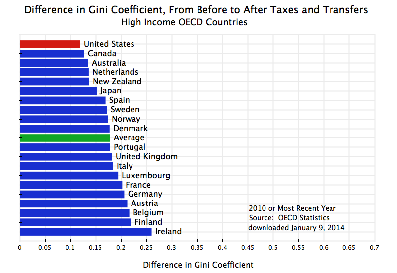
But inequality falls by less in the US than elsewhere once one takes into account taxes and transfers, so that the US moves from the middle of the set of comparator countries to the country with the worst distribution.  The differences in the Gini coefficients are shown explicitly in the following chart:

Gini Coefficient - Dif Before and After Taxes & Transfers, OECD, 2010

Inequality as measured by the Gini coefficient is reduced in each of the countries once one takes into account taxes and transfers.  The reductions are indeed quite significant.  But the reduction in the US is smaller than in any other country, and the result is that the US then ranks worst in terms of inequality once one takes into account taxes and transfers.

An interesting question is whether the reductions in inequality are primarily due to the tax system, or to transfer programs.  Tax systems and transfer programs are both in general progressive.  That is, tax rates are generally higher for those individuals with higher income, and transfer programs are generally designed to benefit the poor more than the rich.  But not all individual tax and transfer programs are progressive.  Flat consumption taxes, such as sales taxes in the US and value-added taxes in Europe, can be regressive, in that they take a higher share from the poor (who must consume almost all of their limited income) than the rich.  The scale of the programs also matter.  One might have an extremely progressive tax structure, for example, but if the size is small (so that little is collected in taxes) then it will have little impact on inequality.

One therefore needs to look at the data.  While the standard OECD files used for the above do not have this, an analysis posted as the Budget Incidence Fiscal Redistribution Database by the research center known as the Luxembourg Income Study (based in Luxembourg and with a US office at the City University of New York), does provide such a breakdown.  The analysis was prepared by Chen Wang and Koen Caminada of the University of Leiden in the Netherlands, and a description is available in this working paper.

Their analysis is drawn from data for 2004 (for most of the countries):

Change in Gini From Before To After Taxes and Transfers
2004 or nearest year
Gini Gini Total From From  Transfers/
Before After Change Taxes Transfers Income
US 0.482 0.372 0.109 0.043 0.066 9.9
Canada 0.433 0.318 0.114 0.038 0.076 10.9
Spain 0.441 0.315 0.126 0.001 0.124 20.7
Switzerland 0.395 0.268 0.128 -0.003 0.130 17.5
UK 0.490 0.345 0.145 0.021 0.124 14.3
Australia 0.461 0.312 0.149 0.047 0.101 11.1
Italy 0.503 0.338 0.165 0.000 0.165 25.4
Average 0.456 0.289 0.167 0.031 0.136 19.6
France 0.449 0.281 0.168 0.017 0.151 26.2
Norway 0.430 0.256 0.174 0.035 0.139 20.2
Ireland 0.490 0.312 0.178 0.046 0.132 17.3
Luxembourg 0.452 0.268 0.184 0.037 0.147 23.4
Austria 0.459 0.269 0.190 0.034 0.156 26.7
Denmark 0.419 0.228 0.191 0.042 0.149 18.9
Netherlands 0.459 0.263 0.196 0.040 0.156 21.3
Sweden 0.442 0.237 0.205 0.037 0.168 24.6
Germany 0.489 0.278 0.210 0.052 0.158 21.2
Finland 0.464 0.252 0.212 0.044 0.168 23.2
Europe only 0.456 0.279 0.177 0.029 0.148 21.5

The first two columns show the Gini coefficient, first before and then after taxes and transfers.  The third column then shows the change in the Gini, with the countries in the table ranked according to this change (from smallest to largest).  While the specific numbers differ from those in the OECD data shown above (the year is different, plus the data may be drawn from different underlying sources), the two are broadly consistent.  In both sets, the US ranks as the most unequal in terms of income after taxes and transfers, with the change in the Gini from before to after also the smallest.  Before taxes and transfers, the Gini for the US is within the range seen for the other countries, with Italy, the UK, Ireland, and Germany all worse.

The authors decompose the change in the Gini according to how much is due to the tax system and how much is due to government transfer programs.  For the US, for example, the total reduction in the Gini was 0.109 points, with 0.043 coming from the tax system and 0.066 coming from the impact of government transfers.

The reduction in the Gini in the US due to the impact of the tax system (of 0.043 points) is within the range seen for the other countries and is indeed even somewhat higher than the average impact across all countries (of 0.031 points).  The US relies mainly on direct income taxes for raising tax revenue, while European countries rely more on value-added taxes.  Income taxes with progressive rates will have a greater impact on reducing inequality than will value-added taxes.  But there are other taxes in all countries, including income taxes in Europe.  More importantly, Europe collects far more in tax revenues than the US does, and hence even if the US tax system has more progressive rates overall, the larger scale in Europe means there can be more of an impact on inequality there.  Based on OECD tax data, the US collected (at all levels of government) just 24% of GDP in tax revenue in 2012, while Western Europe on average collected over 60% more at 39% of GDP.

But more important than the impact of the tax system on inequality was the impact of government transfer programs.  Transfer programs in the US did reduce inequality as measured by the Gini by 0.066 points.  But this was the smallest of any of the countries.  It was less than half the average reduction across all the countries of 0.136 points, and an even smaller share relative to the average for just the European countries of 0.148 points.

The reduction was larger in Europe than in the US primarily because the transfer programs were larger in Europe than in the US.  The final column in the table shows the average level of transfers in each country relative to household incomes.  This was just 9.9% in the US, which was about half of the 19.6% for all the countries, and well less than half of the 21.5% average for just the European countries.

Transfer programs do bring down inequality, and does this in all countries including the US.  But government transfer programs are so much more limited in the US than elsewhere that the US ends up as the worst in the world in inequality once one accounts for them along with taxes.

C.  Poverty Rates

The discussion above was on inequality, using the Gini coefficient as the measure.  But inequality (and the Gini measure), cover the entire income range from rich to poor.  One might also reasonably want to know how the US compares when one focuses exclusively on the poor.  What share of the population is poor, where does the US rank by this measure compared to other countries, and again what is the impact of taxes and transfers?  We will find that the results are basically the same as that found above for the Gini.

A direct measure of the poverty rate is available from the same OECD data base utilized above for the Gini.  The concept used is the share of the population (the head count) with incomes below a poverty line defined as 50% of the median income in the country.  This is a relative measure that takes into account that the standard used for determining who is poor should depend on how rich the country is.

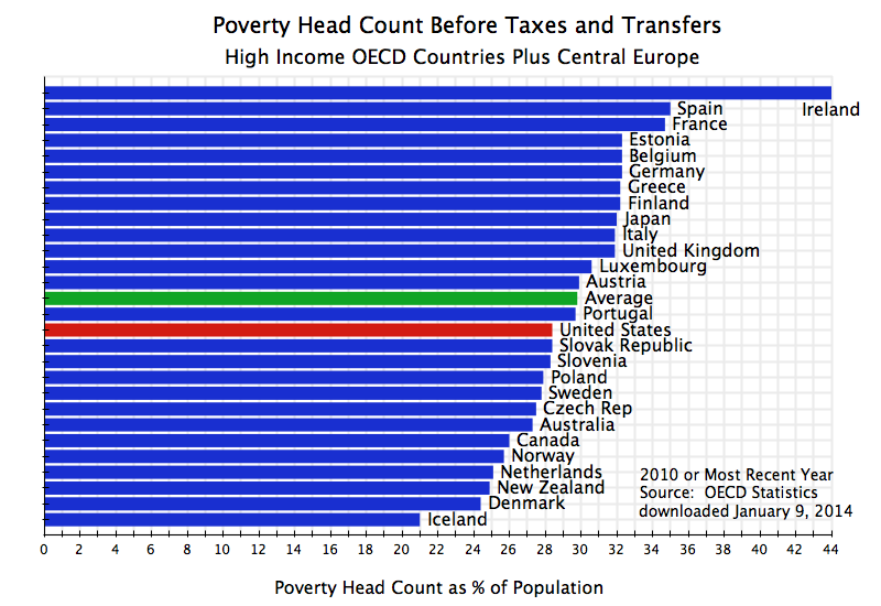
Based on this measure of poverty, the US poverty rate before taxes and transfers is again similar to that for other OECD countries.  It is indeed slightly better than the average for all the OECD countries included here (where there is consistent data also available now for this measure for the countries of Central Europe, so these countries have been added):

Poverty Head Count Before Taxes & Transfers, OECD, 2010

The US market economy therefore does not lead to higher poverty rates than that found in other OECD countries.  But this changes, as it did for the Gini, when one takes into account the system of taxes and transfers:

Poverty Head Count After Taxes & Transfers, OECD, 2010

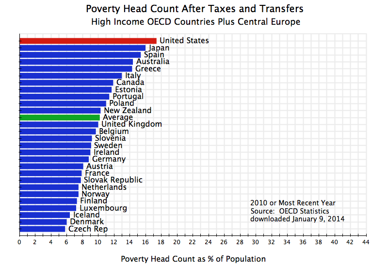
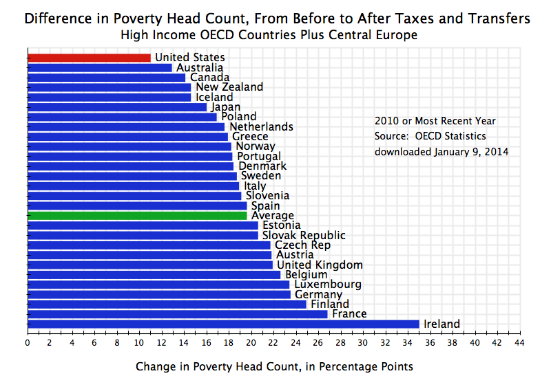
The US then ranks again worst among all OECD countries in terms of the poverty rate, once one includes the impact of taxes and transfers.  The system of taxes and transfers has a positive impact in all of the countries, in that the poverty rates fall in each country once one accounts for taxes paid and transfers received.  Indeed, the impacts in many of the countries are quite large.  But the programs are more limited in the US than elsewhere, so that the net reduction in the US is the smallest:

Dif in Poverty Head Count, Before to After Taxes & Transfers, OECD, 2010

Due to the limited scale of such government programs in the US, poverty rates end up higher in the US than in any other high income OECD country.

D.  Conclusion

Many presume that the US has high inequality and poverty rates because of the market economy system in the US.  While it may be recognized that inequality in the US is higher than elsewhere, and poverty rates also higher, the presumption is that these are unfortunate byproducts of a market system that rewards hard work and risk taking.

But this is not the case.  Inequality and poverty in the US is similar to that found elsewhere among the high income OECD countries, when one takes incomes as determined before accounting for taxes paid and the impact of government transfer programs.  The US is indeed quite close to the average seen elsewhere for these market determined incomes.  Where the US differs, however, is in inequality and poverty rates after one takes into account taxes paid and transfers received.  And since this determines what individuals are in fact able to buy and consume, these incomes after taxes and transfers determine actual living standards.

Once one takes into account taxes and transfers, the US moves from the middle of the range to the worst ranking country.  The tax systems and transfer programs reduce inequality and poverty rates in all countries, including the US.  But the US programs are so much more limited than those found elsewhere, particularly in Europe, that the rest of the OECD world reaches and surpasses the US by these measures.

Inequality and poverty rates in the US, as the worst in the world after accounting for taxes and transfers, are not therefore a consequence of failed government programs, which conservatives such as Senator Rubio want to cut by even more.  Rather, the ranking of the US as the worst in the world is a consequence of the opposite:  that these programs are too small and limited.