Facts vs. Polemics on Unauthorized Immigration of Mexicans to the US

Stock of Mexican Unauthorized Immigrants in the US, 1995 to 2014, #2

Annual Net Flow of Mexican Unauthorized Immigrants to US, 1996 to 2014

In the heated rhetoric of the current Republican presidential campaign, one would think that the US is being flooded by illegal immigrants from Mexico, slipping through a porous border with President Obama unwilling to do anything about it.  Calls are being made for a bigger, taller, and longer wall, more aggressive policing of the border, and the forced deportation of those who are already living here.  These calls have been a centerpiece of Donald Trump’s campaign from the day he announced his candidacy (when he asserted Mexico is “sending” criminals, drug pushers, and rapists to the US).  More recently, in the November 10 Republican presidential debate and in more detail in the days after, Trump called for the creation of a new special police force, a “massive deportation force”, which would aggressively pursue and deport those in the US who were believed to be illegal. Yet Trump has for some time now been at the top of polls of Republicans as their choice for president.

But what are the facts?  The US is actually not being flooded by illegal immigrants from Mexico. Nor has the supposed “problem” become far worse under President Obama.  The Pew Research Center released on November 19 a report with careful estimates of the number of unauthorized immigrants from Mexico residing in the US.  The report brings up to date figures the Pew Center had released previously for earlier years.

The chart at the top of this post is a replication of the chart presented as Figure 5 in Chapter 1 of their report, with figures on the estimated total number of unauthorized Mexican immigrants resident in the US by year.  The second chart is then simply the net annual flows as calculated from the numbers on the totals in the first chart (the change from one year to the next).  It should be noted that Pew Center presented estimates only for 1995, 2000, and 2005, before going to annual figures.  Hence the figures on net flows for 1996 to 2000 and 2001 to 2005 assume equal annual changes.

The Pew Center estimates that the number of unauthorized Mexican immigrants resident in the US reached a peak in 2007, and has since fallen substantially.  The falls in 2008 and 2009 can probably be attributed mostly to the severe downturn in the US in those years, when jobs were scarce and more Mexicans immigrants chose to return to Mexico than come to the US.  However, it is significant that as the US labor market has strengthened since 2009, with the unemployment rate hitting just 5.0% recently, the net outflow of Mexican immigrants continued.  In each and every year of the Obama administration there has either been a net outflow, or no net change, in the number of unauthorized Mexican immigrants in the US.

There are many reasons for this, including stepped up and more effective border enforcement as well as more deportations.  The Pew Report provides a good review of the factors, and I will not go into them all.  But one fact to note is that in FY2013, with Obama as president, the number of deportations reached a record high of 315,000, an increase of 86% from the level in 2005.

One may debate what the appropriate policy should be.  In my view, while immigration has been controversial throughout US history, the US has always also always benefited from it. Recall the discrimination against Catholic immigrants from Ireland in the early and mid-1800s, and yet how such immigration developed into an important part of what made the US what it is now.  There is little reason to believe that this time is different.

But regardless of whatever one’s policy views are, one should start with the facts.  And it is clear that the Republican candidates for president do not have these straight.

An Update on Progress in the Labor Market Recovery Under Obama

Cumul Private Job Growth from Inauguration to Oct 2015

Cumul Govt Job Growth from Inauguration to Oct 2015

A)  Introduction

The Bureau of Labor Statistics released on November 6 its most recent report on the state of the job market.  It was a strong report, with net job gains of 271,000 in October and the unemployment rate falling to 5.0%.  One should not, however, put too much weight on the figures in just one month’s report.  Indeed, the report for October followed relatively weaker reports in the two previous months.  Rather, one should put all these reports in the longer term context of how the labor market has moved in recent years.  And what they show is continued, and remarkably steady, improvement.

This post will look at that longer term context by updating several labor market charts that have been discussed in previous posts on this blog.  It will look first at net job growth in the private sector and in the government sector in the period since Obama’s inauguration, with a comparison to the similar period during George W. Bush’s term.  The post will then look at the continued fall in the unemployment rate, with a comparison to the similar period under Reagan, and finally to the share of part time workers in total employment.  The last is to see whether there is any evidence to support the assertion coming from Republican critics that Obamacare has led to a shift by employers to part time workers so that they can avoid providing health insurance in the overall wage compensation package for their staff.  We will find that there is no indication in the data that this has been the case.

B)  Total Job Growth

The charts at the top of this post show total net job growth, in the private sector and in the government sector, in the period since Obama’s inauguration (up to October 2015) and under Bush (for his two full terms).  They update similar charts discussed in several earlier posts on this blog, most recently from June 2014.

Private sector job growth has been strong under Obama, and continues to be.  And the record is clearly far better than that under the George W. Bush administration.  There has been a net increase of 9.3 million new private jobs under Obama since the month he was inaugurated, versus just 4.0 million new private jobs over the similar period in the Bush administration.  Furthermore, this 4.0 million additional private jobs was close to the peak achieved in the Bush years, before it started to fall and then plummet as the housing bubble burst and the economy collapsed in the last year of his second term.  By the end of his presidency there were fewer private jobs than there were on the day he was inaugurated, eight years before.

Obama faced this collapse in the jobs market as he took office.  The economy was losing 800,000 private jobs per month, with the economy contracting at the fastest pace since the Great Depression.  The new administration was able to turn this around with the stimulus package and with aggressive Fed actions, with the fall in employment first slowing and then turning around.  The result has been a net growth of 13.5 million new private jobs from the trough just one year into the new administration until now.

Government jobs, in contrast, have been cut.  This hurt total job growth both directly (government jobs are part of total jobs obviously) as well as indirectly.  Indirectly, the government job cuts (as well as the fiscal austerity that began in 2010) reduced demand for goods and hence production at a time when the economy was still depressed and suffering from insufficient demand to keep production lines going.  As discussed in an earlier post on this blog, without the fiscal austerity introduced from 2010 onwards the economy would have recovered from the economic downturn by 2013 and perhaps even 2012.  The initial stimulus package in 2009 turned things around.  It is unfortunate that the government then moved to cuts from 2010 onwards, which reduced the pace of the recovery.

It should be recognized that government jobs as recorded here include government jobs at all levels (federal, state, and local), with federal government jobs only a relatively small share of the total (12.4%).  But government jobs have fallen at all three levels, federal as well as state and local.

The cuts on government jobs during Obama’s time in office stand in sharp contrast to the growth in government jobs during Bush’s two terms.  Yet Obama is charged with being a big government liberal while the Republicans claim to be small government conservatives.

C)  The Rate of Unemployment

Unemployment Rates - Obama vs Reagan, up to Oct 2015After peaking at 10.0% in October 2009, the rate of unemployment has fallen at a remarkably steady pace under Obama (aside from the monthly fluctuations in the reported figures, which will in part be statistical noise as unemployment estimates come from household surveys).  This was discussed in this earlier post on this blog.  The record is certainly better than that under Reagan.  The unemployment rate is now 5.0%, while it was still 6.0% at the same point in the Reagan presidency.

Furthermore, Reagan was not confronted, as Obama was, with an economy in collapse as he took office.  Rather, unemployment began to rise only about a half year after Reagan took office, as he began to implement his new budgetary and other policies.  The unemployment rate then rose to a peak of 10.8% in late 1982 before starting to fall.  And while the recovery was then rapid for a period, supported by rising government spending, it stalled by mid-1984 with unemployment then fluctuating in the range of 7.0% to 7.5% for most of the next two years.  One does not see the steady improvement as one has had under Obama.

With the unemployment rate now at 5.0%, it is expected that the Fed will soon start to raise interest rates.  This would be unfortunate in my view (as well as that of many others, such as Paul Krugman).  Inflation remains low (only 0.2% over the past year for personal consumption expenditures for all goods, or 1.3% over the past year if one excludes the often volatile food and energy costs).  And while wages ticked up by 2.5% over the year before in the most recent BLS labor market report, this is still below the roughly 3 1/2% increases that would be consistent (after expected productivity gains in a normally functioning job market) with the Fed’s 2.0% inflation target.  And if wages are not allowed to rise faster than inflation, then by definition there will be no increase in real wages.

It is of course recognized that the rate of unemployment cannot fall forever.  There will always be some slack in the labor market as workers transition between jobs, and if the unemployment rate is too low, there will be excessive upward pressure on wages, and inflation can become a problem.  But where that “full employment rate of unemployment” is, is not clear.  Different economists have different views.  It does not appear to be at 5.0% under current conditions, as the rate of inflation remains low.  But whether it is at 4.5% or 4.0% is not clear.  At some point, it would be reached.

When it is, the pace of job creation will need to fall to match the pace of labor force growth (from population growth).  Otherwise, by simple arithmetic, the rate of unemployment would continue to fall.  And this cut in employment growth would be the objective of the Fed in raising interest rates:  It would be to slow down the pace of job growth to the rate that matches labor force growth.

Once the Fed does start to raise interest rates, one should then not be surprised, nor criticize, that the pace of job growth has slowed.  That is the aim.  And it will need to slow sharply from what the pace of job growth has been in recent years under Obama.  Over the past two years, for example, employment growth has averaged 236,000 per month. The labor force has grown at a pace of 101,000 per month over this period.  As a result, unemployment has fallen at a pace of 135,000 per month (= 236,000 – 101,000), with this leading the unemployment rate to fall to 5.0% now from 7.2% two years ago.  If unemployment is now to be kept constant rather than falling, the pace of job growth will need to fall by more than half, from 236,000 per month to just 101,000 per month (or slightly more, to be precise, taking into account the arithmetic of a constant unemployment rate).

I have no doubt that when this happens, and the pace of job growth slows, that Obama will be criticized by his Republican critics.  But this will reflect a fundamental confusion of what full employment implies for the labor market.

D)  Part-Time Employment as a Share of Total Employment

Part-Time Employment #2 as Share of Total Employment, Jan 2007 to Oct 2015

Finally, it is of interest to update the graph in an earlier post to see whether there is now any evidence that the Affordable Care Act (Obamacare) has led employers to fire their regular full time workers and replace them with part-timers, in order to avoid the mandate of including health insurance coverage in the wage compensation package they pay to their workers.  Conservative politicians and media asserted this as a fact (see the earlier blog post cited for several references).  But as discussed before, and as confirmed with the more recent data, there is no indication in the data that this has been the case. Indeed, the share of part time workers in the total has been falling at an accelerated pace in the most recent two years, at a time when the Obamacare insurance mandate provisions have come into effect.

The acceleration in the pace of this improvement is consistent with the improvement seen in the overall labor market over the past several years, as discussed above.  As the economy approaches full employment, those who are working part time (not by choice, but because they have no alternative) are able to find full time jobs.  The share of part-time workers in total employment is still somewhat above (at about 4%) what would be normal when the economy is at full employment (at about 3%), lending support to those arguing that while the labor market is improving, we are not yet at full employment (and the Fed should thus wait longer before it starts to raise interest rates).  But it is getting better.

I have also added to the graph a line (in red) showing what the share of part-time employment workers were in total employment during the Reagan years.  At the comparable time in his presidency, the share was higher than what it is now under Obama.  Furthermore, it had improved only slowly under Reagan over the three years leading up to that point.  Yet Reagan is praised by conservatives for his purportedly strong labor market.

E)  Conclusion

The labor market has improved considerably in recent years under Obama.  It could have been better had the government not turned to austerity in 2010, but even with the government cuts, job growth has been reasonably good.  The unemployment rate has now fallen to 5%, and it is expected the Fed will soon begin to raise interest rates in order to slow the pace of job creation.  One should not then be surprised if fewer net new jobs are created each month, nor criticize Obama when it does.  That will be precisely the aim of the policy.  But I strongly suspect that we will nonetheless hear such criticisms.

The Success of Obamacare: A Sharp Reduction in the Number of Americans Without Health Insurance

Health Insurance, % Without Coverage, 1999 to 2014, with 2013 -2014 scaled to US totals, ver 2 with gapA)  Introduction

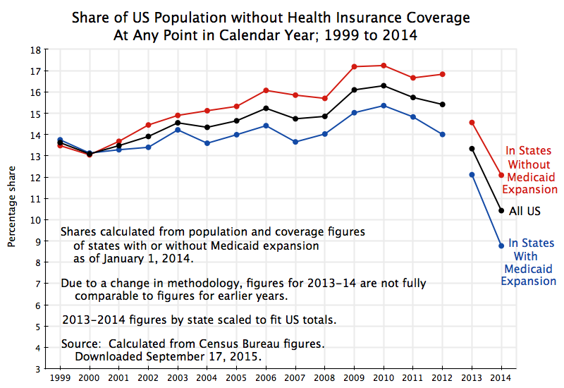
The US Census Bureau released on September 16 its 2014 report on “Health Insurance Coverage in the United States”.  It provides the best estimate available on the share of the US population that is covered by health insurance, drawing on figures from both its Current Population Survey and its American Community Survey. The graph above was calculated from the underlying data used in the report (released by the Census Bureau along with it).

The new figures confirm that Obamacare has succeeded in sharply reducing the number of Americans who must suffer from lack of health insurance.  The results are consistent with those released earlier by other organizations, including from the commercial polling firm Gallup and from the non-profit Health Policy Center of the Urban Institute.  But the Census Bureau results are derived from larger and more comprehensive surveys than a commercial outfit such as Gallup or a nonprofit such as the Urban Institute can mount.

Gallup, the Urban Institute, and now the Census Bureau, have all found that health insurance coverage improved sharply in 2014, the first year in which the health insurance exchanges set up under Obamacare came into operation.  Also important was the expansion from the start of 2014 of Medicaid coverage in 26 of the 51 states plus Washington, DC.  The expansion, an integral part of the Obamacare reforms, raised eligibility from what had previously generally been 100% of the poverty line (there was some variation across states), to now include also the working close-to-poor who earn between 100% and 138% of the poverty line. Those earning more than 138% of the poverty line are eligible for federal subsidies (phased out with rising income) to purchase privately provided health insurance on the Obamacare market exchanges.

The improvement in health insurance coverage in 2014 (the decrease in the share with no insurance) is clear from these multiple sources.  And it should not be a surprise: The primary purpose of Affordable Care Act (aka Obamacare) was precisely to make affordable health insurance available to all.  Yet prominent political figures opposed to the act (such as the Republican Speaker of the House John Boehner, and Florida Senator Marco Rubio, now a candidate seeking the Republican presidential nomination) claimed that the Affordable Care Act had actually increased the net number of uninsured.  It was clear at the time that they did not understand some basics of insurance enrollment, and it is absolutely clear now that they were dramatically wrong in their assessments.  But I am not aware that any of these political critics have had the courage to admit that they had in fact been wrong.

There are some technical issues that arise in the Census Bureau numbers that should be understood, and these will be discussed below.  But the basic numbers are clear. Between 2013, before the Obamacare exchanges were in operation, and 2014, there was a sharp reduction in the share of the American population who had no health insurance cover.

This blog post will first review the basic results on improved health insurance cover with the start of the Obamacare reforms, and will then discuss some of the technical issues behind the numbers.

B)  The Reduction in the Number of Americans Without Health Insurance Following the Start of the Obamacare Reforms

The graph at the top of this post shows the Census Bureau numbers, as percentage shares of the population with no health insurance over the period 1999 to 2014. Unfortunately (and as will be discussed further below), the Census Bureau changed its methodology in 2013, so the 2013 and 2014 figures are not directly comparable with the figures for 1999 to 2012.  However, the 2013 and 2014 figures are directly comparable to each other, and show the sharp drop in the share of the population without health insurance in 2014 (the first year of the Obamacare market exchanges) compared to what it was before.

The share of the population without health insurance cover at any point in the calendar year fell from 13.3% in 2013 to 10.4% in 2014.  In terms of absolute numbers, the number of Americans without health insurance cover fell from 41.8 million in 2013 to 33.0 million in 2014, a reduction of 8.8 million or 21%.  The number of Americans with health insurance cover rose by 11.6 million, with this number different from the reduction in the number with no insurance cover (the 8.8 million) because the overall US population is growing. Furthermore, this was not (as some politicians have charged) solely a result of the Medicaid expansion.  While the Medicaid expansion was important, with an increase of 6.7 million enrolled in Medicaid (both under its prior program conditions, as well as under the expanded eligibility rules), the total number of Americans with some form of health insurance rose by well more than this.

The chart also shows the shares without health insurance separately for the group of states that as of January 1, 2014, had chosen not to take the federal money to expand Medicaid coverage to include the working close-to-poor (those earning between 100% and 138% of the poverty line).  Twenty-six states (all with a Republican governor or state legislature or usually both) decided not to expand Medicaid coverage to allow this segment of the population to obtain health insurance, despite the fact the additional costs would be covered 100% by the federal government for the first several years, with this then phased down to a still high 90% ultimately.  Even at the 90% federal cost share, the net cost to the state would not simply be small, but in fact negative.  Due to the higher state tax revenues that would be gained from what Medicaid would be paying hospitals, doctors, and nurses to provide health services to these close-to-poor, plus the lower state subsidies that would be needed at hospitals to cover a share of the cost of emergency room care that the uninsured must use when they have no alternative, the states would in fact come out ahead financially by accepting the Medicaid expansion.  Yet for purely political reasons, the Republican governors and legislators in these states refused to permit this Medicaid expansion, leaving this segment of the population with no health insurance cover.

It is also interesting to note from the chart at the top of this post that actions in this group of states to limit (or at least not facilitate access to) health insurance cover appear to have begun much earlier.  The shares of the population without access to any health insurance cover in those 26 states which as of January 1, 2014, had chosen not to expand Medicaid coverage, are shown as the red line in the chart.  The shares in the 25 states plus Washington, DC, that did decide to expand Medicaid coverage are shown in the blue line. In 1999 (the first year with comparable data in this series) and 2000, there was no such a discrepancy in health insurance cover between these two groups of states.  Indeed, in 1999 a slightly smaller share of the population had no insurance cover in the red states than in the blue states.  In 2000 the shares were almost identical.

But this then changed.  Starting in 2001, a consistent gap started to open up in the shares between the two groups of states, with fewer covered by insurance in the red states than in the blue.  The overall national trend for the share of those with no insurance cover was also upwards.  Why the gap between the two groups of states started to open up in 2001 and remain to this day is not fully clear, but it may reflect the trend to more conservative politics that started at that point (including the start of the Bush administration in 2001). The refusal to accept the Medicaid expansion (even at a cost to themselves), and other measures aimed at blocking Obamacare or at least make access more difficult (such as refusal to operate market exchanges at the state level), is in keeping with the observed deterioration in access to health cover in these states well prior to Obamacare ever being debated.

C.  Some Technical Notes

Estimates of the share of the population with or without health insurance cover come from surveys, and thus have the strengths and weaknesses of any surveys.  The accuracy of the results will depend on how well those being surveyed recall and answer correctly what they were asked.  The results will often depend on the way the questions are worded, and sometimes even on the sequence in which the questions are asked.  The Census Bureau recognizes this, continually tests its questionnaires, and periodically will change the way they ask their questions in a survey in an effort to obtain more accurate results.

Unfortunately, when there is such a change the new survey results will not be strictly and directly comparable with the responses provided in the past.  Often the Census Bureau will use various methods to try to link the different data series into one consistent whole, but this is not always done.  One way to do this, for example, would be to conduct two parallel surveys when there is to be a change, one following the old method and one following the new, and then with statistical methods to control for sample characteristics, seek to determine by how much the old series would likely need to be adjusted to become consistent with the new.

The Census Bureau did this when methodological changes were made in the series tracking health insurance coverage in 2007 and again in 2011.  When the 2007 changes were made, they went back and adjusted figures from 1999 onwards to approximate what they would be following the 2007 approach.  And when the 2011 changes were made, they again went back, to 1999 again, to produce a consistent series that eventually covered the period 1999 to 2012.

However, when the changes implemented in 2013 were made, the Census Bureau did not go back to adjust previous figures for consistency with the new approach.  I have found no explanation for why they have not, but would guess it might well be linked to budget cuts.  But for this reason, one cannot assume that the figures showing a reduced share of the population without health insurance in the 2013 figures compared to those in 2012, are necessarily due to more people enrolling in health insurance in 2013 relative to 2012. Hence the gaps in the lines in the graph as drawn above.

Indeed, other evidence suggests that coverage in 2013 was similar to that in 2012. Specifically, the Gallup numbers  previously cited indicate that share of uninsured in 2013 was actually a bit higher than where they were in 2012 (averaging what are quarterly estimates).  There was then a sharp fall in 2014 in the Gallup figures following the start of the Obamacare exchanges and the Medicaid expansion, consistent with the Census Bureau numbers.

It is unfortunate the Census Bureau did not try to work out a consistent series of estimates for health insurance coverage for this critical period.  But for whatever reason they did not (at least not yet).  But what we do know from the Census figures is that the share of the uninsured in the population was trending upwards over the 1999 to 2012 period, and that there was a sharp reduction in the share uninsured in 2014 compared to what it was in 2013.  And that is therefore all we could work with in this post.

Another issue is that the state by state figures were determined by the Census Bureau under one survey for the 1999 to 2012 period (the Annual Social and Economic Supplement to its Current Population Survey, or CPS-ASEC), but then a different survey for 2013 and 2014 (the American Community Survey, or ACS).  Both are large surveys, asking questions on a variety of issues.  But they ask somewhat different questions on the issue of health insurance coverage.  Specifically, the CPS-ASEC, which is undertaken between February and April of each year, asks the respondents whether they had had health insurance coverage at any point in the previous calendar year (separately for each household member).  The ACS survey, in contrast, is undertaken on a rolling basis throughout the year, and the question asked in that survey is whether each household member had health insurance cover at the time they were being interviewed.

These are of course different questions.  And by simple arithmetic, it should be clear that the responses to whether they had insurance at any point in the year will, for the sample as a whole, always be a higher figure than the share in response to the question of whether they have health insurance at the time of the interview.  Someone might not have health insurance at the time of the interview, but could have had it earlier in the year (or will obtain it later in the year).  The shares uninsured will be the mirror images of this.

The national figures for 2013 and 2014 were:

CPS-ASEC

ACS

No insurance at any

time in the calendar year

No insurance at the

time of the interview

2013

13.3%

14.5%

2014

10.4%

11.7%

The figures in the graph at the top of this post are based on the estimates of coverage at any point in the calendar year.  There was, however, a problem in determining on a consistent basis the underlying state figures, from which one could compute the shares for the states that had expanded Medicaid coverage and for those who had not.  The figures at the state level that the Census Bureau made available on its web site for the 1999 to 2012 period were from the CPS-ASEC series.  However, for some unexplained reason, but as part of the changes introduced with the new 2013 numbers, the state level figures for 2013 and 2014 were only made available under the ACS series.  I do not know why they did this, as it introduces another element of inconsistency when making comparisons across time.

Since the bulk of the state level series, for 1999 through to 2012, were published under the CPS-ASEC series, I used those as published.  But for 2013 and 2014, I determined the state totals for the Medicaid expansion and Medicaid non-expansion groups based on the ACS numbers (as they were the only ones available), and then rescaled the figures to fit the published national totals (working in terms of the underlying numbers, and then computing the shares).  The figures should be very close to what would have been worked out directly from the CPS-ASEC figures if they had been made available at the state level. One would expect the ratio of the figures of those without health insurance under the two different definitions (throughout the year or at the time of the interview) would not differ significantly between the two groups of states (those with and without the Medicaid expansion).

D)  Conclusion

Technical issues exist with any data set, and it is important to recognize what limitations such issues place on what one can infer from the figures.  Unfortunately, the Census Bureau numbers as published do not permit us to compare directly the 2013 and 2014 results to those of 1999 to 2012.  However, the 2013 and 2014 results are directly comparable to each other, and they clearly show that there has been a major improvement in health insurance coverage in 2014 after the Obamacare exchanges and Medicaid expansion came into effect.