GDP Growth in the First Quarter of 2012: A Slow Economy Going Slower

BEA release of 4/27/12 2011 Q3 %growth 2011 Q4 %growth 2012 Q1 %growth Contribution to GDP growth in 2011 Q4 Contribution to GDP growth in 2012 Q1
Total GDP 1.8 3.0 2.2 3.0 2.2
A.  Personal Consumption Expenditure 1.7 2.1 2.9 1.47 2.04
B.  Gross Private Fixed Investment 13.0 6.3 1.4 0.78 0.18
   1.  Non-Residential Fixed Investment 15.7 5.2 -2.1 0.53 -0.22
   2.  Residential Fixed Investment 1.3 11.6 19.1 0.25 0.40
C.  Change in Private Inventories nm* nm* nm* 1.81 0.59
D.  Net Exports nm* nm* nm* -0.26 -0.01
E.  Government -0.1 -4.2 -3.0 -0.84 -0.60
   1.  Federal Government 2.1 -6.9 -5.6 -0.58 -0.46
   2.  State and Local Government -1.6 -2.2 -1.2 -0.26 -0.14
Memo:  Final Sales 3.2 1.1 1.6 1.15 1.61
        nm* = not meaningful
$ Value of Change in Private Inventories (2005 prices) -$2.0b $52.2b $69.5b

A.  Introduction

The Bureau of Economic Analysis (BEA) of the Department of Commerce released this morning its first estimate of GDP growth in the first quarter of 2012.  The table above summarizes the key figures.  Overall, the report is disappointing.  Many observers were expecting GDP growth to accelerate, continuing the path of quarter by quarter increases seen during the course of 2011 (with growth rates of 0.4%, 1.3%, 1.8%, and 3.0%, in the first through the fourth quarters, respectively).  But readers of this blog may recall that I had warned of a real possibility of deceleration in a posting on January 27, when the BEA released its first estimate of growth in the fourth quarter of 2011.  That slowdown has happened.  So far the slowdown has been modest, and one should not put too much emphasis on one quarter’s figures.  But a deeper assessment of the numbers contained in the report suggests that growth could slow further in the next few quarters, in the period just before the Presidential election.  This is not good for Obama.

The table has a lot of numbers to give the full picture, but we will focus on a few.  The table is similar to the one I used in the January 27 posting noted above, although this time I have split out the Change in Private Inventories from other investment (i.e. from Fixed Investment), to give a clearer picture of the trends.  Note also that the figures for the fourth quarter of 2011 differ somewhat from those shown in the January 27 posting.  This is because the January figures were the initial estimates (the BEA calls them the “advance estimates”), which are then revised twice (and released in late February and then in late March).  The initial estimate for the fourth quarter of 2011 was that GDP rose by 2.8%.  Following the revised second and then third estimates (as more complete data became available), the GDP growth rate for the period is now estimated to have been 3.0%.  And there are small changes in a number of the other figures as well.  Similarly, the release today was the initial estimate for the first quarter of 2012, and revised estimates will be released in late May and then in late June, before the release in late July of the initial estimates for the second quarter.

B.  The Change in the Change in Private Inventories

It is best first to focus on what has happened to the Change in Private Inventories, as this can drive the short term dynamics of quarter to quarter GDP growth.  As was described in a posting in the Econ 101 section of this blog, it is the change in the change in private inventories which leads to a change in GDP (i.e. to GDP growth).  In the last line of the table above, I have shown what the actual (estimated) dollar value was of inventory accumulation (the change in private inventories), going back to the third quarter of 2011.  In that third quarter, the stock of inventories in fact fell a small amount, by $2.0 billion (in 2005 prices).  Inventories are then estimated to have grown by $52.2 billion in the fourth quarter, for a change in the change in private inventories of $54.4 billion.  This contributed 1.81% points of the 3.0% growth in GDP.  That is, fully 60% ( = 1.81 / 3.0 ) of the growth in the fourth quarter (based on the revised figures) is now estimated to have come from inventory accumulation.

In the first quarter of 2012, private inventories are estimated to have grown by even more than they did in the fourth quarter:  by $69.5 billion.  But even though inventory accumulation is now estimated to have been higher, the change in the change in inventories was only $17.3 billion ( = $69.5b – $52.2b).  Thus even though inventory accumulation was greater than in the fourth quarter of 2011, the contribution to the growth of GDP in the first quarter of 2012 was an estimated 0.59% points (vs. the 1.81% of the previous quarter) of the 2.2% growth, or about 27% ( = 0.59 / 2.2 ) of the growth in GDP.

Inventory accumulation thus continued to add to, rather than subtract from, overall GDP growth in the first quarter, but at a slower pace than in the fourth quarter.  Looking forward, inventory accumulation would need to grow further to $86.8 billion ( = $69.5b + $17.3b) for the change in the change in private inventories to continue at the same pace, and contribute approximately 0.6% points to growth.

But with high positive inventory growth for two quarters now, there is a good chance that producers will cut back on production so as not to add so much to inventories sitting on shelves.  If inventory accumulation even simply continues at the $69.5 billion pace of the first quarter, the change in the change in inventories will then be zero.  If all else in the economy continues to grow as it did in the first quarter (it won’t, but if it did), then the growth rate in the second quarter would be 2.2% – 0.6% points = 1.6% (which is the rate of final sales growth in the quarter; see the table above).

But inventory accumulation could be a good deal less than that.  A fall in the stock of inventories is not unusual.  From 2001Q1 through 2012Q1, for example (a period of 45 quarters), the change in private inventories was negative in 15 of the quarters (i.e. one-third of the time) and positive in 30.  Even if the change in private inventories was just zero, and not even negative, the change in the change in private inventories would then be a negative $69.5 billion from the pace in the first quarter.  This would subtract 2.4% points from GDP growth, and if all else grew at the pace it did in the first quarter, then GDP growth would be a negative 0.8% ( = 1.6% growth of final sales minus the 2.4% points).

There is a good chance, but no certainty, the pace of inventory accumulation will slow down.  If so, overall GDP growth would slow, and even possibly turn negative.  The economy remains weak.

C.  Personal Consumption and Fixed Investment

A positive in the figures is that household expenditures, for both personal consumption and for residential investment, continued to strengthen.  Personal consumption (which accounts for 71% of GDP), grew by 2.9% and accounted for 2.04% points of the 2.2% growth.  And residential fixed investment (mainly housing) grew at a very fast 19.1% pace, following the 11.6% growth of the fourth quarter.  These are strong figures, and suggest housing may be starting to recover.  However, as had been noted in the January 27 blog posting, residential fixed investment has fallen by so much in the crash of the housing bubble (to just 2.3% of GDP now, from a high of over 6% during the bubble, and a more normal 4% of GDP or so), that such investment would need to double to return to normal levels, or triple to get back to where it was before.  And with its current small share of GDP, the 19.1% growth of residential fixed investment only accounted for 0.40% points of the 2.2% GDP growth in the first quarter.

Offsetting this positive news on household consumption and investment, there was a decline in business (i.e. non-residential) fixed investment.  Business fixed investment had been strong earlier in the recovery, from early 2010 through to late 2011, but is estimated to have contracted by 2.1% in the first quarter.  This subtracted from GDP growth.  And with business fixed investment (at 10.3% of GDP currently) much larger than residential fixed investment, the declining growth of business fixed investment has pulled down overall fixed investment from a 13.0% rate of growth in the third quarter of 2011, to 6.3% in the fourth quarter, and to just 1.4% in the first quarter.

D.  Fiscal Drag Continues

Finally, and most stupidly in a still depressed economy with high unemployment, government expenditures are falling, acting as a drag bringing down the overall economy.  And while earlier this fiscal drag was mostly due to cuts in government expenditures at the state and local level, cuts in federal expenditures are now also pulling down the economy. Federal government expenditures on goods and services fell by 5.6% in the first quarter, following a fall now estimated at 6.9% in the fourth quarter.  State and local government expenditures continued to fall (as they have in 11 of the 13 quarters since the first quarter of 2009), but now federal expenditures are falling even faster.

The direct impact of the decline in government expenditures subtracted 0.6% points from what growth would otherwise have been in the first quarter.  That is, had government expenditures simply remained flat rather than fallen by 3.0% (for federal combined with state and local), GDP growth would have been 2.2% + 0.6% = 2.8%.  With a modest 3.0% growth (instead of a 3.0% cut) in government expenditures, growth in the first quarter would have been a more respectable 2.2% + 1.2% = 3.4%.  And assuming a multiplier of just 1.5, the growth rate would have been 2.2% + 1.5×1.2% = 4.0%.  While still modest, this would bring GDP growth closer to the rate needed for a sustained reduction in unemployment.  And as was noted in a previous posting on this blog, had government expenditures been allowed to grow at the pace it had during the economic downturn after 1981 during the Reagan years, the economy would now be at full employment.

Cutting government expenditures when the economy is so weak and unemployment so high only serves to further weaken the economy.  The consequences of an even more severe austerity program can be seen in the UK.  The Conservative Government in the UK has adopted an austerity program similar to what Republicans have pushed to be adopted here.  The new GDP report for the UK issued two days ago indicates that growth in the UK was negative in the first quarter of 2012, as it was in the fourth quarter of 2011.  The two quarters of negative growth meets the criterion normally used to define a recession, and hence the UK has now dropped back into recession for the second time since the 2008 crisis.

The US has fortunately not adopted an austerity program as severe as that adopted by the UK.  However, Republicans are pushing strongly for the US to do so.  If Obama did, the results would be similar to that seen in the UK.  If you are running for re-election, that is not a good place to be.  And that may explain why the Republicans have been pushing for it.
Multifactor Productivity Growth: A Record High in 2010

US Productivity Growth, Non-farm Business Sector, 1988- 2010

The Republican presidential candidates continue to assert loudly that over-bearing new regulatory burdens under Obama have crippled the American economy and account for the slow recovery from the 2008 collapse.  Mitt Romney, in a policy address at the University of Chicago on March 19 for example (see transcript here), asserted that regulatory burdens (in addition to higher taxes, even though taxes have in fact been cut under Obama), were leading to businesses shutting down and jobs disappearing as “Entrepreneurs decide it’s too risky and too costly to invest and to hire.”

New burdensome regulations, if they were a problem, would reduce productivity.  Yet as this blog has noted previously (see here), productivity growth has in fact been quite good during the Obama period.  The productivity concept normally used for such discussion is simple labor productivity, which measures output (GDP) per unit of labor input (either employment or hours of labor).  This productivity concept is useful in part because it can be estimated as soon as one has an estimate of GDP, i.e. each calendar quarter.  But it is not a measure of pure productivity, as output per unit of labor can rise due to several things, including from increased capital investment (more machinery and equipment, which improves productivity) or from changes in the composition of labor (towards more highly educated, and hence more productive, workers).

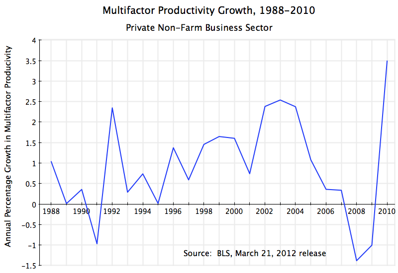
Multifactor Productivity (also sometimes called Total Factor Productivity) is a measure of productivity that takes into account increased capital availability and other such factors.   The Bureau of Labor Statistics of the US Department of Labor provides an estimate of it, but because it is more difficult to estimate, it only comes out with a major lag.  On March 21, the BLS issued its estimate for 2010.  Only annual estimates are made.  And while the series only goes back to 1987 (and hence has growth rates only from 1988), it is interesting that while Romney and the other Republicans are complaining of a large increased burden on business from regulations under Obama, the BLS found that multifactor productivity grew faster in 2010 than in any year since they started estimating the series in 1988.

The graph above shows the BLS estimates of multifactor productivity (MFP) growth for 1988 to 2010, for the private non-farm business sector.  MFP grew by 3.5% in 2010, reversing the downward trend seen since 2003 and absolute declines in 2008 and 2009.  As noted, the 3.5% increase in MFP in 2010 is the highest in the history of the series.  If Obama’s regulations were stifling businesses, one would not see such an upward bounce in productivity.  The Republican charge is simply not consistent with the facts.

One should also not jump to the opposite conclusion that the upward bounce in productivity in 2010 can be credited totally to regulatory or other reforms instituted by the Obama administration.  It would be consistent with such reforms improving productivity (i.e. the opposite of what Romney and the Republicans have asserted), but it could be due to other factors also.

The truth is that much of the year to year change in productivity can be accounted for by the business cycle.  When economic output is falling, as it was in 2008 and the first half of 2009, productivity will typically fall (or not grow as much as in normal growth years), as businesses lay off labor only with a lag after they find they cannot sell all of their output.  And in an economic recovery, productivity will rise, as businesses also only start to hire new workers with a lag.  The same happens with business investment (and hence the stock of machinery and equipment and other capital available for use), so that capital is underused as economic output falls in a recession and then is more intensively used at the start of a recovery.  Looking forward, it is likely that MFP growth will not be so high in 2011, and indeed might even be relatively low, as businesses started hiring new workers more aggressively in 2011 as the economic recovery continued (albeit slowly, due to still low demand for what they could produce).  But we will not know for another year, when the BLS issues their estimate for MFP growth in 2011.

The productivity data cannot by itself demonstrate conclusively whether or not the record high growth in productivity in 2010 was primarily due to measures implemented by the Obama administration.  But what we do know is that the data is clearly not consistent with the Republican charge that Obama has imposed huge new regulatory burdens which have stifled productivity.

The Impact of Reagan: Good for the Rich, Bad for Most

No belief is more firmly held in Republican dogma than that the Reagan “Revolution” turned the US economy around from perpetual stagnation to strong growth, with consequent benefits for all.  It is now 30 years since Reagan took office and started his program of tax cuts, financial deregulation, and other measures, and we therefore now have 30 years of data to see what the impact has been.  We can compare this to how the US economy performed in the 30 years before Reagan, 1950 to 1980, to see what the differences have been.

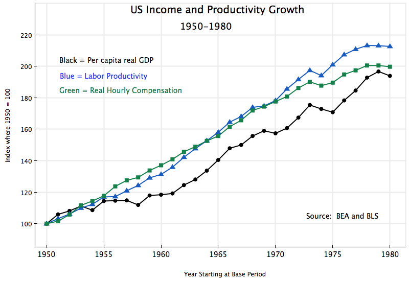
We will do this with a series of graphs, starting with:

This shows the path of per capita real GDP, real labor productivity, and real hourly compensation (everything will be in real terms in this note).  Per capita GDP grew by 94% over this 30 year period, or an average of 2.2% a year, while labor productivity grew by a bit more, by a total of 113% or 2.5% a year.  Real hourly compensation grew similarly, by 100%, for a 2.3% annual rate.  In “normal” times one would expect these three measures of productivity and real incomes to grow at similar rates and to track each other, and this is basically what one observes in the pre-Reagan period.

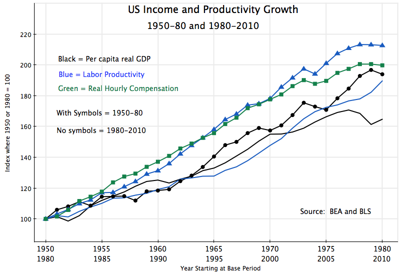
If the Reagan measures helped spur growth, then these growth rates should have shot upwards in the next 30 years.  But one finds:

Per capita real GDP and labor productivity still grew following Reagan, but at a slower rate than before.  Per capita GDP grew only by 65% in the thirty years following Reagan (1.7% a year), vs. 94% (i.e. 45% higher) in the thirty years before.  Much of this difference is due to the weak economy at the very end of the period, due to the 2008 collapse at the end of the Bush administration and only weak recovery after, and it could be argued that one should allow for this.  Growth in the 25 years to 2005 was almost as high as the growth in the 25 years to 1975.  But then growth was strong during the Carter years (despite the widespread and oft-repeated incorrect assertion that the economy was stagnant then), while it collapsed at the end of the Bush Administration.

Growth in the economy ultimately comes from growth in labor productivity, and here the record post-Reagan is consistently weaker relative to before.  Labor productivity over 1980 to 2010 consistently tracks below where it was over 1950 to 1980, and grew by a total of 90% (2.2% a year) vs. 113% (2.5%) before Reagan.

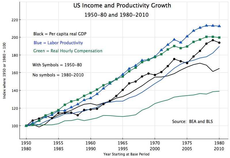
But the really startling difference is in real hourly labor compensation:

Instead of tracking closely to the growth in labor productivity, as one would normally expect, real hourly compensation was well below.  For all workers, average real hourly compensation grew only by 39% (1.1% a year) over the thirty years post-Reagan, vs. 100% in the thirty years before.  There clearly was a change, post-Reagan, but if you were a worker, it was sharply for the worse.

The figures so far have been about overall averages:  for per capita GDP, productivity per worker, and hourly compensation per worker.  But it is also of interest to see how the average gains have been distributed across income groups.

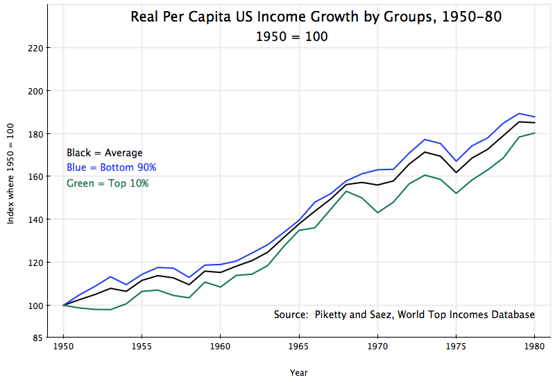
First, for 1950 to 1980:

This data comes from Piketty and Saez, and is based on incomes as reported in US income tax returns (deflated to real terms using the GDP deflator).  Taxable income (including income from capital gains) is a different concept from income as defined in the GDP accounts, but the two concepts track each other fairly well over time, so comparisons in terms of growth relative to a base period will be similar.

For 1950 to 1980, one sees that average real incomes, the real incomes of the bottom 90%, and the real incomes of the top 10%, all track each other within a relatively narrow band.  Overall growth (of taxable income) was 85% (2.1% a year), with slightly more (88%, still 2.1% a year) for the bottom 90%, and a bit less (80%, or 2.0% a year) for the top 10%.  Pre-Reagan, all income groups shared similarly in income growth.  A rising tide lifted all boats.  And with incomes of the bottom 90% growing a bit faster than that of the top 10%, income equality improved some.

But things changed post-Reagan:

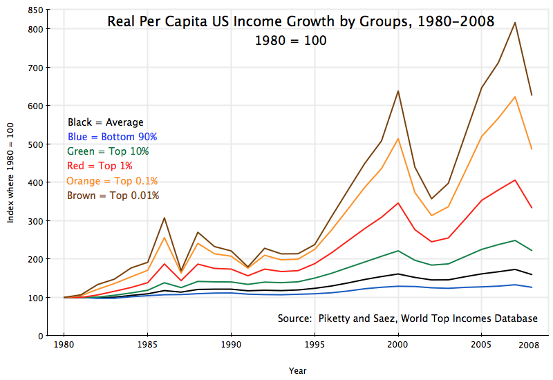
First of all, note that the scale here is very different than that in the previous graphs.  Note also that the data goes only up to 2008, the most recent year for which such US income tax return data has been released in a form that Piketty and Saez could analyze.  Note also that with the economic collapse in 2008, some comparisons can better be made using 2007 instead of to a trough in the business cycle.

For the full period of 1980 to 2008, average real taxable income for everyone grew by 60% (1.7% a year).  This is a somewhat slower pace than that for the thirty years before Reagan (where average real taxable income grew by 2.1% a year), consistent with and similar to the slower pace noted above for per capita real GDP.  But real incomes of the bottom 90% grew only by a total of 26% over 1980 to 2008, or 1.1% a year.  In contrast, the top 10% saw their incomes grow by 122% in the post-Reagan period, or 2.9% a year.  Distribution became more unequal, with incomes of the top 10% growing substantially faster than the incomes of the bottom 90%.

But what is startling is the growth in the shares of income going to the increasingly rich.  The top 10% enjoyed income growth over 1980 to 2008 of 122% (2.9% a year), vs. just 26% for the bottom 90%, as noted above.  But the top 1% enjoyed income growth of 234% (4.4% a year) over this period, while the top 0.1% saw their real incomes grow by 387% (5.8% a year), and the top 0.01% saw their incomes grow by 527% (6.8% a year).  The super-rich became far far richer.

Furthermore, the last year of the Bush Administration, 2008, was a year of economic collapse, with the stock market also crashing.  There were few capital gains to report as part of taxable income.  If one takes 2007 rather than 2008 as a more reasonable point of comparison, real income growth over the 27 years post-Reagan was only 33% for the bottom 90%, but 149% for the top 10%, 306% for the top 1%, 523% for the top 0.1%, and 716% for the top 0.01%.  Distribution became sharply worse.

To summarize:

1)  Overall growth in per capita GDP and in labor productivity was not higher post-Reagan, but rather was lower.  Per capita GDP, relative to the starting point, grew by 45% more in the 30 years before Reagan than in the 30 years after Reagan.

2)  Before Reagan, the paths of per capita GDP, labor productivity, and hourly compensation, tracked each other fairly closely.  After Reagan, hourly compensation rose at a far slower rate than labor productivity or per capita GDP.  Wage earners did far worse relative to others post-Reagan.

3)  Before Reagan, the incomes of the bottom 90% and the top 10% grew at fairly similar rates.  Indeed, income growth of the bottom 90% was a bit higher than that of the top 10%, indicating some move in the direction of greater equality of incomes.  But this was shattered post-Reagan, with the bottom 90% seeing income growth of just 26% over the 28 years from 1980 to 2008, while the top 10% enjoyed income growth of 122%.  But even this growth by the top 10% was small compared to that enjoyed by the top 1%, top 0.1% and especially the top 0.01%.

In other words, if you are among the rich, and especially the super-rich, you have benefited post-Reagan.  It is this elite that account for most of the money given to political campaigns, who drive the political discussion, and from the evidence considered here, have good reason to believe Reagan was positive.

But for the economy as a whole, and especially for those in the middle and lower classes all the way to the 90% mark, growth in living standards was far better before Reagan than it has been after.