The High and Rising Cost of Health Care in the US

A.  Introduction

What to do about health care has been a central issue debated by the candidates seeking the Democratic nomination for the presidency.  Different proposals have been made, but two underlying factors drive the issue.  One is that health care costs in the US are high – far more than what they were not so long ago, and far higher than what health care costs in other countries.  The second and related issue is that despite such a high amount being spent, and despite as well a marked improvement under the Obamacare reforms, the US still has a substantial share of its population who are uninsured and hence suffer from a lack of effective access to the health care system.

This post will look at those issues at a macro level, basically through a series of charts.  I have been working on a post that examines the Medicare-for-All proposals, where the plans now issued by Elizabeth Warren are the most specific and detailed.  But it is useful first to set the context by reviewing the high costs for the US (while yielding only mediocre health outcomes), as medical care and how to pay for it would not be the prominent, and difficult, issues that they now are if we were not spending so much.

B.  Health Care Expenditures as a Share of GDP

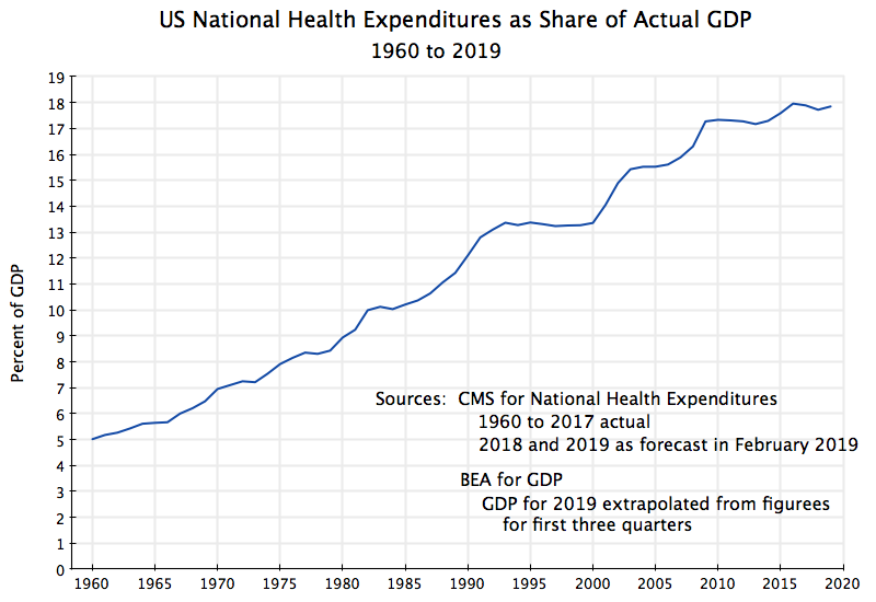
A commonly used measure, which allows comparisons both over time and between countries, is the amount being spent on health care as a share of GDP.  The chart at the top of this post shows this for the US, with national health expenditures (whether from private sources or from public, and for investment as well as for current consumption of the services) going back to 1960.

The figures on national health expenditures are as published by the Centers for Medicare and Medicaid Services (CMS), which provides each year authoritative and detailed figures on such expenditures, both historical and projected.  The most recent historical figures cover the years through 2017, while the accompanying forecasts (for 2018 to 2027) were issued in February 2019.  The figures used in the chart above for 1960 to 2017 come from the historical tables, while the 2018 and 2019 figures come from the first two years of the 2018 to 2017 forecasts.  The GDP figures come from the Bureau of Economic Analysis (BEA), where the 2019 figure is based on a simple extrapolation of the current estimates for the first three quarters of the year.

It was not so long ago that the US spent far less on health care than it does now.  In 1960 it was only 5.0% of GDP.  But this then rose, fairly steadily, to 8.9% in 1980, 13.4% in 2000, and close to 18% of GDP now.  Note that by examining this as a share of GDP one is taking into account that as a country grows richer, it can spend more on health care (as well as on everything else) with a share that is unchanged.  But in the US the share itself has increased dramatically.

Note also that as a share of GDP one is taking a ratio of a nominal magnitude (what is being spent on health care, in current dollars) to a nominal magnitude (overall GDP, also in current dollars).  There is therefore no issue of whether the price indices for health care services are being measured correctly (and in particular whether they are reflecting quality changes correctly), as price indices do not enter.  Rather, one is simply adding up all that is being spent on health care services, and comparing this to a broad concept of national income and output.

But while this chart is an accurate portrayal of how much is being spent on health care as a share of actual GDP in any period, fluctuations in the curve could be due either to changes in health care spending from one year to the next, or due to changes in GDP from one year to the next.  One can see that there were particularly sharp upward movements in the share in those years when the economy went into recession (such as in the early years of the Reagan presidency, again when Bush Sr. was president, again in the early years of the Bush Jr. presidency, and then especially sharply in his last year in office).  The curve flattened out in the years of strong economic growth (such as during most of the Clinton presidency).

One can control for these business cycle fluctuations in GDP by calculating the health care expenditures as a share of potential GDP rather than as a share of actual GDP:

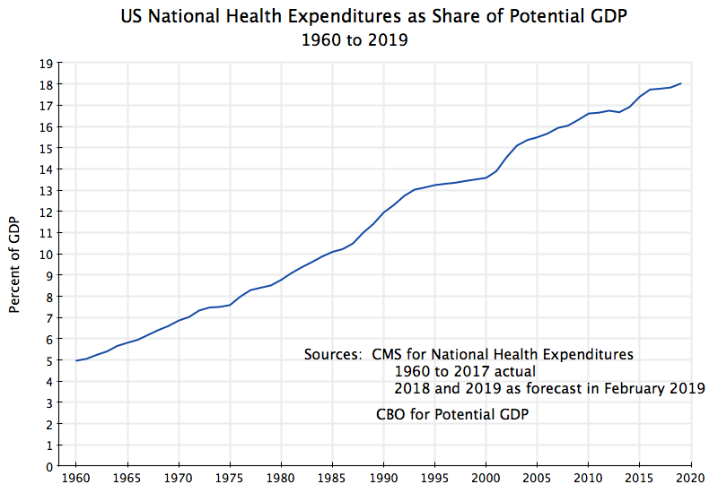
Potential GDP is an estimate of what GDP would have been in any given year, had employment been at full employment levels.  The estimates of potential GDP used here come from the Congressional Budget Office, which comes up with careful estimates of potential GDP as part of its budget work.

Potential GDP grows at a steady pace, unlike the business cycle fluctuations of actual GDP.  And with this, one does not see the degree of fluctuations in the curve for health care spending as one has with actual GDP.  What this implies is that health care spending grows at a relatively steady rate, whether the economy is growing well or has gone into a downturn.  The rise in the share during economic downturns, when measured in terms of actual GDP, thus is primarily due to the reduction in those years of the denominator (GDP), rather than a sudden rise in the numerator (health care spending).

This should not be surprising, except to those who think consumers treat health care spending as a discretionary expense which they can control.  That is, conservative analysts (and Republican congressmen) have advocated for health funding systems where the patients face a high share of their health care costs (and a 100% share in high deductible health insurance plans, except in catastrophes).  The presumption is that patients have a good deal of choice in whether to seek health treatments or not.  If this were the case, one would find health care spending falling along with GDP when the economy goes into a downturn, due to higher unemployment in such times (with the unemployed losing their previous health insurance cover) and money in general being tight.  But one does not see this.  Rather, health care is a necessity, which one needs regardless of the state of the economy.

There are still some modest fluctuations in the curve, coinciding with periods where administrations have focused on health care costs.  Thus one sees a flattening of the curve (relative to the overall trend) during the Clinton years (1993 to 2000), and again after the Obamacare reforms were passed in 2010.  But overall, the curve has steadily risen, from 5% of GDP in 1960 to 18% now.  This increase, by a factor of 3.6, is extraordinary.

C.  US Health Care Spending and Outcomes Compared to Other Countries

Not only has US health care spending increased by an extraordinary amount over the last several decades, but it is also far higher than what other countries spend:


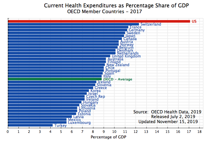
This chart, as well as those immediately below with other cross-country comparisons, are updated versions of several from an earlier post on this blog.  That earlier post also has additional comparisons and detail which readers may find of interest, but have not been replicated here due to space.  But they still apply.

The earlier charts were for 2011, while these are now for 2017.  Both sets are based on health care data assembled by the OECD for its member countries.  Standard definitions are set by the OECD to allow cross-country comparisons.

As the chart above shows, the US still stands out, as before, by spending far more for health care (as a share of GDP) than any other country.  Note that the figures here only include expenditures on current health care services.  The OECD had earlier included also health care expenditures for investments (such as for hospital buildings, for research, and so on), but now places investment expenditures in a separate, and only partial, table.  While the investment figures are readily available for the US, it appears they are difficult to obtain for a number of others.  Hence the OECD now treats it separately, in a table with a large number of blanks.

But the US spending on current health care services, at 17.1% of GDP, is still far ahead of such spending by the second-ranking country – Switzerland here.  And the US spends close to double the OECD average.

Such exceptionally high spending does not, however, yield exceptionally good health outcomes.  Indeed, by a number of standard measures US health outcomes are among the worst in the OECD, where the only countries that are worse are those with a far lower income than what the US enjoys.

First, one can look at infant mortality rates:

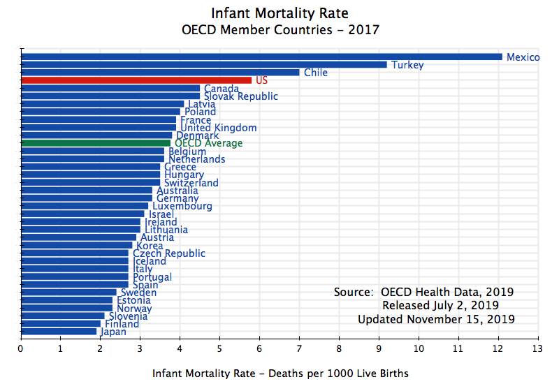
Infant mortality rate, 2017, US compared to other OECD member countries

Only Mexico, Turkey, and Chile have a higher infant mortality rate than the US does.  And there is a huge room for improvement.  The infant mortality rate in Japan is only one-third that of the US.  Yet Japan spends less than 11% of GDP on health care services, compared to the more than 17% of GDP in the US.

Life expectancy is also a standard measure of health care outcomes:

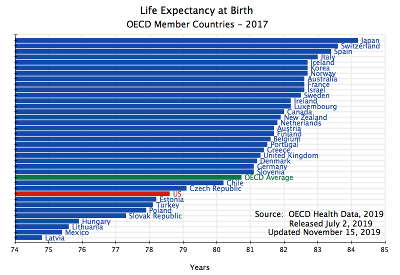
Only a number of countries from Central Europe. as well as Turkey and Mexico, have a lower life expectancy than that of the US.  And they all have far lower incomes than the US.

Finally, a measure more commonly used by health care professionals takes into account how death rates vary by age.  That is, given the age profile at which deaths occur in a country, the “potential years of life lost” measure multiplies the number of deaths that occur at any given age by the difference between that age and a reference age (where the OECD uses age 70 for this benchmark).  It then takes the sum across all ages, and computes this per 100,000 of population.  Thus a death at age 50 will receive twice the weight of a death at age 60, as a person dying of some disease at age 50 would have had 20 more years to live to age 70, while a person dying at age 60 would have had only 10 more years to live to age 70.

The US once again comes out poorly, even by this more sophisticated measure:

Only several countries of Central Europe, plus Mexico, are worse than the US.  Even Turkey is better.  All the countries of Western Europe, as well as Japan, Korea, Australia, and Canada, are far better.

D.  The Impact of the Uninsured

At least part of the reason for these poor health outcomes in the US compared to the high-income countries of Europe and Asia is that the US, despite spending more, has a high share of its population left uninsured.  All those other high-income countries have universal health insurance cover (with the partial exception of Belgium, where coverage is 98.7%):

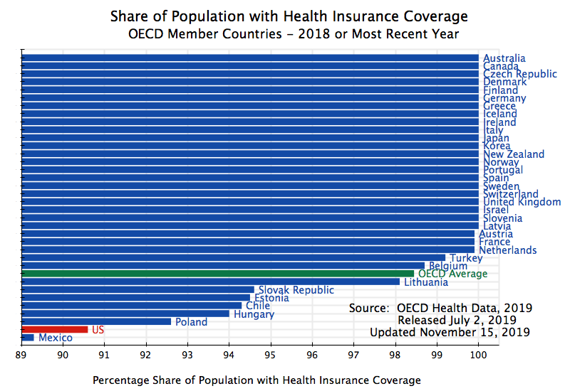
US health insurance coverage (under the standardized definition of the OECD) is only at 90.6%.  Only Mexico, among OECD members, is worse.

Taking this into account, the US spending figures are even worse than they at first appear.  Not only does the US spend on health care services a far higher share of GDP than other OECD member countries do, but that higher spending is concentrated on less than the full population due to the high share of uninsured.  The uninsured do, of course, have certain health care costs, which they pay for, to the extent they can, out of pocket, by charity, or for certain services under various government programs (such as for public health) that cover everyone.  But overall, the uninsured are more limited in what they can obtain in health care services than what an insured person can.

With the Obamacare reforms, the share of the population in the US without health insurance fell significantly, for the first time in a generation.  While the Trump administration has done all it legally can to reverse these gains, the impact so far (up to 2018, where note the figures here are annual averages) has been only partial:

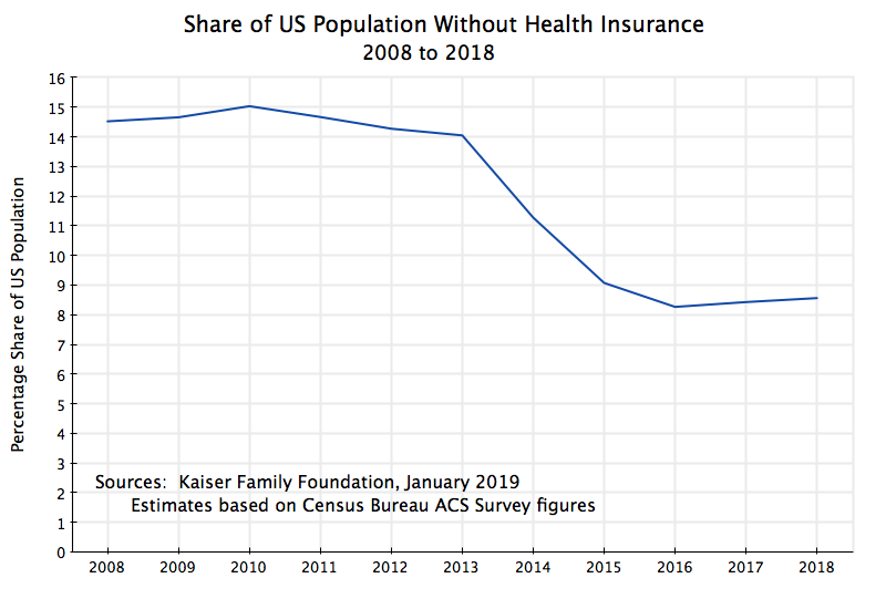
The figures come from the American Community Survey (ACS) of the US Census Bureau, by way of a Kaiser Family Foundation analysis of the ACS results (and with 2018 based on figures in the 2018 Census Bureau report on Health Insurance Coverage).

With Obamacare (more formally, the Affordable Care Act), the share of the US population without any health insurance fell from 15% in 2010 to 9% in 2015 and 8.3% in 2016.  The Affordable Care Act was passed in 2010, and while certain of the reforms went soon into effect (such as the requirement, effective in 2011, that sons and daughters up to age 26 could remain on their family health insurance plans), the primary changes entered into effect in 2014, with the opening of the Obamacare market exchanges and the Medicaid expansion.

With this significant reduction in the number uninsured, an interesting question is whether this might account for some or all of the increase in observed national health expenditures as a share of GDP in the years of that expansion in coverage.  This chart will help address this:

The lower curve in the chart, in blue, shows national health expenditures as a share of GDP, and is the same, and from the same sources, as in the chart at the top of this post.  The only difference is that the focus now is only on the period since 2008.  The curve was basically flat (indeed falling a bit) from 2009 to 2013.  It then rose from 2014 to 2016, which is the period that coincides with the substantial reduction in the share of the population that did not have health insurance.

An analogous curve for just the insured is then shown as the top curve in the chart, in red, and plots what national health expenditures were per insured person in the US, with this then taken as a share of GDP per capita.  Note that national health expenditures as a share of GDP (the blue curve) is the same as national health expenditures per person, with this then taken as a share of GDP per capita (i.e. with both numerator and denominator divided by the population).  The sources are the previously cited Kaiser Family Foundation report and ACS for the number uninsured, the Census Bureau for population, and the BEA for GDP.

If 100% of the population were insured, the two curves would coincide.  As the share who were uninsured fell following the Obamacare reforms, the two curves approached each other.  And it is interesting that the costs per insured person fell after 2010, with an especially sharp fall in 2014 and a smaller reduction in 2015.

But as was noted previously, to see the underlying trends one should remove the impact of the cyclical fluctuations of GDP, by calculating the shares in terms of potential GDP.  When one does this one finds:

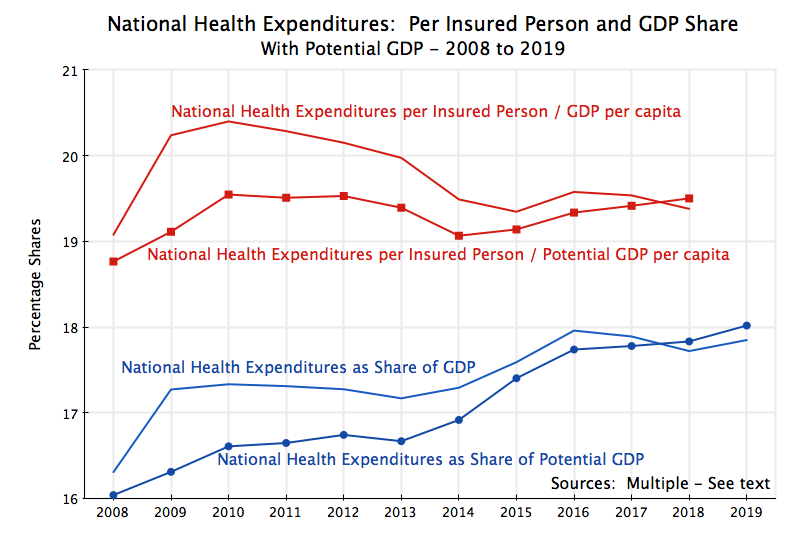
National health care costs per insured person (as a share of potential GDP per capita) fell in 2014, the year the number of uninsured fell sharply, and in 2015 was still below earlier levels.  But it has risen fairly steadily from 2015 onwards.  The increase in national health care costs (as a share of GDP) in 2014 and 2015 therefore can be attributed to the expanded coverage achieved in those years.  But after 2015, the steady and similar increases in both curves suggest a return to the earlier trends of rising health care costs.

E.  Conclusion

The US spends an extraordinary amount on health care.  No other country comes close.  Furthermore, what the US spends, as a share of its GDP, has risen dramatically over recent decades, from just 5% of GDP in 1960 to almost 18% of GDP now.  And while other developed countries have been able to attain universal health insurance coverage despite spending far less, the US has not.  The Obamacare reforms helped, but the Trump administration is trying to do all it legally can to reverse those achievements.

It is these high costs that are basically driving the need for fundamental reform in the US health care funding system.  The current path is not sustainable.  But whether reforms will be enacted to reverse those cost trends, or at least flatten them out, remains to be seen.

How Fast is GDP Growing?: A Curiosum

A.  How Fast is GDP Growing?

The Bureau of Economic Analysis released today its first estimate (what it calls it’s Advance Estimate) for the growth of GDP and its components for the third quarter of 2019.  Most of it looked basically as one would expect, with an estimate of real GDP growth of 1.9% in the quarter, or about the same as the 2.0% growth rate of the second quarter.  There has been a continued slowdown in private investment (which I will discuss below), but this has been offset by an expansion in government spending under Trump, coupled with steady growth in personal consumption expenditures (as one would expect with an economy now at full employment).

But there was a surprise on the last page of the report, in Appendix Table A.  This table provides growth rates of some miscellaneous aggregates that contribute to GDP growth, as well as their contribution to overall GDP growth.  One line shown is for “motor vehicle output”.  What is surprising is that the growth rate shown, at an annualized rate, is an astounding 32.6%!  The table also indicates that real GDP excluding motor vehicle output would have grown at just 1.2% in the quarter.  (I get 1.14% using the underlying, non-rounded, numbers, but these are close.)  The difference is shown in the chart above.

Some points should be noted.  While all these figures provided by the BEA are shown at annualized growth rates, one needs to keep in mind that the underlying figures are for growth in just one quarter.  Hence the quarterly growth will be roughly one-quarter of the annual rate, plus the effects of compounding.  For the motor vehicle output numbers, the estimated growth in the quarter was 7.3%, which if compounded over four quarters would yield the 32.6% annualized rate.  One should also note that the quarterly output figures of this sector are quite volatile historically, and while there has not been a change as large as the 32.6% since 2009/10 (at the time of the economic downturn and recovery) there have been a few quarters when it was in the 20s.

But what appears especially odd, but also possibly interesting to those trying to understand how the GDP accounts are estimated, is why there should have been such a tremendously high growth in the sector, of 32.6%, when the workers at General Motors were on strike for half of September (starting on September 15).  GM is the largest car manufacturer in the US, its production plummeted during the strike, yet the GDP figures indicate that motor vehicle output not only soared in the quarter, but by itself raised overall GDP growth to 1.9% from a 1.2% rate had the sector been flat.

This is now speculation on my part, but I suspect the reason stems from the warning the BEA regularly provides that the initial GDP estimates that are issued just one month after the end of the quarter being covered, really are preliminary and partial.  The BEA receives data on the economy from numerous sources, and a substantial share of that data is incomplete just one month following the end of a quarter.  For motor vehicle production, I would not be surprised if the BEA might only be receiving data for two months (July and August in this case), in time for this initial estimate.  They would then estimate the third month based on past patterns and seasonality.

But because of the strike, past patterns will be misleading.  Production at GM may have been ramped up in July and August in anticipation of the strike, and a mechanical extrapolation of this into September, while normally fine, might have been especially misleading this time.

I stress that this is speculation on my part.  Revised estimates of GDP growth in the third quarter, based on more complete data, will be issued in late November and then again, with even more data, in late December.  We will see what these estimates say.  I would not be surprised if the growth figure for GDP is revised substantially downwards.

B.  Growth in Nonresidential Private Fixed Investment

The figures released by the BEA today also include its estimates for private fixed investment.  The nonresidential portion of this is basically business investment, and it is interesting to track what it has been doing over the last few years.  The argument made for the Trump/Republican tax cuts pushed through Congress in December 2017 were that they would spur business investment.  Corporate profit taxes were basically cut in half.

But the figures show no spur in business investment following their taxes being slashed.  Nonresidential private fixed investment was growing at a relatively high rate already in the fourth quarter of 2017 (similar to rates seen between mid-2013 and mid-2014, and there even was growth of 11.2% in the second quarter of 2014).  This continued through the first half of 2018.  But growth since has fallen steadily, and is now even negative, with a decline of 3.0% in the third quarter of 2019:

There is no indication here that slashing corporate profit taxes (and other business taxes) led to greater business investment.

Andrew Yang’s Proposed $1,000 per Month Grant: Issues Raised in the Democratic Debate

A.  Introduction

This is the second in a series of posts on this blog addressing issues that have come up during the campaign of the candidates for the Democratic nomination for president, and which specifically came up in the October 15 Democratic debate.  As flagged in the previous blog post, one can find a transcript of the debate at the Washington Post website, and a video of the debate at the CNN website.

This post will address Andrew Yang’s proposal of a $1,000 per month grant for every adult American (which I will mostly refer to here as a $12,000 grant per year).  This policy is called a universal basic income (or UBI), and has been explored in a few other countries as well.  It has received increased attention in recent years, in part due to the sharp growth in income inequality in the US of recent decades, that began around 1980.  If properly designed, such a $12,000 grant per adult per year could mark a substantial redistribution of income.  But the degree of redistribution depends directly on how the funding would be raised.  As we will discuss below, Yang’s specific proposals for that are problematic.  There are also other issues with such a program which, even if well designed, calls into question whether it would be the best approach to addressing inequality.  All this will be discussed below.

First, however, it is useful to address two misconceptions that appear to be widespread.  One is that many appear to believe that the $12,000 per adult per year would not need to come from somewhere.  That is, everyone would receive it, but no one would have to provide the funds to pay for it.  That is not possible.  The economy produces so much, whatever is produced accrues as incomes to someone, and if one is to transfer some amount ($12,000 here) to each adult then the amounts so transferred will need to come from somewhere.  That is, this is a redistribution.  There is nothing wrong with a redistribution, if well designed, but it is not a magical creation of something out of nothing.

The other misconception, and asserted by Yang as the primary rationale for such a $12,000 per year grant, is that a “Fourth Industrial Revolution” is now underway which will lead to widespread structural unemployment due to automation.  This issue was addressed in the previous post on this blog, where I noted that the forecast job losses due to automation in the coming years are not out of line with what has been the norm in the US for at least the last 150 years.  There has always been job disruption and turnover, and while assistance should certainly be provided to workers whose jobs will be affected, what is expected in the years going forward is similar to what we have had in the past.

It is also a good thing that workers should not be expected to rely on a $12,000 per year grant to make up for a lost job.  Median earnings of a full-time worker was an estimated $50,653 in 2018, according to the Census Bureau.  A grant of $12,000 would not go far in making up for this.

So the issue is one of redistribution, and to be fair to Yang, I should note that he posts on his campaign website a fair amount of detail on how the program would be paid for.  I make use of that information below.  But the numbers do not really add up, and for a candidate who champions math (something I admire), this is disappointing.

B.  Yang’s Proposal of a $1,000 Monthly Grant to All Americans

First of all, the overall cost.  This is easy to calculate, although not much discussed.  The $12,000 per year grant would go to every adult American, who Yang defines as all those over the age of 18.  There were very close to 250 million Americans over the age of 18 in 2018, so at $12,000 per adult the cost would be $3.0 trillion.

This is far from a small amount.  With GDP of approximately $20 trillion in 2018 ($20.58 trillion to be more precise), such a program would come to 15% of GDP.  That is huge.  Total taxes and revenues received by the federal government (including all income taxes, all taxes for Social Security and Medicare, and everything else) only came to $3.3 trillion in FY2018.  This is only 10% more than the $3.0 trillion that would have been required for Yang’s $12,000 per adult grants.  Or put another way, taxes and other government revenues would need almost to be doubled (raised by 91%) to cover the cost of the program.  As another comparison, the cost of the tax cuts that Trump and the Republican leadership rushed through Congress in December 2017 was forecast to be an estimated $150 billion per year.  That was a big revenue loss.  But the Yang proposal would cost 20 times as much.

With such amounts to be raised, Yang proposes on his campaign website a number of taxes and other measures to fund the program.  One is a value-added tax (VAT), and from his very brief statements during the debates but also in interviews with the media, one gets the impression that all of the program would be funded by a value-added tax.  But that is not the case.  He in fact says on his campaign website that the VAT, at the rate and coverage he would set, would raise only about $800 billion.  This would come only to a bit over a quarter (27%) of the $3.0 trillion needed.  There is a need for much more besides, and to his credit, he presents plans for most (although not all) of this.

So what does he propose specifically?:

a) A New Value-Added Tax:

First, and as much noted, he is proposing that the US institute a VAT at a rate of 10%.  He estimates it would raise approximately $800 billion a year, and for the parameters for the tax that he sets, that is a reasonable estimate.  A VAT is common in most of the rest of the world as it is a tax that is relatively easy to collect, with internal checks that make underreporting difficult.  It is in essence a tax on consumption, similar to a sales tax but levied only on the added value at each stage in the production chain.  Yang notes that a 10% rate would be approximately half of the rates found in Europe (which is more or less correct – the rates in Europe in fact vary by country and are between 17 and 27% in the EU countries, but the rates for most of the larger economies are in the 19 to 22% range).

A VAT is a tax on what households consume, and for that reason a regressive tax.  The poor and middle classes who have to spend all or most of their current incomes to meet their family needs will pay a higher share of their incomes under such a tax than higher-income households will.  For this reason, VAT systems as implemented will often exempt (or tax at a reduced rate) certain basic goods such as foodstuffs and other necessities, as such goods account for a particularly high share of the expenditures of the poor and middle classes.  Yang is proposing this as well.  But even with such exemptions (or lower VAT rates), a VAT tax is still normally regressive, just less so.

Furthermore, households will in the end be paying the tax, as prices will rise to reflect the new tax.  Yang asserts that some of the cost of the VAT will be shifted to businesses, who would not be able, he says, to pass along the full cost of the tax.  But this is not correct.  In the case where the VAT applies equally to all goods, the full 10% will be passed along as all goods are affected equally by the now higher cost, and relative prices will not change.  To the extent that certain goods (such as foodstuffs and other necessities) are exempted, there could be some shift in demand to such goods, but the degree will depend on the extent to which they are substitutable for the goods which are taxed.  If they really are necessities, such substitution is likely to be limited.

A VAT as Yang proposes thus would raise a substantial amount of revenues, and the $800 billion figure is a reasonable estimate.  This total would be on the order of half of all that is now raised by individual income taxes in the US (which was $1,684 billion in FY2018).  But one cannot avoid that such a tax is paid by households, who will face higher prices on what they purchase, and the tax will almost certainly be regressive, impacting the poor and middle classes the most (with the extent dependent on how many and which goods are designated as subject to a reduced VAT rate, or no VAT at all).  But whether regressive or not, everyone will be affected and hence no one will actually see a net increase of $12,000 in purchasing power from the proposed grant  Rather, it will be something less.

b)  A Requirement to Choose Either the $12,000 Grants, or Participation in Existing Government Social Programs

Second, Yang’s proposal would require that households who currently benefit from government social programs, such as for welfare or food stamps, would be required to give up those benefits if they choose to receive the $12,000 per adult per year.  He says this will lead to reduced government spending on such social programs of $500 to $600 billion a year.

There are two big problems with this.  The first is that those programs are not that large.  While it is not fully clear how expansive Yang’s list is of the programs which would then be denied to recipients of the $12,000 grants, even if one included all those included in what the Congressional Budget Office defines as “Income Security” (“unemployment compensation, Supplemental Security Income, the refundable portion of the earned income and child tax credits, the Supplemental Nutrition Assistance Program [food stamps], family support, child nutrition, and foster care”), the total spent in FY2018 was only $285 billion.  You cannot save $500 to $600 billion if you are only spending $285 billion.

Second, such a policy would be regressive in the extreme.  Poor and near-poor households, and only such households, would be forced to choose whether to continue to receive benefits under such existing programs, or receive the $12,000 per adult grant per year.  If they are now receiving $12,000 or more in such programs per adult household member, they would receive no benefit at all from what is being called a “universal” basic income grant.  To the extent they are now receiving less than $12,000 from such programs (per adult), they may gain some benefit, but less than $12,000 worth.  For example, if they are now receiving $10,000 in benefits (per adult) from current programs, their net gain would be just $2,000 (setting aside for the moment the higher prices they would also now need to pay due to the 10% VAT).  Furthermore, only the poor and near-poor who are being supported by such government programs will see such an effective reduction in their $12,000 grants.  The rich and others, who benefit from other government programs, will not see such a cut in the programs or tax subsidies that benefit them.

c)  Savings in Other Government Programs 

Third, Yang argues that with his universal basic income grant, there would be a reduction in government spending of $100 to $200 billion a year from lower expenditures on “health care, incarceration, homelessness services and the like”, as “people would be able to take better care of themselves”.  This is clearly more speculative.  There might be some such benefits, and hopefully would be, but without experience to draw on it is impossible to say how important this would be and whether any such savings would add up to such a figure.  Furthermore, much of those savings, were they to follow, would accrue not to the federal government but rather to state and local governments.  It is at the state and local level where most expenditures on incarceration and homelessness, and to a lesser degree on health care, take place.  They would not accrue to the federal budget.

d)  Increased Tax Revenues From a Larger Economy

Fourth, Yang states that with the $12,000 grants the economy would grow larger – by 12.5% he says (or $2.5 trillion in increased GDP).  He cites a 2017 study produced by scholars at the Roosevelt Institute, a left-leaning non-profit think tank based in New York, which examined the impact on the overall economy, under several scenarios, of precisely such a $12,000 annual grant per adult.

There are, however, several problems:

i)  First, under the specific scenario that is closest to the Yang proposal (where the grants would be funded through a combination of taxes and other actions), the impact on the overall economy forecast in the Roosevelt Institute study would be either zero (when net distribution effects are neutral), or small (up to 2.6%, if funded through a highly progressive set of taxes).

ii)  The reason for this result is that the model used by the Roosevelt Institute researchers assumes that the economy is far from full employment, and that economic output is then entirely driven by aggregate demand.  Thus with a new program such as the $12,000 grants, which is fully paid for by taxes or other measures, there is no impact on aggregate demand (and hence no impact on economic output) when net distributional effects are assumed to be neutral.  If funded in a way that is not distributionally neutral, such as through the use of highly progressive taxes, then there can be some effect, but it would be small.

In the Roosevelt Institute model, there is only a substantial expansion of the economy (of about 12.5%) in a scenario where the new $12,000 grants are not funded at all, but rather purely and entirely added to the fiscal deficit and then borrowed.  And with the current fiscal deficit now about 5% of GDP under Trump (unprecedented even at 5% in a time of full employment, other than during World War II), and the $12,000 grants coming to $3.0 trillion or 15% of GDP, this would bring the overall deficit to 20% of GDP!

Few economists would accept that such a scenario is anywhere close to plausible.  First of all, the current unemployment rate of 3.5% is at a 50 year low.  The economy is at full employment.  The Roosevelt Institute researchers are asserting that this is fictitious, and that the economy could expand by a substantial amount (12.5% in their scenario) if the government simply spent more and did not raise taxes to cover any share of the cost.  They also assume that a fiscal deficit of 20% of GDP would not have any consequences, such as on interest rates.  Note also an implication of their approach is that the government spending could be on anything, including, for example, the military.  They are using a purely demand-led model.

iii)  Finally, even if one assumes the economy will grow to be 12.5% larger as a result of the grants, even the Roosevelt Institute researchers do not assume it will be instantaneous.  Rather, in their model the economy becomes 12.5% larger only after eight years.  Yang is implicitly assuming it will be immediate.

There are therefore several problems in the interpretation and use of the Roosevelt Institute study.  Their scenario for 12.5% growth is not the one that follows from Yang’s proposals (which is funded, at least to a degree), nor would GDP jump immediately by such an amount.  And the Roosevelt Insitute model of the economy is one that few economists would accept as applicable in the current state of the economy, with its 3.5% unemployment.

But there is also a further problem.  Even assuming GDP rises instantly by 12.5%, leading to an increase in GDP of $2.5 trillion (from a current $20 trillion), Yang then asserts that this higher GDP will generate between $800 and $900 billion in increased federal tax revenue.  That would imply federal taxes of 32 to 36% on the extra output.  But that is implausible.  Total federal tax (and all other) revenues are only 17.5% of GDP.  While in a progressive tax system the marginal tax revenues received on an increase in income will be higher than at the average tax rate, the US system is no longer very progressive.  And the rates are far from what they would need to be twice as high at the margin (32 to 36%) as they are at the average (17.5%).  A more plausible estimate of the increased federal tax revenues from an economy that somehow became 12.5% larger would not be the $800 to $900 billion Yang calculates, but rather about half that.

Might such a universal basic income grant affect the size of the economy through other, more orthodox, channels?  That is certainly possible, although whether it would lead to a higher or to a lower GDP is not clear.  Yang argues that it would lead recipients to manage their health better, to stay in school longer, to less criminality, and to other such social benefits.  Evidence on this is highly limited, but it is in principle conceivable in a program that does properly redistribute income towards those with lower incomes (where, as discussed above, Yang’s specific program has problems).  Over fairly long periods of time (generations really) this could lead to a larger and stronger economy.

But one will also likely see effects working in the other direction.  There might be an increase in spouses (wives usually) who choose to stay home longer to raise their children, or an increase in those who decide to retire earlier than they would have before, or an increase in the average time between jobs by those who lose or quit from one job before they take another, and other such impacts.  Such impacts are not negative in themselves, if they reflect choices voluntarily made and now possible due to a $12,000 annual grant.  But they all would have the effect of reducing GDP, and hence the tax revenues that follow from some level of GDP.

There might therefore be both positive and negative impacts on GDP.  However, the impact of each is likely to be small, will mostly only develop over time, and will to some extent cancel each other out.  What is likely is that there will be little measurable change in GDP in whichever direction.

e)  Other Taxes

Fifth, Yang would institute other taxes to raise further amounts.  He does not specify precisely how much would be raised or what these would be, but provides a possible list and says they would focus on top earners and on pollution.  The list includes a financial transactions tax, ending the favorable tax treatment now given to capital gains and carried interest, removing the ceiling on wages subject to the Social Security tax, and a tax on carbon emissions (with a portion of such a tax allocated to the $12,000 grants).

What would be raised by such new or increased taxes would depend on precisely what the rates would be and what they would cover.  But the total that would be required, under the assumption that the amounts that would be raised (or saved, when existing government programs are cut) from all the measures listed above are as Yang assumes, would then be between $500 and $800 billion (as the revenues or savings from the programs listed above sum to $2.2 to $2.5 trillion).  That is, one might need from these “other taxes” as much as would be raised by the proposed new VAT.

But as noted in the discussion above, the amounts that would be raised by those measures are often likely to be well short of what Yang says will be the case.  One cannot save $500 to $600 billion in government programs for the poor and near-poor if government is spending only $285 billion on such programs, for example.  A more plausible figure for what might be raised by those proposals would be on the order of $1 trillion, mostly from the VAT, and not the $2.2 to $2.5 trillion Yang says will be the case.

C.  An Assessment

Yang provides a fair amount of detail on how he would implement a universal basic income grant of $12,000 per adult per year, and for a political campaign it is an admirable amount of detail.  But there are still, as discussed above, numerous gaps that prevent anything like a complete assessment of the program.  But a number of points are evident.

To start, the figures provided are not always plausible.  The math just does not add up, and for someone who extolls the need for good math (and rightly so), this is disappointing.  One cannot save $500 to $600 billion in programs for the poor and near-poor when only $285 billion is being spent now.  One cannot assume that the economy will jump immediately by 12.5% (which even the Roosevelt Institute model forecasts would only happen in eight years, and under a scenario that is the opposite of that of the Yang program, and in a model that few economists would take as credible in any case).  Even if the economy did jump by so much immediately, one would not see an increase of $800 to $900 billion in federal tax revenues from this but rather more like half that.  And other such issues.

But while the proposal is still not fully spelled out (in particular on which other taxes would be imposed to fill out the program), we can draw a few conclusions.  One is that the one group in society who will clearly not gain from the $12,000 grants is the poor and near-poor, who currently make use of food stamp and other such programs and decide to stay with those programs.  They would then not be eligible for the $12,000 grants.  And keep in mind that $12,000 per adult grants are not much, if you have nothing else.  One would still be below the federal poverty line if single (where the poverty line in 2019 is $12,490) or in a household with two adults and two or more children (where the poverty line, with two children, is $25,750).  On top of this, such households (like all households) will pay higher prices for at least some of what they purchase due to the new VAT.  So such households will clearly lose.

Furthermore, those poor or near-poor households who do decide to switch, thus giving up their eligibility for food stamps and other such programs, will see a net gain that is substantially less than $12,000 per adult.  The extent will depend on how much they receive now from those social programs.  Those who receive the most (up to $12,000 per adult), who are presumably also most likely to be the poorest among them, will lose the most.  This is not a structure that makes sense for a program that is purportedly designed to be of most benefit to the poorest.

For middle and higher-income households the net gain (or loss) from the program will depend on the full set of taxes that would be needed to fund the program.  One cannot say who will gain and who will lose until the structure of that full set of taxes is made clear.  This is of course not surprising, as one needs to keep in mind that this is a program of redistribution:  Funds will be raised (by taxes) that disproportionately affect certain groups, to be distributed then in the $12,000 grants.  Some will gain and some will lose, but overall the balance has to be zero.

One can also conclude that such a program, providing for a universal basic income with grants of $12,000 per adult, will necessarily be hugely expensive.  It would cost $3 trillion a year, which is 15% of GDP.  Funding it would require raising all federal tax and other revenue by 91% (excluding any offset by cuts in government social programs, which are however unlikely to amount to anything close to what Yang assumes).  Raising funds of such magnitude is completely unrealistic.  And yet despite such costs, the grants provided of $12,000 per adult would be poverty level incomes for those who do not have a job or other source of support.

One could address this by scaling back the grant, from $12,000 to something substantially less, but then it becomes less meaningful to an individual.  The fundamental problem is the design as a universal grant, to all adults.  While this might be thought to be politically attractive, any such program then ends up being hugely expensive.

The alternative is to design a program that is specifically targeted to those who need such support.  Rather than attempting to hide the distributional consequences in a program that claims to be universal (but where certain groups will gain and certain groups will lose, once one takes fully into account how it will be funded), make explicit the redistribution that is being sought.  With this clear, one can then design a focussed program that addresses that redistribution aim.

Finally, one should recognize that there are other policies as well that might achieve those aims that may not require explicit government-intermediated redistribution.  For example, Senator Cory Booker in the October 15 debate noted that a $15 per hour minimum wage would provide more to those now at the minimum wage than a $12,000 annual grant.  This remark was not much noted, but what Senator Booker said was true.  The federal minimum wage is currently $7.25 per hour.  This is low – indeed, it is less (in real terms) than what it was when Harry Truman was president.  If the minimum wage were raised to $15 per hour, a worker now at the $7.25 rate would see an increase in income of $15.00 – $7.25 = $7.75 per hour, and over a year of 40 hour weeks would see an increase in income of $7.75 x 40 x 52 = $16,120.00.  This is well more than a $12,000 annual grant would provide.

Republican politicians have argued that raising the minimum wage by such a magnitude will lead to widespread unemployment.  But there is no evidence that changes in the minimum wage that we have periodically had in the past (whether federal or state level minimum wages) have had such an adverse effect.  There is of course certainly some limit to how much it can be raised, but one should recognize that the minimum wage would now be over $24 per hour if it had been allowed to grow at the same pace as labor productivity since the late 1960s.

Income inequality is a real problem in the US, and needs to be addressed.  But there are problems with Yang’s specific version of a universal basic income.  While one may be able to fix at least some of those problems and come up with something more reasonable, it would still be massively disruptive given the amounts to be raised.  And politically impossible.  A focus on more targeted programs, as well as on issues such as the minimum wage, are likely to prove far more productive.