A. Introduction
There is little that is as destructive to a democracy as gerrymandering. As has been noted by many, with gerrymandering the politicians are choosing their voters rather than the voters choosing their political representatives.
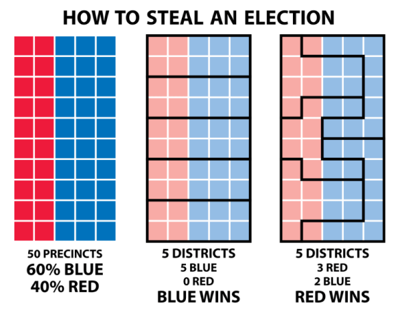
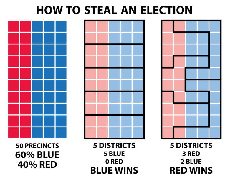
The diagrams above, in schematic form, show how gerrymandering works. Suppose one has a state or region with 50 precincts, with 60% that are fully “blue” and 40% that are fully “red”, and where 5 districts need to be drawn. If the blue party controls the process, they can draw the district lines as in the middle diagram, and win all 5 (100%) of the districts, with just 60% of the voters. If, in contrast, the red party controls the process for some reason, they could draw the district boundaries as in the diagram on the right. They would then win 3 of the 5 districts (60%) even though they only account for 40% of the voters. It works by what is called in the business “packing and cracking”: With the red party controlling the process, they “pack” as many blue voters as possible into a small number of districts (two in the example here, each with 90% blue voters), and then “crack” the rest by scattering them around in the remaining districts, each as a minority (three districts here, each with 40% blue voters and 60% red).
Gerrymandering leads to cynicism among voters, with the well-founded view that their votes just do not matter. Possibly even worse, gerrymandering leads to increased polarization, as candidates in districts with lines drawn to be safe for one party or the other do not need to worry about seeking to appeal to voters of the opposite party. Rather, their main concern is that a more extreme candidate from their own party will not challenge them in a primary, where only those of their own party (and normally mostly just the more extreme voters in their party) will vote. And this is exactly what we have seen, especially since 2010 when gerrymandering became more sophisticated, widespread, and egregious than ever before.
Gerrymandering has grown in recent decades both because computing power and data sources have grown increasingly sophisticated, and because a higher share of states have had a single political party able to control the process in full (i.e. with both legislative chambers, and the governor when a part of the process, all under a single party’s control). And especially following the 2010 elections, this has favored the Republicans. As a result, while there has been one Democratic-controlled state (Maryland) on common lists of the states with the most egregious gerrymandering, most of the states with extreme gerrymandering were Republican-controlled. Thus, for example, Professor Samuel Wang of Princeton, founder of the Princeton Gerrymandering Project, has identified a list of the eight most egregiously gerrymandered states (by a set of criteria he has helped develop), where one (Maryland) was Democratic-controlled, while the remaining seven were Republican. Or the Washington Post calculated across all states an average of the degree of compactness of congressional districts: Of the 15 states with the least compact districts, only two (Maryland and Illinois) were liberal Democratic-controlled states. And in terms of the “efficiency gap” measure (which I will discuss below), seven states were gerrymandered following the 2010 elections in such a way as to yield two or more congressional seats each in their favor. All seven were Republican-controlled.
With gerrymandering increasingly common and extreme, a number of cases have gone to the Supreme Court to try to stop it. However, the Supreme Court has failed as yet to issue a definitive ruling ending the practice. Rather, it has so far skirted the issue by resolving cases on more narrow grounds, or by sending cases back to lower courts for further consideration. This may soon change, as the Supreme Court has agreed to take up two cases (affecting lines drawn for congressional districts in North Carolina and in Maryland), with oral arguments scheduled for March 26, 2019. But it remains to be seen if these cases will lead to a definitive ruling on the practice of partisan gerrymandering or not.
This is not because of a lack of concern by the court. Even conservative Justice Samuel Alito has conceded that “gerrymandering is distasteful”. But he, along with the other conservative justices on the court, have ruled against the court taking a position on the gerrymandering cases brought before it, in part, at least, out of the concern that they do not have a clear standard by which to judge whether any particular case of gerrymandering was constitutionally excessive. This goes back to a 2004 case (Vieth v. Jubelirer) in which the four most conservative justices of the time, led by Justice Antonin Scalia, opined that there could not be such a standard, while the four liberal justices argued that there could. Justice Anthony Kennedy, in the middle, issued a concurring opinion with the conservative justices there was not then an acceptable such standard before them, but that he would not preclude the possibility of such a standard being developed at some point in the future.
Following this 2004 decision, political scientists and other scholars have sought to come up with such a standard. Many have been suggested, such as a set of three tests proposed by Professor Wang of Princeton, or measures that focus on the share of seats won to the share of the votes cast, and more. Probably most attention in recent years has been given to the “efficiency gap” measure proposed by Professor Nicholas Stephanopoulos and Eric McGhee. The efficiency gap is the gap between the two main parties in the “wasted votes” each party received in some past election in the state (as a share of total votes in the state), where a wasted vote is the sum of all the votes for a losing candidate of that party, plus the votes in excess of 50% when that party’s candidate won. This provides a direct measure of the two basic tactics of gerrymandering, as described above, of “packing” as many voters of one party as possible in a small number of districts (where they might receive 80 or 90% of the votes, but with all those above 50% “wasted”), and “cracking” (by splitting up the remaining voters of that party into a large number of districts where they will each be in a minority and hence will lose, with those votes then also “wasted”).
But there are problems with each of these measures, including the widely touted efficiency gap measure. It has often been the case in recent years, in our divided society, that like-minded voters live close to each other, and particular districts in the state then will, as a result, often see the winner of the district receive a very high share of the votes. Thus, even with no overt gerrymandering, the efficiency gap as measured will appear large. Furthermore, at the opposite end of this spectrum, the measure will be extremely sensitive if a few districts are close to 50/50. A shift of just a few percentage points in the vote will then lead one party or the other to lose and hence will then see a big jump in their share of wasted votes (the 49% received by one party or the other).
There is, however, a far more fundamental problem. And that is that this is simply the wrong question to ask. With all due respect to Justice Kennedy, and recognizing also that I am an economist and not a lawyer, I do not understand why the focus here is on the voting outcome, rather than on the process by which the district lines were drawn. The voting outcome is not the standard by which other aspects of voter rights are judged. Rather, the focus is on whether the process followed was fair and unbiased, with the outcome then whatever it is.
I would argue that the same should apply when district lines are drawn. Was the process followed fair and unbiased? The way to ensure that would be to remove the politicians from the process (both directly and indirectly), and to follow instead an automatic procedure by which district lines are drawn in accord with a small number of basic principles.
The next section below will first discuss the basic point that the focus when judging fairness and lack of bias should not be on whether we can come up with some measure based on the vote outcomes, but rather on whether the process that was followed to draw the district lines was fair and unbiased or not. The section following will then discuss a particular process that illustrates how this could be done. It would be automatic, and would produce a fair and unbiased drawing of voting district lines that meets the basic principles on which such a map should be based (districts of similar population, compactness, contiguity, and, to the extent consistent with these, respect for the boundaries of existing political jurisdictions such as counties or municipalities). And while I believe this particular process would be a good one, I would not exclude that others are possible. The important point is that the courts should require the states to follow some such process, and from the example presented we see that this is indeed feasible. It is not an impossible task.
The penultimate section of the post will then discuss a few points that arise with any such system, and their implications, and end with a brief section summarizing the key points.
B. A Fair Voting System Should Be Judged Based on the Process, Not on the Outcomes
Voting rights are fundamental in any democracy. But in judging whether some aspect of the voting system is proper, we do not try to determine whether or not (by some defined specific measure) the resulting outcomes were improperly skewed or not.
Thus, for example, we take as a basic right that our ballot may be cast in secret. No government official, nor anyone else for that matter, can insist on seeing how we voted. Suppose that some state passed a law saying a government-appointed official will look over the shoulder of each of us as we vote, to determine whether we did it “right” or not. We would expect the courts to strike this down, as an inappropriate process that contravenes our basic voting rights. We would not expect the courts to say that they should look at the subsequent voting outcomes, and try to come up with some specific measure which would show, with certainty, whether the resulting outcomes were excessively influenced or not. That would of course be absurd.
As another absurd example, suppose some state passed a law granting those registered in one of the major political parties, but not those registered in the other, access to more early days of voting than the other. This would be explicitly partisan, and one would assume that the courts would not insist on limiting their assessment to an examination of the later voting outcomes to see whether, by some proposed measure, the resulting outcomes were excessively affected. The voting system, to be fair, should not lead to a partisan advantage for one party or the other. But gerrymandering does precisely that.
Yet the courts have so far asked declined to issue a definitive ruling on partisan gerrymandering, and have asked instead whether there might be some measure to determine, in the voting outcomes, whether gerrymandering had led to an excessive partisan advantage for the party drawing the district lines. And there have been open admissions by senior political figures that district borders were in fact drawn up to provide a partisan advantage. Indeed, principals involved in the two cases now before the Supreme Court have openly said that partisan advantage was the objective. In North Carolina, David Lewis, the Republican chair of the committee in the state legislature responsible for drawing up the district lines, said during the debate that “I think electing Republicans is better than electing Democrats. So I drew this map to help foster what I think is better for the country.”
And in the case of Maryland, the Democratic governor of the state in 2010 at the time the congressional district lines were drawn, Martin O’Malley, spoke out in 2018 in writing and in interviews openly acknowledging that he and the Democrats had drawn the district lines for partisan advantage. But he also now said that this was wrong and that he hoped the Supreme Court would rule against what they had done.
But how to remove partisanship when district lines are drawn? As long as politicians are directly involved, with their political futures (and those of their colleagues) dependent on the district lines, it is human nature that biases will enter. And it does not matter whether the biases are conscious and openly expressed, or unconscious and denied. Furthermore, although possibly diminished, such biases will still enter even with independent commissions drawing the district lines. There will be some political process by which the commissioners are appointed, and those who are appointed, even if independent, will still be human and will have certain preferences.
The way to address this would rather be to define some automatic process which, given the data on where people live and the specific principles to follow, will be able to draw up district lines that are both fair (follow the stated principles) and unbiased (are not drawn up in order to provide partisan advantage to one party). In the next section I will present a particular process that would do this.
C. An Automatic Process to Draw District Lines that are Fair and Unbiased
The boundaries for fair and unbiased districts should be drawn in accord with the following set of principles (and no more):
a) One Person – One Vote: Each district should have a similar population;
b) Contiguity: Each district must be geographically contiguous. That is, one continuous boundary line will encompass the entire district and nothing more;
c) Compactness: While remaining consistent with the above, districts should be as compact as possible under some specified measure of compactness.
And while not such a fundamental principle, a reasonable objective is also, to the extent possible consistent with the basic principles above, that the district boundaries drawn should follow the lines of existing political jurisdictions (such as of counties or municipalities).
There will still be a need for decisions to be made on the basic process to follow and then on a number of the parameters and specific rules required for any such process. Individual states will need to make such decisions, and can do so in accordance with their traditions and with what makes sense for their particular state. But once these “rules of the game” are fully specified, there should then be a requirement that they will remain locked in for some lengthy period (at least to beyond whenever the next decennial redistricting will be needed), so that games cannot be played with the rules in order to bias a redistricting that may soon be coming up. This will be discussed further below.
Such specific decisions will need to be made in order to fully define the application of the basic principles presented above. To start, for the one person – one vote principle the Supreme Court has ruled that a 10% margin in population between the largest and smallest districts is an acceptable standard. And many states have indeed chosen to follow this standard. However, a state could, if it wished, choose to use a tighter standard, such as a margin in the populations between the largest and smallest districts of no more than 8%, or perhaps 5% or whatever. A choice needs to be made.
Similarly, a specific measure of compactness will need to be specified. Mathematically there are several different measures that could be used, but a good one which is both intuitive and relatively easy to apply is that the sum of the lengths of all the perimeters of each of the districts in the state should be minimized. Note that since the outside borders of the state itself are fixed, this sum can be limited just to the perimeters that are internal to the state. In essence, since states are to be divided up into component districts (and exhaustively so), the perimeter lines that do this with the shortest total length will lead to districts that are compact. There will not be wavy lines, nor lines leading to elongated districts, as such lines will sum to a greater total length than possible alternatives.
What, then, would be a specific process (or algorithm) which could be used to draw district lines? I will recommend one here, which should work well and would be consistent with the basic principles for a fair and unbiased set of district boundaries. But other processes are possible. A state could choose some such alternative (but then should stick to it). The important point is that one should define a fully specified, automatic, and neutral process to draw such district lines, rather than try to determine whether some set of lines, drawn based on the “judgment” of politicians or of others, was “excessively” gerrymandered based on the voting outcomes observed.
Finally, the example will be based on what would be done to draw congressional district lines in a state. But one could follow a similar process for drawing other such district lines, such as for state legislative districts.
The process would follow a series of steps:
Step 1: The first step would be to define a set of sub-districts within each county in a state (parish in Louisiana) and municipality (in those states where municipalities hold similar governmental responsibilities as a county). These sub-districts would likely be the districts for county boards or legislative councils in most of the states, and one might typically have a dozen or more of these in such jurisdictions. When those districts are also being redrawn as part of the decennial redistricting process, then they should be drawn first (based on the principles set out here), before the congressional district lines are drawn.
Each state would define, as appropriate for the institutions of that specific state, the sub-districts that will be used for the purpose of drawing the congressional district lines. And if no such sub-jurisdictions exist in certain counties of certain states, one could draw up such sub-districts, purely for the purposes of this redistricting exercise, by dividing such counties into compact (based on minimization of the sum of the perimeters), equal population, districts. While the number of such sub-districts would be defined (as part of the rules set for the process) based on the population of the affected counties, a reasonable number might generally be around 12 or 15.
These sub-districts will then be used in Step 4 below to even out the congressional districts.
Step 2: An initial division of each state into a set of tentative congressional districts would then be drawn based on minimizing the sum of the lengths of the perimeter lines for all the districts, and requiring that all of the districts in the state have exactly the same population. Following the 2010 census, the average population in a congressional district across the US was 710,767, but the exact number will vary by state depending on how many congressional seats the state was allocated.
Step 3: This first set of district lines will not, in general, follow county and municipal lines. In this step 3, the initial set of district lines would then be shifted to the county or municipal line which is geographically closest to it (as defined by minimizing the geographic area that would be shifted in going to that county or city line, in comparison to whatever the alternative jurisdiction would be). If the populations in the resulting congressional districts are then all within the 10% margin for the populations (or whatever percent margin is chosen by the state) between the largest and the smallest districts, then one is finished and the map is final.
Step 4: But in general, there may be one or more districts where the resulting population exceeds or falls short of the 10% limit. One would then make use of the political subdivisions of the counties and municipalities defined in Step 1 to bring them into line. A specific set of rules for that process would need to be specified. One such set would be to first determine which congressional district, as then drawn, deviated most from what the mean population should be for the districts in that state. Suppose that district had too large of a population. One would then shift one of the political subdivisions in that district from it to whichever adjacent congressional district had the least population (of all adjacent districts). And the specific political subdivision shifted would then be the one which would have the least adverse impact on the measure of compactness (the sum of perimeter lengths). Note that the impact on the compactness measure could indeed be positive (i.e. it could make the resulting congressional districts more compact), if the political subdivision eligible to be shifted were in a bend in the county or city line.
If the resulting congressional districts were all now within the 10% population margin (or whatever margin the state had chosen as its standard), one would be finished. But if this is not the case, then one would repeat Step 4 over and over as necessary, each time for whatever district was then most out of line with the 10% margin.
That is it. The result would be contiguous and relatively compact congressional districts, each with a similar population (within the 10% margin, or whatever margin is decided upon), and following borders of counties and municipalities or of political sub-divisions within those entities.
This would of course all be done on the computer, and can be once the rules and parameters are all decided as there will no longer be a role for opinion nor an opportunity for political bias to enter. And while the initial data entry will be significant (as one would need to have the populations and perimeter lengths of each of the political subdivisions, and those of the counties and municipalities that they add up to), such data are now available from standard sources. Indeed, the data entry needed would be far less than what is typically required for the computer programs used by our politicians to draw up their gerrymandered maps.
D. Further Remarks
A few more points:
a) The Redistricting Process, Once Decided, Should be Locked In for a Long Period: As was discussed above, states will need to make a series of decisions to define fully the specific process it chooses to follow. As illustrated in the case discussed above, states will need to decide on matters such as what will be the maximum margin of the populations between the largest and smallest districts (no more than 10%, by Supreme Court decision, but it could be less). And rules will need to be set on, also as in the case discussed above, what measure of compactness to use, or the criterion on which district should be chosen first to have a shift of a sub-district in order to even out the population differences, and so on.
Such decisions will have an impact on the final districts arrived at. And some of those districts will favor Republicans and some will favor Democrats, just by random. There would then be a problem if the redistricting were controlled by one party in the state, and that party (through consultants who specialize in this) tried out dozens if not hundreds of possible choices on the parameters to see which would turn out to be most advantageous to it. While the impact would be far less than what we have now with the deliberate gerrymandering, there could still be some effect.
To stem this, one should require that once choices are made on the process to follow and on the rules and other parameters needed to implement that process, there could not then be a change in that process for the immediately upcoming decennial redistricting. They would only apply to those following. While this would not be possible for the very first application of the system, there will likely be a good deal of attention paid by the public to these issues initially so such an attempt to bias the system would be difficult.
As noted, this is not likely to be a major problem, and any such system will not introduce the major biases we have seen in the deliberately gerrymandered maps of numerous states following the 2010 census. But by locking in any decisions made for a long period, where any random bias in favor of one party in a map might well be reversed following the next census, there will be less of a possibility to game the system by changing the rules, just before a redistricting is due, to favor one party.
b) Independent Commissions Do Not Suffice – They Still Need to Decide How to Draw the District Maps: A reform that has been increasingly advocated by many in recent years is to take the redistricting process out of the hands of the politicians, and instead to appoint independent commissions to draw up the maps. There are seven states currently with non-partisan or bipartisan, nominally independent, commissions that draw the lines for both congressional and state legislative districts, and a further six who do this for state legislative districts only. Furthermore, several additional states will use such commissions starting with the redistricting that follows the 2020 census. Finally, there is Iowa. While technically not an independent commission, district lines in Iowa are drawn up by non-partisan legislative staff, with the state legislature then approving it or not on a straight up or down vote. If not approved, the process starts over, and if not approved after three votes it goes to the Iowa Supreme Court.
While certainly a step in the right direction, a problem with such independent commissions is that the process by which members are appointed can be highly politicized. And even if not overtly politicized, the members appointed will have personal views on who they favor, and it is difficult even with the best of intentions to ensure such views do not enter.
But more fundamentally, even a well-intentioned independent commission will need to make choices on what is, and what is not, a “good” district map. While most states list certain objectives for the redistricting process in either their state constitutions or in legislation, these are typically vague, such as saying the maps should try to preserve “communities of interest”, but with no clarity on what this in practice means. Thirty-eight states also call for “compactness”, but few specify what that really means. Indeed, only two states (Colorado and Iowa) define a specific measure of compactness. Both states say that compactness should be measured by the sum of the perimeter lines being minimized (the same measure I used in the process discussed above). However, in the case of Iowa this is taken along with a second measure of compactness (the absolute value of the difference between the length and the width of a district), and it is not clear how these two criteria are to be judged against each other when they differ. Furthermore, in all states, including Colorado and Iowa, the compactness objective is just one of many objectives, and how to judge tradeoffs between the diverse objectives is not specified.
Even a well-intentioned independent commission will need to have clear criteria to judge what is a good map and what is not. But once these criteria are fully specified, there is then no need for further opinion to enter, and hence no need for an independent commission.
c) Appropriate and Inappropriate Principles to Follow: As discussed above, the basic principles that should be followed are: 1) One person – One vote, 2) Contiguity, and 3) Compactness. Plus, to the extent possible consistent with this, the lines of existing political jurisdictions of a state (such as counties and municipalities) should be respected.
But while most states do call for this (with one person – one vote required by Supreme Court decision, but decided only in 1964), they also call for their district maps to abide by a number of other objectives. Examples include the preservation of “communities of interest”, as discussed above, where 21 states call for this for their state legislative districts and 16 for their congressional districts (where one should note that congressional districting is not relevant in 7 states as they have only one member of Congress). Further examples of what are “required” or “allowed” to be considered include preservation of political subdivision lines (45 states); preservation of “district cores” (8 states); and protection of incumbents (8 states). Interestingly, 10 states explicitly prohibit consideration of the protection of incumbents. And various states include other factors to consider or not consider as well.
But many, indeed most, of these considerations are left vague. What does it mean that “communities of interest” are to be preserved where possible? Who defines what the relevant communities are? What is the district “core” that is to be preserved? And as discussed above, there is a similar issue with the stated objective of “compactness”, as while 38 states call for it, only Colorado and Iowa are clear on how it is defined (but then vague on what trade-offs are to be accepted against other objectives).
The result of such multiple objectives, mostly vaguely defined and with no guidance on trade-offs, is that it is easy to come up with the heavily gerrymandered maps we have seen and the resulting strong bias in favor of one political party over the other. Any district can be rationalized in terms of at least one of the vague objectives (such as preserving a “community of interest”). These are loopholes which allow the politicians to draw maps favorable to themselves, and should be eliminated.
d) Racial Preferences: The US has a long history of using gerrymandering (as well as other measures) to effectively disenfranchise minority groups, in particular African-Americans. This has been especially the case in the American South, under the Jim Crow laws that were in effect through to the 1960s. The Voting Rights Act of 1965 aimed to change this. It required states (in particular under amendments to Section 2 passed in 1982 when the Act was reauthorized) to ensure minority groups would be able to have an effective voice in their choice of political representatives, including, under certain circumstances, through the creation of congressional and other legislative districts where the previously disenfranchised minority group would be in the majority (“majority-minority districts”).
However, it has not worked out that way. Indeed, the creation of majority-minority districts, with African-Americans packed into as small a number of districts as possible and with the rest then scattered across a large number of remaining districts, is precisely what one would do under classic gerrymandering (packing and cracking) designed to limit, not enable, the political influence of such groups. With the passage of these amendments to the Voting Rights Act in 1982, and then a Supreme Court decision in 1986 which upheld this (Thornburg v. Gingles), Republicans realized in the redistricting following the 1990 census that they could then, in those states where they controlled the process, use this as a means to gerrymander districts to their political advantage. Newt Gingrich, in particular, encouraged this strategy, and the resulting Republican gains in the South in 1992 and 1994 were an important factor in leading to the Republican take-over of the Congress following the 1994 elections (for the first time in 40 years), with Gingrich then becoming the House Speaker.
Note also that while the Supreme Court, in a 5-4 decision in 2013, essentially gutted a key section of the Voting Rights Act, the section they declared to be unconstitutional was Section 5. This was the section that required pre-approval by federal authorities of changes in voting statutes in those jurisdictions of the country (mostly the states of the South) with a history of discrimination as defined in the statute. Left in place was Section 2 of the Voting Rights Act, the section under which the gerrymandering of districts on racial lines has been justified. It is perhaps not surprising that Republicans have welcomed keeping this Section 2 while protesting Section 5.
One should also recognize that this racial gerrymandering of districts in the South has not led to most African-Americans in the region being represented in Congress by African-Americans. One can calculate from the raw data (reported here in Ballotpedia, based on US Census data), that as of 2015, 12 of the 71 congressional districts in the core South (Louisiana, Mississippi, Alabama, Georgia, South Carolina, North Carolina, Virginia, and Tennessee) had a majority of African-American residents. These were all just a single district in each of the states, other than two in North Carolina and four in Georgia. But the majority of African Americans in those states did not live in those twelve districts. Of the 13.2 million African-Americans in those eight states, just 5.0 million lived in those twelve districts, while 8.2 million were scattered around the remaining districts. By packing as many African-Americans as possible in a small number of districts, the Republican legislators were able to create a large number of safe districts for their own party, and the African-Americans in those districts effectively had little say in who was then elected.
The Voting Rights Act was an important measure forward, drafted in reaction to the Jim Crow laws that had effectively undermined the right to vote of African-Americans. And defined relative to the Jim Crow system, it was progress. However, relative to a system that draws up district lines in a fair and unbiased manner, it would be a step backwards. A system where minorities are packed into a small number of districts, with the rest then scattered across most of the districts, is just standard gerrymandering designed to minimize, not to ensure, the political rights of the minority groups.
E. Conclusion
Politicians drawing district lines to favor one party and to ensure their own re-election fundamentally undermines democracy. Supreme Court justices have themselves called it “distasteful”. However, to address gerrymandering the court has sought some measure which could be used to ascertain whether the resulting voting outcomes were biased to a degree that could be considered unconstitutional.
But this is not the right question. One does not judge other aspects of whether the voting process is fair or not by whether the resulting outcomes were by some measure “excessively” affected or not. It is not clear why such an approach, focused on vote outcomes, should apply to gerrymandering. Rather, the focus should be on whether the process followed was fair and unbiased or not.
And one can certainly define a fair and unbiased process to draw district lines. The key is that the process, once established, should be automatic and follow the agreed set of basic principles that define what the districts should be – that they should be of similar population, compact, contiguous, and where possible and consistent with these principles, follow the lines of existing political jurisdictions.
One such process was outlined above. But there are other possibilities. The key is that the courts should require, in the name of ensuring a fair vote, that states must decide on some such process and implement it. And the citizenry should demand the same.


 An Economic Sense
You must be logged in to post a comment.