Rising Income Inequality: Full Employment Would Have Kept the Bottom 20% From Falling Behind

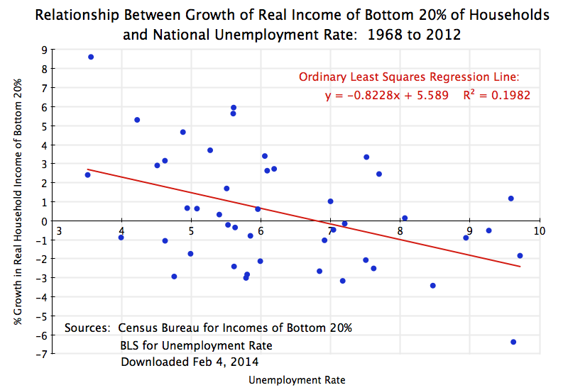
Real Income Growth of Bottom 20% vs Unemployment Rate, 1968-2012

A.  Introduction

President Obama highlighted in this year’s State of the Union address, as well as in other recent speeches and events, the importance of and concerns about the worsening distribution of income in the US.  As this blog noted in a post two years ago, income distribution has worsened markedly in the US since about 1980, when Reagan was elected.  This deterioration since 1980 is in sharp contrast to the period from the end of World War II until 1980, when incomes of all groups in the US moved upward together.  The paths then diverged sharply after 1980, with large increases in the incomes of the rich (and in particular the extremely rich:  the top 1%, top 0.1%, and especially the top 0.01%), while the real incomes of the bottom 90% were flat or even falling.

An important question, of course, is what to do to achieve more equitable growth, and in particular more rapid growth in the real incomes of those in the lower strata of the population.  Much of the discussion has focussed on measures such as improving our educational and training systems, to prepare workers for better paying jobs.  There is no doubt that such measures are important, and need to be done.  Their impact will, however, only be over the long term – in a generation for measures such as improvements in the educational system.

This blog post will focus on a more immediate action that can be taken:  returning the economy to full employment and keeping it there.  We will find that based on historic patterns, slack in the labor market due to less than full employment has been negatively associated with growth in the real incomes of the bottom 20% of households.  Furthermore, based on statistical regression parameters estimated from the historical data, the greater degree of slack in the US labor market since 1980 compared to that in the thirty years before 1980, largely suffices in itself to account for the relative deterioration of real incomes since 1980 of the bottom 20% of households compared to the top 20%.

This is an important result.  Note that the claim is not that greater slack in the labor market (on average) in the decades since 1980 was the sole cause of the deterioration of relative incomes of the poorest 20% vs. the richest 20%.  There were undoubtedly numerous reasons for this.  But what the finding does indicate is that had the unemployment rate after 1980 matched what it had been in the three decades before 1980, this would have largely sufficed in itself to offset the other factors, and would have led to a rate of growth in the real incomes of the bottom 20% close to what it was for the top 20%.

B.  The Relationship Between Real Income Growth of the Bottom 20% and the Unemployment Rate

The scatter diagram at the top of this post shows the relationship between the annual real income growth of the bottom 20% of households since 1968, and the average rate of unemployment in the same year.  The income data for the bottom 20% comes from the series produced by the US Census Bureau, and measures household cash income before tax and from all cash sources (so it will include Social Security, for example, but not payments under Medicare).  The series starts in 1967 (so 1968 is the first year for which one can compute the growth), and goes to 2012.  The unemployment rate comes from the standard series produced by the US Bureau of Labor Statistics, where the annual rate is the simple average of the monthly rates over the year.

The scatter diagram suggests there is a relationship between slack in the labor market (a higher unemployment rate) and the annual change in the real incomes of the bottom 20% of households, but that it is by no means a tight one.  Other factors matter as well.  But a simple ordinary least squares regression of the annual change in the real incomes of the bottom 20% against the average unemployment rate in that year, does suggest that the unemployment rate is an important and statistically significant factor.

The regression fitted line slopes downward with a coefficient of -0.8228, indicating that on average, a 1% point increase in the unemployment rate in the year will be associated with a 0.8228% point fall in the growth rate that year of the real incomes of the bottom 20%.  The t-statistic on the 0.8228 slope coefficient is 3.3, where any t-statistic greater than about 2.0 is generally seen as statistically significant (with a greater than 95% degree of confidence).  That is, with a greater than 95% degree of confidence, the results suggest that the coefficient is significantly different from zero (where zero would indicate no relationship).

The R-squared of the regression (an indication of correlation) is relatively modest at just 0.1982.  It can vary from zero to one.  This indicates that there is more than just the unemployment rate that accounts for the annual change in the real incomes of the bottom 20%.  But this does not mean that the unemployment rate does not matter.  The t-statistic for it is highly significant.  Rather, the modest R-squared indicates there are other factors as well which have not been identified here.

Similar regressions were run for the changes in the real incomes of the other quintiles of the household income groups.  The estimated coefficients became progressively closer to zero, from -0.82 for the bottom 20%, to -0.62 for the second 20%, to -0.52 for the middle 20%, to -0.47 for the fourth 20%, and then dropping sharply to -0.25 for the top 20%.  This suggests that the link to unemployment as a factor explaining the growth in the real incomes of the group became progressively less important for the richer groups.  And the t-statistic for the coefficient for the top 20% was only 1.0, indicating the estimated coefficient (of -0.25) was statistically not significantly different from zero (and hence that one cannot reject the hypothesis that no relationship is there).  The R-squareds for the regressions similarly fell steadily, from 0.1982 for the bottom 20%, to 0.19 for the second 20%, to 0.16 for the middle 20%, to 0.14 for the fourth 20%, and then dropping sharply to an extremely low 0.02 for the top 20%.

The results suggest that slackness in the labor market, as measured by the unemployment rate, was a significant factor in explaining the annual growth in the real incomes of the bottom 20% (with more unemployment leading to lower or indeed negative growth).  The results also suggest that higher unemployment did not have a statistically significant impact on the growth in real incomes of the top 20%.

C.  The Impact of Less Slack in the Labor Market

From 1950 to 1979, when growth was similar for all income groups (see this earlier blog post), the monthly unemployment rate averaged 5.17% in the US.  But from 1980 to 2012, the monthly rate averaged 6.44%, or 1.27% points higher.  The index of real incomes of the bottom 20% of households (in the US Census data cited above) had risen from 100.0 in 1967 (the earliest year with such data) to an index value of 118.9 in 1980.  But since then it has risen hardly at all, reaching only 119.5 in 2012.  The 1980 to 2012 growth rate was only 0.015% per year (note not 1.5% per year, but rather only one-hundreth of that).

Suppose the labor markets over 1980 to 2012 had been as close to full employment as they had been over the period 1950 to 1979.  Applying the estimated regression coefficient of -0.8228 to the 1.27% point difference in the average unemployment rates, the annual growth rate of the real incomes of the bottom 20% would have been 1.045% points higher (equal to 0.8228 x 1.27% points), and hence would have reached a growth rate of 1.06% a year (equal to 1.045% + 0.015%).  With such a growth rate, the real incomes of the bottom 20% would have reached an index value of 166.5 in 2012  This would have been close to the index value of the real incomes of the top 20% in that year of 169.8 (with 1967 set equal to 100.0).  Relative incomes would have grown similarly since 1967, and inequality (for the bottom 20% compared to the top 20%) would not have grown.

This is an interesting result.  It suggests that the higher unemployment rates we have on average suffered from since 1980 can account both for the stagnation of the real incomes of the bottom 20%, and the increasing inequality when comparing this group to the top 20%.  Note it does not offset all of the increasing inequality seen since Reagan was elected.  The real incomes of the top 1%, top 0.1%, and especially the top 0.01% have grown by far more than the incomes of the top 20%.  But keeping up with the top 20% would still be a major accomplishment.

A return to the economic performance that the US enjoyed in the three decades before Reagan would not be impossible.  To keep the average unemployment rate at the 5.17% rate achieved between 1950 and 1979 would not mean that all recessions need be avoided.  There were a number of recessions in the three decades before 1980.  But the recessions since 1980 (dating from January 1980 at the end of the Carter Administration, from July 1981 at the beginning of Reagan, from July 1990 during Bush I, from March 2001 at the beginning of Bush II and December 2007 at the end of Bush II) have been especially severe.  Avoiding those high peak rates of unemployment would have brought down the average.  Specifically, the average unemployment rate (based on the monthly figures) over 1980 to 2012 would have matched the 1950 to 1979 average if one would have been able to avoid those months since 1980 when the unemployment rate reached 6.4% or more.

D.  Conclusion

There is increasing recognition that the rise in inequality in the decades since 1980, and the stagnation since then in the real incomes of those in the lower strata of the population, cannot go on.  But the solutions commonly proposed, such as better education and training, will take decades to have an impact.

The analysis in this post indicates that the more immediate action of bringing the economy back to full employment and then keeping it close to full employment, would have a major positive impact on the real incomes of those in the bottom 20% of households, and would lead to a more equitable distribution.  The analysis suggests that had the unemployment rate over 1980 to 2012 been at the level achieved over 1950 to 1979, then the rate of income growth of the bottom 20% since 1980 would have been similar to that of the top 20%.  The higher rate of unemployment since 1980, on average, may well explain why growth was broadly equal among income groups in the three decades before 1980, but not in the three decades since.

While there are many factors that underlie income growth and distributional changes, particularly for those at the very top of the income distribution (the top 1% and higher), the results suggest that getting the economy back to full employment should be seen as critically important and valuable.  And there is no mystery in how to do this:  As earlier posts on this blog have noted, the fiscal drag from government cutbacks since 2009 can fully explain why full employment has yet to be achieved in this recovery.  Had government been spending been allowed to grow simply at its historical average rate, the economy would already have returned to full employment by now.  Had government spending been allowed to grow at the higher rate it had under Reagan, the US would likely have been back at full employment in 2011 or early 2012.

Unemployment matters.  Not only is it a direct and personal tragedy for those who have lost a job because of the macro mismanagement of the economy, it is also a waste of resources for the economy.  The evidence reviewed in this post suggests further that the greater degree of slack in the US labor market since 1980 may well explain the stagnation of real incomes of the poorer strata of the population, and the widening degree of inequality of recent decades for those other than in the extreme upper strata.
ObamaCare Has Not Led to a Shift of Employees From Full-Time to Part-Time Work

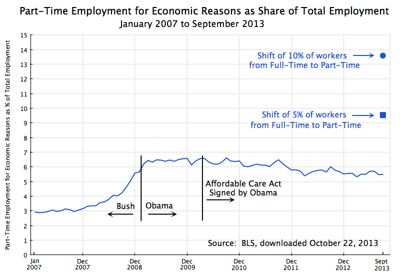
Part-Time Employment #2 as Share of Total Employment, Jan 2007 to Sept 2013

Conservative media have repeatedly asserted that due to ObamaCare (formally the Affordable Care Act), there has been and will be a big shift of workers from full-time to part-time status.  Publications such as Forbes, the Wall Street Journal, and of course Fox News, have asserted that this is a fact and a necessary consequence of ObamaCare.  The argument is that since ObamaCare will require employers to include health care benefits as part of the wage compensation package to full time employees (defined as those who normally work more than 30 hours a week for the firm), firms will have the incentive, and by competition the necessity, of shifting workers to part-time status.  It is argued that instead of employing three workers for 40 hours each (for 120 employee hours), firms will instead employ four part time workers at just below 30 hours each to obtain the 120 employee hours.

There are a number of problems with this argument.  First, the ObamaCare requirements for health coverage only apply to firms with more than 50 full time employees.  There is no change for firms employing fewer than 50 workers.  Second, almost all of the firms in the US with more than 50 employees, and indeed a majority also of the workers in firms of fewer than 50 employees, are already in firms that provide health insurance coverage for their workers.   Specifically, 97% of the workers in firms with more than 50 employees are in firms offering health insurance coverage as part of their wage compensation package.  ObamaCare will require this (to avoid a per worker penalty) to go from 97% to 100%, which is not a big change.  And even though ObamaCare will not have such a requirement for firms employing fewer than 50 workers, it is already the case that 53% of the workers in such firms are in firms providing health insurance coverage.   Firms provide health insurance coverage as part of the total compensation package they pay their employees both because they have a direct interest in having healthy workers, but also because there are tax and financial advantages to doing so.

Notwithstanding these issues, the conservative media and Republican politicians continue to assert that ObamaCare is leading to a large substitution of part-time for full-time workers.  But as Jason Furman, the Chairman of the Council of Economic Advisors in the White House has recently noted, this is not seen in the data.  The graph at the top of this blog post is one way to look at this data.

The graph shows the share of part-time workers (part time for economic reasons and not part time by choice) in all workers, by month, for the period from January 2007 to September 2013.  The data come from the Bureau of Labor Statistics.  If ObamaCare is leading to a large shift of workers from full-time to part-time status, then this ratio would be rising since ObamaCare was passed or at some more recent date.  But it is not.

The share of part-time workers in all workers rose in the last year of the Bush administration due to the economic crisis, from about 3% before to about 6 1/2% after.  It was rising rapidly as Obama took office, but stabilized soon thereafter as the economy began to stabilize with the passage of Obama’s stimulus package and aggressive actions by the Fed.  Since then the ratio has trended downwards, albeit slowly.  As has been noted previously in this blog, the continued fiscal drag from government expenditure cuts since 2010 has held back the economy and hence the recovery in the job market.  The blog post noted that if government spending had simply been allowed to grow at its long term average rate, we would likely have already returned to full employment (and would have returned to full employment in 2011, if government expenditures had been allowed to rise at the same pace as they had during the Reagan years).

The Affordable Care Act was signed by Obama in March 2010.  As the graph above indicates, there was no sharp change in trend once that act was signed.  If anything, the share of part-time workers in all workers then began to decline from a previous steady level.  Such a response is the opposite of what the conservative media and Republican politicians have asserted has been the result of ObamaCare coming into effect.

To put the figures in perspective, the graph above also shows how high the ratio of part-time workers to all workers would have had to jump, had either just 5% (the square point) or 10% (the round point) of full-time workers been substituted for by an equal number of part-time workers, additional to where the September 2013 ratio in fact was.   An equal number is used between the full-time and part-time workers to be conservative in the estimate.  The argument being made by the critics is in fact that a higher number of part-time workers would have been hired to substitute for the full-time workers let go, to get the same number of working hours.  But even with an equal number being substituted, such a shift of 5% of the workers would have led to rise in the ratio by 74% relative to where it was in September 2013, and a shift of 10% would have led to a rise of 148%.  One does not see anything like this.

It is not known what the paths would have been to reach those 5% or 10% shifts, but the resulting changes in the paths would have been obvious.  Such changes did not occur.  Since one is comparing the figures to what otherwise would have been the case, the conservative critics would need to argue that the ratio of part-time to all workers would have plummeted in the absence of ObamaCare.  There is no reason given on why this would have been so.  Furthermore, for the case of a 10% shift the number of part-time workers would have had to be negative in the absence of ObamaCare, which is of course impossible.

There is simply no evidence to support the assertion in the conservative media that ObamaCare is leading a significant share of firms to shift workers from full-time to part-time status.

The Impact of Health Reform on Jobs: The Evidence from Massachusetts is Positive

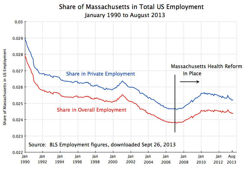
Share of Massachusetts in US Employment, Jan 1990 to Aug 2013

A.  The Assertion

Republicans have repeatedly asserted that the Affordable Care Act signed into law in 2010 (also often referred to as ObamaCare) will be, and indeed already has been, a “job-killer”.  The Republican controlled Congress has voted repeatedly to repeal the health reform, starting once they took control of the chamber in January 2011 (with the first such bill titled “Repealing the Job Killing Health Care Law Act”), and with over 40  such party-line votes since then.

But while the Republicans have vociferously asserted that the health care reform law has and will “kill jobs”, is there any evidence that such a law will indeed do this?  The assertion is particularly odd as the major reform under the law, that of establishing competitive market exchanges through which the currently uninsured will be able to purchase affordable health coverage from private insurers, has not even gone into effect yet.  The exchanges are scheduled to open only on October 1, and coverage will not begin for policies purchased on the exchanges until January 1, 2014.

Once the law goes fully into effect, we may be able to find from the data whether the impact of the health reform law had a negative, or a positive, impact on jobs.  But until then we can look at the impact a very similar reform that may shed light on what to expect.

Specifically, what has come to be called “ObamaCare” was modeled on a very similar health reform passed in Massachusetts in 2006.  That reform was signed into law by then Governor Mitt Romney on April 12, 2006, and entered into implementation in phases starting in late 2006.  The poor were first enrolled into a subsidized health insurance program, and then competitive market exchanges for health insurance for other individuals opened on May 1, 2007.  An individual mandate to have insurance from some source began on July 1, 2007.  If this health care reform is a job killer, one would expect to find that job growth in Massachusetts from 2007 and for the next several years to be relatively slower than job growth in the rest of the US.  The share of Massachusetts in total US jobs would then fall.  Did that happen?

B.  The Evidence

The graph at the top of this post shows employment in Massachusetts (using BLS data) as a share of employment in all of the US from 1990 (when the series on state employment starts) to now, including the period before and after 2007.  The Massachusetts shares of overall employment (including government) as well as private employment only, are shown.  (The private employment share is higher than the overall employment share since the share of government employment in Massachusetts is relatively less than it is elsewhere in the country, despite what some people appear to assume).

The trend from 1990 up to 2007 was for the share of Massachusetts in national employment to fall.  Massachusetts is a relatively small and mature state, and employment in the US in the period was focused more on the Sun Belt states.  But it is then striking how this turned around precisely in 2007, as the Massachusetts Health Care reform entered into effect.  If such a health reform had been a “job-killer”, then the Massachusetts share in national employment would have fallen in 2007 and the following years.  One would at least have seen a continuation of the previous downward trend.  But instead the share turns sharply up starting in 2007, with this continuing to about 2010/2011 before it levels off and then perhaps resumes the previous trend.

One should of course not put too much weight on this one observation.  There was much else going on in the economy at that time, which might account for why job performance in Massachusetts was relatively better than elsewhere in the US in 2007 and subsequent years.  In particular, the economy collapsed in 2008, in the last year of the Bush Administration, pushing up national unemployment in 2008 and 2009 until the stimulus program of the new Obama Administration plus aggressive Fed actions turned this around.  The 2008 collapse could have differentially affected Massachusetts.  However, the change in the trend in Massachusetts began before national unemployment started to rise.

Furthermore, while one sees also a similar (but much smaller) peak in the graph starting with a rise from the beginning of 2000 and then a fall in 2001, this rise and fall did not coincide with the increase in unemployment during the first few years of the Bush Administration.  National unemployment started to rise only in January 2001, and then reached a peak in June 2003.  Finally, from 1990 to June 1992 there was also a rise in national unemployment, during the Bush I Administration, but this coincided with a steady fall of the share of Massachusetts in total national employment over the period.  This was the opposite of the pattern seen in 2007 to 2010.  There does not appear to be a consistent pattern that the Massachusetts share of US employment rises in recessions, so one would need to be careful to argue that this must explain what happened in 2007-10.

C.  Conclusion

The rise in the share of employment in Massachusetts in overall US employment following the implementation of the Massachusetts Health Reform in 2007 is therefore consistent with the view that such reforms are not job-killers.  Following the implementation of the health reform, job growth in Massachusetts was relatively faster (or job cuts were relatively slower, during the peak of the downturn) than elsewhere in the US, with this lasting for several years.  While too much should not be read into this finding and assume that it implies health reform will spur a sharp increase in jobs, it is certainly not consistent with the assertion made by the Republicans that such health reform will necessarily be a dramatic killer of jobs.