
“We had the greatest economy in the history of the world. We had never done anything like it. … Nobody had seen anything like it.”
Donald Trump, Republican National Convention, Milwaukee, July 18, 2024
A. Introduction
Donald Trump is fond of asserting that the US “had the greatest economy in the history of the world” while he was president. He claimed this when he accepted the nomination at the Republican National Convention (as quoted above); he claimed it when he debated President Biden in June; and it is a standard line repeated at his campaign rallies. He also asserts that this is all in sharp contrast to the economy he inherited from Obama and to where it is now under Biden. In a June 22 speech, for example, Trump said “Under Biden, the economy is in ruins.”
These assertions of Trump are not new. He was already repeatedly making this claim in 2018 – in the second year of his administration – asserting that the US was then enjoying “the greatest economy that we’ve had in our history” (or with similar wording). And he repeated it. The Washington Post Fact Checker recorded in their database that Trump made this claim in public fora at least 493 different times (from what they were able to find and verify) by the end of his term in January 2021.
Repetition does not make something true. And numerous fact-checkers have shown that the assertion is certainly not true (see, for example, here, here, and here, and for the 2018 statements here). But readers of this blog may nonetheless find a review of the actual data to be of interest, and in charts so that the extent to which Trump is simply making this up is clear.
The post will focus on Trump’s record compared to that of Obama’s second presidential term (immediately before Trump) and Biden’s presidential term (immediately after). The post will also show that even if you just focus on the first three years of his presidential term – thus excluding the economic collapse in his fourth year during the Covid crisis – Trump’s record is nothing special. The collapse in that fourth year was certainly severe, and with that included Trump’s record would have been one of the worst in US history. But Covid would have been difficult to manage even by the most capable of administrations. Trump’s was far from that, and that mismanagement had economic consequences, but Trump’s record is not exceptional even if you leave that fourth year out.
This post complements and basically updates a longer post on this blog from September 2020. That post compared Trump’s economic record not only to that of Obama but also to that of American presidents going back to Nixon/Ford. I will not repeat those comparisons here as they would not have changed. I will focus this post on just a few of the key comparisons, adding in the record of Biden.
B. The Record on Growth
The two charts at the top of this post show how Trump’s record compares to that of Obama and Biden in the two measures most commonly taken as indicators of economic performance – growth in national output (real GDP) and growth in total employment (jobs). This section will focus on Trump’s not-so-special record on growth, while the section following will focus on employment.
Trump has repeatedly asserted that economic growth while he was president surpassed that of any in history. This is not remotely true in comparison to growth under a number of post-World War II presidents. (Quarterly GDP statistics only began in 1947 so older comparisons are more difficult, but there were certainly many other cases further back as well.) Giving Trump the benefit of excluding the economic collapse in 2020 during the Covid crisis, real GDP grew at an annual rate of 2.8% over the first three years of Trump’s presidential term. But real GDP grew at an annual rate of 5.3% during the eight years of the Kennedy/Johnson presidency; at a rate of 3.7% during the Clinton presidency; 3.4% during Reagan; and 3.4% as well during the Carter presidency. The 2.8% during the first three years of Trump is not so historic. Carter’s economic record is often disparaged (inappropriately), but Carter’s record on GDP growth is significantly better than that of Trump – even when one leaves out the collapse in the fourth year of Trump’s presidency.
Nor is the Trump record on growth anything special compared to that of Biden or Obama. As seen in the chart at the top of this post, growth under Biden over the first three years of his presidency matched what Trump bragged about for that period (it was in fact very slightly higher for Biden). GDP growth then remained strong in the fourth year of Biden’s presidency instead of collapsing. Growth in the Obama presidential term immediately preceding Trump was also similar: sometimes a bit above and sometimes a bit below, and with no collapse in the fourth year. It was also similar in Obama’s first term once he had turned around the economy from the economic and financial collapse he inherited from the last year of the Bush presidency.
Trump’s repeated assertion that “we had the greatest economy in the history of the world” was a result – he claimed – of the tax cuts that Republicans rammed through Congress (with debate blocked) in December 2017. While the law did cut individual income tax rates to an extent (heavily weighted to benefit higher income groups), the centerpiece was a cut in the tax rate on corporate profits from 35% to just 21%. The argument made was that this dramatic slashing of taxes on corporate profits would lead the companies to invest more, and that this spur to investment would lead to faster growth in GDP benefiting everyone.
That did not happen. As we have already seen, real GDP did not grow faster under Trump than it had before (nor since under Biden). Nor, as one can see in the chart at the top of this post, was there any acceleration in the pace of GDP growth starting in 2018 when the new tax law went into effect in the second year of his presidential term (i.e. starting in Quarter 5 in the charts).
The promised acceleration in growth was supposed to be a consequence of a sustained spur to greater private investment from the far lower taxes on corporate profits. There is no evidence of that either:

The measure here is of fixed investment (i.e. excluding inventories), by the private sector (not government), in real terms (not nominal), and nonresidential (not in housing but rather in factories, machinery and equipment, office structures, and similar investments in support of production by private firms).
This private investment grew as fast or often faster under Obama (when the tax rate on corporate profits was 35%) as under Trump (when the tax rate was cut to just 21%). Growth under Biden has also been similar, even though the tax rate on corporate profits remains at 21%. This similar growth is, in fact, somewhat of a surprise, as the Fed raised interest rates sharply starting in March 2022 with the aim of slowing private investment and hence the economy in order to bring down inflation.
With the far lower corporate profit tax rates going into effect in the first quarter of 2018 and the Fed raising interest rates starting in the first quarter of 2022 – both cases in the fifth quarter of the Trump and Biden presidential terms respectively – a natural question is what happened to private investment in the periods following those changes? Rebasing real private non-residential fixed investment to 100 in the fourth quarter of the presidential terms, one has:

The paths followed by private investment under Biden (facing the higher interest rates of the Fed) and under Trump (following corporate profit taxes being slashed) were largely the same – with the path under Biden often a bit higher. They diverged only in the 12th quarter of each administration (the fourth quarter of 2019 for Trump, and the fourth quarter of 2023 for Biden). Under Trump, private investment fell in that quarter – well before Covid appeared – and then collapsed once Covid did appear. Under Biden, in contrast, it kept rising up until the most recent period for which we have data.
It is also worth noting that private investment during the similar period in Obama’s second term rose by even more than under Trump (and for a period faster than under Biden, although later it rose by more under Biden). This was despite a tax rate on corporate profits that was still at 35% when Obama was in office. There is no evidence the tax rate mattered. And although not shown in the chart here, private investment rose by far more in the similar period during Obama’s first term (although from a low base following the 2008 economic collapse).
With similar growth in such investment in all three presidential terms (leaving out the collapse in 2020), the conclusion one can draw is that taxes at such rates on corporate profits simply do not have a meaningful impact on investment decisions. Decisions on how much to invest and on what depend on other factors, with a tax rate on profits of 21% or of 35% not being central. Nor did the Fed’s higher interest rates matter all that much to investment during Biden’s term. With a strong economy under Biden, firms recognized that there were investment opportunities to exploit, and they did.
The far lower tax rate of 21% on corporate profits did, however, lead to a windfall gain for those who owned these companies. Far less was paid in such taxes. That is, the tax cuts did have distributional consequences. But they did not spur private investment nor overall growth. They did not lead to “the greatest economy in the history of the world”.
C. The Record on Employment
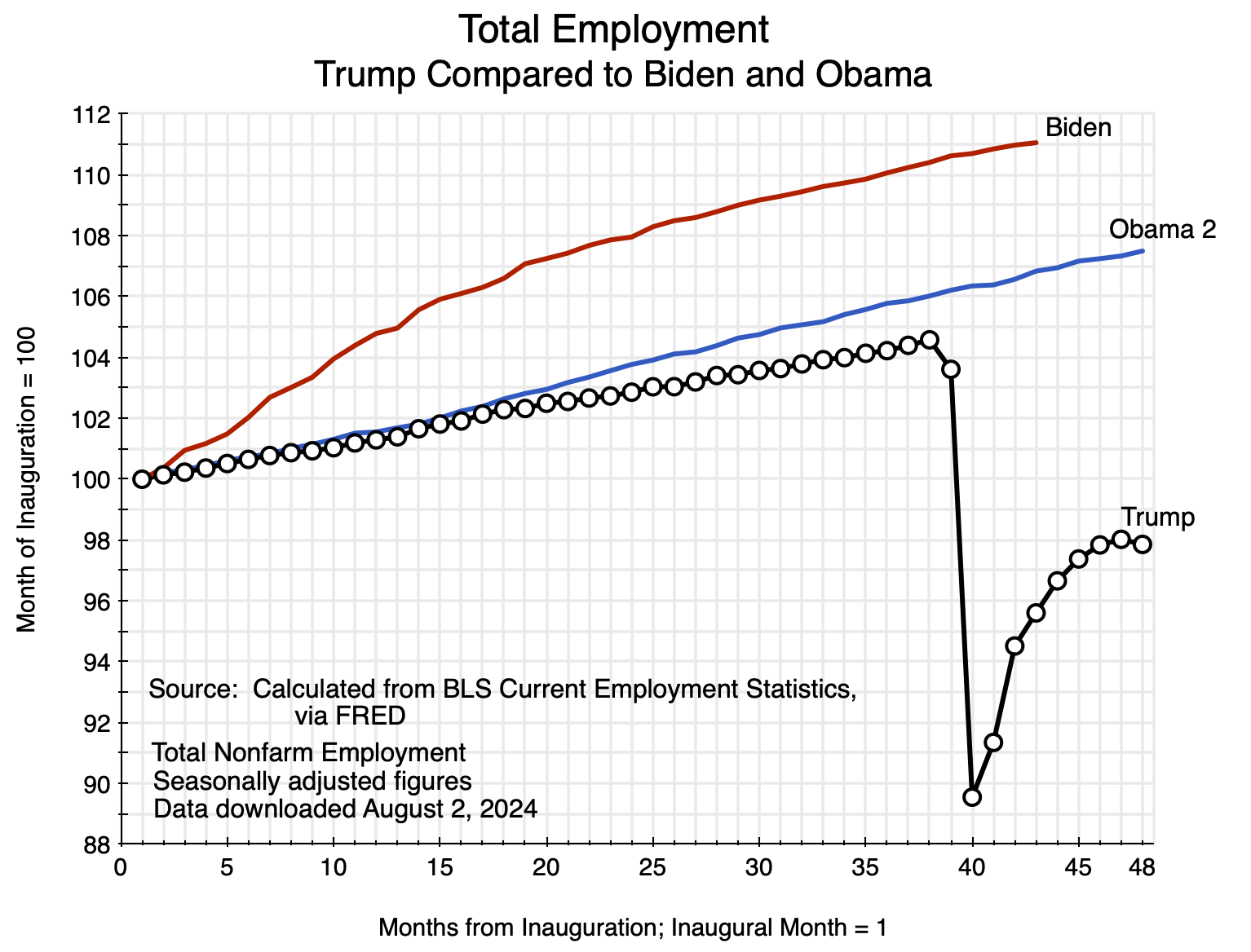
As seen in the chart at the top of this post, growth in total employment was higher under Obama than it was under Trump, and has been far higher under Biden – even if you restrict the comparison to the first three years of the respective presidential terms. In the face of this clear evidence in favor of Biden’s record, Trump has now started to assert that the growth in jobs under Biden was due to a “bounce back” in jobs following the collapse in the last year of his administration, or that they all went to new immigrants. But neither is true.
First, as one can see in the chart there has been strong growth in the number employed not only early in Biden’s administration but on a sustained basis throughout. And second, nor was the growth only in the employment of immigrants. The Bureau of Labor Statistics provides figures from its Current Population Survey (CPS) of households on the employment of those who were born in the US (the native-born) and those born abroad (the foreign-born). Leaving out the collapse in 2020, employment growth over the first three years of Trump’s presidential term of the native-born averaged 1.3% per year. During the first three years of the Biden presidential term, employment growth of the native-born averaged 1.8% per year. The growth in employment of the native-born was not zero under Biden – as Trump claims – but rather was faster under Biden than under Trump. While there is a good deal of noise in the CPS figures (which will be discussed below), these numbers do not provide support for Trump’s assertion.
There has also been concern expressed in the media with what was interpreted as a “disappointing” growth in employment in July. The BLS “Employment Situation” report for July, released on August 2, indicated that employment rose by an estimated 114,000 in the month. This is a good deal below the average in the 12 months leading up to July of 209,300 per month. But an increase of 114,000 net new jobs in the month is substantial. While there will often be large month-to-month fluctuations, one should not expect more on average going forward.
With the economy basically at full employment (the recent uptick in the unemployment rate – to a still low 4.3% – will be discussed below), the number employed cannot grow on a sustained basis faster than the labor force does. And the labor force will grow at a monthly pace dictated by growth in the adult civilian population (i.e. age 16 and over) and what share of that adult population chooses to participate in the labor force. The labor force participation rate in July was 62.7% and has been trending downward over the past several decades. While a number of factors are behind this, the primary one has been the aging of the population structure with the Baby Boom generation moving into their normal retirement years.
The BLS report (using figures obtained from the Census Bureau) indicates that the adult civilian population rose by an average of 136,800 per month in the 12 months leading up to July. At a labor force participation rate of 62.7%, the labor force would thus have increased by 85,800 per month. Without an increase in the labor force participation rate, employment cannot grow faster than this on a sustained basis going forward.
In the past 12 months, however, the BLS report for July indicates that the labor force in fact grew at an average pace of 109,700 per month. How was this possible? The reason is that although the labor force participation rate is on a long-term downward trend due to the aging population, there can be and have been fluctuations around this trend. And a small fluctuation can have a significant effect. The labor force participation rate one year ago in July 2023 was 62.6%, and thus the rate in fact rose by 0.1% from July 2023 to July 2024. If the labor force participation rate in July 2023 had in fact been 62.7%, then the labor force in July 2023 would have been 167,410,000 rather than the actual 167,113,000, and the increase over the 12 months leading to July 2024 would have averaged 84,900. Within round-off, this is the same as the 85,800 figure calculated in the preceding paragraph for a constant 62.7% labor force participation rate, (With more significant digits, the labor force participation rates were 62.589% and 62.696% respectively, and a constant 62.696% participation rate would have yielded the 85,800 figure for labor force growth.)
We should therefore not expect, going forward, that monthly employment will increase on a sustained basis by more than about 90,000 or so, or even less. It could be higher if the labor force participation rate increases (and a small change can have a major effect), but the trend over the past couple of decades has been downward – as noted already – due to the aging of the population. How then, was it possible for employment to have gone up by an average of 209,300 per month over the past year? And this was also a period where the estimated unemployment rate rose from 3.5% in July 2023 to 4.3% in July 2024, which “absorbed” a share of the increase in the labor force as well.
The reason for these not fully consistent numbers is that employment estimates come from the Current Employment Statistics (CES) survey of establishments where people are employed, while the labor force and unemployment estimates come from the different Current Population Survey (CPS) – a survey of households. The CES is a survey of nonfarm employers in both the private and public sectors, and covers 119,000 different establishments at 629,000 different worksites each month. The “sample” (if it can be called that) covers an estimated one-third of all employees.
The CPS, in contrast, is a survey of about 60,000 households each month. There will only generally be one or two members of the labor force in each household, so the share of the labor force covered will be far less than in the CES. If each household had two members in the labor force, for example, the total of 120,000 would be only 0.07% of the labor force – a sharp contrast to the one-third covered in the CES. There is therefore much more statistical noise in the CPS data. There are also definitional differences: The CPS will include not only those employed on farms but also the self-employed and those employed in households. Also, a person with two or more jobs will be counted as one person “employed” in the CPS. The CES, in contrast, counts the employees of a firm, and the employers will not know if the individual may be working at a second job as well. Thus a person working two jobs at two different firms will be counted as two “employees” in the CES.
These definitional differences are not major, however, and in part offset each other. An earlier post on this blog looked at these differences in detail, and how, in an earlier period (2018/2019) there was a substantial deviation in the employment growth figures between the estimates in the CES and the CPS. This was the case even with the figures adjusted (to the extent possible) to the same definition of “employment” in each. There is a similar deviation between the employment estimates in the CES and in the CPS currently, with this accounting for a strong growth in employment as estimated by the CES (of 209,300 net new jobs each month over the past year) even though the labor force has grown -according to the CPS – by a more modest 109,700 per month over this period.
The labor market remains tight, however, even with the rise in the estimated unemployment rate to 4.3% in July:

The unemployment rate fell rapidly under Biden, following the chaos of 2020. It was at a rate of 3.9% or less for over two years (27 months), despite the efforts by the Fed to slow the economy by raising interest rates. The unemployment rate was also 3.9% or less for a period under Trump (for 20 months). But as one sees in the chart, during the first three years of Trump’s term it basically followed the same downward path as it had under Obama. It then shot up in March 2020 when the nation was caught unprepared for Covid. As with the other key economic indicators (the growth in GDP, in employment, and in private investment), the paths followed by the economy during the first three years of Trump’s term were basically the same as – although usually not quite as good as – the paths set during Obama’s presidency. They all then collapsed in Trump’s fourth year.
Any unemployment rate near 4%, and indeed near 5%, is traditionally seen as low. Economists have defined the concept of the “Non-Accelerating Inflation Rate of Unemployment” (NAIRU) as the rate of unemployment that can be sustained without being so low that inflation will start to rise. While one can question how robust this concept is (as will be discussed below), the NAIRU rate of unemployment has generally been estimated (for example by the staff at the Federal Reserve Board) to be between 5 and 6%. An unemployment rate of 4.3% is well below this. While the unemployment rate has gone up some in recent months, it is still extremely low.
D. The Record on Real Living Standards
Ultimately, what matters is not the growth in overall output (GDP) or in employment, but rather in real living standards. Many have asserted that because of recent inflation, living standards have gone down during Biden’s presidential term. This is not true, as we will see below. But first we will look at inflation.
Inflation rose significantly early in Biden’s presidential term. The pace moderated in mid-2022, but until recently prices continued to rise:

Inflation was less during Trump’s term in office but was even lower under Obama. Indeed, consumer price inflation has been low since around 1997, during Clinton’s presidency, until the jump in 2021. Why did that happen?
The rise in 2021 can be attributed to both demand and supply factors. On the demand side, both Trump and Biden supported and signed into law a series of genuinely huge fiscal packages to provide relief and support during the Covid crisis. The packages were popular – especially the checks sent to most Americans (up to a relatively high income ceiling) that between the various packages totaled $3,200 per person. But the overall cost for all the various programs supported was $5.7 trillion. That is huge. The funds were spent mostly over the two years of 2020 (under Trump) and 2021 (under Biden), and $5.7 trillion was the equivalent of 12.8% of GDP over those two years. Or, as another comparison, the total paid in individual income taxes in the US in the single year of FY2023 was “only” $2.2 trillion.
While there was this very substantial income support provided through the series of Covid relief packages, households were limited in how much they could spend – out of both these income transfers and their regular incomes – in 2020 due to the Covid pandemic. One went out only when necessary, and kept only to shopping that was necessary. This carried over into early 2021. But people could become more active as the Biden administration rolled out the massive vaccination campaign in the first half of 2021. People then had a backlog of items to buy as well as the means to do so from what had been saved in 2020 and early 2021. Demand rose sharply, and indeed Personal Consumption Expenditures in the GDP accounts rose by more in 2021 (by 8.4%) than in any year since 1946 (when it rose by 12.4%, and for similar reasons).
But at the same time, supply was constrained. Supply chains had been sharply disrupted in 2020 worldwide due to Covid, and took some time to return to normal. There was then the additional shock from the Russian invasion of Ukraine in February 2022, leading oil and many other commodity prices to spike.
Supply chains did, however, return more or less to normal early in the summer of 2022. And as they did, one saw a sudden and sharp reduction in pressures on prices, in particular on the prices of goods that can be traded:
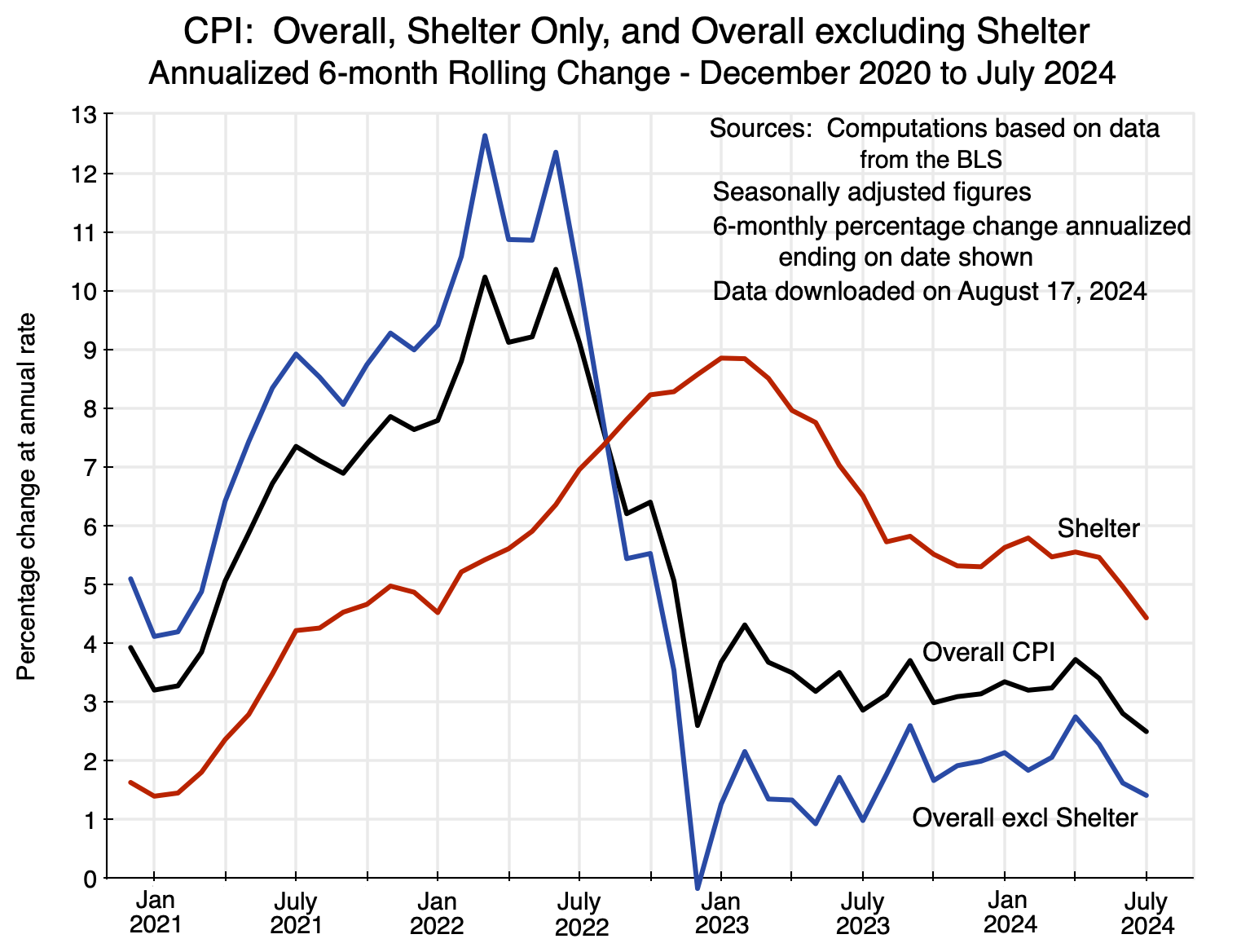
This chart shows the annualized inflation rates for 6-month rolling periods (ending on the dates shown) for the overall CPI, for the shelter component of the CPI, and for the CPI excluding shelter. The overall inflation rate rose from an annualized rate of 3.2% in the six months ending in January 2021 (the end of Trump’s term) to a peak of 10.4% in the six months ending in June 2022. It then fell remarkably fast, to an annualized rate of just 2.6% in the six months ending in December 2022.
This sudden drop in the inflation rate is seen even more clearly in the CPI index of prices for everything but shelter: The annualized rate fell from 12.4% in the first half of 2022 (the six months ending in June) to a negative 0.2% rate in the second half of 2022 (the six months ending in December). Why? There was not a sudden collapse in consumer or other demand. Rather, supply chains finally normalized in the summer of 2022, and this shifted pricing behavior. When markets are supply constrained (as they were with the supply chain problems), firms can and will raise prices as competitors cannot step in and supply what the purchaser wants – they are all supply constrained. But as the supply chains normalized, pricing returned to its normal condition where higher demand can be met by higher production – whether by the firm itself or, if it is unwilling, by its competitors. It is similar to a phase change in conditions.
Shelter is different. It covers all living accommodations (whether owned or rented), and as has been discussed in earlier posts on this blog (see here and here), the cost of shelter is special in the way it is estimated for the CPI. It is also important, with a weight of 36% in the overall CPI index (and 45% in the core CPI index, where the core index excludes food and energy). The data for the shelter component of the CPI comes from changes observed in the rents paid by those who rent their accommodation, and rental contracts are normally set for a year. Hence, rental rates (and therefore the prices of the shelter component of the CPI) respond only with a lag. One can see that in the chart above, with the peak in the inflation rate for shelter well after the peak in the inflation rate for the rest of the CPI.
Since mid-2022, the rate of inflation as measured by the overall CPI has generally been in the range of 3 to 4% annualized. Increases in the cost of shelter have kept it relatively high and above the Fed’s target of about 2% per annum. But as seen in the chart, it has recently come down – falling to an annualized rate of 2.5% in the six months ending in July. For everything but shelter, the rate in the six months ending in July was only 1.4%.
One question that some might raise is whether the very tight labor markets – with an unemployment rate that was 4% or less until two months ago – might have led to the inflation observed. The answer is no. As noted above, inflation in all but shelter fell suddenly in mid-2022, falling from a rate of 12.4% in the first half of the year to a negative 0.2% in the second half, even though the unemployment rate was extremely low at 4% or less throughout (and only 3.5 or 3.6% in all of the second half of 2022). Unemployment has remained low since while inflation has come down. If the cause was tight labor markets, then the rate of inflation would have gone up rather than down.
Similarly, inflation as measured by the CPI was not high in 2018 nor in 2019 when labor markets were almost as tight during Trump’s presidency – with overall inflation then between 2 and 3% on an annual basis. Nor did inflation go up during the similarly tight labor market of 1999 and 2000 during the Clinton presidency: CPI inflation was generally in the 1 1/2 to 3 1/2 % range during that period. All this calls into question the NAIRU concept, with its estimate that an unemployment rate below somewhere in the 5 to 6% range will lead to pressures that will raise the rate of inflation.
Managing inflation coming out of the chaos of 2020 was certainly difficult. Inflation spiked in most countries of the world following the Covid crisis, reaching a peak in 2022. But the rate of inflation has since come down as supply conditions normalized. That does not mean that the absolute level of prices came down, only that they were no longer increasing at some high rate. Wages and other sources of income will then adjust to the new price levels, and what matters in the end is whether real levels of consumption improve or not. And they have:

The chart shows the paths followed for per capita real levels of personal consumption expenditures, as measured in the GDP accounts, during the presidential terms of Trump, Biden, and the second term of Obama. The path followed under Trump was basically the same as that followed under Obama – until the collapse in the last year of Trump’s term. The path followed under Biden has been substantially higher than either. It was boosted in his first year as the successful vaccination campaign allowed people to return to their normal lives. They could then purchase items with not only their then current incomes, but also with the savings they had built up in 2020. But even if one excludes that first year, the growth under Biden has been similar to that under Obama and under Trump up to the collapse in Trump’s fourth year.
Once again, there is no basis for Trump’s claim of the “greatest economy”.
E. Summary and Conclusion
The economy during Trump’s presidency was certainly not “the greatest in the history of the world”. Nor was it even if you leave out the disastrous fourth year of his presidency. Covid would have been difficult to manage even by the most capable of administrations, and Trump’s was far from that. Instead of preparing for the shock this highly contagious disease would bring, Trump’s response was to insist – repeatedly – “it’s going to go away”.
Trump’s economic record was certainly nothing special. Real GDP grew as fast or faster under Obama and Biden as it had under Trump. Trump insisted that growth would be – and was – spurred by the tax cuts that he signed into law in late 2017 that slashed the tax on corporate profits. But there is no indication of this in the data. Nor is there even any indication that private investment rose as a result of the lower taxes.
Employment has grown far faster under Biden than it had under Trump, and also grew faster in Obama’s second term – even leaving out Trump’s disastrous fourth year. Unemployment fell during the first three years of Trump’s term in office (before sky-rocketing in his fourth year), but here it just followed a very similar path to that under Obama. For this, as with GDP and employment growth, perhaps the biggest accomplishment of Trump’s first three years in office was that he did not mess up the path that had been set under Obama. And unemployment has been even lower under Biden.
Inflation was certainly higher in 2021 as the US came out of the Covid crisis. Supply chains were still snarled, but there was pent-up demand from consumers who had had to avoid shopping in 2020 due to Covid and who also benefited from a truly huge set of Covid relief packages passed under both Trump and Biden. Supply chains then normalized in mid-2022, sharply reducing pricing pressures for goods other than shelter. Due in part to lags in how rental rates for housing are set (as they are normally fixed for a year) and then estimated by the BLS, the cost of the shelter component of the CPI came down more slowly than the cost of the rest of the CPI. This kept inflation as measured higher than what the Fed aims for, although recently (in the last half year) it has come down again. Most anticipate that the Fed will soon start to cut interest rates from their current high levels. The inflationary episode resulting from the Covid crisis appears to be coming to an end.
There is thus no justification for the claim by Trump that “we had the greatest economy in the history of the world”. Yet he has repeatedly asserted it, both now and when he was president. Why? Stephanie Grisham, who served in the Trump administration as press secretary and in other senior positions, and who had been – by her own description – personally close to Trump, explained it well in a speech she made on August 20 to the Democratic National Convention. She noted that Trump used to tell her: “It doesn’t matter what you say, Stephanie. Say it enough, and people will believe you.”
Many do appear to believe that the economy was exceptionally strong when Trump was president: that it was “the greatest in history”. But that is certainly not true. Facts matter; reality matters; and a president needs to know that they matter.



You must be logged in to post a comment.