
Chart 1
A. Introduction
The extreme, and growing, inequality in wealth ownership in the US has been receiving increasing attention. In its most recent annual listing of the 400 most wealthy Americans (from September 15, 2026), Forbes estimates that 15 individuals (and their immediate families) each have a wealth of $100 billion or more, seven have a wealth of $200 billion or more, and the top one – Elon Musk – had a wealth (as of the date of publication) of over $900 billion. Concern with such concentration of wealth has also grown as a number of these ultra-wealthy individuals have become increasingly politically active, using their wealth in ways that can determine election outcomes and overwhelm basic democratic institutions. This became especially evident in the 2024 presidential election, with consequences that are now clear.
This post, and several to follow, will review the basic data that estimate the inequality in wealth holdings and how that inequality has grown in recent decades. This first post will look at wealth per household (more precisely net worth, but the terms will be used interchangeably) with the households ranked by their level of wealth from least to most: the bottom 50%, the 50 to 90%, the 90 to 99%, the 99.0 to 99.9%, and the top 0.1%.
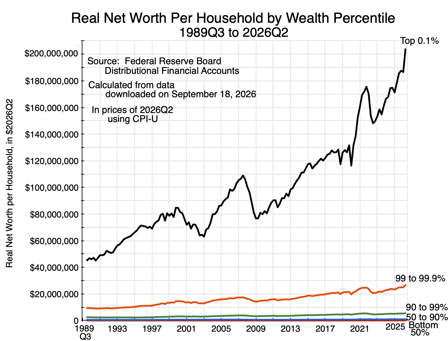
The chart at the top of this post shows how that net worth has grown (in real terms) over the last several decades. Because of the immense wealth of the top 0.1% – whose average net worth grew to over $200 million per household – it is hard to see on the chart the average wealth of the bottom 99% of the population. Their net worth is just too small. Charts below will split out the bottom 99% to show their histories, but the point is that the disparity between the top 0.1% and the rest is so large that – other than for the top 1% – their average holdings disappear on the scale of the chart.
The post will first discuss in Section B below the data for these estimates. They were calculated from data estimated by staff at the Federal Reserve Board and released as its Distributional Financial Accounts. This source is widely considered the best set of estimates on household wealth available for the US. These are, of course, estimates, however, and while the best available, it is important still to recognize their limitations. Wealth is difficult to estimate, for both conceptual and practical reasons.
Section C will then present the basic estimates of per-household wealth (net worth) when grouped by households ranked by the wealth they hold. The figures going back to 1989Q3 for all five groups the Fed distinguishes are as in the chart at the top of this post, and charts will then be provided also for the bottom 99% (and its sub-groups) and for the bottom 50%. Each has a story to tell.
Section D examines how the wealth estimates have changed over time in real terms and per household relative to what they were in the earliest period in this data series (1989Q3). Inequality was already high in 1989, but then grew much more. Section E will decompose the figures for average overall wealth, linking their increase to the growth in GDP over the period, to the increasing share of profits in GDP (at the expense of wages), and to the increase in how that wealth is valued as a multiple of the profits the owners of the assets are entitled to.
Section F will conclude. Future posts will examine other aspects of wealth holdings, using the same Fed data, including on wealth holdings when households are ranked by their income levels rather than their wealth levels, and on wealth holdings at the same age for different generations – i.e. for Baby Boomers compared to generations before and after. A final post will then examine what might – or might not – be done through policy to address these issues.
B. The Fed’s Distributional Financial Accounts
The measurement of wealth is not at all straightforward, and poses both conceptual and practical issues. This is in contrast to the measurement of incomes. For incomes, there are actual market transactions where firms earn revenues from what they sell. Out of those revenues the firms pay a portion for the inputs used and for the wages of their employees, with the remainder then being the gross profits that will cover taxes, the interest they pay on their debt, and their investment costs (counted as depreciation). What remains is their net profits. All of these transactions (other than depreciation) are measurable in cash being transferred and can be observed.
The measurement of wealth is different. Wealth is the value that others would be willing to pay for the assets owned. That is not observed and can only be estimated. Guessed may be a better term. It is also in a fundamental sense socially determined, as the measured value of the wealth is not inherent in the asset itself, but rather an estimate of what others – given the state of the economy, their expectations of what the future might be, the availability of financing, and other such factors – might be willing to pay for the asset. The transfer of the asset does not take place, however, and hence cannot be observed in the manner that incomes are observed. The value can only be estimated as a hypothetical.
Thus if someone is willing to pay twice as much for an asset (perhaps real estate, or a company, or whatever) than what it was valued at the previous day, the owner of the asset would be richer. His wealth would be greater. But nothing fundamental has changed in the economy; the assets are all the same as before. Only the valuation has changed.
In the face of such issues, statisticians do the best they can. They need to make assumptions about what others might be willing to pay for the assets. And they can assemble data on transfers of assets that have recently taken place and hence can be observed, where those assets may be similar – to a greater or lesser degree – to those they are trying to value. This can inform – to some extent – the valuations they assign to assets that did not change hands.
The calculations discussed in this post (and those that follow in this series) are based on data assembled by staff at the Board of Governors of the Federal Reserve System in Washington, DC, and specifically its Distributional Financial Accounts (DFA). The DFA estimates are published quarterly, usually about 11 weeks after the end of each calendar quarter. The accounts for the second quarter of 2026 were released on September 18, and provide estimates for wealth held by households as of the end of the quarter, i.e. on June 30.
The DFA data sets include quarterly data going back to the third quarter of 1989, but were only first produced starting in 2019. They are based on a combination of two other data sets produced by staff at the Fed Board of Governors, the Survey of Consumer Finances (SCF) – a survey undertaken once every three years – and the quarterly Financial Accounts of the United States (FA).
The SCF is a survey of households undertaken on behalf of the Fed where household assets and liabilities are recorded in detail, along with household income and characteristics of the household such as the age, education, race, and similar of its members. Because of this, the Fed can then produce estimates of wealth not simply of households in general, but also of households categorized by their income, their age, education, and/or race, and similar.
A representative sample of households across the country is chosen for the SCF, along with an oversampling of higher-income households in order to get meaningful sample sizes of the more wealthy households that hold a substantial share of household wealth.
The response rate of the general sample is reasonably good – at about 70% – but that for the oversampled wealthy households is only 10%. This may lead to biases in the results. While it would not matter if the wealthy households not responding were random (one could then simply start with a sample size ten times larger), it is likely that the relatively more wealthy households within that group are less likely to respond. The share of the nation’s wealth held by the most wealthy would then be underestimated. Despite this possible bias in the estimates, we will see below that the share held by the most wealthy groups is nonetheless extremely high.
A point to note is that the SCF specifically excludes any sampling of the extremely wealthy households on the Forbes 400 list of richest Americans. This might be due to privacy concerns, or simply the recognition that they would be unlikely to respond to the SCF survey even if asked. However, the DFA accounts specifically add them back in, with assets and liabilities either obtained from Forbes or drawn from the same sources used by Forbes. The net worth of the top 400 is significant. In the most recent September 2026 ranking, their total net worth came to $8 trillion. The DFA estimate of the net worth of the top 0.1% of households as of June 30, 2026, was $28 trillion. Thus the top 400 alone account for 29% of the total wealth of the group, even though they account for less than 0.3% of the approximately 135,000 households in the top 0.1%.
The SCF is, as noted, conducted only once every three years. To arrive at the quarterly estimates, the Fed staff use the quarterly Financial Accounts of the United States (FA) data to estimate how the wealth holdings of the households in the groupings analyzed may have changed quarter to quarter. The FA accounts date back to 1955, and were formerly called the Flow of Funds Accounts. They track – for the nation as a whole – both the stocks and flows of capital assets (both real and financial) in all their forms across economic sectors such as households, businesses, governments, and financial intermediaries. They are normally released ten weeks after the end of the quarter, and present financial flows during that quarter along with end-of-period stocks.
The DFA estimates combine the triennial SCF estimates on wealth holdings of categories of households with the quarterly FA estimates of total assets and liabilities held by households in the country as a whole. But this is not always a simple scaling, for several reasons. For a full discussion, see this chapter from a NBER conference held in March 2020 (and published in 2022) where Fed staff describe in some detail how the then new DFA accounts were assembled.
Arriving at household holdings of wealth – both assets and liabilities – consistent with national-level estimates of the totals of such assets and liabilities in the economy is not always straightforward. A couple of examples illustrate this.
One is the accounting of the assets backing up commitments to retirees in defined benefit pension plans. The SCF does not attempt to include at the household level the assets held in such schemes. Workers expect they will receive a pension of some amount, which will be tied to how many years they ended up working for the firm and what their final income was (often averaged over some period, such as their final three years). They will have little idea what assets are being invested to back up those commitments. But at the national level, the assets of the company pension plans backing up those commitments have been invested and are reflected in the totals in the FA accounts.
To resolve this, the DFA makes an estimate of what a household’s share of the assets held by the pension fund managers would be given the characteristics of the households. For those who are already retired and are receiving such a pension, plus for those who expect to receive a pension at a certain level based on their past employment with some firm, they calculate the present discounted value (which will depend on their age) of their expected future pension benefits. They then subtract those present value totals from the assets of the defined benefit pension plans at the national level to arrive at a figure for the pensions of workers still employed, who will start to receive pension benefits once they retire at some future date. They use a similar approach for the determination of the value at the household level of wealth held indirectly in annuity schemes and in life and other insurance plans. This approach can be easily criticized, but is probably the best that can be done.
As another example of the type of assumptions they had to make, there is an issue with how equity in privately held businesses as well as closely-held corporate entities should be valued. The SCF reported figures based on the household responses for both the cost basis of such equity and for what the households believed the market value would be. Aggregated to the national level, the market value estimates were well above the totals in the FA accounts while the cost basis estimates were well below. However, the average of the two turned out to be close, so they used that.
It should be noted that while estimates are made of the value to the household of the assets held (directly or indirectly) in their defined benefit pension plans as well as their defined contribution plans (401k’s, IRAs, and so on) and annuities from insurers, the DFA accounts do not include the implicit value of their Social Security retirement (and other) benefits. But the value of those Social Security commitments are significant, and especially so (as a share of their total wealth) for lower-income households.
To illustrate, a standard rule-of-thumb in retirement calculations is to spend each year no more than 4% of the balance of assets held in the retirement accounts at the time of retirement. The remaining assets will continue to grow in value, but at that 4%, retirees are unlikely to outlive the savings they had to cover retirement. Based on this, one can calculate the assets that would be required in a private pension savings account to cover benefits equal to those paid by Social Security.
As of December, 2025, the average monthly benefits paid to retirees, along with the average paid to the bottom 50% of retirees and top 50%, were:
|
Average Monthly Benefit |
Annual Equivalent |
Capital-Value Using 4% Rule |
|
| All Retired Workers |
$2,071 |
$24,854 |
$621,350 |
| Bottom 50% |
$1,338 |
$16,060 |
$401,505 |
| Top 50% |
$2,813 |
$33,761 |
$844,017 |
Source: Calculated from data at Social Security – Beneficiaries by benefit level. For December 2025.
To cover the average benefit to retirees of $2,071 per month, assets of over $620,000 would have been needed if one followed the 4% rule. For the bottom 50% of retirees (bottom 50% of the recipients of Social Security benefits), it would have been over $400,000, and over $840,000 for the top 50%. These could be counted as part of household wealth (assuming Social Security keeps to its commitments – which certainly can be done but will require Congress to act).
These are significant amounts. As will be discussed in the following section below, the average net worth as of June 30, 2026, of the bottom 50% of households (as ranked by their net worth) is only $63,000 in the DFA figures. For those in the 50 to 90% percentile, the average net worth was $988,000.
At the same time, keep in mind that the assets required by the 4% rule to match what Social Security is paying retirees would be the assets as of the year they retire and start collecting Social Security retirement benefits. Any individual builds up this entitlement to benefits over their working life, and thus the equivalent value when they are younger would be proportionally less. Similarly, retirement assets will be drawn down during the years one is retired, so the equivalent assets as one ages after retirement will then also be less.
However, the important point is that Social Security could be seen as a significant addition to household wealth, and especially so for the least wealthy. The DFA could have included that implicit wealth (with then a suitable adjustment in the treatment of the Social Security Trust Account in the federal government accounts) just as they did for private defined contribution pension plans, but chose not to.
I have given these examples to make clear that the wealth figures really are estimates, where those estimates need to be based on assumptions that can be questioned. The approach taken is probably the best that has been done to estimate the distribution of wealth in the US, but the limitations should not be forgotten.
C. Real Net Worth per Household, Stratified by Rank in Terms of Net Worth
There is extreme disparity in the distribution of wealth in the US. Specific figures by category of household may provide a better sense of this, along with the ownership of the types of assets of each group. As of the end of the second quarter of 2026:
| 2026Q2 per Household – in $thousands |
Bottom 50% |
50 to 90% |
90 to 99% |
99.0 to 99.9% |
Top 0.1% |
| A. Total Assets |
$152 |
$1,153 |
$5,906 |
$27,454 |
$205,938 |
| 1) Real Estate |
$71 |
$429 |
$1,240 |
$3,876 |
$14,377 |
| 2) Consumer durables |
$32 |
$71 |
$158 |
$347 |
$5,413 |
| 3) Bank deposits & Money mkt accts |
$12 |
$113 |
$583 |
$2,345 |
$17,790 |
| 4) Bonds/Loans |
$1 |
$24 |
$214 |
$1,066 |
$9,418 |
| 5) Equities |
$8 |
$180 |
$2,412 |
$17,164 |
$153,056 |
| 6) Retirement accts |
$19 |
$304 |
$1,210 |
$2,234 |
$3,873 |
| 7) Other |
$8 |
$30 |
$90 |
$421 |
$2,012 |
| B. Total Liabilities |
$89 |
$164 |
$346 |
$732 |
$2,200 |
| 1) Home mortgages |
$47 |
$126 |
$280 |
$373 |
$857 |
| 2) Consumer credit |
$39 |
$33 |
$43 |
$92 |
$383 |
| 3) Other |
$3 |
$5 |
$23 |
$267 |
$960 |
| C. Net Worth |
$63 |
$988 |
$5,559 |
$26,722 |
$203,738 |
| o/w Net Real Estate |
$25 |
$303 |
$959 |
$3,503 |
$13,520 |
Source: Calculated from the data at Fed Board of Governors, Distributional Financial Accounts. Downloaded September 18, 2026.
Households are ranked here by their net worth – from those with the least (and indeed negative) net worth to those with the most. The DFA shows the totals held in categories for the bottom 50% of households, for those ranked between 50 and 90%, between 90 and 99%, between 99.0 and 99.9%, and for the top 0.1%, along with the number of households in each group (so one can calculate the per household averages). As of the end of 2026Q2, there were approximately 135 million households in the US, so the bottom 50% covered the 67.5 million with the least net worth, and then so on to the top 0.1% with approximately 135,000 households.
The DFA data (in what is made publicly available) identify 15 categories of assets and 5 categories of liabilities. The table above aggregates some of these into broader categories of interest. The figures shown here are rounded to thousands, and for the reasons discussed in the preceding section of this post, need to be taken as approximate estimates.
Keep in mind also that these are averages over the households in each of the given categories. The minimum net worth to be included in the categories (in 2022Q2 – the date of the most recent SCF survey used for this categorization) was $240,000 for the 50 to 99% group, $2.1 million for the 90 to 99% group, $11.0 million for the 99.0 to 99.9% group, and $46 million for the top 0.1%.
Also keep in mind that the categories cover individuals of all ages. The trends over time do not follow the experience of any given individual, who might start out their working life with a very low net worth – and thus is in the bottom 50% of households – but who then accumulates wealth as they grow older and ends up in one of the wealthier groups. Rather, the figures on the wealth holdings over time are for those in each of the groups (the bottom 50%, the 50 to 90%, and so on) at each point in time.
Furthermore, because the distribution of net worth is highly skewed to the right – both overall and within each category of net worth – the average holdings of a group will be greater than the median holdings. That is, the median holding – the net worth where half of the households in the group hold less and half hold more – will be less than the averages shown in this table. Since the DFA files released by the Fed only show total holdings (in nominal terms) and the number of households in each group, one can calculate averages but not medians.
The one exception where a median can be found is the dividing line in net worth between the bottom 50% of households and the next group up (the 50 to 90%). As noted above, that dividing line in 2022Q2 was $240,000. Since 50% of households have a net worth less than this, that will be the median for the nation as a whole. But the average net worth of households in the nation as a whole was $1,043,000 as of the end of 2022Q2. The average is more than four times the median. As of the end of 2026Q2, the average net worth was $1,373,000. (The figures in this paragraph are all in current price terms.)
But even with the qualifiers on the impact of age and the difference between the average and the median due to the skewness of the distributions, I still find it mind-boggling that the DFA estimates indicate that the top 0.1% – 135,000 households in the US – have on average a net worth as of the end of June 2026 of $203.7 million.
The chart at the top of this post shows how the average net worth of households ranked by their wealth percentile has grown since 1989Q3. To allow for meaningful comparisons over time, these have been adjusted for inflation using the CPI-U index – the most commonly used consumer price index measure in the US. They are expressed in terms of the prices of 2026Q2.
The average net worth of the top 0.1% of wealth-holders rose from $45.2 million in 1989Q3 (in prices of 2026Q2) to $203.7 million as of the end of 2026Q2. The substantial increase in wealth of those in the 99.0 to 99.9% group can also be seen in the chart (from $9.4 million on average at the start to $26.7 million now). But the scale of the chart is such that what happened for those in the bottom 99% is not clear.
Limiting the chart to just the groups in the bottom 99%, one has:
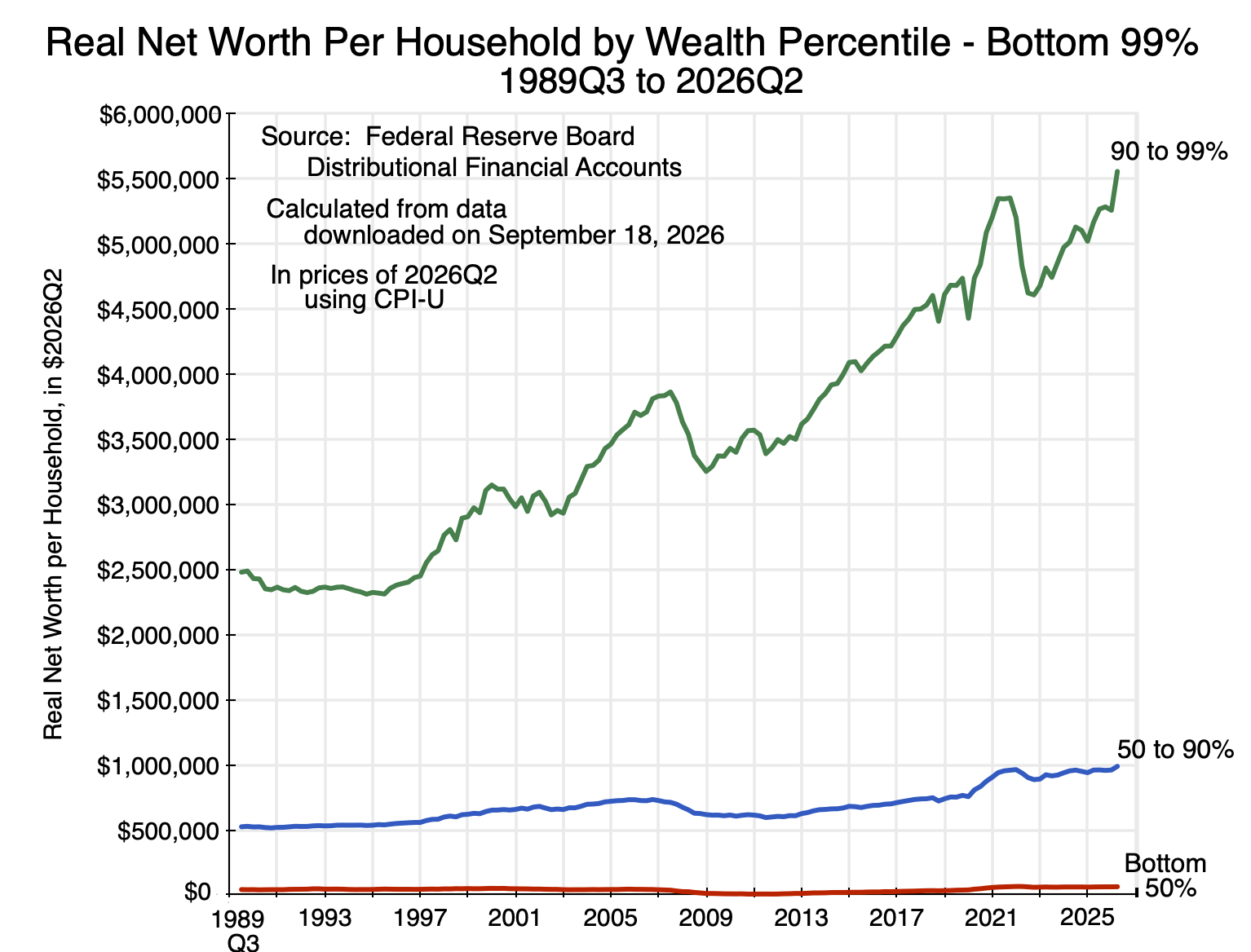
Chart 2
The average net worth of the 90 to 99% group rose over the period from $2.5 million to $5.6 million as of the end of 2026Q2. The average net worth for the 50 to 90% group rose from $524,000 to $988,000.
The line for the bottom 50% is still not clear, so in a chart on its own:
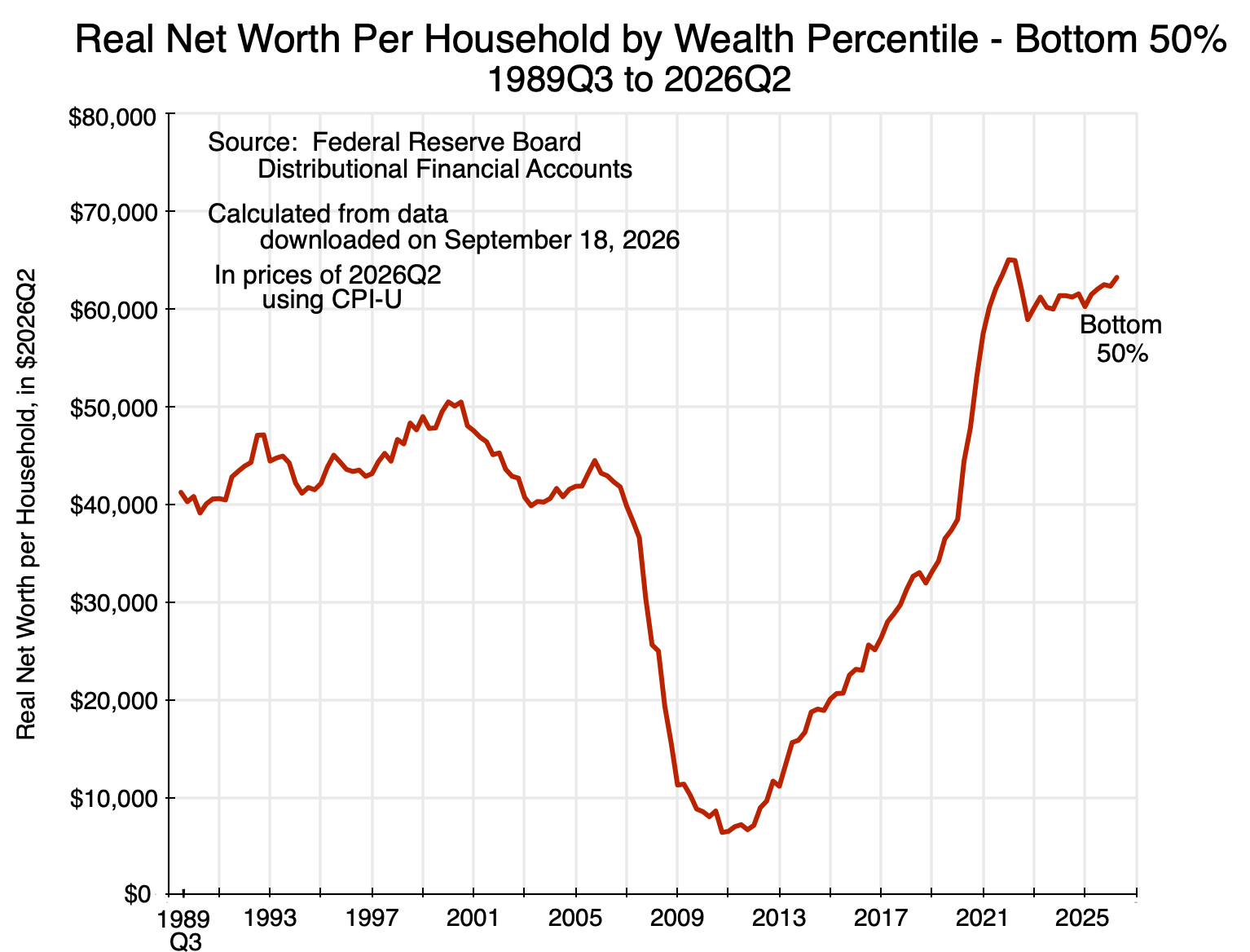
Chart 3
The path is far from steady: While average net worth for the bottom 50% rose over the full period from $41,200 to $63,300, it fell to a low of just $6,400 in 2010Q4 as a result of the 2008/09 economic and financial crisis. This primarily reflected the crash in real estate values – assets which account for a disproportionate share of the wealth of the bottom 50%. The average net value of their real estate wealth (i.e. the value of their real estate assets less that owed on home mortgages) was a negative $15,850 at the end of 2010.
Furthermore, while their net worth then recovered, it did not recover fully until 2020. The average net worth of the bottom 50% was $44,500 in 2005Q4, and an even higher $50,500 in 2000Q3 near the end of the Clinton presidency. But as of the end of the third quarter of 2016 (September 30, just before the November election that Trump won), the average net worth of the bottom 50% was only $25,600. This was only half of what it had been 16 years before. The disquiet and concern on economic prospects among many in the bottom half of the population should not be surprising.
There is tremendous inequality in net worth across households. As of mid-2026, the bottom half had an average net worth of only $63,300. The average net worth of the top 0.1% was over $200 million. That is over 3,200 times as much.
D. Inequality is Not Just High, But Also Has Grown
The disparities are gigantic. But the disparities aren’t only huge: they’ve grown. Taking the net worth of each group as a ratio to their level in 1989Q3 (with all in real terms per household), one has:
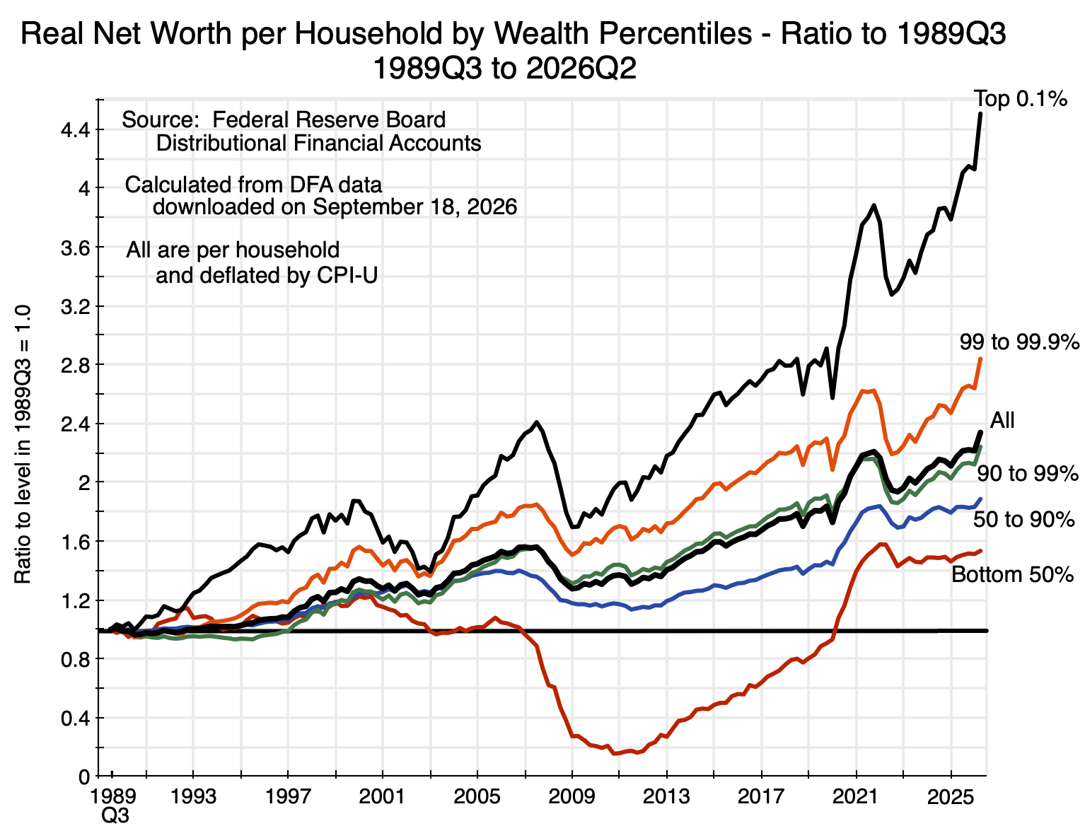
Chart 4
The real net worth per household of the top 0.1% at the end of 2026Q2 grew to be 4.5 times what it was at the end of 1989Q3. That of those in the 99.0 to 99.9% stratum was 2.8 times as high. And so on to the bottom 50%, where it was 1.53 times as high. The wealthier the group to start, the greater the growth in their wealth over the period.
There was no necessity for this. Indeed, until around 2005, there were times when the relative growth in the net worth of less wealthy groups grew by more than that of some of the more wealthy groups. But over extended periods, they did not.
But it is also not terribly surprising. The more affluent can invest in riskier assets, and over extended periods such assets will generally achieve a higher rate of return. The returns on riskier assets are subject to greater volatility, but over time their higher growth will win out. This is aside from advantages the wealthy can engineer for themselves through their advantageous capacity to intervene in political processes and decision-making.
E. Decomposing the Growth in Overall Wealth
The average real value of wealth per household in the US as a whole has gone up substantially over this time period. It is shown as the thick line in black in Chart 4, and is – as one would expect – in the middle of the increases recorded for the various groups. Overall net worth (in real terms and per household) in 2026Q2 was 2.34 times higher than what it was in 1989Q3.
What accounts for this? To start, GDP has grown, but as we will see, the value of wealth has grown by far more. Breaking this down, the rise has been due to a combination of real GDP growth, an increase in the share of GDP going to earnings on assets (profits), and a higher valuation multiple being placed on those earnings.
To start, profits grew as a share of GDP while the share of wages fell:
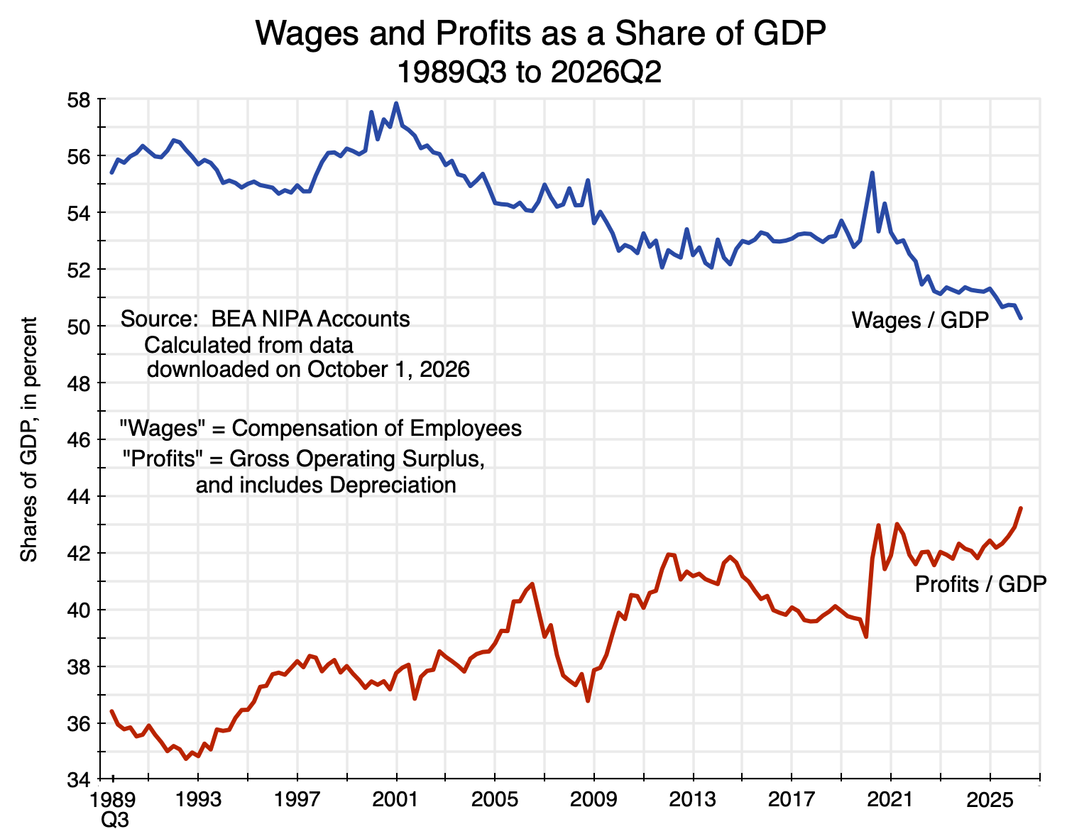
Chart 5
Gross profits (i.e. including depreciation allowances) rose from 36.4% of Gross Domestic Product as of the end of 1989Q2 to 43.6% as of the end of 2026Q2 – an increase (relative to the 36.4% share at the start) of almost 20%. The share paid to employees (wages) fell from 55.4% of GDP to 50.3%. As lower income groups are more dependent on wages for their income rather than profits, that fall in the wage share is significant.
[Side note: The shares of wages plus profits in the chart do not add up to 100% of GDP. The difference primarily reflects indirect taxes (such as excise taxes on fuels and tobacco, tariffs on imports, state and local property taxes, and more). Indirect taxes are not counted as being paid out of wages or profits (direct income taxes are), and hence constitute a third category of income in the National Income and Product Accounts. Those taxes have totaled a steady 6 to 7% of GDP throughout this period (except for a short period in 2020-2021 when they fell with the fall in spending due to Covid), and hence do not affect the trends seen for the wage and profit shares.
There will also be variation in the “statistical discrepancy” – the name the BEA uses for the difference between the estimated values of Gross Domestic Product (GDP) and Gross Domestic Income (GDI). GDP and GDI should in principle be identical, as the value of all that is produced (GDP) will be someone’s income (GDI). The statistical discrepancy is small – less than +/- 2% of GDP – but varies over time. Wages, profits, and indirect taxes are estimated in the GDI accounts, and will sum to 100% of GDI. But they are expressed here as shares of GDP, which, while close, will not sum to 100% of GDP due to the statistical discrepancy.]
A “valuation multiple” can next be defined as the ratio of wealth (i.e. net worth) for the country as a whole to the profits being earned. It is akin to a price/earnings ratio often used in valuation measures of equity. The valuation multiple over this period also rose:
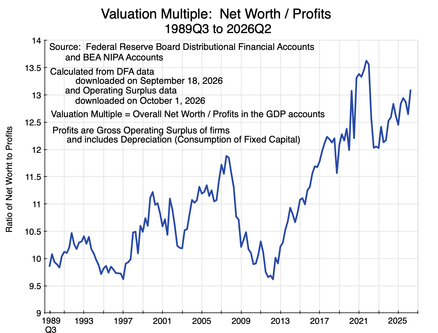
Chart 6
The valuation multiple rose from 9.9 in 1989Q3 to 13.1 in 2026Q2 – an increase of 33%. But it fluctuated a lot. It rose to 11.9 in 2007, fell to as low as 9.6 in 2012 following the economic and financial collapse of 2008/2009, and then rose again. It reached 13.6 in the last quarter of 2021, fell to 12.0 in 2022Q3, and ended at 13.1.
An astute observer might note that the gross profits being assessed here (as a share of GDP in Chart 5, and then as the denominator in the ratio in Chart 6) are the overall profits in the economy. The corresponding wealth being valued based on those profits is then the wealth held by households. Will this coincide with the total wealth in the economy as a whole? The answer is that it will be close, although not exact. The Fed’s Financial Accounts of the United States (FA), discussed in Section B above, estimates that the aggregate wealth of the US economy as of the end of 2026Q2 was $181.0 trillion (Table S1.b). The Fed’s Distributional Financial Accounts (DFA) estimate the aggregate wealth of households as of the end of 2026Q2 was $185.7 trillion.
These are close to each other but not the same for several reasons. One is that some of the estimation methods and definitions are different in the DFA accounts than those in the FA accounts, as discussed in Section B above. But they are close because the ownership of most assets and liabilities is ultimately attributed to households in the DFA. Households may hold assets directly (such as homes), or via their ownership of equity in both corporate and non-corporate businesses, or their ownership of financial assets (e.g. deposits in banks, or direct ownership of bonds). These account for most assets in the economy.
The main exception will be government assets – including federal, state, and local government assets. These totaled $23.1 trillion as of the end of 2026Q2 in the FA accounts. But largely offsetting this is the net claims on US assets by foreign entities. These totalled $20.7 trillion, leaving a small net difference. Coupled with definitional and estimation differences, the total net worth of all US households is reasonably close to the net assets of the economy as a whole and adequate for the purposes here.
Putting this together: GDP per household rose in real terms, profits rose as a share of GDP, and the valuation multiple assigned to those profits also rose:
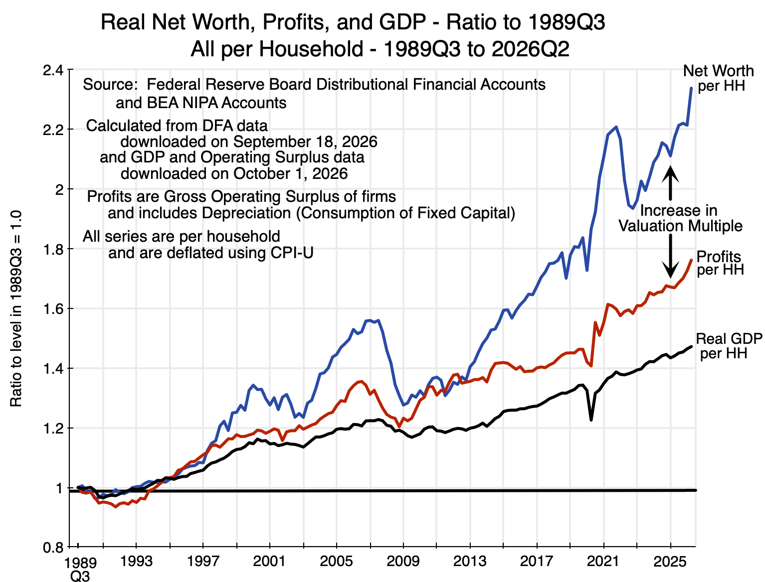
Chart 7
Putting numbers on this, real GDP per household rose by 47.2% over the period, profits as a share of GDP rose by 19.7%, and the valuation multiple rose by 32.7%. Multiplying this out, the result is: 1.472 x 1.197 x 1.327 = 2.338. That is, as of 2026Q2, overall real net worth per household rose to 2.338 times what it was in 1989Q3. That corresponds to the line in blue in Chart 7, as well as the identical line for households as a whole in Chart 4 above (the thick black line).
Decomposed in this way, one sees that the increase in real GDP per household was the largest single factor behind the increase in overall wealth (with its increase of 47.2%). The economy is producing more now than before. The increase in the valuation multiple (by 32.7%) was the second most important factor. Higher valuations are being assigned to assets for any given level of current profits. And these were then amplified by profits growing as a share of GDP (by 19.7%). All three were significant, and together led to wealth that is now valued at 2.338 times (i.e. 133.8% higher than) what it was in 1989Q3.
In stable conditions, one would expect wealth to grow in line with the growth in GDP. But it increased by substantially more over the past 37 years because an increasing share of the income being generated in the economy (GDP) is going to profits rather than wages, and because the value being placed on the assets for a given level of profits (the valuation multiple) has also increased. Together, they led to an increase in the value placed on that wealth for any given level of GDP by almost 59% (since 1.197 x 1.327 = 1.588). A good question is why, but that is a topic for a separate discussion.
F. Conclusion
Overall real wealth per household has grown significantly over the almost 37 years covered by this data series. Adjusting for inflation using the CPI, it is now 2.338 times what it was at the start in 1989Q3.
But its distribution is highly skewed. Ranking households by their net worth, the average net worth of the bottom 50% of households was an estimated $63,300 as of 2026Q2. The average in the 50 to 90% group was an estimated $988,200. In contrast, the average net worth of the top 0.1% was an estimated $203.7 million, and that in the 99.0 to 99.9% range was $26.7 million.
The disparities were already huge in 1989Q3 – the earliest period in this data series. But those disparities then grew, with the estimated real net worth per household of the top 0.1% growing to 4.5 times what it was at the start, and that of the 99.0 to 99.9% growing to 2.8 times what it was at the start. In contrast, while the real net worth per household of the bottom 50% grew, it grew to just 1.53 times what it was at the start. It also fluctuated widely, and for 13 years (from 2007 to 2020) was less than what it was in 1989Q3. This was primarily due to depressed values for their net real estate assets. The value of those assets collapsed in 2007/08, remained depressed for several years, and recovered only slowly. And real estate accounts for a high share of the net worth of the bottom 50%.
The purpose of this post has been to provide some of the basic figures on the distribution of wealth in the US and to describe how the underlying basic data were estimated by the Fed. Future posts will examine other aspects of the distribution of wealth, including its distribution when groups are classified by income rather than their wealth holdings, and how wealth accumulation has changed across generations. A final post will discuss what might be done to address these disparities.


You must be logged in to post a comment.