
A. Introduction
The US health care funding system is a mess. One consequence is that despite spending far more than any other country in the world for its health care system (about 18% of GDP currently, where the next highest country spends only about 12%), US health care outcomes are mediocre at best. Among OECD member countries, only a few countries, with incomes well below that of the US (some countries of Central or Eastern Europe or in Latin America), have worse outcomes than the US in such standard measures as life expectancy or infant mortality rates.
Bringing this to the level of individual families, the Kaiser Family Foundation found (based on a survey of firms) that the average cost of an employer-sponsored health plan in the US in 2019 came to $20,576 for family coverage. Of this, the share covered directly by the employer (as part of its overall worker compensation package) came to $14,561 (71%) while the worker paid via premia an additional $6,015 (29%). For 2018, the figures were a total cost of $19,616, with $14,069 for the employer share and $5,547 for the employee share. Median family income in 2018 (the most recent year available) in the US was $80,663 (Census Bureau estimate). Adding in the employer share of the cost of the health plan to cash family income, the total cost of an employer-sponsored health care plan came to 21% of this expanded family income.
On top of this, a family will have to pay out-of-pocket the costs of deductibles, co-pays, co-insurance, and health care costs not covered under their insurance plan. Milliman, a health care advisory firm, estimated that in 2018 such out-of-pocket costs were an average of an additional $4,704 for a family of four. This would bring the total cost of health care for a family of four to $24,320, or 26% of expanded family income. This is huge. And the burden is of course proportionally larger for the 50% of the population with an income below the median.
Such a high cost for health care is in and of itself a giant problem. But beyond this, not having effective access to the health care system, at whatever the cost, is even worse. It can literally be a matter of life and death.
It should not therefore be a surprise that what to do about health care has become a prominent issue in the race for the Democratic nomination for the presidency in 2020. While each candidate has his or her own specific proposals, most are grouped around one of two alternatives: A single-payer Medicare-for-All plan, where Elizabeth Warren has released the most detailed proposal on what she would seek to do; and plans which would add a public option to the Obamacare exchanges, which has been dubbed Medicare-for-All-Who-Want-It by Pete Buttigieg, its most prominent proponent.
This blog post will review these two alternative proposals, focusing on the implications of each. In addition, Elizabeth Warren has also released a detailed plan for what would be, under her proposals, a transition to a Medicare-for-All system during which she would add a public option to the Obamacare exchanges. On the surface this would appear similar to the Medicare-for-All-Who-Want-It proposals of Buttigieg and others, but there are in fact important differences in the specifics. After discussing the Warren Medicare-for-All proposal and then the Buttigieg Medicare-for-All-Who-Want-It proposal, this post will then review the Warren transition proposal and its differences with the Buttigieg plan.
To summarize very briefly, the implications of these different plans include:
a) The Warren Medicare-for-All plan, while providing comprehensive and generous health care coverage for all in the US, would also imply massive shifts in how health care is funded. Total costs would not rise (an increase due to the broader coverage would be offset, she argues, by efficiency gains of similar magnitude). But the shifts in how health care would be funded are staggeringly large, potentially disruptive, and unrealistic in the view of many analysts.
b) The Medicare-for-All-Who-Want-It plan, in contrast, need not in principle cost much. A public-managed option added to the Obamacare health insurance exchanges could be priced to cover its costs, just as private insurers on the exchanges do now (along with their profits). And indeed, a careful analysis by the Congressional Budget Office (which will be discussed further below) concluded that the overall impact of allowing a public option would reduce the fiscal deficit significantly, due to indirect effects that would reduce public expenditures while increasing public revenues. However, the specific Buttiegieg plan goes further than just adding a public option, by increasing the health care plan subsidies significantly and providing them to a broader range of families and individuals than receive them now. With this as well as other measures, Buttiegieg estimates his proposals would lead to increased federal spending, but of only $1.5 trillion over ten years. This would be well below the $26.5 trillion shifted to federal spending in the Warren Medicare-for-All plan.
However, while a Medicare-for-All approach (such as proposed by Warren) would lead to everyone enrolled in a similar (and comprehensive) health insurance plan with funding through federal government sources, the addition of a public option to the Obamacare exchanges would lead to what would still be a highly diverse and variable set of health insurance plans, with very different levels of coverage and very different costs. Some enrollees would pay relatively little (if they are young and healthy, or of low income) while others would pay much more (if they are older, or of moderate or higher income). The health care funding system would remain fragmented, extremely complex, and with widely varying costs for different families and individuals. And from such a starting point it would then be difficult to transition to a Medicare-for-All system, even if the overwhelming majority choose to enroll in the public option.
c) Finally, while the Warren transition plan would add a public option at the start of the process, her public option would be of a health plan that is very different from the public option of Buttiegieg, Biden, and others. Her proposed public option would be for an insurance plan that is similarly comprehensive to what she has proposed for her Medicare-for-All plan. It would also then receive, from the start, a high level of subsidy, benefiting those who choose to enroll in that public option. These subsidies would be funded centrally by the government. The overall expense would depend on how many would choose to enroll in the plans, but with the comprehensive coverage proposed by Warren coupled with high subsidies, it would be foolish for most not to enroll. While this would then provide a path to a compulsory Medicare-for-All system, the funding that would need to be provided would be large.
B. The Elizabeth Warren Medicare-for-All Plan
Elizabeth Warren has presented the most detailed proposal for how her Medicare-for-All plan would be set up, and importantly also how it would be paid for. Medical costs covered would be expansive in her plan, and include not only that 100% of the cost of the medical services that Medicare currently provides for would be covered (i.e. no deductibles, no co-pays, no co-insurance), but so would medical expenses such as for dental and visual services, and for prescription drugs. This would be much broader than what Medicare as it currently exists covers, as Medicare has a deductible, limits on the number of hospital days covered, and generally covers only 80% of doctor services. Furthermore, Medicare does not cover expenses for dental, visual, and certain other areas of care, and while Medicare Part D now covers certain prescription drug costs, there are limits on how much it pays.
This expansive coverage is similar (indeed probably identical) to what Senator Bernie Sanders has proposed. But while Elizabeth Warren has presented a detailed plan on how the costs of the expansive health funding program would be covered, Bernie Sanders has not. Rather (at least as of this writing) Sanders has made available a six-page note titled “Options to Finance Medicare for All”. But while the alternative funding sources outlined in that note are presented as options from which to choose, if one adds up the estimated amounts that would be raised by summing up all of the options presented the total of $16.2 trillion over ten years would not suffice to cover the costs of his Medicare-for-All program. As we will see below, the shift in health care spending to the federal government, even after an assumed $7.5 trillion in savings through various measures, would come to $26.5 trillion over ten years.
We will therefore focus on the Warren plan, although on the cost side the figures would be similar to what Sanders has proposed. And there will be a lot of numbers. The key issue for the Warren (and Sanders) plans is that the dollar amounts involved are massive. It is important to stress that this does not mean health care costs will be higher (other than certain costs from the increased access, to be offset by savings from several reforms), but rather that there will be shifts (and massive shifts) from how these costs are covered now to how they would be covered under the Medicare-for-All plan.
To see these shifts, it is best to start from estimates of what national health care expenditures would be should the US keep the current system. A ten-year period is being covered (as is standard in most budget analyses), and for the purpose of this exercise the Warren team has come up with estimates of how those costs would then change if their plan were fully in place for the years 2020-29. This is of course notional, as the full Medicare-for-All plan was not in place on January 1, 2020. But use of the 2020-29 period is reasonable to demonstrate what would happen under such a plan, as reasonable estimates can be made for such a period.
For what health expenditures are expected to be under current law, most US analysts use the detailed forecasts provided each year by the professional staff at the Centers for Medicare and Medicaid Services (CMS). The most recent National Health Expenditure (NHE) projections, covering the period 2018-27, were released in February 2019, and the figures presented below are based on Table 16 of that set of forecast tables. The NHE projections stop at 2027 and hence do not include 2028 and 2029, but for those final two years I extrapolated from the 2027 estimates based on the growth rates in the forecast numbers of the last few years before 2027 (specifically, 2025 to 2027). Other analysts would use similar methods, and for the final two years of a ten-year series the totals will be close.
As we will see below, the Warren figures are mostly, although not entirely, consistent with these NHE forecasts. The causes of the limited inconsistencies are not fully clear, as the Warren figures are mostly presented in terms of what the shifts would be from some base. Despite this, it is still useful to review first the NHE numbers, as they will give one a sense of the magnitudes involved in the funding of our health care system as it currently exists. And they are huge.
The NHE forecasts (extrapolated for the final years, as noted above) for health expenditures between 2020 and 2029 under current law will be:
|
in $ trillion |
GDP share |
|
|
Total National Health Expenditures under Current Law: 2020-29 |
$52.5 |
18.9% |
|
A. Federal Government |
$15.8 |
5.7% |
|
Private insurance for government employees |
$0.5 |
0.2% |
|
Medicare taxes for government employees |
$0.1 |
0.0% |
|
Medicare from budget |
$6.0 |
2.1% |
|
Medicaid |
$5.5 |
2.0% |
|
Other health programs (CHIP, DOD, VA, more) |
$3.8 |
1.4% |
|
B. State and Local Government |
$8.7 |
3.1% |
|
Private insurance for government employees |
$2.8 |
1.0% |
|
Medicare taxes for government employees |
$0.2 |
0.1% |
|
Medicaid |
$3.4 |
1.2% |
|
Other health programs |
$2.3 |
0.8% |
|
C. Private Business |
$10.1 |
3.6% |
|
Private insurance for employees |
$7.7 |
2.8% |
|
Other (Medicare, disability, worker comp, more) |
$2.4 |
0.8% |
|
D. Households |
$14.3 |
5.2% |
|
Private insurance premia and employee share |
$5.1 |
1.8% |
|
Medicare taxes |
$4.0 |
1.4% |
|
Out-of-Pocket |
$5.2 |
1.9% |
|
E. Other Private Revenue (philanthropy, more) |
$3.5 |
1.3% |
Total national health expenditures under current law are forecast to be $52.5 trillion dollars over the period 2020 to 2029. This is huge. It comes to an average of 18.9% of GDP over the period as a whole, rising from 17.9% in 2020 to 19.9% in 2029. By way of comparison, the Congressional Budget Office forecast of total federal government tax and other revenues (including all income taxes, Social Security taxes, and everything else) will be less than this, summing “only” to $45.6 trillion over this period. Addressing how health care spending is funded will unavoidably deal with huge dollar amounts.
The $52.5 trillion in total health care costs are then funded through a combination of the amounts spent by the federal government ($15.8 trillion), state and local governments ($8.7 trillion), private businesses for their employees ($10.1 trillion), households ($14.3 trillion), and other sources, including philanthropy ($3.5 trillion). Taking the federal government expenditures as an example, the NHE forecasts are that the federal government will spend $0.5 trillion over the ten years for its payments to private insurers to cover health insurance for federal workers, and $0.1 trillion in Medicare taxes for those federal employees. These are relatively minor amounts but are included for completeness. The really major expenditures are then what the federal government will provide directly to Medicare from the budget ($6.0 trillion), will spend on Medicaid ($5.5 trillion), and will spend on other health programs such as for CHIP (the Children’s Health Insurance Program), for the Department of Defense, for the VA, and so on ($3.8 trillion).
The breakdowns in the other components of health care spending are similar, and will not be repeated here. But it is useful to note that even under current law, the total being spent on health care by government (the federal $15.8 trillion as well as the state and local $8.7 trillion) would be expected to come to $22.5 trillion over the ten years, or 43% of the $52.5 trillion forecast to be spent. Government is already heavily involved in health care funding in the US, even though the system is often described as “employer-based”.
This mix of health care funding sources would then differ dramatically under any Medicare-for-All proposal, even with total health care expenditures unchanged. Elizabeth Warren provides specifics on what this would be under her plan (available at both her campaign website and identically also at this commercial website in case her website is eventually closed). Additional detail is provided in two more technical notes, prepared by advisors to her campaign, first on the overall costs of her Medicare-for-All plan, and second on the taxes and other measures that would be implemented to fund the federal government expenditures in such a program.
The specifics on the costs are presented in the following table:
|
Warren Medicare-for-All Plan: 2020-29 |
in $ trillion |
GDP share |
|
A. Base National Health Expenditures |
$52.0 |
18.7% |
|
Increase in cost from expanded cover |
$7.0 |
2.5% |
|
B. Total Health Expenditures if nothing else done |
$59.0 |
21.2% |
|
1) National health spending not affected by plan |
$8.0 |
2.9% |
|
2) Base level of Federal Govt Spending before plan |
$17.0 |
6.1% |
|
C. Increase in Federal Govt Spending Before Savings |
$34.0 |
12.2% |
|
D. Savings from Reforms |
$7.5 |
2.7% |
|
1) Lower Admin Costs (beyond Urban Inst estimate) |
$1.8 |
0.6% |
|
2) Lower Costs of Prescription Drugs |
$1.7 |
0.6% |
|
3) Lower Costs and Payments to Health Providers |
$2.9 |
1.0% |
|
4) Slower Growth of Medical Costs |
$1.1 |
0.4% |
|
E. Net Increase in Federal Govt Spending |
$26.5 |
9.5% |
As a base from which to start, the Warren team used estimates made by analysts at the Urban Institute of what total national health expenditures would be under current law and then under a Medicare-for-All system (with the expansive cover proposed by Warren as well as by Sanders). The Urban Institute forecasts that under current law, total national health expenditures would be $52.0 trillion for the period 2020-29. This is a bit below the $52.5 trillion figure arrived at using the NHE forecasts of the staff at the Centers for Medicare and Medicaid Services (CMS), but close (99%). The Urban Institute has its own model for forecasting health expenditures, but say that they use the CMS figures for certain components they do not directly model.
The $52 trillion in health expenditures would be under current law. The more expansive cover under the Warren (and Sanders) plans would then make health care more widely available, and the Urban Institute estimated (in a separate, but linked, publication) that this would lead to a net increase in health care costs of $7 trillion over the 2020-29 period. This is a net increase as the Urban Institute includes in the $7 trillion certain savings from a Medicare-for-All system, in particular savings from the far lower administrative costs of Medicare compared to the costs at private insurers in the US (savings I discussed in an earlier post on this blog).
Total national health spending would then be $59 trillion over the ten years. To arrive at what the federal government would be funding out of this, the Urban Institute analysts first subtracted $8 trillion of health care costs that they estimate would not be affected under a switch to a Medicare-for-All funding system. These include a variety of expenditures, such as medical care for the military and their families when deployed overseas, acute care for people living in institutions (such as prisons as well as nursing homes), certain state and local government direct expenditures, public health programs, and so on.
The Urban Institute then estimates that other federal government health expenditures (under current law) would total $17 trillion over the ten years. This is higher than the $15.8 trillion forecast in the CMS NHE numbers discussed above, and it is not clear why (particularly as certain of the federal government expenditures, such as for military personnel, are included in the $8 trillion figure of costs that will not be affected). The Urban Institute reports made publicly available are not technical documents, so many of the details are not explained and documented. But based on the $17 trillion figure for federal health spending, the increase in federal health expenditures (due to shifts from others under a Medicare-for-All plan), would be $59t – $8t – $17t = $34 trillion.
The Warren advisors started from this $34 trillion figure. From this, they estimated that savings from several measures that would accompany their plan would lead to $7.5 trillion in lower national health care costs over the period. One would be further savings from the lower administrative costs of the far more efficient Medicare system. The Urban Institute estimated that such administrative costs (as a share of total costs of the insurance plan) could, conservatively, be reduced to 6% under Medicare, down from the 12.2% that it costs private insurers to administer their insurance plans (in their high-cost business model, with its negotiated networks and other such costs). The Warren team argued, reasonably, that this could be reduced further to just 2.3%, which is what it now in fact costs Medicare to administer its system.
The Warren advisors then estimated that other cost savings could be achieved through reforms of the prescription drug system in the US ($1.7 trillion), through lower costs incurred by health care providers when they need only to deal with one insurance provider (Medicare) rather than the complex system of private insurers they must now contend with (and then lower payments to reflect this – an estimated $2.9 trillion in savings), and an overall slower growth of health care costs ($1.1 trillion).
With the estimated $7.5 trillion in savings from such measures, the net increase in federal spending for health care over the ten year period would be $26.5 trillion ( = $34.0t – $7.5t).
This is still a giant number. Recall that the CBO estimate of all federal government tax and other revenue over this period totals just $45.6 trillion, and $26.5 trillion is 58% of this. So how would Warren cover this cost?:
|
Warren Plan: Paying for the Shift to Federal Govt Spending |
in $ trillion |
GDP share |
|
Net Increase In Federal Spending |
$26.5 |
9.5% |
|
A. Taxes / Transfers from Current Health Care Spending: |
$14.9 |
5.4% |
|
1) Transfer from State/Local Govt health insurance savings |
$6.1 |
2.2% |
|
2) Tax Private Businesses amount of insurance savings |
$8.8 |
3.2% |
|
B. Other New Taxes / Federal Govt Spending Reductions: |
$11.7 |
4.2% |
|
1) Taxes on worker income now spent on health insurance |
$1.4 |
0.5% |
|
2) Financial transactions tax of 0.1% |
$0.8 |
0.3% |
|
3) Systemic risk fee on large financial institutions |
$0.1 |
0.0% |
|
4) End accelerated depreciation for large businesses |
$1.25 |
0.5% |
|
5) Minimum tax on foreign earnings of 35% + tax on foreign firms in US |
$1.65 |
0.6% |
|
6) Additional tax of 3% on wealth over $1 billion |
$1.0 |
0.4% |
|
7) Capital gains (as accrued) taxed at regular rates for richest 1% |
$2.0 |
0.7% |
|
8) Better tax law enforcement |
$2.3 |
0.8% |
|
9) Tax revenues from normalization of immigrants |
$0.4 |
0.1% |
|
10) Reduction in military spending |
$0.8 |
0.3% |
|
C. Reductions in Health Care Funding |
$12.2 | 4.4% |
|
1) Household savings on health costs (insurance + out-of-pocket) |
$12.0 |
4.3% |
|
2) Net private business savings on health costs |
$0.2 |
0.1% |
First, Warren would require that state and local governments transfer to the federal level what those governments are now spending out of their own budgets for private insurance for state employees ($2.8 trillion in the table above of the CMS NHE forecasts) plus what those governments spend out of their budgets for Medicaid ($3.4 trillion in the CMS NHE figures). The total in the CMS NHE figures of $6.2 trillion is within roundoff of the $6.1 trillion in the Warren estimates. Whether such a transfer is politically realistic is a separate question. I can imagine that a number of the state governments (particularly those in Republican hands) would tell the federal authorities that it is great that they are now covering those health care costs directly (under a Medicare-for-All system), but that they will keep the savings in their budgets for themselves. In any case, it would certainly be litigated in the courts.
Warren would then also set what would in essence (or in actuality) be a tax on private businesses, equal to 98% of what those businesses now spend for the employer share of the health care premia for the private insurance for their workers. Warren’s team estimates that businesses would spend under current law a total of $9.0 trillion over the ten year period on their share of their employer-based health insurance plans, and 98% of this is $8.8 trillion. The $9.0 trillion figure appears to be broadly consistent with the CMS NHE figures discussed above, which estimates that private businesses will spend $7.7 trillion over the period on private health insurance for its employees, and also some portion of a further $2.4 trillion in other health expenses the employers will incur.
But the main issue with the new $8.8 trillion tax on private businesses is that it would be set, business by business, to reflect what that business is currently spending for its share (or, more precisely, 98% of its share) of the private health insurance plans for its workers. Thus firms with health insurance plans that are generous in what they cover and in what share of health care costs they pay (and hence are more expensive), will pay more. Workers at such firms might be accepting lower wages than they could earn elsewhere, knowing that the generous health insurance plans cover more, including more of what they would otherwise need to pay out-of-pocket. At the other end, there are firms with stingy plans that are cheap, or even with no health insurance plans at all (which is legal if the firm has fewer than 50 employees, although health insurance plans are still common among such firms). These firms would pay much less, or even nothing at all, under the Warren proposal, even though their workers, like everyone, would be covered by Medicare-for-All.
Many would view this as inequitable: Firms with strong health care plans would be penalized, as they would then pay more into the Medicare-for-All funding, while firms with stingy or no health care plans would pay less or even nothing at all. While there would be some undefined phasing in period in the Warren proposal to more equal shares being charged across firms, this would only be implemented over several years.
Furthermore, knowing that at least for some initial period the firms with the more generous plans would pay more and the firms with the more stingy plans would pay less, would create a perverse set of incentives. In the mid-November update on her plans (which will be discussed in more detail later in this post), Senator Warren said that she would not introduce legislation for her Medicare-for-All plan until her third year in office. That would mean that the new Medicare-for-All system would not enter into effect until at least her fourth year in office, and more likely no earlier than two or three years after that (as any such major reform takes time to implement). If firms expect this to take place at some point in the next several years, they would have a strong incentive to revise the health insurance plans they sponsor for their employees in the direction of making them more stingy, or dropping them altogether if they legally can.
It is therefore likely that at least this aspect of the Warren plan will be revised should it go forward. An addition to the payroll tax we now pay for Social Security and for Medicare is one likely alternative, and will also give a sense of the magnitudes involved. Currently workers pay on their wages (half directly and half by their employers on their behalf as part of their overall compensation package) a tax of 12.4% on wages up to $137,700 in 2020 ($132,900 in 2019). In addition, they pay 2.9% to fund Medicare (with no ceiling), for a total payroll tax of 15.3% on wages up to the ceiling.
The Congressional Budget Office, in their August 2019 forecasts, estimated that the Social Security tax (of 12.4%) will raise $11,269 billion in revenues over 2020-29. To raise $8.8 trillion on this same wage base, would therefore require a rate of 9.7% (based on the proportions). The overall payroll tax would then increase from the current 15.3% to a new 25.0%. Many might view this as too much to pay, but one should recognize that it reflects what is now, on average, being paid on wages once one adds together Social Security, Medicare, and what the average employer pays for its share (or more precisely, 98% of its share) of the private health insurance plans for its employees. One should also note that while 25% might seem high, it is substantially less than the approximately 40% rate found for payroll taxes (employer and employee combined) in a number of European countries (including Germany, the Netherlands, Belgium, Sweden, and Italy, and with France at over 50%).
Transferring to the federal government what is now being paid out by state and local governments for health insurance ($6.1 trillion, including the state portion for Medicaid), and by 98% of what private businesses are paying ($8.8 trillion), would then leave $11.7 trillion to be raised from other sources (where $11.7t = $26.5t – $6.1t – $8.8t, with rounding). The Warren plan lists ten specific measures to do this: six would be new taxes (or increases in existing or proposed taxes); one would be tax revenues from personal incomes that would become taxable with the move to Medicare-for-All; one would be increased revenues from better tax law enforcement; one would be taxes on incomes of immigrants who have had their status normalized; and one would be savings from reduced military spending. A total of $10.9 trillion would come from higher taxes and $0.8 trillion from military spending reductions.
This is a wide, and diverse, set of funding sources. I will not comment on each, but note that some analysts consider at least some of the revenue forecasts to be highly optimistic. And one should always be skeptical when “better tax law enforcement” is assumed to raise a substantial share of the increased revenues needed ($2.3 trillion over ten years in the Warren plan, or 0.8% of GDP, which is huge).
Nevertheless, the Warren plan at least sets out proposals on how revenues might be raised (or expenditures reduced). She should be commended for this, and it is in sharp contrast to, for example, the Republican / Trump tax cuts approved in December 2017. Those tax cuts were forecast to lead to a loss in government revenues of $1.5 trillion over ten years (and it now appears that the losses will be even higher). No effort was made by Trump or by the Republicans in Congress on how those revenue losses would be covered – the revenue losses would instead simply be added to overall government debt. Warren, in contrast, has laid out specific proposals on how shifting health care expenditures to the federal level would be covered. While one can be skeptical of certain of the figures, there is at least the recognition that something should be done to cover the shift in health costs.
It is also telling that the measures listed seek to avoid what might be obviously taxes on middle-class incomes. Presumably this was done for political purposes, but one should recognize that at least some of the measures will impact middle-class incomes. Specifically, it should be recognized that what employers pay for what is termed “the employer share” of health insurance premia for their employees is, in reality, a portion of the overall compensation package being paid to workers. Over time, workers’ wages adjust to reflect this. And while under the Warren plan this employer share (or 98% of it) would be transferred to the government, such a transfer would eventually become a uniform tax on employers (and as discussed above, this should probably be done immediately to avoid the perverse incentives of a gradual shift). The payroll tax would need to increase by 9.7% points to cover this, bringing the total payroll tax (for Social Security, current Medicare, and part of the cost of the new Medicare-for-All program) to 25.0%. This is a tax on middle-class incomes. There is nothing necessarily wrong with that, but it should be recognized.
Similarly, the Warren plan recognizes that since what workers now pay as their direct share of the cost of the employer-sponsored health insurance plans will go away under a Medicare-for-All system, the increase in income taxes on such incomes (as they are now largely income tax-exempt) would be substantial ($1.4 trillion over ten years in their estimate). While fully reasonable, this is still a tax on middle-class incomes.
With total health care spending about the same ($7.0 trillion more for the increased access, offset by $7.5 trillion in cost reductions, for a net reduction of $0.5 trillion), but with $11.7 trillion in funding from new taxes and other measures, which groups will be spending less? Under this plan, households would no longer pay health insurance premia nor out-of-pocket for most health care expenses. The Warren campaign put this figure at $11 trillion over the ten-year period, which would then go to zero. In addition, private businesses would gain the 2% from the requirement that they transfer 98% (not 100%) of what they now pay in health insurance premia, which would be an additional $0.2 trillion. The total gain then by these two groups would be $11.2 trillion (ignoring, for this calculation, that some portion of the additional taxes would be paid by them).
But this does not add up properly. After struggling with this for some time, I believe a mistake was made by the Warren advisors (which may have arisen as they were in a rush to get the plan out). Assuming all the underlying numbers are correct, the $11.7 trillion raised by additional taxes (mainly) plus the $0.5 trillion net reduction in national health care spending under the plan ($7.0 trillion in more comprehensive coverage, minus $7.5 trillion in cost savings), would imply that the total gain by households and private businesses would be $12.2 trillion. With the private businesses gaining $0.2 trillion (the 2%), this would imply a $12 trillion gain by households, not $11 trillion. My guess is that instead of adding the net $0.5 trillion reduction in overall health care expenditures to the $11.7 trillion in increased funding (a total of $12.2 trillion), they subtracted it (a total of $11.2 trillion).
This is not fully clear as all the underlying numbers from the Urban Institute used by the Warren advisors have not been made publicly available (at least not from what I have been able to find). Of relevance here is how they arrived at their figure that health care costs totaling $34 trillion would shift to the federal government under a Medicare-for-All plan such as that of Senator Warren (and Senator Sanders). Nor did the Warren advisors present all the numbers on what each of the groups (state and local governments, private businesses, and households) would spend under current law and under their Medicare-for-All proposal. Rather, they only provided how each of these would change.
[Side note: There is possibly also another issue. The CMS NHE figures discussed above forecast that total household expenditures over the period for private health insurance premia and for out-of-pocket expenses would total just $10.3 trillion. On top of this, households would also spend $4.0 trillion in existing Medicare taxes (for old age cover). While the Warren plan does not address this explicitly, implicit in her numbers is that the taxes gathered for old-age Medicare would remain as they are now (even though Medicare benefits would switch to the more generous cover of the Warren Medicare-for-All plan, such as no deductibles or co-pays). But if households will be spending $10.3 trillion over the period for health care premia and other expenses, then their savings under the Warren plan cannot be $11 trillion, much less $12 trillion. What is going on? It is not fully clear, as the full set of underlying numbers have not been presented, but it is possible that the Warren advisors are working from a forecast that household spending on health care will total $11 trillion, rather than the $10.3 trillion forecast in the CMS NHE figures. We would need to see the underlying numbers to sort this out.]
With the exception of this possible “glitch”, the Warren plan does, however, provide us with a good sense of the magnitudes of what the shifts in costs would be under a comprehensive Medicare-for-All plan.
In summary, with the US spending so much on health care ($52.0 or $52.5 trillion expected over the ten-year period under current law, or close to 19% of GDP), shifting how those costs are paid from private to public insurance will inevitably imply massive dollar amounts. This does not mean higher amounts would be spent on health care. Indeed, with Medicare far more cost-efficient than private insurers, total costs for a given level of coverage will go down. But the shifts will still be massive.
The Warren plan covers these costs by three steps: First, while an enhanced level of coverage would be provided (which by itself would increase overall costs by an estimated $7.0 trillion), these would be more than fully offset by measures which would save on costs (by an estimated $7.5 trillion). Second, what state and local governments are now spending for health care coverage ($6.1 trillion), and 98% of what private businesses are spending as part of the wage packages for their employees ($8.8 trillion), would be transferred to the federal government, as the federal government would now cover these health care costs under the Medicare-for-All plan. And third, the remaining $11.7 trillion needed to cover the additional federal level expenditures (of $26.5 trillion under the plan) would come from a wide range of measures, mostly of new or increased taxes, but also from a cut in military spending.
The net result would then be that households would no longer pay for health insurance directly, nor for current out-of-pocket costs. These would be paid for through indirect means, as outlined above. One can debate the extent to which these new taxes (in particular the transfer from private firms of what they are now paying for their employee health insurance) will impact households, but in the end there will be impacts. Some households will end up spending less than they are now, and some will spend more. And given the magnitudes of the underlying health care costs involved, those impacts will be huge.
C. The Buttigieg Medicare-for-All-Who-Want-It Plan
Pete Buttigieg, as well as several other of the Democratic candidates for president (notably former Vice President Joe Biden and Senator Amy Klobuchar), have proposed instead adding a public option to the Obamacare market exchanges. Buttigieg calls this Medicare-for-All-Who-Want-It, and has said that if private insurers then do not respond with something dramatically better “this public plan will create a natural glide-path to Medicare for All”. This option would be a publicly managed (perhaps by Medicare) insurance plan, with similar coverage to what is now offered by private insurers and made available through the Obamacare marketplace exchanges along with the private insurance plans. Buttigieg’s basic proposal is available at his campaign web site, with more detail provided at this additional post.
To see how this would work, we will first review how prices and other features for the health insurance plans are currently set by private insurers on the Obamacare exchanges, and then how the public option as proposed by Buttigieg would fit into this system. One can then draw the implications for the system that one would end up with – a system that would be quite different from a Medicare-for-All system such as that proposed by Senator Warren. And an important question is whether a system with a public option such as that proposed by Buttigieg would in fact create a “natural glide-path” to Medicare-for-All.
The Obamacare marketplace exchanges allow individuals to choose, from among the private plans offered in their particular jurisdiction, a health insurance plan for themselves as an individual or for their family. The plans offered on the exchanges are not (other than for a few exceptions for small businesses) for the health insurance offered through employers. Thus they are priced by the insurance companies to reflect what the risk (health expenses) would be, on average, for the individual. There are some restrictions on how the prices for the individual plans can be set, most notably by not charging different rates for males and females, nor excluding (or charging different rates) those with pre-existing health conditions. But other than these restrictions, the premia that are charged to individuals vary, and vary widely, based on a number of factors.
Specifically, they can vary by:
a) The age of the individual (or of the family members in a family plan): Health care costs are generally higher for older individuals. While private insurers had lobbied to be able to charge prices for the oldest individuals that would be covered (age 64, as Medicare starts at age 65) of as much as five times the prices for the youngest, the final legislation set the limit at three times. Still, this is a broad range.
b) Location: The price of the insurance plan varies by where the individual lives – not just by state but down to the county level within a state. Health care costs can differ greatly across the country. And while this is often attributed to general living costs being higher in some parts of the country than in others, a more important factor is the extent to which effective competition drives down (or not) the costs charged by doctors and hospitals on the one hand, and by the private insurers themselves on the other hand. As discussed in an earlier post on this blog, much of the health care system in the US is characterized as a bilateral oligopoly in any given locality, where there might be only one or a few hospitals (where those few hospitals may themselves be part of a chain with common ownership), only a few doctors in particular medical specialties, and where there are also may only be a small number (including possibly just one) of health care insurers.
Health care prices charged will be high where such competition is limited, and low relative to elsewhere where such competition is more extensive. Thus, for example, the premium rate for a 40-year old individual enrolled in the benchmark Obamacare insurance plan in 2020 in Minnesota is an average (across the state) of $309 per month (the lowest in the nation), while the benchmark rate in next-door Iowa is $742 per month (the second-highest in the nation) and $881 in not-so-far-away Wyoming (the highest). The cost of living does not differ that much across these states. The extent of competition does.
c) Tobacco use: While states can opt out of this (or limit it further), the Affordable Care Act allowed that health insurance plans offered on the marketplace exchanges could charge up to 50% more for those individuals who smoke. This would partially compensate for the much higher health care costs of smokers.
d) The extent of health care costs covered: Finally, the Obamacare exchanges allowed for up to four bands or categories of insurance plans, designated by the labels Bronze, Silver, Gold, and Platinum. They differed in terms of the share of health care costs that would, on average, be covered under the insurance plan, and the share that would then be covered by the individual (in terms of the premium to be paid for the plan, and through the deductibles, co-pays, co-insurance, and other costs, up to some out-of-pocket maximum). A Bronze level plan would be expected, on average over all the individuals enrolled in the plan, to cover 60% of medical care costs, a Silver plan would cover 70%, a Gold plan 80%, and a Platinum plan 90%.
But the plans offered within a band (Bronze, Silver, Gold, Platinum) can differ widely in what the mix would be between the deductible, the specific co-pay and co-insurance rates, the out-of-pocket maximum, and then in the premium to be paid. The plans could also differ in exactly what medical costs they cover (e.g. some cover dental costs, some cover prescription drugs, etc.), which doctors and hospitals were in the network for that plan, and what (if any) costs would be covered if one obtained medical services from an out of network doctor or hospital.
The resulting prices for the plans will therefore differ markedly across individuals in the nation. To illustrate how wide this variation can be, even within just one state, I looked at the cost of the insurance plans offered in two regions of Florida. Florida was chosen because its average benchmark plan premium rate ($468 in 2020) is close to the US average ($462), and it is a largish state where up to six insurers compete in offering plans in some parts of the state, while in other parts of the state only one insurer offers plans. Choosing each just at random, I looked at the plans offered in Wakulla County, in the northern part of the state, which has just one insurer offering plans, and in Hillsborough County, around Tampa in the central part of the state, where five insurers offer plans. One can find the plans offered, with all the details on their prices and coverage, at the Affordable Care Act web site, HealthCare.gov.
The costs differ dramatically between the two regions, and are systematically higher in Wakulla County. I priced what a family plan would cost, with a household of four: a man of 35, a woman of 35, a boy of 12, and a girl of 10 (although sex will not matter). The cost of the second-lowest cost Silver plan (the benchmark plan, which I will discuss further below) would be $2,451.12 per month ($29,413 per year) in Wakulla, or 80% higher than the benchmark plan rate of $1,358.94 per month ($16,307 per year) in Hillsborough. But the effective price difference was even greater, as the deductible in the Wakulla benchmark plan is $11,900, versus a deductible of $8,000 in Hillsborough. And the plans differed in various other ways as well.
At the low end of the price range, the least expensive plan offered in Wakulla (a Bronze level plan) would still cost $1,538.22 per month ($18,459 per year), which is 52% more than the least expensive plan offered in Hillsborough of $1,011.00 per month ($12,132 per year). Both of these plans had a deductible of $16,300 for the family, and also an out of pocket maximum of $16,300. That is, these were essentially catastrophic health care plans that would not cover any health care expenses unless very high health care costs ($16,300) were incurred in the year. Furthermore, one would have to pay $34,759 in Wakulla ($28,432 in Hillsborough) for the monthly premia plus the out of pocket expenses in any year when one’s health care costs exceeded the out of pocket maximum.
These costs are huge but reflect the fact that, as discussed at the top of this post, health care costs are simply very high in the US. The amounts paid in premia each year (of $29,413 in Wakulla and $16,307 in Hillsborough) span the average paid (in 2019) of $20,576 for a family plan in employer-sponsored coverage discussed at the top of this post. The main difference is that a large share (71% on average in 2019) of the cost of the employer-sponsored plans is hidden as it is paid by the employer from the overall compensation package for the employees, but before what is then (residually) paid in wages to the workers. But the cost is still there.
Competition (or lack of it) between insurers also matter. The far higher costs in Wakulla relative to Hillsborough are not due to a much higher cost of living in that part of the state (indeed, the cost of living there is probably lower), but rather because only one insurer is offering plans in Wakulla versus five in Hillsborough. But even with the benefit of competition between insurers, it would be difficult for most families to be able to afford, on their own, such health insurance costs. Hence a key aspect of the Affordable Care Act are federally funded subsidies provided to individuals and households to be able to purchase such health care coverage. But this also adds an additional layer of complexity.
There are two forms of these subsidies provided for under the Affordable Care Act. One is a subsidy on the insurance premia paid. This is set according to the cost of the second-lowest cost Silver level plan in the area where the individual lives (termed the “benchmark plan”), and sets the subsidy to be equal to the difference between the cost of that benchmark plan and some percentage of family income. That percentage varies by family income, and starts low (2.08% of family income in 2019, for example, for family incomes of up to 133% of the federal poverty line), and rises up to 9.86% (in 2019) for a family income between 300 and 400% of the federal poverty line. There is no subsidy for those with incomes above 400% of the federal poverty line. The percentages are adjusted year to year according to a formula that reflects certain relative price changes. The ceiling rate of 9.86% in 2019, for example, began at 9.5% in 2014, and in fact fell in 2020 to 9.78%.
[Technical Note: Why the second-lowest price to determine the benchmark plan? It follows from a basic finding of those who analyze how markets function best. If you are selling a product, then one wants those who are bidding to buy the product to bid the highest price that they are willing to pay. But if the price that they will pay in the end depends on the price they specifically offer, they will bias their bid price downwards in the hope that they will get the product at a somewhat lower price. And since all the bidders follow the same logic, the price will be biased low. By providing the product to the one who bids the highest, but at the price of the second-highest bidder, one will remove that systematic bias. In the case here, where one is offering a product for sale (the insurance plan), the same logic holds, but it will be the second-lowest priced plan chosen to serve as the benchmark. And while the issue here is a price to be used for setting the subsidy that will be provided to those participating in these markets, the same principle holds.]
The second subsidy, provided for those with incomes up to 250% of the federal poverty line, covers a share of the out-of-pocket costs for deductibles, co-pays, and co-insurance. The insurance companies would initially provide these (i.e. not charge the individual for these when health costs are incurred), and under the Affordable Care Act would then be compensated by the federal government for these costs. However, the Trump administration working with the then Republican-controlled Congress ended these payments to the insurance companies, by zeroing out the funds for these in the budget.
The insurance companies were, however, still obliged by law to provide these cost-sharing subsidies to the eligible (low income) enrollees in their plans. The result was that the insurance companies were forced to raise their premium rates on the plans to everyone to cover those costs.
Here it is important to note a feature of how the Obamacare premium subsidies are structured. Since the amount a person eligible for a premium subsidy (i.e. with income up to 400% of the federal poverty line) will pay is fixed at some percentage of their income, any increase in the cost of the benchmark insurance plan for that individual will be matched dollar for dollar by an increase in the premium subsidy. Hence the decision by Trump and the Republicans in Congress to end the cost-sharing subsidies led directly to a similar amount of higher premium subsidies being paid, with little or no savings to the budget.
But it gets worse. While those receiving the premium subsidies (those with incomes up to 400% of the federal poverty line) would not be affected by the now higher plan prices, middle-income households with incomes above that 400% line would have to pay the higher prices. As a result, some of those households dropped their coverage due to the higher cost. This in turn led the insurance companies to raise the costs of their plans by even more (due to the more limited, and likely higher risk, mix of enrollees in their plans). This in turn then led to even higher premium subsidies being paid to those eligible (those with incomes below 400% of the poverty line). The end result of this effort by Trump and the Republicans in Congress to undermine the Obamacare exchanges was to increase the amount spent in the federal budget over what would have been the case had they continued to fund the cost-sharing subsidies.
The Buttigieg plan (and similarly that of others, such as Joe Biden) would then be to keep this basic structure, but add to it a publicly-managed health insurance option. It would be sold on the Obamacare marketplace exchanges, in parallel with the private plans, and those seeking health care insurance in those markets would be able to choose whichever they preferred.
What would be the impact? The Congressional Budget Office provided estimates in an analysis undertaken in 2013. They concluded that a public option would be able to provide health plans similar to the private plans offered on the Obamacare exchanges, but at premium rates that would be 7 to 8% less. That is, for similar coverage the greater efficiency that could be achieved by a publicly managed option (due to greater scale, the ability to piggy-back on the extremely efficient Medicare system, and by not paying the profit margins that the private health insurers demand), could provide insurance cover at a significantly lower cost. Note this 7 to 8% lower cost would be an average across the country – it would be more in some areas and less in others. And with the public option priced at this level, covering its costs, the CBO estimates (conservatively, it would appear) that 35% of those participating in the Obamacare exchanges would choose this public option.
And it gets better. While there would be no direct effect on the net government budget by offering a public option priced to cover its costs (no more and no less), there would be significant positive indirect effects. First, government outlays would be reduced, as the new competition brought on to the Obamacare exchanges by the public option would drive down overall prices on the exchanges, and in particular the price of the benchmark insurance plan (the second-lowest cost Silver plan). At these lower costs, the amount the government would need to spend on premium subsidies for existing enrollees with incomes up to 400% of the federal poverty line would go down. This would be partially (and only partially) offset, however, by a larger number of those currently with no insurance choosing now to enroll through the exchanges to obtain health care insurance. A number of these individuals and their families would be eligible for premium subsidies. However, while this would be a cost to the budget, increased enrollment is a good thing and was, after all, the primary objective of the Affordable Care Act.
Second, with some workers (and their employers) now finding the insurance options on the exchanges more attractive, a switch of some share of workers to the exchanges will lead to an increase in the taxable share of worker incomes. Hence government revenues would go up.
The impact of these two sets of indirect effects would be significant savings to the government budget. The CBO estimates were for the period 2014 to 2023, but assumed the program would be in effect only from 2016 to 2023 and with a ramping up period in 2016. Hence this was not a true ten-year impact estimate. But if one extrapolates the CBO figures for a full ten years, and for the period 2020 to 2029 (the same period as was used above for the Warren plan), the net savings to the budget would be about $320 billion. This is not small.
Adding a public option to the Obamacare exchanges would therefore appear to be an obvious thing to do, and it is. And indeed, a public option was included in the Affordable Care Act legislation as it was originally passed in the House of Representatives in 2009. But it was then taken out by the Senate. The Democrats had a majority in the Senate at that time, but still abided by the legislative rules that required a 60 vote majority to pass major pieces of legislation. (This was later effectively changed by Senate Majority Leader Mitch McConnell when Republicans took control of the Senate so that, for example, the major re-writing of the tax code in December 2017 was deemed to require only 51 votes to pass.) But to get to 60 votes, the Democrats needed the vote of Senator Joe Lieberman of Connecticut. Lieberman would only agree if the public option was taken out. Lieberman represented Connecticut and insurers are especially influential in that state, providing significant campaign contributions and with several headquartered there. And it is only the private insurers who will lose out by allowing competition from a public option. As a consequence, the Affordable Care Act as ultimately passed did not include a public option.
Buttigieg’s full health care plan includes a number of other proposals as well. Generally, all the candidates support them (even Trump says he does on some of them), including requirements such as ending surprise out-of-network billing (when care is provided at an in-network hospital by an out-of-network doctor or other provider, and then billed at often shockingly high out-of-network rates); limits on what those out-of-network rates can be (Buttigieg would set a ceiling of two times the Medicare rates); allowing Medicare to negotiate on prescription drug prices used in health care services it covers (Medicare is currently blocked from doing so by law); and more. But while all the candidates support such reforms, there are powerful vested interests that have so far succeeded in blocking them.
Buttigieg would also lower the share of family income used to determine the premium subsidies they are eligible for. As discussed above, that share is 9.78% in 2020 for those with incomes between 300 and 400% of the federal poverty line (and lower for those at lower income levels). Buttigieg would set the ceiling rate at 8.5% (with lower rates for those at lower incomes), and importantly would also remove the limit on family incomes for eligibility. This would be significant for many. Take, as an example, the price of the benchmark plan being offered in 2020 in Wakulla County, Florida, of $29,413 for a family of four (at the ages specified, as discussed above). With the federal poverty line in 2020 of $26,200 for a family of four, and hence $104,800 as 400% of this poverty line, such a family would be required to pay 9.78% of their income ($10,249) for their share of the cost should they choose the benchmark insurance plan, and would receive a subsidy of $19,164 (where $19,164 = $29,413 – $10,249). If they earned $1 more than 400% of the poverty line, they would receive no subsidy and would have to pay the full $29,413 should they purchase the benchmark plan.
In the Buttigieg proposal, the share of income would be capped at 8.5%, so for someone at 400% of the poverty line their share of the cost would be $8,908 instead of $10,249. Furthermore, it would not be restricted only to those with an income below 400% of the poverty line. So if the benchmark plan cost were to remain at $29,413 (the CBO estimates it would go down by 7 to 8% if a public option is introduced, as noted above, but leave that aside for here), families with incomes of up to $346,035 would be eligible in this county of Florida for at least some subsidy, with the subsidy having diminished smoothly to zero at that point.
Another difference is that Buttgieg proposes that the benchmark plan be shifted from the second-lowest cost Silver plan to a Gold-level plan (presumably also second-lowest cost, although he does not say specifically in what is posted). Gold-level plans have more generous benefits than the Silver plans, but at the cost of higher premia. Hence the premium subsidies would be higher for any given level of income given the 8.5% cap. Keep in mind also that the Affordable Care Act premium subsidies, while determined relative to the cost of the benchmark insurance plan, can then be used by the individual for any other plan offered on the exchanges. The dollar amount provided under the subsidy will be the same.
Buttigieg would also auto-enroll into the public option (which could then later be switched by the individual to one of the private plans) those who would otherwise be eligible for free insurance. This would be in cases where they would have been eligible for Medicaid had that state accepted the expansion under the Affordable Care Act but then refused to do so, or in cases where the individual or family would have been eligible for a zero-cost plan after the premium and cost-sharing subsidies are taken into account. Possibly more problematic would be the Buttigieg proposal to enroll retroactively someone without a health insurance plan who would then need some health care treatment. This could provide an incentive not to enroll in any insurance plan (with its associated monthly premia) unless and until some substantial health care cost is incurred.
How would this be paid for? Buttigieg estimates that the 10-year cost would be $1.5 trillion, which is modest compared to the Medicare-for-All plans. There is no way I can check that figure, but it appears plausible. Part of the reason it is relatively modest is that for those workers enrolled in an employer-based plan but who choose to switch to the public option (as they would now be allowed to do), Buttigieg would require the employer to pay in an amount equal to what they would otherwise have paid for that employee’s health insurance plan.
While one should want to require something of this nature, exactly how it would work is not clear. There could be an adverse selection problem. If the employer was required to pay in an amount that is the pro-rated share of the cost of one worker in the company plan, and hence the same for each worker whether old or young or with a pre-existing condition or not, there would be an incentive to encourage (perhaps quietly) the workers with the more expensive expected health insurance expenses to switch to the public program. How to set the prices of what the companies would pay to avoid such negative outcomes would need to be worked out. There is also the issue that the system would create an incentive for companies to scrimp on the coverage of the health plans they offer, so that they would then both encourage workers to shift to the public option and pay less into that system when their workers do so.
But such issues should be resolvable, for example by tying what the employer would pay for an employee switching to the public option not to what the employer was spending before on their health plan, but rather to what providing health care coverage would cost in the public option for that worker.
The addition, then, of the public option would be a major improvement over what we have now. Would it, however, provide as Buttigieg asserts a “natural glide-path to Medicare for All” if private health insurers “are not able to offer something dramatically better” than what they have now? That is not so clear.
The addition of the public option to the present system would not fundamentally change the system. One would continue to have a highly complex and fragmented system, with disparate plans where any individual’s cost of health insurance would depend on several factors. Specifically, even for the same degree of coverage in terms of what medical costs are covered and for the same deductible, co-pays, and so on, the cost of their health plan would vary depending on the expected health care risks of the individual (their age), how much it then costs to address any consequent health care issues that arise (their location), and their income (for those eligible for subsidies).
Setting aside the income (health care subsidies) issue for the moment, we have noted above that health plan costs can vary by up to a factor of three based on age. And the costs by location vary similarly. Even using state-wide averages (the variation will be greater if one took into account the different costs at the county level within a state), the average cost of the benchmark insurance plan for a 40-year-old in 2020 is $881 per month in Wyoming but $309 in Minnesota. This is a ratio (between the most expensive and the least) of close to three. Putting just these two cost factors together, the range of costs for an individual across the country can vary by a factor of nine. Taking within state variation in cost also into account would lead to an even higher ratio.
By what path would this then possibly transition to a Medicare-for-All system? Suppose one is at the point where 90% or more of the population has chosen to enroll in the public option. While almost all of the population might then be in a publicly managed health care plan, they would be in plans where either they (or other parties on their behalf, i.e. their employers or the government) are paying premia that could vary by a factor of nine or more for the exact same coverage. Some (the young and healthy, living in areas where health care costs are more modest) would be paying relatively little, while others (the old and those living in areas where health care costs are especially high) would be paying much more. This is not what most people envision when referring to Medicare-for-All.
Would this then transition to a true Medicare-for-All system? That could be difficult. In a Medicare-for-All system as most people view it, the amount paid for health care would vary only based on income. The current Medicare system (for those aged 65 and older) is funded by a combination of taxes on wages (2.9% of wages of workers of all ages, technically half by the employer and half by the employee), and by monthly premia for those enrolled in Medicare (where these premia start at $144.60 monthly in 2020 per person, and rise to as much as $491.60 per person for those at high-income levels).
If the Medicare-for-All system were then funded, directly or indirectly, by taxes and/or premia that are based solely on income (such as a higher payroll tax, for example), the transition would imply that those who were before paying relatively modest amounts in premia for their health care plans (whether via the public option or in one of the private plans) would end up paying more. And it could be much more given the factor of nine (or greater) range in the cost of these plans. One should expect that they will scream loudly, and seek to block such a transition.
This would then not be a “natural glide path” to Medicare-for-All. Rather, unless something major is done, and forced through despite the likely opposition of those who would end up paying more for their health care insurance, the system would likely remain as now, with a highly fragmented and complex system of multiple health care plans, at widely varying premium rates, with some paying relatively modest amounts and some an order of magnitude more.
[And a point of full disclosure: I had myself, in an earlier post on this blog, not seen this issue. I had argued that a system with an efficient public option could lead, through competition, to a Medicare-for-All system. The proposal I had discussed there included that the publicly-managed option would be allowed also to compete on the market for employer-sponsored plans, and not just in the market for individual cover, but the issue would remain. One would end up in a system with widely varying premia rates, based on the risk of those being covered, and it would then be difficult to move out of such a system to one where what is paid is linked solely to income.]
D. The Warren Plan for a Public Option as a Transition to Her Medicare-for-All Plan
Senator Warren announced her Medicare-for-All plan (described in section B above) on November 1, 2019. Two weeks later, on November 15, she announced that as first step she would seek to add a public option early in her administration, while postponing to the third year of her prospective administration seeking approval in Congress for her Medicare-for-All plan. See the link here for this proposal at her campaign website, or here for the same proposal at an external website.
While there are a number of health care reforms she presents in this proposal, several of which she says could be implemented by executive order alone and not require congressional legislation, I will focus here on how she envisions her public option. It is quite different from the public option as discussed by Buttigieg, Biden, and others, and indeed Warren labels it (somewhat confusingly) a “Medicare for All option”. It would be offered on the Obamacare market exchanges, along with the private insurance plans that are there now, but would differ from them in key ways.
Most importantly, Warren’s public option would provide for a far more generous level of coverage than what is covered under the private health insurance plans, with this paid for in part by substantially more generous government subsidies than what would be provided to those who enroll in any of the private health insurance plans. That is, this would no longer be a level playing field, with the public option priced to cover its costs and then competing on the basis of being able to operate more efficiently and at a lower cost than the private plans.
This then addresses the key question, discussed above, of how to transition from a system of multiple, competing, health plan options, to a single-payer Medicare-for-All system. The answer is that the public option that Warren proposes to add in the first year of her administration would be so generous, and at such a low cost to the individual, that it would make little sense for almost anyone not to enroll in it.
Specifically, under her proposals:
a) The Warren public option health insurance plan would be comprehensive in what it covers, matching what would be covered in Warren’s November 1 Medicare-for-All proposal. That is, in addition to what the insurance options on the Obamacare exchanges are now required to include, her public option would include coverage for expenses such as for dental care, vision services, auditory, mental care, long term care, and more. This would be far broader than what the current Medicare system covers for those over age 65 (but as part of her proposal, she would have Medicare expand its coverage to include these additional medical expenses as well).
b) There would be a zero deductible from the start, and some unspecified (but low) cap on out-of-pocket expenses.
c) The Warren public option would be free for those below the age of 18, and free as well for households with incomes below 200% of the federal poverty line (i.e. $52,400 for a family of four in 2020). Note that in effect this makes Medicaid redundant, as all those now eligible for Medicaid (those with incomes up to 130% of the federal poverty line, but less in states that did not accept the expansion of Medicaid provided for in the Affordable Care Act) would be better off with the proposed Warren public option.
d) The Warren public option plan premiums, co-pays, and co-insurance would then be set so that the plan would initially cover 90% of expected medical costs. Note that while a Platinum level plan on the Obamacare exchanges also covers 90%, the public option plan proposed by Warren would cover a broader range of medical expenses (dental, etc.), so they are not fully comparable.
e) Premium subsidies for the Warren public option (and usable only for this option) would be set so that households do not spend more than 5.0% of their incomes for the insurance plans (and less for those at lower incomes). This would be well below the 9.86% ceiling in effect in 2019 on premium subsidies (9.78% in 2020) under the current Affordable Care Act system for those purchasing coverage on the exchanges. Importantly, and as Buttigieg also proposes, these subsidies would be available for households of any income, and not capped at a household income of 400% of the federal poverty line.
The new subsidies would be generous compared to what is now provided. While it is not clear how much it would cost on average for the comprehensive coverage (with zero deductible) as envisioned in the Warren public option (no estimate was provided in what was posted by the Warren campaign) if one assumes a modest plan cost of $25,000 per year for this expansive cover, the subsidies would be:
|
Family Income |
5% of Income |
Subsidy |
|
$100,000 |
$5,000 |
$20,000 |
|
$300,000 |
$15,000 |
$10,000 |
|
$500,000 |
$25,000 |
$0 |
The subsidy would only fully phase out at an income of $500,000 in this example. This would mean that even some households with an income in the top 1% in the US (incomes that started at about $475,000 in 2019) would be receiving subsidies to purchase their health insurance plan.
f) Keep in mind as well that, as was discussed earlier, any increase in the cost of providing the insurance plan will be covered dollar-for-dollar with an increased subsidy (for those receiving any subsidy). The amount the individual pays is capped at 5% of income. This is important as Warren would have the 90% share of expected medical costs being covered by the insurance plan rising “in subsequent years” to 100%. While this more generous cover would, in normal insurance, need to be paid for by higher premia, the 5% of incomes cap on what will be charged in effect means that the more generous cover would be paid for by higher government subsidies, dollar for dollar, for all those eligible to receive such subsidies.
g) For those who choose to continue to enroll in one of the private insurance plans offered on the Obamacare exchanges, Warren has that the share of income required from the individual would be “lowered” from the 9.86% rate of 2019 (9.78% in 2020). But she does not specify to what rate it would be lowered to. Presumably if the intention is to lower it to the 5.0% rate that would apply for Warren’s public option, they would have said so. And the subsidy would also be made more generous by benchmarking it to the cost of Gold level plans, rather than the second-lowest cost Silver plan. Finally, the Warren plan says that for those choosing still to enroll in one of the private insurance plans they would also “lift the upper income limit on eligibility” for the premium subsidies from the current 400% of the federal poverty line. But it is not clear if it would be removed altogether, or simply lifted to some higher level.
These measures would lead to an increased level of subsidies for those choosing to remain with one of the private plans on the Obamacare exchanges. But while there is much that is not fully clear here, it does appear clear that the subsidies would not rise to what would be provided to those who choose instead to enroll in the Warren public option. And what would certainly be the case is that the public option as proposed by Warren would provide a more comprehensive level of health cost cover than what is being covered in the private plans, and with a zero deductible, lower co-pay and co-insurance rates, and a lower out-of-pocket ceiling.
h) Workers in firms that provide company-sponsored health insurance plans could opt to enroll in the Warren public option instead. For those who do, their companies would be required to “pay an appropriate fee” to the government. How that “appropriate fee” would be set was not specified. If linked to what the employer would be otherwise paying for the company-sponsored plan for the worker, one would have the same adverse selection issue that was discussed above for the similar proposal in the Buttigieg plan. But it should be possible to address this in some way.
How much would this cost, and how would it be paid for? As noted above, no specific cost estimates (on neither the cost of a typical plan nor the cost of the overall proposal) are provided in what the Warren campaign posted. All that is clear is that with the more comprehensive list of what is covered, along with the zero deductible, modest co-pays and co-insurance, and a low limit on out-of-pocket expenses, the Warren public option plans will cost more to provide than what the Platinum level plans offered on the exchanges cost. This is true even though both would be priced to cover 90% of expected medical costs, since the list of medical costs covered would be broader.
But while the cost of providing the Warren public option plan would be higher, the cost to the individuals signing on to it would be lower due to the greater premium and other subsidies that would be made available for it (with the 5.0% limit on family income, with no ceiling on income for eligibility). With such subsidies being made available, it is difficult to see why anyone would not wish to sign on to such a plan. While technically voluntary, and with private insurance “allowed” to compete for such business, this would be far from a level playing field.
Thus there would be a significant cost to the overall government budget to cover the cost of the subsidies provided to those signing on to the Warren public option. But as noted, no estimate was provided in what was posted by the Warren campaign of what this might be. All that was provided was the statement that the cost would be less than what her full Medicare-for-All plan (as discussed in Section B above) would cost. She notes that that proposal had listed a number of taxes and other measures to pay for the Medicare-for-All plan, and that the more modest cost of her proposed public option could make use of some subset of these.
But how much less would that cost be? It would of course depend on how many people enroll, and that is not known. But with the higher subsidies provided for a far more extensive cover than available in the private plans offered on the Obamacare exchanges, and indeed more extensive than in most employer-sponsored private health insurance plans, there are not many who would not be personally better off by switching to the Warren public option.
There would, however, be at least one key difference in the funding, at least to start. While Warren has that individuals with incomes over 250% of the federal poverty line would pay premia for the public option she is proposing, with this capped at no more than 5.0% of family income, the full Warren Medicare-for-All plan would have no such premia. But paying premia of 5% of income would generate significant funding. While Warren says that the 5% rate would be scaled down over time (at some unspecified pace), a crude back-of-the-envelope calculation indicates that a 5% charge (if applied throughout the 2020-29 period) could provide on the order of about 40%, and possibly more, of the $11.7 trillion in extra funding (for the 2020-29 period) that would be required in Warren’s Medicare-for-All plan
Specifically, the share of family income to be paid for premia (whether 5.0%, or the 9.86% in 2019 on the current Obamacare exchanges) is based on a share of taxable household income. With some minor adjustments (which can be ignored for the purposes here), that income is the adjusted gross income shown on the family’s income tax return. Using data for 2016 reported by the IRS, the total adjusted gross income shown on all tax returns filed in the US that year was $10,226 billion. Of this, $1,960 billion was reported by households with incomes of less than $50,000 (which also accounted for 59.4% of all returns filed). Since this is roughly what 250% of the poverty line would be (for a family of four), where Warren would not charge any premium rate, those incomes will be excluded. And while the premium rate would then only be phased up with incomes to the full 5.0% rate, Warren does not say what the pace of that would be. Taking the extreme case by assuming it would go immediately to the 5.0%, the total adjusted gross income on tax returns filed for 2016 for incomes of $50,000 or more would then be $8,266 billion (= $10,226b – $1,960b).
To make this comparable to the figures discussed in Section B above on the cost of Warren’s full Medicare-for-All plan, one can then take this as a share of GDP and apply it to the forecast value of GDP for the 2020-29 period. Note first that the figure for overall adjusted gross income as reported on tax returns ($10,226 billion in 2016) is less than GDP (which was $18,715 billion in 2016) for a number of reasons. Taxable income, as defined under tax law, differs from income as defined in the GDP accounts, and there are other factors as well (such as corporate income). But the two will generally move together. Applying then the share of GDP in 2016 accounted for by households with incomes of more than $50,000, to the forecast total GDP for the 2020-29 period ($261,911 billion) and then taking 5.0% of that, households would pay (assuming 100% enroll) about $5.8 trillion if applied to the full ten year period. This would be a substantial portion of the $11.7 trillion that would need to be raised by new taxes or government spending reductions in the Warren Medicare-for-All plan. That is, very roughly, half.
This assumes, however, that the premia paid will always be 5.0% of incomes. But that will not be the case. The premia will be set at some rate, and households would pay only up to whatever that rate is (but no more than 5.0% of their incomes). As noted above, even with a premium rate of $25,000 a year (likely low for an average rate, given the generosity of what would be covered), households with incomes of up to $500,000 a year would be receiving subsidies. And $500,000 a year for household income is approximately the break-point between the 99% and the 1% in terms of income ranking. If one assumes that the 1% choose not to enroll in the Warren public option, but rather buy their health insurance directly from some private provider, the impact on health care costs incurred in the public plans would be negligible. They are only 1% of the total (assuming the other 99% do enroll), plus they probably have lower per person health care costs than for those of lower incomes (the rich are generally healthier, with a lower incidence of heart disease, cancer, diabetes, and so on).
But the richest 1% do account for a significant share of overall household income. Again using the IRS data for 2016, the richest 1% of households accounted for 17.2% of overall adjusted gross income of all households. Taking this as a share of GDP, applying that share to the forecast 2020-29 GDP, taking 5% of it and subtracting that amount from what would be generated if all households paid the 5%, one arrives at a figure of $4.6 trillion for the funding that could be raised. This would be close to 40% of the $11.7 trillion required.
These estimates are rough, and would apply only to the initial years of the program Warren is recommending as part of a transition to her Medicare-for-All plan. But it suggests that 40% or more of the extra government funding required could be raised by charging a 5% premium to those with incomes over 250% of the poverty line. Note that the $11.7 trillion in net funding needed (over ten years) already has taken into account a transfer from state and local governments of what they would otherwise be spending on Medicaid and other health insurance programs that would become redundant under Warren’s plans. It is also net of transfers from private companies of what they would otherwise be spending on the employer shares of company-sponsored health insurance plans. Thus the 5% premium would be a substitute for some share of the additional taxes that Warren has proposed in her Medicare-for-All plan. But as that 5% premium rate is reduced to zero over time under her proposals, that full set of additional taxes would be needed. Just not right away.
Still, the amounts involved are huge. If everyone (other than the extremely rich) choose to enroll in Warren’s public option, as it would make sense for them to do, the 5% premia paid would come to 1.7% of GDP. The $11.7 trillion required in the full Medicare-for-All plan comes to 4.2% of the ten-year GDP. Thus there would be a need to raise from some set of sources an additional 2.5% (= 4.2% – 1.7%) of GDP. GDP in 2020 will total about $22 trillion, and 2.5% of this is $550 billion. That is a massive amount to be raised. Keep in mind that this is not additional spending, but rather in effect a transfer from what would otherwise be spent on health care (through the insurance premia we now pay, plus out-of-pocket expenses). Indeed, there would be a net saving by moving to a more efficient / lower-cost health care funding system. But that $550 billion would still need to be raised.
E. Summary, and a Path Forward
The health care funding system in the US certainly needs to change. The US spends far more than any other country in the world on health care, but despite this health care outcomes are worse than elsewhere.
Fundamental reform is needed, and a number of proposals have been made. The most far reaching would be to move to a Medicare-for-All system. Senator Elizabeth Warren has made a detailed proposal on how this would work and what the funding needs would be, and is to be commended for this. But the funding needs would be massive. While overall spending on medical care would not go up (indeed it would go down under her plan), there would be massive shifts from how the payments are made now (via premia paid for private health insurance and out-of-pocket) to how they would be made in a single-payer Medicare-for-All scheme.
In Warren’s plan, the shift in spending through government accounts would total an estimated $34.0 trillion over the ten years of 2020-29 (12.2% of GDP), if nothing else is done. However, Warren’s team estimates that there would be savings of $7.5 trillion from a number of reforms and other efficiency gains leaving $26.5 trillion (9.5% of GDP) to be funded. To provide a sense of how large this is, it can be compared to the forecast by the CBO that individual income taxes over this period would in total raise less, at only $23.2 trillion.
Part of the $26.5 trillion would be covered by transfers from state and local governments of what they currently spend on health care programs out of their own budgets (primarily Medicaid), and part from transfers of 98% of what private companies spend on the employer share of company-sponsored health care plans for their employees. But even assuming such transfers will be possible (it is likely they will be strongly resisted), there will still be a need to raise a further $11.7 trillion (4.2% of GDP). Warren proposes to do this through a series of measures, mostly from new taxes. In terms of 2020 GDP of about $22 trillion, that 4.2% would come to $920 billion. This is huge.
Given such amounts to be raised, plus concerns over the possible disruption that any such plan might cause (where one especially never wants to face disruption when health is at stake), many prefer a more gradual and possibly more modest reform. An obvious alternative would be to include in the Obamacare market exchanges a public option, similar to Medicare and possibly managed by Medicare itself. Allowing also employees currently on a company-sponsored health insurance plan to opt in to the public option should they wish (with their company still paying a fee tied to what they otherwise would be spending for the worker), one would have that those who want a Medicare-like plan could choose it, and those who don’t don’t.
The Congressional Budget Office has estimated that such a public option could be provided at a cost that is, on average, 7 to 8% less than what private plans charge, as the public option would be more efficient. On top of this, there would be significant indirect savings to the overall government budget.
But would this then provide “a natural glide-path” to a Medicare-for-All system, as Buttigieg asserts? That is not so clear. The reason is that the public option would price plans similar to how the private plans are now priced (just 7 to 8% lower on average). Their prices would reflect the risks of the individuals being covered and the cost of providing health care where they live. Thus even if the public option grew to dominate the market, one would still have a wide range of health care premia being paid, which could easily vary by an order of magnitude between the low risk / low cost individuals to the high risk / high cost ones. And the system would then remain like this, complex and with a wide range of costs linked to factors other than income. Moving that system to one where the costs depend only on income would lead to higher costs for the low risk / low cost individuals in the system, and they will likely complain loudly.
How was this addressed in the second plan that Warren put out, where (in addition to a long list of other reforms) a public option would be made available immediately, as a transition step to her full Medicare-for-All scheme? The answer is that the “public option” Warren proposed was quite different from the public option referred to by Buttigieg (as well as by Biden, Klobuchar, and others). The public option as normally presented has been an option that competes with the private plans on the Obamacare exchanges, priced to cover its costs and receiving no special advantages.
Warren’s public option is different. It would be comprehensive in terms of what it covered, would not have a deductible, only low co-pay and co-insurance rates, and a low out-of-pocket ceiling. And while the premium for such a plan would need to be relatively high to cover such benefits and low out-of-pocket costs, Warren would provide government subsidies so that no one would need to pay more than 5% of their incomes to cover those costs. And at a 5% ceiling, those subsidies could go to some pretty rich people. Assuming a premium of $25,000 a year would be required to cover the costs of the plans (a conservative estimate, given what it would cover), households with incomes of up to $500,000 a year would be eligible. That is, all but the richest 1% would be eligible.
In such a system one could choose to continue with a private plan, but for most it would be foolish not to switch. Thus while this public option as proposed by Warren would be competing with the private plans, it would not be on a level playing field. Rather, those enrolling in the public option of Warren would receive subsidies substantially greater than what those enrolling in a private plan could. There is nothing necessarily wrong with this, but it should be recognized. And those subsidies would have to be funded from somewhere.
The Warren team provided no estimate of what the overall cost of this might be, but simply noted that it would be something less than the full Medicare-for-All plan she had earlier proposed. And the premium of up to 5% of family income that would be paid to cover a portion of the cost would be a significant source of funds. But even including this, and assuming most Americans (other than the rich in the top 1%) chose to enroll in Warren’s public option, there would be a need to find $550 billion in additional government funding (if this applied in 2020).
These amounts are all huge. But given the amount the US is now spending on health care (about $4 trillion expected in 2020, or 18% of GDP), any fundamental shift in how health care is funded will involve massive amounts. And again it should be emphasized that the amounts needed do not imply a net increase in what will be spent, as the reforms being considered can be expected to reduce overall health care costs. Nevertheless, the amounts are large, and will lead to major interpersonal shifts (with some paying less than they are now, and some paying more and possibly much more). Those impacts should not be downplayed.
Still, the Warren plan for a transition to a Medicare-for-All system would be a plan for how to move forward. It may well not be possible to do this quickly, given the size of the shifts in funding sources. But one can envision where one might start with a public option such as Warren has proposed (exhaustive in what it covers, and with a zero deductible), but where the ceiling on family income for the premia might start not at 5% but perhaps more like the 8.5% Buttiegieg has proposed. Then this would be reduced over time, perhaps by 1% point per year while other funding sources are scaled up, with this eventually brought down to zero. At that point we would be in a full Medicare-for-All system.
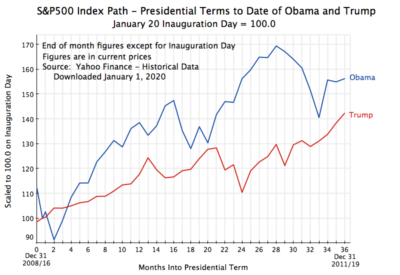

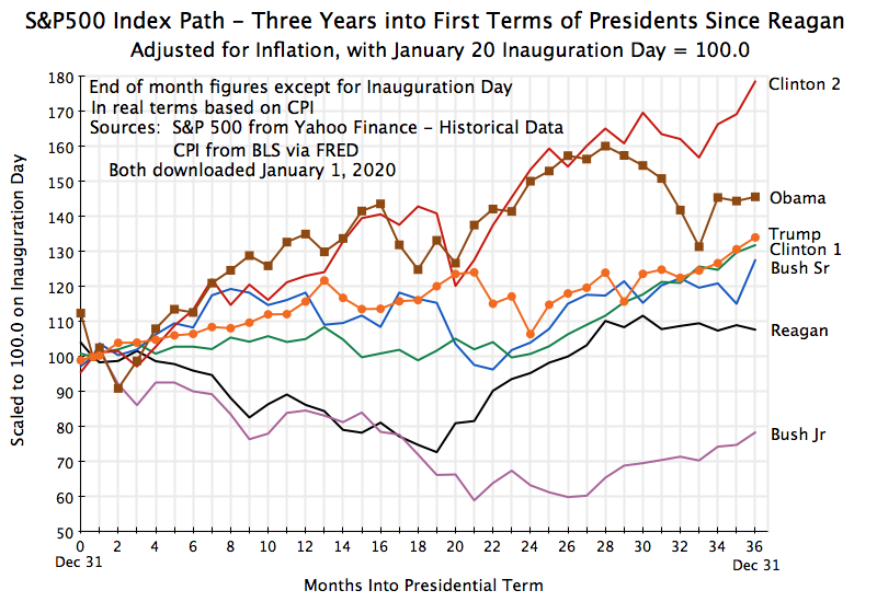
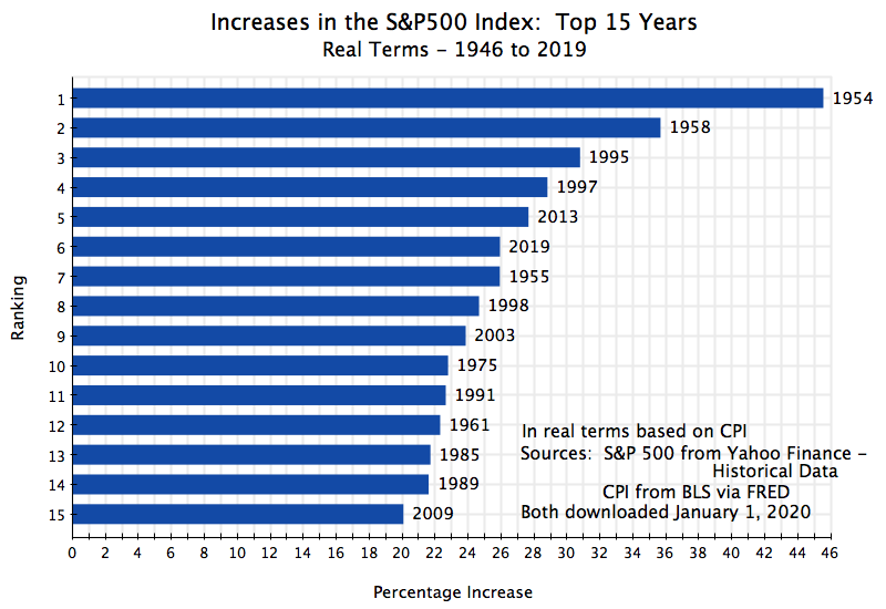
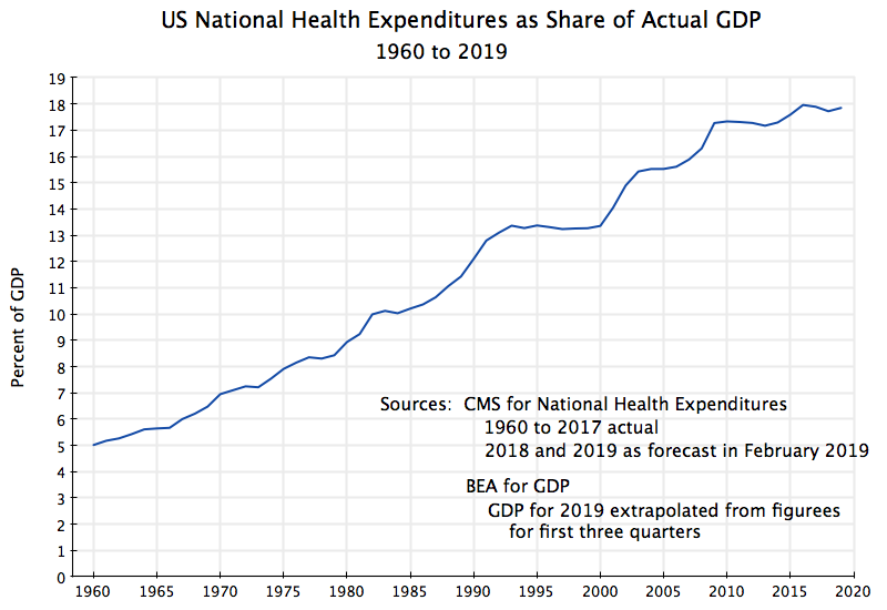
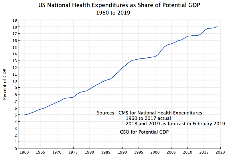
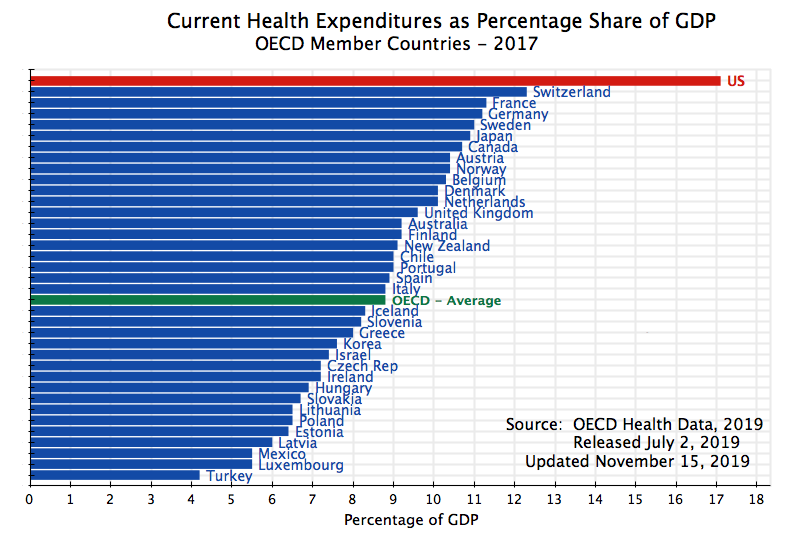
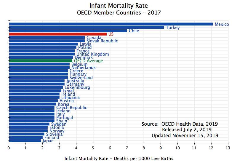
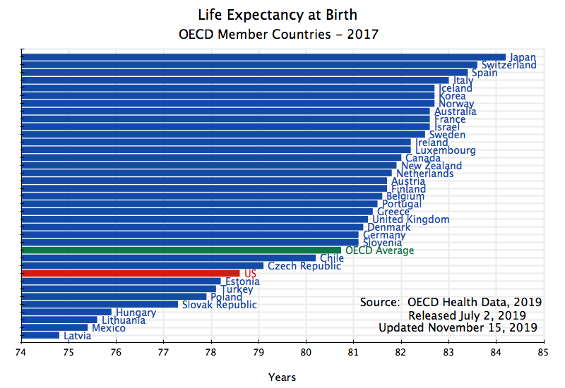

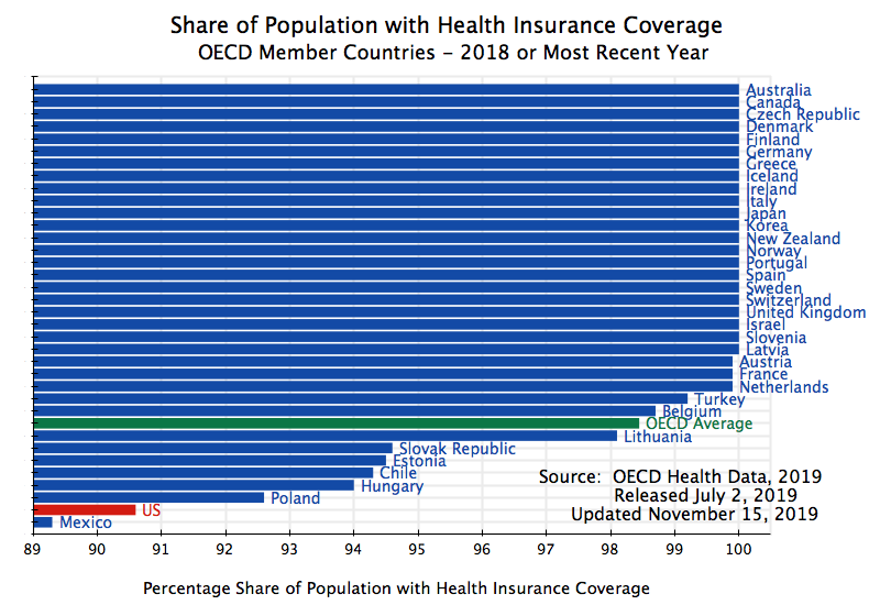
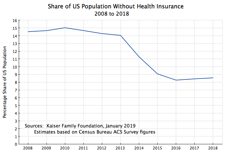

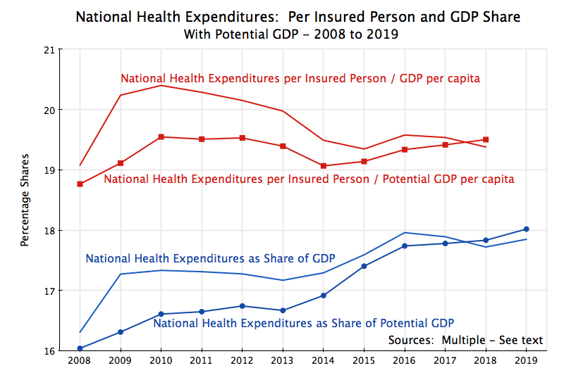

You must be logged in to post a comment.