The Historic Impact on Federal Debt of the “One Big Beautiful Bill”

Chart 1

The Senate is now debating, and will likely soon pass, its version of the officially named “One Big Beautiful Bill Act”.  While minor changes are possible, its overall impact on the federal deficit and hence on federal debt is unlikely to differ much from the June 27 version that the Congressional Budget Office (CBO) examined.  The CBO estimated that this bill would increase the federal deficit by a sum of $3.25 trillion over the ten-year period of FY2025 to FY2034 relative to the CBO’s prior (January 2025) baseline forecast.

This is huge.  It will also be highly regressive, based on a CBO analysis of the similar bill passed in the House in May.  Despite the overall cost (and consequent federal borrowing to pay for it), the poorest households – and indeed households in the lowest three deciles of the population (the bottom 30%) – will see an absolute fall in their incomes.  This is historic.  Previous tax cut bills (the primary focus of this bill) saw at least some increase in the after-tax and transfer incomes of the poor.  Just not very much, and far smaller than the tax cuts received by the rich.  But the “One Big Beautiful Bill Act” (and that is, indeed, the official name) will result in the real incomes of the poor being cut in absolute terms, primarily because the Republicans in both the House and the Senate have reduced the overall impact on the federal deficit by slashing Medicaid.

The impact of the bill on federal debt will also be substantially higher than the figures commonly cited in the press.  Those figures come directly from the CBO estimates.  For some reason (possibly a legislated rule the CBO must follow), the ten-year cost estimates made by the CBO of bills such as this are the simple sum of the year-by-year estimates of the impact on the deficit in each year.  But the ten-year cost will be higher than that simple sum.  With the annual deficits higher, the federal debt will be higher, and interest will need to be paid on that higher federal debt starting in year one.  More funds will need to be borrowed to cover those interest payments.  And there will be interest due on those borrowed funds as well.

Thus the increase in the federal debt over the ten-year period (over and above whatever was in the baseline comparator) will not simply be the sum of the higher deficits in each of those ten years.  There will be higher interest costs as well.  I have estimated that the resulting higher interest expense exceeds $0.7 trillion, based on the assumption that the increased borrowing will cost, on average, the CBO forecast of the 10-year US Treasury bond rate.

Including interest, the resulting impact on the federal debt after ten years will not be the $3.25 trillion figure from the CBO often cited in press articles on the Senate bill, but rather substantially higher at just short of $4 trillion:

in billion $

FY2025 to 2029

FY2025 to 2034

CBO Estimated Outlays           -$274.2         -$1,212.7
CBO Estimated Revenues      -$2,271.0       -$4,466.0
Net Effect on the Annual Deficit       $1,996.8        $3,253.3
Increase in interest due          $160.9           $736.9
Net Effect including Interest        $2,157.7        $3,990.2
Change in Debt in 2029 & 2034       $2,157.7        $3,990.2

Focusing on the ten-year (FY2025-34) costs, the CBO estimates that under the Senate bill being considered (as of June 27), overall outlays in the budget would be reduced by $1.2 trillion.  Most of this would come from cuts to Medicaid ($725 billion), with overall health programs cut by $1.15 trillion.  There would also be major cuts to food stamps (SNAP) and similar food programs ($186 billion).

But spending would be higher on certain favored programs, such as for the military ($173 billion including the Coast Guard) and programs to block immigration ($169 billion).  The CBO estimates there would be a net reduction in fiscal outlays of $1.2 trillion.

But the core of the bill is tax cuts, primarily for the benefit of those with high incomes.  Most of the cost will come from extending the tax cuts enacted in late 2017 during the first Trump administration.  In the 2017 bill, those tax cuts were set to end in 2025.  Formally ending the measures in 2025 made it appear that the full cost of the 2017 tax cut measures would (over the standard ten-year time horizon Congress uses) be less than under the real intent of making them permanent.  That cost has now become apparent.

The total cost of the revenue measures in the Senate bill – as included in the CBO estimates (where the CBO figures in fact come from estimates made by the Joint Committee on Taxation of Congress) – are close to $4.5 trillion over the ten-year period.  Netting out the $1.2 trillion of reduced expenditures, the ten-year cost – as often cited in the press – is $3.25 trillion.

But interest will be due on the debt that will be incurred to fund the higher deficits.  When that interest is included, the federal public debt will not be a $3.25 trillion higher after ten years, but $4 trillion higher.

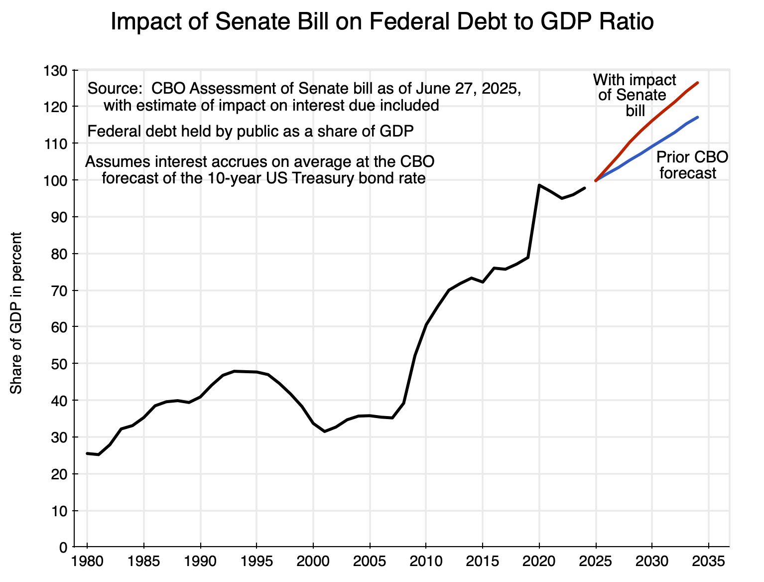
The resulting path for the federal debt to GDP ratio is shown in the chart at the top of this post, with the debt to GDP ratio shown going back to 1980 to provide context.  For the 2025 to 2034 period, the curve in blue shows what it would be under the prior (January 2025) CBO forecast (which assumed current law would be followed), while the curve in red shows what it would be if the Senate bill is passed and then approved also in the House and signed into law by Trump.

The federal debt to GDP ratio (defined as the net federal debt held by the public, where internal trust fund and other accounts – such as for Social Security – are netted out) is now close to 100% of GDP.  It was already on a rising path in the prior (baseline) CBO forecast released in January (a forecast based on budget and tax law as it stood at the time).  With the Senate bill it will now rise even faster.  Fiscal deficits will soon exceed 7% of GDP under Trump – unprecedented in times of full employment other than during World War II – and the federal debt to GDP ratio will soon exceed the record set in 1946 when it hit 106% of GDP.  Under the Senate bill, it is expected to exceed 106% of GDP by 2027, and will reach 126% of GDP by 2034, with no sign of it falling from there.

One should also note that the CBO forecasts of GDP and the federal deficit are long-term, and of necessity the CBO can only forecast some long-run path of steady growth.  In reality, of course, there will be fluctuations around any such path; it is just impossible to know when.  But when there is a downturn (and it is a matter only of when, not whether, with that likelihood especially high due to the chaos of the Trump administration), the fiscal deficit will rise and should rise.  The federal government has an important responsibility to help stabilize the economy.  But that higher fiscal deficit will add to federal debt, and the federal debt to GDP ratio will be higher following any such downturn even when GDP has returned (hopefully) to its previous long-term path.

The CBO forecast of the debt to GDP ratio in the outer years is therefore likely to be an underestimate.  By 2034, it could be a good deal higher than 126% of GDP unless Republicans in Congress finally recognize that their cuts in taxes are irresponsible.

In addition, not only are the measures included in the “One Big Beautiful Bill” tremendously costly, they will only be of benefit to those with higher incomes.  Based on the earlier version of the One Big Beautiful Bill (HR1) passed by the House in May, the CBO estimates that the lowest three deciles of households will see their absolute incomes (post taxes and transfers) reduced.  The CBO issued its estimates for this bill on June 12.  It is not clear whether the CBO will do a similar analysis for the specific Senate bill now being considered, and if so when it would come out.  However, the primary measures in the House and Senate versions of the bill are similar, and the distributional impacts will likely be similar.

The CBO estimates of the impacts on households by decile of income of the version of the bill passed by the House (as a percent of household incomes) were:
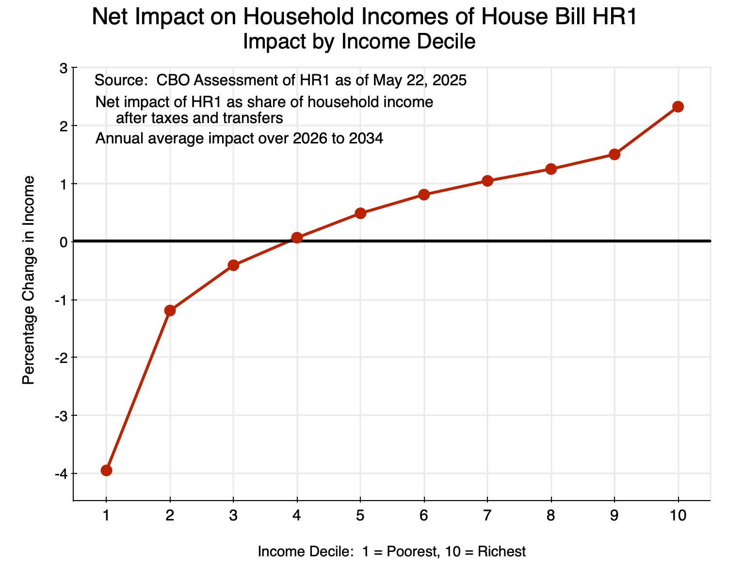
Chart 2

The poorest decile of households would be especially adversely affected.  They would lose 4% of their incomes in absolute terms, with this is in a bill that is being funded primarily by increased federal borrowing.  Households in the second and third deciles would also lose in absolute terms, while those in the fourth decile would see (on average) almost no impact.  Higher income households then gain progressively more, with especially large gains for the richest (highest decile) households.  Note that this is presented as percentages of household incomes, after taxes and transfers.  Since incomes are much higher for the highest income households, the absolute dollar gains are especially high for the richest households.

There has never before been such an expensive and highly regressive measure passed by Congress.  But it appears this bill will soon be passed and signed into law by Trump.

Why Voters Are Upset: The Underperformance of the US Economy Since the 2008 Crash

A clear message from the November 5 election is that voters are upset with their economic circumstances.  Much of the focus has, not surprisingly, been on the comparison households feel relative to 2020, when Trump was president.  But 2020 was a special year.  While the economy collapsed with the lockdowns, massive federal relief programs (first proposed by Nancy Pelosi and the Democrats in Congress, and later welcomed and signed into law by Trump) sustained and indeed added to household disposable income levels.  With expenditures restrained due to the Covid pandemic, household savings and bank account balances rose.  They were then spent down in the following years.  A post on this blog from December 2022 estimated the excess savings balances would likely be used up by 2024 – the election year – at which time households would be in a bind.  And that appears to be precisely what happened.  An analysis by JPMorganChase of the bank accounts of 7.8 million of its customers found that bank balances – which had risen to more than 60% above normal levels in 2020-21 – had by 2024 fallen to below what would have been expected based on historical patterns.

But the economy has not been doing well for some time.  Using up and then going beyond what had been saved in 2020-21 needs to be explained by more than households making use of those excess balances.  Rather, households have grown increasingly anxious about not being able to sustain a standard of living that they had expected they would be able to enjoy.  That anxiety needs to be examined in a longer-term context.

The chart at the top of this post suggests what might be underlying this.  Both per capita real GDP and per capita real Personal Consumption Expenditures (PCE) grew at a remarkably steady pace from 1950 for per capita real GDP and back even further to around 1936 for per capita real PCE.  Note that the chart is shown with the vertical scale in logs, and hence a constant rate of growth will be a straight line.  The trend lines shown (in black) are then drawn so that they go roughly from peak to peak, although with a small excess sometimes allowed.

Growth in per capita GDP and PCE were both remarkably close to those trends – up until 2008, that is.  Both GDP and PCE then fell in the economic and financial collapse in that last year of the Bush administration, with this continuing into 2009.  They then stabilized and began to grow again.  But unlike in prior downturns stretching back to 1936, the economy did not return to its previous path.  Rather, it remained below.  A gap opened up and has remained.  Indeed, the gap has grown.

This can be seen more clearly in the same chart but for the period of 2000 to 2023 only:

The trend lines are the same as drawn before.  By 2023, real GDP (in 2017 prices) was $67,600 per person, but would have been $81,300 per person had the economy continued on the previous trend path.  Real Personal Consumption Expenditures per person was $46,600 in 2023, but would have been $55,700 had it kept on the previous path.  These differences are not small.  Personal consumption would have been more than $9,000 higher per person (in 2017 prices), or more than $36,000 higher for a family of four.  In terms of 2023 prices, personal consumption would have been close to $11,000 higher per person, or $44,000 higher for a family of four.  Economic growth matters, it compounds over time, and when it slows, the impacts can soon be huge.

The figures can also be presented in percentage terms, where the following chart shows the ratio of per capita real GDP and real PCE on the trend compared to what they actually were in each year:

There were relatively modest fluctuations around the trend as drawn up until 2008.  But then one sees a bulge – far larger than anything seen before – that has been sustained and shows no sign of returning to the trend path.  By 2023, both per capita GDP and per capita Personal Consumption Expenditures would have been 20% higher had the economy remained on (or had returned to) the previous trends going back to 1950 for per capita GDP and 1936 for per capita PCE.  That is a huge difference.

It is also worth noting that not only has the economy not returned to the previous trend path, but – while still early, with a limited number of years – the growth rate of per capita real GDP has slowed.  On the prior trend path from 1950, per capita real GDP grew at an annual rate of 2.15%.  GDP then fell in 2008/2009 before stabilizing under Obama and then starting to grow.  From the start of Obama’s second term (2013) through to 2023, per capita real GDP grew at an annual rate of 1.87% (with similar rates under Obama, Biden, and Trump if one excludes the collapse in Trump’s fourth year in office).  That is, growth in real GDP has slowed by about 0.3% per annum, and hence one sees in the chart above that real GDP on the trend path was about 17% above the actual in 2013 and is now 20% above the actual.

Growth in per capita real Personal Consumption Expenditures, in contrast, has not slowed as much.  On the trend path it grew at a rate of 2.3% per year, while from 2013 to 2023 it grew at almost the same rate of 2.2% per year.  That is, households have sought to sustain their previous growth in consumption expenditures.  But with GDP (and hence incomes) not growing as fast, this has become increasingly difficult.

Finally, it should be noted that these figures on per capita GDP and per capita PCE are averages, and do not take into account distributional changes.  But as was shown in previous posts on this blog, the distribution of incomes became dramatically worse since about 1980 – when Reagan was elected – while wages have stagnated.  Richer households have been doing better, and hence relative to the averages, poorer households have been doing worse.

Voters therefore have good reason to be upset.  The economy never fully recovered from the 2008 collapse, and while growth resumed, the rate of growth has been somewhat less than what the country had before.  Households have tried to sustain the previous growth in personal consumption, but that has become increasingly difficult in the face of a slower pace of GDP growth.

The critical question is, of course, why did the economy never recover in full from the 2008 collapse.  I hope to address that in a future blog post.  The purpose of this one has been simply to present that there is an issue.  Note also that there may be multiple reasons for the lack of a full recovery.  The underlying factors can be additive, and together account for an economic performance that falls short of what had previously been expected.

The Performance of the Stock Market During Trump’s Term in Office: Not So Special

A.  Introduction

Stock market performance is often taken to be a good measure of how the economy as a whole is performing.  But it is not.  For most Americans it is simply irrelevant, as the overwhelming share of investments in the stock markets are held by only a small segment of the population (the wealthy).  And its track record as a broader indicator of how the economy is performing is imperfect at best.

Still, many do focus on stock market returns, and Trump brags that the performance of the market during his term in office has been spectacular.

That is not the case.  This post will look at how the stock market has performed during Trump’s term in office thus far, and compare it to what that performance was under presidents going back to Reagan up to the same point in their terms.

First, however, we will briefly discuss to what extent one should expect stock market prices to reflect actions a president might be taking.  And the answer is some, but there is much more going on.

B.  Presidential Policies and the Stock Market

Owning shares of a firm entitles the owner to a share of the profits generated by that firm, both now and into the future.  And while there are many complications, a simple metric commonly used to assess the price of a share in a firm, is the price/earnings ratio.  If earnings (profits) go up, now and into the future, then for a given price/earnings ratio the price of the stock would go up in proportion.

Economic policies affect profits.  And in a thriving economy, profits will also be rising.  The policies of a presidential administration will affect this, and although the link is far from a tight one (with important lags as well), policies that are good for the economy as a whole will generally also lead to a rising stock market.

But there is also a more specific link to policy.  What accrues to the shareholders are not overall profits, but profits after taxes.  And this changed significantly as a result of the new tax law pushed through Congress by Trump and the Republicans in December 2017.  It resulted in the effective corporate profits (income) tax being cut by more than half:

This chart is an update of one prepared for an earlier post on this blog (where one can see a further discussion of what lies behind it).  It shows corporate profit taxes at the federal level as a share of corporate profits (calculated from figures in the national income accounts issued by the BEA).  While Trump and the Republicans in Congress asserted the 2017 tax bill would not lead to lower corporate profit taxes being paid (as loopholes would be closed, they asserted), in fact they did.  And dramatically so, with the effective corporate tax rate being slashed by more than half –  from around 15 to 16% prior to 2017, to just 7% or so since the beginning of 2018 (and to just 6.3% most recently).

This cut therefore led to a significant increase in after-tax profits for any given level of before-tax profits, which has accrued to the shareholders.  Note that this would not be due to the corporations becoming more productive or efficient, but rather simply from taxing profits less and shifting the tax burden then on to others (i.e. a redistributive effect).  And based on a reduction in the taxes from 16% of corporate profits to 7%, after-tax profits would have gone from 84% of profits to 93%, an increase of about 11%.  For any given price/earnings ratio, one would then expect stock prices, for this reason alone, to have gone up by about 11%.

[Side note:  Technically one should include in this calculation also the impact of taxes on profits by other government entities – primarily those of state and local governments.  These have been flat at around 3 1/2% of profits, on average.  With these taxes included, after-tax profits rose from 80 1/2% of before-tax profits to 89 1/2%, an increase that is still 11% within round-off.]

One should therefore expect that stock prices following this tax cut (or in anticipation of it) would have been bumped up by an additional 11% above what they otherwise would have been.  Other things equal, the performance of the stock market under Trump should have looked especially good as a result of the shift in taxes away from corporations onto others.  But what has in fact happened?

C.  Trump vs. Obama

The chart at the top of this post compares the performance of the stock market during Trump’s term in office thus far (through December 31, 2019) to that under Obama to the same point in his first term in office.  The difference is clear.  Other than during Obama’s first few months in office, when he inherited from George W. Bush an economy in freefall, stock market performance under Obama was always better than it has been under Trump.  Even after slashing corporate profit taxes by more than half, the stock market under Trump did not do exceptionally well.

The S&P500 Index is being used as the measure of the US stock market.  Most professionals use this index as the best indicator of overall stock market performance, as it is comprehensive and broad (covering the 500 largest US companies as measured by stock market value, with the companies weighted in the index based on their market valuations).  The data were downloaded from Yahoo Finance, where it is conveniently available (with daily values for the index going back to 1927), but can be obtained from a number of sources.  The chart shows end-of-month figures, starting from December 31 of the month before inauguration, and going through to December 31 of their third year in office.  The index is scaled to 100.0 on exactly January 20 (with this presented as “month” 0.65).

So if one wants to claim “bragging rights” for which president saw a better stock market performance, Obama wins over Trump, at least so far in their respective terms.

D.  Trump vs. All Presidents Since Reagan

A comparison to just one president is limited.  How does the performance under Trump compare to that under other US presidents up to the same points in their terms in office?  Trump is roughly in the middle:

This chart tracks the performance under each president since Reagan up through the third year of their first terms in office.  I have adjusted here for inflation (using the CPI), as inflation was substantially higher during the Reagan and Bush Sr. terms in office than it has been since.  (I left the chart at the top of this post of just Obama vs. Trump in nominal terms as inflation in recent years has been steady and low.  But for those interested in the impact of this, one can see the Obama and Trump numbers in real terms in the current chart.)  I have included in this chart only the first terms of each president (with one exception) as the chart is already cluttered and was even more so when I had all the presidential terms.

The exception is that I included for perspective the stock market performance during Clinton’s second term in office.  The stock market rose over that period by close to 80% in real terms, which was substantially higher than under any other president since at least before Reagan in either their first or second terms.  The performance in Obama’s first term (of 146% in real terms) was the second-highest.  There was then a set of cases which, at the three-year mark, showed surprising uniformity in performance, with increases of between 32% and 34% in the second Reagan term, the first Clinton term, the second Obama term, and Trump’s term so far.  Bush Sr. was not far behind this set with an increase of 28%.

The worst performances were under Bush Jr. ( a fall of 22% to the third-year point in his first term), and Reagan (an increase of just 8% to that point in his first term).

So the performance of the market under Trump is in the middle – not the worst, but well below the best.

E.  Single Year Increases in the S&P500 from 1946 to 2019

Finally, was the increase under Trump in his best single year so far (2019) a record?  No, it was not.  Looking at the single year performances (in real terms) since 1946, the top 15 were:

The increase in 2019, of 25.9%, was good, but only the sixth-highest of the 74 years between 1946 and 2019 (inclusive).  The stock market rose by more in 2013 during Obama’s term in office (by 27.7%), and in 1997 (28.8%) and 1995 (30.8%) which were both Clinton years.  And the highest increases were in 1958 (35.7%) and 1954 (45.6%) when Eisenhower was president.

The market also rose substantially in 2017, in Trump’s first year in office, by 16.9%.  But it then fell by 8.0% in 2018, in Trump’s second year in office.  Overall, the average rank (out of the 74 years from 1946 to 2019) of the individual year performances over the three years Trump has been in office so far, would place Trump in the middle third.  Not the worst, but also far from the best.  And comparing the three-year average while Trump has been president to rolling three-year averages since 1946, Trump’s average (of 11.6%) is well below the best.  The highest was an average return of 25.3% in 1995-97 during Clinton’s term in office.  And the three-year average return was also higher at 16.7% in 2012-14 during Obama’s term.

F.  Summary and Conclusion

Trump likes to brag that the performance of the stock market during his term in office has been exceptional.  But despite a slashing of corporate profit taxes (which, other things being equal would be expected to increase stock prices by 11%), the performance of the market during Trump’s term in office would put him in the middle.  Specifically:

a)  The market rose by more during the first three years of Obama’s term in office than it has under Trump;

b)  Compared to the first three years in office of all presidents since Reagan (whether first terms only, or first and second terms) would place Trump in the middle.  Indeed, the increase under Trump so far was almost exactly the same as the increases seen (at the three-year point) in Obama’s second term, in Reagan’s second term, and in Clinton’s first term.  And the return under Trump was well below that seen in Obama’s first term, and especially far below that in Clinton’s second term.

c)  The individual year performances during Trump’s three years have also not been exceptional.  While the performance in 2019 was good, it was below that of a number of other years since World War II, and below that of individual years during Obama’s and Clinton’s terms in office.

But as noted at the start of this post, stock market returns should not be over-emphasized.  An increase in the stock market does little for those who do not have the wealth to have substantial holdings in the stock market, and as a broader indicator of how the overall economy is performing, stock market returns are imperfect at best.

Still, one should be accurate in one’s claims.  And as on many things, Trump has not been.