
The Rate of Economic Growth and the Budget Gap: Returning to the Long-Term Average Growth Rate Would Eliminate It

Long Run US GDP per Capita Growth (1870-2088) in logarithms

Larry Summers published an op-ed yesterday (appearing in Reuters, the Financial Times, the Washington Post, and probably elsewhere) in which he makes the important point that the current budget impasse is focussed on the wrong issues.  The discussion, at least as publicly expressed, has focussed on what is seen as needed to deal with the fiscal deficit and the resulting public debt.  Even the Republican attempt to end ObamaCare was ostensibly about cutting the government deficit (even though the CBO concluded that the opposite would happen, as they found that the ObamaCare reforms will reduce the deficit, rather than increase it).

Yet this focus on near term and projected budget deficits is misguided.  As Summers notes, under current policies the public debt to GDP ratio is falling, and is projected to continue to fall into the 2020s.  The recently issued Long-Term CBO budget projections indicate that while the debt ratio would then start to rise (primarily driven by expected higher health care costs), there is a good deal of uncertainty in those projections.

Specifically the CBO figures show that it would not take much, in terms of either higher revenues or lower spending, to keep the public debt to GDP ratio flat.  Higher revenues or lower spending or some combination of the two, of 0.8% of GDP over the next 25 years or 1.7% of GDP over the next 75 years, would suffice.  This is consistent with an earlier post on this blog, which showed that if the Bush tax cuts had not been extended for almost all households, the projected debt to GDP ratio in the CBO numbers would fall rapidly.

But projections of revenues or of spending are highly uncertain.  Projected health care spending has been coming down steadily in recent years, for example, in part due to the slow economy, but also in part as a result of the efficiency gains and cost reductions that the ObamaCare reforms are leading to.  With these lower costs, the CBO has been steadily reducing the projected costs to the government budget from Medicare, Medicaid, and other such health programs.  In the recent CBO report, for example, the projections of government spending on health care programs in the 2030s were reduced by 0.5% of GDP from what the CBO had projected just one year earlier.  Going back further, the CBO projections for government spending on health care in 2035 were over 1% of GDP lower in the projections recently issued than in the projections published in June 2010.

This should not be interpreted as a criticism of CBO.  Their projections are probably the best available.  Rather, the point is that these projections are inherently hard to do, and the uncertainty surrounding them should not be ignored.  Yet the politicians often ignore precisely that.

Furthermore and perhaps most importantly, the projected budget deficits and resulting public debt to GDP ratios depend critically on the rate of growth of the economy.  The CBO uses a fairly detailed and reasonable model to project this (based on projected labor force growth, investment in capital, and productivity growth).  However, it is probably even more difficult to project GDP than to project future spending levels and tax revenues for any given level of future GDP.  But Summers notes the critical sensitivity of the projected future deficits to the projected growth in GDP.  He states “Data from the CBO imply that an increase of just 0.2 percent in annual growth would entirely eliminate the projected long-term budget gap”.

One can calculate from the data made available with the CBO report their projected growth of real per capita GDP.  For 2013 to 2088, it comes to 1.60%  year.  A previous post on this blog noted the remarkable constancy of the rate of growth of real per capita GDP since at least 1870 of 1.9% a year (or 1.87% a year at two digit precision).  That earlier post noted that real per capita GDP in the US, despite large annual variations and even decade long deviations (such as during the Great Depression, and then during World War II), has always returned to a path of 1.87% growth since at least 1870.  That path even did not shift when there were even substantial deviations, such as during the Great Depression.  Rather, the economy always returned to the same, previous, path, and not one shifted up or down.

This is truly remarkable, and no one really knows the reason.  The path can be seen as a trend growth of capacity (based on labor available and capital invested, coupled with the technology of the time), but why this should path should have grown at 1.87% a year in the late 1800s; in the early, mid and late 1900s; and all the way into the 21st century, is not known.

Since we do not know why the economy has always returned to this one path, we need to be careful in looking forward.  Still, it is noteworthy that the CBO projections imply that the economy will now slow, to just 1.60% real per capita GDP growth over the next 75 years.  This CBO path is substantially lower than the path of 1.87% growth that has ruled for the last 140 years in the US.

The graph at the top of this post shows the path of GDP per capita projected by the CBO (which one should note is a year by year projection, which just averages out to 1.60% per year over the full period), along with an extension of the 1.87% path that has ruled since at least the 1870s.   The graph is adapted from my earlier post (although now converted to prices of 2005 whereas the earlier one was in prices of 1990; this does not affect the rates of growth).  It is expressed in logarithms, since in logarithms a constant rate of growth is a straight line.

It is not clear why there should be this deceleration to 1.60% from the 1.87% rate of growth the economy has followed over the last 140 years.  Mechanically, one can ascribe the deceleration to what the CBO assumes for the rate of growth of technological progress.  But projecting growth in technology over a 75 year period is basically impossible, as the CBO notes.

The deceleration over the next 75 years has a very important implication, however.  The CBO found in its sensitivity analysis that a rate of growth that is just 0.2% faster will suffice to close the budgetary gap, even if one does not take any new measures to raise revenues or cut government spending.  Hence a return to the previous historical growth path of 1.87% a year from the 1.60% rate the CBO projects, or a difference of 0.27%, will more than suffice to close the budgetary gap.

The policy implication is that with such sensitivity to the growth in GDP, we should be focussed on measures to raise growth, rather than short term budgetary measures that will act to reduce growth.  The economy has suffered from government austerity since 2010, which has held back growth.  Government has been cutting spending, thus undermining demand in an economy with high unemployment and close to zero interest rates, where more labor is not employed and more is not produced because the resulting products could not then be sold due to the lack of demand.  As an earlier post on this blog noted, if government spending had been allowed to grow simply at the historic average rate (and even more so if it had been allowed to grow as it had under Reagan), the US would by now be back at full employment.

Over the medium term, Summers notes that both conservatives and liberals agree that growth should be raised, and on the types of measures which should help this.  More investment, both public and private, is required rather than less.  Research and development, both public and private, is important.  More effective education is also required.

I would agree with all of these.  But to be honest, since we do not really understand why the economy always returned to the 1.87% growth path over the last 140 years, it would not be correct to say we can be sure such measures will be effective.  However, what we can say with confidence is that measures that hinder the recovery of the economy, as the government spending cuts have been doing, will certainly hurt.

The Sluggish Recovery: Fiscal Drag Continues to Hold Back the Economy

Recessions - GDP Around Peak, 12Q before to 22Q after

I.  Introduction

The recovery from the 2008 economic collapse remains sluggish, with GDP growing in the first half of 2013 at an annualized rate of only 1.4% (according to recently released BEA estimates).  And based on fourth quarter to fourth quarter figures, GDP grew by only 2.0% in 2011 followed by just 2.0% again in 2012.  As a result, the unemployment rate has come down only slowly, from a peak of 10.0% in 2009 to a still high 7.4% as of July.

Conservatives have asserted that the recovery has been slow due to huge and unprecedented increases in government spending during Obama’s term, and that the answer should therefore be to cut that spending.  But as has been noted in earlier posts on this blog, direct government spending during Obama’s term has instead been falling.  This reduction in demand for what the economy can produce has slowed the recovery from what it would have been.

This blog will update numbers first presented in a March 2012 post on this blog, which compared the paths of GDP, government spending, and other items in the periods before and after the start of each of the recessions the US has faced since the 1970s.  That earlier blog post looked at the paths of GDP and the other items from 12 quarters before the business cycle peak (as dated by the NBER, the entity that organizes a panel of experts to date economic downturns) to 16 quarters after those peaks (when the downturns by definition begin).  The figures were rebased to equal 100.0 at the business cycle peaks.  We now have an additional year and a half of GDP account data, so it is now possible to extend the paths to 22 quarters from the start of the recent downturn in December 2007.  This has therefore been done for all.

The conclusions from the earlier post unfortunately remain, but are even more clear with the additional year and a half of observations.  GDP growth remains sluggish, government spending has fallen by even more, and residential investment remains depressed (although it has finally begun to recover).

II.  The Path of Real GDP

The graph at the top of this post shows the path followed by real GDP in the periods from 12 quarters before to 22 quarters after the onset dates of each of the recessions the US has faced since the 1970s.  The sluggish recovery from the current downturn is clear.

The economy fell sharply in the final year of the Bush administration, and then stabilized quickly after Obama took office.  GDP then began to grow from the third quarter of 2009 and has continued to grow since.  But the pace of recovery has been slow.  By 22 quarters from the previous business cycle peak, real GDP in the current downturn is only 4% above where it had been at that peak.  At the same point in the other downturns since the 1970s, real GDP was between 15% and 20% above where it had been at the previous peak.  This has been a terrible recovery.

 III.  The Path of Government Spending

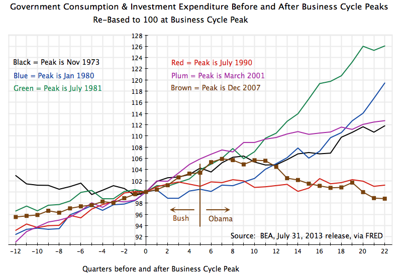
How has this recovery differed from the others?  To start to understand this, look at the path government spending has taken:

Recessions - Govt Cons + Inv Expenditures Around Peak, 12Q before to 22Q after

Direct government spending has fallen in this recovery, in sharp contrast to the increases seen in the other recoveries.  Real government spending was 26% higher by 22 quarters after the onset of the July 1981 recession (the green line) during the Reagan presidency, and 13% higher at the same point in the recovery from the March 2001 recession (the plum colored line) during the Bush II presidency.  While both Reagan and Bush claimed to represent small government conservatism, government spending instead rose sharply during their terms.

In contrast, in the current downturn direct government spending is now 1.2% below what it had been at the start of the recession in December 2007.  Furthermore, it is worth noting that while it rose in the final year of the Bush presidency and then in the first half year after Obama took office (a major reason why the recovery then began), it has since fallen sharply.  Government spending is now almost 7% below where it had been in mid-2009, a half year after Obama took office.  Such a decline (indeed no decline) has ever happened before, going back at least four decades, as the economy has struggled to recover from a recession.  The closest was during the Clinton years, when government spending was essentially flat (a 1% increase at the same point in the recovery).

Note that the measure of government spending shown here is that for total government spending on consumption and investment (i.e. all government spending on goods and services).  This is the direct component of GDP.  Government spending can also be measured by including transfer payments to households (such as for Social Security or unemployment insurance), but as was noted in the earlier blog post from March 2012, the results are similar.  Note also that the government spending figures include spending at the state and local levels, in addition to federal spending.  While we speak of government spending as taking place during some presidential term in office, the decisions are made not simply by the president but also by many others (including state and local officials, and the Congress) in the US system.  But the president at the time is typically assigned the blame (or the credit) for the outcome.

IV.  The Path of Residential Investment

The current downturn and recovery also differs from the others by the scale of the housing collapse, and consequent fall in residential investment:

Recessions - Residential Investment Around Peaks, 12Q before to 22Q after

The build up of the housing bubble from 2002 to 2006 was unprecedented in the US, and the collapse then more severe.  As the graph above shows, there has been a start in the recovery of residential investment from the lows it had reached in 2009 / 2010, but it is still far below the levels seen in previous downturns.

Housing had been overbuilt during the bubble in the Bush years, leaving an oversupply of housing once the bubble burst.  And while supply was in excess, demand for housing was reduced due to the severe recession.  As was discussed in an earlier blog post on the housing crisis, the result was a doubling up of households as well as delays in household formation as young adults continued to live with their parents.  Residential investment therefore collapsed, and has recovered only very slowly.

V.  The Path of Household Debt

The housing bubble also led to over-indebtedness of households.  Nothing of this sort at all close to this scale had ever happened before in the US.  With the lack of regulation and oversight of the financial sector during the Bush administration, banks and other financial entities launched and aggressively marketed and sold financial instruments that led to a bidding up of home prices.  But these new financial instruments were only viable if housing prices continued to rise forever.  When the housing bubble burst, widespread defaults followed.  And those households who did not default struggled to pay down the debts they had taken on, for assets now worth less than the size of the debts tied to them.

The result was a sustained fall in household debt (three-quarters of which is mortgage debt) in the period of the downturn:

Recessions - HH Debt Around Peak, 12Q before to 22Q after

This pay-down of debt had never happened before, and is in stark contrast to the rise in household debt seen in all the other downturns of the last four decades.

VI.  The Path of Personal Consumption Expenditure

Households struggling to pay down their debt have to cut back on their consumption expenditures.  This brings us to the last element of the current recovery I would like to highlight:  the especially slow recovery in household consumption.  That path of consumption during the current downturn stands out again in contrast to the paths followed in the other downturns and recoveries of the last four decades in the US:

Recessions - Personal Consumption Around Peaks, 12Q before to 22Q after

The difference is stark.  Households could spend more in the prior recoveries in part because they could continue to borrow (see the graph on household debt above).  In this recovery, households have instead had to pay down the debts they had accumulated in the housing bubble years, and could increase their household consumption only modestly.

VII.  Conclusion

The recovery in the current downturn has been disappointing.  GDP has grown since soon after Obama took office, but has grown only slowly, and has been on a path well below that seen in other recoveries.

There are a number of reasons for this.  Household consumption has kept to a low path as households have struggled to repay the over-indebtedness they had accumulated during the housing bubble years.  Residential investment collapsed as well following the bubble, is only now starting to recover, and remains far below the levels seen at similar points in other recoveries.
And government spending has been allowed to fall during Obama’s term.  This had never happened before in the previous downturns.  Indeed, while real government spending rose by 26% at the same point in the economic recovery during the Reagan presidency, it has been reduced by over 1% in this recovery (and reduced by 7% from what it had been a half year after Obama took office).
The reduction in government spending reduced the demand for what the economy could have produced.  In this it was similar to the reduced demand resulting from lower residential investment or lower household consumption expenditure.  All these reductions in demand reduced GDP, reduced the demand for workers, and hence increased unemployment.  But while residential investment and household consumption can only be influenced indirectly and highly imperfectly by government policy, government has direct control over how much it spends.  That is, government can decide whether to build a road or a school building, and doing so will employ workers and will lead to an increase in GDP.  Hence government spending is a direct instrument that can be used to raise growth and employment, should the government so choose.
Sadly, and in stark contrast to the sharp increase in government spending during the Reagan period that spurred the recovery to the 1981 downturn, US politics during the Obama presidency have instead led to a cut-back in government spending, with a resulting drag on growth.  The disappointing consequences are clear.

Obama and Prices: The Markets Expect Inflation to Remain Low

US Treasury Bond Yields, TIPS, and Expected Inflation, Jan 2, 2003, to Aug 8, 2013

Conservative critics of Obama argue his policies will inevitably lead to high inflation.  A previous blog post on this site showed that in fact inflation during the four years of Obama’s first term had been the lowest over any presidential four year term going back a half century.  Low inflation during Obama’s first term cannot be denied.

The conservative critics respond that while inflation may have been low so far, it is inevitable that inflation will soon rise.  The blog post cited above provides links to several examples of what they have been saying.  But this assertion can be examined as well.  In particular, the financial markets (which the conservative critics generally take as reflecting a sound view on such matters, as the investment returns of such investors will depend on getting this right) can be used to see what at least the markets believe inflation will be going forward.

Since 1997 the US Treasury has been issuing bonds of varying maturities whose principal is indexed to the US CPI price index.  These bonds, known as TIPS (for Treasury Inflation-Protected Securities), provide a return which will be the same in real terms regardless of what inflation turns out to be.  The yields on such bonds can be compared to the yields on regular US Treasury bonds of similar maturity.  Such regular US Treasury bonds will pay interest and at the end return the principal in certain dollar amounts, with a value in real terms which will vary depending on what inflation turned out to be.

Inflation is normally positive, so the regular bonds will pay rates which are higher than the rates on TIPS bonds.  But whether the higher rates are worthwhile will depend on how high inflation turns out to be.  To illustrate with some simple numbers, suppose the rate on a 10-year regular US Treasury bond is 3% while the rate on a 10-year TIPS is 1%.  If inflation turns out to be 2%, the bonds will be equally valuable.  But if inflation turns out to be 3%, it would have been better to have invested in the TIPS.  The TIPS will still pay out a 1% real return, while the regular US Treasury will yield a real return of only 0% (a 3% nominal return, but with 3% inflation the real yield will be zero).  Alternatively, suppose inflation turns out to be 1%.  The real return on the regular US Treasury will be 2% (equal to 3% minus 1%), while the TIPS will still yield the contracted 1% real return.  In one believes inflation will be just 1% over this period until maturity, it would have been better to have invested in the regular bonds.

The investors will therefore need to determine what they expect inflation to be.  They will bid up the price of one of the bonds (and bid down the price of the other) if they believe inflation over the time to maturity of the bond, will be higher or lower than the current gap in the yields between the two.  Where the prices of the two bonds settle, and therefore what the gap in yields is between the two, therefore reflects what the financial markets as a whole believe will be the rate of CPI inflation over the period until the bonds mature.  Since real money is riding on this, the investors will take it seriously.

The graph above shows the yields on regular 10-year US Treasury bonds (in blue) and on 10-year TIPS (in green), for the period from January 2, 2003, to August 8, 2013.  The data comes from the official US Treasury web site (where the data presented there goes back to January 2, 2003).  The implied 10-year expected rate of inflation (in red) is then calculated based on the difference between the two yields.

As can be seen in the graph, the yields on the regular 10-year US Treasury bond varied a fair amount over the period, from generally between 4 and 5% during the Bush presidency, falling over time to below 2% for much of 2012, and then rising to about 2 1/2% recently.  The 10-year TIPS yield similarly varied from around 2% during the Bush years, to negative levels for 2012 and the first half of 2013, and rising to a still low but positive 1/2% recently (and most recently just 1/3%).

Despite such fluctuations in the yields of the regular 10-year bond and the 10-year TIPS, the implied expected inflation rate (the difference between the two yields) has been relatively constant, at about 2 1/2% during the Bush years and a similar but slightly lower rate (on average) during the Obama presidency.  The one exceptional period, which should be excluded, would be during the period of economic and financial collapse in the final months of the Bush presidency, after Lehman Brothers went bankrupt and the financial markets were in chaos.  The TIPS yields went up while the regular US Treasury bond yields fell sharply, leading to an implied expectation of inflation of close to zero.  But the figures under such chaotic conditions should not be taken as meaningful.  The chaotic markets then stabilized within a short period of Obama taking office in January 2009, with the rates then returning to more normal levels.

The financial markets, which the conservative critics of Obama normally place a good deal of faith in, therefore do not show any indication that they expect inflation over the next decade to rise.  Rather, they expect inflation of around 2% a year to continue, which is consistent also with the rate of inflation the Fed targets.

Finally, the figures on the bond yields in the graph above also show that the US government has been able to borrow, and continues to be able to borrow, at incredibly low rates, whether in real or nominal terms.   The TIPS yield (the borrowing rate in real terms) was indeed negative in for most of 2012 and the first half of 2013, and is still only 1/2% or less.  Even were it not for the still high unemployment in the country, this is the period when the government should be undertaking investments in both new infrastructure and other assets, and in maintenance of existing assets.  Such investments are worthwhile even if they generate returns of only 1/2% in real terms.  Yet such investments, particularly in maintenance, will generate returns that are orders of magnitude greater than that.

It has been incredibly stupid that the Republican insistence on cutting government spending has blocked us from proceeding with such investments at a time when the borrowing costs to fund them have been so low.