 A. Introduction
The Consumer Price Index (CPI) and the price deflator for Personal Consumption Expenditures (PCE) in the GDP accounts are two alternative measures of consumer price inflation. The CPI is produced by the Bureau of Labor Statistics (BLS) in the US Department of Labor, while the PCE deflator is produced by the Bureau of Economic Analysis (BEA) in the US Department of Commerce. The PCE deflator is part of the GDP accounts (more formally the National Income and Product Accounts, or NIPA), and is needed to deflate to real terms (i.e. adjust for price changes) the nominal estimates of the Personal Consumption Expenditures component of GDP. The two measures have similarities and show similar trends generally, but they are arrived at in very different ways. And they can at times produce differing estimates of inflation that are significant enough to have policy implications. Now is one of those times.
The Fed has said that it focuses more on the PCE deflator than on the CPI, but both matter and the Fed looks, of course, at a wide range of other indicators as well. It also generally considers “core inflation” as more significant than inflation in the overall indices, where the core inflation indices (which can be defined for both the CPI and the PCE deflator) leave out movements in the prices of food and energy. The Fed’s objective is for inflation of around 2% per annum.
Over the past year and a half or so, however, the core CPI and PCE inflation indices have not deviated all that far from their respective measures of overall inflation. Rather, what has been significant over this period has been inflation in the housing component of the two indices. Those have been much higher than inflation in the indices excluding housing – that is, for inflation in everything but housing. The price indices excluding housing – whether for the CPI or the PCE deflator – have generally been increasing at an annual rate of about around 2% (although a bit higher most recently). But the price of housing (which is referred to as “shelter” in the CPI) has been increasing at an annual rate of 5 1/2 to 6%. Because of this, the overall CPI and also the overall PCE deflator have been increasing at rates above the Fed’s 2% target. As shown in the chart at the top of this post, the overall CPI has been rising at a pace of about 3 to 3 1/2% per annum, while the overall PCE deflator has been rising at a pace of around 2 1/2%.
It is important in this to be clear on what is meant by the “price of housing”. This will be discussed intensively in the post below, but briefly, it is not some sort of price index for the cost of buying a new home. Buying a new home is an investment, and the consumer price indices (whether the CPI or the PCE deflators) are rather estimates of prices of goods or services that individuals or households intend to consume. For housing, what is being “consumed” is the value of the services being provided by a home (the services of a comfortable space to live in), and this is measured for both the CPI and the PCE deflators by what such a home would rent for. Inflation in the “price of housing” will thus be inflation in those rental rates.
How and why, then, do the indices differ? This Econ 101 post will look at how the CPI and PCE deflators are each estimated, and what led to the recent differences in their respective estimates of inflation. We will see that the approaches taken for estimating the two indices are very different, although not – perhaps surprisingly – in the prices used for the individual items themselves. They in fact use largely the same prices. They differ, rather, in what they include in their respective indices that sum to their measures of “personal consumption”, how they measure the expenditures on the items that add up that total, and thus in what weights they assign to the various components of the expenditures to arrive at the respective overall price indices. There are also some methodological differences, although these have been of less importance in the recent data. The resulting differences in inflation as measured by the respective indices are thus a consequence not primarily of what is happening in the estimated prices themselves, but rather in the weights each assigns to those prices to come up with their respective overall price indices.
The post may be of interest as well to those who want to understand better how such economic statistics are arrived at, as it will go into the nitty-gritty of the process by which the two agencies arrive at their respective estimates. The sausage-making involved is not always pretty. And it turned up a few tidbits that some may find of special interest. They include:
a) It is well known that GDP is designed to estimate the value (at market prices) of all economic transactions in an economy. If not paid for, it is not counted. Thus we have the common joke that a way to increase GDP – indeed even double GDP, depending on how much is paid – would be for all husbands to divorce their wives and then hire them as housekeepers. The value of housework that is not directly compensated is not counted in GDP while it is if it is paid for.
There is, however, an exception that most are not aware of. The NIPA accounts include in Personal Consumption Expenditures an estimate of the value of the services from owner-occupied homes (the services of a space to live in). These are estimated as imputed rents based on what actual renters pay for similar homes (as noted above and extensively discussed below). These imputed rents are then notionally “paid” to the homeowner – that is to the owner of the owner-occupied home The amount is significant ($2.2 trillion in 2023, or close to 8% of GDP), and a major contributor to GDP. To keep the NIPA accounts balanced, these notional expenditures must then also be reflected in estimated incomes. And indeed they are. After deducting the costs of home ownership (such as for maintenance, depreciation, taxes, mortgage interest, and such), they appear as part of the line labeled “Rental income of persons” in the National Income tables.
These imputed rents are by no means a minor source of “income”. Even though no monetary transaction is involved, they are a significant addition that raises GDP as measured.
b) The cost of interest paid when an item is purchased with financing (such as a loan when buying a car) is not included in either the CPI or the PCE deflator measures. Thus when interest rates rise (as they have since the spring of 2022), the higher monthly payments on, for example, a car loan due to the higher interest rates do not get counted as a source of inflation in the official indices.
The logic of this is that financial investments (such as in stocks or bonds, bank CDs, or whatever) are not included in consumer expenditures. Borrowing can be seen as similar, but just with the opposite sign. It is arguable, however, that borrowing costs should be included. If they were, higher interest rates would lead to a higher rate of inflation as then measured. This may be more consistent with how the general population views what inflation has been in recent years.
What many may not realize is that there is in fact one category of spending where, as currently measured, higher interest rates are reflected in a higher cost. This is for how the cost is measured for the PCE deflator for financial services such as checking accounts with banks, where little or no interest is paid and where there may also be little or no explicit fees. While the CPI includes only what is paid directly in explicit fees for such financial services, the PCE deflator measure includes in the cost of such accounts the difference between what the banks can earn on the balances in those accounts (assuming they invest in a safe, short-term, asset such as US Treasury bills) and what the banks actually pay to the account holders. Account holders are “paying” an opportunity cost that is estimated to correspond to the difference between what the funds deposited would earn in an asset such as US Treasury bills, and the low or zero rate that they in fact earn in those checking (and similar) accounts.
The result is that if interest rates rise – as they have since March 2022 – that opportunity cost on checking and similar accounts will go up. That is then reflected in the estimated PCE deflator for such financial services. The sector is small compared to the overall economy – with only a 2.3% share of overall personal consumption expenditures – but this has nonetheless had a measurable impact on inflation as estimated. Had the PCE price index for these financial services risen at the same rate since early 2022 until now as it had for the other 97.7% of expenditures (i.e. for all but these financial services), then the overall inflation rate as measured by the PCE deflator would have risen not at the 3.8% annual rate as estimated, but rather at a rate of 3.5%. Not a huge difference as the sector is small, but also not insignificant (especially relative to a goal of inflation at a 2% rate).
The effect of higher interest rates would be much more significant if consumer borrowing for items such as car loans were taken into account. Indeed, the general population may already see it this way in their assessment of what inflation has been. This may in part explain why inflation as perceived by households (and reported in various surveys) has been a good deal higher than inflation as measured by the official inflation indices.
The irony here is that the Fed raises interest rates in order to slow the economy and reduce inflation. That is basically the only instrument it has. But there will also then be a direct impact from the higher interest rates leading to higher costs, which many feel should be included in the official measures of inflation.
c) Note, however, that housing is once again special. While home mortgages are by far the largest component of consumer borrowing, almost all existing mortgages are now at fixed rates, and hence would not be affected by an increase in interest rates. Only new mortgages would be and they are a small share of the total.
An implication of this is also that whatever is happening to the cost of housing as measured by implicit rental rates does not matter to the roughly two-thirds of households that own their home and have a fixed-rate mortgage or no mortgage at all. For them, the overall CPI or PCE deflator is simply not relevant to their living costs. What matters to them is inflation in the indices of everything other than housing – and that inflation has been well below the overall inflation rates as measured.
Another implication is that those homeowners with sources of income that are indexed to the overall inflation rate (such as from Social Security benefits as well as many defined-benefit pension plans, and whether explicitly or more often implicitly, certain wage contracts) have come out ahead. The overall inflation rate is relatively high due to the cost of housing (as measured) pulling it up, and Social Security and similar benefit payments indexed to the overall CPI will then go up at this relatively rapid rate. But homeowners with a fixed rate mortgage or no mortgage at all will not in fact see their actual cost of housing changing at all. For them, the CPI for all items excluding housing is the relevant measure of the change in their cost of living, and inflation for such homeowners has been less than how much their Social Security (and similar CPI-linked benefits) have gone up. Their real incomes will in facthave increased.
d) As noted above, one can define the concept of “core” indices for both the CPI and the PCE deflator. The core indices exclude food and energy prices. Such core measures are often of interest as food and energy prices are especially volatile, go down as well as up (in contrast to most prices), and hence core measures will often reflect better what underlying inflationary pressures really are. But as also noted above, the differences between the core measures of inflation and the overall indices have not been all that significant in the past year or two. Rather, the key factor in understanding recent inflation has been the difference between inflation in the cost of housing and in everything but the cost of housing.
Still, it is useful to understand how the core measures are constructed, as the distinction has been important at other times. What is interesting is that while the core measures exclude – for both the CPI and the PCE deflator – what is simply referred to as “food and energy”, the two measures define “food and energy” differently. Specifically, while “food” is defined for the core CPI measure to include both food consumed at home and food consumed away from home (i.e. at restaurants), “food” is defined for the core PCE deflator as only food that is purchased for consumption at home. One could argue for either approach, but the point to recognize is that they are different.
Largely because of the differing treatments of food consumed away from home (and to a lesser extent how the “energy” component is defined and estimated), the exclusions to arrive at the core inflation measures are very different. About 20% of consumer expenditures are excluded for the core CPI, while only about 13% of expenditures are excluded for the core PCE deflator. Put another way, the core CPI includes 80% of expenditures, while the core PCE deflator includes 87%.
Such a difference can matter. One implication is that while housing (what the CPI refers to as “shelter”) accounts for an already high 36% share in the overall CPI, that share will be 45% in the core CPI (as 36%/80% = 45%). This is getting close to half, and the relatively rapid rate of inflation in shelter costs (estimated primarily through imputed rental rates) has been the primary driver of the higher-than-2% inflation as measured by the CPI – and especially the core CPI – over the past couple of years. In contrast, housing accounts only for 15% of the overall PCE deflator, and 17% of the core PCE deflator (where 17% = 15%/87%). Hence the impact of rising housing costs (as estimated for the indices) will be much less for the PCE deflator measures – whether overall or for the core only.
These and other issues will be discussed in the post below. It will first examine how each index is in practice estimated, with a section on the basics of the CPI and then a section on the basics of the PCE deflators. A section will then look at the resulting differences between the two, followed by a section discussing some of the implications. It will conclude with a brief discussion of inflation in the period since the onset of the Covid crisis in early 2020.
B. The Basics of the CPI
The CPI is a product of the Bureau of Labor Statistics (BLS), with a consistent series for the monthly estimates going back to January 1913. It may well be the longest continuous economic series produced by the US government. If not, it is certainly the longest such series that is still the source of media attention each month as new figures are released. And while I am not a historian, I suspect that it was not a coincidence that 1913 – the first year with such estimates – is also the year the Department of Labor was created (splitting off from what had previously been a Department of Commerce and Labor). The Bureau of Labor Statistics is, however, older, dating from 1884.
The methodology has, of course, evolved over time, and I will present here only how it is currently estimated. The key issue is that any index representing in one summary figure what is in fact a weighted average of many individual changes (in this case price changes) will always be imperfect. But some set of decisions needs to be made. The primary issue is what set of weights to use in calculating the overall average.
For the CPI, the weights come from an estimate of how much households spend, on average, on whatever they purchase for their consumption. Thus it excludes whatever is saved and invested as well as what is paid in income taxes. To estimate this, the BLS has organized regular surveys (implemented by the Census Bureau) of samples of households to determine how much they spend. The BLS then complements this with data on prices collected each month of roughly 94,000 goods and services – collected primarily from a nationwide sample of roughly 23,000 retail establishments. For inflation data on housing, the BLS organizes what it calls its Housing Survey, where a sample of rental housing units are surveyed every six months on what is being paid in rent on that unit. One-sixth of each panel is replaced each year (so any individual rental unit will be surveyed twice a year for six years). Note that what is being sampled is a rental housing unit, not the household living there at the time. The tenants at the rental unit can and often will change over the course of the six years that the unit is included in the sample panel.
The sample universe for the expenditure estimates is the US civilian noninstitutional population. That is, those in active military service living overseas or on a base are not included, nor are residents in institutional settings (such as nursing homes or prisons). Nor does it include foreign individuals who may be traveling in the US (as tourists or on business). Those included account for about 98% of the US population.
The household expenditure data are obtained primarily from two separate expenditure surveys (which together the BLS refers to as the Consumption Expenditure Survey), with independent samples of households for each. For one – the Diary Survey – the sampled household is asked to record in a diary provided to them whatever they spent on a daily basis over a short (two-week) period. For the other – the Interview Survey – a representative of the household is interviewed every three months over a year in a comprehensive survey that will also include infrequent but major discrete expenditures (such as buying an appliance or a car) as well as their recurrent expenditures (such as for utilities).
After two weeks of filling in the diary of daily expenditures, each sampled household for the Diary Survey is replaced with another sampled household. The households in the Interview Survey, in contrast, are in a rotating panel with interviews every third month for a year (i.e. four times) with that group then replaced with a new one. The interviews are staggered over three sub-groups so that a set is interviewed each month. Each household in the Interview Survey will thus end up reporting on their major expenditures over a full year.
Together, the information provided in the Diary Surveys and the Interview Surveys should cover all that households spend on consumption. The sampled households (selected in a stratified way to provide representative coverage of the civilian population) complete each year about 20,000 Interview Surveys and about 11,000 Diary Surveys.
There are a number of implications that follow from this basic design:
a) First, this is a household survey, and the accuracy of the data will depend on how well (and how honestly) the households report on what they spend. It is, however, not always an easy task to keep track of all that household members are spending on each day, both small and large. And as we will see below, it appears that certain expenditures (such as on alcohol) are consistently underreported.
b) But of greater importance conceptually is that a household can only report on expenditures that it made directly, and not on expenditures made on its behalf. This may include expenditures made on behalf of households by government entities, by non-profits (such as many private educational institutions), or by insurers. The household cannot know what these might have cost. It can only record what it spent.
c) The most important example of this is for medical expenditures. The direct expenditures made by households will not include payments made on their behalf via government-funded programs such as Medicaid. Nor will it include payments made on their behalf via medical insurance plans they pay premia for – whether private plans (often via their employer) or organized by the government (such as Medicare). What they can and do record instead are any medical insurance premia they paid directly themselves. This will not include what has been paid for such insurance by their employers (in company-sponsored plans) or by the government (for example for a share of Medicare costs).
d) While other insurance, such as for a car or a home, will normally not have a share paid for by others (whether an employer or by the government), it remains that the household surveys of consumer expenditures can only record what was paid in premia, not what was paid out by the insurers for claims. As we will discuss below, the PCE estimates in the NIPA accounts handle this differently, with expenditures counted as what is paid in premia net of what is paid in claims by the insurers.
It is not that one approach is right and the other wrong. Rather, one needs to be aware of the differing treatments to understand how the weights to determine the CPI and the PCE deflator are determined.
e) As was discussed in an earlier post on this blog, shelter (housing) is special, and is central to understanding the path of the CPI in recent years. While both the Diary and the Interview Surveys have questions on what was spent for housing by those who own their home (including for maintenance, mortgages, and similar costs), the BLS does not use those expenditures to determine the weight assigned to the cost of housing, whether for owner-occupied homes or for rental units. Rather, the BLS uses two questions in its Interview Survey to determine the weights used for the shelter component of the CPI.
For those who rent, the question is straightforward. They are simply asked what they paid in rent, with this adjusted to take into account whether items such as utilities are included (where the rent of residences included in the shelter component of the CPI will exclude utilities and similar items).
For those in an owner-occupied home, the issue is more difficult. They are asked in the Interview Survey: “If someone were to rent your home today, how much do you think it would rent for monthly, unfurnished and without utilities?” The answer to this is then used to determine the weight assigned to the “owners’ equivalent rent of residences” component of the CPI. It is not used to determine what the change was in prices of owners’ equivalent rent in any period (I will address that in a moment), but rather only what weight to assign to that component of the CPI. And that weight is large: It accounts for 26.8% of the CPI (as of December 2023), which is far larger than any other single item in the CPI. The weight of rentals of primary residences is an additional 7.7%, and together with some other much smaller items (primarily lodging away from home, i.e. hotels), the shelter component of the CPI has a weight of 36.2% in the overall index.
The price changes assigned to shelter are then determined by the responses given in the separate Housing Survey of the rents actually paid by those who rent. Each sampled rental unit is asked at six-month intervals what rent they are paying, with the increase relative to the response six months before then used to calculate the inflation rate on such rentals. As was discussed in the earlier blog post, given that most rental contracts are for a year and have a fixed rental rate within that year, this leads to a relatively slow change in rental rates in response to any pressure that might exist to raise or lower rental rates.
Those observed rental rates (and how they have changed compared to what they were six months before) are then used not only for housing units that are rented, but also for owner-occupied homes. The BLS adjusts the rental rates through a statistical regression process to account for differences in average quality (incorporating factors such as number of bedrooms, type of structure, age by decade built, whether there is air conditioning, and so on) as well as for location. Through this, the BLS estimates what the price changes would be for an owner’s equivalent rent from the changes in the observed actual rents reported in its Housing Survey.
One can readily see issues with this approach. For myself, for example, I do not know what answer I would give if I were asked in a BLS-sponsored survey how much I could rent my home for today. I have no idea. The BEA uses a different approach to estimate the weight it assigns to housing for the PCE deflators – one based purely on observed rental rates for housing units that are rented, with a regression analysis to adjust for quality and location. It arrives at a significantly lower estimate for owners’ equivalent rent. These issues will be discussed in Section D below.
f) As with any survey of households, there can be a number of reasons for the quality of the data to be less than perfectly accurate. First, those interviewed will be a sample, and there will always be statistical noise. Second, there may be mistakes in the responses. We are all only human. This may in particular be an issue for the Diary Survey, as household members might forget to record some of their expenditures (and especially some of the expenditures of others in the household).
But there could be other biases as well. Response rates will never be 100%, but they have fallen significantly over the past 10 years. In January 2014, the response rate of those selected for the surveys was 65.7% for the Diary Survey and 67.0% for the Interview Survey. As of November 2023 (the most recent data available as I write this), the response rates for the two were 41.3% and 40.8%, respectively. Interestingly, while there was a fall in the response rates at the start of the Covid crisis (especially for the Diary Survey), there was then a rebound after just a few months back to the previous trend. The problem, rather, has been a steady decline in the response rates over the decade – already in the years well before Covid – and it shows no sign of diminishing. And one has seen this same downward trend in other regular household surveys of the government, such as for the survey used to estimate unemployment rates.
While one can increase the initial sample size to offset the decline in response rates, the problem is that those who choose not to respond are likely to have different characteristics than those who do respond. This then introduces biases that may be difficult to control for. The BLS does what it can through various statistical techniques, but there are limits.
g) The weights used to calculate the CPI are then determined based on the implicit expenditures on the services of owner-occupied homes from the responses in the Interview Survey to the question on what an owner-occupied home could be rented for, plus from the expenditures on everything else based on the responses in the Diary and Interview Surveys. The Diary and Interview Surveys each focus on certain expenditure items, but there are also some overlapping items that both surveys cover. For the overlapping items, the BLS uses statistical methods to determine which estimate is likely to be more accurate and then uses that.
h) The expenditure weights are then combined with the monthly estimates of prices to arrive at the overall consumer price indices. As noted above, the BLS collects approximately 94,000 prices each month. Approximately two-thirds of these come from personal visits of data collectors to brick-and-mortar stores. The retailers are chosen in part based on the responses collected in the Diary Surveys (as the diary records not just what was purchased and the amount paid, but also from where it was purchased). The remaining one-third of prices are collected by telephone, from retailer websites, or from other sources (such as for airline fares, postal rates, used cars, and more).
i) The expenditure weights used to calculate the regular CPI are now fixed for a period of a year. They were updated only once every two years prior to 2023, and before 2002 were updated only once every 10 to 15 years. They are based (now) on the estimated consumer expenditures of two years before. Thus the weights used for the 2024 calculations of the indices are based on consumer expenditures in 2022 (updated to the prices of December 2023), with those weights then used for the inflation estimates from January to December 2024.
Those fixed weights should be distinguished, however, from the figures the BLS provides in its monthly CPI reports in the column in each of the price tables that it labels “Relative importance” in the preceding month. The “Relative importance” concept is close to, but with one exception not quite, the weights used to calculate the overall price indices. The exception is for the December figures on “Relative importance” that are provided each year in the January report (and released in mid-February). Those relative importance shares will then be the expenditure weights used to calculate the CPI index for January.
But for the rest of the year, the figures shown in the “Relative importance” column will be updated to reflect relative price changes between that month and the December figures. The nominal expenditure share of an item whose price rose relative to the prices of other items will rise (albeit slightly) while the nominal expenditure share of an item whose relative price fell will see its nominal expenditure share fall. The effects are small, as relative prices do not change by much from month to month, and hence the expenditure shares due to changes in relative prices will not change by much. But to be precise, those “Relative importance” figures are not quite the same as the expenditure weights used to calculate the overall price indices (with, as noted, the exception of the December figures each year).
j) The BLS calculates three price indices from this data. The most common one – and the one generally referred to as simply the “CPI” – is formally named CPI-U, or CPI for urban consumers. It has a broad definition of what is considered “urban”, and covers 93% of the US civilian non-institutional population – all those living in towns or cities of 10,000 or more. The expenditure weights it uses to arrive at the overall indices are fixed for a year, as just described above. The BLS also calculates a CPI index for Urban Wage Earners and Clerical Workers (labeled CPI-W). But that covers only about 30% of the US population currently (it was more in the past). The CPI-W index also uses fixed expenditure weights, but with those weights calculated for expenditures of households considered to fit in the “wage earners and clerical workers” category.
The CPI-W index is important historically, however, as well as in one current application. Historically, the CPI was originally calculated for wage earners, and it was only in 1978 that the BLS started to provide consumer price index estimates for all urban consumers, i.e. for what they then started to label as CPI-U. The BLS then used the data on file to calculate what would have been the CPI-U all the way back to 1913 (in the non-seasonally adjusted series, and to 1947 for the seasonally adjusted series). But it only did this in 1978.
And in terms of an important application, Social Security benefits are indexed to inflation based on the CPI-W, not the CPI-U. Indexing Social Security benefits automatically to inflation only began in 1975. Prior to that, there were ad hoc adjustments passed by Congress every few years. And in 1975, the CPI was what is now labeled CPI-W. While the CPI-U is now the most commonly measure used for inflation indexing (such as for the indexing of tax brackets, which Congress enacted in the mid-1980s), Social Security benefits have continued to be indexed to CPI-W. Had they switched to CPI-U when they started to calculate the series in 1978, Social Security benefits in 2024 – 46 years later – would have been 2.4% higher. The average monthly Social Security benefit as of May 2024 would have been $1,821 rather than the actual $1,778 – a difference of $43. Not much of a difference over 46 years, but some.
In addition, and more recently (starting in 2002, with estimates going back to December 1999), the BLS has calculated a “chain-weighted” index (labeled C-CPI-U). The coverage is the same as the CPI-U (i.e. all urban consumers) but rather than using fixed expenditure weights over what is now a one-year period, the chain-weighted index uses an average (technically a geometric average) of estimated expenditures in the current month and in the previous month. A problem is that since monthly consumption expenditure estimates are only preliminary when first issued, and are then updated as additional data become available, the C-CPI-U is not final when first issued but will change as the additional expenditure data becomes available. The CPI-U and CPI-W indices, in contrast, are final once issued and do not need to be updated, as the expenditure weights are fixed and the price data are all final as collected. This is a useful attribute for contracts where adjustments are made for inflation. The annual adjustment of Social Security benefits is one such example.
A number of conservatives argue that the C-CPI-U provides a better estimate of changes in the cost of living. Consumers can be expected to shift away from items whose prices have risen relative to others, and a chain-weighted index will then reflect more immediately any such shift in consumption shares away from such items than a fixed-weight index will. They thus argue it should be used for adjustments in, for example, Social Security benefits. Since the C-CPI-U will generally rise more slowly over time than the CPI-W index, use of the C-CPI-U instead of the CPI-W would thus, over time, reduce Social Security benefits relative to what they would be with the CPI-W. Based on the BLS estimates of each, the change in the chain-weighted C-CPI-U index was, as of December 2023, 6.2% less than the change in the CPI-W, relative to what it was 24 years earlier in December 1999 (the start of the C-CPI-U series). That is, had Social Security benefits (and any other inflation-adjusted wages or benefits using the CPI-W index) switched in December 1999 to the C-CPI-U, they would now be 6.2% less.
k) The “core” CPI index is then simply the index calculated where expenditures on what the BLS defines as the “food and energy” components of the CPI are excluded. As we will discuss in Section D below, the food and energy components – as defined by the BLS – come to a bit over 20% of total expenditures – leaving 80% for the rest. And with shelter accounting for over 36% of total expenditures, shelter will account for 36%/80% = 45% in the core CPI index. What is happening to shelter prices – as measured for the CPI – is extremely important. And as we will see in Section D below, there is also a significant difference between what the BLS includes in “food and energy” for the core CPI and what the BEA does for its core PCE deflator.
l) Finally, the CPI-U and CPI-W indices are also available as seasonally adjusted series (the C-CPI-U is not), where the BLS uses a standard statistical algorithm to convert the non-seasonally adjusted basic figures into a series that compensates for the seasonality in the raw data. I have used the seasonally adjusted CPI-U series in all the charts and for all the figures cited in this post.
C. The Basics of the PCE Deflators
The alternative measure of inflation, and the one the Fed now prefers to focus on, is the deflator calculated for Personal Consumption Expenditures – part of the National Income and Product Accounts (NIPA, or GDP, accounts). The PCE deflator indices are arrived at via a different approach than that used to estimate the CPI measures and thus they complement each other – serving as a check on each other. While the analogy is not perfect, one might say that the CPI approach is a bottom-up approach that is built around surveys of households of what they purchase. The PCE deflators are arrived at in more of a top-down approach based on estimates of what firms produce and then sell to households.
As was discussed in an earlier post on this blog, GDP reflects a three-way equality, by definition. Broadly speaking, whatever is produced will be sold: production equals demand. Hence one can estimate GDP both by estimates of production and by estimates of demand, and they should be equal. Furthermore, the value-added in production (that is, the gross value of what is produced less what is purchased from other producers as inputs to that production), when added up across the economy will equal incomes: the total value that is added in production (which will equal GDP) will equal what is paid in wages and what is obtained as profits. Since the purchases of intermediate inputs by one producer from another will cancel out in the aggregate, the incomes received (value-added) will also equal GDP. Adding up incomes therefore provides a third way to estimate GDP.
These three ways to estimate GDP should in principle all be equal, and the NIPA accounts provide estimates of all three. Furthermore, whatever is produced by an individual sector will equal what is sold by that sector (with purchases for personal consumption expenditures as one of those sources of sales), so there will be a sector-by-sector balance as well. There will therefore be internal checks on the estimates, which serve as a way to help validate them. If something is out of line, it will be reviewed. The estimates are not perfect, of course, as they are all statistical estimates based on reports from a sample of business establishments. The BEA therefore also reports in the NIPA accounts what it calls the “statistical discrepancy”. It is the remaining discrepancy they cannot otherwise resolve between GDP as estimated from the production and demand accounts and GDP as estimated from the income (wage and profit) accounts. That discrepancy has generally been small.
It is important also to recognize that the data gathered from businesses on their production and sales, and on the wages paid and profits obtained, will all be in nominal dollar terms. They are not, and indeed cannot be, reported in terms of some sort of physical units of the products made and sold – there would be millions of such products. But what policymakers, and indeed most people, want to know is what has happened to real GDP. Hence, they need to estimate what has happened to the prices of products sector by sector, with the changes in those prices then used to “deflate” the nominal production and sales estimates to arrive at estimates of what the changes were in real terms. That is why they are called deflators.
The overall PCE deflator is then the overall price index calculated from the prices (deflators) for the basket of goods and services that are sold for personal consumption, as estimated in the GDP accounts. The core PCE deflator is the price index calculated for the PCE basket that excludes food and energy items. The PCE deflator was never intended to be a cost-of-living index. But it does provide a measure of inflation in the overall economy that the Fed sees as a good indicator of inflationary pressures.
Some implications that follow from this basic approach include:
a) An approach that follows business sales will include sales to anyone. That is, the expenditure estimates based on business sales of items for personal consumption will be more comprehensive than just the purchases of the US civilian noninstitutional population – the universe for the CPI measure. Thus it will include sales to foreign tourists, for example, as Walmart will not know whether what it sold went to a domestic resident or to a foreign traveler. Of greater quantitative importance, it will include sales made to nonprofits that provide services to individuals, such as universities or charitable institutions, as well as to for-profit entities providing nursing home and similar services.
b) In cases where insurance may be covering some or all of the costs, the entire value of what is being sold and paid for will be included in the Personal Consumption Expenditure figures, and not simply what the consumer might have paid out of pocket. A car repair shop that is fixing a car damaged in an accident will know what it charged, and will not care if some or all of it might then be covered by a claim filed with an insurer. Insurance firms themselves (a separate sector from, say, car repair shops) will record the net value of what was paid to the insurers in premia less what the insurers paid out in claims.
For the CPI, in contrast, the consumer expenditure counted is only what the consumer paid out of pocket (to the car repair shop, for example). There is then separately the gross amount paid by the households in premia to the insurance companies, and not the net amount after receipts from claims made.
c) This also applies in the PCE accounts when some portion of the cost of insurance was covered by others. This is most significant for medical insurance, where a portion may be paid for by employers (in most employer-based plans), or in other cases by a government entity (such as for Medicaid). The entire value of the medical services provided is counted in the Personal Consumption Expenditures category of the NIPA accounts, regardless of who paid for them. For the CPI, in contrast, only the cost of the medical insurance premium paid directly by individuals plus what households paid out-of-pocket are included in its estimate of household expenditures for medical care.
d) With the NIPA accounts based on what is reported by firms, it will not be possible to record the value of sales that might be made directly from one household to another. Thus, for example, sales of used cars from one household to another will not be recorded and hence implicitly treated as zero, while for the CPI, the household surveys will in principle include such sales in their estimates of Consumer Expenditures. The NIPA accounts will, however, include used cars that are sold to, and then sold by, car dealers.
e) The treatment of the cost of housing is, as it is for the CPI, significant as well as special. Similar to the treatment of owner-occupied housing in the CPI, the value of housing services in the PCE for those who own their home is an estimated imputed rent. But while for the CPI the underlying data for the estimates of the weights in the index come from a question asked in the BLS Interview Survey (on what the person interviewed believes their home could be rented for), the BEA uses data on what is paid by those who actually rent their homes – using figures that are gathered in the American Community Survey (ACS) of the Census Bureau. The BEA then uses a statistical regression approach to estimate from rental data in the ACS what owner-occupied homes in those areas would likely rent for after adjusting for average differences in various qualities – such as the number of rooms, age of the home, etc. – and adding as well what the BEA calls an “owner’s premium”.
Note that these implicit rents on owner-occupied homes will be an expenditure item by households, and hence will be reflected in the PCE totals. The imputed values for these implicit rents of owner-occupied homes (paid by, and at the same time received by, the owners) were an estimated $2,171.6 billion in 2023 (see table 2.4.5 in the NIPA accounts). This is close to 8% of GDP.
To ensure the GDP accounts remain balanced, those implicit rents (net of home ownership costs) must then also be included as an addition to the income of households. And they are, although few may realize this. The net imputed rents are recorded in the “Rental Income of Persons” line of both the Personal Income and the National Income tables in the NIPA accounts (tables 2.1 and 1.12, respectively, in the NIPA tables). That line for Rental Income came to $967.3 billion in 2023, or 3.5% of GDP. It is less than the $2,171.6 billion in imputed rents as it is a net income figure, i.e. net of estimated costs for maintenance and repair, mortgage interest, property insurance, property taxes, depreciation, and “all other housing expenses” (see Chapter 12 of the NIPA Handbook).
But also included on the “Rental Income of Persons” line are certain other sources of rental income to non-business individuals, such as actual rental earnings when an individual may own and rent out some small number of properties but is not a formal business, as well as earnings by individuals from royalties earned on intellectual property. In 2022, the net imputed rents on owner-occupied homes were $665.6 billion, and this accounted for 76% of the total Rental Income of Persons figure of $878.3 billion in that year (see table 7.12 in the NIPA accounts; figures for 2023 have not yet been released by the BEA).
It is reasonable to include such imputed rentals on owner-occupied housing, even though the GDP accounts normally do not attempt to estimate the implicit value of services that are not directly paid for. That is, the GDP accounts do not attempt to include a value of, for example, the services of a spouse for household chores. But aside from a requirement to include such imputed rents in incomes if they are included as an expenditure in order to ensure balance in the GDP accounts, this approach recognizes that a nation that enjoys a higher stock of housing (and thus of the services that housing provides) will enjoy a higher standard of living than one with less housing.
f) The imputed rents for housing services are included in part so that the overall estimated value of the services will not depend on what share of residences is rented and what share is owner-occupied. The homes are in principle the same – just some are rented and some are not. The BEA applies this same principle in its estimation of the value of financial services. While of a far smaller magnitude than the imputed value of the services of owner-occupied homes, the BEA imputes a value to the financial services that banks and other financial institutions provide but do not charge for explicitly. For example, checking accounts will often not be charged an explicit fee, or the fee may be relatively low. But there is an implicit cost to the owner of that account from no interest, or relatively low interest, being provided on their checking accounts.
The BEA imputes a cost for such financial services, with that cost then included in the PCE expenditure estimates. It estimates this cost based on the difference between a “reference rate” for banks (equal to the interest rate banks earn on short-term, low-risk, assets, specifically US government securities such as Treasury bills) and the interest it pays on such checking accounts. These imputed costs are then added to the explicit fees that banks and other financial intermediaries charge on such accounts to determine the total of what is included in Personal Consumption Expenditures for financial intermediation services.
Note, however, that in contrast to the imputed rents on owner-occupied homes, there will be no need then to add an imputed income in the case of financial services. What the banks may or may not pay in interest to the customer on such checking and other accounts will only affect the division of the interest income on those assets (the balances in the checking accounts) between the bank and the account holders.
Note also an implication of this treatment of the cost of financial services – more amusing than significant. The Fed raises interest rates when it is seeking to reduce inflation. Higher interest rates will normally slow the pace of economic activity, and that slower pace will reduce pressures for price increases. How effective this strategy has been in recent years is debatable. Inflation has certainly come down since mid-2022, but growth has also been strong, and the fall in the rate of inflation may have been due to other factors – such as the normalization of supply chains following the Covid disruptions and the winding down of the massive Covid relief packages – rather than due to higher interest rates reducing the pace of GDP growth.
But regardless of whether or not higher interest rates can be credited with the sharp reduction in the inflation rate seen since mid-2022, higher interest rates did have a direct impact on inflation in at least one area. But that impact was that it led directly to higher prices (as measured), not lower ones. It was the impact on the prices for certain financial services, which are measured – as described above – by imputing a cost for the financial services provided, for example, with a checking account. The cost incurred with such an account is measured by the opportunity cost assuming those funds could be earning instead an interest rate on a safe, short-term, asset such as US Treasury bills, as described above.
When interest rates rise – as the Fed has engineered since the Spring of 2022 – that opportunity cost will increase. Hence the PCE price index for such financial services – as measured by the BEA – will increase. And one sees this in the NIPA tables. In the “Underlying Detail” set of tables for the NIPA accounts, one can find the PCE price deflator indices and the PCE expenditures at a level where the financial service categories are broken out to show those where the financial services are provided without a specific fee (payment) or with a fee. One can calculate from these that between the first quarter of 2022 (when the Fed first started to raise interest rates – in March) to the first quarter of 2024, the overall PCE deflator rose at an annual rate of 3.8%. However, the PCE deflator for financial services that are furnished without a specific charge or fee rose at an annual rate of 9.2%. With the Fed’s decision to raise interest rates, the opportunity cost of accounts that paid only low or no interest became higher. Those financial services are a small share of the overall personal consumption expenditures – only a 2.3% share as of 2024. But if their price had risen at the same rate as the prices of the other 97.7% of expenditures, then the overall inflation rate (as measured by the overall PCE deflator) would have risen at a rate of 3.5% rather than 3.8% over the period. Not a huge difference, but noticeable, especially relative to a goal for inflation of 2%.
g) There are also some more technical differences between the approach taken for the PCE deflators and for the CPI. The one that is most often mentioned is that the PCE deflator is a chain-weighted index, while the main CPI index (CPI-U) uses weights that are fixed for a period of time (now a year, as was discussed above).
The BEA uses chain-weighted indices in its estimates for all of the GDP accounts, including for the PCE deflators. The weights are derived from a moving average (technically a geometric average) of estimated expenditures in the current period and in the previous period, i.e. in the current month and in the preceding month (for the monthly estimates being considered here). Since the BEA updates the monthly estimates as new data become available (as well as part of an overall reconciliation process), the PCE deflator estimates will be revised a number of times (as all the GDP estimates are) before they will be more or less stable (subject only to changes in BEA methodology, where the BEA may then revise figures going as far back as it has the data to do so).
The use of a chain-weighted system is thus one of the reasons the estimated PCE deflators may differ from the CPI (more specifically the CPI-U) estimates. As was discussed above, the BLS now also provides a chain-weighted CPI estimate (C-CPI-U), but this has been driven to a major extent by politics. The C-CPI-U estimates are also not available on a seasonally adjusted basis, while the PCE deflators are. But in practice, the impact of the differing formulae used (fixed vs. chain-weighted) between the CPI-U and the PCE deflator estimates has been relatively minor compared to the impacts of the other differences – especially over a time horizon of a few years or less. Rather, the primary cause of the differing estimates has been differences in what the respective indices cover and the weights they give to individual items.
h) Finally, where does the BEA obtain the price figures that it then uses (along with the weights) to determine the overall index? Surprisingly, perhaps, most of these price estimates come from the BLS price estimates for the individual items. That is, at the level of the individual products and sectors the price estimates themselves are largely the same. Details are provided in Chapter 5 of the BEA’s NIPA Handbook. See, in particular, Tables 5.A and 5.B for a sector-by-sector summary of the sources the BEA uses for prices (as well as for a short summary of the methodology used in each sector). It appears the BEA uses the same figures the BLS gathers for its CPI estimates whenever possible. But that is not always possible, as what the BEA includes in its Personal Consumption Expenditures is broader than what the BLS includes in its Consumer Expenditures – for the reasons discussed above. A BEA official in 2006 puts the share in nominal PCE where a CPI estimate is used at 74%. For the other 26%, the BEA uses Producer Price Index (PPI) cost estimates (which are also gathered by the BLS) and miscellaneous other sources.
The BEA cannot simply use the BLS cost estimates gathered for the CPI for all of the items because of the differences in coverage between the CPI and the PCE deflators. For example, as discussed above, medical costs in the CPI only reflect what the households may have paid directly out-of-pocket plus for their medical insurance premia. The CPI does not reflect the actual cost of providing those medical care services. The PCE does, and hence it uses PPI estimates for the cost of medical care services provided by doctors, hospitals, and others.
Thus, for similar sectors and for similar coverage, the BLS and the BEA largely use the same basic price estimates. The primary causes of the differences between the CPI and the PCE deflators of the BEA do not stem from this. Rather, the overall inflation indices differ primarily because their respective estimates of the expenditures on the various items differ – often substantially – with consequent differences in the weights used in combining the underlying changes in prices. We will turn to that next.
D. Differences Between the Weights Used for the CPI and for the PCE Deflator
When defined similarly (e.g. excluding cases such as for insurance as discussed above), estimates of consumer expenditures in dollar terms should in principle come out the same whether estimated via household surveys or via the production and demand estimates and balances in the GDP accounts. But for reasons that are not well understood, they typically do not, with estimated consumption from household surveys usually well less than what is estimated in the GDP accounts.
This is true for the US figures but also elsewhere in the world, and while common, I am not aware of a good explanation for why this is normally the case. Reference is usually made to households simply underreporting their income and expenditures. There have been efforts to try to adjust for this, but these are still in the realm of research. For example, a recent (March 2024) paper by a group of economists at Columbia University and the New York Fed developed one rough method. They used regional estimates of GDP within a country to ascertain which income groups appear to be underreporting their incomes the most (making use of the fact that different regions in a country have different average incomes, and then assuming the degree of underreporting by each income group will be similar within a country).
I cite this recent paper simply as an example of the wide recognition that income and expenditure figures that are found from household surveys and then aggregated are typically well below estimates obtained from production figures. We see that in the US data as well. While there have been numerous articles and papers by the staff of the BLS and the BEA – as well as others – that have examined the differing estimates (see, for example, here, here, here, here, and here, and there are many more), the articles I have seen have basically simply documented that there are major differences even after the definitions of the expenditure categories have been adjusted to match each other.
For the price index computations, it would not matter if all of the expenditures as estimated via the household surveys were some fraction of the expenditures estimated via the GDP accounts. The shares would then be the same, and the overall price indices (the CPI and the PCE deflator) would be the same. But they are not, and not only because of the different coverages of each (as discussed in Sections B and C above). There is simply no common scaling factor. The ratios vary widely.
Several of the key expenditure shares that are used to calculate the CPI and PCE deflators, as well as their associated expenditure levels, are provided in the following table. The categories shown are far from exhaustive, and have been chosen here to illustrate a range of issues. The figures also reflect calculations I have made and thus may not be precisely the same as what lies behind the CPI and PCE deflator estimates as published. But the purpose here is to illustrate the nature of the differences in several key areas, and the values provided here should be reasonably close:
|
Weights in Index & Expenditures in $ billions
|
CPI – Dec.2023 |
PCE – 2022 |
CPI – Dec.2023 |
PCE – 2022 |
| A. Food and Energy |
|
|
|
|
| Food at home |
8.2% |
8.0% |
$835 |
$1,394 |
| Food away from home |
5.4% |
6.1% |
$550 |
$1,060 |
| Energy |
6.7% |
4.7% |
$682 |
$824 |
| Excluded from Core |
20.2% |
12.7% |
$2,057 |
$2,218 |
| Core as defined |
79.8% |
87.3% |
$8,126 |
$15,294 |
|
|
|
|
|
| B. Selected Items |
|
|
|
|
| Health Services |
6.5% |
19.6% |
$662 |
$3,435 |
| Educational Services |
2.4% |
1.8% |
$244 |
$319 |
| Alcohol at home |
0.5% |
1.2% |
$49 |
$214 |
| Apparel |
2.5% |
3.0% |
$255 |
$518 |
| New Vehicles |
3.7% |
2.1% |
$377 |
$375 |
| Used Vehicles |
2.0% |
1.4% |
$204 |
$242 |
| Financial Services |
0.2% |
4.6% |
$20 |
$807 |
|
|
|
|
|
| C. Shelter/Housing |
|
|
|
|
| Owner-occupied Homes |
26.8% |
11.4% |
$2,729 |
$1,999 |
| Rental Housing |
7.7% |
3.5% |
$784 |
$617 |
| Hotels |
1.3% |
1.0% |
$132 |
$177 |
| Group Housing |
0.2% |
0.0% |
$20 |
$3 |
| Home Insurance |
0.4% |
0.1% |
$41 |
$15 |
| Shelter/Housing Share of All |
36.2% |
15.0%*
|
$3,686 |
$2,619*
|
| Shelter/Housing Share of Core |
45.4% |
17.1%* |
$3,686 |
$2,619*
|
| * PCE Housing excludes Hotels and Home Insurance |
|
|
|
|
|
|
|
|
|
| D. Total Expenditures ($b) |
|
|
|
|
| Total PCE incl. Non-Profits |
|
|
|
$17,511.7 |
| Total Household PCE |
|
|
$10,182.8 |
$16,979.6 |
| Comparable Items only |
|
|
$7,711.6 |
$10,636.0 |
Sources: For Panels A to C: CPI: As provided by the BLS in the January 2024 CPI report for December 2023. These are based, as discussed in the text, on the BLS Consumer Expenditure surveys undertaken in 2022. PCE weights are my calculations based on the 2022 nominal PCE figures in Table 2.5.5 of the NIPA accounts of the BEA (where 2022 is the most recent annual figure available as I write this, but also the year that the BLS expenditure figures are based on). For Panel D: Figures provided in a spreadsheet of the BLS (available at this link).
The total expenditure figures – in billions of dollars – are presented in Panel D of the table. Total Personal Consumption Expenditures ($17,511.7 billion in 2022) as defined in the NIPA accounts include net expenditures of non-profit entities (such as universities). Net non-profit expenditures (i.e. net of fees paid to the nonprofits, where those fees are accounted for elsewhere as part of household PCE expenditures) were $532.1 billion. Excluding this figure for the net expenditures of non-profits leads to the Total Household PCE figure in the NIPA accounts of $16,979.6 billion. This total can be compared to the total household expenditures arrived at through the household surveys of $10,182.8 billion. This total household expenditures figure (for 2022) is provided in a BLS spreadsheet (available here) that compares the BLS figures with the PCE estimates of the NIPA accounts (where that spreadsheet provides comparisons to expenditure estimates – for the totals as well as for specific items – from several other government surveys of households as well).
The PCE total in the NIPA accounts is 67% higher than the household expenditures total derived from the household surveys (or, put the other way, the total from the household surveys used by the BLS for the CPI is 40% less than the total expenditures used by the BEA for the PCE deflator). In part this is due to differences in what is covered (e.g. for medical insurance), but it is not just that. The BLS spreadsheet shows that even for expenditure items that should be comparable, the PCE figure in the NIPA accounts ($10,636.0 billion) is 37% higher than what should be a similar total for the BLS household surveys ($7,711.6 billion). While such a discrepancy is common internationally (as noted above), I have not seen a good explanation for why there is such a large discrepancy even in US data, which is carefully and competently compiled.
The other panels in the table (A to C) provide share and dollar expenditure figures for a selection of items that ultimately provide the weights used to compute the overall CPI and PCE deflators. Detailed descriptions of what makes up each category are made available by both the BLS for the CPI (see here) and by the BEA for the PCE components (see Tables 5A and 5B here). The PCE components table also provides details on the methodology used to arrive at the estimates for each item, as well as what price index the BEA uses for the PCE deflators for that item.
Panel A in the table above shows figures on expenditures on food and energy – the categories that are excluded in arriving at the estimates of the core CPI and the core PCE deflator. The respective shares for “food at home” are almost the same at 8.2% and 8.0% (and hence will have similar weights in the calculations of the overall CPI and overall PCE deflator). But this is because the dollar value estimates ($835 billion and $1,394 billion, respectively) are as much different (in ratio terms) as the expenditure totals are. This may be a coincidence. It is not clear why those dollar values should be so different from each other.
There are also significant differences seen in the “food away from home” and “energy” components – although with an expenditure share that is higher in the PCE estimate than for the CPI estimate for “food away from home” and the opposite for “energy”. But in working through the figures, I was surprised to find that while “food away from home” is considered an expenditure that is excluded to arrive at what is considered “core” expenditures for the CPI estimate, it is not excluded in the calculation of the core PCE deflator. A reasonable argument could be made for either approach (for the CPI: that “food away from home” is similar to “food at home” and thus should be excluded for the core; and for the PCE: that “food away from home” mostly pays for the services that restaurants provide to diners, where the unprepared food component of this is secondary and does not much affect restaurant prices). But for whatever reason, the BLS and the BEA treat this “food away from home” expenditure differently in their respective definitions of the “core”. Hence the core CPI and the core PCE deflator cover different items, even though it is commonly simply said that both exclude “food and energy”.
Mostly due to this (the different shares for energy also contribute, but are secondary), while 20.2% of overall expenditures are excluded from the core CPI estimate (leaving 79.8% included), only 12.7% of overall expenditures are excluded from the core PCE deflator (leaving 87.3% included). These are significantly different from each other, mostly because of differing definitions for what is included in “food”.
Panel B in the table shows the figures for several items that illustrate the nature of the differences between the two sets of estimates. There are several different kinds.
a) To start, and as one would expect from the discussion above on how health care is treated in the two sets of inflation estimates, there is an especially large difference for Health Services. The weights in the overall price indices are 6.5% for the CPI but 19.6% for the PCE deflator. And the dollar values of the expenditures counted differ by even more: by more than a factor of five.
The primary reason for this is the difference in how medical insurance is treated. As was discussed before, household expenditures for medical care include only what the households pay directly (whether out of pocket or for medical insurance premia). In contrast, medical care in the NIPA accounts (and hence for the PCE) is a service that is paid for mostly by medical insurance (and to a lesser extent out-of-pocket). The gross amount paid by the medical insurers in claims is included, regardless of who paid for the insurance.
Because of this difference in what is covered, the price estimates used in the CPI calculations for medical services will not be meaningful for medical services as defined for the PCE. The BEA therefore uses a producer price index (PPI) figure for the healthcare industry in its calculation for inflation in the medical services sector, as noted before.
b) Educational services cover what is paid for private for-profit and not-for-profit schools, from nursery school to university. Public education (government schools) is treated as a Government Consumption Expenditure in the NIPA accounts, and hence is not included here in the PCE figures for education. Nor will the cost of public schools be in the household expenditure figures used for the CPI as households do not pay fees for public schools directly. But while the sector as defined for the CPI includes the cost of childcare, the calculations for the PCE deflators place childcare expenses elsewhere.
Despite the PCE excluding child care, the estimated dollar value of household expenditures on educational services was $244 billion for the CPI and a higher $319 billion for the PCE. This can in part be explained by expenditures by educational institutions (in particular many nonprofit universities), where student tuition and fees do not cover the full costs and the remainder comes from government grants, endowment incomes, and other such sources.
c) Alcohol at home has a weight of just 0.5% for the CPI index but 1.2% for the PCE deflator. In dollar terms, the amount spent in the PCE estimates is more than four times higher than that in what is reported in the household surveys used for the CPI. As noted before, observers have speculated that households may well underreport what they spend on alcohol.
d) One would think that what is spent on apparel should be broadly similar across the two alternative measures. But they still differ significantly (especially in dollar value terms), with no obvious explanation.
e) The dollar values for purchases of new vehicles (primarily cars) are very close to each other. But the share of that value is much higher for the CPI than for the PCE deflator because the estimate of total household expenditures is lower in the BLS figures.
f) The expenditure share for used cars is substantially higher in the figures used for the CPI than those used for the PCE deflators. As was discussed above, the expenditure figures collected in the household surveys by the BLS include purchases (such as for used cars) from other households, while the PCE figures in the NIPA accounts include only sales through businesses. While the dollar expenditure figures are still somewhat lower in the figures used for the CPI than those used for the PCE deflators, the difference (as a ratio) is less than that for the overall expenditure totals and hence the share figure for the CPI can be, and is, higher.
g) The differences are huge for the financial services item. As was discussed before, only what households pay directly in fees for the financial services they obtain (such as explicit checking account fees) are counted in the household expenditure surveys used by the BLS for the CPI. In contrast, the PCE figures in the NIPA accounts include the implicit cost of such accounts arising from interest rates paid on checking and similar bank accounts that are substantially below the interest rate that banks can earn on safe investments such as US Treasury bills.
Panel C provides figures on what the BLS calls “Shelter” and what the BEA calls “Housing”. The shares are substantially different, and my original impetus to try to understand how the BLS and the BEA arrive at their respective inflation estimates was to try to find the cause of those differences. As we will see below, those different shares are the primary reason why the inflation rate as measured by the overall PCE deflator is now only around 2 1/2%, while higher – at 3 to 3 1/2% – when measured by the CPI.
As was discussed in Sections B and C above, the BLS and the BEA arrive at their estimates of the dollar values used to determine the weights for shelter/housing services based on different sources of data and – in the case of owner-occupied housing – based on a different method. For the CPI, the BLS asks homeowners how much they believe their homes would rent for, while for the PCE deflator, the BEA uses a statistical regression analysis to determine what an owner-occupied home would rent for, based on data gathered on what is paid on homes that are rented.
Panel C of the table above shows the resulting estimates for the implicit (for homeowners) or explicit (for renters) expenditures for shelter/housing, and the consequent weights those expenditures will have in the overall CPI and PCE deflator price indices. They differ substantially. They also differ in that while the BLS estimates are normally well less than the BEA estimates for household PCE (40% less overall), the reverse is true for both the implicit rents on owner-occupied homes and the explicit rents paid by renters. The BLS estimate for the dollar value of the implicit rents on owner-occupied homes is 37% higher than the BEA estimate, while the estimate for rental units is 27% higher.
The reason why the dollar values of the estimated “expenditures” are higher in the BLS estimates than in the BEA estimates is not clear. One might attribute to homeowners a possible upward bias in how much they might think they could rent their home for when asked this question in the BLS Interview Survey. But the fact that the aggregate explicitly paid in rents by tenants is similarly higher in the BLS estimates than in the BEA estimates suggests something else might be underlying both of these figures.
With the higher expenditure levels on shelter/housing services in the BLS figures for owner-occupied homes and for rental housing, coupled with the lower overall household expenditures in the BLS estimates, the resulting shelter/housing shares in the BLS calculations for the CPI are far higher than the shares in the BEA calculations for the PCE deflators: 26.8% vs. 11.4% for owner-occupied homes and 7.7% vs. 3.5% for rental housing.
Furthermore, the BLS and the BEA define their shelter/housing categories a bit differently. The BLS includes expenditures on hotels in what it defines as “shelter”, as well as group housing (such as college dorms) and what is paid in premia for home insurance. The BEA, in contrast, puts hotel expenditures in a separate sector along with food away from home in a sector that it labels “food services and accommodations” while group housing is very small. The BEA also places home insurance in a separate insurance sector (along with other insurance), and counts only the net amount paid in claims (as that is what is counted in the income of insurers).
The PCE deflator for what it includes in “housing” can thus in principle differ from what it might have been had the BEA included the same categories of expenditures as the BLS did. This will not affect the figures for the overall PCE deflator, as those categories (hotels, etc.) are still included in the overall index – just elsewhere. And as will be seen below, the price indices for what the BLS calls shelter and what the BEA calls housing in fact generally track each other closely – with one exception related to sharp swings in hotel prices arising from the Covid crisis.
Due to these different approaches, the weight given by the BLS to what it refers to as “shelter” sums to 36.2% of the overall CPI index – by far the single largest component of the CPI. The BEA, in contrast, arrives at a weight of just 15.0% for what it refers to as “housing”, with this encompassing only the estimated services of owner-occupied homes, rental housing, and – to a minor extent – group housing (i.e. excluding hotels and home insurance).
Furthermore, when taken as a share of what is included in the core inflation indices, the respective shares of shelter/housing will diverge even more. As noted above, the core CPI excludes 20.2% of expenditures on food and energy, leaving 79.8%. The core PCE deflator, in contrast, excludes only 12.7% of expenditures, leaving 87.3%. For the core CPI, shelter then accounts for 36.2% / 79.8% = 45.4% of the index. For the core PCE deflator, housing accounts for 15.0% / 87.3% = 17.1% of its index. These are very different. The core CPI is approaching the point where close to half (45.4%) of the inflation rate as measured is due solely to the estimate for price increases in shelter. In contrast, changes in the cost of housing have far less of an impact on the core PCE deflator measure.
E. Some Implications
Several implications follow from these approaches to estimating inflation. Worth noting are:
a. The rate of inflation as measured by the CPI and by the PCE deflator currently differ due only to the different weights each gives to shelter/housing:
As was noted at the top of this post, the rate of inflation as measured by the CPI has generally been in the 3 to 3 1/2% range over the past year, while inflation as measured by the PCE deflator has been around 2 1/2%. However, when broken down into the components for just shelter/housing or for all other than shelter/housing, the underlying rates have not been significantly different:
 This similarity has not always been true, in particular for the indices of the everything-but-shelter/housing, but over the last year they have been close. The inflation rates in the shelter/housing indices have generally been especially close. As was noted in the table in Section D above, for both the CPI and the PCE deflator the dominant items are the imputed rents for owner-occupied homes and the explicit rents for tenant-occupied homes. The prices used for these rents (actual and imputed) both come from the BLS and its Housing Survey. Thus the prices of the shelter/housing components in the CPI and in the PCE deflator generally move similarly – as seen in the chart.
But they also differ in their treatment of hotels – as was also noted above – and this can matter. This led to the deviation seen in the chart between the two indices in mid to late 2021. This was a period when the nation was recovering from the Covid shock, and this especially affected the travel industry. Hotel rates had been slashed with the 2020 lockdowns necessitated by Covid and the consequent severe cutback in travel. This continued until vaccinations against Covid became widely available in the first half of 2021. Hotel rates were then brought back to prior levels in the second half of 2021 as travel resumed, but the percentage increases in the rates were especially high from the low levels to which they had been slashed in 2020 and early 2021. The CPI index for shelter includes hotels while the PCE deflator for housing does not. Thus one sees the “hump” in the CPI shelter line in the second half of 2021.
In terms of the overall inflation indices, the impact of the differing weights for shelter/housing can be seen in the following table:
Inflation at Annual Rates: CPI vs. PCE Deflator, March 2023 to March 2024
| March 2023 to March 2024 |
Overall
|
Excl Shelter/Housing
|
Shelter/Housing
|
| A. CPI actual |
3.5%
|
2.3%
|
5.6%
|
| PCE Deflator actual |
2.7%
|
2.2%
|
5.8%
|
|
|
|
|
| B. CPI weights |
|
63.8%
|
36.2%
|
| PCE weights |
|
85.0%
|
15.0%
|
|
|
|
|
| C. CPI at PCE weights |
2.8%
|
|
|
| PCE at CPI weights |
3.5%
|
|
|
Section A at the top of this table shows what the actual inflation rate estimates were for the overall CPI and PCE deflator indices over the period from March 2023 to March 2024, plus what the inflation rates were for the indices excluding shelter/housing and for shelter/housing alone. I show the one-year period ending in March 2024 as the April figures for the PCE deflators are not yet available as I write this.
The inflation rates for the March to March period excluding shelter/housing – 2.3% for the component of the CPI and 2.2% for the component of the PCE deflator – are both close to the 2% target of the Fed. But when shelter/housing is included, the overall rates of inflation rose to 3.5% for the CPI and 2.7% for the PCE deflator. Those rates are significantly different from each other. (For the April 2023 to April 2024 period for which the CPI data is available, the inflation rate in the CPI index excluding shelter was 2.2% and for the overall CPI was 3.4%.)
These differences in the overall inflation indices were entirely due to the different weights. Section B of the table shows the weights of shelter/housing and all but shelter/housing in the two indices. These are not precisely the average weights used over this period by the BLS and the BEA, but should be – and appear to be – close. For the CPI, I used the weights reported by the BLS in December 2023 that would apply in 2024. The weights that would apply in 2023 would be a bit different and would apply for a portion of the March to March period. And for the PCE deflator, I used weights calculated from dollar levels of Personal Consumption Expenditures in 2022 as shown in the NIPA accounts. But as was discussed above, the PCE deflator is based on a chain-weighted index where the weights will evolve over time based on movements in relative expenditure levels. Thus what would have applied over the March 2023 to March 2024 period will have differed by some amount from the weights calculated based on 2022 expenditures.
However, the calculations were nonetheless very close. Section C of the table shows that if the CPI index had been calculated at the weights as estimated for the PCE deflator (i.e. 85.0% for all but housing and 15.0% for housing), then the CPI would have risen at a rate of 2.8% over the period – very close to the 2.7% rate as measured by the PCE deflator. And if the overall PCE deflator had been calculated at the weights as estimated for the CPI (i.e. 63.8% for all but shelter and 36.2% for shelter), then the PCE deflator would have risen at a rate of 3.5% – the same as the CPI over this period.
The increases in the estimated rental rates that account for the bulk of the shelter/housing components of the CPI and the PCE deflator are therefore key in understanding recent inflation rates. But why are these rental rates rising at such relatively high rates? This is not the place for a full assessment of the underlying causes. In part it is due to the inherent lags in rental rates, as was discussed in an earlier post on this blog. Rental contracts are normally fixed for a year, and hence when there may be some event leading to pressures for higher rental rates, the higher rental rates will only be reflected in the rents actually paid (and hence reflected in the responses in the Housing Survey) after a lag of up to a year.
But there also appears to have been a major impact on rental rates from the special conditions associated with the Covid crisis. Rents in many jurisdictions were frozen during the period of the crisis, evictions were not allowed, and in any case, due to the shift to remote work (at first mandatory, and later often optional) demand for rentals fell in high-rent districts close to downtown jobs as well as in high-rent metro areas such as San Francisco.
These special Covid measures were then reversed as the nation recovered, starting from mid-2021 and more comprehensively in 2022. One would then expect that rental rates would return to their previous path, and this is indeed what appears to have happened.
The following chart shows the ratio of the price index for shelter as estimated for the CPI to the price index of all but shelter in the CPI:

I started in January 1981 to show the long-term trend in the ratio. The price indices used for the CPI are generally all scaled so that each will equal 100 in the base period – which the BLS sets to the average over 1982 to 1984. Hence in that base period of 1982 to 1984, the ratio of the two price indices will be equal to 1.0. The individual price indices then measure the changing levels of the prices of each of the components over time.
The ratio of the two price indices (as in the chart above) then shows how their relative prices have changed over time. For the relative price of shelter to the price of everything but shelter, the trend has been a rising one. This is consistent with what one would expect from Baumol’s Cost Disease – a theorem that predicts that the relative price of labor-intensive goods will rise over time relative to the price of less labor-intensive goods (where less labor-intensive goods can generally be produced more cheaply over time due to automation and other such advances in technology). Housing construction is relatively labor-intensive and cannot be as easily automated as the production of goods in factory settings (i.e. for cars and such), so it is not a surprise to see that its relative cost has been on a rising trend over time.
[Side note: Baumol’s Cost Disease was discussed in an earlier post on this blog that focused on why one has seen the relative cost of goods and services provided by the government to have gone up over time. The reason is that much of what the government pays for – whether health and education services, or the delivery of mail, or soldiers ready to fight wars, or the building of high-tech military weapons, or the construction of public infrastructure – are generally labor-intensive.]
While rising over time, the path of the relative price of shelter to everything but shelter has generally not been smooth. But then, in the upper right, one has the shockingly precise V-shaped path of the relative price first falling from the spring of 2020 to a trough in June 2022, with then a recovery to its prior ratio. When that relative price ratio was falling (spring of 2020 to June 2022), the inflation rate for the shelter component of the CPI would have been below the inflation rate for the everything-but-shelter component of the CPI. This can indeed be seen in the chart of the CPI and PCE deflator inflation rates above, where one needs to keep in mind that in the latter the inflation rates are for six-month periods ending on the dates shown. When that relative price ratio was rising (June 2022 to now), the inflation rate for the shelter component of the CPI would be above the inflation rate for the everything but shelter component of the CPI, and that is indeed what one has seen since mid-2022.
This V-shape in the relative price ratio is also consistent with what one would expect where there was first a large shock depressing rental rates, and then a reversal at some point later. With rental rates generally fixed for a year, changes in actual rents paid will only be introduced with a lag of up to a year, as rental contracts come up for renewal randomly over the course of a year. This will lead to the smooth month-to-month changes observed in the relative price of shelter following the Covid-related shocks of at first the lockdowns and then the recovery from the lockdowns.
That recovery has now brought the relative price of shelter (relative to the price of everything but shelter) back to where it was in early 2020. Where will it now go? If it were to stay at that ratio, then the inflation rate in the price of shelter would fall back to the inflation rate of everything but shelter, i.e. to perhaps 2.3% or so. It would be similar for the PCE deflator, and these would be close to the Fed target of around 2%.
But the relative price of shelter to everything but shelter has been rising over time, so it would be more reasonable to assume the ratio would return not to where it was in the spring of 2020 (at 1.40), but rather to where it would be now had it followed its previous long-term trend before the Covid shocks. While that trend has been far from smooth, it did bring the relative price to 1.40 in early 2020 from 1.0 in the base 1982-84 average, or say from early 1983. The growth rate in the 37 years from early 1983 to early 2020 works out to 0.9% per year, and extrapolating at this rate to early 2024, the trend path would have risen to about 1.45. It is probably more reasonable to assume the relative price will return to something more like that rather than just to the 1.40 where it was before the Covid crisis, although there is a good deal of uncertainty in this.
b. The actual increase in the cost of living for almost all of those who own their home is not the overall CPI but rather the everything but shelter component of the CPI:
Inflation indices are constructed for an “average consumer”. But there is no such thing as an average consumer: no one is average. And this is not just because we each have our own tastes and expenditure patterns (although there is that also). There are other issues as well.
By far the most important lies in how – once again – the cost of shelter is treated. Working out how to include the cost of shelter (or housing) in an inflation index is always difficult, as was discussed above. For the CPI and the PCE deflators, the BLS and the BEA both provide estimates of imputed rental rates for owner-occupied homes, where the imputed rates are based on a survey of what is being paid on actual rented homes. But imputed payments are not actual payments. The statisticians at the European Union concluded that – due to there not being any actual monetary transaction involved – the best way to handle this would be simply to exclude any such “cost” in their index of consumer inflation. They call their equivalent to the US CPI the HIPC (for Harmonized Index of Consumer Prices), and its construction was discussed in an earlier post on this blog, and it simply leaves out housing.
One can debate the best way to handle such housing costs for owner-occupied homes, and measuring that cost by imputed rents is a reasonable approach. But one needs to keep in mind that actual homeowners do not pay such rents – imputed or otherwise. And if you are a homeowner with a fixed-rate mortgage, or no mortgage at all, the change in your cost of housing from one month to the next is exactly zero. Even those with an adjustable-rate mortgage will see no change in their cost of housing based on what is happening in the rental housing market.
To put some figures on how many fall into this category: Based on figures from the 2022 Survey of Consumer Finances (which is organized by the Fed), 66% of households owned the home they are living in. The share of the US population in their own homes will be something more than this as the average household living in their own home is larger than households who rent their living quarters. Of the 66% who own their home, 42% have a mortgage on it. And based on data from the 2019 Survey of Consumer Finances, 92% of the mortgages held were fixed rate in that year and only 8% adjustable rate. I could not find more recent such data on fixed vs. adjustable rate mortgages (even though it is presumably buried in the raw data in the 2022 Survey of Consumer Finances), but we do know there was a major wave of refinancings to low fixed-rate mortgages in 2020 to 2022, when one could obtain 30-year fixed-rate mortgages for historically low rates of as little as 2.65% (in early 2021). Many if not most of those who had adjustable rate mortgages in 2019 likely refinanced to a fixed rate mortgage by 2022.
Combined with the 24% of home-owning households who had no mortgage at all (24% = 66% – 42%), the share of US households with a fixed-rate mortgage or no mortgage at all is now likely very close to 66%. Even if none of the 8% with adjustable rate loans in 2019 had refinanced to a fixed rate mortgage, the share would be 63% (= 92% of the 42% with mortgages, plus the 24% with no mortgage). But we know that many if not most of those with an adjustable-rate mortgage in 2019 refinanced to a fixed-rate mortgage when interest rates on 30-year mortgages were at historical lows in 2020 and 2021. With adjustable-rate mortgages now such a small share of all mortgages, for simplicity I will focus on those with a fixed-rate mortgage, or with no mortgage at all.
Thus for close to two-thirds of households – and an even higher share of the population – the 3.5% rate of increase in the overall CPI is not really relevant. Their monthly housing payments – if any – are unchanged. The overall CPI inflation rate has been pulled up by the increases in the cost of shelter (as measured by the BLS for the CPI), but the cost of shelter for close to two-thirds of US households has not changed at all. What is relevant for those households is not the overall CPI, but rather the everything but shelter component of the CPI. And that has been rising at a rate of only 2.3% over the past year.
Finally, note another implication. Many Americans will have wage or pension payments linked to the overall CPI. This might be informal (as wages are adjusted) or formal (in some wage contracts, in many defined benefit pension schemes, and in particular for Social Security pension benefits). For those who own their home, payments that are indexed to the overall CPI rather than to the everything but shelter component of the CPI will lead to increases in the wages or pensions they receive that are greater than increases in their actual cost of living. They should welcome this.
c. Yet there is a widespread sense that inflation is not only much higher than what is officially measured, but that they are personally being hurt by it:
Despite the data from both the BLS and the BEA, the general perception in the US is that inflation is far higher than what the measurements say it is. As of the fourth quarter of 2023, for example, the University of Michigan Survey of Consumers (as reported in this study) found that inflation in the average view of those surveyed was 6.4% over the prior 12 months. By the CPI measure, it had been 3.2%. Inflation over the prior 12 months as perceived peaked at a 10.0% rate in the fourth quarter of 2022, when as measured by the CPI it had been 7.1%. And it is not only the average perception that matters. In the fourth quarter of 2022, 57% believed inflation over the prior 12 months had been 10% or higher, and 36% believed it had been 15% or higher.
There are many reasons why inflation as perceived may be well more than inflation as measured. This gets more into psychology than economics, but people will typically focus on a few high-profile prices (such as for gasoline or eggs) rather than on the entire span of what they consume; increases in prices (especially large increases) are remembered more than decreases; and comparisons are often drawn from memories of what prices might have been for particular items a number of years ago, and not what the rate of change in those prices might have been more recently.
Perceptions are what they are, and they matter economically (such as when major spending decisions are made) as well as politically. But aside from possible psychological factors that enter into perceptions of what inflation has been, there can also be factors that follow from how official inflation indices – such as the CPI and the PCE deflator – are estimated. As discussed extensively above, numerous decisions need to be made by officials in the BLS and the BEA on precisely how the inflation indices will be measured. While they operate within a consistent framework, there can be differences among the experts on how best to measure various components of inflation.
For example, it was discussed above that for what is “spent” for housing in owner-occupied homes, the BLS and the BEA differ in how they each determine what weight to assign to this expenditure item. The BLS assigns a weight (a very large weight) based on the response households give when asked in the Interview Survey (on consumer expenditures) what they believe their home could be rented for. In contrast, the BEA assigns a weight based on a statistical analysis of what homes with similar qualities (e.g. number of rooms, location, etc.) are renting for. They arrive at very different weights for the owner-occupied homes component of their respective inflation indices.
The Europeans adopt a different approach. As discussed above, given the inherent difficulties in measuring inflation in the cost of living in an owner-occupied home, their HICP index of inflation simply leaves out housing.
Even experts can therefore differ in judging how best to produce such estimates. There can similarly be differences in what many consumers might judge to be the proper measure of inflation. A specific example that would have been especially significant in the last few years is how the cost of interest should be incorporated.
The CPI, being a measure of inflation in consumer expenditure items, does not include expenditures on investments (whether in stocks or bonds, collectibles or bank CDs, or simply funds accumulated in bank accounts). Consistent with this, it does not include expenditures to cover interest or finance charges on loans, although it does include the principal repayments on loans (other than on home mortgages, as the cost of services from owner-occupied homes is addressed separately, as extensively discussed above). This is logical. When a loan is used to buy some item – such as, say, a piece of home furniture – the principal that is repaid will match the original cost of the item purchased. Thus that principal can be seen as an expenditure on some item of consumption – it is just that instead of paying all at once upfront, one pays for it gradually over time. In the aggregate when combined with the responses from the thousands of others being surveyed, it will provide an estimate of what is being spent for the item – in this example for some piece of home furniture.
But consumers might view this differently, and see the cost of the financing as being part of (and additional to) the cost of the item being purchased. In practice, this is probably of greatest importance in what enters into the CPI for the purchase of cars and other motor vehicles. These are often financed, and as interest rates have gone up since the Fed started to raise interest rates in March 2022, the cost of that financing has gone up substantially.
One can illustrate the impact with some simple calculations. The average amount financed on new car loans was $31,700 in December 2019 and $38,520 in December 2023. This is an increase of 21.5% over the four-year period as a whole, and matches almost exactly the 21.9% increase over this period of the cost index for “new cars” as estimated for the regular CPI. The average financing rate at commercial banks on 6-year (72-month) loans for a new car was 5.4% in February 2020, went as low as 4.5% in February 2022, reached a peak of 8.7% in November 2023, and as of February 2024 (the most recent data available) was 8.4%.
Consumers who finance their purchase of a new car (and many do) may view the cost of buying a car as a combination of the purchase price and the financing cost. Using a standard car payment calculator (such as this one from Capital One Bank), one finds that in February 2020 with a 6-year car loan of $31,700 being financed (i.e. after a standard down payment and whatever other upfront costs there might be), the monthly payment would be $516. But as of February 2024, financing a loan of $38,520 to purchase a new car at an interest rate of 8.4% would lead to a monthly cost of $683. This is almost a third (32%) higher. A major part of this comes from the higher cost of new cars (21.9% as estimated by the BLS for the CPI), but the higher cost of financing is on top of this.
The same principle would apply to the cost of purchasing a home. While the CPI measures the cost of owning a home differently (by an imputed rent), those in the market for purchasing a new home may well look at this differently. They would instead view the cost as a combination of the purchase price of a new home and the cost of borrowing for a mortgage. One can again illustrate the impact of both rising interest rates and the rising cost of purchasing a new home with some simple calculations.
The average sales price for a new house in February 2020 – just before the Covid crisis hit – was $386,200. The average sales price for a new house in March 2024 was $524,800. Assuming a 20% down payment on each, the financing would be for $308,960 and $419,840 respectively. The average rate on a 30-year fixed rate mortgage in the US was 3.5% in February 2020, reached a trough of just 2.7% in December 2020 (and remained at 3.1% or below throughout 2021), and as of March 2024 was 6.9%.
Using again a standard mortgage calculator, one finds the monthly payment on such a mortgage on a borrowing of $308,960 would be $1,387 at the February 2020 interest rate, $1,253 at the December 2020 interest rate, and $2,035 at the March 2024 interest rate. For a mortgage of $419,840, the monthly payments would be $1,885 at the February 2020 rate, $1,703 at the December 2020 rate, and $2,765 at the March 2024 rate.
Over the February 2020 to March 2024 period, the average new house price rose by 36%. But the financing cost – even for the same mortgage amount – would have risen by 47% due to the higher interest rates. Compounding the two – i.e. accounting for both the higher cost of new homes over this period as well as the higher interest rate on a mortgage – the monthly cost would have doubled (an increase of 99% to be more precise).
Purchasing a home is an investment – an investment that generally goes up in value over time. Thus the treatment of owner-occupied homes by the BLS and the BEA in terms of the imputed rental rate is reasonable. However, when asked about the cost of housing, it is not surprising that many will see the relevant cost to them as being the monthly mortgage payment they would need to make, and view the increase in that monthly mortgage payment as the “true” inflation rate in housing.
More broadly, it is arguable that the cost of financing – i.e. interest payments – should be reflected in the CPI. Housing could still be handled as it is now by imputed rental rates given the investment nature of purchasing a home, but for items such as car loans or purchases on credit (whether via credit cards or more generally), one could argue that the interest that would be paid on such purchases should be included in the cost of those goods. Not everyone buys on credit, of course, and many pay off their credit card balances each month and hence incur no interest on such purchases. But many do buy on credit and pay interest, and the fact there is diversity in how some items are purchased is the same as the diversity seen in other aspects of how the overall indices are calculated. Different individuals buy different things from different types of places. Averages are then taken for the nation as a whole on what is bought and how.
One might also recall from the discussion above (on how the PCE deflators are estimated), that interest costs enter now in the determination of the cost of certain financial services (such as for common checking accounts). The interest is treated as an implicit cost in this instance. The cost someone implicitly pays for the services provided by a checking account – financial accounts that typically pay little or no interest on the balances held in those accounts – is estimated to equal the difference between what banks in fact pay on those accounts and what the banks would earn from such balances when invested in a safe short-term asset such as US Treasury bills. Thus there is the precedent of including interest costs (in this case implicitly) in the estimation by the BEA of the PCE deflator for financial services.
An argument can therefore be made that interest costs should be reflected as other costs are in how the CPI is estimated. But my more basic point is that numerous decisions need to be made when working out how to define as well as how then to estimate the components of any inflation index. I would certainly not argue that the CPI as well as the PCE deflators are poor measures. Reasonable decisions have been made on how best to define and then estimate them. But one should recognize that there are implications that follow from those decisions, which one should be mindful of as inflation estimates are announced each month.
F. Conclusion: Inflation Since the Covid Crisis
Rather than try to summarize the material above on how the CPI and PCE deflator measures of inflation are estimated (there is far too much detail), this final section will build on that description to provide a short summary of the story of recent inflation. Figures on CPI inflation will be provided, but the story would be similar if told with the PCE deflators.
The main lesson is that one should distinguish between inflation in the cost of shelter and in the cost of everything but shelter. Shelter accounts for about 36% of the CPI index and everything but shelter then the remaining 64%.
For shelter, the key is seen in the sharp V-shaped fall and then recovery in the relative price of shelter to the price of everything else, as presented in the chart above. The fall coincided with the onset of the Covid crisis, fell to a trough in June 2022, and recovered since then so that the ratio now (1.40) is exactly where it was just before the Covid crisis hit. Both the steady fall in the relative price and then the steady rise, as well as the trough that came only in June 2022, all reflect the long lags in rental contracts for housing. These contracts typically are fixed for a year or more.
The relatively fast pace of inflation in the shelter component of the CPI (an annualized rate of 6.7% from June 2022 to April 2024) can be accounted for by this recovery in the relative price of shelter. It is now back to where it was just before the Covid crisis hit. But where it will go now cannot be predicted with certainty. The long-term trend is that the relative price of shelter rises, and had it continued on this trend, the relative price of housing would not be where it was in February 2020, but something higher than that now. How much higher is difficult to predict, as the trend is not a steady one. Based on the trend over the 1983 to early 2020 period (a growth of 0.9% a year on average), the ratio would now be at 1.45 rather than 1.40. This suggests that the relatively high rate of growth in the cost of shelter may continue for another half year or so.
The other component of the CPI covers everything but shelter. For a baseline for comparison, that component of the CPI rose at an annual rate of 1.4% from January 2017 – when Trump was inaugurated – to February 2020 – just before the onset of the Covid crisis. Those prices then actually fell on average in March, April, and May 2020 due to the lockdowns that were necessary due to Covid. They then started to rise, and from the trough in May 2020 until the end of Trump’s term in January 2021 they rose at an annual rate of 5.1%. It could be argued, however, that it is not appropriate to measure this from the trough in prices as one should expect some bounce-back. But the price of the everything but shelter component of the CPI had recovered by September 2020 to above where it was in February, and from September to the end of Trump’s term its growth was 3.8% at an annual rate.
That is, inflation in the everything-but-shelter component of the CPI had started to rise to well above prior levels already in the final half year of Trump’s term in office. This can be attributed to the combination of the supply chain disruptions due to the lockdowns and the huge Covid relief packages signed into law by Trump in 2020 (and then with an additional one in early 2021 under Biden). The Covid packages included a range of support measures, but probably the highest profile was the direct payments to most Americans (up to a certain income limit) commonly referred to as “stimulus checks”. The package passed on March 27, 2020, and provided direct payments of $1,200 per adult and $500 per child. A later package passed in December provided an additional $600 per person (adult or child), and a package passed in March under Biden provided an additional $1,400 per person (adult or child). Along with all the other support measures included in the packages (there were many), the packages passed in 2020 under Trump and in 2021 under Biden came to $5.7 trillion, an incredible 12.8% of two years of GDP (2020 and 2021 together).
With the resulting strong demand but limited supply due to the Covid disruptions, the rate of inflation rose. This is not to argue the Covid relief packages were not needed. They certainly were. The question, rather, is what the appropriate size should have been. It is difficult to determine this ahead of time even though one must, and especially difficult to determine this in the context of politics. But as Larry Summers argued (see here, here, and here), the packages were simply too large. (Or rather, and more precisely, Summers argued that too much would be spent in the Covid packages on short-term support measures, and that a share of that spending should have been shifted to investments in public infrastructure – investments that by their nature require a number of years to carry out.)
Inflation in the CPI index covering everything but shelter, which had begun to rise in the last half year of Trump’s term, then rose at an even higher rate in the first year and a half of Biden’s term. Between January 2021 and June 2022, the index rose at an annual rate of 6.5%, up from 3.8% between September 2020 and January 2021 (and 5.1% between May 2020 and January 2021).
But it then turned around rapidly in just one month: July 2022. Prices in the everything but shelter component of the CPI were rising at an annual rate of 12.4% in the six months ending in June 2022, and then fell at an annual rate of 0.2% in the following six months. In terms of just the single month of July 2022, prices went from increasing at an annual rate of 20.3% in June to falling at an annual rate of 3.4% in July. The sudden change can be explained by supply chains returning to normal at that time, where with supply once again adequate to meet demand there was no longer pressure on prices arising from shortages.
Since July 2022, prices in the everything but shelter component of the CPI have been rising at basically the same rate as they were before the Covid crisis: an annual rate of just 1.6% in the period from July 2022 to April 2024 (the most recent data as I write this). This is basically the same as the 1.4% rate in the years before the Covid crisis.
Will this low rate now continue? Nothing is forever, and there may be some suggestions in the data that the rate may be creeping up, although still at a relatively low level. In the twelve months between July 2022 and July 2023, the everything but shelter component of the CPI rose at a rate of 1.1%. In the twelve months ending in April 2024, it rose at a rate of 2.2%: still modest, but higher. This should not be totally surprising. GDP growth has been strong, possibly too strong as discussed in a recent post on this blog. The unemployment rate has been at 4.0% or below for 28 straight months, and as low as 3.4%. It has not been this low for so long since the 1960s. With such a tight labor market and strong GDP growth, one should expect some pressures on prices. What might be surprising is that the pressure on prices has – at least so far – been so modest.


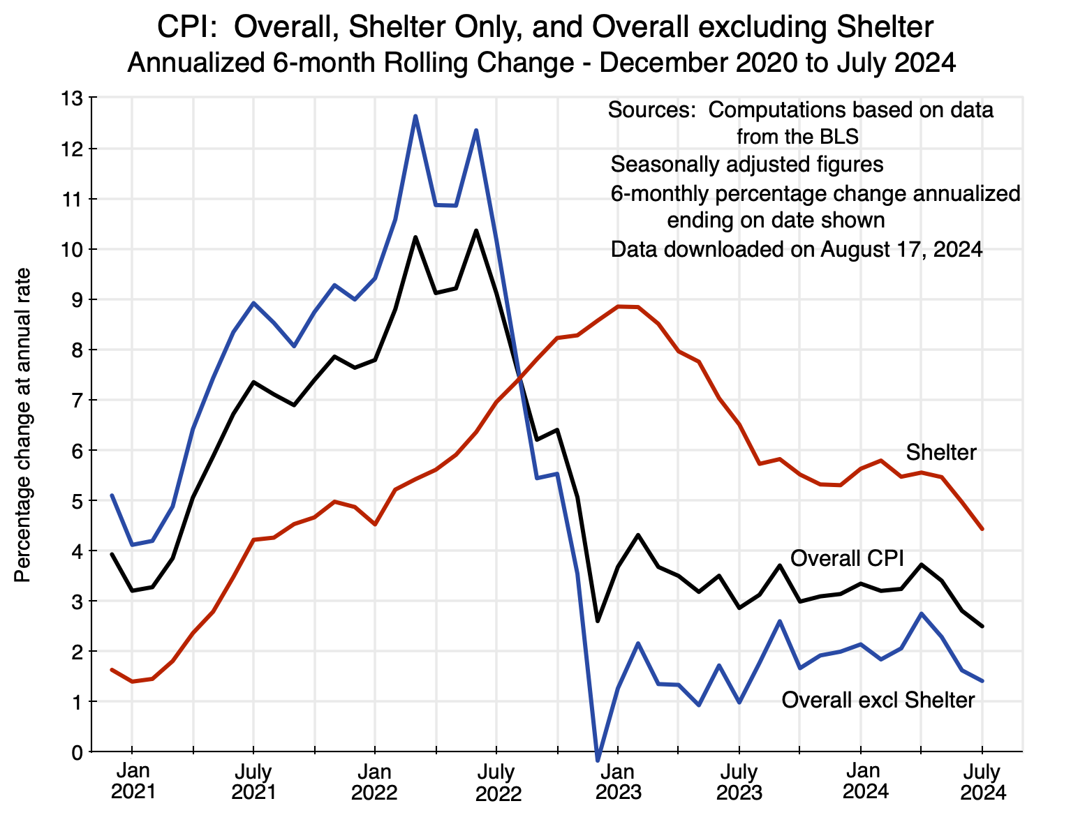


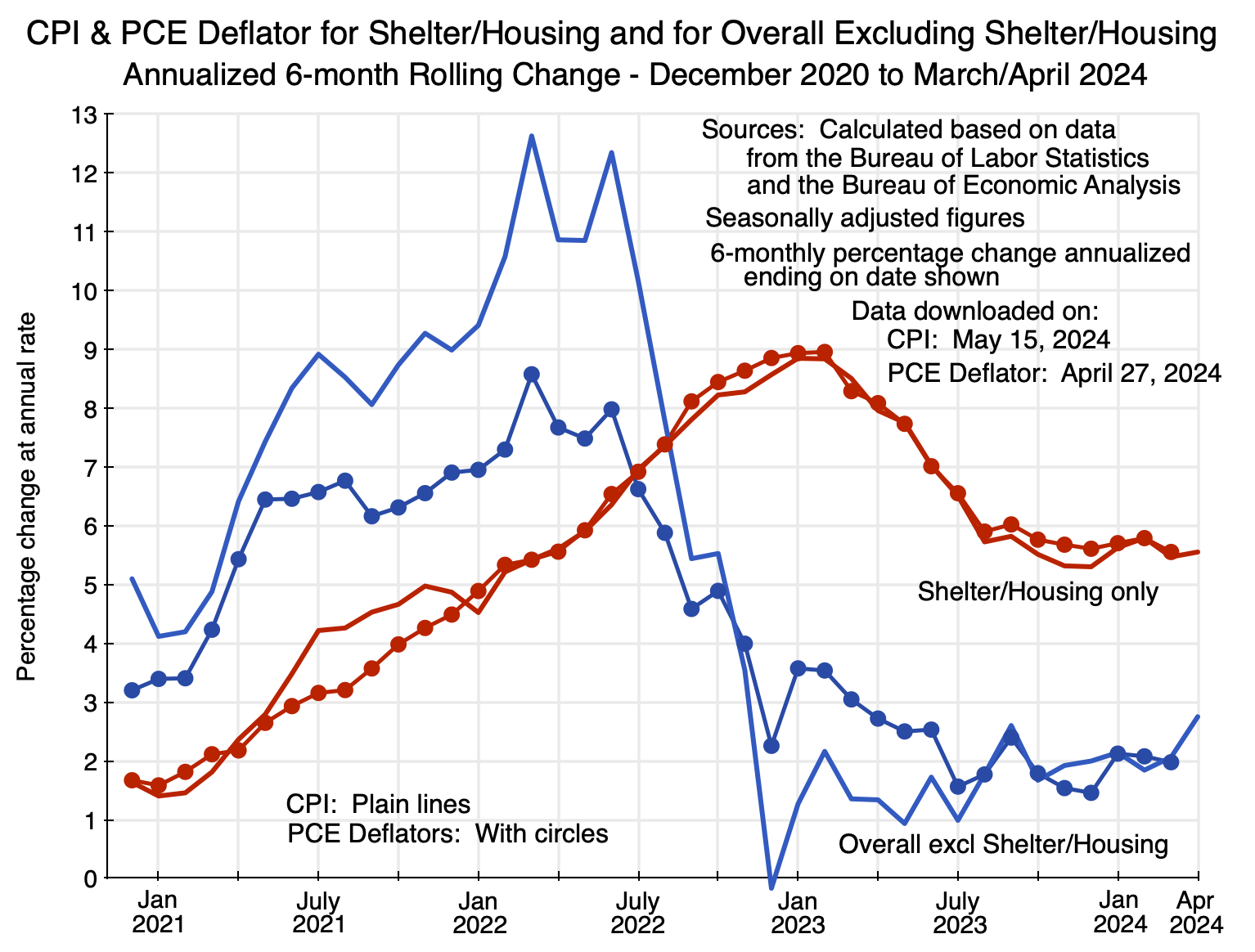
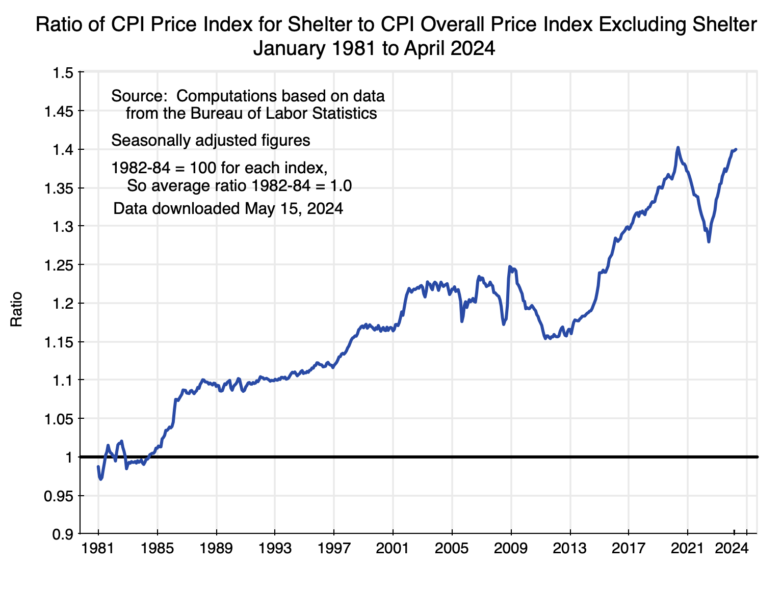

You must be logged in to post a comment.