
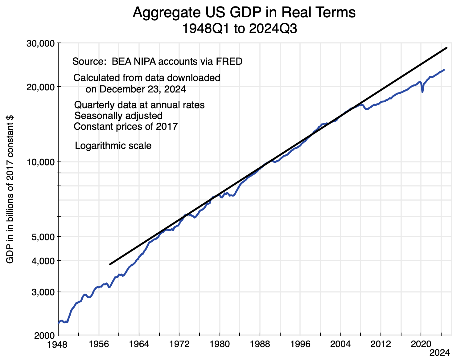
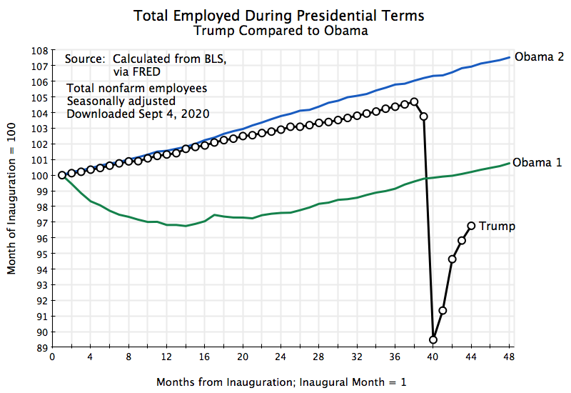
Chart 1
A. Introduction
The previous post on this blog described the slowdown in US growth since the 2008 crash. GDP fell sharply in the second half of that year – the last year of the Bush administration – due to the crisis in home mortgages leading to a broad collapse in the financial markets. It led to what has been termed the “Great Recession”. But unlike in past recessions, GDP never recovered to its previous trend path, even though the unemployment rate fell to lows not seen since the 1960s. GDP remains well below that previous path today. The chart above shows how that gap opened up and has persisted since 2008.
The question is why? The unemployment rate had averaged 4.6% in 2007 – the last full year before the 2008/09 economic and financial collapse. While the pace of the recovery from the collapse was slowed by federal budget cuts, the economy eventually did return to full employment. The unemployment rate was at or below 5% in Obama’s last year in office and then continued on the same downward path during the first three years of the Trump administration. It averaged 3.9% in 2018 and 3.7% in 2019, and hit a low of 3.5% in September 2019. After the brief but sharp 2020 Covid crisis, the unemployment rate then went even lower under Biden, reaching a low of just 3.4% in April 2023 and averaging just 3.6% in 2022 and again in 2023. The unemployment rate has not been this low for so long since the 1960s.
In prior times, GDP would have returned to the path it had been on once the economy had recovered to full employment, with resources (in particular labor resources) being fully utilized. But this time, despite unemployment going even lower than it had been before the downturn, GDP remained far below the path it had been on. By 2023, real GDP would have been almost 20% above where it in fact was, had it returned to the previous path. That is not a small difference.
That is, while the economy recovered from the 2008 collapse – in the sense that it returned to the full utilization of the labor and other resources available to it – economic output (real GDP) with that full utilization of resources was stubbornly below (and remained stubbornly below) what it would have been had it returned to its prior growth path. The economy had followed that path since at least the late 1960s (as seen in the chart above). Indeed, that same growth path (in per capita terms) can be dated back to 1950 (as the previous post on this blog showed).
This post will examine the proximate factors that led to this. The post will look first at the growth in available labor. It has slowed since 2008. This has not been due to a fall in the labor force participation rates of the various age groups, as some have posited. We will see below that holding those participation rates constant at what they were in 2007 (for each of the major age groups) would not have had a significant effect on labor force totals. Rather, labor force growth slowed in part simply because the growth in the overall population slowed, and in part due to demographic shifts: A growing share of the adult population has been moving into their normal retirement years. It is not a coincidence that the first of the Baby Boom generation (those born in 1946) turned 62 in 2008 and 65 in 2011.
The second proximate factor is available capital – the machinery, equipment, and everything else that labor uses to produce output. Capital comes from investment, and we will see below that net investment as a share of GDP has fallen sharply in the decades since the 1960s. Overall net fixed investment fell by more than half. This led to a slowdown in capital growth, and especially so after 2008. There was an especially sharp reduction in public investment. Since 2008, net public investment as a share of GDP has been only one-quarter of what it was in the 1960s. It should be no surprise why public infrastructure is so embarrassingly bad in the US. And net residential investment (as a share of GDP) is only one-third of what it was in the 1960s. The resulting housing shortage should not be a surprise.
The third proximate factor is productivity. Labor working with the available capital leads to output. How much depends on the productivity of the machinery, equipment, and other assets that make up the capital, and that productivity grows over time as technology develops and is incorporated into the machinery and equipment used. We will see that the rate of growth in productivity fell significantly after 2008. Given the reduction in net investment and the consequent slowdown in capital accumulation after 2008, it is not surprising that productivity growth also slowed.
For a rough estimate of the relative importance of these three factors – labor, capital, and productivity – I developed an extremely simple Cobb-Douglas production function model to simulate what could be expected. Despite being simple, it turned out to work surprisingly well both in terms of tracking what actual GDP was (for given employment levels) and in tracking the trend path for GDP given the trend paths of labor, capital, and productivity.
As noted above, the trend level of GDP in 2023 was almost 20% above what GDP actually was in that year – a year when unemployment was at record lows. Despite being at full employment, the economy was not producing more. Based on the Cobb-Douglas model, roughly a quarter of the shortfall can be attributed to a slowdown in productivity growth from 2007 onwards. Of the remaining shortfall, about 60% can be attributed to a smaller stock of capital and 40% to a smaller labor force (both relative to what they would have been had they continued on the same trend paths that they had followed before 2008).
Section B of this post will examine the labor force figures. Section C will look at what has happened to investment and the resulting growth in available capital. Section D will then examine the Cobb-Douglas model used to estimate the relative importance of labor and capital both growing more slowly than they had before and the impact of slower productivity growth. Section E will conclude.
As noted above, labor growth has slowed due to demographic changes as population growth has slowed and as the population has aged. A rising share of the population (specifically the Baby Boomers) have been moving into their normal retirement years, and this has led to a slower rate of growth in the labor force. There is nothing wrong with this, it depends primarily on personal choices, and there is no real policy issue here.
In contrast, there are important policy issues to examine on why investment has fallen in recent decades – and especially since 2008 – with the resulting slower rate of capital accumulation as well as slower productivity growth. But the causes of this are complex, and will not be examined here. I hope to address them in a subsequent post on this blog.
[Note on the data: In each chart, I used the most detailed data available for that particular data series, i.e. monthly when available (labor force statistics), quarterly (real GDP), or annual (capital accumulation). The data are current as of the date indicated for when they were downloaded, but some are subject to subsequent revision.]
B. Growth in the Labor Force
Growth in the US labor force has slowed, but by how much, when did this start, and why? We will examine this primarily through a series of charts. Most of these charts will be shown with the vertical axis in logarithms. As you may remember from your high school math, in such charts a straight line will reflect a constant rate of growth. The slope of the lines will correspond to that rate of growth, with a steeper line indicating a faster rate of growth.
The trend lines in the charts here (including in the chart at the top of this post) have all been drawn based on what the trends appear to be (i.e. “by eyeball”) in the periods leading up to 2008. They were not derived from some kind of statistical estimation, nor from a strict peak-to-peak connection, but rather were drawn based on what capacity appeared to be growing at over time. They were also drawn independently for aggregate real GDP (Chart 1 above), for growth in the labor force (Chart 2 below) and for growth in net fixed assets (Chart 10 below). Despite being independently drawn, we will see in Section D below that a very simple Cobb-Douglas model finds that they are consistent with each other to a surprising degree, in that the predicted GDP trend corresponds to and can be explained by the trends as drawn for labor and for capital.
Starting with the labor force:
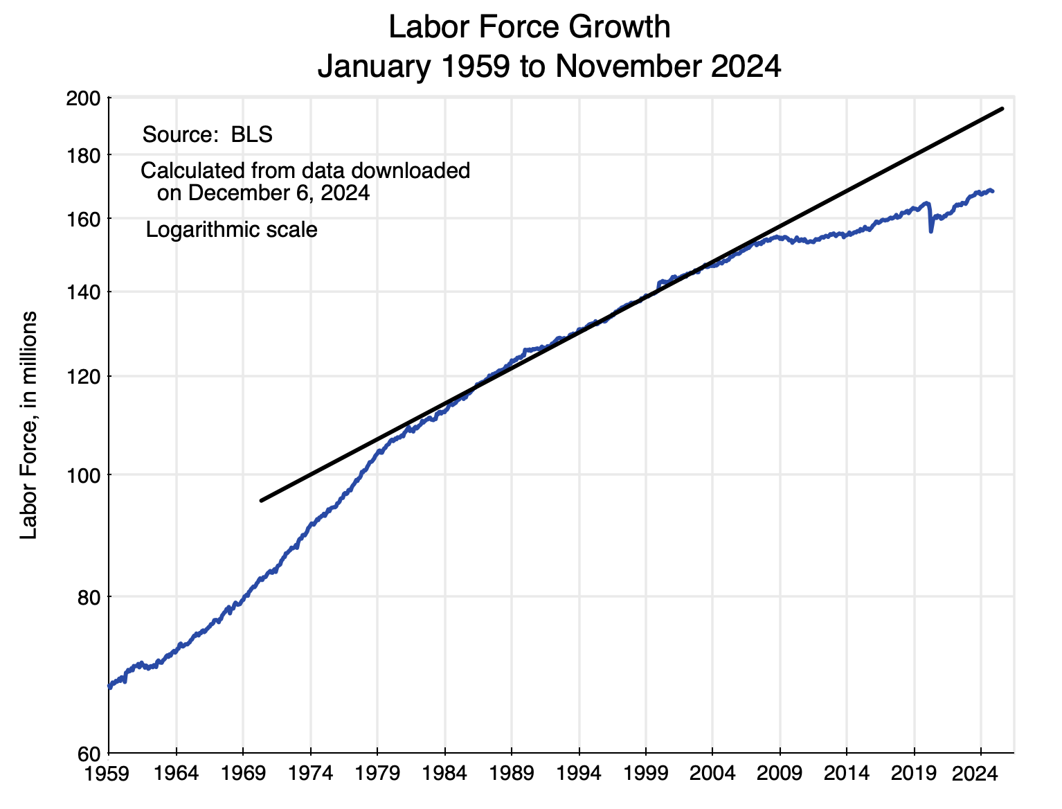
Chart 2
The US labor force grew at a remarkably steady rate from the early 1980s up to 2008. Prior to the 1980s, it grew at a faster pace (a trend line would be steeper) as women entered the labor force in large numbers and later as the Baby Boomers began to join the labor force in large numbers in the early 1970s.
But then that steady rise in the labor force (of about 1.3% per annum before 2008) decelerated sharply. The growth rate fell to only 0.5% per year between 2007 and 2023. Why?
We can start with overall population growth:
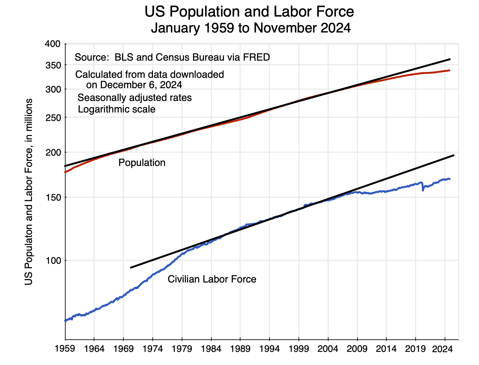
Chart 3
Population, too, had grown at a steady pace prior to 2008. But population growth then slowed. In this context, it is not surprising to see that growth in the labor force also slowed.
But there is more to it than just this. Before 2008, the US population had been growing at a similar rate as the labor force, thus leading to a fairly constant share of the labor force in the population (generally in the range of 50 to 51%):
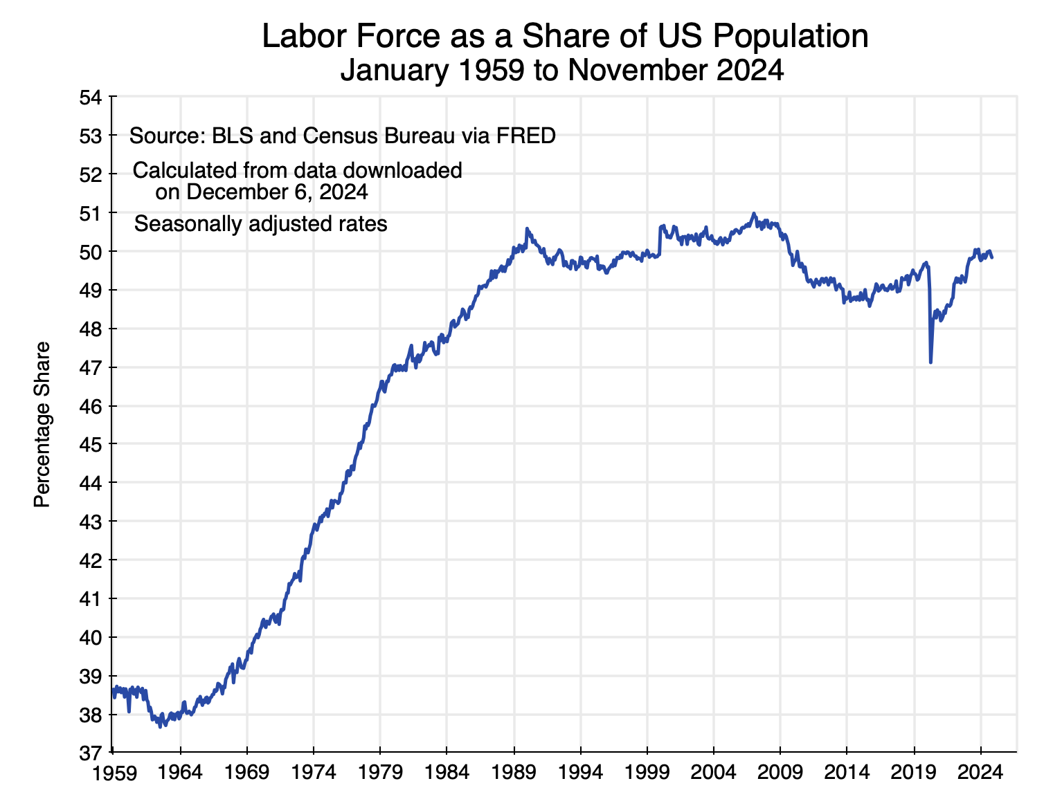
Chart 4
But then, in 2008, the share of the labor force in the US population fell. Growth in the labor force slowed by more than growth in the US population. What were the factors behind that?
One assertion that is often made is that labor force participation rates fell. At an aggregate level this is, almost by definition, true. As a share of the US adult population (those aged 16 and over), the labor force participation rate fell from 66.0% in 2007 to 62.6% in 2023 (using standard BLS figures). But one can be misled by focusing on the aggregate participation rate. The overall participation rate came down not because those in various age groups became less likely to join the labor force, but rather because an increasing share of the population was aging into their normal retirement years.
The BLS provides seasonally adjusted figures for the labor force broken into three age groups: those aged 16 to 24, those aged 25 to 54, and those aged 55 or more. Labor force participation rates are provided for each of these three groups, and one can calculate what the labor force participation would have been for each had the participation rate always been at that of 2007:

Chart 5
The line in red shows what the labor force then would have been, with the line in blue showing the actual labor force and the line in black the trend (the same trend as in Chart 2 above). While it would have made a significant difference before the 1980s (as women were not participating in the formal labor force to the same degree then), between 2008 and 2023 it makes very little difference. The labor force would have still fallen by about the same figures relative to its previous trend.
Rather, the labor force has been aging, with a growing share of the population now in the normal retirement years when labor force participation rates are low. From the BLS numbers, one can work out the share of the population that are age 55 or older:
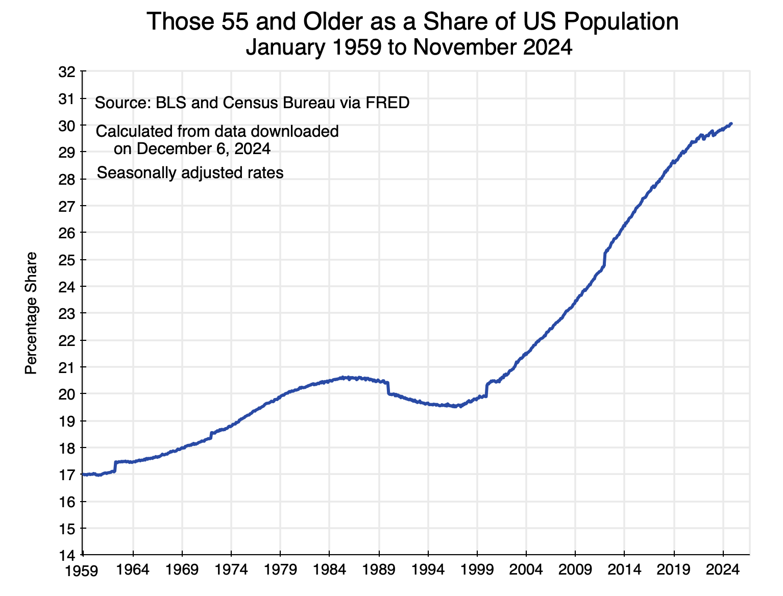
Chart 6
The share in the population of those aged 55 or older started to turn sharply upward around 1998. They thus would have been 65 or older starting around 2008. And as noted before, this is also when the first of the Baby Boomers (those born in 1946) would have started to reach their normal retirement age.
[Side note: The discontinuities that one sees at various points in this chart are there because of adjustments made by the BLS in their control totals. They adjust these control totals once new results are available from the decennial US population censuses. They need such control totals for the shares of the various demographic groups since the labor force estimates come from its Current Population Survey (CPS), and as with any survey, control totals are needed to generalize from the sample survey results. But the BLS does not then revise prior CPS estimates once the control totals are updated with each decennial census. That then leads to these discontinuities. For our purposes here, those discontinuities are not important.]
Labor force growth thus slowed from 2008 onwards. This can be explained by basic demographics with an aging population. This was not due to less willingness to participate in the labor force – an assertion one often sees. Holding participation rates constant at what they were in 2007 for just three broad age groups led to no significant difference in what the labor force would have been. Rather, people are just aging into their normal retirement years.
C. Growth in Capital
Labor works with machinery, equipment, structures, and other fixed assets – which together will be referred to as simply capital – to produce output. Those assets also reflect the technology that was available and economic (in terms of cost) when they were installed. Those assets are acquired by investment, and it is important to recognize that net investment has fallen sharply over the last several decades.
This is not often recognized, as most analysts and news reports focus not on net investment but rather on gross investment. Gross investment figures are provided in the GDP accounts that are released each month, and gross investment as a share of GDP has not varied all that much. The decade-long averages for gross private fixed investment have varied only between 16 and 18 1/2% of GDP since the 1960s.
But the accumulated stock of capital does not arise simply out of gross investment but rather out of investment net of depreciation – i.e. net investment. Less attention is paid to net investment figures, and estimating depreciation is not easy. It is certainly not depreciation as defined by tax law, as tax law as written reflects a deliberate attempt to encourage investment by allowing firms to declare depreciation to be greater than it actually is (e.g. through accelerated depreciation). Assigning a higher cost to depreciation will reduce reported profit levels and hence reduce what needs to be paid in taxes on that profit income.
For the GDP accounts (NIPA accounts) the BEA needs to record what actual depreciation was, not what depreciation as allowed under the tax code may have been. The BEA estimates of this are carefully done and are the best available. However, one still needs to recognize that these are estimates and that there are both conceptual and data issues when estimates of depreciation are made.
Based on the BEA estimates in the NIPA accounts, both public and private net fixed investment levels – as shares of GDP – have fallen sharply since the 1960s:
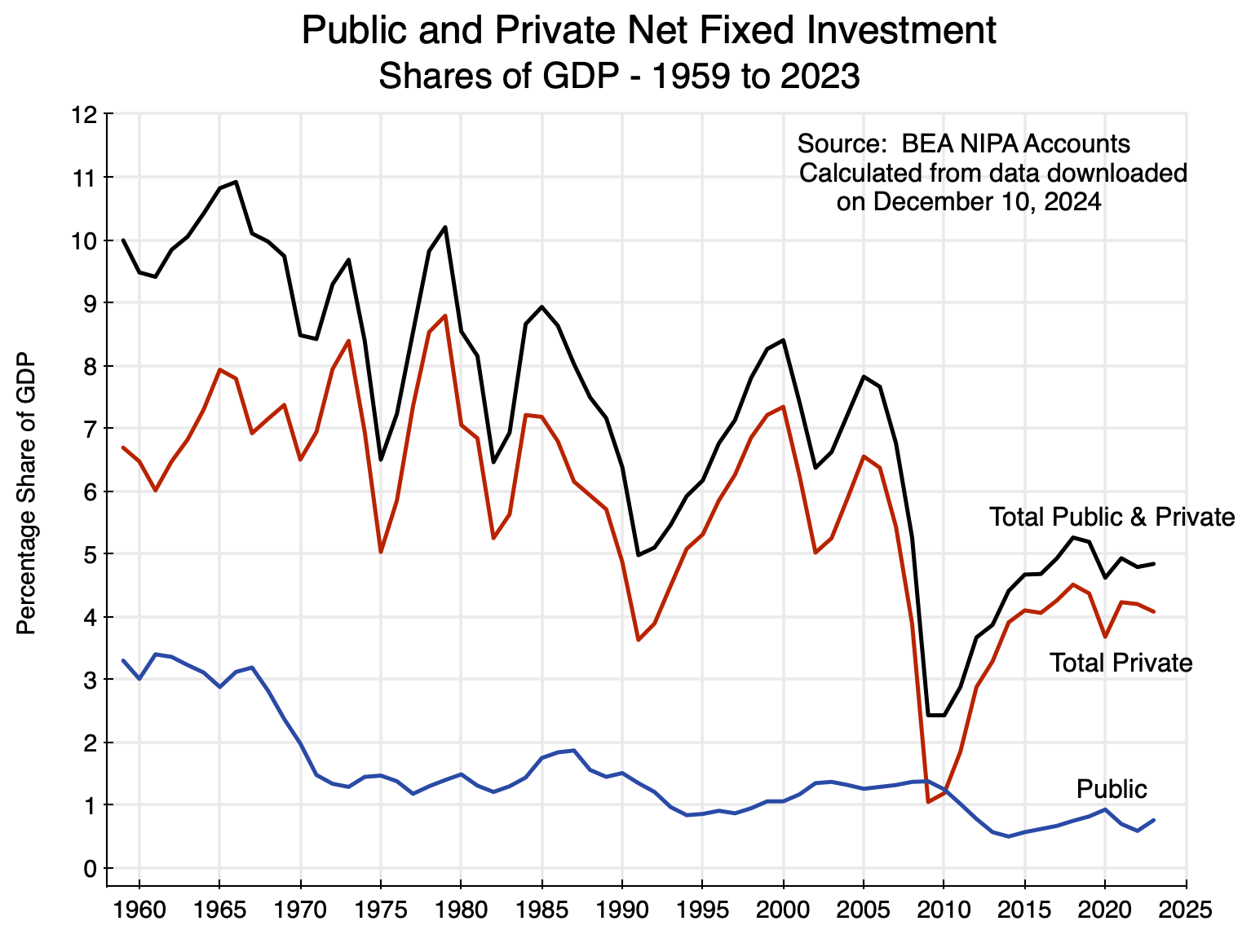
Chart 7
There are significant year-to-year fluctuations in the shares – especially in the private investment figures – as investment varies significantly over the course of the business cycle. It falls in recessions and increases when the economy recovers. The trends may thus be more clearly seen using decade averages of the net investment shares:
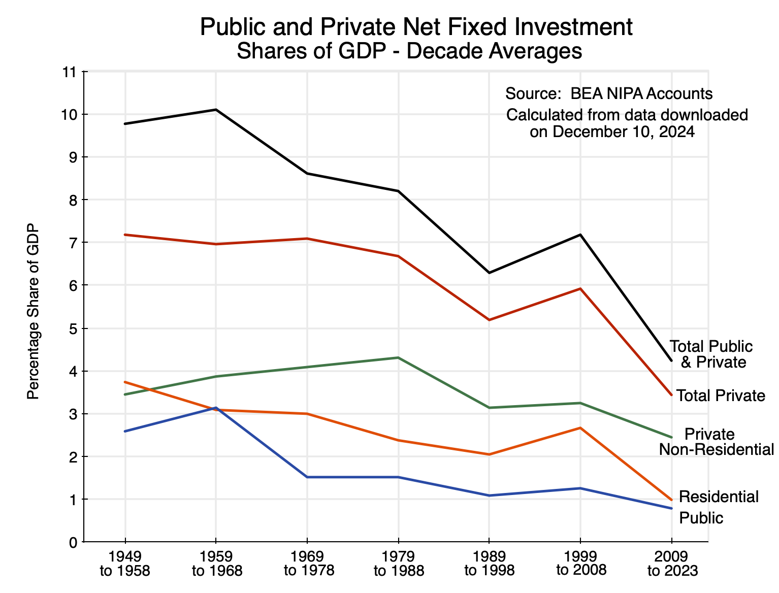
Chart 8
Total public and private net fixed investment fell from over 10% of GDP in the 1960s (and almost as much in the 1950s) to just 4.2% of GDP in the period from 2009 to 2023 – a fall of close to 60%. Total private net fixed investment fell from about 7% of GDP in the 1950s, 60s, and 70s, to just 3.4% since 2009 – a fall by half. Public net fixed investment fell even more sharply: from over 3% of GDP in the 1960s to just 0.8% of GDP in recent years – a reduction of three-quarters (in the figures before rounding). It should be no surprise why public infrastructure is so embarrassingly poor in the US.
The chart also shows private net fixed investment broken down into the share for investment in residential assets (housing) and non-residential assets. Much of the decline in private net fixed investment was driven by an especially sharp reduction in investment in housing. Still, private investment in assets other than housing has also been cut back substantially, with a reduction of over 40% compared to where it was in the 1980s.
Based on their net fixed investment estimates and other data, the BEA also provides estimates of how the accumulated stock of real fixed capital has changed over time, with those levels shown in terms of quantity indices. The resulting rates of growth in accumulated capital (which the BEA refers to, more precisely, as the net stock of fixed assets) have declined sharply with the reductions in the net investment shares:
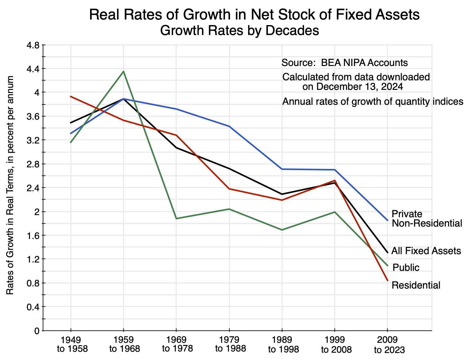
Chart 9
In the 1960s, the annual growth rates varied between 3.5% (for residential fixed assets) and 4.4% (for public fixed assets). But in the period from 2009 to 2023 those growth rates had fallen to just 1.9% for private non-residential fixed assets, 1.1% for public fixed assets, 0.8% for residential fixed assets, and 1.3% for all fixed assets. Such a slow rate of capital accumulation will not be supportive of robust growth.
The reductions in the growth rates were especially sharp following the 2008 crisis. This led capital accumulation to fall well below the trend path that it had previously been on:

Chart 10
As was the case for growth in the labor force, there is again a substantial fall after 2008 in the growth of an important factor in production relative to its previous trend. This time it is accumulated capital. It should not be surprising that this slowdown in the growth of both available labor and capital would then be accompanied by a slowdown in the growth of GDP – all relative to their previous trends. But an open question is how much of the close to 20% shortfall in GDP as of 2023 was due to labor, how much to capital, and how much to the productivity of labor working with the available capital? This will be examined in the next section.
D. Modeling GDP: The Relative Importance of Labor, Capital, and Productivity to the Shortfall
Output (GDP) has fallen relative to the path it was on before – and a 20% shortfall is a lot – as have both the size of the labor force and of accumulated capital. To estimate how much of the shortfall in GDP can be attributed to the shortfall of labor, how much to the shortfall of capital, and how much to a slowdown in the growth in productivity of that labor and capital, one needs a model.
For this analysis, I used the extremely simple but standard model of production called the Cobb-Douglas. Its formulation is credited to Paul Douglas (an economist) and Charles Cobb (a mathematician) in 1927, although Douglas recognized and acknowledged that a number of economists before them had worked with a similar relationship. While extremely simple, it allows us to arrive at an estimate of how much of the shortfall in GDP can be attributed to labor, how much to capital, and how much to a change in productivity growth. Despite being simple, there was a good fit when the model was tested for its predictions of GDP against what GDP actually was historically. There was also a very surprisingly good fit against whether the trend growth in GDP was close to what the model predicted based on the trend growth observed for labor and for capital.
The Cobb-Douglas production function is an equation that relates what output (real GDP) would be for given levels of labor and capital as inputs. The following subsection will provide a brief overview of that equation and of the parameters used. Those who prefer to avoid equations can skip over this section and go directly to subsection (b) below, where the model was tested via a comparison of the model’s predicted values for GDP to what GDP actually was, both year-by-year and in its trend.
a) The Cobb-Douglas Equation and Parameters
The Cobb-Douglas production function can be written as:
Y = A(1+r)tLβK1−β
where Y is real GDP, L is labor, K is capital as measured, r is a rate of growth for the increase in productivity over time (t), A is a scaling factor, and β is an exponent indicating how much output (Y) will increase for a given percentage increase in L as an input. With constant returns to scale (which is generally assumed), the exponent for K will then be 1- β. They will also match (under the assumptions of this model) the shares in national income of labor and capital, respectively. In the NIPA accounts for 2023, the compensation of employees was 62% of national income. All other income (e.g. basically various forms of profit) was 38% of national income. I rounded these to just a 60 / 40 split, so β = 0.60 and 1-β = 0.40.
Productivity will grow over time. That is, the output that can be generated for a given amount of labor and of capital will grow over time. As technology changes and is reflected in the accumulated stock of capital, labor working with the available machinery and equipment will be able to produce more. While the contribution of the growth in productivity can be incorporated into the Cobb-Douglas in various different ways, the simplest is to assume that it augments the combination of labor and capital together. This growth in productivity can then also be referred to as the growth in Total Factor Productivity (TFP).
For the simulations here, I took the year 2007 (the last full year before the 2008 collapse) as the base period, and hence scaled the labor and capital inputs in proportion to what they were in 2007. Thus they were both set to the value of 1.00 in 2007, and if they were then, say, 10% higher in some future year they would have a value of 1.10 in that year. The scaling coefficient A would then be equal to real GDP in 2007 ($16,762.4 billion in terms of 2017 constant $).
Finally, the rate of TFP growth was set so that GDP as modeled would roughly track what the actual values for GDP were historically. It turned out that an annual rate of growth in TFP of 1.20% worked well for the years leading up to 2007, with this then falling to 0.90% per year in the years following 2007 up to and including 2023. I did not try to fine-tune this to any greater precision (i.e. I looked at annual TFP growth to the nearest 0.1% and not more finely, i.e. to 1.20% or 1.30% but not to 1.21%). I also constrained the TFP growth to be at just one given rate for all of the years before 2007 (1.20%) and one rate after 2007 (0.90%), even though it is certainly conceivable that it could fluctuate over time.
b) Comparison of GDP as Modeled by the Cobb-Douglas versus Actual and Trend GDP
The Cobb-Douglas just provides a model, and the first question to address is whether that model appears to track what we know about the economy. There were two tests to look at: 1) how well it tracked actual GDP as a function of actual labor employed and capital (net fixed assets), and 2) how well the model tracked the trend line for GDP growth (as drawn in Chart 1 at the top of this post) as a function of the trend line as drawn for the labor force (Chart 2) and the trend line as drawn for capital (Chart 10). Keep in mind that these trend lines were drawn independently and “by eyeball” based on what appeared to fit best in the decades leading up to 2008.
This chart shows how well the modeled GDP tracked actual historical GDP:
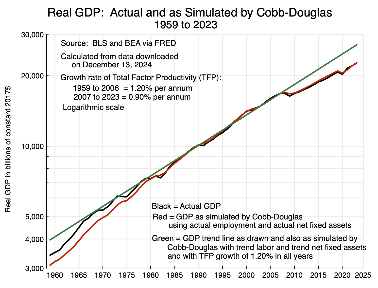
Chart 11
The line in black shows what actual real GDP was in each year from 1959 to 2023. The line in red shows what the simple Cobb-Douglas model predicted real GDP would be in each year with the parameters as discussed above and with the labor input based on actual employment in that year rather than the available labor force. The capital input is always available net fixed assets (as an index, which is all we need for the relative changes), as estimated by the BEA for the NIPA accounts (shown in Chart 10 above).
The line in red for the modeled GDP tracks well the line in black of actual GDP, especially from about the early 1980s onwards. A reduction in the growth rate for TFP in the years prior to 1980 would have led it to track the earlier years better, but I did not want to try to “fine-tune” the TFP rate. My main interest is in how well predicted GDP tracks actual GDP over the last several decades. Over this period, a simple Cobb-Douglas with fixed parameters and with TFP growth of 1.20% for the years before 2007 and 0.90% in the years since, tracked quite well. And this was over a period when GDP grew from just $7.3 trillion in 1980 (in 2017 constant $) to $22.7 trillion in 2023 – more than tripling.
A second test is whether something close to the GDP trend line (as drawn in Chart 1 at the top of this post) will be generated by the Cobb-Douglas model when the labor force grows on its trend line (as drawn in Chart 2) and capital grows on its trend line (as drawn in Chart 10). Each of these trend lines were drawn independently and “by eyeball”.
The answer is that it does, and to an astonishing degree. This may have been the case in part by luck or coincidence, but regardless, was extremely close. The line for GDP as predicted from the Cobb-Douglas model using labor and capital inputs that each followed their own trend lines, was so close to the GDP trend line that they were on top of each other in the chart and could not be distinguished.
One should keep in mind that, by construction, the predicted GDP in 2007 from the Cobb-Douglas model will be equal to actual GDP in that year. The scaling factor was set that way. But the question being examined is whether the predicted GDP (based on the labor and capital trend lines) would drift away from the trend line for GDP (as drawn) over time. It did not. Calculating it back over a 60-year period (i.e. equivalent to going back to 1947 from the 2007 base), the predicted GDP was only 0.7% greater than what GDP on the drawn trend line would have been 60 years before.
This is tiny, and indeed so tiny that I at first thought it might be a mistake. But after simulating what would have been generated by various alternative parameters for the Cobb-Douglas, as well as alternative trend paths for labor and capital, the calculations were confirmed. The implication is that the trend lines for GDP, labor, and capital – while independently drawn – are consistent with each other and with this simple Cobb-Douglas framework.
The rate of productivity growth – TFP growth – for the years leading up to 2007 was 1.20%. It was derived, as noted above, by trying various alternatives and seeing which appeared to fit best with the figures for actual GDP in those years. Going forward from 2007, however, it would have over-predicted what GDP would have been. What fit well with the data on actual GDP (and based on actual employment and available net fixed assets) was a reduction in the TFP rate from the 1.20% used for the years up to 2007 to a rate of 0.90% for the years after.
The resulting path for actual GDP versus the path as modeled by the Cobb-Douglas can be more clearly seen in the following chart. It is the same as Chart 11, but now only for the period from 2000 to 2023:

Chart 12
The red line shows the path for the simulated GDP, where from 2007 onwards the assumed TFP growth rate was 0.90%. The fit is very good, and especially in 2022 and 2023 – the years of most interest to us – when the simulated GDP (from the Cobb-Douglas) is almost identical to actual GDP. These are both well below the path (the green line) that would have been followed based on the previous trend growth in labor and capital, as well as the continuation of productivity growth at a 1.20% rate rather than falling to 0.90%.
c) The Causes of the Below Trend Growth of GDP Since 2008
From this simple Cobb-Douglas model, we can try various simulations of what growth in GDP might have been had the labor force continued to grow at the rate it had before 2008, had capital continued to grow at the rate it had before 2008, and had productivity (TFP) continued to grow at the rate it had before 2008.
The results are shown in the following chart:
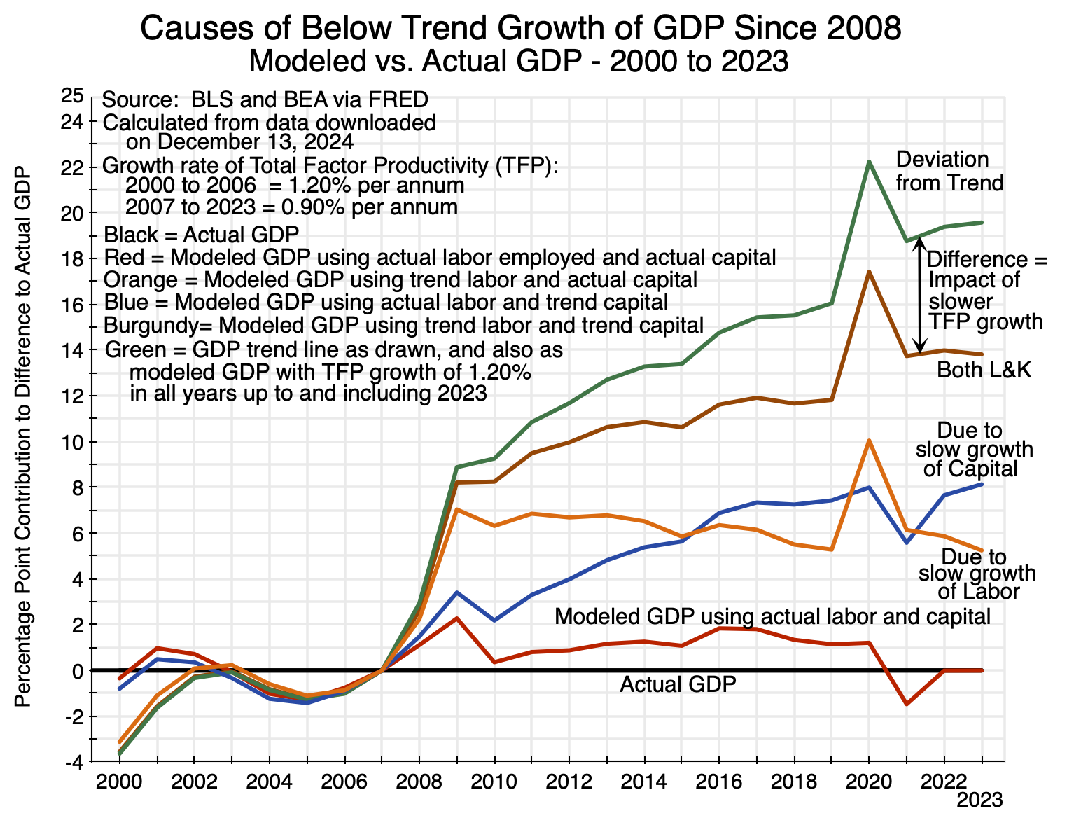
Chart 13
The resulting paths for GDP are shown as a ratio to what actual GDP was in each year, with the differences expressed in percentage points. By definition, there will be no difference for actual GDP, so it is a flat line (in black) with a zero difference in each year. The line in red then shows what the modeled GDP was in each year in terms of the percentage point difference with actual GDP, using actual labor employed in each year and available capital. The red line shows at most a 2 percentage point difference with actual GDP – and no difference at all in 2022 and 2023. The model tracks actual GDP well when the labor input is equal to observed employment.
The line in blue then shows what GDP would have been (according to the model) had capital growth continued after 2007 along its pre-2008 trend path (the path drawn in Chart 10 above) while labor grew at the actual rate of employment. It shows how much the shortfall in GDP was as a consequence of capital accumulation slowing down from 2008 onwards. As seen in the chart, the impact of this slowdown has grown over time.
The line in orange shows what GDP would have been had labor growth continued after 2007 on its pre-2008 trend path (the path drawn in Chart 2 above), while capital grew not along its trend but rather as measured. Here one needs to take into account that the growth rate of actual employment and the growth rate of the labor force will only match between periods when the unemployment rate was the same. Thus comparisons should be limited to periods when the economy was close to full employment, such as between 2007 (when unemployment averaged 4.6%), 2016 to 2019 (annual unemployment rates of 4.9% to 3.7%), and 2022/23 (annual unemployment rates of 3.6%). That is, the “peaks” seen in the orange line in 2009 and again in 2020 are not significant, as they reflect labor not being fully used. This was not because the labor force was not available but rather due to the disruptions of the downturns in those years.
The line in burgundy then shows what GDP would have been (in terms of its percentage point difference with actual GDP) had both labor and capital inputs continued to grow (and been used) on their pre-2008 trend paths. Note that the values here will not be the simple addition of the percentage point contributions of the slower than trend growth of the labor force and the slower than trend growth of capital. The Cobb-Douglas relationship is a multiplicative one, not a linear one. But if one does multiply out the two (the blue and orange lines, but as ratios rather than percentage points), and adjust for the model’s tracking error (the red line), one will get the impact of the two together (the burgundy line).
Finally, there is the impact of the slowdown in TFP growth from 1.20% per year before 2007 to 0.90% after. That will appear as the difference between what GDP would have been had it followed the previous trend path (the green line in the chart) and the impact of labor and capital both slowing down from their respective trends (the burgundy line). Its impact grows steadily larger over time.
Based on these simulations, as of 2023 approximately 25% of the shortfall in GDP relative to what it would have been had it continued on its pre-2008 trend can be attributed to a fall in the rate of productivity growth (TFP) from 1.20% to 0.90%. Of the remaining shortfall, approximately 60% was due to the slowdown in investment and hence capital accumulation, and approximately 40% was due to the slowdown in the growth of the labor force. Or put another way (and keeping in mind that the impacts are not linearly additive, but only approximately so), of the total shortfall in 2023, about 70% was due to the slowdown in productivity growth together with the related slowdown in capital growth, and about 30% was due to the slowdown in labor force growth.
But these figures are for 2023 and will shift over time. Going forward, and unless something is done to change things, the shortfall in GDP (its deviation from the pre-2008 trend) will be widening, and the shortfall in capital accumulation (due to the fall in investment as a share of GDP) plus the related reduction in productivity growth, can be expected to account for an increasing share of this increasing shortfall in GDP. These already accounted for about 70% of the shortfall in 2023, and on current patterns that share will grow in the coming years.
E. Conclusion
GDP fell sharply in the economic and financial collapse that began in the second half of 2008. But while there was a recovery, with employment eventually returning to full employment levels, GDP never returned to the path it had previously been on. This was new. In prior recessions (as seen in Chart 1 at the top of this post), GDP was back close to its earlier path once employment had recovered to full employment levels. As a consequence, by 2023 GDP would have been close to 20% higher than what it was had GDP returned to its previous path. And 20% higher GDP is huge. In terms of current GDP in current prices, that is close to $6 trillion of increased output and incomes each year. Total federal government spending on everything is about $7 trillion currently.
The proximate causes of this can be broken down into three. First, the labor force began to grow at a slower rate in the years following 2008. This was not due to labor force participation rates falling for individual age groups. Rather, this in part reflected a slowdown in the growth of the overall US population (and to this extent, will then be offset when GDP is looked at in per capita terms). But in addition, there was the impact of an aging population, with the Baby Boom generation entering into their normal retirement years.
In policy terms, there is not much one can or should want to do about labor force growth. Population growth is what it is, and an aging population will see an increasing share of the population moving into their retirement years. These all reflect personal choices.
In contrast, the slowdown in investment and the resulting slowdown in capital accumulation and productivity growth is a policy question that merits a careful review. Why are firms investing less now than they did before? Profits (especially after-tax profits) are at record highs and the stock market is booming. In a market economy where firms are avidly competing with each other, this should have led to an increase – not a decrease – in net investment.
A future post in this series will examine the factors behind this. But first, a post will examine the specific case of residential investment. Net residential investment fell especially sharply after 2008 (see Charts 8 and 9 above), while home prices have shot up. Housing is important, and its rising cost has been the source of much displeasure in recent years by those who do not own a home and must rent. The rising cost of housing is the primary (indeed, the only) reason why the CPI inflation index remains above the Fed’s target of 2%. It merits its own review.


You must be logged in to post a comment.