Chart 1
A. Introduction
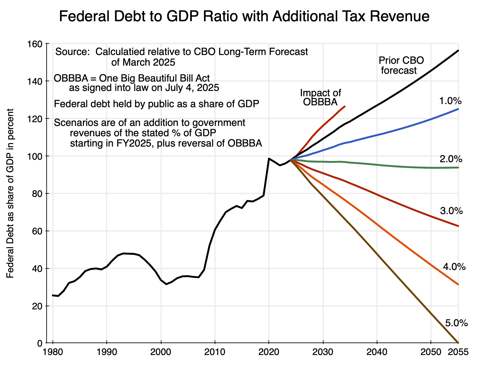
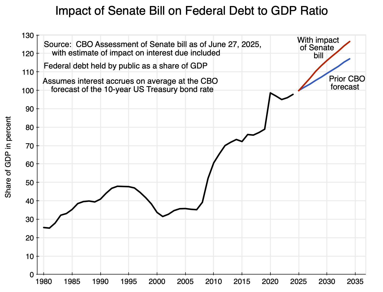
The previous post on this blog showed how far federal government debt will rise as a share of GDP as a consequence of the “One Big Beautiful Bill Act” (OBBBA). The Senate version of the bill was accepted in full by the House and was signed into law by Trump on July 4. The bill will add $4.0 trillion to public debt in the decade to FY2034, increasing that debt from 98% of GDP as of the end of FY2024 to 126% of GDP by the end of FY2034 (up from the 117% of GDP if the bill had not been passed).
Such numbers on the debt (which would have been astounding just a few years ago, before Trump’s first term in office) might lead some to conclude that rising public debt is now inevitable – that nothing can be done to avoid it. And some might conclude they should therefore get what they can as fast as they can from bills such as the OBBBA. The result was a bill laden with numerous special interest provisions for a favored few, and with tax cuts principally of benefit to those with high incomes.
The path is unsustainable and would eventually lead to financial collapse. But a rising path for the debt ratio is also not inevitable. A modest increase in federal revenues (2% of GDP or more) along with reversal of the OBBBA would lead to that ratio not just stabilizing, but falling in the decades to come. The chart at the top of this post shows what the impact would be of a given increase in federal revenues, expressed as a share of GDP, above that in the baseline in the most recent (March 2025) Long-Term Budget Projections of the Congressional Budget Office (the CBO). This CBO forecast was made prior to the OBBBA being passed, so a first step would be reversal of that act in order to return to that earlier baseline for revenues.
The paths are smooth as they follow the trends under the specified assumptions. In reality they will of course fluctuate along with the business cycle of economic downturns and upturns. Right now we do not know when those will occur, but the objective here is simply to illustrate what the longer-term trends would be.
A 3% of GDP revenue increase (plus reversal of the OBBBA) would be a modest target to meet. To put this in perspective, an extra 3% of GDP of federal revenues in FY2025 would have brought federal revenues (as a share of GDP) back to where they were in FY2000. This was the last year of the Clinton Administration, and growth was strong, the unemployment rate was the lowest since the 1960s, and the fiscal accounts were in surplus. But then revenues were cut (as a share of GDP) following the tax cuts of Bush (in 2001 and 2003) and Trump (in 2017).
One can also compare government revenues as a share of GDP of the US to what it is in comparator countries in Europe and elsewhere. The US is an extreme outlier, with far lower fiscal revenues than what other countries raise – countries with living standards for the general population that many in the US envy. If other countries can raise such fiscal revenues, one has to wonder why opponents assert it would be devastating for the US economy.
This post will first examine the impact higher federal revenues would have on the path of the federal debt to GDP ratio over the coming decades. It would not take much. To provide a better understanding of why that is so, it will also look at the basic math behind it. The section that follows will then look at what government revenues (as a share of GDP) are in the US compared to the share in comparator countries. A higher (and indeed always far higher) government revenue share in those countries has not meant a reduction in their standard of living. In many – perhaps all – cases, those living standards for the general population are in fact seen as superior. Those countries typically also enjoy public infrastructure that is not the embarrassment seen in much of the US. The section will also look at the economic conditions in the US in 2000, when government revenues were 3% of GDP higher than what they are now. The economy was performing well in 2000 (and better than it ever has since), and there is no reason why the US could not return to such a level of tax revenue collection.
The section that follows will then discuss some of the criticisms made against raising more in government revenue. Those arguments (such as that higher tax rates will lead workers to drop out of the labor force, that corporations would invest less, and hence that tax cuts will pay for themselves) are not supported by the evidence. Nor do the theoretical arguments made in favor of tax cuts stand up.
Mathematically, an alternative to increasing federal revenues would be to reduce federal expenditures. All else equal, that would also reduce the deficit. But we can thank Trump for demonstrating that that will not work. We have seen via the OBBBA that cuts in federal expenditures are not easy to find. The most severe cuts will be to the Medicaid program – with an expected reduction in expenditures of $1.04 trillion over ten years. The CBO estimates that those cuts will lead to 11.8 million losing their Medicaid coverage.
Yet the just over $1.0 trillion reduction in federal government expenditures on Medicaid will amount to less than 0.3% of GDP over the period. With cuts to other programs (such as food stamps), the total cuts were still just 0.3% of GDP after rounding. The cuts would have had to have been ten times as high to get to a federal expenditure reduction of 3% of GDP. The authors of the OBBBA searched desperately for expenditures to cut in order to reduce the impact of the OBBBA on the fiscal deficit, and failed to find enough to suffice to cover even one-tenth of what would be needed to get to 3% of GDP. And the ones they did make will have severe consequences for the poor.
In addition to the lessons from the search under the OBBBA to try to find cuts in federal expenditures to offset what will be lost in lower tax revenues – and failing – there is also now the failure of the effort by Musk and DOGE. Despite savage cuts to critically valuable government programs (from medical research to the weather service), the federal government has spent (as of July 10) over $300 billion more since Inauguration Day than it did in the same period in 2024. DOGE had a stated aim that it would cut federal spending by $2 trillion per year. It never got remotely close.
But what I will refer to as the Musk/DOGE cuts (totaling $190 billion as of July 13, they claim) have had important consequences. Funds and government staff positions have been cut from medical research, basic science, overseas aid, and the weather service, along with much more. These cuts have had consequences, as will be discussed below.
What is needed to stop the upward spiral in federal debt relative to GDP is not complicated. There is a need for more revenues – revenues that have been repeatedly slashed by the tax cuts of Bush in 2001 and 2003, Trump in 2017, and now Trump again.
But while the answer is simple, that does not mean it will happen. In the current political environment – and as seen with the OBBBA rammed through Congress with only Republican votes – a return to a more sane fiscal policy cannot be expected anytime soon.
B. The Increase in Government Revenues Needed to Bring Down the Debt to GDP Ratio
The chart at the top of this post shows what the path of the federal debt to GDP ratio over the next three decades would be (with the path since 1980 included for context), for alternative additions to federal revenues expressed as a share of GDP. The base path is that calculated by the CBO in its Long-Term Budget Outlook issued last March. This forecast was made prior to the OBBBA, so a first step in all of the scenarios would be to reverse that costly new law. And the basic story is clear: With more federal revenues – and not that much more – the debt to GDP ratio would fall. Federal revenues include all sources of revenue to the federal government, but more than 99% of these are tax revenues.
Relative to the March 2025 (i.e. pre-OBBBA) estimates of the CBO, additional federal revenues of 2% of GDP would lead to a federal debt to GDP ratio that is broadly stable and in fact declining a bit. Additional revenues of 3% of GDP would put it on a clear downward path, which would be steeper at 4% of GDP in additional revenues, and would be so steep at 5% of GDP that federal debt would fall to zero by 2055 if sustained. As noted, all these paths would now also require that the OBBBA be reversed.
The pattern is consistent with each step up in federal revenues as a share of GDP. But what might be surprising to many is that additional revenues of just 2% of GDP (before the OBBBA) would suffice to stabilize the federal debt to GDP ratio. The overall fiscal deficit will exceed 6% of GDP this fiscal year (6.2% of GDP in the January 2025 CBO forecast). But the nation would not need anything close to that in deficit reduction to stabilize the debt to GDP ratio.
To see why, one needs to look at the basic math behind this. It is not that complex, and there are only a few parameters involved. One is the growth rate of nominal GDP (in total, not per capita, terms). This can be split up into the growth rate of real GDP and the rate of inflation (specifically inflation as measured by the GDP deflator, but price indices in general move similarly). Another is the average nominal rate of interest on government debt (US Treasuries), which also implies some average real rate of interest given the rate of inflation.
A last, and key, variable is what economists call the primary deficit in the fiscal accounts. While not often mentioned in news reports, it is key to understanding the dynamics of the debt to GDP ratio. The primary deficit is simply total federal government revenues minus total federal government expenditures, other than expenditures for the payment of interest on public debt. The overall deficit is then the primary deficit minus interest payments on the public debt.
Currently, the federal debt to GDP ratio is very close to 100%. The 100% figure is not a factor in the dynamics (as will be discussed below), but provides a starting point. One can use any units, and for convenience I will assume GDP equals $100 (billions of dollars or whatever) and that therefore federal debt also equals $100. Assume, then, that the growth in real GDP is 2% per annum, that the rate of inflation is 2% per annum, and that therefore the growth in nominal GDP is basically 4% per annum (ignoring interaction effects; it would be 4.04% if one did not). Assume also a nominal interest rate of 4%, and hence a real interest rate of 2% (again ignoring the same interaction effects).
The primary deficit is then key. Suppose that it is equal to zero. The overall fiscal deficit would then be the nominal interest due. Nominal interest would be 4% times debt outstanding, or 4% x $100 = $4. Thus the overall deficit would be $4, which would have to be covered by borrowing. Debt at the start of the next period would then be $100 + $4 = $104.
Nominal GDP in the denominator of the ratio would also have grown. With a nominal growth rate of 4% per annum, GDP in the next period would also be $104 = 1.04 x $100. With debt at $104 and GDP at $104, the debt to GDP ratio would be unchanged in that next period at $104 / $104 = 100% once again. One can continue with the same calculations for further periods. With these GDP growth rates, interest rates, and a primary deficit of zero, the debt to GDP ratio would be stable.
It does not matter that the debt to GDP ratio started out at 100%. Suppose it were 50% instead (e.g. debt of $50 with GDP still at $100), along with a primary deficit of zero. Interest due would then be $2 ( = 4% of $50), and the overall deficit would be $2. Debt in the next period would then be $50 + $2 = $52. GDP would once again have grown to $104 (with the 4% nominal growth), and the debt to GDP ratio would be $52 / $104 = 50% again. It is unchanged.
More generally, when the rate of growth in GDP matches the rate of interest (both either in real terms or in nominal terms), then with a primary deficit of zero, the debt to GDP ratio will be stable. The debt to GDP ratio will fall if GDP growth exceeds the rate of interest when the primary deficit is zero, and will rise if the rate of interest exceeds the rate of GDP growth. Or, as one can see in this simple arithmetic, if the primary deficit is, for example, 1% of GDP, then the debt to GDP ratio will be stable if the rate of growth of GDP is 1% point higher than the rate of interest. And if the primary balance is in surplus by 1% of GDP, then the debt to GDP ratio will be stable even if the rate of growth of GDP is 1% below the rate of interest.
This is all basically just arithmetic and can be calculated with a simple spreadsheet. What matters, then, are the actual figures in the CBO forecasts. In the underlying data for the CBO’s Long-Term Budget Outlook of last March (where all the figures can be found at this CBO page), the CBO forecasts that over the 2025 to 2055 period, real GDP will grow at an average annual rate of 1.6% and nominal GDP at a 3.7% rate. The GDP deflator grows at a 2.0% average rate. The average interest rate on all outstanding public debt held by the public is forecast to average 3.6% per annum in nominal terms and 1.5% per annum in real terms.
Thus the growth rate of GDP (1.6% per annum in real terms and 3.7% in nominal terms) is close to the average interest rate on outstanding public debt (1.5% in real terms and 3.6% in nominal terms). With this, a primary deficit of zero will yield a basically stable public debt to GDP ratio. In the CBO March 2025 budget outlook, the primary deficit is forecast to average very close to 2.0% of GDP over the period 2025 to 2055 as a whole, coming down from 3.0% of GDP in FY2025 to 2.1% for the remainder of the decade and then 1.8% or 1.9% in the outer decades.
Thus an increase in federal revenues of 2% of GDP (plus reversal of the OBBBA) would bring the primary deficit to zero. With real GDP growing at close to the same rate as the average interest rate on the debt, the debt to GDP ratio would be stable. With an increase in federal revenues of more than 2% of GDP, the primary balance would be in surplus, and at these growth rates and interest rates, the debt to GDP ratio will fall. All that is as shown in the chart at the top of this post.
Some might note that all this assumes the rate of growth of GDP and the level of interest rates are unchanged in each year in the various scenarios. This is correct. But whether GDP growth will then be faster or slower, and/or interest rates higher or lower, in the various scenarios is debated. This will be discussed in section D below.
C. Comparator Countries Raise Far More in Government Revenues than the US, as the US Itself Also Has in the Past
Would it be impossible to increase government revenues by, say, 3% of GDP? One might start by looking at what other countries – comparable to the US in income – are able to do:
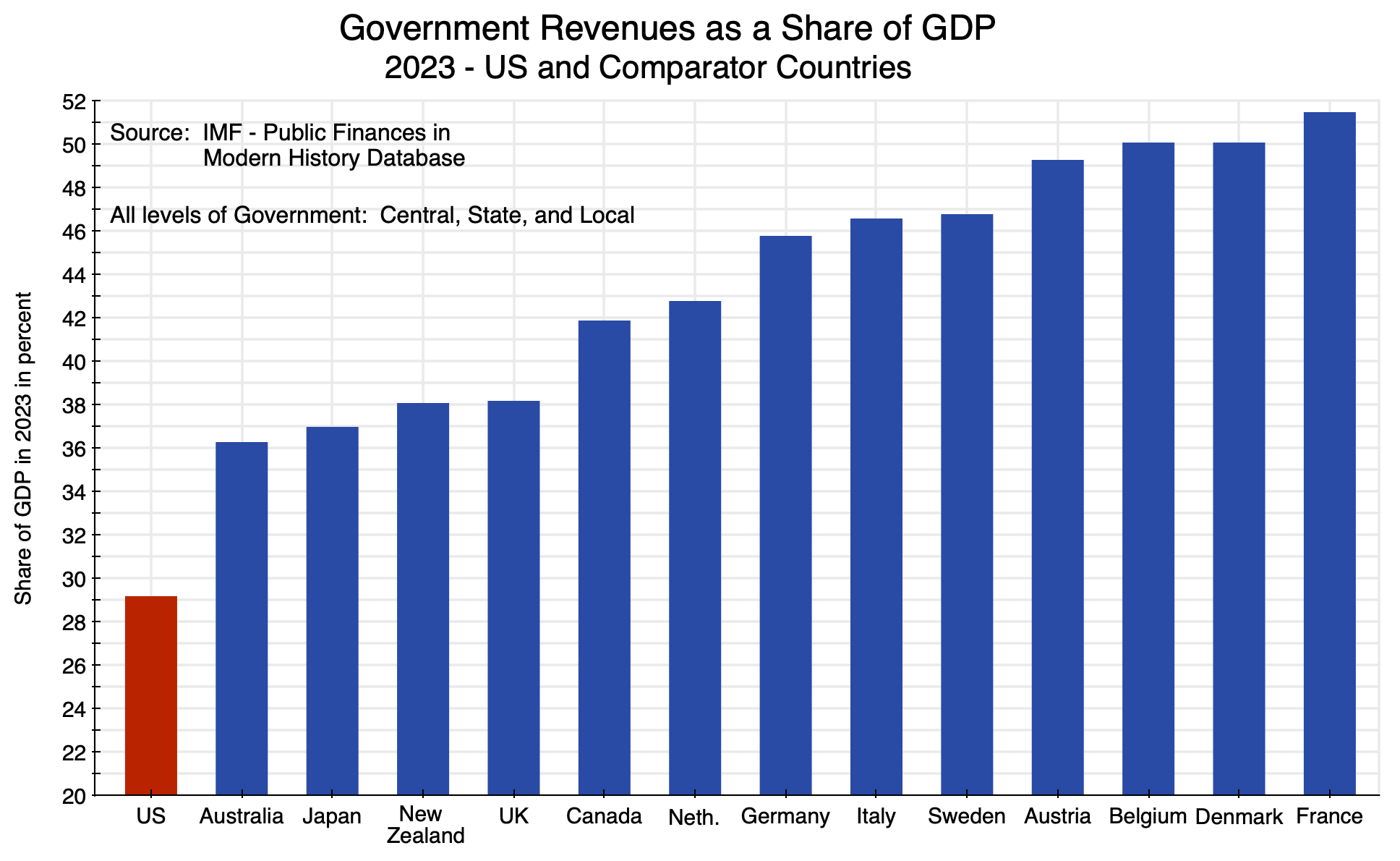
Chart 2
The figures here were assembled by the IMF and are for total government revenues at all levels of government (central/federal, state/provincial, and local) in order for the figures to be comparable across countries.
The US collects far less in government revenues as a share of GDP than do comparator nations. In 2023, government revenues totaled 29% of GDP in the US. The closest nation to the US in this list was Australia, at 36% of GDP – 7% points higher. It was 38% for the UK (9% points higher), an average of 47% for all the European nations on this list (18% points higher), and over 50% of GDP in Belgium, Denmark, and France.
Those other countries have done well. Living standards are high, and public infrastructure is typically far better than in the US (where it is often an embarrassment). If all those countries are doing well, it is difficult to see the basis for the assertion that a modest rise in government revenues in the US (of, say, 3% of GDP) would be so problematic.
One can also look at some specific indicators. Critics of higher taxes assert they would lead to a lower supply of labor (as they claim people would choose to work less when facing a higher tax rate) and a lower supply of capital assets (as they claim corporations and other business entities would invest less when facing higher tax rates).
But neither appears to be a problem in comparator countries. Labor force participation rates in these comparator countries are – with one exception – all higher than in the US:
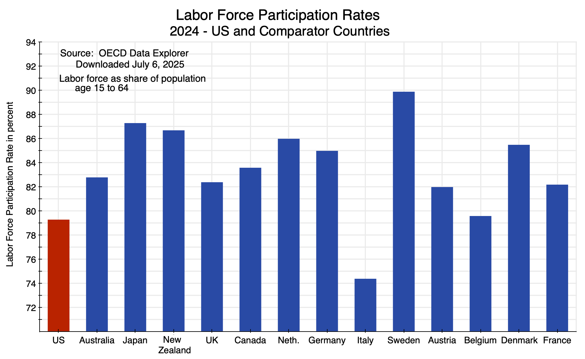
Chart 3
The data are from the OECD (where figures across countries are based on comparable definitions). The US rate was 79.3%, and the only country with a lower rate than this was Italy (at 74.4%). The participation rates were higher in all the other countries, and often substantially higher. The rate was almost 90% in Sweden, despite government revenues 17.6% points of GDP higher than in the US. Social policy is a far stronger determinant of labor force participation than tax policy.
Higher taxes are also not associated with lower investment. Investment in the comparator countries are all higher than in the US with two exceptions:
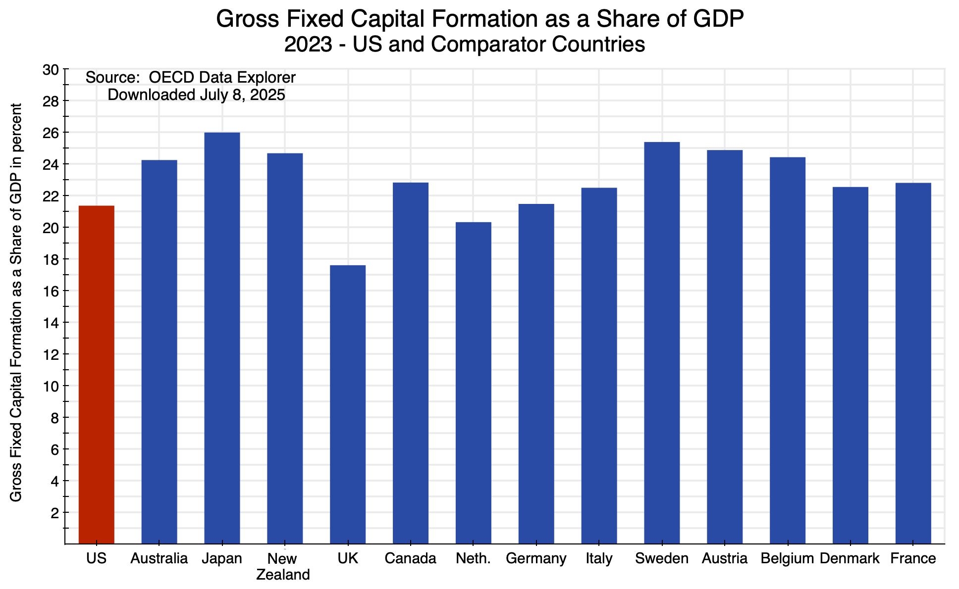
Chart 4
The chart shows gross fixed capital formation (i.e. investment) as a share of GDP in the set of countries in 2023, the most recent year with complete coverage in the OECD data. The US was at 21.4% of GDP. The UK was less at 17.6% and the Netherlands marginally less at 20.4%. The rates were higher in all the other countries, and they were higher despite collecting far higher tax revenues as a share of GDP.
In sum, I would not suggest that the US go to taxes at the level of France, nor even Australia. But to argue that the US cannot “afford” to raise tax revenues by 2 or 3 or 4% of GDP is belied by the ability of other countries – with comparable incomes and arguably a better standard of living for most of the population – to raise far more than that. And there is little indication that labor force participation or capital investment are diminished even with government revenue collections that are far greater (as a share of GDP) than what they are in the US.
One can also look at the experience of the US itself. Government revenues (federal only now) reached 20.0% of GDP in FY2000 – the last year of the Clinton administration. After repeated tax cuts, it was only 17.1% of GDP in FY2024. That is, the US was able to raise federal revenues in FY2000 that were almost 3% of GDP higher than what they were in FY2024.
The economy did not suffer when those higher revenues were collected. Real GDP grew by 4.1% in 2000, and at a 4.5% rate in the four years of Clinton’s second term. It has not grown faster than that for any four-year period since then, and only once for any individual year since then (in 2021, under Biden with the recovery from the Covid downturn). This is despite the tax cuts of Bush and Trump.
Nor did the tax cuts help investment. Real private fixed investment grew at a 8.8% rate in the four years ending in 2000 and real private fixed nonresidential investment (i.e. investment by businesses) grew at a 10.2% rate in the four years ending in 2000. Neither has grown at such rates in any four-year period since then, despite the repeated tax cuts of Bush and Trump.
The labor market was also strong. The unemployment rate fell to 3.8% at one point in 2000 (and was 3.9% still at the end of the year) – the lowest unemployment rate for the US up to that time since the 1960s. Total nonfarm employment grew at a 2.2% rate in 2000 and total private nonfarm employment grew at a 2.1% rate. Both were faster than in any subsequent year until 2021-23 during the Biden administration. The four-year growth (in annualized terms) ending in 2000 was 2.5% for total employment and 2.6% for private employment. Both were faster than in any subsequent four-year period until the four years ending in 2024 in the Biden administration.
So can the US do well with taxes set to raise an extra 3% of GDP? Certainly. Other countries do not suffer despite raising far higher government revenues as a share of GDP, and the US itself raised that much in additional government revenues in 2000. What is basically needed is a reversal of the repeated tax cuts of Bush in 2001 and 2003, Trump in 2017, and now Trump again in 2025. The government debt to GDP would not now be at 100% of GDP, rising on a trajectory for it to go ever higher for the foreseeable future (if the financial markets allow it), if government revenues were increased by just a few percentage points of GDP.
D. Some Critiques
a. Republican arguments for tax cuts are not supported by historical evidence nor by theory
A standard Republican argument since Reagan is that tax cuts will spur growth, as they claim labor will choose to work longer hours and businesses will invest more. They have also argued that real wages would rise as a consequence of this higher investment. Indeed, Republicans have argued repeatedly – starting with the Reagan tax cuts of 1981 – that tax cuts will increase growth by so much that they will “pay for themselves”. That is, they asserted that GDP and incomes would rise by so much that total tax collected would rise rather than fall. The arguments were repeated for the Bush tax cuts of 2001 and 2003, for the Trump tax cuts of 2017, and have been made once again for the OBBBA.
However, this never turned out to be true. See earlier posts on this blog that examined the impact of the Reagan and Bush tax cuts (which found they were not a boost to employment nor to growth, but did increase fiscal deficits); examined whether the Reagan tax cuts led to higher real wages (they did not); examined the record of Trump’s first term compared to that of Obama and Biden (which found that despite the tax cuts of 2017, growth was slower during Trump’s first term than under Obama and Biden even before the 2020 Covid crisis, that employment growth was substantially less, and business investment was no higher); and looked at what happened to corporate profit taxes following the sharp cut in corporate tax rates in 2017 (they fell in half, which should not be surprising but is counter to the argument that they would “pay for themselves”). Another post showed that if the government revenues lost due to the 2017 tax cuts under Trump were directed instead to the Social Security Trust Fund, Social Security would remain fully funded for the foreseeable future, rather than being depleted by 2034. What was lost in the 2017 tax cuts alone was huge.
One should also not forget that the highest marginal income tax rates in the US in the 1950s (when Eisenhower was president) were 91 or 92%. Rates at even those levels did not crush the economy.
History does not, therefore, provide support for the argument that the tax cuts of Reagan, Bush, and Trump led to higher growth, employment, or real wages.
Aside from the empirical evidence of history, the arguments that lower taxes will spur increased work effort and business investment are also mistaken at a theoretical level. As presented in another earlier post on this blog, the argument on labor supply is flawed as it fails to recognize that there will be income effects (and much more) as well as substitution effects when taxes on wage income change.
The Republican argument is that when one taxes wages, labor will work less as their after-tax return will be less. This is a substitution effect. But as is taught in any introductory Econ 101 course, there are income effects as well. They work in the opposite direction, as people work to achieve a certain standard of living as well as sufficient savings for retirement. There are also social (e.g. availability of childcare) as well as legal factors (e.g. a standard 40-hour workweek) that are probably as important, if not more important. And as discussed in Section C above, labor force participation rates in the US are less – in some cases substantially less – than in comparator countries with far higher taxes than in the US.
The argument against profit taxes is also flawed. The argument is that when profits are taxed at a lower rate, businesses will invest more. But that is not so clear (in addition to not being seen in the evidence). Businesses invest in the expectation of making a profit. A share of those profits are then paid in taxes. If the tax rate on profits is reduced, that does not mean that an investment that would otherwise be a loss (be unprofitable) will then become profitable. Rather, the lower tax rate on profits will mean that the businesses will retain a higher share of the profits on investments that are profitable. Such taxes – when properly structured as a tax on profits – will not turn a profitable investment into a loss.
This is the case when firms choose to invest whenever they expect to earn a profit, including possibly only a small profit. Mathematically, it will be different if firms will only invest in the expectation that they will earn some minimum rate of return – called the hurdle rate. The tax rate on profits can then matter as the taxes will reduce the after-tax rate of return to less than what it was before taxes. For investments on the margin (there may not be many), taxes could then lead to an after-tax rate of return below the hurdle rate. Investments that are expected to generate a very high before-tax rate of return will not be affected, as the after-tax rate of return would still be above the hurdle rate. Nor would they affect investments expected to generate a low before-tax rate of return. Such investments would not be done in any case.
In terms of the numbers, the impact of taxes on profits within the relevant range for the rate of return is not substantial. While this will depend to some degree on the specific pattern of returns as well as the lifetime of the investment, an increase in the tax rate on corporate profits from the current 21% by 3% points to 24% will generally reduce the after-tax rate of return by only a percentage point or less. That is, if the hurdle rate is 10.0%, the increase in the tax on corporate profits by 3% points will only matter for investments with an expected rate of return of between 10.0% and 11.0%. There will not likely be many investments in this narrow relevant range. Those who make decisions on corporate investments also know that they can rarely predict the rate of return on some investment so accurately that this would matter.
The increase in the tax rate on corporate profits from 21% to 24% would be for the headline rate. Due to numerous measures in the tax code, what corporations actually pay is much less. Using BEA figures in the NIPA accounts, corporations only paid an average tax of 12.8% on corporate profits in 2024. An increase in this to 15.8% would have close to the same impact as an increase from 21% to 24% on the rate of return on potential investments: It would reduce the return by a percentage point or less. Hence, it would only matter for investments with an expected rate of return only marginally above the company’s hurdle rate.
As with labor supply, one should also not presume that only narrow economic factors matter. Social factors can also matter, where businesses look at what others are doing (and do not want to be left behind), “animal spirits” matter, and investment decisions are based on far more relevant considerations than whether the tax rate on any profits that are made (if profits are made) are somewhat higher or somewhat lower.
b. Interest rates can be expected to be lower than otherwise when the fiscal accounts are on a sustainable path, and GDP growth would then rise not fall
Raising tax revenues by 3% of GDP or more can in fact be expected to lead to an increase – not a decrease – in the rate of growth of GDP.
The US fiscal accounts are on an unsustainable course with the ever-rising public debt to GDP ratio. The US Treasury needs to borrow the funds necessary to cover the annual deficit (as well as to roll over all the debt coming due in each period), and lenders will become increasingly cautious as debt rises on a path of steadily increasing debt relative to GDP. As they become increasingly cautious, they will only lend the funds needed if they are given a higher interest rate.
Putting the fiscal accounts on a path with a falling public debt to GDP ratio will avoid this. Interest rates would then fall to less than what they would have been with an ever-rising debt to GDP ratio. Lower interest rates can then be expected to spur investment. The scenarios in the chart at the top of this post all assume fixed values in each year for interest rates as well as GDP (those in the CBO’s baseline scenario of last March). But a more complete analysis would account for both the lower cost to the US Treasury of the consequent lower interest rates and an increase in the rate of growth in GDP (as a result of increased private investment) when the fiscal accounts are placed on a sustainable path. Both would then lead to a more rapid fall in the public debt to GDP ratios than presented in the chart at the top of this post.
c. We now know from OBBBA and Musk/DOGE that cutting federal expenditures by the amount needed to put the fiscal accounts on a sustainable path is not possible
Mathematically, the fiscal deficit would also be reduced and the public debt to GDP ratio would fall if, instead of increasing federal revenues by, say, 3% of GDP, federal expenditures were cut by 3% of GDP. But while mathematically true (under the assumptions that interest rates, GDP growth, and other such factors are then unchanged), what we have seen with the OBBBA and with the failure of the Musk/DOGE campaign are the high costs of trying to cut government expenditures by even a small fraction of what would be needed. Their efforts have shown that cutting federal expenditures by the 3% of GDP target considered above is simply not feasible.
To start with the OBBBA: The CBO estimates that the bill in its final form (as passed by the Senate, then by the House, and signed by Trump) will reduce federal revenues by $4.5 trillion over the ten years of FY2025 to FY2034. Most of this loss in revenue is from tax cuts primarily of benefit to the rich. To try to reduce the impact this would have on the federal deficit, Republican leaders in both the House and the Senate strenuously sought to find significant federal expenditures they could cut. The final bill, as passed, cut expenditures over the ten years by a net of $1.2 trillion. Planned expenditures were increased for certain Republican priorities – specifically about $150 billion for the military and about $190 billion for anti-immigrant measures (funding for prisons, the border wall, and similar, and including for the Coast Guard) – while targeted programs for the poor were cut severely.
The main program cut was Medicaid, with an expected reduction in federal costs of $1.04 trillion over the ten years. There were also cuts to the food stamps program (SNAP) and other health care programs with a focus on the poor (such as CHIP – the Children’s Health Insurance Program). Medicaid expenditures would be cut by making enrollment more bureaucratically difficult as well as by reductions in the federal share of costs covered.
The CBO has estimated that the Medicaid measures alone will lead to 11.8 million fewer people being covered by Medicaid. (This 11.8 million estimate is hard to find, but is presented in a footnote on the Summary page of the spreadsheet with CBO’s cost estimate of the Senate version of the OBBBA. The spreadsheet can be found here. The 11.8 million figure is an update of a 10.9 million estimate for the original House-approved version of the bill, and reflects changes that the Senate added to what became the final version of the OBBBA.)
This cut to Medicaid coverage has been strongly criticized. The program is only for the poor, and 11.8 million is a massive number. Much of the “cost savings” will also prove to be a false savings at the national level, as many of those denied health insurance cover can be expected to end up in much more expensive hospital treatment both for routine treatment and for treatment when their health condition has worsened to the point that only a hospital will suffice. In addition, some of the federal savings will come from shifting costs to the states.
Despite the severe impacts on the poor, the estimated $1.04 trillion reduction in federal expenditures over the ten years only comes to less than 0.3% of GDP over the period. Cuts would need to be ten times as high to get to 3% of GDP in federal expenditure reductions. Republicans in the House and the Senate were only able to find a net of $0.2 trillion in other expenditure reductions (after the increases for the military and for anti-immigrant measures), bringing the total cut in expenditures to $1.2 trillion, or 0.34% of GDP over the ten years.
If they could have found more to cut, they would have. The fact that they could not is telling.
The cuts orchestrated by Elon Musk and the DOGE group he established (all with the strong backing of Trump) also failed. Musk said they would be able to cut “at least” $2 trillion in federal expenditures out of the $6.5 billion budget of Biden (which was actually $6.75 billion in FY2024). This was, of course, always nonsense. On the DOGE website (as of July 13, when I accessed this) they claim on their “wall of receipts” that they have achieved “savings” of $190 billion. That is less than one-tenth what Musk claimed they would easily do.
And the $190 billion figure itself is certainly wrong. While the documentation provided was far from adequate for most of the line items they listed, analysts nonetheless found numerous errors in many of the costs DOGE claimed to have saved. A prominent, and obvious, early example was a claim of saving $8 billion on one canceled contract when it was in fact an $8 million contract (this was later corrected). But analysts have also found that some contracts were counted twice or even three times, that savings were claimed on contracts that had already expired or been canceled during Biden’s term, that they confused what would be spent on certain contracts with certain caps, that iffy guesses were made on savings on contracts that had not yet been awarded, and more. The figures were also wrong as they mixed one-time asset sales with expenditure reductions, savings over multiple years as if they had all been saved in this year, and other basic accounting mistakes.
The actions of the Musk/DOGE group have also led to higher costs being incurred. For example, key government personnel who had been fired (such as a group of nuclear safety experts) then had to be rehired (or alternative personnel hired), and certain contracts that had been canceled had to be renewed (at a higher cost due to the disruption).
The cuts made have also not had a noticeable effect on overall federal government expenditures. As of July 10 (the most recent date in the data as I write this), federal expenditures in 2025 under the Trump administration have been $300.5 billion higher since Inauguration Day than they were over the same period in 2024 under Biden.
There have been cuts – some of them drastic for individual agencies (such as USAID, which has been completely dismantled) – but even $190 billion in cuts (an inflated figure, as discussed above) would only amount to 0.6% of GDP. It is also clear that the cuts have not reflected cuts in “waste, fraud, and abuse” despite assertions that they have. Musk/DOGE never even examined whether waste, fraud, or abuse was present. Rather, they cut where it was easy to do. An example has been the blanket firing of staff on probation. Newly hired government staff, and staff who have been promoted, will typically be on probation for their first year (sometimes longer). They can be readily fired with limited rights to appeal, and thus were easy targets for dismissal by the DOGE team. But recently promoted staff were promoted because they were good performers, and they are precisely the staff the government should want to keep.
There have also been and will be costs from government work not done. The clearest will be lower tax revenues collected as a consequence of major cuts in the IRS budget and its staff. Already as of the end of March, the IRS had lost close to one-third of its auditor staff and 11% of its overall staff, with an objective of going to a cut of half of all staff. The loss of auditor staff is particularly costly. A group of researchers – primarily at Harvard – estimated from IRS data that audits on average generate $2.17 in additional revenue for every $1 spent. The return is much higher for audits of high-income taxpayers, with an average return of $6.3 for every $1 spent on audits of those in the top 0.1% of income. And if one includes an estimate of the resulting deterrence effect in future years for the individuals involved and for those who see what was done, the return is $36 per $1 spent for the richest 0.1%. This would be seen by anyone in the private sector as a tremendous return on investment. But it has been treated as rather something to cut if one wants to make it easier for the top 0.1% to cheat on their taxes.
The IRS cuts, especially of the audit staff, will lead to a major reduction in federal revenues, thus widening – not narrowing – the fiscal deficit. An estimate by the Yale Budget Lab (a program at Yale University) concluded that if half of the IRS staff are dismissed, the federal government would lose $395 billion in tax revenues in the next ten years and a net of $350 billion once $45 billion in IRS cost “savings” are taken out.
It is also worth noting that due in part to constraints on the IRS limiting its ability to ensure all taxes due are paid, the US lost an estimated $696 billion in tax revenue in 2022. That was 2.7% of GDP that year. Just collecting that would have led to an increase in federal revenues of close to the 3% target discussed above. It will of course never be possible to collect 100% of what is due, but it is clear that much more could be done by properly funding the IRS. Instead, Musk and his DOGE group have slashed IRS funding and staff.
The Musk/DOGE cuts have also slashed funding for medical research and basic science research, and for agencies such as USAID, the National Oceanic and Atmospheric Administration (NOAA – where the National Weather Service resides), and others. There will be damage from this, although some will be difficult to assess. It will be impossible, for example, to point with any certainty to a specific medical cure that will not now be found due to the cuts in medical research.
But we do know that medical research in the past has been critical to cures we now have to forms of cancer, to heart disease, and much more. Two prominent economists (David Cutler and Ed Glaeser, both Professors of Economics at Harvard) recently arrived at a very rough estimate of what the cost would be to the nation if Trump’s proposed cut in the NIH budget (of 43%, with a resulting cut in NIH supported research of 33%) is approved and sustained. Based on the past relationship between NIH supported medical research, resulting therapies, and their impact on life expectancy, they estimated that $20 billion proposed cut in the NIH budget (adding up to $500 billion over a 25 year time horizon), would lead (conservatively) to a loss to the nation of $8.2 trillion from the reduced life expectancy. That is, the loss would be $16 for each $1 reduction in funded medical research.
Or take the case of USAID. Musk was absolutely gleeful in early February when he announced that he had “spent the weekend feeding USAID into the wood chipper”. Later in the month he waved around a chainsaw in celebration of the funding that had been slashed as he posed on stage in black clothes and dark sunglasses at the Conservative Political Action Conference.
The end of USAID and its programs will have a brutal impact on many in the countries where it provided assistance. While the Musk/DOGE did not examine the effectiveness of USAID before feeding it “into the wood chipper”, a recently published peer-reviewed article in the medical journal The Lancet did. The researchers examined the impact of USAID programs on mortality in the period 2001 to 2021, and concluded that those programs led to 92 million lives being saved (with a two standard deviation uncertainty band of 86 million to 98 million). They also looked at the resulting reduction in mortality from specific causes such as tuberculosis, HIV/AIDs, maternal mortality, and more. And based on their findings, they concluded that unless the funding cuts announced for the USAID programs in the first half of 2025 are reversed, deaths will rise in the countries affected by 14 million in the years to 2030 (and then continue). Of those deaths, 4.5 million will be deaths of children under the age of five.
For a specific example of the impacts in the US itself, we have just seen the tragedy of the flooding in Texas on the night of July 4. As of July 13, 129 are confirmed dead, including 36 children in Kerr County alone (mostly from Camp Mystic, a Christian camp for girls). An estimated 170 remain missing. No one has been found alive since July 4.
Questions have been raised on whether the Musk/DOGE cuts in the staff and budget of the National Weather Service may have played a role in this tragedy being as bad as it has been, and on whether changes at FEMA have delayed its ability to respond on a timely basis to the destruction from the floods.
The National Weather Service (NWS) has lost about 17% of its staff (a loss of about 600 staff members) from the Musk/DOGE cuts. Five former leaders of the NWS (in both Republican and Democratic administrations) released a public letter in May warning that such cuts could lead to loss of life. Cuts in the NWS budget have also forced it to cut back on the information it gathers on the weather, such as cuts in the daily number of balloons it launches (previously twice a day at 100 sites) to obtain information on atmospheric temperatures, humidity, and wind speed.
What is not clear is whether those cuts led to a lack of adequate warning of the flooding. Local officials have stated that more rain came down than was forecast, which led to more severe flooding than expected. Other observers have stated that the forecasts were as good as one could expect. The two NWS offices responsible for this region in central Texas (San Antonio and San Angelo) were operating, however, with 10 vacancies out of 33 positions for meteorologists on staff. Most importantly, the position for the meteorologist responsible for communication with local officials was vacant. The long-time member of the staff responsible for this took one of the early-retirement buy-out packages offered as part of the Musk/DOGE cuts.
The forecast of a flash flood happening may have been as good as one could expect given the circumstances. But if the danger was not adequately conveyed to local authorities on a timely basis, a tragedy could still follow. And the NWS apparently recognizes from experience the need for a position with a professional meteorologist responsible for such communications.
There have also been concerns raised with the slow response of FEMA to the flooding. FEMA search and rescue teams did not reach the site of the disaster until a week after the disaster, having been told by FEMA to mobilize only five days after the flooding. In flooding in the Appalachians early this year, the teams reached the sites within 12 hours. FEMA also did not answer two-thirds of the calls to its disaster assistance line, after having laid off hundreds of contractors who had been responsible for answering such calls at the close of business on July 5 (when their contracts expired). Secretary of Homeland Security Kristi Noem – the cabinet office responsible for FEMA – asserted this was not true. But documents reviewed by The New York Times indicate otherwise.
Earlier this year, Trump had said he wanted FEMA to “go away”. Noem indicated in March that she was going to “eliminate” FEMA. The cost of degrading FEMA capacity is now becoming clear, however.
E. Summary and Conclusion
An ever-rising public debt to GDP ratio is not inevitable. Nor is it sustainable. And it would not take much to reverse it. An increase in federal revenues of just 2% of GDP (and reversal of the OBBBA tax cuts) would lead to a debt to GDP ratio that is broadly stable, while a larger increase would lead the ratio to decline.
An increase of 3% of GDP in federal revenues would be modest. Comparator countries collect far more; the next lowest country (Australia) collects 7% points of GDP more in government revenues than the US does. And the US itself collected 3% points of GDP more in federal government revenues in FY2000 at the end of the Clinton administration than it did in FY2024.
The arguments that have been made that higher tax rates will lead to slower growth (and lower tax rates to faster growth) are not supported by the historical evidence nor by theory. Rather, it was the tax cuts of Bush in 2001 and 2003, and of Trump in 2017, that have led to the unsustainable rise in the public debt to GDP ratio. The just passed OBBBA will make this even worse.
We have seen this story before. A post on this blog from 12 years ago (with a title that also begins with “We Have a Revenue Problem …”) showed that the federal debt to GDP ratio would have fallen over time had the Bush tax cuts of 2001 and 2003 (then up for renewal) been allowed to expire. This assumed, of course, that there would also never have been the Trump tax cuts of 2017 and now in 2025. The analysis of the current post has arrived at a conclusion that is essentially the same. Our nation is on an unsustainable fiscal path not because too much is being spent, but because of the repeated tax cuts of Bush and Trump.
While government expenditures are not to blame for our unsustainable fiscal condition, cuts in expenditures of a sufficient magnitude (such as 3% of GDP) would mathematically also reduce the debt ratio, taking all else as equal. But cuts of such a magnitude are simply not possible. Republicans sought strenuously to find programs to cut as part of the OBBBA to offset some of the impact on the deficit of the tax cuts that were their priority. In the end, the major program they cut was Medicaid. But those cuts amounted to less than 0.3% of GDP – only one-tenth of what one would need for 3% of GDP. Even with the cuts to food stamps and other programs targeted for the poor, the total net reduction in expenditures was still only 0.3% of GDP within round-off.
The Musk/DOGE cuts have also not been anywhere close to the $2 trillion that Musk claimed he could easily do. The current claim is that $190 billion has been cut, but that figure is itself inflated by dodgy accounting. And even $190 billion is just 0.6% of GDP.
Important programs have certainly been cut by the Musk/Doge group, and thousands of federal government staff have lost their jobs. But the costs of those cuts are becoming evident. The US is losing much of what had made it great.
Reversing the direction of the public debt to GDP ratio is not impossible, nor even complicated. There is a need for more federal revenues. But in the current political environment, it is doubtful anything will soon be done.


You must be logged in to post a comment.